#but they didnt design it very accurately)
Text

redrew another screencap that i thought was cute :)
#inazuma eleven go#5hehzada art#kariya masaki#kageyama hikaru#didnt draw hikaru very accurate to his design but thats because i am so bad at anime hair
127 notes
·
View notes
Text

Sounds legit to me! Someone should give this guy absolute power
#gods art#bill cipher#flatland#extreme liberties taken with his flatlander form. bc I do not want to draw his insides#and I also want him to be somewhat recognizable as bill#someday i will draw an accurate flatlander version of bill. but today is not that day#gods bill doodles#my worst enemy is currently the size of profile pictures on this god damn website.#i forgot how to hide the profile picture next to usernames on posts. cant remember if it was an xkit rewritten thing or a settings thing#i didnt want to hide them completely but it would be nice to remember how to do when taking post screenshots at the very least#current pfp size adds way too much unnecessary blank space to the top of screenshots of textposts which makes the text smaller#empty space for no reason in website design my beloathed.#id in alt
94 notes
·
View notes
Note
The prevailing belief of many ASTV viewers seems to be that Miguel O'Hara is an actual, literal vampire. Do you think this funny.
Nope! <3 it shows such a lack of willingness to do even Basic Research that would take maybe two seconds to look up that it makes me want to Kill. like. cmon. he has Fangs because he's half-spider...,,.,
They're hollow, and whenever he Bites People, it is specifically with the intent to POISON them with the VENOM from his FANGS-- he also Says That every time he does it, like he's an anime character, lol, and it means a lot to me. we don't know the exact makeup or potency of his venom, but we Do know that it's fast-acting, paralytic, and (apparently, thankfully) non-toxic, at least.
#talking tag#asks#spider-man 2099#spiderman 2099#atsv#across the spiderverse#spider-man: across the spider-verse#but like. honestly ive Never liked ppl calling him a vampire LOL ppl alREADY didnt know anything abt 2099 as it was Before ATSV came out y/#and then ATSV comes out nd its portrayal of My Blorbo for whom my foolish fool self would & Will go 2 bat for Debunking Disinformation abt-#--is Canon Accurate in its characterization of him even if in general i think it's pretty Thematically Weird 2 have chosen Mig Specifically#--for the role that they put him in just specifically because. like. the themes of SM2099 kind of actively go against All Of That Stuff?#but. whatever. dbsdkvbdvjbsk it's not a Dealbreaker 4 me i Understand quite intimately that literally nobody cares abt analyzing 2099 LOL.#and i am just a nitpicky esoteric autistic Bitch with Very Strong Opinions or w/e#anyways they made lots of Funney Jokes. tho i dont dig how often mig was Called Unfunny because he Is Funny hes just autistic nd quiet#mig Is Funny he just doesnt make quips as a nervous reaction or to distract villains when he is wearing the costume.#like the Whole Point of his spider-man is that hes Supposed to b Weird And Different from other Spiders thats literally what he was made 4#zigging where lee & ditko zagged. He Was Designed That Way On Purpose That Is Why He Is So Interesting He Is ACTUALLY DIFFERENT#Christ almighty one more person acts like he wasnt nothin before this film as if he aint existed for 30 years with an established history.#feel like i m just gonna start freakign Killing
106 notes
·
View notes
Text
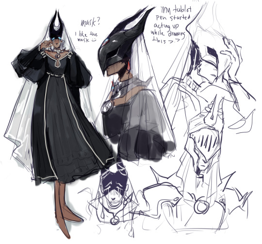
caitha
#dark souls#caitha goddess of tears#niksartstuffs#im still very unsure abt this design tbh [shrug]#once i started colouring it felt less.. soulsy. oh well.#i think the mask is great but it needs like. intricate detail that i simply cannot pull off. also sorry for not giving her shoes but its.#its just the accurate fromsoft thing to do. i tried and it didnt look right.
115 notes
·
View notes
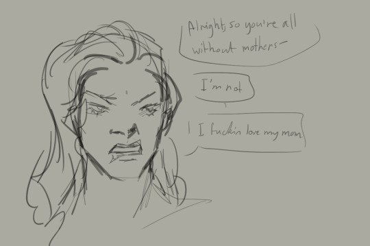
Text
what if i said my genuine opinion of "rom the vacuous spider" is that she's actually not like, peaceful because she's stupid, she's just extremely fucking chill bc she's so enlightened. like she WILL defend herself but really she just wants to hide in her cool lake world and hide dark rituals
#idk i have crazy amount of thoughts on rom lately (makes a post thats half tags) (im sorry in advance)#like that she was blessed by kos.... now how you interpret HER and her relationship w the fishing hamlet may vary but like#kos strikes me as sympathetic towards humans (who are not hunters. it is the HUNTERS nightmare. though ive always wondered)#(why are there research patients there? what did THEY do?)#(anyway. idk i like to think that rom was very kind (if a bit. dumb maybe? but like tbh thats so subjective.) and thats why kos blessed her#thats extremely cheesy and sappy for bloodborne ikik but like. ye#though ive also seen other theories on how she might have ascended that ARENT related to kos giving her eyes#or ones that focus on the cut content abt kos being ebrietas's name at one point in development#which has VERY different implications (+ tbh? more likely#ebrietas has a more confirmed affinity for helping humans and also the whole 'altar of despair' grieving#(which re the character model: tbh i think its MEANT to be rom#but they didnt design it very accurately)#anyway thats all thank u for coming to my impromptu ted talk#OH WAIT edit i forgot to add i think we should consider WHO is calling her vacuous. the brygenwerth scholars? we know SO little about#1. who she was#and 2. where she earned this title. for fucks sake shes not even that spider shaped. whos to say this moniker is accurate?#not trying to start shit. i would love her even if no thoughts head empty#but like i hc her as niceys idk
15 notes
·
View notes
Text
i love the stanley figs so much
#was recently watching some reviews of really bad merch that made it clear the designers didnt care about#the characters the designs accuracy to anything...#i think the figlurlanleyrines hit that sweet spot really well#they make you go 'wait! that's not fucking stanley/me!' the first time you look at them#but they're also more accurate than most fanart#it gives you the vibe of someone higher-up designing it and going 'stanley is nervous all the time isnt he? weakwilled? so ill add that in'#which of course is what the narrator is actually doing#personal#very important post btw you will Listen to me analyze how ultra deluxe uses Theoretical Merch
2 notes
·
View notes
Text
g1 blurr & rb blurr are the only 2 blurrs designed to be alive. Everybody else gets to die and suffer
Edit as I was typing the tags: OH YEAH ARMADA BLURR I'm p sure he gets alive privileges too
#i am not joking Actually thsoe 2 are literally are not meant to not die#rb blurr is in a baby kids show hes safe from all harm#and g1 blurr. is very much not supposed to die hes supposed to replace ppl that died#tf the movie had everybody die so the new cast can come on in. and blurr is a part of that new cast#the irony of this is not lost on me and i think its hilarious#blurr is introduced in the everybody dies movie and doesnt die. most interations of blurr following that very much die#i constantly see ppl mistake the last blurr on the disadvantages of blurr as g1. this isnt entirely accurate#and i didnt tag it as g1 bc of this. thats uk marvel comics blurr not cartoon g1 blurr#which. sure thats g1 too ig but are u seriously gonna tell me when ppl say ''g1'' they are thinking abt the marvel comics.#no theyre thinking about the cartoon#and i have to reitarate so hard. cartoon g1 blurr is So Specifically not a blurr that dies or gets close to it#u may be asking ''wooly why do u give so much of a shit about if ppl think g1 blurr is a part of the blurr death club?''#well i can answer that. its bc i can. this isnt actually important at all lol#i just get irrationally huffed up when ppl are wrong abt stuff i like even if its completely inconsequential. im a nerd you see.#OK THIS IS THE POINT I REMEMBER ARMADA BLURR#i dont think he dies. idk i havent seen this one i just watch clips of it and go ''i like the hot shot guy :]. blurr is cool here too''#i love his design in that series even though its not meant to be blurr originally i think#but orange and blue is p swaggy and the red demon eyes are cool i cannot deny this#i do think his characterization is actually not far off from blurrs base character#like ppl say the anime tfs have like no relation to their other counterparts (and include blurr in this statement i think)#but from what i can tell.. i dont think that's rlly the case with blurr?#like yeah hes much more of a brooding kind of serious and gruff than other blurrs#but that falls in line with how tfa blurr is p serious (even if he didnt exist at this time)#and hes a former racer & p competitive thats sounds like ur typical blurr following idw#its just a different way going abt it which i might..prefer over typical modern blurrs???#idk i havent seen the whole show/trilogy but i like it when blurr is serious and a stick in the mud#so basically all this shit i have to say abt armada blurr boils down to. i dont know enough abt him to explain why he doesnt die#he just doesn't. he gets treated as a normal character and not canon fodder#and never again does he get this treatement if hes not protected by baby show immunity <3#🐝 could you repeat the last part? 🟦
11 notes
·
View notes
Text
Not the final design so it won't be included in the future post but I still felt like showing this
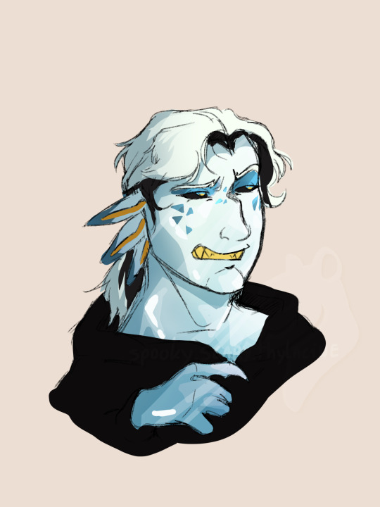
Little bastard man in the GaP AU
#spooky arts#i have so many issues with this design#first off. he looks nothing like p03. aside from the freckles or the specific way i draw his eyes/brows (but youd have to follow my art to#know this) theres nothing that tells you who it is at the first glance.#secondly. he looks too young. baby faced motherfucker. i mean these fickers dont age normally on the account of not being organic but#COME ON. HE LOOKS LIKE A TEENAGER.#the colours are. eh? i think my biggest mistake was giving it a blueish tint meaning i couldnt make its eyes blue or the design would be#too monotone. next attempt i'll use more greyish colours or some other timt.#i do like the eyeshadow and freckles and the two tone hair though. will include that in the revision#hate how the hair looks like normal hair though. ill have to figure out how to make it look more like itd belong on a being made of rock#design aside the implications of making them a Crystalian royalty keep hitting me. like somebody periodically throwing bricks at my face.#first off. motherfucker's a sibling to my bestie's oc. wild to think about.#secondly. i didnt even considered this when making this decision but motherfucker is distantly related to a literal god#his family pledged loyalty to the equivalent of a fucking Cthulhu. and the only reason he wasnt immediately fucking murdered upon ending up#on earth was because he could be useful in finding where his family is. fucking wild.#accidentally making this au into a political drama which seems oddly fitting considering the source material#'gods and pawns' is. a very accurate title for this au huh
8 notes
·
View notes
Text
.
#this is also why i still think sakou was pretty close compared to the other 2 designers#theres nothing in takahashis design thats manga based except for costume design and even then the vibe is ALL off#infact he was closer to shinsobans style back in s1/2! just takahashis style frfr is literally a nothing style#a blank slate for tadano to jump off of to make her weird 90s pug face amalgam#its not exactly Itoh's 90s but its not exactly manga either... not really shinsoban... but its clsar shes tryna mimick Itohs 90s#ill even be funny and say sakou took from Tamegai cus the bangs are kinda similar in fluffiness and shape#and he even went to be more manga accurate (in a 90s anime era anyway)#he still had to jump off itoh obviously cus obligations contuing from the last season#i have a post in it but like she used kanzenban for sure sakou said so herself but she wanted it to be a more modern esque style which like#honest to god ill never know what that means cinsidering loli and moe is the trend for the past decade#but blending cute and elegant was the goal and thats naokos style its cute and elegant not just cute#the bodyshape too in sakous style is very tankobon era while kanzenban and shinsoban is more like a brick tm#trapezoid shaped#she was close honest to god#thats probably why ppl think our style is some weird take on Crystal like its not though#its purely manga based (escpet for mamoru cus no good references)#like its not crysyal fanart its manga fanart to its very core#it just feels like a better sakou style cus sakou was actually *that* close to hitting a similar jackpot#like idk persinally she was pretty close just needed a lot of work she didnt have time for#our design took much longer (years) than hers (months)#and theres even 20 years of work behind our design cus ive been studying Naoko's style since I was like 10 years old
2 notes
·
View notes
Note
uhm. have you seen the movie sonic in the rescue rangers show
havent seen the clip but ive seen screenshots and. maybe im just being too defensive of sonic but imo the "sonic BAD! look at how awful this sonic related thing is!!!!" jokes are just low hanging fruit at this point they stopped being funny a long time ago and the whole "ugly sonic" thing is no exception
also again maybe i am just being weirdly defensive of sonic but i cant help but feel this joke was a bit. distasteful? i guess? the sonic movie crew already listened to the criticism and put in a bunch of extra work to change the design but then disney puts the old one in one of their movies just to make fun of it like. come on
maybe disney is just jealous that the sonic movies are better than the entire mcu and thats why they felt the need to make fun of it /j
#at the end of the day though i dont really care about this movie#i didnt think it looked very good before and i dont think it looks very good now#a sonic cameo is not gonna change my opinion lmao#asks#also i know i just said i dont really care but also.#i keep seeing people post screenshtos from that clip like WOW this dseign is so ugly so glad they dindt use it#and like Yeah i agree the new design is a lot better than the old one im glad they changed it#but also the clip from that chip n dale movie isnt even an accurate representation of what the old design looked like#they obviously made it look worse there because the whole joke is that its ugly#if youre gonna talk about how bad the old design is#at least talk about the actual old design and not a version of it that was intentionally made to look worse. sobbing emoji
14 notes
·
View notes
Text

missing him... my meow meow
#Kagero Kanzaki#my art#second doodle is old and i kept failing to redraw it to ig im posting it like this :(#its still accurate-ish to his design so its whatever#and yes he uses a cane :) his leg was permanently injured during an incident so yk#i like to think he hits people with it very frequently#i wanna write his lore. because i love him#but i think ill do it in another post bc im getting tired :(((((#hes so scrunkly tho. whenever im in a slump i can trust him to bring my inspo back#i love him bc hes basically just a normal guy who found himself in a terrible situation#and as a result unwillingly became a crimelord. crazy!#dont u hate it when ur dad comes back in ur life. he sure does#also i didnt add it here but he usually wears a skull mask whenever he does any crime work#yes its inspired by a batman character leave me alone#he used to have like. this huge burn scar under the mask's area but it was 1. very hard to draw and 2. felt unoriginal idk :(#i might bring it back tho. im not sure#OH YEAH ALSO i feel like its very important to mention he has no relation to scarlett at all#i just rlly like drawing brown ppl with red hair i think its pretty :)
0 notes
Text
realizing if i made my console ocs heights closer to their actual ones a LOT of them would have to be changed
#out of the ones i designed at least#i made the switch very small but going by height in inches its on the bigger side of the list#i might fix the dramatic difference btween dc and ps2#but wii xsx and ps5 being the tallest is....accurate#so idk how different the heights would be from the real things to my ocs#since i took liberties and didnt even check until much later whoops
1 note
·
View note
Text
Ladynoir in Bug Noire's design:
I need a break writing other posts so let's talk about a detaile I appreciate so freaking much about Bug Noire’s design:
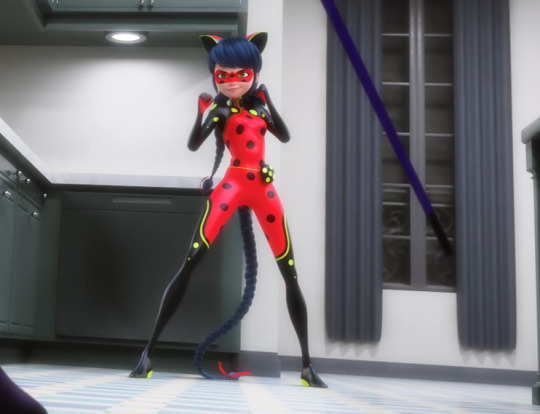
This entire design SCREAMS how much Marinette wished Chat Noir were with her right now and how much she needed him (which she absolutely did, she fucking LOST.)
Chat Noir is with her as the legs that carry her, the shoulders and arms that support and steady her.
In her eyes while she keeps wearing her normal mask, so that when Monarque looks her in the eyes he not only sees her as Ladybug she's also pircing him with every eye-contact with one of Chat Noir's most distinguishing featurs: his green non-human eyes. And it's noteworthy that here it's of crucial importance that her mask and eyes do NOT combine the two miraculous as the rest of her outfit does. Cause now every time Gabriel looks in her eyes she's making him ackowledge them as seperate individuals.
Marinette is not just standing here as Bug Noire for herself, she's also representing her partner who she lost to Gabriel and wants to get back:
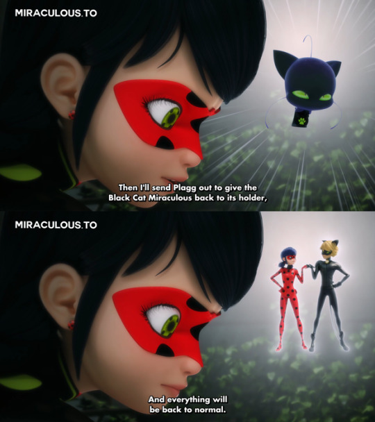
Which - if I may point out - is extremely relevant in this fight because Marinette just saw how badly Gabriel treated Nathalie who then met her end right in front of Marinette because she sacrificed her life and health to help him as Mayura:

Ladybug and Hawkmoth BOTH lost their partners that day but only ONE of them honored hers in this last battle because Marinette ackowledges that she wouldnt have gotten this far without Chat Noir, meanwhile Gabriel in the end basically completely disregarded Nathalie and everything she ever did for him.
But let's continue.
Chat's in her ears that have his green all around on its borders because she most likely can hardly imagine him without his extra ears on his head (Mister Bug being the only rare exception), and then topped it off with a hair style reminding of her Lady Noire hair.
And in the weapons she fought with. Bug Noire fought so much more with Chat's baton than with her own yo-yo which she also colored exclusively in his colors while only changing the footprint color to her red. The yoyo accurately represents Chat's colors (mainly black) while for the baton the main colore should have ben red to represent her suit (but I get why they didnt to that. Not only is she here wearing her suit and red as her main color, it also wouldnt have fit very well overall)
And the weapon with which she hit the butterfly miraculous off of Gabriel was the baton too. The fight choreography took so much care to have Marinette include Chat's baton and cataclysm as much as possible. She didn't just wore both of the miraculous, she fought for the BOTH of them. Using Chat's things so often because thats all she has left of him right now and incorporating him so crucially into her suit design that it's heartbreaking. She literally projected the support Chat gives her onto her suit design because she wished so BADLY that he was by her side right now.
#ml#miraculous#ml recreation#ml season 5#ml season 5 finale#ml spoilers#Bug Noire#ml analysis#ml ladynoir#marinette dupain cheng#ladynoir
680 notes
·
View notes
Note
Can I Pleeaaasssee have a Rivulet design? Pretty please? I’m interested to see how you’d draw the eyes, like would they be buggy or sprite accurate? Also SOS would be cool. THX! Wait I mean thanks not-
OH GOD the thx sonic boom
so this ask sent me on a Journey... what was supposed to be a quick drawing spiraled into a whopping 15 different rivulet designs. the full thought process is under the cut, but if you want just the favorite, here's a rivulet based off of a flatworm!
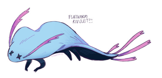
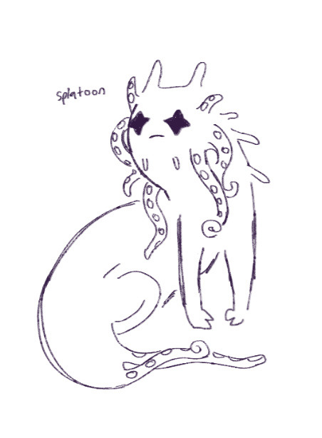
(ps you should totally check out my character design rambles because theres a jetfish rivulet and a shrimp rivulet too and many more)
so the first thing i tried to do was a very simple rivulet design:

however something in this just wasnt enough. im not sure if it was/is the body type similarity to the other slugcats or the fact that i didnt even address the eyes, but i tried to fix it by making the eyes more canon accurate

unfortunately this was Still Wrong. it just felt like i was redrawing the canon rivulet when i KNEW i could make it more visually distinctive. my biggest issue was trying to get the eyes to be sprite adjacent while still remaining buggy because its not rivulet if it doesnt have those big sopping wet pathetic orbs. so there were a Lot Of Eyes
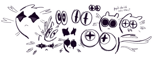
somehow along the way i got distracted and after a long bout of doing something completely irrelevant (trying to make a pupil system for sprite accurate eyes??? it looked bad) i decided to tinker with the body more. leech rivulet came to mind and i drew it because i thought it would be awful in a funny way, but it was...
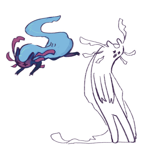
...not bad?
while it wasnt really rivulet, it was still a step in the right direction: mixing and mashing rivulet with aquatic species appeared to yield interesting results. so after doing the next reasonable step and making a sockeye salmon rivulet which was only mildly cursed,

i started playing god with various aquatic species off the top of my head

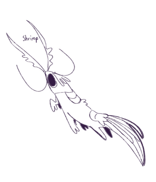
+ shrimp
(not pictured: attempts at a horseshoe crab, a barrel-eye fish, and a rivulet with eyes on the top of its head like a halibut which ended up looking like a scav grown out of a test tube. those 3 did not look good)
i did also end up with 2 extras, which i wasnt sure if they were freaky in a fun way or freaky in an "oh dude wtf" way

and finally, there was a jetfish rivulet
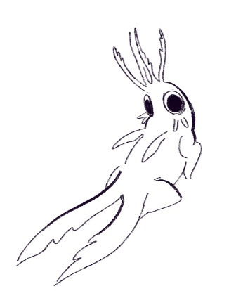
which, excluding the flatworm, should be an exhaustive list of the nonsense i did with riv's design. the flatworm ended up being my favorite because the wavy sides and riv's blue color just make it look too much like waves to pass up.
#ask#i assume sos stands for sliver of straw?#whom i completely forgot about in the name of putting riv through a design blender with the lid off#but i do have a sliver of straw design in mind#just havent had time to work on it...
78 notes
·
View notes
Text
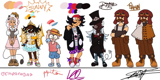
The full lineup is almost done!! (just needs some touch ups and a Chunsik design👍) FEEDBACK IS GREATLY APRECIATED!!
Design process under here (whole lot of yapping)
General thoughts: Ive given them in my previous design sheet (you can find it in my blog)(tldr: designs match characters but still childish, 8-12 years old). Only thing different here, is that these eggs were eggs who I had less of a clear idea of what I wanted to do with them (though I still really liked where I ended up!!)
Empanada: Didnt want to go for the full sweet lolita route, mostly because I thought it'd take away the "little kidness" of it all, but something that still resembles the aesthetic. She's wearing "carneirinhos" (idk the name in english) which is very cute little girl to me, and shes also a demon! Her tail resembles a frying pan!! Though I might change her fringe (it was supposed to be baby hairs but now that I think about it, her type of hair probably wouldnt have them) and put some argyle pattern in her sweater vest. I just forgor💀 to do that...I also wish I had made her shorter, but unfortunetely I drew this before the eggs did the height check (YES ITS BEEN THAT LONG).
Sunny: My beautiful baby girl. She means the world to me. I love this minecraft egg with all my heart. Shes wearing Light up sketchers and some fairy wings like Pomme, and shes actually wearing a swimsuit, she just put a tutu over it. The diamonds they're always holding are rings, they have a "terere" in their hair (idk name in english😭😭) and the beads were inspired by an artist on twt (@\BLUETOMATOSODA). Also if you are wondering why her hair looks like tentacles, its because I had originally made it puffy, but changed my mind after doing the lineart, so i had to get creative with me covering it up. Just pretend she has a fan, shes a star after all!
Pepito: Basically, he is very smoll. Chiquito even. He has strawberry hair and MASSIVE glasses that take up his entire face. Hes wearing a swimsuit aswell (dont ask how it works idk either), and has floaties since he cant swim. Hes got crocs, since flip flops hurt his toes, with a spider man charm on them! Also hes got a sunhat, mostly cause I wanted some other accessorie but didnt want to go with gas mask since it'd kinda kill the whole swimming vibe (since his model is wearing a swimsuit). sorry if its not too accurate to his character. Side note: Him, Em and Sunny all have freckles! Him and Sunny all over their bodies while Em just has on her cheeks.
Leo: Cute sporty vibe, love her shorty spiky hair. Wanted to try to make her face spiky aswell, for the whole shark dad thing. Shes got a necklace with a shark tooth (I guess she got it from Foolish??). He changes tshirts randomly, and opens and closes his attack on titan hoodie depending on the tshirt's expression (basically my version of Leo changing her player heads constantly). His trainers have dragon wings and also: whealies!!
Dapper: Im gonna be honest: did not expect to like his design THIS much. The colouring really elevated, with the long blue hair (the same colour as the ghosties!). Wanted to make them, y'know, dapper, so I had to sacrifice some of the "little kid vibes" unfortunetely, but I think it fits her still. The hat has part of the helmet that they used to wear a lot, demon horn to match Pomme, and a suit that is VERY inspired by Death the Kid from Soul Eater (very fitting for a reaper in training imo). Might be my favourite design!
Ramon: Jesus fuck you'd think designing your fav egg would be easy BUT NO. I struggled long and hard. Again, he doesnt have that much "little kid" vibe whatever man😭😭 Im just happy that I even managed to make SOMETHING. Hes got Create googles, his meathead is a massive hat that completely hides his hair. Very simple, very Ramon, though I will probably end up making a version with an ugly sweater just like he likes instead😔. I still like it but. man...
ANYWAYS IF YOU READ ALL THAT MWAH, YOURE A REAL ONE, THANKS FOR ENTERTAINING MY THOUGHTS🫶🫶🫶
#qsmp#qsmp fanart#qsmp eggs#qsmp empanada#qsmp sunny#qsmp ramón#qsmp ramon#qsmp pepito#qsmp leonarda#qsmp leo fanart#qsmp dapper#qsmp sunnysideup#ramon the egg#ramon qsmp#leonarda#leonarda the egg#leonarda fanart#leonarda qsmp#pepito#empanada#sunnysideup#sunny the egg#empanada the egg#empanada fanart#sunny fanart#dapper the egg#dapper fanart#breakfast trio
52 notes
·
View notes
Text

GUESS WHO GOT A REDESIGN !!!! HEAVILY !!!
@sevenredsuuns helped me out with picking colors for his new design !!
under the cut will just be a little bit of rambling abt michael and his new design
mike's original design was made very very hastily during the first few hours of rrfd being conceived and I've been unhappy with it for a while, but I'm weird about redesigning my ocs so I've just been sitting with it. but we've been revamping some stuff about the story lately and Kaden also got redesigned so I decided to just bite the bullet and overhaul him too, and i'm really really happy with the result!!!
michael is a character that's very very special to me and it's important to me that his design reflects who he is accurately.
his original design had very little going on which. doesn't fit very well considering he's my most developed and thought out oc. i wanted to give him more markings, colors that looked nicer together, and just. generally a better design. i also wanted to separate him more from the design he was initially based on (which was emote, yeah ill say it, i havent exactly been making much effort to hide it lmao. kinda obvious if you know who emote is). and most importantly i wanted it to actually have some thought put into it, because i didnt give myself Time to really think about his original design while making it. so there's some symbolism going on here too.
rrfd has long since evolved way past the thing it was originally based on (though the original story will always be very very special to me as well), both in terms of the main story and the world we've been crafting for it, and im really proud of how far its come. its been an absolute joy working with these characters the past few years and i am so excited to enter this sort of new era for them !!! these silly guys are so important to me!!!
#michael#sfw furry#safe fur work#clean furry#sfw furry art#furry art#furry#furry oc#object head#tv head#tv head oc#original character#artists on tumblr#my art#oc
96 notes
·
View notes
Last Seen Blogs
jinogasux-fr
flight rising fanatic
poetryandart
Poeticamente
weedpizzaedm
I'm a stoner, i'm a stoner, i'm a stoner
flowersacrossindia-blog
Flowers Across India