#can i just express how much i hate sans-serif fonts
Text
Reya plays Midnight Cinderella: It’s like that restaurant where you don’t remember much about the meal but at least you didn’t hate it?
Yeah, that’s Albert’s route.
Confused? Check out the masterpost. Previous update? Over here.
I don’t have much time to write this but I really want this up before the weekend AND I honestly don’t remember much about the route anyway SO let’s see what I’ll actually word vomit out.
I think my biggest impression of Albert is that he was designed to be the geek/Spock trope option of the bachelors ‘cause glasses and awkwardness. Except that they failed. Yes, he has glasses. Yes, he’s awkward with his emotions. That’s about it. I don’t know whether or not I should be happy that they failed to fulfill the trope.

{Image: Closeup of a disapproving Albert by the grand staircase that leads to the entrance of the palace. It is nighttime. The narration text reads, “His eyes were cold as he stared down at me.”}
That picture happens when our princess tries to sneak out right after she’s been chosen princess elect ‘cause she wants to explain what happened to her student Matilda (CYBIRD NAMED SOME RANDOM SIDE CHARACTERS IN A SIDE STORY COMPLETELY IRRELEVANT TO THE MAIN STORY BUT THEY COULDN’T BOTHER TO NAME THE STUDENT THAT’S MENTIONED IN EVERY ROUTE so I named her because names have power). This time around, our protagonist trips into Al’s arms. He knows who she is but she has no idea who he is. He accompanies her on her carriage ride to town because I guess the writer(s) needed an excuse for him to berate Aria in a manner that shows how stoic he is because geeks/nerds don’t know how to effectively express their emotions and empathise with the opposite gender, amirite

{Image: Closeup of a disapproving Albert inside a carriage. He’s saying to Aria, “Taking risks by acting on fleeting emotions is not something a ruler should ever do.”}
They totally tried to model Albert after the “Spock” stereotype. Here’s why I think they failed: there isn’t much to differentiate him from the other bachelors apart from getting embarrassed easily and being awkward with his emotions. He works hard? So does every other bachelor. He knows a lot of stuff? So does every other bachelor. There’s nothing terribly interesting or relateable about Albert. He’s just a more awkward, stern version of the bachelor clones. Therefore, I shall dub him the Wannabe Geek. Al, you could’ve been so much more interesting. Alas.
Anyway, to Aria’s credit, she actually rebuts Albert, saying, “If I know that that [sic] my actions will hurt someone I loved, but I do nothing to prevent that hurt from happening--then I believe that I have failed not just as a princess, but also as a person.” Not a terribly well-crafted argument on why she wants to visit Matilda, but as I’ve mentioned before, that’s okay. She doesn’t have to start off being perfect at debating. Also, @cyikemen do you need a copy editor? I don’t charge much >.>
Wannabe Geek is surprised by Aria’s response because?? Has he never had anyone disagree with him before? Pretty sure Nico disagrees with him all the time, not sure why he’d be surprised by the princess talking back.
The main conflict of this route is that, excuse me while I get myself some alcohol. Yes, that’s it. The main issue is that I wasn’t drunk enough while playing MidCin. I mean, drink responsibly, folks.
The main conflict is that um, I forget. Hang on. Er, there’s, uh, this small but vocal group in Wysteria that’s completely opposed to any relations with Stein and will go to any lengths to make sure the two countries have nothing to do with each other. I think.
So, like, I vaguely remember mildly enjoying the first half of Al’s route and... I’m drawing a blank here. I think I kind of liked the first part of the story because of this:
{Image: One of the special pictures you get in the story. This one is a closeup of a concerned and blushing Albert holding Aria to his chest. The narration text reads, “Albert’s fingers twined in my hair, gently pulling me towards him.”}
I’m not sure why I like this pic. I suspect it’s because it actually looks like the Albert character sprite. I don’t know what it is about the other special photos in the game that make the bachelors look like aliens masquerading as the bachelor they’re trying to imitate (I’m looking at you, Byron the Babyface). This is not just a cybird issue; lots of other VNs have this problem.
*squints* Hey, waitaminute, Al’s usually wearing gloves, where are his gloves in that CG?? Maybe I’m wrong but I don’t remember him taking them off in this scene?
That pic happens during the princess coronation ceremony. Some Wysterian dude is mighty upset that the king of Stein is there and tries to attack. Aria sees him approaching the Steiners and runs over to try to stop him because we’ve very clearly established that our protagonist has no common sense whatsoever. Wannabe easily neutralises the threat and guards take the dude away. Al notices Aria trembling and holds her, then awkwardly lets her go when she calms down. In the meantime, peeps be going bonkers ‘cause of the attack.

{Image: Closeup of Albert in the town square. On the right is a grand church and on the left is a grand building of sorts. There is multicoloured confetti everywhere. Albert is saying to Aria, “You are the only one who can calm this uproar.”}
Now, I keep saying that MidCin should show rather than tell, and here’s one example of them telling instead of showing:

{Image: Text of Aria saying, “Please, everyone! Please calm down. I realize there’s been a small incident, but everything is under control now.”}

{Image: Narration text that reads, “I continued to speak reassuringly until the entire crowd was calm.”}
Apart from her initial words, we don’t actually get to see how our princess calms the crowd. We don’t get to see what she said to reassure everyone. Then not long after, she is praised for how well she calmed the crowd, if I remember correctly. Stuff like this happens all the time, which irks me to no end.
This is why I much prefer Cinderella Phenomenon. The protagonist does things. I won’t spoil the story but I have to say that one of my favourite CGs from an otome is a scene in Cinderella Phenomenon that really showcases protag in action and subsequently her growth as a character. Except for a few instances, we’re only told that Aria’s become a better princess. That’s terrible storytelling.
I gotta wrap this up for today but before I go, have an outfit pic:
Also, also, thanks for putting up with my inconsistent posting! I really do appreciate those of you who’ve stuck around and actually read what I have to say! <3
*UPDATE* Next post is up!
#Reya plays#midnight cinderella#otome#games#visual novel#VN#mobile games#spoilers#albert burckhardt#Wannabe Geek#review#shameless advertising#drink responsibly#oookay there's apparently a drink remove belly fat tag???#wtf#inconsistent art#surrounded by incompetents#can i just express how much i hate sans-serif fonts#showing vs. telling#bad storytelling#Cinderella Phenomenon#has a far better story#and you should play it instead
1 note
·
View note
Note
I saw on someone else's post that you offered to show them how to make gifs? I am super interested in making The Magicians gifs so I was wondering if you could teach me as well? Or even make a public post or tutorial or something? Thank you!!!!
Yeah, of course! There are a lot of ways to make gifs, some of them undoubtedly better than what I do. But, for me, I have a couple methods I generally use, one with Photoshop (when I want very specific control over the colors, composition, type styles, etc.), and the other with just a free tool (when I just want to make a gif that looks decent and not sink a ton of time into it).
I’ll go over the free tool method here; it’s more straightforward and limited, but wayyyy friendlier for someone just starting out. Also, again: it’s free. (But lemme know if you wanna talk Photoshop and I’m always happy to open that giant can of worms.)
One nice thing about gifs becoming the one true currency of the web is that a lot of gif-oriented sites have built gif-making tools in the past couple years and made them free and easy to use, so we can all become gif-producing worker bees, constantly toiling to keep up with the internet’s insatiable demand for gifs.
I use Gif Brewery 3 for mac, built by Gfycat. (There’s also Giphy’s GIF Capture which I’ve used a few times and didn’t hate.) So for the purposes of this tutorial, Step 0: Download and install Gif Brewery 3
So! Now let’s make a gif. Let’s say I want to make some gifs of Margo taking her throne as high king.
Step 1: Open Netflix in Google Chrome (i.e. not Safari because it blanks your screen if you try to record your screen while a video’s playing) or play a DVD on your computer, or pull up the scene you want on YouTube. Basically get a video of the scene you want playing on your computer screen in whatever fashion you prefer.
Step 2: Open Gif Brewery and select “Record Screen.” Resize the window that Gif Brewery then opens up so that it frames the video, hit record, and then play the part of the video you want to gif.

Step 3: When you’re done with video, click “Stop.” Gif Brewery will then open the video clip that you made in their interface. You can close your browser and the blue frame window. You can see the full clip you just recorded in Gif Brewery. Trim the extra bits off of the clip by dragging the green bar to define your start point and the red bar to define your end point.

Step 4: Resize! Tumblr’s main content box is 540 pixels wide. So if you’re making a gif that’s meant to be full width, you can size down to that width. Make sure “Maintain Aspect Ratio” is checked. (Now’s a good time to also crop if you want to, say, gif only Margo’s face without the space to her left and right.)
Step 5: So now we have something that’s the size and shape of a gif. If you want to add text, now’s a good time to do it. Use the “Text” button at the top of the window to open the Text box. Here you add your text, adjust the font weight, size, color, and border if you’re using one. I’m going to use a Billie Eilish lyric for this example because I’m cliche as hell.
If you’re making a standard-style gif with a text caption, you’ll use a bold san serif font like Helvetica, with a black border around it to make sure it’s readable, and then keeping it small and centered at the bottom of your gif, like so:

But! if you’re feeling Artsy, go nuts with your font choice and placement. Find a font that captures the tone your message and clip are conveying. You can find a wide range of free fonts on Google Fonts or good old DaFont. I want that badass Margo ‘tude, so I’m using a grungy font and Margo’s signature bright fuschia. Drag the text box to move and resize it until you’re happy with it.

Step 6: Time to fix your colors! Screen captured images basically always look more dark and muted than they should. The fix is to fuss and fuss and fuss and then fuss some more over the colors. Gif Brewery has limited color controls, but as I’ve learned, you can still spend an inordinate amount of time fussing over them. The Magicians makes this an especially good exercise in finding the limits of your patience because they’re always backlighting scenes in a way that blow out your brightness when you try to make even small edits. (Which is why I’m switching over to a different shot that’s easier to work with for this example. Margo’s hella backlit in our gif.)

Exposure Adjust: Increase exposure to make your brights brighter
Gamma Adjust: Increase gamma to make your darks richer
Saturation: Increase to make the colors as rich as they can be
Vibrance: I also like increasing vibrance for even more of a pop of color
Hue Adjust: their hue controls are funky, but you can make some minor adjustments if at this point your gif looks weirdly too red or yellow.
Play around until you find what looks good to your eye. For a gif that’s meant to look like it’s colored normally, watch out for things like: the whole thing looks too dark and you have to squint to see the details; you overbrightened and now the white is blown out and blinding; or you oversaturated so much things look pixely and glitchy.
Step 7: Open the Settings panel with the button at the top right. Time for more fussing to make sure the timing, frames, and settings are how you want them.

HERE’S THE THING: Tumblr does NOT let you upload gifs larger than 3mb. So everything you’re doing in this panel is a balancing game to keep your gif under 3mb without letting it look like trash. These are the settings you’ll fiddle with most often:
Speed is set to 100% by default. But you may want to slow it down, especially if your clip is only a couple seconds long. Slower means it’s easier to see the subtle changes in a character’s expressions and it makes the action look less jerky. The slower you set your speed, the more frames will be added to the gif, so keep an eye on that.
Frames per Second is what it sounds like. The lower you set this number, the fewer frames you’ll use, but the animation will look jerkier. You want enough frames per second that your animation looks as smooth as a hot knife sliding through butter. 12 is their default. I try to not go lower than 10. When I’m feeling particularly luxurious, I’ll set this to 15.
Color Count: Gifs can use as many as 256 colors and as few as 2, if you don’t care about your gif being an offense to nature. You can set it to the low 200s without compromising on quality, though, so that’s what I did here.
Step 8: Hit “Create” and wait an inordinate amount of time while your gif renders. When it finally, finally does, check the filesize on the bottom right. In the above gif, you’ll see my gif was 2.1mb. Perfect. So I can hit save and it’s done. But if it had said anything larger than 3mb, I’d have hit “Cancel” and then fiddled with the settings some more to get the number of frames down.
Alt-Step 6B: If I want to do anything fancier/artsy-ier/more unique than this kind of gif, this is when I’d usually crack open Photoshop. But there is some room for creativity within Gif Brewery. Let’s go back to Margo and look at some of our options:
In the Filters menu, you can see there are a number of bre-built Photo Effects to play with. Sometimes they look awesome; sometimes they look like trash. So experiment! There’s also rando filters like Halftone effects. And the Color Effects can give you options like adding a vignette, fading the colors to old-timey sepia tones, or creating a duotone like I ended up doing.
Have fun with it and look for effects that will support the tone you’re setting with clip and text you chose. So like for this Margo example, going black and white, or dark and heavy, etc. would not have been tonally consistent with the badass vibe I’m going for.
And I… think that’s it? At least to get started. Hopefully that helps, let me know if you have any questions! Or want to talk about anything beyond the basics. I’m always happy to dive into the specifics of how a particular effect was made, or how to add more advanced refinements.
#bookster-lover#tutorial#pls don't judge my gif-making abilities based on#the shitty gifs I had to make to capture my screen
49 notes
·
View notes
Text

@anonymous said... For any later thought: how do you interpret skeletons as a monster species? Obviously they’ve got some drastically different shapes than a normal human skeleton! But I’ve seen some interesting concepts (like fuzzy skeletons— cute— strange— but cute!). But are their any interesting biological traits you incorporate (claws, thicker bones, strength of tactile perception given they are Just Bones—) or social traits (any quirks of the species—)?
. OUT
@vertebralheights and i could give a whole lecture on skeleton biology (maybe we will one day lol) so ivy, feel free to chime in here with any thoughts. but! i reject the idea of most skeletons having ever been human. that being said, and i’m pulling from ivy’s lore here), there ARE some skeleton monsters who were specifically revived from dead humans (mostly during the war). they have their own unique traits i won’t get into because it’s not super relevant to your question && it’s not my lore or area of expertise. i am intrigued by the comment papyrus makes about skeletons being descended from humans, and i am interested in maybe exploring that, but that’s some backstory detail i have no time to think about right now. instead, i see their shapes and sizes are more reflective of other monster types than human types. that being said, i think that pre-war they were actually the species that bridged the gap between humans monsters mostly because of the familiarity and similarities to humans. of course, as times changed and skeletons as a concept became more associated with necromancy and death and all around spookiness, the humans began to reject the skeletons. this was one of the impetuses for the war.
as for more specific biological traits, i can tell you what i don’t like. and by don’t like i mean fucking HATE. 1) ecto-genitalia/bodies/tongues/etc. i don’t judge anyone who DOES headcanon that but to me it’s just.... dumb and unnecessary. like rip to the entire udnertale fandom but i’m different. it was literally a concept only created for the sake of po.rn and i’m just not here for it?? the whole point of them being SKELETONS is that they’re vastly different from humans and like... all other monsters. just let them be actual skeletons. it’s way funnier that way. also, having ecto-parts is just an easy out for everything. if you’re going to conceptualize a species of monster, make it work within the confines of that species. skeletons are the ONLY pre-existing monster species (besides uh. dogs.). i’ve said it before and i’ll say it again -- just come up with something new! for fuck’s sake. okay, rant over.
i’m not a fan of them having fur, hair, claws or fangs. again, that’s an aesthetic choice i just don’t get the point of. in my mind, they’re really just bones, held together by magic and magic alone. which is HILARIOUS because i love the idea of a skeleton being so tired/devoid of magical energy that they just sorta fall apart. they’re fine (i think they can detach random bones at will) but they have to kinda put themselves back together again. it doesn’t happen that often -- not even to sans except on rare occasions. pretty much only if their body isn’t producing enough magical energy to sustain their physical form. along those lines, the reason they’re able to eat without the food just falling out of them is that monster food as we know does not pass all the way through the body. the natural conclusion to this fact is that their bodies simply convert it to magical energy as it enters their system. this is what gives it it’s healing power. skeletons probably jut evolved in such a way that this conversion happens instantly (even if it takes longer for other monsters. maybe it doesn’t.) i’m not sure what happens if they try to eat non-monster food. my guess is that it works the same way -- but it only satiates hunger, not magical energy nor can it heal. so even on the surface, monsters need to continue making monster food.
i talked about skeleton eye-lights in my last post but something i forgot to specifically say is that they don’t need their eye-lights to see. it’s more of an expressive thing anyway. the eye-lights are magic generated, not an actual biological trait. because again, they’re just eyesockets. however -- skeletons CAN close them. that’s just an odd quirk that’s different from a typical human skeleton. that and creasing their brows.
also, because they’re just bones, they don’t weigh much. think science classroom skeleton. however, they ARE very strong as a general rule, they can lift their own body weight which again, isn’t much, but compared to humans who have to train to be able to deadlift their own weight, it’s a natural ability for skeletons.
in terms of social traits/quirks? i think there’s a tendency to be more reclusive? but then again, i see all monsters that way (as opposed to humans who are naturally social beings). but also, there just..... aren’t a lot of skeletons. most of them are in vertebral heights, and while sans and pap socialize, they also tend to just..... do their own things. skeletons, i think, have a history of standing apart from other monsters and so the ones that are still alive continue that trend.
oh! i need to talk about font & voices while we’re here. again, this could be a post all on it’s own, but i’ll try to streamline it. skeletons are usually (but not always) named after fonts. these names tend to be chosen after hearing the baby vocalize (not necessarily speak, although i ALSO think that babybones speak much earlier than human babies). a skeleton’s font is like a visual manifestation of an accent. it’s not a different language (among roman alphabet fonts) but rather an inflection in the voice. skeleton voices work sort of like synesthesia, where another skeleton can see or at least sense the font that’s being spoken in. and so this is usually how they get their names. sometimes skeletons have multi-part names (first & middle & last), other times not. sometimes a family will use one generation’s last name and carry it down even for skeletons who don’t possess that particular font. i’ll do a post later on the specifics of sans’ family to give some examples.
the exception to this rule is skeletons who speak in symbolic fonts (wingdings, webdings, dingbat, etc). they speak in a series of vocalizations that other symbolic-speaking skeletons understand but pretty much no one else can. it sounds similar to the soundfont used for entry number 17, if less distorted (i think that what we hear there is an effect of the void, despite being written before he fell into the core). symbolic-speaking skeletons CAN learn to speak non-symbolic fonts (that usually take the form of one of the plainest fonts of either the serif or the sans serif families), but not all of them choose to (gaster did not). however, it’s INCREDIBLY difficult for a skeleton who does not possess the natural language to learn to speak it (it’s possible with training, but their voices just don’t work that way). however, learning to read/write in the fonts is an easily achievable practice, as is understand it when spoken, with time. however, most symbolic-font skeletons learn how to sign, and in return most non-symbolic font skeletons learn how to understand sign language.
and i think that’s it??? friends & followers, feel free to drop your skeleton biology thoughts into the replies or in my ask box! i always love hearing other people’s takes!
#this is.... so long wow#* ring ring ring // . ANSWERED#* you will determine the future of this world // . OUT#* massive anomalies // . HEADCANON
6 notes
·
View notes
Photo


Despite having the askbox closed, multiple people still found ways to request that I cover the abomination that is CATWOMAN: SOULSTEALER by Sarah Maas, and who am I to deny such determination?
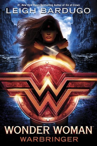
So the DC ya novels, as we can see, all abide by this Formula of BIGASS GRITTY DIMENSIONAL LOGO over the figure themselves, with their face in shadow, author up top, and title and needlessly dramatic subtitle down below. It’s not a good formula! The centrality is static and dull, the shadowed faces of the figures as a requirement is hard to pull off, and the logos and the figures are competing for hierarchical dominance.
Let’s talk first about these two versions of the batman and wonder woman covers, first, because they illustrate some of the, uh, flaws with this system.
The ones on the left are the paperback versions, and the Batman one is, almost, making the formula work: the gold accents of the batsymbol make the logo take visual precedence, the perspective lines are giving it some needed depth and dynamism, and the shadow on his face doesn’t look..... too awful, I guess. And most importantly, the type isn’t getting in anyone’s way: it’s a flat sans-serif, appropriately batman-ey but inoffensive. It’s actually, intentionally, Marie Lu’s signature author font from the Young Elites covers, but it works.
So i have no idea why the middle version, the hardcover/ebook, was like “no no, the type needs to look like a class full of fourth-graders learning to use word art in powerpoint did it.” It’s so, so ugly.

I also don’t know why they felt the need to oversaturate the background with blue, scale up the figure, and actually reduce the shadow on his face but like weirdly, but whatever. The paperback cover is better all around.
The Wonder Woman covers are worse all around, both of them. The paperback’s title type is better by merit of being Not Hideous but where Lu’s “signature” typeface was a naturally good fit, Barduo’s are a little more decorative, and letterforms used to evoke Magic Imperial Russia aren’t so great for Wonder Woman. Also, on the paperback, her legs sticking out of the shield logo like an M&Ms mascot is a DEEPLY unfortunate look.

So the type is either fine but ill-fitting or word-art hideousness, and the imagery is bad on both: murky dramatic ambiguity, a VERY fakebad faceshadow, (she’s being lit from below, it seems like from her shield; we instinctively know it should illuminate her facial features the same way) a static, symmetrical pose with no expression, backlighting that clearly doesn’t belong there, and I don’t know if her bracelets were superimposed or what, but they look STRANGELY fake and ugly.
SO.
This brings us to the worst of the bunch.
Here it is again in case you forgot because I can’t write short posts:
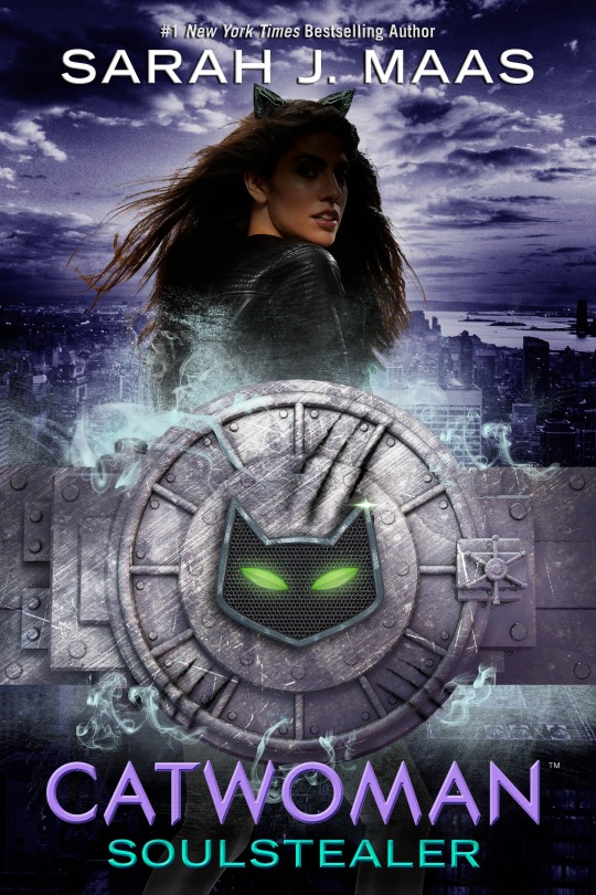
Honestly I only talked about the others to procrastinate bc i don’t even wanna get into this. It’s ugly and I hate it. BUT WE CAME THIS FAR, SO.
This is so bad I gotta break it down: we’re gonna talk about each element, first, and then about how they fit together (or fail to). 1) The symbol lockup/ “logo.”
I didn’t really talk about the “logos” themselves on the BM and WW covers, just how they worked within the design, but both of those were fine by themselves, as three-dimensional rendered items go. Which makes sense, as both those heroes have a long history of classic symbology to go with them.
Catwoman does not. So i have SOME (NOT A LOT. BUT SOME.) sympathy for this weird..... cat..... vault... thing. On the others I called it a logo, but because this is less abstract and more literal, doesn’t feel like one here; it just feels like a misguided imagery choice. Was the best conceptual way to express “SHE STEALS THINGS” really to make her whole thing a literal bank vault? Was it? Why is the cat symbol so small within it? why the heavy crosshatching texture? Why visually imply that this is an Actual Physical Thing To Scale when the scratch marks vs the size of the door handle make no sense? Why do the cat eyes look like the green fairy’s lips? Why the ghostbusters-ectoplasm-looking teal smoke?
Thing 2: the type.
I try to avoid low hanging snark/ hyperbole, but all i got for this is that between the beveling effect and the teal/purple combo, it’s hideous and it makes me want to die. moving on.
(Note: as of yet, there isn’t a paperback cover out, and based on what was done with the other two, we may have a version of this with Maas’s signature fonts to look forward to, whatever the fuck those are.)
3) The model.
So. Ugh. First of all, i saw some “OMG SHE’S WHITEWASHED” stuff flying around, and if you feel like that, that’s valid, (and god knows Maas has issues with it; I’m still not over the whole Illyrians debacle in ACOMAF/ ACOWAR, seriously, nevermind the messy “SURPRISE, LUCIEN HAS BEEN A MOC THIS WHOLE TIME, NO IT’S NOT JUST BECAUSE BLOOMSBURY SAID I NEEDED MORE DIVERSITY″ thing) but this looks like a brown girl to me. One styled to within an inch of her life and subjected to some truly heinous photoshopping, and one who will be doubtless be written with Maas’s deepest discomfort on full display amongst variations of the phrase “golden-tanned skin”, but I would still say that’s a WOC. YMMV, of course.
ANYWAY. This is a really goofy shot. Wonder Woman’s looked bad, but her arm-crossed thing is still her Iconic Move, and her hair could ostensibly have been blowing in the wind. Catwoman here is straight from a CW photoshoot for one of their teen dramas, w a wind machine on her and cat ears photoshopped badly onto her head. (Pretty sure it’s just the same ear, duplicated, too.) As with WW, there is an attempt at backlighting that doesn’t work and the face shadow is real, real bad.
Also, lol @ the fact that you can still see her legs poking out at the bottom. At this point just cut her off behind the logo thing? No one’s actually checking to see if she continues for that last inch behind it except me because that’s what I do?
4) The background! It’s! A City! because GOTHAM. I assume. I don’t know if the story actually takes place in gotham. Whatever. So here’s the thing: obviously, Figures on covers needn’t plausibly physically exist in what their background image is. That would be very limiting. So it’s not the fact that she isn’t actually standing miles above a city that bothers me, it’s that she’s close enough to sort of imply that she is, so instead of a deliberately unreal effect, we get one that’s just Off. It doesn’t help that the other two covers’ heroes definitely are supposed to physically exist in their background. Also the purple treatment is silly and the lighting is totally contradictory to what’s on the model.
OK BEAR WITH ME WE’RE ALMOST THROUGH. THE NIGHTMARE IS ALMOST OVER.
So we’ve talked about why the Series Cover System Overall does not work: static, boring, bad hierarchy, necessitated ugly effects and type. But Catwoman specifically does this the worst of all of them: the background is overemphasized, making the figure and the background compete, and the cover’s split straight down the middle between the logo lockup thing and the figure, making those compete, and the text is such painfully bright, undiluted colors that it steals focus from the logo lockup (which is weirdly lacking contrast) despite placement and the precedence of the other covers indicating it should be secondary in the hierarchy. Then there’s the tense, tight placement: the cat ears run into the author name and the lockup runs into the title, neither a deliberate overlap but an awkward lack of space.
This cover hates itself as much as I hate it, all the elements glaring at each other and fighting futilely in the backseat while the book threatens to TURN THIS THING AROUND.
I wish it would.
281 notes
·
View notes
Text
Warm Hands
"Where chanyeol's s/o is always cold, but he got his warm hands to keep her close."
pairing: park chanyeol X reader
word count: 0.7k
genre: fluff
Enjoy xx
You left the coffee shop with two drinks in hand, wanting to go home with your boyfriend as fast as possible. The winter season have already begun, and you hated it. You have always hated the cold, winter was always you last favourite season, you hated your dried lips, you hated your fingertips and the top of your nose frozen cold, you hated those damn snowflakes and the fact that always drowned your car in it. Besides all that, you could deny that it was beautiful, seeing the kids playing and build snowman’s, couple having coffee dates, and everyone just suddenly had so much style into their clothes.
The best part if all was your boyfriend, Chanyeol. He was the opposite of you, he was tall, a child, very social, loved iced coffee and always loves winter. You remembered the first time you spend the winter season together, as soon as he saw those little snowflakes fall from the sky, he ran outside of your house and just started playing with them, even putting his tongue out like he was about to eat them. You two have been together for almost three years now and you couldn’t be happier. The first time you two exchange eye contact, you knew it was meant to be, it felt like it was yesterday when you two met.
You were still a university student and your finals were approaching and you were so nervous. You went to the library close to your university to study, carrying your books and phone in one arm, and your latte in your hand. As soon as your entered the library, you left your stuff in the table there and went to search a book who would help you study, but you got distracted and ended up in the romantic section. You saw the book you’ve been dying to read and ran up to it, but as soon as your hand the book, another hand touched it with you, which caused you goosebumps considering how warm the other was in comparison with yours, making you look up at person next to you, meeting two dark brown eyes, staring down at you, making you shiver lightly. You knew he was the one, right there.
Opening your front door, you felt the warmth that circled around you house, together with the sound of classical music coming from the living room, he is here. You took of your shoes and made your way to the living room, seeing your boyfriend sitting by the piano, playing another one of his favourite classical music’s, which you never really liked until you started dating him. You stood there, looking at your boyfriend playing in one of his favourite sweaters, the one you liked to wear the most, with a concentrated yet relaxing expressing in his face.
You closed your eyes to enjoy it even more, feeling every note and every melody made by the piano, not lasting long since the song was almost over. By the end of it, you opened your eyes again, to see your boyfriend looking at you over his shoulder with a loving glaze.
“Enjoying it?” he asked now, turning his torso towards your direction
“Definitely” you said walking up to him, sitting beside him, handing his iced coffee while looking into his eyes
“I’ll never understand about how, in this weather, you still can drink iced coffee” you turned your glaze now to the piano with a smile on your face, while hearing your boyfriend’s laugh, your favourite laugh.
“And I will never understand how, even wearing tons of gloves and sweaters, your hands still get cold” he takes your cold hand and intertwine your finger with his. You never really understood how his hands were always warm, but you loved it.
“Well, there is a good about it though” you looked at your hands with a smile and he frowned
“Which is...?” you looked up at him to look at his eyes
“You can hold me like you are doing right now” you smile, seeing the boy blush and smile together
“Well, it doesn’t need to be cold for me to do this, since I love holding your hand and showing how much I love you” this time, you were the one who blushed at his statement and sigh still looking at him, seeing him smile
“I love you” you said, making him smile even bigger and brightly
“I love you too” he said leaning in for a passionate kiss, the ones you loved the most, rubbing each other noses with both your eyes closed
After all, maybe winter wasn’t that bad, at least with him by your side.
masterlist
request here!
71 notes
·
View notes
Text
That's how I knew I'm in Love.
(July 2017)
Nowadays seeing how girls fantasizing over idealistic relationship goals on social media got me thinking of how lucky I am to found him. The one who is completely the opposite of most girls dream 'prince charming'. Who would leave me on 'seen' on whatsapp. No 'good morning' yadas first thing in the morning. He won't check up on me every hour of every day. Rather he will let me go and grow throughout every day of my life. Nevertheless by the end of every each day we will find time for each other. We will have so much to talk about. How our day has been? How much we really miss each other? The conversation flows until one of us fell asleep. Most girls nowadays would flip if they got treated this way. I like it that way; he teaches me that we need to prioritise other commitments in life while committing to each other. It does not always have to be Romeo & Juliet all the time. We will always put our families and friends first. Not neglecting our responsibilities.
Often times, we would call each other names, we laugh, we sang together, we play. From movies to gigs, from karaoke to arcade games. We have our own way of having fun. We treat each other like best friends and lovers at the same time. People will go on wondering what we are. And that's how I knew how real it is. We go against the norms. The norms that we don’t really need to live up the fairy tale to love, that we can love in reality.
I’m a hopeless romantic while he is a realist and rarely to be romantic. He has always have this strong theory about how red roses and surprises are too cliche for his 'standard'. But that is exactly what he did for my 21st Birthday! Little did he know, to me, his presence has already been the best present. Even sometimes instead of exchanging 'I love you' we express it through somewhat I called it art, we let the artwork explain what we have towards each other. Despite of how different we are, we tend to learn acceptance. It is a beautiful experience to truly know a person, it’s even more beautiful that after all we’ve seen, we still choose each other. Other than that, we somehow complement each other's characters like colors in harmony that make each other look brighter.
Instead of getting ourselves caught in any petty arguments, we communicate. We discuss, find solutions and try to understand each other. We also always give each other all the spaces one of us need. Space does not mean ignoring one another but, space is really about respecting both privacy and let them have their own little time to breathe in their own skin. We tend to learn to lower down our ego for the sake of each other which to be honest I find it really hard myself. In reality, love is no competition. Love is compassion and mercy. Never prejudice. Just right and wrong and a lot of understanding.
He has never whispers sweet nothing to my ears. He protected me with the ugliest truth. At the same time he filled me with pure love. He’s the man of his words. He proved to me that I can earn his trust. Not once he ever lie to me throughout us being together. He really showed me faith in loving him.
We may live few miles away from each other. However distance made us realise every moment we spent together need to be cherish every second. We work hard to unite once again. We constantly figuring out new ways to make the relationship exciting. Every date is a celebration of us. Every goodbye is like a hole that has been punched through my heart. Even though I knew we will definitely meet again soon. All the waitings, separations, spaces, and goodbyes made us grew stronger.
He is a person I like to always look up to. Hate to admit this but the man is always right! He is a guy who have strong opinion about almost everything which I find it rather annoying sometimes but somehow his theories always make perfect sense. Also, he has to be the wisest guy I’ve ever met. When he talks about his dream or basically anything, I can see the spark of passion in his eyes, the pump of excitement in his breath. I find it all so beautiful! He’s literally pouring his soul out especially when he talks about the future or even me!
Honestly I have learned so much from him and from this relationship. I've never been in a healthier relationship and I believe I will ever be with others. He made everything easy to solve. He made our long distance seems like zilch, zip, na-da, nothing! He made me want more of him. He has inspired me in so many ways. He made me stronger, less fragile, and somewhat independent than I ever was; he pushed me to do things I thought I have no capability of doing it. He expanded my bubbles without popping it. I am the best version of myself because of him.
We build and grow fonder together in this relationship. Love is a two-way street. Give and take. Push and pull. Work together! Love needs to be earn too. Hence, as he hustle around building his own empire up until it reaches the top of the mountains. I will be there for him. To push him high when he is about to crash and fall. Be the brightest torch to light up his dark journey. And when he’s finally there, I hope he sees me through his victory.
I'm glad that I found him, or he found me. We found each other and I have faith that 'we'will lasts. Here’s to more memories for us to create together in so much more different places with bunch of polaroids, artsy pictures and words. Here’s to the man who has given me so much love even when I least deserve it. Let me tell you this, no one in this world can possibly love you the way my ruptured soul do. For I, will never trade this gem over any pebbles. I will always treasure it as long as my soul holds my body.
Doesn't matter where we are, we are never far apart,
Doesn't matter where we go, when I'm with you I am home,
Yes, I am home.
6 notes
·
View notes
Text
My Love/Hate Relationship With Courier New
As a writer and as a computer user, I have undergone several evolutions with regards to font. I grew up with few options. My first access to the creation of the typed word was a manual typewriter, meaning ‘non-electric’. For those of you who haven’t had the pleasure, you’ve probably never driven a car without power steering either, so that metaphor would be useless on you. Suffice to say that you got a good workout for the fingers if you used this little baby for more than half an hour. This machine is where carpal-tunnel was created.
Later, I graduated to DOS-based WordPerfect. I don’t recall being much concerned with font at this time. I was still learning to save often enough, so that if my foot accidentally pushed on the computer power cord, it didn’t evaporate two hours of work. (I’m still bitter about it.)
Then came Word 3.0, an honest-to-God WYSIWYG editor with spell-check and a drop-down list of fonts with which to play. My first love was Arial. I adored the nice, crisp lines, the fact that nothing was added that didn’t need to be. It was a business-minimalist, no frills, easy to read typeface. The letters and documents I produced at the temp jobs of my middle twenties looked professional. At the time, that was all I cared about. I knew nothing of serifs - what they were, what they were for. I just cared that the text was readable and nice to look at. Next came Tahoma, a carbon-copy of Arial which took up a little more horizontal space. I used it because it was the new thing.
Much later came Verdana. Oh, Verdana, you lovely, lovely girl. I’m sure I could find out who made it - but to you, sir or madam, I say bravo. Here was a sans-serif font, (I knew what a serif was by that time, though I still disliked them), where you could tell the difference between a number 1, the lower-cased l, and the upper-cased I. (If you ask me, even Courier New does a poor job of differentiating the first two.) As far as I know, this is the only sans-serif font to do this. (At least, the only Microsoft font. I cannot speak to Mac users and their strange, Helvetica scripts.)
In the time since those halcyon Verdana days, I’ve fiddled about with other fonts. I noticed that the Harry Potter novels were done up in Garamond, which is a beautiful, if not smallish type. Others came and went out of my life - one night fonts, the Georgias, the Trebuchets, but none of them lasted. But while my fancies varied, the one font I have always loathed is Times New Roman. There is something about this type which has always raised my aesthetic hackles. Whether it’s the fact that the lower-case i’s look like number 1’s with a dot on top, or the overall anemia of its wispy lettering, the font has always made me cringe, even before I could express what it was I didn’t like.
Now, I will admit to a certain anti-authoritarian view of fonts, especially in my youth. There was a part of me that wanted to blaze a new trail by setting everything in Impact, or giving my documents gravitas by choosing a scripted or equally unreadable Gothic typeface. But these were all just youthful indiscretions. Everybody goes through that experimental phase where being different is automatically better than the capitalist 99-percenters with their dainty serifs.
But even as I got older, and these fanciful sets were shunned in favor of readability, I still resisted using one of the two approved fonts when I wrote personally. As I have already said, I hate Times New Roman and would happily resolve myself to Morse Code or Bar Code if that were my only choice. I’d wave flags around if I needed to, just to avoid my hallowed writings displayed in that poncy typeface.
Which leaves me with Courier New, and my reservations with it. There is absolutely nothing critical I can say about Courier’s readability. Whoever chose it for typewriters, where one font was all there could be, chose correctly. There is nothing smarmy about its block-lettering, where every lower-cased ‘l’ takes just as much room as every upper-cased ‘W’, and each letter has proper elbow room.
My issue with Courier is that aesthetically speaking, it is so unkind to the eye. It is the most utilitarian font that I know of. Courier New is the Volvo of typeface. It’s blocky, but as sturdy as a 12-inch oak beam. That said, there’s a damned good reason why editors and proofreaders like it. Misspelled words pop-out more when I use Courier than in any other font. I’ve noticed that even when I’ve fat-fingered words which the spellchecker doesn’t catch, e.g. ‘isle’ instead of ‘else’, I notice them easier in Courier-- even when I’m just scanning. Garamond may be pretty, (and it is), but it would be very easy to miss a little error like that among its sleek lines and contours. Garamond seduces the eye and turns it blind with love. Courier sets you marching in rigid, equally-spaced rows and screams in your ear when you’ve made a mistake. Lover versus Drill Sergeant, on opposite ends of the serif spectrum. And I, in the middle, am finally learning how to march.
0 notes
Text
The Halloween List: A Quiet Place, Emelie, and Hereditary
I'm kicking off The Halloween List this year with one of my favorite hidden gems, and two of the biggest Horror movies of 2018. 2018 has been so long that it's easy to forget A Quiet Place even came out back in April, right?
All three of these films attack the family in very different ways. A Quiet Place is about family surviving in a country that's destroyed; Emelie is about a family that thinks it's safe until they hire the wrong babysitter; and Hereditary is about a family haunting itself. Each is powerful, but which kind of conflict is the most effective on you?
A Quiet Place (2018)
youtube
I have been waiting a damned long time for A Quiet Place. Horror has a troubling history of relegating disabled characters to the roles of villains. I wrote about that phenomenon for Fireside Magazine last year. You can take solace in the well-meaning portrayals of Wait Until Dark and Silver Bullet, but those are moves with abled actors cripping it up, and screenplays that pander. They could never get beneath the surface.
Millicent Simmonds is a deaf actor, and she’s the emotional core of this movie. She plays Regan, the oldest child in one of the few families to survive an invasion of monsters. The monsters hunt on sound; they can hear a toy space ship from miles away, and be there in seconds. Regan has saved the family, because since they all know ASL, they know how to communicate and live without speaking. They walk into town to scavenge on paths of sand to quiet their footsteps. They have adapted.
What’s even more rewarding about this disability rep is that Regan isn’t defined by her disability. If a monster is coming, she can’t hear it behind her, but that’s a peril of a moment, not a constant agony. Regan is defined by her grief that she thinks she was responsible for the loss of a younger sibling, and she has some very creative ways of expressing that. It’s not grief about being disabled, or grief that makes her curse it. This is a relief in contrast to a hundred movies about disabled people who curse being trapped in wheelchairs, or wish they could see the sunrise. Disabled people are going to live lives, and regret openly, not narrowly. A Quiet Place gets this.
The movie is strongly constructed, naturally never giving us an exposition dump on where the monsters came from, or how life has been. We can tell what their lives are like by what they keep around the house, and what chores we see them do. It’s at its best when there’s minimal music, letting us sit in the same terrified silence as the family. They have a baby on the way that won’t be easy to deliver in this world, and the kids are restless to live bigger lives. We see them pushing against the boundaries forced on them with a healthy naturalism.
At under 90 minutes, the movie is tight and knows what it wants to do at all times. Its big set pieces, like the kids falling into a corn silo and the threat of drowning in it, all click. The moment you see a nail sticking out of a step in the stairs of their the basement, you know what’s coming. What comes is harrowing. It’s all worth it, too. It yields one of the most cathartic endings in modern Horror.
Emelie (2015)
youtube
Emelie is a movie good enough to kill your career. It is so unsettling that it might have been more commercially successful if it had been worse. I can see some studios not wanting to work with the people involved because they were willing to make this thing.
Emelie is also a great response to John Carpenter’s Halloween. Halloween is a babysitter’s worst fear: that someone will come in the night when no one older is around to help and attack them and the children. But that isn’t the fear of children. Children’s deepest fear is that the babysitter will hurt them. Emelie is about that fear.
Following a disturbingly casual opening sequence in which a babysitter is kidnapped in broad daylight, we meet a small and intensely believable family. There are three kids, the youngest of which is so naturalistically sweet and excitable that he might just be a six year old that the director gave some sugar to and let roam through the set. Here we have a brooding pre-teen older brother who doesn’t want to spend time with his siblings, and a controlling middle-sister who constantly comes up with costume ideas and games for the youngest and most impressionable of the kids. Their parents are going out for a special dinner. They’ll be gone late. At the last minute their sitter has been replaced, but surely she’ll be fine. What could happen?
From there, Emelie would be a much more comfortable movie if the babysitter (guess her name) whipped out a steak knife and chased these kids. But it’s not a conventional Horror movie. She has the kids pose for photos that seem like a game to them, but are inappropriately morbid to the audience. There’s a scene where she invites the oldest boy into the bathroom with her that isn’t explicitly sexual or violent, but is palpably uncomfortable because even the boy knows this isn’t normal. Scene by scene, the movie pushes you to guess what she’s planning to do to them. The suspense is almost Hitchcockian, except she’s more of a black box than most of Hitchcock’s villains.
The older brother has to pull it together and find ways to call for help when the sitter hasn’t technically done anything explicable yet. It’s surprisingly effective character growth for the kid, who begins the movie as a pouting brat, and who wouldn’t be equipped to stand up to an adult no matter what his attitude was. He’s the only line of protection and he’s intensely vulnerable – perhaps the most vulnerable because Emelie reads him like a book from the minute she steps into the house.
I can’t recommend this to most parents. Many of my friends are having kids now, and for most of them, the natural fear for their children is going to make the tension of this movie too much. Again, it’s not a movie that has them eaten alive or smashed by a hammer. It’s the slow menace that will be too much. It’s easier and more escapist to fear that a werewolf, vampire, or even a serial killer will come in from outside your neighborhood and go after your family. Emelie is a movie about someone you think you can trust.
I spent so much of the ending of this movie yelling at the TV. No movie has sunk its teeth into me like this in years.
Hereditary (2018)
youtube
This is Ari Aster’s debut film. You know you’ve done well when critics argue whether the first movie you’ve ever made is a masterpiece. The guy has an entire career to turn in his masterpiece, but sure, let’s work ourselves into a froth now.
Anything Hereditary does well at all, it does masterfully. If it had a different ending, it’d probably be my favorite movie of the year because of how powerful the rest of it is. Instead it’s one of the best movies that I don’t feel like rewatching.
There are few pieces of art in any medium about an abusive family member dying before anyone gets catharsis from them. You probably have someone in your family who died before someone else got closure with them, and if you’re lucky enough not to, you definitely know somebody whose family has that kind of suffering. Hereditary wallows in the discomforting legacy of a grandmother who traumatized both her daughter and granddaughter. She’s dead, and her shadow is still longer than that of any living member of the family. She haunts them figuratively, and eventually we’ll wonder if she’s doing it literally.
Toni Collette deserves all the praise for her performance that she’s gotten. Nominate her for stuff, and write her fan mail. She lays bare this damaged mother who knows she can’t let go, who hates her mother for always interfering in her parenting, and demeaned her daughter for not being a boy. At the same time this life has made her so uptight and repressed that she can’t talk to her kids honestly without exploding. It took one scene to sell me on this movie, when Collette’s character went to a grief support group and her hatred of her own insecurities flowed out of her. This is not a stock Horror character with stock Horror angst. This is something real and festering, that makes you wish exorcisms worked on trauma.
And suspense? The clucking of a tongue here is scarier than the rev of a chainsaw in another movie.
It’s to Hereditary’s credit that act one pivoted the film somewhere entirely different than I’d expected. This isn’t a “and there are also ghosts!” pivot. This is a demolition of the family’s status quo mid-grieving process, which is the sort of curveball I could only expect A24 films to support. Suffice to say that this family goes through a Hell that, even without the eerie and horrific elements, you can’t expect any family to be equipped to deal with.
If this movie had come out in the 1980s, it would be a part of the canon right next to The Shining and Rosemary’s Baby.
It’s 2018 now, and I’m not surprised that mainstream audiences hated it.
It is an unpleasant movie with an unpleasant view of both family and the supernatural. The characters lack agency because the themes of powerlessness before death and grief are so important, and that builds to an ending that is both tricky to understand and, once you understand it, doesn’t feel worth sitting through an entire movie to get to. It has more to say about who we are as people than the average Horror movie, but the actual payoff of its climax is just another example of an overwhelming trend that I’m sick of. No matter how well executed the rest of your story is, the ending needs to satisfy. Hopelessness is not its own answer.
Come back Friday for Slice, Summer of '84, and the new hotness that is Nicholas Cage's Mandy!
Source: http://johnwiswell.blogspot.com/2018/10/the-halloween-list-quiet-place-emelie.html
0 notes
Link
When Gretchen Carlson — the former Fox News anchor and Miss America 1989 — took over as chair of the Miss America Organization earlier this year, she promised that the 2019 pageant would “join the empowerment movement” and become “open, transparent, and inclusive” by judging contestants on their talking points and social impact initiatives rather than their outfits and looks. And at Sunday’s final competition, it seemed that Miss America 2.0 was indeed the (slightly) less pageant-y pageant that Carlson intended.
Thanks to sweeping changes announced this summer that included removing both the swimsuit and evening gown portions, as well as a major branding overhaul, this year’s event was markedly different from the others in the pageant’s 97-year history.
The viral highlight? Miss Michigan, Emily Sioma, introduced herself not with an overview of her college and major but by drawing attention to the ongoing water crisis in Flint. “From the state with 84 percent of the US’s freshwater but none for its residents to drink, I am Miss Michigan Emily Sioma,” she said.
According to the Daily Beast, Sunday night’s competition, which aired live on ABC, was “50 percent less offensive than the average pageant, with 100 percent more pantsuits.” There were earnest calls from the contestants for everything from diversity to the importance of investigative journalism, women in STEM, and wheelchair adaptive sports, while the opening script relied heavily on words like “sisters,” “future leaders,” and “empowered.”
Yet despite reports of turmoil behind the scenes — as well as a very public rift between Carlson and the most recent Miss America, Cara Mund — Miss America 2.0 could provide a possible model for what beauty pageants might look like in the future.
Because women have always been judged heavily on their looks, beauty pageants have existed around the world for millennia. When Miss America debuted in 1921, it was to attract more crowds on the Atlantic City boardwalk, and audiences would clap for their favorite contestant, which accounted for 50 percent of the vote.
In the pageant’s beginnings, non-white women were not allowed to enter the competition. Even though the rule that required “contestants must be of good health and of the white race” was repealed in 1950, the first black contestant wasn’t included until 1970, and the first black winner was Vanessa Williams in 1984. It was the first time that a winner received death threats and hate mail, and also the first time that a contestant was forced to resign following the discovery of nude photographs (ones that she was told would never appear in print), leading to a contentious national conversation often tinged with racial undertones.
Meanwhile the second-most famous pageant in America, Miss USA, was co-owned by none other than Donald Trump between 1996 and 2015, a time in which the future president engaged in behavior such as entering the Miss Teen USA dressing room while contestants were changing and bragging about it. Trump, who remains very preoccupied with judging women’s appearances, went on to attack Alicia Machado, the Venezuelan Miss Universe, for gaining weight during the 2016 election.
It isn’t entirely surprising that the Miss America Organization has desperately attempted to shed its sexist past. Last December emails between CEO Sam Haskell and lead writer Lewis Friedman leaked in which contestants were referred to as “cunts” and called “piece of trash” and “huge,” among other misogynistic comments.
When Gretchen Carlson, who became a vocal advocate for #MeToo after settling a sexual harassment lawsuit against former Fox CEO Roger Ailes, took over as chair of the organization and named several more women to its board, the goal was to transform the pageant into one that focused less on the contestants’ looks and outfits and more on the social issues they champion.
But in doing so, another minor scandal erupted: In the weeks prior to this year’s pageant, Miss America 2018, Cara Mund stated in a public Facebook post that the organization “systematically silenced me, reduced me, marginalized me, and essentially erased me in my role as Miss America in subtle and not-so-subtle ways on a daily basis.” She accused the organization of prioritizing Carlson over her, as well as using passive-aggressive tactics to minimize her status.
Last week, a sash that read “Gretchen sucks” was placed on the statue of Miss America in Atlantic City, and several posters mocking Carlson with the words “So Fake” were hung from nearby traffic light poles.
Despite the drama, however, it seems as though this year’s contestants largely adhered to the mission of Miss America 2.0. In place of the traditional evening gown portion, the women were free to wear attire that made them feel confident and expressed their personal styles. (Read: lots of jumpsuits).
Even the revamped pageant’s branding looks like that of a hip, socially aware startup — the hero image on its website is a cinemagraph of a woman in a billowy skirt leaping in Converse-like sneakers, while the font is, of course, a cool sans serif.
missamerica.org
But besides Sioma’s bold statement about the water crisis in Flint, most of the contestants who had made it to Sunday’s finals stuck with less overtly political issues to champion — the environment, youth empowerment, and support for people with visual impairments, for example.
There were certainly politics present onstage a few nights before, however. During the pageant’s preliminary round on Friday night, Miss West Virginia, Madeline Collins, stated that “Donald Trump is the biggest issue facing our country. Unfortunately, he has caused a lot of divide in our country, and until we can trust in him and the choices that he makes for our country, we cannot become united.”
And on Thursday, when Emili McPhail (Miss Virginia) was asked how the NFL should respond to its players kneeling during the national anthem, she said that the protests were “absolutely about police brutality,” and that “kneeling during the national anthem is absolutely a right that you have, to stand up for what you believe in, and to make the right decision that’s right for you.”
This, perhaps, could indicate the changes coming to the beauty pageant world. And unlike the overwhelming majority of Miss America winners, this year the judges selected a nonwhite contestant, New Yorker Nia Imani Franklin, who chose youth art education as her social impact initiative.
Miss America 2.0’s goal is to make pageants more like serious job interviews. But to be clear, the Miss America pageant has always been a job interview — it determines the woman who will represent the organization over the next year in speaking and travel engagements. It’s just that being hot and likable can no longer be the only requirement.
However much this year’s pageant was a leap toward the future, it’s still difficult to imagine a Miss America who is queer (although 2016 saw the competition’s first openly gay contestant), who is disabled, who is fat, or who is trans- or gender nonconforming. It’s even difficult to imagine a winner whose personal style is a little off-base, who doesn’t have perfect hair, not to mention one who takes a stand on a controversial political topic.
These are ingredients that are baked in to the Miss America recipe, and though there are plenty of pageants that aim to subvert the norm — drag and queer subcultures have their own versions; there’s even an event to crown the “smallest penis in Brooklyn” — anyone hoping for a truly subversive Miss America probably shouldn’t bother holding their breath for Miss America 3.0.
Original Source -> Gretchen Carlson’s Miss America 2.0 promised empowerment. It mostly delivered.
via The Conservative Brief
0 notes
Text
shou bio html
<h1 style="margin: 25px 0px 10px; padding: 0px; border: 0px; outline: 0px; font-size: 20px; vertical-align: baseline; color: #424242; line-height: 1.2; font-family: 'Helvetica Neue', Arial, sans-serif; background-image: initial; background-attachment: initial; background-size: initial; background-origin: initial; background-clip: initial; background-position: initial; background-repeat: initial;"><span style="margin: 0px; padding: 0px; border: 0px; outline: 0px; vertical-align: baseline; background: transparent;"><img src="https://64.media.tumblr.com/d3c08a1acf49f08180fc64bb15e0abf6/tumblr_inline_oh5sl2WzgT1uot8yq_500.jpg" /></span></h1>
<h1 style="margin: 25px 0px 10px; padding: 0px; border: 0px; outline: 0px; font-size: 20px; vertical-align: baseline; color: #424242; line-height: 1.2; font-family: 'Helvetica Neue', Arial, sans-serif; background-image: initial; background-attachment: initial; background-size: initial; background-origin: initial; background-clip: initial; background-position: initial; background-repeat: initial;"><span style="margin: 0px; padding: 0px; border: 0px; outline: 0px; vertical-align: baseline; background: transparent;">❝ Remind me again- why wouldn’t I claw your throat out?❞</span></h1>
<p><strong style="line-height: 1.4;"><u>APPEARENCE</u></strong></p>
<p><strong style="line-height: 1.4;">Face claim: </strong>Yuyuka Nekota</p>
<p><strong style="line-height: 1.4;">Gender:</strong><span style="line-height: 1.4;"> Agender, fem-presenting (she/her pronouns. Granted, he/him or they/them work fine too.)</span></p>
<p><strong>Sexuality:</strong> Panromantic, Pansexual <strike>but good luck with that lmao</strike></p>
<p><strong>Hair:</strong> White, short pre-tme skip, mid-back post-time skip</p>
<p><strong>Eyes:</strong> Gold, somewhat almond-shaped</p>
<p><strong>Height:</strong> 172 cm pre-time skip, 174cm post-time skip (what a growth spurt)</p>
<p><strong>Body type:</strong> Lean, athletic built</p>
<p><strong>Tattoos:</strong> A large tattoo of the Straw Hat jolly roger on her back</p>
<p><strong>Personality:</strong> <strike>very bad very shitty</strike> <em>she’s alright</em></p>
<p><strong>Full description:</strong> Ever since she was a little kid to the age of seventeen (pre-time skip period), Shou has always had her white hair cropped short, the longest it’s ever been reaching to just about the top of her shoulders. Characteristically, she has a seemingly untamable cowlick that stands defiantly on the top of her head, stubbornly refusing to be tamed even by the most determined of combs and hair brushes and the toughest of hair products (her crew mates Nami and Bambo can attest to this- poor girls gave it their best shot). After the two-year gap during the aftermath of the marine ford war however, she chose to break the habit of maintaining her boyish hairdo and let it grow out to the center of her back, making her look more feminine and older than before.</p>
<p>Her eyes shine gold, and are debatably her most striking feature; lighting up expressively to convey either joy or anger depending on the situation. She has very light skin and a very sturdy, fit figure with defined muscles although still mostly leaning over to the leaner side of things when it comes to the buff-ness scale (secretly, she’s envious of Zoro). Standing at 174cm currently in the story, she’s apparently the second tallest female member in the crew. Inked on her back is Luffy’s jolly roger as a tribute to her captain as well as to showcase the respect, loyalty and deep affection she holds for her Nakama in her heart. Getting the tattoo had been an extremely definitive moment in her life to symbolize the fact that she had finally found her place in the world after years of not quite knowing where she belonged or fit in <em>(“I’ll carry all of you on my back for as long as I live, for without you, God knows I’ll be lonely”)</em>.</p>
<p>Shou loves donning a combination of jackets and coats <em>and</em> very short shorts that could be considered a little… revealing at times. It’s as though she can’t decide between wanting to keep warm and toasty or having the ability to move efficiently on the battle field: which is exactly the problem, to be honest. She is most often seen wearing an army-green bomber jacket, a black or white tank top, and leather or denim shorts. Other items that she’s prone to wearing include the occasional dress, crop-tops, halter-tops, an assortment of jeans, scarves, black boots, and very rarely a snapback on one or two occasions.</p>
<h1 style="margin: 25px 0px 10px; padding: 0px; border: 0px; outline: 0px; font-size: 20px; vertical-align: baseline; color: #424242; line-height: 1.2; font-family: 'Helvetica Neue', Arial, sans-serif; background-image: initial; background-attachment: initial; background-size: initial; background-origin: initial; background-clip: initial; background-position: initial; background-repeat: initial;"><span style="margin: 0px; padding: 0px; border: 0px; outline: 0px; vertical-align: baseline; background: transparent;">❝ What is your worth, anyway? So much that I would refrain from ending your life entirely where you stand?❞</span></h1>
<p><strong><span style="line-height: 1.4;"><u>INTERESTS</u></span></strong></p>
<p><strong><span style="line-height: 1.4;">Likes:</span></strong></p>
<ul>
<li>LUFFY</li>
<li>Ace and Sabo I guess… <strike>(haha losers)</strike></li>
<li>Her crew</li>
<li>Warm climates and places that she can comfortably curl up asleep to <em>(E.G; a fire place, a rock that’s been left out in the sun, one of Franky’s machines that’s been overheated from running too long…)</em></li>
<li>Spicy, spicy food! Where dem’ ghost peppers at, Sanji?</li>
<li>Gems gems gems gems gems JEWELRY</li>
<li>SHINY THINGS</li>
<li>Hoarding said shiny things like a magpie</li>
<li>What do you mean I can’t touch any of the treasure how is that fair Nami</li>
<li>This tin foil isn’t thrash by the way!! how dare you</li>
<li>Stargazing</li>
<li>Crawling into tight spaces to do God knows what…</li>
<li>Asking stupid questions</li>
<li>Anything that’s “weird” or “funny” or “cool” in her book</li>
<li>FiGHT HER</li>
</ul>
<p><strong>Dislikes:</strong></p>
<ul>
<li>oh boy where do we start</li>
<li>Mostly everything that isn’t on the list above</li>
<li>Other people asking stupid questions… hypocrite</li>
<li>the COLD she HATES the ice and the snows and the frosty winds</li>
<li>Having her personal space invaded</li>
<li>Talking about her feelings if she’s trying to hide them</li>
<li>don’t touch a dragon’s hoard just don’t okay</li>
<li>Having her loved ones insulted/put down</li>
<li>Having her loved ones being in danger</li>
<li>Emotional vulnerability</li>
<li>Loneliness</li>
<li><strike>(honestly not even half as tough as she makes herself out to be)</strike></li>
</ul>
<h1 style="margin: 25px 0px 10px; padding: 0px; border: 0px; outline: 0px; font-size: 20px; vertical-align: baseline; color: #424242; line-height: 1.2; font-family: 'Helvetica Neue', Arial, sans-serif; background-image: initial; background-attachment: initial; background-size: initial; background-origin: initial; background-clip: initial; background-position: initial; background-repeat: initial;"><span style="margin: 0px; padding: 0px; border: 0px; outline: 0px; vertical-align: baseline; background: transparent;">❝ My number one priority is to make sure that my Nakama survive. It’s nothing personal.❞</span></h1>
<p><strong><span style="margin: 0px; padding: 0px; border: 0px; outline: 0px; vertical-align: baseline; background: transparent;"><u>ABILITIES</u></span></strong></p>
<p><strong>Devil fruit:</strong> As the user of the Dragon-Dragon fruit (Model: Gold Flame Dragon), Shou has the ability to transform into an actual– and rather big– dragon. She’s capable of tearing through flesh with razor-sharp claws, chomp down hard on opponents with nasty, ferocious teeth, fly easily through the sky, and knock over obstacles with her tail. As you would’ve guessed by the name of her species, she breathes fire that burns a vibrant shade of gold. A favorite tactic of hers is to coat herself in swirling flames while she fights. As a dragon, she is naturally resistant to fire and heat of any kind, though it is still definitely possible to hurt/damage her if the fire is way stronger than her <em>(think: Ace, as a logia type and the element of fire itself, would still be able to burn her just because he’s a considerably more powerful fighter than she is)</em>. Training affects how resistant she is therefore this ability varies.</p>
<p>She is a Colour Of Arms Haki user and uses this to reinforce her scales to serve as an extra coat of armor.</p>
<p><strong>Fighting style:</strong> Simply put, Shou is a heavy-hitter. She relies on breakneck, dashing speed and brute strength to try and take out her enemies as quickly as possible. It’s mostly just dash-and-attack without thinking twice with her, as opposed to being tactical. Not to say she doesn’t consider her actions before she fights, she just goes for the throat when it comes to a brawl and would much rather end it before it drags on too long. As a dragon, it goes without saying that she relies largely on her claws, fangs and tail as her main weapons of choice as well as her flame abilities. Her tail is the hardest part of her body; is nearly as dense as a diamond and hurts like a bitch if you get hit in the face with it. She is also shown to be able to control the temperature of her tail to exceedingly high degrees and scorch her opponents while trapping them in an inescapable bind.</p>
<p>Shou largely prefers staying in her half-transformed state and will only turn into her full dragon form to go all out against an enemy. Only her tail and claws are visible at this time, although she is shown with the transformation affecting her arms and legs too after the time skip to further boost her speed and strength. For some unknown reason, she was unable to master her devil fruit abilities properly and could not trigger her full dragon form safely until post-time skip after much, much, much rigorous training. It is assumed that her body and mental state could not handle the particular nature of her Zoan-type devil fruit due to the species of her dragon being known to be incredibly destructive and feral.</p>
<p><strong>Shortcomings:</strong> The most <em>obvious</em> and biggest disadvantage Shou has is that as a reptile, she’s technically cold-blooded in the most literal sense. This means the she is frighteningly sensitive to cold weather, ice, snow and anything along those lines. If she is frozen for too long, she quickly loses all the energy and mobility in her body and struggles to move even more so than the average person. Think about it the same way other devil-fruit users react to being submerged in water (which is another weakness of hers of course)– and imagine it being just one step below that. (Note: Keep her away from Aokiji and Monet, etc.)</p>
<p>Solution? Set everything on fire. Burn <em>everything</em>.</p>
<h1 style="margin: 25px 0px 10px; padding: 0px; border: 0px; outline: 0px; font-size: 20px; vertical-align: baseline; color: #424242; line-height: 1.2; font-family: 'Helvetica Neue', Arial, sans-serif; background-image: initial; background-attachment: initial; background-size: initial; background-origin: initial; background-clip: initial; background-position: initial; background-repeat: initial;"><span style="margin: 0px; padding: 0px; border: 0px; outline: 0px; vertical-align: baseline; background: transparent;">❝ How FUCKING dare you! Now it’s personal!❞</span></h1>
<p><strong><span style="margin: 0px; padding: 0px; border: 0px; outline: 0px; vertical-align: baseline; background: transparent;"><u>CHARACTER TRAITS</u></span></strong></p>
<p>(Italics = most notable)</p>
<p><strong>Strengths:</strong></p>
<ul>
<li>Excitable</li>
<li><em>Loyal</em></li>
<li>Funny</li>
<li><em>Silly</em></li>
<li><em>Quick-witted</em></li>
<li>Rational</li>
<li>Affectionate (selectively)</li>
<li>Determined</li>
<li><em>Protective</em></li>
<li>Easy going</li>
<li><em>Open-minded</em></li>
<li>Curious</li>
<li>Imaginative</li>
<li><em>Adventurous</em></li>
</ul>
<p><strong>Weaknesses:</strong></p>
<ul>
<li><em>Blunt</em></li>
<li>Aggressive</li>
<li>Quick-tempered</li>
<li>Irritable</li>
<li><em>Deadpan</em></li>
<li>Self-involved</li>
<li>Impatient</li>
<li>Stubborn</li>
<li><em>Sarcastic</em></li>
<li>Rude</li>
<li>Moody</li>
<li>Clingy</li>
<li>Ruthless</li>
<li>Vengeful</li>
<li>Vulgar</li>
</ul>
<p><strong>Dream/Goal:</strong> For the longest time while traveling with the Straw Hats, she never really had a dream unlike everyone else. Finally though, at some point in their journey together, Shou realized that if there was <em>anything</em> she wanted the most in the universe, it was to see everyone else safely achieve theirs. <em>(“I know it’s not grand like everyone else’s,” she said, trying her best to conceal her embarrassment. “but that’s the only thing I would dedicate my life to see happen. Does that count? Is that stupid?”) </em></p>
<h1 style="margin: 25px 0px 10px; padding: 0px; border: 0px; outline: 0px; font-size: 20px; vertical-align: baseline; color: #424242; line-height: 1.2; font-family: 'Helvetica Neue', Arial, sans-serif; background-image: initial; background-attachment: initial; background-size: initial; background-origin: initial; background-clip: initial; background-position: initial; background-repeat: initial;"><span style="margin: 0px; padding: 0px; border: 0px; outline: 0px; vertical-align: baseline; background: transparent;">❝ They’re more important to me than I would ever dare say.❞</span></h1>
<p style="line-height: 19.6px;"><strong style="line-height: 19.6px;"><span style="margin: 0px; padding: 0px; border: 0px; outline: 0px; vertical-align: baseline; background: transparent;"><u>FAMILY</u></span></strong></p>
<p style="line-height: 19.6px;"><strong style="line-height: 19.6px; background-color: transparent;">Father:</strong><span style="line-height: 19.6px; background-color: transparent;"> Balor Faye (Late Head Of The Faye Clan / Deceased)</span></p>
<p style="line-height: 19.6px;"><span style="margin: 0px; padding: 0px; border: 0px; outline: 0px; vertical-align: baseline; background: transparent;"><strong>Mother:</strong> Cameron The Hurricane (Pirate / Deceased)</span></p>
<p style="line-height: 19.6px;"><span style="margin: 0px; padding: 0px; border: 0px; outline: 0px; vertical-align: baseline; background: transparent;"><strong>Siblings:</strong> Sasha Faye (half-brother), Monkey. D Luffy (brother figure), Portgas D. Ace (brother figure), Sabo (brother figure)</span></p>
<p style="line-height: 19.6px;"><strong>Children:</strong> None</p>
<p style="line-height: 19.6px;"><strong>Spouse/Partner:</strong> None</p>
<p style="line-height: 19.6px;"><strong>Crew:</strong> Luffy (captain), Zoro (swordsman), Nami (navigator), Usopp (sniper), Bambo (puppeteer), Chopper (doctor), Franky (shipwright), Robin (archeologist), Brook (musician)</p>
<h1 style="margin: 25px 0px 10px; padding: 0px; border: 0px; outline: 0px; font-size: 20px; vertical-align: baseline; color: #424242; line-height: 1.2; font-family: 'Helvetica Neue', Arial, sans-serif; background-image: initial; background-attachment: initial; background-size: initial; background-origin: initial; background-clip: initial; background-position: initial; background-repeat: initial;"><span style="margin: 0px; padding: 0px; border: 0px; outline: 0px; vertical-align: baseline; background: transparent;">❝ I can’t wait to see you get your dream.❞</span></h1>
<p><strong><span style="margin: 0px; padding: 0px; border: 0px; outline: 0px; vertical-align: baseline; background: transparent;"><u>MISCELLANEOUS INFORMATION</u></span></strong></p>
<p>(<em>“Over the course of the manga, Oda was often asked certain questions about the Straw Hats via the SBS sections. These questions were often about subtle information such as what colors represent the Straw Hats and other similar topics.”</em> -One Piece Wiki</p>
<p>And now I’m gonna answer these questions for Shou just for fun lmao)</p>
<p><strong>What animal does she resemble?:</strong> …Take a wild guess.</p>
<p><strong>Specific Colour:</strong> Gold</p>
<p><strong>Smells like according to Chopper:</strong> Smells like burning (um. that’s not good…..)</p>
<p><strong>Favourite type of island and season:</strong> Spring on a Summer island</p>
<p><strong>Favourite food:</strong> Leg of lamb, extremely spicy ramen, and hot drinks</p>
<p><strong>As a family on the crew:</strong> Youngest daughter</p>
<p><strong>Genderswapped quote:</strong> ……..she’s agender……….</p>
<p><strong>Nationality:</strong> Korean / Irish</p>
<p><strong>Inner brain:</strong> LUFFY, LUFFY, ooo shiny, BAMBO NO, treasure, fight, LUFFY</p>
<p><strong>Suited flower:</strong> Dandelion</p>
<p><strong>Blood Type: </strong>XF, AB</p>
<p><strong>How often do they bathe:</strong> Once every two days</p>
<p><strong>Least favourite food:</strong> Ice cream (too cold)</p>
<p><strong>Typical hours of sleep:</strong> No set time (can be as little as 2 hours to as long as 10 hours)</p>
<p><strong>Alternative career choice:</strong> Jeweler</p>
<p><strong>Cooking specialty:</strong> Ribeye steak with a side of french fries and jacket potato</p>
<h1 style="margin: 25px 0px 10px; padding: 0px; border: 0px; outline: 0px; font-size: 20px; vertical-align: baseline; color: #424242; line-height: 1.2; font-family: 'Helvetica Neue', Arial, sans-serif; background-image: initial; background-attachment: initial; background-size: initial; background-origin: initial; background-clip: initial; background-position: initial; background-repeat: initial;"><span style="margin: 0px; padding: 0px; border: 0px; outline: 0px; vertical-align: baseline; background: transparent;">❝ My life is yours, captain.❞</span></h1>
<blockquote>
<p><img src="https://64.media.tumblr.com/0b4c971e4eeb3c2a5f6b08b205c6bb18/tumblr_inline_oh6bnrY8oM1uot8yq_500.jpg" /><em> Well, that’s it for now! Thanks for reading!</em></p>
</blockquote>
<h1 style="margin: 25px 0px 10px; padding: 0px; border: 0px; outline: 0px; font-size: 20px; vertical-align: baseline; color: #424242; line-height: 1.2; font-family: 'Helvetica Neue', Arial, sans-serif; background-image: initial; background-attachment: initial; background-size: initial; background-origin: initial; background-clip: initial; background-position: initial; background-repeat: initial;"><span style="margin: 0px; padding: 0px; border: 0px; outline: 0px; vertical-align: baseline; background: transparent;">❝ I am Shou Faye of the Straw Hat pirates; the crew belonging to the future Pirate King! As long as I carry this tattoo on my back, aboard the Sunny is the only place I belong!❞</span></h1>
0 notes
Photo

Gavin Lucas: Two Articles
Retrieved from:
creativereview.co.uk/the-trends-issue-illustration/

Enough Postmodernism
Without a doubt, the biggest illustration trend currently in the grip of the zeitgeist is the influence of the 1980s postmodern style of The Memphis Group. A proliferation of zig zags, dots, wobbly lines, geometric shapes, bright colours, fuzzy gradients (and the occasional pot plant) has all but taken over the world of graphic art in the last year or two. Couple this illustrative style with a no-messing bold weight of a sans serif font (like Adobe’s Avenir or Hoefler & Frere-Jones’ Gotham Bold) and you’ve got yourself the most in-vogue (widely copied) graphic style of the moment – and one which has permeated every product and brand iteration imaginable from magazine editorial and book design through to graphic identity, record sleeve design and clothing. Heck, Adidas just released a Memphis Group-inspired sneaker (the ZX 9000 Memphis Group, below). Students beware: creating work in this style will have the opposite effect of setting you apart from the competition.
Painterly, jazzy abstraction
Perhaps a natural progression from postmodernism, and moving further away from computer-generated illustration, is a much more hands-on, freeform approach demonstrated by a steadily growing number of practitioners. There are still plenty of wobbly lines but dots and geometric shapes are replaced by splats, brush strokes and different textures. UK-based image-maker Pat Bradbury is an illustration graduate of the University of Brighton who uses paint and cut paper to create textured and vibrant collages that have something of a jolly and abstract disposition. Finnish illustrator Linda Linko uses similar methods and similarly imperfect shapes, humour, and hand-rendered, brushstroke type to make posters, magazine covers, and patterns for textiles. There are also signs of this kind of approach developing in recent work by other illustrators including UK-based Ed Cheverton, Cyprus-based Anna Kövecses, and Spanish designer Jorge Primo.

Character-based narrative
Character-based narrative illustration – the kind of illustration that comic strips are made of – was perhaps once solely the domain of youth brands. However, it is now increasingly of interest to all kinds of brands and agencies wishing to tell complex stories with wit, charm, humour and irreverence whilst appealing to a certain youthful demographic. Artists who tend to draw in black outline, including Andy Rementer, McBess, Rob Flowers and Rami Niemi, are being commissioned to create narrative, character-based work for sophisticated magazine titles such as Apartamento, Bloomberg Businessweek and The New York Times, as well as for clients including The British Museum, Google, Which? and Transport for London.

Pattern and production
It’s easier than ever for illustrators to connect with craftspeople and manufacturers (and vice versa) who can help them create their dream products – from gift cards and wrapping paper to tote bags, tea towels and cushions through to hand woven wool rugs. While websites such as Etsy and tools like Shopify make it easier than ever to set up shop and start selling product, clever use of social media can take care of marketing and promotion. As a result, more and more illustration portfolios include pattern-based work which, in some cases, is then picked up by brands who also want to work with illustrators to create patterned products. I particularly like Ruby Taylor’s self-initiated hand-drawn repeat patterns, the painterly illustrated wrapping papers that Charlotte Trounce recently created to sell through WRAP, and the wallpapers and fabric designs by Kristjana S Williams for Osborne & Little’s Spring/Summer 2014 collection. The cushions and rugs that Finnish company Tikau hand embroidered with Lotta Nieminen’s illustration work are pretty special too.

Digital tools for maximum impact
Every illustrator should have a portfolio website where prospective clients can peruse their recent projects. However, by using simple looping animated gifs, some enterprising young illustrators are making their websites more impactful than those of their peers. We signed Ed Carvalho-Monaghan to Outline Artists partly on the strength of his first website, on which every project was represented by a brightly coloured animated gif that beckoned you to click it and find out more. Illustrators and animators such as Jack Cunningham and Robin Davey also have similarly dynamic websites, both of which are Tumblr sites which make sharing of posts very easy, thus increasing traffic and garnering followers. Other illustrators such as Jean Jullien and Gemma Correl, for example, favour Instagram as a nifty means to showcase new personal work (and their personalities in the process) on a daily basis. They have tens of thousands of followers as a result. The tools exist, and the pro-active illustrator who understands how to use them to give their work maximum impact to reach ever larger audiences across various channels will be rewarded with shares, follows and, with a bit of luck, commissions.
Gavin Lucas is a former CR senior writer who is now at illustration agency Outline Artists,outlineartists.com
Gavin Lucas picks his favourites from Stereohype’s 10th birthday buttons
retrieved from: itsnicethat.com/articles/stereohype
FL@33’s graphic arts label Stereohype is celebrating its tenth birthday this year, an occasion that also marks the launch of its 1,000th button badge. Over the years, these have been designed by the likes of Supermundane, Jon Burgerman, Lawrence Zeegen and Luke Best, to name but a few, and they’re currently on show with some brilliant posters at London College of Communication in an exhibition running until 8 November.
For the ease of their creation and their miniature stature, the little pin badges can be a perfect “vehicle for expression embraced by the visually creative,” as writer Gavin Lucas states in his foreword for the exhibition catalogue accompanying the show. Gavin has drawn together his top ten Stereohype badges for us, giving just a tiny snapshot of the creativity poured onto these wee circles over the last decade.
Clockwise from top left: Jody Barton: I Hate Dolphins, Tom Gauld:Ghandi vs Robo-Ghandi; Richard J. Kirk / Manikato:Sorry I’m Late, Pietari Posti
1. 0023 I Hate Dolphins by Jody Barton
From Stereohype’s original By Invitation Only (BIO) series, Jody Barton’s I Hate Dolphins is probably the most amusing nugget of political incorrectness ever committed to the medium of the button badge. Great for first dates or meeting the in-laws for the first time. Personally, I quite like dolphins. But I couldn’t eat a whole one.
2. 0042 Ghandi vs Robo-Ghandi by Tom Gauld
Again, this is a series 1 BIO badge. It’s just such a ridiculous and funny concept that I still chortle every time I see it.
3. 0091 Sorry I’m Late from BIO series 2 by Richard J. Kirk / Manikato
I’m pretty much always late so this is a badge for all occasions as far as I’m concerned.
4. 0358 by Pietari Posti
I love this badge by Pietari Posti (which won 2nd prize in the 2007/2008 competition) because it’s illustrative, figurative and decorative all at once. It’s a miniature work of art.
Left to right – Germana Giorno, Russell Weekes for BIO
5. 0507 By Germana Giorno (entered in the single category in 2010 competition)
This also strikes me as a miniature abstract artwork. While a diamond might be a girl’s best friend, a diamond design badge offers far more bang (and bling) for your buck.
6. 0974 Russell Weekes for BIO
This is one of a series of four matter-of-fact Helvetica-set badges designed by Russell Weekes for BIO series 14. I’m not normally into this kind of text-only badge, but I love the combination of honesty and practicality.
Tomi and Agathe at FL@33
7. 0870 & 0875 Tomi and Agathe at FL@33
These two badges are from a series by Tomi and Agathe at FL@33 that celebrates the colourful, abstract beauty of a computer screen during a crash. I really like the way you associate such screens with despair but actually, the patterns they generate can be pretty beautiful.
David Petzold
8. 0921-0924 By David Petzold aka Lobsterboy
Doesn’t matter what type of push bike ride you’ve got – this set of four badges (which took 4th prize in the set of four category in 2013 Stereohype badge competition) has got you covered.
9. Stereotype vs Art & Sole collaboration
OK, rather than pick out more individual badges, I wanted to flag up the Stereotype vs Art & Sole collaboration that resulted in a collection of A Few Of My Favourite Sneakers (AFOMFS) badges. You could buy the whole collection attached to specially produced sneaker laces – but my favourite part of the collaboration is the bespoke packaging you can buy smaller subsets of the badges in that have eyelets and are laced up like actual sneakers. Really nicely done. See more images of the badges and the packaging here
Stereohype’s 1,000 badges created to date
10. Stereohype’s 1,000 badges created to-date
And my final choice is the 100 × 100cm Perspex framed collection of Stereohype’s 1,000 badges created to date that’s on display at their exhibition at London College of Communication at the moment and available to buy in an edition of 10.
0 notes
Text
FINAL EVALUATION
When starting my professional practise brief i struggled a lot to define who i am and what elements about me that i can get across in my identity. I started by applying my name to different weights and different fonts looking at the differences between the serifs and san serifs and how each have a different feel to them. I felt that serif fonts gave a really old fashioned feel and although they looked very professional they did not feel like me instead they felt very fashion like so i stuck with a san serif font pragmatica. I really struggled with deciding between using my name or using my initials alone. this was difficult as my name felt awkward on the page mainly because of the double B in my name (for Abbie). Rich suggested i use the shortened version of my name and use Abi but this isn’t how i spell my name so i didn’t really wanna use that as it would be confusing to have my website email etc as a different spelling of my name i did experiment in this area but it just wasn’t working for me. I decided to look into who i was as an artist i found three main areas of interest i used this to help aid my design. After final identity crit with rich I decided to sprightly change my logo design I wanted to make it more quirky and more interesting to look at. I wanted to create something that was more memorable. To do this I decided to include an ‘I’ before my logo .. this meant my ‘am’ meant to into an I am sentence starter this meant I could express my self through my identity and where I put it expresses who 'I am'. I really like my final identity in the end i feel like it isn't floating and it sits in spaces well i love the use of the ellipsis to allow other work and information to follow on afterwards. To improve i wish i’d experimented with the ‘I AM’ process a lot earlier so that i could have done more experimentations for my final design.
For my business card i worked on it alongside my identity to ensure my identity was working within a context. I experimented with so many layouts as to where my AM can sit on the page i really liked it central but it felt like it was floating on the page i experimented with adding my name underneath but felt this again looked wrong. After changing my logo Laura and i experimented with adding my name after the ellipsis but settled for sitting it in the lower corner of the page this enabled me to keep a minimalist feel to my work by using the negative space. On the back i then added the three dots to join the two sided together. I’m really happy with my final design i think the three stage type works really well and supports who i am as a person i like the quirky text ‘I AM..’ gives my work and hopefully this is a memorable way of working.
For my cv design i found this really difficult at the start on where to start, how much information to include and where to put it. I started be googling cv designs and information and put in the basic information onto my page i then tried centre aligning it but this wasn’t working and felt it was very unbalanced with large lines of text across that page. After a tutorial with Rich i left aligned my work and sat it correctly on my grid which made it look 10x better. I really liked this way of working but felt it looked really boring so thought i’d try link it with the rest of my work so introduced hierarchies that were shown through the use of colour so i looked at the yellow and how i can add it. I was worried that the yellow wouldn't stand out against the white paper but my colouring was a deeper mustard colour and after making the text a bolder font it worked a lot better and i added a interest point of a yellow line as well. I did some last minute changes as i hadn't included any of my GCSE information or A-level information. Again I'm happy with how my cv looks i feel its not my strongest aspect but i still happy with the presentation after the small edits i made at the end. If i was to improve it i’d want to add more work experience that i gain in the future to pad out the page.
For my website i had a few ideas as to where to go with it and found that the tutorials were really helpful in making faster decisions. I decided on a fixed width page very quickly as I loved the idea of including scroll effects and having interesting areas. I also liked the idea of one long page with anchor points that lead you to the different areas. i tried to experiment with everything we learnt and feel like a lot of the skills we learnt were achieved on the website. I struggled the most with the mobile site mainly because i was so used to having such a large portrait canvas to work on. So changing everything to portrait was very difficult to get the images i’d chosen to fit the space. I feel like overall i’d created a good website with the knowledge of Muse that i had. To improve i think i’d have experimented more with my mobile website and how i could have laid out the pages. but it was good to show use of a master page on these layers.
The portfolio aspect is my least favourite area mainly because i really struggled to add my images in a format that i was really happy with and feel like the majority of my pages only have two images which i don't feel are enough but at least the pages are consistent! When photographing my work i tried to look at using coloured backgrounds as recommended but only liked it for my scroll project. Thought it was really nice to add the colour to the cream and black page and the colour linked to the seals i had made. For images such as my train tickets i rephotographed them as i hated the outcome from the studios and instead experimented with taking them by the windows to show the acetate. I found that in the studio having them stacked up made them look grey so by taking specific layers to create the city scape was enough and made them seem more transparent. I really liked the majority of images i took there were some i feel i would replace if i had more time but over all i think they get across what I'm trying to say. When adding text i started with a font that was massive. I needed to change this. so i linked this to my cv and website by using the double title/ subtitle and the orange line to join them all together i made the text smaller and then ensured it fit nicely to my grid without the text going over half the page.
0 notes
Last Seen Blogs

demonqueen-1
Crimsoncore
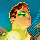
dcmultiverse
DC Multiverse

symphogearconfession-blog
Symphogear Confessions


literatureforthesakeofliterature
Books & Short Stories