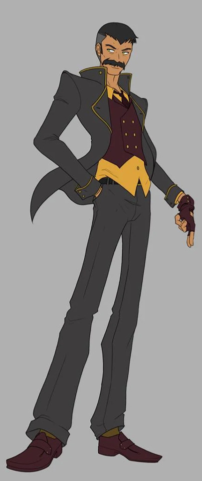
#character design also his colour palette looks so nice with any character
Text
why are like 95% of genshin mlm ships so boring and cliche😭
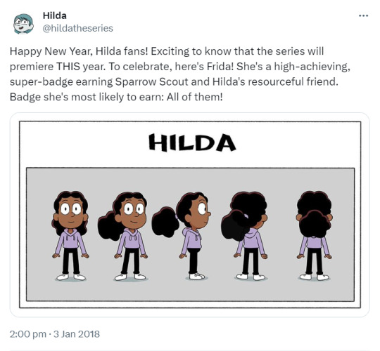
#idk they feel so dull lol#the only mlm ships i like are the scara ships (kazuscara and chiscara) i feel like that’s because scara has such a fun personality and#character design also his colour palette looks so nice with any character#i like kaebedo ofc but they don’t count because they’re not rly popular and have like 0.5 in game material lol#but everything else is so dull#like zhongli/childe kaveh/al haitham ayato/thoma the fontaine guys idk their names#SOOOOO BORING …#wait but i did have a ayato/itto phase they are actually super cute 😭😭😭 i love their dynamic it’s so adorable i would love for more ayaitto#i love how ayaitto compliment eachother it makes so much sense and thoma rly does just feel like a sweet friend honestly i love him for tha#lowkey miss inazuma now lol#WHEREAS most of the wlw ships are soooo fun#idk man like beiguang eimiko while not my favourite ever they are still super fun and cute and i like seeing them#they don’t feel boring lol#i think it’s because i already like their characters individually#plus shenjin and guiping#they’re all so cute#the women of genshin impact are so nicely written now that i think abt it#there’s also lumine/heat and ayalumi#*JEHT NOT HEAT WTF#KOKOSARA beloveds#dehya and dunyazard#not rly a fan of the fontaine girls tho they look kinda basic lol#don’t take this post too seriously i’m just rambling lol
22 notes
·
View notes
Text


y’know generally i try to limit colour palettes to as few colours as possible to make things more cohesive but despite my best efforts only jay ended up being able to stick to that </3
ANYWAYS here’s the as-of-right-now fully updated designs for these dickheads. these will no doubt undergo even more tweaking as i draw them more but this is a start i guess. also pls open the pictures to look at them properly i worked so hard LOL
some random notes under the cut yaaaay
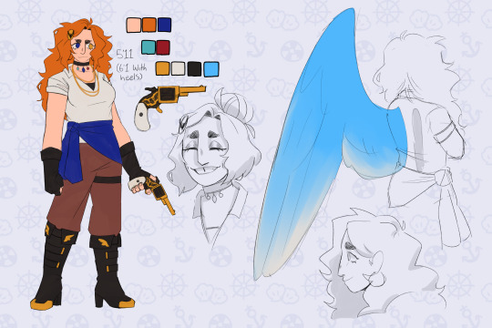
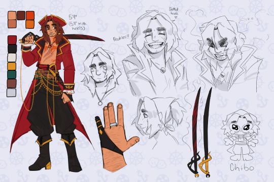
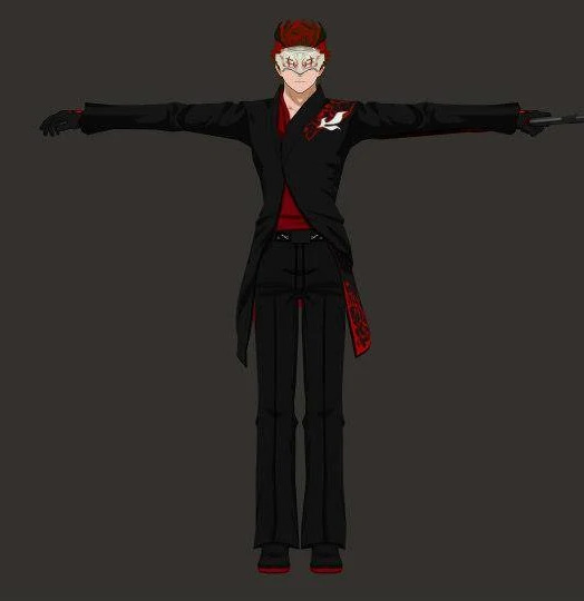
chip —
he jingles when he walks. somehow he’s still stealthy. i do not know how
kept the platinum ring that bonded him to gillion in the block! because hey he doesn’t really have a reason to take it off (and it’s a nice reminder of how much gill cares about him, and how far their friendship has come since that ice arena)
his tattoos shift and flicker like actual flames, and sometimes (harmless, purely aesthetic) sparks fly off them when he’s excited
i just think smoke coming out of his mouth when he’s angry would be cool :]
chipped teeth from biting rocks and coins all the time :/
he has scars from the red lightning, they’re just mostly contained to his back and shoulders. they’re a similar red to his coat even once they’ve healed
gillion —
the tail sleeve thing is so he can rest it on the ground without damaging his scales, he doesn’t usually wear it when he’s just on the ship because the wood is soft enough that it’s usually fine + it can hinder swimming a bit. it’s mostly meant for places where there’s cobblestone or gravel streets and such. i think his armour would probably have a version that looks similar but covers the whole tail minus the fins, maybe with some armour plating of its own. i didn’t draw it because there wasn’t any room lol
his scars from the lightning are pink mostly because red stood out too much tbh. they softly glow in the dark the same as his coral and the pink parts of his fins
also kept his ring! his hands aren’t really made for jewellery, though, because the webbing means it won’t sit very secure on his finger. so he keeps it on the same chain as the necklace he got from aslana to keep it safe
tried to make him look a bit bulkier and more his age than in my original design? i feel like i was leaning too much into the naivety and. shortness. originally lol. he also has thicker eyebrows now and i’m still trying to decide how i feel about them but i think? i like it? i don’t tend to give many character thin eyebrows so it could’ve been a unique thing for him but alas
i think i made the sword too small but like ignore that
also forgor to include pretzel </3 that’s okay though she can get her own design sheet later. she’s special like that
jay —
i believe in tall jay supremacy
blue magic! i was considering gold but that’d look a bit more like a canary than i wanted for her wings so. blue jay :]
her hair is supposed to look kinda like fire to mimic her dad ! kinda showing that even if she runs from her family and the navy they’ll always be a part of her. and also i just like drawing messy hair
i gave her sturdier gloves just because i feel like it fits her better. also changed up the shirt to more of a button up solely because i don’t like tank tops very much LOL
i did WANT to make her outfit a bit flashier to match the boys better but i couldn’t quite figure out where to Put the flash. maybe that’ll come later, the way the story’s going i might get to design some cool prosthetics for her or something
overall —
because there’s just so many fucking colours i triiied to add at least one or two colours from each of them into the others designs. jay has her necklace with each of their main colours on it, her wings are the same blue as gillions eyes, her jacket and right eye are the same dark blue as destiny’s blade, her hair is the same orange as the lighter part of chips tattoos. chip has a dark green sash under all the belts, the same as the hilt of destiny’s blade. they all use the same shades of black, gold, and brown
the only real exception is gillion doesn’t have anything from the other two because he has Such a specific colour palette and he already had so much going on as-is orz jay was obviously the easiest to do this with because she has both warm and cool colours in her palette by default lol (and i did her design last, so that helps)
#.png#jrwi#jrwi riptide#just roll with it#jrwi chip#gillion tidestrider#jay ferin#jrwi spoilers#THEYRE FINALLY DONE zoo wee mama#the lines are thicker on the little armour drawings because i did the sketch thing and then went yk what. good enough. and just coloured tha#also got rid of gills button nose it was too annoying to draw#i’m so used to straight and aquiline noses#another thing that could’ve been unique for him in terms of my character designs#but nah#pls ignore that i drew them all standing on diff planes/angles btw i wasn’t trying very hard w that#weirdly proud of myself for managing to give them all pretty unique profiles#that’s normally something i kinda get stuck on. drawing people from the side#in different ways besides nose shape
413 notes
·
View notes
Text
hi please bear with me while i go insane about the colours in Hilda (aka I'm looking at the trio's season 3 designs and losing my mind)
SO in most visual media, quite a bit of thought goes into the colours they use and how those colours interact with one another - not in a "the curtains are blue bc [character] is sad" kind of way but in terms of which colours stand out and which are harmonious, and even if the viewer doesn't know any colour theory (like me, lol) and isn't paying attention to it, I think it still helps reinforce what we know about the characters, and influence what we take away from the show. visual design is a language and colour is one of the key aspects of it and if you want to hear about how Hilda uses colour in so many clever ways, to guide the viewer's eye or distinguish important characters, there's a really excellent video on that made by someone who actually does know what they're talking about, but one thing I wanna talk about based on my own limited knowledge is how it tells us about the characters -
FOR EXAMPLE Johanna - so you have Hilda, who is dressed in bright primary colours, especially her signature blue hair which makes her stand out as different even more - and then there's her mother, who has, by contrast, a much more toned down colour palette. she broadly shares the colour red with her daughter, but a less-saturated shade and her standard outfit consists of that, brown trousers and sometimes her yellow coat. Hilda's signature blue is completely absent from her design (and even if the creators didn't want to give Johanna the same hair colour as her daughter, they could have added some small blue accent of clothing if they'd wanted to, but chose not to), leaving her with purely warm, harmonious colours. she has an almost completely different palette to her daughter, but still just enough similarity (particularly with her yellow coat) to reinforce that the two are related in some way. (I'm not saying that Hilda is related to everyone who wears yellow in the show, just that the fact they share a colour helps tie them together on screen)
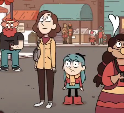
(yep, this is the screencap i'm choosing to illustrate this point it's fantastic)
most importantly (to me, anyway), Johanna's colours are warm. they're safe. to me, the dominance of warm colours and absence of Hilda's blue signify that Johanna is a safe person to Hilda, someone who is supposed to be a respite from her adventures rather than someone who dives into them with her (which, y'know, ties in quite nicely to Hilda's line in Stone Forest about preferring to adventure on her own and then come home to her mum, and how in the show she generally likes to keep her adventures and home life separate... (I could probably write an essay on how Hilda and Johanna's issues in season 2 were kind of a commentary on how Johanna has been coded as the safe stable bg character and how she is actively trying to go beyond that role but I shouldn't tbh)). the point is, they are connected, but Johanna doesn't have the same adventurous streak that Hilda does, so they have some of their warmer colours in common, but not Hilda's unusual, stand-out blue.
(I could also talk about Kaisa here and her copyright claim on the colour purple, but truthfully all I would be doing is paraphrasing the excellent video I linked earlier, so I won't. however I do think its fun to compare her to Johanna, in the sense that here are two adults who Hilda often comes to for guidance, and one is all warm gentle colours that match the home decor and the other all monochrome with two little hints of a colour we rarely see elsewhere in the show, suggesting that this is a character of particular interest.. it kind of hammers in how one is meant to embody the safety and comfort of Hilda's home life and the other is literally there to point hilda at things that might kill her lmao)
that was supposed to be a quick example and it got away from me so uh ANYWAY what I'm getting at here is that in Hilda's friend group, I believe their colour palettes were constructed in a similar way - they work together to tell you about the group
I feel like Hilda as a show is known for making excellent use of a limited colour palette - a lot of the characters have at least one black or brown item of clothing and just one or two stand-out colours, particularly the main trio. you can easily look at Hilda, David and Frida come away with one particular colour associated with them - blue or red for Hilda, orange for David, and...blue again for Frida, which doesn't sound great on paper but works well in the show because Hilda's palette also has a lot of red, so when the two characters are put together it doesn't seem like blue is dominating the colours. I also find Frida's colour palette (basically just her hoodie, lol) super interesting because it used to be different.
now, I haven't spoken to anyone who worked on the show about this, this is purely conjecture, but if you've ever googled the characters you've probably seen an official-looking turnaround page of Frida in a purple hoodie.
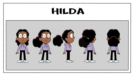
this is real pre-prod show art, and considering the purple hoodie made it all the way through the design pipeline to be included in the turnaround (generally the last stage of character design, as this is what would be given to the riggers to make the character rig)....and was even posted on twitter months before the show aired -
then I think it's safe to say that her hoodie was changed after the fact (2 or 3 episodes into production, by my vague guess looking at the date of this tweet) - not too hard to do, if your show is 2D rig animation, luckily - but if you're me and like reading into things way too hard, this begs the question of why. having purple as Frida's signature colour is perfectly serviceable and sets her apart from Hilda and David nicely. but what her new hoodie colour does is the opposite - it ties them all together
(the other possible explanation is that maybe Kaisa's design was finalised later in production than this turnaround was made (speaking purely from my own experience, secondary characters who appear in later episodes are often finalised later than the main characters, just ahead of the episode they're needed for, and Kaisa wasn't needed until halfway through the first season) and someone noticed that her and Frida sharing the colour purple made them look a little too similar...(I'm sure ppl who like the idea of Frida and Kaisa being witch sisters are yelling through the screen rn that this would've been a good thing and maybe lightly foreshadowed Frida becoming a witch, like Kaisa, but this was all set at the start of season 1, probably a bit too early to start hinting at the witch stuff :') we will come back to this tho)
anyway I love the trio's designs bc if you put Hilda and David next to eachother, they don't visually have much in common, but if you put Frida there then suddenly they're a unit. they got rid of her signature colour and gave her her friends' ones. she quite literally ties the group together so that they look cohesive as a whole
and this is absolutely me digging too deep in things here but her being the one to bring the group's colour palette together also lends itself thematically to their falling out at the end of season 1, and how Frida leaving also caused Hilda and David's friendship to struggle. they are a set and it doesn't work the same if they're not all there. Frida sharing Hilda's signature blue could also lend itself to the idea that Frida shares her love of adventures to a greater extent than David does (though maybe that's closer to 'blue curtains' territory tbh). anyway I love the design of this show so much
SO (if you actually made it this far down I'm so impressed) the thing that sparked all of this was...if this is what the trio's designs are doing in seasons 1-2.....what are the season 3 designs doing
no but this is super interesting to me, Hilda essentially just traded her skirt for leggings and left her colour palette intact, but David and Frida changed theirs entirely and I'm fascinated. both their signature colours are GONE. is it to imply that they've grown and changed in the duration of the time skip? is it David's turn on the 'having a colour in common with Hilda'?? but particularly I want to draw attention to Frida bc now that her hoodie is gone her original purple is BACK and (if there is any weight to my theory that she was changed bc she looked too similar to Kaisa) what's even more interesting is that they doubled down on the witch vibes. she literally has Kaisa's exact colour palette minus the dark purple cape lining. Kaisa's design reflected her personality as this unknowable person with a hint of mystery to her - all monochrome with that pop of an unusual colour - are we to expect the same of Frida? is this a sign that she's leaning further into witchcraft than before? does her contrast to Hilda and David signify that she's come more into her own and has a stronger sense of her own identity (something something closure for her issues in season 1)? or do we take things way too literally and assume that season 3 has her breaking off on her own from the group? or maybe it means absolutely nothing and someone on the design team just thought grey/purple was a neat combo. I know I've talked in this post as if I know things but here I truly don't and I'm obsessed w the possibilities. what does it mean what does it all mean
anyway that's all for this delusional fever dream post, hope you enjoyed and if you made it this far down you deserve some kind of prize
#yeah this is a long post#why did i do this. dear god its midnight i DIDNT MEAN TO MAKE THIS#im so normal about this show as you can see#colour design is my passion#hilda the series#post tag#im sorry if any of this is poorly explained and sounds like nonsense. it is but also im sleepy so blame it on that#alsoo like i said a million years ago im really not a colour expert please dont cite me on anything :'))#i kinda just wrote this to get the thoughts Out of my brain
40 notes
·
View notes
Note
rhis is more like a comment but holy smokes i was NOT expecting wandering on my dash and seeing such immaculate, thought out character designs of such a cool-sounding au HELLO WHAT
im actually devouring ur art rn this is so nice im so excited
also im just gonna throw an ask here but whats ur thought process for each food that corresponds 2 them? was there like any correlation to personalities or character type connecting to their food? :3
ok byebye !!! i love what u do RAAAH SCREAMS IN UR FACE /pos
CAMP CAMP: SUGAR RUSH — DESIGN CHOICES
THIS IS THE NICEST THING ANYONE HAS EVER SAID ABOUT MY AU OMGHDBDNJDJNDN TYYYYY!!!
as for the racers’ designs, sometimes i just picked out random confectionery that i liked and thought would suit their personality/colour palette. below is my reasoning for each racers designs!:
LEMONAX SYRAZZ (blue raspberry lemonade) = i was trying to think of blue candy cos of his hoodie and blue just suits him overall but i couldn’t think of anything at all UNTIL i decided to implement drinks into the mix, also i LOVE BLUE RASPBERRY
NERLIO WHITZ (nerds candy) = it’s cos he’s a nerd 🤓 ALSO A FRIEND OF MINE POINTED OUT THAT HE REPRESENTS THE BI FLAG/COLOURS so it is now canon that nerlio is bi!!!
SKITTOLETTE GLEES (skittles) = i actually don’t remember why i chose skittles but skittolette’s uniform my fav design so i’m not complaining
TARROMEL VON SCHTICK (caramel toffee) = i was looking for a candy similar to his original palette (cos i reckon brown/yellow suits him so well) and i wanted one of the racers to have a power up/the ability to make racers stuck (or whateva) so i was stuck (pun intended) between caramel and toffee… buuuut then i figured i could combine both
SORRIBET DRAGONA (dragon fruit sorbet) = of course nerris had to represent some sort of fantasy/magical food, so i rushed to google and searched up “fantasy desserts” or something like that LMAO
STICKER-POP GUMERRA (bubblegum) = bubblegum is for cool kids. ered is cool. case closed.
GÜMDROPH DAS KONFEKT (gummy bears) = how could i NOT give dolph gummy bears?? gummy bears and dolph both share that adorable demeanour, for the colour choice idk why i chose blue it just looks nice ALSO I LOVE THE UGG BOOTS AND FLUFFY HAT he’s just so darn cute
SLUSH KID (slurpees and starbursts) = before i even created concept art for any of the racers i knew i wanted a slurpee design!! i was gonna give the slurpee design to harrison at first, but liked the caramel toffee idea more, so i gave it to space kid instead. i ALSO wanted to include a reference to space in some sorta way, so i crammed in elements of “starbursts” (kind of not really i just added stars to his jumpsuit and said that iT rEpReSeNtS sTaRbUrStS)
JESTERN RANCHELLO (peach jolly ranchers) = preston’s design was the hardest to think of, it was either jolly ranchers or melody pops :/ i picked peach jolly ranchers because of the design and colour palette AND i gave him an 80s look (he also has a moped!!)
JURF GOBBINGTON (jawbreakers) = i feel like this one is pretty self explanatory
FIRECRACKER (pop rocks) = also self explanatory (rip jasper), but for his actual design i wanted to include his la gear light up shoes and a 90s vibe to the uniform, hence the glitch marks and neon stars. i also added the headset for shits and giggles LOL
hopefully that answers your question, thank you for checking out my AU!! <333
14 notes
·
View notes
Text
OC-tober Day 5 & 6: Relationships & Symbol
To compensate for being late for Day 5, I'll talk about something that mixes up both days. On top of that, to prove that my choice of character for Day 1 was a reasonable one, I will once again talk about something that pertains to Jan.
I'll ask you to first take a look at this old sketch for a sprite edit. This was for my personal project inspired by Mozart l'Opéra Rock, and it uses his old sprite, which features slight mistakes in his palette, but it still comes together fairly nicely in my opinion.

I'd really like to re-use this jacket/colour on him eventually. Still, what I want you to take notice of is the pin on his lapel.
This is not a definite design, just a concept - what it says is "JA DA", and my concept for it would be that the letters be written so fancily that the viewer might not realise they're letters at first.
This is an idea I have for a symbol representing Jan's friend group, which consists of Jan, Adele, Damien and Ashley.
This is part of Murder Fabrication's canon, by the way. Jan is a student in a prestigious music school, in which he studies multiple instruments and genres, but specialises in the piano and classical music. When he joined said school, he was pleasantly surprised to run into his best friend Damien. (If you'd like to know why he didn't know Damien was joining the same school he was ahead of time, I'll have to ask that you wait until a certain arc of Murder Fabrication has been published. Wink, wink.)
Jan befriended their classmate Adele, who happens to be a violinist and share his speciality in classical music. Damien, a bassist, also befriended another one of their classmates named Ashley, a drummer. The four of them quickly became close friends, and together they form the worst band you've ever heard of, consisting of a pianist, a violinist, a bassist and a drummer.
Though they may actually act as a band sometimes, they're mostly friends who happen to each main a different instrument. Still, as fellow musicians in a prestigious establishment, they decided to come up with a symbol or logo they might use to represent them as a group; more so to have a neat representation of their bond than to make themselves look professional in any way. Noticing how the first letters of their names fit together, they decided on a "fancy looking" logo that would use them.
Though this is all worldbuilding/side quests if anything, I have a soft spot for Jan's friend group. Damien, Ashley and Adele are each someone Jan cares about deeply in a different way, and they each love Jan in their own personal way. Neither of them is any less important - either being the person he trusts the most, or the person he wants to spend the most time with, or the epitome of what he thinks is cool, though maybe they don't realise the extent of it, Jan admires each one of them.
His relationship with each of them are perfect examples to use to explore how Jan feels about his loved ones and, generally, those around him, and how they feel about him.
8 notes
·
View notes
Text
LU Character Design Analysis 6
In case you haven’t seen the previous posts yet, I’m doing this thing where I’m analysing and subsequently ranking all the designs of the chain in LU. I was going to do it 2 at a time, but I’ve got so much to say that I’m doing it one a time.
All the designs are really good, it was hard to come up with a decent ranking system that I was happy with and even harder to apply it. The numbers I scored them are subjective and any one of them can be debated.
And now we have...
4th place: Twilight
He’s my favourite so it breaks my heart that he’s not in the top three but it had to be done. I might have let this bias lead me to placing him ahead of Time and Warriors. Eh, this is my list and I wanna praise wolf boi’s design.
Pros: It sounds shallow but I’m glad his hair isn’t brown and more of a dirty blond or almost caramel coloured. It also complements the chainmail.
The colour palette of his outfit is dark and muted, save for the waist situation, which is a fun nod to the art style of Twilight Princess. The dark tunic is a lovely forest green which stands out against the rich gold chainmail, it looks heroic and like he'd be able to blend into any sort of green scenery. I love the little embroidery details too and the ones decorating his boots. The ones on his tunic are much subtler than Sky's and I feel like either he did them himself (adding to the pictures over time) or Ilia got a hold of it and did them herself. The ones on his boots are amazing too and I feel like they'd be a point of pride for him. I can see his boots being a clothing item he cares about a lot.
Twilight like Sky unfortunately suffers from "blankie around the tunic" syndrome, however it's less egregious in his case. One, because it's held by a sash which unlike smooth leather would be less likely to slip down with movement and two, because it looks messier- which is a little more realistic and gives me the impression he has to adjust it whenever coming out of wolf form. I’d prefer if it stayed as part of his civilian clothes, but it does add a nice pop of bright colour. So, I’m not that mad.
Twilight's light blue waist cloth stands out so much that it's easy to miss the discoloured and patched up left sleeve. It actually took me a while before I noticed it. It's a darker green than the rest of the tunic and looks like it had been hastily stitched on, which is a nice reference to his Ordon clothes (the funny looking belted sleeve) and the fact that his arm gets chopped off in the manga. Maybe at some point the original sleeve was torn off in battle and Twilight had to mend it while on the road, hence why it looks so scruffy.
I didn't like Sky's tunic slits because they made the tunic material look delicate and seemed more ceremonial than practical, but they work in Twilight's case because they feel accidental. They give off the impression that they occurred during the heat of battle or during an adventure. Like the patched sleeve also shows, the tunic was worn and torn with extended use and Twilight had to mend it alone and on the go.
It has a sort of rustic homespun appearance which fits his character as a down to earth farmer from a small village.
It’s a brilliant idea to leave the only reference to the Twilight Realm be in the form of the shadow crystal. After all, not only was all that supposed to stay secret, but also Midna left without saying anything, so there’s no way he would have anything else to remember her by. As shown by his less than polished tunic, he’s not very good at making clothes, although he’s good at embroidery. That being said a twili cloak does sound kinda dope and I don’t like that the crystal is out in the open as a necklace- it’s a huge risk for such a cautious guy to take. As a guy who isn’t very open he’d surely hide it in a pouch rather than risk being asked about it, or worse having a member of the chain try to touch it.
He's the only one of the older members wearing a leather arm guard (on his non shielding arm so it doesn’t get in the way of the straps, very nice), which made me realise that he's probably not a fan of wearing plated armour. He could if he wanted to, he clearly has the strength and endurance to run around for hours in armour. Then again that extra weight would be hard on Epona since he rides her a lot. I headcanon that he just barely tolerates the chainmail because it’s for his own safety, but rips it off at the first opportunity once camp has been set up.
Cons: Twilight's fur pelt is another one of those things where it looks cool and is a nice visual hint at his hidden power to turn into a wolf (I especially like how it forms tail at the end, it's goofy but a cool detail), but it raises some seriously questionable things about his character.
Best case scenario it was a gift, maybe from Ashei who also wears fur, he then wore it to be polite but overtime it became part of his usual travelling clothes. But even still, he's the type who'd rather fish or forage than hunt and he can talk to animals...yet he wears the pelt of an innocent deceased animal. Worst case scenario he got it himself, and even if he had to fend off a wolf to save someone I don't even want to imagine him making it. Either way it doesn’t make sense.
Plus the way it’s tucked in at his waist looks like it would be a hassle to put on. To make it more visible it’s not tucked into the light blue material only the orange sash. Looks pretty but not very practical.
Wishlist: Regarding the chainmail, I’m conflicted (I...can never seem to make up my mind). The gold chainmail is unique and a nice reference to the golden sky seen during twilight, a time of day he’s grown to appreciate. It also fits well with his pale complexion, But like Wind I’ve always had the impression that he’d also be more tanned, from working long hours at the ranch. If he had darker and warmer colouring then the gold chainmail wouldn’t work as well and it would have to be a cool toned silver. Which would be a nice nod to his grey wolf form and more importantly would really make his grey face markings pop.
I wish he wore his green hat. He was directly told by one of the light spirits that it was the same garb worn by the hero before him, who he ends up getting to know personally during TP and learns he’s family. Whether or not he likes it is completely irrelevant, because he would wear it 100% of the time while doing hero stuff to honour his ancestor’s legacy.
Twilight arguable has the scruffiest tunic, but the reason why I think he’s chosen to mend it rather than get it replaced is because it holds that much significance to him. Therefore, he’d value the whole thing and wear. the. hat.
The only excuse I’ll accept is that he lost it or it got destroyed during a battle, and even then he’d surely make a new one.
This isn’t important for character or practical reasons, but I’d like him to have longer hair. A shaggy wolf cut perhaps? A mullet situation? I’ve seen the fanart and it all looks amazing, so just...throwing it out there.
Score:
Aesthetic and visual score (/10): 8
Character representation score (/5): 4
Practicality score (/5): 4
Total (/20): 16
It’s a really strong design: visually interesting, practical if a bit well-worn and full of characterisation. It tells you about who he is and what he’s been through just through what he’s wearing, like Time’s design. But better.
~~~
Thanks for reading! What modifications would you make to their designs? And do you agree with me or not? I’d love to know :)
Masterlist
9th place in the character design ranking
8th place
7th place
6th place
5th place
3rd place
1st place
Character analysis posts:
Hero of the Sky, Hero of Time, Hero of Twilight, Hero of the Wild, Hero of Warriors
#linked universe#linkeduniverse#lu#lu twilight#lu twi#linked universe twilight#twilight#lu character design analysis#character design analysis#defo not biased
55 notes
·
View notes
Note
Top five coolest designs for characters in Bakuten Shoot, perhaps🤔
augh ;; i'm not good w like. judging character designs or whatever so this is just me judging how kewl the characters look to me
i'll try to limit myself to one character per team to be fair .. am i doing this right i hope so
5 — hiruta
i vibe with most of the shell killers a LOT i'm very upset they were so short lived. his design is so intimidating ?? /pos
also i started watching yu-gi-oh duel monsters recently and rex's design reminded me of him and i think his design is peak too
4 — mystel
i like how his design radiates positive energy. i think his colour palette is very nice. this placement may or may not be biased. oh, and the mask goes incredibly hard
3 — matilda
i think her design is very adorable. she already has fairy energy without even saying anything. i love her goggles
2 — futsuki
i like visual kei
i like how androgynous his design is but i don't really like his hair, if it was just black and white like i imagined it or any other colour combination that doesn't clash with his clothes that fucking much he would've been first place
honorable mentions — blood, v-force hiromi, mao (both s1 and g-revolution), mariam, olivier, zeo in his psykick uniform
1 — s1 kai
every kai design goes hard but the other two have things i dislike minor or not and s1 kai just. doesn't. s1 kai hits different
#cubic.doc#makoto hiruta#carlos beyblade#mystel beyblade#matilda beyblade#mathilda alster#futsuki kagami#tsuki kagami#kai hiwatari#i spent way too long writing this fuckass post btw
10 notes
·
View notes
Text
La Squadra and Fashion Aesthetics
i originally wanted to do eras of fashion but i think a post like this works a bit better. i know so little about fashion but it was fun thinking about this lmao (also i’ve made little mood boards of what i think but some of the outfits may be on the more feminine side bc it’s hard to find more masculine things on pinterest sometimes </3 but it’s more for just the whole general idea of what i mean). i might regret making this post and it’s a little chaotic but anyway ✨ (edit: i regret it but i put too much effort into it oops) edit again: here’s the link to some more characters!
୨ ╭ ୨୧ ✦ ︶꒷꒦・⎯⎯・⎯⎯・₊ˎ✧๑
Risotto:
he’s probably one of the easier ones to think of so i’ll start with him
goth/emo vibes for sure. it’s so obvious but i had to say it
lots of chains and harnesses
lots of necklaces and random accessories too
high platform shoes and boots
layers, layers, layers
and maybe a little bit of punk but definitely more leaning on the goth side than anything
i was going to say e-girl but maybe more for the accessories than clothes lmao (i can totally imagine him feeling embarrassed googling ‘e-girl accessories’ just so he can find a nice choker or chain or something)
here’s a little moodboard! it’s not exactly what i was thinking but i’ll roll with it

Formaggio:
i wanted to say more streetwear kind of clothes for him at first but i get a bit of a punk vibe from him
spikes and chains
heavily patterned trousers
the little thing under his shirt in his design already gave me fishnet vibes so a lot of fishnet
maybe chokers too? he’d look cute in one of those
or maybe like old school avril lavigne kind of fashion
skater punk kind of fashion? i think he could skateboard lmao
another moodboard! i’ll do his moodboard kind of half and half for both kinds of fashion because i can’t decide

Ghiaccio:
like cybercore/futuristic y2k fashion?
lots of silver, white, and blue colours
also lots of iridescent clothes and clear clothes
platform shoes? (i think he’d look good with some platform trainers or something)
i think the colour palette of this aesthetic was what reminded me of him more than anything else lmao
sporty vibes which i think works for him
also a bit of a space vibe but let’s not talk about that lmao
again here’s a little moodboard. i tried to find some that actually reminded me of what he already wears
Melone:
i don’t know what to call this but i’m gonna say colourful y2k
lots of that colourful, plastic jewellery (like those resin rings and stuff)
bright colours and bold patterns!
like, way too much colour
way too many accessories too
lots of hair accessories like colourful butterflies clips and hairbands etc!
i could also totally see him wearing like a bright pink juicy couture track suit omg
i’m not entirely sure this moodboard captures what i mean but i tried </3

Prosciutto:
this man was so difficult omg anyway i think he would wear like dark academia style fashion
loose fitting shirts and sweater vests (i can’t 100% see him wearing sweater vests i’m not gonna lie)
blazers and suit jackets all the way
not necessarily a whole coordinated suit thing all the time i don’t think. as long as the clothes go in some sort of way i don’t think he would mind
also wears stuff like this to ANY occasion no matter how casual or fancy the situation is lmao
moodboard time! honestly this is probably the most accurate one in my opinion lmao

Pesci:
maybe like a 90s grunge fashion sort of thing
plaid shirts and baggy t-shirts
ripped jeans and clothes that look like they’re past the point of being wearable tbh
converse and vans? but they also look past the point of being wearable
i don’t have much else to say so moodboard time again (yeah most of these pictures are of nirvana i’m so sorry but it’s the only way to get across what i mean lmao)

Illuso:
i was so stuck for this guy and i wanted to say 90s grunge kind of fashion for him instead (i still think he’d look good in that but this isn’t about my illuso fantasies rn lmao) but his ugly ass duvet looking shirt reminded me of a puffer jacket so i’m going with more streetwear fashion for him
generally just loose fitting, baggy clothes
kind of looks like he didn’t make an effort even though he definitely did
comfort is the key! very comfy clothes
here’s the moodboard! i don’t even know what i’m doing at this point

୨ ╭ ୨୧ ✦ ︶꒷꒦・⎯⎯・⎯⎯・₊ˎ✧๑
i ended up hating this post after i finished it but i spent way too much time on it not to post omg at least i tried lmao. also i know i didn’t include sorbet and gelato in this post but their clothes reminded me of cargo pants and stuff so i think they’d probably wear streetwear kind of fashion too! i realised when i made this post that i literally dress like all of these 😭
#formaggio#ghiaccio#illuso#jjba formaggio#jjba ghiaccio#jjba headcanons#jjba illuso#jjba la squadra#jjba melone#jjba pesci#prosciutto#pesci#risotto#melone#risotto nero#risotto headcanons#jjba risotto#jjba prosciutto#prosciutto headcanons#jojo headcanons#jojo hcs#jjba hcs#la squadra hc#jojo la squadra#la squadra headcanons#sorbet#gelato#sorbet and gelato#jjba sorbet
128 notes
·
View notes
Text
Thought of the day:
It's pretty obvious from my profile that I am a fan of Monster High. I used to watch it ever since I was a child and now that Nickelodeon wants to do a reboot of it everyone is talking about it. But why so much hate?
I will be honest, I don't like this reboot just like I didn't like the 2016 one. The originals are the originals. But what makes those reboots be so hated? I saw many comments on instagram talking about the redesigns, people hating the most the new versions of Clawdeen, Cleo, Lagoona and Heath and how many things make no sense, like Draculaura wanting to learn witchcraft that is apparently forbidden.
This other person posted on instagram an explanation on how this new reboot is about Monster High but it's not the same world and that's why things are so different. But my personal opinion is, if Nickelodeon wanted to take the idea of Monster High but change it as they please, they might as well rename it and change the names of the characters completely and say they just got inspired. It's obvious people are going to compare it to the original since the story is exactly the same just the characters' designs changed and the backstories.
But why don't we go after each character since I have something to say about each one we've seen so far:
Frankie Stein
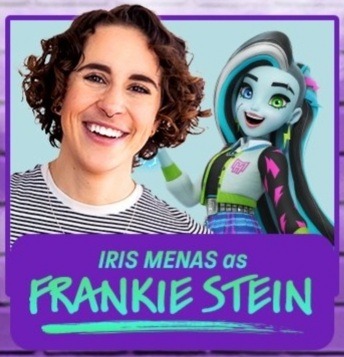
The animated design is not so bad, and that is true. My personal problem is how she was in the live action, no offence to the actress, I just think they failed in her looks. The backstory fairly enough is the exact same, and personally the they/them pronouns don't bother me at all, it doesn't sound like something that scandalous and it's pretty nice that the LGBTQ+ comunity is starting to be normalized.
Overall, not the worst reboot, still sad they changed her/them so much in looks even if the base is the same
Clawdeen Wolf
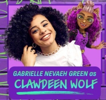
I will say it right away, the actress is beautiful, how she was dressed in the live action is not. I do not like anything about this new Clawdeen. They didn't do a 180 to her, but they were close enough. They managed to change Clawdeen from a strong, sassy girlboss to this geeky half normie werewolf and I can see that many people are sad and offended because of this.
So first of all why make her so geeky and clumsy looking? I heard the opinion of someone from the internet saying that they saw the curly hair and the cute redesign of 2016 and thought "Gives off gamer vibes", as funny as that sounds I'm afraid that's actually the logic behind this design. Also the backstory is just something else
"Half-human & Half-werewolf, Clawdeen is thrilled to join Monster High, despite the challenge of being a half-monster in a school of full monster students,,
Ok so I'm guessing Jackson-Holt is not going to be a character in the reboot just like Casta is either inexistant or in prison.
Draculaura
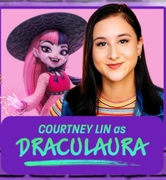
No.
She's not the worst, the redesign isn't necesserely bad. It's just not Draculaura much. If it wasn't for the black-pink combo, I would've never guessed she was Draculaura. Now a thing that might be influenced by my ethnic background but as I'll talk about it later, I might as well say it now: for some characters, the actors were chosen based on the nationality of the character, I feel like this reboot deleted Draculaura's connection to Transylvania/Romania and it's kind of sad. She is Dracula's daughter after all, isn't she? I heard some people's excuses saying "But she isn't his biological daughter". That does not change the fact that we know Draculaura still comes from Romania. Maybe being Romanian isn't all that important for her character but it was part of her identity and I think it's unfair to change any possible character to a different nationality/ethnicity/race no matter what.
Cleo De Nile
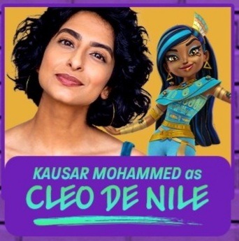
I heard quite the comments for this design. I don't hate it. It just doesn't give Cleo vibes much. I like the idea of darker skin, it really isn't a big deal. The outfit is actually pretty and I do believe it might be more culturally accurate. The colour palette is too Nefera though and that is something I don't personally like. What I read about her backstory, all in all she does sound the same much or less. Not the worst reboot in my personal opinion. But see how the actress is arab from what I'm seeing? They tried their best to make Cleo as egyptian as possible but they didn't do the same for Draculaura or Lagoona as I'll get to that soon.
Lagoona Blue
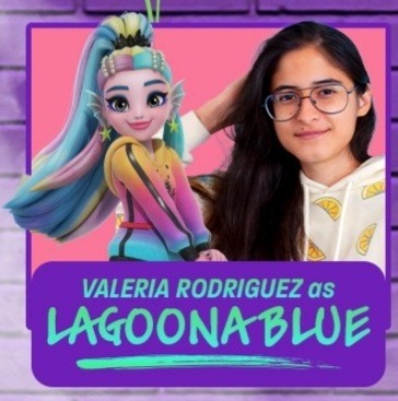
I hate her.
I'm sorry, I do. Her design, her character, they ruined her. She's suddently an ocean unicorn and despite the outfit that all in all in the animation doesn't seem that bad, they made her too girly, it's like she lost her sporty identity. Now my personal biggest question: why did they make her latina? Why did they change her, why isn't she australian anymore? Yeah, Draculaura lost her romanian identity, Lagoona basically switched from australian to latina and for what exactly? I do believe southamericans deserve rappresentation, everyone does and some more than others, but that does not give the right to take away certain rappresenation and change a character especially since there are Monster High characters that rappresent latinos already. Nationality rappresentation is still a thing and it's sad australians don't have their Lagoona anymore in my opinion and I'm not even nearly australian, it's just like how I feel about Draculaura, changing someone's ethnicity/race for me is unacceptable in any case unless it's your own original character.
It wasn't hard to give the same backstory to Lagoona where she grew up underwater mainly and barely knows how's it like to live on land and let her still be australian. Or is it just me?
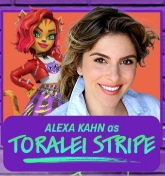
Toralei Stripe
This must be the least bad redesign in this reboot. The style is almost the same at the end of the day and the vibes seem the same too. The only thing that ruined her is her background. Why is she suddently rich and elite? It's not the worst idea but I just don't think it suits her. I actually don't have much to say about her after this.
Deuce Gorgon
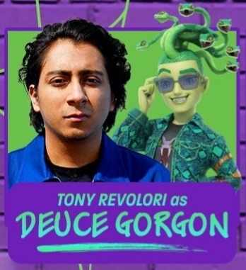
I will be honest, not that bad either. To me this still looks like Deuce despite the green skin. And no offence to the actor but he did look better in the live action than he does in the picture. The backstory seems fairly Deuce enough I just don't get why they gave more personality and power to his hair than to him. Also something I didn't mention earlier so I shall mention now;
Why, just why- did they ship Deuce with freaking Clawdeen?
Like yeah I get it, different worlds. Well different worlds my as-
Out of all the ships they could've made, they just HAD to ruin one of the main ships from the original version.
Heath Burns
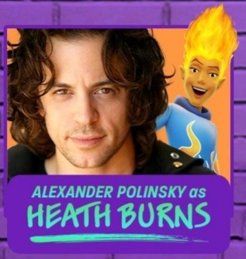
I genuinely believe they have something against Heath. What the hell is wrong with his hair? What is that cursed thing? I don't think I even need to explain why the design is offensive to the original Heath. The fact that he's now greek doesn't change much to me, I honestly don't know what was his original nationality, I have this feeling he was american and in this case changing him wasn't the worst even if I still don't agree with changing nationalities. But the design is just horrible.
Headmistress Bloodgood
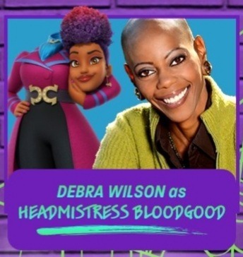
This design is actually cute. Kinda lost the scary but I don't have much to say to this. I don't know the original nationality of Bloodgood either so I actually don't know if to hate or actually like the diversity even if Monster High has always been diverse from every point aside for body size.
We've been shown more characters but these 9 are the ones we've seen the most so far. But anywho, how do you like those reboots? So far all cartoons that had one just went downhill. Do you think it would've been for the best if the essence of the characters was stayed put or do you actually consider the og MH and the 2022 reboot two different stories? I think it's for the best if I do so too. Also I highly doubt I'll be able to see the film or the cartoon regardless but if I do I WILL be judging the smallest shit ever.
#monster high#frankie stein#clawdeen wolf#draculaura#cleo de nile#lagoona blue#deuce gorgon#heath burns#headmistress bloodgood#nickelodeon#thought of the day
22 notes
·
View notes
Text
since i no longer consider myself a genshinner i will share some of my thoughts! epic! do not try at 3am. leaks and its long and stuff warning
- i dont like in game yelan ayato or childe sorry. rich 5* hydro users just arent it for me i guess especially if theyre bows.
- yelans design however objectively speaking i can see why so many like her 👍 go girls
- heizou also i am not a fan of 😕 Unfortunate! hes made me lose my detective liking streak
- i am bad with bows i am so bad with bows.
- idk how i feel about tighnari anymore. a lot of my negative opinions are fandom based tbh and its not the characters' fault for that but w him, the instant switch up was so insanely obvious im kinda iffy about he himself 💀💀 dont c/ynonari me
- also his voicceee 😭😭 never any hate to the vas but its so bad. i dont like it. i have him and made myself do a challenge where i got however many waypoints in sumeru in my ar 55 world using only him at level 11 so i can make this judgement.
- c/ynonari is genuinely.... fhwhhrgegrggrgr LIKE ITS NOT BAD i guess, no comment as far as me being cyno goes, but it just got so popular so quick it jumpscared me
- al-hai/tham. another im more so irritated by what you represent otherwise i probably would like him better. boy why are you white
- kav/eh too man like half of these designs would Literally Look Better With Slightly More Saturated Skin what is going ON!!!!!!!
- i personally dont care for kusa/nali for yk colourism reasons too but there very much is a. well the men are hot. lets get mad at the women tho
- ni/lou is the okest so far for cultural representation but her i just dont care for
- uhhhh. hm. what THE HECK is faru/zans design..... bro... its so bad im sorry? PROFESSOR?? huh? what? 3* design behaviour
- same w nah/ida 😭😭 dont argue against me i get it shes a kid cool nice her pale design is literally not interesting to me its. whatever. thats a 5*? lmao ok
- god...... actually this isnt even a my opinions list its jyst a things-that-were-ruined-for-me bc racism bht everyone else ignored it which ruined it for me more. anyways the harbingers.
- they knew what they were doing with the release time on that and everyone ate it up and it makes me sad bc i was genuinely very invested in the harbingers! but then theyre all shown all at once at a time like that huh. gross.
- idm scaras new design its cool its jhst we got TOO MANY BLUE GREEN PEOPLE 😭😭 change it up!!! his old colour palette or whatever was unique that what was nice ab it. yeah but his new colour scheme is getting a bit old sorry.
- the stepping on is funny for his burst everyone getting mad at it but not raidens is irritating tho
- layla is like..... people ARE being dramatic but i get what they mean on the voice. change it up a little we dont need more high pitched stressed girls my god!!! oh wait this is an anime waifu game
- i love itto 👍 NOBODY TOLD ME ABOUT HIS PERSONALITY. he was another ruined by the fandom bc LITWRALLY ALL I KNEW ABIYT HIM, BEFORE I DID HIS QUEST, was he had abs. thag was it. that was all anyone evr told me. he had slightly more abs than all the other skinny twinks. j dont care aboyt abs so i didnt care about him its that sjmple!!!!! why didnt anyone tell me how great he is!!!!!!!! wtf!!!!!!!!!!!! injustice
- AYA/THOMA IS SO OVERRATED oh my god stop talking
- itto/rou seems to have died down? or idk im interacting with the right people
5 notes
·
View notes
Note
(Please tag lovemezeppeli if you answer but!
✨
This is Quinn Schmidt, my Stranger Things self insert (he/they) made to smooch Eddie!
drop a ✨ in my ask box + one of ur self inserts and i’ll discuss what i like abt their design !
np @lovemezeppeli
red/green is SUCH a good colour combo and i love their fashion sense ! i think you balanced the colours really well - which w such a contrasting palette is so important.
i also love the use of the bag and the eye to break up areas of interest. the use of the more vibrant red in the hair and the blue eye immediately draws attention to his face (which is a character design trick that is v cool) and the bag gives some nice asymmetry across the chest and since it goes the opposite way to the hair covering the eye it balances out. it helps your eye flow thru the design if that makes any sense.
i also think the rips in the jeans not only look super cool but also help break up what would normally be just a big block of colour.
just a personal thing but i also really love the eyelash style. under lashes i think are extremely underutalized in character design and they always look so cool.
1 note
·
View note
Note
nods nods.. same colour palette.. big fan of earthy tones.. except the only blue i wear is very very occasional jeans.. sighs oh i would love to be a True romantic goth but alas i have too much autism to wear such nice fancy clothes. do u have any particular clothing hcs for cr characters? whether that’s subculture-based styles or just colours they tend to wear :0
so true fancy clothes are a autism nightmare.. slimey slippy fabric and stiff clothes. bleh.
hmhmm im gonna go with modern au bc thats easier
- fjord dresses in peak Just A Dude clothes, like he sees a 5 pack of stripy tshirts in various colours and he's like Oh win.
- beau wears basically only athleisure wear when she's not wearing straight up sports clothes. occaisionally she might borrow a silly patterned shirt fjord found somewhere. perhaps everyone thinks its funny to give fjord tropical shirts lol
- caleb has autism momence of wear like the same 5 items all year round, all the same colours. also his heavy coat. theyre the good ol trusty clothing items. its all jumpers and corduroy and shirts, mostly second hand and stolen socks.
- i think cad has lots of sensory problems with clothes being too tight in the wrong place so he sticks to flowy trousers and certain things he does like (which are all hand-me-downs, second-hand or handmade) . . he doesnt like brand new clothes or how underwear or structured trousers feels at all. also likes sewing wonky things and hand-dyeing and tie-dyeing things :-3 he has a big ragged comfy cardigan (maybe similar design and colours as the official merch one) he found in a donation bin and he adores it
- i think molly smells like a musty old charity/vintage clothes shop. he's a jumble of random things from all these places, covered in sequins and jewellery. has a denim jacket absolutely covered in junk, like bits of silk scarves and pins. maybe has turned curtains into a shirt. will wear uncomfy things for the Fashion. looks very funny next to yasha who wears only black cargo trousers and ancient parkas and flannels. she’s dressed like she’s travelling always.
- oo o hmm. .. i think veth would have a fun time making her clothes. she loves fabric shops and buying scraps and buttons and things. has a button collection for sure. also crochets and makes polymer clay jewellery and wears lots of fun things.. fave colour is yellow of course. lots of mustard and honey tones.
- jes makes polymer clay things with veth ! she's rich and kinda buys too much silly stuff without thinking about it (oh dear...). however she does redistribute the wealth (/hj) via helping her friends get things if they need them, like winter boots n things. she has lots of different stuff. i feel like jes would try out a bunch of stuff.. but she likes dresses and skirts and dungarees because theres pockets for art stuff. she likes fun cardigans/jumpers with patterns and art on them. also has a fancy coat with a big fuzzy hood. also likes patterned tights! and socks, she has so many socks and matching pj sets.
ok thats all for now :'-3
66 notes
·
View notes
Note
Villains outfit roasting, go! (Beacon-Mistral versions)
Oh jeez, that's a lot of villains-
Now, really our villains have been serving looks for the most part. It starts going downhill when we get to Mistral, but none of them are actively bad. Because it's for Beacon and Mistral, I'm obviously not gonna mention the Atlas outfits in this one.
Also Beacon outfits will just have the model, because half don't even have the concept art that Ein Lee does later on in the show. All of Cinder’s outfits have been done here, so she won’t be included in this.
Before the actual outfit critique, I have to mention that Emerald really is a poor representation for the first voiced WoC for the show, given that she’s is not only a villain, but a thief and overtly sexualised even by RWBY’s standards. She has her redemption now, but it was poorly done and she still stays one of the few dark skinned characters of the show.
That being said, this is a nice outfit. Even with the little green used, the colours used with it works the same way with Yang despite the lack of yellow on her. The brown used with the forest green works well together, and almost gives a green tint to the brown, while the white is a neutral colour that helps accents the green of her shirt and her hair. Plus, the red of her eyes compliments her green, with the red laces adding that same colour at the back of her legs without going overboard.
Take note, Oscar.
The jacket collar and the gloves works as connections to Cinder’s outfit, namely her gloves and the crossed collar she wore when she and Emerald first met, helping show just how loyal Emerald was to Cinder to the point that she based her entire look on Cinder.
The leather pants and jacket also makes Emerald look more protected, with the silver bracelet and beads adding some more asymmetrical detail to her arms. It’s just a nice touch that I like and think helps with character designs.
I do wish that Emerald has textured hair. I like that it references Cleopatra’s hairstyle that she always seen to have, but every black person or just poc in the show have non-textured hair. It’s all bone straight hair.
As for her past outfit-
This is such a downgrade, lmao-
Really, this is what Emerald looks like when you shove so much green on her. She looks all so similar now without any of the white and black to contrast and concentrate the green. Especially with her legs, since the brown of her leather pants are now blending into the dark green of her pants, rather than standing out against her later white pants.
The red strings and such still contrast nice against the green, and I do like how weathered the leather looks. It sells how long Emerald has been wearing them and how desperate her situation is given that she is unable to replace them. Same with the lack of jewellery that she wears later on, really showing her poor background.
Really, it’s the hairstyle and the colour choices that are poor here.
Now, the outfit itself isn’t bad. Really, this is a pretty average outfit even.
I like the asymmetry with his popped collar and fringe, and the designs on his jacket help make it interesting rather than just a typical jacket. The blue and black together sell the metallic colour of his name, while attributing to his surname. Same with the metal on his boots and armour on his arms.
The thing is, I don’t get why his arms are so protected when he fights entirely with his legs? The metal on his legs would help break up the monotonous black of his pants, better protect them, and just help emphasise them as his main weapon. Add some bandages under his gloves for his arms to show protection and just add a third colour to his palette.
Which is Mercury’s biggest issue. He has two colours, and now just looks really boring because of it. Every part of him looks the same, especially since even the metal has the same blue tint that his hair and eyes do. It helps sell the metallic look of his design, but comes at the cost that it’s kinda bland?
The one thing his Atlas outfit does right is introducing orange into his colour scheme. The popped collar of his jacket could’ve done well being orange, working similar to how the red collar on Weiss’ jacket does in being a pop of colour and bringing attention right to his face.
Still, it’s alright for what it is, especially when compared to his past outfit.
You know how I said orange could work well with Mercury’s design? Yeah, not like this.
For the little good, he still has the popped collar, and I like that his arms are mostly exposed with just short gloves instead. Something like this with the metal guards on his legs would help bring attention to his legs, which are what’s predominantly used in his fights.
Problem is his orange pants are the ugliest things ever. This is obviously way too much orange, and just clashes with it all rather than being used as an accent. Destroy them, they hurt my eyes.
What a dapper gentleman! Look at how he’s standing, yesssss.
Really, this is just a nice outfit. The long white jacket separate the black pants, gloves and sweater while the inside colour is a bright pop of red. He uses all four RWBY colours well similar to other Beacon-era villains. It’s harsh and stark, but very gentlemanly with the style of jacket combined with his neck scarf and bowler hat.
While his bright orange hair and green eyes compliment each other. The style covering one eye makes him seem devious, adding to his criminal character that works well with his fashion and weapon; a fancy cane. The grey scarf here works unlike Neo’s Atlas scarf because Roman already has such a harsh colour scheme, so the grey wouldn’t stand out with him that it would with the softer colour palette that Neo uses.
Plus the little accessories help. How his gold buttons have black to look almost like danger symbols, or his phantom face emblem, and the feather in his bowler hat. The red stripe around it also helps with the red on his collar, looking more cohesive together than just random colours slapped together. His mostly black and white colours helps with these accent colours too.
Neo was also done here!
Ah, Adam’s OG outfit. Back before we knew anything about you and were better off for it.
This is a great outfit. It sells a Yakuza, dangerous, vibe with the strict black and red throughout his outfit. The only white of his mask and petals on his shoulder pop against the black, while the mask hides his face and makes him mysterious, but also ups the creepy factor since we don’t know what Adam looks like. It’s also a good design in universe with Adam wanting to look like a Grimm, the literal monsters that humanity is terrified of.
The way the red is used is really goo too. Even with his body mostly covered in black, the red either pops out with his shirt, his hair, the inside of his jacket and the details on both the jacket, his gloves and the sash on his belt. The sash is the only time I don’t hate when a character is designed to have one of them, because this doesn’t look like a towel slapped on the belt for fun.
The details also just add to the design, like the symbols on his gloves or the swirls on his jacket that moves to his emblem on his back.
One thing I dislike is just how his horns are shown. They’re so small, thin and really just look kinda pathetic. The big, hooked horns of a bull would’ve looked more intimidating, and less like ant man.
What kinda pyjamas looking ass is this?
This is honestly such a downgrade from his original outfit. The sleek design from before now looks like pyjamas with random black patches on his shoulders, two belts on the waist, another belt on his leg and now that sash I praised on his last outfit is now that damn towel. The zippers look so random and don’t even add anything to his design, they look just as dumb as the belts fetish is on the other characters, especially the one on his chest like what is that?
All the details and colours are mostly gone. Adam is primarily in black and grey, with touches of red in his collar, minimally on the inside, his soles and a majority on his belt towel. It looks really bland compared to before and I really dislike it. Even the white petals are stuck completely on his back, rather than going over the shoulder for some interest.
I hate it. Shit outfit for a shit character.
There he is. My man before the accident.
Looking back since Atlas, this outfit isn’t that bad. It gets way more boring when he takes off his jacket, which he seems to have to do so he can fight properly, but with the jacket, it’s actually not that bad.
All the green, brown and black sells the hazel colouring of his name and compliments with his darker skin tone. The silver works as well with it, similar to how it works on Emerald’s colour palette, and is used little enough that it isn’t contrasting with the bronze on his buckle, while providing a bright contrast with the dark brown of his shoes.
The detailing on the jacket adds some interest to what would’ve been boring, using two different shades of green so it doesn’t all blend together into a big green mess. The plain shirt and pants underneath helps to not make the whole outfit look like a cluttered mess.
I also like that his eye colour is hazel. It’s pretty.
Crackhead man, take me to crackhead land.
Now, this ain’t a bad outfit overall. It’s a bit overcomplicated, especially when the jacket is worn, but it’s not horrible to look at.
The issue is that it’s just really bland of character? Obviously, it fits with Tyrian’s very surface level characterisation, but this outfit really doesn’t help. The bandages on the arms, the scars, the multiple straps on his shirt, jacket, boots, the metal all over, it’s just too much to focus on at a time.
Like, besides his weapons and his braid, they didn’t really use his allusion as far as they could? His tail also adds a lot to it, but it’s just really just minute and shows that allusions really take a backseat in how these characters are designed.
Besides that, the colouring is muted, which would’ve been fine if his name wasn’t a shade of purple. There is no purple on Tyrian besides his eyes changing colour a few times. The problem is that the colours on him now would work really bad with purple, so his colour scheme would need to be shifted from the muted brown leather and metallic grey.
Really, how Blake is done with purple is what could’ve been done here, especially since, unlike Blake who’s defined by black, Tyrian’s meant to be defined by purple.
I like the gloves and how scarred he is, along with the braid, but his outfit could work better with some toning back on the detailing of the jacket, attributes to his allusion and just some purple for his name along with colour shifting.
This man looks like an evil scientist and that’s the best character type ever, you can’t prove me wrong.
The smart and distinguished look that Watts wears is really sold here, right down from the shirt tie, vest and even dress shoes. An intellectual design that shows us Watts’ character and even hints towards his past from Atlas, especially with how we saw upper Atlesian men dress in Jacques and Weiss’ gala.
I don’t know what colour you can get from Watts, but I’m guessing they were trying to do yellow since, you know, electricity, but the colouring used on him isn’t that bad. The mellow yellow shirt compliments the dark purple of his vest, gloves and shoes, as well as having yellow accents on his black jacket to add some interest to what could’ve been really boring. The black helps the yellow pop out more, while the purple isn’t too bright or saturated that it would start overpowering the yellow.
It’s also really funny that Watts wears more purple than Tyrian, the character literally named after the shade of purple.
Plus, his green eyes are stand out with his neutral hair colour and tanned skin. It helps that the green compliments with the yellow, rather than being a random colour that could potentially contrast with it too much.
The only negatives is, while I do think it sells his character as an evil doctor and former Atlesian, it is pretty simple. Like, it’s a suit with added vest, and doesn’t have much to add to his allusion or just helping him stand out a bit more. Something like Victorian-esque could help, like even just little accessories could help set him apart.
Before I go onto Salem, I did wanna point out something that is bothering me with the Maya-era villains compared to the Poser-era villains, and that is that the colour is really muted with the Maya villains? Compare Hazel, Tyrian and Watts to CRME or Neo or Adam, and you can see that the Maya villains use mostly white/black with brown or muted colours of green/purple/yellow. Like CRME are out there with their colours, and even Cinder is mostly defined with bright red and gold despite having normal black hair.
Emerald and Mercury have bright mint green and silver hair respectively. Neo has heterochromia and split hair colours! These characters are as bright and colourful as the heroes, but as we jump to Maya, most of the characters are brought back and colour isn’t as important anymore.
But with that said, we got one last villain to do-
Now, the concept art has some things a bit different to her actual model, ignoring the mistake with her eyes on the model, so I’m gonna mostly talk about the model that actually appears in the show.
Biggest thing I take from this is honestly, the design is kinda boring. This is our Big Bad, a grimmified woman from a extinct race that has survived for thousands of years, and she looks like every woman in RWBY but with orientalism. The hairstyle is an interesting style, and is very reminiscent of Japanese hairstyles that I’ve seen before, but once again, this is RWBY using is as an aesthetic on a woman who was literally blonde and blue eyed when she wasn’t evil.
It reminds me of seeing someone years ago trying to say Salem is Japanese. She’s not Asian in the slightest.
The all black gown with red accents does contrast with her pale white skin, but with how desaturated and faded the red is on her gown, it all just blends together and looks really boring. The boob window with the illuminating white skin doesn’t help either. I wish there was just some detailing on her outfit with brighter colours so you have something to look at besides the Las Vegas sign that is her boob window.
I do like the black glass looking decors hanging from her cape, it’s a nice tie to the black glass that Cinder wears, and then would wear the same things as earrings in her Mistral outfit.
Really, I’m just disappointed. I wish Salem was more withered, monsterous, to add a unique looking villain to the roster and really sell how otherwordly she’s supposed to be. Right now, even with the attempts like the black veins and demonic eyes, she just looks like a beautiful woman, and it does unfortunately sell the problem in RWBY that the women can’t look anything but beautiful, especially when added with the issue of different body types severely lacking in the female cast.
You got Cinder to sell the evil but sexy villainess, let Salem look different.
#rwby#rwde#outfit critiques#emerald sustrai#mercury black#roman torchwick#adam taurus#hazel rainart#tyrian callows#arthur watts#salem#answered#luke.txt
35 notes
·
View notes
Text
Steven's Wardrobe Hcs!
this has been on my mind for a few days, and I thought maybe you guys would be interested in hearing it? it’s literally just hcs about steven’s style and wardrobe and stuff.
If people like this, I might do it for other characters. Please don’t hesitate to share your hcs too :)
I have serious silver haired dreamboat rot on the brain rn. He’s such a dork and I wanna marry him
Hcs under the cut.
Steven dresses very formally, the only time where you might see him in a t-shirt or shorts is during the summer, and even then, it’s more likely you’ll see him in a short-sleeved button down than an actual t-shirt. This does not mean his shirts are boring though!
He likes to wear patterns, though they tend to be more classic and less gaudy, think paisley. Even the little rock pattern on his Masters’ summer outfit is quite subtle. If his shirt is patterned, his suits tend to be plain and vice versa. Often his waistcoat, if he is wearing one, might be the only piece he is wearing with a pattern.
As we know, Steven is often seen with a cravat, but he wears ties nearly as often. He has a knack for finding accessories that complement his outfits perfectly. When he’s feeling a little more casual, he won’t wear any form of tie or scarf, and leave the first two buttons undone.
On the note of being casual, as stated above, he’s still quite formal. It’s always a button down, paired with some slacks, or a nice pair of jeans if he’s feeling spicy that day. You still might catch him in a waistcoat, or a sweater vest in the colder months, on his days at home.
During the winter, Steven is partial to a nice knit, though he tends to stick more towards vests than full on jumpers, since he thinks he looks a bit like a dorky dad in them (don’t worry, once he is a dad, he’s all in!). He makes exceptions for a solid black turtleneck, he thinks they’re quite sleek and classic.
Steven proudly wears his rings, but sometimes, he loves a good pair of gloves. Sure, when it’s cold, they keep his fingers warm, but they also provide a flair of elegance and refinery to his look.
In terms of colour palette, Steven tends to stick to a lot of blues, purples and greys. He often uses red as an accent colour, but you’d rarely find him in an outfit where the primary colour is red. More often, but still rarely, he’ll wear an outfit where the primary colour is a rich emerald green, but it’s always in some kind of pattern containing other colours. Sometimes the colours he wears are pastel, sometimes vibrant, sometimes muted.
He tends to stick to black when it comes to more formal occasions, think black-tie weddings, galas and the like. Though he does like to pair a black shirt or turtleneck with a more colourful suit. White becomes a predominant part of his wardrobe during the warm summer months.
When it comes to his jewellery, he likes to match it with his outfit if he can, in terms of the metal and stones used. He tends to stick to silvers and steels, rather than golds or bronzes.
For nightwear, Steven is a silk-pyjama-set kind of guy. Though occasionally you might catch him going to bed in shorts and a shirt. Sometimes no shirt if it’s super warm (and you’re super lucky).
While known to go cave-spelunking in full on three-piece suits, he does have a lot of gear that is tailor made for that kind of stuff. This is where his style philosophy goes out the window, and it is much more about practicality than looks.
Steven comes from capital M Money, so his clothes are very high quality and from designers only those in the know are aware of. That being said, he likes to rewear clothes. He bought them because he liked them, and he’s more likely to get them fixed or repurposes than throw them out.
#steven stone#steven stone headcanons#champion steven#champion steven headcanons#boopy's dumb thoughts#boopy simping over steven again
48 notes
·
View notes
Text
Rating Genshin Impact designs pt.2!
(part 1)
Welcome back whales, f2ps, and everyone in between! Since the first part was pretty well received, I’ve decided to continue this series!
Once again, I am not a professional artist of character designer, I am just doing this for fun since Genshin has a lot of good and bad designs
Aether
I LOVE HIM!!! I LOVE HIM SO MUCH!!!! LOOK AT THE SILHOUETTE! THE DETAILS! THE COLOUR SCHEME!
Aether’s design is a fucking GODSEND from those shitty basic male MC looks. Ya know, the ones with dark basic anime boy hair and an outfit that’s about as imaginative as an unborn fetus.
The use and placement of colours is so nice and I love the details all over him. He looks like your typical kind and princely character, which is honestly how I imagine his personality. Also idk why but I love the fact he’s wearing a crop top, it’s just so refreshing to see an MC that isn’t in a regular outfit or a full suit of armor with a shitty silhouette.
He looks sleek and leaving him in mainly black and other neutral tones ensures that he’ll look good with any element in his lights, gold also works with a lot of colours very well, so nothing ever looks awkward on him.
I also love where they put the lights, it just works really well. Hell, even without lights he looks awesome, I could see Aether’s design without any of the elements lighting him up like a lightsaber.
Also, it looks pretty comfortable for traveling, boots, gloves, and he’s gonna be walking and fighting a lot so a crop top is a good choice. The pants are a bit more loose for easier movement and he doesn’t wear too much armour that could restrict him. Love it.
Overall, I love this design so much, I wish my colour placement was that good, bruh he looks like the friggin sun I love his design so much ;-;
Lumine

Ok so, I like this dress, and I like the design. It’s not my favourite, but Lumine is really cute and looks super dainty and doll like, but it just doesn’t speak as loud as Aether’s design. Idk I feel like it’s lacking something. I do love her hair though, it’s a super cute hairstyle and is leagues different from other generic blonde anime girls.
The main gripe i have with this is that i don’t think a WHITE dress with a corset is a good outfit for traveling. There’s also just a lot of weird detail on the dress? Like there’s this weird part in the middle of the skirt where it looks like there’s metal? Just attached to the fabric?
She doesn’t look like a traveler, she looks like a princess, and I guess that fits given that Aether is the one used in most promotional material, but I think this dress is more something she would wear when she joins the Abyss.
Lumine seems so cool and threatening as a villain, I think her outfit really reflects that, like I said, she looks like a princess and the cool whites and blues really help with that.
Overall.... I just don’t know. I don’t like it, it’s really easy to recognize but it’s just not as good as Aether’s. Sorry Lumine
Mona

Ok, ok, ok, I LOVE MONA!!! Her colour scheme is so nice and not only is her design pretty, it tells you a lot about her. There are stars all over her, she’s an astrologist, her outfit is very intricate and it suggests a cocky personality, which is pretty true.
The outfit looks so expensive though??? Like Mona how did you afford this? But it sells the mage vibe so well and aaaahhhh she’s just so pretty!
Not a lot to say, she’s just pretty :3
Xingqiu
I really like the top part and the shoes, my only gripe is the shorts. They look so out of place?? They look like workout shorts and just don’t flow with how elegant the rest of the design is. I feel like adding more detail to the shorts or just sticking with the “young noblemen from the 1800s” vibe and making them longer (and maybe pleated?) would seel the look a lot better. Don’t get me wrong Xingqiu, you work booty shorts better than me, but booty shorts that look like “athletic gear” from Walmart? On a young noblemen/martial arts prodigy? Yeah no, it doesn’t pass the vibe check.
On the other hand, his shoes and shirt (and tailcoats) really sell his whole rich vibe better. I love how it sort of combines elements of Victorian London and traditional Chinese clothing, it works so well. I just wish I could come of with something as creative.
I see a lot of people dunking on his haircut but I like it personally, it’s very recognizable. The fact that the right is really short and flat just kind of pisses me off? Idk maybe that’s just me.
Overall a very good, well thought, and creative design.
Chongyun
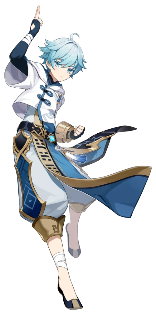
Ok, next to me loving Chongyun so much, I just- look at his design. There is so much to unpack and I love all of it.
It combines modern day fashion with traditional Chinese clothing and it just does it in such a natural way and looks so fucking good??? Like the hoodie over the qipao? The baggy pants and the shoes that allude to him as a martial artist? Immaculate.
Cryo characters all have such nice designs, Miyoho really does play favourites. Like there is not a single cyro character with a bad design, all of them are 1) recognizable and 2) very very very very pretty
(Also random thought but Chongyun reminds me of a k-pop idol? Like his haircut and the drip? Idk but peak k-pop energy)
His colour scheme is on point because why wouldn’t it be? You can tell that he’s sort of cold and that he definitely has ice powers, the placement is also just really smart. Chongyun has like four colours on him (gold, navy, light blue, white) and yet it’s just arranged in such a way where it’s so easy to recognize and sets him apart from all of the other blue and white characters with ice powers.
I remember I saw a video titled “why you should play Genshin Impact” after I had finished BOTW, and I saw Chongyun’s design and being like ‘Oh wow, he looks pretty cool’
I love Chongyun so much and his design is a big contributor to that, and that’s all I have to say.
Geo Daddy Zhongli
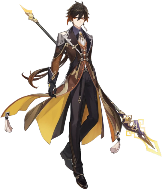
BARK BARK BARK BARK GRRRRR AWOOOOOOGGGGGGGAAAAAAAAAA-
Ok Zhongli is really hot. Like really, really, really, FUCKING hot. Like “he simultaneously raised and lowered my standards for the male gender” hot. How did he lower them? Bruh his spending habits, it makes him so endearing and cute I just- *dies*
(Zhongli I have Mora, you don’t need Childe I can be your sugar mommy-)
Ok so let me start with his colour palette because awooga that shit is hot. Black and brown wasn’t a colour palette I expected to love so much but here we are. He definitely looks like he has earth powers, and it’s so nice. I have never seen any character who have brown in their colour palette, even if they do, it’s just their hair.
And the fact that he’s wearing an elegant suit and yet has pauldrons? I love it so much. It speaks to him as a gentleman and a warrior, which is literally his entire personality and I love it so much.
Once again we have a character who combines Victorian London vibes with traditional vibes and it is amazing. Like the tassels and the dragon motifs? The long ass tailcoats that aren’t practical for fighting but GOD are they hot? Yes. Yes to all of it. I just wanna tug on his lil tie and smooch him.
I love how they just added yellow on the inside of his tailcoats, it’s really nice and helps break up the dark colours of his outfit I love Zhongli so much he is my comfort character and everything I don’t deserve :’)
#genshin impact#zhongli#zhongli genshin impact#chongyun#chongyun genshin impact#xingqiu#xingqiu genshin impact#traveler#traveler genshin impact#aether#aether genshin impac#lumine#lumine genshin impact#mona#mona genshin impact
46 notes
·
View notes
Text
11 Anti LO Asks
1. Zeus would make a much more compelling character if RS grounded his obsession with gaining respect in the context of his childhood: He could’ve been Rhea’s favourite kid and grew a huge ego/sense of entitlement as a result while feeling deeply under appreciated by his brothers and Hera for his instrumental role in rescuing them and his care for her respectively, unable to look past his own trauma and ego to see that they too are struggling with their own demons rather than neglecting him.
2. I’m gonna have disagree with that one anon saying narrators are always a sign of weak storytelling because that’s not always the truth. Hades the game for example has a narrator and it’s used very effectively to give it an fairytale-like feel, a funny thing for zag to comment on because he can hear them and he will often comment on the rude things they say, and also provides a bit of world building. A narrator is also good if it’s established beforehand who is saying the narration, such as a storyteller or prophet, and it can establish to the audience they are viewing something from the past, and they can speak when there are major shifts in the story, not throughout the whole thing. A narrator in LO isn’t even a bad idea, the issue is it should have been established much earlier, maybe even episode one is we’re being honest, instead of just coming out of nowhere to speak of stuff in the future? It’s also pretty purposely only being there to be a cliffhanger instead of even putting in effort to make it interesting enough for anyone to care or come back without the narration there basically begging them to care what’s going on. It’s very strange and shows a lack of confidence and effort in her writing to be so literally spelled out like that.
I agree with the other comments too. The font is atrocious. LO is usually really good with fonts and they picked one that was visually very ugly and hard to read with an even worse color. I didn’t even think the fonts would degrade too like the art, and yet here we are!
3. I love how rachel dropped the cover for vol 2 of LO and its just a treasure trove of book design failures. her name is on top, giving the impression both she is the title and she cares more about getting her own name out there over the actual story, empty space where the title should be, the title covering most of hades, the title being cramped so much to cover him, persephone being covered by volume two, the list goes on. the first cover wasnt much better, but this is much worse.
4. RS is willing to change aspects of the story according to fan speculation but isn't down to do anything that would retcon out the offensive stereotypes, the homophobia, or the character-assassination of apollo.
5. I’m pretty sure Hera and Echo will have an infidelity arc followed by betrayal thanks to Echo’s role in Zeus’s meddling. It’s already established that Hera is just as willing to cheat as Zeus is and Echo’s blue colouration and short hair is clearly reminiscent of Hades. Given how RS has stated that character colour palettes are symbolic, I wouldn’t overlook this detail (the one instance of RS actually sticking to her colour rules lol). Also, Ares’ comment just seems to imply it!
6. Yo I just saw RS Insta story- SHES ALREADY MAKING A VOLUME TWO BOOK???? When the first volume isn’t out yet?????? Tbh, I never expected this
7. Daphne has more personality than Persephone. Though both came from the same deprives mortal realm background, Daphne is thriving. Unlike Persephone, she’s confident and willing to take control over her own life (though this is only illustrated in the context of her dating life which is sad af, female characters never get any other kind of agency in LO). Perse would be a more interesting protagonist if she had Daphne’s (still limited af) personality.
8. There seems to be a lot of infighting here regarding Myth Hades and Persephone and it's 'modern retelling' or butchering by RS.
All fighting aside on whether Hades was a good husband and Persephones role (or lack of agency) in the myth of the Kidnapping - what is actually wrong with appreciating the myth as is?
(Isn't the myth there to give an explanation as to why the seasons change? As well as being a story of a mother in grief over her lost daughter? And her fight to find her?)
Also, in that context, is there really something wrong with liking the... lets say more "modern" adaptations of the Myth where Hades and Persephone loved one another, so long as one understands and respects the original canon (sources) and culture from which it originated?
9. The way Daphne is drawn went from sweet girl-next-door to model with overfilled lips and too many surgical alterations to increase her sex appeal.. Her lips look like they’ve been stung by several bees in the latest FP what is up with that? It’s especially irksome since RS normally draws very nice looking full lips (I.e Persephone) but they just look so off on Daphne.
10. So Minthe being in the story so early on (and already dating Hades) is lets say an "interesting" narrative choice. Mainly because it feels like RS did this because she doesnt want to acknowledge that Hades may have loved someone other than Persephone.
Because (as far as I am aware) Minthe does not show up until after Hades and Persephone are already married. And Hades did care about Minthe (as I believe one anon mentioned - he named a mountain after her?) - and she was stomped on by Persephone for daring to say that Hades liked her more.
It feels like RS made this narrative choice because she wanted to (mess with the myths) showcase that Persephone is Hades 'One True Love' and the only way she could think do to that was to make Minthe a vicious abuser. Which is unfair.
11. Uh …. Why are they already publishing a volume 2 or LO only four months after the first one? If they keep that rate up won’t they catch up really quick to the actual comic and run out of stuff to publish? I would be pissed to get a book with a cover with effort put into it just to get rushed nonsense in the actual book. Girl take a break.
Also the logo is literally covering up half of the couple while there is a giant empty space above them so her name is the main focus. Either Rachel is shit at book cover design (likely) or she needs to stroke her ego real bad and make sure her own name is the main focus. Good lord.
23 notes
·
View notes
Last Seen Blogs
sweetiekinz
Webkinz Are For The Gays™️
itsfitnessgym
fitness gym
wolfcrest-farmer
meanie bobeanie hater
authenticstylesllc
Authentic Styles LLC