#checkbox binding tutorial
Explore tagged Tumblr posts
Visit Tumblr Blog
Explore Tumblr blogs with no restrictions, modern design and the best experience.
Last Seen Tumblr Blogs


Fun Fact
Tumblr posted its first advertisements in May 2012 and subsequently earned $13M in revenue.
Photo

Vue JS 2 Tutorial #30 – Checkbox Binding Hey gang, in this Vue JS tutorial we'll take a look at how to use the v-model directive to bind data to check boxes in our Vue forms. ----- COURSE LINKS: + Repo ... source
#binding#Checkbox#checkbox binding#checkbox binding tutorial#checkbox v-model#tutorial#tutorials#vue#vue form tutorial#vue js#vue js 2#vue js 2 tutorial#vue js 2 tutorial for beginners#vue js checkbox binding#vue js checkboxes#vue js form#vue js form tutorial#vue js tutorial#vue js tutorial for beginners#vuejs#vuejs 2 tutorial#vuejs tutorial#vujs tutorial for beginners
0 notes
Text
TUTORIAL: ICONING LIKE A BEAST
for this tutorial, you’ll need a program called picpick. just get the free version.
so apparently i’ve been iconing from manga differently from everyone else for five years. but my method is also faster, so i don’t know what that tells you guys.
SETTINGS.
the first thing you’ll need to do is open this new, cute little app.

we’re going to get up a key bind for capture your icons! at the bottom left, go to options > hot keys. the thing that we will want to change is called capture fixed region. i chose two keys that are easily accessible to my left hand (alt+c), while also being out of the way of any other key combinations. after that, hit ok.

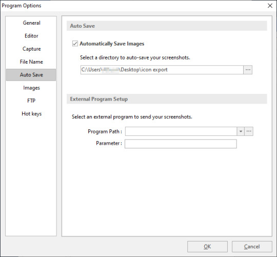
now, we’re going to set up the auto save function. this will make it so that every icon you capture gets automatically saved into a designated folder.
first, create a folder. mine is on my desktop, but you can just put it wherever you want, as long as you can find it and get back to it. then, go to options > auto save. fill in the checkbox that says automatically save images, and then select your folder. hit ok.
ICONING.
now we can start! pull up your favorite manga/webcomic/whatever; i recommend using a website that can load all of the pages in one long strip (i use mangadex), but go with whatever floats your boat.
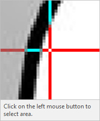
open your chapter and get to a point where you would want to capture an icon of your character, then hit your keybind. you will notice that it’ll freeze everything on your screen, including an image of your cursor. your mouse should be replaced by a red box that looks like below. this is your capture area. the first time you do this, the dimensions displayed will be different than what i have.

in the top-left of your screen, a box that looks like below. this shows the exact pixel that your mouse is on, in case you’re trying to capture an area just inside of a border. it’s pretty handy!
to change the dimensions of your capture area, just right-click and change as needed. when you hit ok, it will take you back to the capture screen. i set my dimensions to 150x150 pixels since it can accommodate for both large and small pages, and i get better resolution out of my icons when i shrink them down for later use. being able to set this capture size also makes it easier if you want to have rectangular icons, if you want them!
to capture an icon, just set your capture area over your desired area and left-click! if the page is too big or small for your capture area, you can zoom in and out (ctrl+scroll on windows) of the webpage as necessary. much better!

when you capture your area, your picpick app should pop up with your icon loaded in. notice how the tab is titled image 001.png. if you look in the folder where you set your icons to auto save, you’ll see that the named file is there.


now that you’ve confirmed that your capture and auto save is working, you can go crazy!
however, picpick is a somewhat tiny app and can’t hold a large amount of images at a time. if you go above 200 images loaded into the app, it will start to slow down and lag tremendously. to avoid this, you can go to file > close > all saved images. this will close all of the images that are in the app, but only the ones that are successfully saved to your export folder.

i tend to do this every 100-ish icons or every chapter. it’ll take a second for the app to close all the images, but give it a few seconds of breathing room before continuing to icon.

and congrats! you’ve got a ton of icons!
for free and easy batch image resizing, check out this tutorial.
67 notes
·
View notes
Text
Visual basic menustrip mnu

VISUAL BASIC MENUSTRIP MNU HOW TO
VISUAL BASIC MENUSTRIP MNU CODE
VISUAL BASIC MENUSTRIP MNU PASSWORD
VISUAL BASIC MENUSTRIP MNU MP3 DOWNLOAD
Inline Coding Model in ASP.NET using VB. When creating menus with the MenuStrip component, the Name property is used to hold the words that will appear on the screen in the menu bar.
Working With Hidden Field Control In ASP.NET Using VB.NET.
BulletedList and Bullet Style property in ASP.NET using VB.NET.
Splash screen effects to your web application in ASP.NET using VB.NET.
Lo stile dei controlli ToolStrip e MenuStrip dipende dallimpostazione delle proprietà RenderMode e Renderer.
GridViewComplexHead in ASP.NET using VB.NET Questo lavoro contiene un piccolo esempio di come sia possibile dotare le proprie applicazioni di controlli ToolStrip o MenuStrip con stile e colori personalizzati e soprattutto indipendenti dal sistema operativo in uso dallutente.
Embed Flash Banner in ASP.NET page using VB.NET.
Creating Text Files in ASP.NET using VB.NET.
ASP.NET change selected color of the menu item using VB.NET.
Check/Uncheck the GridView CheckBox in ASP.NET Using VB.NET.
Highlight ASP.NET GridView Rows On Mouse Over Using VB.NET.
ASP.NET validate DropDownList control using VB.NET.
Retrieving And Storing Values From Session Using VB.NET.
Rotate an Image in ASP.NET using VB.NET.
ASP.NET DataBinder.Eval Method in VB.NET.
HelpProvider Control with HelpClass in VB.NET.
ASP.NET Bind Records with ListView in VB.NET.
VISUAL BASIC MENUSTRIP MNU PASSWORD
ASP.NET Generate Random Password Using VB.NET.
VISUAL BASIC MENUSTRIP MNU MP3 DOWNLOAD
Uploaded by: ITS InfoTechSkills Watch Video Download MP3 Download MP4.
VISUAL BASIC MENUSTRIP MNU HOW TO
Web Form Authentication in ASP.NET Using VB.NET HOW TO USE MENU STRIP IN VB.NET PROPERTIES AND EVENTS VISUAL BASIC TUTORIAL.
ASP.NET 2.0 SqlDataSource Control in VB.NET.
ASP.NET RichTextbox control using VB.NET.
Horizontal Accordion script in ASP.NET using VB.NET.
Scroll to Top of page using VB.NET in ASP.NET Add and remove menu item for File Menu (Recent file list menuitem) Visual Basic 2005 Programmers Reference by Rod Stephens (Author) Publisher: Wrox.
Caching Mechanism in ASP.NET Using VB.NET.
OpenFileDialog and SaveFileDialog control in VB.NET.
NumericUpDown and DomainUpDown control in VB.NET.
Retrieving user password and email address from database in VB.NET.
Storing and Retrieving control data using View State in ASP.NET using VB.NET.
Existance Of Email Address In ASP.NET using VB.NET.
Sort The Columns Of Grid View In VB.NET.
CustomValidator Control Using ASP.NET In VB.NET.
Private Sub Form1_Load( ByVal sender As System.
VISUAL BASIC MENUSTRIP MNU CODE
Than add the Following code on the Form load to show the MenuStrip on left side.
Now Type Text to create SubMenu of the Menu.
Now add the Menu items.After adding the menu names the form looks Like the below Form.
than the window will looks like the below window
First drag the MenuStrip Control from the toolbox on the form.
How to use the MenuStrip Control In vb.net:
AutoSize: a value Showing whether the control is automatically resized to display its entire contents.
GripStyle: For the visibility of the grip used to reposition the control.
CanOverflow: you can get or set a value showing whether the MenuStrip Support OverFlow feature.
ShortcutKeys: Either you can Get or set the shortcut keys available with the ToolStripMenuItem.
this control support overflow, menu merging, tool tips.MenuStrip Control works with Multiple Document InterFace(MDI) and also with Single Document Interface(SDI). When you add a sub-menu, another text box with 'Type Here' text opens below it.Ĭomplete the menu structure shown in the diagram above.A Visual Basic MenuStrip Control Provides a MenuBar On the form.It replaces the Features of MainMenu control.It provides an application menu system. In this example, let us add menu and sub-menu items.ĭrag and drop or double click on a MenuStrip control, to add it to the form.Ĭlick the Type Here text to open a text box and enter the names of the menu items or sub-menu items you want. Occurs when the MenuStrip is deactivated. Occurs when the user accesses the menu with the keyboard or mouse. The following are some of the commonly used events of the MenuStrip control − Sr.No. Gets or sets a value indicating whether the MenuStrip stretches from end to end in its container. Gets or sets a value indicating whether ToolTips are shown for the MenuStrip. Gets or sets the ToolStripMenuItem that is used to display a list of Multiple-document interface (MDI) child forms. Gets or sets the visibility of the grip used to reposition the control. Gets or sets a value indicating whether the MenuStrip supports overflow functionality. The following are some of the commonly used properties of the MenuStrip control − Sr.No. The following diagram shows adding a MenuStrip control on the form − Properties of the MenuStrip Control The ToolStripMenuItem class and the ToolStripDropDownMenu class provide the functionalities to create menu items, sub menus and drop-down menus. The MenuStrip control works as the top-level container for the menu structure. The MenuStrip control represents the container for the menu structure.
0 notes
Text
Sedelco display master

#SEDELCO DISPLAY MASTER HOW TO#
#SEDELCO DISPLAY MASTER FULL#
#SEDELCO DISPLAY MASTER FREE#
Clicking the Select button causes a postback. Note that the GridView lists the name and price for all of the products along with a Select LinkButton. Let's view our progress thus far through a browser. Take a moment to ensure that your GridView's DataKeyNames property is set to ProductID. However, for the selectable GridView in this tutorial, as well as for future tutorials in which we'll be examining inserting, updating, and deleting, the DataKeyNames property must be set properly. While this property has been set for us automatically in the preceding tutorials, the examples would have worked without the DataKeyNames property specified. The DataKeyNames property is automatically set to the uniquely-identifying data field(s) when you bind a data source to a GridView, DetailsView, or FormView through the Designer. The SelectedValue property returns the value of the first DataKeyNames data field for the selected row where as the SelectedDataKey property returns the selected row's DataKey object, which contains all of the values for the specified data key fields for that row. The DataKeyNames property is used to associate one or more data field values with each row and is commonly used to attribute uniquely identifying information from the underlying data with each GridView row. The SelectedIndex property returns the index of the selected row, whereas the SelectedValue and SelectedDataKey properties return values based upon the GridView's DataKeyNames property. In addition to the SelectedRow property, the GridView provides the SelectedIndex, SelectedValue, and SelectedDataKey properties. When a GridView row's Select button is clicked a postback ensues and the GridView's SelectedRow property is updated. By default, the Select buttons are rendered as LinkButtons, but you can use Buttons or ImageButtons instead through the CommandField's ButtonType property. This results in a Select button for each row of the GridView, as Figure 6 illustrates. To accomplish this, simply check the Enable Selection checkbox in the GridView's smart tag.įigure 6: Make the GridView's Rows Selectable ( Click to view full-size image)Ĭhecking the Enabling Selection option adds a CommandField to the ProductsGrid GridView with its ShowSelectButton property set to True. Next, we need to mark the GridView as selectable, which will add a Select button to each row. These steps can be accomplished graphically, by clicking the Edit Columns link from the GridView's smart tag, or by manually configuring the declarative syntax.įigure 5: Remove All But the ProductName and UnitPrice BoundFields ( Click to view full-size image)
#SEDELCO DISPLAY MASTER FREE#
Also, feel free to customize these BoundFields as needed, such as formatting the UnitPrice BoundField as a currency and changing the HeaderText properties of the BoundFields. Next, add a new ObjectDataSource named AllProductsDataSource that invokes the ProductsBLL class's GetProducts() method.įigure 2: Create an ObjectDataSource Named AllProductsDataSource ( Click to view full-size image)įigure 3: Use the ProductsBLL Class ( Click to view full-size image)įigure 4: Configure the ObjectDataSource to Invoke the GetProducts() Method ( Click to view full-size image)Įdit the GridView's fields removing all but the ProductName and UnitPrice BoundFields. Start by adding a GridView control to the DetailsBySelecting.aspx page in the Filtering folder, setting its ID property to ProductsGrid. The GridView control can be configured to include a Select button for each row that causes a postback and marks that row as the GridView's SelectedRow. For the single page master/details report, we will need a Button for each GridView row that, when clicked, shows the details. Such a hyperlink was added to each GridView row using a HyperLinkField. Recall that in the two-page master/detail report that each master record included a hyperlink that, when clicked, sent the user to the details page passing the clicked row's SupplierID value in the querystring.
#SEDELCO DISPLAY MASTER FULL#
Clicking the Select button for a particular product will cause its full details to be displayed in a DetailsView control on the same page.įigure 1: Clicking the Select Button Displays the Product's Details ( Click to view full-size image) Step 1: Creating a Selectable GridView This tutorial will have a GridView whose rows include the name and price of each product along with a Select button. This two page report format can be condensed into one page.
#SEDELCO DISPLAY MASTER HOW TO#
In the previous tutorial we saw how to create a master/detail report using two web pages: a "master" web page, from which we displayed the list of suppliers and a "details" web page that listed those products provided by the selected supplier. Clicking the Select button for a particular product will cause its full details to be displayed in a DetailsView control on the same page.
0 notes
Text
SwiftUI Search Bar Tutorial
in SwiftUI a Search Bar can be displayed inside a List using the searchable modifier. When using the Search Bar the results will be displayed automatically. In this tutorial a list of countries is displayed and can be searched.This tutorial is built for iOS15 and Xcode 13, which can be download at the Apple developer portal.
Open Xcode and either click Create a new Xcode project in Xcode’s startup window, or choose File > New > Project. In the template selector, select iOS as the platform, select App template in the Application section and then click Next.
Enter SwiftUISearchBarTutorial as the Product Name, select SwiftUI as Interface, SwiftUI App as Life Cycle and Swift as Language. Deselect the Include Tests checkbox and click Next. Choose a location to save the project on your Mac.
In the canvas, click Resume to display the preview. If the canvas isn’t visible, select Editor > Editor and Canvas to show it.
In the Project navigator, click to select ContentView.swift. Change the ContentView struct to
struct ContentView: View { // 1. let countries = ["Afghanistan", "Albania", "Algeria", "Angola", "Argentia", "Armenia", "Australia", "Austria"] // 2. @State private var searchString = "" var body: some View { NavigationView { List { // 3. ForEach(searchString == "" ? countries: countries.filter { $0.contains(searchString)}, id: \.self) { country in Text(country) } .navigationTitle("Countries") } // 4. .searchable(text: $searchString) } } }
A propery array of countries is declared.
The searchstring holds the text entered inside the search bar.
The regular countries will be displayed when the search bar is empty. When the user inserts the search string, the list is searched with that string and the results are displayed
The searchable modifier displays the Search Bar and hold the searchString binding
Go to the Preview and select Live Preview. The countries list is displayed.
Enter The text to be searched inside the Search Bar and the results will be displayed.
The source code of the SwiftUISearchBarTutorial can be downloaded at the ioscreator repository on Github.
0 notes
Text
Some important CSS and JS Libraries
1. Styled components
An idea born in an Australian whisky bar has developed into a project of 18 K stars, widely embraced within the culture. Styled components make it simpler to use CSS in React components, by identifying styled components with encapsulated styles as a mediator layer without CSS classes. Styled-components are generated by literal notation using the ES6 framework to describe components. As you would normally do using CSS, CSS properties can be applied to the component as required. Styled components can create specific class names when the JS is parsed, and inject the CSS into the DOM. You will learn more about Max Stoiber in this great chat.
2. Radium
Radium is described as "A toolchain for React component styling" at 6.5 K stars and developed by FormidableLabs. With React without CSS, it's a collection of tools to handle inline types. Radium provides a simple interface and abstractions to manage CSS features that can not easily accommodate Radium inline styles, enabling you to bundle styles together with your React elements, combining javascript, html, and styling. It also provides rendering based on props, allowing you to design your components according to the state of your game.
3. AphroditeAphrodite is a framework-agnostic CSS-in-JS library with server-side rendering support, browser prefixing and limited CSS generation support. Aphrodite transforms everything into classes, using the class attribute.This project operates with or without Respond at 4 K stars and offers features such as modeled injection into the Dom, styles of auto prefixes and more, all at a fairly small size of 20k and a handful of dependencies. Here's a handy rundown of Aphrodite vs. Radium. 4. Emotion
At 4.2 K stars Emotion is a strong and versatile CSS-in-JS library that enables you to style string or object-based apps. To prevent variance problems with CSS it has uniform structure. Based on the glam library and its philosophy the concept is to maintain runtime output by parsing styles with babel and PostCSS while writing CSS. The core runtime is 2.3 kb, and 4 kb with support from React. Emotion isn't just about Reacting.
5. Glamorous
Note: the project is no longer actively maintained! still cool though :)
At 3.6 K stars, PayPal's Glamorous is focused to create styled components and jsxtyle inspired "maintainable CSS with React." Kent C. Dodds describes the project as "React component styling with an elegant (inspired) API, small footprint (< 5 kb gzipped) and great performance (through glamour)." It has a rather similar API to modeled parts, and under the hood it uses similar methods.
6. Glamor
Glamor, inspired by ideas from this great talk, is small and powerful. It helps you to write CSS inline in your components using the same supports for style prop Object CSS syntax React. It is fast and efficient, independent system, serverside / static rendering and adds vendor prefixes / fallback values. Here's a short introductory API notes, a comparison of Glamor CSS techniques and a helpful Glamor tutorial with Gatsby.
7. Fela
<FelaComponent style={{ backgroundColor: 'blue', color: 'red' }} render={({ className, theme }) => ( <div className={className}>I am red on blue.</div> )} />
Fela is a project developed in JavaScript for State-Driven Styling, highlighting 3 things: rendering styling dynamic by design, introducing framework-agnostic (Bindings for Reacting) and performing. Based on the state of the application it is adjustable by nature and renders types. It generates atomic CSS and supports all common features of CSS such as media queries, pseudo-classes, keyframes and font faces. It can be used on any view list, including the native React.
8. Styletron
Thanks to this
code-carrot post
Styletron is a "component-oriented styling toolkit" at 2500 stars. Styletron supports stateless, single-element styled components as primitive base styling with conditional / dynamic styling prop interfaces, and style composition via (typed) JavaScript objects without additional tooling (e.g. Webpack loaders, Babel plugins, etc.). The design of style objects is often un-opinioned on. This fascinating HN thread lets you know more.
9. JSSJSS is a CSS abstraction that uses JavaScript to define styles in a declarative and maintenable manner. It is a high performance compiler JS to CSS that operates both runtime and server-side. This core library is agnostic at low level and frame, and is around 6 KB (minified and gzipped). This can also be expanded by API plugins. Here's a good SCSS (Sass) conversion tutorial here. Test out even React-JSS, a React JSS integration.
10.
Bootstrap Icons
For their icon library the Bootstrap team recently published the Alpha 3 Update. The newest update adds tons of new designs and now has over 500 icons on the Bootstrap SVG icon pack. Bootstrap Icons are designed to interact with components in Bootstrap, from shape controls to navigation. Bootstrap icons are SVGs, so they can easily and quickly scale and be styled with CSS. Although built for Bootstrap, they will work in any project. They are open source (MIT), so you can access, use, and expand it free of charge. Heads up though, right now they are in alpha and open to drastic changes.
11.
Polka
This is my short analysis of Polka which is "... just a native HTTP server with added routing, middleware, and sub-applications support ...!" even though express is relatively light, polka is lighter. What I find fascinating in this approach gives you even more insight into how to build an application. I think Polka is an excellent way to express yourself. With only a few extra modules, you'll have a fully fledged system with stable paths, templating, static files providing in a more lightweight (and hopefully faster) bundle all you have in express. It has not the same express acceptance but this could be an advantage.
12.
Size limit
Open-source tool to measure the performance of JS apps that offers an estimation of how much time end-users will need to run your Javascript. It can be plugged into Travis CI, Circle CI, GitHub Behavior so it runs automatically and prevents over-budget size limit commits.
13.
Stryker
Stryker is a very fascinating project in JavaScript and other languages to run mutation testing. It works by adding "mutations" to the code and running tests on them in random locations, testing how many of the mutations pass and how stable the code really is. By an example let's explain this, Suppose you're creating an online casino. Users are only permitted to access the casino if they are over 18. So you write the following piece of code to test if anyone can access the site:
function isUserOldEnough(user) { return user.age >= 18; }
Stryker will find the return statement and decide to change it in several ways:
/* 1 */ return user.age > 18; /* 2 */ return user.age < 18; /* 3 */ return false; /* 4 */ return true;
We call such shifts mutants. After discovering the mutants, they are introduced one by one and the experiments are performed against them. If at least one of the experiments fails, we're saying the mutant is murdered. This is what we want to see! If no check fails, then it has succeeded. The better the experiments survive the fewer mutants.Stryker produces the results in various formats. One of the easiest reporters to read is the plain text:
Mutant killed: /yourPath/yourFile.js: line 10:27 Mutator: BinaryOperator - return user.age >= 18; + return user.age > 18; Mutant survived: /yourPath/yourFile.js: line 10:27 Mutator: RemoveConditionals - return user.age >= 18; + return true;
The direct text reporter outputs precisely how the code has been changed and which mutator has been used. It would then tell us whether a mutant has been killed which means that at least one test has failed, or whether it has survived. In this case the second mutation is marked as survivor. This means that a test that specifically checks for age younger than 18 is possibly lacking
14.
Dinero.js
Dinero is a JavaScript library designed to work with monetary values. It has a well-designed API which contains all the methods for money and currency operations you might need. Dinero.js allows the development, estimation and formatting of monetary values in JavaScript. You can do arithmetic operations, read and format them thoroughly, search for a variety of items to make your own creation process simpler and safer.
15.
Uppload
Uppload.js is a modern JavaScript library designed to enhance the experience of uploading images. The library offers an elegant interface for file collection that allows the user to drag-drop images from the locale.It also allows you to import images from any data source, such as URL, camera, Instagram post, Facebook public post, etc. Thanks to its plugin program, it provides multiple upload options, allowing you to add more image sources, such as Instagram, screenshots, Giphy and more.You are also allowed to crop, resize, rotate the client-side images until they are submitted to server.
16.
MoreToggels
Pure CSS library offering over 50 stylish checkbox toggles of a pleasant variety. These are very easy to use and customize-only surround a div in your checkbox, add the right class and it's done.
17.
μPlot
Fast, memory-efficient diagram library to generate superb 2D Canvas-based charts. It offers lots of different types of graphs, lots of customization options and other cool features.
18.
Rsup Progress
Easy but still very successful progress bar plugin with promising support and smooth animations. It is super easy to configure and very useful to show the load times at the top of the page. 19.
Bootstrap Treeview
Bootstrap treeview is used to represent hierarchical information starting with the root element and continuing with its children and their respective items. Besides the root every element has a parent and can have children. Easy Bootstrap 4 plugin designed to build elegant treeviews with collapse list objects. It's a fantastic little feature and we wouldn't be shocked to see it integrated with future Bootstrap models. Siblings are objects with one parent and the same. Objects can collapse and expand.
20.
Electron React Boilerplate
Electron React Boilerplate uses Electron, React, Redux, React Router, Webpack and React Hot Loader for rapid application creation (HMR).Great starting kit for the production of Electron-based cross-platform mobile applications. The project GitHub provides a strong framework to help you customize everything and get started in no time.
21.
Panolens
They're panolens. Js is a WebGL focused and event-driven panoramic viewer. Lean and versatile. It is constructed over Three. Amazing JavaScript panorama viewer library right in the browser to create beautiful 360 ° experience. Three.js-based library keeps output fast and smooth, even when viewing high quality images or videos.
22.
Octomments
Very smart solution for adding comments to your website which uses GitHub as a discussion source. The project consists of a GitHub App and a JS library working together to view a fully featured comment section, hosted within a selected repo issue of GitHub.
23.
Rome
Rome is a toolchain experimental to JavaScript. It includes a parser, linter, formatter, bundler, frame checking and more. It aims to be a detailed platform for everything that relates to JavaScript source code production. Rome is not a set of known instruments. All the tools are designed specifically for Rome, do not rely on any external dependencies and are made to communicate with each other seamlessly.
24.
massCode
MassCode is a snippet manager for developers of open-source code. This nice little app offers a clean interface for all of your code snippets and cheatsheets to handle. Runs on Mac, Linux and Windows.
25.
Bootlint
The Bootstrap team's new linter tool that lets you test if your pages use Bootstrap's components with properly organized HTML. It also ensures the appropriate tags are used, an HTML5 doctype declaration is included, and the page's overall markup is accurate.
26.
DarkModeJS
This library uses the mix-blend-mode css to get Dark Mode on all of your websites. Only copy and paste the snippet and you'll get a plugin to turn the Dark Mode on and off. You can also use it programmatically, without the button. Lightweight module, installed in Vanilla. Super lightweight JS library to help you integrate dark & light teams into your applications. It senses local time for the user and changes the UI appearance accordingly. It doesn't have light and dark themes.
27.
Hex Engine
Modern 2D engine designed to render browser games. This versatile toolkit for game development features a Canvas-based rendering engine, aids in physics and sound, gamepad support, integrated design tools, and more.
28.
Chardin.js
A tiny JS tool which makes adding overlay instructions for your apps super simple. These guides can be extremely helpful to clarify the UI, demote the various features of the app or simply show the user what to do next.
29.
Sharect
Share. Js is a lightweight, zero-dependent JS library that transforms any text selected into quotes that can be posted on Twitter and/or Facebook, as you can see in Medium.com.
30.
Lottie
Lottie is an Android, iOS, Web, and Windows library that parses Adobe After Effects animations exported as json with Bodymovin and makes them natively accessible on the smartphone and on the web! The Airbnb developer team's incredible library that exports Adobe After. This makes animations that can be very complex with lots of details and keyframes as well as being super-performing and smooth buttery. It's now designed to expand its use to android, iOS, React Native and Windows in addition to his great work.
31.
Vue Interactive Paycard
View-Interactive-Paycard-Smooth and sweet micro-interaction credit card shape. Includes the printing of numbers, validation and automatic identification of type of token. Designed with viewjs, and completely sensitive as well. Very impressive credit card snippet type which beautifully animates as users input their data. One of the finest projects we've seen all year round, with everything polished to perfection, from the typography to the animations. It's not only pretty either-the card is also very user friendly with the formatting of numbers, validation and the identification of card size. Also, when entering cc info, users actually prefer a well-known interface and not some custom UI.
32.
Cube.js
Cube.js is a scalable open source platform for building analytical web applications and designing your own sophisticated, custom analytics systems. It consists of a wide SDK frontend and a lightweight API backend which can be linked to most databases and systems like MySQL, Postreges and MongoDB .. It is primarily used for developing internal business intelligence tools or for applying customer-facing analytics to an existing app.
33.
Tessaract
Tesseract. Js is the pure Javascript port of Tesseract's popular OCR engine. Node and browser JavaScript library which extracts text from images. It analyzes the image, automatically detects location and orientation of the text, and with great precision extracts words and sentences. Tessaract can recognize more than 60 languages including more complex ones such as Chinese, Arabic and Russian
34.
Barba
Lightweight library for linking seamless transitions to pages on your website. It takes up your usual static website and makes it a great-looking single-page application experience. It helps to reduce the delay between loading pages, to decrease requests for HTTP, and to make the web feel more premium.
35.
Freezeframe
This fun JavaScript library allows for the control of animated GIF playback. It can start and pause the GIFs, for example, based on user feedback such as clicks or hover. As it uses a canvas feature to draw the individual frames, it is also very performant under the hood.
36.
Ink
React-based App building command line interface. It provides a great range of predefined components which can be used to accelerate the creation of terminal interfaces while also allowing features such as more sophisticated templates and controls to be added.
37.
Instant Page
This fun library speeds up loading times when users hover over them by prefretching the links. This makes loading of a page faster until the user clicks on a connection and navigates to the next page. With the latest update it can also automatically prefix all links in a list-great for static content.
38.
Filepond
FilePond is a JavaScript library that lets you upload silky smooth drag n 'drop files. It has a polished UI which is a pleasure to use, while also offering some interesting features under the hood such as optimizing photos for quicker uploads. Just 21 kB gzipped, with adapters available with React, Vue, and jQuery for easier implementation. These docs can assist in downloading, setting up, updating and extending FilePond. If you don't know FilePond you can find more detail on the FilePond product page.
39.
Micromodal
Micromodalistic. Js is a modal library written in pure JavaScript, lightweight, configurable and 11y-enabled. It helps you to build modal dialogs consistent with WAI-ARIA guidelines, with trust and with minimal configuration. Minified and gzipped at just 1.9 kb, it's a tiny library for big change.
40.
Brain.js
A great project for all of you who want to take their first steps in machine learning, Brain.js offers a powerful framework for working in a JavaScript environment with the neural networks. It has lots of examples of excellent documentation that will help you understand some of the most important ML techniques.
As a reputed Software Solutions Developer we have expertise in providing dedicated remote and outsourced technical resources for software services at very nominal cost. Besides experts in full stacks We also build web solutions, mobile apps and work on system integration, performance enhancement, cloud migrations and big data analytics. Don’t hesitate to
get in touch with us!
Source:
whizzystack.co
#b2b ecommerce
#b2b content marketing
#b2b seo
#Ecommerce
#socialmediamarketing
0 notes
Text
Some important CSS and JS Libraries
1. Styled components
An idea born in an Australian whisky bar has developed into a project of 18 K stars, widely embraced within the culture. Styled components make it simpler to use CSS in React components, by identifying styled components with encapsulated styles as a mediator layer without CSS classes. Styled-components are generated by literal notation using the ES6 framework to describe components. As you would normally do using CSS, CSS properties can be applied to the component as required. Styled components can create specific class names when the JS is parsed, and inject the CSS into the DOM. You will learn more about Max Stoiber in this great chat.
2. Radium
Radium is described as "A toolchain for React component styling" at 6.5 K stars and developed by FormidableLabs. With React without CSS, it's a collection of tools to handle inline types. Radium provides a simple interface and abstractions to manage CSS features that can not easily accommodate Radium inline styles, enabling you to bundle styles together with your React elements, combining javascript, html, and styling. It also provides rendering based on props, allowing you to design your components according to the state of your game.
3. AphroditeAphrodite is a framework-agnostic CSS-in-JS library with server-side rendering support, browser prefixing and limited CSS generation support. Aphrodite transforms everything into classes, using the class attribute.This project operates with or without Respond at 4 K stars and offers features such as modeled injection into the Dom, styles of auto prefixes and more, all at a fairly small size of 20k and a handful of dependencies. Here's a handy rundown of Aphrodite vs. Radium. 4. Emotion
At 4.2 K stars Emotion is a strong and versatile CSS-in-JS library that enables you to style string or object-based apps. To prevent variance problems with CSS it has uniform structure. Based on the glam library and its philosophy the concept is to maintain runtime output by parsing styles with babel and PostCSS while writing CSS. The core runtime is 2.3 kb, and 4 kb with support from React. Emotion isn't just about Reacting.
5. Glamorous
Note: the project is no longer actively maintained! still cool though :)
At 3.6 K stars, PayPal's Glamorous is focused to create styled components and jsxtyle inspired "maintainable CSS with React." Kent C. Dodds describes the project as "React component styling with an elegant (inspired) API, small footprint (< 5 kb gzipped) and great performance (through glamour)." It has a rather similar API to modeled parts, and under the hood it uses similar methods.
6. Glamor
Glamor, inspired by ideas from this great talk, is small and powerful. It helps you to write CSS inline in your components using the same supports for style prop Object CSS syntax React. It is fast and efficient, independent system, serverside / static rendering and adds vendor prefixes / fallback values. Here's a short introductory API notes, a comparison of Glamor CSS techniques and a helpful Glamor tutorial with Gatsby.
7. Fela
<FelaComponent style={{ backgroundColor: 'blue', color: 'red' }} render={({ className, theme }) => ( <div className={className}>I am red on blue.</div> )} />
Fela is a project developed in JavaScript for State-Driven Styling, highlighting 3 things: rendering styling dynamic by design, introducing framework-agnostic (Bindings for Reacting) and performing. Based on the state of the application it is adjustable by nature and renders types. It generates atomic CSS and supports all common features of CSS such as media queries, pseudo-classes, keyframes and font faces. It can be used on any view list, including the native React.
8. Styletron
Thanks to this
code-carrot post
Styletron is a "component-oriented styling toolkit" at 2500 stars. Styletron supports stateless, single-element styled components as primitive base styling with conditional / dynamic styling prop interfaces, and style composition via (typed) JavaScript objects without additional tooling (e.g. Webpack loaders, Babel plugins, etc.). The design of style objects is often un-opinioned on. This fascinating HN thread lets you know more.
9. JSSJSS is a CSS abstraction that uses JavaScript to define styles in a declarative and maintenable manner. It is a high performance compiler JS to CSS that operates both runtime and server-side. This core library is agnostic at low level and frame, and is around 6 KB (minified and gzipped). This can also be expanded by API plugins. Here's a good SCSS (Sass) conversion tutorial here. Test out even React-JSS, a React JSS integration.
10.
Bootstrap Icons
For their icon library the Bootstrap team recently published the Alpha 3 Update. The newest update adds tons of new designs and now has over 500 icons on the Bootstrap SVG icon pack. Bootstrap Icons are designed to interact with components in Bootstrap, from shape controls to navigation. Bootstrap icons are SVGs, so they can easily and quickly scale and be styled with CSS. Although built for Bootstrap, they will work in any project. They are open source (MIT), so you can access, use, and expand it free of charge. Heads up though, right now they are in alpha and open to drastic changes.
11.
Polka
This is my short analysis of Polka which is "... just a native HTTP server with added routing, middleware, and sub-applications support ...!" even though express is relatively light, polka is lighter. What I find fascinating in this approach gives you even more insight into how to build an application. I think Polka is an excellent way to express yourself. With only a few extra modules, you'll have a fully fledged system with stable paths, templating, static files providing in a more lightweight (and hopefully faster) bundle all you have in express. It has not the same express acceptance but this could be an advantage.
12.
Size limit
Open-source tool to measure the performance of JS apps that offers an estimation of how much time end-users will need to run your Javascript. It can be plugged into Travis CI, Circle CI, GitHub Behavior so it runs automatically and prevents over-budget size limit commits.
13.
Stryker
Stryker is a very fascinating project in JavaScript and other languages to run mutation testing. It works by adding "mutations" to the code and running tests on them in random locations, testing how many of the mutations pass and how stable the code really is. By an example let's explain this, Suppose you're creating an online casino. Users are only permitted to access the casino if they are over 18. So you write the following piece of code to test if anyone can access the site:
function isUserOldEnough(user) { return user.age >= 18; }
Stryker will find the return statement and decide to change it in several ways:
/* 1 */ return user.age > 18; /* 2 */ return user.age < 18; /* 3 */ return false; /* 4 */ return true;
We call such shifts mutants. After discovering the mutants, they are introduced one by one and the experiments are performed against them. If at least one of the experiments fails, we're saying the mutant is murdered. This is what we want to see! If no check fails, then it has succeeded. The better the experiments survive the fewer mutants.Stryker produces the results in various formats. One of the easiest reporters to read is the plain text:
Mutant killed: /yourPath/yourFile.js: line 10:27 Mutator: BinaryOperator - return user.age >= 18; + return user.age > 18; Mutant survived: /yourPath/yourFile.js: line 10:27 Mutator: RemoveConditionals - return user.age >= 18; + return true;
The direct text reporter outputs precisely how the code has been changed and which mutator has been used. It would then tell us whether a mutant has been killed which means that at least one test has failed, or whether it has survived. In this case the second mutation is marked as survivor. This means that a test that specifically checks for age younger than 18 is possibly lacking
14.
Dinero.js
Dinero is a JavaScript library designed to work with monetary values. It has a well-designed API which contains all the methods for money and currency operations you might need. Dinero.js allows the development, estimation and formatting of monetary values in JavaScript. You can do arithmetic operations, read and format them thoroughly, search for a variety of items to make your own creation process simpler and safer.
15.
Uppload
Uppload.js is a modern JavaScript library designed to enhance the experience of uploading images. The library offers an elegant interface for file collection that allows the user to drag-drop images from the locale.It also allows you to import images from any data source, such as URL, camera, Instagram post, Facebook public post, etc. Thanks to its plugin program, it provides multiple upload options, allowing you to add more image sources, such as Instagram, screenshots, Giphy and more.You are also allowed to crop, resize, rotate the client-side images until they are submitted to server.
16.
MoreToggels
Pure CSS library offering over 50 stylish checkbox toggles of a pleasant variety. These are very easy to use and customize-only surround a div in your checkbox, add the right class and it's done.
17.
μPlot
Fast, memory-efficient diagram library to generate superb 2D Canvas-based charts. It offers lots of different types of graphs, lots of customization options and other cool features.
18.
Rsup Progress
Easy but still very successful progress bar plugin with promising support and smooth animations. It is super easy to configure and very useful to show the load times at the top of the page. 19.
Bootstrap Treeview
Bootstrap treeview is used to represent hierarchical information starting with the root element and continuing with its children and their respective items. Besides the root every element has a parent and can have children. Easy Bootstrap 4 plugin designed to build elegant treeviews with collapse list objects. It's a fantastic little feature and we wouldn't be shocked to see it integrated with future Bootstrap models. Siblings are objects with one parent and the same. Objects can collapse and expand.
20.
Electron React Boilerplate
Electron React Boilerplate uses Electron, React, Redux, React Router, Webpack and React Hot Loader for rapid application creation (HMR).Great starting kit for the production of Electron-based cross-platform mobile applications. The project GitHub provides a strong framework to help you customize everything and get started in no time.
21.
Panolens
They're panolens. Js is a WebGL focused and event-driven panoramic viewer. Lean and versatile. It is constructed over Three. Amazing JavaScript panorama viewer library right in the browser to create beautiful 360 ° experience. Three.js-based library keeps output fast and smooth, even when viewing high quality images or videos.
22.
Octomments
Very smart solution for adding comments to your website which uses GitHub as a discussion source. The project consists of a GitHub App and a JS library working together to view a fully featured comment section, hosted within a selected repo issue of GitHub.
23.
Rome
Rome is a toolchain experimental to JavaScript. It includes a parser, linter, formatter, bundler, frame checking and more. It aims to be a detailed platform for everything that relates to JavaScript source code production. Rome is not a set of known instruments. All the tools are designed specifically for Rome, do not rely on any external dependencies and are made to communicate with each other seamlessly.
24.
massCode
MassCode is a snippet manager for developers of open-source code. This nice little app offers a clean interface for all of your code snippets and cheatsheets to handle. Runs on Mac, Linux and Windows.
25.
Bootlint
The Bootstrap team's new linter tool that lets you test if your pages use Bootstrap's components with properly organized HTML. It also ensures the appropriate tags are used, an HTML5 doctype declaration is included, and the page's overall markup is accurate.
26.
DarkModeJS
This library uses the mix-blend-mode css to get Dark Mode on all of your websites. Only copy and paste the snippet and you'll get a plugin to turn the Dark Mode on and off. You can also use it programmatically, without the button. Lightweight module, installed in Vanilla. Super lightweight JS library to help you integrate dark & light teams into your applications. It senses local time for the user and changes the UI appearance accordingly. It doesn't have light and dark themes.
27.
Hex Engine
Modern 2D engine designed to render browser games. This versatile toolkit for game development features a Canvas-based rendering engine, aids in physics and sound, gamepad support, integrated design tools, and more.
28.
Chardin.js
A tiny JS tool which makes adding overlay instructions for your apps super simple. These guides can be extremely helpful to clarify the UI, demote the various features of the app or simply show the user what to do next.
29.
Sharect
Share. Js is a lightweight, zero-dependent JS library that transforms any text selected into quotes that can be posted on Twitter and/or Facebook, as you can see in Medium.com.
30.
Lottie
Lottie is an Android, iOS, Web, and Windows library that parses Adobe After Effects animations exported as json with Bodymovin and makes them natively accessible on the smartphone and on the web! The Airbnb developer team's incredible library that exports Adobe After. This makes animations that can be very complex with lots of details and keyframes as well as being super-performing and smooth buttery. It's now designed to expand its use to android, iOS, React Native and Windows in addition to his great work.
31.
Vue Interactive Paycard
View-Interactive-Paycard-Smooth and sweet micro-interaction credit card shape. Includes the printing of numbers, validation and automatic identification of type of token. Designed with viewjs, and completely sensitive as well. Very impressive credit card snippet type which beautifully animates as users input their data. One of the finest projects we've seen all year round, with everything polished to perfection, from the typography to the animations. It's not only pretty either-the card is also very user friendly with the formatting of numbers, validation and the identification of card size. Also, when entering cc info, users actually prefer a well-known interface and not some custom UI.
32.
Cube.js
Cube.js is a scalable open source platform for building analytical web applications and designing your own sophisticated, custom analytics systems. It consists of a wide SDK frontend and a lightweight API backend which can be linked to most databases and systems like MySQL, Postreges and MongoDB .. It is primarily used for developing internal business intelligence tools or for applying customer-facing analytics to an existing app.
33.
Tessaract
Tesseract. Js is the pure Javascript port of Tesseract's popular OCR engine. Node and browser JavaScript library which extracts text from images. It analyzes the image, automatically detects location and orientation of the text, and with great precision extracts words and sentences. Tessaract can recognize more than 60 languages including more complex ones such as Chinese, Arabic and Russian
34.
Barba
Lightweight library for linking seamless transitions to pages on your website. It takes up your usual static website and makes it a great-looking single-page application experience. It helps to reduce the delay between loading pages, to decrease requests for HTTP, and to make the web feel more premium.
35.
Freezeframe
This fun JavaScript library allows for the control of animated GIF playback. It can start and pause the GIFs, for example, based on user feedback such as clicks or hover. As it uses a canvas feature to draw the individual frames, it is also very performant under the hood.
36.
Ink
React-based App building command line interface. It provides a great range of predefined components which can be used to accelerate the creation of terminal interfaces while also allowing features such as more sophisticated templates and controls to be added.
37.
Instant Page
This fun library speeds up loading times when users hover over them by prefretching the links. This makes loading of a page faster until the user clicks on a connection and navigates to the next page. With the latest update it can also automatically prefix all links in a list-great for static content.
38.
Filepond
FilePond is a JavaScript library that lets you upload silky smooth drag n 'drop files. It has a polished UI which is a pleasure to use, while also offering some interesting features under the hood such as optimizing photos for quicker uploads. Just 21 kB gzipped, with adapters available with React, Vue, and jQuery for easier implementation. These docs can assist in downloading, setting up, updating and extending FilePond. If you don't know FilePond you can find more detail on the FilePond product page.
39.
Micromodal
Micromodalistic. Js is a modal library written in pure JavaScript, lightweight, configurable and 11y-enabled. It helps you to build modal dialogs consistent with WAI-ARIA guidelines, with trust and with minimal configuration. Minified and gzipped at just 1.9 kb, it's a tiny library for big change.
40.
Brain.js
A great project for all of you who want to take their first steps in machine learning, Brain.js offers a powerful framework for working in a JavaScript environment with the neural networks. It has lots of examples of excellent documentation that will help you understand some of the most important ML techniques.
As a reputed Software Solutions Developer we have expertise in providing dedicated remote and outsourced technical resources for software services at very nominal cost. Besides experts in full stacks We also build web solutions, mobile apps and work on system integration, performance enhancement, cloud migrations and big data analytics. Don’t hesitate to
get in touch with us!
0 notes
Text
Getting Started With Redux: Learn by Example
Redux helps you manage state by setting the state up at a global level. In the previous tutorial, we had a good look at the Redux architecture and the integral components of Redux such as actions, action creators, the store, and reducers.
In this second post of the series, we are going to bolster our understanding of Redux and build on top of what we already know. We will start by creating a realistic Redux application—a contact list—that's more complex than a basic counter. This will help you strengthen your understanding of the single store and multiple reducers concept which I introduced in the previous tutorial. Then later we'll talk about binding your Redux state with a React application and the best practices that you should consider while creating a project from scratch.
However, it's okay if you haven't read the first post—you should still be able to follow along as long as you know the Redux basics. The code for the tutorial is available in the repo, and you can use that as a starting point.
Creating a Contact List Using Redux
We're going to build a basic contact list with the following features:
display all contacts
search for contacts
fetch all contacts from the server
add a new contact
push the new contact data into the server
Here's what our application is going to look like:
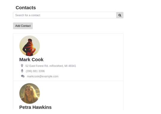
Final product — Contact list View

Final Product — Add contact view
Covering everything in one stretch is hard. So in this post we're going to focus on just the Redux part of adding a new contact and displaying the newly added contact. From a Redux perspective, we'll be initializing the state, creating the store, adding reducers and actions, etc.
In the next tutorial, we'll learn how to connect React and Redux and dispatch Redux actions from a React front-end. In the final part, we'll shift our focus towards making API calls using Redux. This includes fetching the contacts from the server and making a server request while adding new contacts. Apart from that, we'll also create a search bar feature that lets you search all the existing contacts.
Create a Sketch of the State Tree
You can download the react-redux demo application from my GitHub repository. Clone the repo and use the v1 branch as a starting point. The v1 branch is very similar to the create-react-app template. The only difference is that I've added a few empty directories to organise Redux. Here's the directory structure.
. ├── package.json ├── public ├── README.md ├── src │ ├── actions │ ├── App.js │ ├── components │ ├── containers │ ├── index.js │ ├── reducers │ └── store └── yarn.lock
Alternatively, you can create a new project from scratch. Either way, you will need to have installed a basic react boilerplate and redux before you can get started.
It's a good idea to have a rough sketch of the state tree first. In my opinion, this will save you lots of time in the long run. Here's a rough sketch of the possible state tree.
const initialState = { contacts: { contactList: [], newContact: { name: '', surname: '', email: '', address: '', phone: '' }, ui: { //All the UI related state here. eg: hide/show modals, //toggle checkbox etc. } } }
Our store needs to have two properties—contacts and ui. The contacts property takes care of all contacts-related state, whereas the ui handles UI-specific state. There is no hard rule in Redux that prevents you from placing the ui object as a sub-state of contacts. Feel free to organize your state in a way that feels meaningful to your application.
The contacts property has two properties nested inside it—contactlist and newContact. The contactlist is an array of contacts, whereas newContact temporarily stores contact details while the contact form is being filled. I am going to use this as a starting point for building our awesome contact list app.
How to Organize Redux
Redux doesn't have an opinion about how you structure your application. There are a few popular patterns out there, and in this tutorial, I will briefly talk about some of them. But you should pick one pattern and stick with it until you fully understand how all the pieces are connected together.
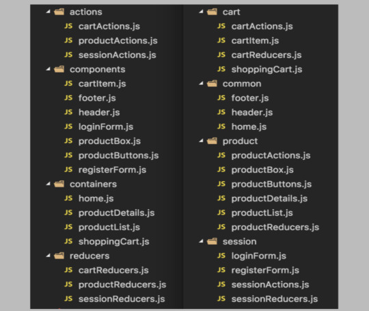
The most common pattern that you'll find is the Rails-style file and folder structure. You'll have several top-level directories like the ones below:
components: A place to store the dumb React components. These components do not care whether you're using Redux or not.
containers: A directory for the smart React components that dispatch actions to the Redux store. The binding between redux and react will be taking place here.
actions: The action creators will go inside this directory.
reducers: Each reducer gets an individual file, and you'll be placing all the reducer logic in this directory.
store: The logic for initializing the state and configuring the store will go here.
The image below demonstrates how our application might look if we follow this pattern:

The Rails style should work for small and mid-sized applications. However, when your app grows, you can consider moving towards the domain-style approach or other popular alternatives that are closely related to domain-style. Here, each feature will have a directory of its own, and everything related to that feature (domain) will be inside it. The image below compares the two approaches, Rails-style on the left and domain-style on the right.
For now, go ahead and create directories for components, containers, store, reducers, and action. Let's start with the store.
Single Store, Multiple Reducers
Let's create a prototype for the store and the reducer first. From our previous example, this is how our store would look:
const store = createStore( reducer, { contacts: { contactlist: [], newContact: { } }, ui: { isContactFormHidden: true } }) const reducer = (state, action) => { switch(action.type) { case "HANDLE_INPUT_CHANGE": break; case "ADD_NEW_CONTACT": break; case "TOGGLE_CONTACT_FORM": break; } return state; }
The switch statement has three cases that correspond to three actions that we will be creating. Here is a brief explanation of what the actions are meant for.
HANDLE_INPUT_CHANGE: This action gets triggered when the user inputs new values into the contact form.
ADD_NEW_CONTACT: This action gets dispatched when the user submits the form.
TOGGLE_CONTACT_FORM: This is a UI action that takes care of showing/hiding the contact form.
Although this naive approach works, as the application grows, using this technique will have a few shortcomings.
We're using a single reducer. Although a single reducer sounds okay for now, imagine having all your business logic under one very large reducer.
The code above doesn't follow the Redux structure that we've discussed in the previous section.
To fix the single reducer issue, Redux has a method called combineReducers that lets you create multiple reducers and then combine them into a single reducing function. The combineReducers function enhances readability. So I am going to split the reducer into two—a contactsReducer and a uiReducer.
In the example above, createStore accepts an optional second argument which is the initial state. However, if we are going to split the reducers, we can move the whole initialState to a new file location, say reducers/initialState.js. We will then import a subset of initialState into each reducer file.
Splitting the Reducer
Let's restructure our code to fix both the issues. First, create a new file called store/createStore.js and add the following code:
import {createStore} from 'redux'; import rootReducer from '../reducers/'; /*Create a function called configureStore */ export default function configureStore() { return createStore(rootReducer); }
Next, create a root reducer in reducers/index.js as follows:
import { combineReducers } from 'redux' import contactsReducer from './contactsReducer'; import uiReducer from './uiReducer'; const rootReducer =combineReducers({ contacts: contactsReducer, ui: uiReducer, }) export default rootReducer;
Finally, we need to create the code for the contactsReducer and uiReducer.
reducers/contactsReducer.js
import initialState from './initialState'; export default function contactReducer(state = initialState.contacts, action) { switch(action.type) { /* Add contacts to the state array */ case "ADD_CONTACT": { return { ...state, contactList: [...state.contactList, state.newContact] } } /* Handle input for the contact form. The payload (input changes) gets merged with the newContact object */ case "HANDLE_INPUT_CHANGE": { return { ...state, newContact: { ...state.newContact, ...action.payload } } } default: return state; } }
reducers/uiReducer.js
import initialState from './initialState'; export default function uiReducer(state = initialState.ui, action) { switch(action.type) { /* Show/hide the form */ case "TOGGLE_CONTACT_FORM": { return { ...state, isContactFormHidden: !state.isContactFormHidden } } default: return state; } }
When you're creating reducers, always keep the following in mind: a reducer needs to have a default value for its state, and it always needs to return something. If the reducer fails to follow this specification, you will get errors.
Since we've covered a lot of code, let's have a look at the changes that we've made with our approach:
The combineReducers call has been introduced to tie together the split reducers.
The state of the ui object will be handled by uiReducer and the state of the contacts by the contactsReducer.
To keep the reducers pure, spread operators have been used. The three dot syntax is part of the spread operator. If you're not comfortable with the spread syntax, you should consider using a library like Immutability.js.
The initial value is no longer specified as an optional argument to createStore. Instead, we've created a separate file for it called initialState.js. We're importing initialState and then setting the default state by doing state = initialState.ui.
State Initialization
Here's the code for the reducers/initialState.js file.
const initialState = { contacts: { contactList: [], newContact: { name: '', surname: '', email: '', address: '', phone: '' }, }, ui: { isContactFormHidden: true } } export default initialState;
Actions and Action Creators
Let's add a couple of actions and action creators for adding handling form changes, adding a new contact, and toggling the UI state. If you recall, action creators are just functions that return an action. Add the following code in actions/index.js.
export const addContact =() => { return { type: "ADD_CONTACT", } } export const handleInputChange = (name, value) => { return { type: "HANDLE_INPUT_CHANGE", payload: { [name]: value} } } export const toggleContactForm = () => { return { type: "TOGGLE_CONTACT_FORM", } }
Each action needs to return a type property. The type is like a key that determines which reducer gets invoked and how the state gets updated in response to that action. The payload is optional, and you can actually call it anything you want.
In our case, we've created three actions.
The TOGGLE_CONTACT_FORM doesn't need a payload because every time the action is triggered, the value of ui.isContactFormHidden gets toggled. Boolean-valued actions do not require a payload.
The HANDLE_INPUT_CHANGE action is triggered when the form value changes. So, for instance, imagine that the user is filling the email field. The action then receives "email" and "[email protected]" as inputs, and the payload handed over to the reducer is an object that looks like this:
{ email: "[email protected]" }
The reducer uses this information to update the relevant properties of the newContact state.
Dispatching Actions and Subscribing to the Store
The next logical step is to dispatch the actions. Once the actions are dispatched, the state changes in response to that. To dispatch actions and to get the updated state tree, Redux offers certain store actions. They are:
dispatch(action): Dispatches an action that could potentially trigger a state change.
getState(): Returns the current state tree of your application.
subscriber(listener): A change listener that gets called every time an action is dispatched and some part of the state tree is changed.
Head to the index.js file and import the configureStore function and the three actions that we created earlier:
import React from 'react'; import {render}from 'react-dom'; import App from './App'; /* Import Redux store and the actions */ import configureStore from './store/configureStore'; import {toggleContactForm, handleInputChange} from './actions';
Next, create a store object and add a listener that logs the state tree every time an action is dispatched:
const store = configureStore(); //Note that subscribe() returns a function for unregistering the listener const unsubscribe = store.subscribe(() => console.log(store.getState()) )
Finally, dispatch some actions:
/* returns isContactFormHidden returns false */ store.dispatch(toggleContactForm()); /* returns isContactFormHidden returns false */ store.dispatch(toggleContactForm()); /* updates the state of contacts.newContact object */ store.dispatch(handleInputChange('email', '[email protected]')) unsubscribe;
If everything is working right, you should see this in the developer console.

That's it! In the developer console, you can see the Redux store being logged, so you can see how it changes after each action.
Summary
We've created a bare-bones Redux application for our awesome contact list application. We learned about reducers, splitting reducers to make our app structure cleaner, and writing actions for mutating the store.
Towards the end of the post, we subscribed to the store using the store.subscribe() method. Technically, this isn't the best way to get things done if you're going to use React with Redux. There are more optimized ways to connect the react front-end with Redux. We'll cover those in the next tutorial.
via Envato Tuts+ Code https://ift.tt/2JaE04i
0 notes
Text
Angular 7 Reactive – Form Validation Simple Example
Every application requires user input and the input must be correct that is the developer’s responsibility. Angular 7 comes with the form validation feature.
Today we will learn about the validation of the 7 Angles form.
So let’s start with a simple registration form validation. We need a 7 Corner project. If you don’t know how to create an Angular project 7. Follow this tutorial.
Register the…
View On WordPress
#angular 7 reactive form checkbox example#angular 7 reactive form example#angular 7 reactive form validation#angular 7 reactive form valuechanges#angular 7 reactive forms#angular 7 reactive forms crud example#angular 7 reactive forms custom validation#angular 7 reactive forms file upload#angular 7 reactive forms tutorial#angular 7 reactive forms two way binding
0 notes
Text
Form Input binding in vuejs - Form Handling in vuejs - Vuejs tutorial - Tutorial 17
Form Input binding in vuejs – Form Handling in vuejs – Vuejs tutorial – Tutorial 17
[ad_1] [DISCOUNTED] Master CSS Grid Course: https://bit.ly/2NONxxE
Form Input binding in vuejs – Form Handling in vuejs – In this lecture we will learn how can we bind property value to form fields like input field, checkbox, radio, textarea.
This form input binding lecture will be pretty quick and easy to learn. First we will start with simple input type text. Where we will bind it value to…
View On WordPress
#binding#form#form handlign vuejs#form handling#form handling in vuejs#form input binding vuejs#form vuejs#forms#forms vuejs#Handling#handling form#Input#input binding vuejs#multiple select vuejs#select multiple vuejs#tutorial#v-model#v-model vuejs#vuejs#vuejs beginners tutorial#vuejs form#vuejs form handling#vuejs form input binding#vuejs forms#vuejs multiple select#vuejs radio#vuejs select#vuejs textarea#vuejs tutorial#vuejs tutorial for beginners
0 notes
Text
Android Design Support Library: Getting Started
Android Design Support Library to the rescue!
Have you been surfing through thousands of Github libraries to add a Facebook-like Sliding Navigation menu in your project? Or searching for a convenient widget that will show tabs with icons at the bottom of your app’s homepage?
Behold – the Android Design Support Library is for you!
The Android Design Support Library helps you implement those shiny, interactive design components with minimal code!
In this tutorial, you’ll create a marketplace app called iSell using the Android Design Support Library. By the end, you will learn how to:
Use common Material Design components like BottomNavigationView and FloatingActionButton
Get rid of needing different images for the same icon to support different device resolutions with VectorDrawables
Bring some wow-factors to your users with CoordinatorLayout and CollapsingToolbarLayout
This is gonna be awesome!
Getting started
To kick things off, start by downloading the materials for this tutorial (you can find a link at the top or bottom of this tutorial). Unzip iSell.zip folder into your desktop.
Now launch Android Studio 3.1.2 or greater and select Open an existing Android Studio project to import the starter project.
Choose iSell-Starter inside the iSell folder and click Open
Build and run by firing keyboard shortcut Shift + F10 (or Control + R if you are using a Mac)
And you will see a screen with the project name. Kudos – you’ve successfully kickstarted the project!
Managing Design Support Dependencies
Adding Design Support Library to your project is a piece of cake, but it requires a few different components. You should always use the latest version of each component, and make sure they’re the same version for all the components. To manage this efficiently, an external variable is defined in your Project level build.gradle file as following:
ext.supportLibraryVersion = '27.1.1'
You will use this version with all the Design Support Library components later.
Open the build.gradle file from your app module and append the following lines inside the dependencies section:
// 1: Design Support Library implementation "com.android.support:design:$supportLibraryVersion" // 2: CardView implementation "com.android.support:cardview-v7:$supportLibraryVersion"
Let’s take a moment to understand what each of dependencies provides:
Design Support Library: Adds all those “exciting” UI components we are talking about. For example: BottomNavigationView, FloatingActionButton. We’ll be adding one of each later in this tutorial.
CardView: Is a View component that shows its content in an elevated card, and highlights it to stand-out from the background. Most commonly used with list items.
Also, you’re are going to use VectorDrawables for the icons, so add this inside the defaultConfig section:
vectorDrawables.useSupportLibrary = true
Your app module’s build.gradle file finally may look like this:
apply plugin: 'com.android.application' apply plugin: 'kotlin-android' apply plugin: 'kotlin-android-extensions' android { compileSdkVersion 27 defaultConfig { applicationId "com.raywenderlich.isell" minSdkVersion 16 targetSdkVersion 27 versionCode 1 versionName "1.0" vectorDrawables.useSupportLibrary = true } buildTypes { release { minifyEnabled false proguardFiles getDefaultProguardFile('proguard-android.txt'), 'proguard-rules.pro' } } androidExtensions { experimental = true } } dependencies { // Kotlin implementation "org.jetbrains.kotlin:kotlin-stdlib-jre7:$kotlinVersion" // AppCompat implementation "com.android.support:appcompat-v7:$supportLibraryVersion" // Design Support Library implementation "com.android.support:design:$supportLibraryVersion" // CardView implementation "com.android.support:cardview-v7:$supportLibraryVersion" }
Notice that the build.gradle file has uses a plugin:
apply plugin: 'kotlin-android-extensions'
With kotlin-android-extensions, you can directly access a View‘s id without having to initialize it using findViewById(). Its just sweet syntactic sugar! If you are keen to know more about kotlin-android-extensions you can find out more here.
Before adding any Kotlin code, configure Android Studio to automatically insert import statements so that you don’t need to worry about imports for every change you make.
Go to Preferences\Editor\General\Auto Import, check Add unambiguous imports on the fly and Optimize imports on the fly checkboxes and click OK.
Again, don’t forget to click Sync Now in the top-right corner of your IDE. You’re now done with all the setup!
Showcasing Items with RecyclerView
First things first, you’ll display a list of items to sell. To show the list, replace the TextView inside activity_main.xml with a RecyclerView:
<RelativeLayout xmlns:android="http://schemas.android.com/apk/res/android" xmlns:app="http://schemas.android.com/apk/res-auto" xmlns:tools="http://schemas.android.com/tools" android:layout_width="match_parent" android:layout_height="match_parent" tools:context=".ui.activity.MainActivity"> <android.support.v7.widget.RecyclerView android:id="@+id/itemsRecyclerView" android:layout_width="match_parent" android:layout_height="match_parent" app:layoutManager="android.support.v7.widget.GridLayoutManager" app:spanCount="2"/> </RelativeLayout>
Here, RecyclerView will be identified as itemsRecyclerView and the width and height properties should match its parent layout.
app:layoutManager="android.support.v7.widget.GridLayoutManager" app:spanCount="2"
You’ll notice that you set the layoutManager directly in the XML to use a GridLayoutManager. Setting the app:spanCount tells the GridLayoutManager that you want to show 2 items in a row, so you tell the layoutManager to prepare layout for the grid.
Next, you need to design the layout for the items in the list.
Highlight with CardView
For each item in being sold, you’ll want to show the image, price and title. To make a layout for that, right-click on layout folder, select New, then select Layout resource file and name it layout_list_item.xml.
Now add following code inside layout_list_item.xml:
<?xml version="1.0" encoding="utf-8"?> <android.support.v7.widget.CardView xmlns:android="http://schemas.android.com/apk/res/android" xmlns:card_view="http://schemas.android.com/apk/res-auto" xmlns:tools="http://schemas.android.com/tools" android:layout_width="match_parent" android:layout_height="wrap_content" android:layout_margin="@dimen/default_margin" android:foreground="?android:attr/selectableItemBackground" card_view:cardBackgroundColor="@color/cardview_light_background" card_view:cardCornerRadius="@dimen/cardview_default_radius" card_view:cardElevation="@dimen/cardview_default_elevation"> <RelativeLayout android:layout_width="match_parent" android:layout_height="wrap_content"> <ImageView android:id="@+id/itemImage" android:layout_width="match_parent" android:layout_height="@dimen/item_image_height" android:scaleType="fitCenter" tools:src="@drawable/laptop_1"/> <TextView android:id="@+id/itemPrice" android:layout_width="match_parent" android:layout_height="wrap_content" android:layout_below="@id/itemImage" android:layout_marginLeft="@dimen/default_margin" android:layout_marginRight="@dimen/default_margin" android:maxLines="1" android:textAppearance="@style/TextAppearance.AppCompat.Headline" android:textColor="@color/colorAccent" tools:text="@string/hint_price"/> <TextView android:id="@+id/itemTitle" android:layout_width="match_parent" android:layout_height="wrap_content" android:layout_below="@id/itemPrice" android:layout_marginBottom="@dimen/default_margin" android:layout_marginLeft="@dimen/default_margin" android:layout_marginRight="@dimen/default_margin" android:ellipsize="end" android:maxLines="2" android:minLines="2" android:textAppearance="@style/TextAppearance.AppCompat.Title" tools:text="@string/hint_title"/> </RelativeLayout> </android.support.v7.widget.CardView>
It will look like this in the Preview pane:
Here the CardView and its properties may seem new to you, but other components are quite familiar – you are just adding views to show the image, price and title inside a RelativeLayout sequentially.
Using CardView makes your item appear elevated with the use of drop shadows around the element.
card_view:cardBackgroundColor="@color/cardview_light_background"
The above property adds a light-themed background color for the CardView from Design Support Library.
card_view:cardCornerRadius="@dimen/cardview_default_radius"
This property makes the card’s corners to look rounded. You are using the default radius provided in Design Support Library. You can play with the values for this property, the edges will look more rounded with a larger value.
The most interesting property of CardView is:
card_view:cardElevation="@dimen/cardview_default_elevation"
This property allows a CardView to look more or less elevated. This elevation of the view determines the size of the drop shadow. The larger the value you provide, the more elevated it’ll look.
RecyclerView in Action
It’s time to bind some data to the layout. Consider the DataProvider class inside util package as a storehouse of all your Items. You need an adapter to show items in the RecyclerView added earlier. To do so, add a new class inside the adapter package named ItemsAdapter as follows:
// 1 class ItemsAdapter(private val items: List<Item>) : RecyclerView.Adapter<RecyclerView.ViewHolder>() { // 2 class ViewHolder(itemView: View) : RecyclerView.ViewHolder(itemView) { fun bind(item: Item) = with(itemView) { itemTitle.text = item.title itemImage.setImageResource(item.imageId) } } // 3 override fun onCreateViewHolder(parent: ViewGroup, viewType: Int): RecyclerView.ViewHolder { val view = LayoutInflater.from(parent?.context) .inflate(R.layout.layout_list_item, parent, false) return ViewHolder(view) } // 4 override fun onBindViewHolder(holder: RecyclerView.ViewHolder, position: Int) { (holder as ViewHolder).bind(items[position]) } // 5 override fun getItemCount(): Int { return items.size } }
That’s a lot of code to digest at once! Let’s break it down…
ItemsAdapter is declared as a subclass of RecyclerView.Adapter which accepts a list of Item.
ViewHolder is a subclass of RecyclerView.ViewHolder. It inherits the power of being cached into memory and re-used to display an Item inside the RecyclerView. The bind(item: Item) function inside it does all the binding between the Item and the View.
onCreateViewHolder() function creates a new ViewHolder when the adapter needs a new one with the view you designed in layout_list_item.xml.
onBindViewHolder() glues each Item from the list with a ViewHolder to populate it using the bind() function.
getItemCount() function tells ItemsAdapter the number of items in the list.
Add a function that will set the data in RecyclerView according to the category you want inside MainActivity.kt:
private fun populateItemList(category: Category) { val items = when (category) { Category.LAPTOP -> DataProvider.laptopList Category.MONITOR -> DataProvider.monitorList Category.HEADPHONE -> DataProvider.headphoneList } if (items.isNotEmpty()) { itemsRecyclerView.adapter = ItemsAdapter(items) } }
This function accepts Category as input and fetches a list of items from that category through the DataProvider. Then it creates a new ItemsAdapter with those items and sets to itemsRecyclerView.
Call this function with a Category from onCreate() function inside MainActivity:
populateItemList(Category.LAPTOP)
Here you are fetching items from the LAPTOP category through the DataProvider. Feel free to play around with other categories also.
Run the app again. You’ll see the list as follows:
Listening to Click Events
You need to set a listener that’ll notify you when a user clicks on an item from the list. For that, you should declare an interface inside ItemsAdapter:
interface OnItemClickListener { fun onItemClick(item: Item, itemView: View) }
The onItemClick(item: Item, itemView: View) function will be called by the interface to let you know which specific Item object is clicked. Here itemView is the view that represents the Item in RecyclerView.
Now modify ItemsAdapter‘s constructor to match the following:
class ItemsAdapter(private val items: List<Item>, private val clickListener: OnItemClickListener)
ItemsAdapter now requires an OnItemClickListener instance when created so that you can use the instance later.
Modify onBindViewHolder() as follows:
override fun onBindViewHolder(holder: RecyclerView.ViewHolder, position: Int) { (holder as ViewHolder).bind(items[position], clickListener) }
This binds the clickListener instance to every ViewHolder.
At this point you might see a compiler warning like this:
but don’t worry, all you need is to update ViewHolder class to fix that:
class ViewHolder(itemView: View) : RecyclerView.ViewHolder(itemView) { fun bind(item: Item, listener: OnItemClickListener) = with(itemView) { itemTitle.text = item.title itemPrice.text = "\$" + item.price itemImage.setImageResource(item.imageId) setOnClickListener { listener.onItemClick(item, it) } } }
Notice that you are using listener.onItemClick(item, it) inside setOnClickListener for itemView. That means, onItemClick() function will be fired whenever user clicks on an itemView and passes the reference of it’s corresponding item and view through the listener interface.
You should navigate from MainActivity to DetailsActivity when a user clicks on a item to see its details. Implement the OnItemClickListener interface in MainActivity as follows:
class MainActivity : AppCompatActivity(), ItemsAdapter.OnItemClickListener { }
and override onItemClick() function inside MainActivity:
override fun onItemClick(item: Item, itemView: View) { val detailsIntent = Intent(this, DetailsActivity::class.java) detailsIntent.putExtra(getString(R.string.bundle_extra_item), item) startActivity(detailsIntent) }
When an item inside the RecyclerView is clicked on, the onItemClick(item: Item, itemView: View) function will notify MainActivity and navigate to DetailsActivity starting a new Intent. Update the creation of the ItemsAdapter
itemsRecyclerView.adapter = ItemsAdapter(items)
to include the OnItemClickListener inside populateItemList(category: Category) method.
itemsRecyclerView.adapter = ItemsAdapter(items, this)
Run again at this and click on a item from the list – you will see a white screen with a text like this:
But that’s ok for now, you will make it look good soon enough!
Before going any farther let’s import the icons you are going to use later…
Using VectorDrawables for Icons
VectorDrawables are graphic elements that consist of points, lines and color information defined in a XML. It adjusts itself to different screen densities without loss of image quality, so using one file is enough to support devices with different resolution which results a smaller APK!
Android Studio has a lot of VectorDrawables bundled with it for your convenience, but you can also use your own svg or psd icons as VectorDrawables. To import them, you would right-click on the res folder and select New > Vector Asset. This will open the Asset Studio.
The starter project for this tutorial has icons that have already been converted to vector drawables in a folder named SVG inside the project directory. Navigate to that folder and copy all the xml files into the res/drawables folder.
You can now use those vector drawables inside a BottomNavigationView.
Categorize items with BottomNavigationView
You may want to display items of different categories in different tabs. How about showing them at the bottom of MainActivity with a nice icons? Design Support Library provides a widget called BottomNavigationView that makes this task easy!
Implementing BottomNavigationView
Right-click on res > menu folder and add new Menu resource file.
Name it menu_bottom_navigation.xml and add following code:
<?xml version="1.0" encoding="utf-8"?> <menu xmlns:android="http://schemas.android.com/apk/res/android" xmlns:app="http://schemas.android.com/apk/res-auto"> <item android:id="@+id/nav_laptops" android:icon="@drawable/ic_laptop" android:title="@string/laptops"/> <item android:id="@+id/nav_monitors" android:icon="@drawable/ic_monitor" android:title="@string/monitors"/> <item android:id="@+id/nav_headphones" android:icon="@drawable/ic_headphone" android:title="@string/headphones"/> </menu>
The code is pretty straightforward here, you are setting an id, icon and title for each item in the BottomNavigationView which will be displayed as a Tab with an icon and title.
Now add BottomNavigationView inside activity_main.xml under RecyclerView:
<android.support.design.widget.BottomNavigationView android:id="@+id/bottomNavigationView" android:layout_width="match_parent" android:layout_height="wrap_content" android:layout_alignParentBottom="true" app:menu="@menu/menu_bottom_navigation"/>
You should also add
android:layout_above="@+id/bottomNavigationView"
to the RecyclerView so that it shows above BottomNavigationView instead of fullscreen.
Handling Item Selection on BottomNavigationView
The intention of the BottomNavigationView is to show Items of different categories when users select different tabs from the BottomNavigationView.
First, have MainActivity implement BottomNavigationView.OnNavigationItemSelectedListener. Modify the MainActivity declaration as follows:
class MainActivity : AppCompatActivity(), ItemsAdapter.OnItemClickListener, BottomNavigationView.OnNavigationItemSelectedListener { }
and add following function inside MainActivity class:
override fun onNavigationItemSelected(item: MenuItem): Boolean { when (item.itemId) { R.id.nav_laptops -> populateItemList(Category.LAPTOP) R.id.nav_monitors -> populateItemList(Category.MONITOR) R.id.nav_headphones -> populateItemList(Category.HEADPHONE) else -> return false } return true }
The onNavigationItemSelected(item: MenuItem) function fires each time a user clicks a MenuItem shown as Tab in BottomNavigationView.
This function, determines which MenuItem was clicked using the item.itemId and calls populateItemList() with it’s corresponding Category to show the items of that category in the RecyclerView.
onNavigationItemSelected(item: MenuItem) will return true to notify MainActivity that a NavigationItem is selected if item.itemId matches to any item defined in the menu_bottom_navigation.xml or returns false otherwise to keep things unchanged.
Add this line inside onCreate() function in MainActivity:
bottomNavigationView.setOnNavigationItemSelectedListener(this)
Run the app again you’ll notice the items changing after each tab is selected.
Adding New Items
Adding another button inside MainActivity to add new items will eat a lot of precious real estate in your landing page, but how about overlaying a button over the list of items? Did someone say FloatingActionButton?
Using FloatingActionButton
Add a FloatingActionButton at the bottom of activity_main.xml, to look as follows:
<?xml version="1.0" encoding="utf-8"?> <RelativeLayout xmlns:android="http://schemas.android.com/apk/res/android" xmlns:app="http://schemas.android.com/apk/res-auto" xmlns:tools="http://schemas.android.com/tools" android:layout_width="match_parent" android:layout_height="match_parent" tools:context=".ui.activity.MainActivity"> <android.support.v7.widget.RecyclerView android:id="@+id/itemsRecyclerView" android:layout_width="match_parent" android:layout_height="match_parent" android:layout_above="@+id/bottomNavigationView" app:layoutManager="android.support.v7.widget.GridLayoutManager" app:spanCount="2"/> <android.support.design.widget.BottomNavigationView android:id="@+id/bottomNavigationView" android:layout_width="match_parent" android:layout_height="wrap_content" android:layout_alignParentBottom="true" app:menu="@menu/menu_bottom_navigation"/> <android.support.design.widget.FloatingActionButton android:id="@+id/addFab" android:layout_width="wrap_content" android:layout_height="wrap_content" android:layout_above="@id/bottomNavigationView" android:layout_alignParentRight="true" android:clickable="true" android:onClick="onClickAddFab" app:srcCompat="@drawable/ic_add" app:useCompatPadding="true"/> </RelativeLayout>
Then add following function inside MainActivity.kt:
fun onClickAddFab(view: View) { startActivity(Intent(this, AddItemActivity::class.java)) }
This function will be called when user clicks on the FloatingActionButton and navigate from MainActivity to AddItemsActivity by starting a new Intent.
Run the app again, and click on the FloatingActionButton, you should see the app transition into the AddItemsActivity:
Before moving to the next section, update imageFromCategory() inside AddItemActivity.kt so that it returns an icon that matches with provided Category:
private fun imageFromCategory(category: Category): Int { return when (category) { Category.LAPTOP -> R.drawable.ic_laptop Category.MONITOR -> R.drawable.ic_monitor else -> R.drawable.ic_headphone } }
Interacting with TextInputLayout
Add a TextInputLayout in activity_add_item.xml to wrap titleEditText and priceEditText:
<android.support.design.widget.TextInputLayout android:id="@+id/titleTextInput" android:layout_width="match_parent" android:layout_height="wrap_content" android:layout_below="@+id/categoryTitle" app:counterEnabled="true" app:counterMaxLength="30"> <EditText android:id="@+id/titleEditText" android:layout_width="match_parent" android:layout_height="wrap_content" android:hint="@string/hint_title" android:maxLines="2" /> </android.support.design.widget.TextInputLayout> <android.support.design.widget.TextInputLayout android:id="@+id/priceTextInput" android:layout_width="match_parent" android:layout_height="wrap_content" android:layout_below="@+id/titleTextInput" app:counterEnabled="true" app:counterMaxLength="30"> <EditText android:id="@+id/priceEditText" android:layout_width="match_parent" android:layout_height="wrap_content" android:hint="@string/hint_price" android:inputType="numberDecimal" /> </android.support.design.widget.TextInputLayout> <EditText android:id="@+id/detailsEditText" android:layout_width="match_parent" android:layout_height="wrap_content" android:layout_below="@+id/priceTextInput" android:hint="@string/hint_details" android:lines="2" />
TextInputLayout is basically a wrapper for EditText enhancing it to display floating hint animations, error message and character counts in a more material way.
For example, adding
app:counterEnabled="true" app:counterMaxLength="30"
in titleTextInput inside activity_add_item.xml displays 30 character limit for titleEditText input and shows character count interactively and no extra line needed!
Showing error message is easy when using TextInputLayout. You might want to check if user inputs title and price before adding an item, and show an error near the input fields if empty or invalid. Write a function in AddItemActivity.kt that does exactly that:
private fun hasValidInput(): Boolean { // 1 val title = titleEditText.text.toString() if (title.isNullOrBlank()) { titleTextInput.error = "Please enter a valid Title" return false } // 2 val price = priceEditText.text.toString().toDoubleOrNull() if (price == null || price <= 0.0) { priceTextInput.error = "Please enter a minimum Price" return false } // 3 return true }
This section checks if user leaves titleEditText blank or inserts whitespace only. Then it'll set an error to titleTextInput field and stops proceeding farther by returning false
This section tries to convert user input on priceEditText to a Double value. toDoubleOrNull() returns null if the conversion fails due to and invalid input or even whitespace. Again, user must input a price greater than 0. So you set an error on the priceTextInput field which stops proceeding farther by returning false if the price is null or no more than 0.0
It returns true if all validation filters above passed and proceeds to add an item.
Call hasValidInput() from inside onClickAddItem(view: View) function like this:
fun onClickAddItem(view: View) { if (hasValidInput()) { val selectedCategory = categorySpinner.selectedItem as Category DataProvider.addItem(Item( imageId = imageFromCategory(selectedCategory), title = titleEditText.text.toString(), details = detailsEditText.text.toString(), price = priceEditText.text.toString().toDouble(), category = selectedCategory, postedOn = System.currentTimeMillis()) ) } }
You should clear all error message whenever user starts typing on the input fields again. To do that you need to modify beforeTextChanged() function as following:
override fun beforeTextChanged(s: CharSequence?, start: Int, count: Int, after: Int) { titleTextInput.error = null priceTextInput.error = null }
easy-peasy, huh?
Run the app and try to add an item without price - you'll be stopped with an error message!
Using Snackbar for Temporary Messages
Snackbar is the smarter version of Toasts in Android. You can provide action buttons like "OK" or "CANCEL" along with a message using a Snackbar. Unlike Toast, you need to provide a view to display the Snackbar.
It's good practice to show a confirmation message after adding an item successfully and take back to the item list after user's acknowledgement. Let's add a function for that inside AddItemActivity:
private fun showAddItemConfirmation() { Snackbar.make(addItemRootView, getString(R.string.add_item_successful), Snackbar.LENGTH_LONG) .setAction(getString(R.string.ok)) { navigateBackToItemList() } .show() }
It shows a Snackbar in addItemRootView with a success message for a longer duration defined by Snackbar.LENGTH_LONG.
You added an action button with text "OK" by appending
.setAction(getString(R.string.ok)) { navigateBackToItemList() }
which performs navigateBackToItemList() action on button click.
Add showAddItemConfirmation() at the bottom of onClickAddItem() function:
fun onClickAddItem(view: View) { if (hasValidInput()) { val selectedCategory = categorySpinner.selectedItem as Category DataProvider.addItem(Item( imageId = imageFromCategory(selectedCategory), title = titleEditText.text.toString(), details = detailsEditText.text.toString(), price = priceEditText.text.toString().toDouble(), category = selectedCategory, postedOn = System.currentTimeMillis()) ) showAddItemConfirmation() } }
Run the app again and to add a new item title, price and details, The output should be like this:
Animating Item Details
Presenting item details is an attractive way of providing the user more information that may lead to more items sold. One approach to making the detail page more attractive is to use animation. In this section, you'll leverage what Design Support Library offers to make the app more lucrative...
Using CoordinatorLayout and CollapsingToolbarLayout
Combining CoordinatorLayout with CollapsingToolbarLayout is a killer-combo that can make your app lot more fascinating to the users. Before seeing them in action, replace everything inside activity_details.xml with the following:
<?xml version="1.0" encoding="utf-8"?> <!-- 1 --> <android.support.design.widget.CoordinatorLayout xmlns:android="http://schemas.android.com/apk/res/android" xmlns:app="http://schemas.android.com/apk/res-auto" xmlns:tools="http://schemas.android.com/tools" android:layout_width="match_parent" android:layout_height="match_parent" tools:context=".ui.activity.DetailsActivity"> <!-- 2 --> <android.support.design.widget.AppBarLayout android:id="@+id/appBar" android:layout_width="match_parent" android:layout_height="@dimen/app_bar_height" android:theme="@style/AppTheme.AppBarOverlay"> <!-- 3 --> <android.support.design.widget.CollapsingToolbarLayout android:id="@+id/collapsingToolbarLayout" android:layout_width="match_parent" android:layout_height="match_parent" app:contentScrim="@color/colorPrimary" app:layout_scrollFlags="scroll|exitUntilCollapsed"> <ImageView android:id="@+id/itemImageView" android:layout_width="match_parent" android:layout_height="match_parent" android:scaleType="centerCrop" app:layout_scrollFlags="scroll|enterAlways|enterAlwaysCollapsed"/> <!-- 4 --> <android.support.v7.widget.Toolbar android:id="@+id/toolBar" android:layout_width="match_parent" android:layout_height="?attr/actionBarSize" app:layout_collapseMode="pin" app:popupTheme="@style/AppTheme.PopupOverlay"/> </android.support.design.widget.CollapsingToolbarLayout> </android.support.design.widget.AppBarLayout> <!-- 5 --> <include layout="@layout/content_details"/> <!-- 6 --> <android.support.design.widget.FloatingActionButton android:id="@+id/shareFab" android:layout_width="wrap_content" android:layout_height="wrap_content" android:layout_margin="@dimen/fab_margin" android:onClick="onClickShareFab" app:layout_anchor="@+id/appBar" app:layout_anchorGravity="bottom|end" app:srcCompat="@android:drawable/ic_menu_share"/> </android.support.design.widget.CoordinatorLayout>
Switch to the layout-blueprint for a better overview, then you'll go over each item in the layout, one by one:
CoordinatorLayout is the root layout and the container for it's child views. By specifying a behavior to a direct child of CoordinatorLayout, you’ll be able to intercept touch events, window insets, measurement, layout, and nested scrolling. Don't panic - you'll learn to implement them in the next section!
AppBarLayout allows your Toolbar and other views (such as the ImageView) to react to scroll events in a sibling view.
android:theme="@style/AppTheme.AppBarOverlay"
You used the above property to overwrite relevant attributes for light overlay style.
CollapsingToolbarLayout is a wrapper for Toolbar which allows the Toolbar to expand or collapse as the user scrolls through a view.
app:contentScrim="@color/colorPrimary"
Using the above property gradually changes CollapsingToolbarLayout's color to the provided color when it's collapsing.
app:layout_scrollFlags="scroll|exitUntilCollapsed"
The above property means the view should scroll off until it reaches to its minimum height (?attr/actionBarSize in this case)
Toolbar is actually a more flexible and customizable ActionBar that holds your navigation button, activity title etc. Here, using
android:layout_height="?attr/actionBarSize"
assures the Toolbar has exactly same height of a regular ActionBar, and
app:layout_collapseMode="pin"
pins it on top when CollapsingToolbarLayout is fully collapsed. Finally
app:popupTheme="@style/AppTheme.PopupOverlay"
styles it to be elevated as like a Popup when the Toolbar is visible.
You are including a layout from content_details.xml that shows the price, title and details of the item.
The FloatingActionButton allows you to share your item via a share-intent.
android:onClick="onClickShareFab"
Setting the above property will fire the onClickShareFab(view: View) function inside DetailsActivity when user clicks on it.
app:layout_anchor="@+id/appBar" app:layout_anchorGravity="bottom|end"
These last two properties keep the button it attached to the bottom-end of the AppBarLayout. The CoordinatorLayout automatically manages the visibility of FloatingActionButton when AppBarLayout is collapsed as you set the appBar as layout_anchor.
Put everything inside content_details.xml within a NestedScrollView, so the layout will look like this:
<?xml version="1.0" encoding="utf-8"?> <android.support.v4.widget.NestedScrollView xmlns:android="http://schemas.android.com/apk/res/android" xmlns:app="http://schemas.android.com/apk/res-auto" xmlns:tools="http://schemas.android.com/tools" android:layout_width="match_parent" android:layout_height="match_parent" app:layout_behavior="@string/appbar_scrolling_view_behavior" tools:context=".ui.activity.DetailsActivity" tools:showIn="@layout/activity_details"> <LinearLayout android:layout_width="match_parent" android:layout_height="wrap_content" android:orientation="vertical" android:padding="@dimen/default_padding"> <TextView android:id="@+id/priceTextView" style="@style/TextAppearance.AppCompat.Display1" android:layout_width="wrap_content" android:layout_height="wrap_content" android:textColor="@color/colorAccent" tools:text="@string/hint_price"/> <TextView android:id="@+id/titleTextView" style="@style/TextAppearance.AppCompat.Title" android:layout_width="match_parent" android:layout_height="wrap_content" android:layout_marginBottom="@dimen/default_margin" android:layout_marginTop="@dimen/default_margin" android:transitionName="@string/transition_title" tools:targetApi="lollipop" tools:text="@string/hint_title"/> <TextView android:id="@+id/detailsTextView" style="@style/TextAppearance.AppCompat.Body1" android:layout_width="match_parent" android:layout_height="wrap_content" tools:text="@string/hint_details"/> </LinearLayout> </android.support.v4.widget.NestedScrollView>
app:layout_behavior="@string/appbar_scrolling_view_behavior"
With the above property, you share scroll events on the NestedScrollView with AppBarLayout so that it can expand or collapse accordingly.
Finally, set the Toolbar inside onCreate() function in DetailsActivity.kt:
setSupportActionBar(toolBar) supportActionBar?.setDisplayHomeAsUpEnabled(true)
and modify populateDetails(item: Item?) function like this:
private fun populateDetails(item: Item?) { supportActionBar?.title = item?.category?.name itemImageView.setImageResource(item?.imageId!!) priceTextView.text = getString(R.string.currency_symbol) + item?.price.toString() titleTextView.text = item?.title detailsTextView.text = item?.details }
This sets the category name in the Toolbar title and the Item's image to the ImageView.
Run the app again, and navigate to the DetailsActivity of any item - you should see something amazing:
Adding Parallax Scrolling Effect
As you already seen, Design Support Library does all the heavy-lifting when it comes to animation, providing your users a rich user experience. Why not add one more effect! add following to the ImageView inside activity_details.xml:
app:layout_collapseMode="parallax" app:layout_collapseParallaxMultiplier="0.7"
This adds a nice parallax-scrolling effect to the ImageView when AppBarLayout open or collapse. The layout_collapseParallaxMultiplier impacts on speed and visible area during scroll. Default value for this is 0.5, you can play around this value and check which suits you best.
Build and Run and see the changes in all its glory!
This completes your quest into making an awesome marketplace app! Don't stop here; keep working on it - and maybe you can make the next eBay!
Where To Go From Here?
You can download the final project using the link at the top or the bottom of this tutorial.
To take your Material Design skills to the next level, here are some additional things to explore:
Learn to implement Activity Transitions With Shared Elements, The Palette API and more from raywenderlich.com
Learn to use AnimatedVectorDrawables
Use Downloadable Fonts to improve overall look and feel.
I hope you enjoyed materializing your app with Android Design Support Library. If you have any questions, comments, or awesome modifications to this project app please join the forum discussion and comment below!
The post Android Design Support Library: Getting Started appeared first on Ray Wenderlich.
Android Design Support Library: Getting Started published first on https://medium.com/@koresol
0 notes
Photo

Handling Forms in Vue.js
Introduction
When building web applications, there is always the possibility of working with forms. Learning to handle them as you work with different tools is very important. In this tutorial, you will see how to handle forms in Vue.js.
Get Started
Create a new Vue project using Vue-CLI. If you do not have Vue-CLI installed on your machine, you can do so by running:
npm install -g vue-cli
That will install Vue-CLI globally on your machine. You can go ahead to create the project by running:
vue init webpack vue-forms
That will create a new Vue project, using the Webpack template. Navigate to the directory that was created for the project, and install the dependencies.
cd vue-forms npm install
You will be making use of Bootstrap in this tutorial. Open your index.html file and make it look like this.
#index.html <!DOCTYPE html> <html lang="en"> <head> <meta charset="utf-8"> <title>vue-forms</title> <link rel="stylesheet" href="http://ift.tt/2apRjw3" integrity="sha384-BVYiiSIFeK1dGmJRAkycuHAHRg32OmUcww7on3RYdg4Va+PmSTsz/K68vbdEjh4u" crossorigin="anonymous"></head> <body> <div id="app"> </div> <script src="/dist/build.js"></script> </body> </html>
Nothing fancy here—just the link element tag for our Bootstrap stylesheet. You will build a simple registration form from scratch, and bind the values entered into the form using v-model. When working with forms in Vue.js, you bind form input values to the Vue instance using the v-model directive.
Input Binding
Let's get started with some simple text input to collect the email address, password, and age of the user. Open up your App.vue file.
Edit the template section to look like what I have below.
#src/App.vue <template> <div class="container"> <form> <div class="row"> <div class="col-xs-12 col-sm-8 col-sm-offset-2 col-md-6 col-md-offset-3"> <h1>Enter your information</h1> <hr> <div class="form-group"> <label for="email">Mail</label> <input type="text" id="email" class="form-control" v-model="userData.email"> </div> <div class="form-group"> <label for="password">Password</label> <input type="password" id="password" class="form-control" v-model="userData.password"> </div> <div class="form-group"> <label for="age">Age</label> <input type="number" id="age" class="form-control" v-model="userData.age"> </div> </div> </div> </form> </div> </template>
In the above, you are using the v-model directive to bind the inputs for email, password, and age to an object. Here, the object is called userData. The userData object is supposed to have different properties—email, password and age—where the values of the inputs will be saved.
The userData object has to be defined in the data option of your Vue instance.
<script> export default { data () { return { userData: { email: '', password: '', age: 40 } } } } </script>
With that, you have established a two-way binding. You can now access the values for the email, password, and age inputs as userData.email, userData.password, and userData.age respectively. From the above, you set the default value for the age object. Without entering a value, the value is set at 40. This is an example of how you can implement defaults when working with forms in Vue.js.
Input Modifiers
Now go to the form group for your password to make the password visible. The form group should look like this.
<div class="form-group"> <label for="password">Password</label> <input type="password" id="password" class="form-control" v-model="userData.password"> <p></p> </div>
As you enter inputs in the input box, each letter you enter gets displayed. Vue.js gives you the option to halt display of the values till you move to another input field or another place in the page. To do this, you have to edit the v-model directive by adding a lazy modifier, like so.
<input type="password" id="password" class="form-control" v-model.lazy="userData.password">
This does not listen to the input event, but the change event that gets fired when you are done with that input field. Another modifier that can come handy is the trim modifier. If used for the email field, it will look like this.
<input type="text" id="email" class="form-control" v-model.trim="userData.email">
This is the same way you used the lazy modifier. The trim modifier will remove any extra space from the entered values.
Working with textarea is like what you did above. The only difference is that interpolation will not work. Let's add a textarea to our form, inside the form tag.
<div class="row"> <div class="col-xs-12 col-sm-8 col-sm-offset-2 col-md-6 col-md-offset-3 form-group"> <label for="message">Message</label><br> <!-- Interpolation between <textarea></textarea> doesn't work!--> <textarea id="message" rows="5" class="form-control" v-model="message"></textarea> </div> </div>
Update the model to look like this.
<script> export default { data () { return { userData: { email: '', password: '', age: 40 }, message: 'This is a placeholder text' } } } </script>
Checkboxes and Radio Buttons
Checkboxes give users the opportunity to select more than one option. When implementing this, the values are bound to the same array.
So, in your template, you should add this.
<div class="row"> <div class="col-xs-12 col-sm-8 col-sm-offset-2 col-md-6 col-md-offset-3"> <div class="form-group"> <label for="designer"> <input type="checkbox" id="designer" value="Designer" v-model="occupation"> Designer </label> <label for="developer"> <input type="checkbox" id="developer" value="developer" v-model="occupation"> Developer </label><!-- Also show for single checkbox with true/ false --> </div> </div> </div>
While the data model is updated too.
data () { return { userData: { email: '', password: '', age: 40 }, message: 'This is a placeholder text', occupation: [] } }
If you are working with radio buttons, where the user can only select one option, you do not make use of an array. Let's add radio buttons to the registration form.
<div class="row"> <div class="col-xs-12 col-sm-8 col-sm-offset-2 col-md-6 col-md-offset-3 form-group"> <label for="male"> <input type="radio" id="male" value="Male" v-model="gender"> Male </label> <label for="female"> <input type="radio" id="female" value="Female" v-model="gender"> Female </label> </div> </div>
The corresponding data model will look like this.
data () { return { userData: { email: '', password: '', age: 40 }, message: 'This is a placeholder text', occupation: [], gender: 'Female } }
Vue.js knows that both radio buttons belong to the same group, so it only allows the selection of one. It also stores the value of the selected radio button in the gender property; this is done automatically for you.
Handling Drop-Downs
The v-model directive is also used for dropdowns. In the template, you are to loop through a collection of values, as these values are automatically populated in your form.
Here is a drop-down that loops through a list; the list will be defined in the data model.
<div class="row"> <div class="col-xs-12 col-sm-8 col-sm-offset-2 col-md-6 col-md-offset-3 from-group"> <label for="expertise">Expertise</label> <select id="expertise" class="form-control" v-model="selectedExpertise"> <option v-for="expertise in expertises"></option> </select> </div> </div>
The data model should look like this.
data () { return { userData: { email: '', password: '', age: 40 }, message: 'This is a placeholder text', occupation: [], gender: 'Female, selectedExpertise: 'Professional', expertises: ['Newbie', 'Beginner', 'Professional', 'Expert'] } }
The binding is done on the select tag element, and not on the individual options. A default option is set in the data model when a user selects another option, and the selectedExpertise gets updated.
Form Submission
Here, you'll add a submit button. You'll need to prevent the submit button from submitting the form to the server, which is its default behaviour. You'll substitute that with displaying the form on the page.
Thus there will need to be a method that changes the value of the display section to true. When true, the display section is expected to show the values of the form. Start by adding the submit button.
<div class="row"> <div class="col-xs-12 col-sm-8 col-sm-offset-2 col-md-6 col-md-offset-3"> <button class="btn btn-primary" @click.prevent="submitted">Submit!</button> </div> </div>
Here, you're listening for the click event, and when the button gets clicked, you want to call a method. This method needs to be added to the script section of your code.
<script> export default { data () { return { userData: { email: '', password: '', age: 40 }, message: 'This is a placeholder text', occupation: [], gender: 'Female, selectedExpertise: 'Professional', expertises: ['Newbie', 'Beginner', 'Professional', 'Expert'] } }, methods: { submitted() { this.isSubmitted = true; } } } </script>
With that done, you can add the display section, after the closing tag of the form.
<hr> <div class="row" v-if="isSubmitted"> <div class="col-xs-12 col-sm-8 col-sm-offset-2 col-md-6 col-md-offset-3"> <div class="panel panel-default"> <div class="panel-heading"> <h4>Your Data</h4> </div> <div class="panel-body"> <p>Mail: </p> <p>Password: </p> <p>Age: </p> <p style="white-space: pre">Message: </p> <p><strong>Interest</strong></p> <ul> <li v-for="item in interest"></li> </ul> <p>Gender: </p> <p>Priority: </p> </div> </div> </div> </div>
With that, when the submit button gets clicked, the values entered in the form will be displayed.
Conclusion
At this point, you can work effectively with forms when building applications using Vue.js. If you’re looking for additional resources to study or to use in your work, check out what we have available in the Envato Market.
You learned how to work with all possible parts of a form you might encounter in your journey as a developer. You've tried your hand at inputs, select options, radios, checkboxes, and textarea.
Thanks for reading!
by Chinedu Izuchukwu via Envato Tuts+ Code http://ift.tt/2CrO9af
0 notes
Link
Envato Tuts+ Code http://j.mp/2kTDKJw
What You'll Be Creating
This is the second part of the series on Introduction to Forms in Angular 4. In the first part, we created a form using the template-driven approach. We used directives such as ngModel, ngModelGroup and ngForm to supercharge the form elements. In this tutorial, we will be taking a different approach to building forms—the reactive way.
Reactive Forms
Reactive forms take a different approach compared to that of the template-driven forms. Here, we create and initialize the form control objects in our component class. They are intermediate objects that hold the state of the form. We will then bind them to the form control elements in the template.
The form control object listens to any change in the input control values, and they are immediately reflected in the object's state. Since the component has direct access to the data model structure, all changes can be synchronized between the data model, the form control object, and the input control values.
Practically speaking, if we are building a form for updating the user profile, the data model is the user object retrieved from the server. By convention, this is often stored inside the component's user property (this.user). The form control object or the form model will be bound to the template's actual form control elements.
Both these models should have similar structures, even if they are not identical. However, the input values shouldn't flow into the data model directly. The image describes how the user input from the template makes its way to the form model.
Let's get started.
Prerequisites
You don’t need to have followed part one of this series, for part two to make sense. However, if you are new to forms in Angular, I would highly recommend going through the template-driven strategy. The code for this project is available on my GitHub repository. Make sure that you are on the right branch and then download the zip or, alternatively, clone the repo to see the form in action.
If you prefer to start from scratch instead, make sure that you have Angular CLI installed. Use the ng command to generate a new project.
$ ng new SignupFormProject
Next, generate a new component for the SignupForm or create one manually.
ng generate component SignupForm
Replace the contents of app.component.html with this:
<app-signup-form> </app-signup-form>
Here is the directory structure for the src/ directory. I've removed some non-essential files to keep things simple.
. ├── app │ ├── app.component.css │ ├── app.component.html │ ├── app.component.ts │ ├── app.module.ts │ ├── signup-form │ │ ├── signup-form.component.css │ │ ├── signup-form.component.html │ │ └── signup-form.component.ts │ └── User.ts ├── index.html ├── main.ts ├── polyfills.ts ├── styles.css ├── tsconfig.app.json └── typings.d.ts
As you can see, a directory for the SignupForm component has been created automatically. That's where most of our code will go. I've also created a new User.ts for storing our User model.
The HTML Template
Before we dive into the actual component template, we need to have an abstract idea of what we are building. So here is the form structure that I have in my mind. The signup form will have several input fields, a select element, and a checkbox element.
Here is the HTML template that we will be using for our registration page.
HTML Template
<div class="row custom-row"> <div class= "col-sm-5 custom-container jumbotron"> <form class="form-horizontal"> <fieldset> <legend>SignUp</legend> <!--- Email Block ---> <div class="form-group"> <label for="inputEmail">Email</label> <input type="text" id="inputEmail" placeholder="Email"> </div> <!--- Password Block ---> <div class="form-group"> <label for="inputPassword">Password</label> <input type="password" id="inputPassword" placeholder="Password"> </div> <div class="form-group"> <label for="confirmPassword" >Confirm Password</label> <input type="password" id="confirmPassword" placeholder="Password"> </div> <!--- Select gender Block ---> <div class="form-group"> <label for="select">Gender</label> <select id="select"> <option>Male</option> <option>Female</option> <option>Other</option> </select> </div> <!--- Terms and conditions Block ---> <div class="form-group checkbox"> <label> <input type="checkbox"> Confirm that you've read the Terms and Conditions </label> </div> <!--- Buttons Block ---> <div class="form-group"> <button type="reset" class="btn btn-default">Cancel</button> <button type="submit" class="btn btn-primary">Submit</button> </div> </fieldset> </form> </div> </div>
The CSS classes used in the HTML template are part of the Bootstrap library used for making things pretty. Since this is a not a design tutorial, I won't be talking much about the CSS aspects of the form unless necessary.
Basic Form Setup
To create a Reactive form, you need to import the ReactiveFormsModule from @angular/forms and add it to the imports array in app.module.ts.
app/app.module.ts
// Import ReactiveFormsModule import { ReactiveFormsModule } from '@angular/forms'; @NgModule({ . . //Add the module to the imports Array imports: [ BrowserModule, ReactiveFormsModule . . }) export class AppModule { }
Next, create a User model for the registration form. We can either use a class or an interface for creating the model. For this tutorial, I am going to export a class with the following properties.
app/User.ts
export class User { id: number; email: string; //Both the passwords are in a single object password: { pwd: string; confirmPwd: string; }; gender: string; terms: boolean; constructor(values: Object = {}) { //Constructor initialization Object.assign(this, values); } }
Now, create an instance of the User model in the SignupForm component.
app/signup-form/signup-form.component.ts
import { Component, OnInit } from '@angular/core'; // Import the User model import { User } from './../User'; @Component({ selector: 'app-signup-form', templateUrl: './signup-form.component.html', styleUrls: ['./signup-form.component.css'] }) export class SignupFormComponent implements OnInit { //Gender list for the select control element private genderList: string[]; //Property for the user private user:User; ngOnInit() { this.genderList = ['Male', 'Female', 'Others']; }
For the signup-form.component.html file, I am going to use the same HTML template discussed above, but with minor changes. The signup form has a select field with a list of options. Although that works, we will do it the Angular way by looping through the list using the ngFor directive.
app/signup-form/signup-form.component.html
<div class="row custom-row"> <div class= "col-sm-5 custom-container jumbotron"> <form class="form-horizontal"> <fieldset> <legend>SignUp</legend> . . <!--- Gender Block --> <div class="form-group"> <label for="select">Gender</label> <select id="select"> <option *ngFor = "let g of genderList" [value] = "g"> </option> </select> </div> . . </fieldset> </form> </div> </div>
Note: You might get an error that says No provider for ControlContainer. The error appears when a component has a <form> tag without a formGroup directive. The error will disappear once we add a FormGroup directive later in the tutorial.
We have a component, a model, and a form template at hand. What now? It's time to get our hands dirty and become acquainted with the APIs that you need to create reactive forms. This includes FormControl and FormGroup.
Tracking the State Using FormControl
While building forms with the reactive forms strategy, you won't come across the ngModel and ngForm directives. Instead, we use the underlying FormControl and FormGroup API.
A FormControl is a directive used to create a FormControl instance that you can use to keep track of a particular form element's state and its validation status. This is how FormControl works:
/* Import FormControl first */ import { FormControl } from '@angular/forms'; /* Example of creating a new FormControl instance */ export class SignupFormComponent { email = new FormControl(); }
email is now a FormControl instance, and you can bind it to an input control element in your template as follows:
<h2>Signup</h2> <label class="control-label">Email: <input class="form-control" [formControl]="email"> </label>
The template form element is now bound to the FormControl instance in the component. What that means is any change to the input control value gets reflected at the other end.
A FormControl constructor accepts three arguments—an initial value, an array of sync validators, and an array of async validators—and as you might have guessed, they are all optional. We will be covering the first two arguments here.
import { Validators } from '@angular/forms'; . . . /* FormControl with initial value and a validator */ email = new FormControl('[email protected]', Validators.required);
Angular has a limited set of built-in validators. The popular validator methods include Validators.required, Validators.minLength, Validators.maxlength, and Validators.pattern. However, to use them, you have to import the Validator API first.
For our signup form, we have multiple input control fields (for email and password), a selector field, and a checkbox field. Rather than creating individual FormControl objects, wouldn't it make more sense to group all these FormControls under a single entity? This is beneficial because we can now track the value and the validity of all the sub-FormControl objects in one place. That's what FormGroup is for. So we will register a parent FormGroup with multiple child FormControls.
Group Multiple FormControls With FormGroup
To add a FormGroup, import it first. Next, declare signupForm as a class property and initialize it as follows:
app/signup-form/signup-form.component.ts
//Import the API for building a form import { FormControl, FormGroup, Validators } from '@angular/forms'; export class SignupFormComponent implements OnInit { genderList: String[]; signupForm: FormGroup; . . ngOnInit() { this.genderList = ['Male', 'Female', 'Others']; this.signupForm = new FormGroup ({ email: new FormControl('',Validators.required), pwd: new FormControl(), confirmPwd: new FormControl(), gender: new FormControl(), terms: new FormControl() }) } }
Bind the FormGroup model to the DOM as follows:
app/signup-form/signup-form.component.html
<form class="form-horizontal" [formGroup]="signupForm" > <fieldset> <legend>SignUp</legend> <!--- Email Block --> <div class="form-group"> <label for="inputEmail">Email</label> <input type="text" formControlName = "email" id="inputEmail" placeholder="Email"> . . </fieldset> </form>
[formGroup] = "signupForm" tells Angular that you want to associate this form with the FormGroup declared in the component class. When Angular sees formControlName="email", it checks for an instance of FormControl with the key value email inside the parent FormGroup.
Similarly, update the other form elements by adding a formControlName="value" attribute as we just did here.
To see if everything is working as expected, add the following after the form tag:
app/signup-form/signup-form.component.html
<!--- Log the FormGroup values to see if the binding is working --> <p>Form value </p> <p> Form status </p>
Pipe the SignupForm property through the JsonPipe to render the model as JSON in the browser. This is helpful for debugging and logging. You should see a JSON output like this.
There are two things to note here:
The JSON doesn't exactly match the structure of the user model that we created earlier.
The signupForm.status displays that the status of the form is INVALID. This clearly shows that the Validators.required on the email control field is working as expected.
The structure of the form model and the data model should match.
// Form model { "email": "", "pwd": "", "confirmPwd": "", "gender": "", "terms": false } //User model { "email": "", "password": { "pwd": "", "confirmPwd": "", }, "gender": "", "terms": false }
To get the hierarchical structure of the data model, we should use a nested FormGroup. Additionally, it's always a good idea to have related form elements under a single FormGroup.
Nested FormGroup
Create a new FormGroup for the password.
app/signup-form/signup-form.component.ts
this.signupForm = new FormGroup ({ email: new FormControl('',Validators.required), password: new FormGroup({ pwd: new FormControl(), confirmPwd: new FormControl() }), gender: new FormControl(), terms: new FormControl() })
Now, to bind the new form model with the DOM, make the following changes:
app/signup-form/signup-form.component.html
<!--- Password Block --> <div formGroupName = "password"> <div class="form-group"> <label for="inputPassword">Password</label> <input type="password" formControlName = "pwd" id="inputPassword" placeholder="Password"> </div> <div class="form-group"> <label for="confirmPassword" >Confirm Password</label> <input type="password" formControlName = "confirmPwd" id="confirmPassword" placeholder="Password"> </div> </div>
formGroupName = "password" performs the binding for the nested FormGroup. Now, the structure of the form model matches our requirements.
Form value: { "email": "", " password": { "pwd": null, "confirmPwd": null }, "gender": null, "terms": null } Form status "INVALID"
Next up, we need to validate the form controls.
Validating the Form
We have a simple validation in place for the email input control. However, that's not sufficient. Here is the entire list of our requirements for the validation.
All form control elements are required.
Disable the submit button until the status of the form is VALID.
The email field should strictly contain an email id.
The password field should have a minimum length of 8.
The first one is easy. Add Validator.required to all the FormControls in the form model.
app/signup-form/signup-form.component.ts
this.signupForm = new FormGroup ({ email: new FormControl('',Validators.required), password: new FormGroup({ pwd: new FormControl('', Validators.required), confirmPwd: new FormControl('', Validators.required) }), gender: new FormControl('', Validators.required), //requiredTrue so that the terms field isvalid only if checked terms: new FormControl('', Validators.requiredTrue) })
Next, disable the button while the form is INVALID.
app/signup-form/signup-form.component.html
<!--- Buttons Block --> <div class="form-group"> <button type="reset" class="btn btn-default">Cancel</button> <button type="submit" [disabled] = "!signupForm.valid" class="btn btn-primary">Submit</button> </div>
To add a constraint on email, you can either use the default Validators.email or create a custom Validators.pattern() that specifies regular expressions like the one below:
email: new FormControl('', [Validators.required, Validators.pattern('[a-z0-9._%+-]+@[a-z0-9.-]+\.[a-z]{2,3}$')])
Use the minLength validator for the password fields.
password: new FormGroup({ pwd: new FormControl('', [Validators.required, Validators.minLength(8)]), confirmPwd: new FormControl('', [Validators.required, Validators.minLength(8)]) }),
That's it for the validation. However, the form model logic appears cluttered and repetitive. Let's clean that up first.
Refactoring the Code Using FormBuilder
Angular provides you with a syntax sugar for creating new instances of FormGroup and FormControl called FormBuilder. The FormBuilder API doesn't do anything special other than what we've covered here.
It simplifies our code and makes the process of building a form easy on the eyes. To create a FormBuilder, you have to import it into signup-form.component.ts and inject the FormBuilder into the constructor.
app/signup-form/signup-form.component.ts
import { FormBuilder, FormGroup, Validators } from '@angular/forms'; . . export class SignupFormComponent implements OnInit { signupForm: FormGroup; // Declare the signupForm //Inject the formbuilder into the constructor constructor(private fb:FormBuilder) {} ngOnInit() { ... } }
Instead of a creating a new FormGroup(), we are using this.fb.group to build a form. Except for the syntax, everything else remains the same.
app/signup-form/signup-form.component.ts
ngOnInit() { ... this.signupForm = this.fb.group({ email: ['',[Validators.required, Validators.pattern('[a-z0-9._%+-]+@[a-z0-9.-]+\.[a-z]{2,3}$')]], password: this.fb.group({ pwd: ['', [Validators.required, Validators.minLength(8)]], confirmPwd: ['', [Validators.required, Validators.minLength(8)]] }), gender: ['', Validators.required], terms: ['', Validators.requiredTrue] }) }
Displaying Validation Errors
For displaying the errors, I am going to use the conditional directive ngIf on a div element. Let's start with the input control field for email:
<!-- Email error block --> <div *ngIf="signupForm.controls.email.invalid && signupForm.controls.email.touched" Email is invalid </div>
There are a couple of issues here.
Where did invalid and pristine come from?
signupForm.controls.email.invalid is too long and deep.
The error doesn't explicitly say why it's invalid.
To answer the first question, each FormControl has certain properties like invalid, valid, pristine, dirty, touched, and untouched. We can use these to determine whether an error message or a warning should be displayed or not. The image below describes each of those properties in detail.
So the div element with the *ngIf will be rendered only if the email is invalid. However, the user will be greeted with errors about the input fields being blank even before they have a chance to edit the form.
To avoid this scenario, we've added the second condition. The error will be displayed only after the control has been visited.
To get rid of the long chain of method names (signupForm.controls.email.invalid), I am going to add a couple of shorthand getter methods. This keeps them more accessible and short.
app/signup-form/signup-form.component.ts
export class SignupFormComponent implements OnInit { ... get email() { return this.signupForm.get('email'); } get password() { return this.signupForm.get('password'); } get gender() { return this.signupForm.get('gender'); } get terms() { return this.signupForm.get('terms'); } }
To make the error more explicit, I've added nested ngIf conditions below:
app/signup-form/signup-form.component.html
<!-- Email error block --> <div *ngIf="email.invalid && email.touched" class="col-sm-3 text-danger"> <div *ngIf = "email.errors?.required"> Email field can't be blank </div> <div *ngIf = "email.errors?.pattern"> The email id doesn't seem right </div> </div>
We use email.errors to check all possible validation errors and then display them back to the user in the form of custom messages. Now, follow the same procedure for the other form elements. Here is how I've coded the validation for the passwords and the terms input control.
app/signup-form/signup-form.component.html
<!-- Password error block --> <div *ngIf="(password.invalid && password.touched)" class="col-sm-3 text-danger"> Password needs to be more than 8 characters </div> . . . <!--- Terms error block --> <div *ngIf="(terms.invalid && terms.touched)" class="col-sm-3 text-danger"> Please accept the Terms and conditions first. </div> </div>
Submit the Form Using ngSubmit
We are nearly done with the form. It lacks the submit functionality, which we are about to implement now.
<form class="form-horizontal" [formGroup]="signupForm" (ngSubmit)="onFormSubmit()" >
On form submit, the form model values should flow into the component's user property.
app/signup-form/signup-form.component.ts
public onFormSubmit() { if(this.signupForm.valid) { this.user = this.signupForm.value; console.log(this.user); /* Any API call logic via services goes here */ } }
Final Demo
Here is the final version of the application. I've added a few Bootstrap classes to make the form pretty.
Wrapping It Up
If you've been following this tutorial series from the start, we had a hands-on experience with two popular form building technologies in Angular. The template-driven and model-driven techniques are two ways of achieving the same thing. Personally, I prefer to use the reactive forms for the following reasons:
All the form validation logic will be located in a single place—inside your component class. This is way more productive than the template approach, where the ngModel directives are scattered across the template.
Unlike template-driven forms, Model-driven forms are easier to test. You don't have to resort to end-to-end testing libraries to test your form.
Validation logic will go inside the component class and not in the template.
For a form with a large number of form elements, this approach has something called FormBuilder to make the creation of FormControl objects easier.
We missed out on one thing, and that is writing a validator for the password mismatch. In the final part of the series, we will cover everything you need to know about creating custom validator functions in Angular. Stay tuned until then.
In the meantime, there are plenty of frameworks and libraries to keep you busy, with lots of items on Envato Market to read, study, and use.
http://j.mp/2kTDOJg via Envato Tuts+ Code URL : http://j.mp/2etecmc
0 notes
Text
SwiftUI Delete Multiple Rows from List Tutorial
A single item can be easily deleted when swiping a row from a list. When multiple rows must be deleted from a list some additional work needs to be done when the list is in Edit mode. In this tutorial a list of numbers will be displayed, where multiple rows can be deleted in the live preview. SwiftUI requires Xcode 11 and MacOS Catalina, which can be downloaded at the Apple developer portal.
Open Xcode and either click Create a new Xcode project in Xcode’s startup window, or choose File > New > Project. In the template selector, select iOS as the platform, select the Single View App template, and then click Next. Enter SwiftUIDeleteMultipleRowsListTutorial as the Product Name, select the Use SwiftUI checkbox, and click Next. Choose a location to save the project on your Mac.
In the canvas, click Resume to display the preview. If the canvas isn’t visible, select Editor > Editor and Canvas to show it.
In the Project navigator, click to select ContentView.swift. Add the following properties inside the ContentView struct
@State var numbers = ["One","Two","Three","Four","Five","Six","Seven","Eight","Nine","Ten"] @State var editMode = EditMode.inactive @State var selection = Set<String>()
The numbers property contain the row data. The editMode will toggle between active and inactive state and the selection property is needed to enable multiple selection of rows. Next, change the body variable to
var body: some View { // 1. NavigationView { List(selection: $selection) { ForEach(numbers, id: \.self) { number in Text(number) } } // 2. .navigationBarItems(leading: deleteButton, trailing: editButton) // 3. .environment(\.editMode, self.$editMode) } }
The List containing the numbers is displayed.
The delete and edit buttons are declared by separate views
The editMode binding sets the environment value.
Next, add the editButton View
private var editButton: some View { if editMode == .inactive { return Button(action: { self.editMode = .active self.selection = Set<String>() }) { Text("Edit") } } else { return Button(action: { self.editMode = .inactive self.selection = Set<String>() }) { Text("Done") } } }
The Title of the Edit button is changed from “Edit” to “Done” dependent of the current state of the editmode. Next, add the
private var deleteButton: some View { if editMode == .inactive { return Button(action: {}) { Image(systemName: "") } } else { return Button(action: deleteNumbers) { Image(systemName: "trash") } } }
The Trash button is displayed only when in the active edit mode. When the trash button is selected the deleteNumbers method will be called.
private func deleteNumbers() { for id in selection { if let index = numbers.lastIndex(where: { $0 == id }) { numbers.remove(at: index) } } selection = Set<String>() }
The selected items will be removed., where the last row will be deleted first. This is to always ensure items will be deleted cleanly in the array. Go to the preview window and choose Live Preview. Select the Edit button and select a few rows in the List. Select the Trash button and next the Done button. The Rows are removed from the List which is updated in the preview.
The source code of the SwiftUIDeleteMultipleRowsListTutorial can be downloaded at the ioscreator repository on Github.
0 notes
Text
Some important CSS and JS Libraries
1. Styled components
An idea born in an Australian whisky bar has developed into a project of 18 K stars, widely embraced within the culture. Styled components make it simpler to use CSS in React components, by identifying styled components with encapsulated styles as a mediator layer without CSS classes. Styled-components are generated by literal notation using the ES6 framework to describe components. As you would normally do using CSS, CSS properties can be applied to the component as required. Styled components can create specific class names when the JS is parsed, and inject the CSS into the DOM. You will learn more about Max Stoiber in this great chat.
2. Radium
Radium is described as "A toolchain for React component styling" at 6.5 K stars and developed by FormidableLabs. With React without CSS, it's a collection of tools to handle inline types. Radium provides a simple interface and abstractions to manage CSS features that can not easily accommodate Radium inline styles, enabling you to bundle styles together with your React elements, combining javascript, html, and styling. It also provides rendering based on props, allowing you to design your components according to the state of your game.
3. AphroditeAphrodite is a framework-agnostic CSS-in-JS library with server-side rendering support, browser prefixing and limited CSS generation support. Aphrodite transforms everything into classes, using the class attribute.This project operates with or without Respond at 4 K stars and offers features such as modeled injection into the Dom, styles of auto prefixes and more, all at a fairly small size of 20k and a handful of dependencies. Here's a handy rundown of Aphrodite vs. Radium. 4. Emotion
At 4.2 K stars Emotion is a strong and versatile CSS-in-JS library that enables you to style string or object-based apps. To prevent variance problems with CSS it has uniform structure. Based on the glam library and its philosophy the concept is to maintain runtime output by parsing styles with babel and PostCSS while writing CSS. The core runtime is 2.3 kb, and 4 kb with support from React. Emotion isn't just about Reacting.
5. Glamorous
Note: the project is no longer actively maintained! still cool though :)
At 3.6 K stars, PayPal's Glamorous is focused to create styled components and jsxtyle inspired "maintainable CSS with React." Kent C. Dodds describes the project as "React component styling with an elegant (inspired) API, small footprint (< 5 kb gzipped) and great performance (through glamour)." It has a rather similar API to modeled parts, and under the hood it uses similar methods.
6. Glamor
Glamor, inspired by ideas from this great talk, is small and powerful. It helps you to write CSS inline in your components using the same supports for style prop Object CSS syntax React. It is fast and efficient, independent system, serverside / static rendering and adds vendor prefixes / fallback values. Here's a short introductory API notes, a comparison of Glamor CSS techniques and a helpful Glamor tutorial with Gatsby.
7. Fela
<FelaComponent style={{ backgroundColor: 'blue', color: 'red' }} render={({ className, theme }) => ( <div className={className}>I am red on blue.</div> )} />
Fela is a project developed in JavaScript for State-Driven Styling, highlighting 3 things: rendering styling dynamic by design, introducing framework-agnostic (Bindings for Reacting) and performing. Based on the state of the application it is adjustable by nature and renders types. It generates atomic CSS and supports all common features of CSS such as media queries, pseudo-classes, keyframes and font faces. It can be used on any view list, including the native React.
8. Styletron
Thanks to this
code-carrot post
Styletron is a "component-oriented styling toolkit" at 2500 stars. Styletron supports stateless, single-element styled components as primitive base styling with conditional / dynamic styling prop interfaces, and style composition via (typed) JavaScript objects without additional tooling (e.g. Webpack loaders, Babel plugins, etc.). The design of style objects is often un-opinioned on. This fascinating HN thread lets you know more.
9. JSSJSS is a CSS abstraction that uses JavaScript to define styles in a declarative and maintenable manner. It is a high performance compiler JS to CSS that operates both runtime and server-side. This core library is agnostic at low level and frame, and is around 6 KB (minified and gzipped). This can also be expanded by API plugins. Here's a good SCSS (Sass) conversion tutorial here. Test out even React-JSS, a React JSS integration.
10.
Bootstrap Icons
For their icon library the Bootstrap team recently published the Alpha 3 Update. The newest update adds tons of new designs and now has over 500 icons on the Bootstrap SVG icon pack. Bootstrap Icons are designed to interact with components in Bootstrap, from shape controls to navigation. Bootstrap icons are SVGs, so they can easily and quickly scale and be styled with CSS. Although built for Bootstrap, they will work in any project. They are open source (MIT), so you can access, use, and expand it free of charge. Heads up though, right now they are in alpha and open to drastic changes.
11.
Polka
This is my short analysis of Polka which is "... just a native HTTP server with added routing, middleware, and sub-applications support ...!" even though express is relatively light, polka is lighter. What I find fascinating in this approach gives you even more insight into how to build an application. I think Polka is an excellent way to express yourself. With only a few extra modules, you'll have a fully fledged system with stable paths, templating, static files providing in a more lightweight (and hopefully faster) bundle all you have in express. It has not the same express acceptance but this could be an advantage.
12.
Size limit
Open-source tool to measure the performance of JS apps that offers an estimation of how much time end-users will need to run your Javascript. It can be plugged into Travis CI, Circle CI, GitHub Behavior so it runs automatically and prevents over-budget size limit commits.
13.
Stryker
Stryker is a very fascinating project in JavaScript and other languages to run mutation testing. It works by adding "mutations" to the code and running tests on them in random locations, testing how many of the mutations pass and how stable the code really is. By an example let's explain this, Suppose you're creating an online casino. Users are only permitted to access the casino if they are over 18. So you write the following piece of code to test if anyone can access the site:
function isUserOldEnough(user) { return user.age >= 18; }
Stryker will find the return statement and decide to change it in several ways:
/* 1 */ return user.age > 18; /* 2 */ return user.age < 18; /* 3 */ return false; /* 4 */ return true;
We call such shifts mutants. After discovering the mutants, they are introduced one by one and the experiments are performed against them. If at least one of the experiments fails, we're saying the mutant is murdered. This is what we want to see! If no check fails, then it has succeeded. The better the experiments survive the fewer mutants.Stryker produces the results in various formats. One of the easiest reporters to read is the plain text:
Mutant killed: /yourPath/yourFile.js: line 10:27 Mutator: BinaryOperator - return user.age >= 18; + return user.age > 18; Mutant survived: /yourPath/yourFile.js: line 10:27 Mutator: RemoveConditionals - return user.age >= 18; + return true;
The direct text reporter outputs precisely how the code has been changed and which mutator has been used. It would then tell us whether a mutant has been killed which means that at least one test has failed, or whether it has survived. In this case the second mutation is marked as survivor. This means that a test that specifically checks for age younger than 18 is possibly lacking
14.
Dinero.js
Dinero is a JavaScript library designed to work with monetary values. It has a well-designed API which contains all the methods for money and currency operations you might need. Dinero.js allows the development, estimation and formatting of monetary values in JavaScript. You can do arithmetic operations, read and format them thoroughly, search for a variety of items to make your own creation process simpler and safer.
15.
Uppload
Uppload.js is a modern JavaScript library designed to enhance the experience of uploading images. The library offers an elegant interface for file collection that allows the user to drag-drop images from the locale.It also allows you to import images from any data source, such as URL, camera, Instagram post, Facebook public post, etc. Thanks to its plugin program, it provides multiple upload options, allowing you to add more image sources, such as Instagram, screenshots, Giphy and more.You are also allowed to crop, resize, rotate the client-side images until they are submitted to server.
16.
MoreToggels
Pure CSS library offering over 50 stylish checkbox toggles of a pleasant variety. These are very easy to use and customize-only surround a div in your checkbox, add the right class and it's done.
17.
μPlot
Fast, memory-efficient diagram library to generate superb 2D Canvas-based charts. It offers lots of different types of graphs, lots of customization options and other cool features.
18.
Rsup Progress
Easy but still very successful progress bar plugin with promising support and smooth animations. It is super easy to configure and very useful to show the load times at the top of the page. 19.
Bootstrap Treeview
Bootstrap treeview is used to represent hierarchical information starting with the root element and continuing with its children and their respective items. Besides the root every element has a parent and can have children. Easy Bootstrap 4 plugin designed to build elegant treeviews with collapse list objects. It's a fantastic little feature and we wouldn't be shocked to see it integrated with future Bootstrap models. Siblings are objects with one parent and the same. Objects can collapse and expand.
20.
Electron React Boilerplate
Electron React Boilerplate uses Electron, React, Redux, React Router, Webpack and React Hot Loader for rapid application creation (HMR).Great starting kit for the production of Electron-based cross-platform mobile applications. The project GitHub provides a strong framework to help you customize everything and get started in no time.
21.
Panolens
They're panolens. Js is a WebGL focused and event-driven panoramic viewer. Lean and versatile. It is constructed over Three. Amazing JavaScript panorama viewer library right in the browser to create beautiful 360 ° experience. Three.js-based library keeps output fast and smooth, even when viewing high quality images or videos.
22.
Octomments
Very smart solution for adding comments to your website which uses GitHub as a discussion source. The project consists of a GitHub App and a JS library working together to view a fully featured comment section, hosted within a selected repo issue of GitHub.
23.
Rome
Rome is a toolchain experimental to JavaScript. It includes a parser, linter, formatter, bundler, frame checking and more. It aims to be a detailed platform for everything that relates to JavaScript source code production. Rome is not a set of known instruments. All the tools are designed specifically for Rome, do not rely on any external dependencies and are made to communicate with each other seamlessly.
24.
massCode
MassCode is a snippet manager for developers of open-source code. This nice little app offers a clean interface for all of your code snippets and cheatsheets to handle. Runs on Mac, Linux and Windows.
25.
Bootlint
The Bootstrap team's new linter tool that lets you test if your pages use Bootstrap's components with properly organized HTML. It also ensures the appropriate tags are used, an HTML5 doctype declaration is included, and the page's overall markup is accurate.
26.
DarkModeJS
This library uses the mix-blend-mode css to get Dark Mode on all of your websites. Only copy and paste the snippet and you'll get a plugin to turn the Dark Mode on and off. You can also use it programmatically, without the button. Lightweight module, installed in Vanilla. Super lightweight JS library to help you integrate dark & light teams into your applications. It senses local time for the user and changes the UI appearance accordingly. It doesn't have light and dark themes.
27.
Hex Engine
Modern 2D engine designed to render browser games. This versatile toolkit for game development features a Canvas-based rendering engine, aids in physics and sound, gamepad support, integrated design tools, and more.
28.
Chardin.js
A tiny JS tool which makes adding overlay instructions for your apps super simple. These guides can be extremely helpful to clarify the UI, demote the various features of the app or simply show the user what to do next.
29.
Sharect
Share. Js is a lightweight, zero-dependent JS library that transforms any text selected into quotes that can be posted on Twitter and/or Facebook, as you can see in Medium.com.
30.
Lottie
Lottie is an Android, iOS, Web, and Windows library that parses Adobe After Effects animations exported as json with Bodymovin and makes them natively accessible on the smartphone and on the web! The Airbnb developer team's incredible library that exports Adobe After. This makes animations that can be very complex with lots of details and keyframes as well as being super-performing and smooth buttery. It's now designed to expand its use to android, iOS, React Native and Windows in addition to his great work.
31.
Vue Interactive Paycard
View-Interactive-Paycard-Smooth and sweet micro-interaction credit card shape. Includes the printing of numbers, validation and automatic identification of type of token. Designed with viewjs, and completely sensitive as well. Very impressive credit card snippet type which beautifully animates as users input their data. One of the finest projects we've seen all year round, with everything polished to perfection, from the typography to the animations. It's not only pretty either-the card is also very user friendly with the formatting of numbers, validation and the identification of card size. Also, when entering cc info, users actually prefer a well-known interface and not some custom UI.
32.
Cube.js
Cube.js is a scalable open source platform for building analytical web applications and designing your own sophisticated, custom analytics systems. It consists of a wide SDK frontend and a lightweight API backend which can be linked to most databases and systems like MySQL, Postreges and MongoDB .. It is primarily used for developing internal business intelligence tools or for applying customer-facing analytics to an existing app.
33.
Tessaract
Tesseract. Js is the pure Javascript port of Tesseract's popular OCR engine. Node and browser JavaScript library which extracts text from images. It analyzes the image, automatically detects location and orientation of the text, and with great precision extracts words and sentences. Tessaract can recognize more than 60 languages including more complex ones such as Chinese, Arabic and Russian
34.
Barba
Lightweight library for linking seamless transitions to pages on your website. It takes up your usual static website and makes it a great-looking single-page application experience. It helps to reduce the delay between loading pages, to decrease requests for HTTP, and to make the web feel more premium.
35.
Freezeframe
This fun JavaScript library allows for the control of animated GIF playback. It can start and pause the GIFs, for example, based on user feedback such as clicks or hover. As it uses a canvas feature to draw the individual frames, it is also very performant under the hood.
36.
Ink
React-based App building command line interface. It provides a great range of predefined components which can be used to accelerate the creation of terminal interfaces while also allowing features such as more sophisticated templates and controls to be added.
37.
Instant Page
This fun library speeds up loading times when users hover over them by prefretching the links. This makes loading of a page faster until the user clicks on a connection and navigates to the next page. With the latest update it can also automatically prefix all links in a list-great for static content.
38.
Filepond
FilePond is a JavaScript library that lets you upload silky smooth drag n 'drop files. It has a polished UI which is a pleasure to use, while also offering some interesting features under the hood such as optimizing photos for quicker uploads. Just 21 kB gzipped, with adapters available with React, Vue, and jQuery for easier implementation. These docs can assist in downloading, setting up, updating and extending FilePond. If you don't know FilePond you can find more detail on the FilePond product page.
39.
Micromodal
Micromodalistic. Js is a modal library written in pure JavaScript, lightweight, configurable and 11y-enabled. It helps you to build modal dialogs consistent with WAI-ARIA guidelines, with trust and with minimal configuration. Minified and gzipped at just 1.9 kb, it's a tiny library for big change.
40.
Brain.js
A great project for all of you who want to take their first steps in machine learning, Brain.js offers a powerful framework for working in a JavaScript environment with the neural networks. It has lots of examples of excellent documentation that will help you understand some of the most important ML techniques.
As a reputed Software Solutions Developer we have expertise in providing dedicated remote and outsourced technical resources for software services at very nominal cost. Besides experts in full stacks We also build web solutions, mobile apps and work on system integration, performance enhancement, cloud migrations and big data analytics. Don’t hesitate to
get in touch with us!
#b2b seo
#b2bservices
#b2b ecommerce
#b2bsales
0 notes
Text
Form Input binding in vuejs - Form Handling in vuejs - Vuejs tutorial - Tutorial 17 - VueJs
Form Input binding in vuejs – Form Handling in vuejs – Vuejs tutorial – Tutorial 17 – VueJs
Form Input binding in vuejs – Form Handling in vuejs – Vuejs tutorial – Tutorial 17 – VueJs
[ad_1]
[DISCOUNTED] Master CSS Grid Course: https://bit.ly/2NONxxE
Form Input binding in vuejs – Form Handling in vuejs – In this lecture we will learn how can we bind property value to form fields like input field, checkbox, radio, textarea.
This form input binding lecture will be pretty quick and easy to…
View On WordPress
0 notes