#color selection
Explore tagged Tumblr posts
Visit Tumblr Blog
Explore Tumblr blogs with no restrictions, modern design and the best experience.
Last Seen Tumblr Blogs


Fun Fact
130K people were victims of a chain letter scam that affected Tumblr in May 2011.
Text
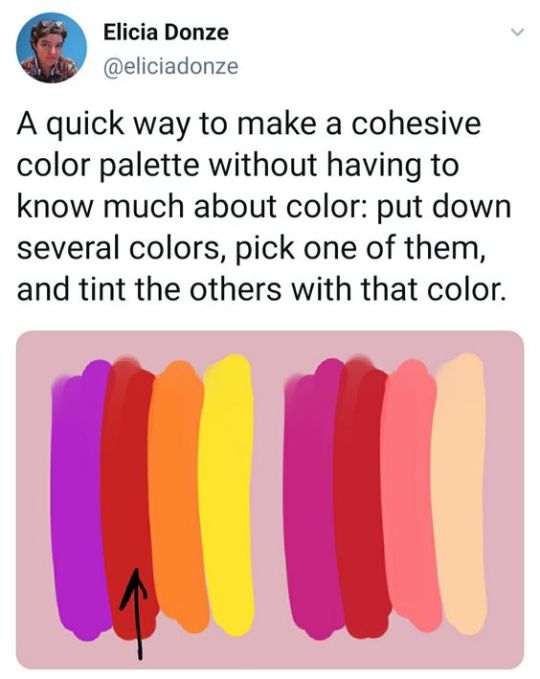
Palette tip form Elicia Donze
#art#color palette#how to create a palette#color inspiration#elicia donze#color theory#color design#palette building#palette design#color selection#art tip#art hack
338 notes
·
View notes
Text

"The Ultimate Guide to Choosing the Perfect Color Scheme for Your Living Room"
Introduction:
Choosing the perfect color scheme for your living room can be a daunting task. With so many options available, it's easy to feel overwhelmed and unsure of where to start. In this post, we'll provide you with a comprehensive guide to choosing the perfect color scheme for your living room, including tips, trends, and inspiration.
Understanding Color Theory
Before we dive into the specifics of choosing a color scheme, it's essential to understand the basics of color theory. Color theory is the study of how colors interact with each other and the way they affect our emotions and perceptions.
The 60-30-10 Rule One of the most popular and effective ways to choose a color scheme is to use the 60-30-10 rule. This rule suggests that 60% of the room should be a dominant color, 30% a secondary color, and 10% an accent color.
Popular Color Schemes Here are some popular color schemes that you might consider for your living room:
Monochromatic: A monochromatic color scheme features different shades of the same color.
Complementary: A complementary color scheme features colors that are opposite each other on the color wheel.
Analogous: An analogous color scheme features colors that are next to each other on the color wheel.
Tips for Choosing a Color Scheme
Here are some tips to keep in mind when choosing a color scheme for your living room:
Consider the natural light: The amount of natural light in your living room can greatly affect the way colors appear.
Think about the furniture and decor: The colors of your furniture and decor can also impact the overall color scheme of your living room.
Don't forget about the trim: The color of your trim can add a pop of color to your living room and create a cohesive look.
Color Scheme Inspiration
Here are some color schemes that might inspire you:
Coastal: Blues and whites, sandy neutrals, and coral accents.
Bohemian: Earthy tones, rich textiles, and bold patterns.
Modern: Bold and bright colors, clean lines, and minimal decor.
Conclusion:
Choosing the perfect color scheme for your living room can be a challenging task, but with the right guidance, you can create a space that reflects your personality and style. By understanding color theory, using the 60-30-10 rule, and considering popular color schemes and tips, you can create a beautiful and functional living room that you'll love spending time in.
Call-to-Action: Need help choosing a color scheme for your living room? Contact us today to schedule a consultation with one of our expert interior designers.
#design#fashion#home interior#interior design#interior decorating#decor#furniture#nivinterior#model designs#luxury designs#color selection
5 notes
·
View notes
Text

Eye of the tiger - cg photography
3 notes
·
View notes
Text


I am nothing if not predictable. Angels AU
Bonus memes...


#conclave#conclave 2024#thomas lawrence#vincent benitez#aldo bellini#goffredo tedesco#joseph tremblay#sister agnes#joshua adeyemi#ray o'malley#my art#The bird selections are based on the countries the characters are from and also vibes#I had a note app with my choices and then promptly forgot some of them and got punched in the face every time I read 'Tremblay Canada Goose#I don't know how ppl draw Conclave fanart I colored one (1) and immediately got eyestrain welp#Me: I hate Tedesco so much Also me: *colors only his drawing and did two more drawings/memes of him* 😂#I want to do another one with Pope!Benitez but here they are now
3K notes
·
View notes
Text
Choosing the Right Color for Window Shutters
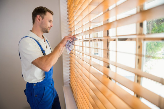
Selecting the perfect color for your window shutters in Vacaville, California is a decision that goes beyond aesthetics; it can significantly impact both the energy efficiency and visual appeal of your home. In this guide, we’ll explore the various aspects to consider when making this crucial choice. This strategic choice not only contributes to a more comfortable indoor environment but also promotes energy conservation.
Learn More: https://www.superdutyblinds.com/choosing-the-right-color-for-window-shutters
0 notes
Video
youtube
The only Color pallet generator you will ever need! Your Complete Guide ...
#youtube#Color#Color pallet#Color pallet generator#Colors#Color theory#Color selection#graphic design#graphic design tools#Graphic design resources#Color pallets#DesignPalette#Design resources#design thinking#design hacks
1 note
·
View note
Text

“Shen-shixiong, Yue-shixiong, that’s the one I was telling you about..”
“I see…”
“How interesting.”
[ID: Shen Jiu, Shen Yuan and Yue Qingyuan stand together looking at the viewer. Shen Jiu, on the left, holds up his fan to hide the lower half of his face, he looks vaguely interesting and disgusted as he peers over his fan at the viewer. Shen Yuan, in the middle, has an open mouthed smile, seemingly in the middle of talking to Shen Jiu and Yue Qingyuan. Yue Qingyuan, on the right, faces Shen Jiu and Shen Yuan and keeps a calm but strained smile while staring at the viewer from the corner of his eye. End ID.]
#svsss#shen qingqiu#shen jiu#shen yuan#yue qingyuan#they are judging you#hardcore judging#SY told them about how u were crushing on them#they are *not* inviting you to their secret rendezvous#L dance#my art#drivebypainter art#Also I hit 1K!!! I made this piece to celebrate that :)#I was also trying a new style of shading and coloring with this drawing#lots of selection and big brush painting lol#I hope the ID works btw- I’m not very good at it but I tried my best.
1K notes
·
View notes
Text
Brothers on their way to dance (´▽` )

#twst#twisted wonderland#silver vanrouge#malleus draconia#doodle#♦Anne⋆˙♦ draws#drawing#twst book 7 spoilers#These two look like brothers to me that got raised by Lillia#So am happy that they pretty much made up in the last chapter of the book#Anyways I still can't draw background I'm so sorry-#I just took the castle bg then selected its colors then randomly airbrushed LMAO
1K notes
·
View notes
Text


How to paint a platypus
(The cover for Sonic the Hedgehog: The IDW Collection vol. 5)
#Dr. Starline#IDW Sonic#I actually do the flat colors before the shading#but I only use them for selection until the shading is done
3K notes
·
View notes
Text

Sketched a little during dnd today
#I'm very rusty on paper but I do like color pencils a lot#it's basically the only way I draw on paper ever. A random selection of color pencils... or just a red pencil#red is so nice to draw with#the gaslight district#gaslight district#sketch tag#tgd mud#melancholy hill#tgd
408 notes
·
View notes
Text

posting a gift wip since I know my siblings aren't on here haha
#rug hooking#wip#purely personals#fabrication#older sis is getting a swan and bb sis is getting an otter#went out today and donated a bunch of yarn at an art supply swap thing#was nice that they had small amounts of yarn/not full skeins that other people donated#because I don't really need a whole ass skein especially if it's solid color#I just want bits and pieces so I can do stuff like the swan background#like this a lot more than latchhook; like latchhook would be pixel art and rug hooking is more like drawing/more freeform#oH it's also nice that all that yarn I prechopped for latchhook I can still use for rug hooking haha#also went to a fabric store and it was crammed full of stuff and the yarn selection was actually really nice#will def go back
8K notes
·
View notes
Note
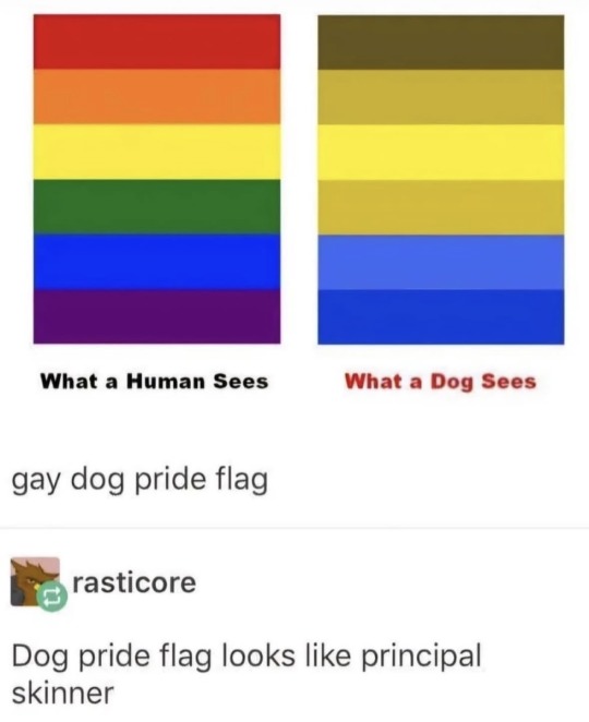
For your gay little dogs
.
#principal skinner pride flag for my gay little dogs#you see this is why my dog people need to see the same spectrum of colors we do#I feel like their literal world view would be drastically altered if they couldn't distinquish between orange and green#I'd argue that red is a significant color in practically every culture#it's instinctual associations with danger food and fertility make it attention grabbing on a visceral monkey brain level#I strongly suspect the impact would be at least somewhat negated if it was a muted brownish khaki instead#meaning it wouldn't be used in visual communication nearly as much#I would have to center my art and worldbuilding more around yellow and blue because those would be the colors the dogs would see clearly#right? is that sound logic?#and that would just make me immensely sad because warm colors are my favorites :<#answered#m0notropa-uniflora#something that continues to boggle my mind is that there are animals that see more colors than humans#we like to assume that our color vision is the best we can see it ALL look at that rainbow there that's the full set#yes primates are well equipped in this regard compared to many other mammals like dogs#but most birds for example have more color receptors in their eyes they have more tools to work with and their rainbow is even wider#it's like sound everyone knows we can't hear sounds that are impossibly low or too high#and we can't process wavelengths of light that are too long (infrared) or too short (ultraviolet)#only what lands between those bookends (called the visible spectrum) reads to our human eyes as “light” and subsequently “color”#I hope I've understood this correctly I'm trying to say that there's a whole layer of vision we don't have the hardware to get access to#and that's just wild to me like we are fundamentally unable to imagine a new color that isn't already included in our built-in selection#but they're definitely there the unimaginable colors are in the room with you and a common pigeon can see them#uv dlc not available for your system
588 notes
·
View notes
Text

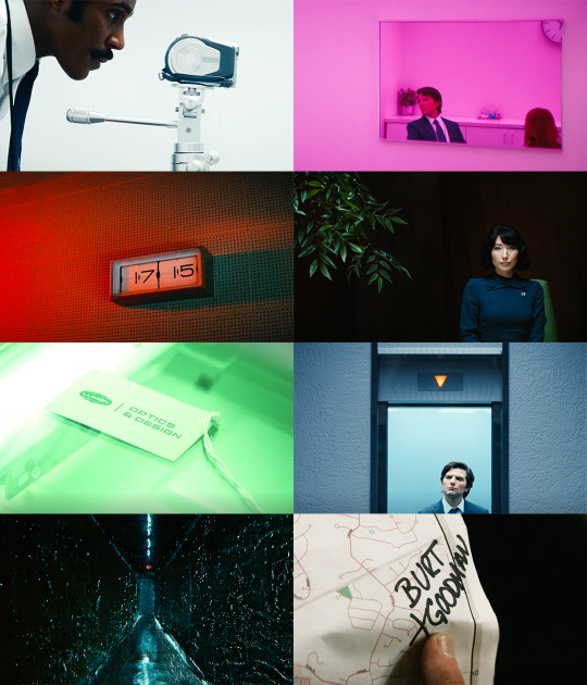
SEVERANCE: SEASON 1 I understand that you're unhappy with the life that you've been given. But you know what? Eventually, we all have to accept reality. I am a person. You are not. I make the decisions. You do not.
#severance#severanceedit#tvedit#britt lower#adam scott#zach cherry#tramell tillman#dichen lachman#o#o picspam#o severance#btw these are genuine colors from the show#of course i did add a bit of vibrance and/or played with selective colors#but no solid colors or anything#such a pretty show#ok apparently this is blurry as shit on mobile -_-#everybody please use desktop thanks bye
555 notes
·
View notes
Text
For me, choosing colors in art is always problematic🥲

Cosplayers: Nitsuke and Dazza.spider.noir ¿Swap cards? or ¿playing cards?


15 notes
·
View notes
Text
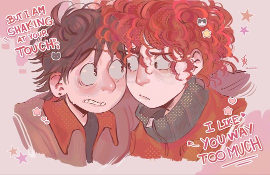
"You better not have drawn Stan and Kyle without hats with a pink color palette and with lyrics from a Weezer song"
me:
#fun fact: the collar of Kyle's coat is GREY. not green. 👍#color theory core#← as if I understood it myself#i was sleepy i had the color red selected and started cooking#by looking at this you may know I had a my little pony phase in my childhood#YES. KYLE LOOKS LIKE PINKIE PIE AND I LOVE THAT. YES#shout out who created the brush with stickers of kittens and cute stuff !! /vpos#my bf said that this drawing tasted like sugar. he's so real for that#especially cotton candy#and pink marshmallows :3#this may have errors bc I drew it by accident and at 2am#responsibilities becoming style drawings as usual LMAO#this song is so them in my au#and in canon WHO SAID THAT /hj#stan falling for kyle for the first time because of how PRETTY AND BEAUTIFUL his hair is#spoiler: he is too#bisexual#← too stupid to realize i hate him /aff#artists on tumblr#south park#stan marsh#kyle broflovski#south park stan#sp stan#south park kyle#sp kyle#south park style#sp style#weezer#my art :3 !!
967 notes
·
View notes
Text


gordandadan
#yup let my just smoosh my interests together yayaya#the intro has such good colors#I want to do more the problem is character selection#if I could animate this I would#half life#half life 2#hl#hl2#dandadan#alyx vance#gordon freeman#barney calhoun#Ough wait reminder Gordon in the Turbo Granny mode would be so cool#buh
605 notes
·
View notes