#colormeanings
Text

Scarves of Symbolism: Exploring Identity Through Colour
The symbolism of both the red and grey scarf on a man conveys layers of meaning, reflecting various aspects of his identity and character.
The red scarf may symbolize passion, vitality, and courage. It can represent warmth, energy, and a bold personality. Red is often associated with love, desire, and intensity, suggesting that the man may be passionate and deeply emotional. Additionally, red can signify power, strength, and leadership, indicating that the man may be assertive, ambitious, and influential in his endeavours.
On the other hand, the grey scarf may symbolize neutrality, sophistication, and subtlety. Grey is often associated with balance, stability, and practicality. It can represent maturity, wisdom, and composure, suggesting that the man may be calm, composed, and rational in his approach to life. Grey can also signify intelligence, professionalism, and sophistication, indicating that the man may have a refined taste and a discerning eye for detail.
Together, the combination of the red and grey scarves may suggest a complex individual who embodies both passion and pragmatism. He may possess a fiery spirit and drive, tempered by a sense of balance and practicality. The dual symbolism of the scarves reflects the multifaceted nature of human personality, highlighting the richness and depth of the man's character.
#ScarvesOfSymbolism#IdentityInColor#FashionSymbolism#RedScarf#GreyScarf#ColorMeanings#SymbolicFashion#PersonalStyle#bernardtschumi#daniellibeskind#londonschoolofarchitecture
#ScarvesOfSymbolism#IdentityInColor#FashionSymbolism#RedScarf#GreyScarf#ColorMeanings#SymbolicFashion#PersonalStyle#bernardtschumi#daniellibeskind#londonschoolofarchitecture#architecture#berlin#area#london#acme#chicago#puzzle#edwin lutyens#massimoscolari#oma#bernard tschumi#daniel libeskind
0 notes
Text
COLOR PHSYCOLOGY
#COLOR#ColorPsychology#EmotionalColors#ColorMeanings#PsychologyOfColor#ColorAndEmotions#ColorTheory#ImpactOfColors#ColorPerception#ColorInfluence#MindAndColors
1 note
·
View note
Text
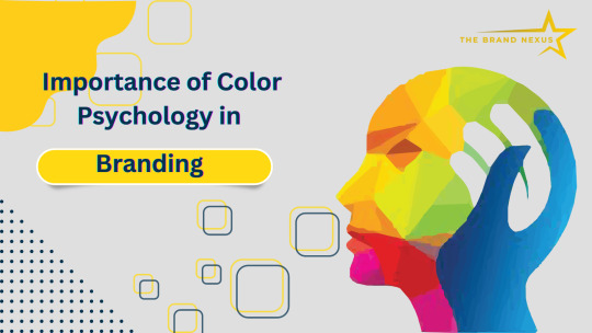
Importance of Color Psychology in Branding
Colour is an important aspect of marketing, particularly when establishing your company’s identity and logo. According to the Exciting Red and Competent Blue research, colour psychology in branding has a major impact on purchase intent because of the influence it has on a brand’s impression. since a result, it’s critical to select the proper branding colours that reflect your personality and behaviours, since this will have a significant influence on your small business.
Each colour reflects a particular personality element of the company, therefore choosing the proper branding colours that match your business type is crucial. The colour of your brand tells volumes about your marketing branding strategy, and it’s the first thing people see before they see your logo design or brand name. As a result, choosing the proper colours is vital to your success.
Colours are an important aspect of many of the world’s most well-known businesses’ visual identities and brand identification, including Cadbury, Virgin, and Starbucks. Specific colours spring to mind when you think of these companies. For example, it’s difficult to imagine Coca-Cola without thinking the swirling red logo, or McDonald’s without picturing the iconic yellow arches. This is why branding colour choices are important and have an impact on businesses.
Colours are a wonderful way to identify a brand and should be addressed early in the creative process. Bright colour combinations are regularly employed by brands to energise their target audience. Colours express emotions, sensations, and experiences, making them more than just a decorative element. Colours have connotations, and companies should be aware of this since picking a colour scheme may make or break them.
Why is Colour Psychology Important in Branding?
Color psychology is a field of psychology that explores the impact of colors on human behavior. It dates back to ancient times when Egyptians studied the effects of colors on mood and utilized them for holistic development. They associated red with increased circulation, yellow with body purification, blue with pain relief, purple with skin problems, orange with increased energy, and black with life and rebirth.
Swiss psychiatrist Carl Jung also believed in the special connection between colors and humans. He stated that “humans have a universal bodily response to color stimulus,” and added that “colors are the mother tongue of the subconscious.” This highlights the significant influence of colors on our psychological and emotional responses.
Colour Contrast Can Help With Recall
Entrepreneur explains that the Isolation Effect suggests that a product which is noticeably distinct is more likely to be memorable. This is the reason why brands use contrasting colors to their advantage. The Facebook logo, with its white and blue colors, and the purple and orange of FedEx are both examples of bold, contrasting colors that are immediately identifiable and easy to remember. It is important to ensure that your brand colors stand out and contrast against the background to help your advertisements stick in the minds of consumers long after they have moved on.
Colour may help you reach out to specific demographics.
According to Entrepreneur, studies have shown that color perception and preferences vary by gender. Men tend to favor strong, opaque, and solid colors, while women often prefer lighter shades that are less opaque and mixed with white. For example, if you are advertising a new coffee drink in a coffee shop, using bold colors in your marketing materials may appeal more to men and convey excitement about the beverage. Conversely, using softer hues that evoke a gentle morning wakefulness could be more effective when advertising the coffee shop’s latest breakfast sandwiches to women.
While many factors contribute to the effectiveness of an advertisement, color cannot be overlooked. Selecting the right hues for your ads can impact first impressions, recall, and even the demographics your ads reach.
Influence on conversions
Research has established a correlation between colors and conversion rates. In a conversion page study, two colors, green and red, were used to examine their impact on the outcome. Results showed that changing the button color to red led to a 21% increase in conversions, indicating that more people clicked on the red button than the green button. Since everything else on the pages was identical, the only difference was the color.
This highlights the significant influence of color on conversions. Specific colors may encourage action, so it is crucial to conduct various A/B tests before deciding on a particular color to represent your brand.
Branding is the art of effectively communicating the essence of your company, its products, and services to your employees and the world at large. It involves informing your current and potential customers, as well as your employees, about the nature of your business and what it stands for. This intricate process combines visual communication with behavior to create a public image that accurately represents who you are.
#ColorPsychology#BrandIdentity#BrandingStrategy#EmotionalConnection#ColorMeanings#BrandRecognition#VisualAppeal#BrandingSuccess#PsychologyOfColors#BrandPerception#ColorPalette#Brand
1 note
·
View note
Text
Color Trends
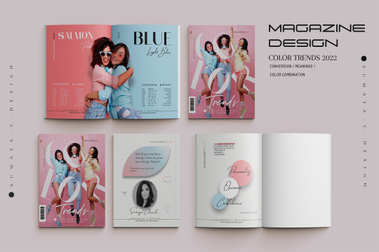
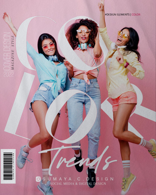
See the full post here
In this post you got :
👉Beautiful and Elegant Color scheme for your next project.
Color Palette ➕Hex Codes➕Color Names ➕ Color Meaning ➕ Color Variations ...
Would you use these TRENDY COLORS in your next Design
◼Let me know in the COMMENTS🗨
____________________
◼ For more content about Design & Color follow me
#sumayacdesign
#color#colori#colormeaning#colormeanings#colours#colorindesign#colourpsychology#pink#purple#whitepure#lavender#graphicdesigner#graphicdesign#elegantdesign#socialmediadesign#magazinedesign#digitaldesign#colorharmony#colorphilosophy#aestheticdesign#colorinspiration#colorinspirationoftheday#colorpalette#elegantcolors#magazine#coverdesign#grafico#fashion
1 note
·
View note
Text
How Colours Affect the Way You Think
How Colours Affect the Way You Think
Our world is awash with a rainbow of colours, but certain shades can have a surprising impact on our ability to concentrate, our mood and even the flavours we experience.
A strange trend began to spread through prisons in Europe and North America a few years ago. They started by giving some of their cells a pink colour. It spread to the point where, in 2014, at least one detention cell in each…
View On WordPress
0 notes
Text
I thought the same colormean the same taste.
Tangerines, oranges and the sun. Citrus.
When I saw my great-grandmother peel a tangerinewith her bare hands while men used knives for oranges, she became God.
I imagined what she could do with the sun.
Yasica
7 notes
·
View notes
Photo
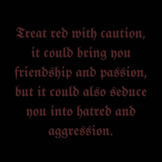
𝕿𝖗𝖊𝖆𝖙 𝖗𝖊𝖉 𝖜𝖎𝖙𝖍 𝖈𝖆𝖚𝖙𝖎𝖔𝖓, 𝖎𝖙 𝖈𝖔𝖚𝖑𝖉 𝖇𝖗𝖎𝖓𝖌 𝖞𝖔𝖚 𝖋𝖗𝖎𝖊𝖓𝖉𝖘𝖍𝖎𝖕 𝖆𝖓𝖉 𝖕𝖆𝖘𝖘𝖎𝖔𝖓, 𝖇𝖚𝖙 𝖎𝖙 𝖈𝖔𝖚𝖑𝖉 𝖆𝖑𝖘𝖔 𝖘𝖊𝖉𝖚𝖈𝖊 𝖞𝖔𝖚 𝖎𝖓𝖙𝖔 𝖍𝖆𝖙𝖗𝖊𝖉 𝖆𝖓𝖉 𝖆𝖌𝖌𝖗𝖊𝖘𝖘𝖎𝖔𝖓. #caution #red #aggressivecolor #aggressive #seduce #colormeaning #hate #redseduction #hatred #colours #colour #friendship #colourmeanings #colormeanings #aggression #redmeaning #passion #color #warning #colors_of_day #colourmeaning #quotesforyou #dailythoughts https://www.instagram.com/p/CHIuW4tHEBu/?igshid=1j2tyjxdjp994
#caution#red#aggressivecolor#aggressive#seduce#colormeaning#hate#redseduction#hatred#colours#colour#friendship#colourmeanings#colormeanings#aggression#redmeaning#passion#color#warning#colors_of_day#colourmeaning#quotesforyou#dailythoughts
0 notes
Photo
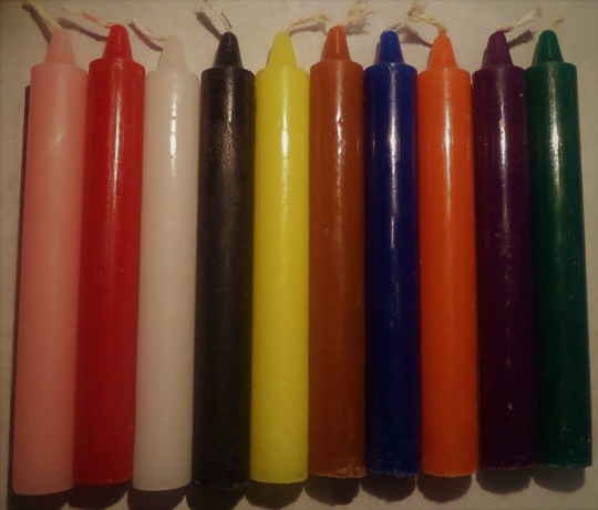
Candle colours in spells:
Pink- self-love, forgiveness, emotional well-being, attract love of others and compassion.
Red- sex, love, power and vitality.
White- spiritual growth, new beginnings, Lunar or Goddess work ( the only type of candle that can be used instead of another candle colour when unavailable).
Black- ending, banishing, absorb negativity and break a bad habit, protective spells.
Yellow- Air element, represents mind, success in learning, communication in relationships, increases focus and intuition.
Brown- grounding, emotional stability, building trust.
Blue- Water element, piece and patience, emotional healing, truth and justice, can help awaken and heal psychic mind.
Orange- ambition, creativity and individuality.
Purple- colour of magic (represents the fifth element Spirit), divination, astral travel, spiritual connection.
Green- money, growth and healing.
You can read more on:
https://www.groveandgrotto.com/blogs/articles/34808449-candle-colors-and-their-meanings
#candle#candlecolours#candlecolors#colourmeanings#colormeanings#babywitch#babywitchtip#babywitchtips
0 notes
Photo
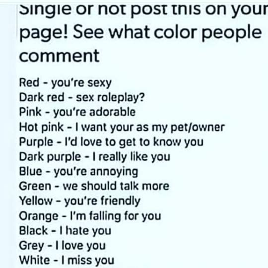
#colormeanings Well let's see if you do the same guys!!😊😊😊 :3 :3 :3 https://www.instagram.com/p/B1d4ibFACz4/?igshid=1j1zqs8ks68sa
0 notes
Photo
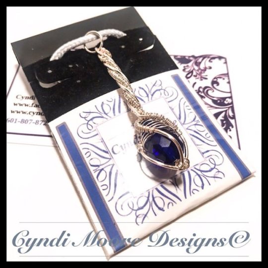
Fun silver and crystal wire-work crystal wand necklaces. Blue is the cool color of water symbolizing peace, truth, communication, and tranquility. It is soothing and represents trust and harmony. It is associated with the 5th Chakra - the throat. It affects the mouth, throat, thyroid, and parathyroid glands. Physical uses of blue include relieving headaches, migraines, earaches, and sore throats. I have 6 colors right now and will be making more in other color crystals as well as metals. This and more @cyndimooredesigns . . . #boholife #bohochicjewelry #freespirit #gypsylife #gypsysoul #wirejewelry #wirewrappedjewelry #colormeanings #colortherapy #metaphysicaljewelry #metaphysicalhealing #spiritjewelry #craftwork #craftworkings #spellwork #colormagic #silverhealing #bluecrystal #thecolorblue #coolcolor #vishuddha #fifthchakra #throatchakra #throatchakrahealing #crystalwand #crystalscepter #artisanjewelry #handmadejewelrydesign #cyndimooredesigns https://www.instagram.com/p/ByyTRmQh-U9/?igshid=3t9cxl2c5poa
#boholife#bohochicjewelry#freespirit#gypsylife#gypsysoul#wirejewelry#wirewrappedjewelry#colormeanings#colortherapy#metaphysicaljewelry#metaphysicalhealing#spiritjewelry#craftwork#craftworkings#spellwork#colormagic#silverhealing#bluecrystal#thecolorblue#coolcolor#vishuddha#fifthchakra#throatchakra#throatchakrahealing#crystalwand#crystalscepter#artisanjewelry#handmadejewelrydesign#cyndimooredesigns
0 notes
Text
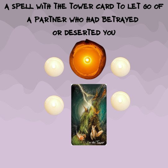
A Spell With The Tower Major Arcana Card
A Spell With The Tower Major Arcana Card
The Tower Card
The Light Seers Tower
Shifts, Endings, New Beginnings
A Tower of Freedom Card Spell Ritual If You Can’t Let Go of a Loved One Who Has Deserted Or Betrayed You
The above is a chart of magickal correspondences for The Tower Card.
This spell is taken from 1001 Spells by Cassandra Eason
What You’ll Need:
The Tower Card (Representing freedom from restrictions but not without…
View On WordPress
#magickspells tarotreader tarotonline tarotcommunity spellcraft witchessociety wicca Jesus witchery religion tarotcard witches s#tarot colibritarot lavender strength colormeaning magick spells wiccansofinstagram wicca tarotcards tarotreading#tarotonline tarotreadings magickspells tarotreader tarotonline tarotcommunity spellcraft witchessociety wicca Jesus witchery rel#heartbreak#let go of a relationship#let go of past boyfriend#magick#overcome heartbreak#tarotreading#the tower card
8 notes
·
View notes
Photo

Orange, the blend of red and yellow, is a mixture of the energy associated with red and the happiness associated with yellow. Orange is associated with meanings of joy, warmth, heat, sunshine, enthusiasm, creativity, success, encouragement, change, determination, health, stimulation, happiness, fun, enjoyment, balance, sexuality, freedom, expression, and fascination. Orange is the color of joy and creativity. Orange promotes a sense of general wellness and emotional energy that should be shared, such as compassion, passion, and warmth. Orange will help a person recover from disappointments, a wounded heart, or a blow to one’s pride. The meaning of the color orange is stimulating, vibrant, and flamboyant. While made up of red and yellow, it carries less aggression and fierceness than the color red due to its combination with the calming color yellow. Studies show that the orange color can create physical effects such as increased hunger, heightened sense of activity, increased socialization, boost in aspiration, stimulated mental activity, increased oxygen supply to the brain, increased contentment, and enhanced assurance. Orange also helps aid decision making, and enhances happiness, confidence, and understanding. The color orange is a very hot color and often provides the sensation of heat. While orange is a common color associated with summer and the hot sun often associated with being a main color of harvest and autumn due to the changing color of the leaves and pumpkins. While orange does stimulate the appetite, it is a common color found in citrus fruit and is often associated with Vitamin C and a healthy diet. Orange is a popular color in restaurants to encourage the feeling of hunger and contentment. The color orange has very high visibility and is often used to gain attention. It still gets your message noticed without the bold, in-your-face presence that the color red has. Too much orange causes self-centered and self-serving qualities, including pride, arrogance, and lack of care for others. Too little orange causes loss of motivation, lower self-esteem, and loneliness.
3 notes
·
View notes
Photo
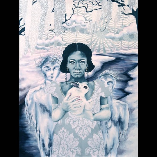
I'm working on a series where each piece represents the symbolic meaning and psychological connotations of a specific color, combining symbolism from different cultures across all regions of the world. This one I just finished is for white. Depending where you are, white can symbolise new beginnings and a clean slate, or endings and mourning making it very much a bookend sort of color. It symbolizes traits that are considered more docile like purity, innocence and virtue, but also more courageous sentiments like protection and sacrifice. White is also a color that across cultures is often associated with femininity. #art #white #whiterabbit #colorpsychology #colormeaning #symbolism #surreal #icepeople #snow #winter #damask #pearl #prismacolorpencils #mixedmedia #watercolor #patterns #blossomingtree #blackandwhite https://www.instagram.com/p/BvHSQY5BFwp/?utm_source=ig_tumblr_share&igshid=jf1e1xggs1nr
#art#white#whiterabbit#colorpsychology#colormeaning#symbolism#surreal#icepeople#snow#winter#damask#pearl#prismacolorpencils#mixedmedia#watercolor#patterns#blossomingtree#blackandwhite
1 note
·
View note
Text
#graphicdesigner#color#colorharmony#colorindesign#colori#designergrafico#colourpsychology#creativebusiness#colours#colormeaning
2 notes
·
View notes
Photo
The color of peacefulness PEACH SUNSHINE • Peace of mind is light blue and sunset yellow • Peace signs are red, purple, orange, yellow, green and chartreuse • Peace and quiet is midnight blue • Peace time is yellow and gray • Peace and harmony is off white • War and peace is a dark black gradient into a light gray and on rare occasion an off white • Peaceful resolution is the color of a sunny day with the chance of dark clouds and showers later in the week • Peace within is the same as peace of mind (#1) but more vivid • Living in peace is a tentative sky blue that can change to a stormy black in a moments notice • Rest in peace starts off as bright white, fading into a light grey and dropping off to black • Peace is the color of a yellow-orange sunset reflecting off a calm body of water Everyone sees colors through their OPP (own personal prism). While we’re alive, nothing is ever one color very long, but an ever changing combination of colors which can be similar, but is usually different for all of us. #awakening #peaceofmind #peacefullness #colormeaning #peace #prism #sky (at Oakville, Ontario) https://www.instagram.com/p/BsdG_xpFPbR/?utm_source=ig_tumblr_share&igshid=1qi8fei8zbr6j
1 note
·
View note
Photo
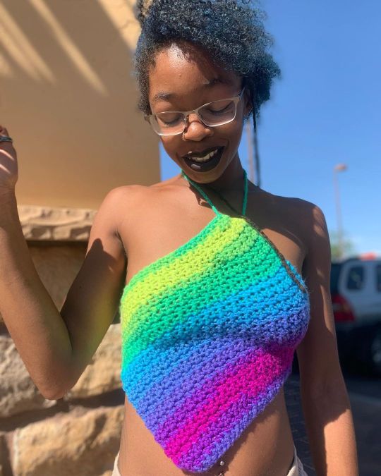
A close up ⬆️ ! These colors are amazing together 😍 Someone wearing these colors gives off friendly, comfortable and happy vibez🎉. Don’t forget to shop today, link in bio💙 . . . . . . . . . . . . . . . . . . . . . . . #kardashiantop #crochettop #crochetersofyoutube #handmadetop #handmadehippie #rainbowlove #rainbowbaby #colorstreet #colorpsychology #colormeaning #vegasfashionblogger #slowfashion #smallbusinesswomen #smallbusinesscheck #summeroutfitinspo #summerfashion2021 #hotgirlshit #simplicity #comfyclothing #casualoutfit #casualfashion #dressmeup #peacockcolors #colourfulcrochetvibez #explorerpage #colourfulvibez (at Sofrito Rico Authentic Puerto Rican Cuisine) https://www.instagram.com/p/CS0FagNpqcO/?utm_medium=tumblr
#kardashiantop#crochettop#crochetersofyoutube#handmadetop#handmadehippie#rainbowlove#rainbowbaby#colorstreet#colorpsychology#colormeaning#vegasfashionblogger#slowfashion#smallbusinesswomen#smallbusinesscheck#summeroutfitinspo#summerfashion2021#hotgirlshit#simplicity#comfyclothing#casualoutfit#casualfashion#dressmeup#peacockcolors#colourfulcrochetvibez#explorerpage#colourfulvibez
0 notes
Last Seen Blogs


zeldatale-comic
ZeldaTale Comic

larae216
Hello world im a mf maniac back2business IM BACKKK

mevanne
Liquor Liquor Lips