#conversion of flash to html5
Explore tagged Tumblr posts
Visit Tumblr Blog
Explore Tumblr blogs with no restrictions, modern design and the best experience.
Last Seen Tumblr Blogs


Fun Fact
The Tumblr app for Google Glass was released on May 16, 2013.
Text
The emergence of HTML5 has changed the perspective of web development. The new technology supports devices and platforms and is greatly accessible. Now, time is rife for businesses whose websites are still Flash-oriented to overhaul them. Therefore, Flash To HTML5 Conversion Services are the need of the hour.
0 notes
Text
Flash Was Killed Because It Was Objectively Dangerous
I get it, I get the Flash nostalgia and the fondness for old Flash games. I was big on Neopets before they decided to ruin the art and make all the pets samey paper dolls to play dressup with (completely ruining the point of the far more expensive "redraw" colors like Mutant and Faerie and Desert). I have fond memories of Newgrounds games and I even managed to take a class for a semester in high school where I could learn flash.
But I also remember how terrible it was. And you should too.
Leaving aside all of the issues involving performance and inaccessibility (such as being easily broken by bog-standard browser actions like the back button, and its ability to modify web code AND OS code in real time likely broke a lot of accessibility tech too), Flash was legitimately one of the most dangerous web technologies for the end user. An end-user is you, or more specifically back then, child-you.
According to Wikipedia and its sources, Flash Player has over a thousand vulnerabilities known and listed and over 800 of these lead to arbitrary code execution.
What is arbitrary code execution? That's when someone can just run any commands they want on a machine or program that didn't intend it. A fun way to see this is in this infamous Pokemon tool-assisted speedrun where they manage to get an SNES to show the host's twitch chat in real time. It's not so fun though when it's someone stealing all the files on your computer, grabbing your credentials so they could clean out your Neopets account (yes, really, it was a pretty common concern at the time), and other nefarious works. Also, there was a time where it allowed people to spy on you with your webcam and microphone.
Oh and on top of all of this, Flash had its own "flash cookies", which could not be cleared by ordinary means and thus could be used to track users indefinitely, at least until Adobe slapped a bandaid over it by introducing yet another screen an ordinary person wouldn't know to use. (I assume this is how the infamous neopets "cookie grabbers" worked, so they could get into your account. This is mainly what I remember about using Flash back in the early 2000s lol) So it not only was a "stranger taking over your machine" concern, but a bog-standard privacy concern too, arguably a precursor to our current panopticon internet landscape, where greedy websites would track you because they could and maybe get some money out of it, facilitated by this technology.
When Apple decided to block it, it wasn't out of greed; Steve Jobs cited its abysmal performance and security record, among other issues such as an inherent lack of touchscreen support, and Apple cited specific vulnerability use-cases when blocking specific versions before they nuked it entirely. When Mozilla, who makes Firefox, decided to block it, it's not like they would've gotten money out of doing so, or by offering an alternative; they did so because it is fucking dangerous.
Your ire and nostalgia is misplaced. Flash was not killed by our current shitty web practices that ruin unique spaces and fun games. Flash was killed because both Macromedia (its original developers) and Adobe were incapable of making it safe, if that was even possible, and it was killed after third-parties, in an unprecedented gesture, collectively threw their hands up and said enough.
Well, that and HTML5 being developed and becoming more widespread, being able to do everything Flash can do without being a pox on technology. One could argue that you should bemoan the lack of Flash-to-HTML5 conversion efforts, but that requires asking a lot of effort of people who would have to do that shit for free...and if they have to run Flash to do so, opening themselves up to some of the nastiest exploits on the internet.
Nostalgia is a fucking liar. The games themselves I think are worth having nostalgia over (look, I still find myself pining for that one bullet hell Neopets made and Hannah and the Pirate Caves), but Flash itself deserves none of that, and absolutely deserved to be put in the fucking ground. You're blaming the wrong causes. It was terrible.
(specifics and sources found via its wikipedia page, which has a lot more than is mentioned here. and also my own opinions and experiences back then. lol)
#flash#nostalgia really is a liar#don't trust it#technology#yet another instance of my unfettered autism#adobe flash#macromedia flash#the old web#I was there gandalf three thousand years ago lmao#personal context: I am now a software QA that tests web apps#and when I was a child I was absolutely a neopets addict and am on Subeta TO THIS DAY#I learned HTML and CSS when I was 12#largely to spruce up my Neopets profile#I have been on the internet A While now#(I understand how ironic it is given that my tumblr layout is kind of shit; I will fix it soon)
20 notes
·
View notes
Text
top five plugins for converting PDFs into interactive flipbooks
1. Flipbook
Flipbook is a powerful and widely-used WordPress plugin to create stunning interactive flipbooks from PDFs or images.
Key Features:
Converts PDFs into realistic flipbooks with page-flipping effects.
Supports responsive designs for mobile, tablet, and desktop devices.
Customizable themes and interactive elements like zoom, navigation, and annotations.
Easy integration via shortcodes.
Why Flipbook?: Its simplicity, rich feature set, and seamless integration make it a top choice for creating engaging flipbooks.
2. Real3D Flipbook
Real3D Flipbook is a versatile plugin that creates interactive 3D flipbooks.
Key Features:
Converts PDFs and images into realistic 3D flipbooks.
Fully responsive and works on all devices.
Supports lightbox and fullscreen modes.
Customizable design options for branding.
Best For: Users who want an immersive, 3D flipbook experience.
3. dFlip
dFlip is a lightweight plugin that focuses on creating simple yet visually appealing flipbooks.
Key Features:
Realistic 3D flipbook effects.
Easy-to-use shortcode generator for embedding flipbooks.
Mobile-friendly and responsive.
Supports single and double-page views.
Best For: Quick and easy PDF-to-flipbook conversion.
4. Flip PDF Pro
Flip PDF Pro is a feature-rich plugin designed for advanced flipbook creation.
Key Features:
Converts PDFs into flipbooks with multimedia elements like videos and links.
Supports both HTML5 and Flash formats.
Customizable templates and themes.
Integration with e-commerce platforms for digital product sales.
Best For: E-commerce and marketing-focused flipbooks.
5. Issuu Embed Plugin
Issuu Embed Plugin connects your WordPress site with the Issuu platform to showcase flipbooks.
Key Features:
Embeds flipbooks hosted on Issuu directly into WordPress posts or pages.
Customizable viewer options, including fullscreen mode.
Provides analytics for flipbook engagement.
Best For: Publishing professionals with existing Issuu accounts.
0 notes
Text
Flash to HTML5 Conversion Company | Apex Solutions
Upgrade digital content with a flash to html5 conversion company offering professional flash to html5 conversion solutions.
0 notes
Text
Custom eLearning Solutions for Effective Learning and Development

Custom eLearning solutions design interactive, engaging courses tailored to meet your specific training needs at competitive prices.
Our eLearning Solutions:
Rapid eLearning
Blended Learning
Legacy Content Conversion
Translation & Localization
Learning Management System (LMS)
Human Resource Management System (HRMS)
What is Custom eLearning?
Custom eLearning provides personalized online courses that cater to the unique needs of learners and organizations. Our goal is to enhance training effectiveness and maximize return on investment (ROI).
The transition from ILT/VILT to eLearning: Convert classroom-based training into SCORM and HTML5 content for interactive, accessible learning.
Microlearning Solutions: Bite-sized modules designed for on-the-go learning to improve quick knowledge retention.
Game-Based Learning Solutions: Engage learners through interactive, game-based learning strategies for effective knowledge transfer.
eLearning Content Development
We offer tailored learning experiences designed to meet specific objectives and learner needs.
Rapid eLearning: Quick, efficient course development using rapid authoring tools.
Blended Learning: Seamlessly integrates in-person and online learning for a balanced training approach.
Custom eLearning Samples
Explore our diverse range of custom eLearning solutions that enhance employee skills through interactive modules and simulations.
Content Conversion Solutions
Legacy Content Conversion: Modernize outdated materials into digital formats.
Flash to HTML5: Upgrade Flash-based courses for compatibility with modern standards.
PPT to eLearning: Turn PowerPoint presentations into engaging eLearning content.
ILT to eLearning Conversion: Transform traditional training materials into dynamic eLearning courses.
Translation & Localization Solutions
Our translation services convert eLearning content into various languages, while localization adapts it to fit specific cultural contexts.
eLearning Translation Services: Convert text, images, audio, and video for multilingual learners.
Multimedia Localization: Adapt multimedia elements like graphics, animations, and more for different audiences.
Our Approach
Storyboarding: Visualizing the course structure for better clarity.
Multimedia-Rich Content: Enhance engagement with videos, animations, and infographics.
Personalization: Tailored learning experiences to match individual needs.
Scenario-Based & Gamified Learning: Real-life challenges and gamification drive deeper understanding and motivation.
Compliances and Standards
We ensure compatibility with eLearning standards such as SCORM, xAPI, and HTML5, as well as mobile responsiveness across devices. We also utilize cutting-edge technologies like AI, VR, and AR to enhance learner engagement.
Custom vs. Off-the-Shelf eLearning
Custom eLearning: Tailored to your specific organizational needs, goals, and brand identity.
Off-the-Shelf Courses: Standardized solutions for quick deployment and cost-efficiency.
Elevate Your Training
We specialize in training for:
Onboarding
Safety & Compliance
Sales & Product Knowledge
Leadership & Soft Skills
Industries We Serve
Our eLearning solutions cater to diverse industries, including corporate organizations, educational institutions, healthcare, and government.
eLearning Authoring Tools
We use industry-leading tools like Articulate Storyline, Adobe Captivate, and Camtasia to deliver high-quality, custom eLearning content.
What Our Clients Say
“Swift provided excellent support in developing our online course. Delivered on time and within budget, the course is now widely used and highly effective.”— Mark Cozens, Principal Veterinary Officer
Please send us your requirements at:[email protected]://www.swiftelearningservices.com/contact-us/
FAQs
Why choose custom eLearning?
Custom eLearning offers flexibility, and enhanced engagement, and aligns closely with your goals.
What does it cost?
Costs typically range from $2000 to $8000, depending on the complexity and customization required.
How long does it take?
Custom eLearning content development generally takes 3 to 5 weeks per hour of content.
Can you customize eLearning content to reflect our brand?
Yes, we tailor all content to align with your company’s branding and values for a consistent learning experience.
#custom eLearning solutions#customs eLearning#custom eLearning development#eLearning development#custom eLearning content#bespoke eLearning#custom eLearning services#custom eLearning content development#custom eLearning design#customized eLearning#eLearning solutions
1 note
·
View note
Text

🚀 Make Your eLearning Content Compatible with All Devices! 🌐 Brilliant Teams ensures the compatibility of your eLearning content with our Flash to HTML5 conversion services. Upgrade today to enhance accessibility for all learners!
#Accessibility#eLearning#FlashToHTML5#LearningManagementSystem#eLearningSolutions#SeamlessLearning#InnovativeLMS#EducationTechnology#UserFriendlyLMS#ContentUpgrade#InclusiveLearning
0 notes
Text
Unveiling the Web Development Dilemma: Solutions from Kolkata's Premier Company
In web development, recurring pain points have plagued businesses. One common issue is the lack of clear project scopes, leading to misunderstandings and delays. For instance, a client might request a "simple" e-commerce site without specifying essential features like payment gateways or inventory management, causing frustration during development.
Another hurdle is outdated technology. Many websites still rely on legacy systems prone to security breaches and poor performance. For instance, using Flash for animations may hinder site accessibility and SEO, turning away potential visitors.
Furthermore, the absence of responsive design is a significant concern. With the rise of mobile browsing, websites must adapt seamlessly to various devices. Failure to do so results in a subpar user experience, deterring engagement and harming brand reputation.
To overcome these challenges, robust project management tools like Trello or Asana streamline communication and ensure everyone's on the same page. Clear, detailed documentation, including wireframes and mockups, helps align client expectations and avoid scope creep.
Embracing modern technologies such as HTML5 and CSS3 enhances website security and performance. Integrating responsive design frameworks like Bootstrap or Foundation ensures optimal viewing experiences across devices, maximizing engagement and conversions.
By partnering with a leading website development company in Kolkata, businesses gain access to expertise and tailored solutions. With a focus on clear communication, cutting-edge technologies, and user-centric design, such a company empowers businesses to thrive in the digital landscape.

#website development company in Kolkata#website development company#website development#website#web development company#like#share
0 notes
Text
⚡➡�� 𝗙𝗿𝗼𝗺 𝗙𝗹𝗮𝘀𝗵 𝘁𝗼 𝗛𝗧𝗠𝗟𝟱: 𝗘𝘀𝘀𝗲𝗻𝘁𝗶𝗮𝗹 𝗔𝗻𝘀𝘄𝗲𝗿𝘀 𝘁𝗼 𝗬𝗼𝘂𝗿 𝗤𝘂𝗲𝘀𝘁𝗶𝗼𝗻𝘀 ❓📝
🌐 Discover the seamless shift from Flash to HTML5! 🎯 Unlock enhanced user experiences, improved performance, and future-proof your web presence. Dive into our guide answering your top 5 conversion questions. Let's embark on this journey together, transforming your online experience! 💻
🔗 𝙍𝙚𝙖𝙙 𝙩𝙝𝙚 𝙛𝙪𝙡𝙡 𝙖𝙧𝙩𝙞𝙘𝙡𝙚 𝙪𝙨𝙞𝙣𝙜 𝙩𝙝𝙚 𝙗𝙚𝙡𝙤𝙬 𝙡𝙞𝙣𝙠! https://www.swiftelearningservices.com/flash-to-html5/
👉 𝙑𝙞𝙨𝙞𝙩 𝙤𝙪𝙧 𝙬𝙚𝙗𝙨𝙞𝙩𝙚 𝙛𝙤𝙧 𝙢𝙤𝙧𝙚 𝙞𝙣𝙨𝙞𝙜𝙝𝙩𝙨: https://www.swiftelearningservices.com/
0 notes
Text
Five plugins for converting PDFs into interactive flipbooks
Here are the top five plugins for converting PDFs into interactive flipbooks, with Flipbook given top priority:
1. Flipbook
Flipbook is a powerful and widely-used WordPress plugin to create stunning interactive flipbooks from PDFs or images.
Key Features:
Converts PDFs into realistic flipbooks with page-flipping effects.
Supports responsive designs for mobile, tablet, and desktop devices.
Customizable themes and interactive elements like zoom, navigation, and annotations.
Easy integration via shortcodes.
Why Flipbook?: Its simplicity, rich feature set, and seamless integration make it a top choice for creating engaging flipbooks.
2. Real3D Flipbook
Real3D Flipbook is a versatile plugin that creates interactive 3D flipbooks.
Key Features:
Converts PDFs and images into realistic 3D flipbooks.
Fully responsive and works on all devices.
Supports lightbox and fullscreen modes.
Customizable design options for branding.
Best For: Users who want an immersive, 3D flipbook experience.
3. dFlip
dFlip is a lightweight plugin that focuses on creating simple yet visually appealing flipbooks.
Key Features:
Realistic 3D flipbook effects.
Easy-to-use shortcode generator for embedding flipbooks.
Mobile-friendly and responsive.
Supports single and double-page views.
Best For: Quick and easy PDF-to-flipbook conversion.
4. Flip PDF Pro
Flip PDF Pro is a feature-rich plugin designed for advanced flipbook creation.
Key Features:
Converts PDFs into flipbooks with multimedia elements like videos and links.
Supports both HTML5 and Flash formats.
Customizable templates and themes.
Integration with e-commerce platforms for digital product sales.
Best For: E-commerce and marketing-focused flipbooks.
5. Issuu Embed Plugin
Issuu Embed Plugin connects your WordPress site with the Issuu platform to showcase flipbooks.
Key Features:
Embeds flipbooks hosted on Issuu directly into WordPress posts or pages.
Customizable viewer options, including fullscreen mode.
Provides analytics for flipbook engagement.
Best For: Publishing professionals with existing Issuu accounts.
Conclusion
For the best overall experience, Flipbook is the top choice due to its balance of ease of use, responsive design, and customization options. For users seeking advanced features like 3D effects or e-commerce integration, Real3D Flipbook and Flip PDF Pro are excellent alternatives.
0 notes
Text
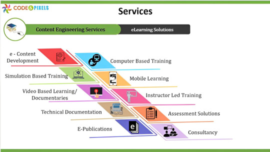
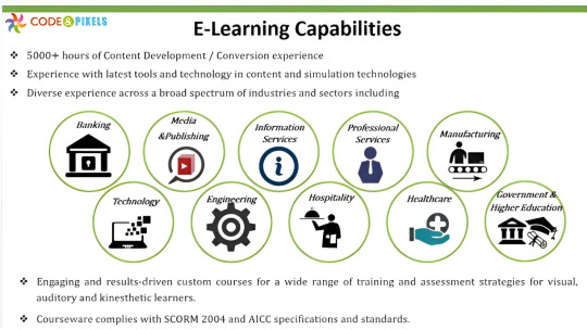
E-learning content Development Company in Hyderabad Code and Pixels
E-Content development
At Code and Pixels, we believe that great training begins with great content.
Code and Pixels provides customised and current learning content that makes you stay competitive — right from knowledge transfer of company processes and systems to product information. Such technically heavy and complex content becomes a challenge for the trainer to deliver and difficult for end users to consume in conventional training formats. Hence,
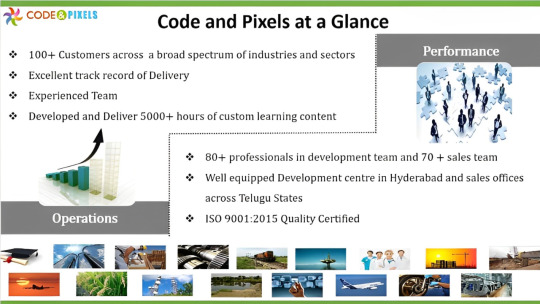
We develop custom E-learning content which is:
Sound using instructional design principles and pedagogy
Compliant with international E-learning standards
A combination of multiple media — games, quizzes, tests, simulations, video, animation, audio and graphics.
Compatible and runs on any standard Learning Management System (LMS)
Highly interactive and enables tracking and scoring of each learner’s progress
Multilingual
We employ a multitude of technologies and tools like graphics, animations, audio-visuals, interactive games and activities that help in giving the right information in the right manner to the right audience.
Mobile Learning/HTML 5
We are living in a multi-device world. We now have options to deliver eLearning using a wide variety of devices such as desktops, laptops, tablets and smart phones. Whether it is for smart phones or tablets — using platforms like Android, BlackBerry or iOS– we develop any kind of solution which suits your mobile learning needs perfectly.
What Is HTML5?
HTML5 is the newest hyper text markup language for websites from the World Wide Web Consortium (W3C). The first draft was made public in 2008, but not much happened until 2011. In 2011, HTML5 was released and people started writing about it and using it, but the support in different browsers was still poor. Today all major browsers (Chrome, Safari, Firefox, Opera, IE) offer HTML5 support, therefore the newest HTML technology can be used at its best today.
Major browsers
IE9+, FF4+, Safari5+, Opera11+, Chrome10+, Blackberry Browser, Silk
Platforms
iOS, Android, ChromeOS, BlackberryOS, Symbian, Windows Mobile 7.5+
Libraries
Webkit (Google, Apple, etc.), Gecko (Mozilla), Trident (Microsoft), Presto (Opera)
A reality indeed. As HTML5’s impact continues to ripple, many companies are dealing with the necessity of abandoning Flash applications. HTML5 is more flexible, allows movement, doesn’t affect SEO and doesn’t need a plug-in.
The migration of Flash eLearning courses to HTML5
eLearning, Training, Media organizations andmarketing departments of all kinds of companies have huge volumes of Interactive Flash content that has traditionally been consumed on desktops. With the rapid proliferation of smart phones and tablets, enterprises are faced with the prospect of their existing content becoming obsolete, since popular mobile platforms don’t support Interactive Flash.
While new content can be developed on a platform an industry standard format like HTML5, ground-up redevelopment of existing Interactive Flash content for mobile devices is not an option for most enterprises. What they need is a high-quality yet rapid solution for migrating their legacy of Interactive Flash content to HTML5.
Flash to HTML5 Migration
We shall take your existing Interactive Flash content and use the Flash to HTML Framework to re-purpose it to make it usable and HTML5 content that is suitable for a variety of devices including desktops, smart phones & tablets.
Powered by HTML5, CSS3 and JavaScript, our Flash to HTML5 framework enables us to accelerate speed-to-market for the new HTML5 content while preserving the richness of the original Flash content.
The new HTML5 content is able to fulfill the greater demands on usability posed by the varying screen sizes and resolutions of mobile devices. Recognizing that mobile devices don’t always have the same processing horsepower of desktops, our migration/conversion process leverages our framework to ensure that the repurposed HTML5 can perform on the most popular mobile platforms.
The framework adheres to content standards and supports various fundamental interactive behaviors like programmed workflows, directional information, enhanced content Menus, Multimedia Content Delivering, 2D Animations, Voice Synchronization, Interactivity, Status Bar, Volume Controllers, Slide Bar, Bookmark, Search, Standard navigation features i.e. Next, Previous, Menu amongst several others
With mobile devices being used and preferred for numerous multimedia applications, we shouldn’t forget something that Apple first pointed out. Flash does use too much processing and battery power; something that makes it disadvantageous. So migration to HTML becomes unavoidable.
In a continuously changing and fast paced environment, we can’t chain users to their desks and offices. So the creation of HTML5 eLearning applications, training material, presentations etc. or the conversion of Flash to HTML for mobile devices has become inevitable.
#E-learning#E-learning software#E-learning standards#Learning Management System#eLearning applications#ietm#ietm code and pixels ietm hyderabad#code and pixels#ietm developement#ietm level iv#elearning#ietm software#ietm level 4#technology#software#paradisosolution#mmgen2
1 note
·
View note
Text
“The Dos and Don’ts of Responsive Website Design”
In today's digital age, having a responsive website design is crucial for businesses to succeed online. A responsive website adapts to various screen sizes and devices, ensuring a consistent user experience. Whether you are a seasoned web designer or just starting out, it is critical to grasp the dos and don'ts of responsive website design. In this post, we'll look at the essential ideas and best practices for creating an effective and user-friendly responsive website.
1. Introduction
In this digital age, where people access the internet via a variety of devices, having a flexible website is critical. Responsive website design ensures that your site looks and performs properly on any screen size, whether it's a desktop, tablet, or smartphone. You can construct a website that engages and converts users across all devices by following the dos and avoiding the don'ts of responsive website design.
2. Understanding Responsive Website Design
Responsive website design is a method of creating and developing websites in order to deliver an ideal viewing experience across various devices. A responsive design, as opposed to producing distinct versions of a website for different devices, changes the layout, content, and functionality to match any screen size. This ensures that users have a seamless experience regardless of the device they use to access the website.
3. The Dos and Don'ts of Responsive Website Design
3.1 Adopt a Mobile-First Approach
It is critical to prioritise the mobile experience while developing a responsive website. Begin with designing for mobile devices and gradually improving the layout and features for larger screens. This method ensures that your website looks and performs properly on small screens, which are typically utilized by a large section of your audience.
3.2 Prioritize User Experience
The user experience should be prioritized in your design approach. Make sure your website is simple to use, with clear and logical menus, buttons, and connections. Use legible typefaces and font sizes to improve the readability of your material. Keep in mind that a good user experience leads to more engagement and conversions.
3.3 Optimize Page Load Speed
Quick-loading websites are critical for user satisfaction and search engine rankings. Reduce file sizes, use browser caching, and optimize images to improve the performance of your website. Reduce the loading time by compressing CSS and JavaScript files. To ensure a smooth user experience, aim for a loading time of three seconds or less.
3.4 Use Responsive Images
Images are important in website design, but they can also slow down page load speeds if not properly optimized. Use responsive images that change size depending on the device's screen resolution. For improved compression and faster loading, use contemporary picture formats such as WebP or JPEG 2000.
3.5 Run Tests on Multiple Devices and Browsers
Check that your responsive design works nicely on a variety of devices and browsers. To detect and resolve any issues, test your website's responsiveness on popular smartphones, tablets, and desktop computers. To simulate different devices and screen sizes, use browser developer tools and online testing tools.
4. Responsive Website Design Don'ts
4.1 Stay away from Flash and outdated technologies.
Many mobile devices do not support Flash or other obsolete technologies. To ensure device compatibility, avoid utilising them in your website design. Instead, develop interactive and engaging experiences with modern web technologies such as HTML5, CSS3, and JavaScript frameworks.
4.2 Don't Overload with Content
While it is critical to deliver excellent content to your users, avoid overburdening them with information. Maintain a concise, well-structured, and visually appealing material. To improve readability, divide lengthy paragraphs into shorter ones and utilise headings and subheadings.
4.3 Avoid Hidden Content or Features
Make sure that all of your content and features are accessible on all devices. Avoid hiding critical information or functionality behind hidden menus or buttons. Ensure that consumers can discover what they need without having to perform extra clicks or actions.
4.4 Don't Ignore Touchscreen Interactions
Because touchscreen devices are becoming more popular, it is critical to design your website with touch-friendly interactions in mind. Make sure that buttons and links are large enough for simple pressing, and avoid putting clickable elements too close together to avoid unintentional taps.
4.5 Avoid Unclear Call-to-Action Buttons
Call-to-action buttons are critical for directing visitors to desired actions, such as making a purchase or signing up for a subscription. Make sure your call-to-action buttons are visible, well-labeled, and strategically positioned on your website. To promote clicks, use contrasting colors and appealing phrasing.
Developing a responsive website design is critical for organizations that want to succeed in the digital realm. You can ensure that your website provides an amazing user experience on every device by following the dos and avoiding the don'ts indicated in this article. To create a website that engages and converts visitors, prioritize mobile-first design, optimize page load speed, and test across different devices.
To get started with Shariwaa and elevate your online presence with a responsive website, contact us today.
#shariwaa#ResponsiveWebDesign#WebDesignTips#UserExperience#WebsiteDevelopment#WebDesignBestPractices#OnlinePresence#DigitalMarketing#WebDesignInspiration#WebDesignCompany#ResponsiveDesign#UXDesign#WebsiteOptimization#MobileFriendly
0 notes
Text
Whaddya know, these are the exact two games I was having frustration with.
The good news is that as of right now, the original Pretty Pixie version is still online and accessible. You'll need Ruffle or some other Flash emulator to play it, but if you have that then you're set. Unfortunately I went looking for the original Flash version of Viking Woman and it seems to have been removed from the site, which is a real bummer. (If anyone still knows a way to access it, please let me know or share a link if possible. I know that Internet Archive has a collection of Azalea's Dolls Flash games but I can't open it from there.)
So...yeah. All that's below the cut is me ranting about what got lost between versions of the one I can still access.


Literally just entirely removed my favorite nose-and-mouth combo from Pretty Pixie. I used to love pairing that crooked nose with the sort-of snarly teeth. None of the three toothy mouth options are available in the updated version, and the Best Nose is gone, which is a real disappointment because those just had so much character to them. (I didn't play around with the ears as much but they got rid of the two most unique ear-choices, too.)
And the skin tones used to be so much more varied. Not only were there some lovely darker ones, but multiple hues of green, blue, pink, orange, and brown; and all in different temperatures too.


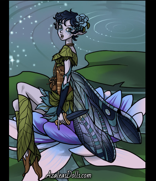

Also certain layers had transparency settings, like lip-color and wings. And there was a specific section in the shirts menu with a few shirts that made your pixie look pregnant, which I'd never seen in a game like this before and even though I didn't use that feature much I thought it was really neat.
And all of the clothing, from shirts to skirts to accessories, let you pick what color they'd be.
It's really disappointing how much of that variety was lost during the html5 conversion. I understand stuff like the transparency settings and the drag-n-drops being lost, but why decrease the number of color options and menu items? It's a huge letdown, especially from a doll site that made its name on how much variety it offered within each dressup game.
Azaela's Dolls has become racist as fuck. Almost none of their new doll makers have the option for darker skin tones, or any option to change skin color at all from the default white, and the ones that do have skin tones that are still relatively light.
I used to use them to create characters for stories and such, but I cant even do that anymore. I dont know what the hell happened to them. Smh.
134 notes
·
View notes
Link
This is a great boon that renders technology to go online without sweating or wastage of time. But a pertinent question is, how to streamline conversion efficiencies? And, this is where rapid authoring tools come to play.
Undoubtedly, Array of tools are available in the market, but choosing appropriate and sustainable tools that best meet one’s needs is very challenging. Well, organizations should be very careful in the proper selection of tools that reminisce the functionality of eLearning courses. So, let’s check out what the tools are-
#flash to html5 elearning#flash to html5 conversion tools#conversion of flash to html5#flash to html5 conversion#flash to html5 conversion services#flash to html5 conversion solutions#rapid elearning#rapid elearning services#rapid elearning solutions#rapid elearning development
1 note
·
View note
Link
#HTML5 – The new strategy for improving #mobileLearning
Due to the Incompatibility with #MobileDevices and the increasing popularity of mobile learning and use of #smartphones is forcing many companies to convert their #Flash content into effective HTML5 #eLearning.
Check this blog for more info!
#flash to html5 conversion#flash to html5 conversion services#flash to html5 conversion solutions#flash to html5 elearning#convert flash to html5#convert flash to html5 services#convert flash to html5 solutions#conversion of flash to html5#conversion of flash to html5 services#conversion of flash to html5 solutions
1 note
·
View note
Link
Conversion of Flash to HTML5 eLearning courses is to create mobile-friendly interactive learning content for global audiences. However, you can customize or update the course content to meet new learning requirements and improve the visual appeal of the course.
#flash to html5 elearning#flash to html5 elearning services#flash to html5 elearning solutions#flash to html5 conversion tools#flash to html5 conversion#conversion authoring tools#conversion of flash to html5#flash to html5 conversion services#flash to html5 conversion solutions
1 note
·
View note