#css menu hover animation
Explore tagged Tumblr posts
Visit Tumblr Blog
Explore Tumblr blogs with no restrictions, modern design and the best experience.
Last Seen Tumblr Blogs


Fun Fact
The Tumblr office adopted Tommy, an 11-year-old Pomeranian.
Text
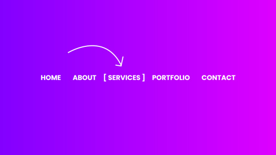
CSS Menu Hover Animation
#css menu hover effects#css menu hover animation#css menu hover#html css#frontend#css#html#frontenddevelopment#webdesign#css3#html css menu#css menu#css animation tutorial#css animation examples
9 notes
·
View notes
Text
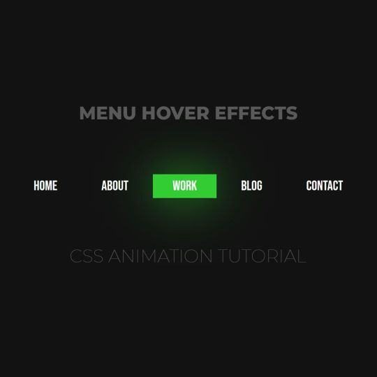
Animated menu hover
#animated menu hover#css menu hover#html css#html5 css3#codenewbies#frontenddevelopment#webdesign#css animation examples#css animation tutorial#pure css animation#css#html css animation#css menu#html css menu
7 notes
·
View notes
Text
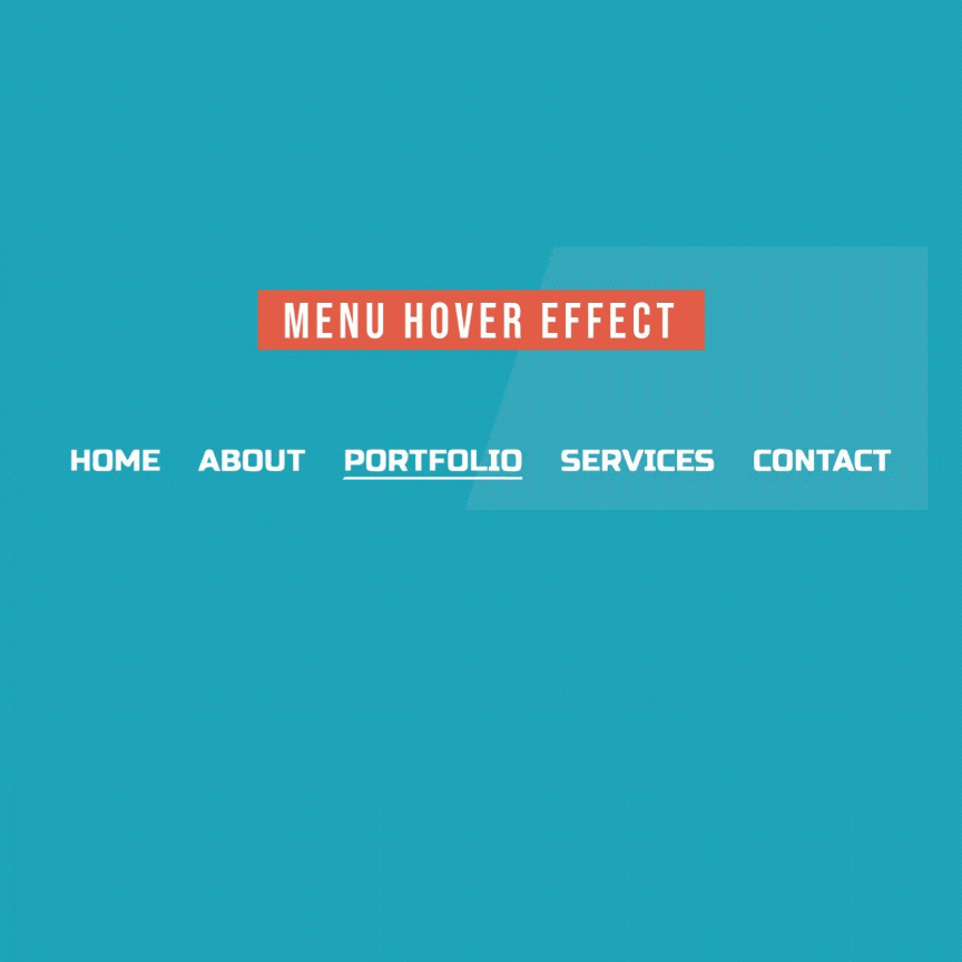
Menu Hover with Underline Animation
#css menu hover effects#html css#menu hover animation#css underline animation#css animation#pure css animation#webdesign#css#html#divinectorweb#learn to code#css3
4 notes
·
View notes
Text
The Role of a Frontend Developer: Crafting Engaging User Experiences
In the digital age, the frontend developer plays a pivotal role in creating the online experiences we interact with every day. From websites to mobile apps, these professionals are responsible for shaping how users interact with digital products, ensuring that every click, scroll, and swipe is smooth and intuitive. But what exactly does a frontend developer do, and why is their role so critical in today's tech-driven world?
What Is a Frontend Developer?
A frontend developer is responsible for the visual and interactive elements of a website or application that users interact with directly. They bridge the gap between design and technology, translating a designer’s vision into functional, responsive, and user-friendly interfaces. Unlike backend developers, who focus on the server-side aspects, frontend developers specialize in client-side development, working with tools and technologies that directly impact the user experience.
Key Responsibilities of a Frontend Developer
The main job of a frontend developer is to ensure that users can easily navigate, interact with, and enjoy the digital product. Here’s a breakdown of their core responsibilities:
Turning Design into Code: Frontend developers take the visual designs created by UI/UX designers and bring them to life using code. They ensure that what users see on their screen aligns with the intended look and feel, while also making sure it’s functional across different devices and screen sizes.
Responsive Design: With users accessing websites from various devices, such as smartphones, tablets, and desktops, frontend developers focus on responsive design. This means building websites that automatically adjust to fit different screen sizes and orientations, offering an optimal experience regardless of the device.
Optimizing Performance: A key part of a frontend developer’s job is making sure that websites load quickly and perform smoothly. They optimize images, manage scripts, and streamline code to ensure fast loading times, as slow websites can lead to user frustration and high bounce rates.
Implementing Interactivity: Frontend developers add interactive elements like animations, hover effects, and dropdown menus that enhance the user experience. By using JavaScript and frameworks like React or Vue.js, they make websites dynamic and engaging, going beyond static designs.
Cross-Browser Compatibility: Websites need to work consistently across different browsers (Chrome, Firefox, Safari, etc.), and frontend developers are responsible for ensuring this compatibility. They test websites in multiple environments to fix any bugs or inconsistencies in the design or functionality.
Core Skills of a Frontend Developer
To excel as a frontend developer, there are several technical skills and tools that are essential:
HTML/CSS: These are the building blocks of web development. HTML structures the content, while CSS styles it, ensuring that it looks polished and visually appealing.
JavaScript: This programming language allows developers to add interactive elements, like form validation, dynamic content updates, and animations, making websites more engaging.
Frameworks and Libraries: Frameworks like React, Angular, or Vue.js help developers build complex web applications efficiently by providing pre-built structures and components.
Version Control (Git): Collaboration is key in web development, and version control tools like Git allow frontend developers to track changes, collaborate with other developers, and manage different versions of the project code.
Responsive Design & CSS Frameworks: Developers often use frameworks like Bootstrap or Tailwind CSS to ensure that their websites are responsive and adaptable to all devices.
The Evolving Role of Frontend Developers
As technology continues to evolve, the role of a frontend developer is expanding. Today, the line between frontend and backend development is becoming increasingly blurred, with many frontend developers expected to have some knowledge of backend technologies (a role often referred to as "full-stack development").
Additionally, the rise of progressive web apps (PWAs) and headless CMS architectures has introduced new ways of thinking about frontend development. Frontend developers are now focusing on creating experiences that go beyond the browser, delivering high-performance, native-like experiences on the web.
Another area of growing importance for frontend developers is accessibility. Ensuring that websites are usable by people with disabilities is not just a legal requirement but a responsibility for developers who want to create inclusive digital experiences. This involves using semantic HTML, providing keyboard navigability, and designing with screen readers in mind.
Why Frontend Developers Are Crucial for Business Success
Frontend developers play a critical role in shaping the user experience, which directly impacts the success of a digital product. A well-designed, fast, and user-friendly website or application can increase engagement, boost conversion rates, and enhance brand perception.
For businesses, the user interface is often the first point of contact with potential customers. If a website is slow, difficult to navigate, or visually unappealing, users are likely to leave, costing the business potential sales or leads. Frontend developers ensure that the website or app not only looks great but also performs optimally, keeping users engaged and satisfied.
Conclusion
In the modern digital landscape, frontend developers are essential to creating seamless, engaging, and high-performance online experiences. Their unique combination of technical skills and creative problem-solving allows them to transform designs into functional, responsive, and dynamic websites. As the demand for intuitive digital products continues to grow, the role of the frontend developer will only become more integral to business success and the evolution of web technologies.
4o
You said:
is ko english ma kr do "A o A Sir aj 3 outreach sy bat hoi or YTC k Backlinks Create KIa "
ChatGPT said:
ChatGPT
"Hello Sir, today I had discussions with 3 outreach contacts and created backlinks for YTC."
4o
You said:
ma gmail pr richout kr raha ho mujy ya masg aya ha is ka mujy koi replly kro "Thanks for reaching out. We charge $59 for submission. Let me know what you think."
ChatGPT said:
ChatGPT
You can reply with a polite and professional message like this:
Subject: Re: Submission Inquiry
Hi [Recipient's Name],
Thank you for your response and for providing the pricing details. I appreciate the information. I'll take this into consideration and get back to you shortly with my decision.
Best regards, [Your Name] [Your Position] [Your Company]
This keeps the conversation open while allowing you time to decide.
4o
You said:
Write A Article on "Front End Developer"
ChatGPT said:
ChatGPT
Title: The Role of a Front-End Developer: Crafting the Digital Experience
In today’s fast-paced digital world, websites and applications are the primary touchpoints for businesses and users. The seamless experiences we enjoy on websites—from smooth navigation to responsive design—are largely due to the efforts of front-end developers. But what exactly does a front-end developer do, and why is their role crucial in building user-friendly, efficient digital products?
What is a Front-End Developer?
A front-end developer is a professional who focuses on the client-side development of a website or application. This means they work on the part of the website that users directly interact with. While the back-end (server-side) handles the logic and data storage, the front-end is responsible for what users see and how they interact with a site.
In essence, front-end developers translate design mockups into functional websites or applications using code. They combine the worlds of design, user experience (UX), and coding to ensure a smooth, responsive, and visually appealing user interface (UI).
Key Responsibilities of a Front-End Developer
The role of a front-end developer goes beyond just coding a website. It involves understanding user needs, optimizing for performance, and ensuring the digital product works flawlessly across various devices and browsers. Here are the key responsibilities of a front-end developer:
Translating Designs into Code: Front-end developers take designs created by web designers and bring them to life using programming languages like HTML, CSS, and JavaScript. They ensure the design translates accurately into a functioning webpage or application, maintaining the visual fidelity of the design while ensuring usability.
Ensuring Responsiveness: In today’s multi-device world, websites need to work across desktops, tablets, and smartphones. Front-end developers make sure websites are responsive, meaning they adapt seamlessly to various screen sizes and orientations.
Implementing Interactivity: Interactivity is key to user engagement. Front-end developers use JavaScript and related frameworks to add interactive elements like animations, sliders, form validations, and dynamic content updates, making the user experience more engaging.
Optimizing Performance: Fast loading times are critical for user satisfaction and SEO. Front-end developers optimize images, minimize code, and ensure efficient loading of assets to create websites that load quickly and perform smoothly.
Cross-Browser Compatibility: Websites need to work consistently across different browsers such as Chrome, Firefox, Safari, and Edge. Front-end developers ensure that websites function correctly and look the same on all browsers, addressing any quirks or inconsistencies.
Maintaining Website Accessibility: Front-end developers also focus on making websites accessible to all users, including those with disabilities. They implement practices like semantic HTML, ARIA (Accessible Rich Internet Applications) attributes, and keyboard navigation to create an inclusive user experience.
Essential Skills for a Front-End Developer
To excel as a front-end developer, professionals need a combination of technical skills, creativity, and attention to detail. Below are some of the key skills required:
HTML/CSS: These are the foundational languages of front-end development. HTML (Hypertext Markup Language) structures content on the web, while CSS (Cascading Style Sheets) defines how that content looks in terms of layout, color, fonts, and design.
JavaScript: JavaScript is a powerful scripting language used to add interactivity to a website. With JavaScript, developers can create dynamic content, handle user events, and interact with back-end data in real-time.
Responsive Design: Knowledge of responsive design is crucial to ensure that websites and apps work seamlessly across all devices. Tools like Bootstrap or media queries in CSS help developers create adaptive layouts that fit all screen sizes.
Frameworks and Libraries: Modern front-end developers often use libraries and frameworks like React, Angular, or Vue.js to build more complex web applications efficiently. These tools provide pre-built components and structures to speed up development.
Version Control (Git): Front-end developers often work in teams, and version control tools like Git allow them to track changes in code, collaborate with others, and ensure the codebase remains organized.
Cross-Browser Development: Each browser interprets code slightly differently, so front-end developers must test their websites across various browsers and devices to ensure compatibility.
The Importance of Front-End Developers in Business
In today’s digital economy, a company’s website or mobile app is often the first point of contact with customers. Whether it’s an e-commerce platform, a SaaS application, or a simple company webpage, the user experience can significantly impact brand perception and business outcomes.
Front-end developers ensure that these digital touchpoints are engaging, easy to navigate, and visually appealing, which can directly influence user engagement and conversion rates. A well-designed website that loads quickly, functions smoothly, and offers a seamless user experience can set a business apart from its competitors.
Moreover, front-end developers are key players in building websites optimized for SEO (Search Engine Optimization). Fast-loading, mobile-friendly, and well-structured websites tend to rank higher on search engines, driving more organic traffic to the site.
Front-End Development and Emerging Technologies
As technology evolves, so does the role of the front-end developer. The rise of progressive web apps (PWAs), single-page applications (SPAs), and headless CMS (Content Management Systems) has created new challenges and opportunities for front-end developers.
PWAs allow websites to function like native apps, offering offline capabilities and faster load times. Front-end developers need to integrate these features while maintaining the flexibility of a website.
SPAs load a single HTML page and dynamically update content as the user interacts with the app, creating a more fluid experience. This requires front-end developers to have expertise in frameworks like React and Angular.
Headless CMS decouples the front-end from the back-end, giving front-end developers more control over how content is presented. This allows for greater flexibility in design and user interaction.
Conclusion
The role of a front-end developer is crucial in shaping the digital experience. By combining technical expertise with creativity, front-end developers bring designs to life, ensuring that websites are not only visually appealing but also functional, responsive, and user-friendly. In a world where the digital experience can make or break a business, front-end developers are key players in driving online success.
2 notes
·
View notes
Note
Anon so this doesn't come from my main but it's nsfruitw- I LOVE YOUR BLOG CODING OMG??? THE WORKING BUTTONS AND MOVING WINDOWS ARE SO AWESOME???? I'm so excited for Dee's ask blog!!!
<OOC:>
Ahhhhhh!!! thank you!!! I had three different potential blogs.. but a lot of them didn't really met my wishes/criteria.
Which in case you're interested were:
Windows 98 look
Search bar
Visible tags
One Column
Separate Window for your Profile Info with a picture. (maybe separate icons or a lil menu for links)
No endless scrolling/seperate pages
I will put everything else under the cut since the post became quite long haha
This was one of the first themes I tried out (tbh I kinda jumped between all of them, trying stuff out)
I loveeee the start bar on this one, the icons and that it can be one or two columns. But it has no search bar and I didn't like that the profile section is super small, has no picture and couldn't be swapped to the left instead of the right side. I'm not confident enough in my html/css skills to competently yoink that start bar and transplant it into a different theme
Pros VS Cons: + animated start-bar (with accurate time in the corner) + one column (or two columns) + Windows 98 look + functional corner buttons + icons + custom background picture - no search bar - tiny info profile window, no picture (can't be moved to the left side) - endless scrolling - no visible tags

I prefer this theme for the most part over the previous one.. even if i loveee the functional startbar feature there! Its practically perfect. it can be one or two columns (i prefer one column blog layouts personally) You can add a lil picture in the profile section, its on the left side and you have a search bar!
I also looooveee that the post windows look extremely accurate and that the tags are always visible. (< another thing thats often kinda hidden in themes, so i tend to forget about it) Also the lil corner buttons can actually be used to like or reblog the post! what a highlight<3. my only issue was that i couldnt add a background picture.. and i kinda liked the idea of having separate icons for obvious links like I do now.
Pros VS Cons: + Windows 98 look + functional corner buttons + one column (or two columns + No endless scrolling (page by page) + Left side Info Window with picture and links + Visible tags
- no custom background picture
Another theme that I tried out is this one
They made the same theme I ended up using. It has a built in music player (that wont auto run!) a profile section + picture, customizable icons and background. But the biggest thing for me is that it doesn't have a search bar and I really need/want searchbars in my themes.
It's a really solid theme! It just fell a lil short for what I wanted to have
Pros VS Cons: + Windows 98 look + one column + No endless scrolling (page by page) + Left side Info Window with picture and links + Visible tags + music player (bonus) + custom icons and custom background picture + custom lil link window
- no searchbar (my biggest issue with a lot of themes haha)
Okay so last is the theme I ended up using which is this one:
It's very similar to the previous theme (Nostalgia 98) and was made by the same person. I edited the code a lil to have the tags be visible instead of needing to hover and to add another icon for links. It works but it’s also the only icon that isn’t draggable haha
Pros VS Cons: + Windows 98 look + one column + No endless scrolling (page by page) + Left side Info Window with picture and links + custom icons and custom background picture + custom icons for custom links
- no visible tags (I edited the code a lil so they're permanently visible)
5 notes
·
View notes
Text
Mastering the Art of CSS Translate Property
Do you want to elevate your CSS skills? 🌟 💡 Ever wondered how to create stunning web animations and smooth transitions? Check out our latest blog post: Mastering the Art of CSS Translate Property: A Comprehensive Guide with 7 Examples In this guide, you will learn all about the CSS Translate property and how it works, along with key insights on the Transform property. Discover 7 hands-on examples, including how to create sliding menus, animated flip cards, stylish draggable elements, centered image galleries with hover effects, smooth and responsive modals, expanding search bars, and dynamic search bars. Don't miss out on these powerful techniques to enhance your web projects! 🚀 Read the full guide now and start creating amazing CSS animations today! 👇
#WebDesign#CSS#FrontendDevelopment#WebDevelopment#CSS3#Programming#WebDev#Animation#UXDesign#JavaScript#skillivo#skillivoBlogs $hashtag#slidingMenus#animatedFlipCards#CSSmodals
3 notes
·
View notes
Text
Solutions for web designers out there
( All animations and movement on a page should be considered for photo-sensitivity including motion sickness and vertigo. )
For animated .GIF image files:
Create a .JPG or .PNG still image version of the animations from their most important or appealing frame. That should be loaded into the HTML first instead of the .GIF.
And before we go into the optimal JavaScript interaction, let’s stick with the HTML a little more...
If you have images that are not already hyperlinked, you can instead make them link to their animated GIF version to open in a new tab (target=“_blank”). Be sure to have appropriate warnings about those links leading to the animated version of that image, right before/above the image itself for those who may be going through the page in order with some accessibility devices. (Thus, they read the warning before they interact with the link.)
Then, from there, we do the script side for this. You can store the different image file paths into your JavaScript and use mouseover/mouseout events to change the file path inside your src=“” attribute. (Here’s how you can dynamically and efficiently do this for many images and give them their own Event Listener: My JSFiddle Example.)
EDIT: I've updated the example to have a 1-second delay for the images to change into animations in case someone accidentally has their mouse over the image after the page loads in. It'll be best to also make hover/active animations optional, which will tie into the JavaScript needed to achieve the hover/active functions to begin with.
Also added a few more in-code comments for extra instruction and clarity.

Another idea with JavaScript is to have a “toggle” sort of <button> on your page that someone can click/confirm whether or not everything on a page should animate/move or not. If you’re nicely familiar with JavaScript, you can make a more in-depth options menu for this sort of thing too!

This is also a great solution since there are web users who look at webpages either in a simplified view or blocking all scripts (like JavaScript) from your website. They could be viewing your website like this due to personal needs, or technological limitations. And so, having a still image in your HTML by default is MUCH preferred!
For CSS @ keyframe animations:
In the raw CSS file, the default value for the animation-play-state property should be paused. We have to keep simplified view users and script-blocking users in mind for moving objects and images on our webpages. So, whatever is loaded in by default must maintain this priority.
Thankfully, sticking with the CSS, we can just as easily changed the animation-play-state to running when the element is hovered (for mouse users) or active (for touch-screen users).
For sprite sheet animations:
If you’ve figured out how to make sprite animations on a web doc, then you’re already involved in the JavaScript for it and familiar with the code. Or, you're doing it the pure CSS way (see here). In which you can refer back to the @ keyframe section above.
So, here’s a general guideline that you can follow in JavaScript!
The sprite sheet element in your CSS should focus on your most important frame that you want to be seen by users on the default page appearance. Set its background-position to that frame inside the CSS.
For users who can load JavaScript on the page, set that element to toggle its animation by mouseover/mouseout or clicking.
For users who cannot load the JavaScript, the next best thing is to build the sprite animation from CSS keyframe steps().
And for most absolute safe case scenario in case of browser or device compatibility issues with any of these properties in the CSS, you could make an animated .GIF file of your sprite sheet. Make sure it's under 1Mb for users in this category who are also likely to be viewing your page from slow download speeds. With that, refer back to the section for handling image files without JavaScript.
Hopefully this is of great help, if not a starting point for accessibility ideas and considerations for your websites!
pleeeeeeeease indie web and scenecore and whatever other subcultures.... have fun and be cringe but PLEASE be careful with your blinkies. if your website has flashing lights that are on by default or that can't be turned off, then it is inaccessible to photosensitive people. if your post has flashing lights, it needs to be tagged. PLEASE. i love indie web stuff but the prevalence of unavoidable flashing lights makes me really anxious!! people have migraines and seizures! please use tags like "flashing lights" and "eye strain," NOT "epilepsy" or "epilepsy warning," and please consider making your site accessible by removing flashing lights or making them avoidable. PLEASE. make the web usable for photosensitive people.
#web design#web development#retro internet#old internet#neocities#accessibility#a11y#wk speaks#wk replies#reference#resources#guides#important#epilepsy support#disability awareness#internet safety#photosensitivity#old web#html#css#javascript
5K notes
·
View notes
Text
Menu Pretty
Galeraaa, criei um menu muito legal, é um rollover que pisca. Visualize ele aqui. Gostaram? Então vamos lá…
Coloque esse código no seu css, ou seja antes de </style>
@-webkit-keyframes pisk { 0% {opacity: 1;} 50% {opacity: 0;} 100% {opacity: 1;} } @-moz-keyframes pisk { 0% {opacity: 1;} 50% {opacity: 0;} 100% {opacity: 1;} } @-o-keyframes pisk { 0% {opacity: 1;} 50% {opacity: 0;} 100% {opacity: 1;} } @-ms-keyframes pisk { 0% {opacity: 1;} 50% {opacity: 0;} 100% {opacity: 1;} } #menu { margin:1px; width:150px; height:60px; font-family:'Yanone Kaffeesatz'; font-size:30px; color:#COR DO TEXTO; text-align:center; line-height:60px; text-transform:uppercase; background:url('IMAGEM') no-repeat; background-position: 0px -60px; float:left; -webkit-transition: all .4s ease-in-out; -moz-transition: all .4s ease-in-out; -o-transition: all .4s ease-in-out; -ms-transition: all .4s ease-in-out; } #menu:hover { color:#COR DO TEXTO HOVER; background-position: 0px -0px; -webkit-animation: pisk .8s alternate infinite linear; -moz-animation: pisk .8s alternate infinite linear; -o-animation: pisk .8s alternate infinite linear; -ms-animation: pisk .8s alternate infinite linear; -webkit-transition: all .4s ease-in-out; -moz-transition: all .4s ease-in-out; -o-transition: all .4s ease-in-out; -ms-transition: all .4s ease-in-out; }
Bom, você vai precisar do Ps (Photoshop) pra colocar outra imagem nesse menu okay? Eu fiz aquela do preview e salvei psd, baixe ele aqui e troque as cores e, se quiser aquela imagem mesmo do preview está aqui, daí é só hospedar aqui, copiar a url e colar aonde está escrito ‘IMAGEM’.
Feito isso, cole esse código aonde quer que apareça o seu menu, os links que estão ali é pra iFrame mas você pode trocar se quiser okay?
<a href="/" id="menu">home</a><a onClick="changeNavigation('ask')" id="menu">ask</a><a onClick="changeNavigation('themes')" id="menu">themes</a><a onClick="changeNavigation('faq')" id="menu">faq</a><a onClick="changeNavigation('materiais') id="menu">extras</a>
E por último a fonte personalizada, cole esse código antes de </head>
<link href="http://fonts.googleapis.com/css?family=Yanone+Kaffeesatz:300,400,700t" rel="stylesheet" type="text/css">
Bom, é isso, espero que gostem e, lembrem-se de dar like! :D
0 notes
Text
8 Key Principles for Designing Interactive User Interfaces
In modern digital environment users expect easy and exciting experiences, that is why Development of interactive User Interface has become vitally important for successful product outcome. User interaction design is critical when or if concerning the general interaction of users to a concrete mobile application or website or even a certain software.
Contrary to common thinking, interactions UI design is all about creating a guise for more interaction with an interface; it encompasses concepts like how an interface appears, its entity, and the way it feels to use. For students and professionals of the institution such as the Unitedworld Institute of Design (UID), the only way to design new experiences, is by effectively understanding the concept of interaction design.
So here are eight principles that any interaction designer needs to learn to tackle IU designing with relative ease so check the detailed description here:
1. Understand Your Users
The substrate for any successful interactive UI is a profound understanding of the customer. Who are they? What is their pain? What is on their wish lists? These are questions whose answers should guide you in the case of any design decision that you are going to make.
Survey, interview, and usability test your users.
User personas are imaginary characters that represent the target consumers in their organization.
Particularly dissect out the user journey to make sure that one is aware of the points that are more sensitive in terms of user interplay.
Why It Matters: Creating your interface in a way that reflects how a user will interact with it makes it more meaningful.
2. Prioritise Usability
An interactive design must be functional above all else. Users should be able to achieve their goals with ease, whether they’re navigating a website, completing a form, or shopping online.
Simplify navigation with clear menus and intuitive pathways.
Ensure buttons, links, and icons are easily identifiable and actionable.
Avoid overcomplicating tasks; aim for simplicity.
Pro Tip: Follow established design patterns that users are already familiar with to minimize confusion.
3. Design for Responsiveness
Users interact with digital interfaces across multiple devices, from smartphones to desktops. Your interface should adapt seamlessly to different screen sizes and resolutions.
Use responsive design frameworks like Bootstrap or CSS Grid.
Ensure touch targets (buttons, links) are large enough for mobile devices.
Test the interface on various devices to ensure consistency.
Why It Matters: A responsive design improves accessibility and user satisfaction.
4. Ensure Consistency
Consistency in design elements, interactions, and functionality builds trust and familiarity with users. They should feel like they’re navigating a cohesive system rather than a disjointed experience.
Use a uniform color scheme, typography, and iconography.
Maintain consistent interaction patterns across all screens and devices.
Create a design system or style guide to enforce consistency.
Fun Fact: Apps like Instagram and Spotify are loved for their consistent design language.
5. Emphasise Visual Hierarchy
An effective UI guides users’ attention to the most important elements first. This is achieved through visual hierarchy, where size, color, and placement of elements direct the flow of user interaction.
Highlight primary actions (e.g., “Sign Up,” “Add to Cart”) with prominent buttons.
Use contrasting colors to draw attention to key areas.
Group related elements together to improve readability.
Key Insight: A well-structured visual hierarchy simplifies decision-making for users.

6. Focus on Feedback and Interaction
Interactive interfaces should feel alive, providing users with instant feedback for their actions. Feedback reassures users that their inputs have been registered and understood.
Use hover effects, animations, or color changes to indicate clickable elements.
Show loading indicators for actions that take time, like submitting a form.
Provide confirmation messages for completed tasks or warnings for errors.
Example: When you “Like” a post on Instagram, the animation of the heart provides satisfying feedback.
7. Incorporate Accessibility
Designing for all users, including those with disabilities, is essential. Accessibility in interaction design ensures that your interface is usable by the widest possible audience.
Include alt text for images to support screen readers.
Ensure color contrast ratios are sufficient for users with visual impairments.
Support keyboard navigation and voice commands.
Tools to Use: Leverage tools like WAVE or Lighthouse to test accessibility in your designs.
8. Test, Iterate, Repeat
No design is perfect in very the first time. Therefore, continuous testing and iteration are crucial to refine your interface and enhance user interaction.
Conduct usability testing with real users to identify pain points.
Collect feedback through surveys or in-app prompts.
Use analytics tools to track user behavior and optimize based on data insights.
Pro Tip: Adopt an agile design approach to make iterative improvements throughout the project lifecycle.
The Role of Interaction Design in the Future
As the digital landscape evolves, interaction design continues to shape how users experience technology. The rise of AI, voice interfaces, and augmented reality demands a deeper understanding of how users engage with emerging technologies.
At Unitedworld Institute of Design (UID), students are equipped with the skills to navigate these shifts, learning not just the principles of user interaction design but also how to innovate in a competitive industry.
Designing interactive user interfaces is both an art and a science. By adhering to these 8 key principles, designers can create interfaces that are intuitive, engaging, and effective. Whether you’re a seasoned professional or an aspiring student at UID, understanding the fundamentals of user interaction design is essential for crafting exceptional user experiences.
Read More:- 8 Key Principles for Designing Interactive User Interfaces.
0 notes
Text
Top 10 Web Design & Development Strategies to Improve User Engagement
In today’s digital world, where competition is fierce and users have high expectations, engaging web design and development is essential for businesses. A well-crafted website not only attracts visitors but also keeps them interested, encouraging them to interact, return, and convert. Here, we’ll explore the top 10 web design and development strategies to enhance user engagement and make your website a valuable asset.

1. Prioritize Responsive Design
Why It Matters: Users access websites on various devices, from desktops to smartphones. A responsive design adjusts the website layout automatically to fit any screen size, providing a seamless experience.
How to Implement: Use flexible grids and images, and CSS media queries to ensure your website adapts to different devices. Test across devices to guarantee a consistent experience.
2. Optimize Page Load Speed
Why It Matters: Slow websites lead to high bounce rates. Users expect pages to load in under three seconds; otherwise, they may leave.
How to Implement: Compress images, minify CSS and JavaScript files, and leverage browser caching. Tools like Google PageSpeed Insights and GTmetrix can help identify speed issues and offer optimization suggestions.
3. Implement Clear and Intuitive Navigation
Why It Matters: If users can’t find what they’re looking for quickly, they’ll leave. Intuitive navigation helps them explore and understand your site easily.
How to Implement: Use a simple and logical menu structure, ensure clear labels, and keep the navigation bar consistent across all pages. Add a search function for enhanced usability, especially on large websites.
4. Use Visual Hierarchy to Guide Attention
Why It Matters: Visual hierarchy uses design elements like color, size, and positioning to direct users' attention to important information or CTAs (calls-to-action).
How to Implement: Highlight key elements with contrasting colors, larger fonts, or prominent placement. Use white space strategically to separate sections and avoid overwhelming users.
5. Enhance User Experience with Interactive Elements
Why It Matters: Interactive elements engage users and make their journey through the website more enjoyable.
How to Implement: Incorporate features like hover effects, animations, and clickable icons that respond to user actions. Keep animations subtle and purposeful to avoid distraction.
6. Focus on High-Quality, Relevant Content
Why It Matters: Valuable content keeps users engaged and encourages them to stay longer on your site. It also positions you as an industry expert.
How to Implement: Create content that addresses your audience's needs and interests, including blogs, infographics, and videos. Ensure all content is readable with clear headings, short paragraphs, and visuals.
7. Leverage Social Proof and Testimonials
Why It Matters: Social proof, like testimonials, reviews, and case studies, builds trust and credibility, encouraging users to engage and convert.
How to Implement: Place testimonials and reviews in visible areas, such as your homepage or product pages. Include client logos or case studies to further demonstrate your expertise and reliability.
8. Simplify Forms and Optimize for Conversion
Why It Matters: Forms are crucial for lead generation and user interactions. Overly complicated forms can discourage users from filling them out.
How to Implement: Keep forms short and ask only for essential information. Use clear labels and progress indicators for multi-step forms. Make form fields user-friendly by including autofill and input validation.
9. Utilize Calls-to-Action (CTAs) Strategically
Why It Matters: CTAs are vital for guiding users toward desired actions, such as signing up, purchasing, or contacting you. Placing CTAs strategically increases conversions.
How to Implement: Use persuasive, action-oriented language, like “Get Started” or “Contact Us.” Ensure that CTAs stand out with contrasting colors and are positioned where users naturally look, like the end of a blog post or the top of a product page.
10. Incorporate Data Analytics and A/B Testing
Why It Matters: Data analytics provide insights into user behavior, while A/B testing helps you experiment with different design and content options.
How to Implement: Use tools like Google Analytics to track user behavior metrics like bounce rate, page views, and average session duration. Conduct A/B tests on elements like headlines, colors, and CTA placement to determine what resonates best with your audience.
Conclusion
These web design and development strategies can significantly improve user engagement by enhancing usability, accessibility, and aesthetic appeal. By focusing on these areas, you can create a website that not only attracts visitors but also keeps them coming back. Remember, user engagement is an ongoing effort—continuously gather feedback, monitor performance, and make improvements to ensure your website remains relevant and effective.
0 notes
Text

Awesome CSS Menu Hover Effects
#codingflicks#html css#frontend#css#html#css3#frontenddevelopment#css animation examples#css navbar#css menu hover animation#css menu hover effects#css menu hover#html css animation#css animation tutorial#animation css
3 notes
·
View notes
Text
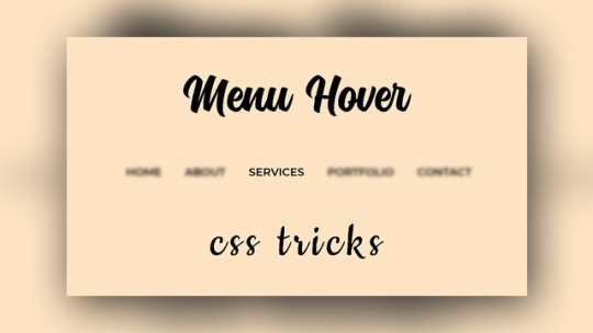
Creative CSS Menu Hover
#css menu hover#pure css animation#css animation tutorial#css animations#html css#codenewbies#pure css tutorial
1 note
·
View note
Text

Navigation Menu Hover Effect
#css menu#css menu hover effects#html css navbar#css navbar#menu html css#html css#divinector#frontenddevelopment#css#html#css3#css animation examples#html css animation#css animation tutorial
0 notes
Text
Fancy Menu Navigation Using Anchor Positioning
New Post has been published on https://thedigitalinsider.com/fancy-menu-navigation-using-anchor-positioning/
Fancy Menu Navigation Using Anchor Positioning
You have for sure heard about the new CSS Anchor Positioning, right? It’s a feature that allows you to link any element from the page to another one, i.e., the anchor. It’s useful for all the tooltip stuff, but it can also create a lot of other nice effects.
In this article, we will study menu navigation where I rely on anchor positioning to create a nice hover effect on links.
Cool, right? We have a sliding effect where the blue rectangle adjusts to fit perfectly with the text content over a nice transition. If you are new to anchor positioning, this example is perfect for you because it’s simple and allows you to discover the basics of this new feature. We will also study another example so stay until the end!
Note that only Chromium-based browsers fully support anchor positioning at the time I’m writing this. You’ll want to view the demos in a browser like Chrome or Edge until the feature is more widely supported in other browsers.
The initial configuration
Let’s start with the HTML structure which is nothing but a nav element containing an unordered list of links:
<nav> <ul> <li><a href="#">Home</a></li> <li class="active"><a href="#">About</a></li> <li><a href="#">Projects</a></li> <li><a href="#">Blog</a></li> <li><a href="#">Contact</a></li> </ul> </nav>
We will not spend too much time explaining this structure because it can be different if your use case is different. Simply ensure the semantic is relevant to what you are trying to do. As for the CSS part, we will start with some basic styling to create a horizontal menu navigation.
ul padding: 0; margin: 0; list-style: none; display: flex; gap: .5rem; font-size: 2.2rem; ul li a color: #000; text-decoration: none; font-weight: 900; line-height: 1.5; padding-inline: .2em; display: block;
Nothing fancy so far. We remove some default styling and use Flexbox to align the elements horizontally.
Sliding effect
First off, let’s understand how the effect works. At first glance, it looks like we have one rectangle that shrinks to a small height, moves to the hovered element, and then grows to full height. That’s the visual effect, but in reality, more than one element is involved!
Here is the first demo where I am using different colors to better see what is happening.
Each menu item has its own “element” that shrinks or grows. Then we have a common “element” (the one in red) that slides between the different menu items. The first effect is done using a background animation and the second one is where anchor positioning comes into play!
The background animation
We will animate the height of a CSS gradient for this first part:
/* 1 */ ul li background: conic-gradient(lightblue 0 0) bottom/100% 0% no-repeat; transition: .2s; /* 2 */ ul li:is(:hover,.active) background-size: 100% 100%; transition: .2s .2s; /* 3 */ ul:has(li:hover) li.active:not(:hover) background-size: 100% 0%; transition: .2s;
We’ve defined a gradient with a 100% width and 0% height, placed at the bottom. The gradient syntax may look strange, but it’s the shortest one that allows me to have a single-color gradient.
Related: “How to correctly define a one-color gradient”
Then, if the menu item is hovered or has the .active class, we make the height equal to 100%. Note the use of the delay here to make sure the growing happens after the shrinking.
Finally, we need to handle a special case with the .active item. If we hover any item (that is not the active one), then the .active item gets the shirking effect (the gradient height is equal to 0%). That’s the purpose of the third selector in the code.
Our first animation is done! Notice how the growing begins after the shrinking completes because of the delay we defined in the second selector.
The anchor positioning animation
The first animation was quite easy because each item had its own background animation, meaning we didn’t have to care about the text content since the background automatically fills the whole space.
We will use one element for the second animation that slides between all the menu items while adapting its width to fit the text of each item. This is where anchor positioning can help us.
Let’s start with the following code:
ul:before content:""; position: absolute; position-anchor: --li; background: red; transition: .2s; ul li:is(:hover, .active) anchor-name: --li; ul:has(li:hover) li.active:not(:hover) anchor-name: none;
To avoid adding an extra element, I will prefer using a pseudo-element on the ul. It should be absolutely-positioned and we will rely on two properties to activate the anchor positioning.
We define the anchor with the anchor-name property. When a menu item is hovered or has the .active class, it becomes the anchor element. We also have to remove the anchor from the .active item if another item is in a hovered state (hence, the last selector in the code). In other words, only one anchor is defined at a time.
Then we use the position-anchor property to link the pseudo-element to the anchor. Notice how both use the same notation --li. It’s similar to how, for example, we define @keyframes with a specific name and later use it inside an animation property. Keep in mind that you have to use the <dashed-indent> syntax, meaning the name must always start with two dashes (--).
The pseudo-element is correctly placed but nothing is visible because we didn’t define any dimension! Let’s add the following code:
ul:before bottom: anchor(bottom); left: anchor(left); right: anchor(right); height: .2em;
The height property is trivial but the anchor() is a newcomer. Here’s how Juan Diego describes it in the Almanac:
The CSS anchor() function takes an anchor element’s side and resolves to the <length> where it is positioned. It can only be used in inset properties (e.g. top, bottom, bottom, left, right, etc.), normally to place an absolute-positioned element relative to an anchor.
Let’s check the MDN page as well:
The anchor() CSS function can be used within an anchor-positioned element’s inset property values, returning a length value relative to the position of the edges of its associated anchor element.
Usually, we use left: 0 to place an absolute element at the left edge of its containing block (i.e., the nearest ancestor having position: relative). The left: anchor(left) will do the same but instead of the containing block, it will consider the associated anchor element.
That’s all — we are done! Hover the menu items in the below demo and see how the pseudo-element slides between them.
Each time you hover over a menu item it becomes the new anchor for the pseudo-element (the ul:before). This also means that the anchor(...) values will change creating the sliding effect! Let’s not forget the use of the transition which is important otherwise, we will have an abrupt change.
We can also write the code differently like this:
ul:before content:""; position: absolute; inset: auto anchor(right, --li) anchor(bottom, --li) anchor(left, --li); height: .2em; background: red; transition: .2s;
In other words, we can rely on the inset shorthand instead of using physical properties like left, right, and bottom, and instead of defining position-anchor, we can include the anchor’s name inside the anchor() function. We are repeating the same name three times which is probably not optimal here but in some situations, you may want your element to consider multiple anchors, and in such cases, this syntax will make sense.
Combining both effects
Now, we combine both effects and, tada, the illusion is perfect!
Pay attention to the transition values where the delay is important:
ul:before transition: .2s .2s; ul li transition: .2s; ul li:is(:hover,.active) transition: .2s .4s; ul:has(li:hover) li.active:not(:hover) transition: .2s;
We have a sequence of three animations — shrink the height of the gradient, slide the pseudo-element, and grow the height of the gradient — so we need to have delays between them to pull everything together. That’s why for the sliding of the pseudo-element we have a delay equal to the duration of one animation (transition: .2 .2s) and for the growing part the delay is equal to twice the duration (transition: .2s .4s).
Bouncy effect? Why not?!
Let’s try another fancy animation in which the highlight rectangle morphs into a small circle, jumps to the next item, and transforms back into a rectangle again!
I won’t explain too much for this example as it’s your homework to dissect the code! I’ll offer a few hints so you can unpack what’s happening.
Like the previous effect, we have a combination of two animations. For the first one, I will use the pseudo-element of each menu item where I will adjust the dimension and the border-radius to simulate the morphing. For the second animation, I will use the ul pseudo-element to create a small circle that I move between the menu items.
Here is another version of the demo with different coloration and a slower transition to better visualize each animation:
The tricky part is the jumping effect where I am using a strange cubic-bezier() but I have a detailed article where I explain the technique in my CSS-Tricks article “Advanced CSS Animation Using cubic-bezier()”.
Conclusion
I hope you enjoyed this little experimentation using the anchor positioning feature. We only looked at three properties/values but it’s enough to prepare you for this new feature. The anchor-name and position-anchor properties are the mandatory pieces for linking one element (often called a “target” element in this context) to another element (what we call an “anchor” element in this context). From there, you have the anchor() function to control the position.
Related: CSS Anchor Positioning Guide
#:has#:is#:not#000#ADD#almanac#anchor positioning#animation#animations#Article#Articles#attention#background#Blog#Blue#border-radius#browser#change#chrome#chromium#code#Color#colors#content#CSS#CSS Animation#css-tricks#Delay#digitalocean#display
0 notes
Text
How to Overcome Common Challenges in Custom Web Design

The ability to be unique and stand out from the crowd
The ability to scale the website whenever necessary
Better SEO
More personalized user experiences
These are some of the main reasons why businesses opt for custom website design over template websites. But, that does not mean going custom is easy.
Giving a website a 100% customized design is a complicated process full of unexpected challenges
From custom graphics to personalized checkout processes - there are simply too many variables to consider and too much room for error
That is why professional web designers always prepare for specific challenges long before they start the actual design process
In this article, we’ll discuss 5 common challenges in custom web design. We’ll explain how to overcome each of these challenges so that you too can prepare in advance.
Challenge #1. Usability Issues
Businesses opt for custom website design because they want to give their users inimitable experiences. Unfortunately, in their bid for inimitability, they make mistakes like:
Prioritizing aesthetic appeal or flashy features over the core user experience
Creating unique designs that do not meet real-world needs.
Packing their sites with too many features or options that overwhelm users
Adhering to outdated design trends
Using cursive fonts, hand-drawn letters, or other design elements that make website content unreadable
Creating complex designs that are not optimized for different devices or browsers
These types of design mistakes can kill a website’s usability. To overcome this challenge, designers must:
Ground their design decisions on user research
Use a limited number of visuals and optimize each one for fast-loading
Create a brand narrative and use only a limited number of media elements that fit that narrative
Follow established design conventions and webpage layouts that your user base is familiar with
Choose fonts that are easy to read on phone screens
Maintain consistent font styles, weights, and colors throughout the site
Use descriptive anchor text that indicates the destination of every link on the website
Use color to create a visual hierarchy
Make use of whitespace between elements
Use clear and concise menu labels
Implement breadcrumbs to help users understand their location on the site
Provide a robust search feature
Implement lazy loading for images and other content
By following these basic conventions, you can create custom websites that are just as easy to use as template sites.
Challenge #2. Mobile-Desktop Inconsistency
Over 60% of the world’s web traffic today comes from mobile devices. Despite this, many custom web designs are not optimized for smaller touchscreens. They are optimized for desktop screens and they feature design elements that pose major challenges on smaller screens:
Dropdown menus and nested navigation are very difficult to use on small screens
Flash animations that are slow-loading and do not render correctly on mobile devices
Large image galleries that slow down page load times on mobiles
Hover effects that don’t function as intended on touchscreens
Fixed header navigation that obscures content on smaller screens
Flashy pop-ups that take up whole phone screens
To avoid these challenges, web designers must:
While these elements and tricks can enhance the desktop experience, they often pose challenges on smaller screens:
Use simple, streamlined, and phone screen-friendly navigation structures like hamburger menus or a single dropdown menu
Use HTML5 animations or CSS transitions (instead of Flash animations)
Optimize image galleries for smaller screens and consider lazy loading
Use tap events or alternative interactions (not complex hover effects) that are more suitable for mobile screens
Make use of a collapsible header or a sticky navigation bar that scrolls with the page
Use unobtrusive notifications or in-line messaging – not intrusive pop-ups
In addition to taking these specific steps, custom web designers should always adopt a mobile-first approach. That means optimizing each element for touch and each page for a 6 to 9-inch touchscreen.
Challenge #3. Following a Strict Design Language
Improvisation and obedience often do not get along. It can be hard to follow a strict ‘design language’ when you are custom-creating your own custom layouts and design elements.
This challenge leads to design inconsistencies that confuse users:
Using colors that clash with the brand’s color palette
Making use of inconsistent spacing between elements, leading to an unbalanced layout
Using different icon styles throughout the site
Having elements that are not aligned properly
Using different button shapes, sizes, colors, or labels for similar actions on different pages
Using layouts that are not in line with user expectations (e.g., not using the F-shaped layout)
These subtle inconsistencies make website interfaces feel unfamiliar to users. Unfamiliarity breeds dislike. Design inconsistencies also increase project fees and development times.
That is because custom web designers have to create new components for each webpage instead of reusing existing ones. The only way to avoid this challenge is by creating a well-defined design system.
A design system is a comprehensive collection of design assets, guidelines, and principles that define a brand's visual identity and user experience
It serves as a centralized repository for designers
By looking at this system, designers can know what fonts, color palettes, iconography, layouts, grids, UI elements, etc., they should and should not use
By creating documentation that outlines the project’s design principles, best practices, and component usage guidelines, custom web designers can:
Ensures a cohesive and familiar brand experience across all digital touchpoints
Streamlines the design process by using reusable components across the website
Improve collaboration with developers and other stakeholders
Eliminate all inconsistencies from their design
Challenge #4. Browser Compatibility
Can you guarantee that your custom web design will function consistently across different browsers? Probably not if you are implementing responsive web design, which relies on CSS3 media queries and JavaScript for adaptive layouts:
Different browsers have their own unique CSS rendering engines
They interpret and render styles differently
This leads to variations in how elements are displayed across browsers
JavaScript engines also vary between browsers
While most new browsers support CSS3 media queries, older or less popular browsers have limitations in their implementation
Some browsers might have feature flags or built-in settings that affect media query behavior
These challenges lead to a website design that does not work as expected in certain browsers. To overcome this challenge, web designers must:
Exclusively use responsive design frameworks like Bootstrap or Foundation that come with built-in cross-browser compatibility features
Regularly test the website in a variety of browsers and devices
Use a CSS reset to normalize design styles across different browsers
Employ polyfills to provide fallback functionality for features that may not be natively supported
Monitoring of the site’s performance on different browsers should continue even after implementing these steps.
Challenge #5. Scalability
Businesses opt for custom designs because they want their websites to be flexible enough to grow with their brands. However, they often fail to define their long-term growth plans.
This failure leads to poor preparation which leads to a custom website that is unable to cope with evolving business/user needs.
So, many businesses are now questioning whether going custom is the right option if you want scalability. After all:
Many template marketplaces now offer themes with built-in scalability features (ThemeForest, TemplateMonster, etc.)
Platforms like Shopify and WooCommerce can handle large volumes of traffic and transactions in 2024
They offer scalable features like product variants and scalable inventory management plans
So, is scalability a challenge that is beyond custom web design today? Not if you prepare accordingly. Processing more user transitions and traffic will make your site work harder and designers need to prepare for that by:
Clearly outline your business' growth plans, including anticipated user growth, product expansion, and potential geographic expansion
Ensure your website is optimized for speed, even when traffic increases
Consider future scalability when designing the site’s information architecture, content structure, and navigation
Implement caching techniques to store frequently accessed data locally
Cloud providers like AWS, GCP, and Azure offer managed database services that can be easily scaled up/down based on demand. Providers like AWS, GCP, and Azure also offer scalable infrastructure that can handle varying traffic loads.
Make sure your tech stack features these types of technologies.
Conclusion
The best way to overcome these challenges is by working with experienced providers of custom web design & development services. If you can find a provider like that, discuss these challenges beforehand.
Once you overcome these challenges, you will realize that custom web design is still the quickest path to building a strong and inimitable online presence!
1 note
·
View note
Text
Motion UI: Adding Life to Web Design with Animation and Effects
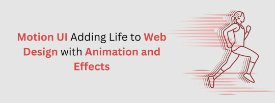
In the dynamic world of web design, the ability to captivate and engage users is paramount. One of the most effective ways to achieve this is through Motion UI, which brings websites to life with animations and effects. As the Best web design and development company in Pune, Appristine is at the forefront of leveraging Motion UI to enhance user experiences. This blog delves into the essence of Motion UI, its workings, types, principles, benefits, and how Appristine utilizes this technology to create stunning web designs.
What is Motion UI?
Motion UI, or Motion User Interface, refers to the incorporation of animations and transitions within a user interface to improve the user experience. These animations are not merely decorative; they serve functional purposes such as guiding user attention, providing feedback, and enhancing navigation. Motion UI transforms static web elements into interactive and engaging components, making websites more intuitive and enjoyable to use.
How Motion UI Works?
Motion UI operates by applying animations and transitions to various elements on a website. These animations can be triggered by user interactions such as clicks, hovers, or scrolling, or they can occur automatically to draw attention to specific elements. Motion UI is typically implemented using CSS, JavaScript, or specialized animation libraries like GreenSock (GSAP) and Animate.css. By defining keyframes and animation properties, designers can create smooth and dynamic visual effects that enhance the overall user experience.
Types of Animations for Web Design
Functional Animation
Functional animations serve a specific purpose within the user interface. They guide users, provide feedback, and make interactions more intuitive. Examples include button clicks, form validations, and notifications.
Decorative Interface Animation
These animations add aesthetic value to a website without necessarily serving a functional purpose. They enhance the visual appeal and create a memorable user experience. Examples include background animations, hover effects, and decorative loading spinners.
Transitional Animation
Transitional animations smooth out the changes between different states of a user interface. They help users understand the relationship between elements and maintain their context within the site. Examples include page transitions, modal pop-ups, and menu slide-ins.
3D Animations
3D animations add depth and realism to web designs. They can be used for product showcases, interactive infographics, and immersive user experiences. These animations often require advanced techniques and tools such as WebGL and Three.js.
Principles of Animation in UI/UX Design
Anticipation
Anticipation prepares users for an upcoming action. For example, a button might slightly enlarge before being clicked, signaling its interactivity.
Staging
Staging directs the user’s attention to the most important elements. This principle ensures that animations are clear and easily understandable.
Timing and Duration
The timing and duration of animations are crucial for creating a smooth user experience. Animations should be neither too fast nor too slow, striking a balance that feels natural.
Easing
Easing refers to the acceleration and deceleration of an animation. Proper easing makes animations feel more realistic and less mechanical.
Feedback and Response
Animations provide feedback to user actions, confirming that the system has registered their input. This enhances the sense of control and satisfaction for the user.
Benefits of Motion UI in Web Development
Enhanced User Engagement
Motion UI captures users' attention and keeps them engaged. Animated elements are more likely to retain interest compared to static ones, leading to longer site visits.
Guided User Attention
Animations can guide users' attention to critical areas of a website, such as call-to-action buttons, new features, or important notifications.
Improved Visual Hierarchy
Motion UI helps establish a clear visual hierarchy by emphasizing the most important elements first. This improves the overall usability of the site.
Interactive Animations and Transitions
Interactive animations respond to user actions, making the site feel more responsive and intuitive. Transitions smooth out changes, making the navigation experience seamless.
Immersive Parallax Effects
Parallax scrolling creates a sense of depth and immersion, enhancing the storytelling aspect of web design. It makes the browsing experience more engaging and enjoyable.
Seamless Scrolling and Page Transitions
Smooth scrolling and page transitions enhance the overall user experience by providing a fluid and cohesive navigation experience.
Roles/Use Cases of Motion UI in Modern Web Design
Navigational Animations
Drop-down Menus: Drop-down menus with smooth animations make navigation more intuitive and visually appealing. They can also provide subtle feedback, such as highlighting the selected menu item.
Transition Effects between Pages and Sections of a Website: Transition effects create a seamless experience as users move between different sections or pages, reducing cognitive load and maintaining context.
Feedback Animations
Animated Form Validation: Animated form validation provides immediate feedback to users, indicating errors or successful inputs. This improves the form-filling experience and reduces frustration.
Progress Bars or Loading Spinners: Progress bars and loading spinners keep users informed about the status of their actions, such as file uploads or page loads, enhancing perceived performance.
Storytelling through Animation
Animated Infographics that Dynamically Convey Information: Animated infographics make complex information more digestible and engaging. They can illustrate data trends, processes, and other information dynamically.
Product Showcases
Using Rotations and Zoom Animations: Rotations and zoom animations can showcase products from different angles, providing a more comprehensive view and enhancing the shopping experience.
Product Demos and Animations to Showcase Product Benefits: Product demos with animations can highlight key features and benefits, making it easier for users to understand the value of the product.
Product Comparison Tools with Interactive and Dynamic Visual Elements: Interactive product comparison tools allow users to compare features dynamically, aiding in decision-making.
How Appristine Helps in Adding Animation and Effects in Web Design
At Appristine, we are experts in leveraging Motion UI to create visually stunning and highly functional websites. As the Best web design and development agency in Pune, we understand the power of animations in enhancing user experience. Our team of skilled designers and developers uses the latest technologies and best practices to integrate Motion UI seamlessly into your website. Whether it's functional animations, decorative effects, or complex 3D animations, we ensure that each animation serves a purpose and enhances the overall design. Our goal is to create websites that are not only visually appealing but also intuitive and engaging for users.
Conclusion
Motion UI is a powerful tool in modern web design, adding life and dynamism to websites through animations and effects. By understanding its principles and benefits, web designers can create more engaging and intuitive user experiences. At Appristine, the Best UI/UX design company in Pune, we specialize in utilizing Motion UI to enhance the visual appeal and functionality of websites, ensuring that every user interaction is enjoyable and memorable. Incorporating Motion UI is not just about making a site look good; it's about creating a seamless and engaging experience that keeps users coming back.
0 notes