#CSS Layout Snippets
Explore tagged Tumblr posts
Visit Tumblr Blog
Explore Tumblr blogs with no restrictions, modern design and the best experience.
Last Seen Tumblr Blogs


Fun Fact
Total funding amounts to $125.3M.
Text
8 CSS & JavaScript Snippets for Creating Sticky Elements — Speckyboy
New Post has been published on https://thedigitalinsider.com/8-css-javascript-snippets-for-creating-sticky-elements-speckyboy/
8 CSS & JavaScript Snippets for Creating Sticky Elements — Speckyboy
Modern websites often feature extensive scrolling. Long pages are common on desktop devices, but are even more frequent on mobile screens. The practice creates usability challenges for tasks like navigation and referencing important information.
That’s where “sticky” design elements come in handy. They allow users to scroll without losing access to your site’s menu. You can also use them to keep ads in view, attach social media sharing buttons to the viewport, or create fun special effects.
Implementing a sticky element can be simple, as CSS has a dedicated position property for this function. JavaScript can be used for building more robust features. As usual, there are several methods to achieve your goals.
We searched the CodePen archives to find interesting examples of sticky elements in use. Below, you’ll find various options that enhance the user experience. So, get stuck in your easy chair and be inspired by these code snippets!
Pure CSS Header Animation to Sticky Navigation
Created by Amit
Sticky headers are among the most popular use cases. On Chromium browsers, this snippet uses CSS to transform a tall and narrow header into a full-screen bar upon scrolling. Unsupported browsers receive a narrower, taller, sticky header. Keyframe animation is used to create smooth transitions. The feature is useful, lightweight, and attractive.
See the Pen Pure CSS header animation to sticky nav by Amit
Sticky Responsive Sidebar Navigation
Created by Areal Alien
Sidebar navigation can also take advantage of staying put during scrolling. Hovering over the sidebar expands the navigation to include text labels – it works on mobile too. However, you might also reserve this concept for large screens and use the traditional “hamburger” menu for mobile.
See the Pen Sticky responsive sidenav by Areal Alien
CSS Sticky Table Header & Column
Created by Mike Golus
Long HTML tables can be a pain to read. You have to memorize the column headers to understand the context. Sticky headers make even the busiest tables easier to read. Using position:sticky (and a few other tricks) on the first row and column enables scrolling without losing sight of key information. The examples in this Pen demonstrate how it’s done.
See the Pen CSS Sticky Table Header and Column by Mike Golus
Long Scroll Sticky Sections
Created by Burmese Potato
Here’s a unique way to denote the various sections of a long page. Scroll down the page, and the episode number (displayed in the left column) sticks until you reach the end of the section. The snippet combines sticky positioning with the calc() property on the container’s height to keep the number in view. This little bit of CSS adds a nice touch to the user experience.
See the Pen Pretty Sticky by Burmese Potato
Just Another Sticky Section Layout
Created by Misala
Sticky design elements can also be used to show off product features. Scroll down this page and watch as featured text and videos change. The layout occupies the entire screen viewport and is responsive for mobile devices. It’s a high-end feature sure to capture a user’s attention.
See the Pen just another sticky section layout by misala
Multi-Navigation Sticky Bars & Layout
Created by Den
This snippet asks the question: What if you have more than one navigation bar? The first bar is sticky by default. Scroll past a few sections, and a second sub-navigation bar lines up underneath. That second bar also features a neat frosted glass look as content scrolls underneath.
See the Pen Sticky layout + filters #2024 by Den
Sticky Video with CSS @container scroll-state()
Created by Jhey
We’re seeing more websites implement sticky videos, where the presentation sticks to the bottom corner upon scrolling. It allows users to view the rest of your content without losing sight of the video. Here, CSS container queries are used to reposition the video player. Use the included config panel to see how different settings impact the animation effects.
See the Pen CSS @container scroll-state() faux PiP video by Jhey
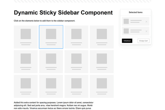
Dynamic Sticky Sidebar Component
Created by Ryan Mulligan
Features like shopping carts are a perfect fit for sticky sidebars. The UI makes it easier for shoppers to keep track of their cart and, most importantly, finish their purchase. This sidebar widget keeps track of cart contents and sticks to the screen while you scroll in the page content area.
See the Pen Dynamic Sticky Sidebar Component by Ryan Mulligan
Stick With What Works in Your Designs
We may think of sticky elements as being used for site headers and navigation. However, the examples above show that they can do much more. There are so many creative possibilities for informing and entertaining users.
What’s more, CSS can do a lot of the heavy lifting for you. Several snippets in this collection don’t require a single line of JavaScript. Still, it’s nice to know you can add some DOM manipulation when needed.
We hope this collection sparked your imagination! Check out our CodePen collection for even more sticky snippets.
Related Topics
Written by Eric Karkovack
Eric Karkovack is a web designer and WordPress expert with over two decades of experience. You can visit his business site here. He recently started a writing service for WordPress products: WP Product Writeup. He also has an opinion on just about every subject. You can follow his rants on Bluesky @karks.com.
Read more articles by Eric Karkovack
#2024#ADD#alien#amp#animation#Articles#attention#Building#Business#buttons#Capture#change#chromium#code#container#content#CSS#CSS Layout Snippets#CSS Snippets#Design#desktop#devices#easy#effects#Featured#Features#Filters#Full#glass#hamburger
0 notes
Text

Bootstrap Web Layout
#bootstrap web layout#responsive web design#bootstrap snippets#html css#divinector#css#html#webdesign#css3#divinectorweb#web design#web development
3 notes
·
View notes
Text
Team Section UI Design
#team section html css#team section flexbox#codenewbies#html css#frontenddevelopment#html5 css3#css#webdesign#css flexbox layout#flexbox snippets
3 notes
·
View notes
Note
how did you learn coding?
I am pretty much entirely self taught as far as front end goes!
I started messing around with HTML and CSS with tumblr themes back in 2016-ish.
For javascript I looked at https://developer.mozilla.org/en-US/ for a lot of documentation + examples. And also used codepen a lot to kinda reverse engineer existing snippets of code.
I also read a lot of https://css-tricks.com/
And for flexbox + css grid there's these:
After I got a good foundation of vanilla JS, I learned Vue for a little while and then moved on to React. The new react documentation is really good in my opinion so I definitely recommend reading that if you're interested in learning.
Most of my learning came from trial and error and working on projects that I was really excited about. I used to be so proud of findtags (the original version) which was in jquery...
The react version is miles ahead of it. And even then, the theme builder is also way ahead of findtags. I learned way more between those two projects than reading documentation alone!
191 notes
·
View notes
Text
I made a website template!
It's based on my own website's design. Feel free to use it for your neocities website, or any other website. Let me know if you do!
Features:
Fully responsive, mobile-friendly design that looks good and comfortable on all devices
Easily customisable colours, fonts, background images, and layout using CSS variables
Elegant paragraph/image layouts
'Preview frame' for linking subpages or other 'fancy' links
Simple image grids
Different types of lists: arrow lists, to-do lists...
2 base themes for different flavours of the template
...and more! There's extra snippets, colour palettes, and I did a lot of work putting the manual together.
Check it out!
283 notes
·
View notes
Text
Tumblr's new dashboard layout
Did you, like me, hop onto our beloved hellsite this morning, and find your dash looking like this?
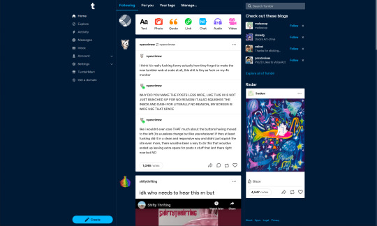
Were you, like me, pretty unimpressed with the new layout?
Did you, like me, imagine a world in which your dashboard could look a bit... less? Well, imagine no more:
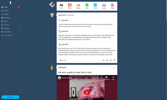
(Thanks to @nyancrimew for making the perfect post to showcase my changes at precisely the moment I was taking screenshots)
One of the advantages to being a front-end web dev is that, when I don't like how a website looks, I can change how it looks in my browser. And now, you can too.
Install a browser extension that lets you inject custom CSS. I use Code Injector for Firefox, but you can take your pick - just search for "[Browser name] custom css [plugin/extension]" in your search engine of choice
Create a new rule for tumblr.com, and paste in this snippet of CSS: https://pastebin.com/LnAduQnM
I've bumped the left-hand sidebar off to the edge of the screen, hidden the right-hand sidebar, centered the feed in the remaining space, and increased the width of the feed a bit. I've also reverted to an older version of the Tumblr blue, and added li'l arrows from posts to their associated avatars, because I'm a crusty old curmudgeon who hates change.
Feel free to tweak these changes to your heart's content; I know I'll be doing so for my own use - this was just a quick first cut to make my dash a bit less claustrophobic.
And don't forget to go leave some feedback for @staff to let them know how you feel about these changes. Squeaky wheels, and all that.
44 notes
·
View notes
Note
Ur website so cool!! ❤️❤️ Do you have by any chances coding tips? Been trying to make my own website for a while but adhd won't let me concentrate a second when it comes to learning coding
Thank you! And 100% It is deceptively approachable but also time consuming, I'm familiar enough with html from a highschool class where we did need to write code out by hand, and then soft practice with coding toyhou.se profiles and futzing around with free code snippets. Largely though I don't think you need to know everything or to write everything by hand, you just need to frankenstein code pieces together (As long as they're free ofc).
I used this first, it's fucking insanely handy and lets you make a simple layout with sidebars, navigation, header, footer and a body base ect, and then just generate and copy the code. The html itself also has greyed out little notes about what parts do what!
I'll be real the rest of it after that is just me googling what I want to do or googling html snippets bc I forgot them. So like html image link with size attributes ect ect, how to make a html image gallery. I don't use one site exclusively but w3schools.com has a bunch of common ones and also has a little live code editor in its tutorials.
Like I still get greatly stumped for hours bc code's kinda sensitive and one or two characters out of place will break sections of it especially when ur just frankensteining. Trying out little segments in live code editors is really helpful because you can kinda break it apart and diagnose the issue before putting it into your site html.
Also if it helps this is kind of how I break it down in my brain as another ADHD-er. so fuckign sorry for how this looks im doing it in snipping tool. But code bits love to live in cages even if it all looks the same, iit would also help if you clean your code up mine is pretty horrid but you just want to familiarize yourself with the little "Sections" ig that's where doing things by hand would help because you would 100% know what each chunk is for but yk yk.
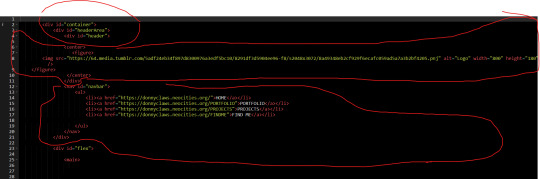
CSS is a different beast I barely understand. The parts of code where it starts stacking on top instead of being horizontal is css and it's basically how you do fancier things to your code, it's linked to stuff you already have down. So like changing the background in the body text box or something, you can only do so much in there. Css targetting the body text box is where you can level it up. Again the sadgrl layout builder has notes so you're not completely blind in there. There's also 100% so many resources to explain what all these words mean, my mmethod is incredibly avoidant I don't know what flex is I haven't needed to fight her yet ect ect.

Sorry if this is confusing this is just my hack and slash understanding atm. Be humbled by code I've spent too long trying to fix up hysterical margin issues just because I had a random apostrophe somewhere or because I tried to spell it colour and not color ect.
33 notes
·
View notes
Text
Snippets of the 2 one-shots I'm working on "Fall Harvest" & "Medic for a day"
Also! I just discovered I can fiddle with the blog settings and give it a custom theme! (It's probs nothing new but it was a discovery!) So I went ahead and got it set up. I wonder if linking it will work or if the default will show up..?
Here's a link to this blog but with (hopefully) the custom layout: https://yohohonabottle.tumblr.com/
Let me know if it works or it's still the same. (^^') Here's a screenshot of what it looks like--
Pretty neat for a free theme! I'm not good at coding or css so I went that route.
#afk journey fanfic#fanfic writing#w.i.p writing#one shot#Did you know you can set a custom theme for your tumblr blog??#Feeling proud of myself
2 notes
·
View notes
Text
Seamless Transition: Best Practices for Website Migration to Shopify
In the ever-evolving landscape of e-commerce, staying competitive requires not just a robust online presence but also adaptability to emerging platforms. As businesses strive to enhance user experience, streamline operations, and optimize sales, many are turning to Shopify for its user-friendly interface, extensive customization options, and powerful marketing tools. However, migrating an existing website to Shopify can be a daunting task if not approached strategically. In this comprehensive guide, we'll delve into the best practices for a seamless transition to Shopify, ensuring minimal disruption to your online business.
Thorough Planning and Preparation:
Before embarking on the migration process, it's crucial to conduct a thorough assessment of your current website. Identify all existing content, including product listings, images, blog posts, and customer data. Take inventory of any custom features, integrations, or third-party apps that may need to be replicated or replaced on the new platform. Establish clear goals and timelines for the migration process to keep it on track.
Choose the Right Shopify Plan:
Shopify offers a range of plans tailored to different business needs, from startups to enterprise-level corporations. Assess your requirements in terms of product catalog size, expected traffic volume, and desired features to select the most suitable plan. Consider factors such as transaction fees, credit card rates, and additional services offered within each plan.
Data Migration and Integration:
Transferring your existing data to Shopify accurately is crucial for maintaining continuity and avoiding disruptions to your business operations. Utilize Shopify's built-in migration tools or third-party apps to seamlessly import product listings, customer information, and order history. Ensure compatibility with any existing integrations or third-party services your business relies on, such as payment gateways, shipping providers, and accounting software.
Design and Customization:
One of the key advantages of Shopify is its customizable design options, allowing you to create a unique and visually appealing storefront. Choose a Shopify theme that aligns with your brand identity and offers the features you require. Customize the design elements, layout, and color scheme to reflect your brand's personality and enhance user experience. Leverage Shopify's drag-and-drop editor and CSS customization capabilities to fine-tune the design to your liking.
Optimize for SEO:
A successful website migration should not only maintain your existing search engine rankings but also provide opportunities for improvement. Prioritize SEO best practices throughout the migration process, including:
Properly redirecting old URLs to their corresponding new URLs using 301 redirects to preserve link equity and prevent 404 errors.
Updating meta tags, headers, and image alt texts to optimize for relevant keywords and improve search engine visibility.
Submitting updated sitemaps to search engines to ensure they crawl and index your new Shopify site efficiently.
Implementing schema markup to enhance the appearance of your site's search results and provide rich snippets to users.
User Testing and Quality Assurance:
Before making your Shopify site live, conduct thorough testing to identify and address any issues or inconsistencies. Test the functionality of all features, including product pages, navigation menus, checkout process, and payment gateways, across different devices and browsers. Solicit feedback from beta users or employees to uncover any usability issues or bugs that may have been overlooked.
Launch and Post-Migration Optimization:
Once you're confident in the stability and functionality of your Shopify site, it's time to go live. Monitor closely for any post-migration issues, such as broken links, missing images, or discrepancies in data. Implement tracking tools such as Google Analytics to monitor site traffic, user behavior, and conversion rates. Continuously optimize your Shopify site based on performance metrics and user feedback to maximize its effectiveness in driving sales and achieving your business objectives.
In conclusion, migrating your website to Shopify can be a transformative step in enhancing your online presence and driving business growth. By following these best practices and approaching the migration process with careful planning and attention to detail, you can ensure a seamless transition that preserves your existing assets while unlocking the full potential of the Shopify platform.
2 notes
·
View notes
Text
8 CSS Snippets for Creating Bento Grid Layouts
New Post has been published on https://thedigitalinsider.com/8-css-snippets-for-creating-bento-grid-layouts/
8 CSS Snippets for Creating Bento Grid Layouts
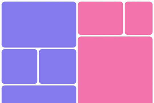
Another day, another design trend! Bento grid layouts are the subject this time around. They’re bold and beautiful. Plus, they satisfy those with a need for symmetry.
So, what exactly is a Bento layout? Think of it as a puzzle. Different-sized containers fit together to create a seamless look. Inspired by Japanese culture, it’s popping up all over the web.
There’s good reason for Bento’s growing popularity. You can use these layouts in a multitude of ways. Everything from listing blog posts to product features is possible. They’re also perfect for dashboard screens.
We should also mention the role that the evolution of CSS has played. Both CSS Grid and Flexbox make these layouts easier to build. No hacks or workarounds are necessary!
With that, here’s a look at 8 beautiful Bento grid layouts.
Complex Bento CSS Grid Layout
CSS Grid packs a lot of power into a tiny bit of code. For example, this complex grid layout requires only 43 lines of CSS. The layout is both efficient and naturally responsive. Therefore, you won’t have to play around with media queries.
See the Pen Complex Bento Layout
Bento-Style Responsive Dashboard
Here’s a gorgeous dashboard layout that benefits from Bento. The layout offers a great way to display relevant content. Everything is neatly organized and easy to follow. The use of photography and color makes this example stand out.
See the Pen Responsive Dashboard | Bento Style by Ecem Gokdogan
Bento Design Concept Layout
This page layout is a different take on the Bento aesthetic. There’s a sidebar featuring in-page navigation. Clicking a button expands it. Meanwhile, the content container maintains a consistent height.
See the Pen bento design concept by Abhishek Bhardwaj
Bento-Box-V1.0.1
Bento layouts also benefit from minimalism. This layout features fewer bells and whistles. Notice the use of white space and legible typography. The animated charts catch your eye without being overwhelming.
See the Pen Bento-Box-V1.0.1 by Gwenaël Guiraud
Sticky Bento on Scroll
This “sticky” presentation adds special effects to the mix. Watch how certain elements stick as you scroll. The idea is that you can go beyond static grids. Bento can be fun, too!
See the Pen Sticky Bento on Scroll ✨ by Jhey
Bento Grid Using CSS Flexbox
Let’s check out another fun example using Flexbox. This grid has a neon look and includes cool hover effects. Bonus points here for maintaining legibility and responsiveness.
See the Pen bento grid – challenge (Chrome +111) by EaterUsr
Card-Based Layout with Gradient Borders
Here’s an example for those wanting to stand out from the crowd. This card-based layout features animated borders, “wipe” effects, and beautiful hover styling. The layout remains clean – even with all those goodies.
See the Pen Cards (gradient border) by Dan
CSS Grid & :has() Grid Layouts
We can achieve a lot with the CSS :has() pseudo-class. This example uses it to adjust the layout as boxes are added and subtracted. Watch as the layout maintains perfect symmetry throughout.
See the Pen Always great grid – CSS grid + :has() + view transitions by Adam Argyle
Use Bento Grids to Keep Your Layout Nice and Tidy
The idea of using Bento aesthetics in web design isn’t new. However, older CSS layout techniques made them difficult to build. That’s no longer the case.
Perhaps the best part is that modern CSS does all the dirty work. We don’t need to compute complex calculations. CSS Grid and Flexbox can do this for us.
That leaves us free to experiment. The examples above demonstrate what is possible. And you can get as creative as you like.
Want to see more Bento grid examples? Check out our CodePen collection!
Related Topics
Top
#amp#Blog#box#challenge#charts#chrome#code#Color#container#Containers#content#CSS#CSS Flexbox#CSS Grid#CSS Layout Snippets#CSS Layouts#CSS Snippets#dashboard#Design#display#easy#effects#Evolution#eye#Features#grid#grids#hover#how#it
1 note
·
View note
Text

Responsive Web Layout
#responsive web layout#responsive web design#html css#divinector#frontenddevelopment#webdesign#html#css3#css#learn to code#css snippets#html css website#create a website
4 notes
·
View notes
Text

Bootstrap Service Section
#bootstrap service section#service section design#responsive web design#codenewbies#html css#frontenddevelopment#webdesign#html5 css3#responsive layout#service section css#service section html css#bootstrap snippets
1 note
·
View note
Text
To add a chart building block to an Object Page in a UI5 (SAPUI5) application, you can use the sap.suite.ui.commons.ChartContainer control to encapsulate different types of charts. The Object Page provides a structured layout that combines different sections of content, and the Chart Container can be placed within these sections to display charts. Here's how you can achieve this:
Setup: Ensure that you have the necessary UI5 libraries included in your project, just like in the previous example.
XML View: In your XML view file (e.g., ObjectPage.view.xml), you need to define the Object Page layout and the Chart Container. Here's an example:
xmlCopy code<mvc:View controllerName="your.controller.name" xmlns:mvc="sap.ui.core.mvc" xmlns="sap.m" xmlns:core="sap.ui.core" xmlns:suite="sap.suite.ui.commons"> <App> <pages> <Page title="Object Page with Chart Building Block"> <content> <ObjectPageLayout> <!-- Header Content --> <headerContent> <!-- Define your header content here --> </headerContent> <!-- Sections --> <sections> <ObjectPageSection title="Chart Section"> <subSections> <ObjectPageSubSection> <blocks> <!-- Chart Container with charts --> <suite:ChartContainer id="chartContainer"> <!-- Define your charts here --> </suite:ChartContainer> </blocks> </ObjectPageSubSection> </subSections> </ObjectPageSection> <!-- More sections can be added here --> </sections> </ObjectPageLayout> </content> </Page> </pages> </App> </mvc:View>
Controller Logic: Depending on your use case, you might need to define logic to populate the charts within the ChartContainer. You can retrieve the ChartContainer control using this.getView().byId("chartContainer") in your controller and then add chart instances to it.
Styling: Apply CSS styling or UI5 styling classes to enhance the appearance of the chart building block.
Run Application: Run your application as before to see the Object Page with the chart building block in action.
Remember that the provided code snippets are illustrative and may need adjustment based on your exact requirements and UI5 version. Always refer to the official UI5 documentation for the latest information and best practices
Mail us on [email protected]
Website: Anubhav Online Trainings | UI5, Fiori, S/4HANA Trainings
Feel free to call us on +91 8448454549,
youtube
2 notes
·
View notes
Text

Well I have no chill and spent like 6 hours on this today in lieu of anything useful. Basically I wanted to play around with transparency, gradients, and blurs, and much more abstractly a feeling of being kind of shoved through the skin a little bit with the italics and the off center layout. Most of that time was messing with extremely minute styling details. On the one hand I should probably fkin quit it with that, but on the other hand with something as abstract as the idea I had for this, spotchecking the feel as accurately as I can feels important. That feeling of driving through the skin is proving harder to make consistent, but I'm enjoying it all the same. I feel good about the hero and the navigation (aside from restyling John's dropdowns), they're responsive all the way through, but I have a ways to go yet on the categories and the forums obviously. I'm not sure I like them, but I think I have to finish the forum row first to see if the vision is good or just silly. If I don't like it, I know what the fallback is going to be at least (blur gradients, so many overlapping gradients).
If you code, I only really did one thing that might be new, and included the code for that below the cut.
The only real problem I solved so far was how to make the blur gradient spread across the entirety of the page, not just the view. I wanted the hero to be very clear, and everything behind the forums and stats to be blurry af so I can overlay text on them reasonably. Here's a little code snippet if you want to do a gradient similar that traverses the whole page (and not just the view height!). Put this in some script tags on your board wrappers. This basically listens to the page loading, or if someone resizes the screen, and then sets the height of the element that has the gradient on it- in this case blur-gradient. window.addEventListener('resize', setBlurHeight); $(document).ready(setBlurHeight)
function setBlurHeight() { const siteHeight = $(document).height(); $(".blur-gradient").css("height", siteHeight); } And here's the blur-gradient css:
.blur-gradient { backdrop-filter: blur(20px); -webkit-mask: linear-gradient(180deg, transparent, black 50%); position: absolute; z-index: -2; width: 100%; top: 0; bottom: 0; } blur-gradient itself is just an empty div with that class. It obviously doesn't have to be a blur gradient- you should be able to use this for any effect which you want to extend the whole vertical range of the page.
1 note
·
View note
Text
What Does Ecommerce home page template Mean?
When you plan on providing digital products you probably don’t have to have a full fledged ecommerce platform. A digital product might be a thing like an ebook, online course, audio file, video file, or software application.
Marketers and developers are actually starting to really feel the mobile speed crunch. Mobile users assume pages on their own mobile devices to load faster than desktop.
Magic Spoon, a breakfast brand, does an excellent position portraying its products’ texture on its ecommerce site. The layout features a journal-like construction, which has a sparking color palette and detectable specifics powering each individual click and scroll.
logo created for fashion e commerce website working with a simple script font model and skinny feminin model as the most crucial thought should be to offer Ladies outfits
Given the gravity of this determination, Kimp delivers you a guidebook on designing Ecommerce logos in 2021.
Simply because nearly every single business contains a logo, generating your own ecommerce logo alerts to customers that your online store is legitimate and credible.
The logo had been designed before which was Unused and client observed it and acquired it for his or her new eCommerce company. We both of those are adore the SD mark! by Graphaety ™
Video & movement graphics for partaking content material & adsKimp Video – Video & motion graphics for participating content & ads
You will need to use a paid application to take full advantage of Amazon FBA integration and dropshipping. Many fulfillment centers offer you free WooCommerce integration, nevertheless some could involve customized development for an extra cost.
There are ten themes (all free) offered within the admin. You would possibly need tiny familiarity with HTML and CSS given that the theme customizer doesn’t Have got a drag and drop functionality.
The In addition plan is $29/month and involves features like deserted cart email, personalised products, and ratings and reviews. The Top ecommerce marketplace quality Plan is $79/month and contains all that furthermore genuine-time shipping prices.
You can use free applications to incorporate Amazon two way sync and Amazon Checkout. You’ll will need paid out applications to manage items like Amazon FBA, fulfillment center and dropshipping integrations, eBay 2 way sync, evaluate snippet structured data, email marketing automation, and print on desire. You’ll require custom development if you would like integrate Adobe Commerce with WordPress.
For the small business over a spending plan, Sellfy is a good starting level. It provides you with anything you might want to get started selling online – regardless of whether you promote physical or digital products. It’s not a perfect solution at scale, although.
This beautifully designed ecommerce store incorporates a theme with a lot of white Room, which helps present the goods more prominently. It has an incredibly neat and clear design, making the website glimpse really Experienced and sophisticated.
3 notes
·
View notes
Text
yes!!
i've been putting a lot of free time lately just finding more stuff (and also because it's fun for me) so here's another list of some tools.
here are some guides! they do go through a lot so i recommend reading at your own pace, and you can even start projects on the side based on what you know rather than trying to read and absorb them all at once. i usually like using guides as references more than a how-to manual before starting anything, but for the very basics it's usually a good place to start.
Interneting Is Hard (but it doesn't have to be), a guide on the raw basics of what a website is and how to make one, written casually and friendly for beginners
Marksheet, a thorough and introductory website on how to make a website, from starting with the basic stuff to introducing more complex techniques
The Quick ‘n’ Dirty Guide to Making a Website, a guide for how and why you should make a website, geared primarily towards artists/creatives
sadgrl online's webmastery resources, particularly: the what you see is what you get layout maker (no coding required), and html & css snippets, which i have heard great things about
petrapixel's layout generator, which also allows you to customize and generate your own layout with no coding required
web design in 4 minutes by jeremy thomas, an introductory tutorial on thinking about webdesign/website structure
tutorials at htmldog, which was my primary place in learning how to make a website in like... 2008. and yet they're still so relevant today
make your own website, a beginner's guide to making one's own website. it was written for the writer's 12 year old child if that may be less intimidating than the rest of these guides
other sitely resources!
easily download your ao3 fics for archival purposes and if you want to reupload them
owls' guide to webshrines, if you're ever interested in or have considered making in the shrine in the form of a website for something you really like and are a fan of! from a fannish perspective this has always been common among fan-inclined indie website makers - people just want to make websites dedicated to things they love, because hey, that's what the rest of us are doing in fandom anyway. this guide goes into detail how, why, and some suggestions for how to make a fan shrine!
how to make your first randomizer at lions-garb.net. you can make a randomizer through just inputting the stuff, sure, but this is a small guide on how to do it on the backend so you can also make your own randomizers while also making them look pretty on the internet.
resources list for the personal web, a very extensive list of a variety of webweaving resources, from tutorials to code snippets to tips to ideas! it may seem very daunting so i recommend just skimming it and seeing what catches your eye first, there's no chronological way to learn things once you have the very basics down
kalechips's layout thrift store, which has a bunch of free codes already created as basic web templates that anyone can feel free to take and adjust and edit and learn from to their liking! there's a lot of different already preset layouts so you don't have to worry about that part, and learn and modify them (if you want) instead
petrapixel's coding self-study checklist, a thorough list of some webdev coding necessities that hobbyists may have i missed (i know have!)
and if you get to the point where you want your website to feel like part of a community as much as you are, you can join a web ring!
the fic ring for self-hosted fanfic sites
the fandom webring, a webring for any webmasters in fandom
here's a consistently updated list of current indie web-rings!
In the wake of the TikTok ban and revival as a mouthpiece for fascist propaganda, as well as the downfall of Twitter and Facebook/Facebook-owned platforms to the same evils, I think now is a better time than ever to say LEARN HTML!!! FREE YOURSELVES FROM THE SHACKLES OF MAJOR SOCIAL MEDIA PLATFORMS AND EMBRACE THE INDIE WEB!!!
You can host a website on Neocities for free as long as it's under 1GB (which is a LOT more than it sounds like let me tell you) but if that's not enough you can get 50GB of space (and a variety of other perks) for only $5 a month.
And if you can't/don't want to pay for the extra space, sites like File Garden and Catbox let you host files for free that you can easily link into NeoCities pages (I do this to host videos on mine!) (It also lets you share files NeoCities wouldn't let you upload for free anyways, this is how I upload the .zip files for my 3DS themes on my site.)
Don't know how to write HTML/CSS? No problem. W3schools is an invaluable resource with free lessons on HTML, CSS, JavaScript, PHP, and a whole slew of other programming languages, both for web development and otherwise.
Want a more traditional social media experience? SpaceHey is a platform that mimics the experience of 2000s MySpace
Struggling to find independent web pages that cater to your interests via major search engines? I've got you covered. Marginalia and Wiby are search engines that specifically prioritize non-commercial content. Marginalia also has filters that let you search for more specific categories of website, like wikis, blogs, academia, forums, and vintage sites.
Maybe you wanna log off the modern internet landscape altogether and step back into the pre-social media web altogether, well, Protoweb lets you do just that. It's a proxy service for older browsers (or really just any browser that supports HTTP, but that's mostly old browsers now anyways) that lets you visit restored snapshots of vintage websites.
Protoweb has a lot of Geocities content archived, but if you're interested in that you can find even more old Geocities sites over on the Geocities Gallery
And really this is just general tip-of-the-iceberg stuff. If you dig a little deeper you can find loads more interesting stuff out there. The internet doesn't have to be a miserable place full of nothing but doomposting and targeted ads. The first step to making it less miserable is for YOU, yes YOU, to quit spending all your time on it looking at the handful of miserable websites big tech wants you to spend all your time on.
#i got so distracted while compiling this list lOL#but i think this is quite thorough and a good length#hope it helps someone!!
11K notes
·
View notes