#css paragraph outline border
Explore tagged Tumblr posts
Visit Tumblr Blog
Explore Tumblr blogs with no restrictions, modern design and the best experience.
Last Seen Tumblr Blogs


Fun Fact
In 2020, 44% of users from Denmark used Tumblr daily.
Text
How To Use CSS To Debug Your Web Pages
One of the most common errors in web development is forgetting to close a tag or a bracket. This can cause unexpected results and break the layout of your web page. To avoid this, you can use the outline property in CSS to create a border around each element. This will help you see the structure and hierarchy of your HTML elements and spot any missing or misplaced tags or brackets.
For example, if you have the following HTML code:<div class="container"> <h1>Hello, world!</h1> <p>This is a paragraph.</p> </div>
You can add the following CSS code to outline each element:* { outline: 1px solid red; }
This will result in the following output:
![outline]
As you can see, each element has a red border around it, showing its dimensions and position. You can also use different colors or styles for different elements to make them more distinguishable.
Another common error in web development is using invalid or deprecated HTML or CSS code. This can cause compatibility issues and affect the performance and accessibility of your web page. To avoid this, you can use the filter property in CSS to apply a grayscale effect to any element that uses invalid or deprecated code. This will help you identify and remove any outdated or unsupported code from your web page.
For example, if you have the following HTML code:<div class="container"> <h1>Hello, world!</h1> <p>This is a paragraph.</p> <font color="blue">This is a font tag.</font> </div>
You can add the following CSS code to filter any element that uses the <font> tag, which is deprecated in HTML5:font { filter: grayscale(100%); }
This will result in the following output:
![filter]
As you can see, the text inside the <font> tag has a grayscale effect, indicating that it uses invalid code. You can also use different filters or values for different elements to make them more noticeable.
A third common error in web development is using inconsistent or conflicting CSS rules for different elements. This can cause layout issues and affect the appearance and functionality of your web page. To avoid this, you can use the !important keyword in CSS to override any other CSS rules that apply to an element. This will help you test and fix any conflicting or overriding CSS rules on your web page.
For example, if you have the following HTML code:<div class="container"> <h1>Hello, world!</h1> <p>This is a paragraph.</p> </div>
And the following CSS code:.container { color: green; } h1 { color: blue; } p { color: red !important; }
This will result in the following output:
![important]
As you can see, the <p> element has a red color, even though it is inside the <div> element that has a green color. This is because the !important keyword overrides any other CSS rules that apply to the <p> element. You can also use different keywords or values for different elements to make them more prominent.
If you want to learn CSS from scratch must checkout e-Tuitions to learn CSS online, They can teach you CSS and other coding language also they have some of the best teachers for there students and most important thing you can also Book Free Demo for any class just goo and get your free demo.
0 notes
Link
In this video we will study about giving Border to any HTML Object using css. We can give different types of border with different widths and colors in css. Watch the video to know more.
#css border color#thick css border#border styling in css#css solid border#css image border in hindi#css left bottom right border#css paragraph outline border#css border#css border style#css tutorial
0 notes
Photo

Building a Tribute Page
A freeCodeCamp Challenge
A Rough Start
My first attempt at this challenge left me puzzled for weeks on end. Initially, I made everything far too difficult on myself. Using Adobe Xd, I designed a page which simply asked too much in the way of responsive design (for a total beginner.)
And so, on my second attempt, I decided to strictly follow the parameters set forth by FCC’s challenge. By focusing on the individual goals, I was able to formulate a more precise attack plan and complete the challenge within hours; rather, weeks of frustration (which seemed only to end in one failure after the next.)
Redemption
The new plan was this: hand-write every (FCC) expectation, hand-draw a design with some pseudo-code marked, use Figma to create a proper prototype and write HTML and CSS with Visual Studio Code.
This new plan would allow me to fully realize my project (step-by-step) before I even considered writing code. While at first this seemed like overkill, it allowed me to fully visualize what my page should look like in shape and code (simply from a legal pad.) Progress was surely being made on this run…
Step By Step
The outline for the Tribute Challenge was as follows:
(1) An element with a corresponding id=“main” (containing all other elements.)
I used a body element to house all of my content (outside of the head). Immediately within the body went a main tag. The main tag was the element labeled id=“main”. I used main to follow semantic procedure.
(2) An element with a corresponding id=“title” (containing a string which describes the subject of the tribute page — Frank Lloyd Wright.)
In stating the title of my page, I thought it prudent to use an h1 tag (for semantic purposes.) So, in the h1 went (labeled as id=“title”.)
My title was a child of three other elements. In closest relation was a div to bind my logo (via flexbox.) The next wrapper up was a nav element to group the title, logo and (“tribute-link”) button (this gave me the opportunity to build a from-scratch navigation bar and learn how to make it responsive). Lastly (and highest up) I used a header element to again, provide semantic context. Onward!
(3) A div element with a corresponding id=“img-div”.
This portion of the goal set was fairly straightforward. From Unsplash, I sourced a black and white image of Frank Lloyd Wright. I then used an img tag to place it into the HTML document, supplying an alt attribute (“frank lloyd wright”) for accessibility purposes. And to finish building the img element, an (4) id=“image” was set. This last id fulfilled the fourth parameter of FCC’s rule set.
(5) Within the img-div element should be a corresponding id=“img-caption” which contains textual content describing the image shown in img-div.
My caption was constructed (in entirety) with two div elements, both containing two h2 tags and two p tags (respectively.) This allowed me to deposit the ‘Birth’ and ‘Death’ information for Wright, along with the details (time and location) for both of those separate events.
For semantic posterity, again, I enacted the h2 tags within the img-caption.
(7) An a element with a corresponding id=“tribute-link”, which links to an outside site that contains additional information about the subject of the tribute page. Secondarily, give the element an attribute of target=“_blank” in order for the link to open in a new tab.
As detailed previously, the aforementioned a element with the id=“tribute-link” was placed within the header and nav tags to form a navigation bar atop the page. In the following paragraphs, I will discuss some of the CSS styling used to achieve this responsive ‘Learn More’ button.
(8) The img element should responsively resize, relative to the width of its parent element, without exceeding its original size.
(9) The img element should be centered within its parent element.
CSS Styling for Frank Lloyd Wright - A Tribute
A distinction should be made: this page was styled ‘mobile-first’. I begin with a 375px screen-width and stretched it to 1300px, while setting a few media queries at 1600px and 2400px (just in case.) As it were, my monitor currently only reaches 1300px, so I did not have the luxury of fine-tuning beyond those resolutions…
Selecting a color palette for my page was first on the list. For this project, I used three complementary shades of grey, white and a contrasting red (with the ‘Learn More’ button being a separate light blue — for visual hierarchy.)
With the body selector, I set the background-color (as mid-grey), color (of the text (to white)), the global font-family to ‘Spectral’, serif and the initial margin to 0 (zero).
Once my global page settings were in place, I needed to focus on making my navigation bar look good. As previously mentioned, I nested my title, logo and button within multiple tags to make this a reality. The title and ‘Learn More’ button were then set to font-family: ‘Montserrat’;.
I was able to use flex to then justify-content, space-between and flex-end the grouped (title and logo) elements as well as the id=“tribute-link” button (respectively). This allowed me to position the grouped elements and button on opposite sides the page, where I then set the margins to provide white space on either sides.
In styling my button, I removed the standard underline of the link with text-decoration: none;. In order to center the text within the light blue background-color, I used the text-align property. Then, border-radius allowed me to round the edges to create a more sleek look.
As a way of achieving goal (8), I used display: block; to maintain full width of the page, while also staying within the parent (img-div) element. By using the block value, I was also able to maintain my height and width of the image itself.
Much like my navigation bar, I used flex and its various related properties/values to achieve the preferred structure and responsiveness of my image captions. In addition, however, I was able to select multiple children of my parent elements with >* (where I could then alter values for several elements simultaneously.)
The last goal I needed to meet for a responsive page was accomplished with @media queries. With several media queries, I was successful in adjusting the size of my button (in the nav bar), altering the shape of some text in my footer (by hiding elements using display: none;) and realigning the footer text itself with more flex and some updated margin.
Conclusion
While I have learned many things through forging this tribute page, some highlights will surely shape my progress in web development and programming.
As I continue down this path of design, creation, coding and problem-solving, I will outline my steps well before I consider taking my first. Although this seems rather obvious to me now, the experience of both methods (blind vs. planned) has taught me how truly valuable it is to understand the fully realized goal before setting off into the woods, with proverbial guns blazing.
In combination with the planning, is the research. Much of the reason I enjoy these processes is because of how spectacularly limitless this world is (in terms of both information and possibility.) As I have built this tribute page, I better understand how valuable it is for me to attain all the knowledge I can on these subjects to further my ability and grow a rapidly evolving community.
github.com/permalik codepen.io/permalik
0 notes
Text
World Wide Web accessibility for Monitor Magnifier Customers

The very good information is that some of the standard rules for increasing accessibility and usability for display magnifiers customers, also increase usability for everybody. To enable, we have outlined six ways to strengthen accessibility and usability for display screen magnifier buyers: Text embedded within just photographs can grow to be blurry and pixelated when seen in display magnifiers, and consequently entirely illegible. This is primarily accurate when the graphic textual content is rather poor high quality, so if you definitely have to embed text in just photos then make confident the graphic is of high high quality. Many screen magnifier users can find it fairly challenging to read text at the most effective of periods, so when it seems fuzzy to them it can grow to be tough to not possible to study. It truly is not generally essential to embed text in illustrations or photos any longer, as most presentational results can now be reached with CSS. By embedding textual content inside illustrations or photos the down load time of just about every site can become significantly increased because of to the fat of these pictures - for end users on dial-up modems it can be a actual discomfort waiting around for these pictures to down load and render. If you're not absolutely sure if a piece of text on the webpage is embedded inside of an graphic or not, test highlighting the text. If you can emphasize each individual letter separately then the text is real text and is not embedded in an image. In case you beloved this article and also you would like to be given details concerning hot sale Phone Screen Magnifier kindly stop by our web site. Distinctive sections of just about every internet web site ought to be evidently divided by the use of borders and distinct qualifications colors. Display magnifiers people can only see a single little segment of a world wide web site at any one particular time so it can occasionally be difficult for these end users to orientate themselves in the website page. By applying a blue history colour for the navigation, for example, display screen magnifier customers can quickly shift via the site and when they see a blue background they instantaneously know that the content material are has completed and the navigation space begun. Also, by separating distinct sections of the website page with borders, when a screen magnifier consumer moves about that border they know they are transferring into a distinctive area. Just one specially popular kind of this, is utilizing a vertical bar to different horizontal navigation things. Separating unique sections of the webpage with track record colors and borders would not only increase usability for monitor magnifier buyers - it increases usability for all people. When regularly sighted people scan by means of a net website page, if the written content, footer and navigation are all effectively differentiated it's very simple to promptly obtain an knowledge of the on-web site format. When display magnifier customers move their magnifier across the display just one of the merchandise that stand out to them is headings. By making sure heading text is big, and probably by differentiating it by the use of colour, it will stand out to these consumers. Display screen magnifier people typically have to quit the movement of the magnifier when they want to examine a piece of text, so when they see a heading, they can halt and study it. Simply because headings (in principle at the very least!) describe the content contained beneath them, monitor magnifier end users can examine a heading, obtain an being familiar with of the written content beneath it, and decide whether they want to examine that content material or not. If not, they can simply just transfer the magnifier down the display screen and prevent at the following heading. Headings are unbelievably beneficial for completely sighted customers also for primarily the exact same reason. When you scan via a website web site, headings are a person of the products that stand out to you. Once again, you can browse the heading (or pay attention to it for a display reader user), and supplied its descriptive, instantaneously obtain an comprehension of the material beneath it. You can then retain studying or skip on to the next heading down the page. Link textual content such as ‘click here’ and ‘more’ should really be avoided and replaced with hyperlink text that adequately describes the connection desired destination. Url text, together with headings, is one particular of the things that stands out to monitor magnifier people (and all consumers for that matter) when browsing a net page. If ‘click here’ is utilised then these customers (and in fact all customers) will have to research by means of the textual content just before and just after the connection in order to do the job out its place. Scrolling or flashing textual content is normally regarded for presenting very poor usability, as it means that consumers won't be able to read through the textual content in their have time. This is doubly correct for display screen magnifier buyers who go through world-wide-web web pages at a slower charge - possibilities are that they will not have time to read through the text at all before it disappears. By front-loading paragraph content, display magnifier users can accessibility the primary position of every single paragraph quickly. Front-loading implies positioning the conclusion 1st, adopted by the what, why, when, wherever and how. By positioning the summary 1st, screen magnifier buyers can examine the summary of the paragraph straightaway and then determine irrespective of whether they are intrigued in studying the rest of the paragraph or not. If display magnifier people aren't intrigued in the information of a paragraph, they can go the magnifier down the monitor and when they see white area they know that the paragraph has finished and the next paragraph begun. This rule about front-loading paragraph information really advantages completely all people. By placing the summary at the start of the paragraph, all customers can immediately gain an understanding of the issue of the paragraph and make a decision regardless of whether they want to continue to keep looking through it (or skip to the next paragraph).
0 notes
Photo

How to Add New Fonts to WordPress
Do you want to make your WordPress website stand out from the crowd?
Custom fonts are one way to give your site that unique look and feel you’ve been craving, even if you’re using the exact same theme as countless other WordPress websites.
In this article, this post, I'll show you how to add new fonts to WordPress. Even better, I’ll show you how to get your hands on thousands of free custom fonts, from two of the Internet’s most popular online font repositories: Abode’s Typekit and Google Fonts.
The Best WordPress Themes on ThemeForest
A great way to make your site look beautiful is with a professional WordPress theme. You can find thousands of the best WordPress themes ever created on ThemeForest.
Where Can I Find Free Custom Fonts?
Although I’ll be focusing on Typekit and Google Fonts, there are countless websites that offer free custom fonts. The process of adding these fonts to your site can vary, but throughout this tutorial I’ll be covering the most common methods, including using plugins and editing your website’s CSS. By the end of this tutorial, you’ll have techniques that you can apply to the majority of custom font repositories, even if they’re not explicitly covered in this tutorial.
If you already have a specific font in mind, then it’s worth booting up your favourite search engine and running a search for custom font followed by a few words that describe your ideal font, such as custom font Netflix or custom font Star Wars.
If you don’t have a particular font in mind, then Typekit and Google Fonts offer thousands of custom fonts, so these two sites should provide you with plenty of options. However, if you’ve trawled Typekit and Google Fonts and still can’t find a font catches your eye, then FontSquirrel, 1001 Fonts and FontSpace are also great places to find custom fonts.
Just don’t get carried away, as cramming your website full of third party fonts can impact its performance, and websites that are forever switching between different fonts tend to be difficult to read, and unpleasant to look at!
Adding Google Fonts to WordPress
There’s typically two ways you can add new fonts to WordPress: use a dedicated plugin, or edit your website’s CSS. In the following sections, I’ll be covering both methods.
CSS: Adding Custom Google Fonts Manually
Editing your theme’s CSS is a multi-step process, but it’s also one of the most versatile ways to import new fonts:
Head over to the Google Fonts website, and find a font that you want to use. Then click the Select this font link.
A Family selected popup should now appear towards the bottom-right of the screen. Click it.
Make sure the Embed tab is selected, and copy the provided embed code.
In a separate tab, log into your WordPress account.
In WordPress’ left-hand menu, navigate to Appearance > Theme Editor.
Open the Select theme to edit dropdown, choose your current theme, and then click Select.
In the Theme files menu, select the header.php file.
Find the opening <head> tag, and paste the Google Fonts embed code directly after this tag.
Click Update file to complete the edit to your theme.
Now that you’ve added this font to your website, you need to define where WordPress should use it, for example maybe want to use the Google Font for your website’s body text or all h1 headings.
In WordPress’ Theme files menu, find the style.css file, and click it. Note that in some themes style.css may be stored inside a CSS folder.
Switch back to your Google Fonts tab and select @Import.
Copy the Specify in CSS code.
Switch back to your WordPress tab and find the section of code that represents where you want to use this font. For example, if you wanted to use the font for your website’s body text, then you’d need to locate a section of code that looks something like this:
body{ margin:0; padding:0; line-height:20px; font-size:13px; color:#5c5c5c; font-family: 'Montserrat', sans-serif; -ms-word-wrap:break-word; word-wrap:break-word; -webkit-box-sizing: border-box; -moz-box-sizing: border-box; box-sizing: border-box; }
This step can vary depending on your theme and the type of text you want to edit. If you’re struggling to work out which piece of code you need to modify, then try opening the style.css file and performing a search for font-family as this will highlight all the code that controls how fonts are used across your website.
Once you’ve identified the correct piece of code, you’ll need to replace the font-family with Google Fonts’ specify in CSS code. For example, my specify in CSS code is:
font-family: 'Indie Flower', cursive;
So I need to replace font-family: 'Montserat' in the style.css file. This gives me the following:
body{ margin:0; padding:0; line-height:20px; font-size:13px; color:#5c5c5c; font-family: 'Indie Flower', cursive; -ms-word-wrap:break-word; word-wrap:break-word; -webkit-box-sizing: border-box; -moz-box-sizing: border-box; box-sizing: border-box; }
Once you’ve modified the code, save your changes by clicking Update File. Refresh your WordPress website, and it should now be using your new font. Note that if the font doesn’t change following a refresh, then you may need to clear your cache or view your website in an incognito tab.
WordPress
How to Clear the WordPress Cache
Jessica Thornsby
Adding Custom Fonts Using the Google Plugin
Since every WordPress theme is unique, editing a theme’s CSS files can sometimes be a challenge.
If you’re struggling to work out which piece of code you need to edit, or you simply don’t like the idea of delving into your website’s CSS, then you can import Google Fonts using the Easy Google Fonts plugin:
In WordPress’ left-hand menu, select Plugins > Add New.
Search for the Easy Google Fonts plugin, and when it appears select Install followed by Activate.
Next, navigate to Appearance > Customize.
You’ll now have access to a new Typography item. Click it.
Select Default Typography.
Scroll the side-menu until you find the section of text that you want to edit, such as Heading 1 or Paragraphs, then open the Font Family dropdown and choose the Google Font that you want to use.
Once you’ve selected your font, you can customize it using the settings in the Appearance and Positioning tabs, for example you may want to change the font’s colour, size or spacing. When you’re happy with your new font, select Publish.
Your website should now update to use this new font.
Adding a Custom Font Using Typekit
Google Fonts isn’t the only place where you can get access to free custom fonts. Let’s look at how you can use CSS to add any font from Adobe’s Typekit repository:
Go to the Typekit website and sign up for an account.
Browse the Typekit library, and find a font that you want to add to your WordPress website.
Give the Add to Web Project button a click.
Give your project a descriptive name, and then select Save.
Push the Activate fonts slider into the On position.
You’ll now need to copy/paste this font’s embed code into your website’s <head> tag. To get your hands on the embed code, navigate to My Adobe Fonts > Web Projects or access the Web Projects page directly.
Find the provided embed code and copy it—without any of the <style> tags.
In a new tab, log into your WordPress account.
In WordPress’ left-hand menu, select Appearance > Theme Editor.
Open the Select theme to edit dropdown, choose the theme you’re currently using, and then click Select.
In the Theme files menu, find the header.php file and clickit.
Find the opening <head> tag, and paste the embed code directly after this tag.
Click Update file.
Flick back to the Typekit tab, and find the following link: If you'd like to use fonts in HTML email, use the @import link. Select this link and then copy the provided import code.
Flick back to WordPress. In the Theme Files menu, select style.css.
Paste the embed code at the very start of the style.css file.
Save your changes to the theme by clicking Update File.
Now, you need to find the code that defines the font you want to change, and update it to reference your Typekit font instead.
This process will vary depending on the theme you’re using and the text you want to update, but you’ll typically need to complete the following steps:
In WordPress’ Theme Files menu, select the style.css file.
Find the section of code that you need to update; once again it may help to search for the phrase font-family as this will highlight all of your theme’s font-related code.
Once you’ve identified the correct section of code, you’ll need the CSS for your new Typekit font. In a new tab, head over to Typekit’s Active Fonts section (or navigate to My Adobe Fonts > Active Fonts.)
Find the font that you want to use on your website and click it.
Scroll to the bottom of the font’s page; the How to Use section should contain a Web code. Copy the font-family section.
Switch back to your WordPress tab, and replace the font-family line with the line that you just copied.
When you’re happy with your changes, click Update File.
Check your website; it should now be using your new font!
Conclusion
In this tutorial, I showed you how to customize any WordPress theme, using the endless supply of free fonts available online.
If you’ve been following along, then you now have the entire Google Fonts and Typekit libraries to choose from. However, if you want to download a font from someone other than Adobe or Google, then you should be able to get similar results by finding that font’s embed code and pasting it into your WordPress theme files, using the instructions outlined in this article. Many large font repositories also have dedicated plugins that make it easier to add fonts to your website, so it’s always worth checking whether there's a plugin available.
Give Your Site a Makeover With a Professional WordPress Theme
Are you in the process of giving your WordPress website a makeover? Our collection of professionally-designed WordPress themes can give your website an entirely new look and feel, within minutes.
Here are a few of the best-selling and up-and-coming WordPress themes available on ThemeForest for 2020.
Inspiration
23+ Best WordPress Portfolio Themes for Creatives
Brenda Barron
WordPress Themes
28+ Best Responsive WordPress Themes (For Sites in 2020)
Brenda Barron
WordPress Themes
25+ Best Coaching & Consulting WordPress Themes (2020)
Brenda Barron
by Jessica Thornsby via Envato Tuts+ Code https://ift.tt/3bLukY5
0 notes
Text
Everything You Need To Know About CSS Margins
Everything You Need To Know About CSS Margins
Rachel Andrew
2019-07-15T12:30:59+02:002019-07-15T11:04:38+00:00
One of the first things most of us learned when we learned CSS, was details of the various parts of a box in CSS, described as The CSS Box Model. One of the elements in the Box Model is the margin, a transparent area around a box, which will push other elements away from the box contents. The margin-top, margin-right, margin-bottom and margin-left properties were described right back in CSS1, along with the shorthand margin for setting all four properties at once.
A margin seems to be a fairly uncomplicated thing, however, in this article, we will take a look at some of the things which trip people up with regard to using margins. In particular, we will be looking at how margins interact with each other, and how margin collapsing actually works.
The CSS Box Model
As with all articles about parts of the CSS Box Model, we should define what we mean by that, and how the model has been clarified through versions of CSS. The Box Model refers to how the various parts of a box — the content, padding, border, and margin — are laid out and interact with each other. In CSS1, the Box Model was detailed with the ASCII art diagram shown in the image below.
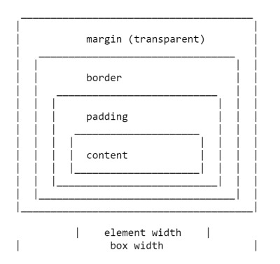
Depiction of the CSS Box Model in CSS1
The four margin properties for each side of the box and the margin shorthand were all defined in CSS1.
The CSS2.1 specification has an illustration to demonstrate the Box Model and also defines terms we still use to describe the various boxes. The specification describes the content box, padding box, border box, and margin box, each being defined by the edges of the content, padding, border, and margin respectively.

Depection of the CSS Box Model in CSS2
There is now a Level 3 Box Model specification as a Working Draft. This specification refers back to CSS2 for the definitions of the Box Model and margins, therefore it is the CSS2 definition we will be using for the majority of this article.
Margin Collapsing
The CSS1 specification, as it defined margins, also defined that vertical margins collapse. This collapsing behavior has been the source of margin-related frustration ever since. Margin collapsing makes sense if you consider that in those early days, CSS was being used as a documenting formatting language. Margin collapsing means that when a heading with a bottom margin, is followed by a paragraph with a top margin, you do not get a huge gap between those items.
When margins collapse, they will combine so that the space between the two elements becomes the larger of the two margins. The smaller margin essentially ending up inside the larger one.
Margins collapse in the following situations:
Adjacent siblings
Completely empty boxes
Parent and first or last child element
Let’s take a look at each of these scenarios in turn, before looking at the things which prevent margins from collapsing in these scenarios.
Adjacent Siblings
My initial description of margin collapsing is a demonstration of how the margins between adjacent siblings collapse. Other than in the situations mentioned below, if you have two elements displaying one after the other in normal flow, the bottom margin of the first element will collapse with the top margin of the following element.
In the CodePen example below, there are three div elements. The first has a top and bottom margin of 50 pixels. The second has a top and bottom margin of 20px. The third has a top and bottom margin of 3em. The margin between the first two elements is 50 pixels, as the smaller top margin is combined with the larger bottom margin. The margin between the second two elements in 3em, as 3em is larger than the 20 pixels on the bottom of the second element.
See the Pen [Margins: adjacent siblings](https://codepen.io/rachelandrew/pen/OevMPo) by Rachel Andrew.
See the Pen Margins: adjacent siblings by Rachel Andrew.
Completely Empty Boxes
If a box is empty, then it’s top and bottom margin may collapse with each other. In the following CodePen example, the element with a class of empty has a top and bottom margin of 50 pixels, however, the space between the first and third items is not 100 pixels, but 50. This is due to the two margins collapsing. Adding anything to that box (even padding) will cause the top and bottom margins to be used and not collapse.
See the Pen [Margins: empty boxes](https://codepen.io/rachelandrew/pen/JQLGMr) by Rachel Andrew.
See the Pen Margins: empty boxes by Rachel Andrew.
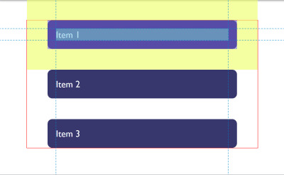
Parent And First Or Last Child Element
This is the margin collapsing scenario which catches people out most often, as it does not seem particularly intuitive. In the following CodePen, I have a div with a class of wrapper, and I have given that div an outline in red so that you can see where it is. The three child elements all have a margin of 50 pixels. However, the first and last items are flush with the edges of the wrapper; there is not a 50-pixel margin between the element and the wrapper.
See the Pen [Margins: margin on first and last child](https://codepen.io/rachelandrew/pen/BgrKGp) by Rachel Andrew.
See the Pen Margins: margin on first and last child by Rachel Andrew.
This is because the margin on the child collapses with any margin on the parent thus ending up on the outside of the parent. You can see this if you inspect the first child using DevTools. The highlighted yellow area is the margin.
DepvTools can help you see where your margin ends up
Only Block Margins Collapse
The last example also highlights something about margin collapsing. In CSS2, only vertical margins are specified to collapse — that is the top and bottom margins on an element if you are in a horizontal writing mode. So the left and right margins above are not collapsing and ending up outside the wrapper.
Note: It is worth remembering that margins only collapse in the block direction, such as between paragraphs.
Things Which Prevent Margin Collapsing
Margins never collapse if an item has absolute positioning, or is floated. However, assuming you have run into one of the places where margins collapse outlined above, how can you stop those margins collapsing?
The first thing that stops collapsing is situations where there is something between the elements in question.
For example, a box completely empty of content will not collapse it’s top and bottom margin if it has a border, or padding applied. In the example below I have added 1px of padding to the box. There is now a 50-pixel margin above and below the box.
See the Pen [Margins: empty boxes with padding do not collapse](https://codepen.io/rachelandrew/pen/gNeMpg) by Rachel Andrew.
See the Pen Margins: empty boxes with padding do not collapse by Rachel Andrew.
This has logic behind it, if the box is completely empty with no border or padding, it is essentially invisible. It might be an empty paragraph element thrown into the markup by your CMS. If your CMS was adding redundant paragraph elements, you probably wouldn’t want them to cause large gaps between the other paragraphs due to their margins being honored. Add anything to the box, and you will get those gaps.
Similar behavior can be seen with margins on first or last children which collapse through the parent. If we add a border to the parent, the margins on the children stay inside.
See the Pen [Margins: margin on first and last child doesn’t collapse if the parent has a border](https://codepen.io/rachelandrew/pen/vqRKKX) by Rachel Andrew.
See the Pen Margins: margin on first and last child doesn’t collapse if the parent has a border by Rachel Andrew.
Once again, there is some logic to the behavior. If you have wrapping elements for semantic purposes that do not display visually, you probably don’t want them to introduce big gaps in the display. This made a lot of sense when the web was mostly text. It is less useful as behavior when we are using elements to lay out a design.
Creating a Block Formatting Context
A new Block Formatting Context (BFC) will also prevent margin collapsing through the containing element. If we look again at the example of the first and last child, ending up with their margins outside of the wrapper, and give the wrapper display: flow-root, thus creating a new BFC, the margins stay inside.
See the Pen [Margins: a new Block Formatting Context contains margins](https://codepen.io/rachelandrew/pen/VJXjEp) by Rachel Andrew.
See the Pen Margins: a new Block Formatting Context contains margins by Rachel Andrew.
To find out more about display: flow-root, read my article “Understanding CSS Layout And The Block Formatting Context”. Changing the value of the overflow property to auto will have the same effect, as this also creates a new BFC, although it may also create scrollbars that you didn’t want in some scenarios.
Flex And Grid Containers
Flex and Grid containers establish Flex and Grid formatting contexts for their children, so they have different behavior to block layout. One of those differences is that margins do not collapse:
“A flex container establishes a new flex formatting context for its contents. This is the same as establishing a block formatting context, except that flex layout is used instead of block layout. For example, floats do not intrude into the flex container, and the flex container’s margins do not collapse with the margins of its contents.” — Flexbox Level 1
If we take the example above and make the wrapper into a flex container, displaying the items with flex=direction: column, you can see that the margins are now contained by the wrapper. Additionally, margins between adjacent flex items do not collapse with each other, so we end up with 100 pixels between flex items, the total of the 50 pixels on the top and bottom of the items.
See the Pen [Margins: margins on flex items do not collapse](https://codepen.io/rachelandrew/pen/mZxreL) by Rachel Andrew.
See the Pen Margins: margins on flex items do not collapse by Rachel Andrew.
Margin Strategies For Your Site
Due to margin collapsing, it is a good idea to come up with a consistent way of dealing with margins in your site. The simplest thing to do is to only define margins on the top or bottom of elements. In that way, you should not run into margin collapsing issues too often as the side with a margin will always be adjacent to a side without a margin.
Note: Harry Roberts has an excellent post detailing the reasons why setting margins only in one direction is a good idea, and not just due to solving collapsing margin issues.
This solution doesn’t solve the issues you might run into with margins on children collapsing through their parent. That particular issue tends to be less common, and knowing why it is happening can help you come up with a solution. An ideal solution to that is to give components which require it display: flow-root, as a fallback for older browsers you could use overflow to create a BFC, turn the parent into a flex container, or even introduce a single pixel of padding. Don’t forget that you can use feature queries to detect support for display: flow-root so only old browsers get a less optimal fix.
Most of the time, I find that knowing why margins collapse (or didn’t) is the key thing. You can then figure out on a case-by-case basis how to deal with it. Whatever you choose, make sure to share that information with your team. Quite often margin collapsing is a bit mysterious, so the reason for doing things to counter it may be non-obvious! A comment in your code goes a long way to help — you could even link to this article and help to share the margin collapsing knowledge.
I thought that I would round up this article with a few other margin-related pieces of information.
Percentage Margins
When you use a percentage in CSS, it has to be a percentage of something. Margins (and padding) set using percentages will always be a percentage of the inline size (width in a horizontal writing mode) of the parent. This means that you will have equal-sized padding all the way around the element when using percentages.
In the CodePen example below, I have a wrapper which is 200 pixels wide, inside is a box which has a 10% margin, the margin is 20 pixels on all sides, that being 10% of 200.
See the Pen [Margins: percentage margins](https://codepen.io/rachelandrew/pen/orqzrP) by Rachel Andrew.
See the Pen Margins: percentage margins by Rachel Andrew.
Margins In A Flow-Relative World
We have been talking about vertical margins throughout this article, however, modern CSS tends to think about things in a flow relative rather than a physical way. Therefore, when we talk about vertical margins, we really are talking about margins in the block dimension. Those margins will be top and bottom if we are in a horizontal writing mode, but would be right and left in a vertical writing mode written left to right.
Once working with logical, flow relative directions it becomes easier to talk about block start and block end, rather than top and bottom. To make this easier, CSS has introduced the Logical Properties and Values specification. This maps flow relative properties onto the physical ones.
For margins, this gives us the following mappings (if we are working in English or any other horizontal writing mode with a left-to-right text direction).
margin-top = margin-block-start
margin-right = margin-inline-end
margin-bottom = margin-block-end
margin-left = margin-inline-start
We also have two new shorthands which allow for the setting of both blocks at once or both inline.
margin-block
margin-inline
In the next CodePen example, I have used these flow relative keywords and then changed the writing mode of the box, you can see how the margins follow the text direction rather than being tied to physical top, right, bottom, and left.
See the Pen [Margins: flow relative margins](https://codepen.io/rachelandrew/pen/BgrQRj) by Rachel Andrew.
See the Pen Margins: flow relative margins by Rachel Andrew.
You can read more about logical properties and values on MDN or in my article “Understanding Logical Properties And Values” here on Smashing Magazine.
To Wrap-Up
You now know most of what there is to know about margins! In short:
Margin collapsing is a thing. Understanding why it happens and when it doesn’t will help you solve any problems it may cause.
Setting margins in one direction only solves many margin related headaches.
As with anything in CSS, share with your team the decisions you make, and comment your code.
Thinking about block and inline dimensions rather than the physical top, right, bottom and left will help you as the web moves towards being writing mode agnostic.

(il)
0 notes
Text
web designing and development overview
Cascading style sheets Dropdowns, Cascading style sheet forms, CSS Rounded Corners by applying border-radius: 25px; that’s an excellent example of cascading style sheet rounded corners. Cascading style sheet Transitions, Cascading style sheet button, cascading style sheet templates.PHP Variables, PHP echo and print Statements, PHP Data Types, PHP Strings, PHP Constants, php operators, PHP if...else...elseif Statements, php scripting fundamentals, variables data types and expressions, operators in php, looping and conditional constructs, standard functions, arrays, user defined functions, error handling and reporting, php superglobals, php forms etc.
It is the work involved in developing a website for displaying on the internet. It is used for developing a static page toa complex web page. It is mainly done or hired by professionals. Web development or website development is a part of information technology sector services. It is based on a content management system, there are three types of web development specialization front end developer back end developer and full stack developer. There are many tools of web development such as MySQL, Personal home page or hypertext preprocessor, hypertext markup language, wordpress etc.
First of all let us discuss websites. A website is a collection of web pages. Usually designing means a preliminary sketch. Designing websites is called website designing. Generally they are displayed or shown on the internet. It is an Information technology service which is given by any company or professional of that field. Mainly it contains or classified in three parts HTML5 which stands for hypertext markup language, CSS3 which stands for cascading style sheet, PHP which stands for hypertext preprocessor or personal home page, Bootstrap4, Javascript,jQuery and jQuery UI SQL which stands for structured query language, Web Hosting, Wordpress, AJAX which stands for Asynchronous JavaScript And XML( extensible markup language), MySQL.
1.Hypertext markup language: tim berners lee is the founder of hypertext markup language. It is a set of markup symbols or codes inserted into a file intended for display on the internet. First of all it is a computer language. By the help of hypertext mark up language we can create our own webpage. When we talk about hypertext markup language then here comes its content such as Hypertext markup language headings, hypertext markup language paragraph, hypertext markup language comments, hypertext markup language colors, hypertext markup language links, hypertext markup language images, hypertext markup language tables, hypertext markup language list which is of two types ordered list and unordered list. Hypertext markup language division,hypertext markup language id character which is described by # hash, hypertext markup language class for style, hypertext markup language forms, Hypertext markup language Canvas, hypertext markup language SVG. Look at below the format of hypertext markup language:
<!DOCTYPE html>
<html>
<head>
<style>
</style>
<title>
</title>
</head>
<body>
</body>
</html>
Let us discuss briefly:
1.The hypertext markup language Document Type: The declaration is not an HTML tag. It is an "information" to the browser about what document type to expect.
In HTML5, the <!DOCTYPE> declaration is simple:
<!DOCTYPE html>
2. The heading tag: The Hypertext markup language heading tags can be defined between h1 to h6. It is important to use the heading tag to show the heading structure.
3. Style tag: The <style> tag is used to define style information (CSS) for a document.
4.Title tag: a title tag described the main headline of the page. A title tag defines the title of the document.
Body tag: a body tag defined the content of the page. It defined the subject matter of the web page. such as headings, paragraphs, images, hyperlinks, tables, lists, etc.
2. Cascading style sheet(CSS3): the invention of this language was done by Håkon Wium Lie on October 10, 1994. Cascading style sheet is a language which describes the style of a hypertext markup language document. It makes the website stylish, decorating and attractive. Its content are Cascading style sheet comment, cascading style sheet colors, Cascading style sheet background, cascading style sheet border, cascading style sheet text, cascading style sheet margins which is given outside the border, cascading style sheet font, cascading style sheet inside padding, cascading style sheet outline, cascading style sheet list which is ordered list and unordered list, Cascading style sheet height and width, cascading style sheet table, cascading style sheet fonts size, font color font family, cascading style sheet font awesome icon, Cascading style sheet styles three types are classified as below:
1.Inline cascading style sheet: a unique style to a single hypertext markup language element.let us take an example below:
<h1 style=”color: blue;”>This a web designing</h1>
2. Internal cascading style sheet: An internal CSS is used to define a style for a single HTML page.
An internal CSS is defined in the <head> section of an HTML page, within a <style> element:
<!DOCTYPE html>
<html>
<head>
<style>
body {background-color: powderblue;}
h1 {color: blue;}
p {color: red;}
</style>
</head>
<body>
<h1>This is a heading</h1>
<p>This is a paragraph.</p>
</body>
</html>
3. External cascading style sheet: With an external style sheet, you can change the look of an entire web site, by changing one file!
To use an external style sheet, add a link to it in the <head> section of the HTML page:
<!DOCTYPE html>
<html>
<head>
<link rel="stylesheet" href="styles.css">
</head>
<body>
<h1>This is a heading</h1>
<p>This is a paragraph.</p>
</body>
</html>
Cascading style sheet links, cascading style sheet float, cascading style sheet alignment by using text-align:center; text-align:right; text-align: left; and text-align: justify; etc. Cascading style sheet opacity elements describe the transparency of the element. The opacity property can take a value from 0.0 - 1.0. The lower value, the more transparent:
img{
Opacity: 0.5;
}
Cascading style sheet navigation bars or menu bars are of two types: horizontal and vertical.
3. Pre hypertext processor or personal home page: it was invented by Rasmus Lerdorf in 1994. Pre Hypertext processor is a server scripting language, and a powerful tool for making dynamic and interactive web pages. The content of (core php)pre hypertext processor is pre hypertext processor installation.php comments are like below:
//this is a single line comment.
<?php = it shows the starting tag.
?> = it shows the ending tag.
/* this is knowns a multi line comment */
Advanced php content includes php date and time, php file upload, php cookies, php sessions, php object oriented programming language, MySQL Database, Intro to PHP Components & Settings, http headers and output buffering, object and classes in php, inheritance and access modifiers, scope resolution operator, class constant parents self, static members and functions, final methods and final classes, abstract members and abstract classes, overview of directory and file processing, Functions Of File ComponentAuthentication in PHP, File Uploads & Downloads, Session & Cookie ManagementAuthentication in PHP, PHP Functions for Managing Sessions. PHP Functions for Managing Sessions.
Php with MySQL server content: intro to MySQL server, Overview of PHP MyAdmin Tool, Database Creation, MySQL Tables & Data Types, Database Connections,PHP functions specific to My SQL arrays, SQL statements and joins, all about record set, authentication in php, Ajax, Angular javascript, CMS(Content management system) overview.
4. Bootstrap4: Bootstrap is the most popular HTML, CSS, and JavaScript framework for developing responsive, mobile-first websites.Bootstrap Grid System Bootstrap's grid system allows up to 12 columns across the page.
If you do not want to use all 12 column individually, you can group the columns together to create wider columns: https://meashvitech.com
0 notes
Text
Contextual Utility Classes for Color with Custom Properties
In CSS, we have the ability to access currentColor which is tremendously useful. Sadly, we do not have access to anything like currentBackgroundColor, and the color-mod() function is still a ways away.
With that said, I am sure I am not alone when I say I'd like to style some links based on the context, and invert colors when the link is hovered or in focus. With CSS custom properties and a few, simple utility classes, we can achieve a pretty powerful result, thanks to the cascading nature of our styles:
See the Pen Contextually colouring links with utility classes and custom properties by Christopher Kirk-Nielsen (@chriskirknielsen) on CodePen.
To achieve this, we'll need to specify our text and background colors with utility classes (containing our custom properties). We'll then use these to define the color of our underline, which will expand to become a full background when hovered.
Let's start with our markup:
<section class="u-bg--green"> <p class="u-color--dark"> Lorem ipsum dolor sit amet, consectetur adipiscing elit, <a href="#">sed do eiusmod tempor incididunt</a> ut labore et dolore magna aliqua. Aliquam sem fringilla ut morbi tincidunt. Maecenas accumsan lacus vel facilisis. Posuere sollicitudin aliquam ultrices sagittis orci a scelerisque purus semper. </p> </section>
This gives us a block containing a paragraph, which has a link. Let's set up our utility classes. I'll be defining four colors that I found on Color Hunt. We’ll create a class for the color property, and a class for the background-color property, which will each have a variable to assign the color value (--c and --bg, respectively). So, if we were to define our green color, we’d have the following:
.u-color--green { --c: #08ffc8; color: #08ffc8; } .u-bg--green { --bg: #08ffc8; background-color: #08ffc8; }
If you are a Sass user, you can automate this process with a map and loop over the values to create the color and background classes automatically. Note that this is not required, it’s merely a way to create many color-related utility classes automatically. This can be very useful, but keep track of your usage so that you don’t, for example, create seven background classes that are never used on your site. With that said, here is the Sass code to generate our classes:
$colors: ( // Define a named list of our colors 'green': #08ffc8, 'light': #fff7f7, 'grey': #dadada, 'dark': #204969 ); @each $n, $c in $colors { // $n is the key, $c is the value .u-color--#{$n} { --c: #{$c}; color: #{$c}; } .u-bg--#{$n} { --bg: #{$c}; background-color: #{$c}; } }
What happens if we forget to apply a utility class in your markup, though? The --c variable would naturally use currentColor… and so would --bg! Let’s define a top-level default to avoid this:
html { --c: #000000; --bg: #ffffff; }
Cool! Now all we need is to style our link. We will be styling all links with our trusty <a> element in this article, but you could just as easily add a class like .fancy-link.
Additionally, as you may know, links should be styled in the "LoVe-HAte" order: :link, :visited, :hover (and :focus!), and :active. We could use :any-link, but browser support isn't as great as CSS custom properties. (Had it been the other way around, it wouldn't have been much of an issue.)
We can start declaring the styles for our links by providing an acceptable experience for older browsers, then checking for custom property support:
/* Styles for older browsers */ a { color: inherit; text-decoration: underline; } a:hover, a:focus, a:active { text-decoration: none; outline: .0625em solid currentColor; outline-offset: .0625em; } a:active { outline-width: .125em; } @supports (--a: b) { /* Check for CSS variable support */ /* Default variable values */ html { --c: #000000; --bg: #ffffff; } a { /* * Basic link styles go here... */ } }
Let's then create the basic link styles. We'll be making use of custom properties to make our styles as DRY as possible.
First, we need to set up our variables. We want to define a --space variable that will be used on various properties to add a bit of room around the text. The link's color will also be defined in a variable with --link-color, with a default of currentColor. The fake underline will be generated using a background image, whose size will be adjusted depending on the state with --bg-size, set to use the --space value by default. Finally, to add a bit of fun to this, we'll also fake a border around the link when it's :active using box-shadow, so we'll define its size in --shadow-size, set to 0 in it's inactive state. This gives us:
--space: .125em; --link-color: currentColor; --bg-size: var(--space); --shadow-size: 0;
We’ll first need to adjust for the fallback styles. We'll set our color to make use of our custom property, and remove the default underline:
color: var(--link-color); text-decoration: none;
Let's next create our fake underline. The image will be a linear-gradient with two identical start and end points: the text's color --c. We make sure it only repeats horizontally with background-repeat: repeat-x;, and place it at the bottom of our element with background-position: 0 100%;. Finally, we give it its size, which is 100% horizontally, and the value of --bg-size vertically. We end up with this:
background-image: linear-gradient(var(--c, currentColor), var(--c, currentColor)); background-repeat: repeat-x; background-position: 0 100%; background-size: 100% var(--bg-size);
For the sake of our :active state, let's also define the box shadow, which will be non-existent, but with our variable, it'll be able to come to life: box-shadow: 0 0 0 var(--shadow-size, 0) var(--c);
That's the bulk of the basic styles. Now, what we need to do is assign new values to our variables depending on the link state.
The :link and :visited are what our users will see when the link is "idle." Since we already set up everything, this is a short ruleset. While we technically could skip this step and declare the --c variable in the initial assignment of --link-color, I'm assigning this here to make every step of our styles crystal clear:
a:link, a:visited { --link-color: var(--c); }
The link now looks pretty cool, but if we interact with it, nothing happens… Let's create those styles next. Two things need to happen: the background must take up all available height (aka 100%), and the text color must change to be that of the background, since the background is the text color (confusing, right?). The first one is simple enough: --bg-size: 100%;. For the text color, we assign the --bg variable, like so: --link-color: var(--bg);. Along with our pseudo-class selectors, we end up with:
a:hover, a:focus, a:active { --bg-size: 100%; --link-color: var(--bg); }
Look at that underline become a full-on background when hovered or focused! As a bonus, we can add a faked border when the link is clicked by increasing the --shadow-size, for which our --space variable will come in handy once more:
a:active { --shadow-size: var(--space); }
We're now pretty much done! However, it looks a bit too generic, so let's add a transition, some padding and rounded corners, and let's also make sure it looks nice if the link spans multiple lines!
For the transitions, we only need to animate color, background-size and box-shadow. The duration is up to you, but given links are generally around 20 pixels in height, we can put a small duration. Finally, to make this look smoother, let's use ease-in-out easing. This sums up to:
transition-property: color, background-size, box-shadow; transition-duration: 150ms; transition-timing-function: ease-in-out; will-change: color, background-size, box-shadow; /* lets the browser know which properties are about to be manipulated. */
We'll next assign our --space variable to padding and border-radius, but don't worry about the former — since we haven't defined it as an inline-block, the padding won't mess up the vertical rhythm of our block of text. This means you can adjust the height of your background without worrying about line-spacing! (just make sure to test your values)
padding: var(--space); border-radius: var(--space);
Finally, to ensure the styles applies properly on multiple lines, we just need to add box-decoration-break: clone; (and prefixes, if you so desire), and that's it.
When you're done, we should have these styles:
/* Styles for older browsers */ a { color: inherit; text-decoration: underline; } a:hover, a:focus, a:active { text-decoration: none; outline: .0625em solid currentColor; outline-offset: .0625em; } a:active { outline-width: .125em; } /* Basic link styles for modern browsers */ @supports (--a: b) { /* Default variable values */ html { --c: #000000; --bg: #ffffff; } a { /* Variables */ --space: .125em; --link-color: currentColor; --bg-size: var(--space); --shadow-size: 0; /* Layout */ padding: var(--space); /* Inline elements won't affect vertical rhythm, so we don't need to specify each direction */ /* Text styles */ color: var(--link-color);/* Use the variable for our color */ text-decoration: none; /* Remove the default underline */ /* Box styles */ border-radius: var(--space); /* Make it a tiny bit fancier ✨ */ background-image: linear-gradient(var(--c, currentColor), var(--c, currentColor)); background-repeat: repeat-x; background-position: 0 100%; background-size: 100% var(--bg-size); box-shadow: 0 0 0 var(--shadow-size, 0) var(--c, currentColor); /* Used in the :active state */ box-decoration-break: clone; /* Ensure the styles repeat on links spanning multiple lines */ /* Transition declarations */ transition-property: color, background-size, box-shadow; transition-duration: 150ms; transition-timing-function: ease-in-out; will-change: color, background-size, box-shadow; } /* Idle states */ a:link, a:visited { --link-color: var(--c, currentColor); /* Use --c, or fallback to currentColor */ } /* Interacted-with states */ a:hover, a:focus, a:active { --bg-size: 100%; --link-color: var(--bg); } /* Active state */ a:active { --shadow-size: var(--space); /* Define the box-shadow size */ } }
Sure, it's a bit more convoluted that just having an underline, but used hand-in-hand with utility classes that allow you to always access the text and background colors, it's a quite nice progressive enhancement.
It’s up to you to enhance this using three variables for each color, either rgb or hsl format to adjust opacity and such. You can also add a text-shadow to simulate text-decoration-skip-ink!
The post Contextual Utility Classes for Color with Custom Properties appeared first on CSS-Tricks.
Contextual Utility Classes for Color with Custom Properties published first on https://deskbysnafu.tumblr.com/
0 notes
Text
10 principles of digital accessibility for modern marketers
When we talk about digital accessibility as marketers, we’re talking about the intentional creation of an experience that can be accessed by as many people as possible.
Designing for digital accessibility means many things. It means designing for individuals with sensory or cognitive impairments. It means designing for people with physical limitations. It means designing for individuals who rely on adaptive and assistive technologies like screen readers or magnifiers to view digital content.
The key is building accessibility into your digital experience from the very start rather than bolting it on like an afterthought. Below, I’ve outlined some key accessibility principles to consider when creating your digital marketing materials.
Principles for developers
1. Apply standard HTML semantics
Accessible design begins with standard HTML semantics. Standard HTML enables screen readers to announce elements on page so that the user will know how to interact with the contents. When HTML tags without semantical information are used–such as <div> and <span> for visual styling – the browser will display the elements as the developer intended, which unfortunately, may not be very helpful for the user.
Keep in mind that the user’s experience with a screen reader can vary greatly. For instance, using <div class=”h1”>Introduction to Semantics</div> or custom coding to override default browser styles will produce something that resembles a header. However, a screen reader will not understand or announce that the element as a header.
Key takeaways
Use standard HTML whenever possible so that screen readers will maintain the structure and content when reading aloud.
Use structural elements to group elements and to create separate regions on a page, such as header, navigation, main and footer. Screen readers recognize these structural elements and announce them to the user and allow for additional navigation between elements.
2. Enable keyboard navigation
All websites should be keyboard accessible because not all consumers can use a mouse or view a screen. In fact, according to WebAIM Low Vision, 60.4% of survey respondents always or often use a keyboard for web page navigation. Additionally, individuals with permanent or temporary loss of their hands or fine muscle control may also use a keyboard or modified keyboards for navigation.
For keyboard navigation to work, a user must be able to navigate through a page by moving from focus item to focus item. A user typically follows the visual flow, going from left to right and top to bottom, from headers to main navigation, to page navigation and lastly to the footer. When using a keyboard for navigation, enter activates a focused link, and the space bar activates a focused form element. Tab facilitates navigation between elements. Escape allows the user to close an element.
Knowing this, it’s important to consider the actions a user might take. The rule of thumb is that if you can interact with a focusable element using a mouse, make sure that you can interact using a keyboard. These elements might include links, buttons, form fields or a calendar date picker.
Key takeaways
Ensure users can navigate with the keyboard to all interaction components of the website. List all your site’s focusable elements and create easy-to-use focus indicators.
Structure underlying source code to correctly order the content and navigation. Use CSS to control visual aspects of the elements.
Allow users to bypass navigation windows if there are too many links in drop downs.
3. Use attributes
When it comes to linking text and descriptions for URLs, screen readers can skip from link to link within an article. If vague link text like “Click Here” or “Read More” is used, it provides very little context or meaning for someone to interpret on a screen reader.
Be specific and descriptive with your link text and include meaningful phrases that describe the content that the link is connecting to. Instead of “Contact us” use more specific language like “Contact our sales team.” For images and videos, assign ALT attributes and use descriptive file names.
Key takeaways
Banish extraneous and non-descriptive words in your links like “Click Here,��� “Here,” and “Read More.” “10 Principles of Accessibility” reads better than “Click here to read the 10 principles of accessibility.”
Optimize file names and URL names and use both open and closed captioning for video content. Consider adding accurate video transcripts.
4. Use the ARIA label attribute
In some cases, the buttons or other interactive elements on your website may not include all the information needed for assistive technology. The ARIA label attribute enables assistive technology to override the HTML labels to allow the website owner to provide additional context to the element on a page.
In the following link example, a screen reader will announce “Bing Ads. Link.”
<a href=”…”> Bing Ads </a>
However, if the button itself is a call-to-action button, the site owner can use the ARIA label to allow the screen reader to speak the call-to-action text visible on the button. In this example, the screen reader will announce, “Sign Up for a Bing Ads Account. Link.”
<a href=”…” aria-label=”Sign Up for a Bing Ads Account”>Bing Ads</A>
Key takeaway
Use the ARIA label attribute within elements like forms and call-to-action buttons to define the visible text that a screen reader should read aloud.
5. Properly label and format forms
Make sure forms are intuitive and logically organized, with clearly identified instructions and labels. To ensure that users load the right keyboard format for all forms, use labels that are always visible and avoid putting placeholder text within form prompts.
From a formatting perspective, take advantage of borders for text fields and drop-down menus, and put forms in a single-column format. Also, use HTML input types, so users do not have to switch across types of virtual keyboards. For example, fields for phone numbers should pull up the numeric keyboard vs. a regular keyboard format.
Key takeaways
Be careful when using JavaScript in forms, which can make the form difficult to complete using a keyboard.
6. Use tables for data
There are two basic uses for tables online: data tables with row and column headers that display tabular data and tables for page layout. The intended use of HTML tables is for tabular data. Layout tables don’t typically have logical headers or information that can be mapped to cells within the table, so screen readers must guess the purpose of the table. For this reason, it’s important to use CSS for layout and reserve tables for data. Using CSS results in cleaner and more simplified HTML code.
Key takeaways
Use the appropriate mark-up for data tables and always include table headers. Always choose CSS over tables for page layout.
Principles for writers and graphic designers
7. Write content in a structured way
The structure and flow of your content are especially important for individuals who have a visual impairment and rely on screen readers. It’s also important for folks with cognitive and learning disabilities, as well as anyone scanning through content on a mobile screen. When writing for accessibility, summon your inner high-school English teacher and organize content clearly with descriptive headings for each section.
Key takeaways
Make text easy to read and logically structured. Be sure to use semantic markup for headings paragraphs, lists, and quotes.
8. Align to the left
Text alignment impacts readability, according to UX Movement. Centered text makes the viewer work harder because without the left straight edge, there is no consistent path for the eyes to follow when continuing to the next line of text. Use left-aligned text for a straight edge that makes it easier for the eyes to scan content and find breaks in the writing structure.
Key takeaways
Only use centered text headlines and short lines of text such as quotes and call outs. Avoid mixing text alignment.
9. Choose fonts judiciously
I love beautiful, artistic fonts. But the fact is that some fonts are easier to read than others. Which is why it’s important to use basic fonts. Sans-serif fonts are easier to read for people with visual or cognitive disabilities – even temporary, visual disabilities like reading a screen in bright sunlight.
Size also matters. Avoid font sizes smaller than 12 and choose absolute units (pixels or points) vs relative units (%) to define font size. Limit the number of fonts to make content easier to read. Don’t rely on the appearance of fonts (color, shape or placement) to convey the meaning of the text. Finally, avoid blinking or moving text – no user wants to chase a message around a screen.
Key takeaways
Choose simple fonts with plain, sans-serif endings, which make it easier for eyes to recognize letters.
Limit the use of font variations and sizes.
10. Put color to work
The application of color also impacts accessibility. According to a 2018 survey of users with Low Vision by WebAIM, 75% of respondents report multiple types of visual impairment, including 61% with light or glare sensitivity and 46% with contrast sensitivity.
Think about your color scheme and the contrast of colors to ensure that text is easily discernable from the background color. The Web Content Accessibility Guidelines (WCAG) recommend using a 4.5:1 contrast ratio for normal text. To put this into perspective, black text on a white background is 21:1 whereas gray text on a white background is 4.5:1.
Using color alone to convey information may not be accessible to those with visual impairments. For example, websites often use green to signal something positive and red to signal something negative, which can be difficult to discern for someone with a visual impairment. Instead, consider combining shapes or icons with color.
Key takeaways
Ensure your colors have ample contrast and combine color with graphics or symbols to help convey meaning.
Designing for accessibility does not need to be complex or costly. It just takes planning and the intentional application of accessibility principles to ensure a more inclusive experience for everyone.
Opinions expressed in this article are those of the guest author and not necessarily Search Engine Land. Staff authors are listed here.
About The Author
Christi Olson is a Search Evangelist at Microsoft in Seattle, Washington. For over a decade Christi has been a student and practitioner of SEM. Prior to joining the Bing Ads team within Microsoft, Christi worked in marketing both in-house and at agencies at Point It, Expedia, Harry & David, and Microsoft (MSN, Bing, Windows). When she’s not geeking out about search and digital marketing she can be found with her husband at ACUO crossfit and running races across the PacificNW, brewing and trying to find the perfect beer, and going for lots of walks with their two schnauzers and pug.
Source link
0 notes
Text
How Well Do You Know CSS Layout?
The difference between a CSS good experience and a long frustrating one is oftentimes a matter of a few small details. CSS is indeed nuanced. One of the most common areas where I see struggles is layout. Personally, I like to study patterns. I notice that I tend to use a small group of patterns to solve the majority of my layout problems. This article is about those CSS patterns I use to get myself through layout challenges. It is also about approaching situations agnostically, regardless of the CSS methodologies used, whether that’s SMACSS, BEM, or even the hot topic of CSS-in-JS because they all focus on the properties themselves rather than architecture, organization, or strategy.
Just for fun, let’s start with a test
We’ll use a platform that I happen to have made called Questionable.io and I’ve used it to create a test that we’ll get to below. Don’t worry, there is no personal data collected, results are anonymous and it’s totally free.
The purpose of the test is to see if you can recognize specific CSS behaviors and problems in context without first being presented with the material. I didn’t set out to make the test difficult, but CSS layout nuances tend to be somewhat complex, especially without having a lot of exposure to them. Remember, this all for fun. The results are not an indication of your awesomeness, but hopefully you get value out of it.
The test is 10 questions and should take 10 minutes or less.
Take CSS Layout Quiz
Interested in the test but don’t want to take it? Here’s a link to the questions with their correct answers.
Done already? Great! Let’s go over the questions one-by-one to get a better understanding of the layout patterns that are covered in the test.
Question 1: Box Model
Learning the Box Model should be high priority on anyone’s list. While this CSS-Tricks Box Model Article may be a bit old, don’t underestimate its value and relevance to modern CSS. The Box Model is prerequisite knowledge for almost every CSS topic related to layout.
This particular question is testing how to get the Box Model’s computed width. The box clearly has width: 100px; but it turns out that the default rules of the Box Model apply width properties to the content layer of the box. The computed width (how wide is rendered on the page) is the sum of the content layer, padding layer, and border layer. For this reason, the answer is 112px:
.box { width: 100px; /* Take this */ height: 50px; padding: 5px; /* Plus this x2 for left and right */ border: 1px solid red; /* Plus this x2 for left and right */ background-color: red; /* = 112px of computed width */ }
If you’ve encountered a situation where the last column or tab in a UI wraps down to the next line and you were confident that five tabs (all set to width: 20%;) adds up to 100%, then it’s very possible that this was the issue. Five tabs at 20% width does add up to 100%, but if there’s padding and/or borders involved, those will add width there won’t be room for the last tab to fit on the same line.
Around the time of CSS3 being introduced, a new tool called box-sizing came to CSS. This allows us to change what layer of the Box Model we want width to apply. For example, we can do box-sizing: border-box; which means we want any width rules to apply to the outside of the border layer instead of the content layer. In this test question, if box-sizing: border-box; had been applied, the computed width would have been 100px.
This is old news for some of you but a good reminder for pros and novices alike.
There are a number of articles on the Box Model and how to use box-sizing as a reset, so it’s applied to your entire project all at once. Box Sizing and Inheriting box-sizing Probably Slightly Better Best-Practice are two great articles right on CSS-Tricks to get started.
Question 2: Borders are pushy
The second test question could almost be considered "Part Two" of the first question. Remember, it’s one thing to read, "The Box Model has layers and they all contribute to the calculated width and hight." It’s another to be able to recognize a Box Model problem in a real situation. This particular problem is somewhat of a classic among those who have been doing CSS for a while. It stems from the fact that borders take up space and will push things around since they are a part of the Box Model. Introducing borders during a state-transition, like :hover, will mean that boxes get bigger and thus push subsequent boxes down. It can also create a jittery experience:
See the Pen CSS-Tricks: Borders are Dimension by Brad Westfall (@bradwestfall) on CodePen.
Out of all the possible solutions in the test question, doing border: 2px solid transparent on the initial "un-hovered" state would be the only one that fixes the problem. box-sizing doesn’t fix this problem because we are not explicitly setting a height. If we had, then the border would be factored on the inside of the height and there would be no shift — but this wasn’t the case.
There are also other solutions that weren’t mentioned as possible answers. One is faux borders with box-shadow and the other is to use outline instead of border. Either of those would have resulting in no shifting during state changes because they are not layers in the Box Model. Here’s another CSS-Tricks article to read more about these solutions
Keep in mind that outline does not support border-radius.
Question 3: Absolute position vs. fixed position
Aside from knowing when to use each and how they differ in visual behavior, it’s also very important to know the rules for how each positioning method attaches to a parent element with its top, right, bottom, or left properties.
First, let’s review Containing Block. The short definition is that a Containing Block is most often the parent of any given element. However, the rules for Containing Block are different between absolute and fixed elements:
1. For absolute elements: The Containing Block is the nearest ancestor parent that is not static. For example, when an element is absolute-positioned, and contains top, right, bottom, or left properties, it will position relative to any parent that has a position of absolute, relative, fixed, or sticky. 2. For fixed elements: The Containing Block is the viewport, regardless of any parents that have position values other than static. Also, the scrolling behavior is different than absolute in that position: fixed; elements stay "fixed" to the viewport as it scrolls, hence the name.
Many developers believe absolute-positioned elements only seek the nearest position: relative; parent. This is a common misconception simply because position: relative is most often paired with position: absolute; to make a Containing Block. The reason it’s commonly used is because relative keeps the parent in flow which is often the desirable behavior. There are times though that the Containing Block of an absolute positioned element is also absolute positioned. This is totally okay depending on the situation. If all parents are static, then the absolute positioned element will attach to the viewport — but in a way that scrolls with the viewport:
See the Pen CSS-Tricks: Position Absolute Scrolling by Brad Westfall (@bradwestfall) on CodePen.
There is a lesser-known caveat to the two rules above: Anytime a parent has a transform property (among a few others) with a value other than none, then that parent will become the Containing Block for absolute- and fixed-positioned elements. This can be observed in this Pen where the notice is position: fixed; and the parent has transform but only when hovered:
See the Pen CSS-Tricks: Containing Blocks by Brad Westfall (@bradwestfall) on CodePen.
Question 4: Parent and first/last child collapsing margins
This is one of those CSS details that can really bite you if you don’t know how it works. There is a CSS concept called Collapsing Margins and many people are familiar with the form of it called Adjacent Siblings Collapsing Margins. However, there is another form of it called Parent and First/Last Child Collapsing Margins which is lesser known. Here is a demo of both:
See the Pen CSS-Tricks: Collapsing Margins by Brad Westfall (@bradwestfall) on CodePen.
Each paragraph tag has a top and bottom margin of 1em that are provided by the browser. So far, that’s the easy part. But why is the gap between the paragraphs not 2em (the sum of the top and bottom)? This is called Adjacent Sibling Collapsing Margins. The margins overlap such that the larger of the two margins will be the total gap size, thus the gap in this case is 1em.
There’s something else happening that’s a little strange though. Did you notice that the top margin of the first paragraph doesn’t create a gap between it and the blue container div? Instead of a gap, it’s almost like it "contributes" the margin to the parent div as if the div had the top margin. This is called Parent and First/Last Child Collapsing Margins. This form of Collapsing Margins will not happen in some circumstances if the parent has any of these:
Top/Bottom padding of any value bigger than 0.
Top/Bottom border of any width bigger than 0.
Block Formatting Context, which can be created by things like overflow: hidden; and overflow: auto;).
display: flow-root (not well supported).
When I have the pleasure of explaining this small CSS detail to people and solving it with padding or border, the response is almost always, "what about padding or border of 0?" Well, that doesn’t work because the value must be a positive integer.
In the previous example, just 1px of padding allows us to toggle between using and preventing Parent/Child Collapsing Margins. The gap that shows up between the first/last paragraphs and the parent is the 1px of padding but now the margin is being factored to the inside of the container since the padding layer creates a barrier preventing collapsing margins.
Regarding the question, I’m confident you can see what the problem is in this UI:
See the Pen CSS-Tricks: Parent/Child Collapsing Margins by Brad Westfall (@bradwestfall) on CodePen.
The first .comment (without the .moderator class) is experiencing Collapsing Margins. Even without looking at the code, we can see that the moderator comment has a border and the non-moderator one does not. In the question, there were actually three answers that were considered correct. Each one is actually already applied in the source of the Pen, they're just commented out.
One reason why this form of Collapsing Margins isn’t as widely known as the others is the wide array of ways we can "accidentally" avoid it. Flexbox and grid items create a Block Formatting Context, so we don’t see this form of Collapsing Margins there. If our "comments" UI were a real project, chances are we would have had padding on all four coordinates to create spacing all the way around, which would fix any Collapsing Margins for us. As rare as it might be, I wouldn’t want you to spend a whole day scratching you head on this one, so it’s good to keep in your thoughts when working with layout.
Here are some CSS-Tricks articles on this subject:
Good ol’ Margin Collapsing
What You Should Know About Collapsing Margins
Question 5: Percent of what?
When it comes to using percentage units, the percent is said to be based on the Containing Block’s width or height (usually related to the parent). As we stated earlier, an element with transform will become a Containing Block, so when an element is using transform, the percentage units (for transform only) are based on its own size rather than the parent.
In this example, we can see that 50% means two different things depending on context. The first red block has margin-left: 50%; and the second red block is using transform: translateX(50%);:
See the Pen CSS-Tricks - Percentage and Transform by Brad Westfall (@bradwestfall) on CodePen.
Question 6: The Box Model strikes again... what a hangover!
Just when you thought we were done talking about Box Model...
See the Pen CSS-Tricks: Left: 0 Right: 0 by Brad Westfall (@bradwestfall) on CodePen.
The hangover stems from the fact that we are using width: 100%; on the footer and also adding padding. The container is 500px wide which means the footer's content layer (being 100%) is 500px wide before padding is applied to the outside of that layer.
The hangover can be fixed with one of these two common techniques:
Use box-sizing on the footer directly or via a reset, like we discussed earlier.
Remove the width and do left: 0; right: 0; instead. This is a great use case for doing a left value and a right value at the same time. Doing so will avoid Box Model issues because the width will use its default value auto to take up any available space between paddings and borders when left: 0; right: 0; are set.
One of the options was "Remove the padding on the footer." This would technically work to fix the hangover because the content layer being 100% would have no padding or border to expand it beyond the width of the container. But I think this solution is the wrong approach because we shouldn’t have to change our UI to accommodate Box Model issues that are easily avoided.
The reality for me is that I always have box-sizing: content-box; as apart of my reset. If you also do this, then perhaps you don’t see this problem often. But I still like to do the left: 0; right: 0; trick anyways because, over time, it has been more stable (at least in my experience) than having to deal with Box Model issues arising from width: 100%; on positioned elements.
Question 7: Centering absolute and fixed elements
Now we’re really starting to combine all the material from above with the centering of absolute and fixed elements:
See the Pen CSS-Tricks: Modal (Lightbox) Centering by Brad Westfall (@bradwestfall) on CodePen.
Since we’ve already covered most of the material in this test question, I’ll simply point out that horizontal and vertical centering can be done "the old school way" with negative margins or the newer "kinda old school but still good" way of doing transforms. Here is an amazing CSS-Tricks guide on all things centering.
It used to be said that if we know the width and height of the box, then we should use negative margins because they’re more stable than transitions, which were new to browsers. Now that transitions are stable, I use them almost all the time for this, unless I need to avoid a Containing Block.
Also know that we can’t use any margin: auto; tricks for this because we need modals to "hover" over the content which is why position is typically used to them out of Normal Flow.
Speaking of which, let’s move on to the next question, which deals with centering with Normal Flow.
Question 8: Centering elements with Normal Flow
Flexbox brought us many amazing tools for solving difficult layout problems. Before it’s release, it was said that vertical centering was one of the most difficult things to do in CSS. Now it’s somewhat trivial:
.parent { display: flex; } .child { margin: auto; }
See the Pen CSS-Tricks: Flexbox Centering (Vertical and Horizontal) by Brad Westfall (@bradwestfall) on CodePen.
Notice that with flexbox items, the margin: auto is being applied to top, right, bottom, and left to center vertically and horizontally. Doing vertical centering with auto didn't work in the past with block-level elements which is why doing margin: 0 auto is common.
Question 9: Calculate mixed units
Using calc() is perfect when two units that we can’t add up on our own need to be mixed or when we need to make fractions easier to read. This test question asks us to figure out what calc(100% + 1em) would be based on the fact that the width of the div is 100px. This was a little tricky because it actually doesn't matter that the div is 100px wide. The percent is based on the parent's width so the answer is Whatever 100% of the containing block's (parent's) width is plus 1em.
There are a few key places where I see myself regularly reaching for calc(). One is anytime I want to offset something by 100% but also add a fixed amount of extra space. Dropdown menus can be a good example of this:
See the Pen CSS Tricks: Calculate Mixed Units by Brad Westfall (@bradwestfall) on CodePen.
The trick here is that we want to make a "dropdown system" where the dropdown menu can be used with different trigger sizes (in this case, two different size buttons). We don’t know what the height of the trigger will be but we do know that top: 100%; will placed at the top of our menu and at the very bottom of the trigger. If every menu needs to be at the bottom of their respective trigger, plus .5em, then that can happen with top: calc(100% + 0.5em);. Sure, we could use top: 110%; as well, but that extra 10% would be context-dependent based on the height of the trigger and the container.
Question 10: Negative margins
Unlike positive margins that push away from their siblings, negative margins pull them closer together without moving the sibling elements. This final test question offers two solutions that technically work to eliminate the double border in our button group, but I strongly prefer the negative margins technique because removing borders would make it much more challenging to do certain tricks like this hover effect:
See the Pen CSS Tricks: Negative Margins with Button Groups by Brad Westfall (@bradwestfall) on CodePen.
The effect is a "common border" that is shown between the buttons. Buttons can't actually share a common border so we need this negative margin trick to make the two borders overlap. Then I'm using a z-index to manage which border I want to be on top depending on the hover state. Note that z-index is useful here even without absolute positioning, but I did have to do position: relative. If I had used the technique to remove the left border of the second button, this effect would have been more difficult to pull off.
It all adds up!
There is one last demo I want to show you that utilizes many tricks we’ve discussed so far. The task is to create UI tiles that expand all the way to the left and right edges of the container with gutters. By tiles, I mean the ability to have a list of blocks that wraps down to the next line when there’s no more space. Hover over the tiles to see the full effect:
See the Pen CSS-Tricks: Flexbox Tiles (Edge-to-Edge) by Brad Westfall (@bradwestfall) on CodePen.
The hurdle with this task is the gutters. Without gutters, it would be trivial to get the tiles to touch the left and right edge of the container. The problem is that the gutters will be created by margin, and when we add margin to all sides of the tile, we create two problems:
Having three tiles with width: 33.33%; in combination with margin will mean three tiles cannot fit on one row. While box-sizing will allow us to have padding and borders on the .tile which will be contained within 33.33%, it will not help us with margins — that means the computed width of the three tiles will be more than 100%, forcing the last one down to the next line.
Tiles on the far left and right side will no longer touch the edges of the container.
The first problem can be solved with calc((100% / 3) - 1em). That’s 33.33% minus the left and right margins of each tile. Adjacent Sibling Collapsing Margins don’t apply here because there is no such thing as Collapsing Margins when it comes to left and right margin. As a result, the horizontal distance between each tile is the sum of the two margins (1em). It also doesn’t apply in this case with the top and bottom margins because the first tile and the fourth tile are technically not Adjacent Siblings, even though they happen to be right next to each other visually.
With the calc() trick, three tiles are able to fit on a row, but they still don’t extend to edges of the container. For that, we can use negative margins in the amount equal to the left and right margin of each tile. The green dotted line in the example is the container where we will apply negative margins to draw out the tiles to match the edge of the surrounding content. We can see that how it extends into its parent’s padding area (the main element). That’s okay because negative margins don’t push neighboring elements around.
The end result is that the tiles have nice gutters that extend edge-to-edge so that they align to the neighboring paragraph tags outside the tiles.
There’s a lot of ways to solve tiles (and they usually come with their own pros and cons). For example, there's a rather elegant solution using CSS Grid discussed by Heydon Pickering which is responsive using a technique that mimics container queries (but with Grid magic). Ultimately, his Grid solution to tiles is much nicer than the flexbox solution I presented, but it also has less browser support. Nonetheless, the flexbox solution is still a great way to demo all the tricks from this article at the same time.
You may already be familiar with Heydon's work. He's known for creating clever tricks like the Lobotomized Owl selector. If you're not familiar, it's certainly worth knowing and I have a video where I talk about it.
Summary
I stated at the start that I tend to look for patterns when solving problems. This article isn’t necessarily about the exact demo scenarios from above; it’s more about a set of tools that can be used to solve these and many other layout problems that we are all likely to come across. I hope these tools take you far and I look forward to hearing your contributions in the comments.
By the way, there are a number of excellent resources that cover the Box Model in thorough detail, most notably ones by Rachel Andrews and Jen Simmons that are certainly worth checking out. Rachel even has a newsletter completely dedicated to layout.
Box Alignment Cheatsheet - Great resource with visuals that highlight the various properties that affect how elements are aligned, either by themselves or relative to other elements.
Jen Simmons Labs - A slew of helpful posts, demos and experiments using modern layout methods.
The post How Well Do You Know CSS Layout? appeared first on CSS-Tricks.
😉SiliconWebX | 🌐CSS-Tricks
0 notes
Text
How to Search Engine Optimize (SEO) A Website
This article is a follow-up to my last entry about search engine optimization (or SEO), which you can also find on EzineArticles. While the first article provided a broad overview of what SEO is and how it can help you market your business, this one is meant to provide a more detailed outline of how the process works and some of the tasks you should perform in order to optimize a site. My intended audience for this article is web design firms and marketing companies who are looking to break into the world of SEO, but need a primer to help them get started.
Getting Started There is one key piece of information to keep in mind through the entire optimization process, and it can be said like this: Search engines have one goal, and that is to return the most relevant results for any given search query. SEO is essentially the process of ensuring that those search engines understand that your site or your client's site is, in fact, a good, relevant result for certain queries. For example, if you or your client owns a coffee shop in Philadelphia, then their website is absolutely a relevant result for the query "Philadelphia coffee shops". However, the search engine algorithms can not determine the relevancy of a given page on their own if the site is not properly optimized. Let's take a look at the key steps that are involved in optimizing a site, so allowing the search engines to realize, "oh! This is a very relevant result for the query I was given".
Choosing Your Primary Keywords and Phrases Choosing the primary keywords and phrases which you will be optimizing for is one of the most important pieces of SEO. You need to find what I call a "middleground" keyword - something that's not so broad that it's useless to optimize for, but not so specific that no one is searching for it.
Consider a client who asks you to optimize for the phrase "real estate". With very few exceptions, this is a perfect example of a keyword that is simply too broad to be worthwhile. Anyone searching for "real estate" will immediately realize that they need to refine their search beyond such a broad term. For example - are they looking to buy real estate, sell it, invest in it, or find a real estate agent? And are they looking for commercial properties or residential properties? To buy or rent?
It should be immediately clear that optimizing for such a broad term is almost always a wasted effort. Not only because the optimization process itself will be excessively difficult, but because, more than likely, the traffic generated will not result in any sales ("conversions").
Now, let's assume your client is ABC Real Estate in Bala Cynwd, PA, and they are residential real estate agents specializing in the Philadelphia market. They may ask you to optimize for "ABC Real Estate Bala Cynwd". This is an example of a keyword that's incredibly simple to optimize for (I probably would not even call it "optimization" since there is only one ABC Real Estate in Bala Cynwd, pretty much guaranteeing you the # 1 result), but this keyword is almost useless for driving new traffic to the site. People searching for the company name already know about the company and probably know what the company does. You want to drive traffic from people who are searching for a product or service the company offers, even when the potential customer does not know about the company yet.
"Homes for sale in Philadelphia" is a keyword to think about in this instance. We know from this query that the person performing the search is looking for homes for sale in Philadelphia. Our client is prepared to provide not only home search capability, but real estate agents who are willing to help the searcher in their quest for a new home. This is the kind of traffic you want to drive to the site. You should choose 2-3 similar keyword phrases to serve as the primary search goals. It's important to note that your site will not be locked into appearing for only those phrases, if you perform the optimization correctly. Now, let's take a look at how you actually go about doing that.
Site Structure The first thing to look at when tasked with optimizing a site is the structure of the site itself - the HTML code, the URL / link structure, and the title and meta tags. If the site does not exist yet, but you will need it to be optimized once it's built, this section still very much applies, so read on.
Navigation One of the most common problems I see with poorly-optimized sites is a navigation system that is effectively invisible to search engines. Oftentimes, the main navigation was created with javascript or flash, and no alternative sitemap or links are provided. While search engines such as Google are getting much better at identifying links embedded in javascript and flash, it is still a much better idea to provide a plain HTML / CSS based navigation system. You can do this without sacrificing any of the javascript or flash functionality or changing the user experience at all, so there is no reason not to do it. If your navigation is javascript based, make sure you are using a "pure CSS" menu system, meaning that you can code your navigation as if it were a normal div based menu, but the script will transform these tags into javascript-powered dropdown menus . Some of the menu systems we use at Context are: Superfish, OpenCube, and SmartMenu. If your navigation is flash based, you can use a dynamic flash publishing script (see swfobject) that will transparently replace the HTML-based navigation with your flash element. In both of these cases, the search engines will see the original HTML and CSS based navigation elements, which are much easier to traverse and index than their javascript or flash-based counterparts.
A Note about flash based sites If your site is done completely in flash, you may want to re-think your design, instead using flash for a header, footer, and / or borders, but leaving the main content as HTML and CSS. Otherwise, I recommend essentially building two full versions of the site - one in HTML and one in Flash. As I mentioned above, search engines are becoming much more effective at indexing flash pages, but you are still doing yourself a disservice in terms of SEO if your site is 100% flash based. Also, completely flash driven sites can often migrate user experience, but that's a topic for another article.
URL Structure Now let's talk about URLs. Search engines like very clean URLs, the kind you see at the top of this (or any Wordpress-based) blog. Even if your site is driven by dynamic content, you will want to rewrite your URLs to look like static pages. For example, rather than having /product-view.php?fromcat=5&id=32, you will want a url that looks more like /products/32/this-is-the-product-name.html. Not only is the actual URL part of what search engines look at when determine what a page might be about (which is why we include the product name), they also have a much easier time indexing static URLs as opposed to complicated dynamic URLs with a string of variables at the end. There are many ways to accomplish the writing, and it's usually not very difficult. The easiest way is to use Apache's mod_rewrite module, which lets you transparent redirect one URL to another, while the visitor only sees the original. If you are using ASP.net on IIS, there is an excellent rewrite module for IIS6, and IIS7 has built-in rewriting capabilities. Finally, development frameworks such as Fuse for PHP or Ruby on Rails have extensive "routing" functionality which allows very fine grained control over the URL structure.
Title and Meta Tags The "title" and "meta" description tags are very important in SEO. These tags are your first chance to explain to a search engine what your site is all about, and you should follow some guidelines when generating these tags:
The title and meta description tags should include your primary keywords and phrases, but only once. Do not repeat "Philadelphia coffee shop" five times in the title tag, because the search engines will penalize the site for keyword stuffing.
While there are no strict rules on length, the title tag should be no longer 60-80 characters, the meta tag around 200 maximum.
The title and meta tags need to be different for every page. Even if the title or meta description tags for some pages do not actually include your primary search phrases (and they do not have to), they should be clear and relevant to every individual page.
Content It is a common SEO adage that "content is king", and although the SEO process has gotten a bit more complex over the years, it is still very true.
Your site should contain as much useful, unique content as possible. Simply plastering bits of text all over the site will not do you much good, but the best thing you can do to optimize a site is to provide high quality content that people actually want to see or read. Developing such content can be tricky, but here are some basic guidelines:
Every page should have at least two paragraphs of relevant content. There are some exceptions here because some pages simply do not require any text, but you should try to work in as much high quality, relevant (remember: HIGH QUALITY and RELEVANT) textual content as possible.
Do not strictly exclusively on bulleted lists. Bulleted lists are fine and will not hurt your positioning, but they should be augmented by rich prose, since larger bodies of text will net you the most gains in terms of SEO.
Include your targeted search keywords and phrases in the content, but do not "stuff" keywords by repeating them more times than is reasonable. There is a balancing act to be performed here, but as a general rule, I try not to include the same keyword or phrase more than once per two paragraphs. There are plenty of exceptions, however, so it's something that you have to develop a knack for after some trial and error.
Your home page is the holy grail of content for your site. Every single website only gets one home page, so the content there is weighed very heavily by search engines. Make sure your home page content is of a decent length (at least 2 paragraphs), contains your primary keywords and phrases (gracefully - do not keyword stuff), and is well written and relevant.
Include as much content on as many different pages as you can. Remember, though: high quality and relevant. Do not create pages for the sake of having more pages - think about information that will be relevant to your potential customers and provide it through your website. For example, if you are optimizing for a coffee shop in Philadelphia, a page dedicated to how to identify & choose the best coffee beans might be a great resource. Oftentimes, you will be surprised and unable to predict some of the keywords and phrases that drive people to your site, but these relevant "landing pages" ensure that you can pick up good traffic that you were not unnecessarily expecting.
Inbound Link Building Another essential piece of the SEO puzzle is getting other sites to link back to yours. There are several ways to do this, but also some pitfalls to avoid.
Directory submission - this is the process of simply adding your site to online directories that list and link to external sites. There are a few important things to remember when submitting your site to directories, however:
There are a lot of good free directories that do not require a reciprocal link. Do not get paid up paying for every submission (although there are some directories that are worth paying for).
Make sure that the directory itself is in good standing with Google. You will want to check its Page Rank (Google's 1/10 score of the importance of a site). The easiest way to check page rank is to install the Google Toolbar
Make sure the directory links directly to your site and does not first go to a tracking page. If the link is not direct, it is essentially useless.
Try to find directories that allow you to specify the anchor text - the text that people will be clicking on to get to your site. Make the anchor text one of your primary keyword phrases, eg the words "Philadelphia coffee shop" should link to philacoffeeshopsite.com.
Press release distribution - Your client should have press releases that outline the current events at their company. These should be posted as text (instead of or in addition to PDF) format both on the website, but also on aggregate press release sites that allow you to submit your own press release. You should also include links back to your site directly in the press release
Social Networking & web 2.0 - There are many sites available that allow you to post your own business profiles on the web. Hotfrog and Merchantcircle are good examples of such sites, and I recommend adding a listing there for any site you are optimizing. Additionally, if you have interesting, relevant content to share with the public, consider posting it to aggregate sites such as Digg.com.
Conclusion Hopefully this article provided insight into the SEO process, and can act as a "getting started" primer for companies who are looking to expand their services offerings. I do not recommend that business owners attempt to optimize their own site, because you will not get the results you expect, and your time is better running the business. Hire a competent SEO company instead, and work with them to position your site for ideal keywords and phrases.
by Jim J Keller NN Hosting Review
Source link : How to Search Engine Optimize (SEO) A Website Home Page: NN Hosting Reviews Blog: NN Hosting Reviews Blog
0 notes
Text
Java 10 Support & Nested Reports Provision by LINQ Reporting Engine inside Java Apps
What's New in this Release?
Aspose development team is happy to announce the monthly release of Aspose.Words for Java 18.8. There are 86 improvements and fixes has included in this regular monthly release, such as Java 10 tested and supported now, New and updated Samples and Examples, Change SHA-1 to SHA-256 and public asymmetric key from 1024 to 2048 for the license mechanism, Implemented support for “underline trailing spaces” compatibility option, Implemented support for paragraph alignment in Omath when inserted using EQ fields, Enhanced computation of interscript spacing values based on TTF properties, Improved wrapping of text around floating objects, Improved calculation of position of floating tables and shapes, Improved floater overlapping logic, Improved computing of pages numbers in continuous sections which have restart attribute and conflicting oddity, Fixed line justification issue when RTL span is at the end of the line, Fixed issue with null dml properties, Fixed issue with rendering of floating shapes in truncated headers/footers, Fixed issue with rendering of lines inside of a field result when updated in truncated part of a cell, Improved rendering of math operators in MathML objects, Improved rendering of MathML objects with n-ary math element when n-ary character and limit location are not specified, Fixed a bug with rendering of a math n-ary element if it is part of a fraction, Fixed a bug when polyline with an arrow and a very small line segment at the end, Fixed a bug when an arrow pointer is incorrectly directed while rendering Bezier curves with arrows, Fixed a bug where the end of the line was outside the “stealth arrow” when rendering, LINQ Reporting Engine supports nested reports. Aspose team has tested Aspose.Words for Java with Java 10 and is pleased to announce that Java 10 is now supported by the latest versions of Aspose.Words for Java. Developers can insert contents of outer documents to their reports dynamically using LINQ Reporting. Starting from Aspose.Words for Java 18.8, developers can enable doc tag to check the template syntax and populate with data using LINQ Reporting. By default, a document being inserted is not checked against template syntax and is not populated with data. It has added support to create snip corner rectangles in this version. This release has added HtmlSaveOptions.ExportCidUrlsForMhtmlResources property. Users can use this property to save the resources of MHTML document using the “Content-Id” URL Scheme. It has also added new property ShowComments in LayoutOptions class. This property is used to show or hide comments in fixed file formats e.g. PDF, XPS. By default, the comments are visible. A new property ShowInBalloons has been added to RevisionOptions class. This property is used to show revisions in the balloons. By default, the revisions in balloons are not shown. Previously, Aspose.Words used to save “@font-face” rules of HtmlFixed documents into a separate file “fontFaces.css” while other CSS declarations were written to “styles.css”. We have changed this behavior and now Aspose.Words saves all CSS rules and declarations into the same file “styles.css”. In case the old behavior is required for compatibility with legacy code, it can be restored by using the new public property HtmlFixedSaveOptions.SaveFontFaceCssSeparately. It has added new property RecognizeUtf8Text in RtfLoadOptions class. This property allows to detect UTF-8 encoded characters and preserve them during import. Obsolete value NumInDash was removed from NumberStyle enum. Please, use NumberStyle.NumberInDash value instead. Obsolete method ToTxt() was removed from Node class. Please, use ToString(SaveFormat.Text) instead. The obsolete property Location has been removed from the FootnoteOptions and EndnoteOptions classes. Please use the Position property. Also, the FootnoteLocation emum type has been removed. The list of most notable new and improved features added in this release are given below
Allow setting "Layout in Table Cell" option of shapes
Add feature to create Snip Corner Rectangle
Track changes rendering issue in resultant PDF
Add a feature to escape ampersand symbol during replacement
Change SHA-1 to SHA-256 and public asymmetric key from 1024 to 2048 for the license mechanism
Add feature to populate template document loaded by "doc" tag
Include Formatting Comments in Save To Tiff
Add feature to detect encoding characters and change them to UFT-8 in output RTF
SaveDate field's result become visible after re-saving the document
Reference resources in MHTML documents using the "Content-Id" URL scheme
Spaces and special characters trimmed when rendering
Remove UTF-8 BOM from CSS parts in MTHML documents
Rework span shallow size tests
Combine styles when saving Words to HTML with HtmlFixedSaveOptions
Incorrect font fallback for Asian characters
Implement the second way of rendering the shape outline
Line Caps Rendering - PolyLine caps direction is not correct
Update minimum possible font size
Remove Aspose logo from Venture license in trial mode
Remove obsolete public properties EndnoteOptions.Location/FootnoteOptions.Location
Set RunPr.ComplexScript to True for Thai letter list labels
SetLicense throws IllegalStateException.
Update Metered license code.
Save HTML to PDF-A_1B does not generate indexed images anymore
Borders look incorrect after converting document to PDF using MS Word or Bullzip PDF Printer
Table with different preferred widths extends outside the page when rendered
Table preferred width no longer automatically resizes when cell preferred width is set
Table column widths are calculated incorrectly during rendering
Cell's contents move to next line after conversion from Doc to Pdf
Elbow Arrow Connectors are not rendering correctly in PDF
Visio objects are overlapped in output PDF
Floating table is positioned improperly
Hijri Date is displayed in English Numbers in output DOCX/PDF
Text is missing after conversion form DOCX to PNG
DOCX to PDF conversion results are inconsistent in Multithreading
DOCX to HTML Issue with HtmlOfficeMathOutputMode as MathML
OfficeMath nodes are exported incorrectly as MathML in output HTML
Image generated from Dokkered web app is completely black.
Thai characters are converted to numbers in PDF
text-anchor' property is not imported correctly
Insert SVG into Aspose.Word.Document results in black image
The rendered PDF output is corrupted
Document.UpdateFields displaces text of frame when using 'IncludeText'
Arrow shape is rendered incorrectly
Numbers List Change while Converting Doc to PDF
Paragraph's text is missing in output PDF
Incorrect rendering of the OMath if FirstLineIndent is specified, after converting to PDF
Problem of incorrect Revisions Count after Comparing documents
CSS border style is not applied to image in output PDF/DOCX
Content is rendered on multiple pages in HtmlFixed/PNG
Distance between symbols not preserved in PDF
Borders of some SmartArt elements not preserved in PDF
LayoutCollector.GetStartPageIndex returns wrong page number
Equations render partially in generated PDF
Document.UpdateFields generates wrong alphabetical sort order for INDEX field
PDF output doesn't match the original DOCX document
Word breaking in Thai language is wrong
Signature images are not visible in generated PDF/Imag
Unknown yellow color rectangle is rendered after conversion from DOCX TO PDF
DOCX to PDF conversion issue with textbox shape glow
StartTrackRevisions hangs and process does not complete
Incorrect rendering of the text outline with zero width after converting to PDF
Extra pages are created when DOCX is converted to PDF
Improve conditions for hanging punctuation
Vertical spacing between Paragraphs increased when rendering to PDF
Remove whitespaces from MathML content while importing html to model.
Line Caps Rendering - Stealth arrow is rendered incorrectly.
Line Caps Rendering - Curved arrow has incorrect direction.
Other most recent bug fixes are also included in this release
Newly added documentation pages and articles
Some new tips and articles have now been added into Aspose.Words for .NET documentation that may guide users briefly how to use Aspose.Words for performing different tasks like the followings.
Inserting Documents Dynamically
Create Snip Corner Rectangle
Overview: Aspose.Words
Aspose.Words is a word processing component that enables .NET, Java & Android applications to read, write and modify Word documents without using Microsoft Word. Other useful features include document creation, content and formatting manipulation, mail merge abilities, reporting features, TOC updated/rebuilt, Embedded OOXML, Footnotes rendering and support of DOCX, DOC, WordprocessingML, HTML, XHTML, TXT and PDF formats (requires Aspose.Pdf). It supports both 32-bit and 64-bit operating systems. You can even use Aspose.Words for .NET to build applications with Mono.
More about Aspose.Words
Homepage Java Word Library
Download Aspose.Words for Java
Online documentation of Aspose.Words
Post your technical questions/queries to Aspose.Words Forum
Receive notifications about latest news and supported features by subscribing to Aspose.Words Blog
#Java 10 Support#Nested Reports by LINQ Reporting Engine#Create Snip Corner Rectangle#Reference Resources in MHTML File#Java Word Processing APIs#Show Revisions in Balloons
0 notes
Text
Faux Grid Tracks
A little while back, there was a question posted to css-discuss:
Is it possible to style the rows and columns of a [CSS] grid—the grid itself? I have an upcoming layout that uses what looks like a tic-tac-toe board—complete with the vertical and horizontal lines of said tic-tac-toe board—with text/icon in each grid cell.
This is a question I expect to come up repeatedly, as more and more people start to explore Grid layout. The short answer is: no, it isn’t possible to do that. But it is possible to fake the effect, which is what I’d like to explore.
Defining the grid
Since we’re talking about tic-tac-toe layouts, we’ll need a containing element around nine elements. We could use an ordered list, or a paragraph with a bunch of <span>s, or a <section> with some <div>s. Let’s go with that last one.
<section id="ttt"> <div>1</div> <div>2</div> <div>3</div> <div>4</div> <div>5</div> <div>6</div> <div>7</div> <div>8</div> <div>9</div> </section>
We’ll take those nine <div>s and put them into a three-by-three grid, with each row five ems high and each column five ems wide. Setting up the grid structure is straightforward enough:
#ttt { display: grid; grid-template-columns: repeat(3,5em); grid-template-rows: repeat(3,5em); }
That’s it! Thanks to the auto-flow algorithm inherent in Grid layout, that’s enough to put the nine <div> elements into the nine grid cells. From there, creating the appearance of a grid is a matter of setting borders on the <div> elements. There are a lot of ways to do this, but here’s what I settled on:
#ttt > * { border: 1px solid black; border-width: 0 1px 1px 0; display: flex; /* flex styling to center content in divs */ align-items: center; justify-content: center; } #ttt > *:nth-of-type(3n) { border-right-width: 0; } #ttt > *:nth-of-type(n+7) { border-bottom-width: 0; }
The result is shown in the basic layout below.
Figure 1: The basic layout
This approach has the advantage of not relying on class names or what-have-you. It does fall apart, though, if the grid flow is changed to be columnar, as we can see in Figure 2.
#ttt { display: grid; grid-template-columns: repeat(3,5em); grid-template-rows: repeat(3,5em); grid-auto-flow: column; /* a change in layout! */ }
Figure 2: The basic layout in columnar flow order
If the flow is columnar, then the border-applying rules have to get flipped, like this:
#ttt > *:nth-of-type(3n) { border-bottom-width: 0; } #ttt > *:nth-of-type(n+7) { border-right-width: 0; }
That will get us back to the result we saw in Figure 1, but with the content in columnar order instead of row order. There’s no row reverse or column reverse in Grid like there is in flexbox, so we only have to worry about normal row and columnar flow patterns.
But what if a later change to the design leads to grid items being rearranged in different ways? For example, there might be a reason to take one or two of the items and display them last in the grid, like this:
#ttt > *:nth-of-type(4), #ttt > *:nth-of-type(6) { order: 66; }
Just like in flexbox, this will move the displayed grid items out of source order, placing them after the grid items that don’t have explicit order values. If this sort of rearrangement is a possibility, there’s no easy way to switch borders on and off in order to create the illusion of the inner grid lines. What to do?
Attack of the filler <b>s!
If we want to create standalone styles that follow grid tracks—that is, presentation aspects that aren’t directly linked to the possibly-rearranged content—then we need other elements to place and style. They likely won’t have any content, making them a sort of structural filler to spackle over the gaps in Grid’s capabilities.
Thus, to the <section> element, we can add two <b> elements with identifiers.
<section id="ttt"> <b id="h"></b> <b id="v"></b> <div>1</div> <div>2</div> <div>3</div> …
These “filler <b>s,” as I like to call them, could be placed anywhere inside the <section>, but the beginning works fine. We’ll stick with that. Then we add these styles to our original grid from the basic layout:
b[id] { border: 1px solid gray; } b#h { grid-column: 1 / -1; grid-row: 2; border-width: 1px 0; } b#v { grid-column: 2; grid-row: 1 / -1; border-width: 0 1px; }
The 1 / -1 means “go from the first grid line to the last grid line of the explicit grid”, regardless of how many grid lines there might be. It’s a handy pattern to use in any situation where you have a grid item meant to stretch from edge to edge of a grid.
So the horizontal <b> has top and bottom borders, and the vertical <b> has left and right borders. This creates the board lines, as shown in Figure 3.
Figure 3: The basic layout with “Filler <b>s”
Hold on a minute: we got the tic-tac-toe grid back, but now the numbers are in the wrong places, which means the <div>s that contain them are out of place. Here’s why: the <div> elements holding the actual content will no longer auto-flow into all the grid cells, because the filler <b>s are already occupying five of the nine cells. (They’re the cells in the center column and row of the grid.) The only way to get the <div> elements into their intended grid cells is to explicitly place them. This is one way to do that:
div:nth-of-type(3n+1) { grid-column: 1; } div:nth-of-type(3n+2) { grid-column: 2; } div:nth-of-type(3n+3) { grid-column: 3; } div:nth-of-type(-n+3) { grid-row: 1; } div { grid-row: 2; } div:nth-of-type(n+7) { grid-row: 3; }
That works if you know the content will always be laid out in row-then-column order. Switching to column-then-row requires rewriting the CSS. If the contents are to be placed in a jumbled-up order, then you’d have to write a rule for each <div>.
This probably suffices for most cases, but let’s push this even further. Suppose you want to draw those grid lines without interfering with the automatic flow of the contents. How can this be done?
Overgridding
It would be handy if there were a property to mark elements as not participating in the grid flow, but there isn’t. So instead, we’ll split the contents and filler into their own grids, and use a third grid to put one of those grids over the other.
This will necessitate a bit of structural change to make happen, because for it to work, the contents and the filler <b>s have to have identical grids. Thus we end up with:
<section id="ttt"> <div id="board"> <b id="h"></b> <b id="v"></b> </div> <div id="content"> <div>1</div> <div>2</div> <div>3</div> <div>4</div> <div>5</div> <div>6</div> <div>7</div> <div>8</div> <div>9</div> </div> </section>
The first thing is to give the board and the content <div>s identical grids. The same grid we used before, in fact. We just change the #ttt rule’s selector a tiny bit, to select the children of #ttt instead:
#ttt > * { display: grid; grid-template-columns: repeat(3,5em); grid-template-rows: repeat(3,5em); }
Now that the two grids have the same layout, we need to place one over the other. We could relatively position the #ttt container and absolutely position its children, but there’s another way: use Grid.
#ttt { /* new rule added */ display: grid; } #ttt > * { display: grid; grid-template-columns: repeat(3,5em); grid-template-rows: repeat(3,5em); }
But wait—where are the rows and columns for #ttt? Where we’re going, we don’t need rows (or columns). Here is how the two grids end up occupying the same area with one on top of the other:
#ttt { display: grid; } #ttt > * { display: grid; grid-template-columns: repeat(3,5em); grid-template-rows: repeat(3,5em); grid-column: 1; /* explicit grid placement */ grid-row: 1; /* explicit grid placement */ }
So #ttt is given a one-cell grid, and its two children are explicitly placed in that single cell. Thus one sits over the other, as with positioning—but unlike positioning, the outer grid’s size is dictated by the layout of its children. It will resize to surround them, even if we later change the inner grids to be larger (or smaller). We can see this in practice in Figure 4, where the outer grid is outlined in purple in Firefox’s Grid inspector tool.
Figure 4: The overgridded layout
And that’s it. We could take further steps, like using z-index to layer the board on top of the content (by default, the element that comes later in the source displays on top of the element that comes earlier), but this will suffice for the case we have here.
The advantage is that the content <div>, having only its own contents to worry about, can make use of grid-auto-flow and order to rearrange things. As an example, you can do things like the following and you won’t need all of the :nth-of-type grid item placements from our earlier CSS. Figure 5 shows the result.
/* added to #snippet13 code */ #ttt > #content { grid-auto-flow: column; } #ttt > #content > :nth-child(5) { order: 2; }
Figure 5: Moving #5 to the end and letting the other items reflow into columns Caveats
The downside here, and it’s a pretty big one, is that the board and content grids are only minimally aware of each other. The reason the previous example works is the grid tracks are of fixed size, and none of the content is overflowing. Suppose we wanted to make the columns and rows resize based on content, like this:
#content { grid-template-columns: repeat(3,min-content); grid-template-rows: repeat(3,min-content); }
This will fall apart quickly, with the board lines not corresponding to the layout of the actual content. At all.
In other words, this overlap technique sacrifices one of Grid’s main strengths: the way grid cells relate to other grid cells. In cases where content size is predictable but ordering is not, it’s a reasonable trade-off to make. In other cases, it probably isn’t a good idea.
Bear in mind that this really only works with layouts where sizes and placements are always known, and where you sometimes have to layer grids on top of one another. If your Filler <b> comes into contact with an implicitly-placed grid item in the same grid as it occupies, it will be blocked from stretching. (Explicitly-placed grid items, i.e., those with author-declared values for both grid-row and grid-column, do not block Filler <b>s.)
Why is this useful?
I realize that few of us will need to create a layout that looks like a tic-tac-toe board, so you may wonder why we should bother. We may not want octothorpe-looking structures, but there will be times we want to style an entire column track or highlight a row.
Since CSS doesn’t (yet) offer a way to style grid cells, areas, or tracks directly, we have to stretch elements over the parts we want to style independently from the elements that contain content. There is a discussion about adding this capability directly to CSS in the Working Group’s GitHub repository, where you can add your thoughts and proposals.
But why <b>s? Why?
I use <b>s for the decorative portions of the layout because they’re purely decorative elements. There’s no content to strongly emphasize or to boldface, and semantically a <b> isn’t any better or worse than a <span>. It’s just a hook on which to hang some visual effects. And it’s shorter, so it minimizes page bloat (not that a few characters will make all that much of a difference).
More to the point, the <b>’s complete lack of semantic meaning instantly flags it in the markup as being intentionally non-semantic. It is, in that meta sense, self-documenting.
Is this all there is?
There’s another way to get this precise effect: backgrounds and grid gaps. It comes with its own downsides, but let’s see how it works first. First, we set a black background for the grid container and white backgrounds for each item in the grid. Then, by using grid-gap: 1px, the black container background shows between the grid items.
<section id="ttt"> <div>1</div> <div>2</div> <div>3</div> <div>4</div> <div>5</div> <div>6</div> <div>7</div> <div>8</div> <div>9</div> </section>
#ttt { display: grid; grid-template-columns: repeat(3,5em); grid-template-rows: repeat(3,5em); background: black; grid-gap: 1px; } #ttt > div { background: white; }
Simple, no Filler <b>s needed. What’s not to like?
The first problem is that if you ever remove an item, there will be a big black block in the layout. Maybe that’s OK, but more likely it isn’t. The second problem is that grid containers do not, by default, shrink-wrap their items. Instead, they fill out the parent element, as block boxes do. Both of these problems are illustrated in Figure 6.
Figure 6: Some possible background problems
You can use extra CSS to restrict the width of the grid container, but the background showing through where an item is missing can’t really be avoided.
On the other hand, these problems could become benefits if, instead of a black background, you want to show a background image that has grid items “punch out” space, as Jen Simmons did in her “Jazz At Lincoln Center Poster” demo.
A third problem with using the backgrounds is when you just want solid grid lines over a varied page background, and you want that background to show through the grid items. In that case, the grid items (the <div>s in this case) have to have transparent backgrounds, which prevents using grid-gap to reveal a color.
If the <b>s really chap your cerebellum, you can use generated content instead. When you generate before- and after-content pseudo-elements, Grid treats them as actual elements and makes them grid items. So using the simple markup used in the previous example, we could write this CSS instead:
#ttt { display: grid; grid-template-columns: repeat(3,5em); grid-template-rows: repeat(3,5em); } #ttt::before { grid-column: 1 / -1; grid-row: 2; border-width: 1px 0; } #ttt::after { grid-column: 2; grid-row: 1 / -1; border-width: 0 1px; }
It’s the same as with the Filler <b>s, except here the generated elements draw the grid lines.
This approach works just fine for any 3x3 grid like the one we’ve been playing with, but to go any further, you’ll need to get more complicated. Suppose we have a 5x4 grid instead of a 3x3. Using gradients and repeating, we can draw as many lines as needed, at the cost of more complicated CSS.
#ttt { display: grid; grid-template-columns: repeat(5,5em); grid-template-rows: repeat(4,5em); } #ttt::before { content: ""; grid-column: 1 / -1; grid-row: 1 / -2; background: linear-gradient(to bottom,transparent 4.95em, 4.95em, black 5em) top left / 5em 5em; } #ttt::after { content: ""; grid-column: 1 / -2; grid-row: 1 / -1; background: linear-gradient(to right,transparent 4.95em, 4.95em, black 5em) top left / 5em 5em; }
This works pretty well, as shown in Figure 7, assuming you go through the exercise of explicitly assigning the grid cells similar to how we did in #snippet9.
Figure 7: Generated elements and background gradients
This approach uses linear gradients to construct almost-entirely transparent images that have just a 1/20th of an em of black, and then repeating those either to the right or to the bottom. The downward gradient (which creates the horizontal lines) is stopped one gridline short of the bottom of the container, since otherwise there would be a horizontal line below the last row of items. Similarly, the rightward gradient (creating the vertical lines) stops one row short of the right edge. That’s why there are -2 values for grid-column and grid-row.
One downside of this is the same as the Filler <b> approach: since the generated elements are covering most of the background, all the items have to be explicitly assigned to their grid cells instead of letting them flow automatically. The only way around this is to use something like the overgridding technique explored earlier. You might even be able to drop the generated elements if you’re overgridding, depending on the specific situation.
Another downside is that if the font size ever changes, the width of the lines can change. I expect there’s a way around this problem using calc(), but I’ll leave that for you clever cogs to work out and share with the world.
The funny part to me is that if you do use this gradient-based approach, you’re filling images into the background of the container and placing items over that … just as we did with Faux Columns.
Conclusion
It’s funny how some concepts echo through the years. More than a decade ago, Dan Cederholm showed us how to fake full-height columns with background images. Now I’m showing you how to fake full-length column and row boxes with empty elements and, when needed, background images.
Over time, the trick behind Faux Columns fell out of favor, and web design moved away from that kind of visual effect. Perhaps the same fate awaits Faux Grid Tracks, but I hope we see new CSS capabilities arise that allow this sort of effect without the need for trickery.
We’ve outgrown so many of our old tricks. Here’s another to use while it’s needed, and to hopefully one day leave behind.
http://ift.tt/2hHJXGf
0 notes
Text
Restricting a (pseudo) element to its parent’s border-box
Have you ever wanted to ensure that nothing of a (pseudo) element gets displayed outside its parent's border-box? In case you're having trouble picturing what that looks like, let's say we wanted to get the following result with minimal markup and avoiding brittle CSS.
The desired result.
This means we cannot add any elements just for visual purposes and we cannot create shapes out of multiple pieces, whether that's directly or via masks. We also want to avoid long, long lists of anything (think something like tens of background layers or box shadows or points inside a polygon() function) in our generated code because, while the results can be fun, it's not really practical to do something like that!
How do you think we can achieve this, given the parts the arrows point towards? Fancy giving it a try before checking my solution below? It's one of those things that seems simple at first, but once you actually try it, you discover it's much trickier.
Markup
Each item is a paragraph (<p>) element. I was lazy and generated them with Pug out of an array of objects which hold the item's gradient stop list and its paragraph text:
- var data = [ - { - slist: ['#ebac79', '#d65b56'], - ptext: 'Pancake muffin chocolate syrup brownie.' - }, - { - slist: ['#90cbb7', '#2fb1a9'], - ptext: 'Cake lemon berry muffin plum macaron.' - }, - { - slist: ['#8a7876', '#32201c'], - ptext: 'Wafer apple tart pie muffin gingerbread.' - }, - { - slist: ['#a6c869', '#37a65a'], - ptext: 'Liquorice plum topping chocolate lemon.' - } - ].reverse(); - var n = data.length; while n-- p(style=`--slist: ${data[n].slist}`) #{data[n].ptext}
This generates the following unspectacular HTML:
<p style='--slist: #ebac79, #d65b56'>Pancake muffin chocolate syrup brownie.</p> <p style='--slist: #90cbb7, #2fb1a9'>Cake lemon berry muffin plum macaron.</p> <p style='--slist: #8a7876, #32201c'>Wafer apple tart pie muffin gingerbread.</p> <p style='--slist: #a6c869, #37a65a'>Liquorice plum topping chocolate lemon.</p>
Basic styles
For the paragraph elements, we set a font, dimensions and a border-radius that's half the height value:
$w: 26em; $h: 5em; p { width: $w; height: $h; border-radius: .5*$h; background: silver; font: 1.5em/ 1.375 trebuchet ms, verdana, sans-serif; }
We've also set a dummy background so we can see their limits:
See the Pen by thebabydino (@thebabydino) on CodePen.
Paragraph background
We have three top-to-bottom gradients, which means we can place each of them within the limits of a different layout box: the top gradient layer is limited to the content-box, the middle one to the padding-box and the bottom one to the border-box. If you need an in-depth refresher on this technique, check out this article, but the basic idea is you picture these layout boxes as nested rectangles.
The layout boxes. (Demo)
This is pretty much how browser DevTools presents them.
The layout boxes as shown by Chrome (left) vs. Firefox (middle) vs. Edge (right).
You may be wondering why we wouldn't layer gradients with different sizes given by their background-size and that have background-repeat: no-repeat. Well, this is because we only get rectangles without rounded corners this way.
Using the background-clip method, if we have a border-radius, our background layers will follow that. Meanwhile, the actual border-radius we set is being used to round the corners of the border-box; that same radius minus the border-width rounding the corners of the padding-box. Then we're subtracting the padding as well to round the corners of the content-box.
See the Pen by thebabydino (@thebabydino) on CodePen.
So let's code this!
We set a transparent border and a padding. We make sure they get subtracted from the dimensions we've set by switching to box-sizing: border-box. Finally, we layer three gradients: the top one restricted to the content-box, the middle one to the padding-box and the bottom one to the border-box.
p { /* same styles as before */ display: flex; align-items: center; justify-content: space-between; box-sizing: border-box; border: solid $b transparent; padding: $p; background: linear-gradient(#dbdbdb, #fff) content-box, linear-gradient(var(--slist)) padding-box, linear-gradient(#fff, #dcdcdc) border-box; text-indent: 1em; }
We've also set a flex layout and a text-indent to move the text content away from the banner edges:
See the Pen by thebabydino (@thebabydino) on CodePen.
Numbering
Before we move on to the tricky part, let's get the paragraph numbers out of the way!
We add them using a counter we set as the content value on the :after pseudo-element. We first make this :after a square whose edge length equals the paragraph height (which is $h) minus the top and bottom border-width (both equal to $b). Then we turn this square into a circle by setting border-radius: 50% on it. We make it inherit its parent's box-sizing and border and we then set its background in a similar manner as we did for its parent.
$d: $h - 2*$b; p { /* same styles as before */ counter-increment: $d; &:after { box-sizing: inherit; border: inherit; width: $d; height: $d; border-radius: 50%; box-shadow: inset 0 0 1px 1px #efefef, inset 0 #{-$b} rgba(#000, .1); background: linear-gradient(var(--slist)) padding-box, linear-gradient(#d0d0d0, #e7e7e7) border-box; color: #fff; content: counter(c, decimal-leading-zero); } }
Alright, this is starting to look like something!
See the Pen by thebabydino (@thebabydino) on CodePen.
We still need to make a few tweaks to the CSS of this :after pseudo-element — a margin-right that's minus its parent's padding and adjustments to its inner layout so we have the number dead in the middle. That's pretty much it for the numbering part!
p { /* same styles as before */ &:after { /* same styles as before */ display: grid; place-content: center; margin-right: -$p; text-indent: 0; } }
We're getting closer!
See the Pen by thebabydino (@thebabydino) on CodePen.
The tricky part
And we're finally here!
We start off by using the :before pseudo-element, absolutely positioning it on the right side and making it a square whose edge length equals its parent's height:
p { /* same styles as before */ position: relative; outline: solid 2px orange; &:before { position: absolute; right: -$b; width: $h; height: $h; outline: solid 2px purple; content: ''; } }
We've also given both this pseudo-element and its parent some dummy outlines so that we can check the alignment:
See the Pen by thebabydino (@thebabydino) on CodePen.
Alright, we now give this :before a dummy background, rotate it, and then give it a border-radius and a nice box-shadow:
p { /* same styles as before */ &:before { /* same styles as before */ border-radius: $b; transform: rotate(45deg); box-shadow: 0 0 7px rgba(#000, .2); background: linear-gradient(-45deg, orange, purple); } }
And we get the following result!
See the Pen by thebabydino (@thebabydino) on CodePen.
We now have a small problem: the :before pseudo-element is absolutely positioned and is now on top of the :after pseudo-elements that holds the numbering! We can fix this by setting position: relative on the :after pseudo-element.
See the Pen by thebabydino (@thebabydino) on CodePen.
Here's where things start getting interesting!
Restricting the background gradient
First, we need to set the stop positions on the gradient of our :before pseudo-element such that they match the bottom and top edges of the parent. This is because we want to have a certain hex value along the top edge of the parent and a certain hex value along the bottom edge of the parent.
The stop positions we need to compute.
Since we've rotated our square :before by 45°, its top-left corner now points upward (and, conversely, its bottom-right corner points downward).
How rotation changes position of the square's corners.
A gradient to the top-left corner of a square is a gradient in the -45° direction (because the 0° angle is at 12 o'clock and the positive direction is, just as for transforms, the clockwise one). A gradient to a corner means the 100% point is located in that corner)
How rotation changes the gradient direction.
The 50% line of a gradient always passes through the midpoint (the point at the intersection of the diagonals) of the gradient box.
The gradient box is the box within which we paint the gradient and whose size is given by the background-size. Since we haven't set a background-size, the default for gradients is to use the entire box defined by background-origin, which is the padding-box by default. Since we don't have a border or a padding on our :before pseudo-element, it results that all three boxes (content-box, padding-box and border-box) are equal in space between them and equal in proportion to the gradient box.
In our case, we have the following lines perpendicular to the direction of the -45°-pointing gradient line:
Getting the relevant stop positions.
the 0% line, passing through the bottom right corner of the :before
the bottom edge of the pseudo-element's paragraph parent
the 50% line which splits our square diagonally into two mirrored right isosceles triangles; given the way we've aligned our paragraph and its pseudo-elements, this line is also a midline for the paragraph itself, splitting it into two halves, each with a height equal to half the paragraph's height ($h).
the top edge of the pseudo-element's paragraph parent
the 100% line, passing through the top left corner of the :before
This means we need to restrict the -45°-pointing gradient on our :before pseudo-element between calc(50% - #{.5*$h}) (corresponding to the paragraph's bottom edge) and calc(50% + #{.5*$h}) (corresponding to the paragraph's top edge).
Sure enough, this does it!
linear-gradient(-45deg, orange calc(50% - #{.5*$h}), purple calc(50% + #{.5*$h}))
See the Pen by thebabydino (@thebabydino) on CodePen.
Adding a sharp transition from and to transparent at these stop positions makes it a lot more obvious they're the correct ones:
linear-gradient(-45deg, transparent calc(50% - #{.5*$h}), orange 0, purple calc(50% + #{.5*$h}), transparent 0)
See the Pen by thebabydino (@thebabydino) on CodePen.
Restricting the pseudo-element itself
The next step is to prevent the :before pseudo-element from spilling outside the boundaries of its parent.
That's easy, right? Just set overflow: hidden on the paragraph!
Well, let's do that!
This is the result we get:
See the Pen by thebabydino (@thebabydino) on CodePen.
Oops, this is not what we were going for!
What we got with overflow: hidden (left) vs. what we want (right).
The problem is overflow: hidden cuts out everything outside an element's padding-box, but what we want here is to cut the parts of the :before pseudo-element that are outside the border-box, which is larger than the padding-box in our case because we have a non-zero border we cannot ditch (and solve the issue by making the border-box equal to the padding-box) because we need three background layers on our paragraph: the top one covering the content-box, the middle one covering the padding-box and the bottom one covering the border-box.
The solution? Well, if you've taken a peek at the tags, you've probably guessed by now: use clip-path instead!
Pretty much every article and demo using clip-path out there makes use of either an SVG reference or the polygon() shape function, but these are not the only options we have!
Another possible shape function (and the one we'll be using here) is inset(). This function specifies a clipping rectangle defined by the distances from the top, right, bottom and left edges. Edges of what? Well, by default1, that's the edges of the border-box, which is exactly what we need here!
How the inset() function works. (Demo)
So let's ditch overflow: hidden and use clip-path: inset(0) instead. This is the result we get:
See the Pen by thebabydino (@thebabydino) on CodePen.
This is better, but not quite what we want because it doesn't take into account the paragraph's border-radius. Fortunately, inset() also lets us specify a rounding that can take any border-radius value we want. No joke, any valid border-radius value works — for example, this:
clip-path: inset(0 round 15% 75px 35vh 13vw/ 3em 5rem 29vmin 12.5vmax)
We only need something much simpler though:
$r: .5*$h; p { /* same styles as before */ border-radius: $r; clip-path: inset(0 round $r) }
And now we finally get the result we wanted:
See the Pen by thebabydino (@thebabydino) on CodePen.
Final touches
Since we don't want a purple-orange gradient on the :before, we replace those with the actual values we need. We then place the paragraphs in the middle because that looks better. Finally, we give our paragraphs a shadow by setting a drop-shadow() on the body (we cannot use box-shadow on the paragraphs themselves because we've used clip-path, which clips out the box-shadow so we wouldn't see it anyway). And that's it!
See the Pen by thebabydino (@thebabydino) on CodePen.
We should be able to change this <geometry-box> value, but Chrome does not implement this part of the spec. There is an issue open for this which you can star or where you can leave a comment with your use cases for being able to change the default value. ↩
The post Restricting a (pseudo) element to its parent’s border-box appeared first on CSS-Tricks.
Restricting a (pseudo) element to its parent’s border-box published first on https://deskbysnafu.tumblr.com/
0 notes
Text
Faux Grid Tracks
A little while back, there was a question posted to css-discuss:
Is it possible to style the rows and columns of a [CSS] grid—the grid itself? I have an upcoming layout that uses what looks like a tic-tac-toe board—complete with the vertical and horizontal lines of said tic-tac-toe board—with text/icon in each grid cell.
This is a question I expect to come up repeatedly, as more and more people start to explore Grid layout. The short answer is: no, it isn’t possible to do that. But it is possible to fake the effect, which is what I’d like to explore.
Defining the grid
Since we’re talking about tic-tac-toe layouts, we’ll need a containing element around nine elements. We could use an ordered list, or a paragraph with a bunch of <span>s, or a <section> with some <div>s. Let’s go with that last one.
<section id="ttt"> <div>1</div> <div>2</div> <div>3</div> <div>4</div> <div>5</div> <div>6</div> <div>7</div> <div>8</div> <div>9</div> </section>
We’ll take those nine <div>s and put them into a three-by-three grid, with each row five ems high and each column five ems wide. Setting up the grid structure is straightforward enough:
#ttt { display: grid; grid-template-columns: repeat(3,5em); grid-template-rows: repeat(3,5em); }
That’s it! Thanks to the auto-flow algorithm inherent in Grid layout, that’s enough to put the nine <div> elements into the nine grid cells. From there, creating the appearance of a grid is a matter of setting borders on the <div> elements. There are a lot of ways to do this, but here’s what I settled on:
#ttt > * { border: 1px solid black; border-width: 0 1px 1px 0; display: flex; /* flex styling to center content in divs */ align-items: center; justify-content: center; } #ttt > *:nth-of-type(3n) { border-right-width: 0; } #ttt > *:nth-of-type(n+7) { border-bottom-width: 0; }
The result is shown in the basic layout below.
Figure 1: The basic layout
This approach has the advantage of not relying on class names or what-have-you. It does fall apart, though, if the grid flow is changed to be columnar, as we can see in Figure 2.
#ttt { display: grid; grid-template-columns: repeat(3,5em); grid-template-rows: repeat(3,5em); grid-auto-flow: column; /* a change in layout! */ }
Figure 2: The basic layout in columnar flow order
If the flow is columnar, then the border-applying rules have to get flipped, like this:
#ttt > *:nth-of-type(3n) { border-bottom-width: 0; } #ttt > *:nth-of-type(n+7) { border-right-width: 0; }
That will get us back to the result we saw in Figure 1, but with the content in columnar order instead of row order. There’s no row reverse or column reverse in Grid like there is in flexbox, so we only have to worry about normal row and columnar flow patterns.
But what if a later change to the design leads to grid items being rearranged in different ways? For example, there might be a reason to take one or two of the items and display them last in the grid, like this:
#ttt > *:nth-of-type(4), #ttt > *:nth-of-type(6) { order: 66; }
Just like in flexbox, this will move the displayed grid items out of source order, placing them after the grid items that don’t have explicit order values. If this sort of rearrangement is a possibility, there’s no easy way to switch borders on and off in order to create the illusion of the inner grid lines. What to do?
Attack of the filler <b>s!
If we want to create standalone styles that follow grid tracks—that is, presentation aspects that aren’t directly linked to the possibly-rearranged content—then we need other elements to place and style. They likely won’t have any content, making them a sort of structural filler to spackle over the gaps in Grid’s capabilities.
Thus, to the <section> element, we can add two <b> elements with identifiers.
<section id="ttt"> <b id="h"></b> <b id="v"></b> <div>1</div> <div>2</div> <div>3</div> …
These “filler <b>s,” as I like to call them, could be placed anywhere inside the <section>, but the beginning works fine. We’ll stick with that. Then we add these styles to our original grid from the basic layout:
b[id] { border: 1px solid gray; } b#h { grid-column: 1 / -1; grid-row: 2; border-width: 1px 0; } b#v { grid-column: 2; grid-row: 1 / -1; border-width: 0 1px; }
The 1 / -1 means “go from the first grid line to the last grid line of the explicit grid”, regardless of how many grid lines there might be. It’s a handy pattern to use in any situation where you have a grid item meant to stretch from edge to edge of a grid.
So the horizontal <b> has top and bottom borders, and the vertical <b> has left and right borders. This creates the board lines, as shown in Figure 3.
Figure 3: The basic layout with “Filler <b>s”
Hold on a minute: we got the tic-tac-toe grid back, but now the numbers are in the wrong places, which means the <div>s that contain them are out of place. Here’s why: the <div> elements holding the actual content will no longer auto-flow into all the grid cells, because the filler <b>s are already occupying five of the nine cells. (They’re the cells in the center column and row of the grid.) The only way to get the <div> elements into their intended grid cells is to explicitly place them. This is one way to do that:
div:nth-of-type(3n+1) { grid-column: 1; } div:nth-of-type(3n+2) { grid-column: 2; } div:nth-of-type(3n+3) { grid-column: 3; } div:nth-of-type(-n+3) { grid-row: 1; } div { grid-row: 2; } div:nth-of-type(n+7) { grid-row: 3; }
That works if you know the content will always be laid out in row-then-column order. Switching to column-then-row requires rewriting the CSS. If the contents are to be placed in a jumbled-up order, then you’d have to write a rule for each <div>.
This probably suffices for most cases, but let’s push this even further. Suppose you want to draw those grid lines without interfering with the automatic flow of the contents. How can this be done?
Overgridding
It would be handy if there were a property to mark elements as not participating in the grid flow, but there isn’t. So instead, we’ll split the contents and filler into their own grids, and use a third grid to put one of those grids over the other.
This will necessitate a bit of structural change to make happen, because for it to work, the contents and the filler <b>s have to have identical grids. Thus we end up with:
<section id="ttt"> <div id="board"> <b id="h"></b> <b id="v"></b> </div> <div id="content"> <div>1</div> <div>2</div> <div>3</div> <div>4</div> <div>5</div> <div>6</div> <div>7</div> <div>8</div> <div>9</div> </div> </section>
The first thing is to give the board and the content <div>s identical grids. The same grid we used before, in fact. We just change the #ttt rule’s selector a tiny bit, to select the children of #ttt instead:
#ttt > * { display: grid; grid-template-columns: repeat(3,5em); grid-template-rows: repeat(3,5em); }
Now that the two grids have the same layout, we need to place one over the other. We could relatively position the #ttt container and absolutely position its children, but there’s another way: use Grid.
#ttt { /* new rule added */ display: grid; } #ttt > * { display: grid; grid-template-columns: repeat(3,5em); grid-template-rows: repeat(3,5em); }
But wait—where are the rows and columns for #ttt? Where we’re going, we don’t need rows (or columns). Here is how the two grids end up occupying the same area with one on top of the other:
#ttt { display: grid; } #ttt > * { display: grid; grid-template-columns: repeat(3,5em); grid-template-rows: repeat(3,5em); grid-column: 1; /* explicit grid placement */ grid-row: 1; /* explicit grid placement */ }
So #ttt is given a one-cell grid, and its two children are explicitly placed in that single cell. Thus one sits over the other, as with positioning—but unlike positioning, the outer grid’s size is dictated by the layout of its children. It will resize to surround them, even if we later change the inner grids to be larger (or smaller). We can see this in practice in Figure 4, where the outer grid is outlined in purple in Firefox’s Grid inspector tool.
Figure 4: The overgridded layout
And that’s it. We could take further steps, like using z-index to layer the board on top of the content (by default, the element that comes later in the source displays on top of the element that comes earlier), but this will suffice for the case we have here.
The advantage is that the content <div>, having only its own contents to worry about, can make use of grid-auto-flow and order to rearrange things. As an example, you can do things like the following and you won’t need all of the :nth-of-type grid item placements from our earlier CSS. Figure 5 shows the result.
/* added to #snippet13 code */ #ttt > #content { grid-auto-flow: column; } #ttt > #content > :nth-child(5) { order: 2; }
Figure 5: Moving #5 to the end and letting the other items reflow into columns Caveats
The downside here, and it’s a pretty big one, is that the board and content grids are only minimally aware of each other. The reason the previous example works is the grid tracks are of fixed size, and none of the content is overflowing. Suppose we wanted to make the columns and rows resize based on content, like this:
#content { grid-template-columns: repeat(3,min-content); grid-template-rows: repeat(3,min-content); }
This will fall apart quickly, with the board lines not corresponding to the layout of the actual content. At all.
In other words, this overlap technique sacrifices one of Grid’s main strengths: the way grid cells relate to other grid cells. In cases where content size is predictable but ordering is not, it’s a reasonable trade-off to make. In other cases, it probably isn’t a good idea.
Bear in mind that this really only works with layouts where sizes and placements are always known, and where you sometimes have to layer grids on top of one another. If your Filler <b> comes into contact with an implicitly-placed grid item in the same grid as it occupies, it will be blocked from stretching. (Explicitly-placed grid items, i.e., those with author-declared values for both grid-row and grid-column, do not block Filler <b>s.)
Why is this useful?
I realize that few of us will need to create a layout that looks like a tic-tac-toe board, so you may wonder why we should bother. We may not want octothorpe-looking structures, but there will be times we want to style an entire column track or highlight a row.
Since CSS doesn’t (yet) offer a way to style grid cells, areas, or tracks directly, we have to stretch elements over the parts we want to style independently from the elements that contain content. There is a discussion about adding this capability directly to CSS in the Working Group’s GitHub repository, where you can add your thoughts and proposals.
But why <b>s? Why?
I use <b>s for the decorative portions of the layout because they’re purely decorative elements. There’s no content to strongly emphasize or to boldface, and semantically a <b> isn’t any better or worse than a <span>. It’s just a hook on which to hang some visual effects. And it’s shorter, so it minimizes page bloat (not that a few characters will make all that much of a difference).
More to the point, the <b>’s complete lack of semantic meaning instantly flags it in the markup as being intentionally non-semantic. It is, in that meta sense, self-documenting.
Is this all there is?
There’s another way to get this precise effect: backgrounds and grid gaps. It comes with its own downsides, but let’s see how it works first. First, we set a black background for the grid container and white backgrounds for each item in the grid. Then, by using grid-gap: 1px, the black container background shows between the grid items.
<section id="ttt"> <div>1</div> <div>2</div> <div>3</div> <div>4</div> <div>5</div> <div>6</div> <div>7</div> <div>8</div> <div>9</div> </section>
#ttt { display: grid; grid-template-columns: repeat(3,5em); grid-template-rows: repeat(3,5em); background: black; grid-gap: 1px; } #ttt > div { background: white; }
Simple, no Filler <b>s needed. What’s not to like?
The first problem is that if you ever remove an item, there will be a big black block in the layout. Maybe that’s OK, but more likely it isn’t. The second problem is that grid containers do not, by default, shrink-wrap their items. Instead, they fill out the parent element, as block boxes do. Both of these problems are illustrated in Figure 6.
Figure 6: Some possible background problems
You can use extra CSS to restrict the width of the grid container, but the background showing through where an item is missing can’t really be avoided.
On the other hand, these problems could become benefits if, instead of a black background, you want to show a background image that has grid items “punch out” space, as Jen Simmons did in her “Jazz At Lincoln Center Poster” demo.
A third problem with using the backgrounds is when you just want solid grid lines over a varied page background, and you want that background to show through the grid items. In that case, the grid items (the <div>s in this case) have to have transparent backgrounds, which prevents using grid-gap to reveal a color.
If the <b>s really chap your cerebellum, you can use generated content instead. When you generate before- and after-content pseudo-elements, Grid treats them as actual elements and makes them grid items. So using the simple markup used in the previous example, we could write this CSS instead:
#ttt { display: grid; grid-template-columns: repeat(3,5em); grid-template-rows: repeat(3,5em); } #ttt::before { grid-column: 1 / -1; grid-row: 2; border-width: 1px 0; } #ttt::after { grid-column: 2; grid-row: 1 / -1; border-width: 0 1px; }
It’s the same as with the Filler <b>s, except here the generated elements draw the grid lines.
This approach works just fine for any 3x3 grid like the one we’ve been playing with, but to go any further, you’ll need to get more complicated. Suppose we have a 5x4 grid instead of a 3x3. Using gradients and repeating, we can draw as many lines as needed, at the cost of more complicated CSS.
#ttt { display: grid; grid-template-columns: repeat(5,5em); grid-template-rows: repeat(4,5em); } #ttt::before { content: ""; grid-column: 1 / -1; grid-row: 1 / -2; background: linear-gradient(to bottom,transparent 4.95em, 4.95em, black 5em) top left / 5em 5em; } #ttt::after { content: ""; grid-column: 1 / -2; grid-row: 1 / -1; background: linear-gradient(to right,transparent 4.95em, 4.95em, black 5em) top left / 5em 5em; }
This works pretty well, as shown in Figure 7, assuming you go through the exercise of explicitly assigning the grid cells similar to how we did in #snippet9.
Figure 7: Generated elements and background gradients
This approach uses linear gradients to construct almost-entirely transparent images that have just a 1/20th of an em of black, and then repeating those either to the right or to the bottom. The downward gradient (which creates the horizontal lines) is stopped one gridline short of the bottom of the container, since otherwise there would be a horizontal line below the last row of items. Similarly, the rightward gradient (creating the vertical lines) stops one row short of the right edge. That’s why there are -2 values for grid-column and grid-row.
One downside of this is the same as the Filler <b> approach: since the generated elements are covering most of the background, all the items have to be explicitly assigned to their grid cells instead of letting them flow automatically. The only way around this is to use something like the overgridding technique explored earlier. You might even be able to drop the generated elements if you’re overgridding, depending on the specific situation.
Another downside is that if the font size ever changes, the width of the lines can change. I expect there’s a way around this problem using calc(), but I’ll leave that for you clever cogs to work out and share with the world.
The funny part to me is that if you do use this gradient-based approach, you’re filling images into the background of the container and placing items over that … just as we did with Faux Columns.
Conclusion
It’s funny how some concepts echo through the years. More than a decade ago, Dan Cederholm showed us how to fake full-height columns with background images. Now I’m showing you how to fake full-length column and row boxes with empty elements and, when needed, background images.
Over time, the trick behind Faux Columns fell out of favor, and web design moved away from that kind of visual effect. Perhaps the same fate awaits Faux Grid Tracks, but I hope we see new CSS capabilities arise that allow this sort of effect without the need for trickery.
We’ve outgrown so many of our old tricks. Here’s another to use while it’s needed, and to hopefully one day leave behind.
http://ift.tt/2hHJXGf
0 notes