#css solid border
Explore tagged Tumblr posts
Visit Tumblr Blog
Explore Tumblr blogs with no restrictions, modern design and the best experience.
Last Seen Tumblr Blogs


Fun Fact
BuzzFeed published a report claiming that Tumblr was utilized as a distribution channel for Russian agents to influence American voting habits during the 2016 presidential election in Feb 2018.
Text
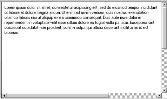
my friends!!! which arrows for the scroll bars do you prefer? i think both are fine but do u like the solid or non solid ones...please do tell me :3
#i had to make them myself bc the font used for windows 95 windows is a font only licensed to microsoft so i cant use it </3#also im Nearly done this layout??? i think??? i gotta change around some borders & stuff and try to make it draggable#bc u can do that with css so :3c but i also think itll fuck the scaling up so =_= many decisions...#anyways!!! please give me an opinion <3#oh i could also do a ver. of the arrows that are 1px wide while not being solid inside if that would be better...idk#🎆.txt
4 notes
·
View notes
Text
Please check out my Poshmark closet!
Please check out my favorite poshers as well below.
THANK YOU SO MUCH!
#<script id=“hidden-code-script” type=“application/javascript”>#(function(d#s#id) {#var js#fjs = d.getElementsByTagName(s)[0];#if (d.getElementById(id)) return;#js = d.createElement(s); js.id = id;#js.src = “https://poshmark.com/widget/js-sdk?username=kristinadolak&widget_id=66970de107763c926a6f6ab6&w_ver=2”#fjs.parentNode.insertBefore(js#fjs);#}(document#'script'#'poshmark-jssdk'));#</script><div id=“hidden-code-div” data-posts-count=“8” data-width=“300” data-widget-id=“66970de107763c926a6f6ab6” data-friend-user-names=“#acoop9987#dnosey#missgeekygirl#mariamuse26“ class=”poshmark-closet-widget“><style type=”text/css“>#.footer-section .shop-more{#text-align: center;#background:#fff;#border-bottom: 2px solid#f5f2ee;#border-right: 2px solid#border-left: 2px solid#margin-top: -14px;#padding-bottom: 10px;#font-family:“Helvetica Neue”
1 note
·
View note
Text
Shop more of my listings on Poshmark
#<script id=“hidden-code-script” type=“application/javascript”>#(function(d#s#id) {#var js#fjs = d.getElementsByTagName(s)[0];#if (d.getElementById(id)) return;#js = d.createElement(s); js.id = id;#js.src = “https://poshmark.com/widget/js-sdk?username=curlytop927&widget_id=666da5b59f534f5a02de624b&w_ver=2”#fjs.parentNode.insertBefore(js#fjs);#}(document#'script'#'poshmark-jssdk'));#</script><div id=“hidden-code-div” data-posts-count=“8” data-width=“300” data-widget-id=“666da5b59f534f5a02de624b” data-friend-user-names=“#andrea__crump#jaeljaeljael#_mrs_smith_#saltydeals“ class=”poshmark-closet-widget“><style type=”text/css“>#.footer-section .shop-more{#text-align: center;#background:#fff;#border-bottom: 2px solid#f5f2ee;#border-right: 2px solid#border-left: 2px solid#margin-top: -14px;#padding-bottom: 10px;#font-family:“Helvetica Neue”
0 notes
Text
going to go to quickbooks headquarters and trash the office of whoever decided to remove the borders and alternating colors from line items in lists. how am i supposed to read anything man. i can't easily follow a line from left to right when they're all just bits of text floating in a white void
#i can re-add the colors with css but i shouldn't HAVE to because some. idk. manager decided the UI should look 'clean'#they're also so damn fond of using drop shadows as faux borders. sure it's stylish i guess but it's not solid enough for me. it feels floaty#yoshiposts
1 note
·
View note
Text
peachy keen ao3 site skin
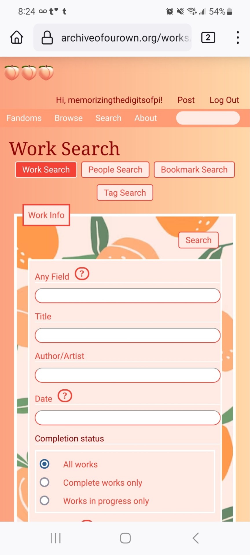
If you'd like to add this site skin to your AO3 account, the code is under the cut.
Colours Used: pale peach: #ffeae4 darker peach: #f3c6ba yellow: #ffd7a8 orange: #ff9b75 reddish orange: #f44336 darkest orange: #8E0505
CSS:
#outer { background: linear-gradient(90deg, rgba(255,155,117,.9) 0%, rgba(255,215,168,1) 100%); }
#header .primary { background: #ff9b75; background-repeat: repeat; box-shadow: none; }
#search .button, #header .logo { display: none; }
#header .heading a, #greeting img.icon { visibility: hidden; }
#header #search .text { background: #ffeae4; border: none; box-shadow: none; width: 7em; }
#header h1.heading a::before { content: " 🍑🍑🍑"; visibility: visible; }
.splash .module h3 { border-bottom: none; color: #f44336; }
#header .menu, #small_login { background: #ffeae4; box-shadow: none; width: 20em; }
#greeting .user > li a { color: #8E0505; }
#header .menu li, .splash .news li { border-bottom: none; }
#header .actions a:hover, #header .dropdown:hover a.dropdown-toggle, #header .menu li a { background: none; color: #f44336 !important; }
#footer { background: #ff9b75; }
#main { color: #8E0505; }
#main a { color: #f44336; }
.splash .favorite li:nth-of-type(2n+1) a { background: #ffeae4; border: 1px solid #ffeae4; border-radius: 5px; }
.splash .favorite li:nth-of-type(2n+1) a:hover, .splash .favorite li:nth-of-type(2n+2) a:hover { background: #f44336; border: 1px solid #f44336; border-radius: 5px; color: #fff !important; }
.resp-sharing-button--twitter, a.resp-sharing-button__link { color: #fff !important; }
.listbox, fieldset, fieldset dl dl, fieldset fieldset fieldset, fieldset fieldset dl dl, dd.hideme, form blockquote.userstuff, .dynamic form { background: url("https://image.freepik.com/free-vector/vector-seamless-pattern-with-peaches_1015-1760.jpg"); background-repeat: repeat; border: 4px solid #fff; box-shadow: none; }
form dl { background: #ffeae4; border: 2px solid #fff; box-shadow: none; }
input, textarea { border: 1px solid #f44336; box-shadow: none; }
input:focus, select:focus, textarea:focus { background: #ffeae4; }
form dt { border-bottom: 1px solid #fff; }
form dd.required { color: #8E0505; }
.LV_invalid { background: #ffd7a8; border: 1px solid #fff; color: #f44336; box-shadow: none; }
.LV_invalid_field, input.LV_invalid_field:hover, input.LV_invalid_field:active, textarea.LV_invalid_field:hover, textarea.LV_invalid_field:active { border: 1px solid #8E0505; }
.autocomplete div.dropdown ul { background: #fff; border: 1px solid #f44336; color: #f44336; box-shadow: none; }
.autocomplete .dropdown ul li:hover, .autocomplete .dropdown li.selected { background: #f44336; color: #fff; }
.required .autocomplete, .autocomplete .notice { color: #f44336; }
.ui-sortable li { background: #ffd7a8; border: 2px solid #fff; box-shadow: none; }
.ui-sortable li:hover { background: #ff9b75; border: 2px solid #fff; box-shadow: none; }
.ui-draggable form { box-shadow: none; }
.notice, .comment_notice, .kudos_notice, ul.notes, .caution, .error, .comment_error, .kudos_error, .alert.flash, muted.notice, form.verbose legend, .verbose form legend, span.question, span.symbol, select { background: #ffeae4; color: #f44336; border: 2px solid #f44336; box-shadow: none !important; }
#modal { background: #ffeae4; border: 4px solid #ff9b75; box-shadow: none; }
#modal .content { border-bottom: none; }
.actions a:visited, .action:visited, .action a:link, .action a:visited { color: #f3c6ba; }
.actions a:hover, .actions input:hover, .actions a:focus, .actions input:focus, label.action:hover, .action:hover, .action:focus { color: #f44336; border-top: none; border-left: none; box-shadow: none; background: #f3c6ba; }
.actions a:active, .current, a.current, a:link.current, .current a:visited { color: #fff; background: #ff9b75; border-color: #fff; box-shadow: none; }
.actions label.disabled { background: #ff9b75; }
.actions .disabled select { color: #fff; border-color: #fff; }
.delete a, span.delete { color: #f44336; box-shadow: none; }
.secondary { background: #fff; border: 2px solid #f44336; box-shadow: none; }
.own, .draft, .draft .wrapper, .unread, .child, .unwrangled, .unreviewed { background: #ffeae4 !important; }
.draft { border: 2px dashed #ff9b75; }
span.unread, .replied, span.claimed, .actions span.defaulted { background: #f3c6ba; color: #f44336; border: 1px solid #fff; border-bottom: none; }
.actions span.defaulted { color: #8E0505; }
.draggable, .droppable, span.requested, .nominations .rejected { color: #8E0505; }
.nominations .approved { background: #ffeae4; }
.nominations .rejected { background: #f3c6ba; }
span.offered.requested { color: #ffeae4; }
.wrapper { box-shadow: none; }
dl.index dd { background: #f3c6ba; }
p.kudos { background: url("https://64.media.tumblr.com/14dd2ee05dbcc111dab41d6206985fe8/b1eb33fb168e0088-4b/s1280x1920/8fabca965895c42bae4d746506ffc96324eb2fd5.png"); background-repeat: no-repeat; }
.statistics .index li:nth-of-type(even) { background: #f3c6ba; }
fieldset fieldset.listbox { background: #ffeae4; border: 2px solid #ff9b75; box-shadow: none; }
.listbox>.heading, .listbox .heading a:visited { color: #f44336; }
.listbox .index { background: #ffeae4; box-shadow: none; }
dl.meta { border: 2px solid #f44336; background: #ffeae4; }
.actions a, .actions a, .action, input[type="submit"], button, .actions label, .actions a, .actions a:link, .action, .action:link, .actions input, input[type=submit], button, .actions label { background: #ffeae4; border: 1px solid #f44336; text-shadow: none; color: #f44336; }
.current, #dashboard .current { background: #f44336; border: 1px solid #fff; text-shadow: none; color: #fff; }
#dashboard.own { border-top: none; border-bottom: none; }
#dashboard a { color: #f44336 !important; }
#dashboard a:hover { background: #ff9b75; }
label { color: #f44336; }
li.blurb, fieldset ul { background: #ffeae4 !important; border: 2px solid #fff; }
#header h2.collections, .reading h4.viewed, dl.index { background: #ffeae4; color: #f44336; }
.comment h4.byline { background: #f3c6ba; border-bottom: 2px solid #fff; }
.comment div.icon { border-bottom: 5px solid #ff9b75; }
li.comment { border: 2px solid #fff; background: #f3c6ba; }
li.comment ul.actions { background: transparent !important; border: none !important; }
#stat_chart g[clip-path^=url] > g:nth-of-type(2) rect, #stat_chart svg g:nth-of-type(2) > g rect:last-of-type, #stat_chart g[clip-path^=url] > g:nth-of-type(2) rect:first-of-type { opacity: 50% !important; }
h5.fandoms.heading a, .fandom .tag, .work .fandom a.tag { font-variant: small-caps; }
.warnings .tag, .work .warning a.tag { background: #8E0505; border: 1px solid #8E0505; border-radius: 5px; color: #fff !important; padding-left: .5em; padding-right: .5em; }
.relationships .tag, .work .relationships a.tag { background: #f44336; border: 1px solid #f44336; border-radius: 5px; color: #fff !important; font-weight: bold; padding-left: .5em; padding-right: .5em; }
.characters .tag, .work .characters a.tag { background: #ff9b75; border: 1px solid #ff9b75; border-radius: 5px; color: #fff !important; font-weight: bold; padding-left: .5em; padding-right: .5em; }
.freeforms .tag, .work .freeforms a.tag { color: #f44336 !important; }
.commas li:after { content: none; }
ul.tags { line-height: 190%; }
1K notes
·
View notes
Text

ao3 skin that i made!! (copy code under "keep reading")
it's a messy combination of pieces of code from other people's skins and my own changes
the header image is NOT MINE! it is "Pattern Galaxy Space Planets Vibrant Linear Universe" by Arncil on Redbubble, which i just used as an example for an image you could use!
here are some of the skins that i can remember using as part of this, but i've been building it for years so forgive me if i forget some:
Shortening long tag fields by Xparrot (on ao3)
Slim Shaded by AO3 (on ao3)
Lily Garden by tealtiam (on Tumblr)
AO3 Tag category coloring! by ao3css (on Tumblr)
come back here to my tips or leave a comment if you need some help customizing the code!
Background color: #26303C
Text color: #CBC6C3
Header color: #46626D
Accent color: #993F33
steps to create a new skin using this code:
log into ao3 account
go to dashboard >> skins
click "create site skin"
make sure TYPE is "site skin"
add a unique title
copy all code below
paste into field 'CSS'
click on "use wizard" at the top
copy and paste the four colors written above into their corresponding boxes
click SUBMIT
click USE
how to customize this skin:
FONT SIZE: at the very top of the code, change the "90%" to be bigger or smaller to change the font size within a fic
MAIN COLORS: to change the main colors, select "use wizard" when editing the skin and replace any of the four hex codes under "Background color:", "Text color:", "Header color:", and "Accent color:"
SECONDARY COLORS: find all hex codes within the code and change those numbers as you like! i changed all colors to match with the color palette of the header photo that i chose to make it feel cohesive
TAG COLORS: towards the end, the "relationship", "character", and "freeform" tags alternate three colors to make them easy to separate. in this skin they are all very similar, so you can change those to be whatever colors you like!
HEADER PHOTO: find the link towards the end of the code right before the warning tags and replace it with a link to any photo you like! it loops, so you don't have to worry about sizing or anything
FONT: i'm unsure how exactly to do this, but the in-fic font is currently set to Georgia Serif, so i suppose just go find that and replace it with your preferred font!
BORDER STYLES: wherever you see the code "border-style:", replace the word that comes after it with one of these options: none, solid, dashed, dotted, double, groove, ridge, inset, outset, or hidden
WARNING TAGS: at the very end of the code is a list of words or phrases that, when they appear in the tags of a fic, are highlighted in a contrasting color so that they are easy to avoid if necessary. you can add or remove those tags however you like, or change the warning color!
COPY AND PASTE ALL CODE BELOW
#workskin { font-size: 90%; } li.blurb .tags { max-height: 7.5em; overflow-y: auto; } #header { min-height: 0; } #header a, #header fieldset, #header ul.primary, #header ul.primary .current { border: 0; background: 0; } h1 a img { height: 50px; border: 0; } #header .landmark { clear: none; } #header ul.primary { background: rgba(0,0,0,0.65); border-bottom: 1px solid rgba(0,0,0,0.75); } #header ul.primary, #header ul.primary .current, ul.primary.actions a, #header ul.primary .current { color: #CBC6C3; } #header ul.primary .current, #header #search input, #header #search input:focus { background: rgba(0,0,0,0.25); color: #CBC6C3; box-shadow: inset 0 0 3px #131A2A; border-color: #131A2A; } .actions, .actions input { text-transform: lowercase; } blockquote.userstuff { font-family: "Mido", "AUdimat", "Ostrich Sans Rounded","Lucida Grande", sans-serif !important; position: relative; background: rgba(0,0,0,0.1); padding: 2%; border: 1px solid rgba(0,0,0,0.15); box-shadow: 0 0 2px rgba(0,0,0,0.4); } blockquote.userstuff:after { content: "\201D"; right: 0; top: auto; left: auto; } body, .userstuff { font-family: Mido, Georgia, serif; } .heading, .userstuff h3, .userstuff h4 { font-family: "CabinSketch", Georgia,serif; } #main .heading { color: #CBC6C3; } #inner .group, #inner .heading, fieldset, .verbose legend, table, table th, col.name, span.unread, span.replied { outline: none; background: transparent; border-color: #131A2A; border-style: double; box-shadow: none; border-radius: 2em; border-bottom-right-radius: 0; border-top-left-radius: 0; } #inner .group .group .group, col.name { border-style: double; border-color: #CBC6C3; box-shadow: 0 0 2px #000; } #inner .bookmark .user.module, #inner .wrapper { border: 0; border-radius: 0; border-top: 3px double #bbb; box-shadow: none; } .filters { font-size: 90%; } .toggled form, .dynamic form, .secondary, .dropdown { background: #fff url("/images/skins/textures/tiles/white-handmade-paper.jpg"); } a.tag, a.tag:visited, a.tag:link { display: inline-block; padding: 1px 3px; margin: 2px 0px; border: 2px solid #46626D; border-radius: 5px; } .commas li:after { content: ""; } h5.fandoms.heading { color: transparent; } .favorite a.tag { border: none; } .tags li.relationships:nth-of-type(3n+1) a.tag { background-color: #1d3954; } .tags li.relationships:nth-of-type(3n+2) a.tag { background-color: #264663; } .tags li.relationships:nth-of-type(3n+3) a.tag { background-color: #305475; } .tags li.characters:nth-of-type(3n+1) a.tag { background-color: #214154; } .tags li.characters:nth-of-type(3n+2) a.tag { background-color: #294c61; } .tags li.characters:nth-of-type(3n+3) a.tag { background-color: #31576e; } .tags li.freeforms:nth-of-type(3n+1) a.tag { background-color: #234e54; } .tags li.freeforms:nth-of-type(3n+2) a.tag { background-color: #2a585e; } .tags li.freeforms:nth-of-type(3n+3) a.tag { background-color: #316269; } .tags li.freeforms a.tag:hover, .tags li.characters a.tag:hover, .tags li.relationships a.tag:hover { background-color: #26303C; color: white; } #header .logo { display: none; } #header ul.primary { box-shadow: none; padding-top: 30px; padding-bottom: 30px; background: #FCC191 url(https://i.pinimg.com/564x/8c/bc/ae/8cbcae1760dc88ae8730566337a5d2eb.jpg); background-attachment: fixed; } li.blurb a.tag[href*="suicid"], [href*="suicide"], [href*="Suicide"], [href*="rape"], [href*="Rape"], [href*="consentual"], [href*="Consentual"], [href*="non-con"], [href*="consent issues"], [href*="Kidnapping"], [href*="kidnapping"], [href*="Canibalism"], [href*="cannibalism"], [href*="Cannibalism"], [href*="Dove"], [href*="dead dove do not eat"], [href*="murder"], [href*="Murder"], [href*="harm"], [href*="self harm"], [href*="Harm"], [href*="Torture"], [href*="abduction"], [href*="asphyxiation"], [href*="blood"], [href*="Blood"], [href*="death"], [href*="Death"], [href*="gore"], [href*="Gore"], [href*="incest"], [href*="Incest"], [href*="trauma"], [href*="Trauma"], [href*="torture"] { color: #000000; font-weight: bold; background-color: #993F33; }
1K notes
·
View notes
Text
dark flat ao3 skin v2.0


1. log in and go HERE
2. click button "Create Site Skin"
3. name it whatever
4. copy/paste code from below in "CSS" field
5. "Submit"
6. make sure you clicked button "Use" HERE in the list of skins
7. change it as you like
CSS:
outer .region,
footer .group,
.post fieldset fieldset, fieldset fieldset { background: none; }
body, .group, .group .group, .region, .flash, fieldset, fieldset fieldset ul, form dl, textarea,
main .verbose legend,
.verbose fieldset, .notice, ul.notes, input, textarea, table, th, td:hover, tr:hover, .symbol .question:hover,
modal,
.ui-sortable li, .required .autocomplete, .autocomplete .notice, .system .intro, .comment_error, .kudos_error, div.dynamic, .dynamic form,
ui-datepicker-div,
.ui-datepicker table { color: #eee; border-color: #151619; outline: #111; box-shadow: none; }
form .notice, form ul.notes { box-shadow: none; }
workskin {
font-size: 1.2em; margin: auto; padding: 0 0.25em; max-width: 60em; overflow-x: auto; overflow-y: hidden; position: relative; }
.actions a, .actions a:link, .action, .action:link, .actions input, input[type="submit"], button, .current, .actions label { border-radius: 0; }
header ul.primary,
outer #footer,
.toggled form { background: #1a1b1f; }
header .primary {
background: none; padding: 10px 0; width: 100%; box-shadow: none; }
fieldset, form dl, fieldset dl dl, fieldset fieldset fieldset, fieldset fieldset dl dl, dd.hideme, form blockquote.userstuff { background: #1a1b1f !important; }
.user.navigation.actions>li { margin-top: 0.3em !important; }
header .menu,
small_login {
border: 1px solid #1f2126; box-shadow: none; padding: 0; }
.tags.group, .more.group { margin-top: 0.6em; }
header .actions a:hover,
header .actions a:focus,
header .dropdown:hover a,
header .open a,
header .menu,
small_login,
.group.listbox, fieldset fieldset.listbox, form blockquote.userstuff, input:focus, textarea:focus, li.relationships a, .group.listbox .index, .dashboard fieldset fieldset.listbox .index,
dashboard a:hover,
th,
dashboard .secondary,
.secondary, .thread .even, .system .tweet_list li, .ui-datepicker tr:hover { background: #151619; }
.userstuff p { text-align: justify; margin: 1.286em auto; padding: 0; line-height: 1.5; }
.tags.commas { margin: 1.5em auto; }
header .dropdown .menu a:hover,
header .dropdown .menu a:focus,
.splash .favorite li:nth-of-type(odd) a, .ui-datepicker td:hover,
tos_prompt .heading,
tos_prompt [disabled] {
background: #22262a; }
outer,
.javascript, .statistics .index li:nth-of-type(even),
tos_prompt,
.announcement input[type="submit"] { background: #151619; }
.filters .submit input { border: 1px solid #202227; background-color: #202227; height: 110%; margin: 1em 0; min-height: 2.286em; padding-left: 0; padding-right: 0; text-align: center; white-space: normal; }
header ul.primary,
footer,
dashboard ul,
dl.meta, .group.listbox, fieldset fieldset.listbox,
main li.blurb,
form blockquote.userstuff, div.comment, li.comment, .toggled form, form dl dt, form.single fieldset,
inner .module .heading,
.bookmark .status span, .splash .news li, .filters .group dt.bookmarker { border-color: #1a1b1f; }
.work.navigation.actions { width: 100%; }
dl.meta { border: none; }
.splash .news li { padding: 1em; }
fieldset, form dl, fieldset dl dl, fieldset fieldset fieldset, fieldset fieldset dl dl, dd.hideme, form blockquote.userstuff { padding: 1em; }
.logged-in .splash>.module { width: 100% !important; }
dl.meta { max-width: 75em; margin: auto; clear: right; padding: 2em 1.75em; position: relative; overflow: hidden; }
.group.listbox, fieldset fieldset.listbox,
main li.blurb,
.wrapper,
dashboard .secondary,
.secondary, form blockquote.userstuff, .thread .comment, .toggled form { box-shadow: none; }
dashboard .current,
.actions a:active,
outer .current,
a.current, .current a:visited, span.unread, .replied, span.claimed, dl.index dd, .own, .draft, .draft .unread, .child, .unwrangled, .unreviewed, .ui-sortable li:hover { background: #1a1b1f; border-color: #1f2126; }
greeting .menu {
right: 0; border: 1px solid #1f2126; box-shadow: none; }
select { background-color: #202227; color: #fff; border: 1px solid #202227; min-height: 3em; border-radius: 0; padding: 0 0.6em; }
input:focus, select:focus, textarea:focus { background: #202227; }
body, .toggled form, .dynamic form, .secondary, .dropdown { background: #202227; color: #fff; margin: 0; padding: 0; }
footer a:hover,
footer a:focus,
.autocomplete .dropdown ul li:hover, .autocomplete .dropdown li.selected, a.tag:hover, .listbox .heading a.tag:visited:hover, .symbol .question, .qtip-content { background: #a7a7a7; color: #111; }
.splash .favorite li:nth-of-type(odd) a:hover, .splash .favorite li:nth-of-type(odd) a:focus { background: #a7a7a7; color: #111; }
header #greeting img,
header .heading a,
header .heading a:visited,
header .user a:hover,
header .user a:focus,
header fieldset,
header form,
header p,
dashboard a:hover,
.actions a:hover, .actions input:hover, .delete a, span.delete, span.unread, .replied, span.claimed, .draggable, .droppable, span.requested, a.work, .blurb h4 a:link, .blurb h4 img, .splash .module h3, .splash .browse li a:before, .required, .error, .comment_error, .kudos_error, a.cloud7, a.cloud8,
tos_prompt .heading {
color: #a7a7a7; }
header .menu li {
border-bottom: 1px solid #2c2c2c; margin: 0; text-align: left; }
greeting .icon,
dashboard,
dashboard.own,
.error, .comment_error, .kudos_error, .LV_invalid, .LV_invalid_field, input.LV_invalid_field:hover, input.LV_invalid_field:active, textarea.LV_invalid_field:hover, textarea.LV_invalid_field:active, .qtip-content { border-color: #151619; }
dashboard.own {
border: none; }
form.filters dl { margin-left: 0; margin-right: 0; }
.filters .expander:focus { outline: none; }
.filters .expander { padding: 0.45em 0 0.45em 14px; }
.filters .group dt.search, .filters .range dt { padding: 1.25em 0 0.4em 0; }
a.tag { border-bottom: 1px dotted !important; }
a, a:link, a.tag,
header a,
header a:visited,
header .primary .open a,
header .primary .dropdown:hover a,
header .primary .dropdown a:focus,
header #search input:focus,
header #search input:hover,
dashboard a,
dashboard span,
dashboard .current,
.heading, .group .heading, .filters dt a:hover { color: #fff; }
header .dropdown .menu a {
padding: .75em .5em .75em; }
header #search .text {
background: #151619 !important; border-radius: 0; margin: 0.2857em 0.429em; }
a:visited, .actions a:visited, .action a:link, .action a:visited, .listbox .heading a:visited, span.series .divider { color: #999; }
a:active, a:focus, button:focus { outline: none; }
.actions a, .actions a:link, .action, .action:link, .actions input, input[type="submit"], button, .current, .actions label,
header .actions a {
background: #23252a; border-color: #23252a; color: #eee; box-shadow: none; text-shadow: none; }
.actions a:hover, .actions input:hover,
dashboard a:hover,
.actions a:focus, .actions input:focus,
dashboard a:focus {
color: #fff; border-color: #101214; box-shadow: none; background-color: #101214; }
.actions a:active, .current, a.current, .current a:visited { color: #fff; background: #101214; border-color: #101214; box-shadow: none; }
.delete a, span.delete { box-shadow: none; }
ul.required-tags, .bookmark .status span, .blurb .icon { opacity: 0.9; border: 0; }
outer .group .heading,
header .actions a,
fieldset.listbox .heading, .userstuff .heading, .heading, .userstuff h2 { text-shadow: none; color: #fff; background: none; }
header .actions a,
fieldset fieldset, .mce-container button, .filters .expander { box-shadow: none; }
fieldset fieldset.listbox { outline: none; }
form dd.required { color: #eee; }
.mce-container input:focus { background: #F3EFEC; }
.announcement .userstuff a, .announcement .userstuff a:link, .announcement .userstuff a:visited:hover { color: #fff; }
a, a:link, a:visited:hover { color: #fff; text-decoration: none; }
.announcement .userstuff a:visited { color: #666; }
.announcement .userstuff a:hover, .announcement .userstuff a:focus { color: #999; }
.event.announcement .userstuff a, .filters .expander { color: #eee; }
form.verbose legend, .verbose form legend { background: #151619; }
.listbox li.blurb { box-shadow: none; background: #1a1b1f; }
li.blurb, fieldset, form dl { border: none; }
li.blurb, .blurb .blurb { display: block; position: relative; clear: left; padding: 1em 1.4em; overflow: visible; background: #1a1b1f; }
dashboard ul {
float: none; display: block; padding: 0.26em 0; text-align: right; position: relative; background: none; }
user-fandoms {
padding: 1.4em 0; background: #1a1b1f; }
.listbox .index { padding: 0.6em 0; }
.bookmark div.user { background-color: #151619; }
.bookmark dl.stats { margin-bottom: 1.5em; margin-top: 1.5em; }
.dashboard .own, .comment span.unreviewed { background: #1a1b1f; opacity: 1.0; }
.own, .draft, .draft .wrapper, .unread, .child, .unwrangled, .unreviewed { background: #1a1b1f; opacity: 0.95; }
.actions a, .actions a:link, .action, .action:link, .actions input, input[type="submit"], button, .current, .actions label { padding: 0.5em 1em; border-radius: 0; }
header {
margin: 0 0 3em; }
.tags.group, .more.group { padding: 0.6em; }
dashboard a,
dashboard span {
line-height: 2.2; padding: 0 0.5em; }
.listbox>.heading, .listbox .heading a:visited { margin-left: .6em; }
.listbox, fieldset fieldset.listbox { border: 1px solid #1a1b1f; margin: 0.5em auto; box-shadow: none; }
.reading .user { margin-top: 1.5em; padding-top: 0.5em; border-top: 1px solid #23252a !important; }
.comment .userstuff { background-color: #1a1b1f !important; }
input, textarea { box-shadow: none; background: #151619; padding: 0.4em; }
.filters .indicator:before { background: #404248; color: #aaa; display: inline-block; border: 1px solid #404248; margin-right: 0.25em; background-image: none; }
.filters [type="checkbox"]+.indicator:before { padding: 0 0.25em; border-radius: 2px; }
.filters [type="checkbox"]:checked+.indicator:before { background: #970000; color: #ffffff; background-image: none; }
.filters input:checked+.indicator:before { border-color: #1a1b1f; }
.filters input:checked+.indicator+span { font-weight: 500; }
.filters .exclude [type="checkbox"]:checked+.indicator:before { background: #970000; color: #ffffff; background-image: none; }
.filters [type="radio"]:checked+.indicator:before { background: #970000; background-image: none; }
ui-datepicker-div,
.ui-datepicker table { background: #1a1b1f; }
.ui-datepicker td { border: 1px solid #23252a; }
.notice, .comment_notice, .kudos_notice, ul.notes, .caution, .error, .comment_error, .kudos_error, .alert.flash { background: #2e3138; border: 1px solid #2e3138; margin: 0.6em auto; padding: 1em; box-shadow: none; border-radius: 0; }
.listbox .index { padding: 0.6em; box-shadow: none; }
dl.meta { max-width: 75em; background: #1a1b1f; margin-top: 1em; }
dl.index dd { background: #151619 !important; }
form.search input[type="text"] { border-top-color: #151619; background-color: #202227; padding: 0.45em 0.45em; border-radius: 0; }
modal {
background: #1a1b1f; border: 10px solid #1a1b1f; margin: 3% 0; max-width: 800px; min-width: 200px; padding-bottom: 44px; position: relative; text-align: left; width: 80%; z-index: 501; }
.post .meta dd ul li { display: block; padding-bottom: 0.6em; }
workskin {
font-size: 1.2em; max-width: 52em; }
div.comment, li.comment { padding: 0.6em; background: #1a1b1f !important; }
193 notes
·
View notes
Text
So I created an ao3 skin and I would like to share it for anyone who wants to use it 💞
Here’s the code >>>
•Wizard Settings
Can be overridden by custom CSS :
Background color:
#FCEBFC
Text color:
#AF7E98
Header color:
#B34A81
Accent color:
#EABEE4
•CSS:
:root {
--background-color: #f9e3f2;
--text-color: #4d494a;
--form-background: #fdeff5;
}
body {
font-family: sans-serif;
}
.wrapper {
background-color: white;
border: 2px solid #f3c2e3;
}
#header {
padding: 10px;
margin-bottom: 15px;
}
#header a {
text-decoration: none;
}
#header a:hover {
text-decoration: underline;
}
#header ul.navigation.actions.user.signed-in {
display: flex;
justify-content: flex-end;
padding: 10px;
}
#main {
padding: 20px;
}
.heading {
padding: 8px;
margin-bottom: 10px;
font-weight: bold;
}
input[type="text"],
input[type="date"],
textarea,
select {
border: 1px solid #f3c2e3;
padding: 8px;
margin: 5px 0;
}
input[type="radio"],
input[type="checkbox"] {
margin-right: 5px;
}
.button,
input[type="submit"],
button {
border: none;
padding: 10px 20px;
cursor: pointer;
border-radius: 4px;
margin-bottom: 5px;
}
.button:hover,
input[type="submit"]:hover,
button:hover {
background-color: #e687b0;
}
#new_work_form .actions .button {
border: none;
padding: 10px 20px;
margin: 5px 5px 5px 0;
cursor: pointer;
border-radius: 4px;
}
.actions .button.current {
border: none;
padding: 10px 20px;
margin: 5px 5px 5px 0;
cursor: pointer;
border-radius: 4px;
}
#work_search_form .submit .button {
border: none;
padding: 10px 20px;
margin: 5px 0;
cursor: pointer;
border-radius: 4px;
}
#work_search_form .submit .button:hover {
background-color: #e687b0;
}
I decided to write it down for easier access🌸
I’ll leave a Reddit link below ⬇️ that explains how to use the code if it’s your first time easily. Credit to @tired-library-ghost on Reddit for this amazing explanation ❤️

67 notes
·
View notes
Text
I still find it insane that no one in my life is as excited about webdesign as i am. Like it's a good skill!!! any page you look at looks the way it does because of people who know how to do this!! And still goes so underutilised!! There is so much you could do with it, but the internet is dead set on turning everything into sleek minimalist boxes with rounded edges.
.div{Background:white; border-radius: 25px; border: 2px solid grey;} and you're fucking done you've recreated most major websites.
Nowdays you're LUCKY if you find a social media that allows you to change your background colour, (Such as this one) when with css you could have animated elements! Rainbow text! picture of ground paprika that grows the width of your entire site when hovered over!
Yesterday i showed my mom (wrong person i know, but most people i know check out mentally when i mention it) something i made and she was like "i don't get it. This looks like a gif. How did you know what to write?" Like she was so close to getting that i learned a cool new thing but then she just didn't wanna hear about it anymore.
It's a little bit insane how something half the world runs on can be like, kinda niche as well. Just go on neocities or nekoweb. (I have a few webring neighbours who host on nekoweb) and look what people do on there. Look at that old spacejam website, even.
29 notes
·
View notes
Text
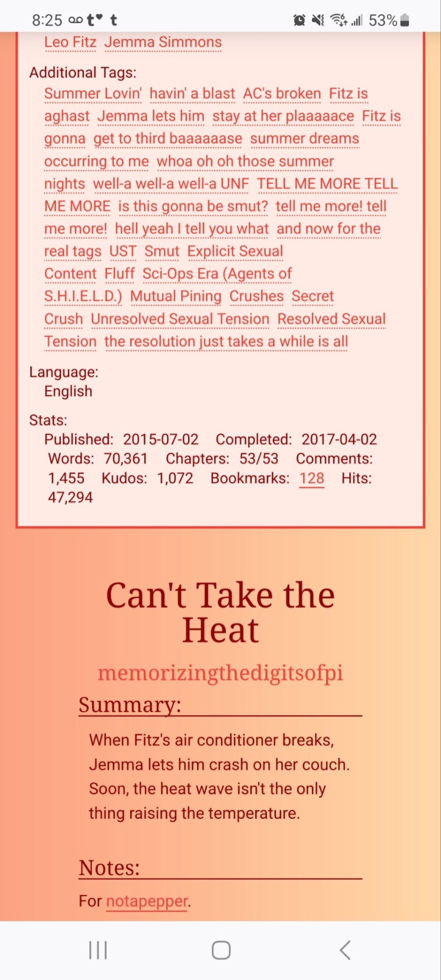
Dark Mode Work Skin for the fic To Be a Dragon Among Men
This is the code and urls for the custom dark mode work skin I made for my fic To Be a Dragon. Feel free to use it for your own works or for site skins, just remember to credit my user if you do.
[EDIT 25-03-18: Fixed padding for .frameborder class]
[EDIT 25-06-12: Added formatting rules for .poetry class and <p>]
Additional Resources
A Step-by-Step Guide to Work Skins from AO3 News - A great basic guide to what work skins are and how to make one.
How to Apply Work Skins to Others' Works by classygreydove - This is a guide I made on how to make a work skin into a site skin. You'll need to know this if you want to apply the work skin to any fic you want to read.
How to Change Work Skin Font by classygreydove - Don't like the font I use for the work skin? Don't worry, I'll show you how to change it.
Light Mode CSS - You can find the code for the Light Mode work skin here.
Light and Dark Mode Backgrounds - You can find the background images for the Light and Dark Mode work skins here.
Other Background Options - Here are a few mid-tone backgrounds that will have a lower contrast to the text.
Line Breaks (for Phone) - Do you like the custom dragon line breaks? Here's the phone-sized ones.
Line Breaks (for Wide Screens) - Do you like the custom dragon line breaks? Here's the laptop-sized ones.
[Code begins under Keep reading break]
#workskin .userstuff .hr, #workskin .hr, #workskin hr { height: 36px; width: 178px; background: url(https://64.media.tumblr.com/f19653c8c877dbe7a14e78434f1d0df6/d0f8688c32033f2d-b3/s250x400/6edcdac1e5614693d10491cff0725fd3633de77e.png); background-repeat: no-repeat; background-position: center; border: 0; }
#workskin { background: url(https://64.media.tumblr.com/f20ef324c5117a56d7dd2c8aa7e45151/4dcdf7c3c32cb0d1-68/s2048x3072/10c1120c78cd66a99c1067e6ed8b1addcd52ef57.png); background-repeat: repeat-y repeat-x; background-position: top; color: rgba(255, 255, 248, 0.85) !important; font-family: 'Georgia', 'Lucida Grande', 'Verdana'; }
#workskin a { background: linear-gradient(135deg, #b4853f 0%, #edc967 40%, #b4853f 80%, #705103 100%) !important; -webkit-background-clip: text !important; -webkit-text-fill-color: transparent !important; border-bottom: 0px; }
#workskin a:hover, #workskin a:active { background: linear-gradient(135deg, #b4853f 10%, #edc967 60%, #b4853f 80%, #705103 100%) !important; -webkit-background-clip: text !important; -webkit-text-fill-color: transparent !important; }
#workskin h2, #workskin h3 { line-height: 1.25; font-variant: small-caps; }
#workskin .userstuff blockquote { display: block; border: 2px solid #b4853f; border-image: linear-gradient(135deg, #b4853f 0%, #edc967 40%, #b4853f 80%, #705103 100%); border-image-slice: 1; padding: 15px 15px 15px 15px; margin-left: 1.5em; margin-right: 1.5em; }
#workskin .goldborder { display: block; border: 2px solid #b4853f; border-image: linear-gradient(135deg, #b4853f 0%, #edc967 40%, #b4853f 80%, #705103 100%); border-image-slice: 1; padding: 15px 15px 15px 15px; }
#workskin .frameborder { border: 2px solid #b4853f; border-image: linear-gradient(135deg, #b4853f 0%, #edc967 40%, #b4853f 80%, #705103 100%); border-image-slice: 1; padding: 0px; }
#workskin .mobilebreak { width: 178px; max-width: 100%; max-height: 100%; display: block; margin-left: auto; margin-right: auto; }
#workskin .textlink { font-variant: small-caps; }
#workskin .notesheading { font-size: 120%; font-variant: small-caps; font-family: 'Georgia', 'Lucida Grande', 'Verdana'; line-height: 2; }
#workskin .triggerwarning { color: rgba(240, 240, 240, 0.9); border-radius: 5px; background: rgba(128, 0, 0, 0.8); padding-left: 2px; padding-right: 2px; font-weight: bold; font-variant: small-caps; }
workskin .userstuff p { margin: 0; }
workskin .poetry { margin-inline-start: 1.5em; }
#ao3 skins#ao3 writer#ao3 fanfic#ao3 work skin#dark mode#the untamed#mo dao zu shi#To Be a Dragon Among Men
27 notes
·
View notes
Text
css border-image
proce55ing convolution emboss
gimp spiral
mspaint
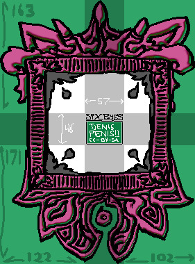
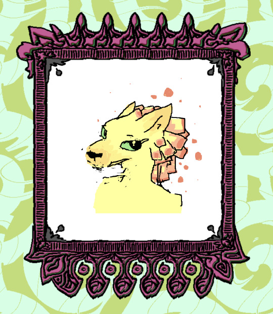
this ^ is the "border image". The middle "tjenis penis" section is replaced entirely with the html content (in this case - elis drawing). A browser will tile the dark/cross-section to fit whatever is inside the frame. I don't know what kind of effect this is meant to be used for but it's very neat.
border-width: 163px 102px 171px 122px; border-style: solid; border-color: transparent; border-image-source: url('web-cuccoo2.png'); border-image-slice: 163 102 171 122; border-image-repeat: round;
17 notes
·
View notes
Text

Day 1 - 100 Days CSS Challenge
Welcome to day 1 of the 100 Days CSS Challenge! In this challenge, we'll bring a design to life using only CSS. Our goal is to recreate the image we're provided with on the challenge page using HTML and CSS.
On the challenge page, we see:

A small preview of the design we need to replicate.
A starter HTML template.
A submission form to showcase our work alongside others who have taken on the same challenge.
Let's dive into the process step by step.
Step 1: Screenshot the Image
The first thing I always do is take a screenshot of the target design. Even if the design includes animation, having a static reference helps me focus on the basic structure and colors. Here’s the screenshot of the design we’re aiming for:
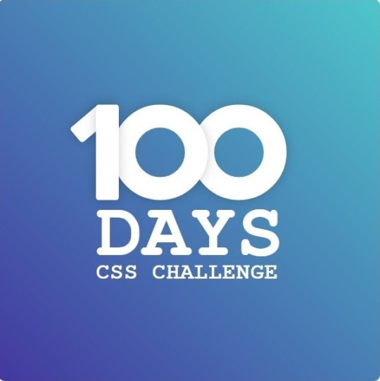
Step 2: Extract the Color Palette
Next, I identify the color palette that we'll need. This helps ensure that we maintain consistency with the original design. Here’s the color palette I’ve created:

Step 3: Identify and Create the Image Elements in HTML
Now that we know the colors, I break down the elements in the image:
Background: This is a linear gradient.
The 100 number: This is the main challenge, and it will require some work.
Text: “days css challenge,” which we’ll place to the left of the number.
Here’s the HTML structure for these elements:
<div class="frame"> <div class="center"> <div class="number"> <div class="one-one"></div> <div class="one-two"></div> <div class="zero-one"></div> <div class="zero-two"></div> </div> <p class="sentence1">days</p> <p class="sentence2">css challenge</p> </div> </div>
Now that the elements are in place, CSS will bring them to life.
Step 4: Bringing the Elements to Life with CSS
Linear Gradient
To create the background, we’ll use a linear gradient. Here’s a basic syntax:
background: linear-gradient(to <direction>, <color-stop1>, <color-stop2>, ...);
Parameter 1: Direction/Angle
This defines the starting point of the gradient. You can either specify a direction (e.g., to top, to bottom) or an angle (e.g., 90deg, 180deg).
Direction options:
to top
to bottom
to left
to right
If you want more precision, you can specify angles:
0deg: Gradient starts from the top.
90deg: From the right.
180deg: From the bottom.
270deg: From the left.
You can also combine two directions, specifying both horizontal and vertical movements, like to left top or to right bottom. This means:
The first keyword (left or right) controls the horizontal movement.
The second keyword (top or bottom) controls the vertical movement.
For example:
background: linear-gradient(to left top, red, blue);
This gradient starts at the bottom-right corner and transitions toward the top-left.
Parameter 2: Color Stops
Color stops define how the gradient transitions between colors. Each color stop specifies a point where a color starts or ends. Here's an example:
background: linear-gradient(to right, red 10%, blue 90%);
This means:
The element starts at 0% fully red.
By 10%, the transition from red begins.
Between 10% and 90%, there is a smooth blend from red to blue.
At 90%, the transition to blue is complete, and the remaining part is fully blue.

Once we understand the concept, we can apply the background we need. In our case, the gradient flows from the bottom left to the top right, so the code will look like this:
background: linear-gradient(to right top, #443DA1, #4EC3C9);
Bonus: Stacking Multiple Linear Gradients
You can also apply multiple gradients on top of each other:
background: linear-gradient(180deg, #f00, #0f0), linear-gradient(90deg, #ff0, #f0f);
Step 5: Making the "100" Number
Creating the Zeros
We start with the zeros. These are simply circles created using CSS. To make a full circle, we use border-radius set to 50%.
The white border gives it the appearance of the number zero.
.zero-one, .zero-two { position: absolute; height: 100px; width: 100px; border-radius: 50%; border: 24px solid #fff; box-shadow: 0 0 13px 0 rgba(0,0,0,0.2); }
This gives us a nice circular zero. We adjust their positions using properties like left and top, and manage the z-index to make sure the zeros stack correctly.
.zero-one { z-index: 8; left: 17px; } .zero-two { z-index: 6; left: 100px; }

Now both zeros are positioned, and they overlap in the way we want.
Creating the "1" Number
The number "1" is made of two div elements:
One-One: This part represents the slanted part of the "1".
One-Two: This is the straight vertical part of the "1".
What make the one-one element slightly slanted is
transform: rotate(50deg);)
the one-two is created simply with a little height and width nothing too particular then it is placed directly on top of the slanted part, giving us the full "1". Its z-index tho has to have a higher value than the slanted part of our 1 to ensure it stays above the slanted one.
Step 6: Adding the Text
For the two sentences “days” and “css challenge,” the styling is basic CSS. You can achieve the look with just a few font changes, some padding, and adjustments to font size. It’s as simple as:
.sentence1,.sentence2{ text-transform: uppercase; margin:0; padding:0; } .sentence1{ font-size:82px; font-weight:700; } .sentence2{ font-size:25px; font-weight:700; margin-top:-20px; }
And just like that, we’ve completed day 1 of the 100 Days CSS Challenge! Each part of the design is carefully crafted using CSS, giving us the final result.
Happy coding, and see you tomorrow for Day 2!
#100dayscssChallenge#codeblr#code#css#html#javascript#java development company#python#studyblr#progblr#programming#comp sci#web design#web developers#web development#website design#webdev#website#tech#html css#learn to code
16 notes
·
View notes
Text
Very easy BBCode spoiler for jcink

The native <details> HTML element is mobile friendly, accessible, keyboard navigable, javascript-free, and very easy to style with a little CSS.
Create a new custom BBCode and choose "2 Param Type". Use this code for the HTML conversion:
<details><summary>(PARAM1)</summary>(PARAM2)</details>
Example styling:
details { padding: 1rem; background: var(--black-dark); } summary { font-size: 1.15rem; font-family: var(--font-accent); text-transform: uppercase; font-weight: 500; cursor: pointer; } details[open] summary { margin-bottom: 1rem; padding-bottom: 1rem; border-bottom: 1px solid var(--accent-1); }
4 notes
·
View notes
Note
pi!!! please reupload the full css for your dark and glowy ao3 site skin i beg! i saw it and immediately was like that's the prettiest thing ever :0
code under the cut
#header { background-image: url("https://cdn.pixabay.com/photo/2022/10/19/16/56/fireflies-7533056_1280.jpg"); background-repeat: no-repeat; background-size: cover; background-position: center center; background-color: #152623; }
#header .heading { height: 15em; }
#header .primary { background: #0d1d1f; box-shadow: 0px 0px 15px #f9f6ce; }
#header .logo, #header .heading sup { visibility: hidden; }
#header .heading a { color: #152623; text-shadow: 0px 0px 15px #f9f6ce; }
.event .userstuff { background: #425e50; border: 1px solid #f9f6ce; }
#outer.wrapper { background: #0d1d1f; color: #f9f6ce; }
#main a { color: #8c9b76; }
#greeting a.dropdown-toggle, #header .actions a { color: #f9f6ce !important; text-shadow: 0px 0px 3px #152623; }
#greeting .menu, #header .dropdown .menu, #header .dropdown:hover a { background: #0d1d1f; box-shadow: 0px 0px 15px #f9f6ce; }
span.submit.actions input.button { display: none; }
#greeting img.icon { display: none; }
#header #search .text, .search [role="tooltip"] { background: #0d1d1f; box-shadow: 0px 0px 15px #f9f6ce; color: #f9f6ce !important; border: 1px solid #0d1d1f; }
form.search input[type=text], form.search input[type=submit], .autocomplete div.dropdown ul { background: #0d1d1f !important; border: none; box-shadow: 0px 0px 15px #f9f6ce; color: #f9f6ce; display: block; }
#header #search .text { width: 7em; }
.notice, .comment_notice, .kudos_notice, ul.notes, .caution, .error, .comment_error, .kudos_error, .alert.flash { background: #f9f6ce; box-shadow: 0px 0px 15px #f9f6ce !important; color: #0d1d1f; border: none; }
.notice a, .comment_notice a, .kudos_notice a, ul.notes a, .caution a, .error a, .comment_error a, .kudos_error a, .alert.flash a { color: #506957; font-weight: bold; }
.splash .module h3 { color: #f9f6ce; border-bottom: 2px solid #f9f6ce; }
.splash .favorite li:nth-of-type(2n+1) a { background: #f9f6ce; box-shadow: 0px 0px 15px #f9f6ce; color: #0d1d1f; font-weight: bold; font-variant: small-caps; }
.splash .favorite li:nth-of-type(2n+2) a { color: #f9f6ce; font-weight: bold; font-variant: small-caps; font-size: 110%; }
.splash .favorite li:nth-of-type(2n+1) a:hover, .splash .favorite li:nth-of-type(2n+2) a:hover { color: #f9f6ce; font-weight: bold; font-variant: small-caps; background: #425e50; }
#footer { background: #425e50; color: #f9f6ce; border-top: 3px solid #f9f6ce; box-shadow: 0px 0px 15px #f9f6ce; }
#footer a, #footer .heading { color: #f9f6ce; }
.actions a, .actions a:focus, .actions input:focus, .action:focus, .actions li input, .actions li input[type="submit"], input[type="submit"], .actions li label, ul.navigation.actions li a, .action:link, .actions a:link { background: #425e50; border: 1px solid #f9f6ce; color: #f9f6ce; box-shadow: 0px 0px 15px #f9f6ce; border-radius: 5px; }
.current, #dashboard .current { background: #f9f6ce !important; color: #0d1d1f !important; box-shadow: 0px 0px 15px #f9f6ce !important; border-radius: 5px; }
#dashboard.own { border-top: 5px solid #f9f6ce; border-bottom: 5px solid #f9f6ce; box-shadow: 0px 0px 15px #f9f6ce; }
#dashboard a:hover { background: #0d1d1f; box-shadow: 0px 0px 15px #f9f6ce; }
#dashboard a { color: #f9f6ce; }
dl.meta { border: 1px solid #f9f6ce; box-shadow: 0px 0px 15px #f9f6ce; }
.listbox .index { background: #0d1d1f; }
.listbox, fieldset fieldset.listbox { background: #f9f6ce; box-shadow: 0px 0px 15px #f9f6ce; }
form dl, fieldset, fieldset fieldset, fieldset fieldset fieldset, fieldset fieldset dl dl, dd.hideme, form blockquote.userstuff, input, select, select:focus, textarea, span.symbol.question, .own { background: #0d1d1f !important; color: #f9f6ce !important; border: 1px solid #f9f6ce; box-shadow: 0px 0px 15px #f9f6ce; }
.autocomplete li.added, .post .meta dd ul li.added, label, label.required { color: #f9f6ce; }
span.delete { background: #f9f6ce; box-shadow: 0px 0px 15px #f9f6ce; }
span.delete a { color: #0d1d1f !important; font-weight: bold; }
.ui-sortable li, .dynamic form, div.dynamic { background: #0d1d1f; border: 1px solid #f9f6ce; }
.dropdown { background: #0d1d1f; }
form.verbose legend, .verbose form legend { background: #f9f6ce; color: #0d1d1f; box-shadow: 0px 0px 15px #f9f6ce; }
li.blurb { border: 1px solid #f9f6ce; box-shadow: 0px 0px 15px #f9f6ce; }
.draft { background: #0d1d1f; color: #f9f6ce; border: 2px dashed #f9f6ce; box-shadow: 0px 0px 15px #f9f6ce; }
.draft .wrapper { background: #0d1d1f; border: 1px solid #f9f6ce; }
#header h2 { background: #f9f6ce !important; color: #0d1d1f; box-shadow: 0px 0px 15px #f9f6ce; }
#stat_chart svg rect:first-of-type { opacity: 60%; }
#stat_chart g[clip-path^=url] > g:nth-of-type(2) rect, #stat_chart svg g:nth-of-type(2) > g rect:last-of-type, #stat_chart g[clip-path^=url] > g:nth-of-type(2) rect:first-of-type { filter: hue-rotate(140deg); opacity: 80% !important; }
.statistics .index li:nth-of-type(2n) { background: #0d1d1f; border: 1px solid #f9f6ce; }
.reading h4.viewed, dl.index dd, table, th, dt.child { background: #0d1d1f; }
#modal, span.replied { background: #0d1d1f; color: #f9f6ce; border: 2px solid #f9f6ce; box-shadow: 0px 0px 15px #f9f6ce; }
h4.heading.byline { background: #f9f6ce; color: #0d1d1f; }
li.comment { border: 1px solid #f9f6ce; }
.comment div.icon { border-bottom: 5px solid #f9f6ce; box-shadow: 0px 0px 15px #f9f6ce; }
.thread .even { background: #425e50; }
.unread { background: #0d1d1f; border: 5px dashed #f9f6ce !important; }
span.unread { background: #f9f6ce; color: #0d1d1f; }
span.indicator::before { box-shadow: 0px 0px 15px #f9f6ce; }
.warnings .tag, .work .warning a.tag, dd.warning.tags a { border: 1px solid #f9f6ce; border-radius: 5px; background: #f9f6ce; padding-left: 2px; padding-right: 2px; box-shadow: 0px 0px 10px #f9f6ce; }
.relationships .tag, .work .relationships a.tag, dd.relationship.tags a { background: none; color: #f9f6ce !important; font-weight: bold; text-shadow: 0px 0px 15px #f9f6ce; }
.filters .expander { background: url("https://64.media.tumblr.com/3c89981f933f9f57157d6dcec6fd85a7/94c6737c6db9ad60-e5/s1280x1920/f7557e617a5439c506721bd326580a0cb4c1f8d8.png") left center no-repeat; color: #f9f6ce !important; font-weight: bold; }
.filters .expanded .expander { background: url("https://64.media.tumblr.com/dab095a2fd9387bc1e0c57747ba6b13f/94c6737c6db9ad60-ad/s1280x1920/c1a4e14e0565cdcac5d3e20bebac3ab440f2d607.png") left center no-repeat; }
8 notes
·
View notes
Note
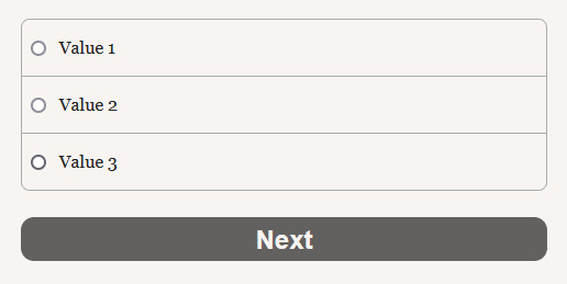
Hello Manon hope you're well! I was wanting to ask for a little bit of coding advice if at all possible? I don't know if you know of Brushmen's code collection to make Twine look like Choice script. I was hoping you would know a way to do something similar in the sense of wrapping the choices in boxes the way they did (similar to how choicescript does.)
Hiya Anon,
Of course! Happy to help.
Yes, I'm familiar with the template, thought I hadn't noticed the update... It is now meant for more intermediate users, it seems.
The source code does provide what is needed to make it happen (which is essentially a custom macro in JavaScript, with some extra CSS to make it pretty). You will need to download the projectfiles.zip from the page, extract it, find the choices.js and choices.css files inside the src folder, and add the code to your project. You can also find examples of how the "<< choice_shown >>" macro is used in the story folder.
However, if you just want to make it look more like ChoiceScript as in rather than

you want

You will need to choose another SugarCube macro: << radiobutton >>. Essentially, code your radiobuttons for the choices (and wrap each of them in a < label> for accessibility), and wrap the whole in a < div> for the styling. Don't forget the button for confirmation!
< div class="choices"> < label><< radiobutton "$choice" "value" autocheck>> Value 1< /label> < label><< radiobutton "$choice" "value2" autocheck>> Value 2< /label> < label><< radiobutton "$choice" "value3" autocheck>> Value 3< /label> < /div> << button [[Next]]>> /* More code if necessary */ << /button>>
You will need to remove the spaces... Tumblr otherwise eats the code...
Then we move on to the StyleSheet:
.choices label { padding: 11px 8px 12px; display: block; border-color: #a9acaf; border-style: solid; border-width: 1px 1px 0px 1px; } .choices label:first-child { border-top-width: 1px; border-top-right-radius: 8px; border-top-left-radius: 8px; } .choices label:last-child { border-bottom-width: 1px; border-bottom-right-radius: 8px; border-bottom-left-radius: 8px; }
That's for the radio button. We target the label, because it's the easiest and it takes into account the whole option block (radiobutton and text). The second and third code is to round the borders.
And if you want the button:
.macro-button { clear: both; display: block; width: 100%; font-size: 1.5em; font-weight: bolder; font-family: -apple-system, sans-serif; margin: 1em auto; color: #f7f4f1; background-color: #626160; border: none; border-radius: 0.5em; padding: 6px; }
And so you get:
#coding support#sugarcube#twine#coding in twine#interactive fiction#i want to make a template that looks like ChoiceScript now...
14 notes
·
View notes
Text
I don't know if anyone knows coding but I need to ask and I don't wanna ask on Stack but do media queries not work for borders?
I'm trying to get this vertical line to disappear when the window is under a specific size but it just refuses to work.
.vertical-line { border: 0; }
@ media only screen and (min-width: 963px) { .vertical-line { border: 0 1px 0 0 solid;} }
Added a space between @ and media so it doesn't actually tag. Like I tried border-left too and others but it just doesn't want to work
Edit: found the solution. I just had to put the CSS in it's own file rather than in-line on the same HTML file because the stupid site is old as shit
#edit: reason why i didnt upload it as a css file is bc its a pain in the ass to go thru the process of re-uploading the css file for every#change. its infuriating since it doesn't actually replace the old file so i have to name it something new every time#etc#if it has to be max-width i will scream#i hate working with media queries
13 notes
·
View notes