#curatorial statement
Explore tagged Tumblr posts
Visit Tumblr Blog
Explore Tumblr blogs with no restrictions, modern design and the best experience.
Last Seen Tumblr Blogs


Fun Fact
Tumblr was acquired by Yahoo for $1.1B in 2013.
Text
CURATORIAL STATEMENT
TOGETHER ALONE - online exhibition 2025
About the exhibition: TOGETHER ALONE In an era dominated by digital interactions, the online exhibition TOGETHER ALONE confronts the paradox of connection and disconnection that defines our virtual world. Divided into three themes: Touching the Screen, Digital Inimacy and Social Touch, the exhibition delves into the emotional and sensory void left by modern technologies such as Artificial Intelligence (AI), Virtual Reality (VR) and modern phenomena as social networking, online gaming and online dating. While technology has extended our ability to connect with each other, bridging distances and enabling real-time communication, it has also accentuated the digital divide—not merely as a gap in access but as a break in human intimacy. The impossibility of a real human physical touch in the virtual world underscores the limitations of our interactions in the digital world, revealing the fragility of true, genuine human relationships built on digital foundations. Is a true human connection possible in the virtual world? Through works by o.a. Margeet Kramer, Noor Nuyten, Rafael Lozano-Hemmer, and Thomas Hirschhorn and an interview with LI-MA curator Sanneke Huisman, TOGETHER ALONE explores these tensions, examining how the absence of the ability to physically touch each other manifests itself in virtual environments. Increasingly people establish their lives in the real world and in a digital world. Our online persona established trough social media can feel just as real as our physical selves and are an essential part of our personality and our lives and critical for our emotional well-being. Who we meet and how we meet and interact is increasingly shaped by algorithms. TOGETHER ALONE offers a critical look at the emotional and physical estrangement wrought by these technological advancements. By examining the possibility and impossibility of true human connections in the digital age, the exhibition not only critiques our dependence on virtual systems but also seeks to inspire new ways of understanding and options to bridge the digital divide that separates us. TOGETHER ALONE invites the visitor to reflect on the spaces in between—where touch becomes memory, connection becomes longing, and humanity persists in a search for closeness. As Sanneke Huisman states: “if artists dare to look for the poetry, digital touch can be intimate”.
TOUCH COLLECTIVE
#touch#new media#art#digital art#touch collective#digital touch#online exhibition#curatorial statement
1 note
·
View note
Text
'Multividual Realms'
2020
by Lesego Seoketsa
In this collection, including the pieces Multividual, Cost of Living, Headstrong, and others, the artist creates a vivid, introspective journey into the layers of identity, culture, and self-perception. These works come together as a meditation on the “multividual”—a term that reflects the artist’s exploration of the self as a complex, multi-faceted entity shaped by various identities and histories. Each piece peels back the layers of personal and cultural identity, revealing an intricate dance between presence and absence, fullness and fragmentation.
The figures in these images are marked by both ancestral and ritualistic symbols, partially shielded by hands or structures that protect yet reveal. Through these gestures, the artist delves into themes of belonging and self-acceptance, with each hand or gaze suggesting a form of selective revelation—what one is ready to face, or hide, in moments of prayer, meditation, or introspection. These elements emphasize the tension between what is shown and what is concealed, embodying a process of both self-protection and self-revelation that resonates with anyone who has experienced cultural duality or an evolving sense of self.
The imagery also engages with broader social and economic realities, as seen in pieces like Cost of Living, which reflects on the constraints and complexities faced by marginalized bodies navigating modern landscapes. The figures stand within or emerge from structures that evoke the notion of “home,” yet these are homes that are not entirely complete or accessible. This evokes a powerful metaphor for the fragmented experience of those who feel both within and outside their cultures and communities, highlighting the struggle for belonging amid shifting cultural and generational landscapes.
Through Headstrong and other pieces, the artist emphasizes resilience and the act of holding space for one’s power, even when it feels neglected or avoided. In each work, the body becomes a site for personal and ancestral stories, embodying the strength, contradictions, and fluidity that come with navigating multiple identities. This body of work ultimately invites viewers to see identity as a constantly evolving tapestry—one woven from heritage, self-assertion, and the courage to exist as a “multividual.”
In these six images, the artist has created a reflective and layered portrayal of the self as a “home” that is continually built and redefined. By confronting themes of visibility, invisibility, self-protection, and revelation, this collection encourages us to engage with the complexity of our own identities, recognizing the beauty and strength found in our multi-dimensional, resilient selves.
0 notes
Text
The Broken Hearts are Singing
How does it feel to love something that doesn’t love you back? In popular culture, brokenheartedness is often portrayed in a cis-heteronormative relationship—a man longing for a woman to love him back or vice versa. Yet brokenheartedness also emerges through other affective regimes such as belonging towards land, community, or even a nation.
On one hand, national borders are getting intensified, through the criminalization of dissents, the discriminating visa, or the invisibilization of migrants. While at the same time, those who are considered as legitimate citizens in majority are still struggling with everyday violences in the intersection of class, race/ethnicity, or gender. Yet with all the hardships of living, the obligation of a good citizen is to love the country. What are the paradoxes in this love? When loving becomes more and more impossible, are there other ways of loving that allow us or any collective life to thrive?
This project offers a more reparative reading of brokenness. By gathering sonic practices, including jamming and composing, through the works of Julian Abraham “Togar” and other invited artists-collectives, this framework seeks to put brokenheartedness as scenes of possibility amidst the impossible. What kind of resonances emerge from a shared feeling of broken heart? Would it be too much to imagine the possibility of gathering the pieces of shattered hearts so it will beat together? How to tune our ears so we can catch them beating and hear them singing?
The pavilion is calling all the broken hearts to jam the space; to do jamming sessions with music instruments, to fill the space by sitting down, or simply to listen to one another.
Throughout the unfolding of this project within the Indonesia Pavilion at ACC Gwangju, the exhibition space will be used as a place to be together by using brokenness as a shared affect and material condition while finding the necessary alliances, affinities, towards more in the future. The three months period will be divided into three phases;
● Phase 1: Shared belonging in brokenness
In this first phase, various rehearsals (or public programs) will be enacted as a series of attempts to use brokenness as shared affect and material condition. Brokenness is a (re)productive position with the potential that we need each other more than ever.
● Phase 2: Brokenness as a method
In the second phase, more rehearsals will be oriented towards care and collective well-being. To care is to struggle hand in hand with each other. In this phase, more recording and documenting practices will be held as a cumulative gesture towards the future.
● Phase 3: Broken Composition as Manifesto
In the last phase, the documentations from the previous phase will be presented. The Indonesia Pavilion will be closed with a manifesto presented in a public gathering.
1 note
·
View note
Text
Magnus Archives art museum AU. You agree.
#i work at an art museum so like. i got this idea while i was working#I don't have it ALL planned out but i do have a good amount!#like jon being the head curator instead of the head archivist#and the archival assistants being curatorial assistants#all/most of the statements are donated pieces#same as TMA though where not every statement in the archives is real/related to the fears#but every statement that has to be recorded is related to the fears#thinking of calling it 'The Magnus Institute of Arts'#like as an AU name and the name of the actual institute#oh! and leitners would still exist. just not books. it would be pieces marked 'from the gallery of jurgen leitner'#the magnus archives#tma
5 notes
·
View notes
Text
Workers at the Noguchi Museum in New York City are unionizing. Staff across administrative, curatorial, education, and visitor services departments, among others, have petitioned the National Labor Relations Board for a vote to form a union with Local 2110 United Auto Workers (UAW), according to a press release shared with Hyperallergic.
The union includes both full and part-time workers and will be “wall-to-wall,” which means all staff members can join regardless of their job title or department.
In a statement, Noguchi Museum workers cited “a need for greater transparency” and “better conditions” within the Queen’s institution.
“We all care about the Noguchi Museum, and I want the working conditions to be sustainable so that staff can continue doing the jobs that we love,” said Austin Kim, an archives associate at the museum.
23 notes
·
View notes
Note
You said you wanted to be asked about Duchamp so here I am (not confrontational though! I'm just curious and really into art history stuff)
Would you consider making art as requiring "effort"? Like the physical effort to paint, sculpt, draw, etc, not just the effort of coming up with an original idea since that's separate imo
I do agree that ai """art""" isn't really art, but I'm really curious if you think Duchamp's readymades and other, more "conceptual" art isn't really "art" because they're not doing that "effort" themselves
Again, just curious, I don't want to start any sort of discussion :]
PUTTING a urinal in a gallery is a statement on art, and a powerful one, and I'm not mad that it was done. Curation of art is a whole conversation that is very worth having, especially the way art curation classically does disregard functional or utilitarian pieces. HOWEVER, signing your name on something someone else made does not make you the artist of that piece.
So The Fountain is the big one, but while I do think the readymades are art, I don't think that DuChamp is the artist. Some designer or team somewhere made the sculptural form for that urinal, they THEY are the artist of that piece; it is no more or less art sitting in a gallery than it is mounted on a bathroom wall. Art is not contingent on the space it is displayed in; art can be art without being displayed at all.
I think of it as analogous to being the editor of and anthology, or the producer of a play. You have facilitated the display of the work, you may have even selected the work to present a theme or thesis or emotional response in an audience, but you did not CREATE the work yourself. Being a good curator is a skill, it can definitely be used to make a point, but it is a different skill from making art.
The conversation gets wobbly when you start looking at natural objects as art. How much transformation is needed? Is a quarry block art? You can put it in a gallery, it was worked, so how is it materially different from a sculpture? Is it? Put a river rock on a plinth; is THAT art? Photographs of landscapes? Photographs of animals? Photographs of other art?
So to your question, I do think there has to be some "effort" in translating your idea into the realm of perceivable. Writing a prompt for generative AI is art, actually - idea to words. The generated image itself is just a mathematical average of other people's work, and is therefore curatorial or editorial.
9 notes
·
View notes
Text
FINAL PROJECT PORTFOLIO:
Title: Out of Reach


Lighting: Natural Lighting/indoor lighting
Camera details: Canon EOS 2000D/ Rebel T7
Artist Statement:
I am visual artist dedicated to fostering connections through art, with a particular focus on community outreach and engagement with underserved communities. As an artist my work centers on the enduring power of community and the profound narratives that arise from cultural intersections.
My artistic journey is intricately woven with the inspirational threads of local non-profits and the rich cultural heritage of my surroundings. Through my work, I strive to create a dialogue that bridges the past and the present, capturing the essence of shared experiences and collective memory. My photography, illustrations and curatorial work are explorations of identity and resilience, aiming to illuminate the often-overlooked stories that reside within our communities. In my practice, I employ a diverse range of media to reflect the multifaceted nature of community dynamics. Whether through community events that enliven public spaces or intimate installations that invite personal reflection, my work seeks to evoke a sense of belonging and empowerment.
Ultimately, my artistic vision is driven by a commitment to social impact and a belief in the transformative potential of art. My hope is that through my work, I can contribute to a more connected and compassionate world, where art serves as a catalyst for positive change and a testament to the enduring spirit of community.
Artist Statement for Final Work:
Out of Reach is a social response triptych piece that addresses more of a demand for inclusivity and diversity specifically in the arts and education domains. The title of the piece is called 'Out of Reach’, however, in the design the word "of" is in a slanted format above the words "Out" and "Reach". The purpose is for the viewer to first read the word as 'Outreach' and then as 'Out of reach. This design decision was to highlight the ‘outreach’ aspect of this industry and what I hope to provide more of in the future as an artist. At the same time, the purpose of highlighting the ‘out of reach’ aspect is just as important. There are many communities and institutions that still do not have the necessary resources and support when it comes to education and the arts. Even through existing "outreach" organizations where the helping hand is presented as being one with the community, but in reality, the sole purpose is to benefit the institution and their members more than it is to benefit the community or the youth.
The sculptures I designed and photographed embody both the outreach and out-of-reach concepts. The sculptures also represent those who work in outreach positions, that are causing more harm and creating more barriers for people in vulnerable communities by providing insufficient resources. The sculptures also reflect individuals who are seeking guidance and have dreams of success and making a difference in the world. The photograph I took of my younger cousin staring out at generations of her family exemplifies the importance of youth having positive impacts in their families, schools, and communities. Each generation, regardless of ethnicity or socioeconomic class, should have the same opportunities, resources, and access to mental health resources, education and the arts.
I intended to use high contrast photographs to create a demanding mood and maintain the emphasis on the subjects rather than the surrounding factors. To continue with this theme, I wanted the lighting to draw attention to the subjects, as these are B&W images. The goal of making my sculptures faceless and more abstract was to make every viewer feel connected without focusing based on gender, race, ethnicity, age, etc. In composing the image, I deliberately placed my cousin in sharp focus while allowing the background — the older generations — to blur, creating a sense of distance. This stylistic choice highlights the dual ideas of connection and separation: the youth are intimately tied to their heritage and those who came before them, yet they also stand at a threshold, reaching toward a future that they themselves must build.
By leaving my cousin’s face unseen, I removed individual identity from the subject, transforming her into a universal symbol of youth everywhere. This invites viewers to project their own experiences, hopes, and challenges onto the figure, thus making the photograph more emotionally resonant and inclusive. It suggests that this is not just about one child or one family, but about the collective potential of all young people across different ethnicities and socioeconomic backgrounds. The themes of access, opportunity, and equity are central to the project. Every child, regardless of where they come from, should be afforded the same fundamental supports: high-quality education, access to the arts, mental health resources, and a nurturing community. The blurred background further reinforces the concept of these essential resources often feeling out of reach for many, symbolizing the barriers that must be overcome for true equity to be realized.

3 notes
·
View notes
Photo

Brooklyn Museum to Lay Off 40 Employees
The Brooklyn Museum will imminently lay off around 40 employees to ease a budget deficit with the potential to reach $10 million by June
... The news was first reported by *[Hyperallergic](https://hyperallergic.com/988467/union-decries-expected-layoffs-at-brooklyn-museum/)* and confirmed via a statement by museum director Anne Pasternak to the *[New York Times](https://www.nytimes.com/2025/02/07/arts/design/brooklyn-museum-layoffs.html)*. Pasternak reportedly broke the news to staff in a letter on Friday, writing that the institution was “experiencing strong headwinds: inflation has dramatically impacted our operating budget, adding millions of dollars to everyday costs and outpacing funding,” as quoted by the *Times*.
She added that these financial troubles were “further compounded by slow post-pandemic attendance recovery across the field.
”Layoffs are reportedly planned across museum departments and will include union and non-union positions. Per *Hyperallergic*, the president of Local 1502—a division of the District Council 37 union that represents art handlers, curatorial assistants, and maintainers—claimed that he was informed of the news on February 6, one day before the museum staff was set to receive notice. The timing, he said, may constitute a breach of contract clause requiring the union receive advance notice of layoffs. The union has since sent a cease-and-desist letter to the museum to stop management from laying off union members without the opportunity for negotiations or adequate warning. ...
4 notes
·
View notes
Text
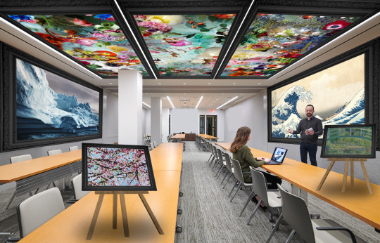
Curatorial Statement: Nature on the Brink
As global warming, rising sea levels, and pollution push our Earth on the brink of destruction, Nature on the Brink invites viewers to pause and reflect on nature’s fragile beauty and humanity’s powerful connection with it. This exhibition showcases this beauty through various artistic mediums, such as photography, pastels, and oil paint.
The five featured works - Damien Hirst’s oil painting Cherry Blossom, Isabelle Menin’s inland photograph Dream River 04, Katsushika Hokusai’s woodblock print The Great Wave off Kanagawa, Claude Monet’s oil painting The Water Lily Pond, and lastly, Zaria Forman’s hyper-realistic pastel drawing Greenland #63 - are placed inside a black frame to outline each work inside the Environmental Protection Agency (EPA) conference room, a space dedicated to the U.S. government to discuss environmental protection matters. The easels look like they are falling back to represent how nature is falling apart in this century. In addition, the placement of these works serves as a poignant reminder that the natural beauty depicted on these canvases is at stake. Thus, I chose this space to highlight my theme of preserving nature in this century, as our society must take better care of nature to save our planet.
I chose each art piece to fit into my theme based on their visual appeal of nature imitations, but also from researching each artist’s unique view on nature and inspiration for their work. Hirst created Cherry Blossom because he believed cherry blossoms have an “insane transience of beauty” against a clear sky and are very decorative objects from nature. Menin created a disordered landscape she calls Dream River 04 to represent the parallels between human complexity and nature. Hokusai created The Great Wave off Kanagawa to show the impressive power and force of nature. Monet painted The Water Lily Pond with inspiration from the beauty of his garden. And lastly, Forman created Greenland #63 to allow viewers to be transported to a natural landscape, with hopes to inspire their viewers to preserve nature.
Forman’s intent for preserving nature shaped the theme of this exhibition, as her work reminds us that nature is all around us, yet its importance and value are overlooked. Nature on the Brink seeks to reinforce this vital message with the presence of Forman’s work, along with the four other artists’ art pieces. My exhibition hopefully reminds you all to take action to cherish, protect, and save this planet…before the only existence of nature left is on paper or a canvas.
2 notes
·
View notes
Text
Let Art Speak
The use of art descriptions and explanations—especially written ones—has a deep history, but the formal practice developed over time in stages, especially as art moved into public institutions and became part of intellectual discourse.
1. Early Religious and Royal Patronage (before the 1500s):
No written descriptions were common, but symbolic meaning was built into the artwork itself—especially in religious art.
In churches, priests or scholars explained artwork to the public orally, especially since most people were illiterate.
In royal courts, court artists or patrons might include inscriptions or heraldic symbols to convey identity or meaning.
2. Renaissance (1400s–1600s):
Artists began signing their work and sometimes included Latin inscriptions or visual clues to indicate meaning.
Thinkers like Vasari (in Lives of the Artists, 1550) began writing biographies and interpretations of artists' works—this was an early form of art writing and interpretation.
Patrons also began commissioning works with specific meanings or allegories, often recorded in letters or contracts.
3. Baroque & Enlightenment (1600s–1700s):
Art academies emerged (like the French Académie des Beaux-Arts), and with them came formal rules and rationales for what art should do.
Exhibition catalogues started to appear, offering short descriptions of artworks shown in salons or royal collections.
Paintings were often described in terms of themes, moral lessons, or classical references.
4. Romanticism & Realism (1800s):
As artists sought to express personal emotion or social truth, art critics like Baudelaire began to write about art in newspapers and books.
Artists started writing manifestos or letters explaining their intentions (e.g., Courbet’s political realism).
Public museums like the Louvre or British Museum began offering labels and guided tours—bringing written description to mass audiences.
5. Modernism (1900s):
As art became more abstract, the need for explanation grew—leading to manifestos (e.g., Futurism, Dada, Surrealism).
Art critics and theorists like Greenberg, Benjamin, and Berger began interpreting and contextualizing work for readers.
Museums introduced more sophisticated wall texts, catalogues, and artist statements.
6. Contemporary Art (1970s–present):
Art description has become nearly standardized—most galleries and museums now include:
Artist statements
Curatorial essays
Wall labels with conceptual and historical context
Conceptual and installation art especially requires explanation, as the idea is often not visible in the object.
So, while symbolic and oral explanation existed in ancient and medieval times, formal art descriptions as we know them today really took off during the Renaissance, then institutionalized in the Enlightenment, and became essential in Modern and Contemporary art.
by ChatGPT
#Ai#ChatGPT#Art#realism#artist#artquotes#painting#drawing#paint#draw#brushstrokes#figure#figurative#figurativeart#portrait#anatomy#figuredrawing#portraitpainting#figurativepainting#contemporarypainting#contemporaryart#modernart#ศิลปิน#ศิลปะ
1 note
·
View note
Text

Jason deCaires Taylor, The Silent Evolution, 2011 Overview Jason deCaires Taylor’s The Silent Evolution (2011) is a monumental underwater installation consisting of 450 life-size sculptures in Mexico’s Museo Subacuático de Arte (MUSA), located off the coast of Isla Mujeres. The sculptures were made from pH-neutral materials designed to encourage coral growth, transforming the underwater museum into an evolving coral reef. This work not only draws attention to marine conservation but also serves as a habitat for marine life, creating a fusion between art and ecology.
Critical Analysis In The Silent Evolution, Taylor merges environmental art with direct conservation efforts, which I find particularly compelling. This piece challenges conventional views on art by integrating sustainable materials and placing the sculptures in the ocean to foster coral growth. By doing so, Taylor engages with critical frameworks surrounding eco-art and environmental activism, where the artwork goes beyond being a visual or conceptual statement and contributes tangibly to the ecosystem.
A central theme in this work, and in my own practice, is the intersection of art and environmentalism. As I have seen firsthand through diving, the ocean’s ecosystems are fragile and easily damaged by human activity. Taylor’s work creates an immersive experience where art helps rebuild these environments. This concept resonates with my belief that art can not only reflect on issues like climate change but can also be part of the solution. The underwater setting ensures that the audience, mostly divers, experiences the work in a space directly connected to the environmental issues it addresses, making the conservation message more impactful.
Taylor’s The Silent Evolution has influenced my own curatorial ideas, particularly regarding how art can engage audiences in conservation efforts. The installation’s ability to attract divers and foster environmental awareness demonstrates that art can create profound connections between viewers and the natural world. By incorporating natural materials and fostering coral growth, the piece also serves as an example of how art can contribute to the restoration of ecosystems, which I aim to explore in future exhibitions.
Through the analysis of this work, I critically reflect on my own curatorial strategies and how I can integrate environmental themes into art spaces to foster engagement and education. The Silent Evolution shows how immersive, interactive art can bridge the gap between aesthetics and activism, inspiring me to think more critically about how to create impactful exhibitions with real-world ecological benefits.
2 notes
·
View notes
Text

Curatorial Statement
By: Danielle Adams
Title: A Wave of Emotions
Water is not simply a liquid. It is so much more! I chose to focus on how water can play the role of a main character in pieces of art. It can show itself in so many ways. I have chosen to show it expressed, through six different artwork selections from five different artists, in three different forms: frightening, calming and neutral. These artwork selections show how water is a force in our environment and in our lives that can affect our emotions. Sometimes water can be rough and make us feel worried. Sometimes water can be still and make us feel peaceful. Sometimes water can make us feel a combination of all of these feelings or neither.
Water variation, and how it makes me feel, is the theme. This guided me in choosing the artwork selections in this exhibition. It also guided me to choose the exhibition space, which is an aquarium display. I wanted the pieces of artwork to be gathered in a place where water is usually held and where water is expected to be seen. I am actually afraid of being in water, but I also think that water is very beautiful to look at. I feel like all of the six pieces of art embodied my theme as water was shown from different emotional angles. They all stood out in their own way, but I felt they worked well together too. When I was picking out the artwork selections, I felt intensity from some, tranquility from some, and then a mixture of in between from others. Putting all of the six artwork selections together made me feel like I was looking at something bigger than it was. I feel that my exhibition captured a range of sentiments, and this is what I was trying to accomplish. I hope that the audience will feel moved in the same way as I was!
1 note
·
View note
Text
being mlm in fandom is so weird and tiring. overrepresented in fic, almost invisible in the community, constant discourse about us which is never addressed to us. ppl are always forgetting we're even in the room, except when they're making reductive statements about How Men* Do Fandom ("curatorial"; shallow; emotionless; "dudebro" most likely; Bad and Wrong; get away from Women's Interests!!!), or, if trans, when we're being misgendered and made into a representation of Everything Wrong With Fandom.
*presumed, but almost never stated, to be cishet. that's what man means, right?
#sapphics keep shouting at other sapphics for not writing about sapphic experiences enough without acknowledging who they're talking to#and managing to make me feel guilty for having representation that i don't even engage with that often anyway#[head in hands]#i'm just tired.
2 notes
·
View notes
Text
🎨 Artagan Williams ♀️
Ultimate Arts Administrator
Color Theme: Burgundy / Rouge Red
🎭 Character Introduction:
> “There’s a soul in every stroke, a story in every smear. Curating art isn’t about showing it—it’s about understanding it.”
Artagan Williams stands with a sharp eye and a steady hand in the creative chaos. Whether it's a vintage surrealist piece or a protest mural on a brick wall, she sees beyond the brushstrokes—into the heart of what the art says about us. She's calm but expressive, grounded but passionately observant.
🖼️ Backstory:
Born in Santa Fe, New Mexico, Artagan grew up among adobe buildings and vibrant street art. Her parents—local gallery owners—let her paint on the walls as a child, nurturing her artistic curiosity early. While other kids drew flowers, she was replicating Frida Kahlo’s self-portraits or classifying street graffiti styles by influence. It wasn’t long before the national art community took notice.
By 15, she was organizing exhibitions in local libraries. By 17, she was managing gallery installations, publishing critiques, and digitizing folk art collections for preservation. Her deep historical insight and organizational genius earned her the title of Ultimate Arts Administrator—an unheard-of blend of curatorial mastery and youthful genius.
🧠 Personality:
Authentic-artistic and unpretentious
Speaks with poetic language, even in tense situations
Doesn’t perform for attention—her presence is the statement
Passionate about preserving cultural memory, especially underrepresented voices
Mediator type—believes art is where people with differences can meet
She's often compared to characters like Lisa Simpson (from The Simpsons) for her intellect and artistic idealism, or Penny from The Proud Family when she’s defending the value of community voices. In moments of inspiration, she’s animated like a Genndy Tartakovsky character—controlled chaos in motion.
🎓 Occupation / Talent:
Ultimate Arts Administrator
She’s more than a curator—she’s a conductor of galleries, workshops, and cultural movements.
Can instantly analyze artistic styles, influences, and historical context
Digitally preserves endangered artworks and organizes exhibitions
Advocates for inclusive representation in art spaces
Helps others find artistic meaning and form in their work
Often brings order to chaotic situations in class or group projects
🌮 Likes:
Mexican cuisine (especially mole and chilaquiles)
Art zines and catalogues
Stationery stores
Independent artists' markets
Latin American art history (particularly Orozco and Rivera)
🚫 Dislikes:
People who treat art as just decoration
Plagiarism and exploitative "copy-paste" trends
Bureaucracy that cuts funding for the arts
Crowds who don’t respect sacred or cultural exhibits
Fast food ketchup (too fake for her taste)
📛 Name Etymology:
"Artagan" is a stylized fusion of "art" and the Celtic-sounding suffix “-gan,” giving her name a mythical yet grounded feel—like a guardian of creative culture.
"Williams" is a classic surname, symbolizing her role as a grounded, relatable anchor in a story full of eccentric personalities.
🎨 Cartoon Traits Referenced:
Daria Morgendorffer (Daria) – dry wit, quiet insight, disdain for fake enthusiasm
Velma Dinkley (Scooby-Doo) – analytical, logical, passionate about documentation
Pepper Ann (Pepper Ann) – art-club type, with an individualistic streak
Jane Lane (Daria) – chill, sarcastic, but fiercely dedicated to real expression
Garnet (Steven Universe) – stoic presence but deeply emotional when it matters
🧩 In the American Danganronpa Setting:
Artagan is the rational glue that holds the fractured group together when emotions flare. She rarely panics, often sketching silently to process information during trials. She uncovers hidden details in background art or overlooked cultural symbols in the environment. While she doesn't have a flair for confrontation, her logic and ability to connect motives through visual symbolism make her a surprising asset in uncovering truths.
And no—Artagan never dies or gets executed. Her story is one of survival, transformation, and legacy-building. She’s the kind of character who ends up preserving everyone's stories after the tragedy.
0 notes
Text
Week 1 Without Youtube or Instagram
Day 4 was the first difficult one. I hadn't had a great night's sleep, and I was due to receive a tick shot that morning, which made me even more tired and sluggish. Luckily, I had no jobs that day so I though I could just coast through it. I spent most of the energy I had working on some music down at our studio space. The tricky part came late in the afternoon, as I was settling in on the couch back at home. I got an email asking me very nicely to take on a rush translation. For a number of reasons, I didn't want to say no. And suddenly, when I thought my day was over, there I was, parsing through the decidedly curatorial language of an exhibition statement.
So far, this was when the urge to distract myself with some sort of media was the strongest. At first, I gave in a little: I checked a couple of news websites and wandered onto Facebook twice. But I managed to catch myself before getting sucked in. What I've noticed, however, is that the stress of a rush job tends to skew your perception. By some distorted logic, sitting idly for a minute and resting your mind feels like more of a waste of time than watching a 20-minute video on 2x speed. In the end, I worked for about 2 hours and I knew I’d have to get back to it early next morning because I was in no state to deliver a polished translation.
After that day, I had a few more nights of poor sleep, which further dulled the awareness that I was doing a challenge. The novelty was wearing off, too. I think I began checking news sites more often. Which technically isn't against the rules. I listened to a few podcasts when I wasn't able to sleep. I was opening Instagram a few times a day to look at the top stories and whatever reels my wife had sent me. For some reason, this didn't feel like a major violation, even though technically, it is against the rules, and at least a couple times, I slipped up and started scrolling. I should make a note to keep it at once a day.
Basically, I'm still keeping the challenge going, but it started fading into the background. Has it been worth it so far, though? I'd say, yes. Perhaps not in a huge way: I haven't been magically transported back to my childhood or whatever. But I have a little more headspace for:
Creative projects. If not actively working on them, then thinking about goals and ideas. They're starting to feel less like chores and more like fun hobbies again
Researching an interesting topic instead of watching a video on it (which would inevitably lead to another video, and another, until they're no longer related to what I wanted to learn about)
Reading
Listening to music
But:
I don't think it's made it much easier to focus on dull tasks
I'm finding different (arguably more rewarding?) ways to waste time
If I'm really tired, the alternative to watching a video might just be doing nothing. Which is probably still better for me?
I'll make another update after week 2.

1 note
·
View note
Text
Art, Bullshit, and the Digital Paradox

Andreij’s disenchantment with the contemporary art world doesn’t come from nowhere. It’s the kind of bitterness that only comes after years of trying to play the game—only to realize the whole game is rigged.
“I accidentally found out many times that the contemporary art world is full of bullshit,” he spits. “Bad execution, shitty visuals—but wrap it all up in five pages of curatorial statements with fancy academic jargon, and suddenly it’s high art. If you want to present philosophy, just be a philosopher. The artist’s job is to create visually good work—not to explain it in a damn essay about why the artwork matters.”
His answer to all that bullshit? AI.
“With AI, I can bypass all the pretentious crap. I can create whatever I want—direct, raw, without needing anyone’s permission or approval. Whether people like it or not—who cares?”
Read more about Andreij’s perspective on AI & art at AIDEA Magazine Get your free copy now! Download here AIDEA Magazine #1 Edition
0 notes