#demake
Text
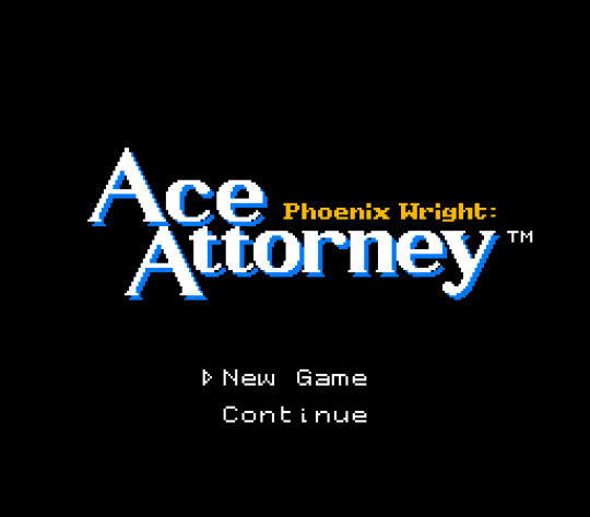
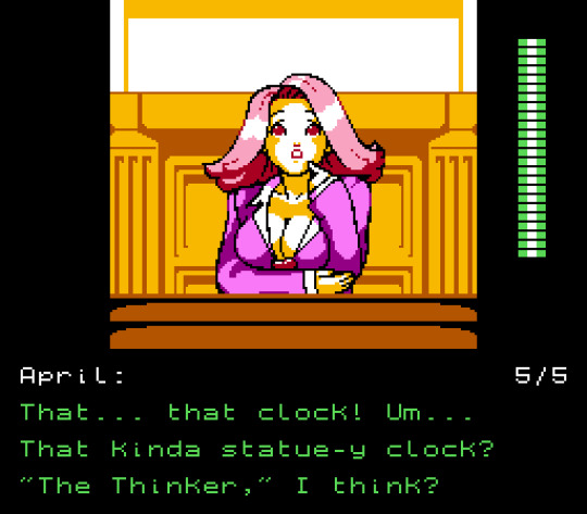
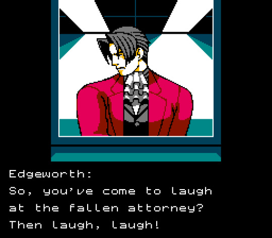
Phoenix Wright: Ace Attorney (1991) for the NES
It's fun to work with the color limitations of the NES, and also I'm a sucker for all-black UIs.
I made a font that matches the modern sans-serif style of the original but still fits into the one-letter-per-tile scheme, and I really like how it turned out.
Might make more AA stuff like this actually.
#ace attorney#phoenix wright#april may#miles edgeworth#ace attorney art#fanart#art#artwork#pixel art#retro#retro gaming#retro aesthetic#video games#demake#nes
6K notes
·
View notes
Text
#pixelart#ドット絵#sprite#sprigatito#fuecoco#quaxly#pokemonscarlet#pokemonviolet#pokemon scarlet and violet#starter pokemon#retroaesthetic#gbc#gameboycolor#gameboy#4 colors#sprite art#demake#pokemon
5K notes
·
View notes
Text
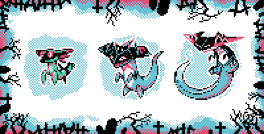
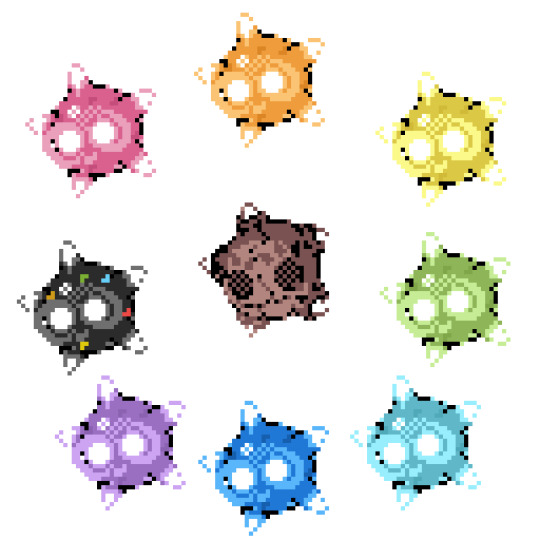
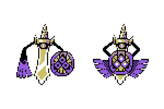

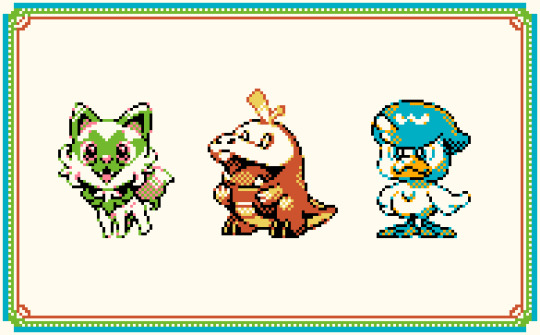
Some of the newer Pokemon that I remade in the style of gen 2 for the Gamebody Color. Sometimes I stick the 4 color rule
instagram
#pixel art#ドット絵#pokemon#dragapult#minior#cosmog#aegislash#lunala#solgaleo#sprite#sprite art#demake#2bit#gameboy#4 colors#pokemon sword and shield#pokemon sun and moon
629 notes
·
View notes
Video
Dead Space Demake is a PS1 styled demake of Isaac's classic Sci-Fi survival horror adventure!
Read More & Play The Full Game, Free (Windows)
#Gaming#indie games#pc games#pc gaming#video games#horror#horror games#pc game#dead space#demake#free games
2K notes
·
View notes
Text
Bloodborne PSX launch trailer reupload cuz I'm new here 🥳
#bloodborne psx#bloodborne#demake#ps1#i already feel nostalgic for this project#brb getting misty eyed hsshs
2K notes
·
View notes
Text

I think there's something wrong with my copy of Legends Arceus...
#Pokemon#Pokemon diamond and pearl#Pokemon black and white#ingo#akari#sprite edits#pokemon legends arceus#demake#sprite demake#I realised right when i put akari next to ingo that BW and DPPt sprites ARE styled slightly different to eachother oof#also just now im realising i forgot the shadows AAAAAA#Also this is a sequel to my Ingo front standing sprite-edit i made a bit back ig
4K notes
·
View notes
Text
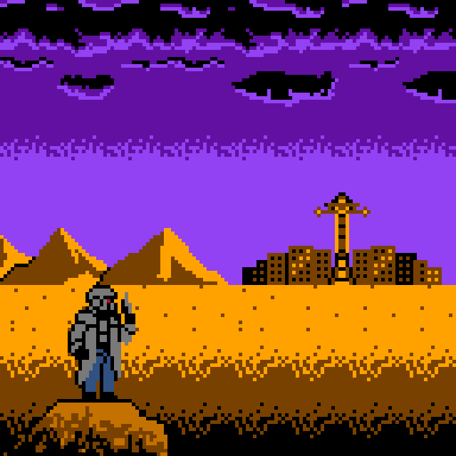
NES - New Vegas
pixel_dailies : wasteland : 2/24/23
#pixel art#pixel art animation#animation#pixel dailies#new vegas#fallout fanart#nes color palette#2d animation#pixel artist#fallout#artists on tumblr#mojave wasteland#fallout: new vegas#fnv#fan art#demake#the courier
669 notes
·
View notes
Text

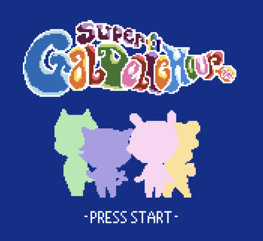

Super Galdelic Hour for the Gameboy Colour!
112 notes
·
View notes
Text
I spent two damn years on my demake of Demon’s Souls for PS5 into a PS3 aesthetic and now they friggin tell me…
103 notes
·
View notes
Text

Silent Hill 2 intro demake using Pixaki.
#pixel art#retrogaming#video games#gif#demake#pixaki#silent hill#silent hill 2#fanart#playstation#sony playstation#playstation 2#ps2#nintendo#gameboy#nintendo gameboy#konami
616 notes
·
View notes
Text
The Binding of Isaac (1994) ?
I'm trying to use twitter less, so here's the only art I ever uploaded there.
#binding of isaac#the binding of isaac#tboi#tboi fanart#isaac moriah#art#artwork#fanart#pixel art#game boy#gb#video games#demake#retro#retro gaming
526 notes
·
View notes
Text
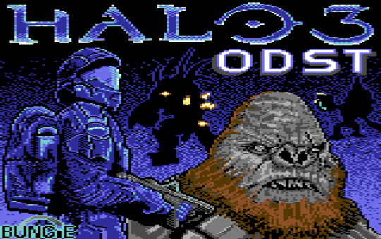
Halo 3 ODST Commodore 64 version. 160*200 multicolour mode, 16 Colours 2:1 pixel ratio. Loading screen for a proposed ODST C64 demake.
This was super fun to do, working at 160*200 and then stretching the image afterward to the 2:1 pixel ratio can be a little awkward but after a short while it becomes very satisfying :-)
258 notes
·
View notes
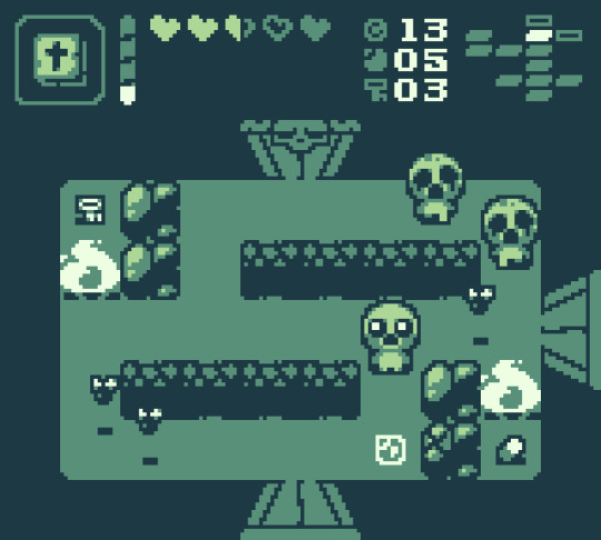
Text

killscreen for a game that doesn’t exist
246 notes
·
View notes
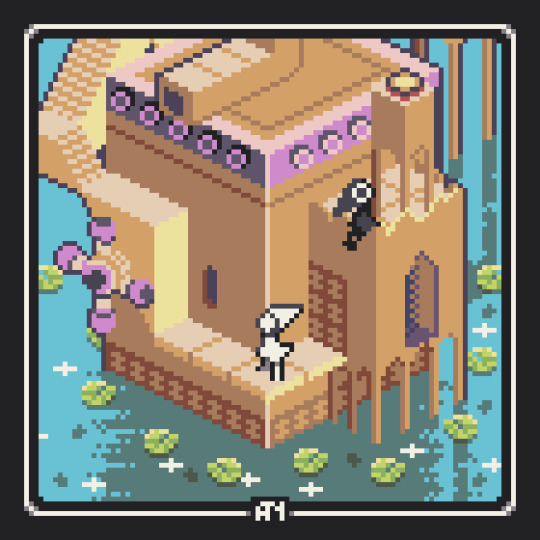
Text

I gave myself the whole month to pixel up a Link's Awakening inspired mockup of game set during the OT
LUKE'S AWAKENING
#pixelart#ドット絵#star wars#may the 4th be with you#may the 4th#zeldalike#zelda#gameboy color#mockup#demake#fanart
274 notes
·
View notes
Text
Oldie but Goodie: Monument Valley, demake'd
166 notes
·
View notes
Text

i made my precious amiibos
3K notes
·
View notes
Last Seen Blogs
yi-wu
Yi Wu
norsainbeautylounge-blog
Beauty Saloon

misseroticashow
ཀུ་མུད་

tttr
Together

atd-sportscars-blog
ATD-Sportscars