#difference between raster
Explore tagged Tumblr posts
Visit Tumblr Blog
Explore Tumblr blogs with no restrictions, modern design and the best experience.
Last Seen Tumblr Blogs


Fun Fact
The “We are the 99%” Tumblr blog became the slogan for the Occupy Wall Street movement.
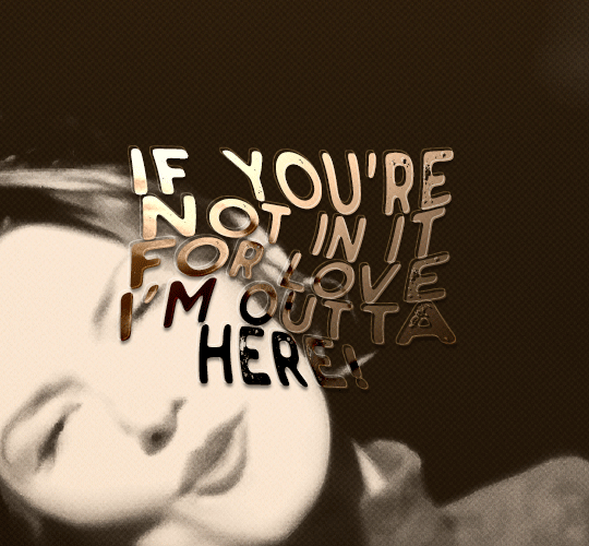
Text
Graphic design is my
Fucking
burden!!!!!!!!!
#ragsycon exclusive#explaining the difference between a vector and a raster for the millionth time. despite knowing it will never stick#explaining that gen ai assets are so full of nonsense details and artifacting that they're next to impossible to trace out into a vector#explaining that i don't want to be involved with this project because nobody's paying & also I'm busy & also the project lead is my mother
7 notes
·
View notes
Text

Hello folks! As someone who never did any celebrations nor tutorials for giffing, I decided it's finally the time now. So thank y'all for putting up with my horror shenanigans, 8k is just amazing and I hope y'all will keep enjoying my blog and posts!
PHOTOPEA GIF TUTORIAL
Moving to Photoshop after years of using Photopea, I can say while they both work very similarly, they're also different. Photoshop is far superior, you can still make very HQ and nice gifs in Photopea too! This post aims to show you my personal way of making crispy gifs while also covering the basics of getting the frames and uploading them to Photopea. (If you're looking for more detailed beginner tutorial, there's plenty of those out there, amazingly done!)
Photopea is completely free, video player is completely free, downloading movies is completely free. Only thing it'll cost you is your time.
WHAT YOU'LL NEED:
- photopea - potplayer - good quality movie file ( i go for the highest GB ones, above 10gb is amazing. Sometimes I get 40gb and prefer 1080p source. Note that higher file doesn't immediately mean higher quality - if the movie looks weird just download another one)
GETTING THE FRAMES: Once you get your source file and open it via PotPlayer, find the scene you want to gif. Using D and F keys you can go backwards or forward by single frames. When you get the perfect frame where you want the gif to start, I always go back 10 frames because PotPlayer tends to cut those out. It's better to get more frames than you need as you can always delete those extra ones later on.
I'll be giffing scene from Longlegs alongside the tutorial.
PRESS CTRL + G. This will open the frame capturing window. Fix the setting to match these:

and press "START". Click back on the PotPlayer to bring focus back on the window and hold or press the forward key - F - to play the scene and capture the frames. You can see the frames number going up on your other window. If it stays on 0 you're not capturing anything. Once the desired scene is over, press "STOP" on the frame capturing window and voila - you have your frames in your selected folder. Delete any extra or unwanted ones. The amount of frames usually sits between 40-80 depending on what ratio you'll use later on for the gifs to fit the 10mb Tumblr upload limit.
Now it's time to open PHOTOPEA.
FILE > NEW: you have to write down the exact dimensions of your frames. This action will create a new file with single background. Go back to FILE > OPEN AND PLACE > SELECT ALL YOUR FRAMES and upload them. Depending on the size of the frames, this could take a while or even lag your browser. Make sure to not click anywhere within the app before all frames are done uploading.
Now lets finally make the gif. The following were my most used gif making steps in general, play around other options and find out what works - every gif or scene is different!
Delete the original empty layer at the bottom and then select all the frames (clicking the first/last layer and then click the last/first layer while holding shift to easily select all) and by pressing CTRL+G, group them. Select all layer again and
RIGHT CLICK (on the layers) > RASTERIZE LAYER (on the upper taskbar) > ANIMATION > MAKE FRAMES Now your frames should have _a_ in their names. CREATE NEW LAYER

and select all your frames again.
CROP the whole project to whatever ratio you want, Ill be using 64x44 ratio for wider gif.

By pressing ALT+CTRL+I open the RESIZE window. Tumblr gif dimension is 540px wide max (heres tutorial for other dimensions and why correct sizing is important) so using that and "bicupic sharper" option under resample, resize the gif.

Now you have the base gif done.

Its dark, muddy and unclear. We sharpen it and give it the clear crispy look using noise. FILTER > NOISE > ADD NOISE and set the Amount to 1% and select monochromatic FILTER> SHARPEN > SMART SHARPEN > 150% amount with 1px radius FILTER> SHARPEN > SMART SHARPEN > 50% x 10px

Now its time to bring the gif to life. Create NEW ADJUSTMENT LAYER. This is where all the editing options are.

For this specific gif Im doing:
BRIGHTNESS/CONTRAST +50 brightness, +10 contrast
VIBRANCE +20 vibrance, +10 saturation
HUE/SATURATION master -50 , red +50, cyan +50, blue +50 (the reason i tune all colors in master down by 50 is to mute them all down. Adding back on colors you want is making them stand out way more! It works on gifs with dominant few colors but if the gif is very colorful, you're better off leaving this option out completely and rather work with selective colors. As I said, try it out and see!)
another layer of BRIGHTNESS/CONTRAST +20 brightness
COLOR BALANCE range: midtones > magenta - green: -11, yellow - blue: +8
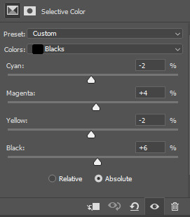
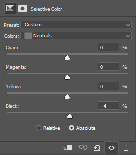
SELECTIVE COLOR red: cyan: -20%, yellow: +20, black: +10 yellow: yellow: +50% white: yellow: -10%, black: -20% black: black: +4%
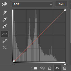
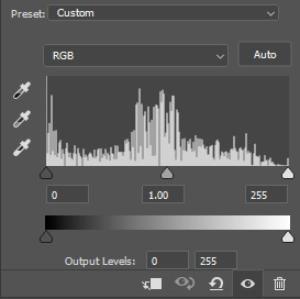
CURVES(those are something I didnt use much in Photopea as in general youre just fine with brightness and selective color. Just move the point on the curve and see what it does! For this gif I went with Curves like these and it enhanced the gif nicely.)

another layer of SELECTIVE COLOR > black: black: +2%

Now Im satisfied with the gif and want to save it. Clicking FILE > EXPORT AS > GIF will open this window:

Make sure the quality is at 100%, the size in darker numbers lower than 10MB. Speed in Photopea is quite tricky for some reason, but 180% - 190% is the "normal 100% speed" of the gif.

Enjoy giffing and feel free to ask anything if unclear!
66 notes
·
View notes
Text
gif tutorial
i was asked to make a tutorial for this set i made, so let's get right into it!
first things first, i downloaded the music videos from youtube in 1080p using 4k video downloader. unfortunately, the quality of youtube videos always seems... not great, to put it simply. plus these music videos are from the 90s, so they've been upscaled to 1080p after the fact. all of this works against us, but i've definitely worked with videos of lesser quality than these, so at least there's that!
when i gif, i import video frames to layers rather than screencapping. this comes down to personal preference. after everything has loaded, i group all my layers together and set the frame delay to 0.05. i then cropped my gif to 540x500.
the next step in my process is sharpening. i did play around with my settings a bit given the quality of the footage and the dimensions of the gif. i compared both @hellboys low-quality video gif tutorial to my regular sharpening action and my vivid sharpening action and in this case, i preferred my normal vivid sharpening action. i used this tutorial to create the action for myself, and you can find other sharpening tutorials here. this action converts my frames to video timeline and applies sharpening.
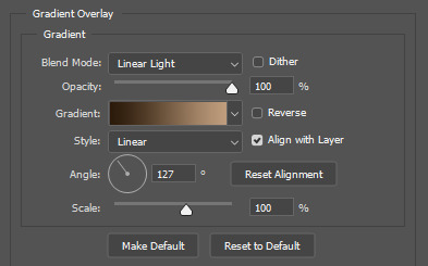
once my gif is sharpened and i'm in timeline, i begin coloring. i wanted to simplify the amount of colors used in these gifs, again because of the video quality -- i knew it wasn't going to have the crispness i would normally like for my gifs. here are my coloring adjustment layers and their settings (not pictured: my first layer is a brightness/contrast layer set to screen) (explanation in alt text):

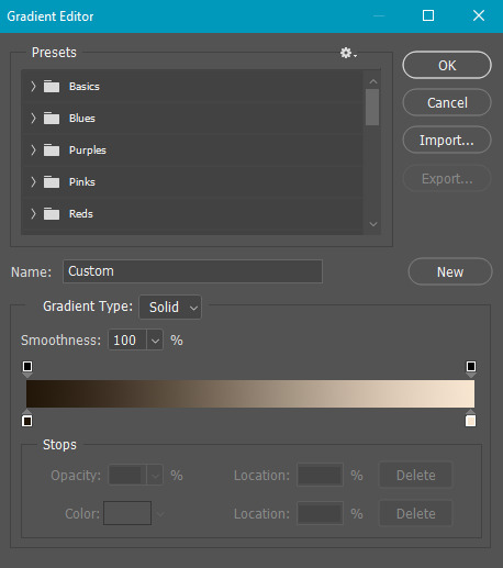
all of these layers and their settings will vary depending on your footage and its coloring (and obviously, feel free to make the gradient map whatever colors you like if you aren't going for this exact look).
pretty basic coloring, especially with just slapping a gradient map on top (my beloved), but at this point, i still didn't like the quality of the gif, so i added a couple textures/overlays.
i put the left one down first and set the blending mode to soft light and the opacity to 8%. depending on what look you're going for, you could increase or decrease the opacity or play around with different blending modes. i like using this texture with lower quality footage because even when it's sized up a bit, it adds some crispness and makes things feel more defined. for the second texture, i set it to overlay and 75% opacity. we love and respect film grain in this house.
now for the typography! sometimes i really enjoy typography and other times it's the bane of my existence for the sole reason of just how many fonts i have installed. anyway, here are the settings i used for this set:
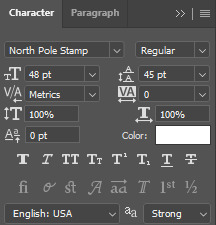
make sure the color of your font is white and then set the blending mode to either difference or exclusion. i can almost never see a difference between the two, but for this set, i used exclusion. below are the blending options (double click on your text layer to bring up this menu or right click and select blending options).
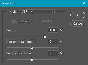
now we have to add the warp effect. with your text tool still selected, click this icon at the top of your screen:

from the dropdown menu, select twist. these were my settings, but feel free to play around with different warp options and their settings. the ones i use most often are flag, fish, and twist.
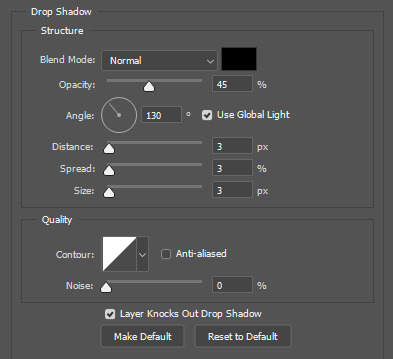
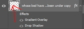
this last step is completely optional, but it's an effect i use in most of my sets with typography. duplicate your text layer (select the layer and ctrl+j), turn off the layer effects (click the eye icon next to effects), and set the blending mode to normal. right click on the layer and select rasterize type. right click on the layer icon itself and choose select pixels.
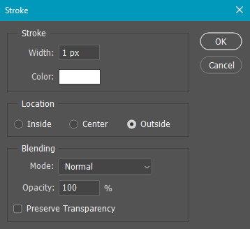
at this point, you should see the moving black and white dotted line showing that only your text is selected. then go to edit > stroke. here are the settings i almost exclusively use.
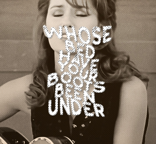
this is what your text should look like now:
using ctrl+T, move the layer off the canvas so you can't see any of the text anymore. you should be left with only your outline. click anywhere on your canvas to de-select the text we just moved. use ctrl+T again as well as your arrow keys to nudge the outline over to the left 2px and up 2px. this is personal preference as far as the positioning, but i almost never move it any other way. you can leave it like this, which i sometimes do, or you can set the blending mode to soft light like i did for a more subtle effect.
and that's it! rinse and repeat for each gif in your set or use a different warp effect on each gif to switch it up! if you have any questions about this tutorial or would like me to make one for anything else, please feel free to ask any time!
#gif tutorial#my tutorials#gifmakerresource#completeresources#dailyresources#chaoticresources#userdavid#coloring tutorial#typography tutorial#tutorial#photoshop tutorial
279 notes
·
View notes
Text
About scale, process, palette and canvas: a few considerations on pixel art as a medium
User moredogproblems answered an interesting and legitimate question by another, DiscountEarly125, regarding my work and canvas size. He also perfectly isolated two central concepts of pixel art, which are scale and process. Canvas size, which was the theme of DiscountEarly125's specific request, is more of a dependent variable to those two aforementioned concepts, rather than a starting point. I hope the following considerations I shared may help or prompt some other ideas, but this is what I could come up with 15-ish years of experience with pixel art (and a few more years of art and media studies). I was quite in the mood of writing down these few thoughts that have been floating for a while. I apologize as this may also result in a confusing wall of text, but it is all part of a my work and research, and I would love to polish all the material, hopefully with some thoughts, insights from other colleagues, as well as pictures and materials!
A. Scale and canvas size It is true that the bigger the canvas, the more distance one may visually create from pixel art, but I personally think this is to be possibly considered a matter of perceiving pixels, rather than a fundative problem of the medium. In fact I concur with the idea of "process makes the medium" rather than identifying pixel art as how (evidently) pixeled the result feels. The general picture, or the sum of pixels, though, is a really important matter to the medium nonetheless! Pixels themselves work in relation one with another, so it's their overall result that gives context and makes the subject recognizable. This relationship between pixels links back to all the art fundamentals that each artist is taught, from color theory to shape and composition - and so on. So, the canvas size debate usually boils down to a matter of scale or necessity of your subjects. As long as the dimension (canvas) of your subject (as in: a drawing of an apple, a character sprite, a mockup environment) allows you to operate, control and keep an eye on the quantity (number/area of pixels together) and quality (color, shaping of multiple pixels, texturing obtained through color and shapes) of isolated single pixels or pixeled areas, you're in the pixel art universe. The other way around to define the matter of scaling: in order to be operating pixel art fundamentals and techniques, your subject has to be on a scale that allows you to apply principles of pixel art within the space of your canvas and your personal style. These very same principles, or basics, can be applied with different results and extent to bigger and smaller canvases alike, each with their own specific difficulties and variables. It is important to adapt your scale when learning, and trying classic canvases per subject like "16x16px" (standard tile or character sprite unit, tied to older consoles and screen ratios, it's a bit complicated there) is always a nice idea - they also tend to be industry benchmarks and necessities so in case you'd like to consider a professional output, that's very useful.
Scale also applies to the array of colors, and there lies the concept of palette: a number of single hexadecimal hues we are using for each single pixel. Any single pixel can have one hexadecimal color only.
Consequentially it is absolutely true that either a huge canvas or a palette too broad may prevent a viewer from perceiving immediately the "nature" of your medium, namely seeing square pixels, recognizing a certain amount of color - or more thoroughly recognizing that you made some choices for each subject on a pixel level. What could possibly happen on a huge canvas (without zooming in) is that you can't really grasp the pixels, but just the "overall picture" - and that may not differ too much from digital, raster art, which is of course also based on pixels. Therein appearently lies a sort of threshold that is really hard to pin down for us pixel artists, as it depends on screen size, visualization methods, distance, filters and lots of other inherently subjective parts.
This kinda is my case sometimes: I make big environments (possibly too big, and too detailed in each part I tell myself) that are a sum of many lesser parts: both tilesets and sprites that relate (but not strictly adhere) to a basic space unit that is 16x16pixels. You can indeed consider scale in a broader sense as a subdivision or magnification issue, much alike squinting your eyes to focus on a picture's overall contrast or, conversely, analyzing its fundamental parts with a magnifying glass, and then a microscope - an analogy as follows:
a. the picture as a whole is like a colorful rock that you can analyze by magnifying its grain. b. the characters, geographical elements and textures, works like the different substances that compose the rock and give its visible characteristics grain and complexity, c. single pixels constitute the very atoms of those previously recognized substances.
I mean "atom" in the traditional, classical meaning of indivisible, fundative object. That's a "quantized" part of information, which for pixel art is ultimately color (or a binary value, like yes/no black/white). If you were, for example, to crop some parts of my work - let's say 160x144 pixels (a gameboy screen resolution in pixels) you would see the substances that are characters and elements of nature, and when you zoom in again, every atom becomes visible as a single entity of color. There are 29 different type of "atoms" in Ruin Valley as in different, singularly hexadecimal colors that work together in different combinations and shapes to create different substances and characters. 18 of them are used for the different qualities of the environment, and 11 more for extra hues for characters and other elements to pop out a bit.
It's really interesting to see how many pixel artists push this "threshold" of pixel art canvases to the extremely small or the extremely big, whereas, notably, palettes are less open to growth: it is indeed my opinion that pixel art tends to quantize color (quality) over than dimension (quantity). Palettes, notably, do not grow exponentially, but tend to a lower, fixed, controlled amount of individual values instead. This usually gives the artist the true possibility and toolkit through which is possible to think about/with pixels. In other words: color (or its absence) is the founding unit and identity of pixel art as a digital medium.
B. Pixels as process or pixels as objective? Pixels themselves (as strange as that may sound!) are not to be considered an objective of pixel art, I think, but the founding matter of its research as a medium instead. I think that making pixel art is not just devoting oneself to show those jagged, squarey areas or blunt edges that we all know and love: this is just one of the possible aesthetics that pixel art conveys or adopts - especially on small canvases. Pixel art is not about denouncing itself as pixels, but, rather, embracing the square, atomic unit to build an ensemble that conveys a content or a style. That's the important part of the discourse that emancipated pixel art into being a medium, and not just an aesthetic choice or style of representation. Again: process makes this medium. Speaking of that, I consider pixel art as part of a broader family of "quantized art", namely media that operate on/with "indivisible, founding bricks and unities" that can assume a certain quality (color, mainly) within a certain quantity (palette, canvas size) and in relation to its surroundings to describe something. This puts pixel art, with its specifics and with a certain degree of semplification, among other mediums such as cross-stitch, bead art, construction sets, textile art (on a warp and weft basis), (micro-)mosaics and others.
A classic threshold example of process vs objective: oekaki art. Oekaki art - which I love and also happen to make from time to time - doesn't really work or "think" specifically on a pixel base: it doesn't place pixels per se, but uses pixel-based areas and textures on bigger canvases with a certain degree of freedom, like one would normally do with brushes on raster digital art programs (adobe ps, gimp, clip studio and so on) in order to convey an aesthetic with fewer colors and a certain line style and texturing. That way, oekaki uses and knows pixels in a deep way, but doesn't see them primarily in a quantized way. As a result the "overall picture" shows pixels to a certain extent, and it's possible to recognize distinct pixels for each part, but the objective is not an analysis and use of pixel and quantized information, but the use of an aesthetic based upon accessibility of resources, their control and a certain rendering style.
A huge part of pixel art is its absolute accessibility: everyone with a fairly outdated computer or screen and a basic drawing program can study the medium. To be fair, it's indeed considering accessiblity that I highly support an inclusive approach to the term "pixel art" and I think traditional oekaki is a close, beautiful relative that builds upon the rules and techniques of pixel art and pixel rendering, yet keeping its identity as its very own medium - somehow like a dress may be built around/upon textile design. Anyway, boundaries are meant to be crossed and I think there definitely are lots of oekaki and pixel-based art that meet traditional pixel art mid-way - or further. I also think the "is it pixel art?" discourse possibly ensuing - and generally speaking any media belonging purist ontology - is a treacherous, slippery terrain leading to excesses, and this is not my focus today, neither am I able to tackle that subject extensively at the moment.
C. Conclusions and a few good exercises Everything above may be farfetched or too complicated as a starting point. I tried to write all down as orderly as possible. The point of this (possibly discouraging) analysis and the reasoning between scale and process is that (pixel) art is about trying different canvases, and reasoning on one's subject and objective, rather than limiting oneself to presets sizes or styles. It's important to choose something that resonates with us and, in doing so, thinking about other, more interesting limitations: that's the discourse about quantity of space and quality in color. Limiting is the best possible exercise and one I wholeheartedly encourage: by doing so we are progressively delving deeper on the basics, as we learn the fundamental relationships between shapes and colors that we can achieve through pixels. A few good exercises that I too implemented in my own workflow come to mind: 1. Trying different canvases (or sizes) for the same subject (sprite, character art, illustration or so on). This helps a lot finding a comfortable size to apply pixel techniques, as well as getting a hold over fundamentals such as aliasing, linework, conventional representation and so on. 2. Trying different palettes for the same subject, both by varying colors themselves (therefore learning about values and contrast and readability, as well as atmosphere and mood!) or singular hues and their components, in order to discover possible relationship between them. Have fun! 3. Reducing the width of the palette progressively for the same subject: reducing the number of singular colors forces a reasoning on shapes, rapresentation. You may go from 1-bit art (just black/white) to 3 colors, 4, 8 and so on. We'll not talk about transparency as a singular color there, but if you happen to be interested in retro art, transparency counts to the palette size. This exercise is very useful in rendering, and possibly tricky. And definitely fun. :') 4. Choosing an objective and usage of our work: for example trying to learn about old pixel art limitations for games, in order to reason within specifics. Get inspired by traditional games (spriters-resource is your best friend here, in case you have a specific retrogame you're thinking of)! I will probably talk about limitations and style on another post. 5. Four eyes (and other multiples) are better than two: try to talk with people and friends and other artists you trust and feel comfortable with to get their point of view. This can be scary, I know, especially at the beginning. You're not forced to, of course, but if you do (in a safespace) there's lots you can learn about concepts such as readability, subject recognition, rendering and composition. Our eyes and brains get accustomed to something, and pixel art being a rather analytic medium made of synergies, subtle changes, limitations and conventions is especially tricky on the artist's eyes on the long term. Either way, the important thing about pixel art is understanding that this medium is about recognizing and enjoying the process rather than the eventual aesthetic and in order to do so the best choice is to start simple, small, with few colors and techniques at a time! Have fun and hit me up with your progress and considerations. :')
354 notes
·
View notes
Text
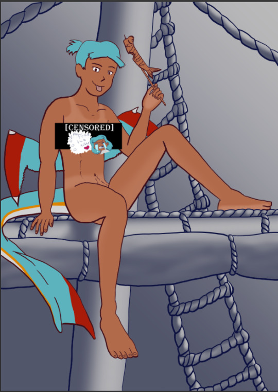
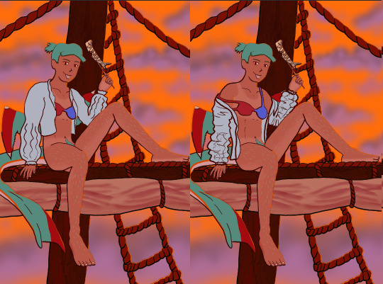
The Harriet Pinup Art Project
Session 2- Process till completion? But where're the other sessions?? Well that escalated both quickly and slowly
The last report was Early September 2024…. Dear god it’s been almost 7 months since last report. I would’ve like to have split what comes next into 2 more sessions but- it is what it is. This is gonna go all over the place so apologies.

Finding some dissatisfaction with my end result in last-session I tweaked the fish-holding arm and the dangling leg a little bit more to my liking and sketched again.
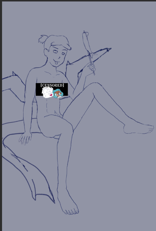
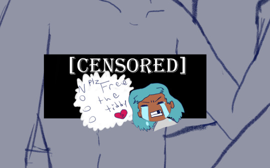
The nips got finally drawn and with it- the censor will now have to drop to keep tumblr-compliant and also to keep this blog sfw, hope you enjoy the humor (Harriet doesn’t).

The wings kept feeling wrong (looking more stretched and unnaturally tacked on vs being naturally relaxing from her backside) so between struggling wing csp assets to reference (not super great when there are no flipper-esque wings) and some more direct input from a friend I ended up landing on a more natural look.
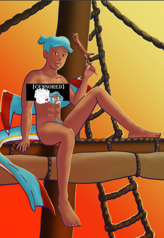
Linearting
Now for my nemesis- linearting.
Despite my disdain for the process I did not want to half ass it by just cleaning up the sketchwork like I normally do. While I struggle to grasp its use, I really wanted to implement lineweight in my lineart. From what I’ve seen lineweight can be used in a lot of different ways; purely randomly, to emphasize mass, or to emphasize the light source of the piece. Of all the choices I tried to stick to the last option since I felt I could best understand it enough to attempt it.
I also decided to try a feature I’ve never used before; linearting with vector lines instead of rasterized ones. For those who don’t know what the difference is I’ll do the extremely dumbed down explanation; rasterized lineart is more common (I think) and is less memory intensive, vector lines are more common in graphic design (since they can be resized w/o the pixel distortion you can encounter with raster lines). I wanted to try this method in an attempt to make the process of linearting a little less painful; with vectors I can adjust the lineart without having to redraw said line if it’s a small tweak, and changing colours is a lot quicker too.
Sadly during this phase my tablet pen's nib broke in a way that was unfixable (leaving the broken part of the nib DEEP in the pen), and due to pricing (tldr- the pen was more expensive than just replacing the entire tablet, in which case it's better to upgrade altogether if possible) had to wait for a new tablet after researching my best choice for a replacement; definitely was a great upgrade but GOD I did not like that happening when it did. Upon a friend’s suggestion I adjusted pen sensitivity so I could try to avoid putting so much force on the pen when doing the thicker lines.

I think I’ve grown a little more confidence on linearting, but it’s still far from my favourite step. I both enjoyed and hated the process of using vectors for the lineart. I felt like there’s probably a lot more I could’ve done with the vectors than what I was doing, but in my opinion it is not that bad for someone jumping in with very minimal knowledge/understanding.
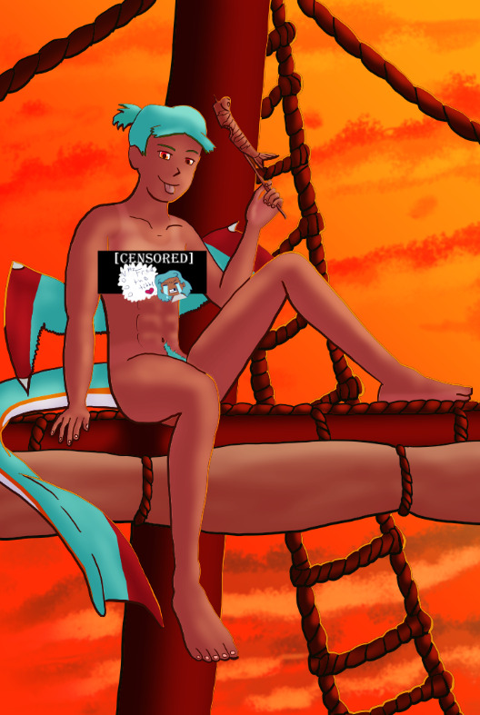
Colouring/Shading

Being colouring is one of my favourite steps I couldn’t resist I rushed right into it. Though I actually ended up doing the shading before the colouring this time. I did the method I’ve heard/seen for digital artists where you block the subject with just black/dark, and then erase it off where the lighting/highlights would be. I’ll say I definitely found this method put more strength into my shading from usual.
Then I rushed to colouring Harriet herself. Just did the ol-colour picker from her refsheet to throw her colours on, then did some adjustments to colour her nipples and tanlines (cause I WANTED DEM TANLINES!!!!!) though I tried to not make the latter too bold of a contrast since she imo has darker skin and not just tanned.
Then from there there was colouring the background and mast and just wrestling the colour balance and blends, there was a lot of it so I’m just gonna share one of the ones I went through.
At one point I even took a sunset from google and maxed its size on the background (and crashed CSP as a consequence due to the large image resolution- which lead to me shrinking the canvas/image during this process) to try to help me get an idea of what I MIGHT want to do for the background.
Clouds 💢
After a point I started trying to make my own clouds- the first attempt wasn’t too bad save for the tiny little problem that was the brush made the clouds look wayyy too sharp and grainy on closer inspection so had to scrap them and try again, even going as far as looking at irl clouds to try to get an idea of how to emulate them.

I ended up using a generic soft brush and tried my best to do clouds again. It was okay, but not great and kept getting adjusted between other steps. fortunately we’ll better revisit/redux on these clouds far later in the chain-of-events.
Like the clouds I has having problems getting the nice folds look for the sails, grabbed some refs and kept trying to get it right. The results are far from perfection but they are sufficient. Folds on this sort gonna be a pain in general.
Clothes roughs
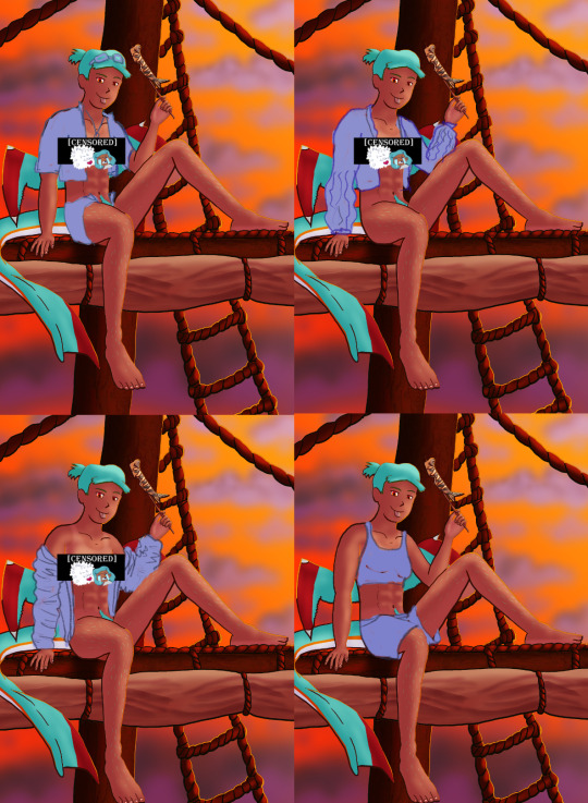
I did some rough draw-ups of different alternative outfits for her to wear. After a lot of wrestling I settled on her just wearing an opened poet’s shirt and the other two ideas got discarded.
Added a bi-colour bra to make it that I don't have there's a variant that I can share in sfw spaces, and then I lined and coloured the rest of it up, only to stumble into an unfortunate realization-
Ew that went wrong for clothes- reference and redo

[image source 1, 2, and sadly 3 only leads to a pinterest result or a malicious site so 🤷]
With extreme dissatisfaction I ended up trying to tackle them again; I learned the term for the kind of shirt I was after (poet’s shirt, that way it also reduced the amount of AI messing with my results), got several reference photos then tried again while trying to mimic what I was seeing.
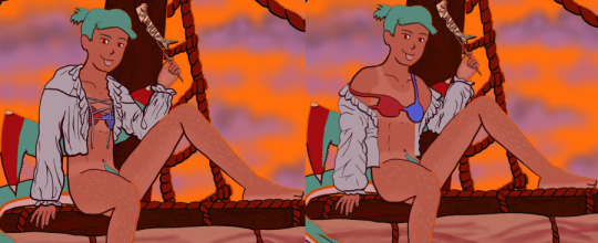
MUCH better.
Clouds redo
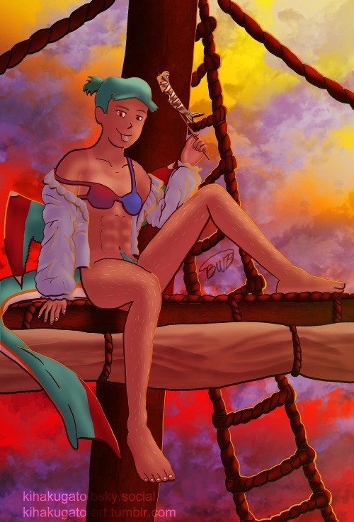
With that, let’s get the clouds looking better. I checked this tutorial to try to get a better idea, and found some cloud brushes that are in Official CSP but weren’t downloaded thanks to another tutorial and used them, used them then used the tutorial to help further elevate them a little bit. To further elevate said clouds I hilariously used my previous crummy clouds as a overlay to help the new clouds pop. Much better, and with that it’s done, slap dat signature and watermarks! Ready to throw onto the internets
Personal Evaluation on this project
This project ended up taking much longer than I wanted; Some of it was due to real life kicking my butt, and some of it was from clumsy planning and impulsiveness to get to certain steps quicker.
I liked it taking longer cause it gave me more time to think about certain steps and chisel away at parts when I had time, like working on a super large puzzle. On the opposite end it ended up making me much more intimate with the flaws with the piece/project than I’d like to be during the process, since most artists nowadays including myself tend to hit that stage after they’ve completed and posted a work online.
This lead to a lot of times asking “am I gonna shrug off this flaw or go through the time/trouble to redo a part to make it better?” For the case of the clouds and clothes, yes I felt the redo was necessary and it helped strengthen the overall piece, but there were many other flaws I chose to ignore cause I was too far into it to be worth the backtrack.
The biggest example flaw is ironically the anatomy/perspective when sketching Harriet’s body; while using the 3D tool was very helpful, I feel I should’ve did more perspective exaggeration for certain parts of her body (the biggest case being her hands; they imo would’ve looked much better if I made them and her fingers a little bit bigger and chonkier). Another case were the folded sails of the ship that I feel could’ve been better shaped and the folds could’ve been more sensible, ironic for me to say considering I had done several references and do-overs for that part of the piece. Conversely there are probably still various flaws in the lineart itself; despite the convenience of being able to edit the lineart via the vector points it is still a lot of nitpicking if you don’t decide that it’d be better to just move on so long as the idea is brought across via the art, flaws be damned.
When it came to the clothes stage, in my opinion I should’ve done that LONG before colouring/shading Harriet’s body and back when I had just finished the lineart, as it would’ve lead to less visual confusion for my eyes when I had to sketch the clothes out. Some ofher steps were out of order enough to cause confusion to myself, but I won’t bash myself about it since this is probably the first piece I’ve worked on that’s taken this long, plus this winter alone has been very mentally taxing so dumb decisions are bound to happen thanks to that.
That being said, I’m glad I did this project. I got to experiment and test out strategies and tools I’ve never even considered delving into before, and I may even end up using some of them again. There were even some points in this project where said tools I just thought “well this could be handy for [this group of drawing ideas]”. It’s also lead to beautiful results and is probably my biggest high effort piece I’ve done in a long time, probably rivaling if not outclassing some of my bigger pieces that I still admire today from back in my highschool days.
Hearing from one friend talk about the flow of the piece made me happy since, despite never mentioning it during the journaling of this project, that it was something in the back of my mind on/off while working on this piece; the flow of the ladder and clouds all intentionally despite to try to point the eyes of the audience towards Harriet who’s meant to be the main feature of the piece. It really proves that considering flow is a vital element when you want to make a piece work.
I may actually try to print one of the several variants as a print to put on my wall. Not that I will hold my breath on the results as my track record of digital-to-print for my artworks has always been a hard hit/miss for results.
Thank you for those who decided to follow along on the journaling of this art project.
[Session 0] [Session 1]
#The Harriet Pinup Project#artists of tumblr#artists on tumblr#art process journal#wip art#wall of text#long post
6 notes
·
View notes
Note
hiii so sorry if this is a stupid question but how do you make icons that aren’t squares? the only canvas i can make Is square 🥲

how to make shaped icons!
no worries anon! things like this can be a little confusing at first, so i get you. let’s get into it!
first thing’s first is creating a new project in photopea. i tend to make my icons 300x300, but it doesn’t really matter the dimensions as long as they match (so you shouldn’t do 750x700, for example.) make sure your background is set to transparent (no worries if you forgot this step—just delete the colored background layer!)
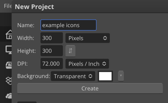
next thing is getting the shape! i tend to use photopea’s shape tool for this, since it’s easiest for me, but you can also just google “circle png” or something. (make sure your image is actually transparent, though. click and drag or click and hold and see if the dotted background lingers or goes away!)
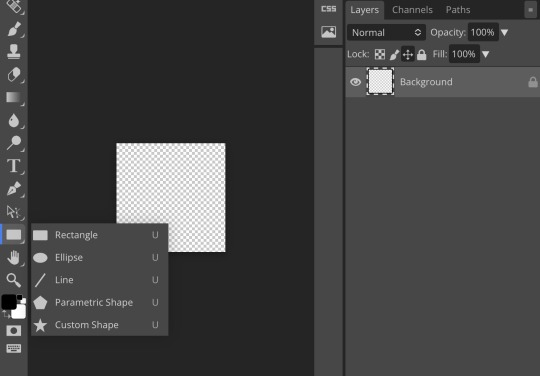
for the first icon, i’m going to use the ellipse tool. feel free to change the color of your shape—i usually set backgrounds later, but that’s up to you. the exact dimensions of this shape don’t matter, but like your canvas, they have to match so the circle is even. click and drag to make your shape
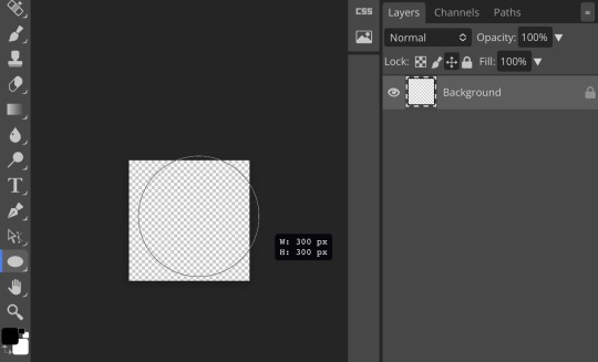
as you can see, my shape isn’t centered just yet—but i corrected that by using the click and drag tool: the one at very top of your sidebar. photopea will center and align your shape for you if you move it towards the middle
now you have your base! time to start adding backgrounds and such things. i used my usual method for the background, but you can do whatever. one thing to make sure for this step is to set all your layers to clipping mask (putting the shape below all your other layers)
to find clipping mask click the button that says layer at the top
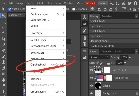
as you can see, my gradient fill is already clipped mask’ed. if for whatever reason you want your layers un-clipping mask’ed later, just go back and click the clipping mask button again. (i’ve said clipping mask too many times. it feels like a fake word.)
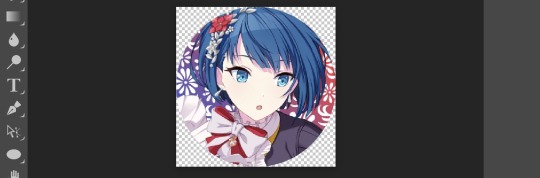
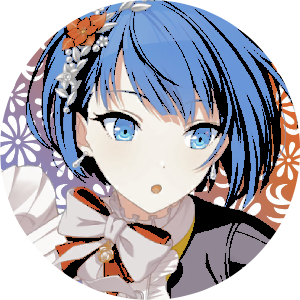
(hello, haruka!) this is how my icon looks so far! everything is clipped mask’ed to my circle. if you’d like, you can stop here, and download your image. i went ahead and added a psd. unless you’re using a color fill later or something similar in your psd, that doesn’t really need to be clipping mask’ed.
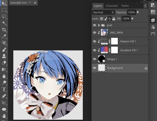
(the psd i used here is really simple and i didn’t save it, but always put your psds in folders, just to make your life easier.)
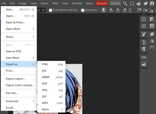
now that we’ve got that done, time to export! make sure that you export as a png. otherwise, your icon will still be square.
the finished product! pretty simple, right? you can use this method for all sorts of shapes. i went ahead and did two other kinds—bordered and faded.
for the border, i copied my original shape (a square in this instance) and switched the fill mode to the icon with an x through it, and switched the stroke mode to a solid color, and set the stroke to seven pixels. i think for bordered icons you can also shift the border so that there’s a space between it and your icon, but i left it where it was this time
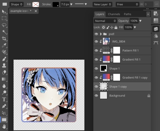
as you can see, i didn’t change any other layers, except that i duplicated my gradient fill! this is the same project i was working on before, just with a different base.

now for the faded icon! i used a heart shape for this, as that’s pretty standard, “but wait! photopea’s shape tool doesn’t have a heart option!” it does, actually! it’s just hidden. click your shape tool and go down to custom shapes. then scroll at the top until you see the little arrow with the star beneath it (which should be as far right as you can scroll.)
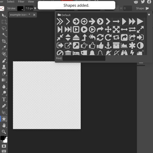
wow! so many shapes!! i scrolled down until i found the heart, and added it. the heart i didn’t worry too much about the numbers—i just adjusted it until it looked nice.
now to make our heart faded! first thing to do is to rasterize your shape layer. make sure you have your dimensions and everything set before you do this, as you won’t be able to correct them after your shape is rasterized.
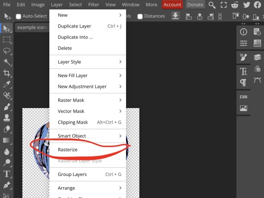
rasterize can be found in the layer drop-down menu, where you found clipping mask. click that, and now you can blur your shape! the blur tool can be found in filter > blur > gaussian blur. you can also use motion blur or radial blur, but i like gaussian blur
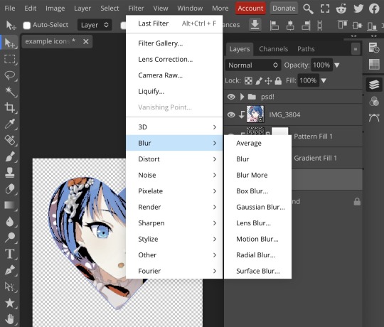
clicking gaussian blur will give you one of our old friends the sliders. just mess with that until it looks about right. click “ok” once you’ve got it set how you want it
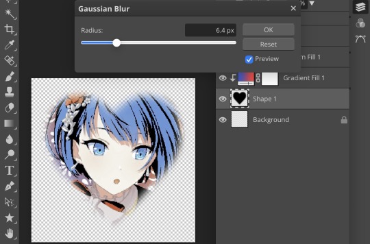
i also adjusted my heart’s sizing a bit by going to edit > free transform and making it bigger. just do what looks good to you!
and there’s your faded icon!
i hope this is helpful!! feel free to ask if you have any questions :3
sincerely, eos
91 notes
·
View notes
Note
HAII!! I’m not sure if u did it in photopea but for ur mizuki trans icon how do u have like a small little gap between the icon and border? 🐬

hi doll! all my editing is in photopea unless stated otherwise <3 i’ll do my best to explain this in a way that makes sense!
there are two ways to get the gap which give you two different outcomes! there’s this one, which is all in one shape:
and this one, which is two separate shapes:
either one works well, but i recommend using the first for solid color, gradient, or pattern borders and the second for image borders (i.e. pride flags, etc.) they’re both pretty easy to make though!
for the first one, all you do is make a shape as per usual (i made a circle bc that’s easiest to measure) and then go to layer styles and add a stroke. make sure to add two—a small one first and a bigger one second. to add two, click the little plus sign after adding the first!

then go to your first stroke and find where it says “opacity” and turn that all the way down to 0%. make sure your second stroke is at 100% opacity—also make sure your second stroke is bigger than the first, or else it won’t show up. if you want a two pixels stroke on the edge and a three pixels gap, your first stroke has to be 3px and your second has to be 5px, because otherwise it just gets eaten by the first.
after that you can set the fill type of your outermost stroke and clip an image as per usual. it should look like this:

which gives you the result as seen above!
the second method requires two shapes and i think can only be done with the shape tool—if you want a customized shape that isn’t in photopea’s list, make sure to add it in edit > define new > custom shape!
make one shape and then a bigger version of that same shape—the exact sizing depends on how big your icons are, but i did 135x135 & 145x145 for mine. just make sure there’s a decent amount of space between the two.
after making both your shapes, click the second one and go up to the top of the shape menu. remove the “fill” and give it a “stroke” instead—setting the pixels and colors as you like. with the shapes, you can also do fun little borders, but i typically just do solid. make sure your stroke is small enough that there’s still a gap, but you can always use edit > free transform and adjust the sizing as needed!

(you can change the position as necessary to make sure your stroke is within your canvas—“inside” puts it inside of the blue outline of your shape, “center” puts half inside half outside, and “outside” puts it outside of the blue outline!)
from there you clip your images as usual, like this:

or you can turn them both into raster masks, which i did to save as a template. it’s up to your personal preference.
anyway, i hope this was helpful for you, lovely!! if it’s not feel free to ask me any questions you may have haha
9 notes
·
View notes
Text
#op how do you make the custom metal logo plate @xactodreams
i don't make them myself, i prep the art from digital files and get the magnesium plates from evergreen engravers! been buying from them for years and years, totally consistent & they're close by to me. I hear good things about beaver engraving in oregon as well, but i don't know much about specific engravers outside the pnw. the engraving is a pretty cool process, there's a photoexposure step that fixes a protective film to the surface of the plate, and then some kind of. acid mist part that removes the negative space with a sloping edge.
idk how much context you have for commercial letterpress backend so ignore me if i'm repeating things you know! letterpress classes might do at least one project where you make plates directly from a digital file like these, but they'll usually use photopolymer rather than magnesium. It's a way cheaper material (NOT worse to print from, seriously, there's just a lot of other factors that make magnesium worth the price for some things), but the file preparation is basically the same. vector art is vastly preferable, use if at all possible, but raster is workable as long as it's at least 600 ppi. 1200 is ideal.
i also use photopolymer for some things, & the differences between polymer & magnesium plates are……complicated. also there's a bunch of options within each category about thickness & engraving depth & mounting & other file prep finessing etc etc, anyway! happy to answer any specific questions about it if you have them but that's the short version.
12 notes
·
View notes
Text
Azil-verse Masterpost
World Building
T-M Model Subtypes
Tags by character:
Jenn: #jenn #jenn&co #butterfly #free runner #jenn butterfly
Jenn's playlist
Soenn/Nova: #soenn #kilonova
Nova's playlist
Ulsen/Tydal: #tydal locke #ulsen #ul
Tydal's playlist
Kel'sunn/Event: #black out #event horizon #kel’sunn #kel
Event's playlist
De'ul/Echo: #red moon #echo chamber #de’ul #black out #de
Echo's playlist
Total:
Bee:
Lucian:
Sing:
Xeros: #xeros #rulle #cosmos above
Narii: #narii #binary #nebula #cosmos above
Legacy AU: #legacy #legacy au #jenny_jukebox #jenny jukebox #jennifer raster #BAFIA
Legacy playlist (playlists might have some overlap in songs because I like them)
Shipping permissions post.
Read the Beta fic HERE!
==============================
StarHearts
#starhearts #jenyl #ven oriz #kilais nossun #locke tyro #ambere anterre #mafia!au
StarHearts is an alternate timeline of the Azil multiverse where millennia passed and new civilizations rose, but some things never changed--including human and synth conflict. When fate decreed the Old World's time had passed and its relics woke to find themselves lost in a sea of unfamiliar faces, how would they survive when no one was there to show them kindness between the fear? Faced with taking survival into their own hands for decades, what could one human hope to achieve when competing with the pain left to fester under the metal and wire?
Part 1, Chapter 1
Playlist
(there's a lot of overlap with Free Runner's main playlist due to shared themes but the character songs are also mixed into the list if they're different from the individual lists seen above, which now have songs from both timelines)
My stuff :
Twitter: @/cleverfox94
Bluesky: @//jukeboxarts.bsky.social
Ko-fi: JukeboxArts
Deviantart: Jukebox-Arts
11 notes
·
View notes
Note
(For the metroidvania) Mayhap a mix? Valuable space station goes down (likely doing something experimental/black ops) and some violent entity loots the tech and goes underground. Quite literally?
It's an idea for sure, though might risk losing some of the innate isolation that space provides. Could of course also be some kind of station built directly into an asteroid that proves to be hollow and containing mysterious stuff™ too etc
Part of the reason I'm so undecided is because there's a lot of competing factors involved? Like I want multiple different, and preferably at least somewhat interesting, biomes rather than have everything just be a series of progressively darker caverns, and I would like to be able to have at least the occasional "room", for lack of a better word, that opens up a bit and gives a sense of space rather than having just cramped tunnels and facilities everywhere.
At the same time though, I want the location to be physically isolated without having to rely too much on invisible walls? Like an island or a crater or a space station or something where you can't easily just leave without hitching a ride via aircraft or space ship or something?
It's one of those things that's easy to do in 2D because you can just wall the player in with discrete "rooms" while displaying an open expanse in the background via parallax scrolling, thus creating the illusion of a much larger open space without making said space possible to traverse. With 3D, there's far less of a distinction between playable space and background space, so it's harder to wall off in a way that feels natural - especially in a genre infamous for providing significant levels of traversal.
Plus there's also just the simple question of what kind of setting and situation might be cool to have etc - like it might also be interesting to allow players to occasionally move around in zero gravity, see Prey (2017) using space walking almost as a kind of fast travel system etc. Not to mention that all of this has implications for how the actual engine needs to be built - like there's a reason why Doom and Quake don't have a lot of wide open outdoor spaces, why Descent I and II takes place entirely within caverns, and why MechWarrior 2 is almost entirely just wide open space with relatively sparse and simple terrain and a minimal amount of structures you can walk into or otherwise interact with.
There's also the possibility of taking a page from the narrative setup behind Quake and use teleporters as a basis for how completely different locations can still somehow remain both related and interconnected, but at the moment it's all just really up in the air.
Especially since I still don't even have a working triangle rasterizer implemented, lmao.
5 notes
·
View notes
Note
What are ur ocs hobbies??
— Melon/Bella-tan 🍈
idk why, but i feel like fyro would be into racing lol
vanilla would definitely love doing photography besides drawing
luna sometimes rollerskates (and likes to use her jet to go very fast lol)
glade would be glade
pyro likes to play pranks on people
vector enjoys making any sort of sculpture, tho he likes to make ice ones the most
raster would be into making music i think
the x-day girl does a lot of DJing
cotton LOVES rhythm games (favorite? probably split between ddr and pop'n music lol)
hydroid can NOT stay away from water, when he isn't fixing a water related issue or preventing any water disaster he's probably having a swim in a pool or exploring an ocean or smth LOL
giga loves to do karaoke just to show off with her friends lol
iraira likes to mix around and experiment with different spells
and then there's several ocs who just. can't have a hobby lol, like pipo (security robot, he has NO time for anything else!!), demodia (demon goddess who is in control of all the spirits in the world, i kinda feel like she's in need of another redesign, because the last time i touched her design was in 2022, and i already wasn't very sure with it lol (not to mention the very first design was AWFUL)), and maybe some others i can't think of rn
that's just a few i can think of right now lol, i have a bajillion more ocs but these are just the ones i thought of off the top of my head :D
3 notes
·
View notes
Note
do you have any raw .drw files? how does its file size compare to a vector image / raster image of the same size / similar content? like ik vector files can be very small compared to a jpeg... storing timing info sounds simple to implement, but i wonder if it bloats up .drw file sizes?
Oooh, good question, and my answer uhh... got a little out of hand..
Here's the files in the folder for one of my drawings on the windows beta:

So we have the .drw file, the .sim file, a .csv file (this stores text data for my added title and description), and a .png and .sim for the thumbnail.
The .sim file is new to me, but looking at other files I believe the .sim files holds the individual layer data. Maybe the .sim stores the actual image data for display during drawing?
For example, heres the files for my haunter painting:

And here are the layers for the drawing in game (software?):

The sizes match up pretty well with the actual data on each layer!
(I should mention here that looking at file types and figuring out how they work is completely new to me so I could be getting some things wrong. I'm debating if I should reach out to the dev directly to check my work before starting this essay proper... but it's also been fun for me and my brain to try and figure this stuff out on my own)
Actually.. the sim files made me curious... if the main data is in the .drw file, what would happen if I delete the .sim files? Would the file still work?

First off, the thumbnail does not load, but the file still opens fine and the replay function still works.

And we still got all the layers no problem.

Hmm, if I save changes to the images, will it create .sim files?


It did! Huh!
Then uhh.. I don't really know what the .sim files do. If has something to do with display in game which is why the thumbnail didn't display. But I don't know where the layer files would be displaying if it's all based on the .drw. Maybe it's for file conversion? For uploading to the gallery? I don't know...
Anyways... back to the topic at hand, files sizes! The windows beta lets you export files as layered .psd files, .png files, and partial replay in uncompressed and compressed .avi!
So a quick reminder, here are the file sizes of the original image set up for Colors Live:

The .drw is pretty small!!
And here are my exports!:

The .drw is MINUSCULE compared to the .psd. And the .sim size falls between the two sizes of .png. Hmm, still don't know what's going on with that. Also for fun we can look at the size of an uncompressed two minute long .avi looks like. 4 million kilobytes, yay ^_^
Vector wise.. I'm actually not super familiar with vector programs (should probably brush up on them for this essay, huh?) so I'm not sure what exactly is comparable... I've had to use Illustrator this semester but I feel like Colors and Illustrator are approaching vector graphics in a very different way. Illustrator is saving data for vector objects, but Colors is saving data for brush strokes!
Well.. anyway we can open up one of my projects:

And we can stretch that layers panel all the way out so you can see all my layers and paths and objects:

And let's check the file size...

Yep! Pretty small!
For fun we can also convert that .psd I made into a .ai..

Yep! It's smaller!
Regarding file bloat... I think the devs did a fantastic job creating such a small file size and it's perfect for drawing on game consoles that usually have very limited space! However, my experience with Colors! 3D as a kid did have issues with file sizes.. Colors! was the biggest app on my 3DS and I constantly had to juggle uninstalling games and uploading and deleting paintings so I would have more room for new paintings. I did have quite a number of painting files... in various states of progress (as is typical) but storage space was a real issue for me. Now, were my SD cards only 2 or 4 gb big? Yes. Did I understand at the time that those were quite small for SD cards, even at the time? No. Does my experience mean anything then? I don't know.
Colors! 3D also had an issue were particularly lengthy paintings (were talking hitting the ~4 hour mark) would stop saving replay data. The replay would only play up until a certain point. I'm not sure why that is, based on what we know about .drw files I don't think it can be a limitation with the file type? That's kinda all it does? Maybe it's a limitation with the size of the 3DS memory that couldn't play the replays that long? Hitting that ~4 hour mark would also limit the amount of undos you were able to do so it could easily have to do with memory.
(Bit off tangent but undos take soooo long in Colors. And the more undos you do the longer they take! Colors didn't official start limiting the players undos until that ~4 hour mark but they were already limited by your patience)
Anyways, I will leave you with this, a link to the documentation of the .drw file format. It's only two and half pages long which I think is pretty short? Maybe you can find more info in there that what I can parse...
2 notes
·
View notes
Text
my mom doesn't even know the difference between raster and vector.
2 notes
·
View notes
Text
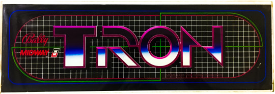
Bally Midway's "Tron" Arcade marquee
Released in 1982 by Bally Midway, "Tron" is an arcade game that was developed alongside the groundbreaking Disney film of the same name. Both the film and the game were instrumental in showcasing the potential of computer graphics in entertainment, making "Tron" a landmark in both cinematic and video game history. The game itself is not just a tie-in but an extension of the film's aesthetic and themes, exploring the concept of living inside a digital world, a notion that was revolutionary at the time.
Technological and Historical Context
The early 1980s marked a period of rapid evolution in video games, with developers exploring new ways to integrate storytelling and advanced graphics into gameplay. "Tron" was released during the golden age of arcade games, a time characterized by intense creativity and technological advancement. The film "Tron" was notable for being one of the first major motion pictures to make extensive use of computer-generated imagery (CGI), and the arcade game sought to bring that visual style to the gaming world.
Gameplay and Design
"Tron" consists of four distinct mini-games, each based on different scenes from the movie. The games include:
Light Cycles: Perhaps the most iconic of the four, this game has players controlling a light cycle that leaves a solid trail behind it. The goal is to trap the other cycles with your trail while avoiding walls and the trails of other cycles.
Grid Bugs: Players must destroy grid bugs and clear a path to the I/O tower within a set time.
Battle Tanks: In this mini-game, players control a tank and navigate a maze-like battlefield, destroying enemy tanks.
MCP Cone: The objective is to break through blocks spinning around the MCP's cone by firing at them, without getting hit by returning fire.
These mini-games are accessed from a central hub, a design choice that not only provided variety but also reflected the segmented nature of the digital world depicted in the film.
Graphical Innovations
"Tron" utilized colorful and detailed raster graphics, which were advanced for the time and provided a visual fidelity that mirrored the high-tech, neon-infused aesthetic of the film. The game was one of the first to use a blacklight in the cabinet, which made its fluorescent colors stand out, enhancing the visual experience and drawing players in arcades.
Control and Interface
The game featured a unique control scheme, including a rotary dial for aiming and a joystick for movement, which were innovative at the time. This setup allowed for precise control, which was necessary for navigating the game's various challenges.
Sound and Narrative Elements
"Tron" featured pioneering sound design, with audio that closely mimicked the electronic score of the film. This integration of sound helped immerse players in the digital world of Tron, enhancing the game's futuristic feel.
Impact and Legacy
"Tron" was critically acclaimed and commercially successful, becoming one of the most memorable arcade games of the 1980s. Its success helped solidify the concept of games as a viable promotional tool for films and demonstrated the potential for cross-media convergence.
Technologically, "Tron" pushed forward the notion that video games could be both visually stunning and complex in design. The game's emphasis on multiple types of gameplay within a single cabinet anticipated later developments in arcade and console gaming, where multi-genre games became more common.
Conclusion
The arcade game "Tron" stands as a significant achievement in the history of video gaming, notable for its technological innovation, distinctive design, and its role in the broader context of 1980s pop culture. By bridging the gap between cinema and video gaming, "Tron" not only captured the imagination of a generation but also pointed the way toward the future of interactive entertainment, where the lines between different media would continue to blur. As a historical artifact and as a piece of entertainment, "Tron" remains a fascinating study in the convergence of technology, art, and commercial entertainment.
4 notes
·
View notes
Text
Vector Image File Formats
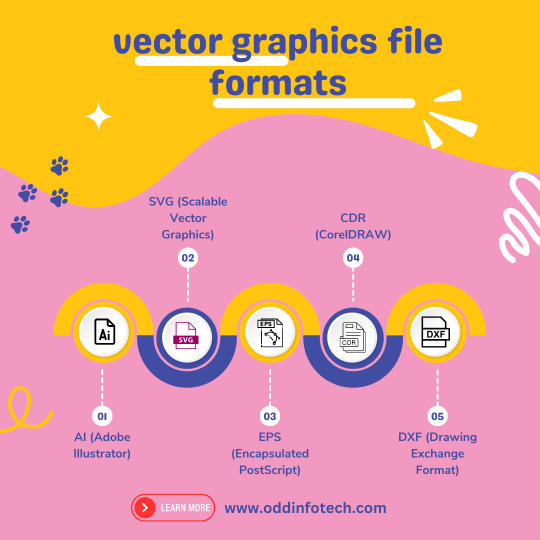
Unlock the magic of vector image file formats! 🎨 Dive into the world of precision and scalability with our latest Code Highlights session. 🚀 Discover the secrets behind crisp graphics and efficient storage. 🌐 Ready to elevate your coding game?
+91-81485-51615
Vector image file formats are graphics file formats that store images as mathematical equations or geometric shapes, rather than a grid of pixels like raster image formats. This allows vector images to be scaled to any size without losing quality. Here are some common vector image file formats:
SVG (Scalable Vector Graphics): SVG is an XML-based vector image format that is widely used for web graphics. It is an open standard that can be easily edited with a text editor.
EPS (Encapsulated PostScript): EPS is a file format that can contain both vector and raster graphics. It is often used for print design and is compatible with various graphic design software.
AI (Adobe Illustrator): AI is the native file format of Adobe Illustrator, a popular vector graphics editor. AI files can store both vector and raster data and are primarily used for editing within Illustrator.
PDF (Portable Document Format): PDF is a versatile file format that can store both vector and raster graphics. It is widely used for documents and presentations and can be opened with various software applications.
CDR (CorelDRAW): CDR is the native file format of CorelDRAW, another vector graphics editor. It is used for saving designs and illustrations created in CorelDRAW.
DXF (Drawing Exchange Format): DXF is a file format developed by Autodesk and is commonly used for exchanging vector graphics between different CAD (Computer-Aided Design) applications.
WMF (Windows Metafile): WMF is a vector graphics format used by Microsoft Windows applications.
2 notes
·
View notes
Text
…I. Mm. Nah, Sorry! I’m meanposting. OP this isn’t meanposting directed at you specifically, this is me being exasperated in general at people participating in systems they never fully interrogate and end up shocked when they’re fucked over in a way they didn’t expect. You sound stressed out trying to navigate a situation that is impacting you and your community heavily and I’m sorry. You’re worried about this beast’s claws and I’m showing you its teeth.
Anyway. Digital artists and illustrators: the “count the teeth and toes and joints and shadows” thing was NOT meant for you. It was NOT meant to differentiate AI Art from Real Art. You could fuck these up any day of the week and compete with a big robot market and it still wouldn’t fix your audience numbers. The fact that this is how y’all are concerned about the issue makes me want to scream. The media communications and OpSec blindspot on this is. Bad. It’s really bad!
The CHECK THE TEETH AND BODY FEATURES AND PERSPECTIVE ISN’T FOR ART. IT’S FOR FAKE PEOPLE AND COMPANIES. IT’S FOR PUTTING FAKE FACES TO MASS-DISINFORMATION CAMPAIGNS. IT’S FOR PEOPLE GETTING ACCESS TO YOUR PARENTS’ RETIREMENT FUND. IT’S FOR FALSE INCITING EVENTS TO TRIGGER REAL-WORLD UNREST. There are articles for boomers, gen X, millennials, and zoomers rn talking about How To Tell A Video Is Untrustworthy and they talk about “lack of a clean, professional logo” but MY parents certainly could not tell the difference between a Fiver Logo 50 Purchase (vectorized, applied neatly) and a professional logo for an actual company (raster, 20x20 px) applied poorly by an intern who doesn’t get paid for 85 views on the published youtube video. They DEFINITELY wouldn’t be able to tell the difference between A Real Video With Real Audio and a fucking Joe Biden Racist Deepfake Meme That Escaped Containment. These “public internet safety bulletins” are going out of date before they can even circulate for the simplest of things, not even getting into the more advanced (and increasingly accessible!) forms of fraud and fake content.
Wanna see something terrifying? HERE! MAKE UP A GUY! EVERY ONE IS DIFFERENT! THIS IS THE SAME CLASS OF TOOL PEOPLE USE TO MASS-CREATE BOTS THAT ARE LIKE “thank you, judge. As a real human person who isn’t white, I love racism and hope you bring it to more communities. Check out my Real Person PFP”: https://thispersondoesnotexist.com/
Please. Please for the love of patreon exclusive brush packs or whatever else you give a shit about. Get some perspective. Your art is your career, it’s your life, I know. It is Not the most insidious or dangerous trend in AI images and to frame its rapid advancement and utilization in an “oh well, what can ya do! don’t get burnt out, just do your thing and follow Real People™” way puts people at risk. Including you and your fellow artists.
The point shouldn't be to identify for sure 100% what is ai art and what isn't. I keep seeing posts advising one to look out for wonky perspective (as if perspective doesn't routinely trip up even the most experienced artists) or to pay attention to fudged detailing (as if impressionism wasn't one of the most influential artistic movements in history), and I think that's coming from a good place but frankly it's a losing battle. Remember when everyone was on about counting the fingers or counting the teeth, and a week later they had that shit ironed out completely? All you're really doing is giving these people more data points to work with to refine their algorithm. It's just going to be constantly shifting goalposts, and at a certain point real artists are going to get exhausted trying to make their art look as not algorithmically generated as possible. It'll be impossible to keep up.
So what should we do? Honestly, I think old practices are still best practices. Find real artists and follow them. Don't repost art, and dont spread reposted art. If something doesn't have a source, skip it. Support artists you like, either by sharing their work directly or donating. And if someone's work looks suspicious? Maybe give them a second look. See some of their other art before jumping to conclusions.
And yes, that means sometimes, you're gonna be tricked. Some people are going to fly under the radar and pass off ai art as their own. And that sucks, and they're liars, but you can't let the obsession with bad actors police real artists out of their communities, or discourage new artists from entering the scene.
#meanposting#art#source: graphic designer who was at ground 0 for the ‘the customer can create their own stuff or get it for $5’ advancement#which tanked the industry#all caps#media#media literacy#AI art#digital ethics#[sighs for 80000 years] good luck OP none of us are getting outta this unscathed#long post
26K notes
·
View notes