#evolution of aero
Text

#plymouth#superbird#road runner#road runner superbird#plymouth superbird#plymouth roadrunner superbird#muscle car#nascar#race car#classic#muscle cars#american muscle#legend#legendary cars#concours#london#london coucours#evolution of aero
72 notes
·
View notes
Text
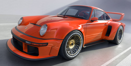


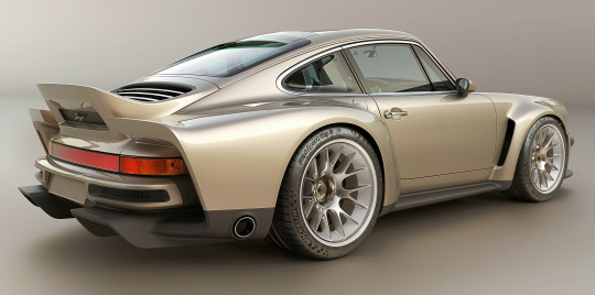
Porsche 911 reimagined by Singer, DLS – Turbo, 2023. Singer have presented 2 new cars in their Dynamics & Lightweighting Study series based on 964 air-cooled 911 models made between 1989 and 1994. The car in Blood Orange has been specified by its owner to emphasize track performance, featuring a high-downforce rear wing with adjustable upper element and a track-oriented front fascia with larger splitter. The car in Moet Blanc has been specified by its owner to be road-focused, including an aero-optimized rear ducktail spoiler and road-oriented front fascia which reduce drag. Both are powered by 3.8 litre, 4-valves per cylinder flat-six engines with twin turbochargers, electric wastegates, air-to-water intercooling and a horizontally mounted, electrically powered fan. This evolution of the engine developed for DLS restorations enables power outputs over 700 HP at more than 9000 rpm.
#Singer#Singer DLS Turbo#2023#turbocharged#rear engine#Porsche 911 reimagined by Singer#restomod#carbon fibre#boxer engine#flat 6#Porsche 911 964
491 notes
·
View notes
Text
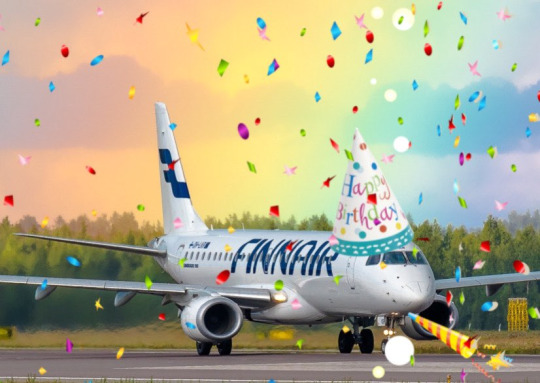
No. 55 - Finnair [+ Centenary Livery]
So I know I'm in the process of writing a bunch of longer posts and thus haven't posted in absolutely forever, but I had to let something cut the line very quickly because in this case it was somewhat time-sensitive. I've missed the actual date by two months, but if I get in a post while it's still 2023 (...in my timezone, at least, so sorry to actual Finns busy enjoying 2024) I think that counts, and this entire blog is about what I think, so that means it counts.
On 1 November 2023 Finnair became the sixth airline to turn 100 years old, consistent with its status as the sixth oldest airline in continuous operation. I wish I'd started this blog earlier in the year, or prioritized differently, because Aeroflot and Czech Airlines also turned 100 in 2023, but...well, I didn't. You'll probably see them both in 2024 instead. Finnair, however, was requested by @kuivamustekala - particularly their centenary liveries. Requested a long time ago, even. So I'm going to hope that late is better than never and throw Finnair one last birthday party to wrap up 2023 by looking at where they started, where they are now, and what they've been doing to celebrate.
1923: PROTO-FINNAIR
Finnair, obviously the flag carrier of Finland, was founded in 1923, but its first service was in early 2024, using a Junkers J.13 (fitted with obligatory floats, as there were no suitable airstrips in Finland at the time).
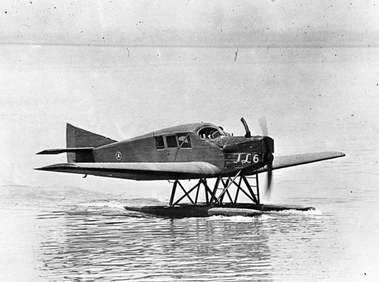
image: Joseph Eaton via US Navy National Museum of Naval Aviation
This is actually the US license-built version, the Junkers-Larsen JL-6, but I couldn't find any pictures of actual J.13s on floats.
Unfortunately, Finnair was founded under the name 'Aero', which is probably the actual single worst name for an airline I have ever heard. We can jest and joke about things like Jet2 and Fly Air, but I sincerely do not think I have ever seen anything with worse SEO than an airline named 'Aero'. Even for 1923 this was fairly dire - back then, as for much of history, airlines were generally named for the area they served. Aero may have been a private company, rather than state-owned, but that didn't mean they couldn't name themselves for the area they served - private airlines have always done this and still do. Incredibly enough, there was a second 'Aero' founded in Poland in 1925, but that was quickly merged into what would become LOT Polish Airlines, shedding the name like a chrysalis.
Bafflingly, even when the Finnish government bought the airline in 1946 (they still own a majority share of it today) they didn't bother to change the name. They did begin writing 'Finnish Airlines[1]' on the fuselages, but as far as I can tell this appears to have been more of a stylistic flourish of sorts than an actual rebrand, or maybe even a clarifying subtitle on the very nonspecific name. In 1953 they began marketing under the much catchier 'Finnair', but the company remained legally named 'Aero' until literally 1968 and the fuselages still read 'Finnish Airlines'.
image: Finnair
An Aero/Finnish Airlines Convair 340, photographed in 1953 in a livery which included both the large 'Finnish Airlines' wordmark and 'Aero' on the tail.
Early Finnair, like most early airlines, didn't have a particularly standardized livery for its fleet, and even where it did it's not very well documented. Finnair unfortunately has some of the poorest documentation for livery evolution of any large airline I've discussed so far, which really surprised me. That said, it's when the name became Finnair that things begin to be easier to find, and so that's where I'll begin.
1968: CLASSIC FINNAIR

This original logo[2], introduced in 1968, was designed by Kyösti Varis - at least, that's what every logo database I looked in said. I actually couldn't find either Finnair or Varis confirming this[3], but I still think it's probably true. Unlike designers like Vic Warren and Lindon Leader, who wrote and gave interviews about their designs for major airlines, Varis appears to have other preoccupations. He is enormously successful and prolific, to the point where his website doesn't even mention Finnair. According to the timeline he provides he would have either been creating this logo freelance or in his very last days at Advertising Agency SEK (probably the latter, since they did the two subsequent iterations), and based on his history as a typographer I think it's safe to say the letterforms are his creation as well. Also according to his timeline, he is younger than Finnair! And we almost have the same birthday.
I like the original Finnair branding. It's not ostentatious, but it's nice and sleek, with that forward slant I love in airline branding and a long unbroken line (both in the 'F' logo and in the even heights of the letters in the wordmark). It looks aerodynamic and the rounded, blocky letters have a hint of that 60s futurism while not being gimmicky. It's kind of incredible looking at it next to the '91-'94 FedEx wordmark, which occupies the opposite end of the sliding quality scale of TRON-looking text. The design as a whole is simple enough to easily reproduce but distinct enough to easily recognize. The shade of blue chosen is a fair bit lighter than the blue of the Finnish flag, but visually pleasing enough. They basically keep iterating on this general concept for the rest of their history, which I think is fantastic - no need to get rid of something that's working for you. It's nice to see an airline not feel pressured to reinvent its logo and livery every 20 years. That's about it for the logo[4] - what about the livery?
As mentioned prior, Finnair's liveries, before quite recently, were very poorly documented. Variants definitely existed between different types and different periods in the company's history, but the broad strokes of the branding seem to have remained almost startlingly intact for around thirty years.
image: Letterform Archive
The cover of a style guide from 1985. If it's changed from the 1968 original, I can't tell how.
But I'm really here to talk about one thing: the liveries.
The above image was from Finnair's own archive and was taken in 1968[5], making it contemporary with the introduction of the Kyösti Varis branding, as well as lining it up with the 1969 addition of DC-8s, like the pictured airframe.
For the majority of Finnair's history, their livery is always going to look something a little bit like this. Primarily white, with a thick blue cheatline (in what I call the domino-mask style, where it's vertically centered around the cockpit windows) that lightly flips up at the very end and a blue cross on the tail to represent the Finnish flag.
Finnair says this image is from 1960. If so, the livery was already well on its way to existing prior to 1968, with my guess being that it was introduced in 1960, along with the first jets in Finnair's fleet - the pictured Sud Aviation Caravelle, which pioneered the swept-wing, aft-engine format later seen on immensely popular jets like the DC-9 and Tu-134 - the latter of which was commissioned specifically because Nikita Khrushchev was so impressed with the Caravelle's aft engines and the quiet cabin experience they provided. It's a plane with a lot of unique visual features, featuring a nose that looks almost slanted downwards (a copy of the de Havilland Comet nose), a cruciform tail (instead of the more efficient T-tail used for future rear-engined designs), and triangular passenger windows. Most crucially, though, it was more or less the first short-range jet on the market. This made it perfect for an airline like Finnair, which at this point didn't really go that far from actual Finland.
This 1960 photograph provides a very strong blueprint for what was to come. It's the first iteration of the livery to say 'Finnair' instead of 'Finnish Airlines', and it's introduced a modern-for-1960 single-rule cheatline, although this early version was flipped horizontally, curling up at the front to frame the cockpit windows instead. (I think the white paint also cuts off behind it, leaving the space in-between the cheatline and painted nose blank metal, but in black-and-white it's somewhat hard to tell.) I do think I prefer the modern version. The use of the white downward curve with no blue hemming it in creates a really nice effect where it blends with the unpainted metal underside, due to the metal being right where you would expect to see a shadow anyway. (This effect is why I'm not quite sure where the paint ends on the Caravelle, and am just guessing based on which parts are noticeably reflective.) I definitely prefer the change made to the tail, where the single line of trim at the end of the rudder was replaced with a white canvas for the Finnish flag.
While I do tend to have a slightly pessimistic outlook on primarily-white liveries, I will say that if you're going to have a primarily white plane, and you are the flag carrier of Finland, this is a fairly understated and stylish way of incorporating it. While I probably would have done it on the main body, over where the first set of doors is, instead of on the tail, I think this is far from the end of the world. What they have is a nice, elegant taper where the tip seems to point directly at the tailplane, and it looks neat and intentional. A lot of airlines tend to just awkwardly slap a logo on their tail, which often looks really sloppy due to poor alignment or even just out-of-place entirely, and Finnair avoids that while keeping the tail from being completely blank. Having an element on the tail that's more horizontal than vertical, like the old 'AERO' rectangle or the tail rectangle on the one decent livery Lufthansa ever had.
If you look in the background, you can see that wow has the Olympic Air livery looked like that for a long time! But that's a story for soon.
Additionally, some details were added on the nose. You can see on this DC-8, photographed in 1969, that the nose features an e-girl cheek stamp of the Kyösti Varis logo. Next to it is the name of the aircraft - in this case, Jean Sibelius - in really difficult-to-read thin text. (Finnair unfortunately appears to have stopped naming their planes by the late 1970s, but at one point they would frequently be named for Finnish people and places.) The 'domino mask' goes quite a bit beyond the cockpit windows to create a wider line from the side. I wish that the logo could have been integrated some other way, because the extra little blue thing just looks cluttered, but I can't imagine how they would do it without just replacing the cheatline. I mean, that would have been an option - indeed, it's what I would have done[6] - but assuming that they keep this general look I think the logo just can't fit in on the livery. The engine nacelles, maybe? Though that would still present issues on the Caravelle, where the engines are directly over the cheatlines. I also wish they would have made it a bit easier read the name, because I like to know what the plane's name is - thankfully, some later paint jobs actually do this before, tragically, Finnair stops writing names on their planes at all.
I believe this to be the strongest iteration of the classic Finnair livery, and it was pretty obviously optimized for the DC-8. Modern airlines tend to not bother adjusting their liveries between types, creating some absolute travesties of proportion, but Finnair boldly went in the opposite direction by modifying it for each airframe and yet still having it look worse.
The sharpest deviation arises in the CV-440 version of the livery. This image is from 1971, just two years after the DC-8 liveries would have carried their first passengers, and it's wildly different. The cheatline is lowered sharply, sitting below the cockpit windows and wrapping around to contour the body of the airplane. There's a certain je ne sais quois to the domino mask that I find myself missing here. This design also has an unnecessary second 'Finnair' added to the tail, which kind of looks awkward stacked on top of the existing cheatline besides being redundant, and the Finnish flag on the tail is somewhat awkwardly made free-floating. It feels a lot less sleek and a lot more arbitrary.
On the other side of the plane the cheatline goes down quite a bit farther than on the jet models, probably because they thought it would be a better way of negotiating the Convair's rather bulbous nose, and I actually think I prefer the wide, upturned variant. This version, if anything, is too close for my taste to the livery VARIG operated in a similar timeframe. There are a lot of differences, yes, but in the 70s having one big solid cheatline on a white body and metal underbelly was the equivalent of the Lufthansa Line, so if you toed said line, be it cheat or Lufthansa, you risked becoming easily mistakeable for any airline with too similar of a color scheme. And blue-on-white was maybe the most common color-scheme at the time.
I doubt Finnair shared many tarmacs with VARIG, but here they are with Pan Am, and they could also expect to run into airlines like Sabena, Icelandair, and probably a half-dozen I've never heard of, all competing to be the one the others get mistaken for. It's a tricky position to be in.
I do quite like the livery on the left, maybe even more than the DC-8 one, but I can't seem to find any other airframes painted like this. I'm not sure why this one is.
These images are from 1971 and 1969. They are both the same model of airplane - the Super Caravelle or Caravelle 10B. Their liveries are completely different. And that's just how it was back then - not even standard within the same airline, somehow still trying to stay distinct from dozens of other non-standardized blue-on-white cheatlines.
When evaluating classic Finnair, I have to keep myself tempered in both directions. When I think it's clean and well-proportioned I have to remind myself that it's just a complete nothingburger. When I think it's a lazy and cowardly non-design I have to remind myself that, no, at its best classic Finnair does look like it was designed with some thought, and it does have some traits that feel at the very least interesting enough to merit not being totally dismissed.
But...look, I have to give classic Finnair a D+. Because they tried, and they did something, sure, but it's ultimately not something especially memorable and the implementation is just spotty.
Even given a canvas like the DC-10, they fumbled. The DC-10, in my opinion, was a big test for them. And I do mean big. In the DC-10 is a plane with all the space in the world to add visual elements, and a space where just a couple lines can go from a detail to a fin that towers over anything that isn't a 747, showing off the Finnish flag as if someone had flown it from a building mast. The third engine, which I feel like a lot of airlines really struggle with on the DC-10, gets a nice horizontal line of writing that's not intrusive but helps prevent it from feeling like a giant gap. The wordmark gets larger, is moved forward, gets to really own the space it takes up instead of being squeezed in. And...they made the cheatline just....a really thin flat line that looks bad and stiff and boring. There's nothing setting them apart from Icelandair, and Icelandair's livery from this point in time was so boring that my only comment on it was that it looked like they forgot to paint the rest of the plane. You can do white planes well, but Finnair just really doesn't get there.
...hey, Finnair? You can't just decide to do belly stripes but worse, Finnair, you're literally next door to like two thirds of SAS and that livery was designed from the ground up. They have a couple of near-misses with SAS's toes but this is the one that makes me actually go 'is this allowed?'. It seems to have been exclusive to their late-80s MD-80 fleet, but it's just incredible to me that it ever happened. (That said, those three shades of blue are so nice together and I wish they had ever brought them back. I understand the appeal of sticking to the stark contrasted blue-on-white of the flag, but there's so much potential out there!)
1997: NEW TYPE, NEW LIVERY
I really like the 757. It deserves a better livery than this.
Removing the cheatlines was a very trendy choice to make. This is the sad beast I call the Deltalite - a Deltalike but without the painted nacelles and belly that are usually slight redeeming factors. There's such a beautiful design on the tail that could have been put on the whole fuselage, honestly, and that's sad, but even on the most granular of levels...why keep the little cheek stamp if you have the logo visible on the tail now? Weird choice. Being so desperate to do the Deltalite thing everyone else is doing that you get rid of your country's flag on the tail is just a bad choice of priority, I think. There's not much to say about this. Honestly, I'd drop it to a D-. There's enough happening that it would lose something by being painted into Star Alliance colors, but it wouldn't lose terribly much.
2000: NEW FINNAIR

Oh, Finnair. Why? Did no airline resist the siren song of getting way too into airbrushing in the early 2000s?
Maybe I just have whatever the opposite of nostalgia is for the early 2000s, but this just makes me sad. They've made the wordmark look worse, overcomplicated the simplicity of the logo, and gone ham with the gaussian blur.
Look, it's not all that bad. The shades used on the actual plane are noticeably darker, and the colors at least don't look half bad now. And they've even bothered to paint the engines this time around! But...come on. You've changed 30 years of something that was working just fine for...this? Something which maybe climbs up to a flat D?
The 2000 brand overhaul, including the logo, was done by Finnish agency SEK & Grey. They're nearly as old as Finnair and have worked for brands as prominent as Coca-Cola and Kellogg's, but their about page puts Finnair front and center. They have an entire page describing their Finnair work.
Despite claiming to have included humanity and warmth and movement, I see none of this. I'll admit upfront I generally dislike what's dubbed 'Nordic' design. It's not the minimalism which I dislike but the banality.

What does any of this have to do with Finnair? What here represents the history of one of the world's oldest airlines? What here really speaks to the Finnish people? Why is just designing something generic and making sure it's all crisp (when you're photographing it fresh out of the plastic, before it's been tripped over and stepped on and yanked down staircases and accidentally sat on and stained with tea) considered a substitute for designing something that people will see years down the line and get nostalgic for? I'm nostalgic as hell for Alitalia, an airline that doesn't exist anymore. I still use the bag from an amenity kit I got on Alitalia nearly ten years ago to store small essential things like toothbrushes and medication while traveling, but I wouldn't know it was Alitalia by looking at it, because it's lovely and convenient and ergonomic but it's literally just grey. It evokes nothing, and it doesn't even say 'Alitalia' on it anywhere. Nothing here could ever be considered ephemera or memorabilia. I could steal Finnair's look at the Gap.
2010: SORRY, HERE'S NEW FINNAIR FOR REAL THIS TIME

SEK & Grey gave it another shot. This one's a lot better.
I like the change in the logo, first off. And this, the word 'Finnair', is the logo, but I'm comparing it to the earlier wordmark. 2000's attempt felt like it was taking the original and just trying to sand off the corners to make it more modern, but the 2010 take on it actually shapes each glyph into a neat little space-age thing that creates this curved shape by way of a lot of straight lines, in a way that feels visually pleasing and interesting. I enjoy the square holes in the A and R, the return of the crossbar on the N, and the extreme range of widths which gives the letters a real weight to them. This isn't a typeface - these glyphs exist in the context of the word FINNAIR in this exact configuration and one of four colorways. Finnair does have a proprietary typeface, Finnair Sans, and it looks nothing like this because this is not a font, it's a logo.
I think it is a shame that this is the logo now. I really liked the F. And they haven't gotten rid of it, but it's now been relegated to an official subordinate position, according to their branding guide:
The official Finnair logo is the text version of the logo, and it is primarily used. The F emblem is used as an additional symbol.
Look, I'll always think it's a shame when your main logo is just the name of your company. Some airlines do it, and it feels like an empty space to me. It can be satisfactory but not outstanding. When you start out with a nice little symbol and then take it away, though, I do feel somewhat robbed.

It stings extra because I really like the way the new F looks. It has that long brushstrokey look and it almost makes me think of Hebrew characters. The way it tapers now really adds to the feeling of movement I get from it, and it's a great base for a livery. Now that it's darker, even though this does bring Finnair into competition with airlines like SAS, LOT, TAROM, Lufthansa, and even Ryanair when it comes to dark-blue-on-white, it also contrasts better with the main body, and it's still light enough that you can recognize it as blue. Anyway, it doesn't take a genius to know how to integrate this into a livery. Long line for the fuselage, go up to match the tail...
Finnair. Are you serious, Finnair?
Look! I get it! Billboards are in now, it's fine, I get it. it's probably the nicest billboard I've seen in a while, font-wise. It feels comfortable on the fuselage and it feels like it earns the space it occupies. The F is nicely centered on the tail, cuts off at a pleasant point. But...why?
I really can't be too mean about this. I want to be meaner than I actually can justify, because I think if any other airline made their plane this featureless I would hate it but Finnair's billboard livery is actually nice enough and everything is placed well enough that it's not at all unpleasant to look at. It's an acceptable livery. If maybe 25% less planes were basically all white it would shoot up in my esteem. I don't really like the fact that they put the little Fs on the inside of the wingtips of their A350s, but that's really my only nitpick. It's just sort of...bringing a really fantastic loaf of bread to a potluck when you were asked to bring baked desserts. You've done a very good job, but you didn't quite get the assignment.
It's a bit hard to critique the modern Finnair livery in detail because I think it's executed fine. There's nothing really wrong with it except that it has a logo that could lend itself to all sorts of interesting shapes, it has 30 years of variants of a very specific design to draw on, and it's chosen to go tabula rasa just to be all clean and minimal instead of doing any of the interesting things it could have with this new start.
I want to dislike this take on the Finnair livery, but at the end of the day I just don't. I think it's completely satisfactory. A lot of airlines try to get this look and somehow end up seeming cluttered for it. Finnair is one of the only instances I can think of where a white fuselage with just a wordmark has looked okay. It isn't ugly. It hasn't failed at the thing it's trying to do, but I think that it should have tried to do something else.
At the same time, though, this is the most Finnair that Finnair has ever been. The blue cheatline and the Deltalites were stumbling over well-trod ground. The modern livery, at least, isn't sloppily tail-heavy and seemingly thoughtless.
I give modern Finnair a C. This took an excessive amount of deliberation, but it really is...good enough. It's satisfactory. It's fine! I would have taken a completely different direction, but they have done a good job with their sort of lackluster idea. It's alright. We'll check on them again in another hundred years and see where they're at.
2023: CENTENAIRY
A century is a very long time. Finnair is older than my oldest grandparent. Finnair is older than over a dozen sovereign countries. Finnair is older than aerodromes in Finland. It's older than every currently operating airline except KLM, Avianca, Qantas, Aeroflot, and Czech Airlines. As of the first of November, Finnair is in triple digits.
I adore this centenary stamp Finnair has put out, celebrating the long relationship between aviation and the mail. It's not complex, but it's not barren, either. It combines the dark blue of the modern livery with the light blue of the classic one, all with the white silhouettes of airplanes elegantly soaring over an outline of Finland. The outstretched white wings on the deep blue have the grace of a giant fish swimming beneath a glass-bottomed boat.
But of course it isn't just stamps. Finnair is an airline. Airlines do special liveries. Qantas and KLM both slapped a big 100 sticker on an airplane for their big anniversaries. Finnair has of course done something similar.
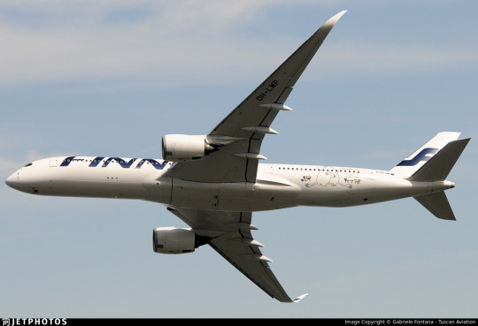
Three airframes - the pictured A350-900, OH-LWR, and two A320s - OH-LXK and OH-LXM - have had a 'bringing us together since 1923' sticker applied. Matching the rest of Finnair's branding, it's certainly quite minimal, but it's a nice gesture. It's not what people have been talking about. That's OH-LWO and OH-LWP, both A350-900s, who have been given something more substantial to wear.
youtube
I'm going to assume that after its renaissance on tumblr a few years back most people reading this are familiar with the Moomin franchise. I definitely am, because when I was in my larval stage my mother first taught me to read Russian using an omnibus book of Moomin stories. Creator Tove Jansson apparently designed both the shape of the eponymous white critters and the sound of the name Mumintrollen itself are designed to evoke a feeling of softness, and it's clear why these characters are so beloved.
It isn't the first time Finnair, which frequently collaborates with Finnish brands and highlights its Finnish roots, has featured Moomins.
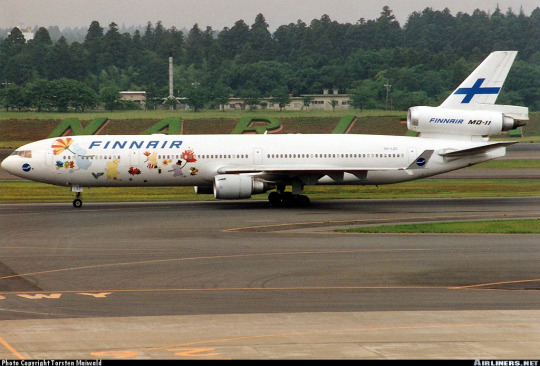
image on left: Antti Havukainen
In the 1990s, the airline first flew a Moomin jet. They had another in the 2000s. Both were withdrawn from service before 2010. It's been a while now since Finnair flew their last MD-11, but when celebrating their 100th birthday, a milestone that the vast majority of airlines will never see, they chose to do it by way of a soft Moomin embrace.
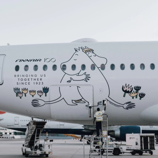
image: Changi Airport
And, I'll be honest, I think it's very sweet. It got an actual, sincere little smile out of me.
100 years is a really long time. In 1923 aviation was unrecognizable. What we would now consider an airliner didn't really exist yet - space for ten passengers, closed cockpits, and metal fuselages were the exceptions rather than the rule, and the Ford Trimotor was two years from its first flight. Cabin crew were barely even a concept. Airplanes, for all intents and purposes, were considered a type of boat. A nonstop flight across the Atlantic was a ridiculous concept. In a report published by the US National Bureau of Standards, it was said: 'there does not appear to be, at present, any prospect whatever that jet propulsion of the sort here considered will ever be of practical value, even for military purposes'. There were no aerodromes in Finland, so a small company called Aero attached floats to a plane just large enough for four passengers and took them from Helsinki to Tallinn.
Look how far we've come.
Footnotes:
[1]: The Finnair website's history page, which I used as a source for much of the background and several images in this post, renders it as 'Finnish Air Lines', but on the airplanes themselves it clearly has no space, so I've corrected that seeming error for them. I don't know why this discrepancy exists, because as far as I know during this period they were marketing themselves as Aero so this text would only have existed on the livery itself.
[2]: Actually, I very occasionally see this version where the F logo isn't fully surrounded by the circle and the F in the wordmark doesn't have the rounded top, and I don't know which came first or if the less round version is just somehow...not real? I did try to figure this out, I swear, but at some point I realized I am literally not a professional logo historian, and nobody is going to be let down if I don't brute-force an answer despite not even speaking Finnish, and I should finish writing the post before it's 2024.
[3] The closest thing to an official source I can find is the descriptions of two listings for the centenary stamp including a quote from designer Ilkka Kärkkäinen attributing it to him. I don't at all doubt that he did design it, but I always like to find concrete attribution for things if I can and would hate to spread misinformation and the sparseness of confirmation here is something I find very strange. My best guess is that there's plenty of good sources on it in Finnish but nobody has bothered to make it as clear in English.
[4] Admittedly this is a stretch, and I certainly don't think it was intentional, but it does remind me of the longship prow used in early SAS liveries. This motif was introduced in 1946 and continued to see use after the Finnair logo was introduced. The overlap is fairly limited in that SAS never used the longship in their logo (...I kind of want to talk about their logos one of these days) and the Finnair livery you'll see shortly doesn't look like SAS's at all, plus SAS has the extra pink on their liveries, but I couldn't get it out of my head that they do look sort of alike.
[5] The absolute hero who uploaded it to jetphotos mentioned that Finnair had given him the photograph while planning to dispose of it, and this makes me wonder if the lack of documentation is just because Finnair doesn't hold onto their old materials, which makes me very sad. A lot of companies, more broadly, didn't bother to keep records until somewhat recently, but in Finnair's case it seems to be particularly egregious. As someone literally studying to be an archivist it makes me exceptionally sad to see history lost just because nobody cared enough to preserve it.
[6] Maybe they didn't want to look like backwards SAS. Who can say?
#tarmac fashion week#finnair#grade: c#grade: d+#region: finland#grade: d#grade: d-#region: northern europe#era: 1960s#era: 1970s#era: 1980s#era: 1990s#era: 2000s#era: 2010s#era: 2020s#special liveries#commemorative liveries#requests
50 notes
·
View notes
Text
Over 550ps, top speed over 300km/h. New era complete by Veilside 029838 · 1104
Veilside EVOLUTION RII
Veilside in Tsukuba brings to the world a GT-R that is at the cutting edge of the times, and in complete form!!! This is the Veilside Evolution RII, with the theme of ``faster and more beautiful.''
The engine displacement has been increased to 2680cc with 88 forged pistons, H-stage connecting rods, camshafts, etc.
The turbine is equipped with twin TD-16G. Equipped with ARC intercooler, Trust wastegate x2, etc.
The fuel system is 550cc with only the main injector. The fuel adjustment, ignition timing, and each injector are controlled by the original computer. The muffler is made entirely of stainless steel that meets vehicle inspection requirements.
Main pipe 30 → outlet 10 single. The suspension is strengthened with a 5-level vehicle height adjustment shock absorber and a coil spring kit that is compatible with official vehicle inspections. Rate is F5.5, R4.0kg/m. I wear P-ZERO's F275/35-18 and R315/30-18 on this. The wheels will be Monza's F18 x 11JJ and R18 x 13JJ. The brake system is reinforced with Earl's hoses and D-Speed NoI pads.
The appearance is a blister fender kit. These include the F bumper, F/R fender, R wing, S step, and aero mirror.
The interior of the cockpit has been refined and a complete meter with 3 meters has been installed. It can be said to be the complete product of a new era.
33 notes
·
View notes
Text
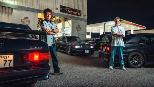
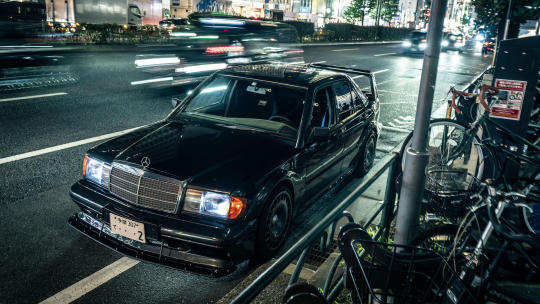
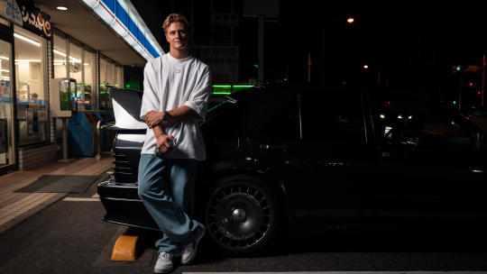
A Night In Tokyo With Mick Schumacher and A Mercedes 190E Evo II
Driving around Tokyo is daunting. With no centre or suburbs, its road network is huge, spiralling, occasionally latticed and sometimes subterranean. At times, even Mr Roboto in the satnav gives up and shrugs directions your way. Which has happened. Meaning I'm lost while leading Mick Schumacher (behind the wheel of a stunning Mercedes 190E 2.5-16 Evolution II) through Japan's neon-lined labyrinth.
It's a hot, humid evening and Mercedes F1's reserve driver (and son of iconic seven-time Formula One world champion Michael Schumacher) is cutting the perfect shape of a 90s boyband member. Where I'm perspiring like a burst pipe, he palms back his blonde curls and looks effortlessly cool in his loose-fitting, oversized Tommy Hilfiger contractual clobber. Sartorially, it couldn't be more of a perfect fit for the car he's driving.
Born out of German touring cars, the Evo II is a deeply lustworthy, boxy and bewinged sports saloon. With a revvy, induction-tastic 232bhp four-cylinder engine mated to a dog leg close-ratio five-speed manual, rear-wheel drive and aero appendages that get petrolheads salivating, it's a proper tip one's hat 'if you know, you know' car.
Mercedes only built 502 of them (as per DTM's homologation rules) out of some 1.9 million W201 models that it's based on, so they're properly rare beasts. The fact we've got a quadruplet of Evos following Mick makes the situation we're in a bit more mind-blowing. But that's the plan. We wanted to give Mick an evening to remember, to take him away from the repetition and rigmarole of modern media junkets. We don't want to know where he keeps his ketchup, or when the last time he thought of the Roman Empire was. We want to indulge his love for cars.

"I went looking for an Evo II to buy but decided against it… for now," Mick says in his soft, geographically hard to place international accent. "It's a beautiful car and has huge sentimental value to me, the main reason being that my dad had one as a company car when he was a Mercedes junior. He spent a lot of time doing lots of laps on the Nordschleife with Heinz-Harald Frentzen. I remember within a month they had to change the brake pads and things with the engine. So it's an emotionally important car to me."
Growing up in Gland, Switzerland, Mick struggles to pinpoint exactly when he got bitten by the road car bug. "Honestly, I don't really know where I got into them. Driving them around the property as a child was a big factor. The first time I had a steering wheel in my hand from a road car was maybe four or five years old, on my dad's lap. I got to drive very nice cars, very soon and very early. I guess it just grew naturally. Especially when I turned 18; then it really turned into an obsession."
Raised on a healthy diet of racing, the Fast and Furious franchise and gaming, Mick picked up a penchant for JDM cars by proxy. "I just love how raw and simple they are," he says. "I enjoy playing around with them, changing stuff, tuning them and making them more fun to drive."
Knowing this, we head out of Tokyo towards Chiba to meet Japan's most inconspicuous bad boy: Kazuhiko 'Smokey' Nagata. Tobacco and turbo enthusiast Smokey is one of Japan's legendary tuners. He and his company Top Secret have modified every generation of Nissan GT-R, including an R33 Skyline GT-R that managed 0–186mph in 17 seconds at Yatabe test track and 204mph in Tokyo's famous Aqualine tunnel. Like Smokey, Mick is also a GT-R fanboy, with some tucked away in a shed at home, including his R34 drift car.
"I've really got into drifting. As an F1 driver, drifting, or oversteer, is the opposite of what you want to do, but if you control it and have the feel for it, it can really help you. So I took the step of saying 'I want to try it' after the 2019 Race of Champions skill race.
I was quite good, finishing second against rally drivers and everything, so I thought, 'Okay, maybe I should try this a bit more,' so I got my own car and started enjoying sideways. I love the sensation of connecting turns and being in a difficult situation, because obviously the car is upset, to then be able to control it. I think that's what's so intriguing. It's a good feeling."
Mick's curiosity and JDM love resonates as he wanders around Smokey's GT-R littered shop. Not being able to speak Japanese, Mick uses international hand signals for car nuts to explain various car parts, gets out his phone to show Smokey his cars before stumbling upon Smokey's VR32 GT-R (an R32 with all the mechanics and interior of the R35 transplanted) and trying to find a way to import it into Switzerland. But we've got no time for this, as we've got the legendary Bayshore Route to hit and a car meet to get to.
For someone so young, 24-year-old Mick is at a rather quiescent point in his career. Having had a triumphant run in his youth coming second in karting in the World, European and German Junior Championships, then switching to Formula 4 in 2015 and finishing second overall in both the German and Italian F4 championships, before becoming European Formula 3 Champion in 2018 and FIA Formula 2 Champion in 2020, Mick made it to the big leagues and bagged himself a seat in F1 with Haas.
It wasn't easy. In 2022 Mick lost his seat after a difficult second season that saw him struggle to match teammate Kevin Magnussen for form. He recorded a best finish of sixth in Austria, one of two points finishes during the season, but it was not enough to save his seat. For 2023, Mick dropped his Ferrari junior ties and linked up with Mercedes (the last team his father raced for in F1), picking up the role of reserve driver.
"Being a reserve driver gives you tremendous insight, especially at Mercedes," Mick says. "I miss driving, I'm not going to lie, but the main thing I've learned since moving from Haas to Mercedes is how the team operates, the tools they have, how they use them and the communication. They're big learning points. It has opened my eyes in a lot of ways and has made it clear why Mercedes is as successful as it is. The worst part is sitting in the garage and seeing everybody drive out and do what you love to do."
Part of Mick's remit is to join Mercedes trackside at all F1 race. That's how we're able to blat around Tokyo for a night before he heads to Suzuka to support the team. But time in Merc's state-of-the-art sim back in Brackley is also key. Mick was praised by Mercedes' technical director James Allison for a 2 am shift he did during the British GP weekend, turning the car's "woeful" one-lap pace on Friday into a competitive car and set-up for Lewis Hamilton and George Russell to compete with during quali and the race on Sunday.
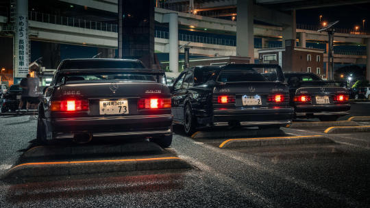
With every mile behind the Evo II's wheel, Mick's smile grows to match the width of its monstrous rear wing, especially when he realizes it shoots flame on the overrun after a 7,600 rpm toll booth roll out. We cross over to Yokohama and swirl down a concrete pillared plughole, arriving in an unsuspecting parking lot that doubles up as the epicentre of cool Japanese car culture in Japan: Daikoku PA. Mick, having never been to a car meet before, has his eyes widened.
Even though it's a school night, the place is pumping. Mick walks around curiously, showing his girlfriend, Danish model Laila Hasanovic, Veilside-kitted Mazda RX-7s, how riveted wide arch Liberty Walk bodywork hangs from an R35 GT-R for the ultimate kerbside stance, and the extended provenance from the flood of awesome, rare Mercedes (including the original 190E Evo I, an AMG-clad W124 and a custom Cosworth 2.5 boasting Penta wheels and Brabus brakes) that are all parked honourably in their uniform herringbone bays. As Mick gets under the bonnets and kindly signs carbon airboxes for marginally hysterical owners, I wonder if he's handy with the spanners.
"I wish I was," he says, "but I don't have the time. I'm starting to bring more of my cars over to my place so that I eventually will be able to work on them myself and change things that I want to change. Currently, I am very good at taking things apart… maybe less gifted at putting them back together."
But since the meteoric rise of social media and documentaries like Netflix's Drive to Survive, racing drivers' personalities have been mainlined into public consciousness. Nowadays, it appears drivers' human interests need to be put on display like the plastic dishes outside Daikoku's service station restaurant windows. Yet here, tonight, Mick seems completely at home and relaxed.
"It's risky because I feel like I'm a very private person. I like my privacy. Sometimes when you get people wanting to know more, they get a bit too snoopy. I feel it should be my choice how much I share, and what I share, not people trying to figure that out for me."
In this job you get to sniff out the car nuts from the blaggers, and Mick's passion is palpable. It's refreshing to see, and a welcome break from the headlines and hearsay currently surrounding him given he's caught in a gloopy limbo where F1 politics, money and raw talent are all currently fighting each other to work out where he'll race next.
As I type, Mick's currently linked with an LMDh drive with Alpine in next year's World Endurance Championship, a move Mercedes F1's big boss Toto Wolff is fine with, as Mick is "part of the family" and "will always have a home."
Mick's tone becomes more forlorn when talking about the future, obviously having had a tough few years and aching to get back into an F1 car. I wonder if it takes its toll, and how he pushes through in times of uncertainty.
"Having the right people around you," he says. "You need to try and be mentally in the right space and try and get the best out of the situation so that you can, whenever it's necessary, be in the position that you can jump in and be ready to go."
After an evening with Mick, you can't help but wish him the best of luck. If all else fails, he could always lean into drifting and see where that takes him. Sideways Schuey. Has a good ring to it, doesn't it?
#mick schumacher#f1#formula 1#japanese gp 2023#fic ref#fic ref 2023#japan#japan 2023#japan 2023 thursday#not a race#2023 not a race#between singapore and japan 2023#tw food#cw food#tw smoking#with michael#childhood photos
12 notes
·
View notes
Text

Light of Evolution related Art!
Peterrymon is meeting a lot of friends lately!
These two, Kaamon and Aero, belong to @/fleurdelynx and @/BluFaith_
Check out LoE yourself!
https://discord.com/invite/467SEX2W
9 notes
·
View notes
Note
will you make any predictions about 2026? im sure u saw the driver standings? it is the same 5 teams in the same order... do u think 2026 will save our beloathed sport?
I can take a stab at this, but there are a lot of pieces still moving, so this is just based on vibes more than anything:
So I think that the cost cap kinda made it so that the top teams stay on top simply because before the cost cap they were able to build up state of the art facilities and throw money around for their setup. That does carry over beyond the cost cap. Having control over the production of a car and the quality facilities plays a role. For example Ferrari would probably not be as good of a team if they didn't have all of the facilities and years of experience building high quality engines.
So predicting ahead to 2026 there is no reason to really expect the top five not to remain the top 5(unless someone really messes up, like catastrophically messes up the development of their car) Top teams are usually their own worst enemy more than anyone else.
However the order I do think will be different. With the way Red Bull is looking like they are losing personnel there is a very good chance that we see them in 2026 with a weaker car. Not out of the top 5 but also not the clear number 1. Red Bull also is getting an engine from a brand new operation at Ford, the chances that engine is competitive with Ferrari and Merc the first year is extremely low. The simple fact Red Bull doesn't have their own in house engine facilities is potentially going to be an issue for them. Starting from scratch with a new supplier is a big disadvantage to a team that has been building engines that are great for decades specifically tuned to their cars.
I can also say that Mercedes might be a wild card. While the engine thing is in their favor, the dynamic aero might not be. They have been struggling to understand aero since the last change and these regulations are evolving this aero so I am unsure of exactly where they will land. Who knows maybe they will really find a good footing with the new aero.
Since the regulations are also going to allow for more engine power we are likely looking at the top two teams that make their own engines starting out on top, or at least close (Ferrari and Mercedes) The engine regulations alone put Red Bull at a disadvantage against Merc and Ferrari.
So I guess TL:DR the top 5 teams will probably stay the top 5, but the 2026 regs have a good chance of breaking the Red Bull dominance.
I will say I do think we are going to see the driver standings change a lot more this year(and next year the field will be even closer, there won't be big car evolutions like this year). I don't think at the very least Checo is the easy number two. We will probably see the standings shuffle more. It's only 4 races in, there are still a lot of points on the board. I am not going to predict concrete placement for this season because I am not going to be the one who jinxes it. I have my secret predictions but I ain't writing them down to curse the rest of the season. I'll just say that I think might get some surprises.
12 notes
·
View notes
Note
People are saying that the new Red Bull is a big difference in concept from 2023, but idk why I see it as a very logical follow up...sidepod inlets were getting thinner and thinner, so they took the final step and made it as thin as possible, and the side effect of that was they needed somewhere to get air from to cool the car so they just put a hole vertically where it wouldn't interfere with all the aero of the sidepod structure...
It’s an evolution of their design definitely but I would say that it maybe takes inspiration from the Mercedes Zeropod concept and that’s potentially something to talk about.
Newey said before that their (Mercedes) zeropod design didn’t shock him, and that they had initially considered that approach and not gone with it for unspecified reasons, so it seems potentially they are now flirting with that concept a bit.
To be honest I would guess that a lot of the innovation has been hidden under the car, the thing with the current spec of cars is that it’s harder to see a lot of the special changes, because most will be related to the floor, leaving the sidepods and the sidepod inlets as the main thing that can be talked about.
10 notes
·
View notes
Text
Bones like Aero chocolate: Brazilian researchers discover evolution adaptation that helped dinosaurs to fly

It’s sometimes difficult to imagine how the planet we call home, with its megalopolis cities and serene farmlands, was once dominated by dinosaurs as big as buses and five-storey buildings. But recent research has helped deepen our understanding of why dinosaurs prevailed: the answer may lie in their special bones, structured like Aero chocolate.
Brazilian palaeontologist Tito Aureliano found that hollow bones filled with little air sacs were so important to dinosaur survival, they evolved independently several times in different lineages.
According to the study, aerated bones evolved in three separate lineages: pterosaurs, technically flying reptiles, and two dinosaur lineages theropods (ranging from the crow-sized Microraptor to the huge Tyrannosaurus rex) and sauropodomorphs (long-necked herbivores including Brachiosaurus). The researchers focused on the late Triassic period, roughly 233 million years ago, in south Brazil.
Continue reading.
37 notes
·
View notes
Text
AERO PRECISION RELEASES THE M4E1 PRO SERIES LOWER RECEIVER
Aero Precision has released the M4E1 Pro Series lower receiver on the heels of the complete rifle launch.
Aero Precision states”The M4E1 PRO lower receiver is the next evolution of the M4E1 lineup. Machined from a solid 7075-T6 forging- this lower receiver is fully ambidextrous and seamlessly incorporates mirrored controls into the construction of the lower allowing for a reliable and intuitive…

View On WordPress
3 notes
·
View notes
Text
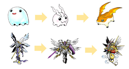
Partners for the Digimon Frontier Digidestined
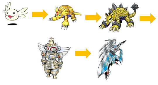
In Episode 47, the Digidestined land on the Yellow Moon, courtesy to an attack from the freed Lucemon. There they meet the Baby Digimon and Digimon Eggs they had previously encountered, which had been under Swanmon's protection. And each of the Digidestined picks up a newly hatched Digimon, holding them in their arms. One day, I had the idea of making a list. Based on the Digimon they each picked up, what would each Digidestined's partner be if they had partners instead of Spirits?
I went according to what each Digimon would evolve in according to Wikimon, which contains all kinda official evolutions throughout all the different media (be it Pendulums, games, or whatever). At the same time, I tried to stick to each kid's theme where possible, like electricity for JP and wind for Zoe. Only ones that were impossible were Takuya and Tommy, since none of the Digimon they picked up had anything with ice or fire in their evolution trees.
Also, the Digivices would be the D3 from Adventure 02, cause I like the idea that these partners would also be able to Armor Digivolve - into armor Digimon we didn't see in anime yet as well (or at least not with the 02 kid's Digimon. We got Sagittarimon appearing shortly twice, but I'd loved to see Veemon actually evolve with the Digimental of Hope in an anime).
So, have fun, and if you have any ideas, don't hesitate to let me know with a comment. ;) Enjoy the list!
Takuya
Digivice color: Dark blue


Chibomon - Demiveemon - Veemon - Veedramon - Aero-Veedramon - UlforceVeedramon
It would have been quite tempting to put the evolution line of Davis's Veemon. However, Paildramon and Imperialdramon are Jogress Evolutions, and we don't know what Exveemon would evolve into without Stingmon. Luckily, we have a very cool alternative option in the line of Tai's (probably) Veemon from the V-Tamer manga. So I went with that. Speaking of Tai - it's interesting that they gave him Chibomon and not Botamon/Koromon. The Agumon line would have kept the fire theme. But honestly... I would love to see the Veedramon line in anime one day. Or why not animate V-Tamer?
Koji
Digivice color: Light blue

Poyomon - Tokomon - Patamon - Angemon - MagnaAngemon - Goddramon
What can I say, with him getting a Tokomon...? Of course I had to pick the Angemon line. I only switched up the Mega level, picking Goddramon instead of Seraphimon. For... multiple, sometimes obvious reasons.
Koichi
Digivice color: Dark purple
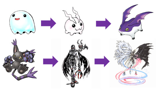
Poyomon - Tokomon - Tukaimon - BlackGatomon - LadyDevimon - Mastemon
Oooff... my favourite Frontier kid, and he was the hardest to do. I wanted to keep a dark aestetic, since he does have the Spirits of Darkness. And I wanted to do like a dark counterpart to Koji. Unfortunately, there aren't a lot of dark colored angel or angel-like Digimon that aren't evil. I think there are even none of those. That's why I was reluctant to pick LadyDevimon, since she usually is an antagonist when she appears in the anime. Isn't the only good LadyDevimon the one from Cyber Sleuth? But I think this is the list I feel most content with from all the option that I checked out. And Mastemon is pretty cool-looking. n.n I also could have gone with a cat aestetic, since, well, AncientSphinxmon, Löwemon and KaiserLeomon, but that worked out pretty badly as well.
Zoe
Digivice color: Pink

Poromon - Hawkmon - Aquilamon - Sylphimon - Valkyriemon
Thank god they gave her Poromon. This made her list pretty easy. I mean, as holder of the Spirit of Winds, what better for her than a bird Digimon? Unfortunately we don't have a proper Ultra Level for Aquilamon, so I had to pick the Jogress Evolution Sylphimon. But I am not sad; it visually fits quite well with Aquilamon, and is also a perfect segway into Valkyriemon.
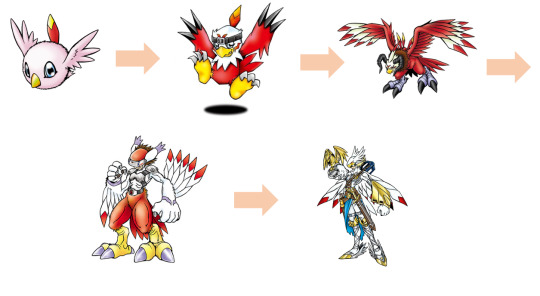
J.P.
Digivice color: Dark yellow

Motimon - Tentomon - Kabuterimon - Alturkabuterimon Blue - Herakleskabuterimon
Another veery easy pick. Tentomon line. Elektric bug. Need I say more? I only switched Izzy's red Alturkabuterimon its blue variant to pay tribute to the blue in Beetlemon's color pallet.
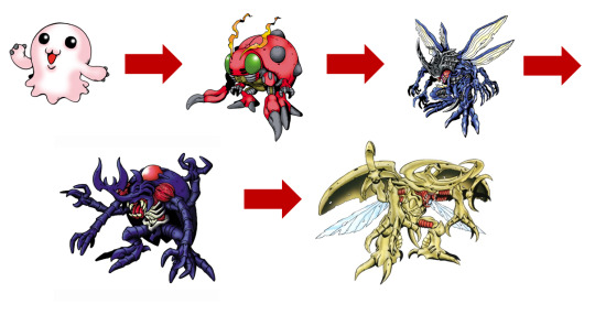
Tommy
Digivice color: Light yellow

Upamon - Armadillomon - Ankylomon - Shakkoumon - SlashAngemon
No ice for Tommy-boy here. However, I think he'd be very cute with Armadillomon, especially if it were anything like Cody's Armadillmon from 02. Here, I too had to pick the Jogress Evolution Shakkoumon for Ultra Level. But with SlashAngemon as Mega, I don't mind, since Shakkoumon serves as a good segway from earth to steel (and angel).
#digimon#digimon frontier#takuya#kanbara#takuya kanbara#koji#minamoto#koji minamoto#koichi#kouichi#koichi kimura#kouichi kimura#J.P.#Junpei#Shibayama#Tomoki#Tommy#Himi#Zoe#Izumi#Orimoto
5 notes
·
View notes
Text

#schuppan-962-cr#concours#lemans#supercar#fast car#fast cars#race car#history#historic#car#cars#legend#evolution of aero
25 notes
·
View notes
Text
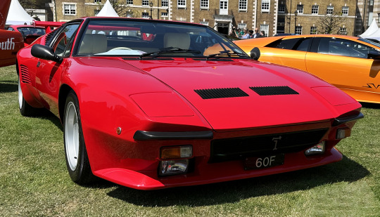
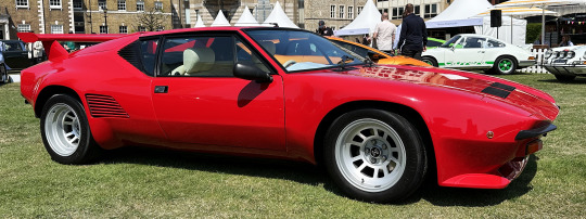


De Tomaso Pantera GTS-5, 1990. A very late series Pantera was also part of the Evolution of Aero section at the London Concours
#De Tomaso#De Tomaso Pantera#De Tomaso Pantera GTS-5#1990#London Concours#Ghia#Tom Tjaarda#Ford V8#mid engine#aerodynamic
329 notes
·
View notes
Text
"Arven? Arven please answer the phone! This is the third time I've tried to call you, just to get voice-mail. Your friend returned to the Academy saying you both separated following the battle with the third Titan. Just... just call me right away, alright sweetie? Love you."
Sada did her best to calm her breathing. Arven never stayed out late without giving her a heads up. It was something they agreed on- a way to make sure he was safe and she wouldn't worry too much following-
Following...
Following the events of last year.
~~~~~~~~~~~~~~~~~~~~~~~~~~~~~~~~~~~~~~~~~~~~~~~~~~~~~~~~~~~~~~~
One Year Ago...
Sada was busy at work inside her lab at the lighthouse, currently on video call with Professor Augustine Sycamore regarding possible links between Terestalization and Mega Evolution. Arven was away on the Treasure Hunt, no doubt having the time of his life.
"Whats strange is how it only works here in Paldea, unlike Mega Evolution. Augustine, is it possible that-" Her Rotophone began ringing, flying out of her pocket and in front of her to reveal the caller ID.
[Incoming Call: Arven][Accept/Decline]
"I'll talk to you later, Augustine. Arven's calling."
"Au Revoir, Lucina! Say 'ello to your son for me!"
She chuckled and nodded, ending the video call before answering the phone. "Yes, Arv-"
"MABOSSTIFF!!!"
Her blood ran cold at the wail her son let out. That wail was one of pure terror and anguish. "Arven?! Arven where are you?! What happened?!" Sada asked, already rushing out the door.
"W-We went into the Great Crater to l-look for Uncle Clavell and something a-attacked us! Mabosstiff is really hurt and h-he's not moving!!"
The professor cursed under her breath. He went to Area Zero?! Alone?! Entry to the Great Crater was prohibited for most students, but Arven was allowed only if accompanied by either herself or Clavell. And seeing as Clavell was currently in Area Zero and he was calling her, the boy certainly was alone. Sending out Aero, she did her best to keep her son calm. "Arven, sweetie, I need you to stay calm for me, okay? Where in the Crater are you?"
The sound of sobs came from the other end of the phone as he struggled to catch his breath. "R-Research Station One. I'm h-hiding inside." He finally managed out, hiccuping and sniffling. "Okay. I'll be right there. Stay inside. I'll stay on the line for as long as I can."
He whimpered in response. Aero took off, the Aerodactyl seemingly sensing the urgency and moving as fast as he could. Sada still felt it wasn't fast enough, pleading to whatever higher power would listen that this was just a nightmare, that this was just something her mind had cooked up. Her fears were confirmed when she saw her son run out of the research station towards her as she landed. He was still a sobbing mess, Mabosstiff's pokeball in his hands as he collapsed into her arms, sobbing and apologizing and begging her to save Mabosstiff. Her heart shattered at the sight of her child like this. Helping him onto Aero, she pocketed Mabosstiff's Pokeball and climbed on, the pair quickly soaring out of the Crater towards the nearest PokeCenter. Her son hugged her waist from his spot behind her, his face buried in her back as he continued to sob.
He ended up crying himself to sleep sometime after they got the news at the PokeCenter that Mabosstiff had been stabilized, but that they couldn't get anything else to work. Nothing they tried seemed to work. She sent out an email to Director Harrington about what had happened and not to expect Arven back at school for a bit. Currently, she was digging through old textbooks on Pokemon biology to find possible remedies to Mabosstiff's condition. Sada had already emailed several other professors in hopes one might be able to suggest something- anything- to help.
She never wanted to see Arven in such a state ever again.
~~~~~~~~~~~~~~~~~~~~~~~~~~~~~~~~~~~~~~~~~~~~~~~~~~~~~~~~~~~~~~~
She's shaken from her thoughts as Arven entered her office, yawning. "Sorry I'm late, Mom. My phone died-"
He's surprised when she hugs him tightly, trembling. "Thank Arceus you're alright..."
"Mom? Of course I-" He stops, realizing why she's acting like this. Hugging her back, he rubs her back. "It's okay, Mom. I'm safe. I'm safe..."
#angst hours#pokemon ask blog#ask-directorsada-and-friends#pokemon scarlet violet#professor sada#ai clavell AU#story progression#pokemon au#pokemon sada#pokemon#what happened to arven and mabosstiff in area zero#pkmn arven#arven pokemon
50 notes
·
View notes
Text

Ralliart tuned street version EVO. Tommy Makinen TM-V4
Lancer Evolution TM-V4
Ralliart fine changes EVO.
For a stronger evo
Numb!!!
Report/ Motonobu Takehira
Based on the Lancer EVO 6 Tommy Makinen Edition, a model tuned by Ralliart incorporating sports parts has appeared. That is the TM-V4, a street model based on the GSR, equipped with plenty of Ralliart sports parts and aiming for further improvements. Not a so-called complete car. Instead, it will be a tuning model that incorporates parts developed by Ralliart.
First of all, looking at the exterior, the side aero spoilers, which are larger than the normal ones, are noticeable, but the rest of the car doesn't look any different from the normal ones. Isn't it?
The tires are Michelin Pilot Sport 235/40ZR18. This is expected to increase the potential of exercise performance on winding roads.
If you look at the cockpit, you won't feel any difference from the normal one, but the 300km/h scale white triple meter, Carbon look panel on centre console and polyacetal shift knob increase rally mood.
Suspension is equipped with a shock absorber that can adjust the damping force (4 levels), and a vehicle height adjustment type with series springs (5 kg for both front and rear). It has aluminum tower bars on the front and rear. The brakes are reinforced with stainless mesh hoses, master cylinder stoppers, and sports pads.
And although the engine is worrisome, the main body is normal. However, motor sports improved exhaust efficiency. A muffler, piping that smoothes the air flow in the intake system, a sports type air cleaner, etc. are used to smooth the flow of intake and exhaust, and the sports ECU manages the engine.
When you open the hood, the dull black pipes have been changed to bright blue and red pipes, and just looking at them is exciting. It is also a part of Ralliart that is beautifully put together.
Running is a high-level unity ◎!!
Well, what about the running!?!?! I wrote that the engine itself is normal, but isn't it powered up? In particular, you can clearly feel the power increase in the middle and high rotation range. The response to the accelerator is sharper in the entire range, and the top end is even better. By the way, the boost is up by about 0.1 kg/cm. Isn't it about 30 horsepower increased!?!?!
No problems with drivability. Torque may be lower than normal at low revs, but there is no practical problem at all. Same smoothness as NORMAL, same ease of handling. The suspension is also perfectly decided
Wider for higher grip
Even if the tires are bumped and the road is uneven It is well demonstrated. Hardness
It is also exquisite, and the ride comfort is properly secured, so it can be used well on the street. The damping force to the shock absorber was set to 3 stages both front and rear, but this is the best setting for general winding.
You can enjoy sharp handling and improved cornering performance.
Brakes are high even at normal running. I felt a sense of rigidity, but this guy is even more solid. Efficacy that responds linearly to pedal force,
There is no perfect touch.
TM-V4 is a radical tuner
Although it is not a driving model, you can definitely enjoy the performance and enjoyment of riding on a higher rank without sacrificing comfort.
I think Lancer Evo owners will enjoy using these parts and tuning step-by-step.
Photographed by Tadashi Saito
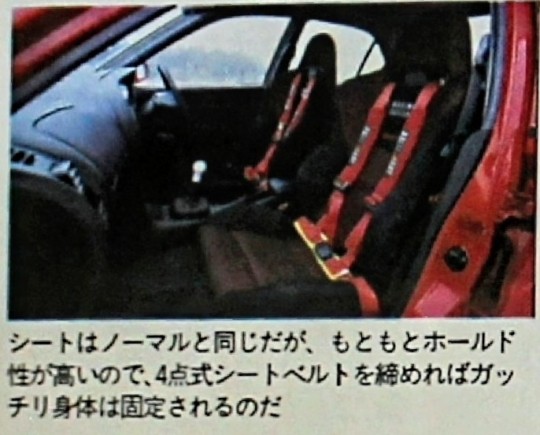
PIC CAPTIONS
Equipped with a Ralliart damper suspension that can handle 18-inch tires, it is extremely controllable even in heavy wet conditions.
The engine itself is normal, but the engine performance has been improved with piping that reduces intake resistance and a pickup with a sports muffler. beautiful to look at
A 300km/h scale white meter, polyacetal sports shift knob, carbon-like console panel, and triple gauges give it a unique look.
The seat is the same as the normal seat, but it has a high holdability, so if you tighten the 4-point seat belt, your body will be firmly fixed.

22 notes
·
View notes
Text
Ferrari’s Head of Chassis, Enrico Cardile at Dutch GP
What can you say about the 2024 Ferrari?
"Not a lot, but it will be very different, because developing this year’s car, we realised that some architectural choices we did were not right – it was constraining the development too much. From there, next year’s car will not be an evolution of this year’s car like this year’s car has been compared to last year’s car, but it will be a brand-new car – different chassis with different design, different rear end to allow our aero [department] to better develop the car to achieve their targets."
Having described 2023 as “crucial” for Ferrari to “better understand” their issues, he added:
"For us, it is crystal clear what we did wrong with the car… The weaknesses [are] clear, it’s not a matter of understanding what we should do. Now, for the future, it’s a matter of delivering a good product which will cope with the targets we have. We are not in ‘nowhere land’, we know what we have to do. It’s a matter of doing, it’s a matter of finding the right contents of the car, the right architecture of the car to achieve the target."
Charles in response to Cardile’s comments after quali:
"It’s great to hear that and obviously I can’t wait. First, I’ve got a season to finish in 2023, but we can only go in another direction because at the moment the car is really difficult to drive. It’s just very, very difficult to be on the limit
I think we are particularly struggling this weekend and even more so than what the balance would slow us down, just because we need to be so far off the limit. As soon as you get close to the limit, you just really don’t know what’s going to happen. That’s exactly what happened in my Q3 lap, so it’s a difficult situation."
Source: formula1.com
Just when did they realize their choices were wrong? Obviously, Charles didn't find out until testing.
"Crystal clear what they did wrong." Hopefully this means it's easy enough to get it right then?
He makes it sounds so easy to get it right. Stop giving me hope, Enrico.
Not really earth-shattering news here, but Charles's comments make it very clear he is the one driving this car on the limit, risking it all every time he does.
#give him the car he deserves enrico#once he doesn't have to fight the bloody beast#but has it working for him#charles can really show what he is capable of#charles leclerc#enrico cardile#dutch gp 2023#scuderia ferrari#f1#sf-23#sf-24?
12 notes
·
View notes
Last Seen Blogs

ellelans
Fruit.Fruit.Tits.Tits. Plant.Plant.

mesmerisedbythesements
Mesmerised By These Moments

zoteversus
Zote Versus

wincestion
just one look

amoraq
⌗ 𝐬𝐨𝐡