#excelchart
Explore tagged Tumblr posts
Visit Tumblr Blog
Explore Tumblr blogs with no restrictions, modern design and the best experience.
Last Seen Tumblr Blogs


Fun Fact
130K people were victims of a chain letter scam that affected Tumblr in May 2011.
Text
Best Graph Making Tools

Follow @everythingaboutbiotech for informative and useful stuff ✨
#DataViz#DataVisualization#Graphs#Charts#DataGraphs#GraphDesign#Infographics#DataAnalytics#ChartTypes#BarChart#PieChart#LineGraph#GraphSoftware#ExcelCharts#TableauViz#DataStorytelling#FlowChart#OrgChart#Data#Analytics#Numbers#Statistics#DataScience#BigData#Dashboard
9 notes
·
View notes
Text
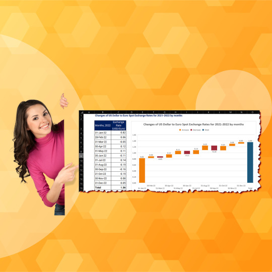
#ExcelChallenge#WaterfallChartChallenge#ExcelWorkout#DataVisualization#ExcelSkills#DataAnalysis#ExcelEnthusiasts#ExcelCommunity#ExcelMastery#SpreadsheetChallenge#ExcelGraphs#FinancialData#DataVisualizationChallenge#ExcelTips#ExcelTricks#ExcelExperts#ExcelLearning#ExcelDataAnalysis#ExcelCharts#ExcelDashboard#ExcelCompetitions#ExcelExcellence#visualization#data#team#opportunity#like#power#excel#microsoftexcel
0 notes
Text
Techaircraft
Master the power of data with our comprehensive Microsoft Excel course! 📊 Unlock your potential to analyze, visualize, and manage information effectively. Whether you're a beginner or looking to enhance your skills, our structured lessons cover everything from basics to advanced techniques. Gain proficiency in spreadsheets, formulas, charts, and more. Start your Excel journey today and excel in every aspect of your work and personal projects! . 𝐖𝐞𝐛𝐬𝐢𝐭𝐞 - www.techaircraft.com
𝐓𝐞𝐜𝐡𝐚𝐢𝐫𝐜𝐫𝐚𝐟𝐭 𝐬𝐮𝐩𝐩𝐨𝐫𝐭 𝐝𝐞𝐭𝐚𝐢𝐥𝐬:
𝐌𝐨𝐛𝐢𝐥𝐞 𝐍𝐮𝐦𝐛𝐞𝐫 - 8686069898
#MicrosoftExcel #ExcelTraining #SpreadsheetSkills #ExcelTips #DataAnalysis #ExcelTutorials #LearnExcel #ExcelCourses #ExcelFormulas #ExcelCharts

2 notes
·
View notes
Link
How to Remove Excel Cell Formatting (from All, Blank, Specific Cells)
#Blank#excelchart#excelcomparing#excelFACTfunction#ExcelFormula#excelformulas#excelfunction#EXCELHLOOKUP#Excellookup#excelshortcutkey#HowtoRemoveExcelCellFormattingfromAll#ShortcutKey#vba
0 notes
Link
how to make a pie chart in excel If you want to learn about this, then read this article carefully. Its really helpful for you in future.
0 notes
Text
Radar charts
A complete guide How to create and when to create a Radar charts in MS excel
#excel #microsoft #charts #radarcharts #MS365 #excelcharts #microsoft365
Click here to learn more...
https://excelinexcel.in/ms-excel/articles/radar-charts-in-excel/
1 note
·
View note
Text
Radar charts
A complete guide How to create and when to create a Radar charts in MS excel
#excel #microsoft #charts #radarcharts #MS365 #excelcharts #microsoft365
Click here to learn more...
https://excelinexcel.in/ms-excel/articles/radar-charts-in-excel/
1 note
·
View note
Text
Radar charts
A complete guide How to create and when to create a Radar charts in MS excel
#excel #microsoft #charts #radarcharts #MS365 #excelcharts #microsoft365
Click here to learn more...
https://excelinexcel.in/ms-excel/articles/radar-charts-in-excel/
1 note
·
View note
Text
How to Organize Your Data for Optimal 100% Stacked Area Chart Creation
Data Visualization – Charts, Graphs and Infographic designs - ThinkCell: Expert Q&A Guide
1.How to read 100% stacked area chart?
A 100% stacked area chart displays the proportional contribution of different categories to a total overtime. Each area represents a category, and the height of each area indicates its percentage of the total. The chart allows you to compare the relative sizes of categories at different points, showing how each category's share changes over time while totaling 100%.
2. What is an advantage of using a 100% stacked area chart instead of an ordinary area chart in Excel?
A 100% stacked area chart emphasizes the relative contributions of each category to the total over time, showing the percentage distribution rather than absolute values. This makes it easier to compare the composition of different series at a glance, highlighting trends and shifts in proportions, which can be more informative for understanding overall patterns in the data.
3. How to show total in stacked area chart?
To show the total in a stacked area chart, you can add a line representing the cumulative total of all stacked areas. This line can be overlaid on the chart, using the same axis, to indicate the overall value. Alternatively, you can display data labels or annotations at key points to highlight the total values.
4. How do you plot a stacked area chart?
To plot a stacked area chart, use a data visualization library like Python. Prepare your data in a suitable format (e.g., a DataFrame). Use the `stackplot()` function, specifying the x-values and the y-values for each category. Customize colors and labels as needed, then display the chart with `plt.show()`.
5. What are the problems with stacked area charts?
Stacked area charts can be difficult to interpret, especially when there are many series, as it can be hard to distinguish between individual components. The overall area can obscure trends in the individual series, and changes in one series can be misleading due to the cumulative effect. Additionally, they can misrepresent data if the baseline is not consistent.

Visit: VS Website See: VS Portfolio
#DataVisualization#StackedAreaChart#ExcelCharts#DataAnalysis#ChartingTechniques#BusinessIntelligence
0 notes
Text
Create a Radar charts
A complete guide How to create and when to create a Radar charts in MS excel
#excel #microsoft #charts #radarcharts #MS365 #excelcharts #microsoft365#
Click here to learn more...
https://excelinexcel.in/ms-excel/articles/radar-charts-in-excel/
1 note
·
View note
Text

Master Excel: Unlock Your Data Potential
Excel is more than just a spreadsheet tool—it's a gateway to data mastery. Whether you're a student, professional, or entrepreneur, learning Excel enhances your ability to analyze, visualize, and manage data effectively. With its powerful functions, formulas, and features, Excel empowers you to make informed decisions and boost productivity.
Why Learn Excel?
Universal Application: Used across industries for data analysis, budgeting, and reporting.
Enhances Efficiency: Automate tasks and streamline workflows.
Career Advancement: Proficiency in Excel is often a prerequisite for many job roles.
Getting Started
Begin with the basics—understand cell referencing, basic formulas, and formatting. Gradually progress to advanced topics like pivot tables and data visualization. Consistent practice is key to mastering Excel.
Hashtags: #LearnExcel #ExcelForBeginners #DataAnalysis #ProductivityTools #ExcelTips #FreeExcelCourse #ExcelTraining #MicrosoftExcel #DataVisualization #CareerSkills #ExcelMastery #TechSkills #OnlineLearning #ExcelFunctions #ExcelCharts #BusinessTools #ExcelTutorial #ExcelCourse #ExcelEducation #ExcelCommunity #ExcelSkills #ExcelPower #ExcelBasics #ExcelAdvanced #ExcelFormulas #ExcelPivotTables #ExcelShortcuts #ExcelHelp #ExcelSupport #ExcelPractice #ExcelExperts #ExcelLearning
0 notes
Text
Copy & Paste visible cells only without using GOTO in excel #shorts
0 notes
Link
Create Charts in MS Excel
0 notes
Photo

Whether you enter, extract or connect to your data, once you have it in Excel, you can organise, format, sort and filter, cross-query and concatenate, lookup, chart, tabulate, collaborate, analyse, visualise and report. Let us join you on your Excel journey with a course from our suite of Microsoft Excel training courses.
#excelquery #excellookup #excelconcat #excelchart #excelanalyse #excelreport #excelcourse #exceltraining #foursquaretraining
0 notes
Text
PIVOT TABLE FOR BEGINNERS – PART 1 Pivot Tables in excel is backbone of data analysis in excel. If you want to perform various analysis in excel, then I would suggest, learn this amazing excel feature to complete your analysis with in few minutes https://excelsirji.com/pivot-table-for-beginners-part-1/ Subscribe us to learn more about MS Excel

#Excel #onlineexcel #Exceltraining #ExcelVBA #Excelvba¯os #datavalidation #excelfunctions #excelformulas #excelcharts #advancedexceltraining #freeonlineexcel #DataAnalytics #exceltips
0 notes