#figma export to react
Explore tagged Tumblr posts
Visit Tumblr Blog
Explore Tumblr blogs with no restrictions, modern design and the best experience.
Last Seen Tumblr Blogs


Fun Fact
When “GIF” was named word of the year in 2012, Oxford Dictionaries U.S.A. credited Tumblr for pushing the word.
Text
Learn how to convert Figma designs into React components seamlessly with this step-by-step guide. Perfect for streamlining your workflow and building pixel-perfect UIs.
#Figma to React#Figma to React Conversion#Figma to React Service#figma to react code#figma design to react code#convert figma to react#figma export to react#figma react
0 notes
Text
AWS Amplify Studio: Your All-in-One App Development Platform
AWS Amplify‘ AWS Amplify Studio, is a visual development environment that integrates Amplify’s robust backend setup and management capabilities with new features that allow frontend developers to speed up UI development with less coding. Figma designs are automatically converted into human-readable React UI component code by Amplify Studio. Developers may visibly link the UI elements to the app’s backend data in Amplify Studio. Amplify Admin UI’s current backend configuration and management features will be integrated into Amplify Studio in the future, giving developers a single interface to create full-stack apps more quickly.
It is possible for developers to create UI components, set up a backend, and connect the two within Amplify Studio. All of Admin UI’s backend creation and management features are included in Amplify Studio, making it easier to set up and manage app backend infrastructure including database tables, user authentication, and file storage without the need for cloud knowledge. Amplify Studio gives developers access to a React UI toolkit with hundreds of components, like e-commerce cards, contact forms, and newsfeeds, to speed up UI creation. Because every UI component in Figma is completely customizable, designers have total control over how components look using tools they are already familiar with.
Developers may visually link the UI elements to data from the app backend using the component editor after importing component customizations from Figma into Amplify Studio. With the help of well-known programming concepts JavaScript for application code, Amplify CLI, and AWS CDK for expanding backend infrastructure developers can completely customize the application’s design and behavior by exporting Amplify Studio is used to convert all frontend and backend artifacts (UI elements, backend infrastructure) to reliable code.
Write Your Own Code with AWS Amplify Studio
Developers can convert Figma designs into pixel-perfect React components using AWS Amplify Studio. The code is one of the most crucial aspects of the story because it is designed for developers.
Overrides
Overrides are the first method of altering Studio-generated components. Amplify UI components are used by Studio as subcomponents when it develops components. The associated documentation contains numerous properties that can be used to change the attributes of these components. You can pass an object to the overrides prop available in each component to modify any of these props. The names of the subcomponents you want to change are represented by the keys in that object; these are set in Figma and are also visible in the resulting file for any component. The properties you wish to modify will be the values.
Personalize Collections
You can also make collections or list views in Amplify Studio that generate instances of a component for every data point in a dataset. Items in a collection can have their properties overridden, and this can even be done conditionally depending on the data instance the component represents. Like many higher order JavaScript functions like map and reduce, you can give a function to the overrideItems prop, and it will take as inputs “item” and “index.”
Exiting the ui-components directory of files
The ui-components folder contains the components that Amplify Studio creates. Any modifications made by a human author to the component file are overwritten when the component file is regenerated in Studio as a result of an approved update in Figma or modifications to the data shown.
You might relocate the component outside of the ui-components directory if you wanted to write code directly within the component file. Normally, you would use overrides to change anything you need to within a component. You could now author code right within the component and it would no longer renew.
Using only the UI elements
You can utilize the Amplify UI components directly in your application, just like you would with any React component library, if you want to add additional UI elements to your application that complement your theme and the Studio-generated elements but don’t want to use Studio for them.
Theme
You may incorporate them into your Figma or develop Amplify Studio apps. To add a theme to your app within code, you can use the Figma extension or a JS object with design tokens or CSS.
In conclusion
Amplify Studio was created to facilitate the designer-developer handoff and make developers’ work easier. It is crucial that the code be simple to alter and expand; developers can do this in a variety of ways with components produced by Amplify Studio.
Read more on Govindhtech.com
#AWSAmplify#AmplifyStudio#AWSAmplifyStudio#Amplify#UIcomponents#UI#News#Technews#Technology#Technologynews#Technologytrends#govindhtech @awscloud#govindhtech
1 note
·
View note
Text
🚀 Enhance Your Motion Design Skills in Figma! 🎨
Creating captivating motion designs can elevate your projects and engage users in meaningful ways. If you’re looking to bring your designs to life, check out these six essential Figma plugins that will help you achieve stunning animations and interactions:
Figmotion: This powerful plugin allows you to create animations directly within Figma using an intuitive timeline interface, making motion design accessible to all.
Smart Animate: A built-in feature that enables seamless transitions between frames. Perfect for prototyping interactive designs that flow effortlessly.
Motion: Easily define motion paths and easing effects to add dynamic elements to your designs without any hassle.
LottieFiles: Import, preview, and export high-quality vector animations. Elevate your projects with engaging animations that look great on any platform.
Anima: Create responsive prototypes with advanced animations and interactions, making your designs not just static but truly interactive.
Framer Motion: For those familiar with coding, this plugin integrates React components for complex animations directly in Figma, enhancing your design workflow.
These tools will not only streamline your design process but also help you create engaging and dynamic user experiences.
🔗 Ready to take your Figma designs to the next level? Try these plugins today!
Any Project in your mind !! Then connect me & say Hi. WhatsApp: +880 1611 123478 Email: [email protected] Telegram: https://www.t.me/asifriaj
You can follow me: https://www.linkedin.com/in/asifriajofficial/ https://www.behance.net/asifriaj https://www.facebook.com/AsifRiajj/
FigmaPlugins #MotionDesign #Animation #UIUX #Prototyping #DesignTools #InteractiveDesign #FigmaMotion #GraphicDesign #userexperience
0 notes
Text
Exciting New Tools for Designers, July 2024
July 01, 2024
Welcome to this July’s collection of tools, gathered from around the web over the past month. We hope you’ll find something here to make work just that little bit easier. Enjoy!
Sometimes inspiration is slow in coming when faced with a blank screen. This aptly named AI design helper can get you started with color schemes and font suggestions.
The trend of remote working is becoming increasingly common among designers and developers. This platform is designed for remote workers who wish to make the most of their location independence by arranging home swaps that meet their technical needs.
Gluetrail can create articles and enhanced videos from a single screen recording, which could really speed up the process of making guides and tutorials. It’s a browser extension, currently Chrome only.
Linktopia describes itself as a link building community for founders. You submit blog articles to receive backlinks and send link requests to boost your SEO. All submissions are checked manually.
While there are existing font identifier browser extensions that work on Safari, they only work on desktop. What Font for Safari has been built specifically for Safari and works across all current Apple devices.
Koosh simplifies video embedding using pre-designed templates for single and multiple videos. It also has options for adding interactions.
Spending an hour here and there accidentally browsing is a common pitfall of working on the web. Tell Intentional what you’re working on, and it will stop you from accessing anything irrelevant.
The Figgy web app helps you track your design contributions and monitor your productivity by displaying your Figma activity in a GitHub-style contribution chart.
There are lots of task timers out there, but Bubble Time (currently for iPhone only) may have the most enjoyable and stress-free interface. Additionally, it does not collect any data.
Uizard has added a conversational modality to Autodesigner, allowing you to use plain English in prompts to generate or edit UI components or component sets.
Portfolo lets you create an online showcase for your work, using markdown. It’s simple and fast, allowing you to focus on the work you want to show.
This AI image generator from Icons8 has been trained on the illustrations created by Icons8’s own team of artists. You can get a set of consistent images, with no legal or ethical issues.
DynaUI is a set of animated components built with React, Tailwind CSS, and Framer Motion. The smaller components are free, while a one-off payment gets you page sections and templates.
The Dualite plugin for exporting Figma to code has had a major update. The new features are Component Mode, for generating reusable code components, and Page Mode for converting animations and pages to code.
Most To Do lists expect you to prioritize tasks yourself: One Task uses AI to do the prioritizing for you. If you feel overwhelmed trying to decide what to do next this might be the answer.
Paddi MacDonnell
Read more here https://www.vingle.net/d5media
0 notes
Text
Web Designer Course: A Complete Guide to Kickstart Your Career in Web Design
In today's digital world, a strong online presence is essential for every business, organization, and individual brand. As a result, the demand for skilled web designers has skyrocketed. A well-designed website not only attracts visitors but also enhances user experience, boosts credibility, and drives business growth. If you have a creative eye and a passion for technology, a Web Designer Course might be the perfect start to your professional journey.
What is Web Design?
Web design is the process of creating visually appealing, user-friendly websites. It involves several components such as layout design, color theory, typography, content structuring, responsive design, and user interface (UI) design. A web designer ensures that a website is both aesthetically pleasing and functional.
Why Choose a Web Designer Course?
A formal course in web design equips students with the technical and creative skills required to build modern websites. Whether you’re a beginner or a professional looking to upskill, a web designer course offers structured learning, expert guidance, hands-on projects, and the foundation needed to enter the competitive digital industry.
Key Benefits:
High Demand: With businesses moving online, web design professionals are more in demand than ever.
Creative Outlet: Web design combines creativity with technology, offering a dynamic and fulfilling career.
Freelance Opportunities: Work independently or with clients across the globe.
Diverse Career Options: From UX/UI design to front-end development and digital branding, the possibilities are vast.
Who Can Enroll?
Anyone with basic computer skills and an interest in design and technology can join a web designer course. It is ideal for:
Students (10+2 and above)
Graduates from any stream
Working professionals looking to switch careers
Freelancers aiming to expand their service offerings
Course Duration and Modes
Web designer courses vary in length based on the depth and specialization:
Short-term Courses: 3 to 6 months (suitable for beginners)
Diploma Programs: 6 months to 1 year (in-depth training)
Advanced Programs: 1 year+ (often includes internship or live project)
Courses are available in online, offline, and hybrid formats. Online classes offer flexibility, while classroom learning provides hands-on mentoring and peer interaction.
Core Modules in a Web Designer Course
A comprehensive course will typically cover the following modules:
1. Introduction to Web Design
Overview of web design and development
Role of a web designer
Understanding the web ecosystem
2. HTML & HTML5
Structure of web pages
Tags, attributes, and elements
Semantic HTML and best practices
3. CSS & CSS3
Styling techniques
Layouts using Flexbox and Grid
Responsive design with media queries
4. JavaScript Basics
Introduction to programming logic
DOM manipulation
Interactive elements
5. UI/UX Design Fundamentals
Wireframing and prototyping
User flow and navigation
Visual hierarchy and usability
6. Adobe Photoshop & Illustrator (or Figma)
Designing web layouts
Exporting assets for the web
UI mockups and icons
7. Bootstrap Framework
Building responsive layouts
Using pre-designed components
Customizing themes
8. Content Management System (CMS) – WordPress
Installing and configuring WordPress
Custom themes and plugins
Managing dynamic content
9. SEO Basics
On-page optimization
Mobile-friendly design
Page load speed and usability
10. Portfolio Development
Building a personal web design portfolio
Live project work
Presentation and feedback
Optional Advanced Topics
JavaScript libraries (like jQuery)
Introduction to React or Vue.js
E-commerce website design
Animation using CSS and JS
Web accessibility and standards
Tools Covered in a Web Designer Course
A good course exposes learners to the most widely-used industry tools such as:
Figma / Adobe XD – UI/UX and wireframing
Visual Studio Code – Code editor
Chrome DevTools – Debugging and optimization
Photoshop / Illustrator – Graphic design
Git & GitHub – Version control
Career Opportunities After Completing a Web Designer Course
Upon successful completion of the course, learners can explore roles such as:
Web Designer
UI/UX Designer
Front-End Developer
WordPress Developer
Graphic & Web Design Specialist
Freelance Web Consultant
Depending on your skills and interests, you could also branch into digital marketing, mobile app design, or motion graphics.
Expected Salary
Web design salaries vary depending on experience, location, and employer. Here’s a general idea:
Entry-Level Web Designer: ₹2.5 – ₹4.5 LPA
Mid-Level (2–5 years): ₹4.5 – ₹8 LPA
Senior Designer or UI/UX Lead: ₹8 – ₹15+ LPA
Freelancers: ₹25,000 to ₹1,00,000+ per project (depending on complexity)
International opportunities can offer even higher packages.
How to Choose the Right Web Designer Course?
With so many courses available, consider these factors before enrolling:
Curriculum Depth: Ensure the course covers both design and development basics.
Faculty Expertise: Learn from experienced industry professionals.
Hands-On Projects: Practical learning is critical for skill-building.
Portfolio Support: Does the course help you build a professional portfolio?
Internships & Placement: Job assistance or internships are a big plus.
Reviews and Ratings: Check feedback from past students.
Certifications
Many reputed institutes offer certification upon completion. Some globally recognized certifications include:
Adobe Certified Expert (ACE)
Google UX Design Certificate
Coursera/edX verified certificates
HubSpot CMS Design Certification
These add value to your resume and enhance credibility.
Final Thoughts
The internet continues to grow rapidly, and so does the need for skilled web designers. A Web Designer Course is a smart investment for those looking to build a creative, flexible, and high-demand career in the digital space. Whether you want to work for a tech company, join an agency, or freelance from home, the skills you gain from a quality course will open doors to endless possibilities.
Are You Ready to Design the Future?
If you're passionate about design, technology, and problem-solving, a career in web design awaits you. Enroll in a web designer course today and start building the digital experiences of tomorrow.
0 notes
Text
Build Chakra UI Applications More Easily with Copycat
If you're a Figma user and you want to use the Chakra UI design system, there's now an easy way to convert your designs to Chakra with the help of Copycat.
Copycat is a design tool that allows you to quickly and easily generate production-ready code for your Figma designs. It supports all of the popular front-end frameworks, including React, Vue, Angular, and more.
To use Copycat with Figma, simply install the plugin and then select the "Copycat" option from the Export menu. You can then choose to export your design as a Chakra UI component. Copycat will automatically generate the necessary code for you.
You can also use Copycat to export other design systems, such as Bootstrap or Foundation. So if you're looking for an easy way to get started with Chakra UI, Figma is a great place to start!
0 notes
Text
Mobile app icon generator

#MOBILE APP ICON GENERATOR HOW TO#
#MOBILE APP ICON GENERATOR GENERATOR#
#MOBILE APP ICON GENERATOR UPDATE#
App - Monkey Mobile App logo design Logo preview image. With thousands of editing options and graphic elements, you can create logos, icons, brands, and other designs. Hatchful's free logo maker can help you design and customize your ideal app logo quickly and easily, so that your application pops out of search results, gets more downloads, and finds more users for your business. * Generate and download Android and iOS app icon easily. The logo maker can generate the perfect app logo for your business. If you’re more into making your own logo or creating a brand identity for a client on the go, then this app is for you. If you want your app to stand out with style, grab attention, and start bringing in revenue, you need an exceptional app logo. * Real time resize and preview your app icon. It creates app icons and favicons very quickly Generate icons and images for mobile apps, android and iOS. Just upload a picture click on Apply button and download file(s) with icons results.You do not need to pay us for using our service
#MOBILE APP ICON GENERATOR GENERATOR#
The size of the app icons may change with every new mobile os version Fast and Free Icon Generator What is App Icon ?Īpp icons are the various size images which are used for android and ios development.
#MOBILE APP ICON GENERATOR UPDATE#
Please note that the collection is dynamic and growing, which means I will update the collection as quickly as possible if there’re new iOS 7 app icon templates released on the web.A favicon is an icon associated with a particular website or webpage that is displayed in the browser address bar next to a site's URL. Supports Native, Cordova, React Native, Xamarin and more. Create icons, generate all required sizes, label and annotate. GitHub - dwmkerr/app-icon: Icon management for Mobile Apps. If you’re looking for a great iOS 7 app icon template to design & create your own app icon, I think this collection of 12+ iOS 7 Application Icon Templates might be helpful for you. Create icons, generate all required sizes, label and annotate. With this PSD, you’ll be able to automatically generate an assets folder, containing all your image files (in retina and non-retina), named in a proper way to be used directly with Xcode or on your website/webapp.įREE Template iOS 7 Icon Grid EPS 8 vector illustration Here’s a free Photoshop Action + PSD template that exports your icon artwork to all of the formats required by the app store. Slices are already setup to 1-click export your files, ready for upload. All you need to do is add your 1024×1024 artwork in one place, and it will price all the required sizes for you. update: iOS App Icon template for SketchĪn iOS 9 App Icon template. IPhone 6s Plus, iPhone 6 Plus iPhone 6s, iPhone 6, iPhone SE iPad Pro, iPad, iPad mini Settings icon Spotlight icon App Store icon 8 sizes Preview on device Use it to showcase you app icon to your clients. Giving you all a free App icon template to use for your personal and commercial purpose. Update: Icon Grid For Your Design Project Update: Icon Grid TemplatesĪ complete set of icon grid templates for iOS, iPadOS, watchOS, tvOS, macOS, iMessage, Android, Windows, and Web Apps.Ī macOS big sure style iOS App icon template in Figma format.Īn iOS icon template for the upcoming iOS 14.
#MOBILE APP ICON GENERATOR HOW TO#
If you’re an iOS app designer & developer and are fed up with how to create a perfect and attractive iOS-style app icon, please check out our hard work of 25+ iOS Application Icon Templates that allow to create your own iOS app icon with ease. By default, the Apple iPhone, iPad Air all use an operating system called iOS. There’s no doubt that iOS is one of the most popular mobile operating systems in the world.
0 notes
Photo

pxCode - Best UI Visual Programming Tool in 2021 Major Features Support in 2020
Export code for React.js and HTML/CSS/SCSS
Reusable Component Support
Android and iOS App (Native) Support with React Native
Bootstrap support for Responsive 12 Grid System
Responsive support by Media Query and breakpoints
Version Control for Editing and Share Share and Instant Preview
What’s our plan for 2021
Figma Support
Vue Support
More Media Query Support
Smart AI Wizard for easier editing
More tutorial videos pxCode: https://www.pxcode.io/ Facebook: https://www.facebook.com/pxCode
0 notes
Text
Libraries for SVG Drawing Animations
In 2013, Jake Archibald introduced this cool trick of animating an SVG path to look like it’s drawing itself. It’s 2020 now, and the trick is still popular. I’ve seen it on a lot of websites I’ve visited recently. I, too, feature an animated SVG loader on my website using one of the libraries I’ll introduce below.
In a previous article, Chris Coyier wrote about how SVG path animations work under the hood, using the CSS stroke-dasharray and stroke-dashoffset properties. In this article, I want to introduce you to four JavaScript libraries that can be used to create SVG path drawing animations with fewer lines of code, like this cool example. Why a library? Because they’re ideal for complex animations involving two or more SVGs with multiple paths.
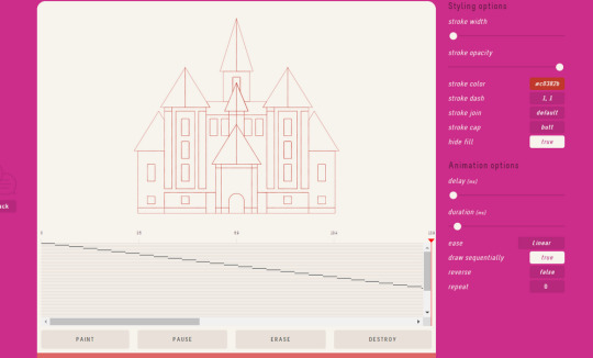
To get started, l’ll first secure an SVG to demo. Let’s use this castle from svgrepo. The castle SVG downloads as an SVG image. But, since we’re dealing with path animation, what we need is the code format of the SVG. To get this, I’ll import the file into Figma and use the “Copy as SVG” feature (Right Click → Copy/Paste → Copy as SVG) to grab the SVG code.
To successfully animate an SVG path, the SVG shape should have a fill of none and each individual SVG path must have a stroke (we’ll set it to #B2441D) and a stroke-width (set to 2px).
The animation effect we want to create is to first draw the outline (or stroke) of the SVG and then fill in the different colors. In total, there are six different fill colors used throughout the SVG, so we’ll remove the fill color from each path and give paths of the same color the same class name.
#695A69: color-1
#B2441D: color-2
#DFDOC6: color-3
#C8B2A8: color-4
#DE582A: color-5
#AO8A8A: color-6
After all the modifications, here’s what the SVG code looks like:
<svg id="svg-castle" width="480" height="480" viewBox="0 0 480 480" fill="none" xmlns="http://www.w3.org/2000/svg"> <path d="M231.111 183.761V150.371C231.111 149.553 231.774 148.889 232.592 148.889H24 7.407C248.225 148.889 248.889 149.552 248.889 150.371V183.761L258.342 206.667H271.111 V135.556H240H208.889V206.667H221.658L231.111 183.761Z" stroke="#B2441D" stroke-width="2px" class="color-6" /> <path d="M311.111 420H288.889V455.556V468.889H311.111V455.556V420Z" stroke="#B2441D" stroke-width="2px" class="color-1" /> <path d="M191.111 420H168.889V455.556V468.889H191.111V455.556V420Z" stroke="#B2441D" stroke-width="2px" class="color-1" /> <path d="M168.889 220V228.889V237.778H222.222V228.889H212.487L221.658 206.667H208.88 9H169.524L177.778 220H168.889Z" stroke="#B2441D" stroke-width="2px" class="color-2"/ > <!-- etc. --> </svg>
That’s all the SVG preparation we need. Let’s look at how to achieve the desired animation with the different libraries.
Library 1: Vivus
Vivus is a lightweight JavaScript class (with no dependencies) that allows you to animate SVGs like they’re being drawn. The library is available using any of these options. To keep things simple, we’ll use a CDN link:
<script src="https://cdnjs.cloudflare.com/ajax/libs/vivus/0.4.5/vivus.min.js" integrity="sha512-NBLGIjYyAoYAr23l+dmAcUv7TvFj0XrqZoFa4i1o+F2VvF9SrERyMD8BHNnJn1SEGjl1AouBDcCv/q52L3ozBQ==" crossorigin="anonymous"></script>
Next, let’s create a new Vivus instance. It takes three arguments:
The ID of the target element (the SVG)
An options object with a dozen possible values
A callback function that runs at the end of the animation
Looking back at our SVG code, the SVG ID is svg-castle.
new Vivus('svg-castle', { duration: 200, type:'oneByOne' });
Now, let’s write a callback function that fills the paths with the different colors we’ve defined:
function fillPath(classname, color) { const paths = document.querySelectorAll(`#svg-castle .${classname}`); for (path of paths){ path.style.fill = `${color}`; } }
The fillPath function selects all paths in the svg-castle element with the supplied classname, loops through and fills each path with the specified color. Remember in a previous step, we removed the fill from each path and gave each path a same fill class (color-1, color-2, etc.).
Next up, we call the fillPath function for the six different classnames and their corresponding colors:
function after() { fillPath('color-1', '#695a69'); fillPath('color-2', '#b2441d'); fillPath('color-3', '#dfd0c6'); fillPath('color-4', '#c8b2a8'); fillPath('color-5', '#de582a'); fillPath('color-6', '#a08a8a') }
That’s the callback function passed to the Vivus instance. See Pen for full implementation.
CodePen Embed Fallback
Library 2: Walkway.js
Walkway is a light-weight SVG animation library for path, line and polygon elements. To start using it, we can either add the library using npm, yarn, or with a CDN link like we did with Vivus. We’ll go with the CDN link once again:
<script src="https://cdn.jsdelivr.net/npm/walkway.js/src/walkway.min.js"></script>
With Walkway, we create a new Walkway instance, passing an options object as an argument. Then, we call the draw method on the new instance and pass in an optional callback function which will be run at the end of the draw animation. Again, very much like Vivus.
We’ve already written the after callback function in the previous example, so the rest should be a piece of cake:
const svg = new Walkway({ selector: '#svg-castle', duration: 3000, }); svg.draw(after);
CodePen Embed Fallback
Library 3: Lazy Line Painter
Lazy Line Painter is a modern JavaScript library for SVG path animation. It requires minimal code to setup. However, if a GUI is more of your thing, you can use the Lazy Line Composer which is a free online editor for SVG path animation from the same makers. The SVG will be exported as an animated SVG file that can be used directly anywhere.
The basic setup for Lazy Line Painter is similar to what we’ve already done in the other examples. First, get the library using either npm or a CDN link. Just like the previous examples, we’ll use a CDN link:
<script src="https://cdn.jsdelivr.net/npm/[email protected]/lib/lazy-line-painter-1.9.4.min.js"></script>
Then, we initialize a new LazyLinePainter instance, which accepts two parameters — a selector (the ID of the target SVG element) and a config object. Let’s call the paint method on the new instance:
// select the svg by id let svg = document.querySelector('#svg-castle') // define config options let options = { strokeDash: '2, 2', } // initialize new LazyLinePainter instance let myAnimation = new LazyLinePainter(svg, options) // call the paint method myAnimation.paint()
A full list of config options are available in the library docs. Unlike the previous libraries, we don’t pass a callback function to the paint method. Instead, we’ll listen for the complete:all event handler on the animation and then pass in the callback function.
myAnimation.on('complete:all', (event) => {after()});
We can also control when the paint method runs using event listeners like we’ve have done in the following codepen demo. Click on the castle to re-run the animation.
CodePen Embed Fallback
Library 4: Framer Motion
Framer Motion is a bit different from other libraries we’ve covered. It’s a production-ready open-source animation library for React components with tons of possible animation types. And, yes, this is from the same team behind the popular Framer prototyping tool.
First up, we’ll install the library with npm in the terminal:
npm install framer-motion
For SVG path drawing animations, Framer Motion provides a motion.path component that takes four props:
<motion.path d={pathDefinition} initial= animate= transition= />
To use it, we’ll simply convert our SVG paths to motion.path, like this:
import React from 'react'; import { motion } from "framer-motion"; const AnimatedCastle = () => { return ( <svg id="svg-castle" width="480" height="480" viewBox="0 0 480 480" fill="non e" xmlns="http://www.w3.org/2000/svg"> <motion.path d="M311.111 420H288.889V455.556V468.889H311.111V455.556V420Z" stroke="#B2441D" stroke-width="2" className="color-1" initial= animate= transition= /> <motion.path d="M191.111 420H168.889V455.556V468.889H191.111V455.556V420Z" stroke="#B2441D" stroke-width="2" className="color-2" initial= animate= transition= /> <!-- etc. --> </svg> ) }
This has to be done for each SVG path. See this demo for full implementation:
CodePen Embed Fallback
There’s a caveat though: the castle SVG has over 60 paths, which is a lot. Going through them was quite daunting for me, and I found the process to be repetitive and prone to errors. For that reason, I don’t recommend Framer Motion but I would say that it is well suited for SVGs within React components with no more than five paths. For anything more than that, go with any of the previous libraries we covered.
Conclusion
That’s a look at four JavaScript libraries we can use to get hand-drawn SVG effects.
Why didn’t we cover a CSS-only solution? While it’s possible to do, it involves a lot of code repetition. For example, it means finding the total length of each path using JavaScript or with this cool trick that sets each path length to 1, and then sets the stroke-dasharrray and stroke-dashoffset of each path to its path length.
After that, we still need to define keyframes to animate the stroke-dashoffset to zero. Then, those keyframe animations will be added to each path and with an animation-delay to offset things a bit. We also have to write six different keyframe rules to fill the paths with their respective colors. Considering that the castle has over 60 individual paths, that’s over 100 lines of CSS! Not exactly the most efficient or straightforward approach.
The post Libraries for SVG Drawing Animations appeared first on CSS-Tricks.
You can support CSS-Tricks by being an MVP Supporter.
Libraries for SVG Drawing Animations published first on https://deskbysnafu.tumblr.com/
0 notes
Photo

Mozilla layoffs, Rome, and some CSS comics
#453 — August 12, 2020
Web Version
Frontend Focus
☹️ Mozilla Laying Off 250 Employees — Sad news from the folks behind Firefox — they've laid off a quarter of their entire workforce, which reportedly includes both the DevTools and MDN teams. A troubling and unfavourable sign for the future of a diverse web. There’s been extensive discussion on Hacker News about this.
Mitchell Baker
Rome: Unifying The Frontend Development Toolchain — This is an ambitious in-beta project that aims to replace Babel, ESLint, Webpack, Prettier, Jest, and more, to ostensibly simplify the frontend workflow. We’re all for it if it works. Here’s the introductory blog post.
Sebastian McKenzie
The Definitive Introduction to Svelte with Rich Harris — Learn how the Svelte framework works, write svelte components, and take a tour through the entire Svelte API in this detailed video course.
Frontend Masters sponsor
Web History — Chapter 1: Birth — The first in a long-form series about the history of the web. This initial entry looks at the work Sir Tim Berners-Lee carried out to make the web a reality.
Jay Hoffman
Some More CSS Comics — Julia is back with another batch of her excellent CSS explainer comics. There’s six to go through here, covering things such as compatibility, specificity, centering, flexbox and more.
Julia Evans
Enhancing User Experience With CSS Animations — How to build CSS animations and transitions in your interfaces that are inclusive, accesible and will enhance your users’ experience.
Stéphanie Walker
⚡️ Quick bits:
A living doc of things to consider when building sites for iOS 14 users.
The New York Times is pretty good at creating clever pages that show off their journalistic work, and so it goes with this look at 'viral particles' on the New York subway.
Some app design lessons we can learn from Google.
People are doing some neat exploration of building SPAs with Rust by way of WebAssembly.
Could you build a Web 'piano' in just 1KB of code? This guy shares how he did it.
From 2017 comes the back story to how we got 'favicons' on the Web.
Do you need a custom select control? Spoiler: No.
Working with pre-rendered/static sites? You may enjoy Brian Rinaldi's JAMstacked newsletter.
💻 Jobs
Our Design Team Is Looking for a Talented UX Content Strategist — We will be creating and publishing original UX thought leadership content that ties into Activity Feeds and Chat Messaging.
Stream
React JS Developer (Remote) — 13 million people and counting plan outdoor hiking and cycling routes with our apps. If you are smart and talented React Dev, join us to inspire more people to explore more of the great outdoors.
Komoot
Find a Job Through Vettery — Use Vettery to connect with hiring managers at startups and Fortune 500 companies. It's free for job-seekers.
Vettery
➡️ Looking to share your job listing in Frontend Focus? More info here.
📙 Tutorials, Stories & Opinion
content-visibility: The New CSS Property That Boosts Your Rendering Performance — The CSS content-visibility property enables web content rendering performance benefits by skipping rendering of off-screen content. Here’s how to leverage it for faster initial load times.
Una Kravets & Vladimir Levin
Optimizing CSS for Faster Page Loads — A look at just how CSS affects page load times and what you can do to improve it.
Tomas Pustelnik
How To Configure App Color Schemes with CSS Custom Properties — A modern approach on how to set up CSS Custom Properties that respond to application colors.
Artur Basak
The Remote Access Smart Lock That Works Without Wi-Fi — Share a PIN with family, friends, guests, and employees. Grant access any time, anywhere using our algoPIN™ technology.
igloohome sponsor
Supercharging <input type=number> — The number input type provides a nice control for working with numbers on most platforms, with min and max bounds, stepping up and down, etc. But what if you want to add more power to it with custom stepping types and controls? Kilian has a go at this here.
Kilian Valkhof
Modern CSS Solutions — We linked to this a few months back, but a lot has been added since. A great series of posts examining modern CSS solutions to annoying problems.
Stephanie Eckles
Laws of UX — A collection of the key maxims that designers must consider when building user interfaces.
Jon Yablonski
Nailing the Perfect Contrast Between Light Text and a Background Image
Yaphi Berhanu
Best Practices in CSS: Organization and Naming Conventions
Daniel Sipe
CSS Mistakes We Make Whilst on Autopilot
Ahmad Shadeed
🗓 Upcoming Events:
Front-End Focus (August 17) – It's got the same name as this newsletter but it's nothing to do with us. It's from the An Event Apart team though and has some fantastic speakers lined up.
You Gotta Love Frontend (August 24-28) — This now online event will feature five talks over five days. Here's the speaker line-up.
International JavaScript Conference (September 2 - 4) — Lots of workshops, sessions and keynotes — now all online.
🔧 Code, Tools and Resources

Coolors: A Customizable and Flexible Color Scheme Generator — There are a number of tools like this one, but this one has quite a few features including palettes from photos, export in multiple formats, share palettes via URL, and lots more.
Fabrizio Bianch
Forge Icons: A Set of 300+ SVG Icons for a Variety of Projects — You can test them out on a dark or light background and interactively change size, stroke, and color to suit your needs.
forgesmith
Online Checkout Made Simple with Square’s Payments APIs and SDKs
Square Developer sponsor

Take Me On — A fun browser-based take on A-Ha’s 80s classic Take On Me. Note: This will ask to turn on your webcam.
Adam Kuhn codepen
Chrome Extension Development Kit — Is a Chrome extension in your future? This paid development kit comes complete with project files (built using React) enabling you to leverage your current skills into a new domain.
Ryan Fitzgerald
Kickstand UI: A Design System You Can Use Everywhere — This framework has a slew of components and utilities that are focused on accessibility via color contrast, HTML semantics, and use of ARIA.
Burton Smith
SurveyJS: A JavaScript Survey and Form Library — Here’s a live demo.
Devsoft Baltic OÜ
Figma to Code: Generate Responsive Pages for Tailwind, Flutter, and SwiftUI — A free design-to-code plugin for Figma that converts your layouts to responsive code.
Bernardo Ferrari
by via Frontend Focus https://ift.tt/2PNTxso
0 notes
Link
Resources are extremely important for a programmer since they can greatly improve productivity while coding. I have been collecting many links throughout months and I wish to share some of them with you. Hopefully, they will be as useful to you as they have been to me. Without further ado here some great free and up-to-date resources! Illustrations
Error 404
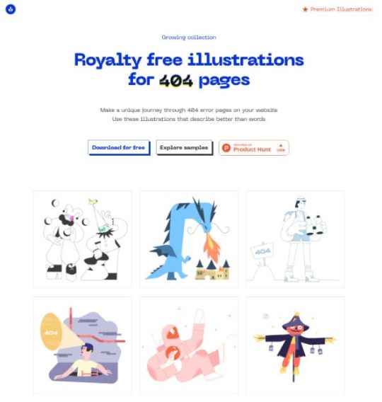
This source is awesome for finding illustrations you can use for your website's 404 page.
Blush

Blush allows you to download all their illustrations for free for commercial and personal use. It is amazing since it features many illustration styles that can be composed to create new ones. Also, they have a Figma plugin so you can immediately get working on them inside your designs.
Smash Illustrations

Smash Illustrations features trendy characters and simple illustrations for free in commercial and personal use. It features more than 250+ object and character, and 20+ unique scenes so you can compose them however you like.
Control
Control features high-quality illustrations in solid and linear style for free. They are free to use in commercial and personal use however they are in .png format. If you need SVGs then you will have to pay $38 which isn't that bad for illustrations of this quality.
DrawKit

DrawKit features 220+ free to use illustrations. They all come in SVG so you can create awesome compositions! Also, they offer animated illustrations using lottie which is huge for cool and sleek website development.
Open Doodles

If you are a fan of sketchy illustrations then you will love Open Doodles. All illustrations and free to download in SVG or PNG format. Also, they have a composition route and generator so you can get the doodles you need!
Free Illustrations
Free Illustrations feature many illustration backgrounds that are perfect for landing page development.
Mixkit
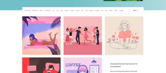
Mixkit is the Unsplash of illustrations, or that is their objective. It features many illustration categories and also stock videos and music, all free of charge.
Delesign
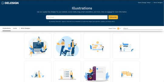
Delesign gives you many clean illustrations for free. Their main strong point is their diversity.
Development
Majestic

Majestic is a zero-config UI for Jest which makes it easier to see tests log output, instead of using purely the terminal. It can be installed globally or just be opened in any repository using npx majestic
Carbon

Carbon is useful if you want to share sleek images of code snippets inside a tweet or blog.
Squoosh
Compress your images will almost unnoticeable quality loss. Also, you can edit image size and how much quality is lost making it a must for optimizing images for your site.
SVGOMG
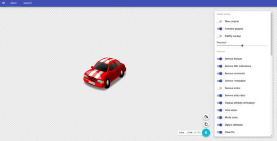
SVGOMG delivers a gui for optimizing your SVG files. Extremely important when working with SVGs for your site.
Kite
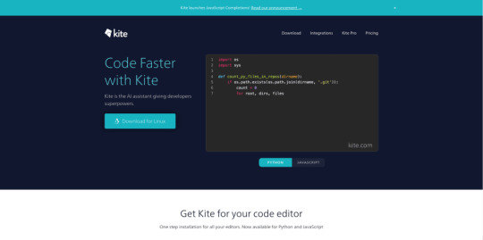
Kite is amazing for increasing your code productivity. I believe that in the future AI won't take our jobs but it will be augmented by tools like this. It offers autocompletion in your favorite editors using machine learning trained with 2+ million repositories. It currently works only with Python and Javascript, but shortly, more languages will be available.
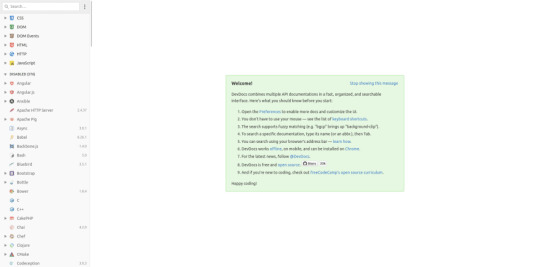
DevDocs
DevDocs is a documentation aggregator. It adds multiple libraries and API documentation in a clean and searchable interface. This is massive for general development so I highly recommend it.
DevHints

This website featured cheat sheets for many tools such as bash, React, go, sass, and many more.
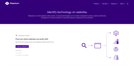
Wappalyzer
Want to know the stack of your favorite website? Say no more, Wappalyzer allows you to know fairly quickly. They also have an extension so you find these on the go.
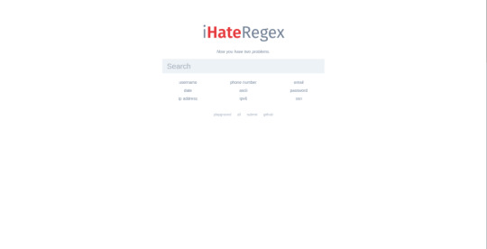
iHateRegex
This site is a holy grail for those that don't want to create their own regex or search all through google. Think of it as google for regex.
LottieFiles

Ever heard of Lottie? I had not until I found this website. Lottie is a library that allows you to parse and run animations exported from Adobe After Effects. These animations are beautiful and LottieFiles houses thousands of these for free. However, take into consideration most of them have a CC-BY 2.0 license.
Shape Divider
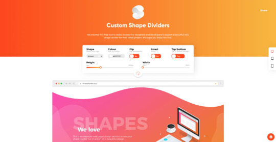
Shape Divider allows you to generate sleek dividers for your website on the fly. It features a cool UI compared to other sites and works very well.
CSS
Animista

Need some CSS animations inspiration or snippets? Animista got you covered. It features many cool CSS effects that can speed up your development.
Pattern.css
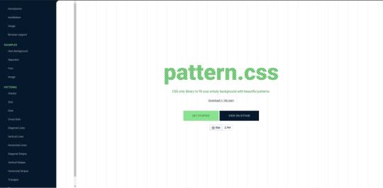
Love to use patterns in your design? Then you will love this one. It is a CSS library that makes distinct classes available for you to create awesome patterns for your website.
CSSeffectsSnippets
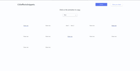
Nifty CSS animations for your website.
98.css
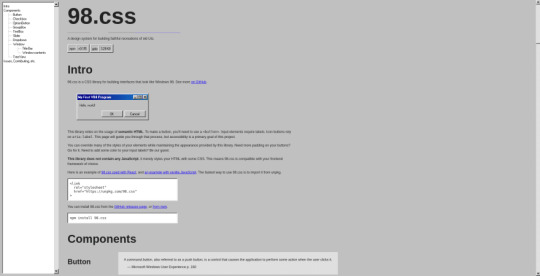
98.css lets your nostalgic fantasies come true. If you need to build a website or electron app with Windows 98 style then 98.css will greatly help you.
Tailwind
TailwindComponents

Tailwind is very popular these days, and sites like this show why. TailwindComponents feature hundreds of community-built components using tailwind.css. Some of these have a very high quality so be sure to check it out!
Tailblocks
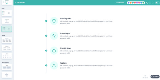
Tailblocks features more high-quality Tailwind components. However, they provide a similar experience to bootstrap so you can create a whole website using these. Absolutely a must to speed development.
Design
colors.lol

Need palettes that are overly descriptive? Colors.lol is the right place to go to find these. They feature 10+ of these palettes which can make your design more vibrant.
ColorMind
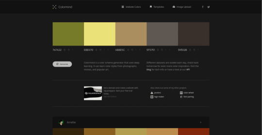
Colormind generates color schemes using deep learning. You can lock the colors and get others which complement that one.
Ucraft Logo Maker

This is my go-to whenever I need a quick logo for a side project. They feature thousands of icons that can help you create many logo combinations. For free commercial and personal use, they let you download a PNG version of your logo.
AppMockUp
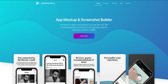
AppMockUp lets you generate mock-ups for Android and iPhones without much work. If you are a mobile developer be sure to check this one out.
Webframe
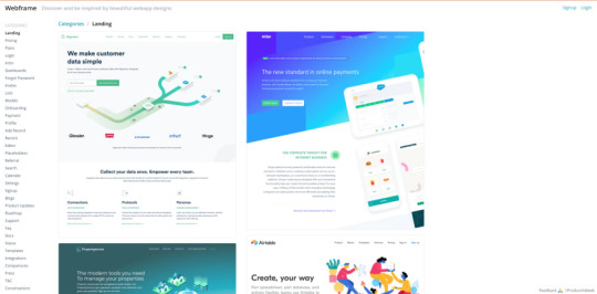
Webframe has thousands of design inspiration based on real websites.
FontSpark

FontSpark allows you to discover your next favorite font by generating different ones until you like it.
HackDesign

Have a lot of time and want to learn design? Then HackDesign is for you. This website features many lessons that can teach you what you need for becoming a designer.
Checklist Design

If you are designing or building a website these checklists can be a life-saver. They guarantee accessibility and great UX for different sections of your site such as forms, typography, buttons, and many more.
Remove BG

The title is pretty self-explanatory. This tool makes it a breeze to delete the background from your images so you can use it in your designs or website.
Unscreen
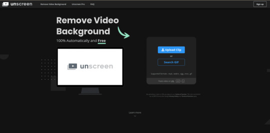
Just like remove.bg but for gifs and videos.
Productivity
Sejda
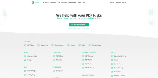
Sejda is provides an online sleek PDF editor. Awesome for editing your CV!
GetTerms

GetTerms generates a Privacy Policy and Terms of Service tailored for your app. This is awesome for saving time in when building a web product.
Top Hunts Time Machine

This tool allows you to see the most famous products featured in Product Hunt. If you want to find resources be sure to check this out monthly.
Notion
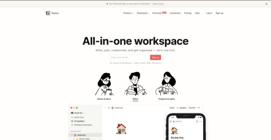
Notion is so good. So good that it is in fact my daily writing platform. I just love how clean and efficient it is for blogging and note-taking.
Writty
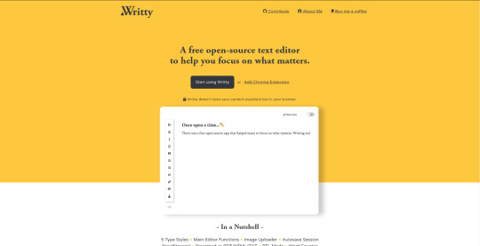
Need a super lean and sleek editor for writing? Then you will like Writty. It features a super simple editor that saves all you write inside your browser so you don't have to worry about it being exposed to the Internet so easily. Also, it is open-source which is a plus.
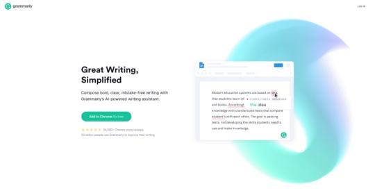
Grammarly
This is a must for writing anything on the Internet. I compare this tool to ESLint since it allows you to find errors before you even notice them. Developers can benefit from this whenever we are writing GitHub issue, a Stack Overflow question, ...
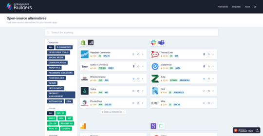
OpenSource Builders
OpenSource Builders offers many open-source alternatives to common products such as Facebook, Slack, Shopify, and many more.
Wave

If you are a freelancer or have your own business, Wave can help with accounting, invoicing, and receipts free on the web.
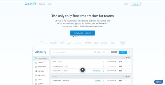
Clockify
A truly free time tracker for individuals and teams. Clockify allows you to log time easily and has many features for you to manage this data.
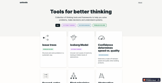
Untools
Untools features many thinking patters that can help you during programming.
Conclusion
I hope all of these resources can help you build better websites and apps as they have helped me! If you have another favorite resource, please write them up in the discussion below.
0 notes
Audio
テクニカルクリエイターを運用するディレクター・プランナーの小島 芳樹さん(@yoshikikoji) と、未来のデザインの仕方について話し合いました。スマホアプリだけでなく、音声や AR/VR などデジタルプロダクトに触れる機会が増えてきた現在。それに合わせてデザインツールの役割も変わってきています。ツールと同様、デザイナーはどうアップグレードしていくべきなのか伺いました。
TECHNICAL CREATOR
Quip
アイアンマン
J.A.R.V.I.S.
Building Jarvis
Echo Show - Black
勝間和代が徹底的にマニアックな話をアップするブログ
MagicBands
Avengers: Age of Ultron (2015)
Viv
InVision
Figma
Framer
なぜ今新しいデザインツールが必要なのか
Fuse
エンジニアと連携がとれる窓口がツールに欲しい
Prott
デザインが手軽に作れるようになることの弱点
デザインの仕方ではなくプロダクトの作り方
作ることに多くの時間を費やす仕事ではない
Code with Design — How we Built a Tool to Export React Prototypes from Sketch
デザイン組織のつくりかた
1 note
·
View note
Text
What’s New for Designers, August 2019

Some of the new tools in this month’s roundup are designed for productivity and getting ahead, from a tool that converts text to speech to a font that’s made for the winter holidays. That’s the whole point of new tools – to make our design lives that much easier. Here’s what’s new for designers this month.
Paaatterns
Paaatterns is a collection of vector patterns for backgrounds, fills, and anywhere you want an interesting design element. The patterns here are strong with bright colors and geo shapes. The collection is free to download and comes in multiple formats, including Sketch, Figma, XD, Illustrator as well as SVG and PNG.

Verby
Verby is a free text to speech tool that lets you create and download natural voices as MP3 files. The free version is even available for commercial use. This can be a valuable tool for websites or apps, online learning tools, video broadcasting, audiobook production, or communication accessibility. (There’s also a premium version with even more voice options.)

Dashblock
Dashblock uses a machine-learning model that can turn any website into an API. Go to a page, right-click on the data you want and save a custom API that you can query.

Rooki.design
Rooki.design is a magazine for design students and junior designers. It’s packed with features and resources to help rookies get acclimated into the design industry. Rooki.design is developed and managed by a student designer, Edoardo Rainoldi.

Gradient Magic
Gradient Magic is a huge gallery of CSS gradients in so many colors and styles that you might get lost browsing through all the combinations. Pick a style – standard, angular, stripes, checkered, burst – and color palette to get started. Then you can view and copy CSS for any selection you like.

Dynamic Charts
Dynamic Charts is a GitHub project that allows you to create animated charts and visualize data using React. Charts can use custom callbacks, labels, and allow you to run by command. There’s default styling that makes it easy to use, but you can go crazy with the design to make it your own.

Components AI
Components AI describes itself as an “experimental platform for exploring generative design systems.” It’s a neat concept that allows you to cycle through ideas and tweak designs until they are just right and then save and export for use.

Avant UI
Avant UI is a Bootstrap-based user interface kit that’s packed with sleek elements and animations. Everything is customizable, although the core design might be all you need. The UI kit includes almost every type of component you can imagine, including colors and gradients, buttons, inputs, dropdowns, alerts, tables, thumbnails, carosels, and more.

Tutorial: Phone Number Field Design Best Practices
It might be one of the most common fields in online forms, but do you ever stop to think about how phone number inputs work? Nick Babich has an excellent tutorial on how to best design these inputs for usability and efficiency. The tips include not splitting fields, using a country selector, and auto-formatting.

Money Vector Icons
Show me the money (icons)! This vector pack includes 50 icons that show currency, banks, and credit in three designed styles.

Stories Illustrations
Stories is an illustration kit with 11 vectors and characters that can tell a business story. The premium kit comes in AI and SVG format for easy use and manipulation.

Isometric
Isometric is a collection of free icon-style scenes that you can use in digital projects. Each illustration is an a true isometric style and SVG format featuring dozens of different designs.

jExcel v3
jExcel v3 is a tool to help you build spreadsheets online with columns, rows, and multiple data formats. From the developer: “jExcel is a lightweight vanilla javascript plugin to create amazing web-based interactive tables and spreadsheets compatible with Excel or any other spreadsheet software. You can create an online spreadsheet table from a JS array, JSON, CSV or XSLX files. You can copy from excel and paste straight to your jExcel spreadsheet and vice versa.”

Space Browser
Space Browser lets you organize all those unruly website tabs into smart folders that make it easy to go back to often used websites and track browsing history. You can also share and sync for collaboration with the tool.

Drama
Drama is a Mac app that’s still in beta and designed to help you draw user interfaces, create prototype, and make animations all in one location.

Font Awesome Duotone
Font Awesome now has a duotone option for Pro users. The style includes two-color options for over 1,600 icons.

Cocomat Pro
Cocomat Pro is a delightful grotesque style typeface with nice ligatures and interesting lines. The premium typeface includes a full family of styles and works for a variety of uses for almost all type elements.

Grinched 2.0
It’s never too early to start holiday planning. Save this font for those projects. Grinched 2.0 is a fun character-style typeface with a full character and number set.

Lansdowne Decorative Font
Lansdowne Decorative Font is just what you’d expect from the name. It includes all caps upper- and lowercase letters with tons of glyphs for personality in your typesetting. It has a vintage style that’s a fun option for light text and display use.

Mobstex
Mobstex is an uppercase handwriting style typeface with a light feel. The thin lines are somewhat elegant and provide visual interest.

Oliver
Oliver is a sans serif typeface featuring an uppercase character set in three weights. It could make a nice display option in light, regular, or bold.

Source from Webdesigner Depot https://ift.tt/2yRHUYU from Blogger https://ift.tt/2ZUcNaY
0 notes
Text
Building A Component Library With React And Emotion
About The Author
Front-end engineer passionate about performance and bleeding-edge technologies. More about Ademola …
A component library helps to keep a design consistent across multiple projects. It ensures consistency because any changes made will propagate across the projects that make use of it. In this tutorial, we’ll learn how to build a component library, using Emotion in React to resolve inconsistencies.
According to Clearleft, a component library is:
“A collection of components, organised in a meaningful manner, and often (but not necessarily) providing some way to browse and preview those components and their associated assets.”
— “On Building Component Libraries,” Clearleft
We’ll learn how to build a component library by making one that comprises four components:
Button A wrapper around the default HTML button
Box A container (HTML div) with custom properties
Columns A container whose children are spaced evenly across the x-axis
Stack A container whose children are spaced evenly across the y-axis
These components could then be used in whatever application we are working on. We’ll build the component library using React and Emotion.
At the end of this piece, you should be able to create a component library that fits whatever use case you have in mind. This knowledge will come handy when you’re working with a team that needs to make use of reusable components.
First, let’s get started by establishing what the Emotion library is. The documentation explains:
“Emotion is a library designed for writing CSS styles with JavaScript. It provides powerful and predictable style composition in addition to a great developer experience with features such as source maps, labels, and testing utilities.”
— “Introduction,” Emotion Docs
In essence, Emotion is a CSS-in-JavaScript library, and an interesting thing about CSS-in-JavaScript libraries is that they enable you to collocate components with styles. Being able to tie them up together in a scope ensures that some component styles don’t interfere with others, which is crucial to our component library.
Emotion exposes two APIs for React:
@emotion/core
@emotion/styled
Before we dive into how these APIs work, note that they both support the styling of components with template strings and objects.
The core API is actually like the regular style property we currently use today when building apps with React, with the addition of vendor prefixing, nested selectors, media queries, and more.
Using the object approach with the core API would typically look like this:
import { jsx } from '@emotion/core' let Box = props => { return ( <div css= {...props} /> ) }
This is a rather contrived example that shows how we could style a Box component with Emotion. It’s like swapping out the style property for a css property, and then we’re good to go.
Now, let’s see how we could use the template string approach with the same core API:
import { jsx, css } from '@emotion/core' let Box = props => { return ( <div css={css` background-color: grey `} {...props} /> ) }
All we did was wrap the template string with the css tag function, and Emotion handles the rest.
The styled API, which is built on the core API, takes a slightly different approach to styling components. This API is called with a particular HTML element or React component, and that element is called with an object or a template string that contains the styles for that element.
Let’s see how we could use the object approach with the styled API:
import styled from '@emotion/styled' const Box = styled.div({ backgroundColor: 'grey' });
Here is one way to use the styled API, which is an alternative to using the core API. The rendered outputs are the same.
Now, let’s see how we could use the template string approach using the styled API:
import styled from '@emotion/styled' const Box = styled.div` background-color: grey `
This achieves the same thing as the object approach, only with a template string this time.
We could use either the core API or the styled API when building components or an application. I prefer the styled approach for a component library for a couple of reasons:
It achieves a lot with few keystrokes.
It takes in an as prop, which helps with dynamically changing the HTML element from the call site. Let’s say we default to a paragraph element, and we need a header element because of semantics; we can pass the header element as a value to the as property.
Getting Started
To get started, let’s clone the setup scripts on GitHub, which we can do on the command line:
git clone [email protected]:smashingmagazine/component-library.git
This command copies the code in that repository to the component-library’s folder. It contains the code required to set up a component library, which includes Rollup to help bundle our library.
We currently have a components folder with an index.js file, which does nothing. We’ll be creating new folders under the components folder for each component we build in our library. Each component’s folder will expose the following files:
Component.js This is the component we’re building.
index.js This exports the component from Component.js and makes referencing components from a different location easier.
Component.story.js This essentially renders our component in its multiple states using Storybook.
It also ships with a utils folder, which defines certain properties that would be used in our components. The folder contains several files:
helpers.js This contains helper functions that we are going to be using across our application.
units.js This defines spacing and font-size units, which we will use later.
theme.js This defines our component library’s palette, shadows, typography, and shape.
Let’s look at what we’ve defined in the units.js file:
export const spacing = { none: 0, xxsmall: '4px', xsmall: '8px', small: '12px', medium: '20px', gutter: '24px', large: '32px', xlarge: '48px', xxlarge: '96px', }; export const fontSizes = { xsmall: '0.79rem', small: '0.889rem', medium: '1rem', large: '1.125rem', xlarge: '1.266rem', xxlarge: '1.424rem', };
This defines the spacing and fontSizes rules. The spacing rule was inspired by the Braid design system, which is based on multiples of four. The fontSizes are derived from the major second (1.125) type scale, which is a good scale for product websites. If you’re curious to learn more about type scale, “Exploring Responsive Type Scales” explains the value of knowing the scales appropriate for different websites.
Next, let’s through the theme.js file!
import { spacing } from './units'; const white = '#fff'; const black = '#111'; const palette = { common: { black, white, }, primary: { main: '#0070F3', light: '#146DD6', contrastText: white, }, error: { main: '#A51C30', light: '#A7333F', contrastText: white, }, grey: { 100: '#EAEAEA', 200: '#C9C5C5', 300: '#888', 400: '#666', }, }; const shadows = { 0: 'none', 1: '0px 5px 10px rgba(0, 0, 0, 0.12)', 2: '0px 8px 30px rgba(0, 0, 0, 0.24)', }; const typography = { fontFamily: "Inter, -apple-system, BlinkMacSystemFont, 'Segoe UI', Roboto, Ubuntu, 'Helvetica Neue', sans-serif", }; const shape = { borderRadius: spacing['xxsmall'], }; export const theme = { palette, shadows, typography, shape, };
In the theme file, we’ve defined our palette, which is essentially the colors we’re going to be using across all components in our library. We also have a shadows object, where we define our box-shadow values. There’s also the typography object, which currently just defines our fontFamily. Finally, shape is used for properties such as border-radius. This theme’s structure is inspired by Material-UI.
Next, our helpers.js file!
export const isObjectEmpty = (obj) => { return Object.keys(obj).length === 0; };
Here, we only expose the isObjectEmpty function, which takes in an object and returns true if the object is empty. It returns false if it has any values. We’re going to make use of this function later.
Now that we’ve gone through all of the files in the utils folder, it’s about time to start building our components!
Buttons
Buttons are one of the most used components on the web. They’re used everywhere and can take different forms, shapes, sizes, and more.
Here are the buttons we’re going to build in Figma.
Button component design from Figma (Large preview)
These subtle variations are going to be applied as properties to our button. We would like the buttons in our component library to accept properties such as variant, size, enableElevation (i.e. box-shadow), and color.
Starting with the button component, let’s create a Button folder, where we will define everything related to buttons, as discussed earlier.
Let’s create our button component:
import styled from '@emotion/styled'; import isPropValid from '@emotion/is-prop-valid'; const StyledButton = () => {}; const IGNORED_PROPS = ['color']; const buttonConfig = { shouldForwardProp: (prop) => isPropValid(prop) && !IGNORED_PROPS.includes(prop), }; export const Button = styled('button', buttonConfig)(StyledButton);
Here, we’ve started off by setting up our button component with a buttonConfig. The buttonConfig contains shouldForwardProp, which is used to control the properties that should be forwarded to the DOM, because properties such as color show up on the rendered element by default.
Next, let’s define our button sizes, which we’re going to use in the button component!
const buttonSizeProps = { small: { fontSize: fontSizes['xsmall'], padding: `${spacing['xsmall']} ${spacing['small']}`, }, medium: { fontSize: fontSizes['small'], padding: `${spacing['small']} ${spacing['medium']}`, }, large: { fontSize: fontSizes['medium'], padding: `${spacing['medium']} ${spacing['large']}`, }, };
buttonSizeProps is a map of our size values (small, medium, and large), and it returns fontSize and padding values based on the sizes. For a small button, we’d need a small font with small padding. The same goes for the medium and large sizes to scale them appropriately.
Next, let’s define a function that provides valid CSS properties based on the passed variant:
const getPropsByVariant = ({ variant, color, theme }) => { const colorInPalette = theme.palette[color]; const variants = { outline: colorInPalette ? outlineVariantPropsByPalette : defaultOutlineVariantProps, solid: colorInPalette ? solidVariantPropsByPalette : defaultSolidVariantProps, }; return variants[variant] || variants.solid; };
Here, the getPropsByVariant function takes in variant, color, and theme properties and returns the properties of the specified variant; if no variant is specified, it defaults to solid. colorInPalette retrieves the palette assigned to the specified color if found, and undefined if not found in our theme object.
In each variant, we check whether a palette actually exists for the color specified; if we don’t, then we use colors from the common and grey objects of our theme, which we will apply in defaultOutlineVariantProps and defaultSolidVariantProps.
Next, let’s define our variant properties!
const defaultSolidVariantProps = { main: { border: `1px solid ${theme.palette.grey[100]}`, backgroundColor: theme.palette.grey[100], color: theme.palette.common.black, }, hover: { border: `1px solid ${theme.palette.grey[200]}`, backgroundColor: theme.palette.grey[200], }, }; const defaultOutlineVariantProps = { main: { border: `1px solid ${theme.palette.common.black}`, backgroundColor: theme.palette.common.white, color: theme.palette.common.black, }, hover: { border: `1px solid ${theme.palette.common.black}`, backgroundColor: theme.palette.common.white, color: theme.palette.common.black, }, }; const solidVariantPropsByPalette = colorInPalette && { main: { border: `1px solid ${colorInPalette.main}`, backgroundColor: colorInPalette.main, color: colorInPalette.contrastText, }, hover: { border: `1px solid ${colorInPalette.light}`, backgroundColor: colorInPalette.light, }, }; const outlineVariantPropsByPalette = colorInPalette && { main: { border: `1px solid ${colorInPalette.main}`, backgroundColor: theme.palette.common.white, color: colorInPalette.main, }, hover: { border: `1px solid ${colorInPalette.light}`, backgroundColor: theme.palette.common.white, color: colorInPalette.light, }, };
Here, we define the properties that are going to be applied to our button based on the selected variants. And, as discussed earlier, defaultSolidVariantProps and defaultOutlineVariantProps use colors from our common and grey objects as fallbacks for when the color specified isn’t in our palette or when no color is specified for what we put in place.
By the way, the solidVariantPropsByPalette and outlineVariantPropsByPalette objects use the color from our palette as specified by the button. They both have main and hover properties that differentiate the button’s default and hover styles, respectively.
The button design we’ve used accounts for two variants, which we can check out in our component library design.
Next, let’s create our StyledButton function, which combines all we’ve done so far.
const StyledButton = ({ color, size, variant, enableElevation, disabled, theme, }) => { if (isObjectEmpty(theme)) { theme = defaultTheme; } const fontSizeBySize = buttonSizeProps[size]?.fontSize; const paddingBySize = buttonSizeProps[size]?.padding; const propsByVariant = getPropsByVariant({ variant, theme, color }); return { fontWeight: 500, cursor: 'pointer', opacity: disabled && 0.7, transition: 'all 0.3s linear', padding: buttonSizeProps.medium.padding, fontSize: buttonSizeProps.medium.fontSize, borderRadius: theme.shape.borderRadius, fontFamily: theme.typography.fontFamily, boxShadow: enableElevation && theme.shadows[1], ...(propsByVariant && propsByVariant.main), ...(paddingBySize && { padding: paddingBySize }), ...(fontSizeBySize && { fontSize: fontSizeBySize }), '&:hover': !disabled && { boxShadow: enableElevation && theme.shadows[2], ...(propsByVariant && propsByVariant.hover), }, }; };
In the StyledButton function, we’re assigning defaultTheme to the theme if the theme object is empty which makes it optional for the consumers of our library to use Emotion’s ThemeProvider in order to make use of the library. We assigned fontSize and padding based on the buttonSizeProps object. We defined several default button properties, such as fontWeight and cursor, which aren’t tied to any property, and we also derived color, backgroundColor, and border values based on the result of propsByVariant.
Now that we’ve created our Button component, let’s see how we can use it:
<Button variant="solid" color="primary" size="small" enableElevation disabled > Small Outline Elevated Button </Button>
We can check what that looks like on CodeSandbox:
That’s how to use the Button component. We define the following properties:
We define a variant with a solid value. We could have specified outline instead. If the variant prop isn’t provided, we would also default to solid.
We define color, with a value of primary. We also support error as a color value or a color from a theme object. If the color property isn’t specified, we would fall back to our default color state.
We define size, with a value of small. It could be medium (the default) or large.
We define EnableElevation because we want some box-shadow on our button. We could have chosen not to use it.
Finally, we define disabled because we want our button to be disabled. The additional thing we do to a disabled button is reduce its opacity.
The button doesn’t need to take any property. It defaults to a solid medium-sized button.
Box Component
A box component is a container that can hold any component or HTML element. It accepts but is not limited to properties such as padding, margin, display, and width. It can also be used as a base component for some of the other components we’ll get into later.
Here’s what it looks like on Figma:
Box component design from Figma (Large preview)
Before diving into the code, let’s not forget to create a new folder for this component.
Now, let’s create our Box component:
import styled from '@emotion/styled'; import isPropValid from '@emotion/is-prop-valid'; import { spacing, theme as defaultTheme } from '../../utils'; const StyledBox = ({ paddingX, paddingY, marginX, marginY, width, display, theme, ...props }) => { if (isObjectEmpty(theme)) { theme = defaultTheme; } const padding = spacing[props.padding]; let paddingTop = spacing[props.paddingTop]; let paddingRight = spacing[props.paddingRight]; let paddingBottom = spacing[props.paddingBottom]; let paddingLeft = spacing[props.paddingLeft]; if (paddingX) { paddingLeft = spacing[paddingX]; paddingRight = spacing[paddingX]; } if (paddingY) { paddingTop = spacing[paddingY]; paddingBottom = spacing[paddingY]; } let margin = spacing[props.margin]; let marginTop = spacing[props.marginTop]; let marginRight = spacing[props.marginRight]; let marginBottom = spacing[props.marginBottom]; let marginLeft = spacing[props.marginLeft]; if (marginX) { marginLeft = spacing[marginX]; marginRight = spacing[marginX]; } if (marginY) { marginTop = spacing[marginY]; marginBottom = spacing[marginY]; } return { padding, paddingTop, paddingRight, paddingBottom, paddingLeft, margin, marginTop, marginRight, marginBottom, marginLeft, width, display, fontFamily: theme.typography.fontFamily, }; }; const IGNORED_PROPS = ['display', 'width']; const boxConfig = { shouldForwardProp: (prop) => isPropValid(prop) && !IGNORED_PROPS.includes(prop), }; export const Box = styled('div', boxConfig)(StyledBox);
The spacing rule we defined earlier is being applied to both padding and margin, as we can see in the Box component. We receive contextual values for padding and margin, and we look up their actual values from the spacing object.
We accept paddingX and paddingY props to update padding across the horizontal and vertical axis, respectively. We do the same for marginX and marginY as well.
Also, we don’t want the display and width props to get forwarded to the DOM because we only need them in CSS. So, we add them to our list of props to ignore, and pass that on to our config.
Here’s how we could use the Box component:
<Box padding="small" paddingTop="medium" paddingBottom="medium" > Simple Box Component </Box>
We can see what this looks like on CodeSandbox.
In this Box component, we’ve assigned small as a value to our padding property, and medium to the paddingTop and paddingBottom properties. When rendered, the Box component will have its padding-left and padding-right properties set to 12px each, and its padding-top and padding-bottom properties set to 20px. We could have replaced paddingTop and paddingBottom with paddingY and gotten the same result.
Columns Component
The Columns component is a variation of our Box component, with a display type of flex and with children spaced evenly across the x-axis.
Here is a representation of the Columns component in Figma:
Columns component design from Figma (Large preview)
Let’s build our Columns component!
import React from 'react'; import { Box } from '../Box'; export const Columns = ({ children, space, ...props }) => { return ( <Box display="flex" {...props}> {React.Children.map(children, (child, index) => { if (child.type !== Box) { console.warn( 'Each child in a Columns component should be a Box component' ); } if (index > 0) { return React.cloneElement(child, { marginLeft: space, width: '100%', }); } return React.cloneElement(child, { width: '100%' }); })} </Box> ); };
We’re using React.Children to map over the Columns component’s children. And we’re adding marginLeft and width properties to each of the children, except the first child, which doesn’t need a marginLeft property because it’s the leftmost child in the column. We expect each child to be a Box element to ensure that the necessary styles are applied to it.
Here’s how we could use the Columns component:
<Columns space="small"> <Box> Item 1</Box> <Box> Item 2</Box> <Box> Item 3</Box> </Columns>
We can see what that looks like on CodeSandbox.
The Columns children here are spaced evenly across the x-axis by 12 pixels because that’s what the value of small resolves to, as we’ve defined earlier. Because the Columns component is literally a Box component, it can take in other Box component properties, and we can customize it as much as we want.
Stack Component
This is also a variation of our Box component that takes the full width of the parent element and whose children are spaced evenly across the y-axis.
Here is a representation of the Stack component in Figma:
Stack component design from Figma (Large preview)
Let’s build our Stack component:
import React from 'react'; import { Box } from '../Box'; import { Columns } from '../Columns'; const StackChildrenTypes = [Box, Columns]; const UnsupportedChildTypeWarning = 'Each child in a Stack component should be one of the types: Box, Columns'; export const Stack = ({ children, space, ...props }) => { return ( <Box {...props}> {React.Children.map(children, (child, index) => { if (!StackChildrenTypes.includes(child.type)) { console.warn(UnsupportedChildTypeWarning); } if (index > 0) { return React.cloneElement(child, { marginTop: space }); } return child; })} </Box> ); };
Here, we map over each child with React.Children and apply a paddingTop property to it with the value of the space argument. As for the first child, we need it to take its original position, so we skip adding a marginTop property to it. We also accept each child to be a Box so that we can apply the necessary properties to it.
Here’s how we could use the Stack component:
<Stack space="small"> <Box marginTop="medium"> Item 1</Box> <Box> Item 2</Box> <Box> Item 3</Box> </Stack>
We can see what that looks like on CodeSandbox.
Here, the Box elements are spaced evenly with the small unit, and the first Box takes a separate marginTop property. This shows that you can customize components however you wish.
Conclusion
We’ve gone through the basics of using Emotion to create components in React using the APIs that it provides. This is just one of many ways to go about building a component library. There are some nuances to building it for a brand because you might not have to take theming and some other things into consideration. But if you plan to release the library to the public one day, then you’ll have to deal with requests for those missing pieces, so consider that possibility and make the library a little flexible ahead of time.
If you have any questions, feel free to drop them as comments.
The repository for this article is on GitHub, and the button designs we’ve used are on Figma.
References
(ks, ra, al, il)
Website Design & SEO Delray Beach by DBL07.co
Delray Beach SEO
source http://www.scpie.org/building-a-component-library-with-react-and-emotion/ source https://scpie1.blogspot.com/2020/09/building-component-library-with-react.html
0 notes
Text
Convert Figma Design into React
You can convert Figma to React with CopyCat in 5 easy steps: -
Download the CopyCat plugin on Figma
Open your design and open the plugin on Figma
Insert the file URL
Select the frame you want to convert to React and code is automatically generated
Preview, edit if necessary, and export code to production
Here is a video for your convenience: https://www.youtube.com/watch?v=Z50x1GgJwUk
0 notes
Text
Building A Component Library With React And Emotion
About The Author
Front-end engineer passionate about performance and bleeding-edge technologies. More about Ademola …
A component library helps to keep a design consistent across multiple projects. It ensures consistency because any changes made will propagate across the projects that make use of it. In this tutorial, we’ll learn how to build a component library, using Emotion in React to resolve inconsistencies.
According to Clearleft, a component library is:
“A collection of components, organised in a meaningful manner, and often (but not necessarily) providing some way to browse and preview those components and their associated assets.”
— “On Building Component Libraries,” Clearleft
We’ll learn how to build a component library by making one that comprises four components:
Button A wrapper around the default HTML button
Box A container (HTML div) with custom properties
Columns A container whose children are spaced evenly across the x-axis
Stack A container whose children are spaced evenly across the y-axis
These components could then be used in whatever application we are working on. We’ll build the component library using React and Emotion.
At the end of this piece, you should be able to create a component library that fits whatever use case you have in mind. This knowledge will come handy when you’re working with a team that needs to make use of reusable components.
First, let’s get started by establishing what the Emotion library is. The documentation explains:
“Emotion is a library designed for writing CSS styles with JavaScript. It provides powerful and predictable style composition in addition to a great developer experience with features such as source maps, labels, and testing utilities.”
— “Introduction,” Emotion Docs
In essence, Emotion is a CSS-in-JavaScript library, and an interesting thing about CSS-in-JavaScript libraries is that they enable you to collocate components with styles. Being able to tie them up together in a scope ensures that some component styles don’t interfere with others, which is crucial to our component library.
Emotion exposes two APIs for React:
@emotion/core
@emotion/styled
Before we dive into how these APIs work, note that they both support the styling of components with template strings and objects.
The core API is actually like the regular style property we currently use today when building apps with React, with the addition of vendor prefixing, nested selectors, media queries, and more.
Using the object approach with the core API would typically look like this:
import { jsx } from '@emotion/core' let Box = props => { return ( <div css= {...props} /> ) }
This is a rather contrived example that shows how we could style a Box component with Emotion. It’s like swapping out the style property for a css property, and then we’re good to go.
Now, let’s see how we could use the template string approach with the same core API:
import { jsx, css } from '@emotion/core' let Box = props => { return ( <div css={css` background-color: grey `} {...props} /> ) }
All we did was wrap the template string with the css tag function, and Emotion handles the rest.
The styled API, which is built on the core API, takes a slightly different approach to styling components. This API is called with a particular HTML element or React component, and that element is called with an object or a template string that contains the styles for that element.
Let’s see how we could use the object approach with the styled API:
import styled from '@emotion/styled' const Box = styled.div({ backgroundColor: 'grey' });
Here is one way to use the styled API, which is an alternative to using the core API. The rendered outputs are the same.
Now, let’s see how we could use the template string approach using the styled API:
import styled from '@emotion/styled' const Box = styled.div` background-color: grey `
This achieves the same thing as the object approach, only with a template string this time.
We could use either the core API or the styled API when building components or an application. I prefer the styled approach for a component library for a couple of reasons:
It achieves a lot with few keystrokes.
It takes in an as prop, which helps with dynamically changing the HTML element from the call site. Let’s say we default to a paragraph element, and we need a header element because of semantics; we can pass the header element as a value to the as property.
Getting Started
To get started, let’s clone the setup scripts on GitHub, which we can do on the command line:
git clone [email protected]:smashingmagazine/component-library.git
This command copies the code in that repository to the component-library’s folder. It contains the code required to set up a component library, which includes Rollup to help bundle our library.
We currently have a components folder with an index.js file, which does nothing. We’ll be creating new folders under the components folder for each component we build in our library. Each component’s folder will expose the following files:
Component.js This is the component we’re building.
index.js This exports the component from Component.js and makes referencing components from a different location easier.
Component.story.js This essentially renders our component in its multiple states using Storybook.
It also ships with a utils folder, which defines certain properties that would be used in our components. The folder contains several files:
helpers.js This contains helper functions that we are going to be using across our application.
units.js This defines spacing and font-size units, which we will use later.
theme.js This defines our component library’s palette, shadows, typography, and shape.
Let’s look at what we’ve defined in the units.js file:
export const spacing = { none: 0, xxsmall: '4px', xsmall: '8px', small: '12px', medium: '20px', gutter: '24px', large: '32px', xlarge: '48px', xxlarge: '96px', }; export const fontSizes = { xsmall: '0.79rem', small: '0.889rem', medium: '1rem', large: '1.125rem', xlarge: '1.266rem', xxlarge: '1.424rem', };
This defines the spacing and fontSizes rules. The spacing rule was inspired by the Braid design system, which is based on multiples of four. The fontSizes are derived from the major second (1.125) type scale, which is a good scale for product websites. If you’re curious to learn more about type scale, “Exploring Responsive Type Scales” explains the value of knowing the scales appropriate for different websites.
Next, let’s through the theme.js file!
import { spacing } from './units'; const white = '#fff'; const black = '#111'; const palette = { common: { black, white, }, primary: { main: '#0070F3', light: '#146DD6', contrastText: white, }, error: { main: '#A51C30', light: '#A7333F', contrastText: white, }, grey: { 100: '#EAEAEA', 200: '#C9C5C5', 300: '#888', 400: '#666', }, }; const shadows = { 0: 'none', 1: '0px 5px 10px rgba(0, 0, 0, 0.12)', 2: '0px 8px 30px rgba(0, 0, 0, 0.24)', }; const typography = { fontFamily: "Inter, -apple-system, BlinkMacSystemFont, 'Segoe UI', Roboto, Ubuntu, 'Helvetica Neue', sans-serif", }; const shape = { borderRadius: spacing['xxsmall'], }; export const theme = { palette, shadows, typography, shape, };
In the theme file, we’ve defined our palette, which is essentially the colors we’re going to be using across all components in our library. We also have a shadows object, where we define our box-shadow values. There’s also the typography object, which currently just defines our fontFamily. Finally, shape is used for properties such as border-radius. This theme’s structure is inspired by Material-UI.
Next, our helpers.js file!
export const isObjectEmpty = (obj) => { return Object.keys(obj).length === 0; };
Here, we only expose the isObjectEmpty function, which takes in an object and returns true if the object is empty. It returns false if it has any values. We’re going to make use of this function later.
Now that we’ve gone through all of the files in the utils folder, it’s about time to start building our components!
Buttons
Buttons are one of the most used components on the web. They’re used everywhere and can take different forms, shapes, sizes, and more.
Here are the buttons we’re going to build in Figma.
Button component design from Figma (Large preview)
These subtle variations are going to be applied as properties to our button. We would like the buttons in our component library to accept properties such as variant, size, enableElevation (i.e. box-shadow), and color.
Starting with the button component, let’s create a Button folder, where we will define everything related to buttons, as discussed earlier.
Let’s create our button component:
import styled from '@emotion/styled'; import isPropValid from '@emotion/is-prop-valid'; const StyledButton = () => {}; const IGNORED_PROPS = ['color']; const buttonConfig = { shouldForwardProp: (prop) => isPropValid(prop) && !IGNORED_PROPS.includes(prop), }; export const Button = styled('button', buttonConfig)(StyledButton);
Here, we’ve started off by setting up our button component with a buttonConfig. The buttonConfig contains shouldForwardProp, which is used to control the properties that should be forwarded to the DOM, because properties such as color show up on the rendered element by default.
Next, let’s define our button sizes, which we’re going to use in the button component!
const buttonSizeProps = { small: { fontSize: fontSizes['xsmall'], padding: `${spacing['xsmall']} ${spacing['small']}`, }, medium: { fontSize: fontSizes['small'], padding: `${spacing['small']} ${spacing['medium']}`, }, large: { fontSize: fontSizes['medium'], padding: `${spacing['medium']} ${spacing['large']}`, }, };
buttonSizeProps is a map of our size values (small, medium, and large), and it returns fontSize and padding values based on the sizes. For a small button, we’d need a small font with small padding. The same goes for the medium and large sizes to scale them appropriately.
Next, let’s define a function that provides valid CSS properties based on the passed variant:
const getPropsByVariant = ({ variant, color, theme }) => { const colorInPalette = theme.palette[color]; const variants = { outline: colorInPalette ? outlineVariantPropsByPalette : defaultOutlineVariantProps, solid: colorInPalette ? solidVariantPropsByPalette : defaultSolidVariantProps, }; return variants[variant] || variants.solid; };
Here, the getPropsByVariant function takes in variant, color, and theme properties and returns the properties of the specified variant; if no variant is specified, it defaults to solid. colorInPalette retrieves the palette assigned to the specified color if found, and undefined if not found in our theme object.
In each variant, we check whether a palette actually exists for the color specified; if we don’t, then we use colors from the common and grey objects of our theme, which we will apply in defaultOutlineVariantProps and defaultSolidVariantProps.
Next, let’s define our variant properties!
const defaultSolidVariantProps = { main: { border: `1px solid ${theme.palette.grey[100]}`, backgroundColor: theme.palette.grey[100], color: theme.palette.common.black, }, hover: { border: `1px solid ${theme.palette.grey[200]}`, backgroundColor: theme.palette.grey[200], }, }; const defaultOutlineVariantProps = { main: { border: `1px solid ${theme.palette.common.black}`, backgroundColor: theme.palette.common.white, color: theme.palette.common.black, }, hover: { border: `1px solid ${theme.palette.common.black}`, backgroundColor: theme.palette.common.white, color: theme.palette.common.black, }, }; const solidVariantPropsByPalette = colorInPalette && { main: { border: `1px solid ${colorInPalette.main}`, backgroundColor: colorInPalette.main, color: colorInPalette.contrastText, }, hover: { border: `1px solid ${colorInPalette.light}`, backgroundColor: colorInPalette.light, }, }; const outlineVariantPropsByPalette = colorInPalette && { main: { border: `1px solid ${colorInPalette.main}`, backgroundColor: theme.palette.common.white, color: colorInPalette.main, }, hover: { border: `1px solid ${colorInPalette.light}`, backgroundColor: theme.palette.common.white, color: colorInPalette.light, }, };
Here, we define the properties that are going to be applied to our button based on the selected variants. And, as discussed earlier, defaultSolidVariantProps and defaultOutlineVariantProps use colors from our common and grey objects as fallbacks for when the color specified isn’t in our palette or when no color is specified for what we put in place.
By the way, the solidVariantPropsByPalette and outlineVariantPropsByPalette objects use the color from our palette as specified by the button. They both have main and hover properties that differentiate the button’s default and hover styles, respectively.
The button design we’ve used accounts for two variants, which we can check out in our component library design.
Next, let’s create our StyledButton function, which combines all we’ve done so far.
const StyledButton = ({ color, size, variant, enableElevation, disabled, theme, }) => { if (isObjectEmpty(theme)) { theme = defaultTheme; } const fontSizeBySize = buttonSizeProps[size]?.fontSize; const paddingBySize = buttonSizeProps[size]?.padding; const propsByVariant = getPropsByVariant({ variant, theme, color }); return { fontWeight: 500, cursor: 'pointer', opacity: disabled && 0.7, transition: 'all 0.3s linear', padding: buttonSizeProps.medium.padding, fontSize: buttonSizeProps.medium.fontSize, borderRadius: theme.shape.borderRadius, fontFamily: theme.typography.fontFamily, boxShadow: enableElevation && theme.shadows[1], ...(propsByVariant && propsByVariant.main), ...(paddingBySize && { padding: paddingBySize }), ...(fontSizeBySize && { fontSize: fontSizeBySize }), '&:hover': !disabled && { boxShadow: enableElevation && theme.shadows[2], ...(propsByVariant && propsByVariant.hover), }, }; };
In the StyledButton function, we’re assigning defaultTheme to the theme if the theme object is empty which makes it optional for the consumers of our library to use Emotion’s ThemeProvider in order to make use of the library. We assigned fontSize and padding based on the buttonSizeProps object. We defined several default button properties, such as fontWeight and cursor, which aren’t tied to any property, and we also derived color, backgroundColor, and border values based on the result of propsByVariant.
Now that we’ve created our Button component, let’s see how we can use it:
<Button variant="solid" color="primary" size="small" enableElevation disabled > Small Outline Elevated Button </Button>
We can check what that looks like on CodeSandbox:
That’s how to use the Button component. We define the following properties:
We define a variant with a solid value. We could have specified outline instead. If the variant prop isn’t provided, we would also default to solid.
We define color, with a value of primary. We also support error as a color value or a color from a theme object. If the color property isn’t specified, we would fall back to our default color state.
We define size, with a value of small. It could be medium (the default) or large.
We define EnableElevation because we want some box-shadow on our button. We could have chosen not to use it.
Finally, we define disabled because we want our button to be disabled. The additional thing we do to a disabled button is reduce its opacity.
The button doesn’t need to take any property. It defaults to a solid medium-sized button.
Box Component
A box component is a container that can hold any component or HTML element. It accepts but is not limited to properties such as padding, margin, display, and width. It can also be used as a base component for some of the other components we’ll get into later.
Here’s what it looks like on Figma:
Box component design from Figma (Large preview)
Before diving into the code, let’s not forget to create a new folder for this component.
Now, let’s create our Box component:
import styled from '@emotion/styled'; import isPropValid from '@emotion/is-prop-valid'; import { spacing, theme as defaultTheme } from '../../utils'; const StyledBox = ({ paddingX, paddingY, marginX, marginY, width, display, theme, ...props }) => { if (isObjectEmpty(theme)) { theme = defaultTheme; } const padding = spacing[props.padding]; let paddingTop = spacing[props.paddingTop]; let paddingRight = spacing[props.paddingRight]; let paddingBottom = spacing[props.paddingBottom]; let paddingLeft = spacing[props.paddingLeft]; if (paddingX) { paddingLeft = spacing[paddingX]; paddingRight = spacing[paddingX]; } if (paddingY) { paddingTop = spacing[paddingY]; paddingBottom = spacing[paddingY]; } let margin = spacing[props.margin]; let marginTop = spacing[props.marginTop]; let marginRight = spacing[props.marginRight]; let marginBottom = spacing[props.marginBottom]; let marginLeft = spacing[props.marginLeft]; if (marginX) { marginLeft = spacing[marginX]; marginRight = spacing[marginX]; } if (marginY) { marginTop = spacing[marginY]; marginBottom = spacing[marginY]; } return { padding, paddingTop, paddingRight, paddingBottom, paddingLeft, margin, marginTop, marginRight, marginBottom, marginLeft, width, display, fontFamily: theme.typography.fontFamily, }; }; const IGNORED_PROPS = ['display', 'width']; const boxConfig = { shouldForwardProp: (prop) => isPropValid(prop) && !IGNORED_PROPS.includes(prop), }; export const Box = styled('div', boxConfig)(StyledBox);
The spacing rule we defined earlier is being applied to both padding and margin, as we can see in the Box component. We receive contextual values for padding and margin, and we look up their actual values from the spacing object.
We accept paddingX and paddingY props to update padding across the horizontal and vertical axis, respectively. We do the same for marginX and marginY as well.
Also, we don’t want the display and width props to get forwarded to the DOM because we only need them in CSS. So, we add them to our list of props to ignore, and pass that on to our config.
Here’s how we could use the Box component:
<Box padding="small" paddingTop="medium" paddingBottom="medium" > Simple Box Component </Box>
We can see what this looks like on CodeSandbox.
In this Box component, we’ve assigned small as a value to our padding property, and medium to the paddingTop and paddingBottom properties. When rendered, the Box component will have its padding-left and padding-right properties set to 12px each, and its padding-top and padding-bottom properties set to 20px. We could have replaced paddingTop and paddingBottom with paddingY and gotten the same result.
Columns Component
The Columns component is a variation of our Box component, with a display type of flex and with children spaced evenly across the x-axis.
Here is a representation of the Columns component in Figma:
Columns component design from Figma (Large preview)
Let’s build our Columns component!
import React from 'react'; import { Box } from '../Box'; export const Columns = ({ children, space, ...props }) => { return ( <Box display="flex" {...props}> {React.Children.map(children, (child, index) => { if (child.type !== Box) { console.warn( 'Each child in a Columns component should be a Box component' ); } if (index > 0) { return React.cloneElement(child, { marginLeft: space, width: '100%', }); } return React.cloneElement(child, { width: '100%' }); })} </Box> ); };
We’re using React.Children to map over the Columns component’s children. And we’re adding marginLeft and width properties to each of the children, except the first child, which doesn’t need a marginLeft property because it’s the leftmost child in the column. We expect each child to be a Box element to ensure that the necessary styles are applied to it.
Here’s how we could use the Columns component:
<Columns space="small"> <Box> Item 1</Box> <Box> Item 2</Box> <Box> Item 3</Box> </Columns>
We can see what that looks like on CodeSandbox.
The Columns children here are spaced evenly across the x-axis by 12 pixels because that’s what the value of small resolves to, as we’ve defined earlier. Because the Columns component is literally a Box component, it can take in other Box component properties, and we can customize it as much as we want.
Stack Component
This is also a variation of our Box component that takes the full width of the parent element and whose children are spaced evenly across the y-axis.
Here is a representation of the Stack component in Figma:
Stack component design from Figma (Large preview)
Let’s build our Stack component:
import React from 'react'; import { Box } from '../Box'; import { Columns } from '../Columns'; const StackChildrenTypes = [Box, Columns]; const UnsupportedChildTypeWarning = 'Each child in a Stack component should be one of the types: Box, Columns'; export const Stack = ({ children, space, ...props }) => { return ( <Box {...props}> {React.Children.map(children, (child, index) => { if (!StackChildrenTypes.includes(child.type)) { console.warn(UnsupportedChildTypeWarning); } if (index > 0) { return React.cloneElement(child, { marginTop: space }); } return child; })} </Box> ); };
Here, we map over each child with React.Children and apply a paddingTop property to it with the value of the space argument. As for the first child, we need it to take its original position, so we skip adding a marginTop property to it. We also accept each child to be a Box so that we can apply the necessary properties to it.
Here’s how we could use the Stack component:
<Stack space="small"> <Box marginTop="medium"> Item 1</Box> <Box> Item 2</Box> <Box> Item 3</Box> </Stack>
We can see what that looks like on CodeSandbox.
Here, the Box elements are spaced evenly with the small unit, and the first Box takes a separate marginTop property. This shows that you can customize components however you wish.
Conclusion
We’ve gone through the basics of using Emotion to create components in React using the APIs that it provides. This is just one of many ways to go about building a component library. There are some nuances to building it for a brand because you might not have to take theming and some other things into consideration. But if you plan to release the library to the public one day, then you’ll have to deal with requests for those missing pieces, so consider that possibility and make the library a little flexible ahead of time.
If you have any questions, feel free to drop them as comments.
The repository for this article is on GitHub, and the button designs we’ve used are on Figma.
References
(ks, ra, al, il)
Website Design & SEO Delray Beach by DBL07.co
Delray Beach SEO
source http://www.scpie.org/building-a-component-library-with-react-and-emotion/ source https://scpie.tumblr.com/post/628442900986003456
0 notes