#filter because
Text

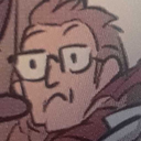
im not particularly religious but i think it’s very cute that Trans Day of Visibility and Easter are on the same day this year :)
its no question that something like this could be triggering or upsetting to a number of queer ppl given the current sociopolitical climate, so i want everyone to remember that u are loved! Regardless of what u or others believe, there are ppl who will love and support you always. Give yourself patience and treat yourself with care!!!
happy and peaceful TDOV everyone!! And Easter to those who celebrate :D
#sorry for treating Jesus like an anime character#trans day of visibility#tdov#easter#Jesus is actually very fun to draw#I have no idea how to tag this because what do I even say#lgbtqia#religion#Jesus#christianity#christian imagery#sorry for all the tags I just wanna make sure ppl can filter this if they don’t wanna see it lol#i drawd this
15K notes
·
View notes
Text
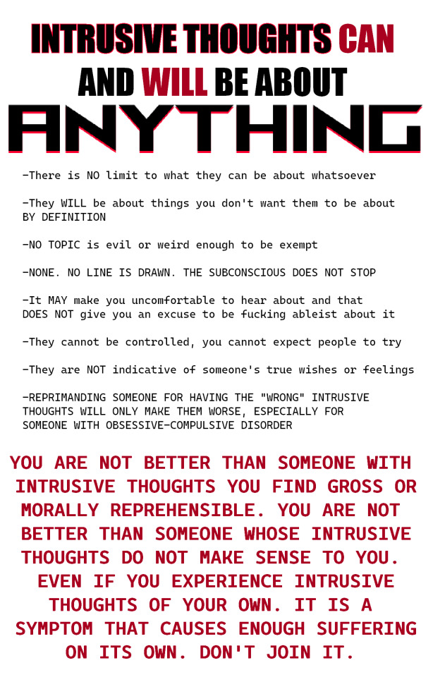
For this Disability Pride Month, I saw a post that was shittybad and it made me angry. So have this
#that one person was right OCD is NOT fucking de-stigmatized#intrusive thoughts aren't exclusive to OCD though I'm just tagging those because that's how I got on the topic#ocd#actually ocd#intrusive thoughts#in case anyone needs to filter stuff like this ->#all caps#bold text#ask to tag
26K notes
·
View notes
Text

dramatic eyes. dramatic lips. drama on the cheeks.
sketch
#the fuck's a look??#this show keeps making me cry happy tears#this show made me cry last season when ed and stede kissed. Now I'm crying because LOOK AT IZZY! LOOK AT WEE JOHN!!!#please for the love of god only look at this with the night light filter on. forgot my screen was tinted yellow and the colors are FUCKEDDD#ya ya It’s la vie en rose I didn’t check my references my b my b je regrette ok#our flag means death#ofmd#our flag means death spoilers#ofmd season 2#izzy hands#wee john feeney#ofmd s2e6#this show brings me so much joy especially now when everything is so hard in real life.#they just get to be queer with their pirate friends#skdfjhskhgjfnlisadfhlksjdfh;sk#art#fan art#the first time in a while I've been inspired to make art :_) I love
7K notes
·
View notes
Text
due to the amount of blogs i follow, the length of time i have had tumblr and the amount of fandoms i have been in, i really see a range of opinions on this over my dash so its time for a poll:
* please be nice to each other in the notes, this poll is purely for my own curiosity because i see such a varied range of opinions of her on this site and not because i want to cause drama!
** im well aware this poll will probably be biased because in my experience, once the swiftie side of tumblr gets a hold of a poll, thats when it gets the most reblogs, so if youre not a swiftie seeing this, please reblog to help get a bigger sample size (thats not to say swifties cant reblog this though, please do!!)
*** i wanted to add more categories cos i get that peoples opinions are more nuanced but im limited by the tumblr poll format lol, so if none of these fit, select the closest option and explain in the tags!
#polls#i won't add any other tags because i think certain people will have certain tags filtered#and i want this to reach as many people as possible#this is either gonna flop or im really gonna regret making it lmao
8K notes
·
View notes
Text
This might seem like an "old man yells at cloud" situation, but it's just wild growing up and being told how dangerous distracted driving is - how, at highway speeds, you can traverse the length of a football field (100 yards, 91 meters) in a matter of seconds - how one split second sending a text while driving could result in a potential fatal crash, and then getting on the road as a driver and being surrounded by billboards. Their entire purpose is to catch one's attention, so they're lining major roads, which tend to be highways. How is it that you're told how important it is to never be distracted while driving, but still being advertised to?
At best, this type of advertising is an eyesore to pedestrians and motorists and a general waste of electricity to light it, and at worst, it is an active danger considering they are there to advertise and therefore, must catch people's attention.
I'm not even against advertising in theory, but this particular mode bothers me so much and I hate how pervasive it is - especially in large cities or highways.
#politics#i don't know much about são paulo banning marketing billboards but on paper i want that here in the USA#as a motorist it at best just makes me more anxious driving in those larger cities because i want to FOCUS ON THE ROAD#and passing 5000 billboards per mile isn't helping actually!#i've gotten good at filtering that out of my FOV but it's still fucking exhausting lol#i especially hate those modern electric billboards. despise them actually#i am aware that advertising is a critical aspect to business management in some cases...#...but it shouldn't risk the safety of the populous for you to advertise to them and i see things like billboards as risking safety...#...i feel similarly about online advertising in that so much of it risks internet user's safety...#...such as flashing ads online which risk triggering epileptic seizures in light/photo-sensitive folks#distracted driving (texting): NO >:( || distracted driving (being advertised to): YAYYYY :D#i've been driving on my own for a few years now and i've been thinking about this for ENTIRELY too long
3K notes
·
View notes
Text
I think 90% of my gripes with how modern anime looks comes down to flat color design/palettes.
Non-cohesive, washed-out color palettes can destroy lineart quality. I see this all the time when comparing an anime's lineart/layout to its colored/post-processed final product and it's heartbreaking. Compare this pre-color vs. final frame from Dungeon Meshi's OP.


So much sharpness and detail and weight gets washed out and flattened by 'meh' color design. I LOVE the flow and thickness and shadows in the fabrics on the left. The white against pastel really brings it out. Check out all the detail in their hair, the highlights in Rin's, the different hues to denote hair color, the blue tint in the clothes' shadows, and how all of that just gets... lost. It works, but it's not particularly good and does a disservice to the line-artist.
I'm using Dungeon Meshi as an example not because it's bad, I'm just especially disappointed because this is Studio Trigger we're talking about. The character animation is fantastic, but the color design is usually much more exciting. We're not seeing Trigger at their full potential, so I'm focusing on them.
Here's a very quick and messy color correct. Not meant to be taken seriously, just to provide comparison to see why colors can feel "washed out." Top is edit, bottom is original.
You can really see how desaturated and "white fluorescent lighting" the original color palettes are.
[Remember: the easiest way to make your colors more lively is to choose a warm or cool tint. From there, you can play around with bringing out complementary colors for a cohesive palette (I warmed Marcille's skintone and hair but made sure to bring out her deep blue clothes). Avoid using too many blend mode layers; hand-picking colors will really help you build your innate color sense and find a color style. Try using saturated colors in unexpected places! If you're coloring a night scene, try using deep blues or greens or magentas. You see these deep colors used all the time in older anime because they couldn't rely on a lightness scale to make colors darker, they had to use darker paints with specific hues. Don't overthink it, simpler is better!]
#not art#dungeon meshi#rant#i'm someone who can get obsessive over colors in my own art#will stare at the screen adjusting hues/saturation for hours#luckily i've gotten faster at color picking#but yeah modern anime's color design is saddening to me. the general trend leans towards white/grey desaturated palettes#simply because they're easier to pick digitally#this is not the colorists fault mind you. the anime industry's problems are also labor problems. artists are severely underpaid#and overworked. colorists literally aren't paid enough to do their best#there isn't a “creative drought” in the anime industry. this trend is widespread across studios purely BECAUSE it's not up to individuals#until work conditions improve anime will unfortunately continue to miss its fullest potential visually#don't even GET ME STARTED ON THE USE OF POST-PROCESSING FILTERS AND LIGHTING IN ANIME THOUGH#SOMEONE HOLD ME BACK. I HATE LENS FLARES I HATE GRADIENT SHADING I HATE CHROMATIC ABBERATION AND BLUR
2K notes
·
View notes
Text
キライ・キライ・ジガヒダイ!
#no filter today because temp always looks good in his normal colors#undertale#sans#template sans#template error#utmv#undertale au#kia doodles shit
1K notes
·
View notes
Note
Since we got The boys TM-
May we have the girls?
The girly pops <3
#poppy playtime chapter 3#smiling critters#bobby bearhug#hoppy hopscotch#craftycorn#picky piggy#Bobby is passionate#a bit too much#shes a war freak look at her#Bubba is the gal with no filter change my mind#Crafty is just concerned#Team Lucky Charms because yes
648 notes
·
View notes
Text
People sorting ao3 solely by stats and only clicking on fics with a certain amount of kudos or comments, you will not survive the winter, nor the summer, nor at all, *brings out knife,* run
#ao3#fanfiction#because if everyone thinks like that then so many fics that might be great get buried and fall into the void#someone has to read it with no hits or kudos#not to mention sometimes people just have wildly different tastes so you don't know unless you look at it yourself#i put a bunch of exclusion filters and then go by summary and tags and open all the ones that sound interesting to me#if they're bad well easy enough to move on#but lotta good ones hidden in there with not a comment in sight and i must change that#knife tw#?#tw knife mention
1K notes
·
View notes
Text
Every day I’m haunted by the fact the boys happily swim in sewer water
Even if it’s filtered somehow there’s no way it’s not still nasty 😭 Bet they can defeat any of their villains just by accidentally giving them diseases I swear
#rottmnt#rise of the teenage mutant ninja turtles#bless their hearts but they’re nasty#it’s funny because like#each and every one of them has moments#where they’re a typical disgusting teenage boy#and then the next they have STANDARDS#can’t blame Leo for being so determined to go to a spa#even if he nearly licked his own foot that’s prob cleaner than anything else the boys have been up to in years 💀#thank you shelldon for all your hard work cleaning after then 🙏#they’re all gross teenage boys!!!#even Donnie he is NO exception here#bro was DRINKING A BEVERAGE while wading through sewer water he is just as gross as his bros#bro also talks with his mouth full he is no more refined than his equally gross bros fr and I love it#but yeah no way that water isn’t disgusting even filtering it would still leave grime on the walls of the sewer for yearsss#pros of them moving into an abandoned subway system is fixing their sense of smell enough to not be as gross#100% that’s part of why they didn’t mind being so filthy pre shelldon#because I mean they were literally raised in the sewers and they’re teenage boys like that’s a double whammy#THEY ALSO DONT WEAR SHOES#the few times any of them do the shoes are discarded before heading home 💀#I love them tho they are endearing anyhow#April’s immune system must be godlike just being around them fr#honestly no joke Mikey’s probably the cleanest of them all#just by virtue of being a chef#Leo I see as a mixture since he no doubt loves to pamper himself so he’s clean like#a percentage of time before he goes out and ruins his own hard work#Donnie is similar in that he’s just VERY SELECTIVE about what he thinks is too gross#Raph may be more on the stinky end but it’s not his fault he has his stinks and eats things of dubious origin(esp since his bros ate poison)#Donnie and Leo really have the gall to be sick about Raph eating the origami salami but they have no room to talk#all their villains are prob like please stay away from us we have salmonella now
583 notes
·
View notes
Text
As much as I adore conlangs, I really like how the Imperial Radch books handle language. The book is entirely in English but you're constantly aware that you're reading a "translation," both of the Radchaai language Breq speaks as default, and also the various other languages she encounters. We don't hear the words but we hear her fretting about terms of address (the beloathed gendering on Nilt) and concepts that do or don't translate (Awn switching out of Radchaai when she needs a language where "citizen," "civilized," and "Radchaai person" aren't all the same word) and noting people's registers and accents. The snatches of lyrics we hear don't scan or rhyme--even, and this is what sells it to me, the real-world songs with English lyrics, which get the same "literal translation" style as everything else--because we aren't hearing the actual words, we're hearing Breq's understanding of what they mean. I think it's a cool way to acknowledge linguistic complexity and some of the difficulties of multilingual/multicultural communication, which of course becomes a larger theme when we get to the plot with the Presgar Translators.
#imperial radch#also a great example of the 'you don't have to be Tolkien' phenomenon#if you want to think about linguistic differences by building all the languages in your setting#and being able to explain what those differences are through actual texts in the language in question#that's AWESOME#but it's not the only way to do it#it's also interesting because of course this style only works in book form#everyone's speaking different languages but in a written account they're all 'translated' for you#but of course if it was a TV series they would all have to be speaking a language the audience understands#(or you *would* have to go wild with conlangs)#and i think that's really cool as well--#how for a series where song is so central we don't actually hear any of the actual in-universe words or any of the music#it's all been filtered#and again you know this is happening but seeing the examples of how real songs--the shape hymns and 'L'homme Arme'--are presented#makes you a lot more viscerally aware of how limited your perspective is#it's good#ann leckie i love you
2K notes
·
View notes
Text
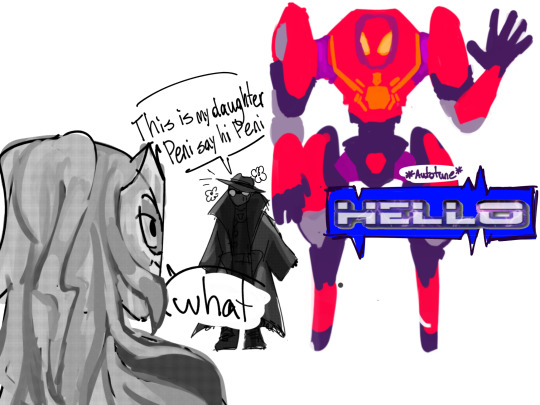

sometimes a family is a 20 year old voiced by nicolas cage and an eva unit
#noir is holding a gas pump in the last image if that wasnt obvious#little hc#peni has a voice filter when shes in SP//dr for obvious reasons but she uses an autotune one when shes with her friends on missions because#its funny#peni parker#SP//dr#peter benjamin parker#spider-man noir#spider noir#felicia hardy#white widow#she was only white widow in this one shitty yt video but whatever#felicia hardy earth-90214#fanart#art#spiderverse#shitpost#lex art#nightmech
1K notes
·
View notes
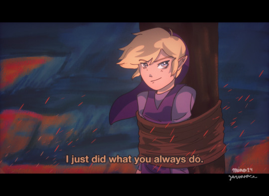
Text
Love this bitch for having multiple gender filters on. He’s transmasc, he’s a woman who’s a man, she’s nothing at all
#i love the idea of writing mizu as effectively nonbinary because of the constant isolation and alienation she feels#identifying with womanhood in a sort of secondary manner— a samurai first and a woman second#explores womanhood through mizu lol#no matter what. shes trans in some way#though i hesitate applying that label#if only because i dont think mizu would identify as trans in any instance; i’m sure mizu thinks he just IS#stuck between womanhood (something she doesn’t really care about) and manhood (a mask for her to put on to fulfill his goals)#and yet transmasc interpretations of mizu UTTERLY FASCINATE ME#AUGH! woman who is a man (this is both a transmasc and nonbinary filter)#thinking back to mizu binding. i wonder how he felt#that scene can have so many gender filters#pain— applicable to both a woman binding to avoid misogyny and a trans man binding to avoid misogyny and dysphoria#i think no matter how you see mizu; he’s dysphoric in that scene#i could go on#blue eye samurai
981 notes
·
View notes
Text
Got notes again on my post abt how Falin's Girl Autism is romanticized to the point where people who don't really know or understand her are trying to propose vs Laios's Boy Autism being seen as an active threat even though the Toudens are literally so fucking alike and like. Yeah. Gdhdh I have nothing to add I was fucking right and I like that Ryoko Kui created such loving and similar siblings so that she could comment on how their autism and hyperfixations are so clearly filtered through a lens of how people see them due to their gender as well
#tomi talks#dungeon meshi#I'm sorry but i deeply don't understand ppl who actually ship Shuro and Falin like#Shuro does not really know Falin and if he can't accept all of her quirks in her brother i don't trust him to truly accept her#he glosses over the ways in which she's similar to Laios because he is romanticizing a woman he doesn't truly understand ://#like it's so filtered thru sexism too lol#like ofc Falin's interest in bugs or living things is 'nurturing' and kind 🙄🙄🙄#like it's especially wild cuz Falin is basically unquestionably more cut throat than Laios imo lmao
409 notes
·
View notes
Text
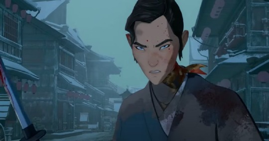
Top 10 anime betrayals except I’m entirely earnest about it
#my art#four swords#fs#four swords manga#you know what we’re putting this in one of the big tags#because it’s cool and I have no filter this late#loz fanart#loz
449 notes
·
View notes
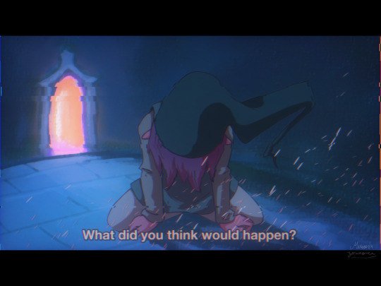
Text
body horror alina was absolutely wasted by netflix smh

(also, I spent two days on this, so it’d be reaaaally great if it didn’t flop lol)
#alina starkov#shadow and bone#grishaverse#the grisha trilogy#the darkling#malyen oretsev#sorry gotta bullshit tag#leigh bardugo#six of crows#SORRY#art#nikolai lantsov#SORRY AGAIN#digital art#sage’s art tag#fantasy art#go off about your grishaverse opinions in the comments or rbs idk#let’s manufacture notes TOGETHER 🫶#I don’t wanna ship tag because shit will get filtered lol
1K notes
·
View notes
Last Seen Blogs
fandomsnstuff
a little too invested in people who don't exist

beewpdx
BeeWpdx
komeijinone
古明地無

vyaratiles
Vyara Tiles

lasnotassuicidas
Las Notas Suicidas