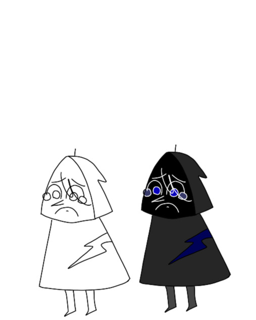
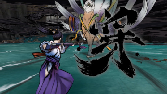
#first time of drawing them so designs and style are very fresh
Text

Hey new fandom, I hate dark drawings
#first time of drawing them so designs and style are very fresh#I still will draw moomins but monkeys have taken over my brain#lmk#lego monkie kid#monkie kid#sun wukong#wukong#lmk wukong#macaque#lmk macaque#shadowpeach#six eared macaque
1K notes
·
View notes
Text
Okay, my voice designs are complete! I am about to ramble about them.
Some general comments before getting into each individual one; I'm terribly inexperienced at drawing creatures, so while I adore how some artists are making them different birds and I would've loved for them to have actual beaks, I care too much about quality to do that to myself. So I just gave them pointy noses. Don't question the ears. At first I was just going to make them all have different outfits that could be worn by any gender or shape of person, because anyone can play the game, but that got in the way of other ideas I had. So they all have different styles/proportions to make them stand out. At first they had different feather bits, but then I realized how much I liked the cannon Long Quiet's little head bits that look like cat ears, which are already super expressive. So I went with that.
Going in rainbow order, first we have Voice of the Paranoid!
I'm pretty sure his was the first of the group I designed, or at least, he's gone through the least revisions. I went full bug-eyed panic obviously. The eyes also make squinting in suspicion very obvious. While I like the designs that include the vital organs he keeps running, he serves a more general role in other routes. The outfit was the hardest to figure out, but I landed on the baseball tee because it was a bit more distinct, not too childish, but still very casual. Some symbolism I realized later is that you get to the Nightmare route by making choices that are uncomfortably in the middle, and that's reflected by Paranoid's shirt and pant sleeves stopping in the middle of the arm, right in the joint.

Voice of the Skeptic.
This one was the hardest for me. I don't know him too well, and he doesn't have a specific action or attitude to play into. I finally got an idea when I decided against using realistic proportions for a different voice, that Skeptic was perfect for realism, he's all about facts and reality. The glasses came pretty quick, and I decided on the beard because he needs something to stroke in contemplation. He almost had a pipe as well, but I decided against it. The outfit was difficult again, I looked up a lot of references to scholars and various sherlock interpretations, and finally decided on a dark academia style turtleneck and the long coat, which was everywhere in my searches. If you could see both of the little head thingies the other one would be sideways kind of like a quirk eyebrow.
Voice of the Contrarian.
While I adore the jester parallels so many others have made, I wanted to focus on the immature side of him. So he's a little brat with a backwards baseball cap because he's rebellious. I wanted to make sure to incorporate the sympathetic side that shows up later in Stranger.

Voice of the Opportunist.
He's honestly one of my favorite voices, and I think part of that is how he's good with people and social interaction, so I leaned into that side by going for a sleezy business man aesthetic. He also mentions that he likes to travel, so I gave him that excellent shirt. He's on the business casual side because you can't be serious all the time, you need to relate to the people. He doesn't know what the earpiece is for, it's just there.

Voice of the Hero.
Everyone's favorite boy! My main goal with the body type was friend shaped. Cause he's your bud. Went with the classic Link tunic because it's so incredibly hero coded, and the half cape to keep it fresh and friendly. I liked that another design gave him pauldrons to convey an upside down triangle shape, which represents intelligence and change, which I thought fit him very well. But fighting isn't really his thing, so I went with only one, putting the design off balance in a way I really liked. The head thingies came like first try, he's definitely swoopy and dynamic.
Voice of the Hunted.
This one sucked to design because as I said previously, I'm bad at animalistic designs and shapes. My first thought was an Australian Bear Grylls type survivalist with realistic proportions, but it wasn't quite working and I loved everyone else's feral creatures. So I tried. The hair thingies came to me at random, and I like that they look like deer antlers. By this point I had everyone else down and none of them had a top heavy face shape so I tried that for Hunted and I liked how it turned out. I learned in my failed creature designs that a wide neck was important, so I did that. I kept the shark tooth necklace for flare.

Voice of the Cheated.
I got very tall vibes from him for some reason. Maybe because it helps contrast his squinty eyes. For his outfit I went with a "someone who went broke at the casino" vibe. It felt right for everything to be mismatched, uneven, and messy. He's also the only one I gave a tired line.
Voice of the Stubborn.
Of course he had to be buff, also wide things are sturdy. The tank top was the best shirt to show off those muscles, and I feel like the basketball shorts were a necessity for this stereotype. Thick eyebrows because angry. His head thingies are tiny and adorable mostly because I found it a funny contrast. The blue was honestly a bit of an afterthought, I'd already given red to Paranoid, and the orangy colors felt too weird for him. I think the blue works though.
Voice of the Broken.
He's small. I had to go for a hoodie because it's gloomy and also to give cult vibes. The face needed to be big in order for those watery eyes to be prominent, and I felt keeping it in shadow was the easiest way to keep it simple. I had a lot of crazy ideas about unmatched puzzle pieces and wobbly towers that I'm incapable of executing, but I needed some sort of literal expression, so there's that big scar. The little line on the top is supposed to evoke a puppet whose string has been cut. I imagine that the others drag him around by it if they get frustrated.

Voice of the Cold.
It was a bit difficult to figure out his design until I realized that he's the type to do hard drugs if given the opportunity to. Then things clicked. And once I made the connection of black lipstick, everything came together. The head thingies are supposed to look like dreadlocks.

Voice of the Smitten.
I struggled so hard with this. I can not draw handsome people, but I can't have Smitty looking like a dork. The swoopy head thingies were easy enough, but most of the rest didn't look right, or was literally just Roman from Sanders sides. But I got in a chin, and decided to go for the heart body shape and I think it turned out well in the end. I was even able to keep the shirt sleeves and bowtie that I had discarded earlier for being too dorky.
25 notes
·
View notes
Text
Once again it is time for
This year's event will be hosted by mahou Zeldas, because I've been spending a lot of time in Hyrule this year.

Mahou anime of the year:
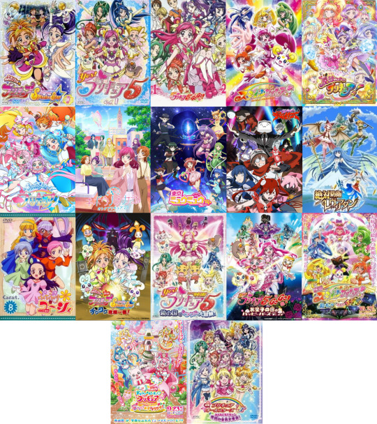
(Futari Wa Precure Splash Star, Yes! Precure 5, Yes! Precure 5 GoGo, Smile Precure!, Mahou Tsukai Precure!, Hirogaru Sky Precure!, Otona Precure, Tokyo Mew Mew New s2, Magical Destroyers, Zettai Bouei Leviathan, Petite Princess Yucie, season movies for Splash Star, Yes5, Yes5 GoGo, Smile & Delicious Party, Crossover movie for Fresh Precure!)
Then the stuff I read:
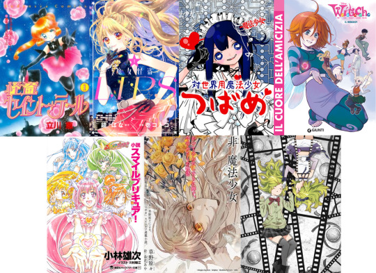
(Saint Tail, Stellar Witch Lips, Magical Girl Tsubame, W.i.t.c.h. reboot, Smile Precure novel, Null Magical Girl, Magia Record Scene Zero)
I also keep up with what kind of designs Magia Record releases though I don't play it or otherwise follow the story.
Extremely Precure year this time around though that was not intentional, usually I only manage one backlog season per year. But I started with Smile, and then we were hit with the news that we'd have a Yes5/Splash Star sequel in autumn, and in preparation for that I had to power through some 150 episodes for the original series. And then I somehow ended up watching all of Mahou Tsukai in less than 2 weeks. And then there was Otona as well of course.
Now there's only three backlog seasons left, and they should be doable in a year if the Mahou Tsukai sprint is of any indication, though we'll see how that goes. I'd like to take a look at other similar shows too (like Doremi and Sailor Moon) but I want to clear Precure first before moving to the next thing.
The W.i.t.c.h. reboot was also a thing this year, which seems to have come and went with a thud. Which is a shame because I was looking forward to it, but... well it wasn't particularly good. I guess it can pick up of there's more to the story.
For the first time I've followed a Magia Record (game) story, with Scene Zero. The format is difficult but I am interested, so it's possible I'll look into more MagiReco stories once Scene Zero is over. The game has so many cute characters so I'd certainly like to know more about them.
This year I also took part in ArtFight and did some mostly mahou themed OC art, which was a lot of fun. I'm looking forward to doing the same next year as well if they host the event again.
Now onto the awards!
Best henshin design goes to Cure Sky! Blue lead Cure aside this is a top tier magical girl design, and that is mostly thanks to the cape, especially the red inside and yellow fringe. It looks so majestic! But being a half-cape prevents her from looking too stuffy. The thin twintails also look great with the cape in action shots. And of course she is also stupidly cute.
Also a shoutout to Saint Tail's simple but very effective look with a rarely seen colour scheme.
Best team design goes to Stellar Witch Lips! Similar enough to be a team but everyone has their own take on the theme, black makes for a good base colour and the sparkly tops look amazing.
Best powerup design goes to Cure Felice's Alexandrite form! She looks so regal and powerful, truly a nature goddess!
Best civilian design goes to Cure Sky in general! I just like her practical style and the clothes look all comfy.

Best hair goes to Junia! It looks so soft and poofy and her pastel colour palette makes everything even cuter.

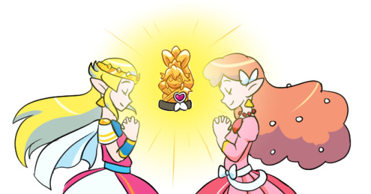
Best magical item goes to the tiara and amulets in Petite Princess Yucie! They aren't that special to be honest but I'm always ready for magical items that don't look like cheap plastic toys.
Best henshin scene goes to Cure Sky! A lot of dynamic animation, the tinted split screen at the end is fresh for Precure, the modulation in the middle amps up the power, the dark background makes everything a little bit cooler, and the cape flip and wings at the end just look amazing.
youtube
Best fan creation goes to ArtFight in general! It was my first time participating, and getting to draw other people's ocs on a low threshold was great, and obviously receiving a ton of art of my own ocs felt amazing.

Best relationship goes to the group in Petite Princess Yucie! I really like how the side characters have distinct relationships with each other and not just the main character, and how not everyone gets along all the time (or most of the time with Glenda and Elmina). The fact that they're also rivals makes things more interesting and everything culminates successfully in the power of friendship in the end.
Best mascot goes to Saki's cat Korone! Not exactly a traditional Precure mascot but he does become more mascot-like towards the end. Absolute unit of a cat, gets a funny deep voice and even lands a hit on the final boss, and most importantly isn't annoying.

Best supporting character goes to Kintoleski from Splash Star! He's a pretty simple character but I like villains who are honourable and polite, and he managed to be consistently funny as well.

Best visual goes to Stellar Witch Lips! The story wasn't really anything to write home about but the ultra cute and sparkly art is just magical.
Best audio goes to Updradft Shining bgm! It's surprisingly epic for such an early series attack and it'd be cool if the franchise used music like this more.
youtube
A honourable mention to Tsubasa's eagle sound effect in the Majestic Halation attack, Mabayu's (MagiReco) silly "nuwawawa" scream of pain in a decidedly serious scene, and every "Haa!" from Ha-chan.
Best scene goes to the separation and reunion scene from Mahou Tsukai Precure! Or I guess that's more like half of an episode. Really impressive how they spent so much time on pretty low-key character stuff like this.
Honourable mention to the big battle towards the end of Petite Princess Yucie.
The Innovation award is given to a magical girl work that I think does something fresh for the genre. This year it goes to Hirogaru Sky! Precure for having a boy Cure, an adult Cure and most importantly a non-pink lead Cure! Which isn't particularly notable for the genre as a whole but a gigantic achievement for this franchise. Hopefully it wasn't just a 20 year celebratory fluke and we'll see more variety in the future too.
The Golden Mana award is the prize given to one thing I didn't like.
This year it goes to the henshin forms in Otona Precure, or more specifically the way it did absolutely nothing about them. No adults-as-magical girls, no new looks as 14-year-olds, and not even a new powerup form for the final finisher. Boo! I'm not really saying that the show is required to include new forms just because I wanted it or because it's common in the genre, but that would definitely have made me a lot more forgiving of its many other flaws. And this is my list so I get to complain about my preferences.
Dishonourable mention to Nozomi's catchphrase in Yes5 and GoGo for exemplifying the selfish and pushy aspect of pink heroines like this that often goes uncriticised.
Best character goes to Cure Sky! In addition to the excellent character design she also has a fun personality, "earnest dumbass" is a great combo, and her determination is just great. I also like that she isn't super girly for once. The story of Hirogaru isn't that good so Sora too is held back from having a truly awesome story, but as a character she is still enjoyable enough.
Best work goes to Petite Princess Yucie! It has fun characters, great designs, good group dynamics, interesting world and a really strong ending. It's a shame they don't seem to do kids' anime like this nowadays?

Plans for 2024

Onwards to 2024! I swear this year I'm going to continue with MagiPro, I've been stuck at volume 7 for several years.
25 notes
·
View notes
Photo
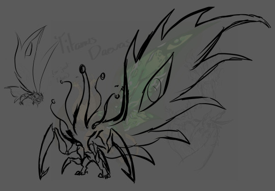
So... hasn’t taken me a while, before I wanted to redesign Daevas. I thought she looked rather bland and not much like the hybrid of a Queen and Devil, so instead of two heads, I’ll be giving her five total and revamping her head design so that she has two sets of split jaws on each head (which is going to be an absolute pain to draw each head).
Additionally, I’m going to give them the cobra hoods I gave to my new Ghidorah design, plus give them a sort of hierarchy of horns - the two outer most heads will have smaller, more ‘stump’ like horns, and progressing to the middle head is where they are the biggest and sharpest.
As for their limbs, I decided to revamp the inner chest limbs so that they’re bigger and more so used for stabilizing Dae, as she has a lot of front weight going on. Might make them bigger so that they’re like the outer set of limbs for better support. Her wings are being changed too to be more ragged - it bothered the hell out of me how I made the wings too streamlined, as I want to lean more heavily towards Ghidorah’s heritage than Mothra’s with this daughter. That’s pretty much it for Dae, as for the moth next to her, that’s actually a new character I’m slowly working on.
Titanus Askifro is the son of Mothra and Battra.
Askifro, I imagine, has a very posh way of speaking, almost like a Victorian style. He doesn’t enjoy short-conversations, so he’s typically advise to have something you can talk extensively about, preferably something he also enjoys - which, admittedly, isn’t a lot. He has a relatively stable relationship with both Mothra and Battra, but tends to prefer his father rather than mother.
he’s actually the older half-brother to Dae, as Mothra first landed with Battra before reaching out to Nii (there’s a whole poly relationship going on that I’ll maybe explain later). Dae never got to meet her older half-sibling, but honestly? Askifro and Dae would surprisingly get along - she understands and respects Aski’s knowledge of things, and is actually a little upset at not meeting him sooner. Something about his presence soothes her immensely, and she feels genuinely safe around him.
Aski doesn’t mind having Dae around, but finds it daunting to be the older sibling. He doesn’t have any trauma really, so it’s hard for him to exactly feel that connection with his younger sister - very much a advice rather than comfort guy too, but tbh his advice is just “kill your enemies and wear their skeletons as trophies” which Dae just responds with “please no”
very knowledgeable on kaiju biology, and is a pristine collector of their bodies if a kaiju is too pass. very careful, very precise. if its a fresh death, he’d likely eat the corpse then drag the remains elsewhere, or if it’s just the bones or a rotting corpse, he’d clean the flesh off of the bones and carve whatever he wants out of them
fucking hates Goji tbh, but keeps it veeeeeeeeeery close to himself. he’s not a big confronter, preferring to keep all of his secrets and opinions to himself rather than tell anyone, including his parents. WHICH REMINDS ME, SHIN AND ASKI
god, he didn’t expect her to be so blunt and outright rude towards him. he didn’t really find her intimidating though, just... kinda annoying. the most he’d do is just bap her on the head (Dae doesn’t do anything about it bc shes admittedly a little spooked of Aski despite the fucking power and height difference) and try to teach her proper manners, which Shin doesn’t actually need, she’s just being a dick
she does warm up to him after a while though, and so Aski watches over his little siblings with a lot of care, actually. HOWEVER, he definitely doesn’t want to get involved in Dae’s rivalry with Apoc. that’s a disaster in itself and while yes he cares for Dae, it’s her fight, he literally has no connection to them so he doesn’t care, plus he can probably get bodied if he got caught in the crossfire
random thought time, after getting to know each other, Shin grows comfortable enough to gossip to Aski about stuff with the other kaiju, and he listens, hiding the smile as he hears all the tales. OH and if they were in their human form, they’d definitely braid each other’s hair and go out to get their nails done, Aski doesn’t give a fuck
one last thing, with Aski and Dae, they have a something similar to what Goji and Mothra had - Aski sacrificing himself to give Dae power, then Dae goes absolutely ham. that is all
#mothra x battra#mothra#battra#king of the monsters#gkotm#godzilla kotm#godzilla king of the monsters#kotm#godzilla#mattra#king ghidorah x mothra#mothra x ghidorah#ichi ghidorah x mothra#ni ghidorah#ichi ghidorah#san ghidorah#ichi x mothra#ni x mothra#san x mothra
62 notes
·
View notes
Text
Why did I become an Artist?
I used to draw a lot more. In fact, one of my favorite things to do was draw as a kid, but it faded away (we all know why).
As an adult, I feel it's harder to be creative, but I had that excitement when I was fresh out of high school and I was very much inspired by seeing these game environment artists at the time. I loved seeing their process and how you could make this amazing thing from essentially nothing...from your head! To me that was mind-blowing; coming from a family who had a pretty traditional view on things: go to school, get good grades, get a job, blah blah blah...if you didn't get good grades you were considered a loser.
That's where my art journey began, really.
I eventually learned the video game industry is not exactly great, and moved on to other things. I got inspired by illustrators and animators, but soon realized I was holding myself to too high of a standard, and a lot of the advice was not good for my mental health. along with the rise of AI art I had to take a break from doing drawing for a long time. I moved on to graphic design.
I studied graphic design for 2 years, I loved making things, but it felt impossible to be one. The amount of materials I had to learn was never-ending because jobs always asked new requirements besides knowing adobe CC and programming languages. The whole list of reasons why they wouldn't accept you to the job listed is a can of worms in itself. Then you could be a freelancer.
"but don't you manage your own time as a freelancer? isn't it more easygoing, and all that?" You may ask
Not really. first of all you gotta have a skill that people would pay you for. Secondly, you gotta check how saturated that market is on the platform you want to freelance on. Next, you have to market yourself to death because you will be flooded by other people from overseas working for a lot less money than probably you do. Also if you do creative work like me your "unique" style won't show up on the site's algorithm no matter if there's people who like it or not. it's a very cookie cutter way of creating work.
Why did I explain all this?
Because I am tired of living cookie-cutter. I wanted to tell stories, I realized that making art is much more than making pretty images. If you want pretty images go to an AI image generator there's thousands of them online. I have learn that art is a form of communication, so I wanted to tell stories with my art. I wanted to write a webcomic.
"Wait but doesn't your blog say mangaka? what does that mean?"
Yes I am really inspired by anime. I watch a lot of anime and I love the stories from them. so I want to create stories in a similar fashion. I also really like the anime art style and im really inspired by that and hope to have my own manga one day. However I want to start off with smaller goals for myself and start with learning how to draw and do a web comic first. I told myself I am not going to stress a lot about the art because then nothing will ever come out of my hands.
"But most successful webcomics have amazing art, mangas too"
I know but you can't just have amazing art from the get go. Also I don't want to pause my whole story just because the art is bad. Take One Punch Man for example, if you look at its early chapters it looked really unrefined. a lot of people sad One's art was terrible, even from himself, but people loved to story and now it's one of the most popular anime watched. A similar story happened with the creator of Attack on Titan
2 notes
·
View notes
Text
[Review] World of Demons (ATV)

Okami 3???
I occasionally browse Apple Arcade to see what's been added; this time what leaped out was a title heralded as Platinum's first mobile game. Platinum of course is known for their character action games and as the successor studio to Clover, creators of Okami for Capcom. This has a very similar setting inspired by Japanese folklore and mythology, and almost identical graphic style inspired by traditional Japanese arts. After enjoying Okami and Okamiden so much, I wanted to see if this recaptured their magic at all.
It's important to reiterate at this point that this is very much a mobile game. The control scheme is simplified compared to other games from the studio to remain accessible on touchscreens, a priority for many Apple Arcade games that must be platform-agnostic. (I did play it on an Apple TV with a controller, which helped it feel better... although there's no helping the dodgy camera.) The level design is more or less simple corridors between battle arenas, with some interaction along the way: it felt like a very stripped-back Okami without the overworld.
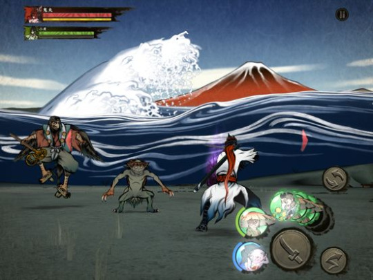
The overall game structure too follows trends of the platform. The game encourages replaying levels with ratings and random drops, and grinding is required at times to progress or at least make your numbers go up enough. A bonus level requires a premium currency to enter, a likely vestige of a free-to-play microtransaction-driven business model which many Apple Arcade games retain even after being retrofitted for the paid service. It never fails to give these games an uncanny feeling of being neither fish nor fowl.
Anyway. The game feels good to play, those well-honed Platinum mechanics in a more accessible framework. There's one main attack button, although different weapons have tweaked attack strings and unique special moves. The dodge button gets a lot of play with well-timed activation giving you a counter. You unlock new characters for a total of four, and they each play quite differently (I favoured a combo of the fast, range-focused shrine maiden Sayo and the cursed Buddhist monk Dohzen who is slow and strong).
But the main gimmick of the game is the recruitable yōkai. These spirits and creatures of legend are the main enemies of the game and a constant stream of new ones keeps the battling fresh. When defeated they drop orbs which let you summon them for a one-time attack or effect. You also unlock permanent versions which can be enhanced, and each level lets you pick two per character to bring with you. (I usually made sure to pick at least one that would draw enemy aggro.) This is a fun way of customising your playstyle and experimenting with combinations, although with the length of the levels it's better to keep experimentation to the short sidequests lest you be punished for a poor choice.
The yōkai also have some use outside of battle, as there's a limited version of Okami's environmental puzzles. Some objects can be interacted with for a few items or an extra battle, but only if you have the right type of yōkai equipped. Since choices are restricted, and you might not get the right drop or know to save it, it's easy to be stuck without the right tools for these and feel left out; and replaying levels can feel a chore. It feels like a half-baked system, often punishing you for poor luck rather than rewarding you for smart play.
The story is pretty standard demon-and-samurai stuff, with a series of amusingly improbable revelations about character relationships as you go on. It's decent enough with a bit of flair, much like the character designs. It must be noted that after four chapters building to a climax, there's a cheap undercut seemingly setting up an Okami-style next phase (complete with a "to be continued" screen as with all the other chapters), only for the game to just not have any more content. I guess they released the game unfinished, expecting to add more story in later updates, as with Castlevania Grimoire of Souls, or Shantae and the Seven Sirens? But with over a year since the last update, who knows when or if it will indeed be continued.
Either way, what's here is a neat package. In fact I'm glad it didn't drag on too long as Okami did at times. The heavily cel-shaded art style invoking traditional ink painting is a great look, and the game systems are solid save for the yōkai interactions. It's not quite an Okami 3 but there's enough DNA here for it to be maybe an Okami 2.5, and for that reason it was a cool novelty for me.
10 notes
·
View notes
Text


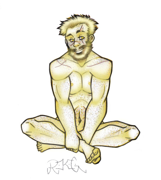
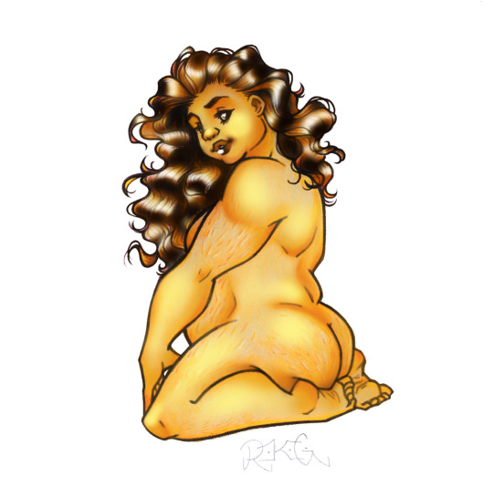

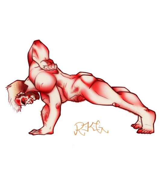

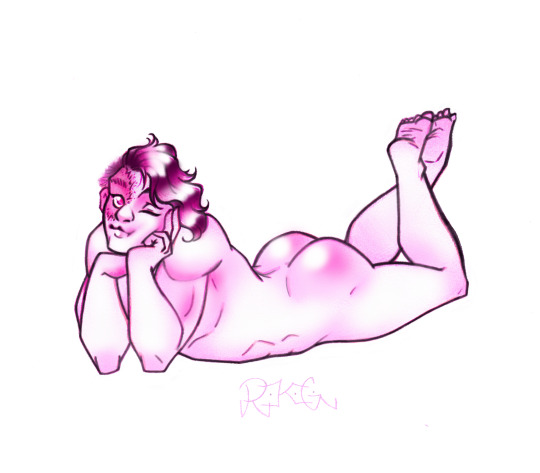
Hey, I can put all my pin-up pictures in one post now!
I spent a couple of weeks drawing these, sometimes trying multiple poses until finally they looked right, and then I had to travel to scan the pictures... and the scanner was really wonky. It washed out certain colors, while over-saturating others. It was just really weird. So, the only solution was to try to edit and fix the scanned images on my computer, and since I only have MS Paint with no layers, this was a challenge. I basically had to add the colors, then go over my lines so they would be clear, and finally erase around the edges. It took another few days to fix them all, but I did it!
(some descriptions for each character design below)
Church gave me the most trouble… and why wouldn’t he? This CHURCH, after all. He lives to be difficult. I knew I wanted him to have the “mud-flap babe pose”, but I kept messing up his face, and didn’t realize how bad I messed up until after I inked and colored it in… at one point, I tried to re-draw the face and cut out the one that didn’t work, and paste the two pieces of paper together. It wasn’t worker, so I finally just traced over my own lines, did the face all over again, and he looked half-way decent. SO, I’m done with Church! Look at that smug expression, he knows he’s a jerk. Seriously though, I love how he turned out!
When it comes to his design, I have my whole RVB story-line with a scenario in which Church and Tex get to come back with synthetic human bodies (specifically, when the Epsilon AI was deconstructed, all of the data from his memories WENT somewhere; it was downloaded back into the original AI units, which weren’t “dead” after the EMP, just deactivated. revived by Epsilon’s data, all the AI were able to reactivate, including Alpha! now HE is the one who is carrying on with the memories another part of him left behind… whoops, that’s sad, but don’t worry! he now also has the chance to feel better~). His was based on the DNA of the Director, but he’s not a clone, exactly. There’s a similarity for sure, but they’d probably look more like brothers. Church is considerably shorter, and even when he was “fresh out of the oven”, he’s more chunky too. As time goes on and he’s able to eat REAL FOOD, Church gets nice and chubby. He also wanted to be strong enough to actually pick Tex up, so that was his whole motivation for muscles. He has fairly long hair at first, and later cuts and styles it to this (imagine it feels like a silky-soft hedgehog). He wound up with some face-fuzz, and wasn’t sure of he should keep it or not… he doesn’t want to seem like he intentionally looks like the Director, but also? If he tries to avoid looking like him on purpose, he’s still letting that dude influence his decisions. Church finally asked Carolina (only fair, because she has to look at him), and she said it kinda suits him, especially since he has a squared jaw. So, the face-fuzz stayed~
*
The first rule of face-designs for RVB characters; Tucker is the prettiest. This is law. He definitely is really into the whole romantic-pose thing, so he’s both flirty and totally relaxed. “Yeah, I know, you want me. Don’t worry, plenty of Tucker for everybody!”. I like imagining his features as being a little aquiline, but still soft (he’s one of those people who looks about 10 years younger than he actually is, and even when he’s an old man, he’ll barely look 40).
He is indeed a manlet short king, thank you very much. He wasn’t always so muscular, but after training with Wash, Tucker has some definition going on (glorious calves, after all). I think the main thing with him that I keep in mind, is; yeah, in the beginning, he definitely wasn’t an “ideal fighter”, but he’s proven to not only be capable, but FANTASTIC… and it isn’t just about fighting. It isn’t just flirting, either. Tucker genuinely has so much depth, and a thoughtful side that makes him really care about people. So, even when I draw him looking strong, or confident, I want him to have a gentle touch in there~
*
When I thought about what kinda pose I wanted for Tex, I knew she had to be FLEXING, obviously. For the rest of the body, I used reference for some drawings I did many years ago in a Human Figure class, with models who posed while we sketched. I always liked the way this one sketch I did showed the line in the back follow all the way down the leg, so I elaborated on this for Tex. I really wanted something to show the full body, and standing up so you get the feel for how imposing/intimidating she is. I think she’d approve~
Like Church, I imagined a scenario in which she gets to return in a synthetic human body, hers being based on the DNA of Allison (rather than turning out identical, they simply share similarities). Ironically, Tex looks more like Carolina than Allison did (I like to think Carolina takes after a great-grandmother on her mom’s side, and Tex just kinda wound up inheriting those traits in her new body, too). Tex is very TALL, and once she was able to, she was determined to get BUFF. Tex is a built like a brick house, heck yeah!
*
I wanted to do another full-standing pose for Caboose to really show how tall he is. For a while, I wasn’t sure what to do with his hands... like, him holding them up over his head didn’t seem to work, on his hips didn’t look right... finally, I sketched them clasped behind his back, and it was perfect! Nice and casual, but also really cute. It also show’s off his arms REALLY good~
Like a lot of people, I imagine Caboose as being BIG. It just kinda fits with how strong he is, and since I made Tucker and Church both tiny, Caboose can totally life them both up on his shoulders! Little boy blue? Nah, big boy blue! Sarge is tiny too, so I love the idea of him standing next to Caboose, who is his favorite Blue (Caboose is son-boy). Caboose is also pretty comfortable with himself, so I just wanted him to calm and happy. He deserves it~
*
We never got a good look at Wash back in Project Freelancer, but at some point, somebody came up with blonde-freckle-man, and a lot of us latched onto it. I am no exception… and I really went all-out with his freckles! It was once mentioned that he grew a beard, so I decided to keep that. It is a little more full and fluffy than I usually draw it, but hey- maybe he’s growing it out a bit. That foot ticked me off, but whatever, I’m done with it. Also, yes; I gave him a catboy pose~
I imagine Wash also being tall, and fairly lean. Certainly athletic, but also agile. The dude has also been all over the map in terms of his character arc; Freelancer Dork, Mr Serious Recovery One, Villain Guy, Church Impersonator, and finally- a dork yet again, but now he’s more comfortable to be one! After living with the Reds and Blues, he’s found a way to sort of… not feel awkward about being awkward? It makes sense when you know this group. Also, I’m not sure how much I would elaborate on it in my story-line… but I kinda lean toward trans Wash~
*
Kai was actually the first one I did (originally, the only one... but then I kept going haha). I had this specific pose in mind for her that I thought was really cute. Somehow, the sketch turned out alright on the first try, and after I added all the ink and color, it was still good! The process I used to draw her was repeated for each picture; pencil sketch, then go over the lines I like with this one almost-dry brown marker (honestly, it looks like drawing with charcoal, but thankfully it WORKS like a felt pen. charcoal is so tricky), erase unneeded pencil lines, add more defined lines with the colors I want to use for the character (for Kai, this one goldenrod pen I have), and continue with the details, mixing different pens and colored pencils for the shading. It was a WHOLE thing.
I love how her pose turned out, she really looks like she has actual form. I wanted to express the fact that she is beautiful, and she’s also chubby with stretch-marks, thank you very much. I also imagine she and her bro have like... very fine body hair that you can barely see (seriously, they have baby hair on their arms and legs). As for the hair on her head, man- I LOVE drawing hair, and hers is so pretty! I like how it almost looks like gold~
*
Sweet Caroline, bah-bah-bah! She’s one of the few characters who shows us her face, so I know what she looks like, but I still wanted to play around with my design of her. I decided short hair works for her (and although I’m just using the aqua-blue here, I imagine that she starts dying it a darker red). She’s usually very tense and tough, so I wanted to let he show a slightly more dainty side with the pose. When I finally figured out how to make legs sort of over-lap in different ways, I started having fun doing poses like this. You can still see her impressive arm muscles, though~
Carolina has definitely taken some battle-damage over the years, with a few scars here and there… also, I think she just doesn’t care about shaving, so enjoy the leg hair! She was arguably the easiest to draw. Thank you for that, Carolina~
*
I struggled with this pose for quite a while… my fault for deciding on something difficult, but come on! I had to go with a push-up. Also, a one-handed push-up at that, because Sarge has to show off. I actually showed my mom all these pictures as I finished them (and she cracked me up, she’d say “That’s a very cute naked person, honey. Now, go color another one” like I’m drawing unicorns or something haha). When she saw Sarge, she said “He looks like a big silver back gorilla”, and she had no idea how ironic and hilarious that actually is.
I imagine Sarge being the shortest of the group, very beefy and very boxy. He’s also got the most body hair of the group. Plenty of scars as well (the ones on his knuckles are from punching so hard while wearing older armor, his hands would get scraped on the inside. newer armor has better padding). I wanted his face to look smug, like he’s saying “Yes, I know you’re looking at me, I can’t blame you”. As you can see, he doesn’t have much of a butt… and what is there is a tight little brick haha~
*
Grif obviously needed to have a very chill pose, so he’s kicked-back, relaxing with his legs crossed, and arms folded behind his head. I’m so happy I’ve gotten better at drawing soft mass, because fat characters are beautiful (and as a chubby person myself, I want to do different body-types justice). Grif is indeed a big guy, and although he’s very calm here, I hope you can kinda tell he’s got some strength in that body too.
Like Simmons’ prosthetics, I wanted Grif’s limbs with the skin-grafts to be clear and easy to see. Over the years, his body has sort of “absorbed” the organic tissue Simmons donated, so Grif has evened-out (though you can kinda tell, his lighter foot doesn’t quite match the one he “grew” himself, but he’s not as lop-sided as when the surgery first happened.) Just like Kai, I loved doing the curls in his wavy hair~
*
Donut was the second one I made after Kai, because he pretty much took over my brain and DEMANDED to be drawn in a pin-up pose. What kind of pose was easy enough to figure out (imagine him spread out on a bead). I totally screwed up on his feet, and didn’t want to re-draw the whole thing… but I also didn’t have white-out, or even white paint. I wound up using this craftwork enamel stuff… which is OK, but really tacky (I don’t mean like it looks bad, but tacky as in it takes forever to dry and stays sticky for too long).
I imagine Donut is what you get if Barbie had a baby with GI Joe; totally adorable, and also impressively buff (especially his arms). His face has the scar from the grenade incident, and after having his hair lop-sided for a while, he started styling with a side-cut and letting the rest grow out. He also has a scar on one of his hands (from when he got hurt from the vehicle). His face naturally makes the cutesy kitty mouth~
*
If you want to imagine these pin-ups as being for like… and actual calendar that exists within the RVB universe, the only way they could get Simmons to be part of it was by intentionally acting like they weren’t going to include him. This would kick his fears of being ignored into high-gear, so he would INSIST on doing it too. He’s still a little uncertain… so, a shy pose for the shy nakey boy~
I wanted to make sure we could clearly see his cybernetics (and I’m so happy with how the foot turned out). Like a lot of people, I imagine red-head Simmons, and I think he probably had short hair most of his life… but around Chorus he didn’t have time to keep trimming it, and after Iris it totally got away from him. One day he pulls it back, to figure out how much needs to cut off, but instead he went “Oh, pony-tail?”. So yeah, long hair Simmons! He used to be a string-bean too, but years of running around and trying not to die helped him put on some weight (he totally doesn’t even realize he has actual muscles~)
*
When I decided to do sort of leaned-over pose with Doc, it was hard to make it work… but finally, I had something that looked decent. I also wanted to show a wink and smirk, because O’Malley is there too! He probably would have rather done some kind of pose in a graveyard to look all creepy, but Doc won with the cute pose.
I like the idea of him having really thick, fluffy, and curly hair. Also, a very defined nose. His legs are really strong (being a former track runner and all), but he not as muscular as some of the others. In fact, Grif is the tallest of the short group, with Doc just a little shorter than him (after that is Church, Tucker, Kai, and Sarge). I’m really happy with how all the shapes of his forms turned out, his tummy, his shoulders, his legs~
*
I really wanted to do an especially cute pose for Locus, because he deserves to feel pretty~ He’s probably about as shy and awkward as Simmons in certain ways (certainly confident when it comes to fighting, but social situations? he’s a dork). So, he’s sort of closed-off here, but hey- popping that leg up, because yes! Locus can have fun, too! His legs turned out really nice too~
We know what he looks like in the show, or at least, what he looked like working with Felix before Chorus. So, I had that to bas his design on. I feel like while Chorus stuff was going on, Locus actually lost a lot of weight, being so stressed-out and not even recognizing how unhappy he was. He’s always been beefy and buff, but now that he has some new friends that actually give a heck, he’s put on some weight, and is just a bit more chubby than he used to be (which is a good thing~)
33 notes
·
View notes
Note
"It seems a little ..." Oh she's looking for a good way to say this, really, but upon comparing weapons to Caelus it grows gradually harder to force back down that tender laugh of hers, polearm up against bat in comparison; " ... corny to use a bat to fight monsters, it's like that game of whack-a-mole ! Do you like Bop them ?"
Guinaifen knows his strength, at least portions of it as there have been tales of his feats and what might he has shown in fights that's gone way over her head. But, she has to admit, the thought of him going after big, scary monsters with a bat is a humoring image. Does the marastruck fear the mighty bat? Maybe. In terms of bopping monsters, however, she really didn't have anything to say. It wasn't as if she had developed a rather offensive and striking style. She smacked the monsters that wanted to take a bite out of her, and if found in a pinch she's throw some stashed away firecrackers at them.
"How do you use it?" She'd ask curiously, allowing her own weapon to vanish from her hand. In return hands would reunite on her back, leaning over to inspect it. Not one to play around with bats, Guinaifen had never even held one.
Gazing up at Caelus from her hunched over lean, a cheeky smile appeared; " ~ cooooould you teach me how to hold a bat ? I've never held one ! I think I'd look pretty awesome with one, don't you think?"
"A little what?"
Did she know that the bat listens to such conversations? Wholly allowing its emotional well being to hinge upon these very words? The fact alone they can find themselves falling into a casual line of conversation, fresh amidst the rotting leaves and the golden haze of Abundance's end, things were going pretty damn well.
Even the Mara struck need a hilarious or inconceivable sight for their final hour.
Caelus's features were quirked into a sense of amusement, a touch leaned in, drinking in the way her features perked into a measure of thought. This in itself was so beautifully endearing, the mere need to sigh wistfully at how damn cute she could be barely resisted! With how easy it was to distract or alter the floor of her conversation, appearances have to be kept!
Corny.
....
Ah, so the advent of emotional damage was inevitable for his dear weapon. If the curio could move in response (like it does in Penacony), it would've shrunk back due to the sting behind such words!
"First off." He mentions, giving an abrupt point and loving prod to the warmth of her cheek. "It'll remember that. The art of bopping as you aptly put it has been a try and true method since the caveman days!" Whether the Trailblazer is aware of what he's insinuating about himself is up in the air. Simply embracing this curiosity of her's was a journey worth diving into, as part of him gets it, life gains a particular set of shades upon the Xianzhou.
Underneath the sanctity of The Hunt, of the glory of the Cloud Knights and no shortage of martial artists, there had to be a form of wonder for the success of an art contently wading through the undisciplined channel. Weaponry, their usage and even the philosophies behind each one held their measure of enrichment here, similar to the perceived grounds of where they were veritable extensions of not only the body, but the mind to the skill. Stances, poise, dignity, and the sheer realm of execution involving multiple styles and unique variations either to mindset or bodily constitution, there was a wellspring of time devoted to it.
Jing Yuan's protegee was living proof of that. The art of drawing blades into a divine state of mentally harnessed and wielded promoted that as truth, and in kind, a lethal flash of inspiration for others to reach that point.

Aligning the bat with the lean in of her figure comes as second nature, allowing the ornate design and paths to be unveiled upon it, hints of steam freshly spilling from it's grooves as a lax grip carries it along. "As simple as it looks, catch your target before your eyes or senses, then proceed to lash it as the best kinda skull cracker. It's a lil different than using it for the sport it's based on." Did that even make sense? He'd have to contemplate that later, for that sight of her immersed in the touch of his renewed history had him.. well.. Touched.
He'd have to really run the humble beginnings of his awakening to fighting a Doomsday Beast to her sometime.
The bigger priority holds in that question as he makes a motion for her hand, to prompt her to perk up and offer those elegantly long limbs for the upcoming example. Grasp the bat, seize a hold as if it was the influence of carnage such a blunt instrument it truly was.
....
Maybe that inner sanctum of Destruction that flows with him needs to calm down.
All the same? Once his hand and Guinaifen's are situated on the curio, he doesn't hesitate to lean close, body to body, both of their hands holding the weapon skyward as his hand cups tenderly over her's. It allows for their grip to become firm. "Now if you want to be cool with it, this centers on applying a little bit of yourself, your force to the swing. Especially with my lil number. Say if we did it like this."
For an instant would that flow of Destruction vibrantly transmit from his palm, ignited from that spark as it'd wash over the stalwart nature of her own hand, harmless in nature to someone so beloved to Caelus. It'd assist itself as a bolstering factor, allowing for the weapon they wield to soak in the thriving potential of Path power. Within moments that once obsidian foundation hums with life, causing the bat to shiver as it gradually sparks with the illumination of his power. A cerulean sheen washes over pridefully across its expanse, allowing that 'bopper' to become both an extension of will and the bane of countless foes.
"Channel your frustrations, your aim, your strength and treat 'em like a watermelon on the beach." The imagery was clear and to the point. The martial finesse that dignified violence was void, for this was a simple and to the point measure, treating their foes to the brutality of nature itself. For many, it calls to a primal part of the soul.
....
Remembering how all of this even started, a lively, base rich chuckle followed from him as they leaned shoulder to cheek.
"Wasn't this corny to you at the start? Or do you plan on making a new definition come to be when it's in your hands?"
If Caelus were to be honest with himself? Picturing her in a similar position, with wild, determined eyes and allowing this Curio to sing the very force of her flames into this lethal model, there was a measure of attraction that made that heart of his shudder and beat with joy. She'd look like the prime definition of badass.
@avaere
#avaere#| Shuttle Mail#Caelus & Guinaifen | It was never the Stars. No. My warmth is the Sun you've always been.#Letting the battlefield adjust to 'their' whimsy on matters?#Their laughter and also the height of their experimentation?#More likely than you think!#but also it tickled him so much that she got increasingly more invested
4 notes
·
View notes
Text
Day 3 of Podcast Girls Week: Angst or Fluff. Pick your poison.
I.M.O.G.E.N. helping Hartro with important presentation as any AI definitely would
Hartro took a deep breath. She had to do a vey important presentation in front of Managers Committee and her preparations weren’t going as good as she wanted. Durek, one of her supervisors, told her recently that even though her 3D designs and creative drawn boards are very unique, it’s not necessarily what Managers Committee might want to see. So she decided to try and do simple digital presentation. Of course it wasn’t going as smoothly as she hoped and now she had barely started presentation and only few more hours to finish it.
“Everything is going to be alright.” She muttered to herself trying not to fall into despair.
She saw out of the corner of her eye her art supplies. Oh, she could see in her mind the colourful board she could make for this occasion. She could even use colour changing glitter she haven’t had chance to use yet.
“No. I will do this.” She stated firmly focusing on screen in front of her. Empty slide stared at her mockingly and she stared back at it with anger.
“Your order has arrived.” I.M.O.G.E.N. said suddenly and delivery tube opened with a quiet ping.
“I haven’t ordered anything.” Hartro said confused.
She walked to the delivery tube and took out a big package. She carefully opened the box worrying if Trexel didn’t finally decide to take revenge on her for restricting him from Cosmic Lounge. She found inside colourful markers, glue, tapes in different patterns (including one with little charts), feathers, Stellar Firma logo confetti and much more.
“I.M.O.G.E.N. I don’t remember ordering this.” She said looking further into the package and seeing more and more art supplies. “Also I thought I already used all my cards for- Oh my Board, is it limited edition Stellar Firma kit for making charts? Oh, I always dreamed about it.”
She picked up a small box and looked at it with complete adoration on her face.
“It will perfect for my presentation! The Committee has never seen a chart so perfect!”
Hartro moved towards her desk with new found energy. However her enthusiasm disappeared as soon as she saw screen of her computer.
“Ah, yes, no chart drawing for this one.” She could feel bitter taste of disappointment in her mouths.
She sat down on the chair with a heavy sigh and put chart making kit on the side.
“Employees of Stellar Firma are required to use ordered supplies in order to not waste company’s assets. Why are you not using them?” I.M.O.G.E.N. asked.
“First, I didn’t order them. And second, I have to make this presentation in digital format like everyone else.” Hartro sighed and send a longing look at art supplies.
“Managers Committee always complains how every presentation is exactly the same. It happens so often they actually created a game to check how many times they see the same thing. It is very entertaining to change their game and see if they notice anything. So far no one did.”
Hartro raised her head interested. Art supplies looked more and more tempting.
“But Durek said they won’t like colourful board.” She said with a hint of sadness in her voice.
“Durek got a lowest rate in his time. Twice. I would advise any aspiring Line Manager not to trust him about this presentation.”
Hartro looked at the screen and plain boring slides. Then she turned to chart making kit on her desk and box of art supplies. She could feel fresh motivation running through her. Her mind was bursting with new ideas incorporating new supplies.
“Okay, it’s time to do it Hartro style!” She exclaimed and left computer behind.
“Playing Hartro Straight To The Top Playlist.” I.M.O.G.E.N. spoke one last time and office was filled with sound of paper, markers, glitter and energetic music.
#may i present you some hartro & imogen besties feelings#compulsory film appreciation give me feelings about these two so i pass them further#podcastgirlsweek#stellar firma#stellar firma fic#rusty quill#littleacebee writes
11 notes
·
View notes
Note
HIHI! can I get a hazbin hotel matchup?????
Specify your gender preference; preferably male, but I geniuenly don't care much. Panromantic demisexual
your pronouns; he/him
your style or aesthetic; I dress like Adam Sandler 99% of the time, bc im wayyy to tired t. Get changed in the morning, but if i do get dressed it's like if grungy/punk had a odd love child with a hippie fairy
your hobbies; crochet, drawing, read, writing. I also like live theater and was is stagecrew ✌️ also I ✨️sing✨️
Personality;im very quiet and reserved until i decide to befriend you, and then I become the most bubbly and chaotic gremlin. I'm also like if the fresh outta jail uncle and overconcerned mom friend and airport dad mixed all together. Very kind and caring, and sometimes forget to filter what I think,, so I say random shit.. (an example is me geniuenly going into specs oh how use can use a silicone d1ld0 as a chew toy, like chewlery)
Im also blunt a lot, but yent to bite my tongue if I don't see the convo going well. Also overly anxious and paranoid but hide it behindhumor.. im an angel dust kinnie if that says anything
some likes/dislikes;
Likes- books, tmnt, hazbin (obvi), doomscrolling tiktok, crochet reels on insta, discovering new music, watching musicals, drawing, looking at ideas for character designs, watching dnd related memes/info videos, internet deep dives about iconic moments in pop history or just history in general, those like.. lore video you watch at three am about the illuminate and shi, talking shit about people I don't like, or just shit talking, watching drama unfold, sometimes those dramatic reality tv shows, current online drama and discourse (I never interact I just read and laugh), also those bread sheeran memes, psychology, archeology, history, literature
Dislike- shitty people, slow walkers, people who just should not be allowed to walk in crowded hallways, bad walkers, shitty ass bad ass walkers-, horrible drivers, waking up before 9am, anything that triggers my sensory issues
if you have a type; someone who wont be Mean to me, and will listen to me when I rant a million miles a minute about one of the many obscure topics I know way to much about
I match you with...
Husk!

best listener, rant to him and even if he looks like he doesn't care he's always following what you say and ready to answer it
omg if you crochet him something he will treasure it forever, maybe he won't even actually use it because he's scared to ruin it
always more than ready to talk shit with you about people you don't like. He becomes soo smug if you insult Alastor, just don't do it when he's near
knows every musical, song you like but won't admit it's for you. He just likes it, okay?
enjoys dramatic reality tv shows more than anything but won't watch them if you don't do it first. Please do.
Hope you enjoyed it! Feedback is always appreciated.
6 notes
·
View notes
Note
Howdy! First I just wanna say you're a really great artist, one of the best I've ever seen, and I love every single one of your LWA fanarts! And if you don't mind, I just wanted to ask how you learned to draw? I've always wanted to learn, but I'm not sure how to learn the fundamentals and progressively get better until I'm as great as someone like you. If you know any books, videos online, exercises/habits, or any resource to look up and learn how to draw and slowly get better, that'd be great!
Hi! Thank you very much, I’m touched by your kind words ^^
I give you Diakko but theyre motivation coaches to wish you the best ! Have fun with drawing, it's one of the best thing on Earth!

It took some time to answer because I wanted to write a document with a lot of resources, so you and other fellows can use it :
To answer the first part of the question, I always loved doodling with a pencil and replicating manga panels like Dragon Ball, Naruto... also I love scientific illustration and fashion design! Never took art classes, but went to an art club in high school^^
I have a pencil and watercolour self taught art background, drew since 9 but with a lot of art breaks (the most recent one lasted 4 years because of pharmacy studies), digital art came very late when I hit 23 (January of this year, got an iPad!🥳🎂) and I learned it with the resources stated in this shared document :D
Now for the second part, let's say every artist have their own art planet, like the Little Prince 😊
You have your art home, and realism is the house foundation to you build up other skills on it. The first skill associatied with foundation is observation : when you look at something...how does it work? Why is this moving like that? What are the simplified shapes of it?
Near you home, you can plant your favourite artists seeds from other art planets in your own art garden to be inspired by them. They'll bloom into different flowers, scents and colors... they'll inspire your work as you progress :D it's like pretty things to admire and look up to! To keep you on the go and learn from them! (It works with the library metaphor too, like having a collection of your fav artists, subjects, reference...)
Then you build up solid walls for your house, by learning/practicing technical things like figure drawing, life drawing, drapery... with these, you can already have a lot of fun!
Adding windows will bring you some fresh air as you'll explore colour theory, light and shadow... at this stage, traditionally or digitally, you'll be able to create really cool sketches/llustrations! You can always use references and observe them to understand the light source, a particular scenery, or some tricky anatomy position, etc...so you can incorporate it in your drawing.
Then you can make your house bigger by adding new rooms: learning how to draw specific things like detailed backrounds, animals, weapons, machinery, everything you'll be interested in...if you started with humans only for example.
Later on, you can decor your house with things like art style, aesthetics, that little somtheing that makes people recognize your works...these come naturally as you progress so dont worry too much about it!
Building a comfy house takes time but it's your home and even if there will be struggles/frustration... enjoying the process is key to a happy artist journey ^^
Hope this helped, and you can always dm for more specific things, if needed (or ask anonymously again, I’m shy so I’ll understand lol)
27 notes
·
View notes
Text
What’s Trending? Hottest Logo Trends of 2024: A Design Journey
Are you a trend-watcher? A design enthusiast? Or just a simple knowledge go-getter. No matter what you’re here for, we got you! Let’s step into the colorful landscape the year 2024 has in store in the realm of logo designing. We’re giving you a plethora of exciting new trends that highlight creativity and innovation for you to draw inspiration for your logo generating journey. Whether it’s your first rodeo or a seasoned designer, join us! Let’s explore the hottest logo trends for the year and all get a head start on what fads would be in the design world for 2024.
Dynamic Logos: I like to move it!
In the diverse era of digital art, still logos are transitioning into animated and dynamic expressions. Brands are opting for logos that morph and move as it creates a unique visual experience that entices the crowd! This 2024 trend does not only inflate audience interaction and engagement, it also echoes how continuously evolving the modern business is and it’s your duty to always be on the know for your emblem!
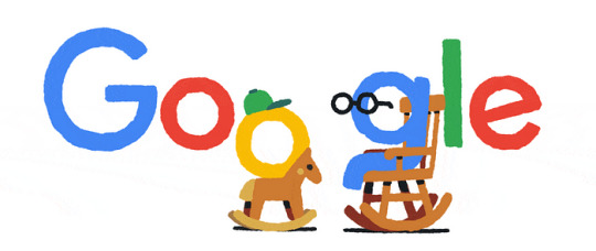
Google emblem always dressing up for the occasion
Pro Tip:
Give your emblem a breath of life by giving your logo a dynamic look. Not sure how? Head on over to Ailogomaker.com and take a look at all the innovative designs it can whip out in seconds!
Geometric Simplicity: Say More with Less
The year 2024 gives geometric simplicity a homecoming! This timeless trend proves that simplicity is always a safe bet. Neat lines, minimalist shapes and highlighting important elements is the very backbone of this trend. This logo style ensures versatility across all mediums and what’s better than that? It also extrudes a modern sense of sophistication for any emblem.

Facebook Meta emblem used across all Facebook social brackets
Pro Tip:
You can utilize online ai logo making tools to craft geometric masterpieces for your logo. The internet is a space of infinite possibilities and getting your perfect logo made is only the tip of the iceberg!
Artistic Typography: I Wrote this for You
Typography is the digital age’s take on calligraphy and it’s all types of beautiful! If you want to incorporate a timeless form of art to your logo, then Artistic Typography is a good way to go! Most customized fonts will give your logo the personality of your emblem! This is a beautiful trend as it celebrates the art of letters and making it not only for conventional reading but as a form of visual treat too.
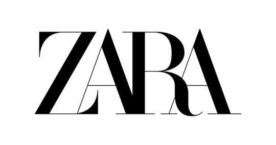
Zara emblem, chic and simple just as Zara is
Pro Tip:
You can surf the web for various font options and if you feel like a certain one is the best fit for your brand personality, then give it a go! The internet directory is on your back so be sure to utilize it. And while we’re on the topic of directories, why not head over to Bizz Directory.com to check out your competitors and draw some inspiration for yourself!
Eclectic Color Palettes: Bring a Pop of Color
Color palettes are running as fast as they could from the conventional, eclectic combos is the new it girl! This option gives your emblem an easy time to convey emotion and personality. To pull this style off try experimenting with bold colors and unexpected combination choices to add vibrancy to your visual personality.
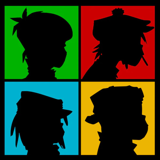
The band Gorillaz and their iconic stencil visual emblem
Pro Tip:
Not sure where to get inspo from? Pinterest is your best friend! The site is also very helpful in keeping up with current trends so make sure to frequent that as well.
Retro World: A Dive of Nostalgia
One thing is for sure, nostalgia sells and it sells good! Even in 2024, old nostalgic designs are still out to influence the crowd with a fresh take on retro aesthetics. Brands are constantly revisiting vintage design elements and whirling them into something more time-fitting and modern. The secret behind this trend is the sense of nostalgia it serves evokes a sense of familiarity to the audiences.
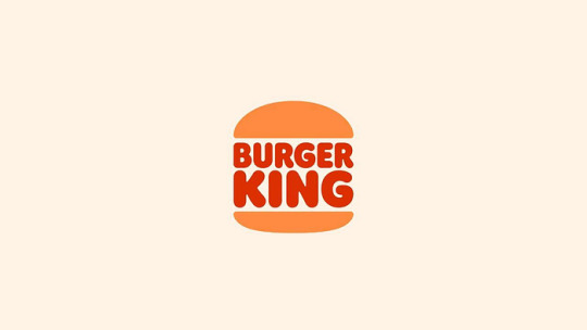
Burger King’s latest emblem refresh is so retro!
Pro Tip:
When you opt for this style, make sure to give it a mix of contemporaneity. Find the perfect blend of nostalgia and modernity and you’re all set!
Interactive Logos: Let them Engage!
In the modern age, user interaction has become extremely important and some brands are adapting their logos into interactive experiences for their audience. To do this, incorporating subtle animations is key. Try clickable features, hidden elements and other forms of interaction to engage users and create memorable brand interaction.
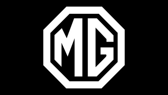
Pro Tip:
Think outside the box! Take MG the UK car company for instance, they made their car emblem non-decorative and crafted it into a sleek trunk door latch. Genius!
Cultural Fusion: All things Prettier when Mixed!
With the world being connected like never before, most emblems are an amalgamation of diverse cultures from all over the world. Brands are injected elements and symbols of diverse global motifs that give their emblem a sense of inclusivity and familiarity.

What better inspiration for Cultural Fusion would be than UNESCO’s iconic emblem
Pro Tip:
Be sure to do your research right with this! Specifically if you’re drawing cultural inspiration from a place that you’re not quite versed with. Repeat after me. Research is key.
Mixed Media Magic: Sugar Spice and Everything Nice
2024 emblems don’t come out to play, they’re here to stand on BUSINESS! Stepping out from the norm and infusing diverse media elements in the mix. Texture, depth and layered designs make aesthetically stimulating emblems that can stand out in a saturated digital landscape.

Typography and geometry perfection!
Pro Tip:
Add depth to your emblem by finding the textures and elements that resonate to your branding the best. Take all you need but make sure to choose wisely!
The year 2024 is the year where we bid to the static norms the previous years had given to us. What the people want today is something that’s visually stimulating, diverse and the perfect mix of modern and familiar. The hottest trends we divulged today are not just fads that fleet in time, these are carefully selected to represent the growth of design into the digital age. If you’re a brand on the look-out for a fresh new skin or a designer on the hunt for inspiration, these emblem trends would be ideal options to go for if you want and let your creativity soar!
And don’t forget that emblem making is hard enough as it is so it’s never a bad idea to get a helping hand that can walk you through your journey! Trust Ailogomaker and other tested online AI emblem generator like Logomaker.ai with your digital journey. Good luck!This blog is from Ailogomakerr.com
0 notes
Text
March 4th, 2024
I did genuinely attempt to be ready to get to Maastricht early in the day to spend more time with former Italian roommate (FIR) but that obviously didn't happen. I am kinda glad though, because it takes 30 minutes to get to my faculty from her apartment and that would have been a pain to do multiple times in one day.
I met with my supervisor where we decided to do a fresh install of MATLAB because he said he remembers there being a checkbox I might need to tick. My laptop was still working on uninstalling when it was time for the lab meeting to start. He had another meeting at the same time, but walked me to mine because the room was different. I'm very grateful for that because I have no sense of direction and I find the building very confusing. It still takes me about 10 minutes to find my supervisor's office.
There were some familiar faces in the meeting, which I was happy about. Having to fiddle with my laptop every few minutes also gave me an outlet during the presentation. The PhD student presenting is also doing something with rhythms but her focus seems to be more on the default mode network. She's also using fMRI and eeg. Afterwards some of the other masters students were talking about how they think she and one of the other PhD students are hardcore flirting. This is at odds with the fact that one of the guys thinks he heard her say she has a boyfriend. Faulty information, a misreading of the situation, or a blossoming forbidden romance? Who's to say? I was able to contribute that I heard them talking about getting drinks later today. Suspicious, no?
FIR tried to meet me at the bus stop near her house, but my bus arrived sooner than she thought so I ended up wandering around with offline google maps while she stood at the bus stop. Eventually she spotted me and we headed inside. The first thing I did was set up my laptop to start downloading MATLAB and chatted a little. She made dinner, a spinach dish that I had loved before. She complained about her roommates a lot which I thought was pretty bold considering they were all in the house. They're all Italian, so it was like I stepped into a little Italian outpost in the middle of the Netherlands. I haven't met that many Italians at uni, but as soon as you know one person of a specific nationality you generally find out that people with similar backgrounds tend to flock to eachother. FIR didn't start out intending for a 100% italian household, but these things happen.
There were (of course) several bottles of wine in the kitchen. One immediately caught my eye due to the label's incredible graphic design. It has, what I presume to be, a drawing of Zeus/Jupiter staring angrily ahead with the words "ROMAGNA DOP SANGIOVESE SUPERIORE RISERVA 2020" on it in what i can only describe as a microsoft word style font. I made FIR take a photo of me with the bottle.
After dinner, we went into town to get some dessert. She suggested an Irish pub nearby that had some sticky toffee she wanted to try. They didn't have any when we got there, but they did have some sort of creme brulee dish. I paid as a thank you for hosting me, and got myself a ginger beer. She decided to try ginger ale because she's not the biggest fan of ginger but was curious, and ended up not minding it.
The dessert was interesting. It came in a bowl with the sugar topping snapped and crumbled on top. There was also fruits mixed it, I think maybe oranges and something else? Not sure. Everytime I felt I had decided if I liked it or not I would take another bite that would change my opinion.
Afterward, we went to this jazz club to hear live music. The band was incredible, and it was packed. We leaned against the windows in the back in front of a table with chairs that had long since been squeezed around other tables. While we listened, we spotted cards that had been left on every table that were "never have I ever." Armed with Google translate, we played, and I very quickly lost. This was just in time for the band to start playing Freedom '90, and everyone started going insane. We danced and sang along, and I tried to get at least one video of FIR dancing because she always takes photos of other people.
As we were leaving, FIR spotted her roommate walking with a girl she very excitedly told me was also American. The girl was from New York, buti could've guessed that without being told. Truly she emobided every single negative stereotype about New Yorkers, but I tried my best to be nice. I think FIR was expecting us to be instant besties, and seemed a little taken aback when that did not happen. Ah well.
As we walked back, we talked about school systems and how the only reason I am a grade ahead of FIR is because I did the America system. She doesn't like it when I talk about being older because we were born in the same year. We are only the same age for 2 and a half months out of the year. I did tell her, though, that the reason my parents decided not to put me in Japanese school was because they would have sorted me in the year below. I guess being a spring baby just means that everybody wants you in their class.
0 notes
Text
My evaluation on my Fmp
Through my first year of doing UAL Diploma Creative Practice in Fashion I have achieved and experienced so many knowledge and technique into a preview of the fashion industry. When I first started this first year I thought I would be strong in marketing and illustration because I studies art and business for my GCSE at secondary school so I have learnt more unlike pattern cutting in which I had very little experience in. Before college I only had experience in hand sewing and I did not have any experience using a sewing machine. I find pattern cutting hard to understand at first as it all was new knowledge and hands on in the deep end for me. However, as I started to develop and progress this year it come easier, and I constructed a garment from an illustration I had drew therefore I was proud and felt happy in my work. As before I would stress it was not perfect, but I still never gave up. Also, through illustration I learnt new techniques and learnt new media with using fresh style compared to my usual art style. I did find drawing figure illustration hard though since I found the proportioning and scale hard so using the grid method, I learnt helped my proportioning and scale. Yet my marketing and my business I previously studied (where I achieved a grade nine) did help me and found it easier to learn and not fall behind compared to my other units where it was new and difficult at first. I found it easier to manage as it had similar units such as the 4ps and branding which I manged to expand my knowledge. During FMP, I had several improvements compared to my previous units. I felt more confident in my work and felt an improvement as I went on in my FMP. In marketing I felt confident and understood my customer and how to manage my research to keep my project connected through my FMP. My illustration was stronger as I practised drawing hands and feet which looked better in my pose development and as well, I found my face development and portraits had become stronger and, in more proportion. I used fine liner to make my work professional and clean to improve my illustration. I also used my media experimenting and used new media in my FMP using my knowledge and practice in my first year. I felt like my clothes designs are stronger with a 3D and fabric movement with adding shading and different strokes to show movement. Through pattern cutting, I worked independently and use my previous technical file to help me where I struggled. I had a cleaner progress through construction and creating my toile. I did find times hard still but not when I first started. I managed to make the correct right and wrong sides and kept a 1cm seam allowance through my whole construction and had less errors made. My strengths of my FMP were my time management and kept organised using my action plan through this project. I found my marketing to help me as well because of my research and Harvard referencing help me during my FMP with understanding my customer making my designs stronger and meet my outcome of this project. Furthermore, my new development of textiles helped me design with creating new samples with fruit inspired from my FMP. I still need to work on my illustration with my hand and feet drawing and making my clothes look realistic to really showcase my designs. Additionally, I want to develop my pattern cutting technique to make better garments and work on new constructions. My drawing technique as well with finding my own style for illustration and having better outcomes and different ones to make my portfolio diverse. For my second year, I will take my textile work forward and my marketing work as I enjoy both and want my work to look professional for work after achieving my years at college. I will work on my illustration skills to make them ready for work and have a clean finish showcasing my portfolio with my years at college.
1 note
·
View note
Text
Beautiful Adaptation of a Hobby | Q&A
Mitchell Romani, an Endicott College student hailing from Fremont, New Hampshire, has always had a keen interest in the arts, particularly drawings and paintings. However, despite his passion, he never progressed past the casual level of creation. That is until he was introduced to the world of pottery and ceramics, which he quickly fell in love with. With the help of his community, Romani was able to take his artistry to the next level and cultivate a talent he never knew he had. Since his initial experience with ceramics, Romani has been giving back to the community that helped him discover his new favorite pastime. He began by gifting his pieces to friends and family, but soon found himself selling beautiful vases and other items in his neighborhood. His success has allowed him to pay back those who helped him along his ceramics journey, from the teacher who first introduced him to the medium to the friends who provided support and encouragement along the way. Romani's dedication and passion for ceramics have sculpted an unknown hobby into a beautiful piece of his life. He continues to experiment with new techniques and styles, pushing himself to grow as an artist. For Romani, ceramics have become much more than just a hobby; they are a source of joy and fulfillment that he plans to continue cultivating for years to come.
A Q&A with Mr. Romani
(Q is Aiden asking a question, A is Romani replying).
Q: How did you begin to be interested in pottery, and what inspired you to begin your “business”?
A: I started my senior year of high school. I spent a lot of time drawing and painting, but I got put into a ceramics class. I wasn’t very good at it at first, but the teacher offered to put me and my friends on the pottery wheel, rather than freehand sculpting, and so we started spending a lot of time using that tool. I didn't have a class at the end of the day during that semester, so we would have an extra hour to make stuff, and we got pretty good at it with that extra practice. It got to the point where we were making way too much pottery. I didn't want to have any more because it was building up in my house, so I decided that I should start giving pieces away and selling them in my small community.
Q: Can you describe the creative process while making pottery?
A: Usually I like to begin with a project in mind, and I always try to make something new. It does take trial and error, but usually I’m able to get the new form I want to make, and those are the pieces I usually like to keep. But sometimes, for example, vases are my favorite thing to make, so since I enjoy creating those I find myself with a little more than my house really needs. Usually, like the vase example, I like to give away pieces that I’ve made before. It’s nice to have fresh ideas in my house, because repetition can make it a tad boring.
Q: So when you make pottery, you paint them, correct?
A: Yeah of course, so you have to use a special paint called a “glaze,” and you use it after you fire the clay once. After firing the clay, it becomes solid so you can't manipulate it anymore like wet clay, and since it’s hard you can paint over it. You can make any kind of designs, and it's a lot of fun experimenting with different glazes because you can create a lot of different effects. Laying glazes can create different designs, so that everything can be a little different.
Q: Where do you get materials apart from using the ones available at school?
A: There's a place in Maine, I think it's called Portland Pottery Co.
Q: Do you have it shipped after buying online or do you actually go to Maine?
A: I go get it.
Q: So you drive all the way up to Maine?
A: Yes!
Q: So would you say that pottery is something you go out of your way to do instead of just a fun hobby?
A: Yes, even though it is a fun hobby it also is fun to dedicate your craft too. It’s always really satisfying when you get a new piece that you really really envisioned and its awesome seeing it come to life.
Q: Could you walk me through the typical clay making process? Like a vase?
A: So you start with a big block of clay and depending on the size you have to portion parts of it off.
Q: So you just pick it apart or do you cut it..?
A: Yeah, you cut it apart and weighing it based on how big you want the piece to be, then you wedge it, which is like forming it into a sort of torpedo shape and it gets rid of all the bubbles and inconsistencies in the clay, and make it easy to throw onto the wheel.
Q: What's the wheel, exactly?
A: The wheel is a platform that rotates as you sculpt the clay
Q: Oh, so that way everything can be symmetrical?
A: Yeah, exactly. So after you put it on the wheel, you need tools and water, like sponges and scrapers so you can stylize the piece and shape it better. You have to wet the clay because it drags on your hands as it spins and it hurts a bit. You first make a hole in the middle and drag your fingers straight up, and after that you can manipulate it however. Then you have to let it dry, which usually only takes like a day, maybe even less. Then you fire it in the kiln, which usually takes a few days depending on the size of the piece. After that you get to choose glazes and patterns, and after you glaze it you fire it a second time. Then you have your piece!
Q: So you began this as a school/hobby thing, how did it turn into a sort of community business?
A: Eventually, once I had so many pieces, we (his family) never used them since there were already so many pieces around the house. I even had extra to bring here to college, like bowls I use for my jewelry and a mug for coffee. Extra pieces were just lying around, and my aunts and uncles always asked me if they were for sale, so I was like yeah why not? I don't use them. So I decided to start giving some out.
Q: So since this is technically not a “real business” and mainly a niche part of your community, how do people find out about your talents? How does word spread that Mr. Romani makes pottery?
A: So, in that senior year of high school, I was kind of infamous for being in the art and ceramics room all the time. I had multiple art classes apart from just ceramics, so sometimes I’d just do ceramics in my other art classes, with permission from the teacher. Everybody knew I was in the ceramics room though, and the teachers put up my pieces around the school occasionally. I also post a bunch of my pieces on social media, and in a small town just about everyone follows everyone, so word spreads quickly. Also family coming over was sort of self explanatory because they'd see it around the house.
Q: So are there future plans? I know it's difficult to keep it up during college.
A: I would love to keep this going throughout my life, and not just at home, but at the moment home is about the only place I can do it. I'd like to do it more often, and it would be beneficial to me because practice makes perfect.
Q: Does being a student affect your pottery career?
A: Definitely. I'm not really able to make much here at college. There is a studio but I'm not sure if and when I'm supposed to use it. I've made one piece here but it's not even finished, and I don't know when the group is meeting again to finish it, but hopefully I can finish it before the end of the year.
Q: What's your favorite piece you've made?
A: That's a tough question. It's probably a tie between two things. One of them was two pieces that I messed up, because when I was trimming, I poked a hole in the bottom by accident and I didnt know what to do. I didn't know what to do with it because obviously a vase with a hole in the bottom is useless, so I put it on top of one of my other pieces and formed it together so it combined into a huge tall vase and I think the glazes I used came out perfectly, like a blue and black which is one of my favorite combos. Black always works really well with other colors. And the other one is a little different. We used a firing process called “raku,” which is a different process. All it is instead of the big kiln, it goes into a different type of kiln where you take it out while it's glowing hot, and you put different stuff all over it, like copper and it melts onto the piece. So you take it out when it's burning hot and you can search stuff onto it, like feathers and stuff for designs.
Q: So it's like branding kind of but the opposite way because the piece is hot instead of the imprint?
A: Yeah exactly. Then you put it into a barrel and put the lid over it, so the smoke and everything encapsulates everything. I made it have a really cool color too, like a turquoise blue gradient into a pink and it turns into literally gold by the end of it.
Q: So that sounds super complicated, is this one of the more difficult things to do?
A: Yeah, the firing process is way harder and longer than usual and it's really easy to mess up. I really liked that piece because it was one of the only ones that made it all the way through the process.
Q: So when you sell pieces, how do you base your prices?
A: So obviously I wont charge my family, but like when I sell it to my neighbors or people in my town it's usually between $25-50 depending on the size and the time it took. It usually never gets to $50, because that's super expensive for something I enjoy doing. It also depends on the materials and stuff, like any business.
Q: Do you use your own pieces a lot?
A: Yeah I do, I use my mugs literally every day. Another piece that gets a lot of use is this whiskey glass that I made for my dad for fathers day. So he uses it obviously, not me.
Q: Were your teachers a main factor?
A: 100%. My ceramics teacher was a huge influence on me, and her encouragement was what kept me going from the beginning. Once, she wanted us to experience a factory type of day where we would make a ton of mugs in one day to see what real production is like. I think we made like 12 mugs and we gave them out to our favorite teachers.
Q: That's so cool, and it kind of gives insight to how a business works?
A: Yeah, especially learning consistency, because that's huge in ceramics, but it's also cool knowing every piece is sort of unique too.
Q: Lastly, how do you deal with pottery you're not happy with?
A: So one thing my teacher did really well was teach us that you can't always get it right. When she didnt like a piece, she would literally smash it right there in front of us. This way, you can get your frustration out, accept that not every piece is going to be perfect, and you can always try again.
Aiden: That's so cool! Thank you so much!
0 notes
Text
Blog Post 9: Rationales Refined
La Stella Trattoria:
My project was a logo redesign so as to give it a fresher look that connects with the restaurant’s Italian cuisine.
THE CHALLENGE
When starting my creative process my first thought was to start by brainstorming and ask myself questions like what is it about their current logo that is dysfunctional and unattractive? What is missing or is inappropriate.” Despite their current design being simple and legible, it wasn’t unique enough and lacked a personality. Hence it was unmemorable and unidentifiable as an Italian restaurant logo.
Being an Italian restaurant, their logo needed some spice, energy, vibrancy and a design element that can help guide their target audience to determine what La Stella Trattoria is, what services they provide, and how’s the ambiance etc.
THE APPROACH
My research consisted of me surfing the web about their restaurant & roots, as well as becoming a customer myself and experiencing their culture and uniqueness through their food and service.
Experiencing it for myself allowed me to get into the headspace of being a loyal customer of La Stella Trattoria. People of different backgrounds and ages enjoyed their time and left feeling satisfied. This made me wonder what about this place makes it so great. That’s when a switch flipped inside of me, La Stella Trattoria became known and loved for its authentic, fresh, home-style pizzas. What makes them stand out in the downtown area was their pizza! Now that I had my design direction I needed my final design to represent warmth, positivity, freshness, and liveliness. It needed to be inviting, and create a sense of nostalgia for its customers, especially Italian cuisine connoisseurs.
THE FINAL RESULT
My process started with a few rough thumbnails consisting of my research and creativity to switch up their logo from simplistic and uninviting to attractive and welcoming. I finally decided on a simplified pizza oven design with a burning flame as my final design for their logo because I wanted the logo to create a sense of connection and familiarity in their target audience so as to remain memorable and unique. This idea was born from the very fact that La Stella Trattoria creates its magnificent pizzas in a pizza oven, right in front of its customers and serves them hot and fresh.
I started in procreate and made my way to Adobe Illustrator to fine-tune my logo and add text. My type choice consisted of a classy type for the main title and a soft rounded one for the subtitle. I decided on this route as I needed the emphasis to be on “La Stella” rather than “La Stella Trattoria.” In addition, to bring to life my keywords of “ warmth, positivity, freshness, and liveliness” I selected a warm and striking colour palette. To finish up I created standard sheets in Adobe Indesign to create certain rules and guidelines to follow when my redesign of their logo is in use.
Tools:
Procreate
Adobe Illustrator
Adobe Indesign

Le Petit Belge
My project was to recreate a menu for this French breakfast restaurant located in Downtown Vancouver, B.C.
THE CHALLENGE
While their current design was legible and simple it lacked character, energy and attractive design elements to draw in their audience. As it was a text-heavy document it had a tendency to become overcrowded with too much information in a limited amount of space. When being presented with an overcrowded menu design, customers who are prone to anxiety when placing orders, like myself, may become more anxious when presented with too many options in a menu that lacks the use of breathing room, a sense of hierarchy, soft & subtle colour palette and some illustrations to help the customers visualize their order of choice.
THE APPROACH
My aim was to help bring life, energy and positivity to my redesign hence I began my research by personally going to their restaurant to experience their service and food items as well as going through their online website. My design direction was to implement creative choices that would result in a menu design that's easy to read, understand, and navigate through for every customer. Through research, I found that Paris, France became known as "The City of Art." I had this need to figure out a simplistic way to take inspiration and incorporate this idea into my design. Not only colour but, art forms and illustration brings life and a sense of uniqueness to a brand and its elements of design.
THE FINAL RESULT
I created a set of thumbnails and rough sketches which were then illustrated in procreate and Illustrator that in the long run, helped me bring my illustrations to life! In addition, I designed my 6-page document in Indesign and structured my layout with hierarchy, and legibility while incorporating a soft neutral colour palette in order to showcase the main reason why Le Petit Belge became well known; their waffles. I kept my illustrations simple and bright so as to catch the viewers' attention but not distract them from what's really important.
Tools:
Procreate
Adobe Illustrator
Adobe Indesign

0 notes
Last Seen Blogs
raveneesimo
Raven M. Molisee

juan12sposts
maduros


globallinksconsultancy-post-blog
Global Links Consultancy and Education Services

arlodoor
Untitled