#flexbox menu
Explore tagged Tumblr posts
Visit Tumblr Blog
Explore Tumblr blogs with no restrictions, modern design and the best experience.
Last Seen Tumblr Blogs


Fun Fact
Hackers stole 65M passwords from Tumblr in 2013.
Text

CSS Flexbox Navigation Menu
#flexbox menu#css flexbox menu#navigation menu#navigation bar#codingflicks#html css#frontend#html#css#code#frontenddevelopment#css flexbox layout#css flexbox tutorial#html5 css3
1 note
·
View note
Text

Responsive Mega Menu
#Responsive Mega Menu#flexbox mega menu#css navbar#css menu#html css menu#css megamenu#responsive menu#codenewbies#html css#css#html5 css3#code#responsive web design
3 notes
·
View notes
Text
Choosing Between Flexbox and Grid for Your Basic Layout Structure

Introduction
Beyond the aesthetics of web design, the choice of layout structure forms the backbone of a project's responsiveness and adaptability. At the heart of this decision lie two powerful CSS tools: Flexbox and Grid. These elements are more than mere design choices; they dictate how a webpage responds to different screen sizes and user interactions, impacting usability and visual appeal.
Understanding the Basics

Flexbox: Flexbox is a one-dimensional layout model best suited for organizing items within a container, offering flexibility in managing space distribution, alignment, and order. Its strength lies in its ability to handle complex layouts while maintaining simplicity in code structure. Grid: Grid is a two-dimensional layout system that creates a grid-based design, allowing precise placement and alignment of elements in rows and columns. Its advantages include fine control over both the rows and columns, making it ideal for overall page structure and layout alignment. Both Flexbox and Grid can be effectively utilized for basic layouts by structuring a header, main content area, and footer with distinct approaches tailored to their strengths.
Comparative Analysis

Flexbox Pros: - Efficient for arranging elements in a single direction, vertically or horizontally. - Great for small-scale layouts like navigation menus or individual components within a page. - Simplified syntax and intuitive approach make it easier to learn and use. Cons: - Complex layouts might require nested flex containers, leading to potential complications. - Challenges in controlling the alignment of both rows and columns simultaneously. Suitable Scenarios: Ideal for smaller, simpler layouts or for organizing elements in one direction, such as in menus or single-axis content layouts. Grid Pros: - Perfect for managing both rows and columns simultaneously, enabling more precise layouts. - Best for complex and multi-dimensional layouts, especially entire page structures. - Offers fine control over placement, making it suitable for responsive designs. Cons: - Complexity in understanding and implementing for beginners due to its comprehensive grid structure. - Not as effective for single-axis layouts compared to Flexbox. Suitable Scenarios: Best suited for larger-scale layouts or designs that demand strict control over both rows and columns, like entire webpage structures or responsive grid systems.
Usage Scenarios

Flexbox Scenarios Where Flexbox Shines: - Small-Scale Components: Flexbox excels in organizing smaller elements within a webpage, like menus, buttons, or individual sections. - Single-Direction Layouts: It's perfect for arranging elements in a single direction, simplifying the structure for one-dimensional layouts. - Mobile-First Designs: Ideal for mobile-responsive designs where content needs to adapt to smaller screens with straightforward layout adjustments. Grid Scenarios Distinct Advantages of Grid: - Full-Page Layouts: Grid is optimal for structuring entire pages, managing complex alignments in multiple directions (rows and columns). - Multi-Dimensional Layouts: Perfect for designs that require precision in both row and column placement, ensuring a cohesive and responsive layout. - Responsive Grid Systems: Offers extensive control for building responsive grid systems that adapt seamlessly across various screen sizes.
Responsiveness and Adaptability
Flexbox and Responsiveness Catering to Responsive Design: Flexbox simplifies responsiveness by allowing elements to adjust based on available space and container size. It facilitates flexible resizing of components within a single direction, aiding in responsive designs. Adaptability in Viewport Sizes: Flexbox is particularly suitable for smaller devices where elements need to flexibly adjust in a single axis, making it easier to adapt content to varying viewport sizes. Grid and Responsiveness Catering to Responsive Design: Grid systems provide a more comprehensive approach to responsiveness by allowing precise control over both rows and columns, enabling intricate adjustments for various screen sizes. Adaptability in Viewport Sizes: Grid excels in handling complex layouts across different viewport sizes, ensuring elements maintain their specified placement and alignment in both axes, enhancing adaptability in various screen sizes.
Best Practices and Recommendations
Choosing Between Flexbox and Grid When to Choose Flexbox: Opt for Flexbox when dealing with simpler, single-direction layouts or smaller components within a webpage. It's ideal for basic layouts requiring flexibility in one axis. When to Choose Grid: Prefer Grid for more complex, multi-dimensional layouts or when structuring entire pages. Choose it when precise control over both rows and columns is necessary. Combining Flexbox and Grid Effective Combination: Consider using Flexbox within specific sections or components within a grid-based layout. For instance, employing Flexbox to organize elements within grid-defined areas can harness the strengths of both techniques. Hybrid Approach: Experiment with combining both Flexbox and Grid to achieve optimal results. For instance, using Flexbox for header and footer elements while implementing Grid for the main content area can leverage the strengths of each method within a single layout.
Real-world Application
Flexbox in Real Projects Project Example: Portfolio Website In a portfolio website, Flexbox was utilized to arrange sections within the main content area. Each project section was organized in a single direction, allowing for easy adaptation to various screen sizes. This choice enhanced responsiveness, especially for mobile devices, providing a seamless browsing experience. Grid in Real Projects Project Example: E-commerce Platform An e-commerce platform used Grid to structure its product listings and category sections. The complex layout demanded precise alignment in both rows and columns, ensuring scalability across different viewport sizes. This choice significantly improved the scalability and responsiveness of the platform, offering a consistent and visually appealing layout.
Conclusion
Flexbox and Grid stand as powerful tools in the realm of web design, each offering distinct advantages based on the nature of the layout and design requirements. Distinguishing Factors: Flexbox excels in simpler, single-direction layouts and smaller components, offering flexibility and ease of use. On the other hand, Grid shines in complex, multi-dimensional layouts, providing precise control over both rows and columns. Significance of Choosing the Right Layout: The choice of layout structure forms the foundation of a project's scalability and responsiveness. A well-thought-out decision between Flexbox and Grid, or a strategic combination of both, is pivotal in ensuring a website's adaptability across various devices and screen sizes. Read the full article
2 notes
·
View notes
Text
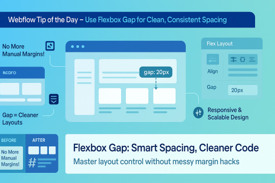
🌟 Webflow Tip of the Day – Use Flexbox Gap for Clean, Consistent Spacing
When building layouts in Webflow using Flexbox, don’t manually add margins between elements. Instead, use the “Gap” property for smarter, scalable, and more elegant spacing.
🔧 How to Use Flex Gap:
Select your Flex container
In the Style Panel → under Layout → enable Flex
Use the Gap field to set uniform spacing (e.g., 20px)
This works both for horizontal and vertical spacing!
✅ Why It’s Better Than Margins:
Maintains consistent spacing across breakpoints
Cleaner code — no messy margin overrides
Easier to manage on large-scale layouts
Improves responsiveness and scalability
💡 Practical Examples:
Equal spacing between buttons in a CTA
Neat rows of cards or feature boxes
Structured menu items in navbars
🔄 Bonus Tip: Use with Grid layout too — Gap is a game-changer there as well!
🚀 Want to build pixel-perfect, responsive Webflow sites like a pro? 📌 Connect With Me:
🌐 Portfolio: www.webflowwork.com 🎯 Upwork: https://bit.ly/4iu6AKd 🎯 Fiverr: https://bit.ly/3EzQxNd
#webflow#freelancewebdeveloper#web design#web development#webflowdesign#webflowexperts#webflowlandingpage#website#nocode#ui ux design#fiverr tutorial#fiverr#freelancing#upwork
0 notes
Text
The Future of Front-End Development: Technologies, Trends, and Services in 2025
Front-end development plays a crucial role in how users interact with websites and applications. The user experience (UX), speed, and responsiveness of a website all depend on how well the front end is developed. As technology evolves, businesses need to stay ahead by adopting modern front end development technologies and ensuring seamless experiences across devices.
With growing competition in the digital space, companies are also investing in front end development services to create high-performing, visually appealing, and user-friendly applications. This article explores the latest technologies, trends, and services shaping the future of front-end development.
1. What is Front-End Development?
Front-end development focuses on the visual and interactive aspects of a website or web application. It includes everything a user sees and interacts with, such as navigation menus, buttons, animations, and layout structures.
Key Responsibilities of Front-End Developers:
Writing clean, efficient, and responsive code.
Ensuring seamless cross-browser compatibility.
Optimizing websites for faster load times and better performance.
Creating accessible and user-friendly interfaces.
Integrating with backend APIs for smooth data retrieval.
To build fast and engaging user interfaces, developers rely on modern front end development technologies that simplify coding, enhance performance, and improve scalability.
2. Latest Front-End Development Technologies in 2025
With new frameworks, libraries, and tools emerging, front-end development is continuously evolving. Here are some of the best technologies shaping the front end in 2025.
A) Front-End Programming Languages
1. JavaScript (JS)
JavaScript remains the dominant language for front-end development, powering interactive and dynamic web applications. With the rise of frameworks like React, Vue, and Angular, JavaScript continues to be at the core of modern web development.
2. TypeScript
TypeScript, a strongly-typed superset of JavaScript, is becoming increasingly popular due to its ability to reduce errors and improve code maintainability. More developers are adopting TypeScript for large-scale applications.
3. WebAssembly (WASM)
WebAssembly allows developers to run high-performance applications in web browsers using languages like C++ and Rust. It is revolutionizing front-end development by enabling faster execution of complex applications.
B) Best Front-End Frameworks and Libraries
4. React.js
Developed by Meta, React remains one of the most widely used front-end libraries. Its component-based architecture, virtual DOM, and support for server-side rendering (SSR) make it ideal for building fast and scalable web applications.
5. Vue.js
Vue is a lightweight yet powerful framework known for its ease of use and flexibility. With Vue 4 expected to launch soon, its improvements in performance and modularity make it a great choice for progressive web applications (PWAs).
6. Angular
Maintained by Google, Angular is a feature-rich front-end framework best suited for enterprise-grade applications. It offers built-in solutions for routing, form validation, and dependency injection, making it ideal for complex projects.
7. Svelte
Svelte is gaining popularity due to its lightweight approach — it compiles components at build time, eliminating the need for a virtual DOM and resulting in faster execution and reduced file sizes.
C) UI/UX and Styling Technologies
8. Tailwind CSS
Tailwind CSS is a utility-first CSS framework that simplifies custom styling. It allows developers to build beautiful interfaces without writing large CSS files, making it a preferred choice for modern UI development.
9. Material UI (MUI)
Based on Google’s Material Design, MUI provides a collection of pre-built, customizable components that improve the speed and consistency of UI development.
10. CSS Grid and Flexbox
These layout techniques offer powerful tools for designing responsive web pages, allowing developers to create dynamic and adaptive designs with minimal effort.
3. Front-End Development Services: What Businesses Need
Building a successful digital product requires more than just coding. Companies offering front end development services help businesses create user-friendly interfaces, optimize performance, and ensure compatibility across devices. The services are explained in detail below -
UI/UX Design and Development
A well-structured user interface (UI) and user experience (UX) ensure smooth navigation and engagement. Front-end developers work closely with designers to implement:
Intuitive layouts for easy navigation.
Accessibility improvements for all users.
Mobile-first designs for seamless performance across devices.
Progressive Web App (PWA) Development
PWAs provide an app-like experience on web browsers. They load faster, work offline, and improve engagement. Businesses investing in PWA development benefit from:
Better mobile performance without requiring an app download.
Improved search engine visibility.
Increased user retention due to smooth interactivity.
Single Page Application (SPA) Development
SPAs dynamically update content without reloading the page, making them faster and more responsive. React, Vue, and Angular are commonly used for building SPAs.
Cross-Browser and Device Compatibility Testing
Ensuring a website functions smoothly across all browsers and devices is crucial. Developers optimize front-end code to prevent issues related to:
Browser inconsistencies (Chrome, Firefox, Safari, Edge).
Mobile responsiveness across various screen sizes.
Performance Optimization
A slow-loading website leads to poor user experience and lower rankings on search engines. Front-end developers focus on:
Reducing page load times by optimizing images and scripts.
Implementing lazy loading for improved speed.
Minimizing HTTP requests and using content delivery networks (CDNs).
4. Future Trends in Front-End Development
With technology advancing rapidly, front-end development is embracing new innovations. Here are some trends shaping the future:
Artificial Intelligence (AI) in UI/UX
AI is being integrated into front-end development for personalized user experiences, automated testing, and smart UI components.
Voice-Activated Interfaces
More websites are incorporating voice navigation, allowing users to interact hands-free.
Augmented Reality (AR) and Virtual Reality (VR)
AR/VR-based front-end development is growing in e-commerce, real estate, and education, offering immersive experiences.
No-Code and Low-Code Development
Platforms like Webflow and Bubble enable faster front-end development without extensive coding knowledge.
Front-end development is evolving rapidly, with new technologies and services transforming how businesses build digital experiences. Choosing the right front end development technologies ensures websites and applications remain fast, responsive, and engaging.
Businesses investing in front end development services gain access to expert developers, optimized UI/UX design, and scalable digital solutions that improve customer satisfaction. As we move into 2025, staying ahead with the latest tools, frameworks, and trends will be key to creating successful web applications. Whether you’re a startup or an enterprise, prioritizing front-end development will set your business apart in an increasingly digital world.
0 notes
Text
Frontend Development: Shaping the User Experience on the Web
Every modern website or application you visit — whether it's a social media platform, e-commerce store, or personal blog — owes its visual appeal and user interactivity to frontend development. As users demand faster, more engaging, and intuitive digital experiences, frontend development has become one of the most essential disciplines in web and software development.
What is Frontend Development?
Frontend development is the practice of building the client-side of web applications — the part that users interact with directly in their browsers. It focuses on designing and developing the structure, design, behavior, and animation of everything you see on a webpage.
Frontend developers work closely with UI/UX designers to bring static mockups to life, ensuring websites are not only functional but also visually engaging and responsive.
Core Technologies in Frontend Development
Frontend development is primarily built upon three foundational technologies:
1. HTML (HyperText Markup Language)
Defines the structure and layout of web pages. Think of it as the skeleton of a website.
2. CSS (Cascading Style Sheets)
Handles the styling — colors, fonts, layout, and overall visual appeal. CSS makes websites look polished and professional.
3. JavaScript
Brings interactivity to web pages. Whether it’s a dropdown menu, slideshow, or form validation, JavaScript makes it dynamic.
Modern Frontend Frameworks and Libraries
To streamline and enhance frontend development, developers often use powerful tools like:
React – A JavaScript library by Facebook for building user interfaces with reusable components.
Vue.js – A progressive framework for building UIs and single-page applications.
Angular – A robust front-end framework by Google that’s great for complex, large-scale applications.
Tailwind CSS – A utility-first CSS framework that simplifies styling by using predefined classes.
Key Responsibilities of a Frontend Developer
A frontend developer is responsible for:
Translating UI/UX designs into functional web interfaces.
Ensuring cross-browser and cross-device compatibility.
Optimizing performance for faster load times.
Integrating with backend services via APIs.
Maintaining code quality using modern development practices.
Responsive Design and Mobile-First Approach
With mobile users making up a significant portion of web traffic, responsive design is a top priority. Frontend developers use tools like:
Media Queries
CSS Flexbox and Grid
Frameworks like Bootstrap or Tailwind
These techniques ensure that websites look and function perfectly on screens of all sizes — from phones to desktops.
Frontend Development Tools
To improve productivity and collaboration, frontend developers use:
Version Control: Git, GitHub
Package Managers: npm, Yarn
Build Tools: Webpack, Vite, Parcel
Code Editors: Visual Studio Code, Sublime Text
Testing Tools: Jest, Cypress
The Importance of Frontend Development
First Impressions Matter: Users often form opinions within seconds of visiting a site. Good frontend design builds trust.
User Experience (UX): A seamless, fast, and interactive frontend keeps users engaged and reduces bounce rates.
Accessibility: Inclusive design ensures all users, including those with disabilities, can interact with the site.
Future Trends in Frontend Development
Frontend development continues to evolve rapidly. Upcoming trends include:
WebAssembly for high-performance apps
Progressive Web Apps (PWAs) that work offline
Motion UI and Microinteractions
AI-powered UI personalization
Headless CMS and JAMstack architectures
Conclusion
Frontend development is more than just writing code — it's about creating meaningful, beautiful, and intuitive digital experiences. As the digital world continues to grow, so does the demand for skilled frontend developers who can turn complex ideas into accessible and engaging interfaces.
Whether you're a beginner exploring web development or a business owner looking to improve your online presence, understanding frontend development is the first step toward building better digital experiences.
Location : https://g.co/kgs/H5YVuuF
0 notes
Text
Top 5 Web Design Tips for Beginners

Web design is not only about decorating a website but also about providing a pleasant and easy user experience. For those new to web design, the very thought of it can even feel intimidating. Don't worry; here are five tips you can't go wrong with to give you a clean, professional look from day one.
1. Keep It Simple
As a novice, you want to pour colors, typefaces, or animations into your design. But remember, less is more. A simple layout with legible typefaces and consistent spacing improves the website's readability and navigation.
Tip: Restrict your palette to 2-3 colors and use only 1-2 fonts.
2. Design for Mobile Responsiveness
Users are mostly mobile now (60+%). Your design must shine and work across all screen dimensions, including desktop, tablet, and mobile.
Tip: Use responsive frameworks like Bootstrap or CSS Flexbox/Grid.
3. Focus on Navigation
A user should never lose their way. Clear labels, menus, buttons-catchy rays, terrestrial ease all keep the user interested.
Tip: Keep your main menu on top or on the side and make relevant pages easy to reach.
4. Select the Right Fonts and Colors
Fonts and colors are somehow the identity of your brand. Use web-safe fonts like Roboto or Open Sans and always keep a good contrast with your background for readability purposes.
Tip: Use coolors.co, and Google Fonts to get your palettes and typography.
🎯 Want to go beyond design into interaction?
👉 Check out our JavaScript Course to learn how to add dynamic features like sliders, popups, and more!
5. Content and Loading Speed
A beautiful design does not mean that it must be slow, giving bad user experience, or devoid of useful content. Optimize images, write useful texts, do away with unnecessary code, or even unnecessary plugins.
Tip: Use compressed images (WebP); analyze your site using PageSpeed Insights and others.
Learn Web Design Step-By-Step
Want to dive deeper into web designing? At TCCI-Tririd Computer Coaching Institute Ahmedabad, we teach from the beginners' level to advanced, with hands-on projects.
Explore Our Web Design Course
Closing Thoughts
Starting the web designing voyage is not a big thing when you build based on that foundation of usability and from there on, all websites you build will not only be gorgeous to look at, but will be a joy to operate. Start small, keep learning, and with each project, improve!
Call now on +91 9825618292
Visit Our Website: http://tccicomputercoaching.com/
#Computer Classes Iskcon-Ambli Road in Ahmedabad#computer classes near me#Learn Web Design at TCCI Ahmedabad#TCCI - Tririd Computer Coaching Institute#Web Design Classes Iskcon-Ambli Road Ahmedabad
0 notes
Text
Common Mistakes to Avoid in Architecture Website Design
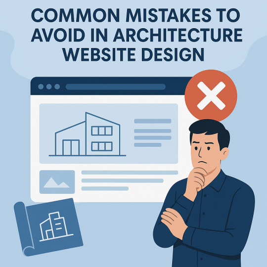
In today's digital landscape, your website is the blueprint of your brand. For architecture firms, Architecture Website Design is more than just aesthetics — it's about communicating expertise, attracting leads, and standing out in a competitive market. Yet, many firms fall into common design traps that can cost them credibility and conversions. In this blog, we explore the most frequent architecture website design mistakes and how to avoid them with practical, technical insights.
1. Overloading the Website with Visuals
Architecture is a visual industry — and while high-quality images are essential, overloading your website with large, unoptimized visuals can backfire. Many firms try to showcase every project, resulting in cluttered layouts and painfully slow load times.
This not only frustrates users but also harms SEO rankings and mobile performance. According to Google, 53% of mobile users abandon a site that takes more than three seconds to load.
How to fix it:
Use next-gen formats like WebP for images.
Compress and lazy-load media files.
Limit portfolio items per page and link to full case studies.
Balanced visual storytelling is the key to effective architecture website design — show just enough to entice without overwhelming.
2. Ignoring Mobile Responsiveness
With over 60% of global web traffic now coming from mobile devices, a desktop-only approach to design is outdated and risky. Architecture websites often suffer from oversized galleries or awkward layouts that don’t translate well to smaller screens.
Responsive design isn’t optional anymore.
Technical tips:
Use flexible grids (CSS Grid or Flexbox).
Set breakpoints for multiple screen sizes.
Implement mobile-first design in frameworks like Bootstrap or Tailwind.
A responsive architecture website design ensures accessibility and a positive user experience for every device.
3. Poor Navigation and User Experience (UX)
Visitors to architecture websites are often clients or collaborators looking for quick answers: Who are you? What have you done? How can they contact you?
Clunky menus, broken links, or buried content can drive them away.
UX best practices:
Use a clear top menu with categories like "About," "Portfolio," "Services," and "Contact."
Implement sticky navigation bars for easy access.
Highlight CTAs like “Book a Consultation” or “Download Portfolio.”
Great UX in architecture website design helps users discover your value fast — and keeps them engaged longer.
4. Lack of Project-Focused Portfolio Structure
An unstructured portfolio is a major red flag. Visitors want to explore your past projects, but many architecture sites either show too much or too little, with no way to filter or drill down.
Fix this with:
Categorized portfolio pages (e.g., Residential, Commercial, Urban). -
Filters for project type, location, or size.
Detailed case studies with challenges, solutions, and visuals.
Smart portfolio presentation sets the tone for your capability and professionalism, enhancing the impact of your architecture website design.
5. Neglecting SEO and Site Performance
A beautiful website that no one finds is a wasted investment. Architecture firms often neglect the foundational elements of SEO — like proper tagging, clean code, and content strategy — which limits their visibility.
Key SEO & performance practices:
Add relevant meta titles and descriptions.
Use schema markup for projects and team profiles.
Optimize for Core Web Vitals using tools like Google PageSpeed Insights.
Host on fast, reliable servers and use a CDN for image delivery.
Platforms like WordPress combined with plugins like Yoast SEO and WP Rocket can streamline performance and SEO for your architecture website design.
6. Inconsistent Branding and Aesthetic
Architecture is about precision and design integrity — your website should reflect that. Yet many firms suffer from branding inconsistency: mismatched fonts, erratic color schemes, and uneven design patterns.
Establish a cohesive identity with:
A defined color palette and typography hierarchy.
Consistent use of logos and visual styles.
A style guide or design system.
Strong branding makes your firm instantly recognizable and sets the tone for trust — a crucial goal of any architecture website design.
7. Not Integrating Contact or Lead Generation Tools
Some websites make it surprisingly hard to reach the company. Others fail to include forms, live chat, or even clickable phone numbers — turning potential clients away.
Conversion-focused design tips:
Include visible CTAs on every page.
Use sticky “Contact” or “Schedule a Call” buttons.
Integrate tools like Calendly, HubSpot, or Mailchimp for leads and automation.
Seamless lead capture transforms your architecture website design from a digital brochure into a business asset.
Conclusion
A well-executed architecture website design should function as a showcase, a sales funnel, and a statement of your firm's identity — all in one. Avoiding the mistakes we’ve covered — from poor mobile optimization to missed SEO opportunities — will help position your brand at the forefront of the industry.
0 notes
Text
Beginner's Guide to Responsive Web Design
Websites are the storefronts of the digital world. Everyone wants a sleek, stylish, and easy-to-use web design in Sydney. However, not everyone knows how to make one that works on all devices. That is where responsive web design comes in. It is not just a trend—it is the new normal. If your web design in Sydney is not responsive, you are already behind. But don’t worry, this guide will help you catch up.
What is Responsive Web Design?
Responsive web design means a website adjusts to any screen size. You don’t need to zoom in. You don’t need to scroll side to side. Everything lines up. Everything flows. It feels natural.
So, the goal is simple: Make your web design in Sydney readable and usable, no matter the device. No matter the screen resolution.
Why Should You Care?
People use all kinds of gadgets today. Laptops, tablets, smartphones, smart TVs, and so on. Some websites look perfect on a laptop, but try the same site on your phone. It’s a mess. The text is tiny. Buttons are hard to click. Images get cut off. All this chaos makes your visitors leave in frustration.
Google loves responsive websites and gives them better rankings. This leads to more visitors and better visibility. Thus, a responsive site is not a luxury but a necessity.
The Key Ingredients of Responsive Design
1. Fluid Grids
A fluid grid uses percentages instead of fixed pixels. That way, elements grow or shrink depending on the screen size. For example, imagine a picture might be 50% wide. It stretches on a big screen, while on a small screen, it shrinks. The layout stays balanced. The structure remains intact.
2. Flexible Images
Images are tricky. If not sized properly, they break layouts. So, responsive design always uses flexible images that are easy to scale and adjust. No overflow. No broken sections. Just smooth visuals. You can use CSS to control this. A common trick is to set the image width to 100%. That way, it always fills the space.
3. Media Queries
This is the secret sauce. Media queries are CSS rules. They tell the browser how to style the page based on screen size.
When the screen is 600 pixels wide or smaller, the background turns light blue. You can:
Change fonts
Rearrange sections
Hide or show content
In short, media queries give you control and make your design smart.
Mobile-First Design: Start Small
Design for the smallest screen first. That is mobile-first design. It makes you focus. It helps you prioritise. You start with what really matters. To put it in order:
Build a layout for phones.
Then scale it up for tablets.
Then expand it for desktops.
This approach saves time while reducing clutter. It also ensures a clean and clear user experience.
Tools to Help You Get Started
Bootstrap
This is a popular framework with pre-made grid systems. It includes responsive components, from buttons to forms to navigation bars. You can build fast. You can customise easily.
CSS Flexbox
Flexbox helps you align items in rows or columns. It adapts quickly and is ideal for one-dimensional layouts. Want a row of cards that wraps on small screens? Flexbox does that.
CSS Grid
Grid is perfect for complex layouts. You can place items wherever you want—rows, columns, or overlapping elements. It gives you full control.
Chrome DevTools
Test your design right in your browser.
Open Chrome.
Press F12.
You’ll see the Developer Tools.
Switch to mobile view.
Resize the window.
See how your site responds.
Adjust and fix issues on the spot.
Tips for Better Responsive Web Design in Sydney
Keep Navigation Simple
Big menus do not work well on phones. Use icons or collapsible menus, and keep it clean. More importantly, keep it user-friendly.
Avoid Fixed Widths
Fixed widths can break your layout. Stick to percentages. Embrace fluidity.
Use Viewport Meta Tag
Add this to your HTML:
```html
<meta name="viewport" content="width=device-width, initial-scale=1.0">
```
This tells the browser how to scale the page. Without it, your design might look weird on mobile.
Test on Real Devices
Simulators help, but nothing beats the real thing. Open your site on different phones. Try it on tablets. Check how it looks. Check how it feels.
Optimise Loading Time
Mobile users want speed. Compress your images. Minify your CSS and JavaScript. Use lazy loading. Keep things light.
Real World Example
Let’s take a basic layout. A homepage with a header, a main section, a sidebar, and a footer.
On desktop:
– The header stretches across the top.
– The main section sits on the left.
– The sidebar is on the right.
– The footer is at the bottom.
On mobile:
– The header still sits on top.
– The sidebar moves below the main section.
– Everything stacks vertically.
Same content. Different layout. That’s the beauty of responsive design.
Common Mistakes to Avoid
Even the best designers mess up. Let’s make sure you don’t.
– Don’t forget the viewport meta tag.
– Don’t use large fixed images.
– Don’t hide important content on mobile.
– Don’t ignore load speed.
– Don’t test only on one screen size.
Each screen is a new experience. Each visitor deserves a smooth journey.
Final Thoughts: The Future is Flexible
The internet will keep changing. New devices will appear and new screen sizes will emerge. So, your fully responsive website must be ready. It keeps your site future-proof. To get started with your responsive web design in Sydney - https://www.makemywebsite.com.au/web-design/sydney/ , connect with Make My Website.
Web design is not just about looking pretty. It’s about function. It’s about flow. It’s about flexibility. Responsive design gives your website a fighting chance.
0 notes
Text
WordPress Theme Development: A Complete Guide
WordPress theme development is an essential skill for developers looking to create custom, high-performance websites. Whether you're building a theme for personal use, client projects, or to sell on marketplaces, understanding the fundamentals is crucial.
This guide covers everything from the basics to advanced techniques, helping you master WordPress theme development.
1. What is a WordPress Theme?
A WordPress theme is a collection of files that define the appearance and functionality of a website. It includes:
PHP Files – Control the structure and content.
CSS Stylesheets – Define the website’s look and feel.
JavaScript Files – Add interactivity and animations.
Template Files – Manage different parts of the website, such as headers, footers, and sidebars.
Themes can be either classic themes (built using PHP) or block themes (based on the WordPress block editor).
2. Tools Required for Theme Development
Before you start, set up a proper development environment. Here’s what you need:
Local Development Server: Install Local by Flywheel, XAMPP, or MAMP to test your theme locally.
Code Editor: Use Visual Studio Code or Sublime Text for writing clean code.
Version Control: Use Git for tracking changes and collaborating with teams.
Browser DevTools: Inspect and debug CSS, JavaScript, and responsive design.
3. Setting Up a Basic WordPress Theme
To create a custom theme, follow these steps:
Step 1: Create a Theme Folder
Navigate to wp-content/themes/ and create a new folder (e.g., mytheme).
Step 2: Add Essential Theme Files
Inside your theme folder, create the following files:
style.css (Main stylesheet)
index.php (Main template file)
functions.php (Handles theme functions)
4. Understanding WordPress Template Hierarchy
WordPress uses a hierarchy to determine which template file to load. Some important templates include:
index.php – Default template (fallback for all pages).
header.php & footer.php – Used for the site's header and footer.
single.php – Displays single blog posts.
page.php – Used for static pages.
archive.php – Displays category, tag, and author archives.
Understanding this hierarchy helps you create a structured theme.
5. Adding Dynamic Features with functions.php
The functions.php file is crucial for adding features like menus, widgets, and theme support.
Registering a Navigation Menu
6. Creating Custom Page Templates
To create a unique page design, you can build a custom template.
Example: Custom About Page Template
Now, when creating a new page in WordPress, you can select "About Page" from the Page Attributes section.
7. Making Your Theme Responsive
Use CSS media queries to ensure your theme works on all devices.
Additionally, using Flexbox and CSS Grid can help create a more flexible layout.
8. SEO & Performance Optimization
Optimize Code and Assets
Minify CSS & JavaScript using plugins like Autoptimize.
Load scripts asynchronously to improve speed.
SEO Best Practices
Use semantic HTML5 tags (<header>, <article>, <footer>).
Optimize images using WebP format for faster load times.
Install an SEO plugin like Yoast SEO to manage metadata and sitemaps.
9. Testing & Debugging Your Theme
Before deploying, ensure your theme is error-free.
Enable Debugging: Add this to wp-config.php: phpCopyEditdefine('WP_DEBUG', true); define('WP_DEBUG_LOG', true);
Use Theme Check Plugin: Install the Theme Check plugin to ensure your theme follows WordPress coding standards.
10. Publishing and Selling Your Theme
Once your theme is complete, you can:
Submit it to the WordPress Theme Repository.
Sell it on marketplaces like ThemeForest or TemplateMonster.
Offer premium versions on your own website.
Conclusion
WordPress theme development is an exciting and rewarding skill that allows you to build powerful, customized websites. By mastering the basics, following best practices, and continuously improving your designs, you can create themes that are functional, responsive, and optimized for SEO.
If you’re serious about WordPress development, start building and experimenting with your own themes today!
0 notes
Text

Flexbox Navigation Menu
#navigation menu#css menu#html css menu#css flexbox layout#html css#learn to code#code#frontend#css#html#css3#css layout#frontenddevelopment#css tricks#navigation bar
6 notes
·
View notes
Text

CSS Flexbox Navigation Bar
#css flexbox navbar#css flexbox layout#css flexbox tutorial#html css#codenewbies#frontenddevelopment#css#html5 css3#navbar html css#webdesign#navigation menu
1 note
·
View note
Text
Fancy Menu Navigation Using Anchor Positioning
New Post has been published on https://thedigitalinsider.com/fancy-menu-navigation-using-anchor-positioning/
Fancy Menu Navigation Using Anchor Positioning
You have for sure heard about the new CSS Anchor Positioning, right? It’s a feature that allows you to link any element from the page to another one, i.e., the anchor. It’s useful for all the tooltip stuff, but it can also create a lot of other nice effects.
In this article, we will study menu navigation where I rely on anchor positioning to create a nice hover effect on links.
Cool, right? We have a sliding effect where the blue rectangle adjusts to fit perfectly with the text content over a nice transition. If you are new to anchor positioning, this example is perfect for you because it’s simple and allows you to discover the basics of this new feature. We will also study another example so stay until the end!
Note that only Chromium-based browsers fully support anchor positioning at the time I’m writing this. You’ll want to view the demos in a browser like Chrome or Edge until the feature is more widely supported in other browsers.
The initial configuration
Let’s start with the HTML structure which is nothing but a nav element containing an unordered list of links:
<nav> <ul> <li><a href="#">Home</a></li> <li class="active"><a href="#">About</a></li> <li><a href="#">Projects</a></li> <li><a href="#">Blog</a></li> <li><a href="#">Contact</a></li> </ul> </nav>
We will not spend too much time explaining this structure because it can be different if your use case is different. Simply ensure the semantic is relevant to what you are trying to do. As for the CSS part, we will start with some basic styling to create a horizontal menu navigation.
ul padding: 0; margin: 0; list-style: none; display: flex; gap: .5rem; font-size: 2.2rem; ul li a color: #000; text-decoration: none; font-weight: 900; line-height: 1.5; padding-inline: .2em; display: block;
Nothing fancy so far. We remove some default styling and use Flexbox to align the elements horizontally.
Sliding effect
First off, let’s understand how the effect works. At first glance, it looks like we have one rectangle that shrinks to a small height, moves to the hovered element, and then grows to full height. That’s the visual effect, but in reality, more than one element is involved!
Here is the first demo where I am using different colors to better see what is happening.
Each menu item has its own “element” that shrinks or grows. Then we have a common “element” (the one in red) that slides between the different menu items. The first effect is done using a background animation and the second one is where anchor positioning comes into play!
The background animation
We will animate the height of a CSS gradient for this first part:
/* 1 */ ul li background: conic-gradient(lightblue 0 0) bottom/100% 0% no-repeat; transition: .2s; /* 2 */ ul li:is(:hover,.active) background-size: 100% 100%; transition: .2s .2s; /* 3 */ ul:has(li:hover) li.active:not(:hover) background-size: 100% 0%; transition: .2s;
We’ve defined a gradient with a 100% width and 0% height, placed at the bottom. The gradient syntax may look strange, but it’s the shortest one that allows me to have a single-color gradient.
Related: “How to correctly define a one-color gradient”
Then, if the menu item is hovered or has the .active class, we make the height equal to 100%. Note the use of the delay here to make sure the growing happens after the shrinking.
Finally, we need to handle a special case with the .active item. If we hover any item (that is not the active one), then the .active item gets the shirking effect (the gradient height is equal to 0%). That’s the purpose of the third selector in the code.
Our first animation is done! Notice how the growing begins after the shrinking completes because of the delay we defined in the second selector.
The anchor positioning animation
The first animation was quite easy because each item had its own background animation, meaning we didn’t have to care about the text content since the background automatically fills the whole space.
We will use one element for the second animation that slides between all the menu items while adapting its width to fit the text of each item. This is where anchor positioning can help us.
Let’s start with the following code:
ul:before content:""; position: absolute; position-anchor: --li; background: red; transition: .2s; ul li:is(:hover, .active) anchor-name: --li; ul:has(li:hover) li.active:not(:hover) anchor-name: none;
To avoid adding an extra element, I will prefer using a pseudo-element on the ul. It should be absolutely-positioned and we will rely on two properties to activate the anchor positioning.
We define the anchor with the anchor-name property. When a menu item is hovered or has the .active class, it becomes the anchor element. We also have to remove the anchor from the .active item if another item is in a hovered state (hence, the last selector in the code). In other words, only one anchor is defined at a time.
Then we use the position-anchor property to link the pseudo-element to the anchor. Notice how both use the same notation --li. It’s similar to how, for example, we define @keyframes with a specific name and later use it inside an animation property. Keep in mind that you have to use the <dashed-indent> syntax, meaning the name must always start with two dashes (--).
The pseudo-element is correctly placed but nothing is visible because we didn’t define any dimension! Let’s add the following code:
ul:before bottom: anchor(bottom); left: anchor(left); right: anchor(right); height: .2em;
The height property is trivial but the anchor() is a newcomer. Here’s how Juan Diego describes it in the Almanac:
The CSS anchor() function takes an anchor element’s side and resolves to the <length> where it is positioned. It can only be used in inset properties (e.g. top, bottom, bottom, left, right, etc.), normally to place an absolute-positioned element relative to an anchor.
Let’s check the MDN page as well:
The anchor() CSS function can be used within an anchor-positioned element’s inset property values, returning a length value relative to the position of the edges of its associated anchor element.
Usually, we use left: 0 to place an absolute element at the left edge of its containing block (i.e., the nearest ancestor having position: relative). The left: anchor(left) will do the same but instead of the containing block, it will consider the associated anchor element.
That’s all — we are done! Hover the menu items in the below demo and see how the pseudo-element slides between them.
Each time you hover over a menu item it becomes the new anchor for the pseudo-element (the ul:before). This also means that the anchor(...) values will change creating the sliding effect! Let’s not forget the use of the transition which is important otherwise, we will have an abrupt change.
We can also write the code differently like this:
ul:before content:""; position: absolute; inset: auto anchor(right, --li) anchor(bottom, --li) anchor(left, --li); height: .2em; background: red; transition: .2s;
In other words, we can rely on the inset shorthand instead of using physical properties like left, right, and bottom, and instead of defining position-anchor, we can include the anchor’s name inside the anchor() function. We are repeating the same name three times which is probably not optimal here but in some situations, you may want your element to consider multiple anchors, and in such cases, this syntax will make sense.
Combining both effects
Now, we combine both effects and, tada, the illusion is perfect!
Pay attention to the transition values where the delay is important:
ul:before transition: .2s .2s; ul li transition: .2s; ul li:is(:hover,.active) transition: .2s .4s; ul:has(li:hover) li.active:not(:hover) transition: .2s;
We have a sequence of three animations — shrink the height of the gradient, slide the pseudo-element, and grow the height of the gradient — so we need to have delays between them to pull everything together. That’s why for the sliding of the pseudo-element we have a delay equal to the duration of one animation (transition: .2 .2s) and for the growing part the delay is equal to twice the duration (transition: .2s .4s).
Bouncy effect? Why not?!
Let’s try another fancy animation in which the highlight rectangle morphs into a small circle, jumps to the next item, and transforms back into a rectangle again!
I won’t explain too much for this example as it’s your homework to dissect the code! I’ll offer a few hints so you can unpack what’s happening.
Like the previous effect, we have a combination of two animations. For the first one, I will use the pseudo-element of each menu item where I will adjust the dimension and the border-radius to simulate the morphing. For the second animation, I will use the ul pseudo-element to create a small circle that I move between the menu items.
Here is another version of the demo with different coloration and a slower transition to better visualize each animation:
The tricky part is the jumping effect where I am using a strange cubic-bezier() but I have a detailed article where I explain the technique in my CSS-Tricks article “Advanced CSS Animation Using cubic-bezier()”.
Conclusion
I hope you enjoyed this little experimentation using the anchor positioning feature. We only looked at three properties/values but it’s enough to prepare you for this new feature. The anchor-name and position-anchor properties are the mandatory pieces for linking one element (often called a “target” element in this context) to another element (what we call an “anchor” element in this context). From there, you have the anchor() function to control the position.
Related: CSS Anchor Positioning Guide
#:has#:is#:not#000#ADD#almanac#anchor positioning#animation#animations#Article#Articles#attention#background#Blog#Blue#border-radius#browser#change#chrome#chromium#code#Color#colors#content#CSS#CSS Animation#css-tricks#Delay#digitalocean#display
0 notes
Text
Mastering CSS Grid and Flexbox: A Designer’s Guide

Mastering CSS Grid and Flexbox: A Designer’s Guide CSS Grid and Flexbox are two powerful layout systems in modern web design, enabling designers to create responsive, flexible, and visually appealing layouts with ease.
Here’s a guide to mastering them:
Understanding CSS Flexbox What It Is:
Flexbox (short for Flexible Box Layout) is a one-dimensional layout system used for aligning items in a row or column.
Key Concepts:
Flex Container: The parent element where Flexbox rules apply. Flex Items: The child elements inside the container.
Axis Control: Layout is managed along the main axis (row/column) and cross-axis (perpendicular to the main axis).
Common Properties: display:
flex: Enables Flexbox on the container. justify-content: Aligns items along the main axis (e.g., flex-start, center).
align-items: Aligns items along the cross-axis.
flex-grow and flex-shrink: Control how items grow or shrink.
Use Cases:
Centering elements, creating navigation bars, and handling dynamic content layouts.
2. Understanding CSS Grid What It Is: CSS Grid is a two-dimensional layout system designed for managing both rows and columns.
Key Concepts: Grid Container:
The parent element where grid rules apply.
Grid Items: The child elements placed inside the container.
Tracks: Rows and columns that define the layout. Grid Lines: Invisible lines separating tracks.
Common Properties:
display: grid:
Enables Grid on the container. grid-template-rows and grid-template-
columns: Define the structure of rows and columns.
gap: Adds spacing between grid items. grid-area: Specifies item placement within the grid.
Use Cases: Complex layouts like dashboards, image galleries, and multi-column designs.
3. Flexbox vs. Grid:
When to Use What Flexbox: Ideal for simpler, one-dimensional layouts (e.g., nav bars, menus).
Grid: Best for two-dimensional layouts with intricate designs (e.g., page layouts, responsive grids).
Combined Use: Both can be used together for maximum flexibility.
4. Tips for Mastery Start Simple:
Experiment with small layouts to understand core properties.
Practice Responsiveness:
Use media queries with grid-template-areas or flex-wrap to build responsive designs.
Learn Naming Conventions:
Use meaningful class names to keep layouts organized. Explore Browser
Dev Tools:
Inspect grid and flex layouts visually using browser tools.
5. Tools and Resources Practice Tools:
CodePen, JSFiddle for live experimentation. Learning Resources: MDN Web Docs, CSS-Tricks tutorials.
Grid Generators:
Tools like CSS Grid Generator and Flexbox Froggy (game-based learning).
Conclusion
Mastering CSS Grid and Flexbox empowers designers to create visually stunning and responsive layouts efficiently.
By understanding their capabilities and knowing when to use each system, designers can craft modern websites that offer both functionality and aesthetic appeal.

0 notes
Text
#UI #Interface For Playstation7
Creating a user interface and splash screen for a future platform like the PlayStation 7 involves several components. Below are some ideas on how to integrate various technologies, including CSS, JavaScript, Perl, and MySQL, alongside self-learning AI capabilities.
For the user interface (UI), utilizing CSS for styling is crucial. You can begin with a minimalist design that focuses on user experience, ensuring that navigation is intuitive. A dark theme with contrasting colors can enhance the gaming atmosphere while also being easy on the eyes during long play sessions. Use CSS Grid and Flexbox for a responsive layout that looks great on any device.
The splash screen serves as the first impression for users. Implement a captivating animation that introduces the PlayStation 7 logo, using JavaScript to create transitions and effects. Libraries like GSAP or anime.js could be useful for smooth animations. Additionally, consider allowing users to personalize their splash screen experience with dynamic elements that reflect their gaming achievements or chosen avatars.
Integration of self-learning AI can enhance both the UI and user experience. For instance, using JavaScript, you can create functions that analyze user interactions, adapt content, and suggest features based on user preferences. This AI can learn over time, improving personalized recommendations for games and settings.
Using Perl for backend scripting could help manage server-side functionalities, such as user authentication, data processing, and interaction with a MySQL database. Storing user data in MySQL allows you to track user behavior efficiently, which can then feed back into the AI functions for a more customized experience.
Incorporating AI functions could involve creating a recommendation engine that uses collaborative filtering, assessing what similar users enjoy to suggest new games or features. Additionally, a chat function powered by AI could assist users by answering common questions and facilitating community engagement.
Lastly, ensuring that all components are well-documented will be crucial for future development and updates. Creating a transparent API with clear guidelines will streamline collaboration and integration efforts, encouraging innovation within the PlayStation development community.
By combining these technologies and methodologies, you can create a robust framework for the PlayStation 7 that not only looks appealing but also functions effectively and adapts to user needs seamlessly.
Creating a script for the user interface (UI) of a hypothetical PlayStation 7 involves combining HTML, CSS, and JavaScript to design a simple layout that could serve as a starting point. Below is a basic script that outlines a splash screen and navigation menu.
```html
<!DOCTYPE html>
<html lang="en">
<head>
<meta charset="UTF-8">
<meta name="viewport" content="width=device-width, initial-scale=1.0">
<title>PlayStation 7 UI</title>
<style>
body {
margin: 0;
font-family: Arial, sans-serif;
background-color: #121212;
color: #ffffff;
display: flex;
flex-direction: column;
align-items: center;
justify-content: center;
height: 100vh;
}
#splash-screen {
position: absolute;
top: 0;
left: 0;
right: 0;
bottom: 0;
display: flex;
align-items: center;
justify-content: center;
transition: opacity 1s;
}
#splash-logo {
font-size: 4em;
opacity: 1;
transition: opacity 1.5s;
}
#menu {
display: none;
flex-direction: column;
align-items: center;
margin-top: 20px;
}
.menu-item {
font-size: 1.5em;
margin: 10px;
cursor: pointer;
transition: color 0.3s;
}
.menu-item:hover {
color: #007bff;
}
</style>
</head>
<body>
<div id="splash-screen">
<div id="splash-logo">PlayStation 7</div>
</div>
<div id="menu">
<div class="menu-item" onclick="navigate('home')">Home</div>
<div class="menu-item" onclick="navigate('library')">Game Library</div>
<div class="menu-item" onclick="navigate('settings')">Settings</div>
<div class="menu-item" onclick="navigate('profile')">Profile</div>
</div>
<script>
window.onload = function() {
setTimeout(() => {
document.getElementById('splash-logo').style.opacity = '0';
setTimeout(() => {
document.getElementById('splash-screen').style.opacity = '0';
document.getElementById('splash-screen').style.display = 'none';
document.getElementById('menu').style.display = 'flex';
}, 1500);
}, 2000);
};
function navigate(section) {
alert('Navigating to ' + section);
// Here, you would add your navigation logic to load different sections of the application.
}
</script>
</body>
</html>
```
This script features a splash screen that initially displays "PlayStation 7" at the center. After a 2-second delay, the logo fades out, and the main navigation menu appears, including options for Home, Game Library, Settings, and Profile.
You can further enhance this script with additional styles, more complex animations, and functionalities tailored to the specific needs of the PlayStation 7 UI.
Here's a simple example of how to use CSS Grid and Flexbox together to create a responsive layout for the PlayStation 7 UI design. This example will include a main navigation bar at the top and a grid layout for content below.
### HTML Structure
```html
<!DOCTYPE html>
<html lang="en">
<head>
<meta charset="UTF-8">
<meta name="viewport" content="width=device-width, initial-scale=1.0">
<title>PlayStation 7 UI</title>
<link rel="stylesheet" href="styles.css">
</head>
<body>
<header class="navbar">
<div class="navbar-item">Home</div>
<div class="navbar-item">Game Library</div>
<div class="navbar-item">Settings</div>
<div class="navbar-item">Profile</div>
</header>
<main class="content">
<div class="grid-item">Game 1</div>
<div class="grid-item">Game 2</div>
<div class="grid-item">Game 3</div>
<div class="grid-item">Game 4</div>
<div class="grid-item">Game 5</div>
<div class="grid-item">Game 6</div>
</main>
</body>
</html>
```
### CSS Styles
```css
body {
margin: 0;
font-family: Arial, sans-serif;
background-color: #121212;
color: #ffffff;
}
.navbar {
display: flex;
justify-content: space-around;
background-color: #1f1f1f;
padding: 10px 0;
}
.navbar-item {
cursor: pointer;
padding: 10px;
transition: color 0.3s;
}
.navbar-item:hover {
color: #007bff;
}
.content {
display: grid;
grid-template-columns: repeat(auto-fill, minmax(200px, 1fr));
gap: 15px;
padding: 20px;
}
.grid-item {
background-color: #282828;
padding: 20px;
text-align: center;
border-radius: 8px;
transition: transform 0.3s;
}
.grid-item:hover {
transform: scale(1.05);
}
```
### Description
1. **Navbar**: The `.navbar` class uses Flexbox to create a horizontal navigation menu that distributes its items evenly across the available space.
2. **Content Grid**: The `.content` class uses CSS Grid to create a flexible layout for the game items. The `grid-template-columns` property allows for responsive design based on the available width, automatically filling rows with items that have a minimum width of 200px.
3. **Grid Items**: Each `.grid-item` serves as a placeholder for a game, with a subtle hover effect that scales it slightly for interactivity.
This setup provides a visually appealing and functional interface that can be easily expanded further with additional styles and components.
Here’s a simple script for a splash screen that you can integrate into your PlayStation 7 user interface. The following example will create a full-screen splash screen featuring a logo (text-based in this case) that fades out to reveal the main content after a brief delay.
### HTML
```html
<!DOCTYPE html>
<html lang="en">
<head>
<meta charset="UTF-8">
<meta name="viewport" content="width=device-width, initial-scale=1.0">
<title>PlayStation 7 Splash Screen</title>
<link rel="stylesheet" href="styles.css">
</head>
<body>
<div id="splash-screen">
<div id="splash-logo">PlayStation 7</div>
</div>
<div id="main-content" style="display: none;">
<h1>Welcome to PlayStation 7</h1>
<p>Your gaming experience starts here!</p>
<!-- Additional content goes here -->
</div>
<script>
window.onload = function() {
setTimeout(() => {
document.getElementById('splash-screen').style.opacity = '0';
setTimeout(() => {
document.getElementById('splash-screen').style.display = 'none';
document.getElementById('main-content').style.display = 'block';
}, 1000);
}, 2000);
};
</script>
</body>
</html>
```
### CSS (styles.css)
```css
body {
margin: 0;
font-family: Arial, sans-serif;
background-color: #121212;
color: #ffffff;
display: flex;
justify-content: center;
align-items: center;
height: 100vh;
}
#splash-screen {
position: absolute;
top: 0;
left: 0;
right: 0;
bottom: 0;
display: flex;
align-items: center;
justify-content: center;
background-color: #1f1f1f;
transition: opacity 1s ease-in-out;
}
#splash-logo {
font-size: 4em;
opacity: 1;
transition: opacity 1.5s ease-in-out;
}
#main-content {
text-align: center;
display: none; /* Hidden until the splash screen is finished */
}
```
### Explanation
1. **Splash Screen**: The `#splash-screen` div fills the entire viewport with a dark background and centers the "PlayStation 7" logo.
2. **Animation**: When the page loads, the splash screen remains visible for 2 seconds. After that, it fades out over 1 second. Once fully faded, it is set to `display: none`, making it invisible, and the main content (`#main-content`) is displayed.
3. **Main Content**: Initially hidden, this section becomes visible right after the splash screen disappears.
You can customize the duration of the splash screen, the design of the logo, and the overall experience to fit your vision for the PlayStation 7 interface.
To create an integrated repository on GitHub that combines all the provided elements—splash screen, navigation, and responsive content layout—here is a complete script structure. This script will include the HTML, CSS, and JavaScript components, ready for deployment.
### Project Structure
First, organize your project files as follows:
```
playstation7-ui/
│
├── index.html
├── styles.css
└── script.js
```
### 1. index.html
This file serves as the main entry point for your application.
```html
<!DOCTYPE html>
<html lang="en">
<head>
<meta charset="UTF-8">
<meta name="viewport" content="width=device-width, initial-scale=1.0">
<title>PlayStation 7 UI</title>
<link rel="stylesheet" href="styles.css">
</head>
<body>
<div id="splash-screen">
<div id="splash-logo">PlayStation 7</div>
</div>
<div id="main-content" style="display: none;">
<header class="navbar">
<div class="navbar-item" onclick="navigate('home')">Home</div>
<div class="navbar-item" onclick="navigate('library')">Game Library</div>
<div class="navbar-item" onclick="navigate('settings')">Settings</div>
<div class="navbar-item" onclick="navigate('profile')">Profile</div>
</header>
<main class="content">
<div class="grid-item">Game 1</div>
<div class="grid-item">Game 2</div>
<div class="grid-item">Game 3</div>
<div class="grid-item">Game 4</div>
<div class="grid-item">Game 5</div>
<div class="grid-item">Game 6</div>
</main>
</div>
<script src="script.js"></script>
</body>
</html>
```
### 2. styles.css
The CSS file includes styles for the splash screen, navigation bar, and content layout.
```css
body {
margin: 0;
font-family: Arial, sans-serif;
background-color: #121212;
color: #ffffff;
display: flex;
justify-content: center;
align-items: center;
height: 100vh;
}
#splash-screen {
position: absolute;
top: 0;
left: 0;
right: 0;
bottom: 0;
display: flex;
align-items: center;
justify-content: center;
background-color: #1f1f1f;
transition: opacity 1s ease-in-out;
}
#splash-logo {
font-size: 4em;
opacity: 1;
transition: opacity 1.5s ease-in-out;
}
#main-content {
text-align: center;
display: none; /* Hidden until splash screen is finished */
}
.navbar {
display: flex;
justify-content: space-around;
background-color: #1f1f1f;
padding: 10px 0;
}
.navbar-item {
cursor: pointer;
padding: 10px;
transition: color 0.3s;
}
.navbar-item:hover {
color: #007bff;
}
.content {
display: grid;
grid-template-columns: repeat(auto-fill, minmax(200px, 1fr));
gap: 15px;
padding: 20px;
}
.grid-item {
background-color: #282828;
padding: 20px;
text-align: center;
border-radius: 8px;
transition: transform 0.3s;
}
.grid-item:hover {
transform: scale(1.05);
}
```
### 3. script.js
This JavaScript file manages the splash screen's visibility and navigation actions.
```javascript
window.onload = function() {
setTimeout(() => {
document.getElementById('splash-screen').style.opacity = '0';
setTimeout(() => {
document.getElementById('splash-screen').style.display = 'none';
document.getElementById('main-content').style.display = 'block';
}, 1000);
}, 2000);
};
function navigate(section) {
alert('Navigating to ' + section);
// Additional navigation logic can be implemented here.
}
```
### Instructions to Deploy on GitHub
1. **Initialize a Git Repository**: Open your terminal, navigate to the `playstation7-ui` folder, and run:
```bash
git init
0 notes