#navbar html css
Explore tagged Tumblr posts
Visit Tumblr Blog
Explore Tumblr blogs with no restrictions, modern design and the best experience.
Last Seen Tumblr Blogs


Fun Fact
Celebrities use Tumblr as well.
Text

Responsive Navigation Menu
#responsive navbar#responsive menu html css#codenewbies#html css#frontenddevelopment#html5 css3#navbar html css#responsive web design#css#html css tutorial#pure css tutorial#html css menu#css menu
1 note
·
View note
Text

Navbar Animation with Moving Hover Effect
#codingflicks#html css#frontend#css#html#frontenddevelopment#webdesign#css menu hover#css menu hover effects#html css menu#navbar animation#css3#moving hover animation#navigation menu#navigation bar
15 notes
·
View notes
Text

Responsive navbar
#responsive navbar#html css#divinector#css#webdesign#frontenddevelopment#css3#html#responsive web design#html css menu#css menu
4 notes
·
View notes
Note
You're more amazing than lineart
You're more amazing than tag blocking
#fa added tag blocking yesterday!#but only for the modern theme...#which would be fine if the modern theme didn't have a bunch of little annoyances#navigation bars that follow you when you scroll down are the devil#like fuck off! stop following me! if i want to use you then i'll just scroll up it's not that hard#they're called sticky navbars or fixed navbars#i actually messed around with the html and css and found the part that makes it sticky and turned it off#but making a whole browser extension just to make modern theme slightly less bad isn't worth it#other Various Annoyances: the giant raccoon art at the top of every page that pushes the rest of the page down#the submission titles don't turn blue after you've clicked on them so you can't tell which pics you've already clicked#the minigallery on submission pages is awful because they copied deviantart's layout which was not designed for a minigallery#the minigallery thumbnails are cropped more than they need to be which i think might be just straight-up a mistake#also there's a really easy way they could've partially implemented keyword blocking. REALLY easy#the search feature already has a method to exclude results that contain a certain keyword(s)#so just let users make a list of blocked keywords and then alter all their searches to use that method to exclude the keywords#literally just add “-(@keywords blocked_keyword_example)” for each keyword. just take the search string and append that. easy#it'd only work on searches but it would've been so fucking easy but that's irrelevant now#ka asks
1 note
·
View note
Text
1 note
·
View note
Text
#copy code#codepen#dropdown#tools#code tools#html#css#navbar#menu#links#html tools#css tools#otros tumblrs#artículo
1 note
·
View note
Text
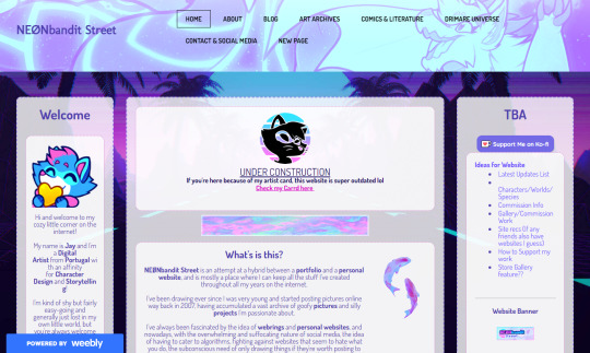
website update log #24 (April 13th, 2025)
I FINISHED RECREATING THE WEBSITE !!!

the look is more or less the same, with subtle differences and the removal of the image carousel (for now) BUT EVERYTHING IN THE HTML AND CSS FILE HAS BEEN CHANGED!!
i made a system for me to edit and add panels really easily, where i used classes for the panel design and reusable elements (ie “long-box” for really long elements like the github chart, and “three-boxes” for three panels in one row), and IDS for specific non-reusable elements like the navbar and the comment section.
now that editing the website became more flexible (compared to the previous version atleast), i FINALLY CREATED A GOOD LOOKING MOBILE VERSION OF MY WEBSITE WITH BOTTOM NAVBARS AND STUFF

i had a hard time making the previous version compatible to mobile, so it just doesnt look that great…

and besides the one before this, which looks really decent and actually mobile optimized,

it just gets worse and worse…


when i created these websites i never had “making it look great for mobile” in my mind at ALL..but when i found out how important it is for people to have a good-ish mobile experience, i gave it a try lol
ANYWAY!! NOW THAT THATS OUT OF THE WAY, LET ME SHOW YOU THE CHANGES IVE MADE TO THIS SITE YAYY!!!
- replaced the twitter feed panel to an “88x31 buttons ive made” panel

i made a whytee.xyz 88x31 button A YEAR AND A HALF AFTER I REDESIGNED MY WEBSITE

moved the under construction disclaimer from an overlay to its own panel

modified the "made by sushiwt" box by adding "built with firefox/chrome and vscode" and a "- 2025" beside the year

and i FINALLY made the artwork section for my website..
now all that's left is the section about myself, and this website is BASICALLY FINISHED!!!!
developing this website was so fun, and until i get the urge to remake it again, it will look like this for a while…
thank you for reading these logs btw :> i really really really appreciate you coming along for the ride (and by “the ride” i mean the creation of this)
- sushiwt <3
10 notes
·
View notes
Text
Hey there,
I just wanted to drop a quick note to express how grateful I am for each and every one of you who has subscribed to my content and given it some love.
This is my secondary Tumblr account, and I'm still figuring some things out, especially when it comes to responding to comments. So, I would love a little help on that !
I'd like to give a special shoutout to @variablecemetery for their comment on my introduction post.
And to @mousiecat, who asked about CSS selector priority – Here's your answer
Adding a class like class="navbar" to a <nav> element in HTML, even if there is only one navigation element on the page, is a common practice in web development. This practice has several advantages:
Consistency: It helps maintain a consistent naming convention in your HTML and CSS. If you have multiple components or sections on your website that share similar styles, using classes can make it easier to manage and apply those styles consistently.
Reusability: If you decide to add another navigation element in the future, you can easily apply the same CSS styles to it by giving it the same class name (class="navbar" in this case). This makes your code more modular and reusable.
Specificity: CSS class selectors have a higher specificity than HTML element selectors. This means that if you ever need to style the element differently in a specific context or override other styles, using a class selector can give your styles higher priority without affecting other elements on the page.
Readability and Maintainability: Adding class names that describe the purpose of an element (e.g., class="navbar") makes your code more readable and understandable, which can be helpful when working on a team or revisiting the code later.
Documentation and Self-Documentation: Using class names like class="navbar" can serve as a form of documentation for your HTML structure. When someone else, including your future self, looks at the code, they can quickly understand the role and purpose of that element.
#code#codeblr#css#html#javascript#java development company#python#studyblr#progblr#programming#comp sci#web design#web developers#web development#website design#webdev#website#tech#html css#learn to code
63 notes
·
View notes
Note
ur website is awesome where did you learn html and css!! ive been looking for months now but i cant find any starting points i can easily understand
Thank you! I kind of mostly used to do Neopets template junk in 2007 and had some extremely basic and outdated HTML knowledge until recently LOL (As in that my knowledge was basically knowing that <i> made your text italic and if I typed color="blue" it would change the color of the text haha)
But yeah, I'm basically self-taught! One of the courses I did in the past did have a few Web Design classes, but I had a really hard time understanding any of it and my grades were awful, so I hardly count that as having contributed anything to my knowledge x) (We were forced to make the most bland minimalistic corporate websites so the lack of fun in that definitely contributed hahaha)
I guess starting out really depends on what you're personally comfortable with? The way I personally started was that I used one of those Free Website Makers like Wix/Weebly/etc to try and "sketch" my website! I had this old unused !Weebly portfolio website I wasn't doing anything with, so I used that
W3Schools is the MVP for this stuff since it has basically everything you can learn about HTML/CSS/etc! For my Website I remember first starting by trying to create the navbar, looking at the Weebly mockup and trying to mentally deconstruct it all into boxes to try and understand how I could recreate it with my own code!
(The reason my navbar looks so different from the screenshot was because I had a really hard time recreating it xD And I ended up with something a lot more basic to match my skillset!)
Something that always worked for me was using templates and just trial and error my way into trying to understand what did what x)
Considering my website has the three-column format, I do recall using SadGrl's Layout Maker code as a reference for my own!
And I guess that's advice I can give?? Finding websites you like, or if you're wondering how someone did something, how their font has weird colours, what animations they're using, etc etc, just go look into their source code, or use the Inspect Tool (F12) and select elements to try and understand the code!
I do sometimes hide goofy hidden text and easter eggs in my source codes, so I'm personally cool with people looking through mine to understand how I did things :)
I definitely relate to this all being overwhelming or confusing at the start, so I'd say just take it slow and make things fun for yourself! I used weird fonts and bright colours when trying to see what does what, use dumb placeholder texts and images too LMAO
Another thing that helped was that I found gifs and images I liked to place on the website and try to make it feel all the more personal and cozy!
Again this is just my personal experience and what I did to make the learning experience more enjoyable :)
#Jay Asks#Anonymous#Neocities Tag#Sorry for the long ramble!#People don't tend to be very receptive to my methods when I share how I do things x) So take it with a grain of salt#I'm very adamant over the Doing what works best for you logic
19 notes
·
View notes
Text
Day 3 even though its like day 5 or 6 of my website recode
Okay, so after that brief detour down "I'm not actually happy with this. Website navigation edition" and fundementally changing the entire navbar, I got back on track...
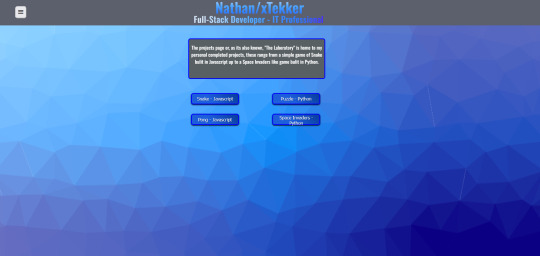
Projects tidy up:
Start of: (Kinda near the start but not really because I updated all the html for the page as well as all the Id's and classes for the css for this page already)
Changing all the css styling, adding new parent elements etc kinda broke alot of the styling on this page so I set about fixing it which was probably the easiest part of this.
Middle(ish):
At this point, I decided I was happy with this for now and moved on to snake.js. It was actually so bad, I'm not even willing to expose myself like that, buttttt, heres what I have now:
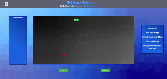
As you can see, there is a functional start and restart buttons, a "how to play section" and a leaderboard thats a WIP. There is also functioning food with an apple image, as well as a snake like image for its head.
This has been pretty fun, I experienced some issues working with the images at first but it wasn't really much, more so sizing issues like the aspect ratio of the food image no being preserved or the snakes head image taking up half the canvas element.
Tomorrow, I shall finish off the leaderboard for snake and begin to slightly polish the puzzle game, which is a drag and slide picture puzzle and the projects page.
9 notes
·
View notes
Text

CSS Flexbox Navigation Bar
#css flexbox navbar#css flexbox layout#css flexbox tutorial#html css#codenewbies#frontenddevelopment#css#html5 css3#navbar html css#webdesign#navigation menu
1 note
·
View note
Text
Foroactivo: ¿Creando una Skin?
Comenzaré diciendo que no conozco lo suficiente sobre Foroactivo (especialmente las plantillas) como para guiar a alguien en la creación de una skin. Estoy convencido de que haré un montón de locuras y habrá más de un diseñador aguantando las ganas de agredirme física y verbalmente. Por lo tanto, aunque esto pueda parecer un tutorial de diseño, no lo es. Se trata más de acompañarme mientras aprendo... a los golpes.
Ahora sí, a trabajar.
Pues... quiero diseñar una skin. Primero lo primero: necesito una temática.
Decidí ir por Fallout porque me gusta y también porque nunca he visto una foro de rol basado en esta saga. Así que nada, el primer paso fue un tiro al piso.
Ahora la paleta de colores, muy importante. Soy daltónico, así que lo último que quiero hacer es elegir colores por cuenta propia. Es por ello que visité un sitio muy nice llamado lospec en el que puedo encontrar paletas para pixel art. No tardé mucho en encontrar una que me gustase "Twilight 5" de Star y, tras crear las variables necesarias en un archivo de CSS, pasé al siguiente paso: ¿Por dónde carajos empiezo a codear?
Puedo encontrar un tutorial en Tumblr, otro por los foros de foroactivo (hehe) y... ¿ya? No sé, algo que no me gusta de esta plataforma es lo poco documentada que está. Lo único que se me ocurrió hacer fue ingeniería inversa.
Comencé inspeccionando el código de un foro recién creado para obtener las ids/clases del navbar y por el camino descubrí algunas variables de javascript que me fueron útiles más adelante. Tras una media hora de darme cabezazos contra el teclado, di con las "plantillas" del foro. Resulta ser que en:
Panel Administrativo > Visualización > Plantillas > General
Existe una plantilla en la que podía modificar la cabecer y barra de navegación del sitio. Esta plantilla es "overall_header".
El editor de texto de foroactivo es feo (siendo amable) así que ni en pedo iba a codear ahí directamente. Fui al vscode de mi pc, creé un archivo HTML, copié el código de foroactivo y tuve acceso a la plantilla con mayor comodidad.
Ahora que sabía de donde salía cada cosa, fue fácil conseguir la barra de navegación:
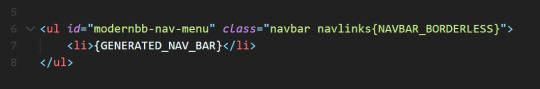
Acá empezaron mis problemas.
No quería trabajar ul y li, sino que deseaba construir todo desde cero. El problema es que esa porción de código llamada {GENERATED_NAV_BAR} genera sí o sí los links del menú en forma de li. Lo inteligente habría sido darse por vencido y trabajar con listas, pero soy terco así que opté por crear mi propio menú con juegos de azar.
Los elements del navbar no son más que enlaces con parámetros para específicar el tipo de acción, así que generar mis propios enlaces estuvo facilito.
Tuqui, tenemos enlaces. (Aunque esto volvería para romperme el culo más adelante).
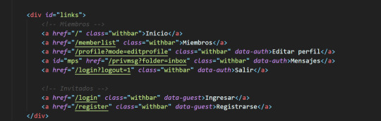
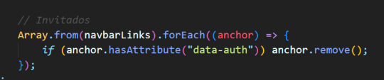
Notarás que algunos enlaces tienen atributos llamados data-guest y data-auth. ¿Qué es eso?
Pues... el foro modifica la barra de navegación dependiendo de si eres un invitado o usuario registrado, así que debí replicar la misma funcionalidad. Estos atributos me permiten diferenciar los links a mostrar según que caso. Un poco de javascript y listo, problema resulto:
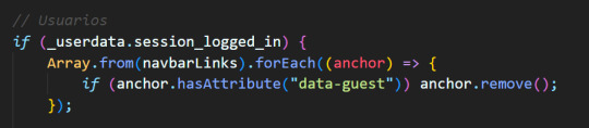
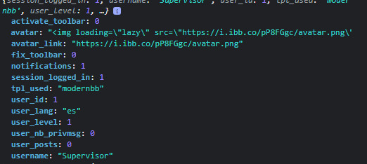
Acá puedes ver que utilizo una variable llamada _userdata, y es que foroactivo intenta arruinarte la vida si decides diseñar una skin, pero te da migajas para que no te rindas. Esta variable cuenta con varios datos útiles, en especial "session_logged_in" para determinar si el usuario está -o no- conectado. Acá el resto de los campos de dicha variable:
Así que listo, ahora contaba con una barra de navegación 100% funcional y acceso a los datos de mi usuario. Así que... ¿y si le doy una saludadita cuando se conecte? En este caso quería una pequeña sección en la parte superior izquierda de la pantalla que dijera:
"Bienvenido, Forastero" a los invitados
"Bienvenido, Nombre" a los usuarios conectados
Ambas vendrían acompañadas de imagen que sería el avatar para el caso de los usuarios conectados y una imagen por defecto para los invitados. Con eso en mente, me puse el overol y a trabajar.
Esta fue muy fácil. De nuevo, la variable _userdata contaba con los dos campos que necesitaba: username y avatar_link. Un par de clicks por aquí, typeo por allá y listo:
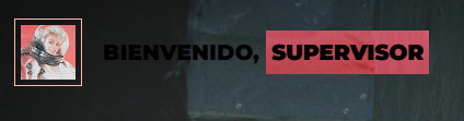
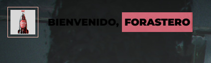
Un menú reactivo, tal y como me gusta. Finalmente, era el momento de abrir una botella de champagne y celebrar mi victoria, pero la realidad me pegó un batazo en toda la cara. ¿Qué pasa con los mensajes privados?
Mi barra de navegación funcionaba, pero no cambiaba en caso de recibir un mensaje privado. Acá no había variable que pudiera salvarme, así que tuve que resolver de una forma que honestamente no me gusta ni un poquito.
La barra de navegación original genera un span cada vez que el usuario recibe un mensaje privado, así que la respuesta estaba justo ahí. Solo debía chequear (con javascript) si ese span existía en el foro y, de ser así, ajustar mi barra de navegación para reflejar el cambio:
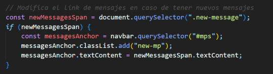
Creé una cuenta nueva, envié un mensaje privado al Admin y... listo!
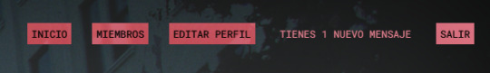
Una vez más, la barra estaba andando. De nuevo, odio esta solución, así que si alguien sabe de una mejor alternativa, soy todo oídos.
Para el resto del día quería crear un tablón o, al menos, la estructura inicial, ajustar las fuentes y colores, agregar animación y poco más. Así que abrí fotochó, recorté al Courier de Fallout New Vegas, probé algunos prototipos y terminé de crear mi cabecera.
Acá un pantallazo de mi foro (so far):
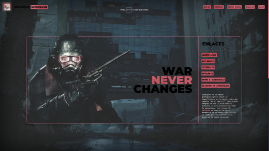
¿Seguiré haciendo este tipo de contenido? Qcyo, puede que sí, puede que no. Todo dependerá de cuan frustrante me resulte la experiencia de diseñar una skin. Hasta ahora ha sido bastante sencillo, pero molesto en algunas secciones.
De cualquier forma, ¡gracias por leer!
— Yo soy el forastero y esta es mi marca.
18 notes
·
View notes
Text

Responsive Navigation Menu
#codingflicks#html css#responsive navigation menu#css menu#css#html#css3#frontend#frontenddevelopment#webdesign#navbar#learn to code#responsive web design#menu html css
5 notes
·
View notes
Text

Responsive Navbar HTML CSS JS
#responsive navbar#responsive menu#responsive navigation menu#responsive navigation menu bar#responsive web design#html#css#javascript#navigation menu#divinector#html css#learn to code#css3#code
4 notes
·
View notes
Text
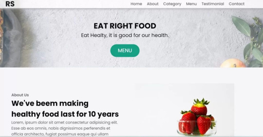
Restaurant Website Using HTML And CSS With Source Code
Restaurant Website Using HTML And CSS With Source Code
Hello coder, Welcome to the Codewithrandom blog. In this article, we create a Restaurant Website using HTML and CSS with Source Code. This is a Simple Restaurant Website with a main home page, types of food available, a food menu, customer reviews, and a contact form section on the restaurant website.
The HTML code for the Restaurant Website is the first thing we develop, and after that, the CSS for styling and JavaScript code. we add JavaScript for smooth scrolling on our website otherwise javascript is optional for this project.
Let’s Start a Responsive and Amazing Restaurant Website Using HTML and CSS. Let’s code a Simple website, We use 1,000+ lines of code to make our Restaurant Website Fully Responsive.
100+ HTML,CSS and JavaScript Projects With Source Code ( Beginners to Advanced)
Basic Knowledge About Project
It’s a front-end intermediate-level project that uses some advanced frameworks like CSS and JavaScript to make the project more elegant and responsive. We have provided you with the project with step-by-step explanations, which will help you better understand the project.
Before we dive into the step-by-step solution to the project, let’s understand some of the basic concepts about restaurant websites using HTML, CSS, and Javascript.
What is an online Restaurant Website?
An online restaurant website is a digital version of any restaurant that allows users to order food directly from the restaurant while sitting at home. These websites were created for customers who wish to eat restaurant food at home. The consumer can select items from the food menu and make payments for faster deliveries.
What are the benefits of Online Restaurant Websites?
reaches the maximum number of customers.
Easy to order
Hassle-free payments
increase in customer reach.
increase in profit.
Live Preview Of Restaurant Website Source Code:-
Restaurant Website Html Code:-
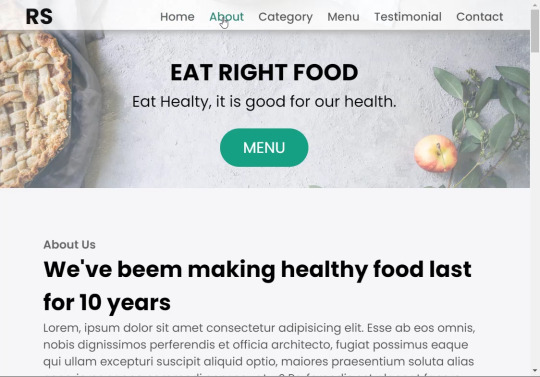
In this HTML code, we create a complete navbar for the footer structure of the restaurant website. first, we link our CSS and JavaScript files in html code. now we add a font awesome icon CDN link in the code because we create the What Our Customers Say section on the website and we show that review with a star so we use a font awesome icon.
Gym Website Using HTML ,CSS and JavaScript (Source Code)
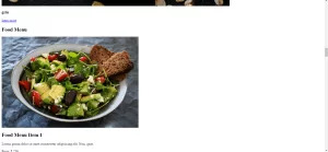
then we create the structure of the navbar and it’s very important in our website because we create a responsive navbar in the project. then we create some simple sections of the restaurant website like what food is available and a food menu list.
and lastly, we create a contact form and a footer copyright line at end of the website.
This is almost 300 lines of HTML code for the restaurant website, and you can see the output below with only the HTML code output of the restaurant menu. Then we add CSS code for styling our restaurant website.
Output Of Only HTML Code For Restaurant Website:-
This is all image output that we create using only HTML code. Now the time is to style our restaurant website using css😍.
Restaurant Website HTML CSS Code:-
In CSS code we include Poppins font from Google font. then we style all sections of the website step by step. we write comments in CSS code so if you want to customize any of the restaurant website parts you can change that section code and it’s all done.
Responsive Resume/CV Website Using HTML & CSS
This is our whole CSS code with 600+ lines. We style our Restaurant Website step by step. We style the utility class and then style our navbar. After the navbar, we styled every html section🔥.
At the end of the code, we use media queries to make our Restaurant Website completely responsive and mobile-friendly. So you can see the output with CSS code. Then we add a little bit of javascript for the scroll effect otherwise our website is completely ready with code.
Ecommerce Website Using HTML, CSS, and JavaScript (Source Code)
Output Of HTML CSS Code Restaurant Website:-
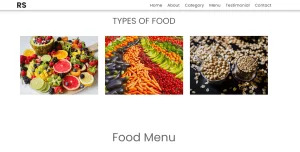
You can see this awesome👏 output with HTML + CSS Code for Restaurant Website. Now we add JavaScript for smooth scrolling.
this is completely optional to add JavaScrpt to this project.
That’s it for our Whole restaurant website code. We write every useful code like making the website mobile-friendly and adding media queries for this. Add JQuery code for smooth scrolling on the restaurant website.
50+ HTML, CSS & JavaScript Projects With Source Code
[su_button id=”download” url=”https://drive.google.com/drive/folders/1Wx9W99uIH3WiO1nkz6aJYCuXVv_ibGmA?usp=sharing” target=”blank” style=”3d” size=”11″ wide=”yes” center=”yes” icon=”icon: download”]DOWNLOAD NOW[/su_button]
Final Output For Restaurant Website Using HTML and CSS Code
You can see this video output to see the complete output. You can see how smooth the website scrolls and this design.
Hope you like this Restaurant Website Project, we create your own and use this project in any project as a part project like the reviews section, and a contact form. If you need any more project-related frontend. Visit our homepage and you get 100+ projects💝.
Age Calculator Using Html Css Javascript ( Source Code )
if you have any confusion Comment below or you can contact us by filling out our Contact Us form from the home section. 🤞🎉
Code By – Sanket Bodake
was written by – Codewithrandom
FAQ For Restaurant Website
Which code editor do you use for this Restaurant Website project coding?
I personally recommend using VS Code Studio, it’s very simple and easy to use.
is this project responsive or not?
Yes! This project is responsive.
What is an online Restaurant Website?
An online restaurant website is a digital version of any restaurant that allows users to order food directly from the restaurant while sitting at home. These websites were created for customers who wish to eat restaurant food at home. The consumer can select items from the food menu and make payments for faster deliveries.
What are the benefits of Online Restaurant Websites?
1. Reach the maximum number of customers. 2. Easy to order 3. Hassle-free payments 4. Restaurant Like food at Home. 5. Increase in profit.
2 notes
·
View notes
Note
Dropdown is like, mostly css for websites. Little more complex for bespoke programs. It is fun how there's so many ways to go about implementing them though.
your ask was so powerful tumblr said i had ten new things in my inbox do you have a tutorial on hand for it that handles multiple buttons separate buttons that have drop down functions on the same navbar that are clickable and not hover? thats what i keep exploding
omg i was saying that just now in a chat where i was crying so pitifully that i really do like how every tutorial you can get a feel for the personality of the person who assembled it like, someone who doesnt explain terms is so use to those terms they dont understand theyre just saying random letters together, another person is still in the habit of defining things people use css for in html, seeing stuff that uses two completely different ways to do it yet still making buttons!!!
2 notes
·
View notes