#fundamentals of logo design
Explore tagged Tumblr posts
Visit Tumblr Blog
Explore Tumblr blogs with no restrictions, modern design and the best experience.
Last Seen Tumblr Blogs


Fun Fact
Tumblr has 16.74 million mobile monthly users in the US.
Text
Master the Art of Logo Design! ✨ Unlock the secrets of world-class logo creation in this FREE online course. Learn the fundamentals of graphic design, the psychology of colors, and the difference between fonts and typefaces. 🚀 Start your creative journey today and craft logos that leave a lasting impression.
🖌️ Enroll now and turn your ideas into iconic designs!
#logo design#free courses#creative journey#fundamentals of logo design#graphic design basics#psychology of colors#craft logos#typography#learn now#design inspiration#creative#creative skills#logo design tips#new opportunities#improve now#art challenge#challenge yourself
0 notes
Text

always forget i can drop off my messy wips and behind the scenes prep work on this blog right here.....until now
#my art#wip#so much of my process is making pure garbage and being in denial about it until it starts to take shape#maybe this is a universal feeling but also a lot of people have nice-looking sketch stages and can sketch well. not me baby.#1000 horrible doodles where i question whether i understand any fundamentals. five good concepts. one good concept that makes it out alive#but also sometimes i butcher it and start devolving into an upset ape#also graphic design is not my passion but coming up with fake adverts and horrible diy band logos and unsettling conspiracy graffiti is
67 notes
·
View notes
Text
Using the costuming to figure out the budget of ‘Murderbot’
So I kept meaning to write other things, but what ended up lingering in my brain this week about ‘Murderbot’ was something a bit more specific to my training an interests: costuming, and more specifically, how costuming can indicate the budget of the show.
I’ve seen posts on here and elsewhere criticizing certain aspects of the show for various costuming or setting choices (no drones, far less chrome and inorganic parts on both MB and Gurathin than I think a lot of us imagined, less visual representation of the Feed, things looking “cheap” or “plastic”, etc), and claiming that Apple has an enormous amount of money, so why did the show ‘cheap out’?
I think that A) fundamentally misunderstands that a single television production is not the same as its production company, and B) dramatically overestimates the budget this show almost certainly has.
I don’t think this is a low-budget show. The CG is solid, the sets are lovely, and none of that is going to be accomplished with low budget, but looking at the costumes it’s clear this isn’t a high-budget show either. Appropriately for a fairly unknown property, my guess is that season 1’s budget was modest. Keeping run-times down to 22 minutes an episode was likely both a stylistic choice (hooray serial adventure stories!), but was also a budgetary choice. Because every minute that makes it to air is a LOT of money on the table.
But I can also see the mid-budget in the costumes, but also a lot of creative work-arounds for a limited budget. For one, most characters thus far essentially have two costumes: their civilian clothing (or MB’s armor), and the hab uniforms. And the uniforms themselves are modular, and so a good amount of customization can happen with a single costuming piece (which is both practical in universe, but also great for saving money for wardrobe). That means that more money can go into limited pieces.
There is certainly money that went into these pieces. We didn’t get to spend a lot of time with the original civilian pieces, but the uniforms all required a decent amount of tailoring, at least in the out piece, because let me tell you: jumpsuits are NOT one-size-fits-all. They have to be fitted to every part of a person in order to fit decently, which means each of the actors had a uniform made bespoke for them. There are also prints (company logo) on a lot of the pieces that would also require custom work. The tunics Bharadwaj and Arada both wear may or may not be custom.
There are a lot of carefully cut corners that almost certainly lowered cost: the shoes, and probably the leggings and cargo pants, look like they were purchased rather than made. Purchasing a costume piece, especially if you don’t have to purchase a brand name or a designer piece, is the cheapest and easiest way to costume.
I think that, if they had unlimited budget, everything would probably be bespoke. Even the fabricated clothing on the hab would be bespoke, down to the shoes (shoes are always the last thing to be bespoke, because very few costumers are also cobblers, and hiring someone to make shoes is VERY pricey). I think they’d take all the little details they managed to work in, and go even farther with them. I want to stress that I think the costumers did really well with what they had, and even had a lot of subtle detail worked into their pieces. Having the company logo as a miniature texture print was particularly great. And you can get away with the ‘printed’ clothing being made out of inexpensive synthetics, while still making it a stylistic choice.
If anything, I think they would have pushed the budget harder with the civilian clothing if they had a bigger budget. It’s stated that their clothing is hand-made. If I were costuming the show, I would want their costumes from Preservation to be actually hand-made, with a ton of detail work, all made of natural fabrics to contrast the synthetics in the Corporation Rim. I would want layered textures, embroidery, bead-work, knits. I could see them trying to do that with the civilian costumes, but it was there that I still saw what almost certainly were purchased pieces that didn’t quite nail that feeling. And that’s what convinced me that this was a mid-budget show. If they had the budget of, say, ‘Game of Thrones’, very different choices would have been made. I mentioned the civilian clothing, but there would have also, likely, been a lot more obviously inorganic parts on Murderbot, and probably also Gurathin.
Anyway, I have no idea if anyone is interested in my thoughts on budget on a show like this, but it was this realization that made me fine with a lot of visual changes to save money. If our SecUnit doesn’t have metallic feet, and a ton of visible inorganics, I get it. A few visual effects shots of being reprinted (a fun thought!) are way cheaper than having to either provide makeup or costumes consistently to create believable synthetic pieces, particularly if you have to supplement them with CG. So it’s fine. It’s fine if they can’t afford that, or the drones. Hell, having the hab look cheap is not only fine, it’s perfect! This is the budget model, after all. It looks like an intergalactic air-stream, while the DeltFall hab (which was the deluxe version) is far more upscale sci-fi visuals. There is so much visual storytelling going on, not only working within the budget, but utilizing their lower budget to tell a story.
#murderbot#murderbot tv#costuming and budget#I have thoughts about craft#and how to make television#and I really like dissecting how people utilize budget#to tell a story#sometimes limitations spark creativity
294 notes
·
View notes
Text
Skysometric Design Retrospective, Part 1
Where It All Started
somehow, after a decade on the internet, i've become one of those people who has a whole Personal Brand™. at first i leaned into it on purpose, partly because i wanted to make videos as my shtick (until i didn't), and partly because i didn't really know how else to express myself on the internet early on. these days, however, keeping up a personal brand is less about Who I Am and more that i just enjoy graphic design. making this stuff is fun!
so over the past few years since coming out and rebranding as Skysometric, i've put a lot of work into a new logo, website design, icons, video thumbnails, and even more besides. i'm pretty proud of how it all turned out! and now that most of the heavy lifting is done, i'd like to write about how it went and some things i've learned along the way. there's a lot to talk about, so strap in for a pretty long series!
but, to start, i can't talk about Skysometric without a quick history lesson about WillWare, the old me – the one who got the ball rolling on graphic design in the first place.
———
maybe this is obvious to the trained eye (or maybe not!), but i'm an entirely self-taught graphic designer. i've never taken any classes, studied design styles, learned the fundamentals, or even so much as had a single course teaching me how Photoshop works. (not that i use Adobe anymore, but you get my point!)
instead, everything i know, i learned by doing. i learned how image editing software works by making tiles and backgrounds for Mari0 levels. my fundamentals are deeply rooted in drawing mazes as a kid, so i quickly discovered how to set up grids in every image editor i got my hands on. i picked up other design techniques by attempting to imitate their logos or styles for personal projects over the years.
on the one hand, this means that i've developed a style and workflow that is wholly and uniquely my own! on the other hand, anytime i get stuck, i don't always have the tools to get un-stuck... or even the words to google it.
so instead of googling it, i used the tools i had to make all of this:


rest in peace, WillWare (the brand). clockwise from top left: logo, social media banner, video end slate, stream archive thumbnail.
what started as just a fancy logo to replace my old Sonic profile picture, snowballed into an entire branding suite across web and video! i learned a lot about graphic design as i gradually expanded these designs into my other creative pursuits. you can see so much of that self-taught style i described above in these few examples – geometric grids and graph paper, simple shapes and layers like my Mari0 work... and imitation of Google's Material Design guidelines, like drop shadows and color choices.
in fact, i leaned so hard on Material Design that, after some time, it no longer felt like my own style. anytime i wanted to branch out, i felt constrained by somebody else's design standards! so i challenged myself to find my own design style from scratch, which I called "New WillWare":
this neon light grid is still pretty dang inspired, but it's not "me" anymore.
it took a couple years of slow iteration to arrive at this neon-looking "light grid," and while it rocks, it also painted me into a corner. i had no idea how to make anything more than pretty promotional pictures in this style – i couldn't figure out how to make it work with video, webpages, or even just text, no matter how much i tried to go back to the drawing board. and my lack of formal experience made it that much more difficult to solve these problems!
so after a while, i felt pretty stuck. my old design didn't feel like my own, my new design was a dead end, and i felt like i was too invested in both to start completely from scratch again. i was simultaneously too burnt out to continue, and too scared to throw everything out and start fresh!
and then i transitioned, and started calling myself Sky.
in case you missed the *cough* subtle indicators, both of my old designs are centered around the letter W (being part of my old username and all). "Sky" does not have a W. so, uh, none of this fits anymore! even though i love this old work, and still consider it part of my history, it no longer accurately represents me or my identity. ready or not, it's time to design something new!
on one side, i felt pressure to get away from my old look, the product of a younger designer whose efforts were still the standard for my online presence. on the other side, i felt pressure to rise from the ashes of my redesign, make something of all the failures, successes, and lessons that i learned.
and thus, shedding my old brand identity and donning my new gender identity, i hit the sketchbook running.
to be continued...
14 notes
·
View notes
Text
https://redcircle.com/shows/d462cbc8-3fe9-41f5-97b1-f1cbc8306fb6/episodes/50c3bb37-fb48-45aa-a17a-65afcbabcfeb
Welcome to Wonderful World of Darklords! In this episode, we're looking at a property that Disney has adapted for both Mickey Mouse and the Muppets: A Christmas Carol. At its heart, A Christmas Carol is a story of redemption--so how do we square that with darklords, who are fundamentally irredeemable? By sending your PCs into a trippy journey through the past, present, and future of a character who isn't the darklord, that's how. Topics discussed include:
Why we didn't choose Scrooge as our darklord, instead opting for another miser whose prison comes with hate;
Concrete examples of past, present, and future visions for Scrooge, a beloved canon NPC, and two PC archetypes;
Ways for your non-Charisma PCs to help Scrooge be a better person (because even the Ghost of Christmas Future had an astronomical Intimidation bonus);
Various levels of dreamscape weirdness, from "we're literally just doing A Christmas Carol" to "we just cited the last two episodes of Neon Genesis Evangelion;"
And more!
The full write-up for Scrooge and Marley is available for free on DM's Guild: https://www.dmsguild.com/product/504721/Scrooge-and-Marley-A-Ravenloft-Domain-of-Dread?view_as_pub=1
The Verge Games Christmas Carol adventure that we "borrowed" much of this domain from is available on their website: https://vergegames.org/all-products/p/christmas-carol-adventure-book
The Nightmare Lands, which we "borrowed"...pretty much the rest of this domain from, is available on DM's Guild: The Nightmare Lands (2e) - Wizards of the Coast | Ravenloft | AD&D 2nd Ed. | AD&D 2nd Ed. | Ravenloft | Dungeon Masters Guild You
Timestamps
0:00 Introduction
08:27 The Lord
31:33 The Land
40:36 Dread Possibilities
1:27:42 Parting Thoughts
1:50:51 D’s Parting Thoughts
All music recordings are in the public domain (mark 1.0) and are licensed through https://musopen.org:
Chopin Nocturne in B-Flat Minor, Op. 9 No.1 (main theme), performed by Eduardo Vinuela
Chopin Etude Op. 25, No. 12 in C Minor: “Ocean” (darklord theme), performed by Edward Neeman
Chopin Nocturne in F Minor, Op. 55 No. 1 (land theme), performed by Luke Faulkner
Rachmaninoff Morceaux de Fantaisie, Op. 3 - 2. Prélude in C sharp minor (Dread Possibilities), performed by Sergei Rachmaninoff
Chopin Nocturne in E Minor, Op. 72 No. 1 (parting thoughts), performed by Luke Faulkner
Dialog for Yensid was written by Azalin Rex himself @darklordazalin
The Wonderful World of Darklords logo was designed by Halite Jones, whom you can find @halite-jones or on Instagram at http://www.instagram.com/insta_halite
Contact us on:
Gmail: [email protected]
Facebook: @wonderfulworldofdarklords
Tumblr: @wonderfulworldofdarklords
Patreon: www.patreon.com/WonderfulWorldofDarklords
YouTube: @wonderfulworldofdarklord
#wonderful world of darklords#ravenloft#dnd#podcast#curse of strahd#disney movies#dms guild#a christmas carol#marley and marley#ripping off the nightmare lands lock shock and barrel
10 notes
·
View notes
Text
T-Shirt: Let's Go Meds!
Hey, do you know who the New York Mets are? Me neither, but they’re a great meme just because everyone I know who _does _know them has _amazing _opinions on them. My favourite so far is ‘imagine spending half a billion dollars on a team and getting the mets.’
Anyway, I thought it sounded like ‘meds’ and made a joke about reminding people to take their meds over on Cohost. That chost went so wide that my notifications didn’t work for a day. Then I thought I’d rechost it again because it made me laugh to remember it, and again, my notifications weren’t useful.
Anyway, the result is that this has been on my mind for a month or two and then I looked up the actual Mets logo, and, like, Uranium Orange and Something Blue is pretty cool as contrasting pairs to work with and anyway, this wound up happening.

It’s a brain! In a sea of serotonin! Seen through a pill! Because sometimes you need a reminder to take ya meds! Love (what aspects of yourself you can access readily and more conveniently thanks to) tha meds, baybee!
Maybe you want a version with a bit more of an _affirmative action _vibe? Well, here:

You can get them on stickers, you can get them on bathmats, you can get them on pet bandannas. If I know one thing about Da Mets it’s that they’re fundamentally designed to be comically obnoxious, and damnit, I don’t want you missing your meds.
You can get them here, without or with the shouty bit!
Check it out on PRESS.exe to see it with images and links!
15 notes
·
View notes
Text
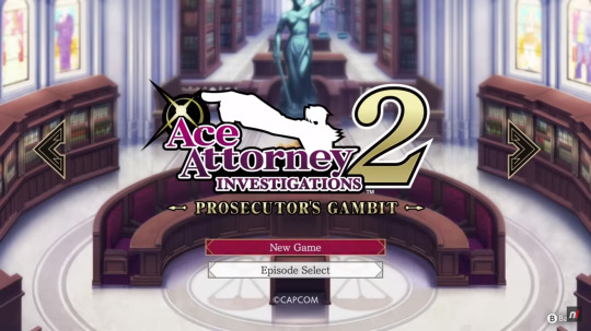
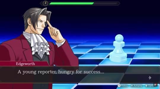
AAIC Gameplay Video (Switch)
This is the 56th post in the Ace Attorney Investigations Collection Countdown: 25 days left until release!
Today's topic: some Gameplay footage from the Switch version of the collection!
youtube
Along with all the new information and previews there have also been two gameplay videos of the Investigations Collection released, one for the Switch (which today's post focuses on) and one for PS5, showing some initial parts of the first cases of both games in the collection. Of course, the gameplay is the same as it was for the DS versions, it's still fundamentally the same games after all, but there are some neat things to be discovered in these videos anyway.
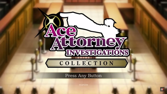
First of all, we get a look at the title screen and main menu of the collection and - WOW! - is that main menu music aka the Investigations Collection theme an absolute banger! I love it! Especially the initial few seconds when it kicks in, so hype! It's gonna feel so amazing just to start up this game every time!
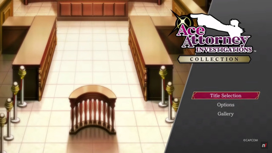
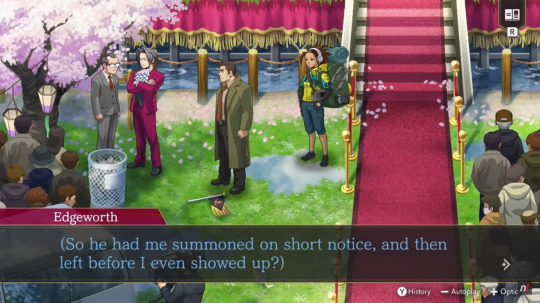
The title screen and main menu look amazing as well, of course. The design is so fancy and elegant! I especially love the prominent logo, the courtroom background (taken from Investigations 1) and the way the selected option is highlighted. That burgundy-coloured box with the gold framing is peak Miles Edgeworth!
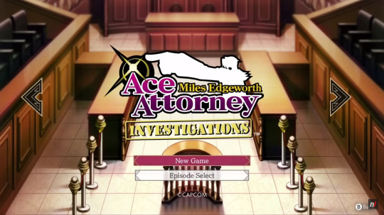
Continuing to the title selection screen we see that the fanciness doesn't stop there. The two screens for the two games have similarly prominent logos and also specific backgrounds to them. The courtroom background, viewed from a little bit higher up, for Investigations 1 and the PIC meeting room background for Investigations 2. Very fancy and gives the two games a very different atmosphere already only from the title screens. I also love the arrows for switching between titles, they're black with a similar gold framing to the highlighted boxes and it fits perfectly! They really just went and coloured everything after Miles' own outfit and preference 😄 So not complaining, it's brilliant!
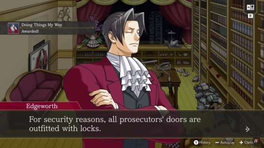
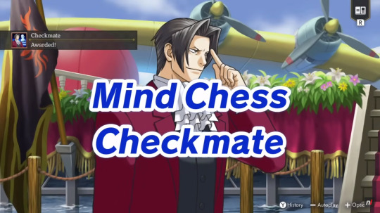
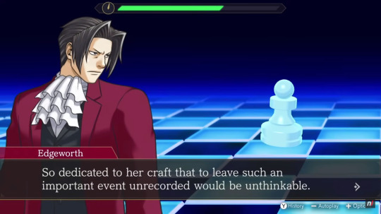
During the shown gameplay we also already get to see two of the many accolades that are in the game: "Doing Things My Way" (awesome name) for using Logic for the first time and "Checkmate" (very fitting) for successfully completing the first Mind Chess segment. Here you can also see that the phrase appearing on screen when finishing Mind Chess is "Checkmate" (instead of "Complete" like in the fan translation). I really like this change, it's much more specific and fancy this way.
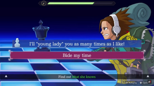
Speaking of translation changes, since we see some gameplay from Investigations 2's first case we also get a more continuous impression of how the official translation compares to the fan translation. I don't have many screenshots of this part of the game with the fan translation on hand and don't remember all the lines specifically so I'm not going to do a direct line-to-line comparison between the two versions but I can definitely say that I like what I see from the official translation! The lines and dialogues flow naturally and there are already some wonderfully phrased moments from just this short amount of story alone! As you can see from the screenshot above, they definitely carried over how hilarious some of the wrong answers in Mind Chess could be 😄 Maybe they even added unique dialogue when picking them? I doubt it but I still hope.


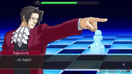
One phrase that stood out to me in particular was this one for when Miles finally checkmates Nicole (Tabby Lloyd). It sounds so badass and poetic! 200% how Miles would phrase this and I love it. I don't remember how the fan translation did this line but I doubt they beat this one. This makes me even more excited to see how the rest of the official translation stacks up! Maybe we'll lose some amazing lines, and I'll be sad about that, but, judging from this, we'll definitely get some new ones, too.
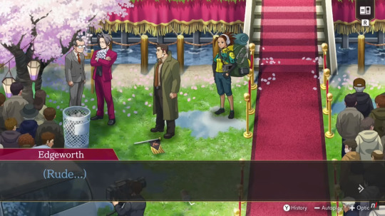
Another moment I loved, and actually laughed out loud at, is this one for when Miles talks to Payne about the chief prosecutor (who he's referring to in his thoughts). Just that singular little "Rude..." at the end there is a-ma-zing especially coming from Miles! 😄 Gah, I'm so excited to play this already!!
#ace attorney#ace attorney investigations#ace attorney investigations collection#aai collection#ace attorney investigations collection countdown#25 days left
14 notes
·
View notes
Text
How to Master Color Theory in Graphic Design – Easy Tips for Students

Introduction
Color is perhaps the most influential graphic design element. It can evoke moods, express emotions, and enhance visual appeal. Whether you're a beginner or an aspiring designer, learning color theory is crucial to achieving professional and stunning designs. In this blog, we simplify color theory and provide easy tips to help students learn it effectively.
Knowing the Fundamentals of Color Theory
Before diving into advanced techniques, it is essential to understand the basics of color theory.
1. The Color Wheel
The color wheel is a diagram that shows colors arranged according to their relationships. It includes:
Primary Colors: Blue, yellow, and red – these cannot be created by mixing other colors.
Secondary Colors: Green, orange, and purple – formed by combining two primary colors.
Tertiary Colors: Created by mixing a primary color with a secondary color (e.g., red-orange or blue-green).
2. Color Harmony
Harmonious color combinations are essential in graphic design. Common color schemes include:
Complementary Colors: Opposite on the color wheel (e.g., blue and orange) and create strong contrast.
Analogous Colors: Placed side by side (e.g., blue, blue-green, and green), producing a calming effect.
Triadic Colors: Three colors evenly spaced on the wheel (e.g., red, yellow, and blue), offering a rich and balanced look.
Monochromatic Colors: Different shades and tints of a single color, creating a clean and simple appearance.
Easy Tips to Master Color Theory in Graphic Design
Now that you understand the basics, here are practical tips for effectively applying color in your designs.
1. Learn About the Psychology of Colors
Colors influence emotions and perceptions. Here are some examples:
Red: Urgency, energy, and passion – commonly used for sales pages and call-to-action buttons.
Blue: Calmness, professionalism, and trust – frequently used in corporate branding.
Green: Health, growth, and nature – ideal for eco-friendly and wellness-related designs.
Yellow: Warmth, happiness, and optimism – great for grabbing attention.
Purple: Mystery, luxury, and creativity – often used in beauty and fashion branding.
Select colors based on the industry and the message the brand wants to convey.
2. Utilize Contrast for Readability
Proper contrast ensures that text and design elements stand out. To enhance readability:
Use black text on a white background for maximum contrast.
White text on dark backgrounds (like navy or black) creates a sleek, professional look.
Avoid using analogous colors for text and background, as they can be hard to read.
3. Apply the 60-30-10 Rule
A well-balanced color scheme follows the 60-30-10 rule:
60% – Dominant color (background or major elements)
30% – Secondary color (complements the main color)
10% – Accent color (highlights key areas)
This technique is widely used in branding, web design, and UI/UX design.
4. Experiment with Different Color Schemes
If you’re unsure about color combinations, use online tools like:
Adobe Color
Coolors
Canva’s Color Palette Generator
These tools help generate visually appealing color schemes with ease.
5. Test Colors on Different Backgrounds
Colors appear differently depending on the background. Always test your design against both light and dark backgrounds to ensure consistency and readability.
6. Stay Updated with Design Trends
Color trends evolve over time. Stay current by exploring design platforms like:
Behance
Dribbble
Observing professional designers can help you stay inspired and refine your skills.
Why Learning Color Theory is Important for Graphic Designers
Mastering color theory is crucial for creating professional designs, whether you’re working on logos, websites, posters, or branding materials. If you’re serious about becoming a skilled graphic designer, consider enrolling in a structured course to enhance your skills.
If you’re looking for graphic designing classes in Yamuna Vihar or graphic designing training in Uttam Nagar, choose an institute that covers advanced design concepts, including:
Color Theory
Typography
Composition
Many reputed graphic designing training institutes in Yamuna Vihar and graphic designing coaching centers in Uttam Nagar offer hands-on learning with expert guidance.
For those interested in multimedia courses in Yamuna Vihar or multimedia training in Uttam Nagar, learning to apply color across multiple media, such as digital design, video editing, and animation, is essential. Mastering color theory allows you to create visually striking designs that capture the audience’s attention.
Final Thoughts
Color theory is a vital aspect of graphic design that every student must learn to create effective and visually appealing designs. By understanding color psychology, contrast, and harmony, you can elevate your design skills. Keep experimenting, practice regularly, and stay updated with design trends to enhance your expertise.
If you are searching for a graphic design course in Delhi or the best graphic design institute near you, opt for a course that provides hands-on experience and industry-specific knowledge. With proper training and guidance, you can build a successful career in graphic design. Visit us:
Suggested Links:
CorelDraw
After Effects
Canva Using AI Tools
#graphic designing#graphic design tips#graphic design tutorials#graphic art#graphic designers#graphic design#graphic designing tips#graphic designing institute#graphic designing course#Graphic designing course in yamuna vihar#Graphic designing course in uttam nagar
5 notes
·
View notes
Text
That dumb poster
Okay, I have had more time to think about the Jimin exhibition poster controversy, and now I'm more pissed than ever. I see that other bloggers on this site (whose opinions I respect, btw), don't think the poster is a big deal. That was sort of my first thought, too. Sometimes Jimin's Korean fans seems to pick up on small transgressions that don't seem like a big deal to us non-Koreans. Why does the poster matter?
It matters for a few reasons.
DESIGN
Jimin has an enormous global fanbase. His name trends on X/Twitter almost daily. He's had six songs chart on the Billboard Hot 100 during this short solo phase. This poster is in no way befitting of a global star. It looks more like an announcement for a pottery show at the local senior center, but even a poster like that would likely include a few photos of pinch pots and mugs. I'm sorry, but it's just ridiculously unprofessional.
Let's talk about contrast. Contrast, especially black and white or complementary colors, attracts our eyes and pulls our attention. Choosing muted pastel pink and yellow achieves the opposite effect. It's nearly invisible to the eye, and therefore the brain. This poster is meant to be subconsciously unimpactful. I took the original poster image (I think BH actually touched it up a bit and made the pink hotter and brighter) and made it black and white just so you can see how little contrast there is.

Some of the most relevant information on the poster - who, what, and where - is absurdly small. The title of an old BTS song and a random date range is the main focus. Jimin is an afterthought.
BRANDING
I talked about this yesterday, so I won't belabor it further, but where is Jimin's branding and cohesive design strategy? The poster has nothing do with either album whatsoever. Again, this is a way to make the announcement invisible because our brains don't associate any of the design elements with Jimin's albums. This is intentional ineptitude. There is no way a company the size of HYBE doesn't know the fundamentals of branding. Look no further than Jungkook's trademarked logo. His announcement poster was full color and full of his face. They know what to do, they just won't do it.
PATTERN
A single poster for an exhibition isn't worth raising your blood pressure over, but it is indicative of a pattern of intentional neglect by HYBE/BigHit. All these small failures cumulatively add up to real damage to Jimin's career and earning potential. It's no big deal, it's just this one oversight/mishandling/mistake. Here's just a tiny fraction of the ways they diminish him on a regular basis -
No Billboard Music Award because the company didn't restock Like Crazy CD singles.
Little to no award nominations. The VMA's 2024 Song of the Summer category being the latest.
Service WHO to radio, but only to Top 40 and not Adult Contemporary or other suitable station platforms, and then do nothing to support it, leaving the burden on fans to request.
Little to no playlisting on Spotify and Apple Music. This is just an egregious fumbling of WHO. Unforgiveable!


All these little transgressions are meant to wear down the fandom over time and subtly minimize Jimin’s popularity. Today's drop to the very bottom of TTH should elicit outrage. It should be trending on Twitter, but it's not, because his fans have now been conditioned to accept the mistreatment and stay quiet. WHO isn't even on K-Pop On! anymore.
HYBE can't go out of business soon enough.
But, it's just a poster.
14 notes
·
View notes
Note
i hope you're excited because palworld is not getting sued for stolen designs, but for the game mechanics patent! so copied pokemon designs will be totally fine, but not monster catching games, that's what they're actually getting sued for. the only thing this lawsuit will do is actually the inverse of what anyone wanted! if this goes through we'll have to watch out for cassette beasts next!
You’re a coward for hiding behind an anonymous ask.
If Nintendo wanted to sue Cassette Beasts, they would have done so already. If Nintendo wanted to sue Yokai Watch, they would have done so already. If Nintendo wanted to sue Digimon, a series that has been plagued by comparisons to Pokémon since the 90s, they would have done so already.
As my buddy @simpingforcreamsoda pointed out, the patent infringement is almost certainly that Palworld’s capture mechanic is functionally and visually identical to using Pokéballs. Persona 5 is another game with a “monster catching” mechanic, but it’s done through negotiation instead of throwing a little ball at the thing to store it in. In Cassette Beasts, you record your monsters with tapes. These are all very different from Pokéballs. Why couldn’t Palworld do something new as well?
I’d still argue that while this Pokéball theft is the smoking gun that’s gonna lose Palworld the lawsuit, it’s the character designs that Nintendo really cares about. The last thing they want is Palworld profiting off of these Frankensteined versions of not only their character designs, but likely their exact models as well. They might not be confident that they can prove that in a court of law with millions of dollars on the line, but blatant rip-offs of Pokéballs? Arguably the most famous iconography in the whole series, down to it being their logo? That’ll do it. Like I said, this is like them getting Capone on tax evasion and not murder.
I know I’m harsh on Palworld. But it’s because I want the gaming industry to do better. The core appeal of Palworld is giving Pikachu an AK-47. That’s it. It’s as fundamental as “haunted Chuck E. Cheese” is for Five Nights at Freddy’s and “rubberhose Gunstar Heroes” is for Cuphead. But both of those, despite their obvious inspirations, do something new. They do something different. Freddy Fazbear is not an expy of Chuck E. Cheese. It’s impossible for a layperson to mistake Cuphead for Mickey Mouse or any of his numerous clones from back in the day. They are not strictly derivative of the source material that inspired them. Besides the guns (which is probably a factor in Nintendo’s aggression here), I don’t think Palworld does anything new, at least visually speaking.
10 notes
·
View notes
Link
Explore Hubble Hubble Home Overview About Hubble The History of Hubble Hubble Timeline Why Have a Telescope in Space? Hubble by the Numbers At the Museum FAQs Impact & Benefits Hubble’s Impact & Benefits Science Impacts Cultural Impact Technology Benefits Impact on Human Spaceflight Astro Community Impacts Science Hubble Science Science Themes Science Highlights Science Behind Discoveries Hubble’s Partners in Science Universe Uncovered Explore the Night Sky Observatory Hubble Observatory Hubble Design Mission Operations Missions to Hubble Hubble vs Webb Team Hubble Team Career Aspirations Hubble Astronauts News Hubble News Hubble News Archive Social Media Media Resources Multimedia Multimedia Images Videos Sonifications Podcasts e-Books Online Activities Lithographs Fact Sheets Posters Hubble on the NASA App Glossary More 35th Anniversary Online Activities 2 min read Hubble Captures a Neighbor’s Colorful Clouds This NASA/ESA Hubble Space Telescope image features part of the Small Magellanic Cloud. ESA/Hubble & NASA, C. Murray Download this image Say hello to one of the Milky Way’s neighbors! This NASA/ESA Hubble Space Telescope image features a scene from one of the closest galaxies to the Milky Way, the Small Magellanic Cloud (SMC). The SMC is a dwarf galaxy located about 200,000 light-years away. Most of the galaxy resides in the constellation Tucana, but a small section crosses over into the neighboring constellation Hydrus. Thanks to its proximity, the SMC is one of only a few galaxies that are visible from Earth without the help of a telescope or binoculars. For viewers in the southern hemisphere and some latitudes in the northern hemisphere, the SMC resembles a piece of the Milky Way that has broken off, though in reality it’s much farther away than any part of our own galaxy. With its 2.4-meter mirror and sensitive instruments, Hubble’s view of the SMC is far more detailed and vivid than what humans can see. Researchers used Hubble’s Wide Field Camera 3 to observe this scene through four different filters. Each filter permits different wavelengths of light, creating a multicolored view of dust clouds drifting across a field of stars. Hubble’s view, however, is much more zoomed-in than our eyes, allowing it to observe very distant objects. This image captures a small region of the SMC near the center of NGC 346, a star cluster that is home to dozens of massive young stars. Facebook logo @NASAHubble @NASAHubble Instagram logo @NASAHubble Media Contact: Claire Andreoli ([email protected])NASA’s Goddard Space Flight Center, Greenbelt, MD Share Details Last Updated Mar 21, 2025 Editor Andrea Gianopoulos Location NASA Goddard Space Flight Center Related Terms Hubble Space Telescope Astrophysics Astrophysics Division Galaxies Goddard Space Flight Center Magellanic Clouds The Universe Keep Exploring Discover More Topics From Hubble Hubble Space Telescope Since its 1990 launch, the Hubble Space Telescope has changed our fundamental understanding of the universe. Hubble’s Night Sky Challenge Hearing Hubble Reshaping Our Cosmic View: Hubble Science Highlights
4 notes
·
View notes
Text
Inconsistências & incoerências na marca NCT

Olá, meus caros NCTzens! Hoje, estou aqui para escrever sobre um fato que me causa certa indignação, principalmente como NCTzen, mas também como artista e como alguém que aprecia as artes num todo.
Analisando, nesses quase 10 anos que acompanho o NCT, consigo pontuar certas coisas que o fizeram se tornar uma marca com potencial desperdiçado {para não dizer, uma marca fraca}. Por mais que eu ame esse grupo, não posso fingir que isso não acontece.
Nesse texto, pretendo falar sobre porque a SM só dá tiro no pé quando o assunto é o grupo. Tudo isso poderia ser resumido a uma única palavra: branding.
Não vou entrar em detalhes de polêmicas envolvendo o nome dos membros e da empresa, mas saibam que isso também contribui para esses ruídos na imagem do NCT. Essa é uma continuação desse post sobre a identidade visual do grupo.
A primeira inconsistência maior que gostaria de pontuar, é de que o NCT foi vendido como um grupo inovador e isso consta em seu próprio nome: Neo Culture Technology. Dito isso, seu marketing foi maiormente feito em cima do conceito de um sistema ilimitado de membros, de um sistema de graduação de uma das unidades, e também do fato de que cada unidade representaria algo diferente, além de uma região. Essa foi a propaganda que sustentou o NCT por anos. Porém, a longo prazo não foi possível sustentar.

Quando houve esse rompimento, seria necessário ter feito um rebranding do NCT, pois, quando uma marca perde um pilar importante é fácil para ela se tornar irreconhecível no mercado em seguida. Imagine esse exemplo prático: se a Apple deixasse de usar a maçã para representá-la, a credibilidade da marca seria duramente afetada, pois foram anos e anos sustentando aquela imagem como peça fundamental.
Segundo ponto: o NCT não possui uma logomarca forte. Sei que eles debutaram em uma época em que o design se tornava bastante minimalista, mas para mim é um erro amador vindo de uma empresa do porte da SM. Pode até ser que na época fosse visto como um movimento datado, mas infelizmente uma logomarca é um ponto importante para reconhecer uma marca antes de ela se apresentar propriamente.
Dentro de sua logo, ao menos um singelo símbolo, o NCT precisaria ter... Pois uma marca é principalmente construída a partir de conceitos visuais e estéticos. O público a quem uma marca atende, precisa sentir que faz parte de algo, quase como se fosse um clubinho.
Outro ponto: resistência no uso da cor verde nos materiais relacionados ao grupo. O NCT 127, por exemplo, começou a utilizar o "verde neo" em Regular; já era o terceiro comeback do grupo. Hoje em dia, venhamos e convenhamos, o verde do NCT é a única coisa que os identifica. Imagine se esse artifício fosse bem aproveitado desde o início do grupo? O verde neo, além de identificar o grupo, não é uma cor tão comum, é uma cor geralmente associada a extraterrestres, então chama a atenção para esse lado dos caras serem "diferentes", algo novo posto à mesa.

Próximo ponto: resistência a conceitos fixos. Sei que esse ponto é o que mais vai gerar discordâncias, mas é minha opinião pessoal. Vejo que grupos de empresas não tão conhecidas acabaram fazendo seu nome no meio dessa forma. Repetindo conceitos para o público entender a proposta, e depois de terem se estabelecido, puderam começar a ousar. Para um público se identificar com um artista, é essencial ter algo com o que se identificar. Se você tenta se identificar com todo mundo, então você não se identifica com ninguém. O conteúdo se torna genérico.
Por último, mas não menos importante, e como mencionei não vou adentrar em polêmicas, mas a associação a marcas que não tem tanto a ver com o NCT, nem com os membros. Para um nome ser crível no mercado, tudo aquilo que se associa a ele também precisa seguir a mesma linha. Dificilmente essa narrativa será construída com marcas e feats com artistas desconhecidos para quem consome Kpop, ou que nenhuma relação tem com o que o grupo produz. Acaba se criando aquele efeito de quando vemos a Fátima Bernardes fazendo publicidade para a Seara. Sabemos que ela não come Seara, nem a pau.
Quais seriam as soluções?
O NCT precisa urgentemente de um rebranding, alguém que pense isoladamente em soluções para erguer esse nome que está sempre à beira de se tornar algo, mas continua somente a tocar a superfície.
A peça fundamental seria a repetição de conceitos até que o grupo se tornasse uma marca identificável novamente. Se antes reconhecíamos o NCT pelo seu conceito de número ilimitado de membros, que não existe mais, agora iremos conhecê-lo por suas unidades focadas em públicos diferentes, de verdade.
A unidade que melhor tem feito isso é o Wish, pois eles pegaram um nicho de conceitos fantasiosos e estão trabalhando muito bem em cima deles, tal qual o Dream no início da carreira. O 127 e o Wayv nunca tiveram esse tipo de cuidado sobre eles. Alguns comebacks são bem melhor trabalhados que outros, o que cria um desequilíbrio em sua imagem. A unidade para comebacks aleatórios sempre foi o NCT U, então, não entendo a necessidade que a SM tem de querer agradar todos os públicos utilizando as demais unidades, contribuindo apenas para a perda da identidade dos seus grupos.
Não acho que seja por acaso o fato de Kick It ter sido um grande sucesso {o maior do NCT até agora}, sendo esse o primeiro comeback construído em torno de um conceito e um universo próprio, com a primeira logomarca com um símbolo. O mesmo podendo ser dito a respeito dos grandes projetos do NCT. A primeira música realmente estourada do grupo, Boss, fazia parte de um grande projeto conceitual. E falando nisso, ao meu ver, esses projetos deveriam ser o carro chefe do grupo, para reforçar o seu diferencial, que são suas unidades diversas. Ainda nessa vibe, poderia citar Glitch Mode. Poderíamos ainda fazer vários comebacks usando somente a cor verde como principal, criarmos uma ou algumas logomarcas para cada unidade, um mascote e um lightstick que fizesse sentido com toda essa história.

A próxima sugestão tem a ver com suas associações. Publicidade que tenha relação com os membros e/ou o grupo, para atender o público que já o consome. Por exemplo, ao invés de investir numa colaboração com uma marca de café genérica, porque não usar o Jaemin ou o Johnny e criar uma linha de café para eles? Nem que seja limitada, vendida somente pela loja da SM. Não apenas atrairia lucro, como ajudaria a criar um universo de marca mais crível. Vale lembrar que o melhor marketing ainda é aquele feito boca a boca, então, a partir do momento em que a marca atinge um público fiel, ele mesmo irá se encarregar de atrair mais público, e público que queira consumir constantemente. Porque não aproveitar a exposição de fotos do Jaemin e fazer uma colaboração com a Kodak ou a Fujifilm? Isso traria mais coerência para marca NCT do que um patrocínio da Prada traz, por exemplo.
Algumas publicidades que a SM acertou foram o jogo de celular NCT Zone, porque combina com o conceito tecnológico, além de que os kpopers geralmente estão inseridos no mundo Geek e acabam se interessando por esse universo. Da mesma forma com a Sanrio e agora Pokemon. É mais fácil ver um kpoper consumindo algo da Hello Kitty do que da Ferragamo, por exemplo. Associações não condizentes prejudicam a imagem da marca. Carregam uma ilusão de visibilidade e lucro, que na verdade tem pouca duração e termina de enterrar a credibilidade tanto do NCT quanto da SM como empresa.
Do que uma marca de sucesso é feita? Eu respondo: um universo de símbolos críveis. A ideia de que você precisa consumir aquele produto para fazer parte de algo. E essa ideia é sustentada por símbolos e ações que identificam seu público alvo. Para um fandom isso é muito mais do que necessário, isso é imprescindível. Então, até o Wish {essa unidade tem uma identidade visual forte} chegar, o NCT não tinha nenhum tipo de símbolo visual, nenhum tipo de logomarca ou mascote, algo que ajudasse a identificar o grupo e as pessoas que o acompanham. O fato das fãs terem criado esses símbolos, como por exemplo, os bichinhos de pelúcia que identificam os membros e, em seguida, a empresa ter copiado a ideia, demonstra amadorismo. Como pode um fã pensar numa necessidade do público, antes de uma empresa que está há anos no mercado?
O que ocorre é que, a longo prazo, é cada vez mais difícil se identificar com algo genérico e feito somente no intuito de vender. Por mais fútil que seja o motivo para agregar, ele deve existir. É terrível concluir que o início do fim do NCT como marca, infelizmente, começou logo após seu debut, com os caminhos tortos que a empresa decidiu tomar demonstrando amadorismo muitas vezes, além de falta de planejamento e posicionamento. Salva de vaias para uma empresa que, a cada ano que passa, demonstra cada vez mais desconexão com a maioria do público que ainda busca seus produtos, num misto de desinteresse a falta de autoridade.
Penso em fazer outros posts nessa mesma linha, analisando antigos comebacks do grupo, bem como alterando aqueles que não são do meu agrado. Comente se você gostaria de ver alguma análise específica envolvendo o NCT!
7 notes
·
View notes
Text
What Makes Someone an Artist? A Personal Reflection on Creativity and Identity

That is, indeed, a tricky question for me. Why? Well…
As Google says:
“An artist is a person engaged in an activity related to creating art, practicing the arts, or demonstrating an art.”
Creating art, huh? First of all, let’s determine what art is.
“A vehicle for the expression or communication of emotions and ideas, a means for exploring and appreciating formal elements for their own sake, and as mimesis or representation.”
A vehicle for the expression. Interesting, right? Expressing yourself is an essential part of art and everyday life if you wish. Here’s a little bit of my story: I have always loved photography. I started taking my first “artistic” shots back in 2016 when I was in middle school. My way of expressing myself — then and now — is about seeing ordinary things from a different perspective (I’m going back to photography talks and articles soon! So I hope you’ll be able to see what I mean). I believe I can show people my vision and how I see things — that is communication and showing emotions with your art.
Formal elements mean valuing things like color, shape, and composition only because they are visually beautiful, without the need to represent something real. They refer to the fundamental building blocks of art (line, shape, color, texture, balance, etc. While representation means realism, like a realistic portrait or landscape, with a certain meaning. And I’ve realized I love both. I have photos of objects without any specific meaning, only capturing them because they look beautiful, like a broccoli on a fork (yes, that’s the real photo I’ve taken). I love to put meaning into what seems like a simple photo, but in reality, it could mean a lot. I love telling stories, whether the ones I’ve imagined or experienced, through art. Photography was my first love in the world of art.

Now that we kind of understand what art is, let’s see who the artist is? An artist is someone who creates, practices and demonstrates art. This is not always visual arts only, such as painting, drawing, photography, and architecture. It’s also music, dance, theater, literature, film, digital art, and even culinary or performance art. Any type of expressing yourself telling your story.
I graduated from university with a Bachelor’s Degree in graphic design, but my studies weren’t limited to design-related subjects. We also practiced drawing portraits, objects, and fruits on a piece of clothing, as well as simple geometric forms like circles and triangles, to understand the fundamental shapes the world around us is made from. It was fun and all, until I heard that some teachers don’t accept anime, for example, as a “real” art. I didn’t pay much attention then. But now, since I’m diving more into the art community, I can hear more people complain about such a thing (or is it just my recommendations?). And this is disturbing. If you love drawing anime characters, or anything else, go for it! It’s your way of expressing yourself. It can be your style or simply the thing you love drawing the most. And there’s nothing wrong with it! I used to draw ponies and human versions of them a lot, but even then, I put meaning into my art. Sometimes not, tho. Simply copying a scene from a movie was perfectly fine for me. No meaning, pure fun.

What’s the point of my little stories? It’s simple — I never thought about myself as an artist. Some people would call me it and I thought they were just being nice or polite. I was primarily drawing My Little Pony characters, then tried doing portraits of celebrities, then I dived into logo and brand identity creation. And now? I’m not sure what I want to draw. I tried creating my sticker pack and ended up creating several sketches, one of which turned out to be a logo for my Substack.

I tried my best to continue being a “true artist”, forcing myself to draw again, so I ended up burnt out quickly. I’ve learned that I still want to create. I want to draw sometimes, if I have inspiration, take photos occasionally, but only when I feel like it. And that is okay! Art isn’t about forcing yourself. It’s about enjoying the process. Maybe I’ll never settle with one thing. And that is also okay! Now I found myself writing my little blog here, telling my story and, maybe, it’ll help someone understand — you love creating? You’re an artist! You can’t keep up with consistency and create only when you really want to? You’re an artist! You take one photo per month but with a deep meaning? You’re an artist! No meaning, just beauty? Still an artist!
Don’t listen to anyone but yourself and your true desires.

#creative identity#am i an artist#self discovery#artist struggle#being an artist#drawing#art thoughts#personal essay#tumblr journal#self expression#tumblr artist#artists on tumblr
4 notes
·
View notes
Note
audhder artist here with at times notably childish aesthetical tastes: insane to go on some white knight arc about awsten brand when 1) the mods here like some and hate some (and own multiple pieces!!) 2) the pieces that *actually* showcase unique qualities and distinctly nd features (zipper neck, puff print, fun textures) are generally considered the best of hiidef while the other is, well. 3) art is subjective to a point but this is literally meant to be a serious fashion brand that people wanna wear, so the “you cant say design and composition are fundamental and objective!!1!” point is moot when this isnt some high end performative designer shit meant to get the pretentious art world talking 4) i love this guy and i think everyone deserves to make cool shit but as an artist you have to be able to take constructive criticism (obv not all “lol bad design” counts, but someone could sit here and explain *why* “brand name no one knows plastered all over shirt with ms paint orange behind it” sucks if they wanted)
seriously. i love the first hiidef piece to bits cuz its actually incredibly unique and cool looking, i can fidget with it, theres a story behind the design, and it doesnt have some logo all over it for people to embarrassingly ask me about. even the button up with the faces, i dont personally enjoy the way the faces are drawn and i think the placement could be better/more thorough— but i want to like it so bad and he made it look really cool! that said, this brand puts out Very little that is truly unique and well designed from a principles of art and fashion standpoint and if wants to be the next drop dead or w6rst he needs to 1) research 2) try harder 3) take criticism like this in stride
yeah pretty much i agree with a lot of what you're saying here also i did not realize tim henson had a online store until now the more you know - iz
#i think like awsten's thing is that he'll have all these fashion books n stuff but i feel like he's learning more through the business side#bc i don't think he still has learned like. decent design principles#since ppl will buy his bullshit regardless bc they want to fuck him and/or rip him to pieces
2 notes
·
View notes
Text
VFX Era: Your Future Begins with Graphic Designing Course in Kanpur

VFX Era is redefining creative education in Uttar Pradesh through its comprehensive graphic designing course in Kanpur. Combining artistic training with career-readiness, this course equips learners with both the vision and the tools to become successful design professionals. Whether you're a recent school graduate or a mid-career switcher, VFX Era has built a design ecosystem that blends theory, practice, and professional mentorship.
What makes VFX Era unique is its complete learning cycle. From learning tools like Adobe Photoshop and Illustrator to understanding brand identity, visual storytelling, and user interface design, students are nurtured into becoming designers who solve real-world problems.
Why VFX Era's Graphic Designing Course in Kanpur Is the Ideal Starting Point
The growing demand for visual content across industries has created a need for trained graphic designers who are not just tool-users but thinkers and creators. VFX Era’s graphic designing course in Kanpur is designed to meet this demand with a practical, future-focused approach. Here, you don’t just learn how to use design software — you learn how to build brands, shape user experiences, and communicate visually.
From logos and brochures to social media content and website layouts, students work on real-time projects that mirror the needs of businesses today. This course doesn’t just prepare you to enter the industry—it prepares you to stand out in it.
The VFX Era Learning Philosophy: Creative, Practical, Professional
At the core of VFX Era’s teaching model is a blend of hands-on practice and conceptual clarity. The course aims to empower students with skills that are instantly applicable in the job market:
Understanding how design solves business problems
Translating ideas into visual campaigns
Creating cross-platform consistency for brand visuals
The course also introduces students to design systems and workflows that are used by professionals in advertising agencies, startups, eCommerce platforms, and global brands.
Course Structure: From Fundamentals to Industry-Level Mastery
Here’s a breakdown of what the curriculum covers:
Design Principles: Color theory, visual hierarchy, composition
Image Editing: Retouching and visual manipulation using Adobe Photoshop
Vector Graphics: Logo and icon creation using Illustrator and CorelDRAW
Typography: The art of readable and brand-oriented text design
Layout and Publishing: Flyers, posters, banners, and social media creatives
UI/UX Basics: Designing for websites and mobile apps
Brand Identity Projects: Packaging, logo kits, visual guidelines
In addition to these, students also receive special training in:
Freelancing and client handling
Building an online design portfolio
Content design for social media platforms
Basics of animation and motion graphics
Project-Based Learning at VFX Era
Every module is accompanied by a project. This means by the end of the course, each student has an impressive portfolio that includes:
Company logos
Product packaging
Event banners
Ad creatives
Website UI samples
Infographics and visual resumes
Students also receive reviews on their projects, just like in real agency settings. These critiques from mentors help learners understand what employers and clients expect.
Career Pathways After a Graphic Designing Course in Kanpur
The beauty of a graphic designing career is its versatility. After completing this course, you can work in:
Digital Marketing Agencies
Media and News Companies
Corporate Design Teams
Freelance Marketplaces
Startups and E-commerce Brands
You can also specialize in:
Branding Design
Social Media Content
Web Graphics
Packaging Design
Presentation & Pitch Deck Design
And if you want to scale further, combining your design skills with digital marketing or front-end development knowledge creates a competitive profile for roles like UI Designer or Digital Content Strategist.
The Role of Mentors in Your Creative Growth
Unlike self-paced online tutorials, the VFX Era experience is guided by mentors. These are industry professionals who:
Review your design drafts
Provide actionable feedback
Teach shortcuts and design hacks
Guide you on pricing, pitching, and professionalism
This mentorship accelerates learning, builds confidence, and prepares students for freelance gigs or full-time jobs.
The Power of Design in Kanpur’s Business Ecosystem
Kanpur is no longer just an industrial city. With the digital boom, local businesses are investing in branding, social presence, and customer engagement. From cafés and real estate firms to coaching centers and eCommerce brands, every business needs visual design.
As a certified designer from VFX Era, you can help these brands:
Build recognition through visual identity
Enhance online reach through engaging content
Improve customer retention through consistent visuals
And the best part? You can do all this while working from home or even as a part-time freelancer.
Expand Your Horizons: Combine Graphic Designing with Digital Marketing & Web Development
VFX Era doesn’t just stop at design. For students who want to expand their skillset, the institute also offers:
A full-fledged digital marketing course in Kanpur, where students learn SEO, PPC, email campaigns, and influencer marketing.
A practical web development course in Kanpur, covering HTML, CSS, JavaScript, and responsive design to build fast, beautiful websites.
By learning how your designs can integrate with marketing and web technologies, you’ll stand out as a full-stack creative professional.
Portfolio Building and Career Support
The course ends with a powerful capstone project and a complete review of the student’s portfolio. But VFX Era goes a step further by helping students:
Create Behance and Dribbble profiles
Draft a winning freelance pitch
Appear for mock interviews and client meetings
Build a design CV and pitch deck
Get referrals to freelance clients and agencies
This comprehensive support ensures you don’t just complete a course—you start a new career.
Final Thoughts: Why VFX Era Is the Top Choice for Graphic Designing Course in Kanpur
There are many ways to learn graphic design, but only VFX Era combines:
Experienced mentors
Real-world projects
Personalized feedback
Industry connections
Career-focused curriculum
That’s why it has become the most trusted name for anyone looking to become a designer in Kanpur.
Address: 117/H1/368 Pandu Nagar Neer Cheer Chauraha, Pandu Nagar, Kakadeo, Kanpur, Uttar Pradesh 208005 Contact: 063904 67467 Website: https://vfxera.com
If you’ve ever wanted to build a creative career, launch your own brand, or work in design globally — your journey starts here. Join the graphic designing course in Kanpur at VFX Era and unlock your true creative potential.
2 notes
·
View notes
Text
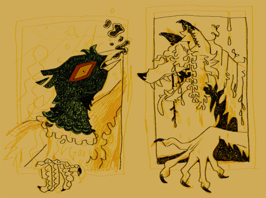
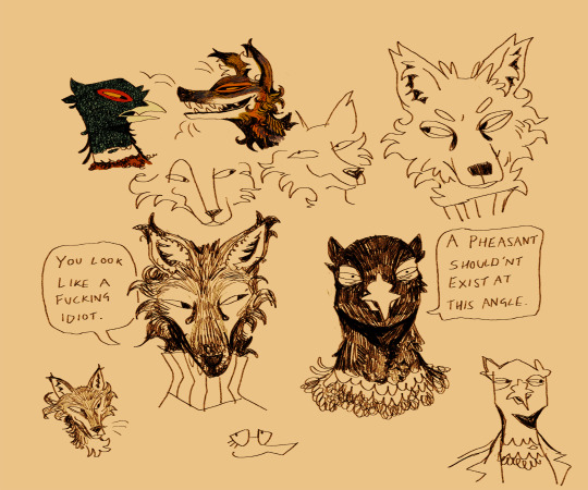
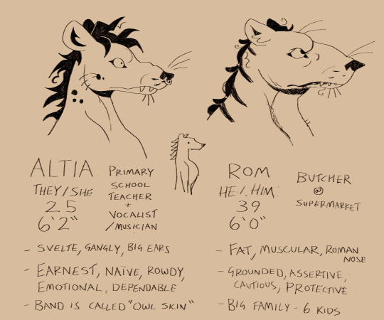
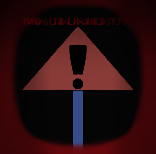
My newest Fpe AU
For people wondering what this AU is, it is the “Curse of the paper: Fundamental haunted story” AU. I had worked on the Logo and Character design.
2 notes
·
View notes