#gapminder
Text
The Interplay of Socioeconomic Status and Alcohol Consumption: Implications for Life Expectancy
I’ve chosen the NESARC dataset about life expectancy associated with alcohol consumption. This dataset is rich and provides a lot of interesting variables to explore.
This is a topic that has always intrigued me and I believe this dataset provides a great opportunity to explore it further.
CodeBook
Variable Name
Description
alcconsumption
2008 alcohol consumption per adult (age 15+), litres
lifeexpectancy
2011 life expectancy at birth (years)
Questions:
Is there a correlation between per capita income (income_per_person) and life expectancy (life_expectancy)?
How does alcohol consumption (alcohol_consumption) vary with per capita income (income_per_person)?
Is there a correlation between the level of education (education_level) and alcohol consumption (alcohol_consumption)?
How does alcohol consumption (alcohol_consumption) affect life expectancy (life_expectancy)?
Is there a difference in alcohol consumption (alcohol_consumption) and life expectancy (life_expectancy) between genders (gender)?
Variables:
Per capita income (income_per_person)
Life expectancy (life_expectancy)
Alcohol consumption (alcohol_consumption)
Level of education (education_level)
Gender (gender)
incomeperperson
This is the Gross Domestic Product per capita in constant 2000 US$
New CodeBook
income_per_person
This variable represents the per capita income for each country. It’s a numerical variable measured in international dollars, fixed 2011 prices.
life_expectancy
This variable indicates the average number of years a newborn child would live if current mortality patterns were to stay the same throughout its life. It’s a numerical variable measured in years.
alcohol_consumption
This variable represents the recorded and estimated average alcohol consumption, adult (15+) per capita consumption in liters pure alcohol. It’s a numerical variable measured in liters.
education_level:
This variable indicates the average years of schooling for adults aged 25 and older. It’s a numerical variable measured in years.
References
Hawkins, B.R., & McCambridge, J. (2023). Association Between Daily Alcohol Intake and Risk of All-Cause Mortality: A Systematic Review and Meta-analyses. JAMA Network Open.
This study found that daily low or moderate alcohol intake was not significantly associated with all-cause mortality risk, while increased risk was evident at higher consumption levels, starting at lower levels for women than men.
Murakami, K., & Hashimoto, H. (2019). Associations of education and income with heavy drinking and problem drinking among men: evidence from a population-based study in Japan. BMC Public Health.
The study revealed that lower educational attainment was significantly associated with increased risks of both non-problematic heavy drinking and problem drinking. Lower income was significantly associated with a lower risk of non-problematic heavy drinking, but not of problem drinking.
Nooyens, A.C.J., Bueno-de-Mesquita, H.B., van Boxtel, M.P.J., van Gelder, B.M., Verhagen, H., & Verschuren, W.M.M. (2020). Alcohol consumption in later life and reaching longevity: the Netherlands Cohort Study. Age and Ageing.
The study found that in women, the total consumption of alcoholic beverages was inversely associated with the decline in global cognitive function over a 5-year period. Red wine consumption was inversely associated with the decline in global cognitive function as well as memory and flexibility.
Rigelsky, M., & Zelenka, V. (2021). Does Alcohol Consumption Affect Life Expectancy in OECD Countries. ResearchGate.
The research concluded that higher income was associated with greater longevity throughout the income distribution. The gap in life expectancy between the richest 1% and poorest 1% of individuals was 14.6 years for men and 10.1 years for women.
Chetty, R., Stepner, M., Abraham, S., Lin, S., Scuderi, B., Turner, N., Bergeron, A., & Cutler, D. (2016). The Association Between Income and Life Expectancy in the United States, 2001-2014. JAMA.
The study found that higher income was associated with greater longevity, and differences in life expectancy across income groups increased over time. Life expectancy for low-income individuals varied substantially across local areas
Given the variables selected from the Gapminder dataset life expectancy, alcohol consumption, and income per person.
Hypothesis
The socioeconomic status, characterized by factors such as income and education, along with lifestyle choices like alcohol consumption, significantly impacts an individual’s life expectancy and overall health. Specifically, higher income and education levels may be associated with lower risks of heavy and problematic drinking, which in turn could lead to increased longevity. However, the relationship between alcohol consumption and health outcomes might be complex and influenced by factors such as the type and amount of alcohol consumed, and the individual’s overall lifestyle and genetic predisposition.
2 notes
·
View notes
Text
Gapminder Quiz
If you're not familiar with Gapminder, it's an organisation set up by Swedish academics Hans Rosling, Ola Rosling and Anna Rosling Rönnlund to close the gap between people's perception of the world and the actual (and usually more positive) reality of it.
If you're looking for some uplifting statistics to start the year and give you some hope for the future, do this quiz and take a look at the site
3 notes
·
View notes
Text
ANOVA Analysis
This is the task of Week 1 of the course Data Analysis Tools at the Coursera Plataform. The challenge is to execute an Analysis of Variance using the ANOVA Statistical Test. This type of analysis assesses whether the means of two or more groups are statistically different from each other. Is used whenever you want to compare the means (quantitative variables) of groups (categorical variables). The null hypothesis is that there is no difference in the mean of the quantitative variable across groups (categorical variable), while the alternative is that there is a difference.
DataSet Used – Gap Minder
Gapminder identifies systematic misconceptions about important global trends and proportions and uses reliable data to develop easy to understand teaching materials to rid people of their misconceptions.
Gapminder is an independent Swedish foundation with no political, religious, or economic affiliations.
should visit it: https://www.gapminder.org/.
The dataset used has 16 variables and 213 rows. I choosed to analyze income per person (incomeperperson) and life expectancy (lifeexpectancy).
And how is the Question?
Is the life expectancy different among four categories of income per person (A,B,C,D,E)?
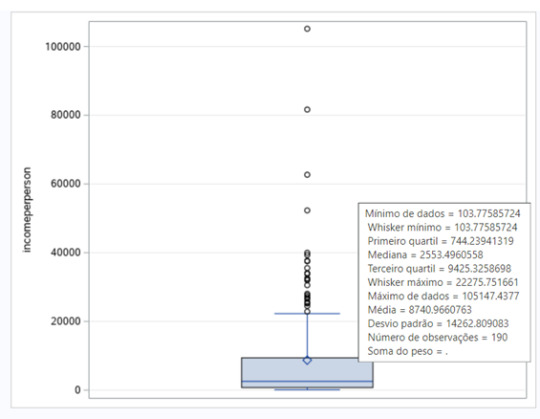
Since the income per person is a quantitative variable, I transformed it into a categorical variable, using parameters sugested by IBGE to classify the social class of according of income. For the parameters, I analyzed the boxplot posted below.

the data in image is in portuguese, because the IBGE is an Brazilian institute.
The Code
I used the Anaconda to code in Python for this task. The code is posted below.
import numpy
import pandas as pd
import statsmodels.api as sm
import statsmodels.formula.api as smf
import statsmodels.stats.multicomp as multi
import matplotlib.pyplot as plt
import seaborn as sns
import researchpy as rp
import pycountry_convert as pc
df = pd.read_csv('gapminder.csv')
df = df[['lifeexpectancy', 'incomeperperson']]
df['lifeexpectancy'] = df['lifeexpectancy'].apply(pd.to_numeric, errors='coerce')
df['incomeperperson'] = df['incomeperperson'].apply(pd.to_numeric, errors='coerce')
def income_categories(row):
if row["incomeperperson"]>15000:
return "A"
elif row["incomeperperson"]>5000:
return "B"
elif row["incomeperperson"]>3000:
return "C"
elif row["incomeperperson"]>1000:
return "D"
else:
return "E"
df=df[(df['lifeexpectancy']>=1) & (df['lifeexpectancy']<=120) & (df['incomeperperson'] > 0) ]
df["Income_category"]=df.apply(income_categories, axis=1)
df = df[["Income_category","incomeperperson","lifeexpectancy"]].dropna()
df["Income_category"]=df.apply(income_categories, axis=1)
print (rp.summary_cont(df['lifeexpectancy']))
fig1, ax1 = plt.subplots()
df_new = [df[df['Income_category']=='A']['lifeexpectancy'], df[df['Income_category']=='B']['lifeexpectancy'], df[df['Income_category']=='C']['lifeexpectancy'], df[df['Income_category']=='D']['lifeexpectancy'], df[df['Income_category']=='E']['lifeexpectancy']]
ax1.set_title('life expectancy')
ax1.boxplot(df_new)
plt.show()
results = smf.ols('lifeexpectancy ~ C(Income_category)', data=df).fit()
print (results.summary())
print ("Tukey")
mc1 = multi.MultiComparison(df['lifeexpectancy'], df['Income_category'])
print (mc1)
res1 = mc1.tukeyhsd()
print (res1.summary())
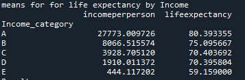
print ('means for for life expectancy by Income')
m1= df.groupby('Income_category').mean()
print (m1)
print ('Results')
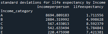
print ('standard deviations for life expectancy by Income')
sd1 = df.groupby('Income_category').std()
print (sd1)
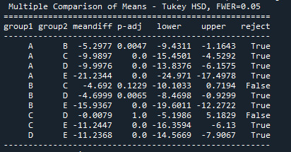
Results – ANOVA Analysis
Aiming to answer the question of the task, I ran a test ANOVA. As shown below, from the 176 rows, 171 were used for the test, i have used a filter to remove some wrong values, as non numeric, negative, etc, reducing the rows of the original dataset

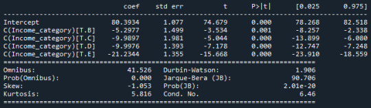
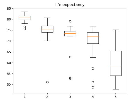
The ANOVA analysis shows a graph for each category (above) and, as we can see, the life expectancy of A class, have the life expectative of 80.39 years while the E class have the life expectative of 59.15 years.
2 notes
·
View notes
Text
Gerenciamento e visualização de dados - Atividade do Coursera
Olá a todos!
Como um requisito para conclusão do curso que estou participando no Coursera na temática de gerenciamento e visualização de dados, segue o passo a passo que segui para realizar minha atividade:
PASSO 01: Por ser uma pessoa que gosta muito de viajar e conhecer curiosidades de outras culturas, decidi pesquisar o banco de dados do Gapminder para a seguinte correlação hipotética:
Os países que possuem a maior expectativa de vida entre seus habitantes, são populações que vivem mais em ambientes urbanos ou rurais?
PASSO 02: O motivo do meu questionamento baseia-se em uma inferência popular que "afirma" que a vida no campo possui uma melhor qualidade de vida, pois a pessoa está afastada do ambiente com poluição dos centros urbanos, por exemplo.
PASSO 03: A plataforma Gapminder criou um livro de códigos para facilitar o leitor de sua planilha a compreensão da informação apresentada; como estou querendo estudar a correlação entre EXCEPTATIVA DE VIDA e VIVER EM AMBIENTE URBANO, irei acrescentar o seguinte código em meu comparativo:
Nome do código: lifevsurbanorfield
Descritivo do indicador: valor informativo se aquela população que tem uma alta expectativa de vida está em sua maioria vivendo na cidade ou no campo. Se o percentual do indicador "urbanrate" está acima de 60%, ele estará descrito como URBAN; se estiver abaixo de 60%, estará descrito como FIELD.
PASSO 04: Outra variável que gostaria de comparar - mas que não achei no banco de dados do Gapminder - era a extensão territorial dos países. Gostaria muito de poder comparar se somente países de menor área são os que possuem melhores indicadores de qualidade de vida - e se também somente os países com maior tamanho poderiam ter grandes áreas de campo habitadas por sua população.
PASSO 05: para viabilizar minha outra variável de estudos, vou utilizar as bases da Wikipedia, informando sobre qual é a extensão territorial dos países com maior expectativa de vida de sua população - segundo a fonte utilizada pelo banco de dados do Gapminder, claro.
PASSO 06: Nas pesquisas feitas no Google acadêmico em meu idioma (Português do Brasil), achei alguns artigos regionais interessantes, que reforçam a percepção das pessoas de que, se viverem em um ambiente rural/campo, terão maior qualidade de vida. Seguem alguns links que foram consultados:
http://biblioteca.clacso.org.ar/ar/libros/anpocs/carne.rtf
PASSO 07: Finalizando esse capítulo, a minha hipótese é a seguinte: As pessoas que vivem nas cidades possuem acesso próximo aos melhores serviços de saúde; logo, isso permite que elas possam ter uma expectativa de vida maior do que as pessoas que vivem no campo, pois, apesar de quem mora no campo ter um ambiente mais saudável, morar longe de hospitais pode ser a diferença entre a vida e a morte em uma emergência.
E é isso, pessoal. Agradeço a sua leitura dessa atividade até o final e até logo!
1 note
·
View note
Text
Testing a Potential Moderator
by Fausto Keske
Introduction
This is the fourth and final assignment (Week 4) of the course Data Analysis Tools from the Wesleyan University at the Coursera Platform. Now, the challenge is to test a potential moderator. So, we are questioning whether there is an association between two constructs for different subgroups within the sample.
Case Study – Gap Minder
Gap Minder was founded in Stockholm by Ola, Anna and Hans Rosling. The company is a non-profit venture promoting sustainable global development and the achievement of the United Nations Millenium Development Goals. It seeks to increase the use and understanding of statistics about social, economic, and environmental development at local, national and global levels. Its website is mind blowing, everybody should visit it: https://www.gapminder.org/.
The dataset provided for this assignment has 16 variables and 213 observations. From the variables, I choose to analyze income per person (incomeperperson) and life expectancy (lifeexpectancy). The moderator is urban rate (urbanrate). The income per person is measured by the Gross Domestic Product per capita in constant 2.000 US$ (2010). And the life expectancy at birth (years) is the average number of years a newborn child would live if current mortality patterns were to stay the same. And the urban rate is % of total population that lives in urban areas (2008).
The Question
Are income per person and life expectancy associated for low urban rate countries? And income per person and life expectancy associated for high urban rate countries? In other words, our explanatory variable associated with our response variable, for each population sub-group? We are using a third variable to understand if this variable effects the direction and or strength of the relation between our explanatory and response variable.
To understand the two variables, I analyze the boxplots posted below.

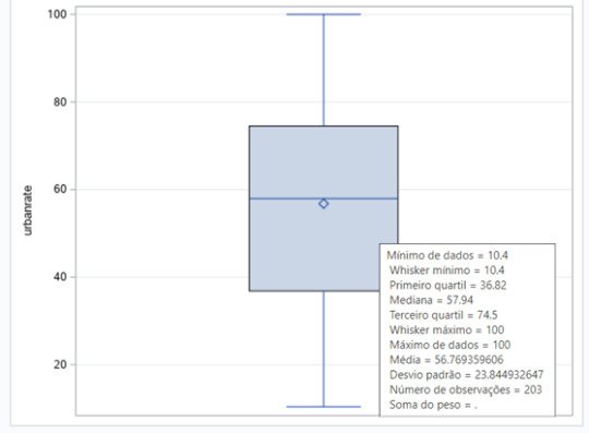
Since urban rate is a quantitative variable, I had to transform it into a categorical variable. I created a sub-group for low urban rate countries and another one to a high urban rate countries.
The SAS Studio Code
For this assignment, I decided to code on SAS Studio, since the tool was new for me, and it was an opportunity to gain experience. The code is posted below. The comments are in Portuguese, my mother tongue.


Results – Pearson Correlation Coefficient (r) for both groups
Aiming to answer the question of the assignment, I ran a correlation procedure to obtain the Pearson Correlation Coefficient (r) for both groups. The results of the test showed a P value 0.0001. So, the test is valid, and we can analyze the results of the two sub-groups.
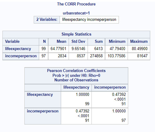

Since the r obtained is positive, we have a positive correlation between income per person and life expectancy for both groups. The correlation is stronger for the second group, the countries with higher urban rate. The r in this group is 0.63784. For the first group, the r obtained is 0.47392. These conclusions can also be seen in two the scatter plot posted below. We can see too much dispersion, when we display the points of the countries at the graph.

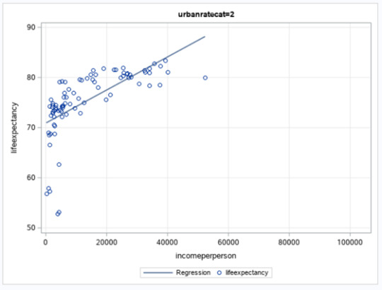
The r2 for the first sub-group (low urban rate) is 0.2246. The r2 is the fraction of the variability of one variable that can be predicted by the other. So, if we know the income per person, we can predict only 22.46% of the variability we will see in the rate of life expectancy.
For the second sub-group (high urban rate), the r2 is 0,4068. If we know the income per person, we can predict only 40.68% of the variability we will see in the rate of life expectancy, almost the double of the first sub-group.
#statistical test#Wesleyan University#Coursera#Data Analysis Tools#gapminder#sas studio#week4#testing a potential moderator
0 notes
Text
Ohhh things are starting to roll <33
#fixed the issue I had yesterday with the data and I added some more :)#*sends a kiss* thank you gapminder for giving well-formatted datas#my post
0 notes
Text
exploratory data analysis- Finding patterns in data
Python program along with required output:
#Summary of Frequency Distributions:#>>It's observed that co2 emission rate(in metric tons) is increasing with the increase of urban rate.#>>It's also observed that there is no missing data in the given dataset i.e gapminder. Data set is complete and ready to extract insights o
1 note
·
View note
Text
Conversation with Olav Hoel Dørum on Norwegian Socio-Culture and Talent: Former Ombudsman, Mensa Norway (3)
Conversation with Olav Hoel Dørum on Norwegian Socio-Culture and Talent: Former Ombudsman, Mensa Norway (3)
Interviewer: Scott Douglas Jacobsen
Numbering: Issue 31.A, Idea: Outliers & Outsiders (26)
Place of Publication: Langley, British Columbia, Canada
Title: In-Sight: Independent Interview-Based Journal
Web Domain: http://www.in-sightjournal.com
Individual Publication Date: September 1, 2022
Issue Publication Date: January 1, 2023
Name of Publisher: In-Sight Publishing
Frequency: Three Times Per…
View On WordPress
#Christians#Donquixote Doflamingo#East-Asian cultures#Gapminder Foundation#geniuses#I.Q. tests#Jordan Peterson#Jung#Kant#LGBTQ+#Nietzsche#non-religious#Norway#Olav Hoel Dørum#Russia#Ukraine#Wechsler Adult Intelligence Scale#Western oriented cultures
0 notes
Note
Wonderful blog! Have you read the book Factfulness by Hans Rosling? It's from 2017 so the diagrams in it are a bit outdated, however there's the site Gapminder that he founded that keeps up to date. It's about using statistics to prove that things DO improve over time, and also how to process the constant influx of bad news and put it into perspective.
Thank you!
I have not heard of it, but it sounds extremely up my alley!
The book is here, for anyone else who wants to check it out!
83 notes
·
View notes
Text
The widespread human barrenness of otherwise-prosperous countries is one of the weirdest things about this age to me.
Via Gapminder - the color coding is Europe yellow, Asia+Oceania pink, Africa blue, Americas green. Caveats about data sources, blah blah, I note that the correlation holds even if you take out the African data points.
Between 32k and 64k there's two pink dots which superficially look like cause for optimism, and I want to note what outlier countries they both are:
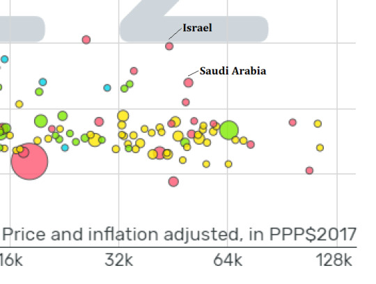
The sheer amount of non-policy circumstances surrounding both these countries makes it unlikely that one can draw policy lessons from either one.
Part of what makes this whole phenomenon so weird to me is the degree to which it resists explanation by common approaches.
Hypothetical Leftist: "GDP per capita is a shit measure, the rich are hoarding all the money and everyone else is too poor to afford raising children, we should redistribute more and have more parental leave!"
But this is wrong, because the poorest half of Americans are having more babies than the richest half, while Norway has four times the parental leave of America but a lower TFR.
Hypothetical Rightist: "The West is undergoing moral decay, women are slutting it up on OnlyFans and men are watching porn instead of getting married, muh based [insert reactionary country here]!"
But that is also wrong, because based reactionary country such as Russia has a TFR of only 1.51, and that wealthy pink dot with the lowest fertility in the whole chart is not exactly West, it's South Korea at TFR 0.87 -- and falling. With caveats about different ways of estimating TFR, other reports have SK dropping another 0.06 from 2022 to 2023 AD.
It isn't physiological, the rich countries have great medical treatments for that. It isn't personal, there have always been lots of individuals who didn't reproduce. It isn't economic, child subsidies and tax breaks and various monetary incentives have been tried with minimal effect.
This feels to me like a poorly-explained and under-appreciated mystery. It's apparently something social and/or structural. Nobody seems to have a good idea of how to stop it or why it happens.
The fact that it happens is undisputed, The Demographic Transition is well known, but that's just a label and the attempts at explaining its causes seem oddly lacking. I can look up a specialist paper studying the Causes and Consequences of the demographic transition and it's one line of causes ("decreasing mortality") and four pages of consequences, I look up a common public explanation and Wikipedia suggests everything but the kitchen sink:
birth rates fall due to various fertility factors such as access to contraception, increases in wages, urbanization, a reduction in subsistence agriculture, an increase in the status and education of women, a reduction in the value of children's work, an increase in parental investment in the education of children and other social changes.
This does not sound like an explanation of causes to me, it sounds like speculatively listing stuff that happened at the time.
And as with the hypothetical partisans above, there's a mostly-counterexample: Japan.
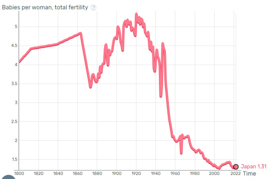
I'd ignore the pre-1860 data because it looks to be two estimates and a connective line. Still, Japan had "various fertility factors such as access to contraception, increases in wages, urbanization", etc. in 1900, and fertility stayed high, until after losing WW2 when TFR collapsed in short order.
Short, not immediate, because 1947 has higher TFR than 1946. One might suspect that the new American-written Constitution of Japan coming into effect in 1947 had something to do with it.
Perhaps I should spell out the assumption that the fertility crisis is a problem.
It is a threat of cultures and nations ceasing to exist if they can't reproduce, it is a threat of economies collapsing for lack of specialist labor and specialist products, it is a threat of pensions being unfunded and old people starving and freezing to death because their retirement plan was based on certain assumptions about the population pyramid. "I can move to another country" isn't reliable in the long term if the other country either has the same problem and will cease to exist as such or if the other country isn't accepting of you and your mindset, "We'll import immigrants" is both politically contentious and of dubious effectiveness because if the migrants do assimilate then they'll also have low fertility and if they don't assimilate then you lose your culture anyway, the place you live is now a colony.
For South Korea in particular, the bleeding edge of the fertility crisis, at this rate the Korean peninsula will be reunited by means of "North Korea walks over unmanned border" - if South Korea manages to level off TFR at 0.87 and not fall any further (already falling, see above), its population will drop by 80% by the end of the century.
If you're reading this on Tumblr, imagine 80% of the media you like not existing, because the people who would have made it were never born. You get two of your top 10 shows (not the best two), and then delete 80% of the good fanfiction about those as well. The rest is slush pile and reruns.
With tongue firmly in cheek: Maybe our future is bimbos - people who really love sex (specifically PIV sex) and are too dumb to use contraception and have too little self-control to keep their legs closed, because that's what evolution will select for.
The problem will, in a sense, eventually resolve itself. The future belongs to those who show up, bimbos or someone else, whoever manages to keep a high birthrate and a high food supply. But it's hard to say who that will be, or what complications there will be on the way towards a blind evolutionary resolution.
Technophiles like to imagine exowombs or cloning will soon be good enough for mass production and replace "birthrate" with humans-production-rate, but I don't see that happening any time soon because progress is slow (Dolly was 30 years ago and still hasn't gotten widespread adoption even for sheep), and I don't see that happening any time later either because the technophiles are most subject to South Koreafication and there will be none of them left to run the cloning tanks.
Across from them we have various Africanists who like to point to countries like Nigeria with its TFR of 5, but that's going to run into food supply problems because Nigeria already imports a hundred million dollars' worth of food from the US every year, and another hundred million dollars' worth of food from Germany, and over a billion dollars in all. In addition to growing the food there's the difficulty of running international logistics from Germany (TFR 1.58) which in the long run might not have the people to operate all that. High-tech mechanized agriculture concentrates the stress on the smartest and best-educated section of the population to make and fix the machines, and that's the section with the lowest fertility!
Things are weird and they're going to get weirder.
5 notes
·
View notes
Text
Activity 01
Following my review of the Gapminder study codebook, I have chosen to conduct an analysis of a global health concern: breast cancer. In conjunction with this primary focus, I will also explore the issue of suicide rates per hundred thousand individuals.
Question: Is breast cancer associated with suicide per 100th?
Variables: breastcancerper100th and suicideper100th
Hypothesis: Women diagnosed with breast cancer may be more likely to commit suicide compared to the general population.
Literature review:
Suicide After Breast Cancer: an International Population-Based Study of 723 810 Women
Catherine Schairer, Linda Morris Brown, Bingshu E. Chen, Regan Howard, Charles F. Lynch, Per Hall, Hans Storm, Eero Pukkala, Aage Anderson, Magnus Kaijser ... Show more
Summary: Few studies have examined long-term suicide risk among breast cancer survivors, and there are no data for women in the United States. We quantified suicide risk through 2002 among 723 810 1-year breast cancer survivors diagnosed between January 1, 1953, and December 31, 2001, and reported to 16 population-based cancer registries in the United States and Scandinavia. Among breast cancer survivors, we calculated standardized mortality ratios (SMRs) and excess absolute risks (EARs) compared with the general population, and the probability of suicide. We used Poisson regression likelihood ratio tests to assess heterogeneity in SMRs; all statistical tests were two-sided, with a .05 cutoff for statistical significance. In total 836 breast cancer patients committed suicide (SMR = 1.37, 95% confidence interval [CI] = 1.28 to 1.47; EAR = 4.1 per 100 000 person-years). Although SMRs ranged from 1.25 to 1.53 among registries, with 245 deaths among the sample of US women (SMR = 1.49, 95% CI = 1.32 to 1.70), differences among registries were not statistically significant ( P for heterogeneity = .19). Risk was elevated throughout follow-up, including for 25 or more years after diagnosis (SMR = 1.35, 95% CI = 0.82 to 2.12), and was highest among black women (SMR = 2.88, 95% CI = 1.44 to 5.17) ( P for heterogeneity = .06). Risk increased with increasing stage of breast cancer ( P for heterogeneity = .08) and remained elevated among women diagnosed between 1990 and 2001 (SMR = 1.36, 95% CI = 1.18 to 1.57). The cumulative probability of suicide was 0.20% 30 years after breast cancer diagnosis.
Topic: cancerheterogeneityearfollow-upscandinaviasurvivorsdiagnosissuicidebreast cancerlikelihood ratiosuicidal behaviortnm breast tumor stagingstandardized mortality ratio
Issue Section: Brief Communications
References:
(1) Rowland J, Mariotto A, Aziz N, Tesauro G, Feuer EJ, Blackman D, et al. Cancer survivorship — United States, 1971 – 2001. MMWR Morb Mortal Wkly Rep 2004 ; 53 : 526 – 9.
(2) Ries LAG, Eisner MP, Kosary CL, Hankey BF, Miller BA, Clegg L, et al., editors. SEER cancer statistics review, 1975 – 2002. Bethesda (MD): National Cancer Institute; 2004. Available at: http://seer.cancer.gov/csr/1975_2002 . [Last accessed: September 22, 2005.]
(3) Yousaf U, Christensen M-LM, Engholm G, Storm HH. Suicides among Danish cancer patients 1971 – 1999. Br J Cancer 2005 ; 92 : 995 – 1000.
2 notes
·
View notes
Text
First Post on Tumblr
Beginner to blogging , always thought of where to start .
Recently I have joined course on Data Visualisation and analytics.
Will be posting Regular Updates .
-> My Topic - Gapminder Data
-> What are the key indicators that drive the social , environmental and wealth of a nation.
My topic of interest would be GDP .
2. Although i came across some reference data , that pointed out that HDI is a good indicator , but I want to stick to GDP .
3. My second topic would be CO2 emissions.
4. My hypothesis comes from the fact that
The decrease in CO2 emissions with increasing GDP is explained by the greater effectiveness of institutional quality. The high quality institutions attract the foreign investors in an economy due to low volume of transactions costs that result the advancement of environment friendly technology. -- Source NIH.gov
2 notes
·
View notes
Text
Exploring Global Longevity: Analyzing Life Expectancy and Urbanization Trends Across Nations
I would like to know more about the relation between climate change and urbanization and how this affects people’s lives all around the globe. For this reason, I selected the database from the Gapminder codebook {Gapminder codebook (.pdf)}
Specifically, my Research Question is: Does life expectancy associated with urban rate per country?
So, I decided that I am most interested in exploring environmental factors of urban rate, in this case CO2 emissions and residential electricity consumption, that affect life expectancy dependence.
Sub-research Question: Do environmental factors like CO2 emissions and residential electricity consumption impact life expectancy in urban areas?
The variables of the research questions derived from the Gapminder codebook: co2emissions, lifeexpectancy, relectricperperson, urbanrate. (You can see the image in the end that I created an Excel shit with only these variables).
I have two hypothesis based on the results I found:
1. That the more people are gathered in urban centers, the higher the technological development and the higher the industrialization rates, and this ultimately increases pollution that affects life expectancy in urban areas.
2. A positive relationship between CO2 emissions and life expectancy in West Africa. CO2 emissions may indirectly contribute to improved life expectancy through mechanisms such as enhanced healthcare infrastructure and increased access to medical services facilitated by economic activities associated with CO2 emissions, notably industrialization.
My hypothesis is based on the following literature review:
Elevated CO2 emissions in urban areas are expected to negatively impact life expectancy due to increased pollution. Prolonged exposure to high CO2 levels can result in respiratory and cardiovascular health problems, thereby reducing life expectancy. Additionally, electricity rates may indirectly affect urban CO2 emissions by shaping energy consumption behaviors.https://www.sciencedirect.com/science/article/pii/S2352550921001950
Reducing exposure to ambient fine-particulate air pollution led to notable and measurable enhancements in life expectancy in the United States.https://www.nejm.org/doi/full/10.1056/NEJMsa0805646
The detrimental impact of CO2 emissions on agricultural output, they might indirectly contribute positively to life expectancy in West Africa. Possible explanations for this unexpected relationship include enhancements in healthcare infrastructure and accessibility to medical services driven by economic activities linked to CO2 emissions.https://ojs.jssr.org.pk/index.php/jssr/article/view/115
The study highlights that CO2 emissions negatively impact life expectancy in both Asian and African countries, potentially due to increased urban pollution and deteriorating air quality. Economic progression has a mixed impact on life expectancy, with a negative overall effect but a positive influence observed in the highest economic quantile. This suggests that while economic growth may enhance life expectancy under certain conditions, it can also lead to negative health outcomes in urban areas due to pollution and lifestyle changes.https://ojs.jssr.org.pk/index.php/jssr/article/view/115

2 notes
·
View notes
Text
Generating a Correlation Coefficient
by Fausto Keske
Introduction
This is the third assignment (Week 3) of the course Data Analysis Tools from the Wesleyan University at the Coursera Platform. Now, the challenge is to generate a Correlation Coefficient. This type of coefficient is used when you have two quantitative variables. For this assignment, as asked, I will use the Pearson Correlation Coefficient (r) that is a numerical measure of a linear relationship between two quantitative variables.
Case Study – Gap Minder
Gap Minder was founded in Stockholm by Ola, Anna and Hans Rosling. The company is a non-profit venture promoting sustainable global development and the achievement of the United Nations Millenium Development Goals. It seeks to increase the use and understanding of statistics about social, economic, and environmental development at local, national and global levels. Its website is mind blowing, everybody should visit it: https://www.gapminder.org/.
The dataset provided for this assignment has 16 variables and 213 observations. From the variables, I choose to analyze alcconsumption and lifeexpectancy. The alcohol consumption per adult (age 15+) is measured by how many liters recorded and estimated average alcohol consumption. And the life expectancy at birth (years) is the average number of years a newborn child would live if current mortality patterns were to stay the same.
The Question
Is there a correlation between alcohol consumption and life expectancy?
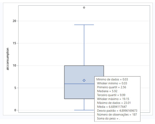
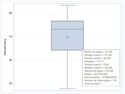
To understand the two variables, I analyze the boxplots posted below.
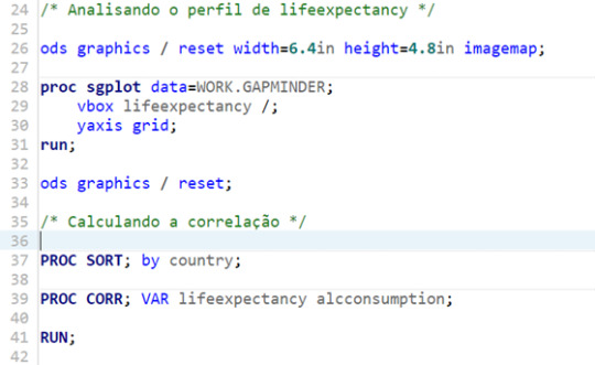
The SAS Studio Code
For this assignment, I decided to code on SAS Studio, since the tool was new for me, and it was an opportunity to gain experience. The code is posted below. The comments are in Portuguese, my mother tongue.


Results – Pearson Correlation Coefficient (r)
Aiming to answer the question of the assignment, I ran a correlation procedure to obtain the Pearson Correlation Coefficient (r). The results of the test showed a P value 0.0001. So, the test is valid, and we can analyze the results.
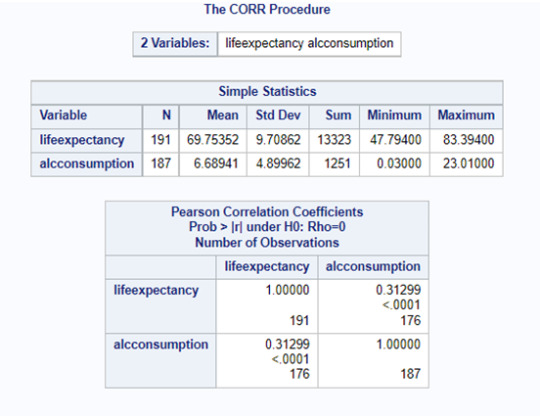
Since the r obtained is positive, we have a positive correlation between alcohol consumption and life expectancy. But this correlation is not strong, since our r is 0.31299, and the possible range is from -1 to +1. This conclusion can also be seen in the scatter plot posted below. We can see too much dispersion, when we display the points of the countries at the graph.
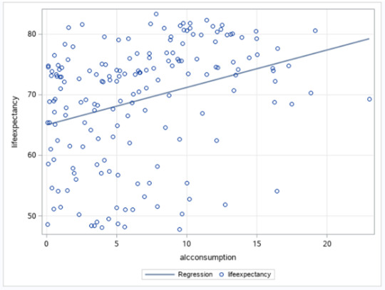
The r2 of this test is 0.098. The r2 is the fraction of the variability of one variable that can be predicted by the other. So, if we know the alcohol consumption, we can predict only 9.8% of the variability we will see in the rate of life expectancy.
#statistical test#Wesleyan University#Coursera#Data Analysis Tools#gapminder#sas studio#week3#pearson correlation coefficient
0 notes
Text
Assignment #1: Getting Your Research Project Started
Is greater urbanization associated with higher rates of suicide?
With my academic majors being Economics and Government, I was drawn into perusing the dataset and codebook from Gapminder, as it offered several variables describing the development status of 213 countries which felt most relevant to my academic interests. The variable that caught my attention first was ‘urbanrate.’ This variable measures the proportion of a country’s population that resides in urban areas. Since the measurement in the dataset, which was in 2008, the world population has increased by over 1 billion people according to the United Nations (UN, 2022). As the global population grows, urbanization will have to increase to make room for more people. This effect will be most prominent in low-income developing countries. By studying what effects urbanization might have on the wellbeing of the population, we can better guide the development of new cities to ensure its citizens the greatest possible prosperity. The second topic that I would like to explore is mental health, specifically Gapminder measures suicides per 100,000. I am curious to see whether urbanization introduces new stressors which lead to difficulties with mental health, and ultimately suicide, or if urbanization brings greater security and therefore decreases such actions.
There have been numerous studies conducted that look within individual countries, to compare suicide rates across counties of different levels of urbanization. A dominant finding is that rural areas tend to have higher rates of suicide than in urban areas, particularly in developed nations such as Japan (Otsu et al., 2004), the United States (Kegler et al., 2017), and the United Kingdom (Saunderson & Langford, 1996). However, researchers have proposed several different factors that may cause urban residents to have a lower risk of suicide than their rural counterparts. Firstly, those who live in rural areas experience geographic isolation, which in turn can often contribute to social isolation (Otsu et al., 2004; Kegler et al., 2017). Simply being surrounded by fewer people can make rural residents feel more alone and have fewer people to turn to in times of psychological distress. Those living in rural areas also tend to have poorer access to psychiatric care (Kegler et al., 2017), meaning that mental health issues often go untreated.
Economic uncertainty affects suicide rates across the entire population. Lower socio-economic status and increased risk of unemployment results in higher suicide risk regardless of urbanization (Saunderson & Langford, 1996). However, rural residents tend to have less protection from economic downturns and therefore their finances can be volatile. This uncertainty about the future raises stress and contributes to higher suicide rates in rural areas.
One study which opposed these views took place in Denmark, finding that suicide rates were higher in urban areas than rural. The author of the study cited greater access to psychiatric help in rural areas as a key factor to reducing rural rates of suicide (Qin, 2005). They also find that psychiatric disorders tend to be more common in urban cases of suicide. This may be because those living in more densely populated areas are likely to be exposed to social stressors at a higher frequency than those living in less populated regions (Qin, 2005). Urban areas are also likely to house more ethnic minorities who experience discrimination, a significant stressor which can increase risk of suicide (Saunderson & Langford, 1996).
All the studies I consulted took place in wealthier developed nations. My research will aim to see if the dominant trend observed within these countries, that rural areas experience higher rates of suicide than urban areas, continues across the globe. I hypothesize that despite the increased psychological stress that urban living can cause, countries with a higher proportion of its population living in urban areas will have lower rates of suicide because urban residents are more likely to have greater access to mental health services as well as better opportunities for social inclusion and socio-economic mobility.
Bibliography:
Kegler, Scott R., Deborah M. Stone, and Kristin M. Holland. “Trends in Suicide by Level of Urbanization — United States, 1999–2015.” MMWR. Morbidity and Mortality Weekly Report 66, no. 10 (2017): 270–73. https://doi.org/10.15585/mmwr.mm6610a2.
Otsu, Akiko, Shunichi Araki, Ryoji Sakai, Kazuhito Yokoyama, and A Scott Voorhees. “Effects of Urbanization, Economic Development, and Migration of Workers on Suicide Mortality in Japan.” Social Science & Medicine 58, no. 6 (2004): 1137–46. https://doi.org/10.1016/s0277-9536(03)00285-5.
“Population.” United Nations, 2022. https://www.un.org/en/global-issues/population#:~:text=Our%20growing%20population&text=The%20world’s%20population%20is%20expected,billion%20in%20the%20mid%2D2080s.
Qin, Ping. “Suicide Risk in Relation to Level of Urbanicity—a Population-Based Linkage Study.” International Journal of Epidemiology 34, no. 4 (2005): 846–52. https://doi.org/10.1093/ije/dyi085.
Saunderson, Thomas R., and Ian H. Langford. “A Study of the Geographical Distribution of Suicide Rates in England and Wales 1989–1992 Using Empirical Bayes Estimates.” Social Science & Medicine 43, no. 4 (1996): 489–502. https://doi.org/10.1016/0277-9536(95)00427-0.

2 notes
·
View notes
Text
Unveiling the Backbone of Nations: Exploring Factors that Define Health and Wealth in Countries
As I delved into Gapminder's data, I found myself pondering the complex web of factors that truly define a country's development. Sorting through various pieces of information, I sought to uncover the critical elements that shape both a nation's health and its wealth.
When it comes to wealth, it's more than just the money. It's about the economy and how well-off people are. I found that factors like GDP (which shows how much a country makes), income per person, how many people live in cities, and how many people have jobs play a huge role. Usually, when these numbers are higher, the country tends to be richer.
On the health side, it's not just about feeling good. It's about how long people live and how healthy they are overall. Things like life expectancy (how long people live on average), rates of diseases like breast cancer and HIV, and even the number of suicides all tell us a lot about a country's health.
The Gapminder data had around 16 different things to look at, but I don't know if these cover everything about a country's health and wealth. I'm on a mission to learn more. As I go forward, I might discover more critical factors and add them to the mix to better understand what makes a country thrive.
3 notes
·
View notes
Last Seen Blogs

booperesque
future PM Adz Lallana

blacktiger5
Blacktiger5's Art

12012xyzcom
👽12.012xyz.com - Gaming+ : Strategy, Simulation, Adventure&

isotopegirl
all my friends are mentally ill (affectionate)

the-cryptids-are-calling
a search for the paranormal