#greyscale value challenge
Explore tagged Tumblr posts
Visit Tumblr Blog
Explore Tumblr blogs with no restrictions, modern design and the best experience.
Last Seen Tumblr Blogs


Fun Fact
Post activity is at the highest at 4:00 pm EDT; notes peak at 10:00 pm EDT.
Text
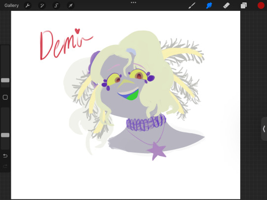
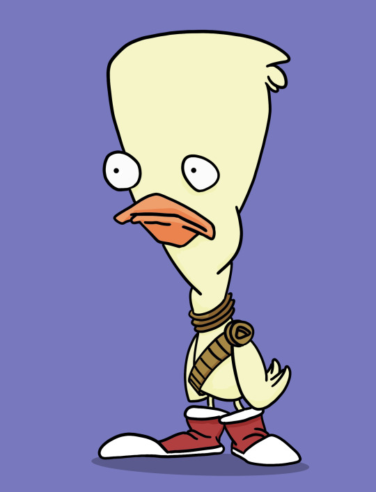
Greyscale Value Challenge!
1st OC is Chester “Axel” Simons, 2nd OC is Demi Alegria
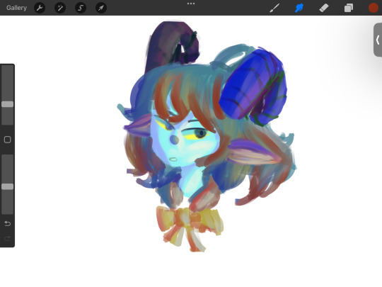


I did not expect to actually like the colours quite a lot. Axel is a lot more messy as he was the first one but I love the blues and purples there a lot. Meanwhile, not as much of a fan as Demi’s revealed colours (though I still really love it) but her shading and general shapes I love a lot because I made them neater.
Axel’s colour scheme is more greys and reds with some blue for his eye whereas Demi is a lot of shades of pinks, white and oranges.
Looking forward to do this again!
Here are some other sketches + other things

#latte’s art#oc art#oc content#procreate#digital art#art#artists on tumblr#greyscale#greyscale challenge#greyscale value challenge#colour value#sketches#lineless art#lineless style#axel Simons#Demi alegria#my OCs#I’ve had these ocs for 3 years now but I’ve only made the recent idea to make Axe#-Axel a goat and Demi an axolotl human person#ahhh help wk 7 is here and assessment is to fear#literary articles are hard asf too 😔#kenekomimi
4 notes
·
View notes
Text
day 23 was to pick a color palette and stick to those colors(with some blending allowed)

#incredibox#incredibox fanart#evadare#xrun#siren#capitan#30 day challenge#sparks creations#OUGH THE EEPERRRRRRRR/POS#BABY CAPITAN MY BELOVED#hes just a little babie <3<3<3<3#siren is SO pretty and for WHAT#I LOVE WOMEN#this was honestly easier than i expected#all i had to do was translate the colors into greyscale#order them from lightest to darkest(lavender. yellow. light blue. red. dark blue)#and place them based on the values#it was just painting it was honestly nice :D#yes i chose the palette based on the name i thought it was funny#it was either still or drawing rafe again with a color palette called Doomed(By The Narrative) XD#but i drew rafe recently so i picked someone else
105 notes
·
View notes
Text
So I tried to do that challenge when you put a bunch of colors, mix/swirl them, turn on the greyscale color filter and have fun drawing completely blind to what colors you use, only values.
Well. Majima turned out, for some reason, extremely hot blue-green in color (ah, yeah, just Kiwami 2 Majima)...
Then I edited it a bit (pure hue shift and some color balance thrown in) to make it look... less green.
(+ greyscale & lineart wersion because I like it too)


#yakuza#he's uh. um. 😳😳😳#rem oscar draws#majima goro#goro majima#ryu ga gotoku#rgg#rgg art#feat. THE fit 🔥
67 notes
·
View notes
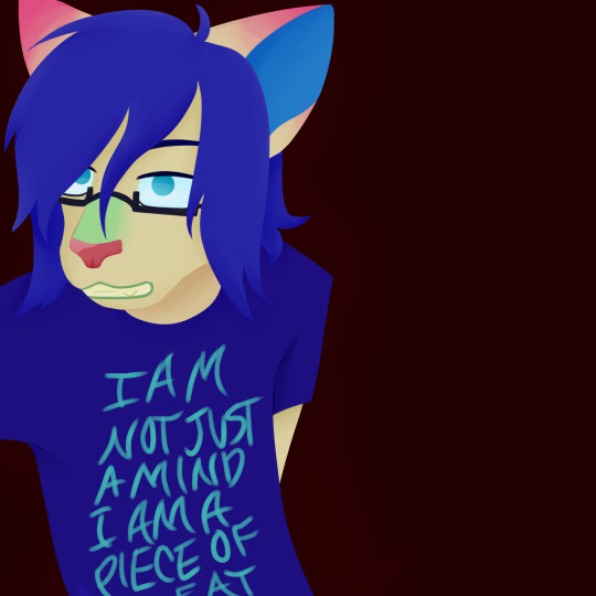
Text

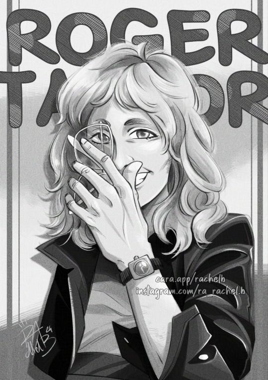
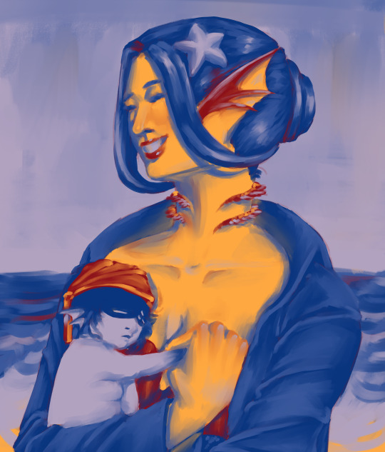
Happy Birthday Roger! 💕
Ahhh happy 75th birthday Roger Taylor, I hope you have a lovely one! 🥰💕💖
This time I wanted to challenge myself and replicate a "colorblind" thing I saw on YouTube, with artists making a color palette, turning the canvas to greyscale and pick the colors only based on their value without knowing exactly which color you're using! To play safe as my first time I only selected the skintone and the eyes but everything else is random and chosen "blindly" 🙏🏻💕 I think it's fitting for our beloved "Blind Melon" Roger 😅
I hope you'll like this! 🥰
Please do not repost without credits! Reblogs and comments are always welcomed 💜
#rachelb's art#queen#queen band#queen fanart#roger taylor#roger taylor queen#roger taylor fanart#roger taylor birthday#digital art#no ai#artists on tumblr#illustration#colorblind challenge#drummer
140 notes
·
View notes
Text

Daily drawing 1821. To mix things up, I wanted to do a color palette challenge where I pick a random palette of 5 colors and try to make it work. I have a bunch of greyscale reference photos that would work well for this type of challenge, and it seemed like a fun way to try and stretch a bit. I didn't want to use gradients for this or mess with the values at all, and that really added a layer of complexity to the challenge. How do you think I did? And if I do it again, should I use more or less colors?
#digital art#procreate#illustration#artists on tumblr#landscape art#color palette challenge#color palette#stylized
16 notes
·
View notes
Text

i decided to do one of those challenges where u change your monitor to greyscale and use a random colour palette to make a drawing. i tried my best to not colour pick from the drawing itself and only using the palette but unlearning that was the hardest part 😭 anyway the result is horrifying but also kinda cool but im gonna hide it below bc it's eyestrain esp if u have colour sensitivity like me :')

the reason why the values are diff if u noticed, it's because i originally didnt know who i was drawing and then i wanted to darken his skin tone so i added a dark layer on top BUT when i turned the colours back on it was this horrifying dark green colour so i turned it back off 😭
#tw: eyestrain#art#artists on tumblr#illustration#illustrators on tumblr#artblr#sketch#art of the day#daily sketch#digital art#painting#oc#character: ares herois#i really need to sit down and actually design this dude#bloochouli art#bloo screeches into the void
9 notes
·
View notes
Text


AU Silco because I cannot stop drawing this man…
i was originally going to challenge myself and do greyscale, but that didn’t pan out too well. This is, however, all the same number value on the color scale, except for the red!
#silco arcane#silco#arcane#this man has my whole heart#i try and think of someone or something new to draw but i just end up drawing more silco#juliets immaculate and totally rad art
5 notes
·
View notes
Text
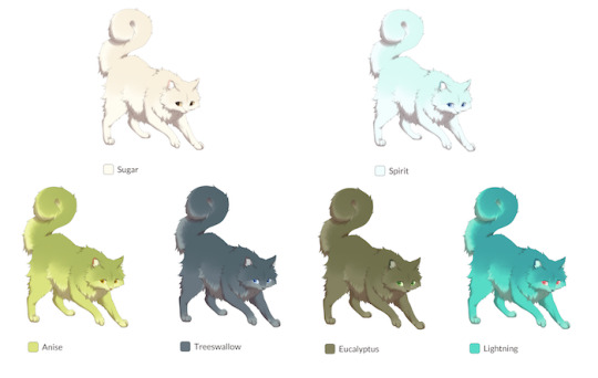
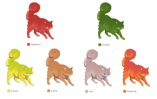
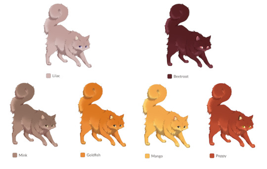
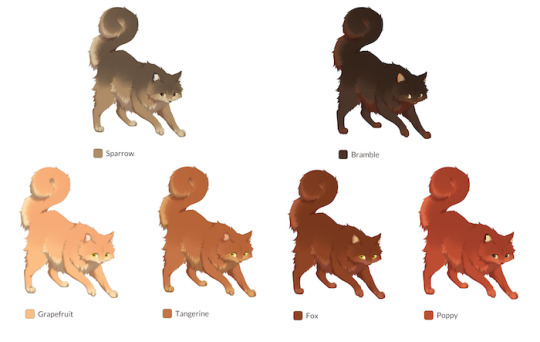
Hey all!
As promised, an update with transparency on how we intend to tackle the color relationship for breeding going forward!
Through prioritizing a user’s ability to breed for consistently favorable results–both from wishing to improve and maintain general aesthetic appeal and from a choice to increase cat scarcity–the PB team has reached a conclusion regarding the way we have set up colors.
Over the past few months, we’ve been developing and testing an alternative approach to the “wheel.”
Originally, breeding was developed using a “color wheel” which would be used as a point of reference for the range of colors two cats could produce. Colors on the wheel between one another would be included in the potential offspring.
Problems we ran into with this system:
Results get unpredictable. Being fully dependent on RNG, wide-range pairs are frequently able to produce unintuitive color combinations.
These chaotic outcomes can de-incentivize breeding with our setup, as Pawborough aims for breeding to be meaningful and rewarding near every time, rather than producing frequent duds en masse which de-values most cats.
A wheel system means that every new color added will broaden two cats’ breeding color range, further increasing the above problems and causing user fatigue. This limits how much color variety and customization we can add.
Ranges are up to the gradients of the wheel, which may also cause user frustration and fatigue. Approaches to setting up a horizontal gradient vary depending on which aspect of a color’s HSL is prioritized for the gradient. Results are inevitably hand-selected. Two oranges can end up on opposite sides of the wheel, for example, frustrating a user who wishes to breed for an orange range and gets red or green in the mix. (Simply put: Two colors which look similar can be very different, and cause issues with how to organize them.)
As a summary: Colors are challenging to organize with such simple conditions, and outcomes fatigue users, produce unintuitive results, and limit our ability to expand the colors.
So what is the solution to these problems? Introducing… a paint mixing system!
The paint mixing system categorizes a color into three categories: Hue, Saturation, and Luminosity
Hue includes the following:
Greyscale
Brown
Red
Orange
Yellow
Green
Teal
Blue
Purple
Pink
Saturation includes the following:
Saturated
Desaturated
Luminosity includes the following:
Light
Medium
Dark
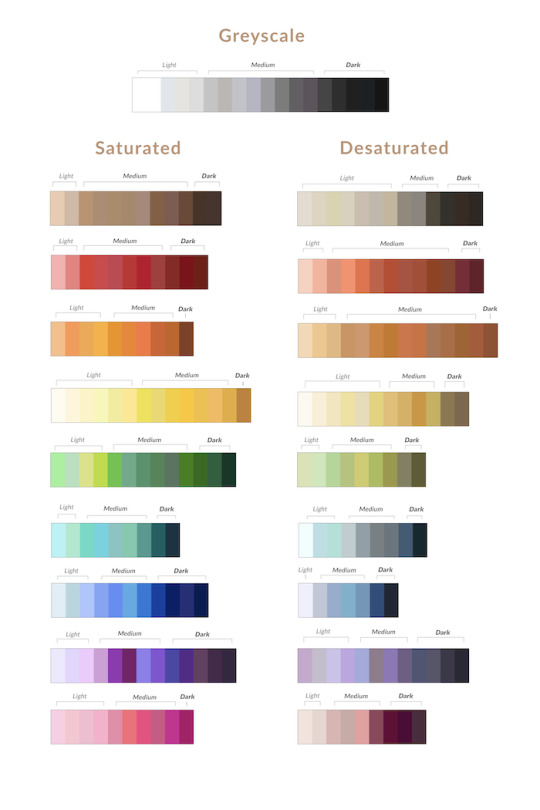
This is not the final lineup, as we are picking accent colors and consistently tooling if there are any weak or lacking color combinations based on user base preferences and enjoyment. By the time this all hits the website, it’ll be final!
These three categories are then taken into account for the breeding ranges.
Outcomes result with whatever categories the cats possess.
For example, a Blue, Light, Saturated color and a Brown, Light, Desaturated color will produce a range of Brown and Blue colors which include only those that are Light, Saturated, and Desaturated!
In addition, in order to preserve some of the fun of large ranges and breeding strategy while remaining intuitive, certain hue combinations will broaden the range based on properties of paint. Breeding a Red and Blue color will produce a range of Red, Blue, and Purple colors!


For comparison, here are those same pairs with the wheel system, with potential offspring colors intentionally picked to show the amount of disparity in this system in comparison to the more consistent examples above:

These outcomes are night and day, giving users a much needed increase in control over what they breed for! Much of the team has felt relief and surprise at the sheer amount of improvement seen in the testing results.
The color picker in the cat generator will also have indications of these categories, with ease to navigate between hues.
So many colors.. but what about Generation 1 cats...?
We've solved the breeding issues that come with a large wheel. Ranges will be relatively predictable and easy to control or curate.
However, the other question raised is: what becomes of generation 1 cats? The more RNG there is, the higher the number of colors, the more likely you are to generate clashing colors when getting a new cat. How can we prevent the majority of generation 1 cats from looking like a mess?
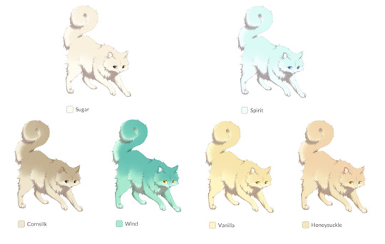
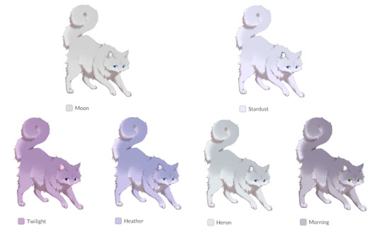
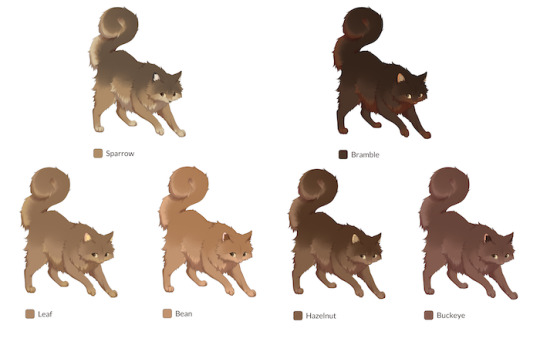
Well, the benefit of a system like this, which pays careful attention to color categorization, is our ability to further categorize "pools" of color used for G1 generation. For example, a G1 cat may roll to only pull colors from a "pastel" pool, which only includes light and saturated colors, or the "gothic" pool, which only includes greyscale, red, and purple colors.
These are just examples, but we've been testing by generating several different pools, tooling with their conditions, and workshopping the amount of control we have over the pools.
Of course, the "all colors" pool will still exist! However, weighing color generation in this way will provide more favorable outcomes the majority of the time, and compensate for a large wheel. We intend to have a great deal of pools to upkeep a healthy amount of RNG and variety while maintaining general aesthetics.
It's the best of all worlds! A large and expansive color variety, easy and intuitive breeding, and the organic population of the site is on average aesthetically pleasing!
I hope you all enjoy what we have here!
In other news, we are continuing color testing in an effort to make sure all undercoat/overcoat combinations are clean and aesthetically viable. I am fairly certain that we've settled on an excellent solution for the problems faced with consistently clashing colors when placed on the compositions of typical cat patterns. Not everything always works, but I'm confident in the results we're seeing. Further testing is required before we announce the latter half of the color and pattern system revamp, but good things are in store!
Thank you! See you all next month!
20 notes
·
View notes
Text
Cat n co (part 1)

I finally started painting what I sketched before!! I started off with a grey background and painting first in greyscale (which I’m very mad I didn’t take process pics of). I think I learned this habit from when I used to do mostly digital art, which actually works really well for learning values in my opinion.
I then added colour- the details on the cats skirt were really hard to do because they’re so small. Also I definitely got the cats face wrong with the angle so I’m going to fix that up tomorrow. I’m a little scared to do more of the glasses just because I usually find them challenging but oh well, I really want to include them so I’ll just practice lol
I really like how the beanie baby turned out though!! He looks really fluffy because of the texture and I’m proud of how I applied the paint


#artists on tumblr#experimental art#sylvanian families#beanie baby#beanie babies#painting#acrylic painting#acrylic paint#crystals#trinkets#self portrait
4 notes
·
View notes
Note
i love the colours in your artwork! how do you choose them?
thank you! colours are one of my favourite things to experiment with and so i've ended up with a relatively streamlined process.
i begin with a palette of 96 colours called springboard-96. i made this palette myself as a starting point for mixing new colours as i develop the art piece. below is a "sample" of springboard-96.

as an aside, i meant to make a 256-colour "extended" version of it but i never got around to it.
springboard-96 is an edit of an edit of an existing palette called Journey by PineappleOnPizza. in its current state, springboard-96 encapsulates my use of colour fairly well. i'll go over some notable features:
the greyscale ramp hueshifts from purple to green. i like this because it gives the darker greys a more grimey feel. it works especially well on metals.
red has a unique hueshifting pattern: initially it shifts towards pink as it gets darker, but after a point it starts getting warmer again. i like doing this because it accentuates the pinkness of the main shade and creates a nice balance of warmth and coolness within the colour ramp.
there's two green ramps. i like green.
when it comes to rendering objects and characters i usually pick 3 tones for each material: a main tone, a shade tone, and a line tone. i avoid making these 3 tones a perfect linear ramp if possible. i like to change the hue or saturation of the line tone so the shade tone isn't straight between the main tone and the line tone, if that makes sense. sometimes i will also move the shade tone closer to the line tone.
for an example, we'll look at ocha's hair:

i've listed the hue, saturation, and value of 3 of the 4 tones her hair uses. you can see the hue of the shade tone is a lot closer to the line tone, while the saturation is closer to the main tone. "biasing" the hue or saturation like this can help to make each colour stand out while fitting nicely in a ramp. (generally keeping value linear is best, but anything works)
additionally, playing around with "non-standard" hueshifting can be very rewarding. usually you're told that light tones should shift towards warmer hues and dark tones should shift towards colder hues but switching it up can produce interesting results. in ocha's hair, the hue shifts from yellow to green, which gives it a nice natural/earthy feel when combined with the low saturation. the highlight also shifts towards green which helps to emphasise the general green-ness of her hair while letting the beige prevent it from becoming overpowering. (additionally, the main tone is pulled from springboard-96 so that's an example of how i use the palette to mix new colours.)
overall, the most important things to my process are to make colours up as i need them and to be Weird with colour usage. in the spirit of minimalism i generally try to use as little unique colours as possible, so finding a balance between that and mixing new colours as i need them can be a fun challenge as well. thank you very much for the ask!
4 notes
·
View notes
Text
Digital Character Design Workbook - Pt.1
In class today we explored using line stability on our paint tool to create smooth and seamless linework. We traced over an existing draft character design employing a few different tools and techniques.
Some of the other techniques we used included, using both the selection tool and paint bucket tools to quickly fill in sections of our linework; with a proper organised layer setup, this setup allows for an easy to navigate, non-destructive workflow to allows for quick and easy adjustments to values and colors. We used the "Some of the other techniques we used included, using both the selection tool and paint bucket tools to quickly fill in sections of our linework; with a proper organised layer setup, this setup allows for an easy to navigate, non-destructive workflow to allows for quick and easy adjustments to values and colors. We used the "Expand" tool to remove any anti-aliasing that occurs using the paint bucket tool.

Once you have your selection expanded and ideally on a layer of it's own, you can quickly change values like hue, lightness and saturation by using the shortcut "Ctrl - U"

We practiced these tools and techniques on a quick donut sketch we did in class. To quickly create different colour variations of the donut, I made sure to group all layers and then I could quick duplicate these groups and adjust the new donuts colour groups as I went.


Below are some of the shortcuts we learned -
Ctrl - U - Colour Change Settings
Ctrl - A - Select All
Ctrl - D - Deselect All
Shift - Command - I - Invert Selection
Alt - Delete - Fill Selection (Used After expanding Pixels
[ - ] - Changes Current Toolsize/Brushsize
Change Opacity Levels - Numpad keys
Value Study -

Today in class we moved away from lines all together and moved on to practicing values.
The first stage of this process involved a flat greyscale blockout that most represented a middle value shown in the reference picture.
The next step was a basic blockout of the shapes, their general location and scale. A tried and true technique while doing this is to place your image close to the study you’re attempting. Also, blurring of the eyes can help remove unimportant information and allows you to focus on the larger scale tasks.
After this study we moved onto creating an original character of our own. I decided to keep it simple and try creating an anthropomorphized animal. I went with a Western theme and chose to use Owls as my animal. I find their strange head and neck flexibility rather menacing and predatory so I took these features and attempted to create a wild west bounty hunter/deadeye type character.
The first thing I did was gather a bunch of references from google images and Artstation. General pictures of different types of owls and Wild West Cowboys and other figures.

Once I had a loose Idea of the types of imagery and subject matter I wanted to roll with, I began doing some very loose shape and linework. At this stage of the design, I was really just trying to gauge what type of stylisation I wanted to use for this character. I'm generally used to creating more realistic character designs, so I wanted to take this as an opportunity to challenge my normal workflow.


After doing some designs ranging from heavily stylised to slightly more dialed back, I decided to go with the design on the right.

I worked on refining this design a little further by adding some more costume elements, and doing a cleaner line pass over the rough sketch.

I then went through with a range of different greyscale values and blocked out each piece of the character, with an aim to keep readability through contrast of values and shapes.
Below are the various value studies I ended up with, I haven't got an overall favorite, but I lean more towards the left most designs value setup.


In class, we were assigned into groups of three, and tasked with both writing a brief relating to a character we worked on developing as a group, and then passing that brief onto another group and receiving our new brief. While waiting for the groups to be set up I jumped into another value study, I wanted to explore the planes of the face this time so I found this sculpture reference through Pinterest and spent about 1 hour total studying (some of the study was done at home after class too).

The brief we received involved a goofy magical minion who was involved in a summon accident, it was left pretty ambiguous in regards to its visual design, so the first thing our group did was put together a reference board with a rough idea of the type of creature we were thinking of. Something goofy but also cute, we also wanted it to be apparent that something was a little off on account of being involved in the summoning accident, so most of our references have a slightly uncanny goofiness.

we all went off and began just brainstorm sketching, we would regroup after a little sketch session. Below is the second stage of the brainstorming where we’ve all done some designs and considered a colour palette, and I’m working on loosely matching my first sketches with elements of the other group members sketches.

This is the third stage where the line art is being cleaned up, the smaller shape language is being refined, and all the colours are now on the design and matching the other group members designs.

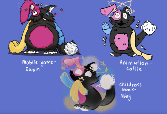
the final sketch has shadowing applied, line art cleaned up and a background, that was built on ideas of retro tv studio contexts (This was also part of the brief character story). The style of this character is meant to loosely represent a mobile game character, but I took a higher fidelity stylised approach to the design.
Here’s the A4 lineup of all our groups characters, I love that their all so stylistically different, yet they are cohesive in their design choices and colour palette.
In class, we compiled these designs as a group page and passed it off to the original brief writing group to see what they think, whether it matches what they envisioned, and what couple be improved.
Each group member went away with the feedback we had recieved from the other team, to create revised versions. Below is the list of things needing adjustment or changing for my character in particular.
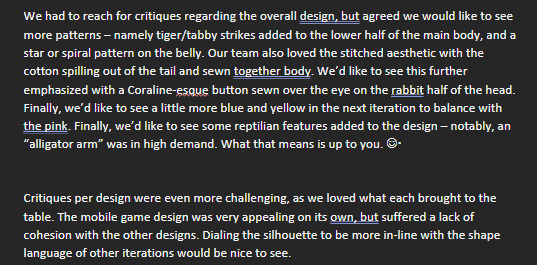
The next step for me was to compile all the feedback points that were specific to my character, as well as general design changes across the board for all of our characters.
I quickly jotted down the points of revision in my procreate character project file, as well as gathered some new reference images for the additional design changes ("Add tiger stripes to lower torso, and an Alligator arm)

One key piece of feedback specific to my character was the lack of design cohesion with the other group designs, so i started by grabbing a reference of the new design Abby had sketched up, and I did a sketch over my original character to figure out which areas needed dialling back or complete redo's. This was also a chance to slot in the new design elements we had received in our feedback.
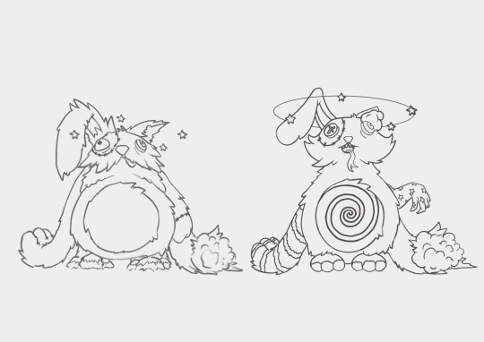
From here I did a simple colour blockout, aiming to match Abby’s reference as accurately as possible this time.
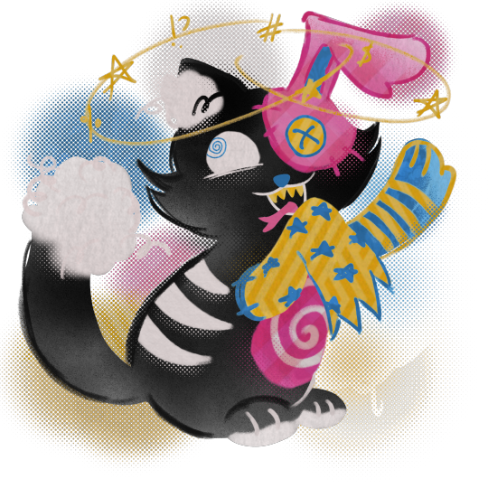
The final and longest spent section was line clean up. I could've probably done a completed fresh sketch, but I instead opted to work my way around the existing sketch and incorporate linework from the old design. I enjoyed dialing between the two designs, and really thinking about which elements to keep, which to bin and which to modify.
To tie the design in even closer to Abby’s I added some stipple-like effects to the shading It also adds a nice subtle texture, and comic-print feel.
Here is the final revision A4 layout of all our new characters.

0 notes
Text

Adam Tower(s) my slutty beloved. Those 10 mins you appear in the entire film are the most precious of the entire movie 😩 we were deprived of your fabulousness 😫✊🏻
Hugh Dancy character form Basic Instinct 2!
Clean-shaven because I don't know how to do facial hair without becoming a mess 🥲
Reference 👇

---
I was today's years old when I finally figured out how to do the greyscale mode thing in Krita and I challenged myself by coloring him first with a random color palette. I didn't know which color I was picking, it was all by eye and how the values looked similar to the reference. Even the skin tone was random


I'm very proud how it turned out, so I'm throwing it out to the world 🔥😈 Have Adam in random colors
---
💫 IG and Bsky @ ayarosenweiss
background pic from Unsplash
❌Please DO NOT repost/remove credits❌
❌NO N/F/T or A/I allowed❌
0 notes
Text

I made a pet portrait commission!
This was a lot of fun to make, but also challenging in a way. Compared to the other times I've painted dogs, this time the painting was very 'detailed' in comparison to the flat graphic look that I usually go for. But I felt that this more detailed look would work better consider the type of fur plus the limited color.
I started with a sketch to break down the areas with different values

and then I added the background color. Usually I would work the other way around, but because the dog would be greyscale instead of color, it was important I have the background set so I can see how dark or light I should go.

Once I had this set, I started laying down base colors where I could build the white fur on. I also did the eyes, nose, and mouth as they would be the darkest areas of the painting.

Then I started adding the actual fur detail on the face. I find it a little more manageable focusing on one area and adding detail, rather than tackling everything at once.

Then I followed the same method to the rest of the body!

After this, all I really did was add more white (partially to make the transitions in the shadow less harsh, but also the dog felt more gray leaning than white.) I also ended up darkening the shadow underneath the dog to help make the white stand out so more!
All done!
#artists on tumblr#art#my art#art commisions#dog painting#dog art#acrylic painting#painting process#painting
0 notes
Text

idk if yall remember that "greyscale challenge" thing that was going around a while back (basically, you set your monitor to greyscale while still drawing in color so you cannot see which colors you're using) but i decided to do it again with my silly :] speedpaint below so yall can see what i was seeing while drawing
youtube
this took about 40 minutes according to the recording
plus a version with a few edits i made while seeing the colors

i just realized i forgot her dark upper eyelid markings AND her mole UGHHH this is what happens when i don't use character references... i didn't want to pull one up to avoid messing with the random colors :/
and tbh i couldve done the challenge better... might have been cool to randomly generate a gradient and colorpick from it... last time i did this challenge i focused on selecting value based on the hue part of the color wheel. and this time i had a bad habit or just moving the dropper around on the Same hue which looks better if youre trying to keep the same color but it wouldve been cool to have different blends of colors... also last time i had less of the color wheel memorized so there were less spoilers LMAO... now i knew that the shirt and hair were Going to be blue
0 notes
Text
Creating Concepts:
Project 4: Light and Shadow
After briefly exploring the character design I wanted to include in this project, I swapped to focusing on the environment design for this concept. This task was challenging for me, as I was stumped as to where I should start planning my 3D background. So, I looked into a few artist channels on YouTube and came across some useful tips in creating an effective and strong background for art.
Nach Rubel posted a tutorial about composition, explaining how he creates complex pieces by deconstructing his work into priorities followed through in a simple order; he advises to start the design with big shapes, while focusing on values - the mid ground tone comes first. Rubel explains he uses references and key themes (desert, ruins, etc.) to produce unique designs for his compositions.
youtube
Rubel states that for a composition to come together, the relationship between the main shapes in the environment needs to firstly be established. Methods like rule of thirds can be used to create an easy flow for the viewer's eyes towards a focal point in a composition.
Additionally, BAM animation, a channel dedicated to teaching viewers about the industry standards of animation, also explains the significance of values determining information within environment design. Visual development artist and guest of BAM animation video Allison Perry advised to prioritise values over hue for the purpose of clarity within a composition; greyscaling can fix any wrong choice of colour, as well as help establish a focal point onto an important object within an environment.
youtube
Brent Noll of BAM animation also explains the method of 'atmospheric perspective', which is an artistic illusion from our perception of objects appearing 'faded' from far away, due to natural dust and moisture 'obscuring' its image. Noll explains that its useful for separating objects within a background to focus a viewer's attention to whatever is important. In typical compositions, these atmospheric objects lack detail and saturation to help connect the environment as a 'framing device'; this corresponds to Rubel's method in leaving out focus of objects that are further away from the view of his environment.
Overall, this is the main safe advice that all artists use regarding environment. Any details from far away or aside from a focal point is left out, to ensure the viewer reads information of the composition better and know exactly what the focal point is within the piece.
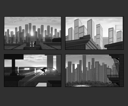
With these artists' methods and the mood boards I provided for myself beforehand, I went ahead and produced some thumbnail work to experiment with my environment piece, including spacing and values. I took reference from the Spider-Man (2018-2023) films in adding specks of light within the building blocks, as well as the gradient values between the sky and city. I applied the spacing of buildings I studied from the environment of Mirror's Edge (2008), and decided to add a few details showing the aging of my city as seen from Stray (2022). This practice was to help me improve my skills in shading, as I mostly struggled with my values in previous works.
Since I only had a week to explore this, I ended up picking the most simple but readable composition among the four; granted it was not so refined, but I was able to alter that when I refined the angle through modelling in Maya.
Sources:
BaM Animation (2023) Painting Backgrounds for TV Animation! Photoshop. 14 June 2023. Available at: https://www.youtube.com/watch?v=MKtcsF5IUF0 (Accessed: 17 January 2024).
BlueTwelve Studio (2022) Stray [Video game]. Publisher OR Available at: https://store.steampowered.com/app/1332010/Stray/ (Accessed: 17 January 2024).
DICE (2008) Mirror's Edge [Video game]. Available at: https://store.steampowered.com/app/17410/Mirrors_Edge/ (Accessed: 17 January 2024).
Nach Rubel (2020) Easy way to create a thumbnail for concept art. 28 December 2020. Available at: https://www.youtube.com/watch?v=REyYFLSxqTE (Accessed: 17 January 2024).
Spider-Man: Across the Spider-Verse (2023) Directed by J. Dos Santos [Feature film]. Culver City, LA: Sony Pictures Releasing.
Spider-Man: Into the Spider-Verse (2018) Directed by J. Dos Santos [Feature film]. Culver City, LA: Sony Pictures Releasing.
1 note
·
View note