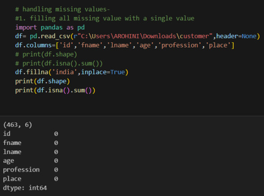
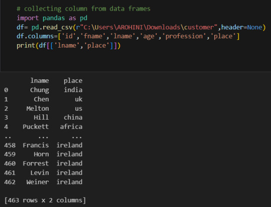
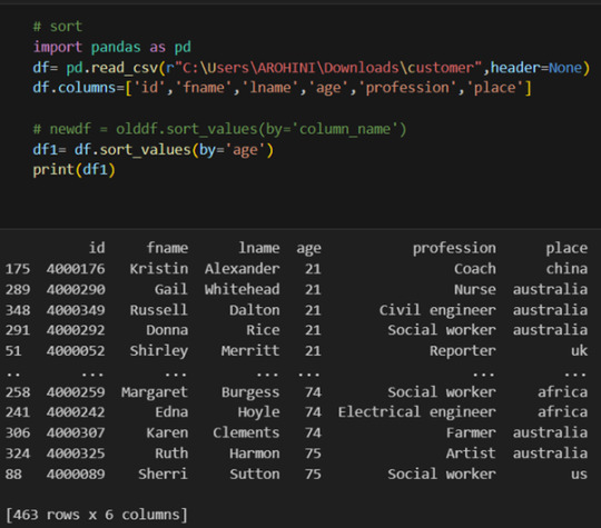
#how to remove a column from a dataframe in python
Explore tagged Tumblr posts
Visit Tumblr Blog
Explore Tumblr blogs with no restrictions, modern design and the best experience.
Last Seen Tumblr Blogs


Fun Fact
Tumblr was created by web developers David Karp and Marco Arment.
Text
How to Drop a Column in Python: Simplifying Data Manipulation
Dive into our latest post on 'Drop Column Python' and master the art of efficiently removing DataFrame columns in Python! Perfect for data analysts and Python enthusiasts. #PythonDataFrame #DataCleaning #PandasTutorial 🐍🔍
Hello, Python enthusiasts and data analysts! Today, we’re tackling a vital topic in data manipulation using Python – how to effectively use the Drop Column Python method. Whether you’re a seasoned programmer or just starting out, understanding this technique is crucial in data preprocessing and analysis. In this post, we’ll delve into the practical use of the drop() function, specifically…
View On WordPress
#DataFrame Column Removal#how to delete a column from dataframe in python#how to drop column in python#how to remove a column from a dataframe in python#Pandas Drop Column#pandas how to remove a column#Python Data Cleaning#python pandas how to delete a column
0 notes
Text
4th week: plotting variables
I put here as usual the python script, the results and the comments:
Python script:
Created on Tue Jun 3 09:06:33 2025
@author: PabloATech """
libraries/packages
import pandas import numpy import seaborn import matplotlib.pyplot as plt
read the csv table with pandas:
data = pandas.read_csv('C:/Users/zop2si/Documents/Statistic_tests/nesarc_pds.csv', low_memory=False)
show the dimensions of the data frame:
print() print ("length of the dataframe (number of rows): ", len(data)) #number of observations (rows) print ("Number of columns of the dataframe: ", len(data.columns)) # number of variables (columns)
variables:
variable related to the background of the interviewed people (SES: socioeconomic status):
biological/adopted parents got divorced or stop living together before respondant was 18
data['S1Q2D'] = pandas.to_numeric(data['S1Q2D'], errors='coerce')
variable related to alcohol consumption
HOW OFTEN DRANK ENOUGH TO FEEL INTOXICATED IN LAST 12 MONTHS
data['S2AQ10'] = pandas.to_numeric(data['S2AQ10'], errors='coerce')
variable related to the major depression (low mood I)
EVER HAD 2-WEEK PERIOD WHEN FELT SAD, BLUE, DEPRESSED, OR DOWN MOST OF TIME
data['S4AQ1'] = pandas.to_numeric(data['S4AQ1'], errors='coerce')
NUMBER OF EPISODES OF PATHOLOGICAL GAMBLING
data['S12Q3E'] = pandas.to_numeric(data['S12Q3E'], errors='coerce')
HIGHEST GRADE OR YEAR OF SCHOOL COMPLETED
data['S1Q6A'] = pandas.to_numeric(data['S1Q6A'], errors='coerce')
Choice of thee variables to display its frequency tables:
string_01 = """ Biological/adopted parents got divorced or stop living together before respondant was 18: 1: yes 2: no 9: unknown -> deleted from the analysis blank: unknown """
string_02 = """ HOW OFTEN DRANK ENOUGH TO FEEL INTOXICATED IN LAST 12 MONTHS
Every day
Nearly every day
3 to 4 times a week
2 times a week
Once a week
2 to 3 times a month
Once a month
7 to 11 times in the last year
3 to 6 times in the last year
1 or 2 times in the last year
Never in the last year
Unknown -> deleted from the analysis BL. NA, former drinker or lifetime abstainer """
string_02b = """ HOW MANY DAYS DRANK ENOUGH TO FEEL INTOXICATED IN THE LAST 12 MONTHS: """
string_03 = """ EVER HAD 2-WEEK PERIOD WHEN FELT SAD, BLUE, DEPRESSED, OR DOWN MOST OF TIME:
Yes
No
Unknown -> deleted from the analysis """
string_04 = """ NUMBER OF EPISODES OF PATHOLOGICAL GAMBLING """
string_05 = """ HIGHEST GRADE OR YEAR OF SCHOOL COMPLETED
No formal schooling
Completed grade K, 1 or 2
Completed grade 3 or 4
Completed grade 5 or 6
Completed grade 7
Completed grade 8
Some high school (grades 9-11)
Completed high school
Graduate equivalency degree (GED)
Some college (no degree)
Completed associate or other technical 2-year degree
Completed college (bachelor's degree)
Some graduate or professional studies (completed bachelor's degree but not graduate degree)
Completed graduate or professional degree (master's degree or higher) """
replace unknown values for NaN and remove blanks
data['S1Q2D']=data['S1Q2D'].replace(9, numpy.nan) data['S2AQ10']=data['S2AQ10'].replace(99, numpy.nan) data['S4AQ1']=data['S4AQ1'].replace(9, numpy.nan) data['S12Q3E']=data['S12Q3E'].replace(99, numpy.nan) data['S1Q6A']=data['S1Q6A'].replace(99, numpy.nan)
create a recode for number of intoxications in the last 12 months:
recode1 = {1:365, 2:313, 3:208, 4:104, 5:52, 6:36, 7:12, 8:11, 9:6, 10:2, 11:0} data['S2AQ10'] = data['S2AQ10'].map(recode1)
print(" ") print("Statistical values for varible 02 alcohol intoxications of past 12 months") print(" ") print ('mode: ', data['S2AQ10'].mode()) print ('mean', data['S2AQ10'].mean()) print ('std', data['S2AQ10'].std()) print ('min', data['S2AQ10'].min()) print ('max', data['S2AQ10'].max()) print ('median', data['S2AQ10'].median()) print(" ") print("Statistical values for highest grade of school completed") print ('mode', data['S1Q6A'].mode()) print ('mean', data['S1Q6A'].mean()) print ('std', data['S1Q6A'].std()) print ('min', data['S1Q6A'].min()) print ('max', data['S1Q6A'].max()) print ('median', data['S1Q6A'].median()) print(" ")
plot01 = seaborn.countplot(x="S2AQ10", data=data) plt.xlabel('Alcohol intoxications past 12 months') plt.title('Alcohol intoxications in the Past 12 Months in the NESARC Study')
plot02 = seaborn.countplot(x="S1Q6A", data=data) plt.xlabel('Highest grade (1-14)') plt.title('Highest grade or year of school completed')
I create a copy of the data to be manipulated later
sub1 = data[['S2AQ10','S1Q6A']]
create bins for no intoxication, few intoxications, …
data['S2AQ10'] = pandas.cut(data.S2AQ10, [0, 6, 36, 52, 104, 208, 365], labels=["very few","some", "often", "quite often", "very often", "permanent"])
change format from numeric to categorical
data['S2AQ10'] = data['S2AQ10'].astype('category')
print ('intoxication category counts') c1 = data['S2AQ10'].value_counts(sort=False, dropna=True) print(c1)
bivariate bar graph C->Q
plot03 = seaborn.catplot(x="S2AQ10", y="S1Q6A", data=data, kind="bar", ci=None) plt.xlabel('Alcohol intoxications') plt.ylabel('Highest grade')
c4 = data['S1Q6A'].value_counts(sort=False, dropna=False) print("c4: ", c4) print(" ")
I do sth similar but the way around:
creating 3 level education variable
def edu_level_1 (row): if row['S1Q6A'] <9 : return 1 # high school if row['S1Q6A'] >8 and row['S1Q6A'] <13 : return 2 # bachelor if row['S1Q6A'] >12 : return 3 # master or higher
sub1['edu_level_1'] = sub1.apply (lambda row: edu_level_1 (row),axis=1)
change format from numeric to categorical
sub1['edu_level'] = sub1['edu_level'].astype('category')
plot04 = seaborn.catplot(x="edu_level_1", y="S2AQ10", data=sub1, kind="boxen") plt.ylabel('Alcohol intoxications in the past 12 months') plt.xlabel('Highest grade') plt.grid() plt.show()
Results and comments:
length of the dataframe (number of rows): 43093 Number of columns of the dataframe: 3008
Statistical values for variable "alcohol intoxications of past 12 months":
mode: 0 0.0 dtype: float64 mean 9.115493905630748 std 40.54485720135516 min 0.0 max 365.0 median 0.0
Statistical values for variable "highest grade of school completed":
mode 0 8 dtype: int64 mean 9.451024528345672 std 2.521281770664422 min 1 max 14 median 10.0
intoxication category counts very few 6026 some 2042 often 510 quite often 272 very often 184 permanent 276 Name: S2AQ10, dtype: int64
c4: (counts highest grade)
8 10935 6 1210 12 5251 14 3257 10 8891 13 1526 7 4518 11 3772 5 414 4 931 3 421 9 1612 2 137 1 218 Name: S1Q6A, dtype: int64
Plots: Univariate highest grade:
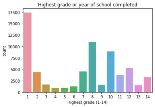
mean 9.45 std 2.5
-> mean and std. dev. are not very useful for this category-distribution. Most interviewed didn´t get any formal schooling, the next larger group completed the high school and the next one was at some college but w/o degree.
Univariate number of alcohol intoxications:
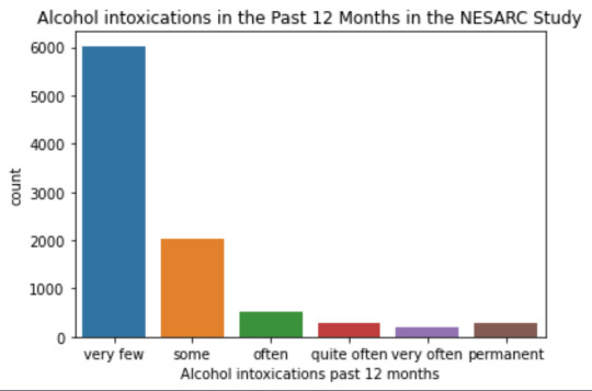
mean 9.12 std 40.54
-> very left skewed, most of the interviewed persons didn´t get intoxicated at all or very few times in the last 12 months (as expected)
Bivariate: the one against the other:
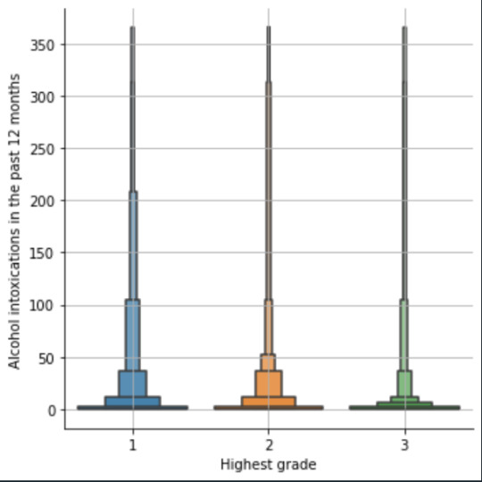
This bivariate plot shows three categories:
1: high school or lower
2: high school to bachelor
3: master or PhD
And the frequency of alcohol intoxications in the past 12 months.
The number of intoxications is higher in the group 1 for all the segments, but from 1 to 3 every group shows occurrences in any number of intoxications. More information and a more detailed analysis would be necessary to make conclusions.
0 notes
Text
Pandas DataFrame Cleanup: Master the Art of Dropping Columns Data cleaning and preprocessing are crucial steps in any data analysis project. When working with pandas DataFrames in Python, you'll often encounter situations where you need to remove unnecessary columns to streamline your dataset. In this comprehensive guide, we'll explore various methods to drop columns in pandas, complete with practical examples and best practices. Understanding the Basics of Column Dropping Before diving into the methods, let's understand why we might need to drop columns: Remove irrelevant features that don't contribute to analysis Eliminate duplicate or redundant information Clean up data before model training Reduce memory usage for large datasets Method 1: Using drop() - The Most Common Approach The drop() method is the most straightforward way to remove columns from a DataFrame. Here's how to use it: pythonCopyimport pandas as pd # Create a sample DataFrame df = pd.DataFrame( 'name': ['John', 'Alice', 'Bob'], 'age': [25, 30, 35], 'city': ['New York', 'London', 'Paris'], 'temp_col': [1, 2, 3] ) # Drop a single column df = df.drop('temp_col', axis=1) # Drop multiple columns df = df.drop(['city', 'age'], axis=1) The axis=1 parameter indicates we're dropping columns (not rows). Remember that drop() returns a new DataFrame by default, so we need to reassign it or use inplace=True. Method 2: Using del Statement - The Quick Solution For quick, permanent column removal, you can use Python's del statement: pythonCopy# Delete a column using del del df['temp_col'] Note that this method modifies the DataFrame directly and cannot be undone. Use it with caution! Method 3: Drop Columns Using pop() - Remove and Return The pop() method removes a column and returns it, which can be useful when you want to store the removed column: pythonCopy# Remove and store a column removed_column = df.pop('temp_col') Advanced Column Dropping Techniques Dropping Multiple Columns with Pattern Matching Sometimes you need to drop columns based on patterns in their names: pythonCopy# Drop columns that start with 'temp_' df = df.drop(columns=df.filter(regex='^temp_').columns) # Drop columns that contain certain text df = df.drop(columns=df.filter(like='unused').columns) Conditional Column Dropping You might want to drop columns based on certain conditions: pythonCopy# Drop columns with more than 50% missing values threshold = len(df) * 0.5 df = df.dropna(axis=1, thresh=threshold) # Drop columns of specific data types df = df.select_dtypes(exclude=['object']) Best Practices for Dropping Columns Make a Copy First pythonCopydf_clean = df.copy() df_clean = df_clean.drop('column_name', axis=1) Use Column Lists for Multiple Drops pythonCopycolumns_to_drop = ['col1', 'col2', 'col3'] df = df.drop(columns=columns_to_drop) Error Handling pythonCopytry: df = df.drop('non_existent_column', axis=1) except KeyError: print("Column not found in DataFrame") Performance Considerations When working with large datasets, consider these performance tips: Use inplace=True to avoid creating copies: pythonCopydf.drop('column_name', axis=1, inplace=True) Drop multiple columns at once rather than one by one: pythonCopy# More efficient df.drop(['col1', 'col2', 'col3'], axis=1, inplace=True) # Less efficient df.drop('col1', axis=1, inplace=True) df.drop('col2', axis=1, inplace=True) df.drop('col3', axis=1, inplace=True) Common Pitfalls and Solutions Dropping Non-existent Columns pythonCopy# Use errors='ignore' to skip non-existent columns df = df.drop('missing_column', axis=1, errors='ignore') Chain Operations Safely pythonCopy# Use method chaining carefully df = (df.drop('col1', axis=1) .drop('col2', axis=1) .reset_index(drop=True)) Real-World Applications Let's look at a practical example of cleaning a dataset: pythonCopy# Load a messy dataset df = pd.read_csv('raw_data.csv')
# Clean up the DataFrame df_clean = (df.drop(columns=['unnamed_column', 'duplicate_info']) # Remove unnecessary columns .drop(columns=df.filter(regex='^temp_').columns) # Remove temporary columns .drop(columns=df.columns[df.isna().sum() > len(df)*0.5]) # Remove columns with >50% missing values ) Integration with Data Science Workflows When preparing data for machine learning: pythonCopy# Drop target variable from features X = df.drop('target_variable', axis=1) y = df['target_variable'] # Drop non-numeric columns for certain algorithms X = X.select_dtypes(include=['float64', 'int64']) Conclusion Mastering column dropping in pandas is essential for effective data preprocessing. Whether you're using the simple drop() method or implementing more complex pattern-based dropping, understanding these techniques will make your data cleaning process more efficient and reliable. Remember to always consider your specific use case when choosing a method, and don't forget to make backups of important data before making permanent changes to your DataFrame. Now you're equipped with all the knowledge needed to effectively manage columns in your pandas DataFrames. Happy data cleaning!
0 notes
Text
Beginner’s Guide: Data Analysis with Pandas
Data analysis is the process of sorting through all the data, looking for patterns, connections, and interesting things. It helps us make sense of information and use it to make decisions or find solutions to problems. When it comes to data analysis and manipulation in Python, the Pandas library reigns supreme. Pandas provide powerful tools for working with structured data, making it an indispensable asset for both beginners and experienced data scientists.
What is Pandas?
Pandas is an open-source Python library for data manipulation and analysis. It is built on top of NumPy, another popular numerical computing library, and offers additional features specifically tailored for data manipulation and analysis. There are two primary data structures in Pandas:
• Series: A one-dimensional array capable of holding any type of data.
• DataFrame: A two-dimensional labeled data structure similar to a table in relational databases.
It allows us to efficiently process and analyze data, whether it comes from any file types like CSV files, Excel spreadsheets, SQL databases, etc.
How to install Pandas?
We can install Pandas using the pip command. We can run the following codes in the terminal.

After installing, we can import it using:

How to load an external dataset using Pandas?
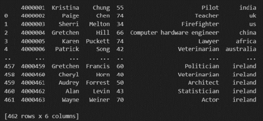
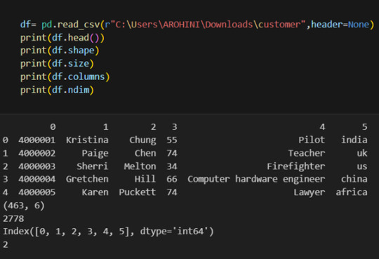
Pandas provide various functions for loading data into a data frame. One of the most commonly used functions is pd.read_csv() for reading CSV files. For example:
The output of the above code is:
Once your data is loaded into a data frame, you can start exploring it. Pandas offers numerous methods and attributes for getting insights into your data. Here are a few examples:
df.head(): View the first few rows of the DataFrame.
df.tail(): View the last few rows of the DataFrame.
http://df.info(): Get a concise summary of the DataFrame, including data types and missing values.
df.describe(): Generate descriptive statistics for numerical columns.
df.shape: Get the dimensions of the DataFrame (rows, columns).
df.columns: Access the column labels of the DataFrame.
df.dtypes: Get the data types of each column.
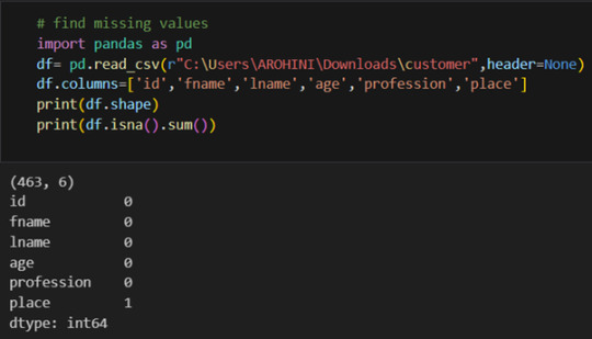
In data analysis, it is essential to do data cleaning. Pandas provide powerful tools for handling missing data, removing duplicates, and transforming data. Some common data-cleaning tasks include:
Handling missing values using methods like df.dropna() or df.fillna().
Removing duplicate rows with df.drop_duplicates().
Data type conversion using df.astype().
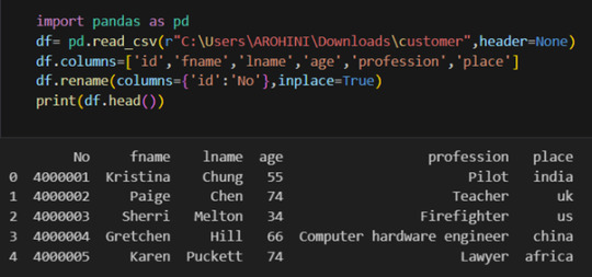
Renaming columns with df.rename().
Pandas excels in data manipulation tasks such as selecting subsets of data, filtering rows, and creating new columns. Here are a few examples:
Selecting columns: df[‘column_name’] or df[[‘column1’, ‘column2’]].
Filtering rows based on conditions: df[df[‘column’] > value].
Sorting data: df.sort_values(by=’column’).
Grouping data: df.groupby(‘column’).mean().
With data cleaned and prepared, you can use Pandas to perform various analyses. Whether you’re computing statistics, performing exploratory data analysis, or building predictive models, Pandas provides the tools you need. Additionally, Pandas integrates seamlessly with other libraries such as Matplotlib and Seaborn for data visualization
#data analytics#panda#business analytics course in kochi#cybersecurity#data analytics training#data analytics course in kochi#data analytics course
0 notes
Text
Dummy Variables & One Hot Encoding

Handling Categorical Variables with One-Hot Encoding in Python
Introduction:
Machine learning models are powerful tools for predicting outcomes based on numerical data. However, real-world datasets often include categorical variables, such as city names, colors, or types of products. Dealing with categorical data in machine learning requires converting them into numerical representations. One common technique to achieve this is one-hot encoding. In this tutorial, we will explore how to use pandas and scikit-learn libraries in Python to perform one-hot encoding and avoid the dummy variable trap.
1. Understanding Categorical Variables and One-Hot Encoding:
Categorical variables are those that represent categories or groups, but they lack a numerical ordering or scale. Simple label encoding assigns numeric values to categories, but this can lead to incorrect model interpretations. One-hot encoding, on the other hand, creates binary columns for each category, representing their presence or absence in the original data.
2. Using pandas for One-Hot Encoding:
To demonstrate the process, let's consider a dataset containing information about home prices in different towns.
import pandas as pd
# Assuming you have already loaded the data
df = pd.read_csv("homeprices.csv")
print(df.head())
The dataset looks like this:
town area price
0 monroe township 2600 550000
1 monroe township 3000 565000
2 monroe township 3200 610000
3 monroe township 3600 680000
4 monroe township 4000 725000
Now, we will use `pd.get_dummies` to perform one-hot encoding for the 'town' column:
dummies = pd.get_dummies(df['town'])
merged = pd.concat([df, dummies], axis='columns')
final = merged.drop(['town', 'west windsor'], axis='columns')
print(final.head())
The resulting DataFrame will be:
area price monroe township robinsville
0 2600 550000 1 0
1 3000 565000 1 0
2 3200 610000 1 0
3 3600 680000 1 0
4 4000 725000 1 0
3. Dealing with the Dummy Variable Trap:
The dummy variable trap occurs when there is perfect multicollinearity among the encoded variables. To avoid this, we drop one of the encoded columns. However, scikit-learn's `OneHotEncoder` automatically handles the dummy variable trap. Still, it's good practice to handle it manually.
# Manually handle dummy variable trap
final = final.drop(['west windsor'], axis='columns')
print(final.head())
The updated DataFrame after dropping the 'west windsor' column will be:
area price monroe township robinsville
0 2600 550000 1 0
1 3000 565000 1 0
2 3200 610000 1 0
3 3600 680000 1 0
4 4000 725000 1 0
4. Using sklearn's OneHotEncoder:
Alternatively, we can use scikit-learn's `OneHotEncoder` to handle one-hot encoding:
from sklearn.preprocessing import OneHotEncoder
from sklearn.compose import ColumnTransformer
# Assuming 'df' is loaded with town names already label encoded
X = df[['town', 'area']].values
y = df['price'].values
# Specify the column(s) to one-hot encode
ct = ColumnTransformer([('town', OneHotEncoder(), [0])], remainder='passthrough')
X = ct.fit_transform(X)
# Remove one of the encoded columns to avoid the trap
X = X[:, 1:]
5. Building a Linear Regression Model:
Finally, we build a linear regression model using the one-hot encoded data:
from sklearn.linear_model import LinearRegression
model = LinearRegression()
model.fit(X, y)
# Predicting home prices for new samples
sample_1 = [[0, 1, 3400]]
sample_2 = [[1, 0, 2800]]
Conclusion:
One-hot encoding is a valuable technique to handle categorical variables in machine learning models. It converts categorical data into a numerical format, enabling the use of these variables in various algorithms. By understanding the dummy variable trap and appropriately encoding the data, we can build accurate predictive models. In this tutorial, we explored how to perform one-hot encoding using both pandas and scikit-learn libraries, providing clear examples and code snippets for easy implementation.
@talentserve
0 notes
Text
Classification Decision Tree for Heart Attack Analysis
Primarily, the required dataset is loaded. Here, I have uploaded the dataset available at Kaggle.com in the csv format.
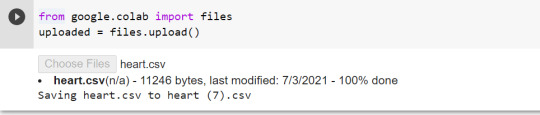
All python libraries need to be loaded that are required in creation for a classification decision tree. Following are the libraries that are necessary to import:
The following code is used to load the dataset. read_csv() function is used to load the dataset.
column_names = ['age','sex','chest pain','resting blood pressure','cholestrol','fasting blood sugar','resting ecg','max heart rate','excercise included','old peak','slp','caa','THALL','output']
data= pd.read_csv("heart.csv",header=None,names=column_names)
data = data.iloc[1: , :] # removes the first row of dataframe
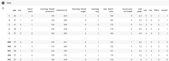
Now, we divide the columns in the dataset as dependent or independent variables. The output variable is selected as target variable for heart disease prediction system. The dataset contains 13 feature variables and 1 target variable.
feature_cols = ['age','sex','chest pain','chest pain','resting blood pressure','cholestrol','fasting blood sugar','resting ecg','max heart rate','excercise included','old peak','slp','caa','THALL']
pred = data[feature_cols] # Features
tar = data.output # Target variable
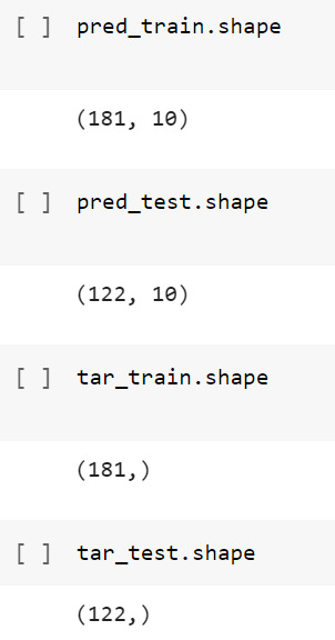
Now, dataset is divided into a training set and a test set. This can be achieved by using train_test_split() function. The size ratio is set as 60% for the training sample and 40% for the test sample.
pred_train, pred_test, tar_train, tar_test = train_test_split(X, y, test_size=0.4, random_state=1)
Using the shape function, we observe that the training sample has 181 observations (nearly 60% of the original sample) and 10 explanatory variables whereas the test sample contains 122 observations(nearly 40 % of the original sample) and 10 explanatory variables.
Now, we need to create an object claf_mod to initialize the decision tree classifer. The model is then trained using the fit function which takes training features and training target variables as arguments.
# To create an object of Decision Tree classifer
claf_mod = DecisionTreeClassifier()
# Train the model
claf_mod = claf_mod.fit(pred_train,tar_train)
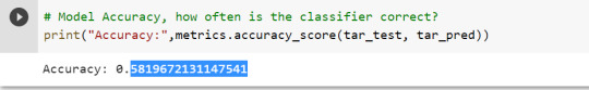
To check the accuracy of the model, we use the accuracy_score function of metrics library. Our model has a classification rate of 58.19 %. Therefore, we can say that our model has good accuracy for finding out a person has a heart attack.
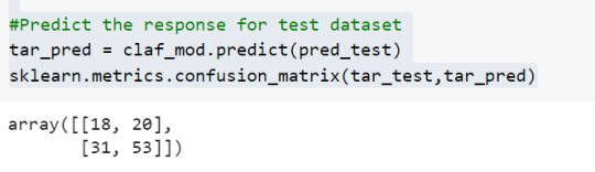
To find out the correct and incorrect classification of decision tree, we use the confusion matrix function. Our model predicted 18 true negatives for having a heart disease and 53 true positives for having a heart attack. The model also predicted 31 false negatives and 20 false positives for having a heart attack.
To display the decision tree we use export_graphviz function. The resultant graph is unpruned.
dot_data = StringIO()
export_graphviz(claf_mod, out_file=dot_data,
filled=True, rounded=True,
special_characters=True,class_names=['0','1'])
graph = pydotplus.graph_from_dot_data(dot_data.getvalue())
graph.write_png('heart attack.png')
Image(graph.create_png())
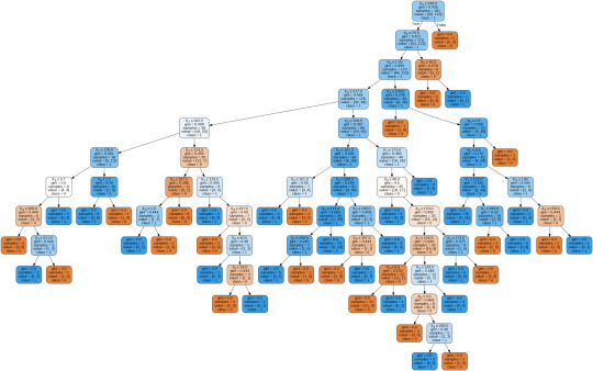
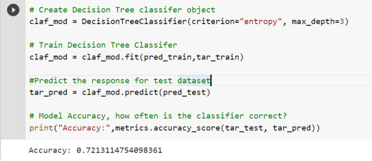
To get a prune graph, we changed the criterion as entropy and initialized the object again. The maximum depth of the tree is set as 3 to avoid overfitting.
# Create Decision Tree classifer object
claf_mod = DecisionTreeClassifier(criterion="entropy", max_depth=3)
# Train Decision Tree Classifer
claf_mod = claf_mod.fit(pred_train,tar_train)
#Predict the response for test dataset
tar_pred = claf_mod.predict(pred_test)
By optimizing the performance, the classification rate of the model increased to 72.13%.
By passing the object again into export_graphviz function, we obtain the prune graph.
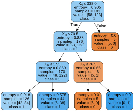
From the above graph, we can infer that :
1) individuals having cholesterol less than 338 mg/dl, age less than or equal to 70.5 years, and whose previous peak was less than or equal to 1.55: 84 of them are more likely to have a heart attack whereas 42 of them will less likely to have a heart attack.
2) individuals having cholesterol less than 338 mg/dl, age less than or equal to 70.5 years, and whose previous peak was more than 1.55: 6 of them will less likely to have a heart attack whereas 38 of them are more likely to have a heart attack.
3) individuals having cholesterol less than 338 mg/dl and age less than or equal to 76.5 years: are less likely to have a heart attack
4) individuals having cholesterol less than 338 mg/dl and age more than 76.5 years: are more likely to have a heart attack
5) individuals having cholesterol more than 338 mg/dl : are less likely to have a heart attack
The Whole Code:
from google.colab import files uploaded = files.upload()
import pandas as pd from sklearn.tree import DecisionTreeClassifier # Import Decision��Tree Classifier from sklearn.model_selection import train_test_split # Import train_test_split function from sklearn.metrics import classification_report import sklearn.metrics #Import scikit-learn metrics module for accuracy calculation from sklearn.tree import export_graphviz from sklearn.externals.six import StringIO from IPython.display import Image import pydotplus
column_names = ['age','sex','chest pain','resting blood pressure','cholestrol','fasting blood sugar','resting ecg','max heart rate','excercise included','old peak','slp','caa','THALL','output'] data= pd.read_csv("heart.csv",header=None,names=column_names) data = data.iloc[1: , :] # removes the first row of dataframe (In this case, ) #split dataset in features and target variable feature_cols = ['age','sex','chest pain','chest pain','resting blood pressure','cholestrol','fasting blood sugar','resting ecg','max heart rate','excercise included','old peak','slp','caa','THALL'] pred = data[feature_cols] # Features tar = data.output # Target variable pred_train, pred_test, tar_train, tar_test = train_test_split(X, y, test_size=0.4, random_state=1) # 60% training and 40% test pred_train.shape pred_test.shape tar_train.shape tar_test.shape
# To create an object of Decision Tree classifer claf_mod = DecisionTreeClassifier() # Train the model claf_mod = claf_mod.fit(pred_train,tar_train) #Predict the response for test dataset tar_pred = claf_mod.predict(pred_test) sklearn.metrics.confusion_matrix(tar_test,tar_pred) # Model Accuracy, how often is the classifier correct? print("Accuracy:",metrics.accuracy_score(tar_test, tar_pred)) dot_data = StringIO() export_graphviz(claf_mod, out_file=dot_data, filled=True, rounded=True, special_characters=True,class_names=['0','1']) graph = pydotplus.graph_from_dot_data(dot_data.getvalue()) graph.write_png('heart attack.png') Image(graph.create_png())
# Create Decision Tree classifer object claf_mod = DecisionTreeClassifier(criterion="entropy", max_depth=3) # Train Decision Tree Classifer claf_mod = claf_mod.fit(pred_train,tar_train) #Predict the response for test dataset tar_pred = claf_mod.predict(pred_test) # Model Accuracy, how often is the classifier correct? print("Accuracy:",metrics.accuracy_score(tar_test, tar_pred)) from sklearn.externals.six import StringIO from IPython.display import Image from sklearn.tree import export_graphviz import pydotplus dot_data = StringIO() export_graphviz(claf_mod, out_file=dot_data, filled=True, rounded=True, special_characters=True, class_names=['0','1']) graph = pydotplus.graph_from_dot_data(dot_data.getvalue()) graph.write_png('improved heart attack.png') Image(graph.create_png())
1 note
·
View note
Photo
Machine Learning Week 3: Lasso
Question for this part
Is Having Relatives with Drinking Problems associated with current drinking status?
Parameters
I kept the parameters for this question the same as all the other question. I limited this study to participants who started drinking more than sips or tastes of alcohol between the ages of 5 and 83.
Explanation of Variables
Target Variable -- Response Variable: If the participant is currently drinking (Binary – Yes/No) –DRINKSTAT
· Currently Drinking – YES - 1
· Not Currently Drinking – No- 0 - I consolidated Ex-drinker and Lifetime Abstainer into a No category for the purposes of this experiment.
Explanatory Variables (Categorical):
· TOTALRELATIVES: If the participant has relatives with drinking problems or alcohol dependence (1=Yes, 0=No)
· SEX (1=male, 0=female)
· HISPLAT: Hispanic or Latino (1=Yes, 0=No)
· WHITE (1=Yes, 0=No)
· BLACK (1=Yes, 0=No)
· ASIAN (1=Yes, 0=No)
· PACISL: Pacific Islander or Native Hawaiian (1=Yes, 0=No)
· AMERIND: American Indian or Native Alaskan (1=Yes, 0=No)
Explanatory Variables (Quantitative):
· AGE
Lasso
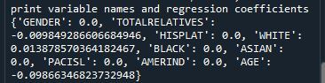
Predictor variables and the Regression Coefficients
Predictor variables with regression coefficients equal to zero means that the coefficients for those variables had shrunk to zero after applying the LASSO regression penalty, and were subsequently removed from the model. So the results show that of the 9 variables, 3 were chosen in the final model. All the variables were standardized on the same scale so we can also use the size of the regression coefficients to tell us which predictors are the strongest predictors of drinking status. For example, White ethnicity had the largest regression coefficient and was most strongly associated with drinking status. Age and total number of relatives with drinking problems were negatively associated with drinking status.
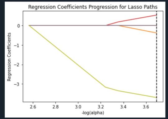
Regression Coefficients Progression Plot
This plot shows the relative importance of the predictor variable selected at any step of the selection process, how the regression coefficients changed with the addition of a new predictor at each step, and the steps at which each variable entered the new model. Age was entered first, it is the largest negative coefficient, then White ethnicity (the largest positive coefficient), and then Total Relatives (a negative coefficient).
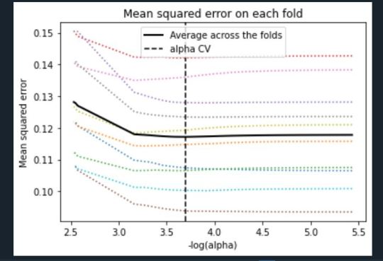
Mean Square Error Plot
The Mean Square Error plot shows the change in mean square error for the change in the penalty parameter alpha at each step in the selection process. The plot shows that there is variability across the individual cross-validation folds in the training data set, but the change in the mean square error as variables are added to the model follows the same pattern for each fold. Initially it decreases, and then levels off to a point a which adding more predictors doesn’t lead to much reduction in the mean square error.
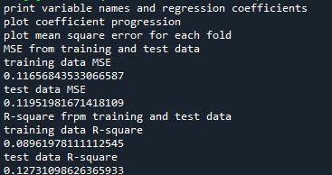
Mean Square Error for Training and Test Data
Training: 0.11656843533066587
Test: 0.11951981671418109
The test mean square error was very close to the training mean square error, suggesting that prediction accuracy was pretty stable across the two data sets.
R-Square from Training and Test Data
Training: 0.08961978111112545
Test: 0.12731098626365933
The R-Square values were 0.09 and 0.13, indicating that the selected model explained 9% and 13% of the variance in drinking status for the training and the test sets, respectively. This suggests that I should think about adding more explanatory variables but I must be careful and watch for an increase in variance and bias.
Python Code
from pandas import Series, DataFrame import pandas import numpy import os import matplotlib.pylab as plt from sklearn.model_selection import train_test_split from sklearn.linear_model import LassoLarsCV
os.environ['PATH'] = os.environ['PATH']+';'+os.environ['CONDA_PREFIX']+r"\Library\bin\graphviz"
data = pandas.read_csv('nesarc_pds.csv', low_memory=False)
## Machine learning week 3 addition## #upper-case all DataFrame column names data.columns = map(str.upper, data.columns) ## Machine learning week 3 addition##
#setting variables you will be working with to numeric data['IDNUM'] =pandas.to_numeric(data['IDNUM'], errors='coerce') data['AGE'] =pandas.to_numeric(data['AGE'], errors='coerce') data['SEX'] = pandas.to_numeric(data['SEX'], errors='coerce') data['S2AQ16A'] =pandas.to_numeric(data['S2AQ16A'], errors='coerce') data['S2BQ2D'] =pandas.to_numeric(data['S2BQ2D'], errors='coerce') data['S2DQ1'] =pandas.to_numeric(data['S2DQ1'], errors='coerce') data['S2DQ2'] =pandas.to_numeric(data['S2DQ2'], errors='coerce') data['S2DQ11'] =pandas.to_numeric(data['S2DQ11'], errors='coerce') data['S2DQ12'] =pandas.to_numeric(data['S2DQ12'], errors='coerce') data['S2DQ13A'] =pandas.to_numeric(data['S2DQ13A'], errors='coerce') data['S2DQ13B'] =pandas.to_numeric(data['S2DQ13B'], errors='coerce') data['S2DQ7C1'] =pandas.to_numeric(data['S2DQ7C1'], errors='coerce') data['S2DQ7C2'] =pandas.to_numeric(data['S2DQ7C2'], errors='coerce') data['S2DQ8C1'] =pandas.to_numeric(data['S2DQ8C1'], errors='coerce') data['S2DQ8C2'] =pandas.to_numeric(data['S2DQ8C2'], errors='coerce') data['S2DQ9C1'] =pandas.to_numeric(data['S2DQ9C1'], errors='coerce') data['S2DQ9C2'] =pandas.to_numeric(data['S2DQ9C2'], errors='coerce') data['S2DQ10C1'] =pandas.to_numeric(data['S2DQ10C1'], errors='coerce') data['S2DQ10C2'] =pandas.to_numeric(data['S2DQ10C2'], errors='coerce') data['S2BQ3A'] =pandas.to_numeric(data['S2BQ3A'], errors='coerce')
###### WEEK 4 ADDITIONS #####
#hispanic or latino data['S1Q1C'] =pandas.to_numeric(data['S1Q1C'], errors='coerce')
#american indian or alaskan native data['S1Q1D1'] =pandas.to_numeric(data['S1Q1D1'], errors='coerce')
#black or african american data['S1Q1D3'] =pandas.to_numeric(data['S1Q1D3'], errors='coerce')
#asian data['S1Q1D2'] =pandas.to_numeric(data['S1Q1D2'], errors='coerce')
#native hawaiian or pacific islander data['S1Q1D4'] =pandas.to_numeric(data['S1Q1D4'], errors='coerce')
#white data['S1Q1D5'] =pandas.to_numeric(data['S1Q1D5'], errors='coerce')
#consumer data['CONSUMER'] =pandas.to_numeric(data['CONSUMER'], errors='coerce')
data_clean = data.dropna()
data_clean.dtypes data_clean.describe()
sub1=data_clean[['IDNUM', 'AGE', 'SEX', 'S2AQ16A', 'S2BQ2D', 'S2BQ3A', 'S2DQ1', 'S2DQ2', 'S2DQ11', 'S2DQ12', 'S2DQ13A', 'S2DQ13B', 'S2DQ7C1', 'S2DQ7C2', 'S2DQ8C1', 'S2DQ8C2', 'S2DQ9C1', 'S2DQ9C2', 'S2DQ10C1', 'S2DQ10C2', 'S1Q1C', 'S1Q1D1', 'S1Q1D2', 'S1Q1D3', 'S1Q1D4', 'S1Q1D5', 'CONSUMER']]
sub2=sub1.copy()
#setting variables you will be working with to numeric cols = sub2.columns sub2[cols] = sub2[cols].apply(pandas.to_numeric, errors='coerce')
#subset data to people age 6 to 80 who have become alcohol dependent sub3=sub2[(sub2['S2AQ16A']>=5) & (sub2['S2AQ16A']<=83)]
#make a copy of my new subsetted data sub4 = sub3.copy()
#Explanatory Variables for Relatives #recode - nos set to zero recode1 = {1: 1, 2: 0, 3: 0}
sub4['DAD']=sub4['S2DQ1'].map(recode1) sub4['MOM']=sub4['S2DQ2'].map(recode1) sub4['PATGRANDDAD']=sub4['S2DQ11'].map(recode1) sub4['PATGRANDMOM']=sub4['S2DQ12'].map(recode1) sub4['MATGRANDDAD']=sub4['S2DQ13A'].map(recode1) sub4['MATGRANDMOM']=sub4['S2DQ13B'].map(recode1) sub4['PATBROTHER']=sub4['S2DQ7C2'].map(recode1) sub4['PATSISTER']=sub4['S2DQ8C2'].map(recode1) sub4['MATBROTHER']=sub4['S2DQ9C2'].map(recode1) sub4['MATSISTER']=sub4['S2DQ10C2'].map(recode1)
#### WEEK 4 ADDITIONS #### sub4['HISPLAT']=sub4['S1Q1C'].map(recode1) sub4['AMERIND']=sub4['S1Q1D1'].map(recode1) sub4['ASIAN']=sub4['S1Q1D2'].map(recode1) sub4['BLACK']=sub4['S1Q1D3'].map(recode1) sub4['PACISL']=sub4['S1Q1D4'].map(recode1) sub4['WHITE']=sub4['S1Q1D5'].map(recode1) sub4['DRINKSTAT']=sub4['CONSUMER'].map(recode1) sub4['GENDER']=sub4['SEX'].map(recode1) #### END WEEK 4 ADDITIONS ####
#Replacing unknowns with NAN sub4['DAD']=sub4['DAD'].replace(9, numpy.nan) sub4['MOM']=sub4['MOM'].replace(9, numpy.nan) sub4['PATGRANDDAD']=sub4['PATGRANDDAD'].replace(9, numpy.nan) sub4['PATGRANDMOM']=sub4['PATGRANDMOM'].replace(9, numpy.nan) sub4['MATGRANDDAD']=sub4['MATGRANDDAD'].replace(9, numpy.nan) sub4['MATGRANDMOM']=sub4['MATGRANDMOM'].replace(9, numpy.nan) sub4['PATBROTHER']=sub4['PATBROTHER'].replace(9, numpy.nan) sub4['PATSISTER']=sub4['PATSISTER'].replace(9, numpy.nan) sub4['MATBROTHER']=sub4['MATBROTHER'].replace(9, numpy.nan) sub4['MATSISTER']=sub4['MATSISTER'].replace(9, numpy.nan) sub4['S2DQ7C1']=sub4['S2DQ7C1'].replace(99, numpy.nan) sub4['S2DQ8C1']=sub4['S2DQ8C1'].replace(99, numpy.nan) sub4['S2DQ9C1']=sub4['S2DQ9C1'].replace(99, numpy.nan) sub4['S2DQ10C1']=sub4['S2DQ10C1'].replace(99, numpy.nan) sub4['S2AQ16A']=sub4['S2AQ16A'].replace(99, numpy.nan) sub4['S2BQ2D']=sub4['S2BQ2D'].replace(99, numpy.nan) sub4['S2BQ3A']=sub4['S2BQ3A'].replace(99, numpy.nan)
#add parents togetheR sub4['IFPARENTS'] = sub4['DAD'] + sub4['MOM']
#add grandparents together sub4['IFGRANDPARENTS'] = sub4['PATGRANDDAD'] + sub4['PATGRANDMOM'] + sub4['MATGRANDDAD'] + sub4['MATGRANDMOM']
#add IF aunts and uncles together sub4['IFUNCLEAUNT'] = sub4['PATBROTHER'] + sub4['PATSISTER'] + sub4['MATBROTHER'] + sub4['MATSISTER']
#add SUM uncle and aunts together sub4['SUMUNCLEAUNT'] = sub4['S2DQ7C1'] + sub4['S2DQ8C1'] + sub4['S2DQ9C1'] + sub4['S2DQ10C1']
#add relatives together sub4['SUMRELATIVES'] = sub4['IFPARENTS'] + sub4['IFGRANDPARENTS'] + sub4['SUMUNCLEAUNT']
def TOTALRELATIVES (row): if row['SUMRELATIVES'] == 0 : return 0 elif row['SUMRELATIVES'] >= 1 : return 1
sub4['TOTALRELATIVES'] = sub4.apply (lambda row: TOTALRELATIVES (row), axis=1)
sub4_clean = sub4.dropna()
sub4_clean.dtypes sub4_clean.describe()
###Machine Learning week 3 additions##
#select predictor variables and target variable as separate data sets
predvar = sub4_clean[['GENDER','TOTALRELATIVES', 'HISPLAT', 'WHITE', 'BLACK', 'ASIAN', 'PACISL', 'AMERIND', 'AGE']]
target = sub4_clean.DRINKSTAT
# standardize predictors to have mean=0 and sd=1 predictors=predvar.copy() from sklearn import preprocessing
predictors['GENDER']=preprocessing.scale(predictors['GENDER'].astype('float64')) predictors['TOTALRELATIVES']=preprocessing.scale(predictors['TOTALRELATIVES'].astype('float64')) predictors['HISPLAT']=preprocessing.scale(predictors['HISPLAT'].astype('float64')) predictors['WHITE']=preprocessing.scale(predictors['WHITE'].astype('float64')) predictors['BLACK']=preprocessing.scale(predictors['BLACK'].astype('float64')) predictors['ASIAN']=preprocessing.scale(predictors['ASIAN'].astype('float64')) predictors['PACISL']=preprocessing.scale(predictors['PACISL'].astype('float64')) predictors['AMERIND']=preprocessing.scale(predictors['AMERIND'].astype('float64')) predictors['AGE']=preprocessing.scale(predictors['AGE'].astype('float64'))
# split data into train and test sets pred_train, pred_test, tar_train, tar_test = train_test_split(predictors, target, test_size=.3, random_state=123)
# specify the lasso regression model model=LassoLarsCV(cv=10, precompute=False).fit(pred_train,tar_train)
# print variable names and regression coefficients print("print variable names and regression coefficients") coef_dict = dict(zip(predictors.columns, model.coef_)) print(coef_dict)
# plot coefficient progression print("plot coefficient progression") m_log_alphas = -numpy.log10(model.alphas_) ax = plt.gca() plt.plot(m_log_alphas, model.coef_path_.T) plt.axvline(-numpy.log10(model.alpha_), linestyle='--', color='k', label='alpha CV') plt.ylabel('Regression Coefficients') plt.xlabel('-log(alpha)') plt.title('Regression Coefficients Progression for Lasso Paths')
# plot mean square error for each fold print("plot mean square error for each fold") m_log_alphascv = -numpy.log10(model.cv_alphas_) plt.figure() plt.plot(m_log_alphascv, model.cv_mse_path_, ':') plt.plot(m_log_alphascv, model.cv_mse_path_.mean(axis=-1), 'k', label='Average across the folds', linewidth=2) plt.axvline(-numpy.log10(model.alpha_), linestyle='--', color='k', label='alpha CV') plt.legend() plt.xlabel('-log(alpha)') plt.ylabel('Mean squared error') plt.title('Mean squared error on each fold')
# MSE from training and test data print("MSE from training and test data") from sklearn.metrics import mean_squared_error train_error = mean_squared_error(tar_train, model.predict(pred_train)) test_error = mean_squared_error(tar_test, model.predict(pred_test)) print ('training data MSE') print(train_error) print ('test data MSE') print(test_error)
# R-square from training and test data print("R-square frpm training and test data") rsquared_train=model.score(pred_train,tar_train) rsquared_test=model.score(pred_test,tar_test) print ('training data R-square') print(rsquared_train) print ('test data R-square') print(rsquared_test)
1 note
·
View note
Video
youtube
In this short Python tutorial, you will get the answer to the question "how do you create a dummy variable in Python?". Here, you will use Pandas read_csv, head, unique, and get_dummies method. Note, the last one is what you will use to create dummy variables. First, you will learn how to read your data from a csv file and have a quick look at the created Pandas dataframe. Second, you will learn how to create dummy variables in Python using pandas pd.get_dummies method: 1) Add prefix 2) Remove prefix After that, you have used a categorical variable with to levels, you will learn how to create dummy variables of a categorical variable with 3 levels. After that, you will learn how to make dummy variables from more than one column and how to change the prefix and prefix separator of your new dummy variables. » Make sure you subscribe to the channel if you haven't: http://bit.ly/SUB2EM » Blog post about creating dummy variables in Python: https://bit.ly/DummyVariablePython » Jupyter Notebook: https://bit.ly/ipynbDummies » Link to the dataset used: https://ift.tt/2E3KCyd » How to install Pandas: https://youtu.be/8Sipkd9vNKk If you need to learn more about importing data from CSV files with Pandas: » Blog post: http://bit.ly/pandas_read_csv » YouTube Video: https://youtu.be/piCU_gxSF7I Now, if you found this valuable, please do comment, like, subscribe, and share it on social media. It's much appreciated!
1 note
·
View note
Text
Image inpaint

#IMAGE INPAINT HOW TO#
#IMAGE INPAINT CODE#
Explainer ( f, masker, output_names = class_names ) # here we use 500 evaluations of the underlying model to estimate the SHAP values shap_values = explainer ( X, max_evals = 500, batch_size = 50, outputs = shap. shape ) # By default the Partition explainer is used for all partition explainer explainer = shap. values ()] # define a masker that is used to mask out partitions of the input image, this one uses a blurred background masker = shap. cache ( url )) as file : class_names = for v in json. imagenet50 () # load the ImageNet class names as a vectorized mapping function from ids to names url = "" with open ( shap. copy () preprocess_input ( tmp ) return model ( tmp ) X, y = shap. Image inpainting aims at filling corrupted or replacing un- wanted regions of images with plausible and fine-detailed contents, which is widely applied in.
#IMAGE INPAINT CODE#
The Python code below inpaints the image of the cat using Navier-Stokes.From 50 import ResNet50, preprocess_input import json import shap import tensorflow as tf # load pre-trained model and choose two images to explain model = ResNet50 ( weights = 'imagenet' ) def f ( X ): tmp = X. Finally, variance in an area is minimized to fill colors.įMM can be invoked by using cv2.INPAINT_TELEA, while Navier-Stokes can be invoked using cv2.INPAINT_NS. Starting from the edges (known regions) towards the unknown regions, it propagates isophote lines (lines that join same-intensity points). This algorithm is inspired by partial differential equations. “Navier-Stokes, Fluid Dynamics, and Image and Video Inpainting”, Bertalmio, Marcelo, Andrea L.It replaces each pixel to be inpainted with a weighted sum of the pixels in the background, with more weight given to nearer pixels and boundary pixels. Considerable progress has been made by techniques that use the immediate boundary of the hole and. Looking at the region to be inpainted, the algorithm first starts with the boundary pixels and then goes to the pixels inside the boundary. Inpainting is the problem of filling-in holes in images. There are also many possible applications as long as you can imagine. Some applications such as unwanted object (s) removal and interactive image editing are shown in Figure 1. This is based on Fast Marching Method (FMM). Image inpainting is the task of filling missing pixels in an image such that the completed image is realistic-looking and follows the original (true) context. “An Image Inpainting Technique Based on the Fast Marching Method”, Alexandru Telea, 2004:.OpenCV implements two inpainting algorithms: In this case, the mask is created manually on GIMP. To inpaint this image, we require a mask, which is essentially a black image with white marks on it to indicate the regions which need to be corrected. Image inpainting works by replacing the damaged pixels with pixels similar to the neighboring ones, therefore, making them inconspicuous and helping them blend well with the background. Taking multiple inputs from user in Python.Python | Program to convert String to a List.The button can be a bit easy to miss because of its colour but you will see it at the top of the page and at the bottom. isupper(), islower(), lower(), upper() in Python and their applications In order to remove background from image using Inpaint.AI, you will first need to visit its website.The home page contains the Start Now button which will take you to the upload page.Print lists in Python (5 Different Ways).Different ways to create Pandas Dataframe.Reading and Writing to text files in Python.Python program to convert a list to string.
#IMAGE INPAINT HOW TO#
How to get column names in Pandas dataframe.
Adding new column to existing DataFrame in Pandas.
ISRO CS Syllabus for Scientist/Engineer Exam.
ISRO CS Original Papers and Official Keys Whether you want to remove people, cars, street lamps, buildings or just date stamps and watermarks Inpaint is a simple and efficient photo editing toolthat.
GATE CS Original Papers and Official Keys.
0 notes
Text
Clean text with gensim

CLEAN TEXT WITH GENSIM HOW TO
Don’t believe me? Here is a simple test: 'plays' = 'play' Outputs: Falseīut here comes the question - Lemmatization needs to be applied on both verbs, nouns, etc. But the computer doesn’t understand this, when it reads ‘plays’, it will be different as ‘play’. In English, we use a lot of form of vocab for verbs and nouns to represent different tense as well plural and singular. Another example is: ‘feet to foot’, ‘cats to cat’. An example could be converting ‘playing to play’, ‘plays to play’, ‘played to play’. Lemmatization means: convert a word to its ‘dictionary form’, aka a lemma. Now the words are a lot more meaningful but a lot less distracting, right? 3. # Gensim stopwords list stop_words = st.words('english') # Expand by adding NLTK stopwords list stop_words.append(stopwords.words('english')) # extend stopwords by your choices, I think it's ok to add 'https', 'dont', and 'co' to the stopword list since they means nothing stop_words.extend( + list(swords)) # Put that in a function def remove_stopwords(texts): return for doc in texts]Īfter stopwords are removed: # Remove Stop Words data_words_nostops = remove_stopwords(data_words) data_words_nostops outputs: You can probably guess, a lot of prepositions are stopwords since they don’t really have any meanings, or their meaning is too abstract and cannot infer any events. Stopwords in NLP means words that doesn’t really have any meanings, some common examples are: as, if, what, for, to, and, but. Break down sentence into a list of vocabularies (it is called tokens), and store them in a data structure like listĭata = covid_() # Remove Emails, web links data = '', sent) for sent in data] # Remove new line characters data = # Remove distracting single quotes data = #Gensim simple_preprocess function can be your friend with tokenization def sent_to_words(sentences): for sentence in sentences: yield(_preprocess(str(sentence), deacc=True)) # deacc=True removes punctuations data_words = list(sent_to_words(data)) print(data_words)Īfter Tokenization: Output:, , ] 2.Remove punctuations & special characters. Stay calm, stay safe. #COVID19france #COVID_19 #COVID19 #coronavirus #confinement #Confinementotal #ConfinementGeneral " 1. “My food stock is not the only one which is empty… PLEASE, don’t panic, THERE WILL BE ENOUGH FOOD FOR EVERYONE if you do not take more than you need. Let’s use the 3rd tweet as an example since it is pretty dirty :) # We all know what this is for :) # Pandas - read csv as pandas dataframe import pandas as pd import numpy as np import warnings warnings.filterwarnings("ignore") # gensim: simple_preprocess for easy tokenization & convert to a python list # also contain a list of common stopwords import gensim import rpora as corpora from gensim.utils import simple_preprocess from import STOPWORDS as swords #nltk Lemmatize and stemmer, for lemmatization and stem, I will talk about it later import nltk from nltk.stem import WordNetLemmatizer from import PorterStemmer from import * # You might need to run the next two line if you don't have those come with your NLTK package #nltk.download('wordnet') #nltk.download('stopwords') from rpus import stopwords as st from rpus import wordnet from rpus import stopwords # read in data tweet_data = pd.read_csv('Corona_NLP_train.csv', encoding='latin1') # subset text colum, as we only need this column covid_tweet = tweet_data # quick preview covid_tweet The first thing when working on a dataset is always to do a quick EDA, in this case, we identify which column contains the text data then we subset it for further use. Load required packages & preview of the data
CLEAN TEXT WITH GENSIM HOW TO
I will show how to process the text data step-by-step in Python, and I will also explain what each section of codes are doing (that’s what we data scientists do, right?) At the same time, I am assuming that readers have at least a basic understanding of Python and some experience with traditional Machine Learning.
0 notes
Link
Introduction
We have been frequently said that between two big e-commerce platforms of Malaysia (Shopee and Lazada), one is normally cheaper as well as attracts good deal hunters whereas other usually deals with lesser price sensitive.
So, we have decided to discover ourselves… in the battle of these e-commerce platforms!
For that, we have written a Python script with Selenium as well as Chrome driver for automating the scraping procedure and create a dataset. Here, we would be extracting for these:
Product’s Name
Product’s Name
Then we will do some basic analysis with Pandas on dataset that we have extracted. Here, some data cleaning would be needed and in the end, we will provide price comparisons on an easy visual chart with Seaborn and Matplotlib.
Between these two platforms, we have found Shopee harder to extract data for some reasons: (1) it has frustrating popup boxes that appear while entering the pages; as well as (2) website-class elements are not well-defined (a few elements have different classes).
For the reason, we would start with extracting Lazada first. We will work with Shopee during Part 2!
Initially, we import the required packages:
# Web Scraping from selenium import webdriver from selenium.common.exceptions import * # Data manipulation import pandas as pd # Visualization import matplotlib.pyplot as plt import seaborn as sns
Then, we start the universal variables which are:
Path of a Chrome web driver
Website URL
Items we wish to search
webdriver_path = 'C://Users//me//chromedriver.exe' # Enter the file directory of the Chromedriver Lazada_url = 'https://www.lazada.com.my' search_item = 'Nescafe Gold refill 170g' # Chose this because I often search for coffee!
After that, we would start off the Chrome browser. We would do it with a few customized options:
# Select custom Chrome options options = webdriver.ChromeOptions() options.add_argument('--headless') options.add_argument('start-maximized') options.add_argument('disable-infobars') options.add_argument('--disable-extensions') # Open the Chrome browser browser = webdriver.Chrome(webdriver_path, options=options) browser.get(Lazada_url)
Let’s go through about some alternatives. The ‘— headless’ argument helps you run this script with a browser working in its background. Usually, we would suggest not to add this argument in the Chrome selections, so that you would be able to get the automation as well as recognize bugs very easily. The disadvantage to that is, it’s less effective.
Some other arguments like ‘disable-infobars’, ‘start-maximised’, as well as ‘— disable-extensions’ are included to make sure smoother operations of a browser (extensions, which interfere with the webpages particularly can disrupt the automation procedure).
Running the shorter code block will open your browser.
When the browser gets opened, we would require to automate the item search. The Selenium tool helps you find HTML elements with different techniques including the class, id, CSS selectors, as well as XPath that is the XML path appearance.
Then how do you recognize which features to get? An easy way of doing this is using Chrome’s inspect tool:
search_bar = browser.find_element_by_id('q') search_bar.send_keys(search_item).submit()
That was the easy part. Now a part comes that could be challenging even more in case, you try extract data from Shopee website!
For working out about how you might scrape item names as well as pricing from Lazada, just think about how you might do that manually. What you can? Let’s see:
Copy all the item names as well as their prices onto the spreadsheet table;
Then go to next page as well as repeat the initial step till you’ve got the last page
That’s how we will do that in the automation procedure! To perform that, we will have to get the elements having item names as well as prices with the next page’s button.
With the Chrome’s inspect tool, it’s easy to see that product titles with prices have class names called ‘c16H9d’ as well as ‘c13VH6’ respectively. So, it’s vital to check that the similar class of names applied to all items on a page to make sure successful extraction of all items on a page.
item_titles = browser.find_elements_by_class_name('c16H9d') item_prices = browser.find_elements_by_class_name('c13VH6')
After that, we have unpacked variables like item_titles as well as item_prices in the lists:
# Initialize empty lists titles_list = [] prices_list = [] # Loop over the item_titles and item_prices for title in item_titles: titles_list.append(title.text) for price in item_prices: prices_list.append(prices.text)
When we print both the lists, it will show the following outputs:
[‘NESCAFE GOLD Refill 170g x2 packs’, ‘NESCAFE GOLD Original Refill Pack 170g’, ‘Nescafe Gold Refill Pack 170g’, ‘NESCAFE GOLD Refill 170g’, ‘NESCAFE GOLD REFILL 170g’, ‘NESCAFE GOLD Refill 170g’, ‘Nescafe Gold Refill 170g’, ‘[EXPIRY 09/2020] NESCAFE Gold Refill Pack 170g x 2 — NEW PACKAGING!’, ‘NESCAFE GOLD Refill 170g’] [‘RM55.00’, ‘RM22.50’, ‘RM26.76’, ‘RM25.99’, ‘RM21.90’, ‘RM27.50’, ‘RM21.88’, ‘RM27.00’, ‘RM26.76’, ‘RM23.00’, ‘RM46.50’, ‘RM57.30’, ‘RM28.88’]
When we complete scraping from the page, it’s time to move towards the next page. Also, we will utilize a find_element technique using XPath. The use of XPath is very important here as next page buttons have two classes, as well as a find_element_by_class_name technique only gets elements from the single class.
It’ very important that we require to instruct the browser about what to do in case, the subsequent page button gets disabled (means in case, the results are revealed only at one page or in case, we’ve got to the end page results.
try: browser.find_element_by_xpath(‘//*[@class=”ant-pagination-next” and not(@aria-disabled)]’).click() except NoSuchElementException: browser.quit()
So, here, we’ve commanded the browser for closing in case the button gets disabled. In case, it’s not got disabled, then the browser will proceed towards the next page as well as we will have to repeat our scraping procedure.
Luckily, the item that we have searched for is having merely 9 items that are displayed on a single page. Therefore, our scraping procedure ends here!
Now, we will start to analyze data that we’ve extracted using Pandas. So, we will start by changing any two lists to the dataframe:
dfL = pd.DataFrame(zip(titles_list, prices_list), columns=[‘ItemName’, ‘Price’])
If the printing of dataframe is done then it shows that our scraping exercise is successful!
When the datasets look good, they aren’t very clean. In case, you print information of a dataframe through Pandas .info() technique it indicates that a Price column category is the string object, instead of the float type. It is very much expected because every entry in a Price column has a currency symbol called ‘RM’ or Malaysian Ringgit. Though, in case the Pricing column is not the float or integer type column, then we won’t be able to scrape any statistical characteristics on that.
`Therefore, we will require to remove that currency symbol as well as convert the whole column into the float type using the following technique:
dfL[‘Price’] = dfL[‘Price’].str.replace(‘RM’, ‘’).astype(float)
Amazing! Although, we need to do some additional cleaning. You could have observed any difference in the datasets. Amongst the items, which is actually the twin pack that we would require to remove from the datasets.
Data cleaning is important for all sorts of data analysis as well as here we would remove entries, which we don’t require with the following code:
# This removes any entry with 'x2' in its title dfL = dfL[dfL[‘ItemName’].str.contains(‘x2’) == False]
Though not required here, you can also make sure that different items, which seem are the items that we precisely searched for. At times other associated products might appear in the search lists, particularly if the search terms aren’t precise enough.
For instance, if we would have searched ‘nescafe gold refill’ rather than ‘nescafe gold refill 170g’, then 117 items might have appeared rather than only 9 that we had scraped earlier. These extra items aren’t some refill packs that we were looking for however, rather capsule filtering cups instead.
Nevertheless, this won’t hurt for filtering your datasets again within the search terms:
dfL = dfL[dfL[‘ItemName’].str.contains(‘170g’) == True]
In the final game, we would also make a column called ‘Platform’ as well as allocate ‘Lazada’ to all the entries here. It is completed so that we could later group different entries by these platforms (Shopee and Lazada) whenever we later organize the pricing comparison between two platforms.
dfL[‘Platform’] = ‘Lazada’
Hurrah! Finally, our dataset is ready and clean!
Now, you need to visualize data with Seaborn and Matplotlib. We would be utilizing the box plot because it exclusively represents the following main statistical features (recognized as a five number summary) in this chart:
Highest Pricing
Lowest Pricing
Median Pricing
25th as well as 75th percentile pricing
# Plot the chart sns.set() _ = sns.boxplot(x=’Platform’, y=’Price’, data=dfL) _ = plt.title(‘Comparison of Nescafe Gold Refill 170g prices between e-commerce platforms in Malaysia’) _ = plt.ylabel(‘Price (RM)’) _ = plt.xlabel(‘E-commerce Platform’) # Show the plot plt.show()
Every box represents the Platform as well as y-axis shows a price range. At this time, we would only get one box, because we haven’t scraped and analyzed any data from a Shopee website.
We could see that item prices range among RM21–28, having the median pricing between RM27–28. Also, we can see that a box has shorter ‘whiskers’, specifying that the pricing is relatively constant without any important outliers. To know more about understanding box plots, just go through this great summary!
That’s it now for this Lazada website! During Part 2, we will go through the particular challenges while extracting the Shopee website as well as we would plot one more box plot used for Shopee pricing to complete the comparison!
Looking to scrape price data from e-commerce websites? Contact Retailgators for eCommerce Data Scraping Services.
source code: https://www.retailgators.com/how-to-scrape-e-commerce-sites-using-web-scraping-to-compare-pricing-using-python.php
0 notes
Text
Week 3:
I put here the script, the results and its description:
PYTHON:
Created on Thu May 22 14:21:21 2025
@author: Pablo """
libraries/packages
import pandas import numpy
read the csv table with pandas:
data = pandas.read_csv('C:/Users/zop2si/Documents/Statistic_tests/nesarc_pds.csv', low_memory=False)
show the dimensions of the data frame:
print() print ("length of the dataframe (number of rows): ", len(data)) #number of observations (rows) print ("Number of columns of the dataframe: ", len(data.columns)) # number of variables (columns)
variables:
variable related to the background of the interviewed people (SES: socioeconomic status):
biological/adopted parents got divorced or stop living together before respondant was 18
data['S1Q2D'] = pandas.to_numeric(data['S1Q2D'], errors='coerce')
variable related to alcohol consumption
HOW OFTEN DRANK ENOUGH TO FEEL INTOXICATED IN LAST 12 MONTHS
data['S2AQ10'] = pandas.to_numeric(data['S2AQ10'], errors='coerce')
variable related to the major depression (low mood I)
EVER HAD 2-WEEK PERIOD WHEN FELT SAD, BLUE, DEPRESSED, OR DOWN MOST OF TIME
data['S4AQ1'] = pandas.to_numeric(data['S4AQ1'], errors='coerce')
Choice of thee variables to display its frequency tables:
string_01 = """ Biological/adopted parents got divorced or stop living together before respondant was 18: 1: yes 2: no 9: unknown -> deleted from the analysis blank: unknown """
string_02 = """ HOW OFTEN DRANK ENOUGH TO FEEL INTOXICATED IN LAST 12 MONTHS
Every day
Nearly every day
3 to 4 times a week
2 times a week
Once a week
2 to 3 times a month
Once a month
7 to 11 times in the last year
3 to 6 times in the last year
1 or 2 times in the last year
Never in the last year
Unknown -> deleted from the analysis BL. NA, former drinker or lifetime abstainer """
string_02b = """ HOW MANY DAYS DRANK ENOUGH TO FEEL INTOXICATED IN THE LAST 12 MONTHS:
"""
string_03 = """ EVER HAD 2-WEEK PERIOD WHEN FELT SAD, BLUE, DEPRESSED, OR DOWN MOST OF TIME:
Yes
No
Unknown -> deleted from the analysis """
replace unknown values for NaN and remove blanks
data['S1Q2D']=data['S1Q2D'].replace(9, numpy.nan) data['S2AQ10']=data['S2AQ10'].replace(99, numpy.nan) data['S4AQ1']=data['S4AQ1'].replace(9, numpy.nan)
create a subset to know how it works
sub1 = data[['S1Q2D','S2AQ10','S4AQ1']]
create a recode for yearly intoxications:
recode1 = {1:365, 2:313, 3:208, 4:104, 5:52, 6:36, 7:12, 8:11, 9:6, 10:2, 11:0} sub1['Yearly_intoxications'] = sub1['S2AQ10'].map(recode1)
create the tables:
print() c1 = data['S1Q2D'].value_counts(sort=True) # absolute counts
print (c1)
print(string_01) p1 = data['S1Q2D'].value_counts(sort=False, normalize=True) # percentage counts print (p1)
c2 = sub1['Yearly_intoxications'].value_counts(sort=False) # absolute counts
print (c2)
print(string_02b) p2 = sub1['Yearly_intoxications'].value_counts(sort=True, normalize=True) # percentage counts print (p2) print()
c3 = data['S4AQ1'].value_counts(sort=False) # absolute counts
print (c3)
print(string_03) p3 = data['S4AQ1'].value_counts(sort=True, normalize=True) # percentage counts print (p3)
RESULTS:
Biological/adopted parents got divorced or stop living together before respondant was 18: 1: yes 2: no 9: unknown -> deleted from the analysis blank: unknown
2.0 0.814015 1.0 0.185985 Name: S1Q2D, dtype: float64
HOW MANY DAYS DRANK ENOUGH TO FEEL INTOXICATED IN THE LAST 12 MONTHS:
0.0 0.651911 2.0 0.162118 6.0 0.063187 12.0 0.033725 11.0 0.022471 36.0 0.020153 52.0 0.019068 104.0 0.010170 208.0 0.006880 365.0 0.006244 313.0 0.004075 Name: Yearly_intoxications, dtype: float64
EVER HAD 2-WEEK PERIOD WHEN FELT SAD, BLUE, DEPRESSED, OR DOWN MOST OF TIME:
Yes
No
Unknown -> deleted from the analysis
2.0 0.697045 1.0 0.302955 Name: S4AQ1, dtype: float64
Description:
In regard to computing: the unknown answers were substituted by nan and therefore not considered for the analysis. The original responses to the number of yearly intoxications, which were not a direct figure, were transformed by mapping to yield the actual number of yearly intoxications. For doing this, a submodel was also created.
In regard to the content:
The first variable is quite simple: 18,6% of the respondents saw their parents divorcing before they were 18 years old.
The second variable is the number of yearly intoxications. The highest frequency is as expected not a single intoxication in the last 12 months (65,19%). The more the number of intoxications, the smaller the probability, with an only exception: 0,6% got intoxicated every day and 0,4% got intoxicated almost everyday. I would have expected this numbers flipped.
The last variable points a relatively high frequency of people going through periods of sadness: 30,29%. However, it isn´t yet enough to classify all these periods of sadness as low mood or major depression. A further analysis is necessary.
0 notes
Text
Week 3 Assignment - Running a Lasso Regression Analysis
Introduction
In this assignment I am going to perform a Lasso Regression analysis using k-fold cross validation to identify a subset of predictors from 24 or so of predictor variables that best predicts my response variable. My data set is from Add Health Survey, Wave 1.
My response variable is students’ academic performance in the measurement of students grade point average, labelled as GPA1, in which 4.0 is the maximum value.
The predictor variables I have used for this analysis are as follows:

Data Management
Since my original raw dataset contains quite a few missing values in some columns and rows, I have created a new dataset by removing any rows with missing data via Pandas’ dropna() function. Also, I have managed BIO_SEX variable by re-coding its female value to 0 and male value to 1, and called it a new variable MALE.
Program
My Python source for this analysis is appended at the bottom of this report.
Analysis
In this analysis, I have programmed to randomly split my dataset into a training dataset consisting of 70% of the total observations and a test dataset consisting of the other 30% of the observations. In terms of model selection algorithm, I have used Least Angle Regression (LAR) algorithm.
First, I have run k-fold cross-validation with k =10, meaning 10 random folds from the training dataset to choose the final statistical model. The following is the list of coefficient values obtained:
-------------------------------------------------------------------------------------
Coefficient Table (Sorted by Absolute Value)
-------------------------------------------------------------------------------------
{'WHITE': 0.0,
'INHEVER1': 0.0002990082208926463,
'PARPRES': -0.002527493803234668,
'FAMCONCT': -0.009013886132829411,
'EXPEL1': -0.009800613179381865,
'NAMERICAN': -0.011971527818286374,
'DEP1': -0.013819592163450321,
'COCEVER1': -0.016004694549008488,
'ASIAN': 0.019825632747609248,
'ALCPROBS1': 0.026109998722006623,
'ALCEVR1': -0.030053393438026644,
'DEVIANT1': -0.03398238436410221,
'ESTEEM1': 0.03791720034719747,
'PASSIST': -0.041636965715495806,
'AGE': -0.04199151644577515,
'CIGAVAIL': -0.04530490276829347,
'HISPANIC': -0.04638996070701919,
'MAREVER1': -0.06950247134179253,
'VIOL1': -0.07079177062520403,
'BLACK': -0.08033742139890393,
'PARACTV': 0.08546097579217665,
'MALE': -0.108287101884112,
'SCHCONN1': 0.11836667293459634}
As the result shows, there was one predictor at the top, WHITE ethnicity, of that regression coefficient shrunk to zero after applying the LASSO regression penalty. Hence, WHITE predictor would not be made to the list of predictors in the final selection model. Among the predictors made to the list though, the last five predictors turned out to be the most influential ones: SCHCONN1, MALE, PARACTV, BLACK, and VIOL1.
SCHCONN1 (School connectedness) and PARACTV (Activities with parents family) show the largest regression coefficients, 0.118 and 0.085, respectively. They apparently are strongly positively associated with students GPA. MALE (Gender), BLACK (Ethnicity), and VIOL1 (Violence) however, coefficients of -0.108, -0.080, and -0.070, respectively, are the ones strongly negatively associated with students GPA.
The following Lasso Path plot depicts such observations graphically:

The plot above shows the relative importance of the predictor selected at any step of the selection process, how the regression coefficients changed with the addition of a new predictor at each step, as well as the steps at which each variable entered the model. As we already saw in the list of the regression coefficients table above, two of positive strongest predictors are paths, started from low x-axis, with green and blue color, SCHCONN1 and PARACTV, respectively. Three of negative strongest predictors are the ones, started from low x-axis, drawn downward as the alpha value on the x-axis increases, with brown (MALE), grey (BLACK), and cyan (VIOL1) colors, respectively.
The following plot shows mean square error on each fold:

We can see that there is variability across the individual cross-validation folds in the training data set, but the change in the mean square error as variables are added to the model follows the same pattern for each fold. Initially it decreases rapidly and then levels off to a point at which adding more predictors doesn't lead to much reduction in the mean square error.
The following is the average mean square error on the training and test dataset.
-------------------------------------------------------------------------------------
Training Data Mean Square Error
-------------------------------------------------------------------------------------
0.4785435409557714
-------------------------------------------------------------------------------------
Test Data Mean Square Error
-------------------------------------------------------------------------------------
0.44960217328334645
As expected, the selected model was less accurate in predicting students GPA in the test data, but the test mean square error was pretty close to the training mean square error. This suggests that prediction accuracy was pretty stable across the two data sets.
The following is the R square for the proportion of variance in students GPA:
-------------------------------------------------------------------------------------
Training Data R-Square
-------------------------------------------------------------------------------------
0.20331942870725228
-------------------------------------------------------------------------------------
Test Data R-Square
-------------------------------------------------------------------------------------
0.2183030945000226
The R-square values were 0.20 and 0.21, indicating that the selected model explained 20 and 21% of the variance in students GPA for the training and test sets, respectively.
<The End>
======== Program Source Begin =======
#!/usr/bin/env python3 # -*- coding: utf-8 -*- """ Created on Fri Feb 5 06:54:43 2021
@author: ggonecrane """
#from pandas import Series, DataFrame import pandas as pd import numpy as np import matplotlib.pylab as plt from sklearn.model_selection import train_test_split from sklearn.linear_model import LassoLarsCV import pprint
def printTableLabel(label): print('\n') print('-------------------------------------------------------------------------------------') print(f'\t\t\t\t{label}') print('-------------------------------------------------------------------------------------')
#Load the dataset data = pd.read_csv("tree_addhealth.csv")
#upper-case all DataFrame column names data.columns = map(str.upper, data.columns)
# Data Management recode1 = {1:1, 2:0} data['MALE']= data['BIO_SEX'].map(recode1) data_clean = data.dropna()
resp_var = 'GPA1' # 'SCHCONN1' # exp_vars = ['MALE','HISPANIC','WHITE','BLACK','NAMERICAN','ASIAN', 'AGE','ALCEVR1','ALCPROBS1','MAREVER1','COCEVER1','INHEVER1','CIGAVAIL','DEP1', 'ESTEEM1','VIOL1','PASSIST','DEVIANT1','GPA1','EXPEL1','FAMCONCT','PARACTV', 'PARPRES','SCHCONN1'] exp_vars.remove(resp_var)
#select predictor variables and target variable as separate data sets predvar= data_clean[exp_vars]
target = data_clean[resp_var]
# standardize predictors to have mean=0 and sd=1* predictors=predvar.copy() from sklearn import preprocessing
for key in exp_vars: predictors[key]=preprocessing.scale(predictors[key].astype('float64'))
# split data into train and test sets pred_train, pred_test, tar_train, tar_test = train_test_split(predictors, target, test_size=.3, random_state=123)
# specify the lasso regression model model=LassoLarsCV(cv=10, precompute=False).fit(pred_train,tar_train)
# print variable names and regression coefficients res_dict = dict(zip(predictors.columns, model.coef_)) pred_dict = dict(sorted(res_dict.items(), key=lambda x: abs(x[1]))) printTableLabel('Coefficient Table (Sorted by Absolute Value)') pprint.pp(pred_dict)
# plot coefficient progression m_log_alphas = -np.log10(model.alphas_) ax = plt.gca() plt.plot(m_log_alphas, model.coef_path_.T) plt.axvline(-np.log10(model.alpha_), linestyle='--', color='k', label='alpha CV') plt.ylabel('Regression Coefficients') plt.xlabel('-log(alpha)') plt.title('Regression Coefficients Progression for Lasso Paths')
# plot mean square error for each fold m_log_alphascv = -np.log10(model.cv_alphas_) plt.figure() plt.plot(m_log_alphascv, model.mse_path_, ':') plt.plot(m_log_alphascv, model.mse_path_.mean(axis=-1), 'k', label='Average across the folds', linewidth=2) plt.axvline(-np.log10(model.alpha_), linestyle='--', color='k', label='alpha CV') plt.legend() plt.xlabel('-log(alpha)') plt.ylabel('Mean squared error') plt.title('Mean squared error on each fold')
# MSE from training and test data from sklearn.metrics import mean_squared_error train_error = mean_squared_error(tar_train, model.predict(pred_train)) test_error = mean_squared_error(tar_test, model.predict(pred_test)) printTableLabel('Training Data Mean Square Error') print(train_error) printTableLabel('Test Data Mean Square Error') print(test_error)
# R-square from training and test data rsquared_train=model.score(pred_train,tar_train) rsquared_test=model.score(pred_test,tar_test) printTableLabel('Training Data R-Square ') print(rsquared_train) printTableLabel('Test Data R-Square ') print(rsquared_test)
======== Program Source End =======
0 notes
Text
Data Analysis Tools - Week 3 - Running a Pearson Correlation Test
Introduction
This week we learned a 3rd inference test, Pearson Correlation, which is used to calculate a correlation coefficient applicable to Q->Q scenarios (quantitative explanatory to quantitative response variables). Since my research question is of that form, this is finally an opportunity to test it directly.
This test provides a coefficient r ranging from -1 to +1.
-1 - perfectly negative correlation (as x goes up, y goes down)
+1 - perfectly positive correlation (as x goes up, y goes up)
0 - no correlation
Like other inference tests, this one also generates a p value that indicates the probability there is no association between the variables, and only p <= 0.05 is sufficient evidence to reject the null hypothesis. Unlike the other inference tests learned thus far, there is no need for a post hoc test.
Pearson Correlation on Q->Q
/// /// /// /// /// /// /// /// /// /// /// /// /// /// /// ///
Research question - How and to what extent does a nation’s CO2 emissions correlate with the percentage of its labor force that is in the military?
Hypothesis - My hypothesis is the GapMinder dataset will demonstrate a high positive correlation between my chosen variables ”armedforcesrate” and ”co2emissions.” I’d like to note, this was my intuitive hypothesis before I began my literature review, and I tried to look out for potential issues of confirmation bias. Although I wasn’t able to find any research (in my admittedly surface review) that took a directly opposing view, it did seem that there is debate to how much militarism itself is an independent driver, as opposed to be being an outgrowth of developed economies.
/// /// /// /// /// /// /// /// /// /// /// /// /// /// /// ///
As formulated, this research question is looking at two quantitative variables and the Pearson Test is applicable.
///PYTHON CODE///
(Text and picture should match, except formatting may be corrupted in the text)

# -*- coding: utf-8 -*- # import packages needed for my program import pandas as pd import numpy as np import seaborn as sb import matplotlib.pyplot as plt import statsmodels.formula.api as smf import statsmodels.stats.multicomp as multi import scipy.stats
#pandas statement to avoid run time error# pd.set_option('display.float_format',lambda x:'%f'%x)
#read in the data from the GapMinder dataset, and convert the column names to lowercase data = pd.read_csv ('_5e80885b18b2ac5410ea4eb493b68fb4_gapminder.csv', low_memory = False) data.columns = map (str.lower, data.columns)
#ensure numerical values are not misinterpreted as strings due to blanks data['co2emissions']=pd.to_numeric(data['co2emissions'],errors="coerce") data['armedforcesrate']=pd.to_numeric(data['armedforcesrate'],errors="coerce")
#make a copy of my dataset sub1 = data.copy()
#!!!!!Course2Week3 material (Pearson Coefficient Test) starts here!!!!!
#create new dataframe with NaN removed, then create copy of it data_clean = sub1.dropna() sub2 = data_clean.copy()
#simple scatterplot of AF (Q) -> CO2 (Q) variables scat1=sb.regplot(x="armedforcesrate",y="co2emissions", data=sub2) plt.xlabel('Armed Forces Rate by % of Labor Force') plt.ylabel('Cumulative CO2 Emissions by Metric Tons') plt.title('Armed Forces Rate -> CO2 Emissions')
#Pearson Correlation print('Association between Armed Forces Rate and Cumulative CO2 Emissions') print('') print('Pearson R, p-value') print(scipy.stats.pearsonr(sub2['armedforcesrate'],sub2['co2emissions']))
#!!!!!Course2Week3 material (Pearson Coefficient Test) ends here!!!!!
///OUTPUT - Scatterplot ////
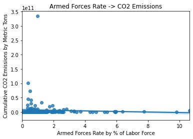
///ANALYSIS - Scatterplot ///
This scatterplot was also created in Course1Week4, at which point I mentioned it falls prey to the problem that visually everything tends to clump in the lowest y values, other than a few outliers. For example, the sky high dot is the United States at approximately 3.5 x 10^11 [350 billion] metric tons, while the next highest, China, is about 2.5 times further below the U.S. than it is above 0.
The trend line appropriately reflects a gradually decreasing, linear relationship. Note that if the trend was curvilinear, the Pearson Correlation results would not be meaningful.
The way the dots cluster around the line, with lots of blank space at the high x values and significant numbers of dots that are far away from the line especially at the low x values, are signs of a weak relationship.
My initial guesses after reviewing the scatterplot, with the new information learned this week about interpreting it, were:
There’s basically no way my hypothesis is going to hold out!
Pearson will show an r that is negative because of the slope of the trend line, but fairly close to zero because of the lack of tight clustering
Of course this is not something that can be determined very precisely just by eyeballing, hence the test.
///OUTPUT - Pearson Correlation///
Association between Armed Forces Rate and Cumulative CO2 Emissions
Pearson R, p-value (-0.05798521119087453, 0.46359915392492285)
///ANALYSIS - Pearson Correlation///
The results show an r of -0.06 which is very close to zero, thus a weak relationship is demonstrated with this sample. The p value is more than 9 times greater than the minimally acceptable--we are looking for p <= 0.05--so there is insufficient evidence to reject the null hypothesis.
CONCLUSIONS
In summary:
The null hypothesis is that there is no relationship between the armedforcesrate (percentage of the labor force employed by a nation’s military) and co2emissions (cumulative metric tons of carbon dioxide released into the atmosphere as of 2006) variables. The alternate hypothesis is simply that there is a relationship, and my hypothesis was that the relationship would be positive.
Scatterplot indicated a potentially weak, but at least linear negative relationship. This is important to check because Pearson would not be able to validate results that showed a curvilinear trend.
Pearson Correlation found an r of -0.06 which is very close to zero, and a p of 0.46, failing to meet the standard of p <= 0.05. We thus have no grounds to reject the null hypothesis (”no correlation”). By implication this also means we reject the alternate hypothesis (”any correlation”) as well as my more specific hypothesis (”positive correlation”).
0 notes
Text
Lasso Regression Analysis
A lasso regression analysis was conducted to identify a subset of variables from a pool of 23 categorical and quantitative predictor variables that best predicted a quantitative response variable measuring school connectedness in adolescents. Categorical predictors included gender and a series of 5 binary categorical variables for race and ethnicity (Hispanic, White, Black, Native American and Asian) to improve interpretability of the selected model with fewer predictors. Binary substance use variables were measured with individual questions about whether the adolescent had ever used alcohol, marijuana, cocaine or inhalants. Additional categorical variables included the availability of cigarettes in the home, whether or not either parent was on public assistance and any experience with being expelled from school. Quantitative predictor variables include age, alcohol problems, and a measure of deviance that included such behaviors as vandalism, other property damage, lying, stealing, running away, driving without permission, selling drugs, and skipping school. Another scale for violence, one for depression, and others measuring self-esteem, parental presence, parental activities, family connectedness and grade point average were also included. All predictor variables were standardized to have a mean of zero and a standard deviation of one.
In lasso regression, the penalty term is not fair if the predictive variables are not on the same scale, meaning that not all the predictors get the same penalty. So all predicters should be standardized to have a mean equal to zero and a standard deviation equal to one, including my binary predictors. It is done as follows
# standardize predictors to have mean=0 and sd=1
predictors=predvar.copy()
from sklearn import preprocessing
predictors['MALE']=preprocessing.scale(predictors['MALE'].astype('float64'))
predictors['HISPANIC']=preprocessing.scale(predictors['HISPANIC'].astype('float64'))
predictors['WHITE']=preprocessing.scale(predictors['WHITE'].astype('float64'))
predictors['NAMERICAN']=preprocessing.scale(predictors['NAMERICAN'].astype('float64'))
predictors['ASIAN']=preprocessing.scale(predictors['ASIAN'].astype('float64'))
predictors['AGE']=preprocessing.scale(predictors['AGE'].astype('float64'))
predictors['ALCEVR1']=preprocessing.scale(predictors['ALCEVR1'].astype('float64'))
predictors['ALCPROBS1']=preprocessing.scale(predictors['ALCPROBS1'].astype('float64'))
predictors['MAREVER1']=preprocessing.scale(predictors['MAREVER1'].astype('float64'))
predictors['COCEVER1']=preprocessing.scale(predictors['COCEVER1'].astype('float64'))
predictors['INHEVER1']=preprocessing.scale(predictors['INHEVER1'].astype('float64'))
predictors['CIGAVAIL']=preprocessing.scale(predictors['CIGAVAIL'].astype('float64'))
predictors['DEP1']=preprocessing.scale(predictors['DEP1'].astype('float64'))
predictors['ESTEEM1']=preprocessing.scale(predictors['ESTEEM1'].astype('float64'))
predictors['VIOL1']=preprocessing.scale(predictors['VIOL1'].astype('float64'))
predictors['PASSIST']=preprocessing.scale(predictors['PASSIST'].astype('float64'))
predictors['DEVIANT1']=preprocessing.scale(predictors['DEVIANT1'].astype('float64'))
predictors['GPA1']=preprocessing.scale(predictors['GPA1'].astype('float64'))
predictors['EXPEL1']=preprocessing.scale(predictors['EXPEL1'].astype('float64'))
predictors['FAMCONCT']=preprocessing.scale(predictors['FAMCONCT'].astype('float64'))
predictors['PARACTV']=preprocessing.scale(predictors['PARACTV'].astype('float64'))
predictors['PARPRES']=preprocessing.scale(predictors['PARPRES'].astype('float64'))
Data is split into a training set that included 70% of the observations (N=3201) and a test set that included 30% of the observations (N=1701).
to run our LASSO regression analysis with the LAR algorithm using the LASSO LarsCV function from the sklearn linear model library we type the following code.
model=LassoLarsCV(cv=10, precompute=False).fit(pred_train,tar_train)
LAR Algorithm was used which stands for Least Angle Regression. This algorithm starts with no predictors in the model and adds a predictor at each step. It first adds a predictor that is most correlated with the response variable and moves it towards least score estimate until there is another predictor. That is equally correlated with the model residual. It adds this predictor to the model and starts the least square estimation process over again with both variables. The LAR algorithm continues with this process until it has tested all the predictors. Parameter estimates at any step are shrunk and predictors with coefficients that have shrunk to zero are removed from the model and the process starts all over again. The model that produces the lowest mean-square error is selected by Python as the best model to validate using the test data set.
The least angle regression algorithm with k=10-fold cross validation was used to estimate the lasso regression model in the training set, and the model was validated using the test set. The change in the cross-validation average (mean) squared error at each step was used to identify the best subset of predictor variables. The precompute matrix is set to false as the dataset is not very large.
The dict object creates a dictionary, and the zip object creates lists. Output is as follows:
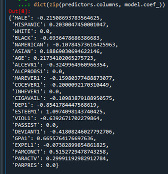
Predictors with regression coefficients equal to zero means that the coefficients for those variables had shrunk to zero after applying the LASSO regression penalty, and were subsequently removed from the model. So the results show that of the 23 variables, 18 were selected in the final model 18 were selected in the final model.
We can also create some plots so we can visualize some of the results. We can plot the progression of the regression coefficients through the model selection process.In Python, we do this by plotting the change in the regression coefficient by values of penalty parameter at each step of selection process. We can use the following code to generate this plot.

This plot shows the relative importance of the predictor selected at any step of the selection process, how the regression coefficients changed with the addition of a new predictor at each step, as well as the steps at which each variable entered the model. As we already know from looking at the list of the regression coefficients self esteem, the dark blue line, had the largest regression coefficient. It was therefore entered into the model first, followed by depression, the black line, at step two. In black ethnicity, the light blue line, at step three and so on.
Another important plot is one that shows the change in the mean square error for the change in the penalty parameter alpha at each step in the selection process. This code is similar to the code for the previous plot except this time we're plotting the alpha values through the model selection process for each cross-validation fold on the horizontal axis, and the mean square error for each cross validation fold on vertical axis.

We can see that there is variability across the individual cross-validation folds in the training data set, but the change in the mean square error as variables are added to the model follows the same pattern for each fold. Initially it decreases rapidly and then levels off to a point at which adding more predictors doesn't lead to much reduction in the mean square error. This is to be expected as model complexity increases.
We can also print the average mean square error in the r square for the proportion of variance in school connectedness.

The R-square values were 0.33 and 0.31, indicating that the selected model explained 33 and 31% of the variance in school connectedness for the training and test sets, respectively.
The full code is as follows:
#from pandas import Series, DataFrame
import pandas as pd
import numpy as np
import matplotlib.pylab as plt
from sklearn.model_selection import train_test_split
from sklearn.linear_model import LassoLarsCV
#Load the dataset
data = pd.read_csv("tree_addhealth.csv")
#upper-case all DataFrame column names
data.columns = map(str.upper, data.columns)
# Data Management
data_clean = data.dropna()
recode1 = {1:1, 2:0}
data_clean['MALE']= data_clean['BIO_SEX'].map(recode1)
#select predictor variables and target variable as separate data sets
predvar= data_clean[['MALE','HISPANIC','WHITE','BLACK','NAMERICAN','ASIAN',
'AGE','ALCEVR1','ALCPROBS1','MAREVER1','COCEVER1','INHEVER1','CIGAVAIL','DEP1',
'ESTEEM1','VIOL1','PASSIST','DEVIANT1','GPA1','EXPEL1','FAMCONCT','PARACTV',
'PARPRES']]
target = data_clean.SCHCONN1
# standardize predictors to have mean=0 and sd=1
predictors=predvar.copy()
from sklearn import preprocessing
predictors['MALE']=preprocessing.scale(predictors['MALE'].astype('float64'))
predictors['HISPANIC']=preprocessing.scale(predictors['HISPANIC'].astype('float64'))
predictors['WHITE']=preprocessing.scale(predictors['WHITE'].astype('float64'))
predictors['NAMERICAN']=preprocessing.scale(predictors['NAMERICAN'].astype('float64'))
predictors['ASIAN']=preprocessing.scale(predictors['ASIAN'].astype('float64'))
predictors['AGE']=preprocessing.scale(predictors['AGE'].astype('float64'))
predictors['ALCEVR1']=preprocessing.scale(predictors['ALCEVR1'].astype('float64'))
predictors['ALCPROBS1']=preprocessing.scale(predictors['ALCPROBS1'].astype('float64'))
predictors['MAREVER1']=preprocessing.scale(predictors['MAREVER1'].astype('float64'))
predictors['COCEVER1']=preprocessing.scale(predictors['COCEVER1'].astype('float64'))
predictors['INHEVER1']=preprocessing.scale(predictors['INHEVER1'].astype('float64'))
predictors['CIGAVAIL']=preprocessing.scale(predictors['CIGAVAIL'].astype('float64'))
predictors['DEP1']=preprocessing.scale(predictors['DEP1'].astype('float64'))
predictors['ESTEEM1']=preprocessing.scale(predictors['ESTEEM1'].astype('float64'))
predictors['VIOL1']=preprocessing.scale(predictors['VIOL1'].astype('float64'))
predictors['PASSIST']=preprocessing.scale(predictors['PASSIST'].astype('float64'))
predictors['DEVIANT1']=preprocessing.scale(predictors['DEVIANT1'].astype('float64'))
predictors['GPA1']=preprocessing.scale(predictors['GPA1'].astype('float64'))
predictors['EXPEL1']=preprocessing.scale(predictors['EXPEL1'].astype('float64'))
predictors['FAMCONCT']=preprocessing.scale(predictors['FAMCONCT'].astype('float64'))
predictors['PARACTV']=preprocessing.scale(predictors['PARACTV'].astype('float64'))
predictors['PARPRES']=preprocessing.scale(predictors['PARPRES'].astype('float64'))
# split data into train and test sets
pred_train, pred_test, tar_train, tar_test = train_test_split(predictors, target,
test_size=.3, random_state=123)
# specify the lasso regression model
model=LassoLarsCV(cv=10, precompute=False).fit(pred_train,tar_train)
# print variable names and regression coefficients
dict(zip(predictors.columns, model.coef_))
# plot coefficient progression
m_log_alphas = -np.log10(model.alphas_)
ax = plt.gca()
plt.plot(m_log_alphas, model.coef_path_.T)
plt.axvline(-np.log10(model.alpha_), linestyle='--', color='k',
label='alpha CV')
plt.ylabel('Regression Coefficients')
plt.xlabel('-log(alpha)')
plt.title('Regression Coefficients Progression for Lasso Paths')
# plot mean square error for each fold
m_log_alphascv = -np.log10(model.cv_alphas_)
plt.figure()
plt.plot(m_log_alphascv, model.cv_mse_path_, ':')
plt.plot(m_log_alphascv, model.cv_mse_path_.mean(axis=-1), 'k',
label='Average across the folds', linewidth=2)
plt.axvline(-np.log10(model.alpha_), linestyle='--', color='k',
label='alpha CV')
plt.legend()
plt.xlabel('-log(alpha)')
plt.ylabel('Mean squared error')
plt.title('Mean squared error on each fold')
# MSE from training and test data
from sklearn.metrics import mean_squared_error
train_error = mean_squared_error(tar_train, model.predict(pred_train))
test_error = mean_squared_error(tar_test, model.predict(pred_test))
print ('training data MSE')
print(train_error)
print ('test data MSE')
print(test_error)
# R-square from training and test data
rsquared_train=model.score(pred_train,tar_train)
rsquared_test=model.score(pred_test,tar_test)
print ('training data R-square')
print(rsquared_train)
print ('test data R-square')
print(rsquared_test)
0 notes
Text
Graphing the Data using Python
In this post I use graphs to review the data for the variables being used for this study. Here’s the Python program used to generate the graphs:
import pandas as pd import numpy as np import seaborn import matplotlib.pyplot as plt import os # set path and filename for the data file and load the dataset data_file = os.path.join(os.path.dirname(os.path.realpath(__file__)) + "\\data", "addhealth_pds.csv") data = pd.read_csv(data_file, low_memory=False) # create a small dataframe containing only the variables of interest df = pd.DataFrame({"hobby": data["H1DA2"], "happy": data["H1FS11"], "enjoy": data["H1FS15"]}) #Set PANDAS to show all columns in DataFrame pd.set_option('display.max_columns', None) #Set PANDAS to show all rows in DataFrame pd.set_option('display.max_rows', None) # HOBBY variable # remove the missing value rows (values 6 and 8) df = df[df["hobby"] < 4] # convert the hobby value to a small integer df["hobby"] = pd.to_numeric(pd.Series(df["hobby"]), downcast="signed", errors="coerce") # change format from numeric to categorical df["hobby"] = df["hobby"].astype('category') print("For the categorical variable hobby show the total count, unique categories, top category, and top count:") print(df["hobby"].describe()) # univariate bar graph for categorical variables seaborn.countplot(x="hobby", data=df) plt.xlabel('Times participated in a Hobby during the past week') plt.title('Impact of hobbies on happiness in AddHealth') plt.show() # HAPPY variable # remove the missing value rows (values 6 and 8) df = df[df["happy"] < 4] # convert the happy value into a small integer df["happy"] = pd.to_numeric(pd.Series(df["happy"]), downcast="signed", errors="coerce") # change format from numeric to categorical df["happy"] = df["happy"].astype('category') print("For the categorical variable happy show the total count, unique categories, top category, and top count:") print(df["happy"].describe()) # univariate bar graph for categorical variables seaborn.countplot(x="happy", data=df) plt.xlabel('How often you were happy during the past week') plt.title('Impact of hobbies on happiness in AddHealth') plt.show() # ENJOY variable # remove the missing value rows (values 6 and 8) df = df[df["enjoy"] < 4] # convert the happy value into a small integer df["enjoy"] = pd.to_numeric(pd.Series(df["enjoy"]), downcast="signed", errors="coerce") # change format from numeric to categorical df["enjoy"] = df["enjoy"].astype('category') print(df["enjoy"].describe()) print("For the categorical variable enjoy show the total count, unique categories, top category, and top count:") # univariate bar graph for categorical variables seaborn.countplot(x="enjoy", data=df) plt.xlabel('How often did you enjoy life during the past week') plt.title('Impact of hobbies on happiness in AddHealth') plt.show() def happy_hi_lo(row): """ used to create a variable coded for the highlest level of happiness vs everything else :param row: series - dataset row :return: int - 1 for highest level of happiness (3), 0 anything less than that """ if row["happy"] < 3: return 0 else: return 1 # HAPPY binary Hi Lo - 2 values 1 if highest happiness level (3) and 0 if anything else df["happyHiLo"] = df.apply(lambda row: happy_hi_lo(row), axis=1) # change format from numeric to categorical df["happyHiLo"] = df["happyHiLo"].astype('category') print(df["happyHiLo"].describe()) print("For the categorical variable happyHiLo show the total count, unique categories, top category, and top count:") # univariate bar graph for categorical variables seaborn.countplot(x="happyHiLo", data=df) plt.xlabel('Experienced highest level of happiness during the week') plt.title('Impact of hobbies on happiness in AddHealth') plt.show() # bivariate bar graph C->C df["happyHiLo"] = pd.to_numeric(pd.Series(df["happyHiLo"]), downcast="signed", errors="coerce") seaborn.catplot(x='hobby', y='happyHiLo', data=df, kind="bar", ci=None) plt.xlabel('Number of times participated in a hobby per week') plt.ylabel('Proportion experiencing highest level of happiness') plt.title('Impact of hobbies on happiness in AddHealth') plt.show() def enjoy_hi_lo(row): """ used to create a variable coded 1 for highest level of life enjoyment (3) and 0 for anything less :param row: series - dataset row :return: int - 1 for highlest level of life enjoyment (3), 0 for anything less (0, 1, 2) """ if row["enjoy"] < 3: return 0 else: return 1 # ENJOY binary Hi Lo - 1 for highest level of life enjoyment (3) and 0 for anything less df["enjoyHiLo"] = df.apply(lambda row: enjoy_hi_lo(row), axis=1) # change format from numeric to categorical df["enjoyHiLo"] = df["enjoyHiLo"].astype('category') print(df["enjoyHiLo"].describe()) print("For the categorical variable enjoyHiLo show the total count, unique categories, top category, and top count:") # univariate bar graph for categorical variables seaborn.countplot(x="enjoyHiLo", data=df) plt.xlabel('Enjoyed life at highest level during the week') plt.title('Impact of hobbies on enjoying life in AddHealth') plt.show() # bivariate bar graph C->C df["enjoyHiLo"] = pd.to_numeric(pd.Series(df["enjoyHiLo"]), downcast="signed", errors="coerce") seaborn.catplot(x='hobby', y='enjoyHiLo', data=df, kind="bar", ci=None) plt.xlabel('Number of times participated in a hobby per week') plt.ylabel('Proportion with highest level of life enjoyment') plt.title('Impact of hobbies on enjoying life in AddHealth') plt.show()
Next I’ll include each of the 7 graphs generated by the program.

This graph shows the distribution for the hobby categorical variable (H1DA2). This variable has a unimodal distribution with a slight skew right. The mode is 1 meaning most subject participated in hobbies 1 or 2 times per week. The skew right means that overall most subjects participated in hobbies.
This graph shows the distribution for the happy categorical variable (H1FS11). This variable has a unimodal distribution. The mode is 2 meaning that most subjects were happy a lot of the time. Generally, subjects reported being happy a lot of the time or more.
This graph shows the distribution for the enjoy categorical variable (H1FS15). This variable has a unimodal distribution and is skewed left. The mode for this variable is 3 meaning most subjects enjoyed life most or all the time.
The happyHiLo variable was derived using 2 categories of happiness. The 1 value for happiness includes only those responses that indicated the highest level of happiness (most of the time or all of the time=3), and 0 includes all other responses. The mode is for 0, or all responses less than happy most or all the time, and this category has about twice the count as we see in category 1.

The above graph shows the proportion of responses that indicated the highest level of happiness for each level of hobby participation per week. We see a clear upwards trend, though each step does not appear to be highly differentiated. That is, as adolescents participate in more hobbies the likelihood that they experience the highest level of happiness increases.
Times when the subject enjoyed life is an alternative response variable to happiness. The above graph shows the derived enjoyHiLo variable. As with the happyHiLo, the enjoyHiLo variable has category 1 that represents the highest level of enjoyment (most of the time or all the time=3), and 0 that includes all other non-missing responses. For this variable, the mode is 0, but the two categories are distributed fairly evenly.

The above graph shows the proportion of responses that indicated the highest enjoyment of life level for each level of hobby participation per week. Much like we say with happiness, we see a clear upwards trend, though each step does not appear to be highly differentiated. That is, as adolescents participate in more hobbies the likelihood that they experience the highest level of enjoyment of life increases. In this case it starts at about 40% of responses for no hobby participation and climbs up to about 55% for those that spend the most time on hobbies.
0 notes