#how to use internal stylesheet in css
Explore tagged Tumblr posts
Visit Tumblr Blog
Explore Tumblr blogs with no restrictions, modern design and the best experience.
Last Seen Tumblr Blogs


Fun Fact
The most popular pages on Tumblr are about Minecraft, GIFs, and David J. Peterson.
Text
am currently working on a neocities site (which i cannot give you the url for yet because im working on the css still and there's no content also it looks ugly still) and oh man does it take me back to ye olde days of custom theme editing on here. i still use a custom theme obvs but back in like 2014/2015ish when i was really into indie rp custom themes were all the rage and you would spend hours editing some character specific image for your bg and then another several hours trying to make the css line up with your image (never at any point did i attempt to actually like. learn html or css. i just read other people's theme codes and edited the parts i could understand and solved problems as they arose. i distinctly remember one time i was using a base that had two sidebars and i only wanted one and deleting the section broke the theme in disastrous ways [bc i had no idea what i was doing] so i literally just made all the elements in the sidebar transparent and moved them off the screen LMAO. the best i ever got was moving from fully built custom themes that i edited to base themes that i built off of)
anyway while im slightly better now (im even reading tutorials! am i following them? sorry i have to go i think someones calling me) i am using a layout builder to build the homepage so it is even more reminding me of mid-2010s tumblr. much like building off a base theme, and definitely easier to understand than tumblr theme building (this time i at least know what all the different pieces of code are doing, even when im not sure how or why, or how to duplicate the effect under slightly different circumstances. but progress is progress!).
a good but annoying thing about the layout that im using is that i havent actually edited the site wide stylesheet, just used internal css on that one page, so when i go to make literally any other page i'll have to start from scratch. this is good because i am learning a lot and i think without doing it this way i would end up with a bunch of useless stuff in the stylesheet that really should be page-specific that i would have to correct with internal or inline css later. annoying because what do you mean i have to make decisions about the sizing and positions of the content? i literally just did that
also im kind of nervous to touch the general stylesheet because im pretty sure what i'll actually want to do is have a couple of stylesheets for different 'sections' of the website, to maintain cohesion between pages of the 'same' type but still allow a lot of fun customization on a per-page basis, but that requires deciding what 'sections' i want on the website and that is a whole other can of worms. but also you can't start without starting so i should probably just try to build a really simple layout and go from there (after all, if it sucks, it's not like i can't just create a new stylesheet, or do the css for each page independently until i hit a groove that's actually worth moving to the stylesheet). but also first i have to finish this goddamn homepage. which means i gotta find a header image that doesn't look ugly as shit
#good idea generator#i dont need a header but im scared of deleting the image in case i break the code and if i go back to the layout maker#i'll have to redo all the code i already did. and im not doing that it was so annoyinggggggg#im having so much fun though. enrichment in my enclosure or whatever#also i found a bunch of my old theme editing stuff while looking for resources and i was like woww i even look like i know what im doing#but ultimately the trick was 90% of my background image should have been css elements instead#like i had a nice box around my content. i should have used a container with a border in the css#but what i did was make a bg img with a box in it already. then try to fit the content to that box#and if youre wondering no i never tested shit all on different screens and i def did not understand positioning#so definitely the boxes did not line up on anyone elses screen. well you live and you learn!
7 notes
·
View notes
Text
CSS Tutorial for Beginners: Build Stylish Web Pages

In the digital world, design is everything. A clean, stylish website can make a powerful first impression, keeping users engaged and encouraging them to return. While HTML is responsible for the structure of a web page, it is CSS (Cascading Style Sheets) that gives it life, color, and personality. If you're looking to create beautiful, modern websites, this CSS tutorial for beginners is the perfect place to start.
Whether you're new to web development or just want to improve your front-end skills, this tutorial will help you build stylish web pages using CSS. We'll walk through the fundamentals of CSS, explore how it works with HTML, and give you real examples to apply immediately.
What Is CSS?
CSS (Cascading Style Sheets) is the language used to describe the presentation of a document written in HTML. It defines how elements like text, images, and layouts should appear on a webpage—everything from font sizes and colors to spacing and positioning.
Without CSS, all websites would look plain and unstyled. CSS separates content (HTML) from design, making web pages easier to manage and more visually appealing.
Why Learn CSS?
Learning CSS offers several benefits, especially for beginners:
Design freedom: Customize any website with colors, fonts, layouts, and animations.
Responsive design: Make your web pages look great on all screen sizes and devices.
Better user experience: Improve readability, navigation, and visual appeal.
Easy maintenance: Update styles quickly without altering the content.
Career advantage: Front-end developers, designers, and content creators all use CSS.
How CSS Works with HTML
CSS works hand-in-hand with HTML by selecting specific HTML elements and applying styles to them. There are three main ways to use CSS in an HTML document:
Inline CSS – inside HTML elements
Internal CSS – inside a <style> tag in the head section
External CSS – in a separate .css file linked to your HTML
Here’s a simple example of internal CSS:<!DOCTYPE html> <html> <head> <style> h1 { color: blue; text-align: center; } p { font-size: 16px; color: gray; } </style> </head> <body> <h1>Welcome to My Website</h1> <p>This is a styled paragraph using CSS.</p> </body> </html>
CSS Syntax Explained
CSS consists of selectors and declarations. Here's the basic structure:selector { property: value; }
Example:p { color: green; font-size: 18px; }
p is the selector (targets <p> tags)
color and font-size are properties
green and 18px are values
You can apply multiple styles to one element by including multiple property-value pairs inside the braces.
Key CSS Concepts Every Beginner Should Know
1. Selectors
Selectors define which HTML elements you want to style. Common types include:
* – universal selector
p, h1, div – element selectors
.className – class selector
#idName – ID selector
Example:#main { background-color: #f0f0f0; }
2. Colors and Fonts
CSS allows full control over colors and typography.body { background-color: white; color: #333; font-family: Arial, sans-serif; }
3. Box Model
Every HTML element is a rectangular box, made up of:
Content
Padding
Border
Margin
Understanding the box model is key to layout and spacing.div { padding: 10px; border: 1px solid #ccc; margin: 20px; }
4. Positioning and Layout
Use CSS properties like position, display, flex, and grid to control layout..container { display: flex; justify-content: space-between; }
5. Responsive Design
Make your site mobile-friendly using media queries.@media (max-width: 600px) { body { font-size: 14px; } }
Build a Simple Styled Web Page
Let’s build a simple web page using HTML and CSS:
HTML (index.html)<!DOCTYPE html> <html> <head> <link rel="stylesheet" href="style.css"> <title>My Stylish Page</title> </head> <body> <header> <h1>My Stylish Web Page</h1> </header> <main> <p>This is a simple paragraph styled with CSS.</p> </main> </body> </html>
CSS (style.css)body { background-color: #f9f9f9; color: #333; font-family: 'Segoe UI', sans-serif; } header { background-color: #007BFF; color: white; padding: 20px; text-align: center; } main { padding: 20px; }
Save both files in the same folder, open index.html in a browser, and admire your styled page!
Tools to Help You Learn CSS
CodePen – Try CSS code snippets online.
MDN Web Docs – Comprehensive documentation for CSS.
Visual Studio Code – A great editor with live preview extensions.
CSS Zen Garden – Explore examples of what’s possible with CSS.
Final Thoughts
This CSS Tutorial for Beginners is your gateway to designing elegant, responsive, and professional-looking web pages. By learning CSS, you gain control over how content appears and interacts with users. Start small, practice consistently, and experiment with real-world projects.
Once you master the basics, explore advanced topics like animations, transitions, flexbox, grid, and preprocessors like SASS.
0 notes
Text
Why .NET Developers Love EasyLaunchpad’s Tailwind UI + Admin Panel Combo
Building a powerful backend is essential — but what about the admin interface your team will use every day?
Let’s face it: Most admin panels are either outdated, bloated with unused UI components, or too time-consuming to design from scratch.
That’s why .NET developers love the UI stack behind EasyLaunchpad: a clean, production-ready admin panel powered by Tailwind CSS and DaisyUI — fully integrated with the .NET Razor view engine.
In this post, we’ll explore how EasyLaunchpad’s UI architecture empowers developers to move faster, customize more easily, and deliver better internal UX from day one.
💡 Why UI Simplicity Matters in a Boilerplate
Your admin panel is the cockpit of your app — where roles are assigned, emails are configured, users are managed, and plans are published.
It must be:
Fast
Clean
Responsive
Easy to navigate
Simple to extend
Most .NET boilerplates focus heavily on backend setup but neglect frontend design. EasyLaunchpad closes this gap by offering a modern, developer-friendly dashboard built with today’s best UI tools.
🎨 The Tech Behind the UI

Here’s what powers EasyLaunchpad’s frontend:
Technology and Purpose
✅Tailwind CSS: Utility-first CSS framework for fast, responsive styling
✅DaisyUI: Prebuilt Tailwind UI components for forms, tables, modals, and alerts
✅Razor Views: Server-side rendering for .NET Core
✅Partial Views & Layouts: Consistent structure and DRY components
✅Alpine.js (Optional): Lightweight interactivity without a frontend framework
Together, these technologies allow for rapid UI development without introducing SPA complexity (like Angular or React), keeping everything lean and maintainable.
What the Admin Panel Includes
From the moment you launch EasyLaunchpad, you get a beautiful and functional admin UI with:
Module and Purpose
✅ Dashboard Overview: Quick-glance metrics, activity log, shortcut links
✅ User Management: CRUD operations, activation toggle, password reset
✅ Role Management: Assign/remove user roles, filter access
✅ Email Settings: Configure SMTP, test mail delivery
✅ Packages & Plans: Add/edit plans linked to Stripe/Paddle
✅ System Settings: Toggle features, branding, limits
✅ Job Monitoring: Integrated Hangfire dashboard for background jobs
All pages are fully responsive and follow a consistent layout, so new features blend in effortlessly.
Why Tailwind CSS Makes It Better
Tailwind CSS takes a utility-first approach to styling. Rather than writing custom classes or cascading stylesheets, you build UI components using readable, descriptive class names.
Example:
<button class=”bg-blue-600 hover:bg-blue-700 text-white font-bold py-2 px-4 rounded”>
Save Changes
</button>
Advantages:
Faster styling workflow
Consistent spacing, color, and typography
Fully responsive without breakpoints guesswork
No CSS bloat — unused styles are purged in production
Tailwind is the modern CSS solution embraced by frameworks like Laravel, Next.js — and now .NET developers through EasyLaunchpad.
Why DaisyUI Takes It Further
DaisyUI is a UI component library built on top of Tailwind. It provides styled components like:
Alerts
Modal
Tabs
Tables
Forms
Dropdowns
Cards
It dramatically reduces time spent on design and layout. You focus on functionality — DaisyUI handles the visuals.
Example:
<div class=”alert alert-success shadow-lg”>
<div>
<span>Changes saved successfully!</span>
</div>
</div>
In EasyLaunchpad, DaisyUI is integrated from day one, so your forms, tables, and pages look polished without writing custom CSS.
UI Architecture and Extensibility
EasyLaunchpad’s UI is structured in Razor Views with:
_Layout.cshtml for layout consistency
_SidebarPartial.cshtml, _NavbarPartial.cshtml for navigation
Views/Admin/ for page-specific content
Reusable partials for tables, modals, input forms
This makes it easy to:
Reuse components
Add new features quickly
Maintain consistency across all modules
How to Add a New Page in the Admin Panel
Let’s say you want to add a “Feedback Manager.”
Step 1: Create Razor View
Views/Admin/Feedback.cshtml
Step 2: Add a Controller Action
public IActionResult Feedback()
{
return View();
}
Step 3: Add Navigation Link
In _SidebarPartial.cshtml:
<li><a href=”/Admin/Feedback”>Feedback</a></li>
Done. It fits seamlessly with the existing layout and design.
Fully Responsive on All Devices
Tailwind + DaisyUI ensures that all admin pages:
Work flawlessly on desktop and mobile
Adjust automatically to screen size
Maintain clean readability and spacing
This is especially helpful for founders and team leads who manage admin functions on the go.
🎯Developer-Friendly Design
Feature and Why It Helps
✅ Utility-first CSS: No need for deep CSS knowledge
✅ Prebuilt components: Save time building UI from scratch
✅ Razor + Partial Views: Easier to manage and reuse code
✅ No JS framework overhead: Great for teams that want clean .NET-only solutions
✅ Production styling: Look polished out of the box
You’re not forced into a heavy frontend framework — just clean Razor + Tailwind + DaisyUI.
Use Cases and Customization Ideas
The admin panel is great for:
Managing your SaaS backend
Granting roles to beta testers
Viewing plan subscriptions
Monitoring job queues
Sending support emails
You can also extend it with:
Graphs (using Chart.js or ApexCharts)
File uploads
Support ticket system
Multi-language settings
The UI architecture is ready for it all.
Developer Feedback
“I loved how EasyLaunchpad gave me a working admin UI in 5 minutes. Tailwind + DaisyUI just clicked — everything was clean and intuitive.” – Full Stack .NET Developer, Startup Founder
Summary: Why You’ll Love It Too
Feature and Value
✅ Tailwind CSS: Rapid, clean UI styling
✅ DaisyUI: Polished components, ready to use
✅ Razor Views: Familiar for .NET devs
✅ Admin Layout: Fully responsive and extendable
✅ No extra frameworks: Pure .NET simplicity
Final Thoughts
When choosing a boilerplate, don’t settle for just backend setup. Your team — and your users — will thank you for a clean, intuitive, scalable admin interface.
EasyLaunchpad gives you a complete Tailwind + DaisyUI admin panel, tightly integrated into your .NET Core app, so you can ship faster and look better from day one.
👉 Want a beautiful dashboard without wasting weeks on UI work? Start with EasyLaunchpad today → https://easylaunchpad.com
#.net boilerplate#.net development#.net Tailwind Dashboard#Tailwind Ui For .net#Daisyui Admin Panel#Admin Interface#easylaunchpad#prebuilt apps
1 note
·
View note
Text
CDNs Explained: How Development Agencies Use Them to Improve Site Speed
When it comes to building high-performing websites, speed is more than a luxury—it’s a necessity. Faster websites improve user experience, boost search rankings, and increase conversion rates. One of the most effective tools web developers use to achieve this is a Content Delivery Network (CDN).
A skilled Web Development Company will often integrate CDNs into your site architecture to make your website faster, more reliable, and globally accessible. But what exactly is a CDN, and how does it work behind the scenes to enhance your website’s performance?
Let’s break it down.
What Is a CDN?
A Content Delivery Network (CDN) is a network of servers distributed across different geographical locations. These servers are strategically placed to deliver website content (like images, videos, JavaScript, CSS files, and even HTML pages) from a server that is closest to the user’s location.
Instead of making every user fetch content from your original web host (which might be in one part of the world), CDNs replicate and serve it from edge servers globally. The result? Reduced latency, faster page load times, and less strain on your origin server.
Why Site Speed Matters So Much
Before diving into how development teams use CDNs, it’s important to understand why speed matters:
Improved SEO: Google considers page speed as a ranking factor.
Better User Experience: Users expect pages to load in under 3 seconds.
Higher Conversions: Faster websites see lower bounce rates and higher sales.
Lower Server Costs: Offloading static assets to a CDN can reduce bandwidth consumption and hosting costs.
Slow websites frustrate users and search engines alike—making speed optimization a core responsibility of any web development project.
How Web Development Agencies Use CDNs Effectively
Professional development teams don’t just plug in a CDN—they configure and optimize it strategically based on the website’s structure, target audience, and traffic patterns. Here’s how:
1. Serving Static Content from Edge Locations
CDNs are perfect for delivering static content—things like images, videos, CSS stylesheets, fonts, and JavaScript files. Development teams configure CDNs like Cloudflare, AWS CloudFront, or Akamai to cache these assets and serve them from the nearest server to the end user.
This reduces the time it takes for content to travel across the internet, especially for international audiences.
2. Reducing Time to First Byte (TTFB)
TTFB is the time it takes for the first bit of data to reach a user’s browser after making a request. A long TTFB can drag down your site speed—even if everything else is optimized.
CDNs reduce TTFB by minimizing the distance between the user and the server. Development teams monitor this closely and use CDN logs and analytics to optimize performance over time.
3. Image and Media Optimization
CDNs often come with built-in media optimization features. Developers can enable:
Automatic image compression
Next-gen formats like WebP
Responsive resizing based on device
Instead of hosting large, unoptimized media files, the CDN handles compression and resizing on the fly—freeing up your core server and delivering content faster.
4. Handling High Traffic Volumes
When your site experiences a surge in traffic—whether from a marketing campaign, sale, or product launch—your main server can get overwhelmed.
CDNs absorb much of this traffic by handling asset delivery, freeing up your origin server to focus on dynamic requests like form submissions, shopping cart updates, or user logins.
5. Improving Global Reach
If your audience is spread across continents, you don’t want users in Asia or Europe waiting for content hosted in the U.S. A CDN ensures they access a version of your site from a local or nearby server, drastically improving loading times and consistency around the world.
6. Added Layer of Security
Many CDNs offer DDoS protection, firewall rules, and bot filtering features. Development teams configure these security layers through the CDN’s dashboard, ensuring that your site is not only fast—but also safe.
This is especially crucial for eCommerce sites, fintech platforms, or any website dealing with sensitive customer data.
Conclusion
In the modern web ecosystem, speed and performance are no longer optional—they're expected. CDNs play a critical role in meeting those expectations by delivering content faster, more securely, and with better reliability.
A professional Web Development Company knows how to implement and fine-tune CDN integration to ensure your site performs optimally across devices and geographies. From serving static content and reducing TTFB to scaling under pressure and protecting against threats, CDNs have become essential to modern web development success.
0 notes
Text
How can I Optimize Website Speed?

Website performance plays a vital role in SEO, user experience, and conversion rates. One of the most common questions from site owners is: How can I optimize website speed? A fast-loading website not only enhances user satisfaction but also improves rankings on search engines like Google. In today’s digital age, even a delay of a few seconds can lead to a noticeable drop in engagement and sales.
In this article, we’ll explore the most effective strategies to optimize your website speed and keep visitors—and search engines—happy.
Why Website Speed Matters
Before diving into tactics, it’s essential to understand why website speed optimization is important:
Better SEO rankings: Google considers page speed a ranking factor.
Improved user experience: Visitors expect fast-loading pages.
Higher conversion rates: Faster sites lead to more leads and sales.
Lower bounce rates: Slow sites push users away quickly.
How Can I Optimize Website Speed? Key Steps to Follow
To answer the question how can I optimize website speed, let’s look at proven strategies categorized into core areas.
1. Measure Your Current Website Speed
Start with a performance analysis to identify slow-loading elements.
Tools to Use:
Google PageSpeed Insights
GTmetrix
Pingdom Tools
These tools provide a speed score and actionable recommendations.
2. Optimize Images
Images often account for the bulk of a page’s load time.
Best Practices:
Use modern formats like WebP.
Compress images using tools like TinyPNG or ImageOptim.
Set appropriate image dimensions.
Implement lazy loading to delay off-screen images.
3. Minimize HTTP Requests
Each element on your page (scripts, stylesheets, images) makes an HTTP request.
Ways to Reduce Requests:
Combine CSS and JavaScript files.
Use CSS sprites for icons and small graphics.
Eliminate unnecessary plugins or third-party scripts.
4. Use a Content Delivery Network (CDN)
A CDN stores copies of your site’s files in servers worldwide, reducing latency for global users.
Popular CDN Providers:
Cloudflare
Amazon CloudFront
BunnyCDN
This step is especially important for sites with international traffic.
5. Enable Browser Caching
Browser caching allows users’ browsers to store files locally, so they don’t have to reload everything on repeat visits.
How to Enable:
Set caching rules in your .htaccess file.
Use a caching plugin if you’re on WordPress (like WP Rocket or W3 Total Cache).
6. Minify CSS, JavaScript, and HTML
Minification removes whitespace, comments, and unnecessary characters from code files.
Tools to Use:
UglifyJS (for JavaScript)
CSSNano (for CSS)
HTMLMinifier (for HTML)
This can significantly reduce page load times.
7. Upgrade Your Hosting Provider
Your web host plays a huge role in load speed. If you're on shared hosting and experiencing lags, it might be time to upgrade.
Options to Consider:
VPS (Virtual Private Server)
Dedicated hosting
Managed WordPress hosting (e.g., SiteGround, Kinsta)
8. Reduce Redirects
Redirects create additional HTTP requests and delay page rendering. Audit your site and remove unnecessary redirects, especially redirect chains.
9. Keep Your Website Clean
Outdated themes, unused plugins, and bloated code slow down your site.
Action Steps:
Regularly delete unused themes/plugins.
Update your CMS and plugins frequently.
Streamline your database using tools like WP-Optimize.
Learn More: In-Depth Optimization Guide
Want to explore more answers to “how can I optimize website speed” with visuals, step-by-step tutorials, and expert advice? Visit this comprehensive website speed optimization guide to dive deeper.
Final Thoughts
A slow website is more than just an inconvenience—it’s a conversion killer and a ranking risk. By understanding how to optimize website speed, you can deliver faster load times, improve your search visibility, and create a seamless user experience.
0 notes
Text
Difference Between HTML and CSS
In the realm of web development, two foundational technologies form the backbone of nearly every website: HTML (HyperText Markup Language) and CSS (Cascading Style Sheets). While they often work closely together to build and style web pages, they serve fundamentally different purposes. Understanding the differences between HTML and CSS is essential for anyone interested in web design or development.
Introduction to HTML
What is HTML?
HTML stands for HyperText Markup Language, and it is the standard language used to create the structure of web pages. Developed by Tim Berners-Lee in 1991, HTML has evolved into a robust language that helps define the layout and content of a website.
Purpose of HTML
HTML is primarily used to:
Define the structure of web documents
Insert and format text
Add images, videos, and other multimedia
Create hyperlinks
Form interactive elements such as buttons and forms
HTML Tags and Elements
HTML uses "tags" enclosed in angle brackets (< >). Each tag has a specific function. For example:
<h1>This is a heading</h1>
<p>This is a paragraph.</p>
<a href="https://www.example.com">Visit Example</a>
In this code:
defines a main heading
defines a paragraph
defines a hyperlink
HTML follows a nested structure. Tags are often paired with closing tags (</tag>) to wrap content.
Introduction to CSS
What is CSS?
CSS stands for Cascading Style Sheets, a language used for describing the presentation and design of HTML documents. Introduced in 1996 by the W3C (World Wide Web Consortium), CSS allows developers to apply styles like colors, fonts, spacing, and layouts to HTML elements.
Purpose of CSS
CSS is used to:
Style text (color, font, size)
Manage layout (grid, flexbox, margins, padding)
Control visibility and positioning
Apply responsive design
Animate HTML elements
CSS Syntax and Example
CSS rules are usually written in a separate file (e.g., style.css) or within a <style> tag. A CSS rule consists of a selector and declaration block:
p {
color: blue;
font-size: 16px;
}
This rule selects all <p> elements and applies a blue font color and a font size of 16 pixels.
Key Differences Between HTML and CSS
Feature
HTML
CSS
Purpose
Structure of a webpage
Styling of a webpage
Language Type
Markup language
Style sheet language
File Extension
.html or .htm
.css
Usage
Adds elements like text, images, forms
Adds color, layout, fonts, and visual effects
Integration
Must be present for any webpage
Optional, but improves user experience
Position in Web Development
Backbone/structure
Design layer/presentation
Role in Web Development
HTML’s Role
Without HTML, there would be no content to style. HTML:
Provides the blueprint for web pages
Organizes content in a logical structure
Serves as a framework for CSS and JavaScript to enhance
HTML is essential for SEO (Search Engine Optimization), accessibility, and content hierarchy.
CSS’s Role
CSS enhances the user experience by:
Making content visually appealing
Ensuring the layout adapts to different screen sizes (responsive design)
Keeping style rules separate from structure, promoting clean code and reusability
Working Together: HTML + CSS
HTML and CSS are complementary. HTML provides the "what," and CSS provides the "how it looks." Here's an example of them working together:
HTML File (index.html):
<!DOCTYPE html>
<html>
<head>
<link rel="stylesheet" href="styles.css">
</head>
<body>
<h1>Welcome to My Website</h1>
<p>This is a simple paragraph.</p>
</body>
</html>
CSS File (styles.css):
h1 {
color: darkgreen;
font-family: Arial, sans-serif;
}
p {
font-size: 18px;
color: gray;
}
In this example:
HTML sets the content: a heading and a paragraph
CSS styles the content: changing colors and fonts
Inline, Internal, and External CSS
CSS can be included in three ways:
Inline CSS: Defined within an HTML tag using the style attribute. <p style="color: red;">This is red text.</p>
Internal CSS: Written within a <style> tag in the <head> section of the HTML. <style>
p { color: blue; }
</style>
External CSS: Linked via a separate .css file. <link rel="stylesheet" href="style.css">
External CSS is the most scalable and recommended method for larger websites.
Advantages and Disadvantages
Advantages of HTML
Easy to learn and use
Supported by all browsers
Crucial for webpage structure
SEO-friendly
Disadvantages of HTML
Limited to content and structure
Requires CSS for styling
Not dynamic on its own (needs JavaScript for interaction)
Advantages of CSS
Separates design from content
Enables responsive design
Allows for consistent styling across pages
Reduces redundancy and improves maintainability
Disadvantages of CSS
Can become complex for large projects
Browser compatibility issues may arise
Changes in structure can require rework in styles
Best Practices for Using HTML and CSS
Use semantic HTML (e.g., , , ) to improve accessibility and SEO
Keep structure and style separate by using external CSS
Use classes and IDs effectively for targeted styling
Test your pages on multiple browsers and devices
Keep your code clean, readable, and well-commented
Real-World Analogy
Think of building a website like constructing a house:
HTML is the framework — the walls, roof, and foundation.
CSS is the interior design — the paint, furniture, and layout.
Without HTML, there’s no house. Without CSS, the house is plain and undecorated.
Conclusion
In summary, HTML and CSS are two essential technologies for creating and designing web pages. HTML defines the structure and content, while CSS is responsible for the visual style and layout. They operate in tandem to deliver functional, attractive, and user-friendly websites.
Understanding the differences between HTML and CSS is the first step toward mastering web development. While HTML answers "What is on the page?", CSS answers "How does it look?" Together, they empower developers to build rich, engaging digital experiences.
0 notes
Text
How to Build an SEO-Friendly Website from the Ground Up

Introduction: A stunning website alone is insufficient in today’s competitive digital environment; it must be search engine optimized to draw in natural visitors. Creating an SEO-friendly website from the ground up is crucial for visibility and success, regardless of whether you’re a startup, business owner, or digital marketing company. To guarantee that your website ranks highly and provides an exceptional user experience, this resource will take you through the essential tactics and best practices.
1. Choose the Right Domain and Hosting
Your website’s foundation starts with a strong domain name and reliable hosting provider.
Pick an SEO-friendly domain: Keep it short, memorable, and relevant to your business.
Select a fast and secure hosting provider: Speed and security directly impact search rankings. Go for hosting services that offer excellent uptime, SSL certificates, and robust security.
2. Plan a Structured Website Architecture
A well-organized site structure enhances user experience and makes it easier for search engines to crawl and index pages.
Use a logical hierarchy: Organize pages into clear categories and subcategories.
Create an intuitive navigation system: Users should be able to find content within a few clicks.
Optimize URLs: Keep them concise and keyword rich.
3. Mobile First Design
With Google prioritizing mobile-first indexing, an SEO-friendly website must be fully optimized for mobile devices.
Use a responsive design that adapts to different screen sizes.
Ensure fast mobile loading speeds by optimizing images and using minimal CSS/JavaScript.
Enhance mobile usability by making buttons tappable and text easily readable.
4. Lightning-Fast Loading Speeds
Page speed is a ranking factor, and slow websites drive users away.
Minimize HTTP requests by reducing scripts and stylesheets.
Optimize images using next-gen formats like WebP.
Use a Content Delivery Network (CDN) to serve content faster across different regions.
Enable browser caching and compression to improve load times.
5. SEO Optimized Content Strategy
Content remains king in SEO.
Conduct keyword research using tools like Google Keyword Planner, Ahrefs, or SEMrush.
Write high-quality, original content that provides value and solves user intent.
Incorporate primary and LSI (Latent Semantic Indexing) keywords naturally.
Use compelling meta titles and descriptions to improve click-through rates (CTR).
Implement proper heading structure (H1, H2, H3, etc.) for readability and SEO.
6. Technical Best SEO Practices
Beyond content, technical SEO ensures search engines can crawl and index your site efficiently.
Use an XML sitemap to guide search engines through your site.
Set up robots.txt to manage which pages search engines should or shouldn’t index.
Implement structured data (Schema Markup) for rich snippets in search results.
Fix broken links and redirect errors to avoid harming user experience.
Optimize for Core Web Vitals focusing on LCP (Largest Contentful Paint), FCP (First Contentful Paint), and CLS (Cumulative Layout Shift).
7. Internal Linking and Backlinking
A proper link-building strategy boosts SEO and credibility.
Use internal links strategically to connect relevant pages and pass link juice.
Earn high-quality backlinks from reputable websites within your industry.
Avoid spammy or low-quality links that could trigger search engine penalties.
8. User Experience (UX) and Engagement
Google values user experience, and a site optimized for engagement improves SEO rankings.
Use clear CTAs (Call-To-Actions) to guide users effectively.
Ensure easy readability with a clean layout and proper typography.
Enhance interactivity with multimedia elements like videos and infographics.
Reduce bounce rates by delivering engaging, value-driven content.
9. Local SEO for Targeted Reach
For businesses targeting specific regions, local SEO is crucial.
Claim and optimize your Google My Business (GMB) listing.
Use local keywords in content and meta descriptions.
Encourage customer reviews to boost credibility and rankings.
10. Regular SEO Audits and Monitoring
SEO isn’t a one-time effort; it requires continuous tracking and optimization.
Use tools like Google Search Console and Google Analytics to monitor performance.
Conduct regular site audits to identify and fix SEO issues.
Update outdated content to maintain relevance and ranking.
Stay updated on algorithm changes to adjust strategies accordingly.
Conclusion Building an SEO-friendly website is a meticulous process that requires strategic planning, high-quality content, and technical optimization. Whether you’re a website development company or a digital marketing agency, following these best practices will ensure your site ranks higher, attracts organic traffic, and delivers an exceptional user experience. SEO is an ongoing game, stay updated, adapt, and watch your website thrive in search results.
#SEO#seo services#blog#like#digital marketing#emailmarketing#social media marketing#smm services#onedatasoftware
0 notes
Text
Page Speed Matters: Tips to Develop Lightning-Fast Websites
The world is digital today, and if one's attention span is shorter than ever, a page speed determines the success of a website. A slow site is frustrating, not only to the users but also reduces the search rankings and conversion rate. Being a web development company, we well understand the necessity to build lightning-fast websites so that visitors engage and perform activities with seamless ease. In this article, we'll try to understand why page speed is crucial and give you actionable tips to optimize your website's loading time.

Why Page Speed is Important
User Experience: Modern users want websites to load in a few seconds. A one-second delay may increase the bounce rate, or leave your website without engaging with its content.
SEO Rankings: Google and other search engines rank websites according to their speed. This means really slow ones get pushed back from the search results.
Mobile traffic: More than half of the web traffic comes from mobiles. It is essential to make sure that the site works perfectly on all screen sizes and speed of connections.
Conversions and Revenue: Conversion rates are relatively higher for fast websites. The speed of loading may be directly related to revenue in e-commerce business.
How to Create Lightning-Fast Websites
1. Optimize Images
Images often use most of the webpage's loading time. Compress images, yet in quality, so the file size is reduced, which is what modern formats like WebP do exceptionally well-together with very high quality-compression. In addition, use lazy loading to ensure images do not need to load until they are in view.
2. Browser Caching
This method saves some of the elements on your website to the user's browser, thus decreasing the time required to reload them during subsequent visits. Website developers can configure rules for caching the images, stylesheets, and scripts, thus ensuring quicker repeat visits.
3. Minify CSS, JavaScript, and HTML
Remove unnecessary characters, spaces, and comments from the code of your website to load faster. The minification tool available can be applied using UglifyJS and CSSNano for resources. Clean and optimized code does not only make the site faster but also more maintainable.
4. Use a Content Delivery Network:
A CDN distributes all of your website content across multiple servers around the world, which means everyone loads data from a server nearest to him. Latency is therefore minimized and leads to significantly higher loads, especially among international customers.
5. Enable Gzip Compression
This makes your files significantly smaller, downloading at much faster speeds. Most contemporary web servers support Gzip, and configuring its settings requires few adjustments to code in order to considerably improve page speed.
6. Use a good host
Another critical factor in the speed of your website would be your hosting provider. Choose hosting services that have fast servers, SSD storage, and scalable resources. For business users, there is managed hosting for certain platforms, and it is great as managed WordPress hosting, for example.
7. Optimize for Mobile
Optimize for mobile users since mobile-first indexing is the future. Use responsive design, lightweight themes, and other mobile-friendliness features to perform better on hand-held devices.
8. Limit Redirect
The redirects are one source of unnecessary HTTP requests that add load times. Audit your site to lower the redirects such that people reach the right page the first time they try.
9. Prioritize Critical Resources
Determine resources that need to load before the above-the-fold content loads quickly. PageSpeed Insights and Lighthouse are the tools that can help you identify those resources along with recommendations.
10. Monitor and Test Page Speed Continuously
Regular monitoring will help you identify potential bottlenecks in your website's speed. Tools like GTmetrix, Pingdom, and Google PageSpeed Insights give you insights into how your site is performing, enabling you to make data-driven optimizations.

How a Web Development Company Can Help
A fast-loading website requires a combination of technical know-how, strategic planning, and continuous maintenance. Being an experienced web development company, we have been providing our clients with the perfect balance between design aesthetics and high performance in websites. Our skilled website developers make use of the latest technologies and best practices to ensure the best speed, functionality, and user experience.
From optimizing images to implementing CDNs and caching mechanisms, our website developers are on all the details that impact page speed. We also test with thoroughness to catch performance issues, so your website is always giving lightning-fast experiences for your users.
Benefits of a Fast Website
Improved User Retention: Fast websites keep users engaged and encourage them to browse more pages.
Higher Search Rankings: The search engine websites tend to favor those websites that load quick; one tends to stay ahead of others.
Better Conversion: A slick user experience yields better conversion rates as well as revenues.
Better Reach: Quick loads make sites accessible by various devices as well as a range of networks.
But with speed and efficiency nearly being synonymous words in the present times, developing a lightning-fast website is not a choice; it's a compulsion. We, at the web development company, understand the impact that page speed makes on user satisfaction, search visibility, and ultimately, business success. Following the tips given above, combined with collaborating with expert website developers, will be able to get you that performing website, bringing you the desired results.
Hence, optimizing your website's speed is not just a one-time thing but is rather an evolving process with respect to changing technologies and user expectations. Always be one step ahead; therefore, always give priority to speed, and your website will not only present amazing user experiences but also present your business at the forefront in the digital marketplace.
0 notes
Text
7 Strategies for Improving Site Speed and SEO
Site speed is a crucial factor for both user experience and SEO. Slow-loading websites can lead to higher bounce rates, lower search engine rankings, and decreased user engagement. If you want to boost your site's speed while improving SEO, implementing the right strategies is essential. Partnering with an SEO agency Singapore can also help you develop an effective approach. In this blog, we’ll explore seven strategies to improve site speed and enhance SEO performance.
1. Optimize Images
One of the most common reasons for slow site speed is large image files. High-quality images are essential, but they can also take up a lot of bandwidth, leading to slow load times. To optimize images:
Compress images without losing quality using tools like TinyPNG or ImageOptim.
Use the right file format (JPEG for photos, PNG for graphics, and WebP for both).
Resize images to the dimensions they’ll be displayed at on your site, rather than using oversized images.
These simple image optimizations can have a significant impact on your site’s loading speed and overall SEO.
2. Minimize HTTP Requests
Every element on a webpage (images, scripts, stylesheets, etc.) requires an HTTP request to load. Too many requests can slow down your site. You can reduce these requests by:
Combining CSS and JavaScript files: Instead of having multiple files, combine them into one to reduce the number of requests.
Using CSS sprites: Combine multiple images into one image file, reducing the number of image requests.
Avoiding unnecessary elements: Remove unnecessary scripts, plugins, or features that slow down your site.
Reducing HTTP requests can make a noticeable difference in loading times and enhance user experience.
3. Enable Browser Caching
Browser caching allows certain elements of your website (like images, CSS files, and JavaScript) to be stored in a visitor’s browser, so they don’t need to be reloaded each time they visit your site. This speeds up load times for return visitors. To enable caching:
Set expiration dates for different resources on your website (e.g., images, CSS files).
Leverage cache-control headers to specify how long browsers should store the cached files.
By enabling browser caching, you improve not only site speed but also user engagement, both of which are important for SEO.
4. Use a Content Delivery Network (CDN)
A Content Delivery Network (CDN) distributes your website’s content across multiple servers worldwide. When a user visits your site, the CDN serves the content from the server closest to their location, reducing latency and speeding up load times. The benefits of using a CDN include:
Faster delivery of content.
Reduced load on your primary server.
Improved site speed, especially for international visitors.
Partnering with an SEO agency Singapore can help you select the best CDN for your needs and integrate it seamlessly into your website.
5. Optimize Your Website’s Code
Reducing the size and complexity of your site’s code can improve loading times. By optimizing HTML, CSS, and JavaScript, you can make your site more efficient. Key strategies for optimizing code include:
Minify HTML, CSS, and JavaScript: Remove unnecessary spaces, comments, and characters to reduce file sizes.
Eliminate render-blocking resources: Move JavaScript to the bottom of your pages or use the "async" or "defer" attributes to prevent it from blocking page rendering.
Use modern coding standards: Adopting newer, more efficient coding practices can improve performance.
Optimized code not only boosts speed but also helps search engines crawl your site more effectively.
6. Improve Server Response Time
Your web hosting service plays a significant role in site speed. Slow server response times can make your site feel sluggish, even with all other optimizations in place. To improve server response time:
Choose a reliable hosting provider: A reputable hosting service with fast servers is essential for improving site speed.
Use faster server-side technologies: Consider upgrading to a server with more resources or adopting technologies like HTTP/2 for faster data transfer.
Implement server-side caching: Cache dynamic content to reduce server load and speed up delivery.
A fast server response time is a foundational element of an efficient, SEO-friendly website.
7. Prioritize Mobile Optimization
With mobile traffic now accounting for the majority of web traffic worldwide, it’s essential that your website is optimized for mobile devices. Google also uses mobile-first indexing, meaning it ranks websites based on their mobile versions. Here’s how to improve mobile site speed:
Use responsive design: Ensure your site adjusts to different screen sizes and devices.
Simplify mobile design: Reduce heavy elements on mobile pages to improve load times.
Test mobile performance: Regularly test your site on mobile devices and make necessary adjustments.
Mobile optimization enhances user experience, reduces bounce rates, and ultimately improves your SEO rankings.
Conclusion
Improving site speed is a crucial step in boosting your website’s SEO and enhancing user experience. By optimizing images, reducing HTTP requests, enabling browser caching, and using a CDN, you can significantly improve loading times. Additionally, optimizing code, improving server response time, and prioritizing mobile optimization are essential for a fast, SEO-friendly website. For personalized advice and implementation of these strategies, consider partnering with an SEO agency Singapore. With the right expertise, you can ensure your site performs at its best and ranks higher in search engine results.
0 notes
Text
HTML Integration with CSS and JavaScript

Integrating HTML with CSS and JavaScript is fundamental to creating interactive and visually appealing web pages. Here’s how you can effectively combine these technologies.
1. HTML Integration with CSS
CSS (Cascading Style Sheets) is used to style HTML elements by controlling layout, colors, fonts, and more.
Inline CSS:
You can apply CSS styles directly to HTML elements using the style attribute.
Example:
<p style="color: blue; font-size: 18px;">This is a styled paragraph.</p>
Pros: Quick and easy for small styles.
Cons: Not reusable, and can clutter HTML code.
Internal CSS:
Internal CSS is defined within a <style> element inside the <head> section of an HTML document.
Example:
<head> <style> p { color: green; font-size: 20px; } </style> </head> <body> <p>This paragraph is styled with internal CSS.</p> </body>
Pros: Allows you to style a complete page in one place.
Cons: Styles are not reusable across multiple pages.
External CSS:
External CSS is stored in a separate .css file, which is linked to the HTML document using the <link> element.
Example:
<!-- Link to external CSS --> <head> <link rel="stylesheet" href="styles.css"> </head> <body> <p>This paragraph is styled with external CSS.</p> </body>
Pros: Separates style from content, making maintenance easier and styles reusable across multiple pages.
Cons: Requires additional HTTP requests to load the CSS file.
CSS Example:
External CSS file styles.css:
body { background-color: #f0f0f0; font-family: Arial, sans-serif; } p { color: #333; font-size: 18px; line-height: 1.6; }
HTML document linking to styles.css:
<head> <link rel="stylesheet" href="styles.css"> </head> <body> <p>This is a paragraph styled with an external CSS file.</p> </body>
2. HTML Integration with JavaScript
JavaScript is a programming language used to create interactive and dynamic web pages.
Inline JavaScript:
You can add JavaScript directly within an HTML element using the onclick, onload, and other event attributes.
Example:
<button onclick="alert('Button clicked!')">Click Me</button>
Pros: Quick for simple interactions.
Cons: Can make HTML code hard to maintain and is not best practice for larger projects.
Internal JavaScript:
Internal JavaScript is included within a <script> tag inside the <head> or <body> section of an HTML document.
Example:
<head> <script> function showMessage() { alert('Hello, World!'); } </script> </head> <body> <button onclick="showMessage()">Click Me</button> </body>
Pros: Keeps JavaScript separate from HTML, making the code more organized.
Cons: Code is still contained within the same HTML document, which can be less modular.
External JavaScript:
External JavaScript is stored in a separate .js file, which is linked to the HTML document using the <script> tag.
Example:
<!-- Link to external JavaScript --> <head> <script src="script.js"></script> </head> <body> <button onclick="showMessage()">Click Me</button> </body>
External JavaScript file script.js:
function showMessage() { alert('Hello, World!'); }
Pros: Keeps HTML, CSS, and JavaScript separate, making maintenance easier and code more reusable.
Cons: Requires additional HTTP requests to load the JavaScript file.
JavaScript Example:
External JavaScript file script.js:
document.addEventListener('DOMContentLoaded', function() { const button = document.querySelector('button'); button.addEventListener('click', function() { alert('Button clicked!'); }); });
HTML document linking to script.js:
<head> <script src="script.js" defer></script> </head> <body> <button>Click Me</button> </body>
Best Practices for Integration:
Keep Content, Presentation, and Behavior Separate: Use HTML for structure, CSS for styling, and JavaScript for behavior.
Minimize Inline CSS and JavaScript: For maintainability and scalability, avoid inline CSS and JavaScript.
Load JavaScript Asynchronously: Use defer or async attributes to prevent JavaScript from blocking page rendering.
Use External Files: Keep CSS and JavaScript in external files to improve maintainability and performance.
By following these practices, you can create well-structured, maintainable, and efficient web pages that provide a good user experience.
Read More…
0 notes
Text
10 Effective Strategies to Enhance Your Website's Page Speed

In the fast-paced realm of the internet, every second counts when it comes to website loading times. Slow-loading pages can lead to high bounce rates and diminished user satisfaction. If you're wondering, "How can I increase my page speed?" fret not, as we've compiled a comprehensive guide to help you optimize your website's performance.
Increasing your page speed is crucial for providing visitors with a seamless browsing experience and improving your site's search engine rankings. Here are ten proven strategies to boost your website's loading times:
Optimize Images:
Large image files can significantly slow down your website. Compress images using tools like TinyPNG or plugins such as WP Smush to reduce their size without compromising quality.
Minimize HTTP Requests:
Each element on your webpage, including images, scripts, and stylesheets, requires an HTTP request. Minimize these requests by combining files, reducing unnecessary elements, and utilizing browser caching.
Leverage Browser Caching:
Enable browser caching to store static files, such as images, CSS, and JavaScript, on visitors' devices. This allows returning users to load your website more quickly by retrieving cached content instead of downloading it again.
Utilize a Content Delivery Network (CDN):
A CDN distributes your website's content across multiple servers worldwide, reducing latency and improving loading times, especially for users located far from your server's location.
Minify CSS, JavaScript, and HTML:
Remove unnecessary whitespace, comments, and formatting from your code to reduce its size. Minification helps browsers parse and load your website's files more efficiently.
Implement Lazy Loading:
Lazy loading delays the loading of non-essential resources, such as images and videos, until they are needed. Prioritize the loading of above-the-fold content to enhance the initial page load experience.
Optimize Server Response Time:
Choose a reliable web hosting provider with fast servers and optimize your server configuration to minimize response times. Consider upgrading to a dedicated hosting plan if you experience consistently slow server responses.
Reduce Redirects:
Excessive redirects can add additional HTTP requests and increase loading times. Minimize redirects by updating internal links and eliminating unnecessary redirection chains.
Enable Gzip Compression:
Enable Gzip compression on your server to reduce the size of transmitted data, thereby decreasing bandwidth usage and accelerating page loading times for text-based content.
Prioritize Above-the-Fold Content:
Load critical content, such as headlines and calls to action, before below-the-fold content to provide users with immediate access to essential information.
By implementing these strategies, you can significantly improve your website's page speed and deliver a better user experience. For more detailed guidance on optimizing your WordPress site's page speed, check out our comprehensive guide on increasing the Google Page Speed of a WordPress site.
Remember, a faster website not only pleases visitors but also enhances your site's search engine visibility and overall performance. Stay proactive in optimizing your page speed to stay ahead in the competitive online landscape.
0 notes
Text
Mastering CSS: Top 10 Interview Questions
CSS (Cascading Style Sheets) is the backbone of web design, shaping the visual presentation of web pages. Whether you're an aspiring developer or a seasoned pro, a strong grasp of CSS is essential. In interviews, CSS questions are often used to assess a candidate's proficiency and understanding of the language. To help you ace your next interview, let's explore the top 10 CSS interview questions you should be prepared to tackle:
1. What is CSS, and why is it important in web development?
Define CSS succinctly and elaborate on its significance in separating content from presentation in web development.
2. What are the different methods for incorporating CSS into a web page?
Discuss various techniques for adding CSS to HTML documents, such as inline styles, internal stylesheets, and external stylesheets, while weighing their pros and cons.
3. Explain the CSS box model.
Define the box model and its constituents—content, padding, border, and margin—clarifying how they influence element layout and design.
4. How do you horizontally and vertically center an element in CSS?
Showcase your understanding of CSS positioning and layout strategies by detailing methods for centering elements both horizontally and vertically on a web page.
5. What are CSS selectors, and how do they function?
Delve into CSS selectors' role in targeting specific HTML elements for styling, covering class selectors, ID selectors, element selectors, and descendant selectors with practical examples.
6. Distinguish between padding and margin in CSS.
Highlight the disparities between padding and margin properties, elucidating their purposes and impact on element spacing.
7. How do you implement responsive design using CSS?
Discuss responsive design principles and methodologies like media queries, fluid layouts, and flexible units to ensure adaptability across diverse devices and screen sizes.
8. Contrast display: none and visibility: hidden in CSS.
Articulate the differences between these CSS properties and their effects on element visibility and layout.
9. What are CSS preprocessors, and why are they beneficial?
Introduce CSS preprocessors such as Sass and LESS, emphasizing their advantages like variables, nesting, mixins, and functions for enhancing CSS development efficiency and maintainability.
10. How do you handle CSS browser compatibility issues?
Explore strategies for addressing browser compatibility challenges, including feature detection, vendor prefixes, polyfills, and graceful degradation.
Mastering CSS interview questions necessitates not only comprehending the concepts but also effectively communicating your knowledge. Practice answering these questions thoroughly, supplementing your responses with examples or coding exercises. Armed with comprehensive preparation, you'll be poised to navigate CSS-related queries and make a lasting impression in your interview.
if you like to read more about it visit analyticsjobs.in
0 notes
Text
How can I make my website speed faster?
Improving the speed of your website is crucial for a positive user experience and search engine optimization. Here are some key steps you can take:

Optimize Images:
Ensure that images on your website are compressed without compromising quality. Use tools like TinyPNG or ImageOptim to reduce file sizes.
Minimize HTTP Requests:
Reduce the number of elements on a page, such as scripts, stylesheets, and images, as each element requires an HTTP request. Combine files when possible.
Enable Browser Caching:
Set up browser caching to store static files (like images, stylesheets, and scripts) on visitors' devices. This reduces the load time for returning visitors.
Content Delivery Network (CDN):
Implement a CDN to distribute your website's static content across servers worldwide. This ensures that users can access your site from a server closer to their geographical location, reducing latency.
Optimize Code:
Minify and compress your HTML, CSS, and JavaScript files. Remove unnecessary characters, spaces, and line breaks to reduce file sizes.
Server Response Time:
Optimize your server response time by using efficient hosting services. Consider upgrading your hosting plan or switching to a faster hosting provider.
Mobile Optimization:
Ensure your website is responsive and optimized for mobile devices. Google gives preference to mobile-friendly websites in search rankings.
Reduce Redirects:
Minimize the use of redirects as they increase page load time. If possible, update internal links to point directly to the destination.
Lazy Loading:
Implement lazy loading for images and other non-essential elements. This defers the loading of certain elements until they are about to come into the user's viewport.
Website Development Agency Assistance:
Consider consulting with a reputable website development agency or a website design and development company in MD. They can conduct a thorough performance audit, identify specific issues with your site, and implement advanced optimization techniques.
Content Optimization:
Optimize and compress your textual content. Use tools to identify and fix large chunks of text, unnecessary spaces, or inefficient code.
Regular Monitoring and Maintenance:
Continuously monitor your website's speed using tools like Google PageSpeed Insights or GTmetrix. Regularly update and maintain your website, get Website Creative Services, ensuring that plugins, themes, and content are up to date.
By implementing these strategies, you can enhance your website's speed and overall performance, providing a better experience for your users and potentially improving your search engine rankings.
0 notes
Text
Decoding React's Building Blocks: A Comprehensive Dive into Understanding Components

How Do React Components Work?
A component in React is a reusable, self-contained building block that contains a portion of the user interface along with its functionality. Parts might be as basic as a button or as intricate as a whole page. By dividing the user interface into small, manageable chunks, components aim to improve the modularity and maintainability of the development process.
Functional Components
React components come in the most basic form as functional components. These are JavaScript functions that return React elements after accepting props, which is short for properties, as arguments. React 16.8 brought React Hooks, which gave functional components the ability to handle state and side effects, increasing their strength and adaptability.
jsx
import React from 'react';
const MyComponent = (props) => {
return <div>{props.message}</div>;
};
Class Components
The more traditional method of defining components in React is using class components, which are still in use today. They have access to lifecycle methods—functions that are called at various stages of a component's life—and can manage local state. But in contemporary React development, functional components have mainly taken the role of class components since the release of Hooks.
Jsx
import React, { Component } from 'react';
class MyComponent extends Component {
constructor(props) {
super(props);
this.state = { message: 'Hello, React!' };
}
render() {
return <div>{this.state.message}</div>;
}
}
Props and State
Props and state are two essential concepts in React components.
Props
Props are React components' inputs. They enable data to be passed from the parent component to its offspring. Because props are immutable, a child component cannot change the props it inherits.
jsx
// Parent Component
import React from 'react';
import ChildComponent from './ChildComponent';
const ParentComponent = () => {
return <ChildComponent message="Hello from parent!" />;
};
// Child Component
const ChildComponent = (props) => {
return <div>{props.message}</div>;
};
State
State, which can vary over time as a result of user interactions or other causes, denotes the internal state of a component. Because state is modifiable, modifications to it cause the component to be rendered again.
jsx
import React, { useState } from 'react';
const Counter = () => {
const [count, setCount] = useState(0);
const increment = () => {
setCount(count + 1);
};
return (
<div>
<p>Count: {count}</p>
<button onClick={increment}>Increment</button>
</div>
);
};
Styling React Components
A key component of web development is styling, and React components provide a variety of methods for handling it. Inline styles, external stylesheet imports, and CSS-in-JS libraries like styled-components are the three ways you can apply styles directly. Every strategy has benefits, and the decision is frequently based on the demands of the project as well as individual preferences.
Inline Styles
React's inline styles let you use JavaScript objects to apply styles directly within the component. With this method, styling at the component level is possible and styles can be dynamically altered based on props or state.
jsx
const StyledComponent = () => {
const styles = {
color: 'blue',
fontSize: '16px',
};
return <div style={styles}>I'm styled with inline styles</div>;
};
External stylesheets
Additionally, you can apply styles to your React components by using external stylesheets. Apply class names in your component file after importing the stylesheet.
jsx
// styles.css
.myComponent {
color: green;
font-size: 18px; }
// Component file
import React from 'react';
import './styles.css';
const StyledComponent = () => {
return <div className="myComponent">I'm styled with an external stylesheet</div>;
};
Lifecycle of a Component
Class components have a lifespan that includes mounting, updating, and unmounting, among other stages. Developers can hook into these stages and run code at designated intervals by using lifecycle methods. Nevertheless, functional components can now employ useEffect to have lifecycle-like behavior thanks to the advent of Hooks.
In summary
The foundation of contemporary web development is made up of React components, which provide an effective and modular method of creating user interfaces. Components, whether functional or class-based, offer an organized method for handling and arranging user interface elements. Learning about props, state, and lifecycle as you go with React development will enable you to build dynamic, interactive online applications.
Credit – Vidyadhar Chavan
MetricsViews Pvt. Ltd.
MetricsViews specializes in building a solid DevOps strategy with cloud-native including AWS, GCP, Azure, Salesforce, and many more. We excel in microservice adoption, CI/CD, Orchestration, and Provisioning of Infrastructure - with Smart DevOps tools like Terraform, and CloudFormation on the cloud.
www.metricsviews.com
0 notes
Text
CSS basics in Web development | Top web design institute in Delhi
What is css?
CSS stands for Cascading Style Sheets. It is a language that describes how HTML (Hyper Text Markup Language) and XML (eXtensible Markup Language) elements are to be displayed on screen or paper or in other media.It helps designers and developers to decide how elements should be displayed, including their layout, fonts, spacing, colours and other visual aspects. It consists of Selectors and Declarations. Selectors state which elements the rule should apply to whereas Declarations state how to specify the properties and their values.
CSS helps in saving a lot of time and effort, by making it an important technology for creating visually appealing and user friendly websites. It can also control the layout of different web pages all at once. Also the external spreadsheets are stored in CSS files which are linked to HTML documents. It follows a ‘cascading order’ which states that multiple styles can apply to each element. Also CSS provides more attributes that plain HTML to define the look and feel of the website. Basically it is designed to enable the separation of presentation and content, including different layout, fonts and colours.
What Are The Benefits Of CSS ?
Let's now discuss why using CSS is significant.
Consistency
CSS helps in ensuring that the design remains consistent throughout the site. Also you can apply consistent styles to multiple styles on a website.
Accessibility
Css helps in improving the accessibility of the web By properly structuring and styling content, you can make it more accessible to users with disabilities, such as screen readers and keyboard navigation.
Reusability
CSS styles SS styles can be reused across different web pages. You don't have to repeat and write the code again and again. Hence this is particularly useful in larger websites or web applications.
Saves a lot of time and efforts
Css helps in saving a lot of time and effort, as the entire website can be changed by changing just one file. As CSS style definitions are saved in external CSS files.
Platform Independent
CSS is the script that offers consistent platform independence and can also support the latest browsers.
Example of CSS
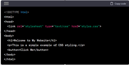
In this example, we'll define CSS rules to style the text, background, and a button:
HTML:
Types of CSS
In CSS there are mainly three types or ways to apply styles to HTML elements They are inline, internal and external . Let us understand all three one by one:
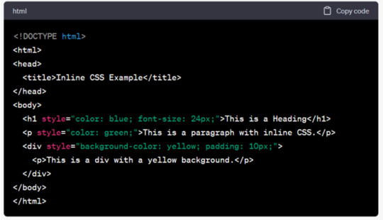
Inline CSS
Inline CSS involves applying styles directly to individual HTML elements within their HTML tags using the ‘style’ attribute. Common uses of CSS Inline include quick styling adjustments or applying unique styles to individual elements.
But this CSS type is not mainly recommended, as for styling entire web pages, especially for larger websites for following reasons it is disadvantageous:
● It can make the HTML code less maintainable and harder to update consistently.
● Adding CSS rules to every HTML element is time-consuming and makes your HTML structure messy.
● Inline styles can make your HTML code more cluttered and less readable. This can affect the maintainability of your code and make it harder to collaborate with other developers.
However it has some significant advantages like:
● Inline CSS is easy to apply on a small or on a single portion of a webpage. There is no need to modify external stylesheets or create additional CSS files, which can be a lot of time and effort consuming.
● These Inline CSS have a higher priority than styles defined in external stylesheets. This can be advantageous if you want that a particular style is always applied.
In CSS, you can apply styles inline directly to HTML elements using the "style" attribute.
Here's an example of CSS inline styling:
Internal CSS
Internal CSS, also known as embedded CSS or inline CSS. It is a method of adding multiple CSS (Cascading Style Sheets) styling rules directly within an HTML document.Internal CSS requires you to add a <style> tag in the <head> section of your HTML document.
But this CSS type is also not much recommended as:
● Styles cannot be easily reused across multiple pages,which makes it less efficient for maintaining a consistent feel and look across a website.
● For larger websites, managing styles becomes more challenging when styles are scattered throughout multiple HTML documents.
However it has some significant advantages like:
● It’s known for its simplicity, straightforward, user friendly and easy to use mainly for small scale projects.
● Also you can quickly type or prototype styles without creating separate CSS files.
Here's an example of CSS internal styling with an HTML document:
Step1- Open your HTML page and locate <head> opening tag.
Step2- Put the following code right after the <head> tag.
<style type="text/css">
Step3- Add CSS rules on a new line.
body {
background-color: blue;
}
h1 {
color: red;
padding: 60px;
}
Type the closing tag:
</style>
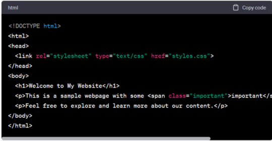
External CSS
External CSS is also a method of applying styles to HTML documents by placing the CSS code in a separate external file. This method is usually used in web development to keep the structure of web pages separate from their visual presentation. With the help of this, you can link your web pages to an external .css file which can be created by any text editor in your device (e.g., Notepad++).
Here are some major advantages of External CSS:
● It helps in separation of different concerns as it separates the content(HTML) from the presentation (CSS), making your code more organised and maintainable.
● It has a reusability feature as you can use the same CSS file for multiple HTML documents.
Although it faces some drawbacks that are:
● It requires an additional HTTP request to fetch the CSS file. This can lead to more time wastage as page loading time increases, particularly if the CSS file is larger or not properly optimised.
● To maintain multiple external CSS files, it can become a bit complex as a website grows. It may be challenging to keep track of which styles are used where, especially in larger projects.
Here's an example of CSS external styling with an HTML document:
HTML File (index.html):
Trainer from top web design institute in Delhi explains CSS is an important and an integral part of web development. As it plays a major part in creating user-friendly and visually appealing websites. It also allows web developers to control and manage the layout and design of the web content. It is a fundamental technology for web development that gives control and consistency in presenting and designing the web content. Also, among the three different types of CSS, the best practice is to adapt external CSS for most web projects. As it offers better code organisation, maintainability and reusability.
0 notes
Text
Exploring CSS Heading Styles: Typography Tips

Introduction
Welcome to an exploration of the fascinating world of CSS heading styles and typography on CSS Monster! In the realm of web development, the way text is presented plays a crucial role in user experience and visual appeal. Cascading Style Sheets (CSS) serves as a powerful tool to control the styling of text, and in this blog post, we will delve into the nuances of CSS heading styles, offering valuable insights and practical tips to enhance your website's typography.
Understanding CSS Basics
CSS, or Cascading Style Sheets, is a fundamental component of web development that allows developers to control the presentation and layout of HTML documents. To harness the full potential of CSS for effective typography, it's essential to grasp some basic concepts. Selectors: CSS selectors are patterns used to select and style HTML elements. Understanding selectors is crucial for applying styles to specific elements on a webpage. Common selectors include element selectors, class selectors (.class-name), and ID selectors (#id-name). Properties and Values: CSS works on a system of properties and values. Properties define the aspects of an element to be styled, such as color, font-size, or margin, while values specify the settings for those properties. For instance, the property 'color' might have the value 'red'. Box Model: The CSS box model is a foundational concept for layout design. It comprises the content, padding, border, and margin of an element. Understanding how these components interact helps in creating well-structured and visually appealing layouts. Cascade and Specificity: The term "cascading" in CSS refers to the order of priority when multiple style rules apply to the same element. Understanding the cascade and specificity helps ensure that styles are applied as intended and that conflicts are resolved systematically. External and Internal Stylesheets: CSS can be implemented in various ways. External stylesheets, often stored in separate .css files, allow for a consistent style across multiple pages. Internal styles, on the other hand, are defined within the HTML document using the tag. List of CSS Properties: Here is a concise list of essential CSS properties for text styling: - font-family: Defines the font of the text. - font-size: Specifies the size of the font. - font-weight: Sets the thickness of the font. - color: Determines the color of the text. - line-height: Establishes the spacing between lines of text. - text-align: Aligns the text to the left, right, center, or justified. CSS Properties and Descriptions PropertyDescriptionfont-familyDefines the font of the text.font-sizeSpecifies the size of the font.font-weightSets the thickness of the font.colorDetermines the color of the text.line-heightEstablishes the spacing between lines of text.text-alignAligns the text to the left, right, center, or justified. By grasping these CSS basics, you lay the foundation for creating visually appealing and well-structured typography on your website.
CSS Heading Styles
Headings are a crucial element of web design, providing structure and hierarchy to content. CSS offers a variety of styling options to make headings not only visually appealing but also aligned with the overall design of a website. Default Headings: HTML provides six levels of headings, from
(the most important) to (the least important). These headings come with default styles, but CSS allows for customization to suit the design requirements of your website. Font Properties: CSS enables the modification of font properties for headings. You can use the font-family property to specify the type of font, font-size to set the text size, and font-weight to control the thickness of the font. This customization helps in creating a distinctive look for your headings. Text Color and Alignment: The color property allows you to define the color of your heading text. Additionally, the text-align property lets you align the text within the heading element, providing flexibility in design and layout. Margin and Padding: CSS provides the margin and padding properties to control the space around and within headings. Adjusting these properties helps in achieving the desired spacing and layout for your headings. Underlining and Decoration: Customize the appearance of your headings by using the text-decoration property. For example, you can underline or remove the underline from headings, adding a stylistic touch to your typography. Example CSS for Headings: CSS h1 { font-family: 'Arial', sans-serif; font-size: 32px; font-weight: bold; color: #333; text-align: center; margin-bottom: 20px; text-decoration: underline; } h2 { font-family: 'Helvetica', sans-serif; font-size: 28px; font-weight: bold; color: #666; text-align: left; margin-bottom: 15px; text-decoration: none; } Table: Commonly Used CSS Properties for Headings PropertyDescriptionfont-familySets the font for the heading text.font-sizeSpecifies the size of the heading text.font-weightControls the thickness of the heading text.colorDetermines the color of the heading text.text-alignAligns the heading text within its container.text-decorationAdds or removes decoration, such as underlining, from the heading text. By utilizing these CSS heading styles, you can enhance the visual appeal and readability of your content, creating a more engaging user experience on your website.
Typography Tips with CSS
Typography plays a pivotal role in web design, influencing how users perceive and interact with content. Leveraging CSS for typography allows developers to go beyond the default styles, providing a unique and visually appealing reading experience. Here are some key tips to enhance typography using CSS: Font Choices: Carefully selecting fonts contributes significantly to the overall aesthetic. CSS offers the font-family property, allowing you to specify a preferred font or a combination of fonts. Consider pairing a readable font for body text with a more distinctive font for headings to create a harmonious balance. Font Size and Line Height: Achieving an optimal font size and line height improves readability. Use the font-size property to set the text size and line-height to control the spacing between lines. Balancing these elements ensures a comfortable reading experience for users. Letter Spacing and Word Spacing: Adjusting letter and word spacing can add a touch of elegance to your typography. CSS provides the letter-spacing and word-spacing properties, allowing you to fine-tune the spacing between characters and words for a more polished look. Text Alignment: Proper alignment enhances the visual flow of content. Utilize the text-align property to align text left, right, center, or justify it. Consistent alignment across your website contributes to a cohesive design. Text Decoration: CSS allows you to customize text decoration, such as underlining or overlining, using the text-decoration property. Carefully consider whether to apply these decorations based on your design goals and overall aesthetic. Responsive Typography: Ensure your typography remains effective on various devices and screen sizes. Use relative units like percentages or ems for font sizes to create a responsive design that adapts to different viewing environments. Variable Fonts: Embrace the versatility of variable fonts, a modern CSS feature that enables dynamic adjustments to font weight, width, and other properties. This allows for more flexible and efficient typography, enhancing the visual appeal of your text. Example CSS for Typography Tips: CSS body { font-family: 'Open Sans', sans-serif; font-size: 16px; line-height: 1.5; letter-spacing: 0.5px; word-spacing: 2px; text-align: justify; text-decoration: none; } h1 { font-family: 'Roboto', sans-serif; font-size: 36px; line-height: 1.2; letter-spacing: 1px; word-spacing: 3px; text-align: center; text-decoration: underline; } Table: CSS Properties for Typography PropertyDescriptionfont-familySets the font for the text.font-sizeSpecifies the size of the text.line-heightControls the spacing between lines of text.letter-spacingAdjusts the spacing between characters.word-spacingDefines the spacing between words.text-alignAligns the text within its container.text-decorationAdds or removes decoration, such as underlining, from the text. By incorporating these typography tips into your CSS styles, you can elevate the visual appeal and readability of your website's content.
Responsive Typography
Responsive design is a critical aspect of modern web development, ensuring that websites provide a seamless user experience across various devices and screen sizes. Typography plays a significant role in responsiveness, and utilizing CSS for responsive typography is essential for maintaining readability and visual appeal. Here are key considerations and techniques for achieving responsive typography: Relative Units: When defining font sizes in CSS, opt for relative units like percentages (%), ems, or rems instead of fixed pixel values. Relative units scale more fluidly, allowing text to adapt to different screen sizes while maintaining proportionality. Viewport Units: CSS offers viewport units, such as vw (viewport width) and vh (viewport height), which are particularly useful for responsive typography. Using these units enables text to scale based on the dimensions of the viewport, enhancing readability on both large desktop screens and smaller mobile devices. Media Queries: Implementing media queries in CSS allows you to apply specific styles based on the characteristics of the device or screen. Utilize media queries to adjust font sizes, line heights, and other typographic properties for different breakpoints, ensuring optimal readability across a range of devices. Flexible Grid Systems: Incorporate flexible grid systems into your design to create a responsive layout. CSS frameworks like Bootstrap or custom grid systems enable you to establish a grid-based structure that adapts to the screen size, providing consistent spacing and alignment for text elements. Breakpoint Considerations: Identify key breakpoints in your design where the layout transitions to accommodate different screen sizes. At each breakpoint, evaluate and adjust typography styles to ensure a harmonious reading experience. This may involve modifying font sizes, line heights, and margins to maintain balance. Fluid Typography: Implementing fluid typography involves using CSS techniques like the 'calc' function and adjusting font sizes based on a percentage of the viewport width. This approach ensures that text remains legible and visually appealing as the screen size changes. Example CSS for Responsive Typography: CSS body { font-size: 16px; line-height: 1.5; } @media only screen and (min-width: 600px) { body { font-size: 18px; } } @media only screen and (min-width: 1200px) { body { font-size: 20px; } } Table: CSS Properties for Responsive Typography PropertyDescriptionfont-sizeSpecifies the size of the text.line-heightControls the spacing between lines of text. By implementing these responsive typography techniques with CSS, you can ensure that your website's text adapts gracefully to different screen sizes, providing an optimal reading experience for users on various devices.
Optimizing for Accessibility
Accessibility is a core principle in web development, and optimizing typography for accessibility is crucial for ensuring that your content is inclusive and usable by a diverse audience. CSS plays a significant role in making typography accessible. Here are key considerations and techniques for optimizing typography for accessibility: Contrast Ratios: Pay attention to the contrast between text and its background. Use the color property in CSS to ensure an appropriate contrast ratio, making text readable for users with visual impairments. The Web Content Accessibility Guidelines (WCAG) recommend a minimum contrast ratio of 4.5:1 for normal text and 3:1 for large text. Font Size and Scalability: Provide flexibility in font size by using relative units like percentages or ems. This allows users to adjust the text size according to their preferences. Avoid setting fixed font sizes, as this can hinder users with low vision who rely on larger text for readability. Proper Heading Structure: Organize content with a logical heading structure using
to tags. Screen readers rely on heading structure to navigate and understand content hierarchy. Ensure that headings accurately represent the content they precede and maintain a hierarchical order. Descriptive Link Text: When using hyperlinks, ensure that the link text is descriptive and provides context about the target. Avoid generic terms like "click here" and use meaningful phrases that convey the link's purpose. This improves navigation for users who rely on screen readers or other assistive technologies. Text Alternatives for Images: Include descriptive alt text for images using the alt attribute. This is crucial for users who are visually impaired and rely on screen readers to understand the content. The alt text should convey the content or function of the image. Focus Styles: Ensure that interactive elements, such as links and buttons, have visible focus styles. Users who navigate with keyboards or assistive technologies rely on these focus styles to understand which element is currently active. Use the :focus pseudo-class in CSS to customize focus styles. Accessible Color Choices: Consider color choices carefully, taking into account color blindness and other visual impairments. Ensure that information is not conveyed solely through color, and provide alternative indicators, such as patterns or labels, for users with different color perception. Example CSS for Accessibility: CSS body { font-size: 16px; line-height: 1.5; color: #333; background-color: #fff; } a { color: #0066cc; } a:focus { outline: 2px solid #ff9900; } Table: CSS Properties for Accessibility PropertyDescriptionfont-sizeSpecifies the size of the text.line-heightControls the spacing between lines of text.colorDetermines the text color.background-colorSets the background color of the element.aStyles the default link text color.a:focusStyles the focus state of links. By incorporating these accessibility considerations into your CSS styles, you contribute to a more inclusive web experience for all users.
Advanced CSS Techniques
As web development evolves, so do the possibilities offered by CSS. Advanced CSS techniques go beyond the basics, providing developers with powerful tools to create intricate and visually stunning designs. Here are some advanced CSS techniques to elevate your web typography and overall design: Variable Fonts: One of the cutting-edge features in CSS is variable fonts. Unlike traditional fonts, variable fonts allow for dynamic adjustments to various attributes, such as weight, width, and slant. This provides greater flexibility and control over typography, enabling smoother transitions and a more customized appearance. Custom Text Effects: CSS enables the creation of captivating text effects through properties like text-shadow and background-clip. Experiment with gradients, shadows, and other effects to add depth and dimension to your text, creating a visually engaging experience for users. CSS Grid for Layout: While not exclusive to typography, CSS Grid is a powerful layout system that significantly impacts the overall design. Utilize CSS Grid to create complex and responsive layouts, allowing for precise placement and alignment of text elements within a grid structure. Transform and Transition: Apply transformations and transitions to text elements using properties like transform and transition. Create smooth animations, rotations, and scaling effects to enhance the user experience and bring dynamism to your typography. Blend Modes: CSS blend modes provide the ability to blend elements with their background in various ways. Experiment with blend modes to achieve unique and artistic effects for text, allowing it to seamlessly integrate with background images or colors. Text Clipping: The text-overflow and white-space properties can be used to control text clipping and overflow behavior. This is particularly useful when dealing with limited space or designing elements like tooltips where concise text display is essential. Calc Function for Responsive Sizing: The calc() function in CSS allows for dynamic calculations, enabling responsive sizing based on mathematical expressions. This is useful for creating flexible and adaptive typography that adjusts based on screen size or layout requirements. Example CSS for Advanced Techniques: CSS h1 { font-family: 'VariableFont'; Read the full article
0 notes