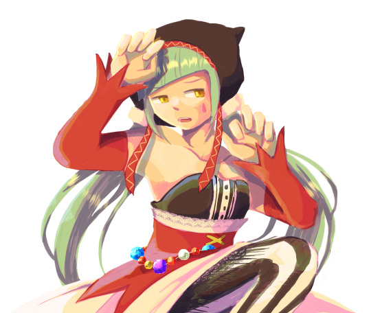
#i added more and liked the composition better so here
Note
Got any tips in shading stuff in black and white digitally?
Hi Anon!
You're in luck! I'm currently wrapping up a book which is shaded digitally, so I've been thinking a lot about this recently.
How I do this is by no means the only way, so take from these tips as much or little as you want! When I add grays and shadows to a line art drawing, I try to think about these things:
Preparing the image
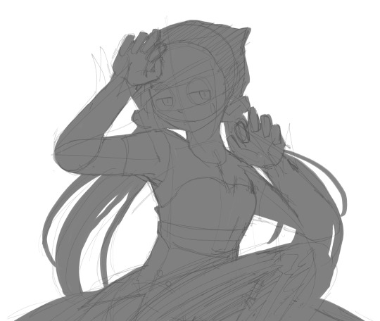
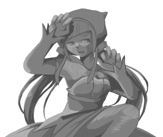
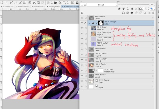
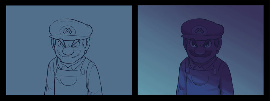
I like to work with a file that has a white background and a layer with only line art on top of it. Between these two layers I add new layers where I use the pen tool and bucket to fill areas with black, then I lower the opacity for that layer to get a value that I want.


This method works well for me, and for simpler pieces I don't need more than 3 layers with different values - light, medium and dark grays.
I work in Clip Studio. Here's a picture of the layers of a recent drawing. Each layer is actually completely black but you can see the opacity percentages by each layer. Lower percentage -> brighter value. This makes it super duper easy to change the value of a layer, no need to repaint it, just change the opacity!

Value composition
For the best result, do a couple of value sketches with a limited set of values and find something that works well for the image. Getting the values right is what will improve the image the most! Here's a quick tutorial on muddycolors. Muddy Colors is a very nice art blog to check out. Looking at grayscale storyboard drawings or value sketches are great ways to pick up on this too.
I try to group values when working with grays. Take this image for example:
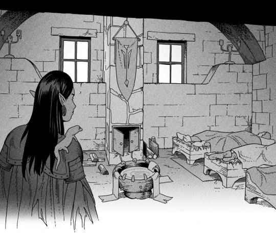
The character in the foreground has mainly dark grays, which separates her from the background, which has mostly light grays. Then the windows are white and the roof black.
Value composition is a huge and complex area and I recommend anyone wanting to learn to be more conscious about their values and to do value sketches. Analysing art you think has good values is great too.
Shadows
Not every piece needs shadows, but they can add a lot to an image! I use three kinds of shadows when I work in grayscale.
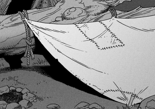
Inked shadows - these shadows are added during the inking stage and usually show areas where light would have almost no way of getting there, such as under this tent.
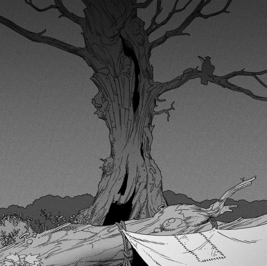
Gradient shadows - these shadows usually represent something getting further and further away from a light source or an area that would bounce light. This tree receives a tiny bit of light from a campfire on the ground and moonlight that bounces on the ground and up, fading as we get higher up in the tree. But mainly I add these gradients in ways that look cool and will help the overall composition.
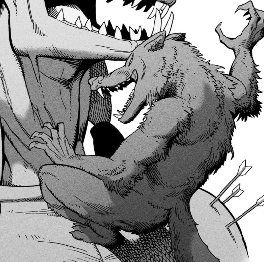
Hard shadows - these shadows appear when a strong light casts shadows and can be used on a shape or to cover something. Here's a werewolf with shadows on its back, which gives it a better sense of mass and is interesting visually!
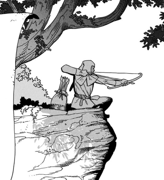
You can also cover an area in shadow like this, where the tree casts a shadow down on the archer and the cliff.
Texture
I like to add a layer of noise as a finishing touch. In Clip Studio you can create a noise layer with Filter->Render->Perlin noise... Find a balance of scale and amplitude that works for the image, then change the layer mode to "Vivid Light" and lower the opacity of the layer to around 30%. I like how this looks, it's not super visible usually but helps make the drawing feel less artificial and digital.

I hope that helps! Here are some nice links too:
Muddy Colors
Android Arts
Gurney Journey - Read his books!
Happy drawing!
218 notes
·
View notes
Text

instigator
(she/her for both)
#i added more and liked the composition better so here#isidore is so super annoying#Isidore: the immortal woman#domíno: hound of hell#shinyart#skeleton oc#skeleton original character#anthro#anthro oc
748 notes
·
View notes
Note
Here is a potentially silly question: how do you feel about birthstones? Do you think they fit the months (by season or astrological sign)? Do you have other stones you'd rather see as birthstones?
Okay, so, birthstones make absolutely no sense.
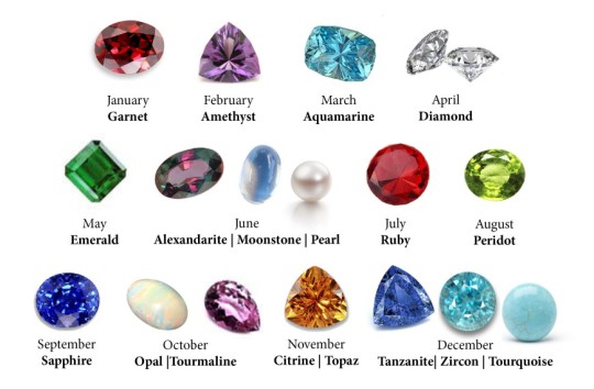
I mean, look at this mess. We’re doing beryl and corundum twice! I get that they get Special Different Names for their Special Different Colors, but it's just lazy. And why are we giving some months cheap, common gemstones like garnet and amethyst while the poor June birthdays have to shell out tens of thousands of dollars for FREAKING ALEXANDRITE? That’s incredibly unfair! We should be picking birthstones that are all roughly the same price. And why do some months get multiple gemstones? I’ll tell you why: because nobody can agree on an official list and every attempt to standardize this thing has just added MORE birthstones to every month.
So obviously the answer is to standardize it again, by throwing out everything and starting over. Here are our goals:
Fair pricing. You should be paying roughly the same amount regardless of what month you were born in. We’re getting rid of those ridiculous outliers like diamond and alexandrite.
More customization potential! Nobody should be stuck with a stone they hate. We’re picking gemstones that come in multiple colors or varieties, so that everyone can choose a variant they like.
Wearability. Some birthstones are too fragile to be worn as jewelry. We need to replace them with stronger stuff.
No more duplicate gemstones. Every month gets a stone or family of stones with a unique chemical composition.
Now without further ado, I present to you:
The New And Improved List Of Birthstones With No Problems Or Flaws That Everyone Will Definitely Agree On And We Can Start Using Right Now Immediately
JANUARY: GARNET
I've got no problem with garnet. It's a fine, classic birthstone, so January can keep it. But I would like to see a little more garnet diversity. January birthdays shouldn’t be confined to just red. The garnet family of minerals contains a rainbow of different colors, like orange hessonite, green uvarovite, pink rhodolite, yellow grandite, and many more. They’re all garnet, so we should be wearing them all!
FEBRUARY: QUARTZ
The original birthstone of February was amethyst, which is… kinda boring. Super cheap and common and you only get one color? No, we can do better. February gets ALL the quartzes now. Keep wearing amethyst if you want, but also feel free to branch out into clear quartz, citrine, rose quartz, smoky quartz, rutilated quartz, tiger eye… actually, take all the agates too. If it’s quartz, it’s yours!
MARCH: SPODUMENE
March was originally aquamarine, but I’ll be giving all the beryls to May, so we need a different stone here. Let’s stick with that theme of pale pastels and go with spodumene. For an April birthday, bedeck yourself in green hiddenite, pink kunzite, or yellow triphane. Despite its subtle colors, your birthstone has some amazing fluorescence, with really cool pinks and oranges under a UV light.
APRIL: FELDSPAR
Diamond is too pricy for this list, so we’re replacing it with something less expensive and way more interesting. April will now be represented by the feldspar family. We’re talking labradorite, moonstone, amazonite, aventurine, and sunstone. While you don’t have much variety in color, your stones are full of shimmery schiller which glitters and shifts as it catches the light.
MAY: BERYL
May’s original birthstone was emerald, which is great and can stay, but we’re also adding its siblings! May is now represented by all beryls: Emerald, Aquamarine, Morganite, Bixbite, Heliodor, Goshenite, and whatever other varieties I’m forgetting to list. A bright and saturated rainbow of colors is represented here, so everyone born in May is sure to find something they like.
JUNE: ORGANIC GEMSTONES AND FOSSILS
It’s time to address the alexandrite in the room, and obviously we’re getting rid of alexandrite. A stone worth $15,000 to $70,000 a carat does not belong on the same list as friggin amethyst. Instead we’ll look at the other traditional June birthstone, pearl. The problem with pearl is that it’s a clear outlier in this list. An organic gemstone, by some definitions not even a mineral. Should we replace it? NO. We are OWNING it. All organic gemstones now belong to June. Pearl is joined here by jet, amber, coral, ivory, ammolite, petrified wood… in fact, June can have every fossil ever.
JULY: SPINEL
July was originally represented by ruby, which is a fine stone and won’t be kicked off the birthstone list - we’re just shuffling it down to September. Replacing ruby for July is spinel. (See, it’s funny because historically spinel has often been mistakenly identified as ruby! That's a little gemology humor for you.) Available in any hue you could possibly desire, spinel offers some nice color options to a month that previously only featured red. Of course if you want to keep wearing red, red spinel mimics ruby so well that you’ll barely notice the difference.
AUGUST: PERIDOT
Nope, we’re not changing this one. Peridot is the ideal gemstone and you ungrateful August whiners can die mad about it. HOW ABOUT YOU LEARN TO APPRECIATE PERFECTION
SEPTEMBER: CORUNDUM
Sapphire is a wonderful, classic stone and it deserves its spot on this list. But the corundum family has been separated for far too long, and we’re finally going to reunite them. Joining sapphire in September is its sister ruby. Between the pinks and reds of ruby and the many, many colors of sapphire, these two stones give September a nice variety of colors.
OCTOBER: TOURMALINE
Look, as gorgeous as opal is and as much as I love it, it is both way too pricy for our list and also TERRIBLE in jewelry. This stone is just too brittle to wear around from day to day and can be ruined just by getting it wet, which makes wearing your birthstone a huge hassle. We’ll kick opal out and hang on to October’s other traditional birthstone, tourmaline. Pink tourmaline may be classic, but this stone comes in plenty of other colors. Whether it’s brown dravite, watermelon elbaite, or the rare and beautiful blue indicolite, you can wear them all!
NOVEMBER: TOPAZ
November can keep topaz, but we’re not confining it to the color yellow. This stone comes in a huge variety of colors, and now they can ALL represent November. No further notes; it’s a nice, classic stone.
DECEMBER: ZIRCON
I dunno, I’ve had to come up with 12 of these, I’m burnt out. Sure, zircon, whatever.
“BUT WAIT,” you say. “Now instead of having a single color assigned to each month, almost every month is represented by almost every color, making it impossible to tell anyone’s birthstones apart and removing what made them special and recognizable as symbols!”
Well CLEARLY you didn’t read the title of this list.
16K notes
·
View notes
Text
YEAH YEAY OKAY! here we go! welcome to i get to infodump about pens again, yay yippee!
what's the difference between ballpoints, rollerballs, and gel pens?
ballpoints, rollerballs, and gel pens all use a ball-socket mechanism that continuously coats itsself in ink as it rolls across a page. what makes them all different from each other is in the ink composition!!
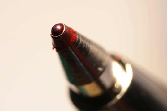
ballpoint pens have an oil based ink paste. the ink is very thick & requires more pressure to write with, and can get kinda skippy as the tip gets dirty or clogged, but is able to stick to many more surfaces like receipts, plastic, really shitty paper, etc. it can be hard to wash out of things that you get it on, since it's more waterproof than other inks.
one of the neat things about this type of ink is that you're able to shade with it by varying pressure. lots of artists make great use of this!
hybrid or low viscosity ballpoint ink is often just ballpoint ink with an added lubricant to make it write smoother and flow better.
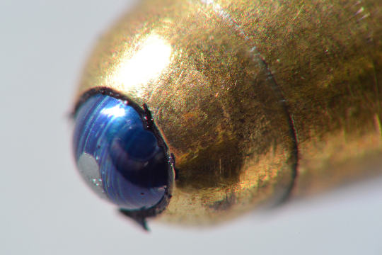
rollerball pens use water based inks. fountain pens, felt tip pens*, and dip pens all usually use water based inks. because of this, rollerballs are very free flowing and rarely clog, but paper choice is more important and some folks can find them to be leaky or overly wet. the writing experience is not as glidey as a gel/ballpoint since the ink is not thick, but it doesn't need a heavy hand. rollerballs enjoy more colour options than ballpoints and can have very dark blacks, but aren't waterproof unless the ink is pigment based instead of dye based.
*felt tip pens feel very different than any of the other pens on this list cause of the soft point, they put out ink in a very even and somewhat dry way, and can also use alcohol inks, like copic markers. alcohol inks soak very deep into the page and dry very fast, and blend very differently. i'm not as familiar with them!
gel pens use inks that are made of pigment suspended in a water based gel. these inks tend to be very thick and put out a wet line that takes a longer time to dry. gel pens are most likely to clog and skip due to this, since the ball is not as evenly coated in a substance so thick. gel pens do have the widest colour options and can be fully opaque (ie. pastels, whites, etc) but are often very frustrating as they clog up and get old and dried out.
as a bonus, true technical pens are a whole different kind of beast and have very specific standardized nib sizes and colours. cad software has largely replaced the need for extremely precise technical drawing, but artists still like pens like the rapidograph! they're made differently everywhere but generally, instead of a ball, there is a small tube of a precise diameter with a little wire inside it that controls the ink flow. they can't be held at a lot of angles and aren't as versatile as other pens, but they put down incredibly crisp lines.
yippee yay pens!! wahoo!!
4K notes
·
View notes
Text
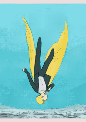
A Canary’s Final Flight
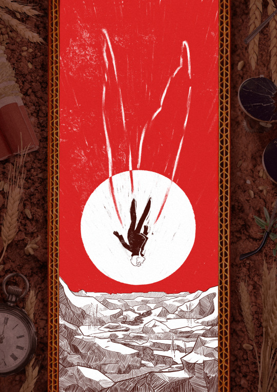
My piece for @trafficzine 4th edition! Get it for free here! 200 pages of excellent art and fics, incredible work from all participants and from the mods especially!! huge shoutout to the mods for real
Process notes under the cut! (I struggled a lot so it's a bit of a novel)
So the entire process was a Ride. I knew when I picked this prompt that I was going to have a hard time, because Jimmy’s final death had been illustrated a billion times over by extremely talented artists. But I had a Vision of the snapshot of the second before the impact, when everything is still but you know what’s about happen. It was very much inspired by the clip of Fog by Jabberwocky, bu the thing is, they have the advantage of all the build up of the fall, and that’s when the trouble started.

This was my first version, and obviously it wasn't working. And I was trying so hard, with so many iterations! Small wings, big wings, no wings, different poses, less backgrounds elements. I'd done compositions were everything seemed peaceful but something is Wrong, but it wasn't working this time.
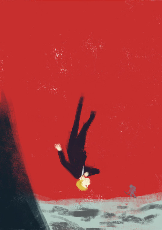
So instead I focused on what rendering I'd like to do - I tried a painterly approach, for that visceral feeling, but it wasn't working either (but hey, I did keep the red sky, so, progress)
At this point I'd been doing back and forths for weeks and I was just as lost as at the start. Now that's my tip for people who make art of any kind, in situations like that, stop thinking about how you can make the best piece possible, and think about you can have fun with it (because when you aren't it's visible). And for that was, 1 - going back to using ink and pen nibs and doing way too detailed inking, and 2- looking at Dave McKean's covers for Sandman (which, funnily enough, was also a reference for my previous trafficzine piece)
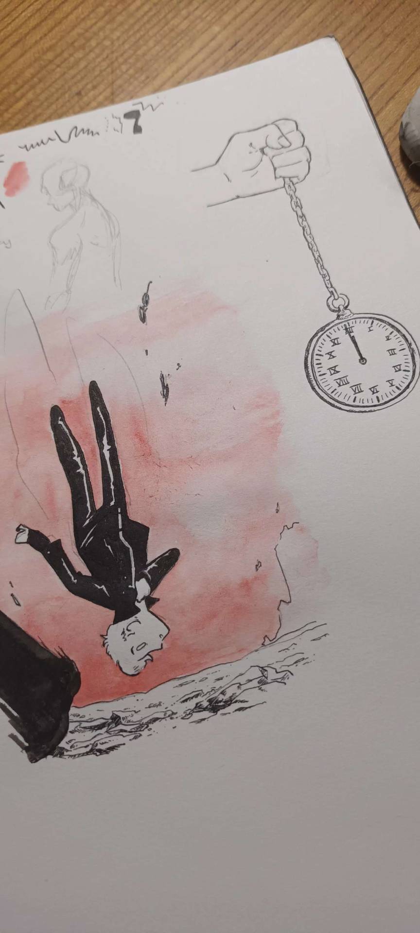
And from there I was actually going somewhere! Between the jagged rocks, the red sky, and the increased verticality with the borders, I had hit the vibes I wanted.
I did some experimentation with the border, and even though I really liked the bad boys I drew they were taking too much away from the lonely desolation, so I actually used Red (Unecessary Redstone)'s idea of all of Jimmy's worldy's possessions scattered on the ground post impact, with the idea to make it looks like the central image is his grave being dug.
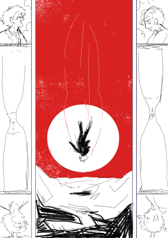
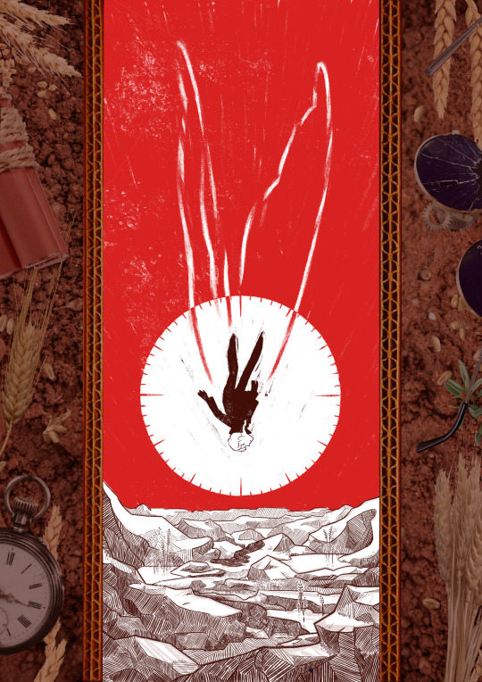
(and yes for a short amount of time the were supposed to be clock markings on the sun, but there was already enough going with the wings so I scrapped that) (also fun fact the reason why the wings aren't fully material but more ghostly is because my toddler cousin was watching me draw the very first draft and asked why he didn't just use his wings and i went :( so the wings are a metaphor now)
So from there I found a bunch of picture and took some myself, cut and assembled everything together, added shadows in all the appropriate places, and repainted some elements so that everything would look better intergrated (some of the wheats are basically 100% handpainted, the cardboard as well). This took a suprisingly long amount of time, but I was done!
Well I wasn't expecting to have that much to say, but I hope if you're still reading, it was at least interesting!
#trafficzine#limited life#limlife#limlife fanart#jimmy solidarity fanart#solidaritygaming#i forgot all the tags augh#curse of not posting often#mcyt fanart#mcyt#zine illustration#zines#my art
1K notes
·
View notes
Text
Shhh!! It's a Library (mod)
27 Sept Update: Found a better shushing sound so I replaced with that. Also added ITUNs for the non computer interactions. Thanks to @cs2te for the Brazilian Portuguese translation! Redownload (if you want these updates) at the link below.
(Note: This mod uses the Ticket Machine animations for the kiosk. If you don't have it, you can download it here. Honestly, it's not that important and without it, your Sim will just stand in front of the machine for a second, that's it)
I'm officially in my Streets era. I'm building out all the community lots in my town so you're going to be seeing a lot of community/town related stuff from me for the next few months. My Sims are trying to be outside!
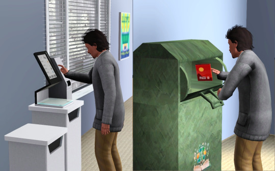
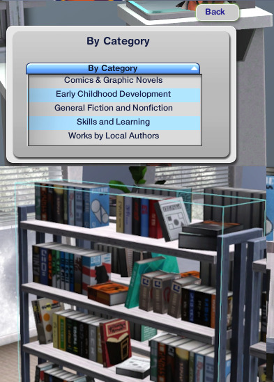
First up! This is a small library mod that allows you to search for books at the library using this gorgeous kiosk object from @aroundthesims. If the book is in the library, it tells you where they are by panning the camera to the bookshelf that has the book and putting a blue outline around it for 10 Sim minutes. Pretty simple.
Features:
Browse Catalog… pulls up all books in the library
Search by… Category | Title | Author - pulls up any book that matches your search entry
Request a Book to Order - allows you to add more books to the library.
You can only order the types of books that are allowed in community libraries so no books that are destroyed after you finish reading them (e.g. recipes, song compositions) and no academic textbooks.
You can order written books, including articles, as well as books from other worlds (e.g. Shang Simla, etc) though for the latter, there is a §35 “overseas shipping cost” added to order these books.
Once you order a book, the mod will check whether the library has enough money to purchase it and then place the order.
Ordered books are added to the library at 8am the next day and you’ll receive a notification that the books have been added.

Library Funding
In order to pay for the books ordered, library kiosks have a budget. Every kiosk, upon creation, comes with a §250 budget.
The library budget is the total amount of funds in all kiosks on the lot. Costs are deducted from individual kiosks even if that specific kiosk doesn't have enough money for the book so long as the library budget has enough money.
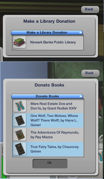
Support your Local Library
Sims can donate books (up to 3 books at a time) to the library using the book donation bin. The bin must be placed on the library lot (either outside or inside) and you need to have books in your inventory. Your Sim will get 500 Lifetime Happiness points for every book donated. (this is related to another mod that I’m working on. More on that at a later date!)
There is also a computer interaction that lets you donate money to the library. Sims that donate §2500 or more will get a 4-hour charitable moodlet. Donations are added to the library budget.
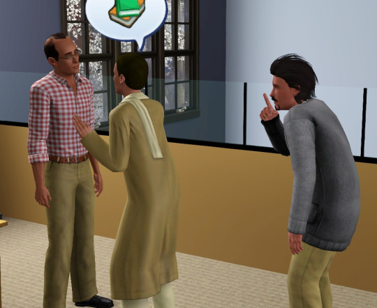
Finally, Bookworms and Proper Sims can shush other Sims at the library. Once shushed, all Sims in the same room doing social interactions or playing music instruments will stop. (You'll find, like in real life, people quickly go back to doing what they're doing so it's kind of useless but it was a low lift so I kept it in). If someone can think of a good "shushing" sound from the game, let me know!
Credits/Thanks: Both credit and huge thanks go to @aroundthesims for creating this beautiful library set and the kiosk which I used as the main object. I did recategorize it to Misc Electronics instead of Sculptures. If you already have it in your game, you may need to remove it or you can just change the script to “Sims3.Gameplay.Objects.olomaya.LibraryStuff.Kiosk”. The donation bin is from Sketchfab created by TheLatestShit (that’s their name, thank you TLS!) and can be found in Misc Storage.
Read through everything below the cut before downloading please! Important instructions below!
Important things to note:
The kiosk must be placed on a counter. If it’s not, your sim will reset because they can only interact with it if it’s on a counter. If you are having issues with resetting, place it on an EA-made counter to confirm it’s not this issue first before you reach out for support. You can use OSMP counters provided they are cloned from a counter and place the kiosk on there and put it wherever you want (like I’ve done in my photo. the kiosk is actually on an OSMP counter, not the white table).
Pulling up the entire library catalog, depending on how many books you have on the lot, can take a few (or several) seconds. Or maybe it won’t, I play on a brick laptop so it does for me
Keyword searches are case sensitive so “raymundo” yields no results, but “Raymundo” will bring up the 85 copies of that 🤬 book that your library probably has
The search will only check books that are in bookshelves, it will ignore library books that have been taken out of the bookshelf and are being read or lying around.
Book requests and financial donations can only be made at public libraries and not privately-owned libraries. So if a Sim in your town owns the lot, these options won’t come up (it should be the owners’ responsibility to buy books). You can still donate books though.
You can have multiple kiosks on the lot. If you delete a kiosk, its funds (if it has any) will be transferred to any of the other kiosks on the lot so you don’t lose the money.
There is a debug interaction on the kiosk that allows you to check the library budget.
You can order one book at a time but there’s no limit to how many you can do in a day but once the books are delivered the next morning, the mod will check whether the library has enough money and will only order the books there is money for
Download HERE | alt: HERE
@simstifulccfinds @kpccfinds @katsujiiccfinds @pis3update @wanderingsimsfinds
573 notes
·
View notes
Text
It had all started in Photography 101.
All he had needed was one more elective added to his schedule for the fall semester to be considered a full-time student. It was Robin who had suggested photography.
Steve had never had that great of a memory to begin with, the numerous blows to the head from juvenile high school fights certainly doing him no favors. Sometimes the amount of time it took to jog Steve’s memory surpassed the time it would’ve taken to simply tell him the story as if he hadn’t been there himself.
He was always able to grasp the memory eventually, but sometimes they were slippery in his mind.
He and Robin had found that his memory was ten times better if he had something to look at. Sometimes that was a souvenir from a trip, sometimes it was a takeout menu with his order circled in red pen, sometimes it was a physical scar on his skin from some silly injury. But most of the time it was pictures.
Steve took to taking photos of everything. His friends, his food, the landscape, a book with a pretty cover, anything he wanted to be able to remember.
The walls of his room grew to be covered with polaroids and prints, some staged, most not. Many blurry and out of focus, but in the moment just the same.
So when Robin suggested Photography 101, Steve saw an opportunity to take something he did for his own benefit and turn it into something he really enjoyed, something he was good at.
The semester was a breeze and Steve flourished under the attention of his professor. He was constantly drowning in compliments about the movement in his photos and his eye for composition.
(Robin would tell him on several occasions that she had never seen him enjoy something this much.)
By the time the semester was coming to a close, he was left with one final project. The professor had been intentionally very vague in her description of it throughout the semester, so Steve was a little on edge.
Sitting in the front row of the small classroom, he twirled the strap of his camera around his fingers while he daydreamed. The room slowly filled and the professor settled in behind her desk.
About five minutes after class was supposed to have begun Steve noticed they were all still sitting in silence. Glancing at the professor he saw her brows furrow and a frustrated lilt to her lips as she looked at her watch.
What are we waiting for?
She stood and dusted off her pants before clapping her hands together.
“Well,” she began, “I guess we can go ahead and get start–”
The door at the back of the room swung open and knocked against the wall with a resounding slam.
“Shit! Fuck! So sorry I’m late. Traffic was a bitch.”
Steve is so caught off guard by the man who just burst into the room that he barely even registers the words he’s saying.
He’is tall and all lanky muscle, dark curls and jewelry, tattoos and the smell of smoke, chains and leather and everything Steve’s not. Everything nobody in this class is.
He’s even more caught off guard when his professor laughs and pulls the man into a tight hug. There are only five other students in this class, surely he’s not the only person confused.
He keeps an arm around her shoulders as she introduces him to the group.
“Guys, this is Eddie. He’s a family friend and he’s going to be your subject for your final project.”
Steve’s own eyebrows furrow as he tries to understand how this was the project she has been keeping under wraps. They’ve had plenty of portrait sessions this semester, with models and subjects of their choice alike.
The guy, Eddie, claps a hand to his chest in a dramatic show of faux humility.
“Thank you for having me, Joyce. It's such an honor to be here.”
She smacks at his arm and carries on.
“So, Eddie is your subject and you have no parameters. The only requirement is that he is the inspiration for your shoot. This can look like a standard portrait session, this can be contemporary urban street photography, whatever you like. Eddie does not even have to be in the photo! He just has to be the inspiration for it.”
Steve's brain is already running a mile a minute, conceptualizing shots faster than he can keep up.
Dingy bars, backseats of cars, details of his eclectic style.
But one idea sticks out from the rest. As Steve lifts his eyes to Eddie once more and meets his own twinkling with mirth and smirking back at him he makes his decision.
He’s going to take his mugshot.
*****
“I want to take your mugshot.”
They’re at the campus coffee shop. Joyce had scheduled a few hours for Eddie to meet with the other students during their class time so they could talk through their projects.
Eddie barks out a laugh. “What, man?”
Steve twirls his straw around his drink and tries not to bristle at the reaction.
“Look,” he starts, running a nervous hand through his hair, “I don’t really know where the idea originated but once I had it, it stuck. I just saw this vision of the shot in my head and it was sick, dude.”
Eddie leans back in the booth, one of his boots knocking into Steve’s foot under the table. He crosses his arms and tilts his head.
“Thought this shoot was supposed to be inspired by moi,” he says, gesturing a hand towards himself. “You saying I look like I should be in jail?”
Steve groans and puts his head in his hands. “No. I already told you I don't know where i got the idea–”
But that’s a lie isn’t it. He knows exactly where he got the idea. It was somewhere between the chains dangling from Eddie’s jeans and the handcuff belt he was wearing the day they met.
He put his hands together on the table between them. “Okay. No, I’m not saying you look like a criminal, Eddie. I’m saying I think you want to look like one.”
Eddie blinks at him for a moment before his face breaks into a slow smirk. He huffs a quiet laugh and leans closer. “Guilty as charged, Stevie. Besides, I was arrested once actually.”
Steve gawks while Eddie laughs. He is unfairly attractive when his dimples pop and Steve is going to have such a hard time holding it together behind the camera.
*****
Steve takes his shoots very seriously. Every detail has to be perfect, even the ones not relating to the subject of the photo.
So it is wildly convenient that his professor happens to be married to the chief of police back in Hawkins.
One quick phone call from Joyce and Steve and Eddie were granted access to the booking room at the police station. You know, for the sake of realism.
Steve’s setting up his tripod while Eddie takes a chalk marker to the placard and writes up his own booking ID, a long series of random numbers with E.M at the end.
Steve would be lying if he said Eddie’s choice of clothing wasn’t exactly what he’d had in mind.
He’s wearing a ratty, old band t-shirt for some group Steve’s never heard of. There’s his usual black leather jacket and the silver chain around his neck. His ripped black jeans and fingers covered in rings and black nail polish.
It's perfect for the shoot. But Steve’s sanity is struggling.
He gets the camera and the lighting set up just as Eddie steps into place in front of the height measurement wall.
Steve puts his hands on his hips and gives instructions.
“Okay, so I know you’ve done this before–”
“Hey! It was one time!”
“So you know how this goes. We’ll do one forward and then one to each side.”
Eddie shakes out his hair and rolls his shoulders back. He holds the placard up in front of him and levels the camera with a dead-eyed stare.
He looks good.
Steve is less than shocked that he looks even better on camera.
He lines up his shot. Click.
Eddie turns to his left. Steve gets a little distracted by the line of his jaw.
Click.
He turns to the right and of course only now does Steve notice his ear piercings.
Steve takes a deep breath and focuses.
Click.
Before he can even look through his shots Eddie is dropping the placard on the desk.
He’s halfway out the door before he grabs the frame and leans back in. “One second pretty boy, I have an idea.”
He’s back before Steve snaps out of his stupor at the nickname. This time, he has a pair of handcuffs swinging from his index finger.
Steve snatches them out of his hand. “Where did you get these?”
Eddie crosses his arms over his chest and shrugs. “I know a guy.”
He rolls his eyes.
He’s already picking up the placard and setting up some detail shots when Eddie grabs his wrist and stops him. He freezes for more than one reason.
“Hey, uh. Not to step on your toes or anything, but I actually have another idea.”
Steve is about to start on his spiel about ‘not messing up his flow’ when Eddie rubs his thumb over the inside of his wrist. Gentle and reassuring.
“Do you trust me?”
Honestly Steve has no reason to trust him, he’s basically a stranger.
A pretty one. His brain supplies.
But he does. Trusts him enough to let him take Steve’s creative liberties and throw them out the window apparently.
“Yeah. Yeah, okay.”
Eddie’s smile is blinding. He turns Steve’s hand over and drops the handcuff key into it.
“Don’t lose this big boy,” he says as he snaps the cuffs around each of his own wrists.
Steve laughs, loud and shocked. He waggles his eyebrows at Eddie.
“Well, now didn’t this take a turn.”
Eddie rolls his eyes this time and lifts his hands as much as he can.
“Don’t try to sexualize my creative prowess, Steve. I am a professional.”
He nearly trips on his way back to his place in front of the wall and Steve has to hide his laugh into a cough.
Steve’s back behind the camera, hands back on his hips when he asks, “Alright, what’s the plan?”
Eddie smiles and says, “You just shoot, Harrington. I’ll do the rest.”
He leans down to finalize his camera settings and line up his shot. When he finally looks through the viewfinder his jaw drops. Because while Eddie was clearly joking about being a professional, if Steve didn’t know any better, this shot would have him believing it.
Eddie’s got both of his pinky fingers tucked in the corners of his smile, tongue bitten between his teeth. His thumbs are raised along with his middle fingers, while he’s got his nose scrunched and one eye squeezed shut. The cuffs hang right under his chin and accentuate his silver jewelry in a way Steve never would have anticipated.
Click.
Click.
Click.
The next is a close-up of the booking placard between his teeth.
His hands twisting to unlock his own cuffs.
He’s a natural, and Steve’s camera roll can attest to the fact.
It wouldn’t be until Steve was reviewing and editing the shots that he caught on. The booking ID on the placard looked long because it was. It was Eddie’s number.
*****
Steve got an A.
He got an A, an endless stream of compliments from Joyce and a dorky hot boyfriend.
The rest of the class went the route Steve expected them to.
Dingy bars, backseats of cars, details of his eclectic style.
But Steve’s mugshot series stood leagues above the rest.
Later in their lives, when one of their friends would see the photo in Steve’s wallet they would ask when Eddie got arrested and why.
It quickly became a game between the two.
He’s been arrested in high school for selling drugs (True.)
When he was twenty for public indecency.
At twenty-two for arson.
Thirty for contract killing. This one was followed up with the claim that he was in witsec and was now going to have to change his identity and flee the country.
But the real when and why Eddie got arrested is because when he was twenty-one Joyce told him there was a nice boy in her class that she thought he should meet.
#photographer x mugshot au#steddie#steddie fic#steddie fanfic#one thing about me: my Eddie is going to be a jackass in every universe#also not to toot my own horn#BUT#Joyce being the professor? when her son??? is a photographer?? who probably learned it from her????#toot toot bitch#its canon I don't make the rules#can you guys tell I am a photographer be honest#steve harrington#eddie munson#steve x eddie#gin writes#fin gin#shot of gin#steddie nation#come get y'all juice
2K notes
·
View notes
Photo

IT’S POWER, EVERYONE!!!
Check out my etsy shop
If you want to see how I made this piece, check out the extended stuff below!
Okay, the story behind this piece is nuts, but. I’ve known I’ve needed to work on improving my art for a while, so as you can tell from all the newest pieces, I’ve been trying to push myself. It started like this:

This was actually the fourth sketch I made. I knew I wanted Power to be looking down at us (you know, what she does with everyone), and I wanted to have her swinging a blood scythe in one way or another. I set up composition lines, but the more I looked at the sketch, the more frustrated I got. I finally just had to accept my anatomy and my 3d understanding of the body is very much lacking, and If I wanted to improve I had to work on something.
I watched a bunch of tutorial videos, and decided to try out the 3D model in Clip Studio paint. It didn’t take too long to learn how to manipulate the model, and I came up with this:
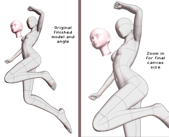
From here, I decided to do my quick sketch with Power

While I was experimenting with Clip studio’s art stuff, I decided to try playing around with their new “Shade Assist”. I figured it could give me some more ideas to make my shadows feel more ‘real’ or have me look at my art in a different way. Once I finished the lineart, got the color in there, and drew in Meowy, this is what I tried.
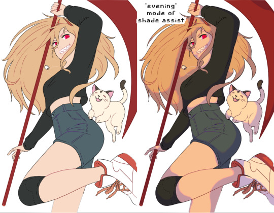
I really loved how the ‘evening’ mode of shade assist looked, even after playing around with my own colors, but I liked how it gave her a slightly more ‘yellow’ tone, and how the shadows were actually just lavender and light pink. So I took those colors, and worked on the shadows.

From there, I made the background layer. I used one of the Clip Studio gradient pre-sets, the ‘evening’ one, and painted a texture on top of it to have it match more with the textured painting style I went with. I added blood splatters, and ‘rectangles’ in the background, just to have more things visually going on.
On top of all of that, I added another layer on top of Power herself, with a very slight tone color of the gradient behind her, to make her and the background feel like they’re supposed to be together. And that’s it!!
I’m really happy with this so I wanted to explain my process. Looking around at tutorials on youtube, talking to artist friends who- tbh, are WAY more knowledgeable then me, helped a ton. And using the 3d model helped visualize the body, and different angles, WAY better then anything else I could find.
So uhhh thank you, and enjoy!
644 notes
·
View notes
Text


here’s some in progress pics for the thumbnail art i made for @parachutingkitten ‘s video essay! and a explanation of the design process :)
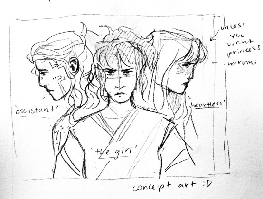
i sent her the first one to give an idea of a composition and designs. she liked the layout but wanted different expressions for harumi and pixal which i thought was a good idea as well
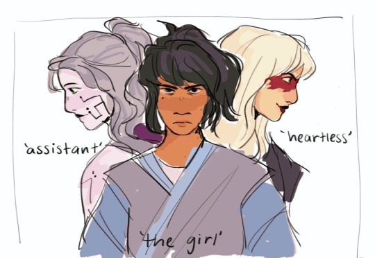
so second concept art was sent with a loose sketch to get a better idea of what it would look like and to update the expressions! she told me that looked good and i sent over loose colored design for approval.
she liked the skin tones and colors overall, but wanted pixal to have glowing green eyes, change nya to her season 10 suit, and wanted me to incorporate more red if possible. (which i added to pixal and nya). i also asked if i could make harumi’s hair more white and she gave me the go ahead!
after those notes i cleaned up the lineart, finalized colors, made the changes she requested, and sent over the final design!! which is what was used for the video :)
was a lovely process and she was great to work with :) i had a ton of fun working on this and thought you guys might want to see the stages it went through!
#ninjago#lego ninjago#ciftrchats#ninjago fanart#nya ninjago#ninjago nya#harumi ninjago#ninjago harumi#pixal ninjago#ninjago pixal#pixal borg#nya smith#nya jiang#harumi jade#princess harumi
308 notes
·
View notes
Note
hi! not exactly a request but i do wanna ask, whats your process when you're rendering more paint like art? (if that makes sense, English isnt my first language so apologies hdskhsjdbd) i really love how you use the colors and im curious how you do it :0
i’ve been meaning to answer this one for a while so here’s how i painted miku in today’s post (put under the read more because yeah prepare for a long post
i’d also like to preface this by saying that i never follow a set way of doing things, so in terms of what my personal process is like, these are only broad strokes of what i do! sometimes i’ll combine or skip parts entirely, depending on how i feel. also, this is not a tutorial, just how i do things, so please don’t treat it like one :’D this will read like the ‘how to draw an owl’ picture if you do
first, like every artist, i sketch. more specifically, i’m getting an idea of what i want to paint later on. this could be how a scene is set up or in this case, how a character is posed. here i’m not concerned about details or getting everything perfectly, i’m only planning how the thing will be composed. maybe a lot of canvas size changing, or adjusting what miku’s doing (note how busted miku’s right hand looks from all the transforming!) however, i still have to be concerned with how clear the sketch will be to future me, because the sketch won’t be any good if i can’t read what miku’s doing

after that, i lay down a flat gray under the sketch, mainly focusing on giving miku a clear silhouette. this is also a good time to make adjustments to the composition on the fly if i suddenly feel like something can be improved upon, like shortening miku’s left arm from the sketch!
after painting a flat silhouette, i start shading in grayscale, focusing only on lighting. i usually do it in two passes, one for the lightest and darkest tones i’ll use (not black and white) and then a second for midtones to blend them better with the base gray but i forgot to screenshot the result of the first pass 🗿 nevertheless, here is where i can start adding some amount of details. i’m not including any extra accessories yet, just focusing on the base design of the outfit and the character herself (for anyone wanting to draw characters from That Gacha Game, this is how i personally make the process more bearable for myself.) i still use the dark gray to separate where certain details (like the facial features and fingers) begin and end, mainly to make colouring more bearable later.
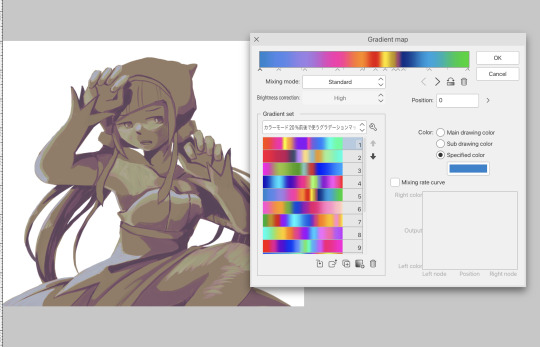
now here’s where i get the Good Colours. it’s a cheat lol. i put a gradient map layer over the grayscale painting so that there’s a little bit of color to start. some gradient maps can be applied as is, some need the layer settings adjusted to make it look good. this one, for example, is a (free) gradient map set from the csp assets store that needs you to set the layer opacity to 20% and to set the blending mode to color to achieve this result. in general, i tend to pick which gradient map i want to use based on vibes, or basically whether i want the work to be warmer or cooler, colour-wise. but this does do quite a bit of lifting for the colors in my stuff.
and then, finally, i add the colours. i add flat base colours in an overlay layer. at this stage, i’ve made the character silhouette clear enough that i don’t need to refer to the sketch anymore for what miku looks like. also, the gradient map layer does its magic by making the shading a bit more vibrant than it would’ve been without it. after that i paint over with a new layer to add details like the lace.
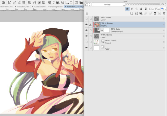
and then i put some extra shading on top. basically this is where the ‘better lighting’ happens. again, this isn’t a tutorial, so i’m not here to say what each part of the lighting is, but i’ve labeled which layers do which job. in other works where the lighting within a scene is more defined (from a window, from a small crack in the walls, etc) the glow dodge layer may be more opaque and sharper, but since this isn’t a work with that, the lighting was applied using an airbrush. the linear burn layer is also there to make the whole thing darker so the glow dodge doesn’t end up oversaturating miku. i also usually match the lights to the vibe i want, and use a complementary color for the shadows. so here you can see i have warm colors on the glow dodge layer, but light purple on both the linear burn and multiply layer.
and that’s it for the character—here’s a gif showing how each layer adds to miku! (sorry it’s so toasty)

as for the background, depending on the complexity, it may go through a similar process, or if i can settle with flat image backgrounds, i just go for that. it’s ok to use external image materials. i didn’t have a background in mind for this miku in specific, so i got some default csp materials and threw together something
and that’s about a rough overview of what my process for more finished works looks like! again, art is a fluid process so i never specifically stick to certain steps all the time, and you shouldn’t either. i can probably answer why i’d pick this colour over another in one particular work, but it’s something that kinda has to be learned on a grander scale. i think everyone can already feel what colors work with what atmosphere or what setting, even if they can’t immediately explain why. colors and composition do take some level of experimentation to find what works best!
127 notes
·
View notes
Note
i rlly like ur composition, i wanna know about your process :D
thank uuu !! yeah so like. composing a scene for me generally begins with a vague idea that i want to get down as quickly as possible- and for me that usually starts with finding a setting. I knew that i wanted to draw a) a group of roomates gossiping in a crowded kitchen and i wanted there to be b) one figure in the extreme foreground and c) lots of plants. i do use some tools to figure out perspective, mainly the csp perspective ruler. Usually i start by finding a picture i like similar to the vibe im going for- but instead of referencing anything else- im purely interested in perspective. sorry to anyone who is shocked i dont generate all of my perspective purely by myself- i can draw in perspective fairly well but i struggle to make straight lines and this is easier to make grids with than the line tool lol ^_^ i try to use it kinda more like spellcheck on typos than like something to fully rely on. this is the video i learned this trick from:
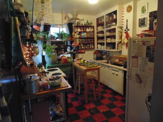
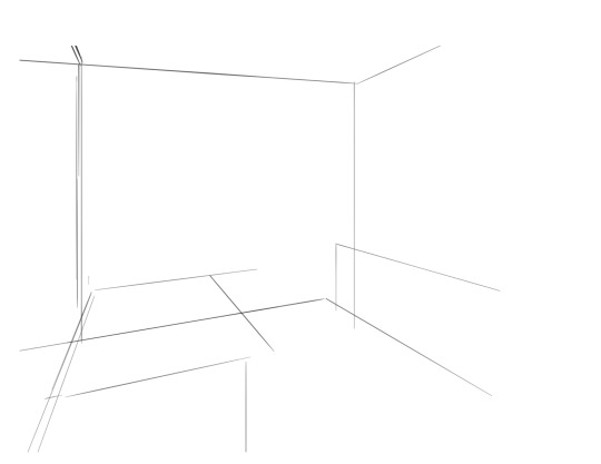
i saw the left photo and realllly loved how the cabinets alligned with the wall- so i used my ruler tool to draw out my inital plotted points from the image- basically the linear movements i was most interested in and then i turned off the image layer and worked with those lines and the ruler tool to move on. eventually i had this:

which was enough for me to put my characters in for the inital round. if you notice- i made a looot of further adjustments as i go on. this sketch is not a final layout, its so my characters have somewhere to be! i cannot draw someone standing on a floor if theres no floor, nor leaning on a table that doesnt exist. i can’t draw my characters without a background, but i also cant finish my background without accounting for how my characters can comfortably exist in it!!

this was the like.. very basic start. i knew the positions of two characters- but i needed to change a lot not only to fit them better but to allow for the other two figures i had planned.
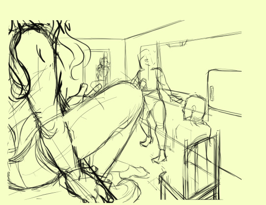
okay.. a little better. i widened the kitchen, closed the fridge door.. added a chair and fit in all the figures.. but this is waaay too dramatic. only two figures are actually interacting- and they are at wildly different energy levels!

this is where things started to make a little more sense characterwiss, so i was ready to refine backgrounds and figures and unite the two.
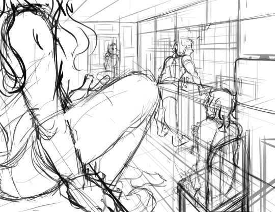
inital base sketch. much better layout.
okay- this is where im getting my footing but things seem.. really really off. You can see me working on my framing here- theres some good linear movement from left to right here- but not vertically. It’s hard to notice the figure in the far back, so i need to redirect the viewers eye to move upwards as well!
this is where i decided to zoom out, add an interesting vertical element to the left of the image and make it clearer whats happening in the foreground. i had to account for some stuff by adjusting the cropping, but i paid attention to that as well.
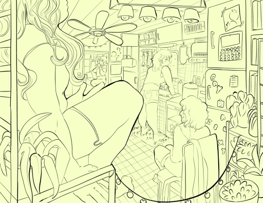
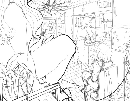
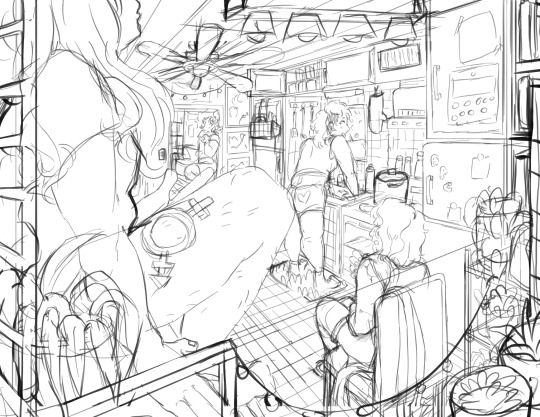
annnd- thats what a clean sketch looks for me! i have all the elements of my scene accounted for, and things are clean enough to read.
the next step for me would be transfer! essentially- I print the image of my sketch out, resizing and taping pages together so my sketch matches the size of the paper i want to paint on, and then i use a lightboard to transfer my sketch with pencil onto my paper. Then i refine the sketch a few times on paper before stretching my watercolor paper (essentially just prepping for painting) and inking with a brush and colored ink before going in with watercolor, gouache and ink, then usually finishing with marker, colored pencil, pastel and ink. it’s a lengthy process but a lot of fun lol. but sketches for me can be like.. 15 layers of different roughs until im happy with just the sketch. there were more images but im on mobile and theres a 10 image limit 😭😭 im a bit masochistic but i believe that if i dont have a good sketch i dont have a good painting!!
101 notes
·
View notes
Text
🎆 Sing for Absolution: behind the scenes 🎆

Hello everyone, and welcome to this summary on how the story was visually built! If you happen to come across this post and would like to read (or reread) the collab @drones-of-innocence and I have created together, just click on the title above and it will take you right to it! 🤗
With that said, let's begin! :D
As some of you already know, this was an idea that Drones had for a long time. It was brought up during one of our many conversations a few months ago, in which she briefly described the plot and sent me a condensed version. I- immediately and completely fell in love with the concept, so much so that I couldn't keep still. 😂💘 I practically begged Drones to let me draw a few frames for it, and she happily gave me permission. At first, what I intended to do was make about 3 or 4 thumbnails, like I had done with One Step Closer.
I returned with 22.

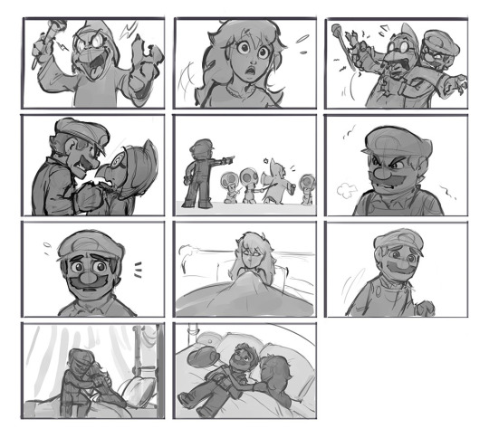
And from there, we both decided "Okay. Yeah. Let's make this official. 🙌💯" LOL
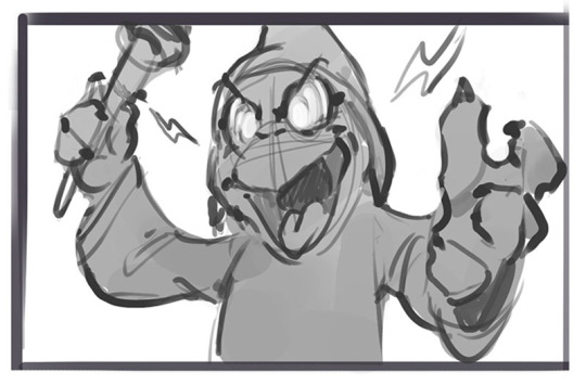
What's interesting here is that, as you can see, some frames didn't make it to the final cut! 🤓 And inversely, new frames were eventually added as the collab progressed. Out of all the sketches that were either abandoned or later deemed superfluous, my personal favorite would probably have to be this shot of Kamek. 😈
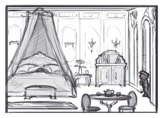
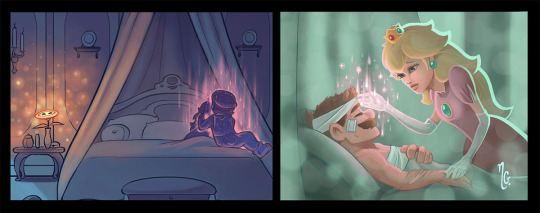
From the rough thumbnails I had presented, Drones helped me select the best and most eloquent ones, and I also changed a few other things along the way. For example, one panel that was entirely redone was frame 3 (where Mario enters Peach's room), because the initial composition didn't allow for the reader to see the setting very clearly, and I felt that the establishing shot needed to be wider.
Many of the drawings were also ultimately flipped to give the visuals a more coherent direction and better flow, including this one!
I decided pretty early on that the palette should be made of cold hues, seeing as these events happen to take place at night and that a warm overlay wouldn't adequately have conveyed the more ominous and solemn tone of the story in my opinion. 🤔💁♀️
Oh! And I almost forgot: using cold colors for the backgrounds and characters was also very convenient because it helped make the magical effects (the fire, the spells, etc- all the bright, warm and/or complementary nuances) really stand out, which resulted in a more interesting and visually striking contrast overall. 😌🎨
As I do with all my illustrations, I started by cleaning the sketches and adding a unifying background filler for all the frames. Then, I selected the colors I wanted to use (a gradient made of a mix of navy blue and purple) and worked on each drawing individually. Even with simple tones, we can observe the sheer difference that shading makes! 👀😉
There's a visual element that appears in the story and which I had borrowed from Drones before, and that would be Peach's healing magic.^^ ✨ I remember I was fascinated by the idea when I first discovered it in Un Fiore Per Te, which had prompted me to ask her if I could feature it in a piece where the Princess is seen using said power while at Mario's bedside in one of my other tangents. 💞
I kept the effect similar on purpose in Sing for Absolution, so that the slight reference would be easier to catch! 😊
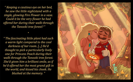
And last but not least, there's that cheeky little Fire Flower! 🤭🔥
As mentioned in a previous ask, the flower actually signifies a lot in this case as it somewhat embodies the deeply affectionate bond between Mario and Peach, glowing brighter and closing its eyes in happiness when the two are close. 💖
While admittedly not the first drawing I made in which a Fire Flower appears, the one that actually inspired both Drones and I to include this symbolic power-up in the story was one that I made all the way back in February for Valentine's Day. 🥰 The subtle yet direct reference can be spotted twice in the text, linking this piece to the collab and establishing a bit of a chronology as well. I was very honored that Drones added this small detail, and I very much look forward to working on more ideas with her in the future! 😁🤝
Big thanks once again to all of you dear friends and followers who have commented and given their thoughts on this projects. Drones and I can't thank you guys enough for your interest and enthusiasm!! 😇💗
ALSO ALSO- I have shared here my visual side of the collab's progression, but Drones intends to give her own side of the story's development soon (explaining some of the themes and narrative elements a little more in depth), so make sure to stay tuned and check her blog as well! ^-^ 💫
#Mario#Princess Peach#Mario x Peach#Mareach#concept#story#collab#Sing for Absolution#fanart#fanfic#elitadream#drones-of-innocence#creators on Tumblr
256 notes
·
View notes
Text
DOODLES
genre. fluff.
warnings. kissing.
pairing. so mun x fem!reader.
wc. 900.
“No peeking!” So Mun scolds, holding his sketchbook even tighter to his chest to make sure there was no way you would be able to glance at his sketch. You huff in defeat and go back to your own drawing which is looking more and more lopsided as you keep trying to capture Mun’s perfectly sharp jawline and fail.
“I’m butchering your handsome face, just so you know.” You mumble, grabbing your eraser for the hundredth time. At this point the drawing looked more smudged than legible and you were close to giving up.
“Good thing you have the real deal right here, then.” Mun replies smoothly, and you glare at him from over your sketchbook making him giggle.
You wonder how he hasn’t even touched his eraser once as you watch him still making little details on his drawing with ease. You know he’s been drawing his whole life and his drawing skills are on par with his fighting skills, but you know he hasn’t had much time to draw apart from composition sketches. You were glad you suggested doing this doodling session with him. It was cosy and relaxing and definitely what you both needed to get your mind off the stress of everything.
You’ve never had anyone draw you before, but you’re glad the first one to do it is your boyfriend. He’s only been drawing for 10 minutes, but you’re starting to get a little impatient to see the results, and so you attempt at sneaking a peek again.
“I said no peeking.” He stops you without even looking, catching your hand in midair before it can reach his sketchbook.
“When will you be done with it?” You ask, and So Mun hums in response. “Baby.” You whine.
“I’m almost done.” He looks up to smile at you before resuming his pencilling. “Are you done yours?”
“I guess… It’s not getting any better so I decided to just leave it.”
“Can I see?” Mun peers over to take a glance and you hand him the open sketchbook. “Aww, you added a heart.” He smiles widely and you swear you can practically see his eyes sparkle.
“It’s so bad, though.” You mutter, cringing at the way you had messed up his proportions.
“I think it’s cute.” Mun smiles again.
“I get to see yours now, right?”
He nods and hands you the sketchbook finally, and your eyes land on the drawing. Your breath is quite literally taken away and you spend the first few minutes just staring at it, taking in every detail, every stroke of pencil. And a warm sense of comfort comes with how you just know that every mark of that pencil was created with so much love behind it. You can feel it.
“So…?” So Mun asks expectantly, blinking at you.
You open your mouth to give him a response, but then pause as the wind slightly blows the page of the sketchbook, giving you a peek of more drawings on the previous page. Curiosity takes over and you flip it, revealing an entire spread of you.
There’s a small drawing of you sipping a bubble tea, and you recognize the exact day it’s from given your outfit. You had stolen So Mun’s leather jacket on your lunch date that day, and he had even drawn in the little hair clip that you had worn.
Looking a little lower on the page were countless more drawings. One of you blowing a kiss, you with a kitten, several of you just smiling, and even one of you sleeping which you immediately suspected he had drawn while you actually had fallen asleep.
“Were you ever going to show me these?” You ask, blinking back tears because they’re all so beautiful and you adore each and every one of them.
Mun panics, “I- I wasn’t not going to show these to you?” His response sounds like he’s questioning the fact himself and you tsk quietly, flipping over to the next page only to find even more drawings.
“How many times have you drawn me without my knowledge?” You question, utterly bewildered at just how many drawings there are. With every page you flip, there are more, and soon you discover that the entire sketchbook is filled with just you.
“If you weren’t my boyfriend this would be so creepy, you know?”
“Do you think it’s creepy?” Mun asks.
“No, it’s probably the cutest shit anyone has ever done for me.” You say in a complaining tone which makes So Mun laugh. You tackle him in a hug, kissing his cheek as many times as you can before he pulls you off of him in a fit of giggles.
“I’m glad you like them because to be honest it’s become a stress reliever to draw you.” Mun admits, melting your heart easily.
“You’d better show me next time, or I’m going to go snooping through your stuff just to find your sketchbook.” You threaten and So Mun nods with a smile before reaching over to kiss you.
He always kissed you softly, like you would break if he put too much pressure into it. Now was no different as his plush lips moved against yours, lifting up into a smile when you pull away. And his smile is so infectious and filled with so much love that you can’t help but to smile back.
↳ k-drama taglist: @yeonjuns-redhair,, @wolfmoonmusic,, @cha3w0n-hearts (abp & tuc only),, @tempobaekh (tuc only)
#﹒fics 𓈃 ⵌ#the uncanny counter#so mun#uncanny counter#the uncanny counter fic#the uncanny counter fluff#uncanny counter fic#uncanny counter fluff#so mun fic#so mun fluff#so mun x reader#kdrama fic#kdrama fluff#jo byeong gyu#jo byeong gyu fic#jo byeong gyu fluff
390 notes
·
View notes
Text
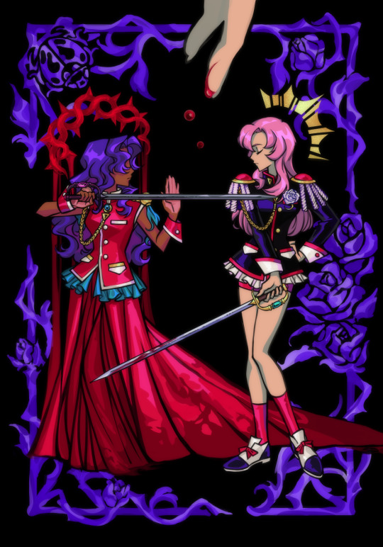
🗒️ 24.04.2024 ⋅⋅⋅ 🥀
some notes for 20.09.2023 post and a separate cut out for utena because i spent a very long time rendering her ...
the original concept i had in my head for this art was very different. it was just supposed to be a style study of this an official anime prop design art, and i'd thought to draw anthy in a similar pose across from her like in the shown version, but with her wearing her prince outfit from the manga. something something another form of female competition under the patriarchyyy stop pitting 2 girlprinces against each other omg etc
(side note, how sick would it have been in an AU where akio made anthy fight against utena in the ring? like i dont think it would hav added more to the story or made it better really ... probably would've diluted the message to be honest ... but everytime i see that manga art of prince anthy i imagine some convoluted black rose arc AU where utenas dodging anthy getting her hair hacked off left and right like himemiyaaa nooo snap out of it this isnt uuu while anthys silent and dead eyed hahaha)
but then after i drew prince anthy, the picture looked rather empty ... so i thought to add a few decals or borders in the style of the show & official arts but aaahh ... there was still too much negative space. i had to scrap anthy's prince outfit and put her back in her rose bride dress 😭 man !!! he cant keep getting away this !!! [blames akio the figurehead of patriarchy instead of taking responsibility of my own actions] which made me sad because i was pretty satisfied with the way i drew her pose and legs ! but i had to cover it up 🥲 ...
the composition overall looked better though. and then after that it kept spiraling. i just kept adding more and more things until i lost control of this drawing and it plagued my WIP folder for months ... i dont want to try and connect all of it in words so ill just lay out all the pieces for you so you can connect them yourself. and you can experience my art thought process in fraction of erraticity and frustration as i experience it myself. this is a lot neater than what happened in my head though because i bothered to put it in order. honestly if i can make you feel a little bit insane trying to scroll through and read all this than i can make you understand how annoying my brain is when all i wanted to draw was utenanthy girlprinces fighting
starting references & inspiration: utena prop reference sheet & manga prince!anthy
the tower & the lovers tarot
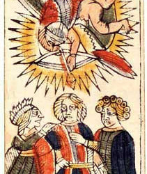
above: the lovers as depicted in the tarot of marseilles deck, tarocco bolognese deck, & tarocco piemontese deck
the lovers (tarot card) wikipedia:
The Lovers is associated with the star sign Gemini, and indeed is also known as The Twins in some decks. Other associations are with Air, Mercury, and the Hebrew letter ז (Zayin).
In the Rider Waite deck, the imagery for this card is changed significantly from the traditional depiction.
Instead of a couple receiving a blessing from a noble or cleric, the Rider–Waite deck depicts Adam and Eve in the Garden of Eden.
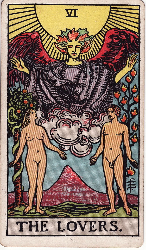
a.e. waite, the pictorial key to the tarot, part III, section 3, no.6:
UPRIGHT: Attraction, love, beauty, trials overcome
REVERSED: Failure, foolish designs. Another account speaks of marriage frustrated and contrarieties of all kinds
a.e. waite, the pictorial key to tarot, part II, VI. the lovers:
In the foreground are two human figures, male and female, unveiled before each other, as if Adam and Eve when they first occupied the paradise of the earthly body. Behind the man is the Tree of Life, bearing twelve fruits, and the Tree of the Knowledge of Good and Evil is behind the woman; the serpent is twining round it. The figures suggest youth, virginity, innocence and love before it is contaminated by gross material desire. This is in all simplicity the card of human love, here exhibited as part of the way, the truth and the life. It replaces, by recourse to first principles, the old card of marriage, which I have described previously, and the later follies which depicted man between vice and virtue. In a very high sense, the card is a mystery of the Covenant and Sabbath.
The suggestion in respect of the woman is that she signifies that attraction towards the sensitive life which carries within it the idea of the Fall of Man, but she is rather the working of a Secret Law of Providence than a willing and conscious temptress. It is through her imputed lapse that man shall arise ultimately, and only by her can he complete himself. The card is therefore in its way another intimation concerning the great mystery of womanhood.
going off of the rider-waite tarot deck: the pictorial key to the tarot—biddytarot's interpretation of the lovers:
UPRIGHT: Love, harmony, relationships, values alignment, choices
REVERSED: Self-love, disharmony, imbalance, misalignment of values
In its purest form, The Lovers card represents conscious connections and meaningful relationships. The arrival of this card in a Tarot reading shows that you have a beautiful, soul-honoring connection with a loved one.
[...] The Lovers is a card of open communication and raw honesty. Given that the man and woman are naked, they are both willing to be in their most vulnerable states and have learned to open their hearts to one another and share their truest feelings.
[...] On a more personal level, The Lovers card represents getting clear about your values and beliefs. You are figuring out what you stand for and your philosophy. Having gone through the indoctrination of The Hierophant, you are now ready to establish your belief system and decide what is and what is not essential to you. It’s time to go into the big wide world and make choices for yourself, staying true to who you are and being authentic and genuine in all your endeavors.
At its heart, The Lovers is about choice. The choice about who you want to be in this lifetime, how you connect with others and on what level, and about what you will and won’t stand for. To make good choices, you need to be clear about your personal beliefs and values – and stay true to them. Not all decisions will be easy either. The Lovers card is often a sign that you are facing a moral dilemma and must consider all consequences before acting. Your values system is being challenged, and you are being called to take the higher path, even if it is difficult. Do not carry out a decision based on fear or worry or guilt or shame. Now, more than ever, you must choose love – love for yourself, love for others and love for the Universe. Choose the best version of yourself.
Finally, The Lovers card encourages you to unify dual forces. You can bring together two parts that are seemingly in opposition to one another and create something that is ‘whole’, unified and harmonious. In every choice, there is an equal amount of advantage and disadvantage, opportunity and challenge, positive and negative. When you accept these dualities, you build the unity from which love flows.

the tower (tarot card) wikipedia:
The Tower is widely associated to danger, crisis, sudden change, destruction, higher learning, and liberation. In the Rider–Waite deck, the top of The Tower is a crown, which symbolizes materialistic thought being bought cheap, downcast.
a.e. waite, the pictorial key to the tarot, part III, section 3, no.16:
UPRIGHT: Misery, distress, indigence, adversity, calamity, disgrace, deception, ruin. It is a card in particular of unforeseen catastrophe
REVERSED: According to one account, the same in a lesser degree also oppression, imprisonment, tyranny
(the wikipedia included a.e. waite's upright meanings, but i have no idea where they got the reversed meanings)
going off of the rider-waite tarot deck: the pictorial key to the tarot—biddytarot's interpretation of the tower:
UPRIGHT: Sudden change, upheaval, chaos, revelation, awakening
REVERSED: Personal transformation, fear of change, averting disaster
The Tower shows a tall tower perched on the top of a rocky mountain. Lightning strikes set the building alight, and two people leap from the windows, head first and arms outstretched. It is a scene of chaos and destruction.
The Tower itself is a solid structure, but because it has been built on shaky foundations, it only takes one bolt of lightning to bring it down. It represents ambitions and goals made on false premises.
The lightning represents a sudden surge of energy and insight that leads to a break-through or revelation. It enters via the top of the building and knocks off the crown, symbolizing energy flowing down from the Universe, through the crown chakra. The people are desperate to escape from the burning building, not knowing what awaits them as they fall.
[...] The best way forward is to let this structure self-destruct so you can re-build and re-focus. [...] with a card like The Tower, you have no choice but to surrender to the destruction and chaos, no matter how unwanted or painful
[...] After a Tower experience, you will grow stronger, wiser and more resilient as you develop a new perspective on life you did not even know existed.
infant stars taken by NASA hubble
used in the background overlay of akio's tower
star birth | cool cosmos:
Stars form from the simplest of building blocks - huge clouds of gas and dust that permeate the Galaxy.
[...] While these big clouds of dust and gas lay dormant for many millions and perhaps billions of years, eventually some of them are disturbed. This can happen gradually, maybe caused by the approach of one of the Milky Way's spiral arms as it slowly sweeps around the center of the galaxy, or it can be a sudden event, like a nearby supernova explosion that blasts a shockwave through the cloud. Either way, a small increase in the pressure and density of the cloud forms knots in the gas and dust that eventually collapse under their own gravity, pulling more and more of the surrounding material in, and forming the stellar "seeds" known as protostars.
From Protostar to Star: As the clouds collapse, they start to rotate, and, like a spinning skater pulling in her arms, each of these seed protostars begins to spin faster the more it collapses. The material falling towards the protostar flattens out into a rotating disk of dust and gas encircling the central core. The protostar warms up, as the potential energy of the material falling in is converted into kinetic energy, but it has not yet ignited to form a fully-fledged star.
For the next few million years, the protostar's gravity pulls in more material from the surrounding cloud into its disk. That disk transports the gas and dust onto the protostar, causing the protostar to grow. The increase in mass causes the gravitational field of the protostar to increase and so even more material is pulled into the disk. The addition of more material, in turn, increases the gravitational field even further, pulling in more material, and so on, creating a feedback loop that keeps the whole process going.
[...] The density and temperature of the protostar keep climbing higher and higher, until eventually the core grows to about one tenth the size of our Sun, and becomes hot and dense enough for hydrogen nuclei to spontaneously stick together to form helium, in a process called nuclear fusion. At that instant, the core ignites, and the new star is born. Meanwhile, in the disk, clumps of material have been forming, which are the seeds of new planets. These seeds sweep up material in the disk in a process called accretion, forming the planets of a new solar system.
Once the star has started nuclear fusion, the heat and wind from the infant star begin to blast the gas and dust away, creating a cavity in the cloud. As more and more matter gets funneled onto the star from the disk, the star gets larger and larger, causing it to push harder and harder against the cloud and the disk, enlarging the cavity, vaporizing the disk, and halting the growth of planets.
deadheading (flowers) wikipedia:
Deadheading is the horticultural practice of removing spent flowers from ornamental plants.
Deadheading is a widespread form of pruning, since fading flowers are not as appealing and direct a lot of energy into seed development if pollinated. The goal of deadheading is thus to preserve the attractiveness of the plants in beds, borders, containers and hanging baskets, as well as to encourage further blooming. Deadheading flowers with many petals, such as roses, peonies, and camellias prevents them from littering.
[...] Ornamental plants that do not require deadheading are those that do not produce a lot of seed or tend to deadhead themselves [...] if the plant bears attractive seeds or fruits, deadheading is normally avoided
ladybird, ladybug, lady beetle: scientific name "coccinellidae" wikipedia:
Etymology: [...] The common English name ladybird originated in Britain where the insects became known as "Our Lady's birds". Mary ("Our Lady") was often depicted wearing a red cloak in early art, and the seven spots of the species Coccinella septempunctata (the most common in Europe) were said to represent her seven joys and seven sorrows.
Trophic Roles: Coccinellids act both as predators, prey and parasitic hosts in food webs. The majority of coccinellids are carnivorous and predatory. [...] Cannibalism has been recorded in several species; which includes larvae eating eggs or other larvae, and adults feeding on individuals of any life stage.
Defense: The bright warning colouration of many coccinellids discourage potential predators, warning of their toxicity [...] Species with more contrast with the background environment tended to be more toxic. Coccinellid haemolymph (blood) contains toxic alkaloids, azamacrolides and polyamines, as well as foul-smelling pyrazines. Coccinellids can produce at least 50 types of alkaloids. When disturbed, ladybirds further defend themselves with reflex bleeding, exuding drops from their tibio-femoral (knee) joints, effectively presenting predators with a sample of their toxic and bitter body fluid.
despite said being named after the lady virgin mary they are known to be promiscuous breeders, who's habits have been documented to result in epidemics of sexually transmitted infection in large populations, subject to various academic studies
lyric from lady oscar's theme song "the rose perishes beautifully"
youtube
ok there was more but its been like 8 hours it turns out trying to put my thoughts into words even if its just a bunch of copy pasting is even more annoying than just thinking them im ending this post 😭
82 notes
·
View notes
Note
Would you mind explaining the last drawing you did for the Mariana post? Was that slime holding the gun?
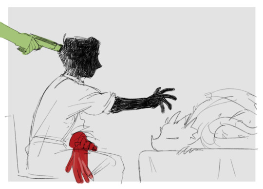
ok here's the drawing itself for reference
Yeah so, i have a little headcanon that mariana has super strength, not in a sense that he can hit hard but more like "he destroys everything he touches". Unless he wears his gloves ofc.
I drew mariana holding flippa with his gloves on, and then wanted to show what would happen if he took the gloves off. Something like "i want to hold my daughter with my hands and not through gloves at least once in my life".
It didn't exactly work out as i wanted it to because in the drawing mariana isn't touching flippa, he only stretches out his arm to do it. Which looked fine by itself but to me it felt like something was missing, like the drawing was lacking impact that i wanted it to have. Mariana is stretching out his arm and he's dark and spooky but ultimately nothing really happens in the picture, it lacks context.
So, i decided to add slime putting a gun to mariana's head. Sort of as if he saw that mariana was about to kill their daughter and decided to stop him with the only way he knew how. (aka by threatening to shoot mariana instead of grabbing his hand or something, idk. very healthy 10/10) So now it doesn't exactly look like mariana is moving forward, but more like he stopped in the middle of it because he's being threatened.
(Now that im looking at it, it would've been better if i made the canvas bigger and drew the rest of slime's silhouette, both to give some context in who's holding the gun and to make the composition more dramatic, because rn its just a random hand dissappearing into nowhere. But its whatever, back when i was drawing it adding slime was a last second decision so i didn't really think about it, and now i obviously wont go and fix it because im lazy and its not so much about fixing the mistake as it is about learning from it.)
(Also in addition to the one punch man headcanon: Slime can't be one-punched because he's a literal slime, its like punching water and wanting something to happen)
#whoops haha this got long#dont ask me to explain something about art bc i wont shut up ever#yagotalk#my art#sketch#el mariana#apologies for maintagging but its for filtering purposes
215 notes
·
View notes
Note
Hi!! Love your artwork and your Charlastor AU with Dawn!!
I was wondering if you think Alastor would make any dawn-themed dad jokes and puns in your AU, and if he does, what would Dawn and Charlie think of them? I can’t really think of any off the top of my head right now, but I know ‘a brand new dawn’ is a phrase he could maybe use!
Again, love your art!!! If you don’t mind answering questions about it, do you have any advice for artists who want to improve their drawing or any practices that have helped you develop your skills? And are there any particular artists that really inspire you?
You’re one of my favorite artists and I don’t know how to explain it but your drawings have so much life in them!! 🌟
sdlksdflkj thank you so much omg!!!
I'm so glad you're enjoying them ;W;
And he would be insufferable with them lmfaoo, especially because I'm sure Charlie would hop in on a few of them and add to the pile as well xD
One more I can think of rn is "Oh, I was wondering where the sun went!" whenever Dawn enters a room, because the implied punchline is "but then it Dawned on me" or something? XD idk I'm not good with puns sadly
Now regarding the art advice!! This one got HELLA long so I'll hide it under a cut for everyone's comfort lmao
I know it sounds shallow and like worthless advice, but a huge huuuuge part of getting better at art is to just... make art! Practice makes perfect - it develops your motor skills, gives you somewhat of a muscle memory for certain basic shapes that are a necessity to have a good feel of for good foundation sketching.
Practice also develops your eye for compositing and for how color theory actually applies in practice, it basically helps you develop a more consistent grasp on art as a whole :D
There are some things I've learned over time that definitely helped speed things up though xD
here's some rough sketches I did just to demonstrate what my rougher drawings can look like - also a little diagram (on the right side of the image) of things I keep in mind for the average proportions of a human body!
I tend to sketch very loosely and try to capture the overall vibe and silhouette/rough shapes first before I even think about adding details - there's a certain flow, squish and stretch to everything that's just much easier for me to get a good feel for when I use quick, loose brush strokes and as few lines as possible to convey a concept.
Repeatedly sketching humanoid characters of various shapes, builds and sizes for years genuinely helped enormously in getting not only faster but also more consistent with it!
I'm fairly well practiced with hands and expressions especially at this point since I like to focus on those in my art often, so those come fairly easily to me as well now!
Something I learned along the way about keeping a certain liveliness to my artworks is that sometimes you have to forego anatomical correctness a bit if you want to fully express specific emotions - if you try too hard to keep everything perfectly proportional and realistic, it can make the outcome look stiffer than you might've aimed for - this is something I actually struggle with in my cleaner artworks :'D The ones I do proper lineart for, since a lot of the flow of the original sketch gets lost in the process haha
As for artists/artstyles that inspire me...
There's @/southpauz for example!
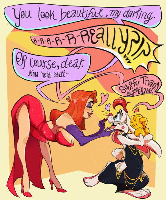

Her artstyle is unbelievably expressive and her eye for compositing and her use of shapes is SUBLIME - it inspired me to let loose more with my expressions, exaggerate features a bit more and to push the way I try to vary facial features :D
Then, back when I had that massive Rise of the TMNT phase, the artstyle of it has actually greatly influenced how I draw today!
It manages to be detailed and highly recognizable despite its deceivingly simple style - it exaggerates shapes and uses it to communicate personalities, emotions and action super effectively and taught me a lot about utilizing those more efficiently myself :D
And last but not least Ishida Sui - the mangaka behind Tokyo Ghoul (which used to be a highschool obsession of mine)
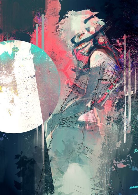
His striking use of colors, textures in abstract, yet symbolically heavy ways and his courage to be rough and expressive rather than looking polished, yet also having such a solid understanding of realism blew me the fuck away as a teen and still does now!!!
His art may have less of an influence on my style today than it used to back then, but I think in my more exagerrated, more horror-esque drawings you can kind of see it still :'D Either way I greatly admire him as both a writer and artist.
-----
I'm genuinely so so flattered that you enjoy what I do enough to give me such high praise, thank you so much for writing me such a wonderful ask <3 I'm glad I got to gush about some of my favorite artists/artstyles for a bit haha
If you have any more specific (digital) art related questions don't hesitate to reach out!! I love giving pointers about a subject I'm so passionate about, we don't gatekeep helpful information in this house!!! <3<3<3
45 notes
·
View notes
Last Seen Blogs

restandrelax-mattress
REST & RELAX

authoricfire
Авторски огън
i-justreally-like-cats-okay
I REALLY LIKE CATS

ratanshisblog
ratanshisblog

neilswartz5
Untitled