#i learnt gradient text
Explore tagged Tumblr posts
Visit Tumblr Blog
Explore Tumblr blogs with no restrictions, modern design and the best experience.
Last Seen Tumblr Blogs


Fun Fact
In 2020, Tumblr had 29.4 million users in the US.
Text
📓✧˖°.bungo stray dogs smut scenarios and hcs
sen: my first smut fic lmao idk what and how i do but i'm gonna TRY MY BEST feed back is VERY MUCH appreciated i originally planned to do purely fic no hcs but i decided against that ^v^ tell me if you want the word count because i'm unsure if i should put it or not
characters: ada!dazai osamu, edogawa ranpo, chuuya nakahara
warnings: smut, mdni, im still putting ooc here, binding, biting (i'm still thinking tell me if smth needs to be added), rough sex (?), oral sex, use of y/n
(starts under the cut!)

‧₊˚⋅📃✎ᝰ..𖥔 ݁ dazai osamu
୨୧ loves binding you with random things that are flexible near him, like a tie or his bandages and things like that
୨୧ dazai just tangles his hand in your hair and like weaves through the strands and he doesn't want to pull his hand out so just pulls your hair and stuff
୨୧ if you ask him to be gentle, he compiles immediately and starts slowing down his relentless thrusts
୨୧ likes preparing you first (using his skilled fingers)
୨୧ when you're all wet he just invites himself
୨୧ pm!dazai would have done gunplay occasionally
scenario:
"bella- shit, you feel so, so, good, baby, yeah- god," dazai moans, his pace not slowing down, but becoming faster, which was what you hadn't expected.
a few whimpers and moans escape your lips, turning the taller on more, "'s-'samu, s-shit, slow down," you whimper some more as dazai hoists a leg on to his shoulder, allowing him to reach deeper places into your hole.
you scream, only to be stopped by two fingers going into your mouth. "shush, bella, yosano-san will find out. you certainly don't want that, do you?"
you shook your head in response, tears rapidly flowing down and reaching the crumpled sheets. although you cried, it was because of both the pain and the pleasure that your boyfriend was giving you.
"osamu..." you mumble as he slowed down his pace to an actually bearable one. "you're too harsh on me."
"oh? is that so?" he grinned and started to fasten his pace once again. "hmm?"
"o-osamu-! fuck-" as your pretty mewing and moans reached his ears, he grabbed a string of bandage on the nightstand next to you and tied your hands with it. "-osamu?"
"mm, you look more delightful than ever like this, bella." the man smirked.
"shall the show officially begin, now?"

‧₊˚⋅📃✎ᝰ..𖥔 ݁ edogawa ranpo

୨୧ into foodplay is the first thing i'll say
୨୧ loves sucking on tits too (literally his favorite thing to do what am i on about)
୨୧ loves sex after a tired day at work (like MINOURA or new people insulting him and stuff) (by insulting i mean saying that he isn't a good enough detective)
୨୧ sex between the both of you always starts with a make out session and then (and then) BOOM you strip and the good part starts
୨୧ he is a lazy bottom for real but when he's mad/frustrated oh boy you bouta see some stars
୨୧ loves when you top him
scenario:
quite a while had passed since you were bouncing on his on his cock, your moans and his combining into a harmony that was unique on the world, and only happens once a week or so.
ranpo had come home from a bad day, a frustrating one. you had always tended to his needs when it came to to tired days. and the same applies for you.
"mm...you look so nice bouncing like that f'me, sugar," the raven-head grins as he aids you with his hand.
you moan prettily, as you say, "ranpo- ngh-"
his moans get louder as he goes closer to reaching his peak. a while more after, you come with him closely following you in the motion. "well, sugar," his chest heaves up and down. "did you enjoy it?"
"m-mhm," you nod, unable to speak too much.
"well," he flips you around, now him on top of you as he puts the lollipop he was sucking in your mouth.
"let's begin round two."
‧₊˚⋅📃✎ᝰ..𖥔 ݁ nakahara chuuya

୨୧ not into gunplay, just because he's in the mafia, doesn't mean he has to be into gunplay right?
୨୧ is really soft with you once you warm up and stuff
୨୧ doesn't really have kinks
୨୧ had this one time he used his ability to pin you down
୨୧ active bottom? maybe. likes being in control more, though
୨୧ loves giving oral
scenario:
"doll, y/n, you're taking me so good, fuck-" chuuya groans in pleasure as your throat contracts and takes his length fully.
"ngh-" you couldn't really speak, considering...his dick was down your whole throat.
the red-head threw his head back as his eyes shut close, all while waves of pleasure overwhelmed his whole body and took over him.
your gaze went up, and observed chuuya. it was as if he had no more self-restraint at all. his gloved hand was tangled in your h/c hair, as he subconsciously massaged your scalp.
your groans met chuuya's sensitive ears and the sounds only turn him on more.
"sweetheart- ngh, fuck, s'good-" he felt some weird feeling gather at the bottom at his spine. was it his orgasm coming? perhaps. but in that moment, nothing mattered. in this world, you are his only pillar. you are his life. you are his everything.
one last moan and he came in your mouth, and less than a few seconds later, you also came. he pulled out as he watched his cum drip from his tip, and you swallowing the bodily fluid your hot session had produced.
"you were so good, doll." chuuya tenderly wiped a few beads of sweat off your forehead.
"i-" you swallowed your saliva, "it felt...good. maybe we should try again some other time, chuu."
"'s that so?" he smiled.
"we should end the night here. we're tired, after all."
©all banners, dividers, and stories are made by marikosenwrites and the pictures in it are from pinterest. i own none of the bungo stray dogs/bungou stray dogs/文豪ストレイドッグス characters mentioned here. all rights reserved, please do not steal.
mdni banner taken from @cafekitsune! (their work is much appreciated)
#bsd#bungo stray dogs#bungou stray dogs#bsd dazai#dazai osamu#chuuya nakahara#bsd chuuya#ranpo edogawa#bsd ranpo#bsd smut#chuuya x reader#dazai x reader#ranpo x reader#mdni#sen's works#i learnt gradient text
372 notes
·
View notes
Text
How the Monster Trio propose to you
a/n: HI SURPRISE I'M TURNING THESE HEADCANONS INTO A SERIES :3 literally loved writing the last batch of headcanons bc they were so cute so i decided to turn it into a little headcanon series <3 you're welcome! ALSO I LEARNT HOW TO DO GRADIENT TEXT HEHEHE
read part 1 here >> How the Cross Guild propose to you (+ Galdino)
not nsfw! only pure fluff and silliness up ahead!
enjoy and don't forget to reblog if you like it!

Monkey D. Luffy
If you think Luffy is capable of proposing in a nice, romantic way — then you're wrong.
He has no clue what he's doing but he's just gonna roll with it.
Begs Asks Nami to find a ring in one of her treasure boxes, to which she reluctantly agrees upon hearing his reasoning.
Literally proposes to you the same day, in the middle of a fight with some rookie pirates.
Just straight up grabs you and pulls you to him, protecting you as he asks the question and shoves the ring in your hand.
"Hey, wanna get married?"
You're stunned for a moment at his sheer audacity to propose like that during a battle, but the seriousness on his face gave you the impression that he wasn't kidding.
With a simple nod, you put the ring on your finger and continued fighting beside him.
The rest of the crew looked on, dumbfounded at the scene in front of them as Luffy sent the last pirate flying before turning to you and giving you the biggest, sloppiest kiss ever — dipping you in his arms for extra effect.
Brook was the only one to clap enthusiastically, followed by a very hesitant Jinbei.
Party celebration? Yep.

Roronoa Zoro
Again, if you think he's going to propose in a romantic way, you're wrong.
Laziest mf when it comes to proposing.
Gets lost when looking for a ring for you on the island you're currently docked at, returns with said ring like five hours later.
Pops the question in the middle of dinner, making Sanji choke on his food.
"Y/N, will you marry me?"
Just so bluntly asks it that you have to do a double-take as Sanji regains himself and yells at him.
"WHAT THE HELL, MOSSHEAD! YOU CAN'T JUST ASK THAT IN THE MIDDLE OF DINNER-"
"I'd love to, Zo." You put the ring on after Zoro slides it across the table.
Sanji is gobsmacked before letting out a shrill, "WHAT THE FUC-"
Zoro lets you watch him work out and also lets you bathe with him as a treat :)
Definitely litters your skin in love-bites though so be careful of what you wear because I feel like Nami and Robin will tease the shit out of you lmao.

Vinsmoke Sanji
By far the most romantic on the ship, right next to Robin and Jinbei.
After the crew has dinner, he takes you out to the lawn on the ship and makes you your favourite dessert, having Jinbei make sure that Luffy doesn't try stealing any of it.
Sets down a blanket and everything and just watches you with adoration in his eyes as you eat and talk your heart out.
He's quick to conversate, nodding along with what you're saying and chiming in from time to time.
As you two are cuddling together on the blanket, he suddenly gets on one knee in front of you and presents the ring with a soft smile on his face.
"We've been together for a while now and every day with you feels like a dream. I could go on and on with how much I love you, but we'd be here for years if I did," Sanji chuckles, making you giggle in return as tears prick your eyes, making him freeze up in concern. "O-Oh no, are you okay? I didn't say anything wrong, did I? Please don't cry-"
You shut him up by kissing him square on the lips, knocking him over onto is back.
He looked at you with hearts in his eyes as you pulled away, taking the ring with a flustered smile and slipping it onto your finger.
Que him fawning over you for a month straight, kissing you any chance he can get and annoying most of your crewmates.
Luffy and Brook find it hilarious while Robin finds it sweet, though.

starnote: my cough is getting better! i'm not hacking up a storm at night anymore, now i'm only coughing a teeny tiny bit :P
creds to @/saradika for the star divider!
#ztarvokwrites#one piece#onepiece#one piece x reader#luffy x reader#one piece luffy#straw hat luffy#monkey d. luffy#zoro roronoa x reader#zoro x reader#zorororonoa#op zoro#roronoa zoro#roronoa zoro x reader#sanji#sanji x y/n#sanji vinsmoke#vinsmoke sanji#sanjionepiece#black leg sanji#one piece sanji#vinsmoker sanji x reader#sanji x reader#monster trio#op headcanons#monster trio headcanons#monster trio x reader
600 notes
·
View notes
Note
VISION YOURE BLUE NOW- WHAT HAPPENED TO THE PINK?! 😭😭😭
HEKHREGKJH I DIDNT THINK ANYONE WOULD REALLY NOTICE 😭😭
i have been changing things around to match my theme colours a little more <33 it's a really light purple/blue and a pale pink :3 they've been my colours the whole time ! im just embracing them a bit more !!! i even learnt how to do gradient texts !!!! next fics formatting will be pretty ehghkewheh
20 notes
·
View notes
Note
hi! again. 😊 Please excuse my bad explanation; I'm new to PS and still learning what things are called. My question was about how you manage to combine pngs images with gifs in such a cool way. As seen in this beautiful HOTD edit, for example. /post/698703305504882688/i-should-not-be-left-to-my-own-devices-anti-hero It would be awesome if you have time to explain how you do this for all of us newbies, but if not, I am thankful that you took the time to answer my ask. Best wishes. 😊
— hii no omg thanku for being so nice with your ask </333333 and i'm more than happy to share how i did it (that set was so long ago 😭 i don't have my hotd files rn but i'll just make do with an example)
this effect technically can be very simple to-do and all you need is a base background and a png to go on top! but if you want to recreate that effect exactly as it was in this set then prior to the png you need:
— two gifs, ready and coloured + blended together — a transparent png with a clean outline — basic knowledge of overlays (but really it's more of a learn-as-you-go thing so its fine 😭)
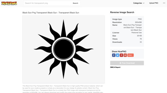
#1 — so first i wanted to find the png i was going to use. just search up ____ (whatever you're looking for) png transparent online and you should be able to find heaps of good, and free to use options! my go to site is nicepng but there are sooo many places you can look!!
what's important to remember is that for a cleaner result, you want to find a png with smooth outlines - aka nothing that is really rough or jagged in its edges.
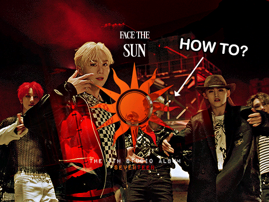
so i chose this sun png and it has plenty of black space in it (as this will play a key role in how the colour shows through the png later) but it isn't a solid block of black either!
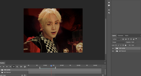
#2 — so i have my two gifs ready, coloured and blended with each other. remember that the gif choice underneath will also affect how the png's colours show through [whether the gif has a lot of pure white/black can really change the effect!]
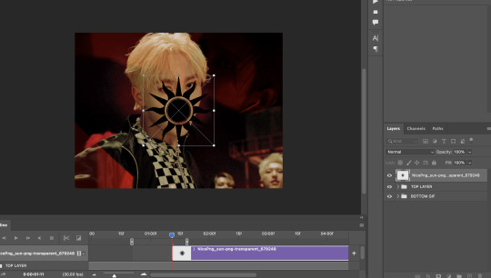
#3 — so now i've just inserted the png onto the gif and you can position it anywhere you want on the canvas!
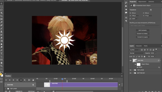
#4 — i'm not sure on the technicalities on why you need to do this (😭) but the png typically is black right, but you want to make it white so make sure to invert the png so it shows up white!! you can invert through adjustments or by pressing command + i or ctrl + i to do this!
#5 — now go to the blending mode of the png and set it to EXCLUSION. i think you can set it to difference as well but i'm no expert in that and i think they give the same result. your white png should turn sort of blue-ish translucent!! now we're ready to add colour <3
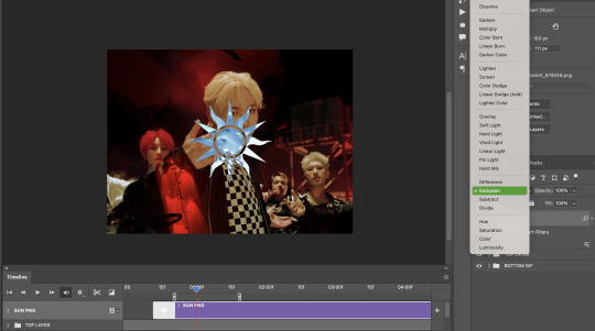
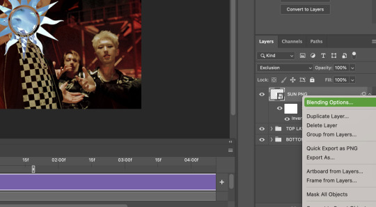
#6 — now right click/double click etc on the png and go to blending options here!
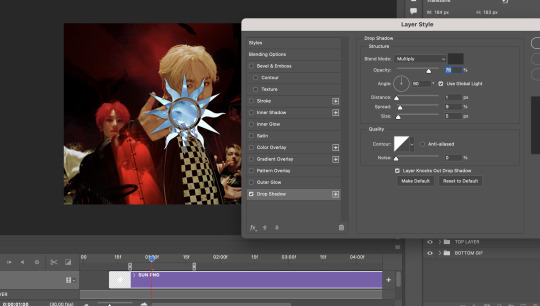
#7 — this is an optional step but if you want the outline of your png to appear a little more against the gif (say as the majority of the background in mine is mostly dark) then you can add a shadow to your liking! these are just my typical settings nowadays :D
#8 — head over to gradient overlay and choose a colour gradient that you would like! there are heaps of easy presets that i often default to (like plenty of blue/green/purple options) <3 and make SURE you set the blend mode of the gradient overlay to EITHER: — multiply (shows up pretty dark which can be useful at times!) — hard light (which shows up pretty bright, i'm going to use that in this gif because bright is what i need!) — colour (shows up more light/white and works well on lighter backgrounds imo)

#9 — finish up by adding your typography however you would like! i added the same gradient effect to 'SEVENTEEN' at the bottom of the text for a little more pop of colour!
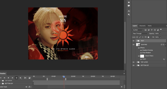
and there you have it!!! that's your finished gif (or at least the same principle behind the hotd/anti hero set!) and here's the finished result <3 i hope this helps!!
i've gone through these similar steps in this tutorial as well! i learnt this from this great tutorial by @anya-chalotra 🧡
#hope that helps :D thanku for being so kind!#ps help#anyway i hope people don't mind the tag 😭 so this doesnt flop#tuserose#isaishi#userfran#userjoanna#heavensyun#cheytermelon#annietrack#hanatonin#userngocchi#uservince#tuseral#userchoi#answered#shuaria
116 notes
·
View notes
Note
i learnt how to make these cool gradient texts on tumbltr i can now kms
whaht the HAY
5 notes
·
View notes
Text
Don't mind me, I just learnt how to make gradient text on tumblr so just testing it out lol.
TAYLOR SWIFT
FEARLESS
SPEAK NOW
RED
1989
REPUTATION
LOVER
FOLKLORE
EVERMORE
MIDNIGHTS
THE TORTURED POETS DEPARTMENT
3 notes
·
View notes
Note
how do you do that color stuff with your text ‼
okay, i'm gonna assume you're talking abt the gradient text nonnie!! i'm kinda bad at explaining things so just in case what i say doesn't make sense, i'll link you to the original tutorial that i learnt from here.
it's fairly simple❗❗ using this website, enter the text you'd like to colour into the first box in the bottom right, then select two colours to create the gradient from the adjacent red and green boxes (you can use the picker, rgb, hsl or hex codes if you want) and then all you have to do is click run and copy the text that appears in the box below the first🥰
now, to get it to show up on your tumblr, i believe you can only do the next steps on the web version. pull up the post you want to add the text to, and click on the little settings icon in the top right corner. scroll until you see the 'text editor' section and switch from rich text to html. paste the text where you'd want it and then when you save, it should appear as a gradient😌💕
hope this helped, nonnie🥺🩷 lmk if you need anything else bc ik i can be confusing sometimes😭💔
3 notes
·
View notes
Text
fear me for i have learnt how to do gradient text
6 notes
·
View notes
Text
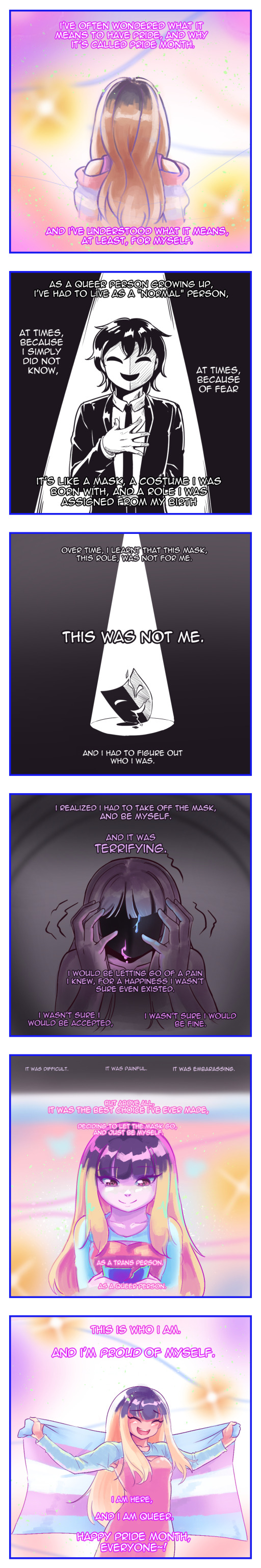
[Image description: A multi-panel comic.
First panel: Drawing of a blonde girl with her back turned to the camera, in a dreamy and colorful background. The text says: "I've often wondered what it means to have pride, and why it's called Pride Month. And I've understood what it means, at least, for myself."
Second panel: Drawing of a person with short, black hair and a formal outfit wearing a smilling mask. The background is black with a spotlight on the person, presumably the same girl on the first panel. The text says: "As a queer person growing up, I've had to live as a "normal" person, [paragraph break] as times, because I simply did not know, [paragraph break] at times, because of fear [paragraph break.] It's like a mask, a costume I was born with, and a role I was assigned from my birth".
Third panel: A drawing of the same smilling mask, falling and shattering on the groud. The background is still dark, but is now a lighter gradient and the spotlight focuses on the mask. The text says: "Over time, I learnt that this mask, this role, was not for me. This was not me. And I had to figure out who I was."
Fourth panel: The drawing shows a girl in the dark, her hands reaching out her face wich is faceless and resembles a dark, black mask. There is a colorful liquid like blood falling from it, and the girl's hands are trembling. The text says: "I realized I had to take off the mask, and be myself. And it was terrifying. I would be letting go of a pain I knew, for a happines I wasn't sure even existed. I wasn't sure I would be accepted, I wasn't sure I would be fine."
Fifth panel: Drawing of the same girl as the previous panel, and also from the first, looking down at her hands which hold a broken dark mask. The girl has a tender smile, and the background fades from the dark in the previous panel to a whimsy, magical background with many colors. The text says, in the dark part of the panel: "It was difficult. It was painful. It was embarassing." And in the rest of the panel, "But above all, it was the best choise I've ever made, decding to let the mask go, and just be myself. As a trans person. As a queer person.
Sixth and last panel: A drawing of the same girl, with a large and happy smile, holding a giant transgender flag in the same dreamy and colorful background. The text says: "This is who I am. And I'm proud of myself. I am here, and I am queer. Happy Pride Month, everyone~!" In this panel, we can have a better look at what she is wearing. her hair is mostly blonde, with a dark part at the top, and she has light skin and wears a pink dress along with a blue topless shirt with long sleeves. /end ID.]
Pride
4K notes
·
View notes
Text


In these screenshots we see the intro lessons in colour for Indesign. I enjoyed layering the text with different opacity, it led to some really interested clashes. We also learnt how to change fill in shapes, create gradients, use effects and place coloured lines in and around text.
0 notes
Note
hii, i was wondering how you do the colored text, like how the color goes from gray to pink, ive researched on here and nothing comes up! if you could best explain or try to it would be very helpful!
hi so it only works on pc or laptop and not mobile, i personally use laptop.
What i do is -
When you create a post go to settings and change the text editor setting from 'rich text' to 'html'
so i use this site to create the text. its pretty simple- just write what you want in the box and you can change the colors and type of gradient, and then when you click on generate, you'll get html tags.
just copy those html tags and paste them in your tumblr post. you can edit the text (like bold, italic and all) in the preview option.
i learnt this from this blog. i tried my best to explain but if u still dont get it pls check out the linked blog or ask again idm ! <3
1 note
·
View note
Note
how do you make the gradient text on your post?
hi!! this is kind of a long explanation (i've tried my best, but i'm actually balls at explaining stuff so pls bear with me... sweats.)
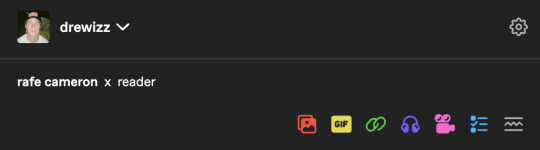
i use this website to help getting the code to input for html for the text i want. (the example i'll use for this post is "rafe cameron")
second, you can either input the hex code of the certain color you want (there are many websites available to search for a certain hex code you want. hex codes are like this -> #000000) or you can select in the given color finder in the website. in this case, i selected 2 colors from the color picker given in the website itself.
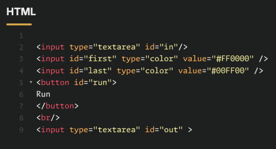
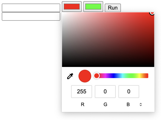
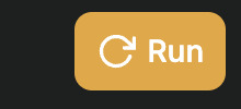
if you are using your own hex codes: line 3 where it says "first" will be the color appearing in the beginning, and line 4 is where it will end. make sure you replace the #FF0000 and #00FF00 with YOUR hex codes. if you use your own hex codes, click the yellow run button at the top. of the website. it should look like the one above.
third, in the first box of the section on the bottom right/very bottom, input exactly what you want to appear as gradient in your text. then, click run.
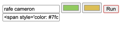
select the entire thing in the second box (where it says <span style='color:) and make sure to copy it.
now moving onto tumblr: in your post, make sure to have the text written out. do all your adjustments to that edit before inputting the code. i find it easier to do it beforehand then to adjust after. (however, it is possible to edit the text after.)
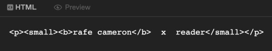
click the cog/setting icon on the top right, and change text editor from rich text to html. you should see something similar to the image above, on the right.
now using the copied code from the previous website, select the text on tumblr that you chose to have as gradient. in my case, it's rafe cameron. paste your code into that space. do not delete the <p> or <small> or <b> or etc codes. those are important.
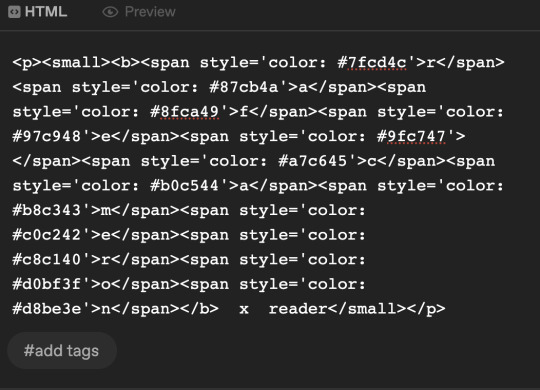
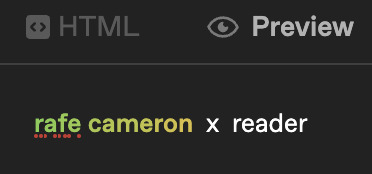
your code should look something similar to this. click preview, and you should see that it worked!!
if you need to adjust your text, whether it's to remove boldness or make it bigger - do not adjust it with html. use rich text editor instead. if you're changing the gradient color, you'll need to delete the entire code pasted in html.
i hope this helped!! personally, i find it easier to input gradients from my laptop rather than phone. (also, i'm pretty positive that i've learnt this from another tumblr user, however i have no clue who. so, credits and kudos to them :')
0 notes
Text
Customisation and Settings
After having Reece and Louis playtest my game [apparently funny sounds and flashing lights make them happy], it was suggested that I add customisation - maybe integrate it into a start screen. I wasn't convinced until they stated I could add a skin that's just the flag of Finland so now I feel I need to do this.

This is my start menu. Why yes it is stupid, but it won't stay like this. clicking on the middle button opens the first level, but I needed the player to not be able to control anything in the background so I made the default level a copy of the previous ones, but empty. I then ran into my next issue - what would load the start screen?
This is fred

No, really.
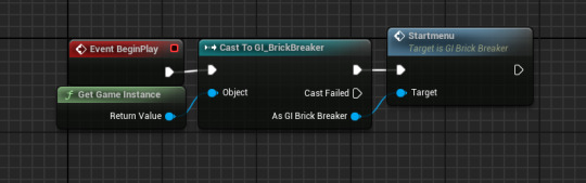

And this is what fred does. Because fred [he prefers you don't capitalise the F] is always in the placeholder level, as soon as the game starts he can cause the GI to make a start screen widget. This is removed when the game starts of course
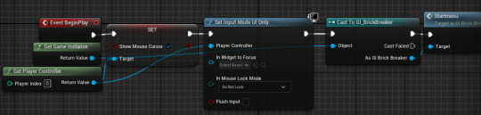
This prevents the player from interacting with the camera and is reset in the game instance. I learnt about this via the post below

I had a problem where the bat would only move if the left mouse button was being held down, but when i changed Set Input Mode Game And UI to just Game Only, this fixed it - i don't know why, but i won't complain.
Next up is customisation. oh god.
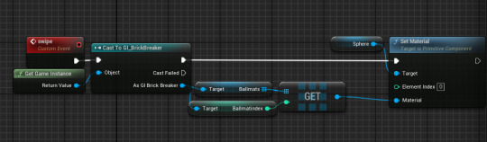
this is how i control what skin is displayed in the little display thing - it's controlled by the game instance so it is universal and persists between levels.

This will be how I have my displays slide - I will also need to spawn another one in, but that's a problem for when this works. I just need to implement this into the actual customisation screen.

I came to the conclusion that what I was doing was far too complicated - instead, everything would be in the widget.

This is how I changed the material,
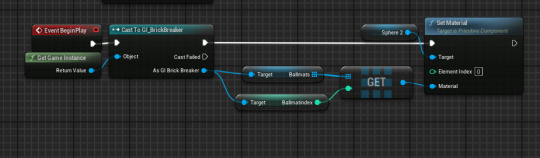
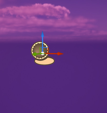
and this is how I set it in the ball. This actually did work, but adding a texture [such as the Finnish flag] makes the ball's jerky rotation extremely apparent, which may need to be fixed. At any rate, I actually have a customisation system now somehow.
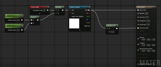
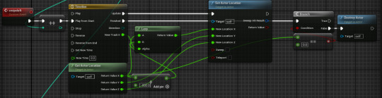
This is how Louis got my map textures to map properly onto a sphere, so now I can have a ball with the Finnish flag instead of a quarter of the sphere being blue lol

Unfortunately due to how the texture is stretched, the materials themselves look kinda weird lol
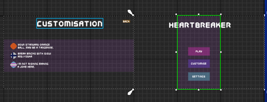
This is the slightly more polished version. I've added the appropriate font, colours and text. The buttons still work but they're just invisible so I'll need to implement an audio cue when clicked. I also finally reintroduced the transparent purple block HUD from the tutorial in a way I like, and different colour backgrounds for play, settings etc to help visibility. I also added little notes at the skins and sprites corresponding to the texture, I also have space for 3 more so I can have 6 skins total. i just don't know what they will be.
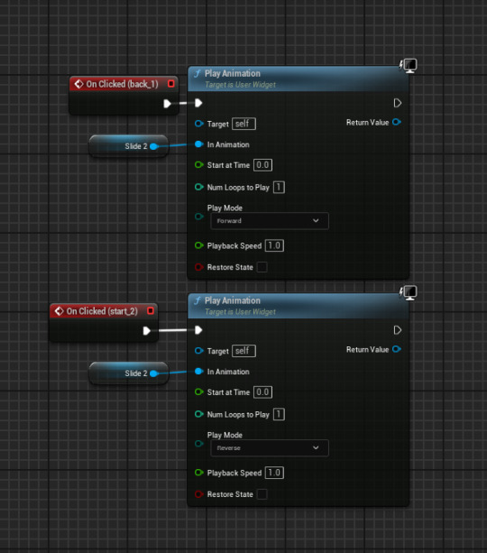
Next, I added a similar animation to the slide left to show the settings screen. This exists for those who may want a lower sensetivity, audio controller or colourblind mode.
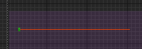
The next thing I added was a [placeholder] slider for mouse sensitivity since I already had a system for it. However, it didn't move. This could be due to it being unable to actually change the variable, or the mouse not being able to do anything.
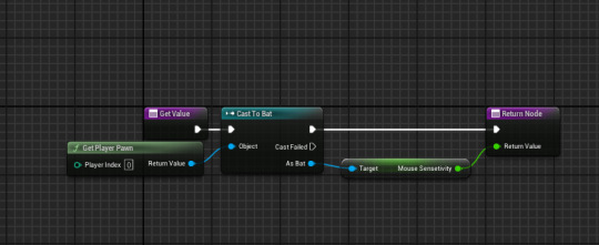
However, using the below tutorial, I got it working. I figured that, since I couldn't do anything in the slider, I could set the sensetivity outside of the slider from it's value
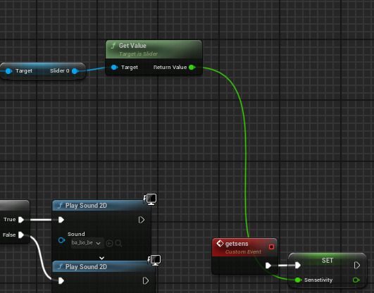
This is in the game instance - it is called when the back animation plays in the widget

And I added this to my bat to utilise the sensetivity. I'm really happy this works, I just need to make the slider look better now.
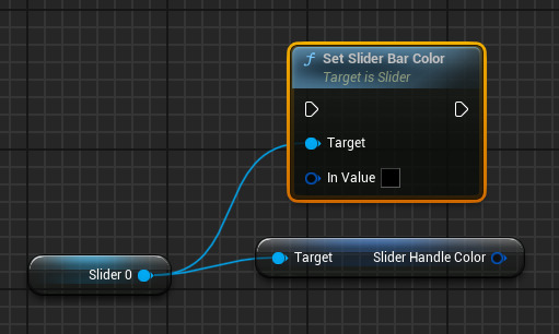
I CAN MAKE THE SLIDER'S HANDLE GRADIENT HAHAHAHAAAAA Y E S
oh
is it actually that easy?
like this works, i just expected it to be harder. i suppose its just one of those days :D yippee

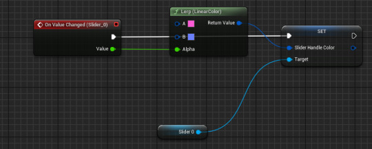
As the scale is from 0.01 to 2 not 0 to 1 [as with lerps], I had to divide the scale by 2 to make the colours properly fit the scale but I love how this looks.
I tried making a volume slider but despite using the above tutorial, nothing was going in and I just didn't understand. Besides, the volume can be turned down outside of the game.
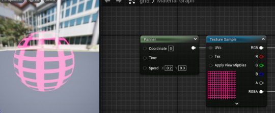
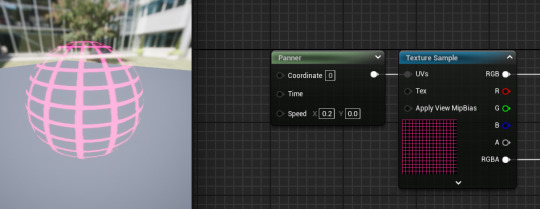
These are some of the grid sizes I tried for the last material, finally reusing my panner material. However, as they were on a far smaller object, the sizes needed to be different

The one I selected was 4x4 squares on 30x30 grid, this gave the sphere enough shape whilst keeping the grid fairly visible
I still don't like the TF2's texture
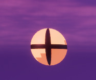
it just looks like an eye. Even moreso than the actual eye itself
Behold. Yugoslavia. I chose the Yugoslav flag soley because Yugoslav history interests me, and because if I ask people what the flag is, I'll likely hear, Dutch, French, Russian and Paraguyan which amuses me :3
0 notes
Text


During this Session i started to create my Trading Card using the Template we were given. I started off with doing the Front of the Card by giving my Character a Name and using the Skills i learnt from Lessons on Typography for the Front by using a Stroke and a Gradient of Dark Purple and a lighter shade of Purple to create it. Once i did that I Copy and Pasted my Character and Background onto the Document and added a Stroke and Glow to my Pirate. I then started to work on the Stats Section of the Card by adding a Box and Text to it and including things like her Bio and other Information about her like her HP and Strength.
0 notes
Text
I learnt how to do gradient text I now have infinite power
1 note
·
View note
Text
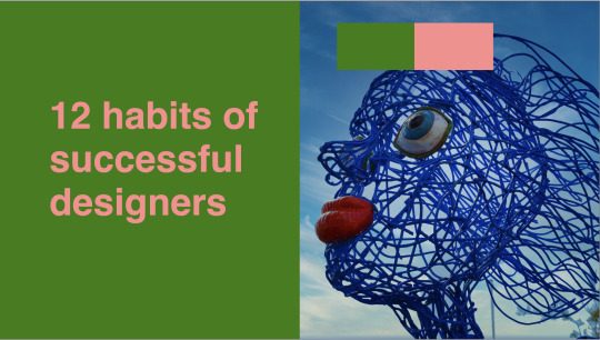
FUNDI'S: CLASS 2 PART 2
For the final slide, we wanted to create a duotone slide.
This is what we started with:

We then grabbed the green rectangle in the background, and went to the control menu in the top and wrote this in the width category:
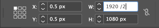
For some reason you can just do math in the text box, which is pretty helpful. Kinda random but pretty helpful. This is what we ended up with:
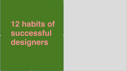
Next we pasted the image that we wanted for the right half of the image in.
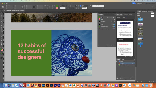
We thought that we image was kind of leading interest away from the text, since there was more going on in the image, and it was facing the opposite direction, so using the control menu at the top again, we flipped it around. We also created a color scheme with a couple square so that we could copy and paste it into photoshop for the next step.
After opening the original image in photoshop, we grabbed our colour scheme and selected both colours as foreground and background.


Then we pressed the gradient map tool in the same section of the layers menu as the curves, and this is what we got:
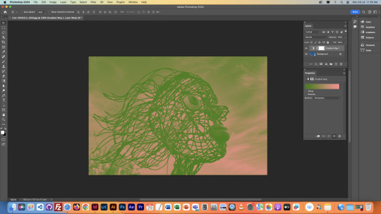
We then used the gradient map menu to adjust the colours until we had gotten what we wanted for the slideshow.

I just adjusted until everything in the image was clear enough.
This is what it looked like in the end:
This was the final task for this class.
Overall this class was super helpful, I learnt lots of new stuff that I'm going to apply to my Owheo park slideshow in Quinn's class. Honestly quite the lifesaver of a class because I had no idea what I was gonna do yet, but this has given me some ideas.
0 notes