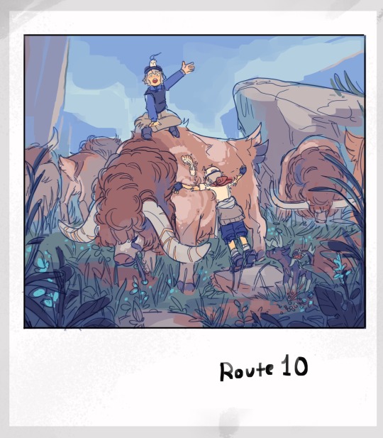
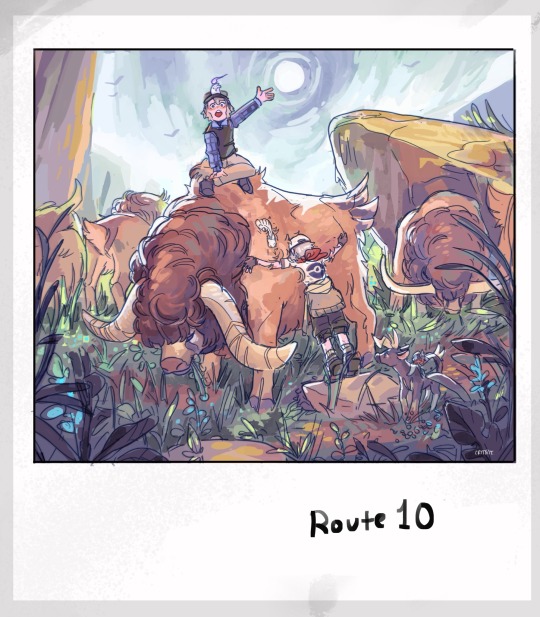
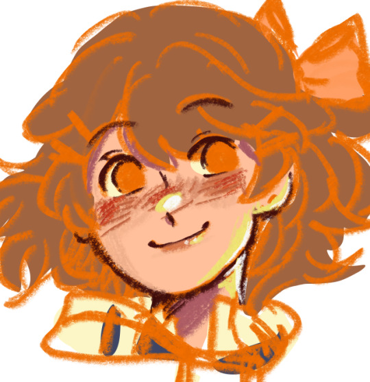
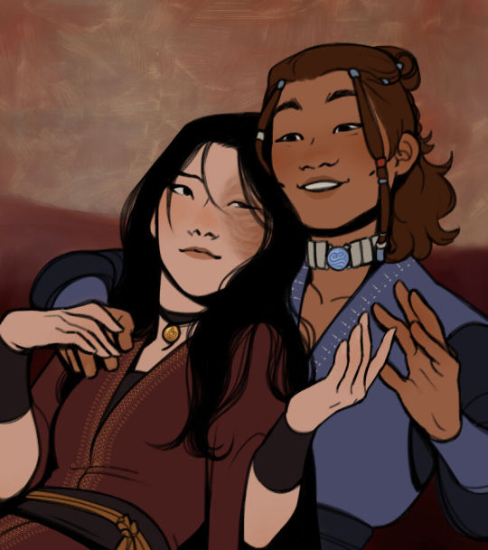
#i love when you go darker and darker in rendering and it starts looking how it's supposed to...
Explore tagged Tumblr posts
Visit Tumblr Blog
Explore Tumblr blogs with no restrictions, modern design and the best experience.
Last Seen Tumblr Blogs


Fun Fact
Tumblr was created by web developers David Karp and Marco Arment.
Text

i have things i need to do. i have not done them.
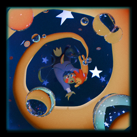
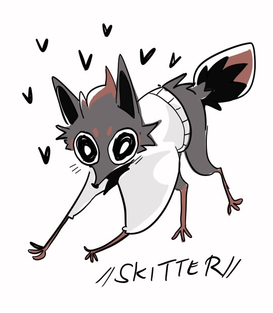
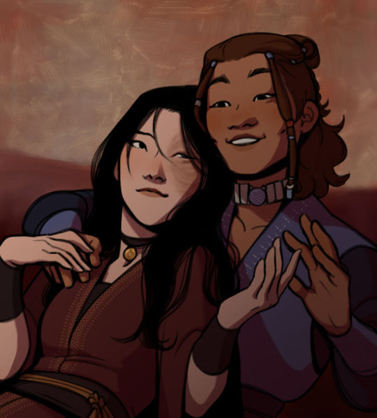
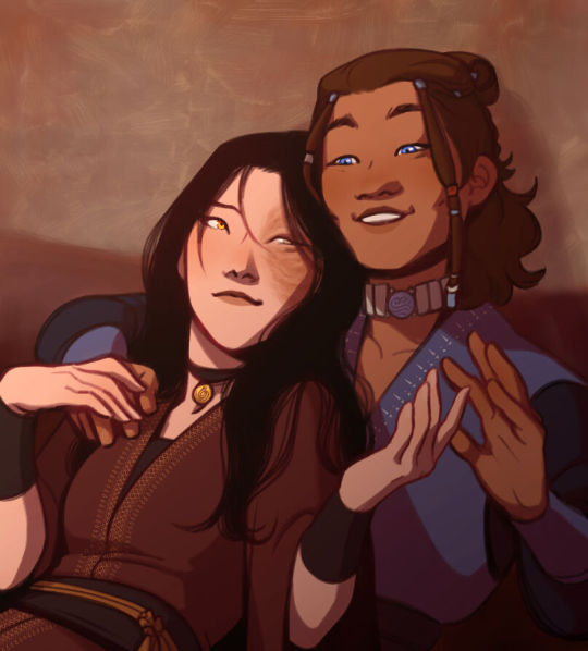
#cadetalk#wip#kylo ren#i have to clean .. i have to prep...... and yet....#maybe when i get back tonight i can finish these tho 😭😭#i love when you go darker and darker in rendering and it starts looking how it's supposed to...#painting like that is so fun like ie cnat even imagine how sculptors must feel#how to explain...#like when you are working away at a shape and with each chip off it slowly becomes more what you saw inside it?#like it's settling#hm.#talking again.
9 notes
·
View notes
Text
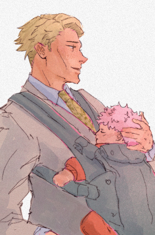
Happy 2 Year Anniversary!!!

This lovely little guy stems from @angelpuns Kid-Leo au! This illustration was made in Blender 3d and it was a lot of fun modeling Kid-Leo into 3d glory!
Behind the scenes under the cut:
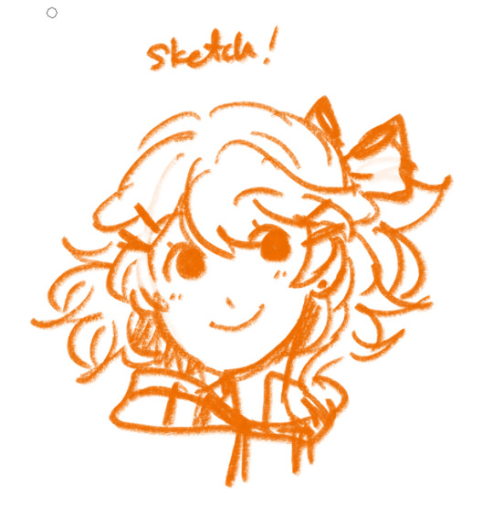
Everything starts with a sketch and for me I had two options;
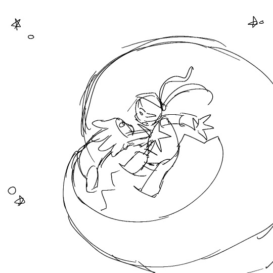
It was hard choosing which one; but I ultimately went with the one on the right as I felt like the posing would be a lot more fun to play around with in 3d!
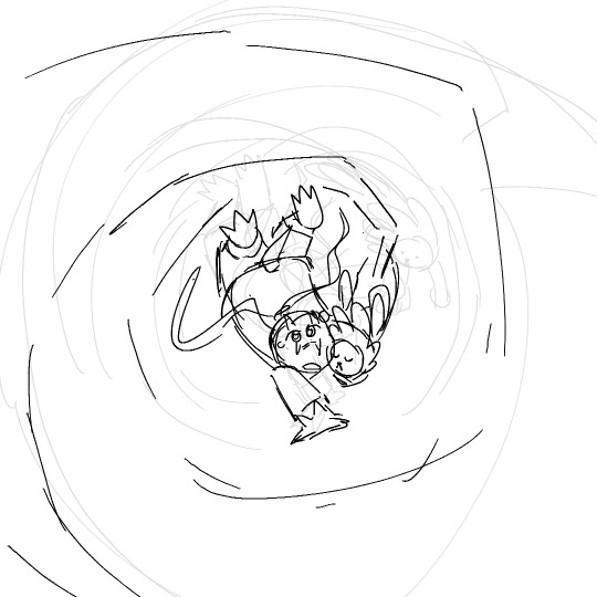
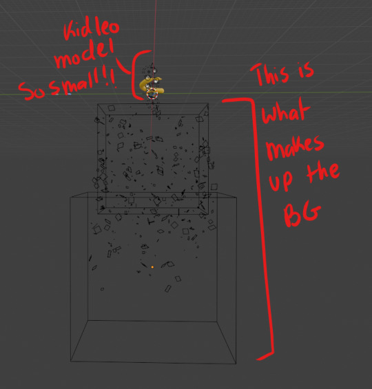
Speaking of 3d; check the viewport view!
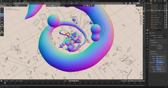
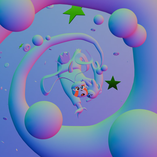
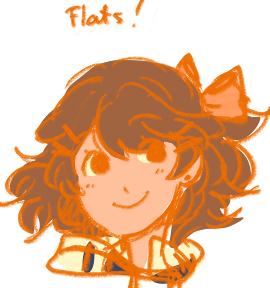
Yup; this is what it looks like before I add all the fun textures and what not. For my fellow blender nerds the final image was rendered in cycles at a sample of 500 with denoise OFF. I wanted the final vibe to feel like a game magazine so I like to render with the intention of having that dithering effect prepacked in there.


Tasty right? Well; you can't have Kid Leo without some stars to fill the void! After making my initial model I used particle systems to add floating stars and cookies that I modeled into the background. I especially love how the stars distort within the glass texture of Leo's tears :3
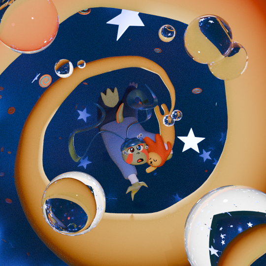
The blue background is simply a giant cube with a volumetric scatter shader to simulate fog; This part is what gave me the most trouble as I'm so indecisive that I didn't know what blues to go with! Eventually I settled for a darker blue as it really helped Leo's green skin POP. When it comes to art I always pay close attention to values.
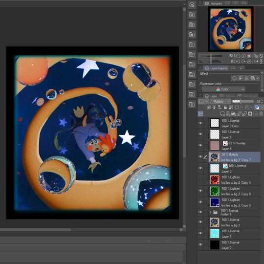
Finally I pulled this baby into clip studio paint for the final touches; aka chromatic aberration and giving it a viewfinder border and then WABAM!
You've got yourself a Kid Leo.
This was a lot of fun. I've been making illustrations in Blender for a hot minute now but haven't shared or posted them due to wanting to make posts like this one explaining everything I did. That May 20th deadline really kicked my butt into high gear. In total I'd say I put about 10 hours of worktime into this; starting the day this dtiys was announced. Getting this done was all I could think about for a hot minute lol.
Final thoughts? This comic has been a real joy to follow and I can't wait to see what happens next. It's been so cool seeing how much the comics art has improved since the beginning and I really admire the dedication to giving us a Leo-centric story to enjoy. Here's to the next chapter!
#kidleo2yranniversary#art#digital art#blender#rottmnt#rottmnt leo#blender 3d#clip studio paint#kid leo au
206 notes
·
View notes
Note
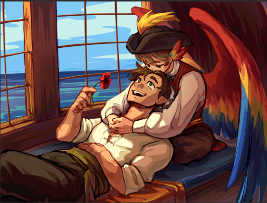
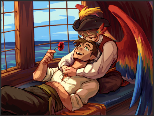
hey so this is really random but i love the way you render your work ( i specifically saw the one of desert due cuddling by the window and i was just encapsulated by how the colours and shadows looked ) and was wondering if you have a time lapse of your process? i have been trying to achieve the vibe your art has in the way i colour and shade and i would love to learn by watching how you do your process?
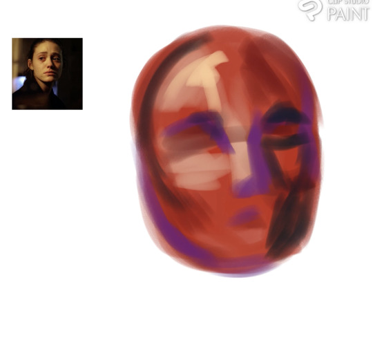
i dont currently have a timelapse of that style but i'll try to record one if i use it for a smaller drawing, for now i do have some screenshots though.
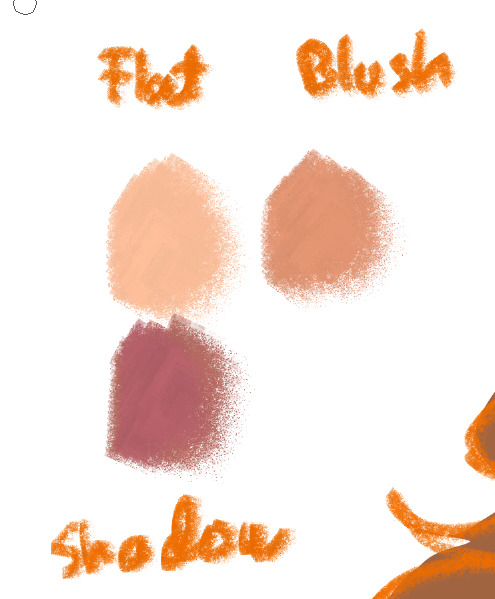
i figure out the colors right after the sketch (i have the colors on top of the sketch with linear burn which gives the sketch a nice colored look, the sketch is usually a dark warm tone) and after the flats i select the sections by color and loosely fill in the shadows roughly in this pattern- the main color, shadow, darker shadow and bounce light, and in few places where it visually works, i add a streak of the darker shadow to outline the cross between the main and first shadow color (you can add another shadow layer in a few darker places if you need mor shading inside the shadow areas, colorpicking from the linear burned sketch can get great fitting colors for this as well)
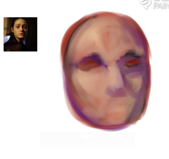
then i merge the color and sketch to a new layer copy and start going over every bit one by one overpainting the shapes and cleaning the sketch, both rendering and lineart in one, but i try to still keep as much of the original sketch as i can. then i add another shadow with multiply layer and light with glow dodge, its good to figure out the multiply shadow at the start with the flat colors just to make sure you get the vibes right when its still rough. this is also where you airbrush more dark or light areas in the background, in places that could use more depth or seem too flat.
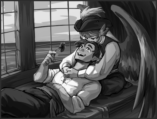
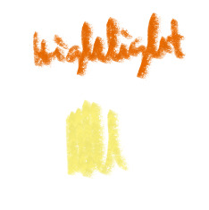
and finally i add some rimlight/highlight with a normal layer, as well as paint over any bits that may have looked off. and you're done. some things to keep in mind is to check your color values with a black and white filter layer to make sure nothing blends together too much. and to not over-render it. make regular copies of your rendering layer so that you can go back if you need to. the main brushes were CSP mechanical pencil for sketch and g pen for the rendering. of course none of these are a rule, pick out what you want and have fun :D
#asks#alot of this is probably very repetitive#im not great at explaining#hopefully it helped sfskhsdkfj
68 notes
·
View notes
Note
hello i love ur art <3 may i ask how you shade/render? or if you can share any helpful tutorials you learned from ^^


Unhinged Art Tutorial
Well, anon and @merlucide! I'm not sure if I'm the best person to learn from (I'll attach some video links at the end to people who I personally look to for art advice) but I happen to have a series of screenshots for how i render with a strawpage drawing I did recently(at the time I drafted most of this a month+ ago), so I'll go over what I do, at least in this case.
Warning: A bit rambly. Not sure if intelligible.
Tutorial..? Explanation? under the cut.
I have a few different shading styles based on ease of program usage and effort level, but in this case i had to individually streak the shadows. I'll be focusing on hair and skin for the most part here.
My sketches are pretty poor, because I'm hasty:


Honestly I find the better the initial sketch, the easier the final profuct will come. So take your time, use layers when sketching to be clean. The airbrush layering shows vaguely how I tend to shade hair.

Backlighting *Applicable mostly when there is a bright background, light behind the subject, or in neutral lighting.
The 'underside'/inside I tend to use a peachier, brighter tone closer to the skin color (for tanned skinned characters I'd use a shade closer to a rosy orange, since that's just a more saturated peach. For darker skinned characters, I'd recommend a slightly redder & brighter version of their skin tone. This works pretty well with dark hair+dark skin, but in the case that your character's hair color is a lot lighter compared to their skin tone [also in the case of a fair skinned character with WHITE hair] it's totally fine to ignore the natural undertone of the character and shade it with a pinkish white.) This works for any hair texture but can be more time consuming for coily hair textures. (2c-4c)

Lineart when I take my time / Old rendering video


It looks more stable if you start off with a solid lineart base because you won't struggle with big-picture placement issues.
"Lineart" when I just try to pump out a drawing

I first did a rough sketch, kept it as an overlay layer and drew over it.

(Chickenscratching is valid though, honestly. I think it has a look to it!) I usually block out base colors, and vaguely where I want the shading to go, unless I need a special type of lighting, which then I'd do the base colors and either choose to wait until I'm finished rendering or do light processing* (*will discuss this later in this post) with different blending modes and layers.
For example if I'm doing the colors mostly FIRST (Choosing a grayed out palette) and then rendering, it'd look a little something like this: Left (Trackpad, on FireAlpaca) / Right (iPad, on Clip Studio & Procreate)


Sometimes, I'll shade with a dark, grayed out tone and then fill it in with something slightly more vibrant. This kind of gives it a bounce-light feel? Also with a lot of pieces I do recently I try to block out entire parts as white because lighting especially on white background pieces looks better if you pretend that it's white behind the character due to an intense sunlight.

Also, I use gradient layers to tweak with the colors. It's pretty useful and looks nice!!!! Gradient maps are available in every software I use: Procreate, FireAlpaca and Clip Studio Paint.

I find that the more intense the light (but not scattered, as in the source is either very bright or it's very close) the darker the shadows usually look? And if there's a brightness coming from behind the figure and the hair is splayed out in some way, it will appear semi translucent because it's just a bunch of strands made of keratin and collagen, something like that....


Anyway this is all very messy but I hope it helped

Here's a process photo for how I shade if that helps too.


More examples..

I broke down my thought process in my lighting so here's a close up of that.
i totally forgot about the video links so here's my idol the one and only:
And I think this guy makes quick but concise tip videos:
Finally I really like the in depth professional explanations from a long time illustrator:
I've personally taken advice from all three's videos and used them to improve my own art, so take a peek!!!!
76 notes
·
View notes
Note
I finally got all my brain ducks into enough of a row to send this! I just wanted to say that Tumblr recommended your art to me on a whim, and I am actually OBSESSED now lol. I had no prior investment in Submas or anything tangentially related to it prior to this (aside from liking Pokémon generally lol), but I couldn’t help but tear through everything you’ve drawn for these silly little rat children and I love them so much now!!! I wanna pick them up and shake him around like little action figures! The shenanigans and the heartfelt moments are just,, UGH so good! I have no words! Thank you for the food I am going FERAL over them <3
Your art is also high key goals for me now tbh. I absolutely ADORE your coloring and rendering style, and also they way you draw Pokémon in general?? Very animalistic but still recognizably Pokémon?? Literally galaxy brained. I’m going to SCREAM. I know you already posted a bit of your art process, but I’d love to know if you’ve got any rendering tips and/or how you get that clean but sketchy look. It looks so good I want to eat it lol.
(Also I really love the way you’ve been formatting Elesa’s dialog, with the extra lines around the letters. It really gives the vibe that her grasp on Galarian is currently shaky at best and idk, I like that you’ve managed to find a way to convey that over text. I think that’s pretty cool :D)
I SAW YOU REBLOG A WHOLE BUNCH AND IM,,, (throwing hearts at you)
Thank you so so much! I’m glad you love these terrible little guys wandering Unova just as much as I do, haha!
As a treat, lemme pull out some drafting for the mini illustrations. I usually start every snapshot with a run down of what I remember from the area, possible shenanigans encountered, and then a doodle of ideas to come.
From there, it’s a SUPER rough sketch, followed by lineart and rough color, and then cleanup!
(More thumbs and their finals below!)
At the end of the day, all my lines are VERY sketchy. I’m a lot stronger when it comes to mashing colors. That, and if you set your line layer from normal to multiply, the lines will always be automatically darker then whatever layer is placed underneath. It’s a trick used quite a bit for placing cel shadows in animation, but it’s useful for lineart in a pinch.
For colors, I like to stick to a limited pallet and branch out only after setting my primary colors. This entire series has been very experimental for me though, as you can probably tell.
As for the last bit— YES… YOU GET IT! As Elesa grows, the lines in her dialogue will start appearing less and less. It’s the little things that map the span of time for these guys.
Yippee!
#ask#mailbox#aah… scared to respond to my inbox because there r so MANY asks but#this one’s asking for tips and i love getting on my soapboxes#and also the sheer amount u reblogged??? holy shit okay if ur gonna put the effort so shall i!!#ANYWAYS!#critterbitter screams into the void#critterbitter
355 notes
·
View notes
Note
hey, how are you? i love your art! i am just learning how to use procreate, and i was wondering what brushes or canvas do you use to get the paper effect when you’re drawing? sorry, i hope you don’t mind me asking. thank you. ☺️
hehe well i’m gonna do a basic comprehensive tutorial on my drawing process and general guidelines i follow when doing art (hope you dont mind im using ur ask), i’ll start with my process first
brushes i use:
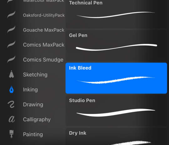
lineart: “ink bleed” brush that comes preprogrammed in procreate
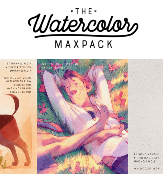
coloring/texture: maxpacks watercolor set (while in the pricy range, ive been using it for years and i think its a worthy investment, he also has sales occasionally)
for sketching: HB pencil that comes with procreate but you can use whatever
so my lineart, i typically duplicate my original layer, “color fill” the new layer with a dark red (or any dark color of ur choice), gaussian blur it @ 3% and set it to multiply and that just gives it some depth (for this piece i actually copied my dark red lineart and adjusted the opacity to make it a little darker so there’s 3 layers in total here)
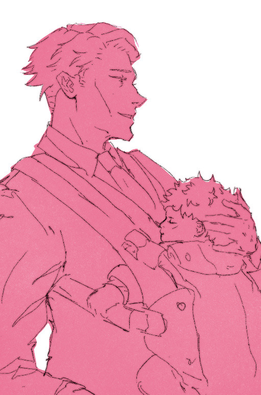
now on to COLORING, i start off with a solid bright color (usually one that goes with the general palette you’d like to use, i wanted something warm so i went with a pink base)
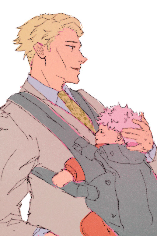
create a new layer and thats where the colors come in, i typically do a rough estimate of the colors i want to use at this point, cause they can be adjusted later in the “color balance” setting under “adjustments” once you have your coloring done (this is all on one layer)
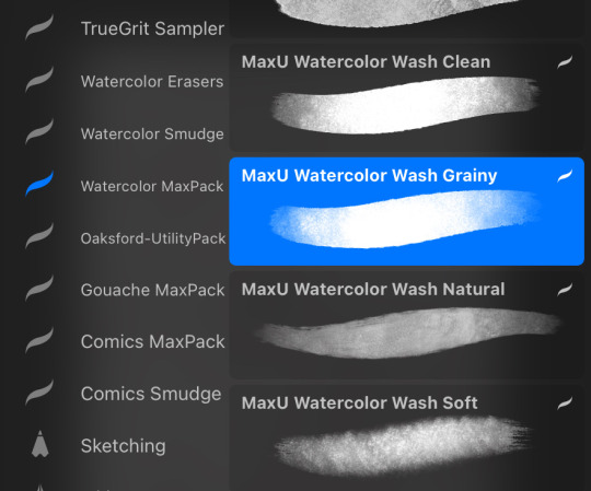
now my SECRET is i use the WASH GRAINY brush as an ERASER and lightly go over my color layer so the pink base comes through a little and unifies the colors and gives it that yummy texture. sometimes i erase the base color too for a little more texture but thats not necessary for every single drawing. once i erase enough, i go to “color balance” adjustment tool and mess with the hues till i get the result i want.
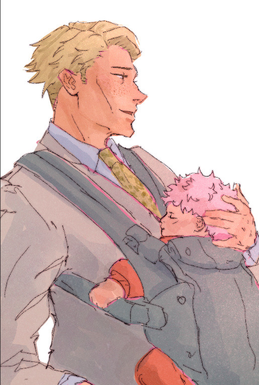
after that i create a multiply layer and with my WASH GRAINY brush i do shadows/face rendering. and with this piece specifically i did an add layer to simulate sunlight on them (i do extra layers at my own discretion, so have fun with it :)
as a final cherry on top i create another multiply layer, fill it with white and then set a noise filter on it @ 17% (dont ask why that number it just works for me lmao) and thats it!
if i need to clarify anything dont hesitate to ask! like i said we dont gatekeep here
and some general tips: dont over-articulate your drawing, cause i find the more i fuss with details the more stiff my drawings look, so i suggest being a little more loose with lineart/sketching and dont sweat the small stuff
same goes for coloring, the more simplistic your shapes are the more cohesive ur drawing will look
another coloring tip: if you’re having trouble with ur drawings looking “muddy” i recommend starting off with a black and white render so you can get a handle on your values before you worry about hue (i do this with my more rendered portraits but i find it helps you focus on the depth of your drawing)
66 notes
·
View notes
Note
Hi! I really love your art! It’s been a huge inspiration to me and a motivation to finally sit down and learn to draw. Care to spare any tips for a beginner? 🥹
What would you describe your art style as? And what’s your usual process? Any favorite brushes?
I hope one day I’ll be able to be as good at drawing as you are ❤️
AAAAAAAAAAAAAAAA FIRST OF IM SO HAPPY YOU STARTED!!!!😭😭😭😭 AND IM SO HONORED TOO???!!!!!


(I'm sorry it took me a while to properly answer!!! I wanted to give the best advice I could sooo…there's a lot of stuff in here, so everything is under the cut + some links)
1. style
I usually describe my style as semi realistic, though I felt like I've been stylizing a little bit more lately (mostly in hair). But it is usually a normal thing to happen! Since you starting, Im going to assume you are looking for your artstyle too! Honestly is really easy to get catch up on that, but keep you options open!!!


aidairo yuto sano demianasche
These are some of my main style references, (I tried to keep some akin like poses to show the difference).
Each of them is on a part of the “stylized - semi realistic - realism” specter, and even though the later still is very close to semi realism, you can see that they differ a lot from each other.
If I can say anything about an “artstyle”, is that is just how you like to draw some stuff. Once you're studying art, some things will come off naturally as more appealing than others! That's how you end up with your very own style.
(I like A LOT this video of Shay (sketches of shay) on this topic, is basically everything I could say and a little bit more💜)
But to resume a bit: LEARN THE FUNDAMENTALS!!!! You will develop your style naturally once you understan how shapes, forms and linework connect
2. my process
I had to film a timelapse for this cause I keep turning it off to save space yay!
I cannot stress this enough but ALWAYS HAVE A REFERENCE!!!!!! REFERENCES ARE FRIENDS AND FOOD. EAT THEM UP. U BRAIN WILL THANK U LATER.
I usually keep them on a pop up window or on the left corner of my screen, so I can always reference back and forth while I draw.
(Some good tips on reference here and here)
If i could resume my process it would be references < sketching < clean up < coloring < detailing.
I don't usually do line art, just clean and refine my sketch on its own layer. Much like you would do on paper, except if I'm working on commissions, but that's another thing.
Also, my painting changed a lot over the months, but I centered my studies around this and this. I like using a base color (either beige or purple) so the colors blend more easily, it really depends on the vibe I'm going for the colors, for example, if I'm doing a darker art, I'm going for a grayish blue, if I'm going for a sunny environment I put the base under a warm beige. It goes a little bit into color theory (I learned it on a "for dummies" video so I can't explain it fully, I'm sorry)
I like to keep my layers as minimal as possible, but that's just a personal preference. When I started, I used to do a layer for everything until I gained some confidence in my brushstrokes but I think that's something that goes from artist to artist so work on what's better for you!!!
3. brushes


I also keep them as simple as I can. To sketch I like using brushes that have a pencil like texture? Anything with a little noise is a go-to for me. Also for rendering i mainly use the basic ones that come with most programs, except the one called “yeeee” that I downloaded somewhere (I can't remember it for nothing, but it's just a round brush with less opacity in the corners), and the “THE render brush” from clip studio that I use to blend here and there. The one marked with * is the one I use whenever I'm going crazy on rendering the hair with is from a really old sakimichan brush pack but is still very handy (tho I think anything with a slight "hair" texture would do the job too).
I recommend u AGAIN to found what's the best for you. What I think is the most important is to not depend 100% upon some brush.
I think is this 🥺
If there's anything specific you want me to tell don't be shy to ask!!! I will so my best to answer!
AND DON'T GIVE UP!!!!! ART IS A KNOWLEDGE THAT TAKES TIME AND PRACTICE!!!!!! YOURE DOING GREAT AS LONG AS YOU KEEP GOING!
18 notes
·
View notes
Note
Hello! Your blog has been incredibly helpful for me, thank you for doing what you do
Disability is a core theme of the stories I make, so accessibility is one of my most important goals. For reference, I write books but my main project is a show that’s sometimes semi-animated and sometimes similar to visual novel style dialog.
Some of the things I’m doing now are subtitles and narration that’s baked into the show itself, sticking to a simpler style of writing, and making it free to watch. It’s one part practicality and one part frustration at being told these things “ruin the experience” for others. Now they’re a core part of the experience.
But those are just the things I find personally helpful, I only have my own viewpoint. My question is what are other things I can do to make my story more accessible?
Specific things I’ve been struggling with are showing nonverbal communication (The narration covers a lot of this, but not enough) and conflicting needs. I know some things will help some people but hurt other’s experiences (ie, subtitles) which is a really hard thing to navigate! So advice on that would be helpful
Thank you!
- @interroblog
Hello lovely asker!
So I'm gonna throw out some ideas here at the start and these are in no way me saying "You have to do this". No, just me tossing some ideas out and maybe they hopefully help! 😁 Let's try this.
First off you also mentioned that it's part of your style in the way you're animating as well. I think if it's your style that you shouldn't have to change that either. It's both something that is unique to how you choose to do things and it also aids in accessibility. You shouldn't feel pressured to change it because some people find subtitles or Narration annoying. It ultimately comes down to how you want to do it, so again here are some things I could think of.
So if the site you're hosting your show on allows you to have toggle on subtitles and audio descriptions I would do that. If not what you can do is when you put your animation through you can have multiple. Kinda like with certain shows or movies you have a version in its original language and a version that's Voiced over with another language. If you want to accommodate your audience perhaps you can have a version:
Without any subtitles or audio descriptions
With subtitles
With audio descriptions
With both the subtitle and the audio description
Granted going this route may be more work than just doing it all together (I'm not 100% sure, I don't know animation very well) but it's certainly an option. I think the process of rendering and saving it at the end (having to do it multiple times) and in regards to space may be an issue.
Another thing you can do is write up a description transcript for each episode so that people can look at it for reference. Some people use screen readers or braille displays that read over this information for them if you're worried about the text itself. Here's a good example of one done from a DeafBlind film done in the 60's at Perkins [Warning for typical 60's language regarding disability]. It usually includes what an audio description would just typed out.
Another thing you can do is see and look around for anyone who is fluent in the local Sign language that your show is in and see if anyone could record and interpret it for you too, if you want to have that option for people as well.
You could also do kinda like comics and Manga do where they mark the sounds/actions on the panel/animation it self.
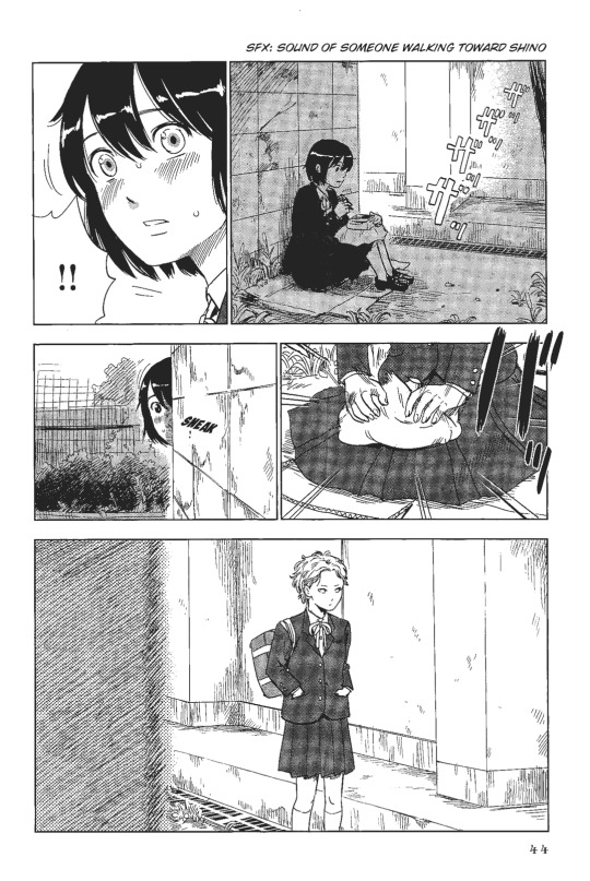
[Manga panel from the Manga "Shino-chan can't say her name"]
For instance in this manga panel there's no dialogue but the author gives us multiple cues which the translator also translates as well. There's the foot steps with the text getting bigger and bigger letting us know that the sound is getting closer and the direction, then in the next panel we have two exclamation points letting us know she's alarmed and aware. The text of the foot steps is now darker and bold and we see the streaks around the characters hands letting us know that she hurriedly wrapped up her box. Then we have the word "Sneak" in bold lettering against the wall where the character is pearing over.
Now I'm not sure what type of nonverbal communication your using so I'm gonna go over things a little vague.
Sign Language [Mostly in ASL because that's the sign language I'm most familiar with and can understand the most]
Here's two animations by @scoliwings and they're both in ASL and the way the person made them is with captions into the animation (also they're very cute and lovely). The show ThisClose also does this with their entire Pilot episode but then only does it with their ASL scenes moving forward in the series. The people who wrote and produced the show note that while they made the show surrounding the deaf community and about the deaf community they wanted the show to reach their hearing audience.
This scene that is with a translator has no captions whatsoever. While this scene between the two main characters using ASL does have captions. Then this one does have captions that go away when the characters communicate verbally.
This is a constant thing of multiple different medias is they kinda choose between which audience they want to pertain to. And whoever they choose, it usually ends up leaving the other out or not 100% involved usually at the fault of accessibility on streaming services/wherever the media is being hosted.
If someone Deaf/Hoh wanted to watch this show and there's no captions available on whatever platform is hosting it then it wouldn't be accessible to them. And if they are fluent in ASL, those parts have captions all the way through. For instance those videos on YouTube, not all of them are accessible because they don't have the toggle on Closed Captions. So the moments where there's characters who speak English and don't sign ASL, especially if the camera isn't on them when they're talking, it's just not accessible.
In the episode "Into the Mystic" on Supernatural, they introduce Eileen's character. This is the only episode that she uses ASL by itself, every other episode she is in uses SimCom and she code switches or uses English. Again captions are in the episode Everytime ASL is used except for scenes where she's signing in the background for instance this scene. From This Gifsets by @winchestergifs
[Gif of Eileen from Supernatural. She's sitting across from an older woman on a couch and she signs in American Sign Language "You" while pointing at the older woman, then she forms her fists into a 'S' shape one on top of another and moves them to the right, she then finger spells "Bait".]
It's never translated, not even in the script or the transcript. Even while this show is targeting their hearing audience they still gloss over things like this. (I also want to note that me and Mod Rock spent a while trying to figure out the second sign and came up empty handed as well 😅)
Now when it comes to Audio Descriptions, it's usually "[Character name] signs [dialogue in Verbal Language]". If it's the first time introducing the character or the character is switching languages, then specify what Sign language off the bat, ASL, BSL, ISL (SEE, SSE,) etc. It's the same as in writing that you write the character dialogue followed by "[pronoun/character name] signed". The shows that I know of that have characters using Sign language and have Audio Descriptions is The Boys (kimiko's scenes), ThisClose also has them, Bridgerton (episode 1 scene in s3, it's one scene in BSL but it's there!), and I'm pretty sure Echo does too (it should, I'm looking at you streaming service) but I've yet to watch that last one. Listening to them might help you with getting a grasp of writing them if you have any signing characters.
Ex. Eileen signs in ASL "You sure you don't want both?"
Another thing with Sign language though is body language and expressions and even things like story telling are there also. So describing an action can give a lot of context of feeling and what is going on in the scene. Here's another ASL animation that is in the works and they go more in detail of how they are animating body motion, face expressions and such. Craig of the creek is an animated kids show that also has BASL and ASL in it (and I love how they go about the characters dialogue, the signs are so well animated, and the friend translating and the others learning for him too.)
There's also Pro-tactile & Tactile Sign language. Granted I've never seen or do I know of a show/movie/short with pro-tactile in it or Tactical Sign Language but if anyone were to do that the audio description would probably be like "[Character A] puts their hands over [Character B]. [Character B] signs [dialogue]". That would be for the Hand over method which is Tactile Sign Language.
For Pro-tactile, this involves other forms of communication such as back channeling, mapping, haptics. It should be translated much the same I believe because these certain elements of the language are used to portray emotional tone, contact/interaction, as well as directions.
Here's some examples of pro-tactile and tactile sign language since I know it's not largely known: (all ASL)
Pro-tactile: Video 1 (Captions & No Voice Over), Video 2 (Captions & Voice Over) and it goes further into specifics of Hand placement, Back channeling while Standing & Sitting, Video 3 (Voice over & Captions). Here's five vlogs in PTASL also, no captions or voice over so Fluency in ASL is needed.
Tactile Sign Language: I was having a hard time finding videos (for some reason) but Here is a segment in a video where they show it. Here is another short video too!
Of course you don't want to describe every movement when it comes to Sign language but you want to describe the base movement. If someones Tracking, (this is where a person holds the wrist area of the other person who is signing so that it's in their field of vision) you might describe that before the dialogue. "[Character] puts their hands over [characters] wrist" and so on and so forth.
Haptics/Mapping may also be very similar but they're mostly used in describing the layout of an area someone is in, directions to somewhere, how to navigate the surrounding area. This is gonna be just explaining how they are moving. The same can be said with Visual Vernacular. It's movement to describe something or to tell a story it's not Sign language but a movement of general understanding. Here is a video where an interpreter details Visual Vernacular alongside ASL. Here's the one without the voice over as well.
AAC
The movie Come Play is a horror movie centered around a non-verbal boy with autism who uses an AAC app on his phone. His device is the one where speech is generated from the different buttons that correlate with the words he clicks. I couldn't find an example of an audio Description for this movie anywhere but it might be similar to the next example.
The Boys again also has scenes with Kimiko where she uses her phone to communicate and such. And the audio description usually sounds like "Kimiko types on her phone, it reads [dialogue]". The only difference in Come Play would be that the Dialogue wouldn't be narrated because it's already done so by the AAC device in the movie, but subtitles would be needed.
Speechless gives a lot of examples between low-tech and high-tech examples. This scene in particular where all the characters are in one scene. The main character (JJ) uses a laser pointer and a word/alphabet board with the assistance of an aid. In this instance the aid reads aloud everything that JJ communicates. If you're one on one though, much like with sign language, you wouldn't really read aloud everything they say especially if it's a private conversation. Instead the pov would probably show the characters AAC method they use whenever they communicate. For the audio description it might be something along the lines of "[Character] points and says [dialogue]".
I've never seen other types of AAC in media so it would probably be the same when it comes to Audio Description when describing another method like print on palm. it might be something like "[character] grabs their hand and writes [dialogue]".
In the show In The Dark the scenes with braille are described as "[character] runs their fingers over the braille, it's read [dialogue/text]". And on that topic, In the show All The Light We Can Not See, it has a really (really really really) good basis of what an Audio Description should be like. It also has multiple featurettes and an audio introduction with it that goes more in depth to explain the costumes, settings, the characters, and other visual information that is often important but left out in the audio descriptions due to the pacing of the show/film.
Immersion was the goal, much like with the production of Romeo and Juliet in PTASL that was performed. Introducing your characters and settings in a little short animation before hand or at the begining as a little segment may be something you can do/consider.
This video details some other forms of communication that I may or may not have left out (Auslan & Voice over). Finger Braille (Video of one handed with translator), Lorm Method, Touch Glove alphabet Method, and some other methods I think can all be described relatively the same. You want to describe the base action of what they're doing (writing, pointing, typing, grabbing, lifting, touching etc) and then focus on their dialogue.
Also I don't use any form of AAC to communicate so if anyone who does finds error, please correct it. Or even if there has been a discussion on this before among the community please reiterate or link to it so we have first hand experience and voices as well.
Known problems with audio Descriptions
Here's a Small history and more in depth article written by someone who needs audio descriptions. They primarily talk about its lack of rush to be used in cinema and primarily the UK.
Describing everything but the characters race: I've heard that this is an issue specifically for Netflix that the audio descriptions are good but they never mentioned the race of the character which some people have made note about. (I don't know much about this I will say just I've heard it around here and there)
Here is a post that goes more into detail about Audio descriptions as well by @accessibleaesthetics. And here is an all around really Good source as well called The Audio Description Project.
Forgetting character entrances & exits: This is important because people need to know what characters are in the scenes. Much like in a play with stage directions you need to know who comes in and when they exit.
Over describing/under describing: I read a debate about the use of over describing and under describing when it comes to AD's. The example given was when describing facial expressions. Option one is to just say "[Character] is surprised". Option two is to describe the facial expression in all its little details "[Character] opens their mouth, their eyebrows raised and eyes wide". Under describing in general seems to be a issue but when it comes to things like body/facial expressions it's best to keep it simple and to the point for another reason that I list down below.
Forgetting small details: the audio descriptions of All The Light We Can Not See, and The Boys do a fantastic job of small details. For others some things are glossed over but then don't make sense later on in the scene. For instance, if the character picks up a knife and this isn't narrated but then the part of them stabbing another person is then, it's kinda like "Oh well I guess the character picked up a knife at some point" but the exact moment isn't specified. In this article, the person who makes Audio Descriptions tells that he had described someone as Smoking a cigarette when he was in fact smoking Weed. He says the reason he realized the difference is because these are two separate substances that change the perception of the character. The little details matter because of the implications and importance to who is doing it and why, when gathering all the information and understanding a character.
Misnaming/mixing up characters: The same article I listed right before also says how mixing up characters is an issue sometimes too.
For audio descriptions in general I think listening to a few different ones might help with getting a grasp on how to do them/better do them. AudioVault is one place that if you can't find audio descriptions of your shows or movies, they might have it there. In this instance, maybe listening to your favorite movies or shows with the audio descriptions on might help you. Most shows/movies that are original to Netflix have them, the same with other streaming services like Peacock and Amazon Prime.
I don't use audio descriptions a lot because my tinnitus makes it difficult but I sometimes turn them on (when available) to understand scenes that are confusing to me. Certain actions and how the cameras frame them don't make sense to me sometimes, or even I can't see because of the lighting of the show or movie and so I need to know what's going on. This brings us to that beside people who are low vision or blind, many other people use Audio Descriptions for different reasons too. The same points can all be made for people who use Subtitles/closed captions as well.
Issues with captions/Things that need to be more common with captions
Names: Some captions have the names of the characters next to their dialogue. A lot don't do this. I think it should be done because of many reasons but mainly it makes it easier to follow along for everyone who uses captions.
Tonal Cues: As I mentioned before Tonal Cues in Captions would be so very helpful for a lot of people.
Don't censor: Don't censor swear words, slurs, anything, write it as it's said. Unless it's actually censored in the audio (which is usually done for comedic reasons) then do that.
Lyrics/music/background sounds: So not only making sure to include the songs that are playing over certain scenes but also making sure to include the soundtrack and background music that is playing. Almost every movie and show uses music as an indication for tone, often times characters or certain situations have their own theme too. These are all important to note when writing captions. The caption writers of Stranger Things did amazing when it came to background noises, writing every creak and bang is important especially if it's being heard and reacted to by either the characters or the audience.
Include language changes: This has long been an issue when you're watching something in one language and then when they switch languages it just says "Speaking in [language]". Instead write out what they said in that language. So instead of "Speaking in Spanish", actually write out "Sana sana colita de rana". If the character knows what they're saying because they speak the language you can also put another set of subtitles under it translating it. If you're doing a sorta comedic scene where the audience needs to know what is said but the character doesn't, then do the same, write it out in the language "Ay dios mio!" And then under/above it put the translation "Oh my God!".
Include different speech patterns: If the character has a stutter write it, if they're slurring their words together write it.
Auditory/Visual Learners: Some people just do better retaining and understanding information when it's in an auditory form. For some people, they're able to retain information more by reading it rather than hearing it as well.
People Who Have Trouble With Social Cues: Okay so a continuation to the "Over Describing/Under describing" bullet points above. For people who have trouble reading body/facial cues, the audio descriptions help by describing it as The character is happy, scared, shocked, surprised etc. This is part of the reason why it's best to use those words instead of describing every movement that goes into a person's expression/body language. Like wise Closed Captions with Tonal Cues would also help and serve much of the same purpose but those are rarely ever seen (in my experience).
Help People Learn The Connection Of Words And Actions: a lot of people are always learning new languages and being able to connect the word to the action helps with the understanding of new languages. Again the same for closed captions, being able to look at how words are spelt while listening to them helps grasp a better understanding.
Overstimulation: For some people looking and listening to something at the same time can be too much and it becomes overwhelming. I know I often turn off the sound to a lot of movies I watch and just use subtitles because sometimes commotion/yelling especially in like action movies is a lot. For some people, a lot of visual movement and constant rapid actions can be overwhelming as well.
Dark Screens: As I mention, especially more recently in the media industry, things are a lot harder to see nowadays. The same can be said with dialogue and why a lot of people may opt-in for subtitles and captions because things are just so hard to hear now.
The Busy Bees: Some people just like to multi-task and much like an audio book, you can do something (chores, crafting, homework etc) while listening to the show and not miss any visual information. Multi-tasking also helps some people concentrate better on what they're working on too much like music helps some people.
People With Other Medical Conditions That Make Viewing Screens Inaccessible: If your having a migraine or headaches, a screen is the last thing you want to look at, and for some people, noise is a trigger for them. They're also a known trigger for many people with epilepsy/seizure disorders. People who have photophobia also may AD due to the light sensitivity. People with ADHD, autism, Prosopagnosia, Processing Disorders, and many many other things that I can't possibly list them all, all may use Subtitles or AD's for multiple different reasons.
Okay, that was a lot, got a bit long, but hopefully I covered everything! Things could be more organized but it works so hopefully this helps! I'm not very familiar with animation so anyone who is, please feel free to add on in a reblog to share a few tips and tricks!
~ Mod Virus 🌸
#mod virus#and a very thank you to mod rock with the translating and helping with describing the AD on PTASL#writing descriptions#interroblog#writing audio descriptions#nonverbal representation
45 notes
·
View notes
Note
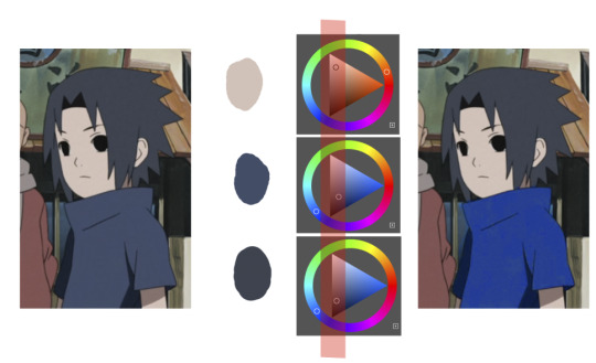
if you don't mind asking, the people (me) would like to know if you can share the tiktoker that inspired you to make the new rendering style because is so so pretty or if you can't find them if you can give tips on how to render like that, no pressure for neither but I am really loving how it looks literally chewed on both the baxter and cove art fdgfdg
I actually have the tiktok saved just for a frame of ref on how the messy render style would look LMFAO, heres the tiktok that inspired this whole color style and im pretty sure they also make a tutorial on how they do that specific render style
But! I have my own spin on it so heres some tips on helping understanding and achieving this way to render
So for starters i only use the charcoal brush for the entire thing but u can use any texture brush of ur choosing

i treat this coloring style how i treat color pencils or color pastels in real life
Meaning i start sketching with like a more lighter color
Its preferable to like usually sketch with either purple, pinks or reds but i usually sketch with how the vibes are feeling rn or what kinda color i associate the chr with LOL
The after that i just proceed with flats and heres the fun part
With how i shade in general i very much rely on my color wheel

Basically when adjusting colors like lets say i wanna shade i adjust the color wheel to the left and adjust the colors saturation but thats depending on how dark you want your shadows to be, if you want them to be darker just keep adjusting a bit more to the left of ur color wheel and lower the saturation more but not TOO much
Same also kinda applies to adding highlights and the only fee changes is adjusting the color wheel to the right
So rinse and repeat and u get these colors for the base skin
Note that these is just a pallete guide on how to pick colors to shade and highlight the skin but for me usually i keep adjusting the colors anyways to like find a way to blend
Remeber kids! Eye dropper tool is your best friend if you wanna blend colors together
When all goes well the face will look like this
Few notes is that you dont want to get rid of the sketch outline even when overlaying when shading and rendering
It also adds more color and life to it if that makes any sense
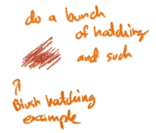
Another thing about shading is that you can do hatching and shit, be free of ur strokes! It maintains the sketchy feel of the piece
One last thing to note as well is where the light and shadows could be coming from when rendering
I also need an excuse to share a lesson i had with my professor on my art college LOL

Bringing out the artist ball but these are the 4 main things you need to note
A reflective light can be made by just putting ur color wheel to the opposite side of your color wheel LOL
Understanding this could go a long way trust me

Then after that youre basically done! Again just rinse and repeat with how you pick your colors and you should be good
If you wanna better understand how to color properly theres this one video that helped me out alot with understanding how to pick colors
Anywahs to wrap this up cause im running out of brain power to explain LOL be very loose with this style, its very sketchy but it adds flare to it if that makes sense
Hopefully i was able to help explain how i do it in some way!
And if not well you can just watch the tiktok tutorial on how to do this HAHAHAHA
26 notes
·
View notes
Note
hi dema! i’m learning how to do digital art, would you mind sharing your coloring process? coloring (and lineart) is the hardest thing for me to do T_T… what brushes do you use for coloring and how do you not make it look muddy? i’ve been trying to follow tutorials from different artists on youtube but i find my work to look so muddy… thank u in advance >__<
Hi, and thank you for thinking about me for advice! I'm honoured to share a bit of my process, nerve-wracking as that is for my shy self, and hopefully help you out as much as I can. Forgive me if I don't express myself very clearly—I have a bit of a hard time explaining these things. Now, let's get started, shall we?
I'll be using the first panel of this artwork as an example.
My process is pretty straight-forward for most artworks. Make a sketch, draw the lineart, and follow a self-made guideline for coloring and rendering.
Sometimes I'll throw the guideline to the trash bin and start experimenting with brushes and chiaroscuro and color palettes, but that doesn't happen most of the time and, when it does, it's more a challenge than anything else, and not really what I think you're looking for.
I'll include my usual steps here, however, and like I said earlier, these steps are more like what you'd call guidelines than actual rules.
(I just realized I didn't save the sketch for this artwork. Oops)
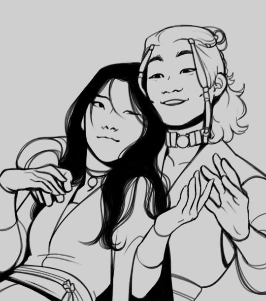
This is the lineart!
I tend to think that details bore me and are actually pretty exhausting to do, but then I go and make things as clear and detailed as I can. Because I'm a hypocrite like that.
I did try to keep things simple here, though, mostly because I had to go through three other panels and didn't want to burn out my fuel mid-process.
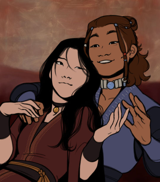
Base colors! The blush (and Zuko's scar!) I draw in a different layer in case I need adjusting the brightness or saturation later.
It's time for shadows!
Pick a color depending on the atmosphere you want the artwork to have. Is it a cozy, warm scene in a honey-tinted room, or is it a moment shared under the moonlight? The color choice should come as an answer to those questions—deep red for the first one and dark blue for the second.
Choose a color and make it dark and saturated. Then, play with the layer opacity! A darker shadow means harsher light, while less opacity works best for a softer look. See the difference? It's subtle, but it's there.
Of course, this is my personal choice. The way shadows are drawn and color is chosen depends on the artist and the artwork. I choose to play with a more simple coloring style, keeping shadows from blending into each other, but you may like a more realistic approach to shadows and colors.
My best advice? Try doing it every way you can, but in the end choose what works best for you. Whatever feels more comfortable, whatever you enjoy drawing the most. And then work to improve it. Love the little proof that you've gotten better, even if it's subtle.
And talking about subtlety...
I love to play with gradients. I use them mostly to give the artwork some form of atmosphere, and make it look cohesive and whole. A light gradient in the color and direction of the shadows will help the characters blend with the background, as will another gradient in lighter colors for the light.
Get creative with gradients! Use them so the lights feel brighter and the shadows darker.

Now it's time to work with the lineart again.
The pure black lineart makes the artwork look harsher, sharper, so I tend to give it some color to soften its edges and compliment the rest of the drawing. In darker shades as the rest of the colors, growing more saturated as the light comes closer.
I love to make the characters' eyes pop and glow! It's really fun what you can do by just messing a bit with the tones of the lineart.
Finally, I play with the level correction. A high contrast will help your artwork stand out and look brighter. See the difference?
And it's done!
Sometimes I like to add other effects or details, but this is the very, very rough shape of my usual process, and thus what I thought you'd like to see.
Once again, I'd like to point out that this is what works for me, and a large part of improving as an artist is just fooling around and messing up until you find the tools and tricks you're most comfortable with.
So keep drawing those muddy shadows and colors! They're only a step of the process.
#dema answers#zutara#art advice#art process#I hope this helped you anon#Tbh I have zero idea of what I'm doing most of the time#So don't worry if you don't#Worry instead the day you feel like a drawing comes easy and poses no challenge anymore#Always strive to do better to improve to fix that lighting or find a new way to depict a scene or find other filters and effects#No artwork is ever perfect and perfection itself should never be the goal#“Don't trust a song that's flawless”#Don't give up on the strain and the frustration of struggling against your own skills#Never fall out of love with the process#That's where art is
29 notes
·
View notes
Text
quite literally NOBODY asked but long post about the mental illness I gained drawing mattress car door and attic (process and references sort of... id post a timelapse but i don't have one because storage :/) this is more just to look back on because i forget my own thought processes 😔 this sounds pretentious i promise i don't think im that guy i just like to Talk


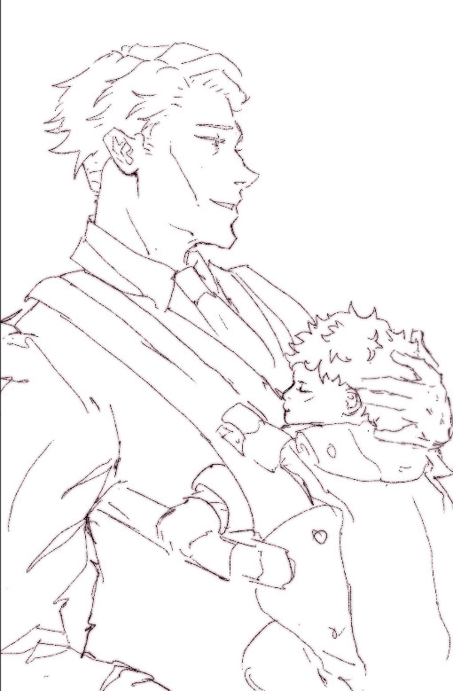
it is legitimately just taiji taomote's marble statue "death visceration" . like i STOLE IT that was my main reference AND HIS OTHER WORK IS SO COOL you can read a bit more about it here . i actually saw this BEFORE i made my karmor and it made me want to make a karmor just so i could draw mahatma and atilla like this.

i think the meaning??? in my drawing is pretty bog standard basic nothing special there like he's trying to stop his mate from dying innit . the moment was only a couple seconds but i wanted him to have like an anime moment in his head so i guess this was it lol
ummm and karmors pose was partially referenced from these spiderman sketches by j scott campbell (?) hehe so neat i love spiderman karmors pose sucks tho but what can U do lol

ummm started with a sketch and added some colours to see if i actually wanted to draw it realised what the hell sure . gradient maps did not help in this case cause i didn't have a lot of different values so i just did
regular colours
dark blue multiply layer to darken the colours
radial gradient on linear light mode going from blue in the centre to yellow/orange to brown/red on the outsides. radial just means circular i think. like radius circle yea did not know that before i found it on my program lol
blue gradient from the top and red background for some contrast yass
teal blue radial gradient in the centre with ... soft light layer mode??? idk (added after i don't think it's in the picture)


cleaned up my lines (lucario helped) and added my flats and started rendering before i realised layers are annoying and i needed to merge them and paint like a REAL WOMAN!!#(# (joking). when i had some shadows down i merged the layers together and PRAYED (U can see in 2nd img below i painted ontop of the lineart which is sooooo useful)


main shadows for me go like a shade that's hue shifted one way, then another shade that's a bit darker than that one and then a lighter shadow shade that's hue shifted the opposite direction to the first shade to fill in blank spaces i guess idk it just looks a bit more interesting
blending used brush with some pressure opacity and colour picker is amazeballs bc my program's blending tool sucks bruh. i put down a colour with slight pressure and picked the resulting colour and painted with that on hard pressure. doing that just gets you a mix of the two colours and more control over what you put down because you don't have to worry about maintaining a light pressure or anything it's just all paint no opacity
hue and saturation sliders my fave cause u can see what shading colours look good but obviously do that before u merge ur layers... highlights mostly reddish from the background
used a gradient map on black and white to check values (deleted after) and see if the highlights are actually highlights (i should've gone darker with the shadows and had more of a stronger red but it doesn't matter who cares 💔) oh and some super basic hatching in some areas that look a little bit flat
karmors lightning power thingy was a last minute decision honestly it doesn't make any sense considering the lighting but idc . who gaf. maybe using my pencil brush would've been better but i was lazy so just don't zoom in and pretend the random ribbon brush looks in place
export + a little cleanup on a new canvas (barely any cause im lazy) . check how it looks on phone add a cool toned filter to it (using my phone gallery app 😭) and . yeah . also Instagram story crash out is mandatory unskippable step
i also just stole karmors entire outfit from Pinterest you see nothing i do is original IM A FRAUD i just steal and look the other way 😭😭😭😭 AND I STOLE HIS FACE i based him off of the model akeem osborne he is very pretty if only i took the time to practice other hair textures instead of being a bum and karmors hair wouldnt look like POPCORN in the final image GOD
I also just cannot paint and. can't draw faces from weird angles . but im glad i drew a full illustration i don't think i really have like this since 2021 😞


okay ya that's it bye
8 notes
·
View notes
Note
hi! i saw your gem painting study that you posted and was curious what your process was? im trying to learn to paint like that and would love some advice :D
Hi! I don't have a speedpaint recorded for my gem painting so here's my process explained on a pearl one!! below the cut since its long!!
I start with a sketch tracing directly over my reference image to see where the eyes/nose/mouth land! I didn't record this part, but It helps me as an exercise before jumping straight in! I tend to paint fully on one layer, but I often save between parts so that if I mess up, I can just go back, which helps with the one layer anxiety!! For tools I have a specific clip studio paint brush I use that's been unfortunately taken off the store :C I suggest downloading and experimenting with a bunch of free oil paint/gouache brushes until you find one you click with!
I focus mainly on defining shadow!! Generally I start with a very rough placement with very high contrast!
Then I glaze over it with a more skin tone layer which preserves the color variation!
Then I jump in and redefine the details and features!!

For this part I think about the face as planes to see where light would hit!! This is especially helpful around the corners of the mouth and on the cheeks!! I also look at the loomis method for this which should be easy to google!
I tend to assign colors to different roles when I work!! In this case yellow was my highlight color so I use a very light yellow in my highlights and try to keep yellow out of my shadows!! For Shadows, I try and have one main shadow color (the one opposite from the light source) and then a secondary shadow color for the shadows created by parts of the face like the nose or eye sockets! In the case of pearl I use Blue/Purple for the main shadow and Red for the secondary shadows!! I also find it helpful to use saturation to provide emphasis! Darker darks and lighter lights have more saturation because they're more powerful in how they shape the piece!! After drawing the face, I have to admit I have a lot less of a process for hair/clothes background! I still haven't found a process of rendering hair I'm happy with sorry!! I mainly just try to keep my value contrast up! A good tip is to put a black saturation layer over your piece AND your reference in order to check values!! This also took me a lot of practice to get to where I am now!! Here's a piece from just 2 years ago of me attempting the same style!! And I still have A LOT more room to improve and learn!

Thanks!! I hope this helps!! :D
6 notes
·
View notes
Note
May I please get Nikolai just being nice to Riot? Just comforting her in way, he can. Or maybe just cheering her to keep being beautiful and mischievous, as she already is?
I mean a little text, not a render.
Disclaimer: Extended Russian sentences between <>
Setting: Near future, when the investigation about HeadHunters is on again (will be expanded in the fanfic). After Darker Matters (and their reunion)
I can't make a little text, omg...
Solntse moye: my sun
Solnyshko: sunshine
"I'm fine"
"I know your 'I'm fine's very well, but ok. We'll speak tomorrow. Now try to sleep"
"Sure. Good night, Kate"
Riot hung up the hotel phone before Laswell answered, and left it carefully on the bedside table, drowning the urge to yank it off and throw the device against the wall.
The day had been draining, being interrogated over and over and over again. Going over her training, Gibraltar, HeadHunters, Transnistria. To the point of being physically sick due to the memories and having to rush to a public toilet right after stepping out of the hearing hall, followed by a very worried Gabi and Kate.
The previous day had been the same. And the following day, there would be more of the same shit.
"Me cago en la puta (very ugly Spanish swearing)" She hissed, through gritted teeth, sitting alone on the bed of the hotel suite in London where the investigation committee had made her stay at. "Me cago en la madre que me parió (another ugly variant of ugly Spanish swearing)"
Alone. The only sound came from the TV, showing a music videos channel.
None of the 141 had been allowed off duty to accompany her. Price had fought against it, but in the end, what Headquarters said, went.
Her only company and support were Kate Laswell and Gabi, but they weren't allowed to sit during the hearings either.
She wasn't allowed to call or receive external calls, and her phone was in Laswell's hands for keeping. So she didn't even have the comfort of venting to Johnny or Kyle, to complain to Price, or be appeased by Simon.
God, she needed Simon. So much that every cell in her hurt.
Alone with her thoughts and with only the TV to keep her company, she thought she'd go crazy before dawn, prowling through the suite like a caged animal.
But there was a knock on the door, and she stared at it, frowning. She wasn't supposed to see anyone. From the hotel to the government building and back, with guards. No visitors, no calls.
Whoever it was, they knocked again, and Riot stood up to go to the door. If someone finally came after her, like with the other former HeadHunters operators, so be it.
But it wasn't a former 'colleague', or anything of the sorts, who was standing there as she opened the door. For a second she was speechless, but then tried to be as deadpan and sardonic as always, but her eyes betrayed her.
"I didn't order a Russian fixer to room service"
"Ah, solntse moye, but I'm sure you'll let your Russian uncle inside" Nikolai smiled, with the mischievous grin that was so typical of him, that sometimes infuriated so many people, but in that moment was what she needed the most.
Without a word she dove right into his arms, burying her face in his chest and gripping that stupid striped t-shirt whose name always escaped her. She could feel the rumble in his chest as he laughed and hugged her tightly.
"What are you doing here? How the fuck did you know I was here?" Christine muttered, so pathetically relieved that she felt a knot in her throat and stomach. Trying to regain her composure, she released him and stepped back a bit. "And how did you enter the hotel? It's supposed to be guarded. Is Olga here too?"
"<One thing after the other, my little sunshine>" Nikolai looked at both sides of the corridor and then pushed her inside to close the door after them. "I'll start with the last because it's easier. I have my methods, one day I'll teach you. Olga couldn't come, she's taking care of some business but sends her love"
Christine looked even sadder for a moment, but smiled and allowed him to guide her to the sofa in front of the TV to sit down, with Nikolai holding her hand.
"What are you doing here, Nikolai?"
"Tsk, tsk, solnyshko, so impatient" He laughed, tapping with his fingers on the back of her hand. "I came to visit you, of course! A little bird told me you could use a friendly face"
"Does that little bird have muttonchops?" She kept smiling although she rolled her eyes, so visibly happy that she couldn't care less about the dull pain on her face due to the strain on the scar tissue. "Or was it Kate?"
"To be honest... both of them" Nik dragged Christine closer, to wrap an arm around her shoulders. She wordlessly snuggled against him, feeling a bit better. "John told me that you were forced to come, to give your statement, and that you were all alone. And Kate very kindly told me the hotel where they're keeping you. And here I am"
"... were you even in the country?" No way. There was no way that Nikolai had been in the UK by sheer coincidence right when she was alone and pathetic.
"What does it matter, solnyshko?" Nik smiled indulgently, running his fingers through her hair as one would do with a little kid. "<I am here now, and that's what matters>"
"But why?" Christine insisted, and he just shrugged, without losing his smile.
"What do you mean, why? Because you needed me, solntse moye"
In other circumstances, in other company, she would have been able to control herself. But after two days of having to explain what happened, in detail, to a group of unknown people who had too much chest candy, without Johnny to be her rock, without Kyle and his calm reassurance, without Price's immutable support, without Simon, Christine felt drained, spent, exhausted and disheartened.
Therefore, when the tears started to fall, she could do nothing to stop them, and sobbing, she buried her face in the crook of his neck. Nikolai just held her, murmuring soothing nonsense in Russian while rubbing her back and running his fingers through her hair.
And she told him everything. Every single horrible, questionable, bloody, painful detail, wanting to die all over again, feeling shame all over again, feeling the rage that darkened her soul. How she was abused and tortured. How she was made to stare at the rotting bodies of her squad.
How she had murdered every single one of her captors until only the leader was left, and how she had tortured him for hours until she finally set him on fire while still alive.
At times Nikolai felt anger and clenched his jaw, staring at the void she was unveiling before him, but his hands kept gently craddling the little girl in his arms, his little sunshine, so brave, so scared and so hurt.
"You did what you had to, little one" He cooed, his voice as calm and nonchalant as always. "You tell your privates that in your self-defence classes, da? Survival is the only goal, by any means needed. And you survived"
She only nodded silently, and Nik kissed gently her hair.
"The only thing I regret of all this, solntse moye, is that you didn't leave anyone alive for me"
"That's what Ghost said" Christine laughed quietly. "And Price"
Nikolai felt better seeing that she laughed and smiled again, and brushed one thumb on her cheeks to wipe away her tears.
"There's my sunshine"
"I don't feel very shiny" She muttered, with a sad little smile, and Nikolai laughed softly, keeping her snuggled and comfortable in his arms.
"Tomorrow will be another day, solnyshko"
"I have to go in again"
"And I'll be waiting when you get out. I promised John you wouldn't be alone"
The music channel on the TV had started showing music videos from the sixties and seventies, and when one song in particular started to fill the room, Nikolai's ears perked up.
Here comes the sun, doo-doo-doo-doo
Here comes the sun, and I say
It's alright
"The Beatles. My grandma liked them" Christine smiled, and Nik looked at her, pretending to be offended.
"Are you calling me old, little one?"
"If it walks like a duck, and sounds like a duck..." She grinned mischievously, more like her usual self.
Little darlin', the smile's returning to their faces
Little darlin', it seems like years since it's been here
Nikolai dragged her up to their feet, and grabbing her hands forced her to twirl, following the music.
"What are you doing?" Christine giggled, allowing it, as they danced to Here comes the sun.
"Making sure you don't think about today or tomorrow, solntse" Nikolai made her twirl again, grinning. "Just enjoy the music. Soon everything will be over and you'll be able to go back home"
"Home" Christine sighed, thinking of her newfound family that she needed so much, and Nik nodded.
"Home. And I'll take you there"
#thanks for the ask!#i love asks#nikolai reboot call of duty#cod nikolai#call of duty nikolai#nikolai cod#nikolai call of duty#christine riot vega#riot vega#cod original character#call of duty original character#cod oc#cod fanfic#call of duty fanfic#cod fanfiction#cod fic#call of duty oc#call of duty fanfiction
38 notes
·
View notes
Note
How do you usually go about coloring and rendering? You have a really nice atmosphere to every piece you do and I wanted to know if you had any tips!!! Love ur work!!! <3
Hey thanks man <3
Now I’m not gonna lie, I stalked your profile a little bit and you have some amazing art!
It looks like you already have a really good grip on color theory and have a really cool style to match!
If your asking about my process I usually start with the silhouette/sketch of the character I’m drawing and then a quick identification of where the lighting is coming from,
I try to have my subject contrast the background through both color and brightness
So if my background is a light warm color I might have my subject as a darker cold color or vise versa!

For rendering references, references, references, especially if it’s something you haven’t drawn before,
I try and think about lighting the most when rendering, where’s the lighting, what color is it, what does it bounce off of, what color shadow it would cast, how can I outline the character with it?
I had to look up references and tutorials on how to draw fire lol
Here’s a small speed-paint as a example:
I really hope this answered your question to some extant, I’m not a very good teacher and I can find it hard to find the right words to explain things, especially when it comes to art
But thank you for asking me and I’m sorry it took so long to reply, keep drawing man your style is so flipping taisty🍴❤️
#small rant#my art#digital art#artists on tumblr#art#digital painting#digital illustration#art tips#rendering#ask me anything
31 notes
·
View notes
Text
It's not "new" but I ran across these stills I'd saved for each check-in I did during In-spiration 5 and thought someone might like to see them. I failed to record any of the process over the summer because I was also working on my coloring book, but I promise you there were a fuck ton of layers even by the end.
Some nerdy notes about it under the cut if you're interested:
I started sketching this idea out almost immediately after signing up - that's how hard the idea struck. I wasn't even planning to sign up originally but I'm glad I did cause I'd be kicking myself if I hadn't seen this idea out.
When I mean a fuck ton of layers, I mean fuck ton. The sketches folder has 17 separate layers so I could move around pieces. Like the book of shadows; I think I originally intended for it to be in front of her/us instead of to her right, but that would mean covering the circle.
Kagome and her materials are the only pieces that were given crisp lineart, and I still painted over portions of those lines. Everything else was painted under the sketch to block out its shape before I finished rendering it.
I think it's the first time I've ever given Kagome a nose stud and my eye kept going to it each time thinking something was wrong XD
Inuyasha's showing a bit more in that reflection than I originally meant to show, but yes he has the hip and cheek stripes.
If you look real close at the book of shadows, the text might look familiar. Might need to view it on ao3 though. Oh hey look here's another link to it so you can give Lavendertwilight some love 😉
Because I wanted the lighting to be more dramatic than what I usually lean towards, I had to duplicate the glow of the candles and still add a more contrasting shadow to the upper corners to make the room darker without losing any of the work.
20 notes
·
View notes
Note
hi tamelee!
I'm here to ask for a little bit of advice if that's okay (: about a month ago I bought a Wacom drawing pad so I could start experimenting with digital art. artists like you here on tumblr have really inspired me to start making art. but I feel kinda.. lost. I've been mostly drawing naruto manga caps and I'm getting better but I guess I don't know where to go from here. coloring and shading scares me lol. I'm using clip studio paint and it's just a little.. intimidating. I feel discouraged, like I won't be able to do it. how did you do it tamelee? did you watch a lot of tutorials, or did you experiment until you figured things out? any advice you'd have for a beginner artist I'd really appreciate.
thank you veryvery much for your time ^^
Hi Nonee! 🧡 Sure!
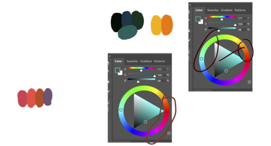
Oh I think that’s a very good place to start. As well as drawing subjects you like ^^! Hmm, tbh I’ve just experimented a lot, but I don’t think my way of having done things was the most efficient. You might want to follow tutorials step by step? You can try coloring only with flat colors until you feel a bit more confident with that as well as cell-shading (toon-shading/non-realistic, like in anime) instead of rendering further as that can all be confusing at first. I personally never truly understood shading until I studied cell-shading and made my art a lot more readable. A lot of Anime uses this;
You see how there is a base color, a darker color for shadows and highlights? (Sometimes not even highlights.)
When you start to study it from existing work you’ll start to notice things like color always being in the same area of saturation and when you suddenly have a color that is way more saturated than the other it can look off. (See example.) But this is a guideline, not a rule. In your own art you can especially use saturation and brightness to help aid you to direct a viewer's focus and even tell a story.
I LOVE ‘How to train you dragon’ and ‘Kung Fu Panda’ for this because their coloring is so inspiring and if you truly want to learn from professionals... well those are the type of media to look for of course! I have an entire folder to inspire me just based on those.
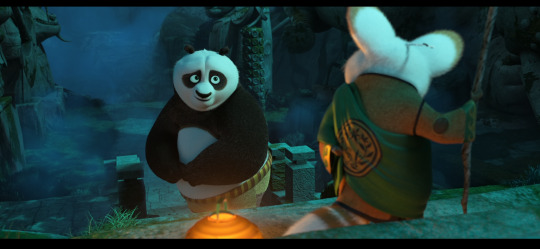
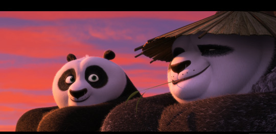
Do you see how calculated those color combo’s are?!?! Here you see both analogous and complementary schemes and it is actually through looking at the things I like that I learned it >< The orangey colors stand out and are bright which helps you to focus on that area whereas the complimentary scheme is used to bring characters together.
If drawing Manga-caps is something you love to do, then maybe for coloring you can study screen-caps from Anime or even other animated films. I’d recommend to take it step by step, though I haven’t really applied it myself, from the video’s I’ve seen and artists I’ve followed it is always advised to have an art-goal that you can work toward. Maybe you first want to focus on lineart and then laying down a base color where the colors are harmonious and next would be cell-shading maybe and then you can start adding another light-source etc- eventually you can decide to create more depth or practice with monochromatic coloring, maybe even greyscale to learn values. But right away that can all sound a bit intimidating doesn't it? Find things that you like and then maybe you can open them in your program and just study. Find a brush you like, put on some music or a show on the background and for a moment play around with it without needing to create a finished piece. This is also how I learned how things like adjustment layers work or what all the different kinds of tools do. I have to agree with you, CSP is intimidating for me as well >< so this is kinda how I approach it as there are so many add-ons and additions within it but I try to only learn what I need for that moment so I don't overwhelm myself. I definitely try to find video’s that can help me with creating Manga though! ^^ There are plenty! It'll get easier eventually, you'll learn the program and you start to recognize placements for shadows and you will get a feel for the coloring- no worries 💪 Learning something new will always stay intimidating, every time I open up a new document I feel it too. It's not easy at all, but you kinda have to allow yourself to experiment and even make mistakes because practice is never perfect. I have some beginner tips written here- I hope any of this is somewhat helpful 🌷🫶
15 notes
·
View notes