#im adding way too many tags.
Text
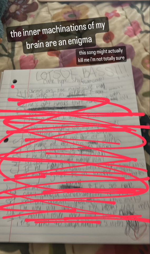
I promise I'll post a proper story soon; I just lost my laptop and have also been very time-consumed with this new Jegulus fic idea :3
Speaking of said idea, here's a paragraph from the teaser of the fic I'll be making!!!
~
On the bed was a boy, possibly a year or two younger than James. And James had to admit, he was beautiful. His hair curled over half of his face in an ebony black fringe, and was only just long enough to be tied into a mini ponytail at the back. He had skin as pale as brand-new parchment, and it was smooth enough to resemble a babies. And his eyes… The only thing that James could find himself comparing them to were diamonds. So blue, and so light, that you could almost believe they glowed in the dark. And they were so, so unimpressed as they bore into James’ plain hazels.
#james potter#regulus black#james x regulus#regulus x james#prince regulus#thief james#jegulus sun#sunseeker#jegulus makes me violently ill#james is literally a flynn rider variant#regulus would be rapunzel#im adding way too many tags.#JEGULUS.
8 notes
·
View notes
Text
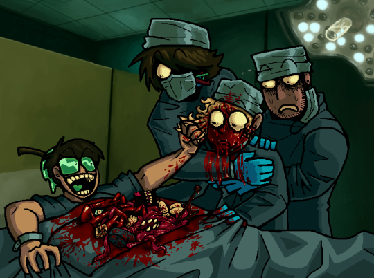
HOW DO YA LIKE THAT DARK DOG??
BEEN REAL ENAMORED BY THE 'SORRY' BOYS AND THEIR ODD ESCAPADES LATELY. I THINK THEY COULD DO A LOT OF GOOD THINGS WITH THREE GALLONS OF 'FAKE' BLOOD.
#sorry boys#sorry fanart#cw gore#cw body horror#DEAR GGODODDD I HOPE I TAGGED SORRY THE RIGHT WAY#PLEASE SORRY FANS IM HHEERE IM HERE AND IM CRAAZYYY GODDD PLEASE FIND MEEE FIND MEEEEEEEEE#GONNA BE HONEST IVE BEEN FLOPPIN BACK N FORTH ON THIS REAAAALL HARD LIKE. IM NOT SURE IF I LIKE IT#BUT EVERYONE WHO SEES IT SAYS ITS COOL! SO IMM GONNA TRUST IN THE WORD OF MY FRIENDS!!!!! THANK YOU FRIENDS!!!!#i tried to fit in as many things in the video as i could into his vile chest cavity. im rly proud of how jumbled n messy n fun it looks!#SOME THINGS TO NOTE! i painted over the bg of a specific shot from the video. painted over a portion of that LIGHT FIXTURE#BUT I Had to improvise the rest and im PRROUD LOOK AT THAT!!! WITH A MOUSE TOO BTW#DREW THIS WHOLE THING WITH A MOUSE. took some time but i think im gettin the hang of it#ANOTHER DETAIL: ranboos lil wires behind his mask. teeehehhehee i rly liked gen loss#i like this weird combo i do of cartoony and photo realistic. not sure where my balance is yet with that but im havin fun!!#ughghgh what else can i say abt this piece... other than it kicked my aASSSSSSS!!!#adding highlights in blood is always SSUCH A FIGHT for me guhhh it takes so much wrestling to make it look right....#ggbbhhbbgbh thats all thats in my brain for now. enjoy my art and enjoy my notes about my own art. enjoy ur day aswell if u can
91 notes
·
View notes
Text
i made a frev picrew after three sleepless nights!! i hope yall like it :) and if theres anything you want me to add or if something's happening that shouldn't be happening please please please let me know :D
and here's me in all my unyassified glory :')

feel free to add yours below!!
#impulsively posting this without checking for mistakes is something im gonna regret next morning#i spent way too much time and effort adding as many clothing/hair options and all the color variants#and the menus still look so empty ://#im pretty sure i missed some too idk anything about frev fashion#frev#art#art tag#picrew#french revolution#history
268 notes
·
View notes
Text

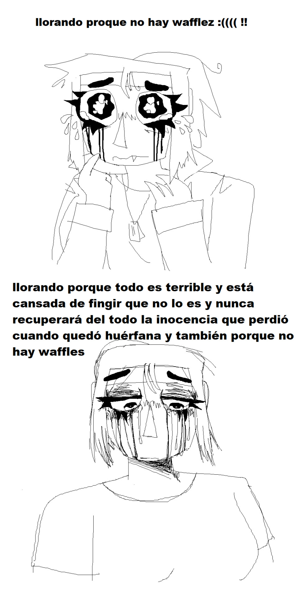
heheh ! its national optimist day !! i just want to remind u all that everythings gonna be ok. everything will go right, and if it doesnt, youll be ok. just have high hopes <3
ily guys!!
#im adding way too many tags#optimistic#optimistism#optimism#national day#agere community#agere#little space#age regressive#sfw agere#age regressor#age regression#agere blog#toddler regression#agere caregiver#sfw caregiver#age regression caregiver#petre community#petre blog#sfw petre#sfw regression#pet regression#pet regressor#pet space#pupspace
9 notes
·
View notes
Text


sally acachalla is a complex character and shes also veryvery fun to draw. shes so "fake" in a coping mechanism age regression way but also genuinely enjoys the things and people she seems to shes just a lot deeper than she lets on... i dont think she's secretly like smart or anything just capable of emotional maturity sometimes. i think she genuinely isnt very good at literacy but she does fully know what death is. yknow. also she has moar swagger than all ur favs combined!!!!
#sorry if anything i said about age regression is inaccurate or offensive please let me know if thatz the case!!#i dont really consider myself an age regressor and i dont think i know anyone who does#but i do know enough about it that u definitely thing thats whats going on with sally. lore says its becauze of a zombie disease#but i say its a coping mechanism for her trauma with the zombie apocalypse and also seeing her family die and get killed by casket and etc#anyways i've read her page so many times i dont like fandom wiki as a website but ppl usually do a good job writing the pages themselves#and the VT wiki is such a fun way to submerge yourself in the lore and the feeling without actually going back and watching the vids..#not that you shouldnt do that. once i download an ad blocker i will try to do so#anyways i just love overanalysing characters and her specifically shes so so cool and fucked up#enough rambling though im gonna have to tag this proper including all the ponies i put pictures of#venturiantale#venturiantale fanart#taleblr#images that are horrid to see and look at#sally acachalla#freddie acachalla#mlp#g3 mlp#g1 mlp#ik i made them a little bigger than they would actually be in her hands but i didnt feel like shrinking the pictures too much#jazz matazz#sew-and-so#baby tiddley-winks#strawberry scoops#hopefully all those names r odd enough that i dont have to clarify like mlp strawberry scoops#im running out of tag space#anyways. sally post#mspaint
20 notes
·
View notes
Text
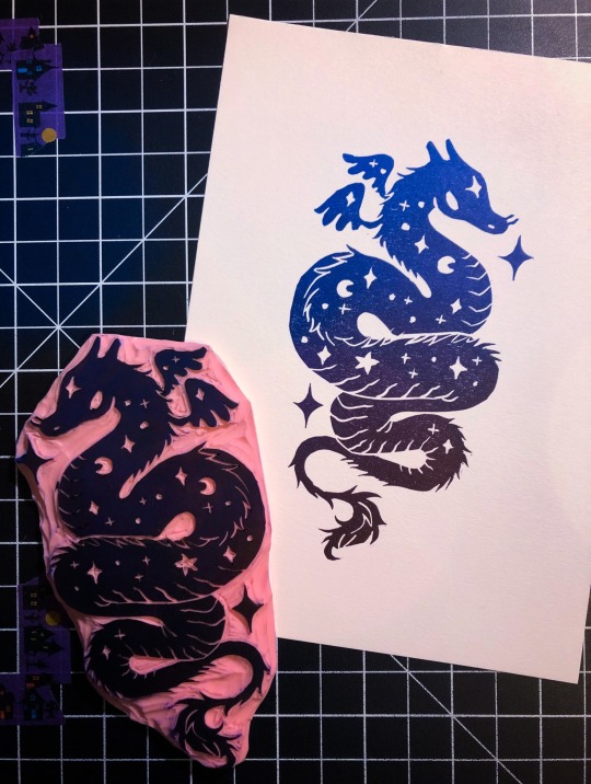
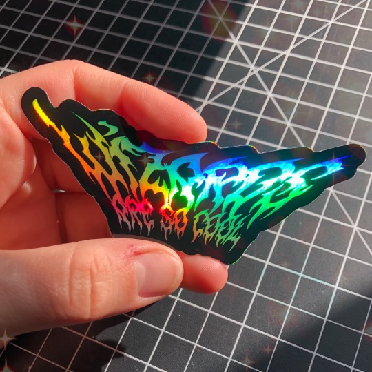
hello all my beautiful friends followers lovers compatriots brothers in arms fags fruits and queers i am here once again to shill my wares! this month we are going quite ✨🔮 MYSTICAL 🔮✨ with a rich blue to deep deep dark purple rainbow roll 🌙 COSMIC WYRM 🌙 and 🧙🏻 WIZARDS ARE SO COOL (FOR REAL) 🧙🏻 holo sticker 🌈
get some stuff in the MAIL 💌 from yours truly by signing up on my patreon by feb 1st and hey guess what- the deadline is also my birthday! and what BETTER gift could you give me than supporting my work, you beautiful bastard 😘🥳
#wizards got pushed up by special request & i wanted to do something ~magical~ to go with it#and since someone just got my other dragon tattooed figured what better time to revisit the WYRM !#patreon tag#i don't talk about my tiers much but they start as low as $2! and you get mail starting at only $4! totally approachable imo!#i did just change my print tiers by a couple dollars bc im gonna start charging more for them but stickers are the same!#they're way cheaper from patreon than in my store. prints are too#so. yknow. gimme a birthday present and sign up 💅🏻#chatpost#art tag#i added too many filters to the dragon but i don't care. i just needed it done#conversely i ONLY added the sparkles to the wizard the light was insane that day. beautiful pic imo
30 notes
·
View notes
Note
adults in children’s spaces should feel weird tbh you have a responsibility as an adult to protect those children and care for them and that should be your priority not fetishizing characters from the shows llmfaaoooo?!?!!!!?! also you’re 24 why are u standing up for imaginary evil 44 year olds??? go smoke some weed or see a movie or something christ
omg hi ok did you read all of my tags... i literally said they should keep it separate and if they want to be weirdos to keep it in their own space and make sure that no children see it and that they, yeah agreeing with you, not be in childrens spaces
and i only made that comment as many adults (30+) get hate only for being old in fandom spaces even though they arent like this, so just as a reminder
and some people just like cartoons, even for kids, many of them have messages for everyone no matter your age, even though i myself dont watch bluey, i know people who do and just enjoy it (not in the weird way) and also am friends with adults that happen to be in fandom spaces and are being hated on for being older, that came to mind when i saw that post first (then i realized mid writing tags it was most likely a jab at the princess thing, which is a great example of gross people and should be shunned)
maybe im just dense cuz i like sonic and cartoons which are only for kids? /s
also i just went to see a movie! saw barbie it was great you should go watch it too
#yay first hate(?)#idk if youre a follower or just someone that happened to stumble upon my tags well sorry i said that i just though of my friends#also i agree with it being a bit weird and some people just cant fucking stop fetishizing everything but i literally dont#care about everyone anymore. as long as the character is an adult i dont care thats it#im not here to policy online individuals#added tag maybe im just too desensitized being in furry spaces most of them are freaks in a way and many sexualize#the dog dad so i didnt give it more thought
7 notes
·
View notes
Text
seeing like a mini debate about ast*rion vs daer*n ar*ndae in regards of quality and i might be specifically seeing only one sides opinion because. i do not think Mr. D is more compelling. ultimately i think theyre quite different as well so idfk
#censoring because i dont want it to pop up in peoples searchs#i might be biased because of 1. d*erans terrible voice acting 2. i have a harder time feeling text-based scenes#i guess the argument is more in regards to their romances and yeah okay d*erans progresses more naturally/feels realer ill give him that#but also i feel like there are more limitations to making a game with proper cinematics. if its only text you have more leeway to make#a relationship progress better and feel more believable idfk#d*erans facetious pseudotsundere antics are very cute but. i will never get over astarions act 2 scene and the graveyard scene#and if you dont talk about their romances im sorry i think astarions storyline wins.#i will say i like the way daer*n words things a lot its quite yummy#basically i saw daer*ns romance and thought “ohhh cute” and forgot a week afterwards. but also hes too much of a young pretty boy for me#i do keep thinking about camellia though. i dont think shes well written but her ass' crazy#it was really cool that her romance's ending is that she fucking abandons you 32rwrgew love herrrrr#you know what im adding more tags because upon further reflection i think part of my opinion is informed by the fact that im not a romantic#so that d*erans romance is more romantic doesnt really affect my opinion because i romance characters to see more of them#not for the romance experience. so idk if thats why i disagree with so many people#do you know all those headcanons that want to make tav way more relevant in astarions life than theyre supposed to be?#i think my disapproval of that is kind of related to this as well. whys tav the bus driver all of a sudden. idc about them
5 notes
·
View notes
Note
🎶✨when you get this, put 5 songs you actually listen to, then publish. Send this ask to some of your favourite followers / mutuals <3
ive been so busy im just now getting to this ahhh but okay the only thing i've listened to since it came out is unreal unearth so i put my music on shuffle so it's not just a list of literally only hozier songs lmao
the story of us - taylor swift
another place - bastille
cherry wine (live) - hozier
blame - bastille
favorite crime - olivia rodrigo
i tried to skip repeating artists but it kept wanting to give me bastille so two bastille songs :)
#thank you for the ask!!!! it was very fun#mutuals <3#i think this is a good representation of what i listen to mostly#it really is just taylor bastille hozier#and then the occasional special guest stars#those are my primary artists tho#i am excited for guts tho#i think if it's a good sophomore album olivia might be added to my mains#also [redacted] but i dont like to admit i listen to them#i did skip a song from [redacted]#ppl always make fun of their music#and im not at a place to accept being cringe yet#even tho i live cringe each and every day#im not ready for that level#this is way too many tags#nobody asked for all this information
4 notes
·
View notes
Text
Trust me causing mass panic and fear is not what I like to do it just sometimes happens. No that was not me who armed my nfts with guns it just didn't happen. Anyways my husband probably hates me now but that is a very different topic, just make sure to buy the nfts of him I have very carefully crafted!!!!

#@btc-offical#ace attorney#wrightworth#miles edgeworth#phoenix wright#phoenix wrong#what the fuck is happening#this is what i get for sleeping way too much#seriously schizophrenic#nftcollector#nfts#nft#nftcommunity#god why is there so many tags#literally just adding them for funny now#ace attorney fanart#trucy if you see this no im not dying#i love morbius#please watch morbius#its morbin time#morbhead#live laugh love
19 notes
·
View notes
Text
!! Music Game !! (again!!)
I was tagged again, I am unstoppable thank you so much for the tag kai !! <3 ( @kerra-and-company ) These are coming from my big 2,762 song playlist again! Meaning: every song I’ve ever liked on spotify in the last five years aksjdh
RULES: You can usually tell a lot about a person by the type of music they listen to. Put your playlist on shuffle and list the first 10 songs, and then tag 10 people. No skipping!
Doubt Comes In by Anaïs Mitchell, Justin Vernon
Infinity by Jaymes Young
More by 5 Seconds of Summer
Yer Killin’ Me by Remo Drive
Weep by Mother Mother
Never Again by Breaking Benjamin
What I’d Give Up by The Classic Crime
To The Blade by Everything Everything
Night of The Hunter by Thirty Seconds to Mars
Oceans Brawl by Cœur de Pirate
(All spotify links again!) Since I’ve already done this and tagged ppl once, I’m not gonna tag people again, but if you wanna do it then im tagging you !! im tagging you in my heart and soul !! and tag me again if you wanna i have so so much music pl--
#the truth is that im tagging everyone in spirit bc i wanna seeeeee#im just too dumb to keep track of who's done this and who hasn't at this point ajshdkajs#song stuff#tag game#ohh some of these songs make me so Sick (positive)#GOD. I THOUGHT MAYBE NOT EVERY SONG.. BUT YEAH. EVERY SONG#i am so ill. i am experiencing so many emotions today. (blorbo related)#sorry. this took so long to post because i had to listen to all of these IMMEDIATELY.#these are all so integral to my soul and my writing in one way or another tbh#ESPECIALLY the fact that The Classic Crime and 30SecondsToMars are both in here !!!!#adding Breaking Benjamin and Mother Mother... oouughfjghksjdsfakjs my g o d#oouugghh Oceans Brawl has waves in it by the way it just made me long for the coast so hard. holy shit
3 notes
·
View notes
Text
watching FMA for the first time ever and man. Man. Why did no one tell me this has all my favorite tropes and horrors <3
#not to sound insane but. i love shows and anime especcially that delve into human experimentation and soul based experiments#when i was like 7 my i saw one ep and didnt understand so i never tried again. regret#ive been really missing the way late 90s and early 2000s anime was too so this is just like. generally a good fix for me#your body being permanently changed in a way foreign to you that changes others perspective on you? never feeling complete?#love that shit#i love al so so so much since of that. and man. the duality of him and ed in moral discussions i love#i also love how with al there's so much of feeling like you aren't human i can relate to#not being able to remember how the people closest to him feel since his senses are gone. not being able to remember if he ever had friends#like does he even truly age? it raises so many questions that to be fair they ad characters dont want to consider#im only on ep20 of the 2003 fma series right now#i feel like there's so much i dont know its wild#fma#anime#august squawks#tag rambles
2 notes
·
View notes
Text
sometimes I say words and sometimes people like/reblog those words (sometimes even adding a tag comment!!!!) and i'm always like "omg do these words make sense to you??? do you like the nonsense that came out of my brain????????" it's always super surprising and makes me do a little happy dance.
part of me wants to talk about that nonsense with them more, but the other part of me is bad at people and too afraid 🥲😅
#lee text#in which lee misses having long autistic rambling conversations with people about interests where we both send paragaraph upon paragraph#as if we are trying to write a novel about the thing and sometimes that conversation would span over a few days and we keep going#until we have thoroughly disussed the thing with as many ideas as we can come up with#its hard to find that kind of person. they have to have the same interest at exactly the same intensity and have a general same opnion on it#same as in they like it and think its good vs disliking and wanting to debare rather than discuss. i hate debate. and they must be creative#and good at continuing the conversation and going with thr flow in a way that we both fit each others conversation style and yeah#i had a few people like that in the past ans miss that. but theyre so hard to come by and you meet them by chance#its not something you can force. its like an accident. so “looking for someone” doesnt work. have to feel their vibe and energy and match#anyway reading people's star rail analysis and theories and thoughts and whatnot is fun#since im too bad at people to talk to ans get along with just anyone. reading posts takes out the pressure to socialize correctly#but its still lonely not sharing my thoughts. thats why when random person likes or reblogs my posts i feel seen/heard#its nice. especially if they add tags. it feels almost like we reciprocated and interacted or something#i was seen and heard and they also are seen and heard by me and im honoured they also said words!!!!!! even if just tags on a reblog#anyway someone reblogged a post i made and added their thoughts in the tags and ive been thinking about it all day 🫣🥲😭🥺
1 note
·
View note
Text
oh god why do i do this to myself
0 notes
Text
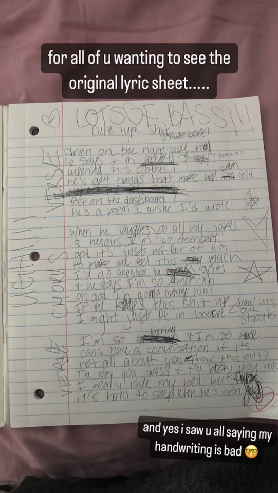
My Favorite Cheap Art Trick: Gradient Maps and Blending Modes
i get questions on occasion regarding my coloring process, so i thought i would do a bit of a write up on my "secret technique." i don't think it really is that much of a secret, but i hope it can be helpful to someone. to that end:

this is one of my favorite tags ive ever gotten on my art. i think of it often. the pieces in question are all monochrome - sort of.

the left version is the final version, the right version is technically the original. in the final version, to me, the blues are pretty stark, while the greens and magentas are less so. there is some color theory thing going on here that i dont have a good cerebral understanding of and i wont pretend otherwise. i think i watched a youtube video on it once but it went in one ear and out the other. i just pick whatever colors look nicest based on whatever vibe im going for.

this one is more subtle, i think. can you tell the difference? there's nothing wrong with 100% greyscale art, but i like the depth that adding just a hint of color can bring.
i'll note that the examples i'll be using in this post all began as purely greyscale, but this is a process i use for just about every piece of art i make, including the full color ones. i'll use the recent mithrun art i made to demonstrate. additionally, i use clip studio paint, but the general concept should be transferable to other art programs.


for fun let's just start with Making The Picture. i've been thinking of making this writeup for a while and had it in mind while drawing this piece. beyond that, i didn't really have much of a plan for this outside of "mithrun looks down and hair goes woosh." i also really like all of the vertical lines in the canary uniform so i wanted to include those too but like. gone a little hog wild. that is the extent of my "concept." i do not remember why i had the thought of integrating a shattered mirror type of theme. i think i wanted to distract a bit from the awkward pose and cover it up some LOL but anyway. this lack of planning or thought will come into play later.
note 1: the textured marker brush i specifically use is the "bordered light marker" from daub. it is one of my favorite brushes in the history of forever and the daub mega brush pack is one of the best purchases ive ever made. highly recommend!!!
note 2: "what do you mean by exclusion and difference?" they are layer blending modes and not important to the overall lesson of this post but for transparency i wanted to say how i got these "effects." anyway!
with the background figured out, this is the point at which i generally merge all of my layers, duplicate said merged layer, and Then i begin experimenting with gradient maps. what are gradient maps?
the basic gist is that gradient maps replace the colors of an image based on their value.

so, with this particular gradient map, black will be replaced with that orangey red tone, white will be replaced with the seafoamy green tone, etc. this particular gradient map i'm using as an example is very bright and saturated, but the colors can be literally anything.

these two sets are the ones i use most. they can be downloaded for free here and here if you have csp. there are many gradient map sets out there. and you can make your own!
you can apply a gradient map directly onto a specific layer in csp by going to edit>tonal correction>gradient map. to apply one indirectly, you can use a correction layer through layer>new correction layer>gradient map. honestly, correction layers are probably the better way to go, because you can adjust your gradient map whenever you want after creating the layer, whereas if you directly apply a gradient map to a layer thats like. it. it's done. if you want to make changes to the applied gradient map, you have to undo it and then reapply it. i don't use correction layers because i am old and stuck in my ways, but it's good to know what your options are.

this is what a correction layer looks like. it sits on top and applies the gradient map to the layers underneath it, so you can also change the layers beneath however and whenever you want. you can adjust the gradient map by double clicking the layer. there are also correction layers for tone curves, brightness/contrast, etc. many such useful things in this program.
let's see how mithrun looks when we apply that first gradient map we looked at.

gadzooks. apologies for eyestrain. we have turned mithrun into a neon hellscape, which might work for some pieces, but not this one. we can fix that by changing the layer blending mode, aka this laundry list of words:

some of them are self explanatory, like darken and lighten, while some of them i genuinely don't understand how they are meant to work and couldn't explain them to you, even if i do use them. i'm sure someone out there has written out an explanation for each and every one of them, but i've learned primarily by clicking on them to see what they do.
for the topic of this post, the blending mode of interest is soft light. so let's take hotline miamithrun and change the layer blending mode to soft light.

here it is at 100% opacity. this is the point at which i'd like to explain why i like using textured brushes so much - it makes it very easy to get subtle color variation when i use this Secret Technique. look at the striation in the upper right background! so tasty. however, to me, these colors are still a bit "much." so let's lower the opacity.

i think thats a lot nicer to look at, personally, but i dont really like these colors together. how about we try some other ones?

i like both of these a lot more. the palettes give the piece different vibes, at which point i have to ask myself: What Are The Vibes, Actually? well, to be honest i didn't really have a great answer because again, i didn't plan this out very much at all. however. i knew in my heart that there was too much color contrast going on and it was detracting from the two other contrasts in here: the light and dark values and the sharp and soft shapes. i wanted mithrun's head to be the main focal point. for a different illustration, colors like this might work great, but this is not that hypothetical illustration, so let's bring the opacity down again.

yippee!! that's getting closer to what my heart wants. for fun, let's see what this looks like if we change the blending mode to color.

i do like how these look but in the end they do not align with my heart. oh well. fun to experiment with though! good to keep in mind for a different piece, maybe! i often change blending modes just to see what happens, and sometimes it works, sometimes it doesn't. i very much cannot stress enough that much of my artistic process is clicking buttons i only sort of understand. for fun.
i ended up choosing the gradient map on the right because i liked that it was close to the actual canary uniform colors (sorta). it's at an even lower opacity though because there was Still too much color for my dear heart.

the actual process for this looks like me setting my merged layer to soft light at around 20% opacity and then clicking every single gradient map in my collection and seeing which one Works. sometimes i will do this multiple times and have multiple soft light and/or color layers combined.
typically at this point i merge everything again and do minor contrast adjustments using tone curves, which is another tool i find very fun to play around with. then for this piece in particular i did some finishing touches and decided that the white border was distracting so i cropped it. and then it's done!!! yay!!!!!
this process is a very simple and "fast" way to add more depth and visual interest to a piece without being overbearing. well, it's fast if you aren't indecisive like me, or if you are better at planning.

let's do another comparison. personally i feel that the hint of color on the left version makes mithrun look just a bit more unwell (this is a positive thing) and it makes the contrast on his arm a lot more pleasing to look at. someone who understands color theory better than i do might have more to say on the specifics, but that's honestly all i got.

just dont look at my layers too hard. ok?
2K notes
·
View notes
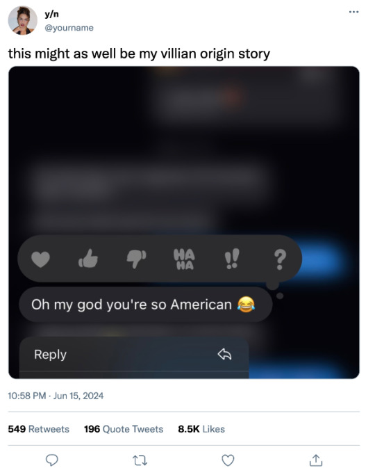
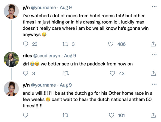
Text
so american ✢ max verstappen

pairing: max verstappen x singer!reader
warnings: none; just some silly shit, some swearing, google translate dutch, max's home race is belgium and not the netherlands for timeline related reasons
summary: y/n is teasing way too many things at once…..can the fans keep up?
author's note: this is NOT an original concept i am aware of this. but this hasn’t left my brain in days. i’ve got a very specific vision so let me cook. i know i haven't posted on here in over a year but i've returned an f1 fan. enjoy!
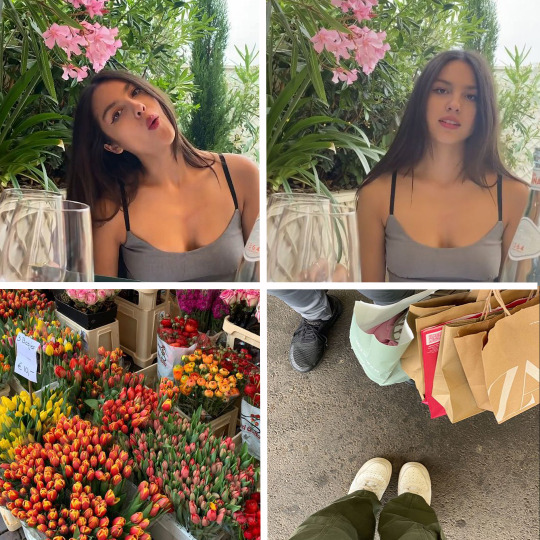
yourname added to their story!
liked by delwatergap, maxverstappen1, and 3,491,842 others
yourname: i think i'm in love with montreal. sorry i’ve been so off the grid but i am Loving Life so hard. so much inspo in my life rn. will talk soon i promise. love u all bunches 🫶🏼🌷
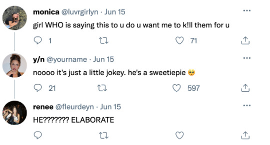
ynsbestfriend: hey queen you have done it again!
-> yourname: ugh i love you so bad
user1: UM BAE WHOS THAT IN THE LAST SLIDE?
-> yourname: beats me!
-> user1: i do not trust you.
lilymhe: hiiiii pretty girl
-> yourname: stop im blushinggggg
user2: i fear she’s in her lover girl era
-> user3: girl help im so fucking scared right now what’s happening
user4: so does any of this have to do with your story from yesterday??????
*liked by yourname.*

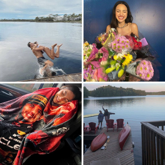
maxverstappen1 added to their story!
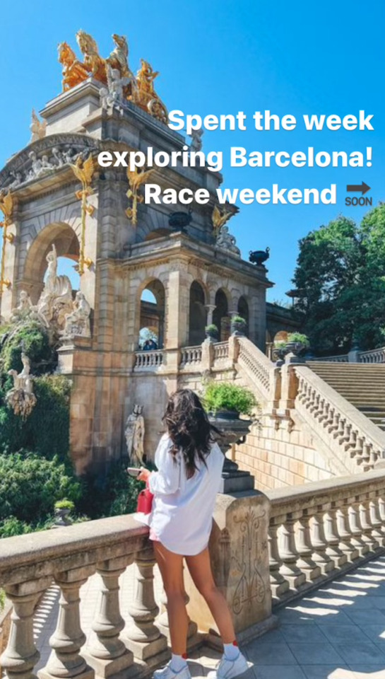
yourname added to their story!

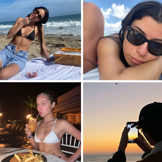
liked by honeymoon, danielricciardo, and 3,572,679 others
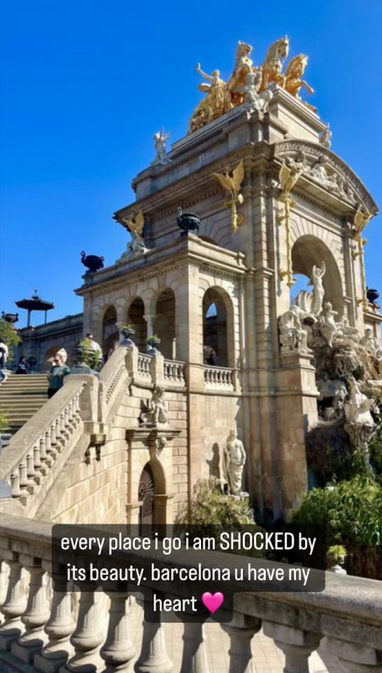
yourname: life's been a beach lately. clearly i've been loathing my time in spain ://///
user5: IS THAT MAX
-> user6: no bc it HAS to be
heidiberger_: Loved spending the week with you! 🤍
-> yourname: same!!!!!! let's do it again sometime 🥰
-> user6: NOT DANNY RIC'S GF COMMENTING?????? AND LILY MUNI HE ON HER LAST POST???????
user6: no bc even if her and max were dating and she's been traveling with him why have we not seen her in the paddock
-> user7: to throw us off our rhythm????
-> user8: what if they debut at his home race in spa ijbol


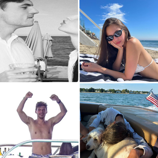
liked by landonorris, taylorswift, and 4,683,892 others.
tagged: maxverstappen1, redbullracing, and ynsbestfriend
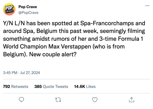
yourname: hahaha felt like dropping 2 things at once on u guys LOLLLLLLLL. thank u to redbullracing, spagrandprix, and the city of spa for letting me and my friends crash the race the other week to film the “so american” music video, and to maxie for winning in ur home country. it was so fucking special to be there supporting u. i love u baby!
ps. another thank u to max for thinking i'm the funniest person in the world and making fun of my americanness for as long as i've known him (which is quite a while).
enjoy this tune guys. it's urs forever and i hope u love it as much as i love the person it's about 🫶🏼 🇧🇪 🇳🇱 TU DU DU DU!!!!!
user9: OH NMY GOD I FUCKING KNEW I SAW U IN THE GARAGE
ynsbestfriend: thanks for letting me third wheel mommy
-> yourname: no one else i'd rather drag along!!!
danielricciardo: Welcome to the family! Song's a banger although I can't believe it's actually about Max of all people 🤢 GROSS!!
-> yourname: jealousy is a disease danny.
user10: i actually cannot fathom this this is so me core
alexandramalsaintmleux: I am so glad to know you! Your happiness is everything 🩷

liked by sabrinacarpenter, carlossainz55, and 4,783,522 others.
tagged: yourname and ynsfriend
maxverstappen1: Spent a week away in New England with my talented, gorgeous girl. Loved getting away and experiencing America through her eyes! Consider me an honorary American now! Also, stream “So American” wherever you choose. It's about me 😉
yourname: does this mean i can stop hiding in the garage now???
landonorris: Happy for you mate! Love the song as well yourname 🤍
-> yourname: awe thank u lando 🥺 i got more to show u when i see u next!!!!!!
redbullracing: ❤️💙
user11: MAX IS IN HIS LOVER BOY ERA
danielricciardo: How many more times can you say American?
liked by charles_leclerc, chappellroan, and 3,694,849 others
tagged: maxverstappen1
yourname: nothing like celebrating the best 2 weeks of my life than showing my boy around ye olde stomping grounds #soamerican
liamlawson30: This is so American of him
-> yourname: like he fits in so well!
lydianight: u'll have him in the american flag board shorts in no time
-> yourname: baby steps :///
user11: she really is in her lover girl era 🥺
clairo: did you take him to the chipotle that is also a historic landmark downtown??
-> yourname: dude of COURSE i did. he said it was "interesting"
yourname added to their story!
#formula 1 x reader#f1 x reader#f1 imagine#formula one x reader#f1 smau#max verstappen x reader#max verstappen x you#max verstappen imagine#max verstappen#mv1 x reader#f1 texts#f1 fanfic#f1 social media au
1K notes
·
View notes
Last Seen Blogs

immajustcrochet
I like crochet

collectible5-blog
Untitled

aswewalkinchrist
As We Walk In Christ

milanvilimekjihlavsky-blog
Untitled
rhneg-rhpos
Fanfic Gifting Anonymous