#image stack css
Explore tagged Tumblr posts
Visit Tumblr Blog
Explore Tumblr blogs with no restrictions, modern design and the best experience.
Last Seen Tumblr Blogs


Fun Fact
Tumblr was created by web developers David Karp and Marco Arment.
Text

CSS Image Stack
#css image stack effect#image stack css#css tricks#css effects#html css#css#html#css3#frontenddevelopment#webdesign#frontend#nesuzone#code#image stack html css
16 notes
·
View notes
Text

Stack animation on hover
#stack animation on hover#css stack animation#html css#divinector#css#html#css3#frontenddevelopment#divinectorweb#webdesign#css image hover effects#css animation examples
6 notes
·
View notes
Text

CSS Image Stack Effects
#stack effect html css#css stack effect#css tricks#pure css effects#html css#html5 css3#css#codenewbies#css image stack effect
3 notes
·
View notes
Text
.
#well my nerve blocking medication or whatever the fuck is kicking in#but now i will need to fight the allure of an afternoon nap because it makes you tired as fuck#anyway. back to getting angry at css#the image isn't stacking correctly on this fucking landing page!!!!!!#miscellaneous
4 notes
·
View notes
Text

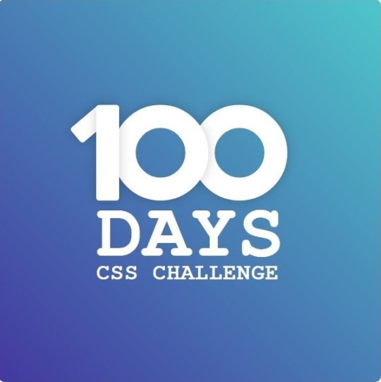
Day 1 - 100 Days CSS Challenge
Welcome to day 1 of the 100 Days CSS Challenge! In this challenge, we'll bring a design to life using only CSS. Our goal is to recreate the image we're provided with on the challenge page using HTML and CSS.
On the challenge page, we see:

A small preview of the design we need to replicate.
A starter HTML template.
A submission form to showcase our work alongside others who have taken on the same challenge.
Let's dive into the process step by step.
Step 1: Screenshot the Image
The first thing I always do is take a screenshot of the target design. Even if the design includes animation, having a static reference helps me focus on the basic structure and colors. Here’s the screenshot of the design we’re aiming for:
Step 2: Extract the Color Palette
Next, I identify the color palette that we'll need. This helps ensure that we maintain consistency with the original design. Here’s the color palette I’ve created:

Step 3: Identify and Create the Image Elements in HTML
Now that we know the colors, I break down the elements in the image:
Background: This is a linear gradient.
The 100 number: This is the main challenge, and it will require some work.
Text: “days css challenge,” which we’ll place to the left of the number.
Here’s the HTML structure for these elements:
<div class="frame"> <div class="center"> <div class="number"> <div class="one-one"></div> <div class="one-two"></div> <div class="zero-one"></div> <div class="zero-two"></div> </div> <p class="sentence1">days</p> <p class="sentence2">css challenge</p> </div> </div>
Now that the elements are in place, CSS will bring them to life.
Step 4: Bringing the Elements to Life with CSS
Linear Gradient
To create the background, we’ll use a linear gradient. Here’s a basic syntax:
background: linear-gradient(to <direction>, <color-stop1>, <color-stop2>, ...);
Parameter 1: Direction/Angle
This defines the starting point of the gradient. You can either specify a direction (e.g., to top, to bottom) or an angle (e.g., 90deg, 180deg).
Direction options:
to top
to bottom
to left
to right
If you want more precision, you can specify angles:
0deg: Gradient starts from the top.
90deg: From the right.
180deg: From the bottom.
270deg: From the left.
You can also combine two directions, specifying both horizontal and vertical movements, like to left top or to right bottom. This means:
The first keyword (left or right) controls the horizontal movement.
The second keyword (top or bottom) controls the vertical movement.
For example:
background: linear-gradient(to left top, red, blue);
This gradient starts at the bottom-right corner and transitions toward the top-left.
Parameter 2: Color Stops
Color stops define how the gradient transitions between colors. Each color stop specifies a point where a color starts or ends. Here's an example:
background: linear-gradient(to right, red 10%, blue 90%);
This means:
The element starts at 0% fully red.
By 10%, the transition from red begins.
Between 10% and 90%, there is a smooth blend from red to blue.
At 90%, the transition to blue is complete, and the remaining part is fully blue.

Once we understand the concept, we can apply the background we need. In our case, the gradient flows from the bottom left to the top right, so the code will look like this:
background: linear-gradient(to right top, #443DA1, #4EC3C9);
Bonus: Stacking Multiple Linear Gradients
You can also apply multiple gradients on top of each other:
background: linear-gradient(180deg, #f00, #0f0), linear-gradient(90deg, #ff0, #f0f);
Step 5: Making the "100" Number
Creating the Zeros
We start with the zeros. These are simply circles created using CSS. To make a full circle, we use border-radius set to 50%.
The white border gives it the appearance of the number zero.
.zero-one, .zero-two { position: absolute; height: 100px; width: 100px; border-radius: 50%; border: 24px solid #fff; box-shadow: 0 0 13px 0 rgba(0,0,0,0.2); }
This gives us a nice circular zero. We adjust their positions using properties like left and top, and manage the z-index to make sure the zeros stack correctly.
.zero-one { z-index: 8; left: 17px; } .zero-two { z-index: 6; left: 100px; }

Now both zeros are positioned, and they overlap in the way we want.
Creating the "1" Number
The number "1" is made of two div elements:
One-One: This part represents the slanted part of the "1".
One-Two: This is the straight vertical part of the "1".
What make the one-one element slightly slanted is
transform: rotate(50deg);)
the one-two is created simply with a little height and width nothing too particular then it is placed directly on top of the slanted part, giving us the full "1". Its z-index tho has to have a higher value than the slanted part of our 1 to ensure it stays above the slanted one.
Step 6: Adding the Text
For the two sentences “days” and “css challenge,” the styling is basic CSS. You can achieve the look with just a few font changes, some padding, and adjustments to font size. It’s as simple as:
.sentence1,.sentence2{ text-transform: uppercase; margin:0; padding:0; } .sentence1{ font-size:82px; font-weight:700; } .sentence2{ font-size:25px; font-weight:700; margin-top:-20px; }
And just like that, we’ve completed day 1 of the 100 Days CSS Challenge! Each part of the design is carefully crafted using CSS, giving us the final result.
Happy coding, and see you tomorrow for Day 2!
#100dayscssChallenge#codeblr#code#css#html#javascript#java development company#python#studyblr#progblr#programming#comp sci#web design#web developers#web development#website design#webdev#website#tech#html css#learn to code
15 notes
·
View notes
Text
webdev log uhhhh... 6?
Haven't worked on my site in a bit because I think I fucked up somewhere in during the deployment phase so now it's hard to host it locally.... only the index page works and the css is half broken anyways, presumably because of laravel breeze's tailwind coming preinstalled. I DID have to jump through hoops to get it going during deployment.. just don't know which hoops so it's stuck that way >_>;; so now I can't host it locally for development......... I'll have to make things and just hope it shows up when I deploy them I think
Failed to listen on 127.0.0.1:8000 (reason: ?)
cool, cool. thanks. very helpful debugging message..
anyways, coded up a little php doohicky and updated my site! WANNA PEEK?
I wanted to migrate my fridge page (art others have done of my characters) to my site, but I didn't want to implement another table because YUCK I'm so done with that.
I wanted something more automatic because I'm lazy and I also wanted it to not look like it's from 2003 like my neocities to match with my new site. too much trouble!!!! including the stuff previously mentioned.. so I left it untouched for a while.
then I was talking with someone and wanted to try making this with php.....

it's pretty basic. finished the code for the script in like an hour maybe, and then later it was mostly just tinkering with the html/css itself to make it display all nice and grid-like.
all it does is take all images from a specified folder and spits them out.
it creates a DirectoryIterator object to iterate through the specified folder (at least, I think that's how DirectoryIterator works.... dunno) then for each individual file it checks if it's an image, gets the time the file was modified, then stores the file path and modified time in an array. then that array gets sorted via modified time (newest first), and then iterated through and BAM...
I'd prefer a better time system such as organize when the file was actually created, but if you paste a file into a new folder, "created time" gets changed to when you pasted it.. using file modified time is the only way when you aren't using a database and just want this to be all done automatically I think. unless I'M STUPID and someone has a better idea.. then please enlighten me.
ANYWAYS added The Fridge to my site using my lil code! :>

updated my About to include a link too...
also, I was looking up things and found this funny example code on stack overflow

let's all randomize our racism images.....
6 notes
·
View notes
Text
CSS Split Scroll: No-JS Half-and-Half Scrolling Layout
The half-and-half scrolling layout, also known as the split scrolling layout, displays visual and textual content side by side. Users scroll through both sections simultaneously, with each maintaining its scroll position. It adapts to screen sizes, defaults to vertical stacking on mobile, and supports images, text, and embedded elements. This works for product showcases, portfolio comparisons, or…
2 notes
·
View notes
Note
Ur website so cool!! ❤️❤️ Do you have by any chances coding tips? Been trying to make my own website for a while but adhd won't let me concentrate a second when it comes to learning coding
Thank you! And 100% It is deceptively approachable but also time consuming, I'm familiar enough with html from a highschool class where we did need to write code out by hand, and then soft practice with coding toyhou.se profiles and futzing around with free code snippets. Largely though I don't think you need to know everything or to write everything by hand, you just need to frankenstein code pieces together (As long as they're free ofc).
I used this first, it's fucking insanely handy and lets you make a simple layout with sidebars, navigation, header, footer and a body base ect, and then just generate and copy the code. The html itself also has greyed out little notes about what parts do what!
I'll be real the rest of it after that is just me googling what I want to do or googling html snippets bc I forgot them. So like html image link with size attributes ect ect, how to make a html image gallery. I don't use one site exclusively but w3schools.com has a bunch of common ones and also has a little live code editor in its tutorials.
Like I still get greatly stumped for hours bc code's kinda sensitive and one or two characters out of place will break sections of it especially when ur just frankensteining. Trying out little segments in live code editors is really helpful because you can kinda break it apart and diagnose the issue before putting it into your site html.
Also if it helps this is kind of how I break it down in my brain as another ADHD-er. so fuckign sorry for how this looks im doing it in snipping tool. But code bits love to live in cages even if it all looks the same, iit would also help if you clean your code up mine is pretty horrid but you just want to familiarize yourself with the little "Sections" ig that's where doing things by hand would help because you would 100% know what each chunk is for but yk yk.
CSS is a different beast I barely understand. The parts of code where it starts stacking on top instead of being horizontal is css and it's basically how you do fancier things to your code, it's linked to stuff you already have down. So like changing the background in the body text box or something, you can only do so much in there. Css targetting the body text box is where you can level it up. Again the sadgrl layout builder has notes so you're not completely blind in there. There's also 100% so many resources to explain what all these words mean, my mmethod is incredibly avoidant I don't know what flex is I haven't needed to fight her yet ect ect.

Sorry if this is confusing this is just my hack and slash understanding atm. Be humbled by code I've spent too long trying to fix up hysterical margin issues just because I had a random apostrophe somewhere or because I tried to spell it colour and not color ect.
33 notes
·
View notes
Text
good morning! i'm groggy but i made a to-do list for finishing up this stadium hue project for BMF. i'm thinking i should be able to finish it today or tomorrow depending on how i feel. i'm pretty excited, there's going to be multiple interactive things and a whole article and a massive image resource that did not previously exist. i'm going to be putting up like, 3-4 new pages at once haha. they're all related!
still tinkering away at the hue shift previewer is going to be the main thing, it needs a proper UI and a couple more features. i wish blue ho-oh was real...

just hue shifting these gifs on the site is more complicated than it appears since the built-in CSS hue slider uses a different method of hue sliding than the N64 and therefore is entirely inaccurate. as a result i have a system of the gifs being broken into vertically stacked spritesheets of their frames, which are continuously looped through to animate it on an HTML canvas. the hue shifting is done by editing the pixel-by-pixel HSL (hue/saturation/lightness) data of the spritesheet. it works great though!
12 notes
·
View notes
Text
25/09/2023 || Day 87
LeetCode
I started doing the questions on Stacks and couldn't figure out how they wanted me to implement it, so I opened up Eclipse and just implemented a Stack on my own from scratch. Still didn't technically solve the LeetCode implementation, but whatever, we can't win everyday.
FrontendMentor Space Tourism Website - Log #1
Officially got started on this project today and I spent 3 hours trying to get the header to look right. I don't think it would've taken me 3 hours to get that done, but I decided to use React Routing for this project and I had to figure out how the CSS and elements worked with routes. I finally have a somewhat decent header that's close to the original, so despite my struggles I did achieve something. Also, getting the navbar to have a blurred background ended up being a lot easier than I thought it would be. I guess I struggled in a previous project to do that, so it went a lot better this time. I gotta be careful though because I haven't made it responsive...I normally go mobile-first route when building the layout, and I haven't done that today, so tmr I'll switch gears and do that. I find it easier to work mobile-first anyways...
Here's a photo of what the header looks like. The background image changes depending on what tab you click on the header:

9 notes
·
View notes
Note
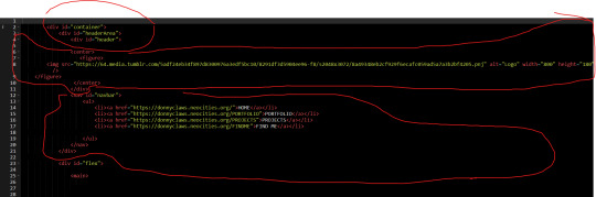
omg i saw ur neocities how did you make it look tht good what's ur secret
when on mobile, go into your address bar, and type "view-source:" without spaces in front of ANY url from my website. unsure if it works on desktop. let me know if it does.
this will allow you to take a closer look at my spaghetti html code, here's an example of a view-sourced link you can look at yourself:
view-source:https://kopawz.neocities.org/
my landing page for example, you will notice,
+ has many flex boxes JUST so i can center everything on the page. i like it that way. do i have to do it like this? no but i like it.
+ every green box i'm putting text in is the same base element from the css. they're all the exact same <aside> lol. they are all called asides because i was initially fiddling with a template, but it was very cluttered and noisy, so...
+ i decided to just use one base element, and use a rampant amount of in-line styling in the html to customize each aside box's size, shape, and other properties, instead of several different elements in the css. it just works better for me that way.
+ i didn't feel like learning how to make images/elements stack on top of eachother, so i set a flexbox to force images to wrap around once they hit the box's max width limit. it's fun to brute-force things!
+ there is no secret, just fuck around and find out what makes most sense to you when making it, so you can understand it for yourself. nobody but you sees the blueprint.
above all else, laugh and learn from your own mistakes- do not use them as weapons against yourself as "proof" that you shouldn't try. 👍
10 notes
·
View notes
Text

CSS Image Stack Effects
#css image stack effect#html css#css#html#css3#webdesign#frontend#neduzone#css basics#photo stack effect css#stack effect css#frontenddevelopment
4 notes
·
View notes
Text
Understanding HTML: The Building Blocks of the Web
In the vast landscape of the internet, HTML stands as the foundation upon which the digital world is built. From simple static web pages to dynamic interactive experiences, HTML (Hypertext Markup Language) plays a pivotal role in shaping the online landscape. Let's embark on a journey to demystify HTML and understand its significance in the realm of web development.
What is HTML?
HTML is a markup language used to create the structure and content of web pages. It consists of a series of elements, or tags, that define the various components of a web page, such as headings, paragraphs, images, links, and more. These elements are enclosed within angled brackets (< >) and typically come in pairs, with an opening tag and a closing tag, sandwiching the content they define.
The Anatomy of HTML:
Tags: Tags are the building blocks of HTML and serve as the basic units of structure. They encapsulate content and provide semantic meaning to different parts of a web page. Common tags include <html>, <head>, <title>, <body>, <h1> (heading), <p> (paragraph), <img> (image), <a> (anchor/link), and many more.
Attributes: Tags can also contain attributes, which provide additional information about the element. Attributes are specified within the opening tag and consist of a name and a value. For example, the <img> tag may include attributes such as src (source) to specify the image file and alt (alternative text) for accessibility purposes.
Nesting: HTML elements can be nested within one another to create hierarchical structures. This nesting allows for the organization and hierarchy of content, such as placing lists within paragraphs or dividers within sections.
Document Structure: Every HTML document begins with a <!DOCTYPE> declaration, followed by an <html> element containing <head> and <body> sections. The <head> section typically contains metadata and links to external resources, while the <body> section contains the visible content of the web page.
The Role of HTML in Web Development:
HTML serves as the backbone of web development, providing the structure and semantics necessary for browsers to interpret and render web pages correctly. Combined with CSS (Cascading Style Sheets) for styling and JavaScript for interactivity, HTML forms the core technology stack of the World Wide Web.
Conclusion:
In essence, HTML is the language of the web, enabling the creation of rich and immersive digital experiences. Whether you're a seasoned web developer or a newcomer to the world of coding, understanding HTML is essential for navigating the intricacies of web development. Embrace the power of HTML, and embark on a journey to craft compelling narratives and experiences in the ever-evolving digital realm.
5 notes
·
View notes
Text

CSS Image Stack Animation
#CSS Image Stack Animation#codenewbies#html css#frontenddevelopment#css animation examples#html5 css3#pure css animation#webdesign#css animation tutorial#html css tutorial#css tutorial
4 notes
·
View notes
Text
Advanced Techniques in Full-Stack Development

Certainly, let's delve deeper into more advanced techniques and concepts in full-stack development:
1. Server-Side Rendering (SSR) and Static Site Generation (SSG):
SSR: Rendering web pages on the server side to improve performance and SEO by delivering fully rendered pages to the client.
SSG: Generating static HTML files at build time, enhancing speed, and reducing the server load.
2. WebAssembly:
WebAssembly (Wasm): A binary instruction format for a stack-based virtual machine. It allows high-performance execution of code on web browsers, enabling languages like C, C++, and Rust to run in web applications.
3. Progressive Web Apps (PWAs) Enhancements:
Background Sync: Allowing PWAs to sync data in the background even when the app is closed.
Web Push Notifications: Implementing push notifications to engage users even when they are not actively using the application.
4. State Management:
Redux and MobX: Advanced state management libraries in React applications for managing complex application states efficiently.
Reactive Programming: Utilizing RxJS or other reactive programming libraries to handle asynchronous data streams and events in real-time applications.
5. WebSockets and WebRTC:
WebSockets: Enabling real-time, bidirectional communication between clients and servers for applications requiring constant data updates.
WebRTC: Facilitating real-time communication, such as video chat, directly between web browsers without the need for plugins or additional software.
6. Caching Strategies:
Content Delivery Networks (CDN): Leveraging CDNs to cache and distribute content globally, improving website loading speeds for users worldwide.
Service Workers: Using service workers to cache assets and data, providing offline access and improving performance for returning visitors.
7. GraphQL Subscriptions:
GraphQL Subscriptions: Enabling real-time updates in GraphQL APIs by allowing clients to subscribe to specific events and receive push notifications when data changes.
8. Authentication and Authorization:
OAuth 2.0 and OpenID Connect: Implementing secure authentication and authorization protocols for user login and access control.
JSON Web Tokens (JWT): Utilizing JWTs to securely transmit information between parties, ensuring data integrity and authenticity.
9. Content Management Systems (CMS) Integration:
Headless CMS: Integrating headless CMS like Contentful or Strapi, allowing content creators to manage content independently from the application's front end.
10. Automated Performance Optimization:
Lighthouse and Web Vitals: Utilizing tools like Lighthouse and Google's Web Vitals to measure and optimize web performance, focusing on key user-centric metrics like loading speed and interactivity.
11. Machine Learning and AI Integration:
TensorFlow.js and ONNX.js: Integrating machine learning models directly into web applications for tasks like image recognition, language processing, and recommendation systems.
12. Cross-Platform Development with Electron:
Electron: Building cross-platform desktop applications using web technologies (HTML, CSS, JavaScript), allowing developers to create desktop apps for Windows, macOS, and Linux.
13. Advanced Database Techniques:
Database Sharding: Implementing database sharding techniques to distribute large databases across multiple servers, improving scalability and performance.
Full-Text Search and Indexing: Implementing full-text search capabilities and optimized indexing for efficient searching and data retrieval.
14. Chaos Engineering:
Chaos Engineering: Introducing controlled experiments to identify weaknesses and potential failures in the system, ensuring the application's resilience and reliability.
15. Serverless Architectures with AWS Lambda or Azure Functions:
Serverless Architectures: Building applications as a collection of small, single-purpose functions that run in a serverless environment, providing automatic scaling and cost efficiency.
16. Data Pipelines and ETL (Extract, Transform, Load) Processes:
Data Pipelines: Creating automated data pipelines for processing and transforming large volumes of data, integrating various data sources and ensuring data consistency.
17. Responsive Design and Accessibility:
Responsive Design: Implementing advanced responsive design techniques for seamless user experiences across a variety of devices and screen sizes.
Accessibility: Ensuring web applications are accessible to all users, including those with disabilities, by following WCAG guidelines and ARIA practices.
full stack development training in Pune
2 notes
·
View notes
Text
Mastering Z-Index in Elementor: Everything You Need to Know
When designing websites with Elementor, managing layers and ensuring proper content visibility can be a challenge—especially when multiple elements overlap. This is where understanding Z-Index in Elementor becomes essential.
What is Z-Index in Elementor?
Z-Index is a CSS property that controls the stacking order of elements on a web page. In simpler terms, it decides which element appears on top when two or more elements overlap. The higher the Z-Index value, the closer the element appears to the front.
In Elementor, every widget or section can be assigned a custom Z-Index value. This is especially helpful when creating advanced layouts such as overlapping text, layered images, sticky headers, or pop-ups.
How to Use Z-Index in Elementor
Select the Element: Click on the widget, column, or section you want to modify.
Go to the Advanced Tab: Under the 'Advanced' settings, scroll down to the 'Z-Index' field.
Set the Value: Input a positive or negative number. Higher values will place the element in front.
Example: If your text is hidden behind an image, increasing the text’s Z-Index will bring it forward.
Common Uses of Z-Index in Elementor
Making sticky headers stay on top while scrolling.
Creating interactive hover effects.
Layering background shapes or graphics.
Fixing overlapping issues between sections and widgets.
Tips for Using Z-Index in Elementor
Avoid unnecessary high values: A Z-Index of 9999 might work, but keep your values logical to avoid conflicts.
Use relative positioning: For Z-Index to take effect, elements often need a relative, absolute, or fixed position.
Check responsive views: Overlapping might differ between desktop, tablet, and mobile views.
Special Features of Z-Index in Elementor
The Z-Index in Elementor isn’t just a basic layering tool—it's a powerful feature that gives you full control over how elements appear in relation to each other on your webpage. Below are some standout features and benefits of using Z-Index effectively in Elementor:
1. Precise Layer Control
Z-Index allows you to manually control which elements appear on top or behind others. This gives you the freedom to design complex, multi-layer layouts without coding.
2. Works Across Widgets, Columns, and Sections
Elementor makes Z-Index available for:
Widgets (like buttons, images, headings)
Columns
Entire Sections
This means you can adjust layering at any level of your layout.
3. Dynamic with Position Settings
Z-Index works best when combined with Elementor’s position controls:
Relative
Absolute
Fixed
You can create advanced designs like sticky headers or floating call-to-action buttons that stay on top of all other content using Z-Index.
4. Responsive Control
With Elementor’s responsive settings, you can tweak Z-Index for mobile, tablet, and desktop individually. This ensures your designs remain visually consistent across all devices.
5. Conflict Resolution
Z-Index is your best friend when solving layering conflicts—like when a menu hides behind a section or a popup doesn’t appear as expected.
6. Supports Negative and High Values
You can assign negative values to push elements further back, or high values (e.g., 999) to bring elements to the front. This flexibility is crucial in layered design scenarios.
7. Improves User Experience
Using Z-Index properly ensures that clickable elements like buttons and menus stay accessible and visible, leading to a smoother UX.
Unlock the Full Power of Elementor Pro at an Unbeatable Price
Want to take your web design to the next level with advanced features, templates, and custom controls?
Get Elementor Pro @ Just ₹499 through CVWorld’s Elementor Group Buy and access premium tools affordably!
0 notes