#interactive data dashboard
Explore tagged Tumblr posts
Visit Tumblr Blog
Explore Tumblr blogs with no restrictions, modern design and the best experience.
Last Seen Tumblr Blogs


Fun Fact
Tumblr is available in 18 languages.
Text
what the FUCK do you mean allmyandroids ladyofthebruinen and tanyayoung-322 ship datalore
#hey people that this is directed at. kindly stop interacting with me!#I DO NOT NEED TO SEE THAT INCEST SHIT ON MY DASHBOARD#b-b-b-bb-b-ut theyre androids!!! THEY CONSIDER EACHOTHER BROTHERS THATS DISGUSTING#hey if i have any datalore shippers in the crowd#leave#and dont come back#i hope every datalore enjoyer goes to hell#star trek tng#rambling#datalore#god i cant believe i have to tag it with datalore#data soong#lore soong
16 notes
·
View notes
Text
Graphy.app Data Visualization Made Easy (and Fast!)
Stop struggling with data! Graphy.app makes creating beautiful, impactful graphs a breeze. See how easy it is!" #datavisualization #graphs #dataanalysis #graphyapp #productivity #businesstools #analytics
Don't forget to like, comment, and subscribe for more AI content!
#impactful graphs a breeze. See how easy it is!"#datavisualization#graphs#dataanalysis#graphyapp#productivity#businesstools#analytics#Don't forget to like#comment#and subscribe for more AI content!#“data visualization”#“graph maker”#“create graphs”#“data analysis tools”#“chart maker”#“easy data visualization”#“online graph maker”#“ai graph generator”#“data visualization software”#“business graph maker”#“data reporting tools”#“interactive graph maker”#“data dashboard tools”#“graph creation online”#“data presentation tools”#“google sheets graph integration”#“notion graph integration”#“business intelligence tools”#“analytics software”
0 notes
Text
The Best Tools for Creating Interactive Dashboards Without Coding
Creating interactive dashboards without coding is now easier than ever, thanks to a range of user-friendly tools. These platforms allow businesses to visualize data, track key metrics, and share insights across teams without the need for complex coding knowledge. Here are some of the best tools available: 1. Tableau Public One of the most popular tools for creating interactive dashboards,…
#business intelligence tools#data analytics#data visualization#interactive dashboards#no-code dashboards
0 notes
Text
you know that thing when you get a notification with "your tumblr crush just posted"? turns out it's not just a silly random notification but it's apparently an actual internal list of blogs for your account?and there's also a list of blogs that are "crushing" on you for each of your sideblogs???
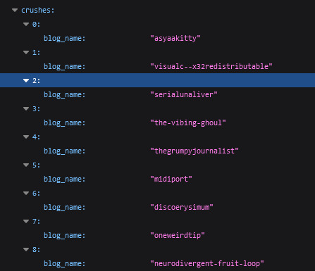

#you get this by doing a gdpr data request from tumblr btw#also it contains a lot of less fun things like.#the list of all your past urls#list of ALL ads and reccomended / fyp posts that were served to you#list of blogs you unfollowed and when did you do it#tags that you seem to interact with the most even if you don't follow them#list of posts served to you on main dashboard spanning over months#normal analytic things :)#irys.txt
1 note
·
View note
Text
How to Use CRM Software to Improve Customer Relations
Introduction
In today’s competitive market, maintaining strong customer relations is crucial for business success. One of the best ways to achieve this is by using Customer Relationship Management (CRM) software. This article will guide you on how to use CRM software to enhance your customer relations and boost your business performance. Read to Continue
#automating tasks with CRM#benefits of CRM software#best CRM practices#choosing CRM software#CRM and marketing tools#CRM customization#CRM data analysis#CRM for business#CRM for sales automation#CRM reports and dashboards#CRM setup guide#CRM software#customer relations#customer service with CRM#how to use CRM#improving customer relations#integrating CRM tools#tracking customer interactions#understanding customer insights#software solutions
1 note
·
View note
Text
Creating an Effective Power BI Dashboard: A Comprehensive Guide

Introduction to Power BI Power BI is a suite of business analytics tools that allows you to connect to multiple data sources, transform data into actionable insights, and share those insights across your organization. With Power BI, you can create interactive dashboards and reports that provide a 360-degree view of your business.
Step-by-Step Guide to Creating a Power BI Dashboard
1. Data Import and Transformation The first step in creating a Power BI dashboard is importing your data. Power BI supports various data sources, including Excel, SQL Server, Azure, and more.
Steps to Import Data:
Open Power BI Desktop.
Click on Get Data in the Home ribbon.
Select your data source (e.g., Excel, SQL Server, etc.).
Load the data into Power BI.
Once the data is loaded, you may need to transform it to suit your reporting needs. Power BI provides Power Query Editor for data transformation.
Data Transformation:
Open Power Query Editor.
Apply necessary transformations such as filtering rows, adding columns, merging tables, etc.
Close and apply the changes.
2. Designing the Dashboard After preparing your data, the next step is to design your dashboard. Start by adding a new report and selecting the type of visualization you want to use.
Types of Visualizations:
Charts: Bar, Line, Pie, Area, etc.
Tables and Matrices: For detailed data representation.
Maps: Geographic data visualization.
Cards and Gauges: For key metrics and KPIs.
Slicers: For interactive data filtering.
Adding Visualizations:
Drag and drop fields from the Fields pane to the canvas.
Choose the appropriate visualization type from the Visualizations pane.
Customize the visual by adjusting properties such as colors, labels, and titles.
3. Enhancing the Dashboard with Interactivity Interactivity is one of the key features of Power BI dashboards. You can add slicers, drill-throughs, and bookmarks to make your dashboard more interactive and user-friendly.
Using Slicers:
Add a slicer visual to the canvas.
Drag a field to the slicer to allow users to filter data dynamically.
Drill-throughs:
Enable drill-through on visuals to allow users to navigate to detailed reports.
Set up drill-through pages by defining the fields that will trigger the drill-through.
Bookmarks:
Create bookmarks to capture the state of a report page.
Use bookmarks to toggle between different views of the data.
Different Styles of Power BI Dashboards Power BI dashboards can be styled to meet various business needs. Here are a few examples:
1. Executive Dashboard An executive dashboard provides a high-level overview of key business metrics. It typically includes:
KPI visuals for critical metrics.
Line charts for trend analysis.
Bar charts for categorical comparison.
Maps for geographic insights.
Example:
KPI cards for revenue, profit margin, and customer satisfaction.
A line chart showing monthly sales trends.
A bar chart comparing sales by region.
A map highlighting sales distribution across different states.
2. Sales Performance Dashboard A sales performance dashboard focuses on sales data, providing insights into sales trends, product performance, and sales team effectiveness.
Example:
A funnel chart showing the sales pipeline stages.
A bar chart displaying sales by product category.
A scatter plot highlighting the performance of sales representatives.
A table showing detailed sales transactions.
3. Financial Dashboard A financial dashboard offers a comprehensive view of the financial health of an organization. It includes:
Financial KPIs such as revenue, expenses, and profit.
Financial statements like income statement and balance sheet.
Trend charts for revenue and expenses.
Pie charts for expense distribution.
Example:
KPI cards for net income, operating expenses, and gross margin.
A line chart showing monthly revenue and expense trends.
A pie chart illustrating the breakdown of expenses.
A matrix displaying the income statement.
Best Practices for Designing Power BI Dashboards To ensure your Power BI dashboard is effective and user-friendly, follow these best practices:
Keep it Simple:
Avoid cluttering the dashboard with too many visuals.
Focus on the most important metrics and insights.
2. Use Consistent Design:
Maintain a consistent color scheme and font style.
Align visuals properly for a clean layout.
3. Ensure Data Accuracy:
Validate your data to ensure accuracy.
Regularly update the data to reflect the latest information.
4. Enhance Interactivity:
Use slicers and drill-throughs to provide a dynamic user experience.
Add tooltips to provide additional context.
5. Optimize Performance:
Use aggregations and data reduction techniques to improve performance.
Avoid using too many complex calculations.
Conclusion Creating a Power BI dashboard involves importing and transforming data, designing interactive visuals, and applying best practices to ensure clarity and effectiveness. By following the steps outlined in this guide, you can build dashboards that provide valuable insights and support data-driven decision-making in your organization. Power BI’s flexibility and range of visualizations make it an essential tool for any business looking to leverage its data effectively.
#Dynamic Data Visualization#Business Analytics#Interactive Dashboards#Data Insights#Data Transformation#KPI Metrics#Real-time Reporting#Data Connectivity#Trend Analysis#Visual Analytics#Performance Metrics#Data Modeling#Executive Dashboards#Sales Performance#Financial Reporting#Data Interactivity#Data-driven Decisions#Power Query#Custom Visuals#Data Integration
0 notes
Text
Interactive Dashboards in Excel
📢 Exciting news! Check out this amazing tutorial on creating interactive dashboards in Excel using the Superstore dataset from Tableau. 🚀📊 In this step-by-step guide, you'll learn how to create pivot tables, pivot charts (including line charts and bar charts), maps, slicers, and formatting techniques to make your dashboard visually appealing and easily understandable. 📝💡 The author emphasizes that the skills learned in Excel can be applied across different domains and software platforms, as long as you have a solid foundation. So, get ready to enhance your data engineering and analytics expertise! 💪 Click on the link below to access the tutorial and start developing your own interactive dashboards in Excel: 🌐✨ [Interactive Dashboards in Excel](https://ift.tt/3RSFGDb) Happy data exploring! 🎉💼 #Excel #DataVisualization #DataAnalytics #Dashboards List of Useful Links: AI Scrum Bot - ask about AI scrum and agile Our Telegram @itinai Twitter - @itinaicom
#itinai.com#AI#News#Interactive Dashboards in Excel#AI News#AI tools#Innovation#itinai#Jake Teo#LLM#Productivity#Towards Data Science - Medium Interactive Dashboards in Excel
0 notes
Text
I’ve posted about it before, but I’ve been working on archiving Martin and Bosco’s blaze post in case Tumblr randomly disappears one day like a cartoon on HBO Max. I figured I’m probably not the only person or community who wants to archive their Tumblr posts, so I made a project website to explain what I’m doing. It all feels ridiculously extra, but that’s how I am about data science stuff.
You’re welcome to follow along with the project if you’re interested in the post or want to learn a bit about how to make sense of data. Questions are always welcome — whether you're curious about the methods, confused by the plots, wondering what’s next, or just thinking, “can I archive my own posts?”.
Link to the project website: https://lebriggs.com/ Note: The website is readable on mobile, but dashboards aren't really built for enjoyable small screen viewing.
Here’s a screenshot of a dashboard to get your started — you can find it on the website in an interactive form.

83 notes
·
View notes
Text
Also preserved on our archive
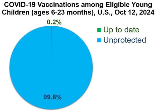
How is this not national news?
At a glance Weekly estimates of COVID-19 vaccination coverage and parental intent for vaccination among children are calculated using data from the National Immunization Survey–Flu (NIS–Flu). COVID-19 Vaccination Coverage and Intent for Vaccination, Children 6 months through 17 years Weekly estimates of COVID-19 vaccination coverage and parental intent for vaccination among children through December 31, 2023, were calculated using data from the National Immunization Survey–Child COVID Module (NIS–CCM). The NIS–CCM was discontinued at the end of 2023 and questions regarding COVID-19 vaccination status and intent were added to the National Immunization Survey–Flu (NIS–Flu).
NIS–CCM and NIS–Flu are national random-digit dial cellular telephone surveys of households with children ages 6 months through 17 years; NIS–Flu is conducted during October-June. The respondent to a NIS–Flu survey is a parent or guardian who said they were knowledgeable about the child's vaccination history. All estimates are based upon parental report of receipt of vaccination and month of that vaccination.
Weekly comparisons to previous season should take into account differences between seasons in vaccine availability dates. 2023–24 COVID-19 vaccines were first available mid-September 2023, and 2024–25 COVID-19 vaccines were first available at the end of August 2024.
The NIS–Flu data posted on the dashboard below are currently a few days behind the data that are posted on the Respiratory Illnesses Data Channel. This lag is due to the time it takes to review data by geographic and sociodemographic characteristics and summarize the findings.
(Follow the link for interactive graphs and all the data)
201 notes
·
View notes
Text
In just a few months, Donald Trump’s second presidential term has drastically reshaped the United States federal government and moved to consolidate the power of the executive branch. At the behest of the president, numerous federal agencies have undertaken aggressive, invasive initiatives to crack down on immigration, police speech, investigate political opponents, curtail US public health efforts and emergency preparedness, and more.
With so much happening at once, numerous organizations and individuals have launched databases, interactive maps, and other trackers to catalog these government actions and their impacts on people’s civil rights across the US. Using open source intelligence, public data, news coverage, and other research, these tools are vital resources for documenting, contextualizing, and analyzing the flood of federal activity that is fundamentally reshaping the US. Here are a few prominent examples.
The Impact Map
by The Impact Project, Americans for Public Service
This interactive map tracks changes to US federal government funding, workforce, and policy across the country, documenting things like mass worker firings, hiring freezes, funding cuts, and lease terminations. The tool also shows places where funding has subsequently been unfrozen, federal workers have been rehired or may be, or the federal government has added a new service or benefit.
The map includes notations to specifically document impacts in rural US counties, areas in which the population is majority non-white, places where 20 percent or more of the population live below the poverty line, and indigenous lands. It also catalogs responses to these initiatives, including legal actions as well as local and state responses to funding cuts.
United States Disappeared Tracker
by Danielle Harlow, data analyst
This dashboard tallies the number of people impacted by the Trump administration’s mass deportations carried out by US Immigration and Customs Enforcement (ICE). The number is already over 4,000. The tool also monitors the status of each individual to the degree that information is available, noting their names, original country of origin, and where they are being detained, when available.
The tracker crucially follows each individual’s status, noting whether they are in ICE custody, have been released temporarily or permanently, have been deported, have “self-deported,” or have died in ICE custody. The tool also lists how many days their ordeal has continued.
ICE Flight Tracking
by Tom Cartwright, immigration rights advocate
Tom Cartwright is a retired JP Morgan executive who uses flight monitoring data from around the country to track ICE Air deportation flights, return flights, and flights within the US. He posts regular, specific updates on his Bluesky social media page and produces monthly reports for the immigration rights group Witness at the Border about ICE Air flights and tallies. In the past 12 months, Cartwright has collected data on roughly 8,000 ICE Air flights, including 824 in April. More than 1,500 of that 12-month total were “removal flights,” while about 1,400 were “removal return” flights. The other roughly 5,000 trips were “ICE Air domestic flights” within the US.
Regulatory Changes Tracker
by The Brookings Institution
The think tank Brookings has built a database cataloging significant regulatory changes implemented since the start of the second Trump administration. It includes new executive orders and regulatory freezes as well as Trump administration changes to executive orders that were issued by past administrations. For example, the White House rescinded a 2022 Biden executive order aimed at lowering the cost of prescription drugs and another from that year calling for research into cryptocurrency regulation.
Trump Administration Litigation Trackers
by Just Security and Lawfare
The law and policy publications Just Security and Lawfare each offer databases that track lawsuits challenging Trump administration initiatives. The tools include case names, docket numbers, and jurisdictions, as well as the executive action being challenged and the status of the litigation. In most cases, the Trump administration has pursued its agenda without congressional oversight or corresponding legislation, and a number of Trump administration efforts that have been challenged in court thus far have either been paused or permanently blocked from continuing.
Far Right Groups Targeting Pride Month
by Teddy Wilson, Radical Reports
Anti-LGBTQ+ groups, including fundamentalist Christian nationalists and white supremacist extremist groups, have targeted Pride Month events previously and are expected to again this June, particularly given the Trump administration’s violent rhetoric and executive actions related to trans rights. This map is tracking Pride Month events around the country and indications that radical opposition groups plan to target the gatherings.
33 notes
·
View notes
Note
Hi, I'm having a weird problem with your submit form. Every time I click the link, I'm prompted to 'log in' to tumblr despite being logged in. When I click 'log in' I'm redirected back to the dashboard. Then when I go back to your blog to submit, I get the same prompt to log in. It's an eternal cycle. I don't expect you to play IT, but would it be alright for me to send submissions in the inbox since the submit form isn't working, provided I format it?
Unfortunately no - we cannot accept submissions via the ask box.
Asks can't be queued like submissions; we'd have to manually copy/paste and format each askbox quote into a new post to be queued, and we simply don't have the time or manpower to do that.
(A related reminder: ALL QUOTES SUBMITTED VIA THE ASKBOX ARE AUTOMATICALLY DELETED. Everyone who submitted via ask recently - and there are several of you - please re-submit via the submit box.)
Our best guess is that this issue happens because of a weird interaction between our custom domain, Tumblr cookies, and your browser's privacy controls. If that's the case, you can try to get around the bug by whitelisting shitmyplayerssay.com in your browser's privacy settings. We aren't collecting your data, we don't want or need your data, we're not up to anything, it's just that (we think) this bug happens due to how third-party cookies are defined.
Anyone who experiences this bug, please report it to Tumblr support! They're the only ones who can do anything about it.
Sorry, Anon - Tumblr has locked submissions down pretty hard. We wish we could do more to fix things!

104 notes
·
View notes
Note
Hi! Thanks for running this blog, I love participating in the polls and seeing how tumblr answers. I was wondering if you would consider queueing polls you’ve posted to repost after their voting time ends. Sometimes for the polls that are specific to a population (e.g. “people with stepparents,”) I want to know how people answer but I don’t want to skew the data with the “not applicable/show results” button. If I knew I’d see the outcome later on, then it’d be easier to skip voting on the first pass. No worries if that doesn’t work for you (I know it would be more work), just thought I’d suggest :) Thank you again!
This is actually a bit of a pet peeve of mine – many other poll blogs reblog each of their own polls (either shortly before the voting period ends, or after it ends so people can see final results), with very valid reasons to do so, but I honestly find it pretty irritating :’)
It puts duplicate posts on followers’ dashboards with no added interactive value, and if you go to scroll through the blog (to find a specific poll, vote on all of the most recent open polls, browse, etc) you end up slogging through infinite duplicates for what feels like no good reason.
No hard feelings toward any of the other hardworking poll bloggers out there, of course– each blogger is right to find the workflow that they like best! But I’m not going to implement that on this blog. Thanks for the feedback!
163 notes
·
View notes
Text
SysNotes devlog 1
Hiya! We're a web developer by trade and we wanted to build ourselves a web-app to manage our system and to get to know each other better. We thought it would be fun to make a sort of a devlog on this blog to show off the development! The working title of this project is SysNotes (but better ideas are welcome!)

What SysNotes is✅:
A place to store profiles of all of our parts
A tool to figure out who is in front
A way to explore our inner world
A private chat similar to PluralKit
A way to combine info about our system with info about our OCs etc as an all-encompassing "brain-world" management system
A personal and tailor-made tool made for our needs
What SysNotes is not❌:
A fronting tracker (we see no need for it in our system)
A social media where users can interact (but we're open to make it so if people are interested)
A public platform that can be used by others (we don't have much experience actually hosting web-apps, but will consider it if there is enough interest!)
An offline app
So if this sounds interesting to you, you can find the first devlog below the cut (it's a long one!):
(I have used word highlighting and emojis as it helps me read large chunks of text, I hope it's alright with y'all!)
Tech stack & setup (feel free to skip if you don't care!)
The project is set up using:
Database: MySQL 8.4.3
Language: PHP 8.3
Framework: Laravel 10 with Breeze (authentication and user accounts) and Livewire 3 (front end integration)
Styling: Tailwind v4
I tried to set up Laragon to easily run the backend, but I ran into issues so I'm just running "php artisan serve" for now and using Laragon to run the DB. Also I'm compiling styles in real time with "npm run dev". Speaking of the DB, I just migrated the default auth tables for now. I will be making app-related DB tables in the next devlog. The awesome thing about Laravel is its Breeze starter kit, which gives you fully functioning authentication and basic account management out of the box, as well as optional Livewire to integrate server-side processing into HTML in the sexiest way. This means that I could get all the boring stuff out of the way with one terminal command. Win!
Styling and layout (for the UI nerds - you can skip this too!)
I changed the default accent color from purple to orange (personal preference) and used an emoji as a placeholder for the logo. I actually kinda like the emoji AS a logo so I might keep it.
Laravel Breeze came with a basic dashboard page, which I expanded with a few containers for the different sections of the page. I made use of the components that come with Breeze to reuse code for buttons etc throughout the code, and made new components as the need arose. Man, I love clean code 😌
I liked the dotted default Laravel page background, so I added it to the dashboard to create the look of a bullet journal. I like the journal-type visuals for this project as it goes with the theme of a notebook/file. I found the code for it here.
I also added some placeholder menu items for the pages that I would like to have in the app - Profile, (Inner) World, Front Decider, and Chat.

i ran into an issue dynamically building Tailwind classes such as class="bg-{{$activeStatus['color']}}-400" - turns out dynamically-created classes aren't supported, even if they're constructed in the component rather than the blade file. You learn something new every day huh…

Also, coming from Tailwind v3, "ps-*" and "pe-*" were confusing to get used to since my muscle memory is "pl-*" and "pr-*" 😂
Feature 1: Profiles page - proof of concept
This is a page where each alter's profiles will be displayed. You can switch between the profiles by clicking on each person's name. The current profile is highlighted in the list using a pale orange colour.

The logic for the profiles functionality uses a Livewire component called Profiles, which loads profile data and passes it into the blade view to be displayed. It also handles logic such as switching between the profiles and formatting data. Currently, the data is hardcoded into the component using an associative array, but I will be converting it to use the database in the next devlog.

New profile (TBC)
You will be able to create new profiles on the same page (this is yet to be implemented). My vision is that the New Alter form will unfold under the button, and fold back up again once the form has been submitted.
Alter name, pronouns, status
The most interesting component here is the status, which is currently set to a hardcoded list of "active", "dormant", and "unknown". However, I envision this to be a customisable list where I can add new statuses to the list from a settings menu (yet to be implemented).


Alter image
I wanted the folder that contained alter images and other assets to be outside of my Laravel project, in the Pictures folder of my operating system. I wanted to do this so that I can back up the assets folder whenever I back up my Pictures folder lol (not for adding/deleting the files - this all happens through the app to maintain data integrity!). However, I learned that Laravel does not support that and it will not be able to see my files because they are external. I found a workaround by using symbolic links (symlinks) 🔗. Basically, they allow to have one folder of identical contents in more than one place. I ran "mklink /D [external path] [internal path]" to create the symlink between my Pictures folder and Laravel's internal assets folder, so that any files that I add to my Pictures folder automatically copy over to Laravel's folder. I changed a couple lines in filesystems.php to point to the symlinked folder:

And I was also getting a "404 file not found" error - I think the issue was because the port wasn't originally specified. I changed the base app URL to the localhost IP address in .env:

…And after all this messing around, it works!
(My Pictures folder)

(My Laravel storage)

(And here is Alice's photo displayed - dw I DO know Ibuki's actual name)

Alter description and history
The description and history fields support HTML, so I can format these fields however I like, and add custom features like tables and bullet point lists.

This is done by using blade's HTML preservation tags "{!! !!}" as opposed to the plain text tags "{{ }}".
(Here I define Alice's description contents)


(And here I insert them into the template)

Traits, likes, dislikes, front triggers
These are saved as separate lists and rendered as fun badges. These will be used in the Front Decider (anyone has a better name for it?? 🤔) tool to help me identify which alter "I" am as it's a big struggle for us. Front Decider will work similar to FlowCharty.

What next?
There's lots more things I want to do with SysNotes! But I will take it one step at a time - here is the plan for the next devlog:
Setting up database tables for the profile data
Adding the "New Profile" form so I can create alters from within the app
Adding ability to edit each field on the profile
I tried my best to explain my work process in a way that wold somewhat make sense to non-coders - if you have any feedback for the future format of these devlogs, let me know!
~~~~~~~~~~~~~~~~~~
Disclaimers:
I have not used AI in the making of this app and I do NOT support the Vibe Coding mind virus that is currently on the loose. Programming is a form of art, and I will defend manual coding until the day I die.
Any alter data found in the screenshots is dummy data that does not represent our actual system.
I will not be making the code publicly available until it is a bit more fleshed out, this so far is just a trial for a concept I had bouncing around my head over the weekend.
We are SYSCOURSE NEUTRAL! Please don't start fights under this post
#sysnotes devlog#plurality#plural system#did#osdd#programming#whoever is fronting is typing like a millenial i am so sorry#also when i say “i” its because i'm not sure who fronted this entire time!#our syskid came up with the idea but i can't feel them so who knows who actually coded it#this is why we need the front decider tool lol
24 notes
·
View notes
Text
The reverse-centaur apocalypse is upon us

I'm coming to DEFCON! On Aug 9, I'm emceeing the EFF POKER TOURNAMENT (noon at the Horseshoe Poker Room), and appearing on the BRICKED AND ABANDONED panel (5PM, LVCC - L1 - HW1–11–01). On Aug 10, I'm giving a keynote called "DISENSHITTIFY OR DIE! How hackers can seize the means of computation and build a new, good internet that is hardened against our asshole bosses' insatiable horniness for enshittification" (noon, LVCC - L1 - HW1–11–01).

In thinking about the relationship between tech and labor, one of the most useful conceptual frameworks is "centaurs" vs "reverse-centaurs":
https://pluralistic.net/2022/04/17/revenge-of-the-chickenized-reverse-centaurs/
A centaur is someone whose work is supercharged by automation: you are a human head atop the tireless body of a machine that lets you get more done than you could ever do on your own.
A reverse-centaur is someone who is harnessed to the machine, reduced to a mere peripheral for a cruelly tireless robotic overlord that directs you to do the work that it can't, at a robotic pace, until your body and mind are smashed.
Bosses love being centaurs. While workplace monitoring is as old as Taylorism – the "scientific management" of the previous century that saw labcoated frauds dictating the fine movements of working people in a kabuki of "efficiency" – the lockdowns saw an explosion of bossware, the digital tools that let bosses monitor employees to a degree and at a scale that far outstrips the capacity of any unassisted human being.
Armed with bossware, your boss becomes a centaur, able to monitor you down to your keystrokes, the movements of your eyes, even the ambient sound around you. It was this technology that transformed "work from home" into "live at work." But bossware doesn't just let your boss spy on you – it lets your boss control you. \
It turns you into a reverse-centaur.
"Data At Work" is a research project from Cracked Labs that dives deep into the use of surveillance and control technology in a variety of workplaces – including workers' own cars and homes:
https://crackedlabs.org/en/data-work
It consists of a series of papers that take deep dives into different vendors' bossware products, exploring how they are advertised, how they are used, and (crucially) how they make workers feel. There are also sections on how these interact with EU labor laws (the project is underwritten by the Austrian Arbeiterkammer), with the occasional aside about how weak US labor laws are.
The latest report in the series comes from Wolfie Christl, digging into Microsoft's "Dynamics 365," a suite of mobile apps designed to exert control over "field workers" – repair technicians, security guards, cleaners, and home help for ill, elderly and disabled people:
https://crackedlabs.org/dl/CrackedLabs_Christl_MobileWork.pdf
It's…not good. Microsoft advises its customers to use its products to track workers' location every "60 to 300 seconds." Workers are given tasks broken down into subtasks, each with its own expected time to completion. Workers are expected to use the app every time they arrive at a site, begin or complete a task or subtask, or start or end a break.
For bosses, all of this turns into a dashboard that shows how each worker is performing from instant to instant, whether they are meeting time targets, and whether they are spending more time on a task than the client's billing rate will pay for. Each work order has a clock showing elapsed seconds since it was issued.
For workers, the system generates new schedules with new work orders all day long, refreshing your work schedule as frequently as twice per hour. Bosses can flag workers as available for jobs that fall outside their territories and/or working hours, and the system will assign workers to jobs that require them to work in their off hours and travel long distances to do so.
Each task and subtask has a target time based on "AI" predictions. These are classic examples of Goodhart's Law: "any metric eventually becomes a target." The average time that workers take becomes the maximum time that a worker is allowed to take. Some jobs are easy, and can be completed in less time than assigned. When this happens, the average time to do a job shrinks, and the time allotted for normal (or difficult) jobs contracts.
Bosses get stack-ranks of workers showing which workers closed the most tickets, worked the fastest, spent the least time idle between jobs, and, of course, whether the client gave them five stars. Workers know it, creating an impossible bind: to do the job well, in a friendly fashion, the worker has to take time to talk with the client, understand their needs, and do the job. Anything less will generate unfavorable reports from clients. But doing this will blow through time quotas, which produces bad reports from the bossware. Heads you lose, tails the boss wins.
Predictably, Microsoft has shoveled "AI" into every corner of this product. Bosses don't just get charts showing them which workers are "underperforming" – they also get summaries of all the narrative aspects of the workers' reports (e.g. "My client was in severe pain so I took extra time to make her comfortable before leaving"), filled with the usual hallucinations and other botshit.
No boss could exert this kind of fine-grained, soul-destroying control over any workforce, much less a workforce that is out in the field all day, without Microsoft's automation tools. Armed with Dynamics 365, a boss becomes a true centaur, capable of superhuman feats of labor abuse.
And when workers are subjected to Dynamics 365, they become true reverse-centaurs, driven by "digital whips" to work at a pace that outstrips the long-term capacity of their minds and bodies to bear it. The enthnographic parts of the report veer between chilling and heartbreaking.
Microsoft strenuously objects to this characterization, insisting that their tool (which they advise bosses to use to check on workers' location every 60-300 seconds) is not a "surveillance" tool, it's a "coordination" tool. They say that all the AI in the tool is "Responsible AI," which is doubtless a great comfort to workers.
In Microsoft's (mild) defense, they are not unique. Other reports in the series show how retail workers and hotel housekeepers are subjected to "despot on demand" services provided by Oracle:
https://crackedlabs.org/en/data-work/publications/retail-hospitality
Call centers, are even worse. After all, most of this stuff started with call centers:
https://crackedlabs.org/en/data-work/publications/callcenter
I've written about Arise, a predatory "work from home" company that targets Black women to pay the company to work for it (they also have to pay if they quit!). Of course, they can be fired at will:
https://pluralistic.net/2021/07/29/impunity-corrodes/#arise-ye-prisoners
There's also a report about Celonis, a giant German company no one has ever heard of, which gathers a truly nightmarish quantity of information about white-collar workers' activities, subjecting them to AI phrenology to judge their "emotional quality" as well as other metrics:
https://crackedlabs.org/en/data-work/publications/processmining-algomanage
As Celonis shows, this stuff is coming for all of us. I've dubbed this process "the shitty technology adoption curve": the terrible things we do to prisoners, asylum seekers and people in mental institutions today gets repackaged tomorrow for students, parolees, Uber drivers and blue-collar workers. Then it works its way up the privilege gradient, until we're all being turned into reverse-centaurs under the "digital whip" of a centaur boss:
https://pluralistic.net/2020/11/25/the-peoples-amazon/#clippys-revenge
In mediating between asshole bosses and the workers they destroy, these bossware technologies do more than automate: they also insulate. Thanks to bossware, your boss doesn't have to look you in the eye (or come within range of your fists) to check in on you every 60 seconds and tell you that you've taken 11 seconds too long on a task. I recently learned a useful term for this: an "accountability sink," as described by Dan Davies in his new book, The Unaccountability Machine, which is high on my (very long) list of books to read:
https://profilebooks.com/work/the-unaccountability-machine/
Support me this summer on the Clarion Write-A-Thon and help raise money for the Clarion Science Fiction and Fantasy Writers' Workshop!
If you'd like an essay-formatted version of this post to read or share, here's a link to it on pluralistic.net, my surveillance-free, ad-free, tracker-free blog:
https://pluralistic.net/2024/08/02/despotism-on-demand/#virtual-whips
Image: Cryteria (modified) https://commons.wikimedia.org/wiki/File:HAL9000.svg
CC BY 3.0 https://creativecommons.org/licenses/by/3.0/deed.en
#pluralistic#bossware#surveillance#microsoft#gig work#reverse centaurs#labor#Wolfie Christl#cracked labs#data at work#AlgorithmWatch#Arbeiterkammer#austria#call centers#retail#dystopianism#torment nexus#shitty technology adoption curve
94 notes
·
View notes
Note
Hi! You don’t know me, I’m not a mutual and I’m new and essentially inactive so far on Tumblr aside from setting up my profile, so please prepare for an extremely random interaction. I’m clinging hard to the anonymous function here. I’m a somewhat new writer on ao3 in the Hannibal fandom. I’m mid 30s so maybe that’s part of it, but I know no one in the fandom world at all. Not in person or online. I just finally decided to try out writing after many years of reading and I’ve been loving it. Like you (based on your pinned post), I’ve historically mostly written academically and professionally, and flexing those muscles in this way is such a pleasure. I’ve read a lot of your stories on Ao3 and I loved them all. And you pop up a lot on the Hannibal dashboard on Tumblr and seem to be a pretty kind person, so I thought you might be someone I could ask this somewhat awkward question without judgment: how did you go about building your fannibal community (I’m just going off of tumblr comments in assuming that you have a fannibal fam)? Now that I’m writing, the urge to chat about random Hannibal thoughts or bounce ideas is overwhelming, and I get the impression most people have their fannibal crew as an outlet for that. Right now I’m just annoying the hell out of my completely disinterested partner who thinks I’m losing my mind lol. So I’m trying to figure out if there’s something I’m missing about how people connect in this world or if it’s just Tumblr and Ao3 and a stroke of luck? If you think this is weird, please feel free to leave me on read lol. No hard feelings at all, I feel weird enough about this as it is. But if you have any advice and wouldn’t mind sharing, I’d welcome it. Thanks and thanks for all your great writing!
omg hi, this is such a sweet ask! genuinely honored that you'd reach out to me at all <3
funny you should mention annoying the hell out of your partner because SAME lolol that's what drove me to start this account in the first place.
so. i'm going to attempt to give a coherent response here, please bear with me.
when i first started out, i pretty much mass followed anybody who had a hannibal-related account and then just started interacting with people. it was mostly just commenting on or reblogging other people's stuff, and i felt wayyyyyyyy out of my comfort zone because, historically, i've been a massive lurker.
then i decided i wanted to do my monthly hannigram fic rec posts because i was tracking that data anyway and i just wanted to do something with it other than just letting it all rot in the spreadsheet never to see the light of day again. and turns out, a lot of people like to ask for and give fic recs! so that was a cool way to find cool myoots.
and then i got the itch to write and started to post Reciprocal Alchemy and was utterly blown away by the response people had. off the top of my head, @incidentsofunknownorigins, @coffee-in-rain, and @serri-i were all very vocally supportive from the jump and i pretty much was like, "hi we're going to be friends, no you don't have a choice, no i'm not sorry" lolol
and then i just kept writing and more people kept engaging (i'm still geeking over the fact that so many people enjoy my writing and are kind enough to make sure i know they like it <3) and here we are?? i think it was helpful that i linked my tumblr at the end of every chapter or fic that i post so people who find me on ao3 can come say hi here as well.
oh and i posted an insane amount of content in a very short amount of time for a popular event (kinktober was almost the death of me lolol) and that resulted in a wide variety of people seeing and reading my stuff.
all that is to say, you're pretty spot on with the tumblr/ao3/stroke of luck combination!
i have no idea if any of this was helpful for you, but hopefully something in here is :)
also, would love to be mutuals!! some of my best fic ideas come from random conversations i've had with other friends and writers, so let's go insane over these gay cannibals together!
all of my love, Grace
#if anybody else has advice for anon#throw that in the notes!!!#hannigram#gracie reads hannigram#ask scifibabe
19 notes
·
View notes
Note
there is a dip in the fic count of all fandoms between february 26 and march 3, is there a reason for that? just something I noticed while looking at the dashboard
So I finally had time to look into this properly - at first I couldn't figure it out, because I didn't make any changes to my workflow around that time.
However, I had a hunch and checked everyone's favorite RPF fandom (Hockey RPF) and the drop was wayyy more dramatic there. This confirmed my theory that my stats were no longer including locked works (since RPF fandoms tend to have a way higher percentage of locked fics).
It looks AO3 made some changes to how web scrapers can interact with their site, likely due to the DDOS attacks / AI scrapers they've been dealing with. That change caused my scraper to pull all fic counts as if it was a guest and not a member, which caused the drop.
~
The good news: I was able to leverage the login code from the unofficial python AO3 api to fix it, so future fic counts should be accurate.
The bad news: I haven't figured out what to do about the drop in old data. I can either leave it or I can try to write some math-based script that estimates how many fics there were on those old dates (using the data I do have and scaling up based on that fandom's percentage of locked fics). This wouldn't be a hundred percent accurate, but neither are the current numbers, so we'll see.
~
Thanks Nonny so much for pointing this out! I wish I would've noticed & had a chance to fix earlier, but oh well!
37 notes
·
View notes