#it would also be easier in clip studio if I could use clip studio without wanting to throw my computer out of a window lmao
Explore tagged Tumblr posts
Visit Tumblr Blog
Explore Tumblr blogs with no restrictions, modern design and the best experience.
Last Seen Tumblr Blogs


Fun Fact
Tumblr is available in 18 languages.
Text
realizing I did not letter the next page that goes up this week and that I have to do that still...

#klsafjs lmao I'm sorry I don't generally like to neg meme about art or the art process bc I think it's a great way to develop an unhealthy#relationship with something that yes is difficult but requires love to do#but you see#I hate lettering#I think I'm not very good at it but i'm also extremely picky about it and I hate the process of actually doing it#it's the ONLY PART of comic making I dislike#I find I dislike it less when I write the script in real time and write it as I'm lettering#but we don't do that here since that's a great way to end up with nonsense#anyway I do really like the next page... i guess I should letter it for you guys so you can read it#I GUESS#I'd pay a letterer if I hate spare money to hire one#at least making my balloons mix-n-match brushes made it easier#it would also be easier in clip studio if I could use clip studio without wanting to throw my computer out of a window lmao#so I letter in procreate#ANYWAY.#anyway#hope you're excited for the next page#enjoy audric answering questions in the meantime
17 notes
·
View notes
Text
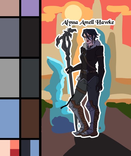
Heroes of the Dragon Age
An animation I've made for Dragon Age Day 2023, featuring my main Warden (Alyssa Cousland-Theirin), Hawke (Eleena Amell Hawke) and Inquisitor (Sulevin Lavellan)!
It's to this day one of my best artwork and I thought I should share it here too! 90+ hours between the original sketch, outfit design, the rough animation, rotoscope, inking, flat-colours, background shading and even the audio :')
Interested in the process? I detailed it below since it was my first time doing something like that:
I would like to start by saying I'm not a professional animator!Everything you've seen here is the result of experimentation and a lot of practice to learn and understand how 2D animation works.

My first idea started in May 2023. I just finished rewatching DA Absolution for the X time, and wanted to analyse why I loved the intro so much. (Even after countless rewatch, I never skipped it once.) I was inspired to study it with my main three protagonists!


Then came the first test with Alyssa Cousland-Theirin, my Hero of Ferelden! I tried to understand which part to separate for the animation. Mainly the hair and cape because it flows a lot more than the rest! If I recall, my first idea here was to make her counter flame attacks (?). Then, as the camera turns around her, I tried to add a grid to know how the camera would work around it.
I ended up making the clip longer, so she could position herself to the further left and leave space to the two other protagonists.

Now it was time to try to animate Sulevin Lavellan, my Inquisitor. I really kept that quick doodling style just to capture the vibe without putting too much time/effort into it! The background would be static to contrast with Alyssa's. I also loved the idea of a rogue sneaking!

Instead of working on Eleena Amell Hawke, my Champion of Kirkwall, I went back to Alyssa and started working with Clip Studio Paint 3D models (this entire animation has been done on the EX version of the software!) It helped for rotoscope animation and maintaining likeness! That's when I got the idea to make the background swirl around the character to let the eyes be guided by the rest of the screen!

After a couple more hours, I planned the entire animatic with 3D models and quick doodles! I finally found a cool pose for Eleena Hawke, which was honestly the hardest of the three to imagine for some reason? I tried many other poses but ended up picking an animation from the game!


This whole time, I was studying a bunch of background ideas and how studio Red Dog Culture House (who made Absolution) work! Thankfully, they have a YouTube Channel where they shared some BTS content so I could analyse it!


Then, I simplified my character and their original designs in the style of the studio! These outfits are how I imagine them after Trespasser. Alyssa as the Queen of Ferelden, looking for a cure to the Calling, Hawke following Fenris to Tevinter & Sully as a Red Jenny Inquisitor!


The idea for Sulevin's animation actually came from a piece I doodled on a live stream, when I was drawing pose studies and turning them into finished artworks haha As for Alyssa, I wanted to draw the fight that got her facial scars!

Once their designs were ready and the background ideas too, I made the rough version of the animation! Basically a sketch done on top of the 3D models to add the details, staying pretty rough just to capture the idea and movements.


Then it was time to start the lines! I decided make a folder per frame, so I could separate all he main elements and draw them one by one. It helps keeping the likeness of a character in the different frames without having big "jumps" between frames! In fact, every parts were coloured differently to recognize them, and then I used vector erasers and masks (Ah yes, the entire lineart is done in vectors of course! It's easier to adjust and save time when working on similar frames!)


At first of course, everything overlaps! But I find it easier to draw too much and erase after, just to make sure everything is coherent in each frames! The cool thing about CSP is how you can change the colour of the layers in one click! So all the coloured lines turned into black in one second, and I could reverse it just as quickly to double check!

Then I started working on Sulevin! I made a blue line to mark where her feet were, as the sketch in the background wasn't perfectly straight! (Like Sulevin's sexuality 🤭😂) The silhouettes were very quick to do, but I had fun adding more & more details as she came closer to the foreground!

I really wanted to add that little dagger trick, but I remember it required me to change the pacing of Eleena's apparition, as it was recovering her arm too quickly! I had to change the pace of multiple frames quite a lot during the project, to make sure the flow was right! For Eleena, most of her animation remained around her arms and the staff itself, as magic would be the most difficult part! That way each character has their own focus: Alyssa has a very animated background, Sulevin got the grappling hook and Eleena the ice!

Then it was time to start adding colours! Just like for the lineart, I separated every colour on it's own layer, so I could easily adjust the colours later if needed. I added one colour at the time, going through all the frames, and then another colour!
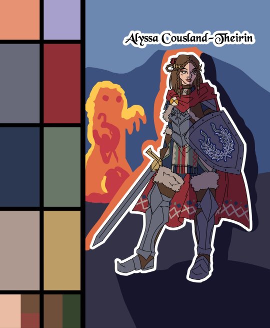
I made full palette tests with the colours I would use for their background at this point, checking if the details remained readable! Alyssa was the most challenging in terms of clothes, because I made her a very detailled armour! I had to simplify the Theirin heraldry, vectorize/redraw the Cousland, and make a brush for her cape's pattern!

Once I was done adding the flatcolours, I started the background, and oh boy it was a wild ride. For the cave, I painted multiple tests. I imagine was to use CSP panorama tools, which transform a texture into a 3D sphere, so each corners must match to look good. Sadly, it made the background very blurry, so after hours of testing, I changed ideas. Instead of the random fire balls (?) I originally imagined for Alyssa, I made three simple frames of a Rage Demon to attack her.


I ended up using the cave as a repeated pattern to make it turn 360° around the character. For Eleena, I mixed inspiration from the comics, Dreadwolf & Absolution, using warm colours matching Hawke's signature red. Just like I made the cave very grey/blue to match Grey Wardens. For Val Royeaux, it was more complex because I wanted to make it green, matching the Inquisitor's signature green. But bright green couldn't work, and the original colour during day time was blue/white/gold. So I added more leaves, played around the design a bit! After adding the rage demon, I made the shading! It was surprisingly easy and quick to do now!

I clipped a white layer on the flatcolours to not be distracted by the colours, and made thin lines to separate the light/shadows, then simply filled everything with the bucket tool! Then you set the layer to multiply and remove the white layer, and you have celshading shadows! Now the character looks out of the picture, so I added layers of blue in color burn, saturation and substract blending modes to make her look like she's in the right setting! Of course, I did the same with the other two, giving Hawke a red overlay and Sulevin green shadows!

Then I added the details, it went from white irises, to sword/staff smears to earrings and smaller finition that goes on top of these layers. To add the lights, I simply selected the shadows and reversed the selection! Using warm and cold tones to create contrast with the purple/bluish shadows! I also added more ambient light layers for Alyssa to reflect the Rage Demon fire. Now it was time to add ice magic! My first attempt had too many frames, making it look weird! Sometimes it's better to lower the frame rate to make things less bumpy!

Then I downloaded some cool ice brushes on CSP assets that made it look less like blue magical flames! But when I covered the screen in ice, I realized "Oh wait, I could make a cool transition from the ice, to blue lyrium turning red?"Red Lyrium truly links these three games and The Veilguard somehow! I spent the next hour painting over the idol and putting it in a black background, with lyrium and then the golden Dragon Age title text.
For the SFX, I used free youtube libraries sounds & "Darkspawn!" comes from the violent human female voice set (iconic for ""Can I get you a ladder? So you can get off my back!"😂🤭) After editing all that, the animation was finally done!

Here's the final math:
About 15 hours for the sketching/rough/animatic phase, 30h for the lineart, 25h for colours, 10h for backgrounds, 5h for details & 5h for music & SFX, for a total of 90 hours. Aka the same amount of time it took me to finish Baldur's Gate 3 the first time lol
If you have any question regarding the animation or the softwares etc. do not hesitate to ask, I'll do my best to answer!
#dragon age#dragon age origins#dao#dragon age 2#da2#dragon age inquisition#dai#da4#dragon age dreadwolf#dragon age the veilguard#animation 2d#original character#tutorial#warden#grey warden#warden cousland#alistair x cousland#alistair x warden#ferelden#hero of ferelden#queen of ferelden#hawke#fem hawke#eleena amell hawke#mage#warrior#rogue#lavellan#inquisitor lavellan#solavellan
301 notes
·
View notes
Note
Whats your process like for making the pages/script/comic in general? any advice you could give?
Hii:D
I'm gonna ramble about this a lot, so I'm adding this read more <3
That way this post won't be super long on the main page
If you DO want to see everything go ahead!
So! Right now I work on the pages from monday to saturday :]
I divide work like this:
Monday-Tuesday: Script, storyboard and dialogue bubbles!
Wednesday-Thursday: Lineart for the 4 pages! 2 pages each day
Friday-Saturday: Color the 4 pages! 2 pages each day
Talking about writing
I don't have the full script ready yet because I realized
I SUCK AT WRITING, NOT IN A "My writing is so bad way" BUT IN A "I can't write words without getting confused" WAY
That's one of the reasons why it took me SO long to start this thing! Because I wanted the script to be fully ready! And I couldn't do that because whenever I'm writing I get super confused😭😭I don't know how to explain it but I NEED visuals ??? I need to see how the dialogue I'm writing is gonna look???
So now, whenever I'm writing, I'm also drawing at the same time! AND FOR SOME REASON THAT WORKS, AND SUDDENLY I CAN WRITE
I REALLY DON'T KNOW WHY THAT IS BUT, UH, IT WORKS FOR ME!!! THAT'S ALL I NEED!!
This does NOT mean I'm improvising the story! I do have the full story ready and outlined! I'm following that outline :]
I realized having everything ready might work for some people, but it wasn't working for me D:
So, uh, my advice for writing is to trust yourself and to try different methods! You'll find something that works for you :]
I DO recommend having an outline of the story before beginning!! You don't need to know everything from the beginning but you need to know what NEEDS to happen and a basic idea of how it should end :]
Now about the making of the comic pages
Pls look for references constantly!! Very important!!
There's many different ways to make comics!
I always look in pinterest for panel layout/color pallete inspiration
I use clip studio paint to make everything, it's super useful cause it has a LOT of features that make the process MUCH easier (vector layers, a paint bucket that actually works, special comic configurations, a panel tool, 3d viewing which is super fun, predetermined speech bubbles, the story editor, etc.)
It takes me like?? Approximately 2 and half hours to make one page?? Some more and some less
But I'm also an easily distracted person so sometimes 2 hours turn into 3 because I spent 1 hour getting distracted with other stuff 😭
Uhhm, so yeah!! I think the layout is my favorite part, my least favorite part is adding the speech bubbles...ESPECIALLY if I have to add Wingdings
Andd I think that covers most of it? If you all have more specific questions let me know because there's a LOT of stuff that goes into making these😭😭but I get better and faster each time! My first pages took me like 4 hours on average...some would take me 6 hours...THAT WENT DOWN A LOT :D
#i don't know what to add here in tags hehe#answered ask#making a comic is great but oh my god does it take time to get used to it ....and to build a schedule that actually works....
74 notes
·
View notes
Note
Hi! I was wondering if you were willing to share any tips/advice when it came to your art processes? Whether it be lineart or composition or anything else really! I’m obsessed with how good your art is dhdhdhd Thank you for your time!
HAKJSD THANK U!! i kinda do most things by vibe so idk how coherent this is gonna be but i'll try my best ajhsdha (these also aren't gonna be the traditional rule-of-thirds/color-theory type of advice because frankly i don't think i'm qualified to give advice on that stuff LMAO this is just what's sitting in the back of my head when i draw)
i'm probably not the best to ask about composition because 99% of the time i'll just be flipping through concepts in my head like a slideshow instead of actually thumbnailing things (which you should absolutely do to help you visualize things better if you're unable to in your head); i literally just operate on a scale of "i think it would look cool if i did this" either based on symbolism (ephemerweek 1 vs 7, for example, where it looks like ephemer is reaching out to bring player/the viewer towards the light behind him vs ephemer facing the light on his own without looking back — in both of these i wanted it to look like he was being blotted out by a harsh light, like when you try to hold an object up to the sun and it becomes impossible to see) or a neat concept (i.e using transparency to make it look like a character is coming through the screen, or something simpler like in my last skuld post where i vaguely wanted her hair to make the shape of a crescent). why am i already rambling. BASICALLY i encourage you to think about what exactly you wanna portray and the methods you can use to reinforce your idea; try to play with the medium if you can! think of themes! be dramatic!!
don't be afraid to mix up your lines when it comes to lineart! you can vary your lines depending on the piece to match the kind of tone you wanna use; sharp and bold for something that's energetic and flashy and colorful, light and thin for something that's melancholic, etc
doing a basic, quick skeleton sketch first to get an idea of the pose you want will save you so much time and headache good lord. i often still find myself getting carried away and not doing the basic sketch first because i wanna hurry up and get to the Fun stuff (especially if i have no specific plans and just wanna doodle), but having it genuinely makes things so much easier and also helps to avoid ending up with stiff poses; personally i like using planes/rectangles more than stick figures since it helps more with the actual figure (and use a box instead of a circle for the head, it's easier to visualize the exact angle you want that way). be better than me and remember to do the basic sketch
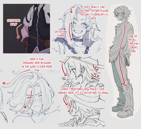
this is probably a personal thing but honestly there is nothing more important than having satisfying Shapes. i don't even know how to explain this but it's like . have you ever looked at how a line curves and thought "fuck that's a nice line, i like that line"? i sound insane i think i'll just put some examples under a readmore but i guess the gist is visual appeal?? like if something felt satisfying to draw, whether that's a curl in the hair or a curve in the silhouette or how clothing wrinkles flow, then chances are it'll be satisfying to look at, too (and on the other hand maybe you could take advantage of this to go the opposite direction to make something feel more unsettling?)
be aware of where the viewer's eye will tend to go first and try your best to do that part well; unless your composition is specifically pointing to a certain place or isn't character-focused, it'll likely be the character's expression/face
learn how to use gradient maps, tone curves, and color balance layers they will save your life when it comes to coloring
i think i'm running out of tips now but if you use clip studio paint, use this if you need help on figuring out perspective for objects or backgrounds
that's all i can think of atm HAKSJDHK hopefully some of this actually made sense !!
and here's some examples of lines or smth that i like that will hopefully make me look less insane. triangles are the best shape btw
does any of this make sense. is this thing on
#i had another thing i was gonna say down here bc it wasnt really a tip but its been two hours and idr what it was .#anyway the shapes are very important imo#i think it works better w cartoonish styles (as exaggeration tends to do) but idk the lines just gotta be satisfying !!#asks
2 notes
·
View notes
Note
hi tamelee!
I'm here to ask for a little bit of advice if that's okay (: about a month ago I bought a Wacom drawing pad so I could start experimenting with digital art. artists like you here on tumblr have really inspired me to start making art. but I feel kinda.. lost. I've been mostly drawing naruto manga caps and I'm getting better but I guess I don't know where to go from here. coloring and shading scares me lol. I'm using clip studio paint and it's just a little.. intimidating. I feel discouraged, like I won't be able to do it. how did you do it tamelee? did you watch a lot of tutorials, or did you experiment until you figured things out? any advice you'd have for a beginner artist I'd really appreciate.
thank you veryvery much for your time ^^
Hi Nonee! 🧡 Sure!
Oh I think that’s a very good place to start. As well as drawing subjects you like ^^! Hmm, tbh I’ve just experimented a lot, but I don’t think my way of having done things was the most efficient. You might want to follow tutorials step by step? You can try coloring only with flat colors until you feel a bit more confident with that as well as cell-shading (toon-shading/non-realistic, like in anime) instead of rendering further as that can all be confusing at first. I personally never truly understood shading until I studied cell-shading and made my art a lot more readable. A lot of Anime uses this;
You see how there is a base color, a darker color for shadows and highlights? (Sometimes not even highlights.)
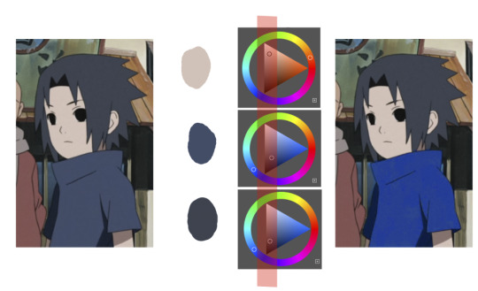
When you start to study it from existing work you’ll start to notice things like color always being in the same area of saturation and when you suddenly have a color that is way more saturated than the other it can look off. (See example.) But this is a guideline, not a rule. In your own art you can especially use saturation and brightness to help aid you to direct a viewer's focus and even tell a story.
I LOVE ‘How to train you dragon’ and ‘Kung Fu Panda’ for this because their coloring is so inspiring and if you truly want to learn from professionals... well those are the type of media to look for of course! I have an entire folder to inspire me just based on those.
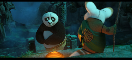
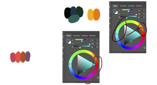
Do you see how calculated those color combo’s are?!?! Here you see both analogous and complementary schemes and it is actually through looking at the things I like that I learned it >< The orangey colors stand out and are bright which helps you to focus on that area whereas the complimentary scheme is used to bring characters together.
If drawing Manga-caps is something you love to do, then maybe for coloring you can study screen-caps from Anime or even other animated films. I’d recommend to take it step by step, though I haven’t really applied it myself, from the video’s I’ve seen and artists I’ve followed it is always advised to have an art-goal that you can work toward. Maybe you first want to focus on lineart and then laying down a base color where the colors are harmonious and next would be cell-shading maybe and then you can start adding another light-source etc- eventually you can decide to create more depth or practice with monochromatic coloring, maybe even greyscale to learn values. But right away that can all sound a bit intimidating doesn't it? Find things that you like and then maybe you can open them in your program and just study. Find a brush you like, put on some music or a show on the background and for a moment play around with it without needing to create a finished piece. This is also how I learned how things like adjustment layers work or what all the different kinds of tools do. I have to agree with you, CSP is intimidating for me as well >< so this is kinda how I approach it as there are so many add-ons and additions within it but I try to only learn what I need for that moment so I don't overwhelm myself. I definitely try to find video’s that can help me with creating Manga though! ^^ There are plenty! It'll get easier eventually, you'll learn the program and you start to recognize placements for shadows and you will get a feel for the coloring- no worries 💪 Learning something new will always stay intimidating, every time I open up a new document I feel it too. It's not easy at all, but you kinda have to allow yourself to experiment and even make mistakes because practice is never perfect. I have some beginner tips written here- I hope any of this is somewhat helpful 🌷🫶
15 notes
·
View notes
Text
-Gorebruary 2023!-
Week 1
Hello everyone! So, in 2020, I impulsively took a goretober list and decided to do in February, because I just could. It ended up being a little bit of tradition on my Instagram, only not done when I genuinely just didn’t have the time. I’ll reposting these here because idk. I just wanted to.
The format ended up being a picture followed by a short story, which I’ll also put beneath each image just to make it easier to read, along with a short personal blurb!
First off: I’m going to the trigger warnings from each image here. Sorry if stuff repeats.
Day 1/Crushed: Blood, mild body horror, organs, eye trauma(?)
Day 2/Decapitated: blood, decapitation/dismemberment
Day 3/pin cushion: needles, blood
Day 4/Amputation: depictions of medical procedures, missing limbs, lots a blood, medical themes
Day 5/Experiment: depictions of medical procedures, medical malpractice, lots a blood, medical themes
Day 6/Infection: cuts, mild blood, depictions of an infection, mild body horror, mild nudity(?)
Day 7/Body horror: Body horror (duh), blood, mentions of suicide in the story segment
With warnings aside, let’s begin the fun!

“Accidents happen.
Things get bumped over, slip out of hands, and clatter to the ground in pieces. It was okay, accidents happen. They were okay.
No one knows how to happened, but the cave collapsed after a loud boom was heard. Everyone got out, asking just what happened and who did it.
After spotting Mr. Riley, whoever did it, decided to keep their mouth shut.
Personal Note: I worked my ass off on this one, and there’s only a few things that I feel I did poorly on. I wanted to start things off with a bang and oh boy did I! For the story, which wasn’t a good as I thought it was like wow, I think I made it so the cave it was caused by Martha missing her shot and hitting the wall. Freddy just happened to be the one who died.
On another note, I was only able to work as well as I could because I’d make concept sketches ahead of time and made a ref sheet. Unfortunately, I don’t have access to my computer/ forgot to email myself the files so I might have to show those another time. It made work a lot better because sketching is such a long process and having a ref made it easier to color.

“Freddy prided himself on his unwavering will. When he wanted something, he did everything in his power to get it. Life was too short to wait and have it pass by, so he did it without care for the consequences.
In the manor, things were a bit different, and he was fully aware of his disadvantages. So, he made up for it by trying to be one step ahead of everyone. If it meant setting traps, hiding things, or telling little white lies, so be it. He was not going to allow himself any weakness.
He thought certain rules would protect him, he hoped they would protect him. After all, hunters could only do so much right-“
PN: this is technically a redraw of a 2020 gorebruary piece, but this one I like much better and uses cooler colors. Story wise, it was the ripper who did it after getting a little too frustrated and losing his cool. Freddy can be a little shit after all.

“Hmm, looks like I need to make some… last minute adjustments…
I’m sure you don’t mind helping, right?”
PN: I HATE THIS ONE. I hit a wall after the first two and relied way to heavily on 3D materials (a benefit of using clip studio paint) so it just looks off. Anatomy is off, pose is still, the story is just ass I shoved in last minute because I really didn’t enjoy making this one. If I redrew it, I’d change a LOT.


“Date: 1/9/XXXX
After the XXXXXXXX incident with subject 5-8-7, and getting the limbs that had been severed from subject 5-8-7 during the incident, we have decided to take one of our test subjects and jumpstart project XXXXXXXX.
At 9:20 am of January 9th, XXXX, we subdued subject 4-0-3, who had somehow informed of our plan and was resisting aggressively. We strapped him down and, due to destruction of our medical grade morphine, had to preform surgery without it.
He is still currently in a near-catatonic state, most likely due to shock, as shown in the picture. He has been patched up, hooked up to an IV and in care. As of me writing this, he hasn’t spoken a word.
Once we have him stabilized and make sure nothing becomes infected, we can move on to phase 2.
- Dr. XXXXXXX”
PN: this, along with the rest of the images for this week, are connected! It’s a resident evil inspired story which also features that years gorebruary “mascot” as a part of the story. Also, in sharp contrast to the previous image, I LOVE how this turned out. While I’d undoubtably made a few errors, I just have a soft spot for this image.


“Date: 1/12/XXXX
We proceeded in phase 2 of project XXXXX, but not without its complications.
Once again, subject 4-0-3 resisted violently, resulting in a few bruises for our staff and some lacerations to the chest on him. We bandaged him up, drugged him with laughing gas, and attached the severed ligaments from subject 5-8-7 to him. The stitching itself is poor quality, making it easier to take off if the limbs are rejected.
Instantly, the arm bonded with the body, even allowing subject 4-0-3 to twist his wrist. The leg has yet to be as responsive, it’s only noticeable changes being the slow increase in length, presumably to match the length of the natural leg.
Something peculiar should be noted: the sudden presence of black veins that are spreading not only on the foreign limbs but on subjects 4-0-3’s body as well. Currently, we are suspecting that’s it’s a bonding method of some sorts.
Subject 4-0-3 has been more quiet than ever, seemingly docile for the time being. He’s under constant supervision to make sure any changes will be noticed ahead of time.
-Dr. XXXXX”
(Note: I’m editing the story’s only a little bit. Nothing major, just for ease of reading)
PN: I like this image a little less. The colors aren’t as contrasting as I would’ve liked them, and the shading is not great. I’d change quite a bit if I did it today, mostly in the posing n such.

“Date: 1/21/XXXX
Time: 7:54 pm
Surprise to no one, Subject 4-0-3 for a severe infection. Discoloration, redness, swelling, boils leaking pus, and other standard symptoms. It’s repulsive to look at, and definitely should’ve been noticed sooner. I feel like an idiot for not noticing sooner, especially when the scratching began.
Outside of the infection, he’s having changes we just can’t fully explaining. The black veins and consumed both limbs, and has absorbed the stitching. His eyes have become discolored, and an identified fluid is just leaking from his face.
I’m more concerned about his sudden shift in behavior. He’s a cautious and guarded man, and he was practically mute when this project finally started. Now he’s chattier than ever, though how aware he is over the situation seems up to coin toss. He’s compliant, but that only makes more worried.
Jean took the photo of him and I, and I can’t say that I’m not having second thoughts about this. As I’m writing this, I’ve come to an disturbing realization: he shouldn’t be walking around with such ease. He’s as blind as a bat, shouldn’t he be struggling more?
On that note, I’m going to go and make a quick checkup on him, maybe even recommend sedation for the foreseeable future. Then, I’ll check on subject 5-8-7, who’s already fully recovered but far too quiet.
- Dr. Wesker”
PN: Tumblr is struggling to let me type. I’m mid about this one, just doesn’t feel all that standout. I’d chance a lot about this one.


“If you’re reading this, my name is Aiko Wesker and I fucked up.
This whole project was rigged from the start; she KNEW and was LETTING it happen, and now Freddy has mutated into something as twisted as her. Half the facility is dead, and no matter how many gunshots I hear the laughter just won’t stop.
They’re keeping me alive. She’s watching me as I’m writing this, staring at me with those soulless eyes. I’d kill myself if I could, but I don’t know if they’ll allow it.
I don’t know what their plan is and I don’t know what to do. May God have Mercy on my soul.”
PN: I don’t really like this pic. I didn’t work as hard as I should’ve and you can see it. You can also see the resident evil hinspo clear as day, which I should’ve really leaned more heavily on. This storyline is wrapped up though!
—
Thank you for being interested in this mess! I’d add more but Tumblr is bugging out hard so goodbye for now! Keep an eye open for week 2!
#freddy riley#idv lawyer#identity v#idv freddy#idv#my art#identity v freddy riley#identity v lawyer#idv freddy riley#fanart#tw g0re#mind the trigger warnings!#reposting my own art on another account#tumblr is so buggy sometimes#at least the mobile version#gorebruary
2 notes
·
View notes
Text
I made a Cara account. I'll link it soon. I don't really like having too many social media accounts, but I like how simple and quiet the app is, and I don't relish the decision from Meta to use our images for AI no matter what. You basically can't opt out, either. Still, Instagram is a big one, and there is so much networking to be done there. I really can't pull away from it just yet, but I think Cara is a promising alternative.
I'm also learning the benefits of 3D tools on Clip Studio. However, mine is the little tablet that could, and for certain huge or really intricate models, it slows the app down or closes the app completely. I plan to make use of what I can to ease the process of manga making, but I probably won't be able to use the big models that I was excited about.
Before, I was drawing perspective grids by hand on Ibis Paint and using the radial rulers as a way to snap to vanishing points. I know the concepts of perspective, but when looking at a blank page,it was hard to visualize what was necessary for the scene. In Clip Studio, they have assets you can use that make visualization and placement easier. I first discovered this with a free 3D grid that someone made in the asset store that sets up a grid for you and allows you to move the horizon line and vanishing points wherever you need it. I'm technology handicapped, haha, so the tools Clip Studio came with for that were frustrating me, and this grid made it easier. (Side note: if you don't have Clip Studio, there are free 3D perspective grids online with the same concept.)
Having a whole grid set up made it so much easier to visualize the scenes I was trying to make. This became even more useful when I found out every 3D object already has its own perspective grids built in that you can draw with. So I can insert an object, set up a camera angle that I'm going for, and turn on the grid to help me draw anything else I need for the perspective. I'm really excited about this. I already know I want to trace the objects, but as long as I can get it into the proper perspective, that alone should be a game changer for me.
The thing to remember is that in a scene, not everything exactly goes to the same one or two vanishing points. There can be multiple points, they just all have to be on the same horizon line. I did NOT learn this in art classes. I thought everything HAD to be on the same one or two vanishing points. Nope, some objects can have their own vanishing point altogether. This is only for the first two types of perspective. I dunno what happens when it's three point perspective.
With that in mind, the new 3D tools I'm using have shown to be very helpful. I was strictly a traditional artist, but I drew my manga digitally because it was convenient to not have to erase an underdrawing. But there are so many more tools that make the process easier for me, especially since I don't have assistants. Even without the 3D models, there are still some really cool things CSP can do. My current favorite is the vector pen and eraser, where it'll erase anything up to an intersection! That was incredible news for someone like me who was drawing backgrounds and erasing the extra lines manually, while being super careful not to hit the lines I intended to keep. I don't care how traditional of an artist you are, you cannot deny how convenient that is. Yes, there are tools and brushes that encourage pure laziness, but there are some tools that just GOT IT. The vector pen and eraser is one of them.
My next tool to try is the automation function, which can ease your workflow by executing a list of commands you would usually do over and over. In Ibis paint, I had a file that I set up with my folders and layers named, organized, and ready, with tones set at the perfect opacity I always used. I would then duplicate this file over and over for every page I needed. I assume automation is similar, and I can't wait to use it.
So I hope my future manga pages will come out ever better with the help of these little handicaps of mine, a crutch I allow myself in place of the assistants mangaka normally have. I may use a small grass brush to make my process easier, but why would I draw something over and over that will essentially be overlooked by readers anyway? You prove nothing by doing that and it just adds to anxiety and burnout. You should focus your energy on things that matter and if you need a crutch for it, then so be it.
0 notes
Text

@orewing i like to do things in convoluted ways that make my life difficult, so my first step was to draw the entire thing by hand on my phone

it's important to get at least 3 characters' hair wrong
then i got frustrated with getting the arrangement right so i opened up https://app.diagrams.net/ which is a free in-browser flowchart tool and spent an awful amount of time rearranging circles and also changing my mind about ships on the fly
i couldn't figure out how to make the triangles i wanted so i settled for dotted lines where any triangles weren't closed and then exported the thing at 200%

then i opened it in clip studio paint, used the fill bucket to color the lines and triangles per a scale i made up (the triangles are on a different layer so i could lower the transparency, and also i cleaned up along the dotted lines because the close gaps fill bucket option is not perfect)
and then i made a folder with a layer mask of all the circles and spent way too long pasting in manga panels from google images
would it have been easier to make the layer mask without the names in the way? yes. did i remove them for this step? no.
in conclusion: there is probably a better way to do this
but flowchart tools Are a nice way to fuck with arrangement while keeping the connections intact

i forgot to take my adhd meds so i spent 3 hours making a shipping chart instead of like. having dinner
#jess pretends to have a life#anything is possible with the power of accidental adhd hyperfocus#you too can spend hours diagramming ships for a fandom none of your friends care about#technically the flowchart tool has a way to put images but i tried and it put suo over half the chart and i could not shrink him#so i. would not recommend that
21 notes
·
View notes
Text
Hybe released today on their youtube channel the documentary on Le Sserafim’s debut. It’s a one hour and a half content that is presented as a documentary, while it’s far from being that. It’s on four parts, I’ll link the first one here:
youtube
I’d like to start with a very short and simple definition of what that is. A documentary expresses or deals with factual events. Instead, what I saw was footage manipulation because they decided that because Kim Garam is no longer in the group, then she shouldn’t appear in the pre-debut footage. How was that achieved? By using methods that are basically unethical in the documentary practices. In the editing phase, they reframed the shots by cutting them in order to not show a sixth person next to the other girls; they carefully selected clips and made a mosaic by choosing close-up shots, fragmented discussions and rarely showed everyone in a full frame, although there are moments where it’s obvious there is another person there (hips or arms in the background or at the edge of the frame); and finally, by digitally removing Garam out of full body shots, where there is an obvious empty space in between the girls when they pose.
I checked the reactions on twitter and the usual explanation was that, because Garam is no longer under contract, using footage of her would be illegal. Then how does anyone explain why they were able to show a trainee who didn’t make their debut? Presently, Hybe is still making money out of Garam, along with the other remaining members, through album sales. It’s not like they can remove her voice from the songs, unless they rerecord the album.
The actual point is that Hybe is trying to manufacture another reality through manipulation and I’m shocked to see this actually happening like it’s no big deal. This is a very serious matter and it’s definitely not acceptable. If they didn’t want that scandal to loom over the group, they could have chosen to not use the footage and instead, make a documentary focused on something else that include the current members. Instead they went the unethical route. And it’s funny (not) that the company has people that are taught to ‘’document’’ what is happening using certain techniques that actually makes it easier to do what they did. The typical close-up shots are ever present, which helps them a lot when they have to edit. We see that with Bangtan Bombs as well.
And one last thing about this ‘’doc’’. These girls are also singers. As much as K-pop is an important fusion between music and choreography, what I saw was not that. 90 percent of the footage was focused on rehearsing the dance moves, while only 10 percent of them in the recording studio or vocal training. It’s like they were backup dancers, not singers as well. I want to make this very clear. I’m not criticizing the girls. I’m sure they worked really hard and it’s not easy to debut and I’m 100 percent sure they spent countless hours in the recording studio, otherwise they wouldn’t have been able to put out an album. But I think this ‘’doc’’ is a disservice to them as well because they are not shown working more on a major part of what a music group should do.
By only releasing documentaries under the the company name, Hybe is able to present a manufactured image of their groups, without even allowing the possibility of an outside perspective. And it doesn’t mean that such an approach will reveal some dark secrets. That’s not the point or the intention. But an actual documentarian would be able to look at it with fresh eyes, without the need to promote the group. Because that’s what Hybe is doing with this type of content. It’s just another promotion material.
I’d like to recommend watching 9 Muses of Star Empire, a 2012 documentary made by a filmmaker who had no official connection to the company. They show the good and the bad, because pre-debut and what comes after is not a fairytale. And I’m not talking only about the hours spent working, but about egos getting in the way and how shitty people are everywhere. The company does not come out with a pristine image and the filmmaker is not shy from showing that. And lastly, they mention at the end what happened to every girl, including the ones who didn’t make their debut and also those who left later, a year after being in the group. No one erased their existence, regardless of their motives. And what was interesting is that they were able to show that not every one of them is perfect. They were real girls who made shitty decisions, did ‘’bad’’ things, they complained, some of them suffered and others were really passionate and made it.
youtube
15 notes
·
View notes
Note
First off- Love your art. Big, hard yet somehow soft and warm. I can't really explain but I feel like all your characters smell great and give serotonine-filled hugs.
I would just love to know your drawing process. All your lines and colors are so clean, so straight, so nice. How do sketches look? Whats the walkthrough. Tell me your secrets. I beg of you.
Thank you! It’s a running joke among my D&D group that my characters give the best hugs, so I’d say your feeling is right ^^
Secrets can be found below ����
The tools I use are as follows
a small Wacom Intuos tablet
Clip Studio Paint (sketch, lineart, flat colours, shading)
Photoshop (textures, backgrounds and lighting effects, colour correction, abusing the Liquify tool to try to fix anatomy mistakes)
Sketches
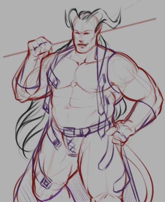
My sketches usually look something like this and involve a lot of scribbling and experimentation and use of the Transform tool until I end up with something I like. I kinda just feel out the shapes as I go and am constantly redoing and adjusting things.
The different colours are just so I can differentiate between the different elements and it doesn't all just become a giant scribbly mess when I'm trying to line it after.
Lines

As for my lineart, half of it is just a result of practice. I've been doing lineart + cell shading as my main style for over ten years now so I like to think I've managed to acquire some decent line control in that time.
The other half is a good stabilizer and pen pressure settings on the brushes I use.
Before Clip Studio Paint, I used Paint Tool SAI for my lineart because I could never get line results I was happy with in Photoshop, but not only does CSP have phenomenal stabilizer settings, its vector layers feature (which automatically turns your lines into vector shapes regardless of the brush you use!) has also made the process way easier by allowing me to edit and adjust my lines after the fact.
The one tip I can share when it comes to lineart is to take advantage of momentum. I never draw directly on my lineart layer; I make a new layer above it, draw on that one, and then merge it down every few minutes. This lets me use momentum to carry my brush strokes and then erase the parts that overlap without worrying about messing up the stuff I already have, resulting in smoother lines than if I had tried to precisely draw a straight line the entire time.
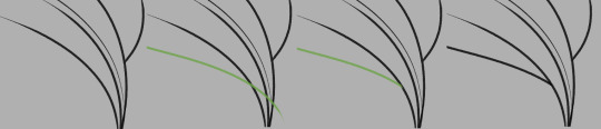
In the example above, the green line is on its own layer and can be easily erased without damaging the black lines around it.
I also tend to use a smaller brush for interior/detail lines and thicker ones for the outer edges of a shape just because I think it looks nice.
Process in General
Honestly, my process is just a lot of trial and error. I draw a line, undo it, draw a line, undo it. I sketch several hairstyles or outfits on different layers and then swap between them like some weird dress up game until I decide which to keep. I experiment with adjusting the hue and saturation of flat colours until I find something I like. I’m a very “make it up as I go” kind of artist, and really, creator in general; and rarely is the finished piece the result of any sort of plan.
That being said, I do have a general order in which I do things:
Sketch a bunch of random things until I find something I like
Merge all sketch layers and reduce the layer opacity until it’s very faint
Make a lineart layer above, then a layer to actually draw on above that
Draw the lineart using the techniques mentioned above (I often jump around and line different sections randomly), fixing any wonky parts of the sketch as I go
Make a separate layer below the finished lineart for each differently-coloured element (eg: hair layer, skin layer, pants layer, etc.) and fill with fill bucket*
Tweak each layer’s colour until vaguely happy with it
Make a layer below all other layers, select the entire interior of the lineart, fill it with black to fill any tiny gaps left by the fill bucket
Make a layer above all other layers, set it to multiply, draw shadows with a light grey-blue-purple colour (I shade one element at a time by selecting the area and then drawing within that selection on the shading layer)
Repeat step 7 with a layer set to Overlay and a light-medium grey for highlights
Open the image in Photoshop and apply gradients, patterns, lighting etc.
Notice all the mistakes it’s too late to fix and start second guessing the entire piece, say “screw it”, save it as a .png, and post anyway!
And I think that’s about it.
Sorry if that was confusing, I’m not sure how much previous knowledge of these programs you have or how much detail I should go into, but I hope maybe some of it was interesting and/or educational lol
I also have a short process video here that shows the steps one at a time that might help you visualise it better
- - - - - - -
*In case anyone’s brave enough to try using this as a tutorial and isn’t sure what I mean here:
CSP lets you set the lineart layer as a reference layer and still fill the colour on a different layer as though the lines were present on that layer. In other programs you may have to select the area you want to colour on the lineart layer manually with the magic wand tool and then move to the corresponding colour layer before filling it in.
If you use a program where you have to select the area manually, you may want to keep all your tiny detailed lines on a separate lineart layer just so you don’t have to spend time selecting all the small gaps between them. Alternatively, you could just fill it by hand with a brush.
28 notes
·
View notes
Text
DATING GOT7 HEADCANON A⇴Z ⇴ Kim Yugyeom
A ⇴ AFFECTION
The definition of a cuddler, he loves to cuddle up nice and closely as much as he can. Whilst he loves to use his height to his advantage and be the big spoon, he’s also not opposed to being the little spoon from time to time and resting into your side.
B ⇴ BEFORE DATING
He didn’t really know what to say when he met you, so instead he decided to dance. Before even saying hello, he offered his hand out for you to take so that you could dance together. It instantly initiated a bit of a spark between the two of you, and once the music had finished, he finally had the courage to introduce himself.
C ⇴ CONFESSION
The shyness he felt in approaching you for the first time came flooding back when he decided it was time to confess to you. He didn’t want you to slip away when he heard rumour that another guy was interested in, so before he could lose you, he invited you out for dinner so he could tell you how he felt. He was worried it might have been too late, but he was lucky, as you told him that you felt exactly the same way.
D ⇴ DATES
Since the two of you met dancing, Yugyeom loved to take you out dancing or to somewhere that played music that the two of you could dance too. He wasn’t quite at a stage in his life where he enjoyed sitting down at a table and eating a meal, he much preferred something fun for the two of you to do. He was very open minded which meant there was always something new for you to do, galleries, museums, concerts, sports centres, whatever appealed to you on the day would usually be the place that you’d head to.
E ⇴ EXPERIENCE
You were the first proper relationship that Yugyeom had, he’d had a couple of girlfriends in school, but they never really counted. He never imagined himself finding love whilst he was young, but then he believed in fate, which was probably why he met you. He’d sat you down at the start of your relationship and let you know how important work was to him, which you were more than willing to balance with, anything you could do to help Yugyeom’s career, you’d do it, you wanted him to succeed as well as your relationship.
F ⇴ FIGHTING
Arguments are a big no for Yugyeom, he hates confrontation of any form. He has a tendency to get a bit teary if your disagreements become quite real, he won’t really know how to handle it. He tends to go very quiet when he struggles to find the words, he’ll stutter and cover his face so you can’t see him getting upset. It’s not to say that you shout a lot either, but you have a little more control over your emotions than Yugyeom does. As soon as you can sense that he’s struggling though, you’ll put the argument to one side, as you know looking after Yugyeom is a lot more important than whatever you argued about.
G ⇴ GETTING TO KNOW HIS FAMILY
You met his brother quite early in your relationship as of course, they live together. For the first couple of visits, you were very anxious, but he soon made you feel very welcome. Just when you’d gotten used to being around his brother, he introduced his parents, but just like his brother, they made you feel very welcome and loved too.
H ⇴ HOME
Yugyeom didn’t want to make you feel awkward by moving you in with his brother, but the second his brother made the decision to move out, Yugyeom couldn’t wait to move you in. He made a lot of space around the apartment to make sure that you felt welcome and spend a lot more time with Dalkyum too, so you got used to leaving with him.
I ⇴ “I LOVE YOU”
He was the first to say, ‘I love you,’ at the end of one of his shows. He didn’t expect to see you there supporting him, knowing that you’d gone to the effort of going to support him meant the world to him. It was the final piece to the puzzle that he needed to know that he was completely falling in love with you.
J ⇴ JEALOUSY
Yugyeom tries hard to not get jealous, he’s used to being the maknae and being teased, so he’s learnt to try and ignore things that are meant to just be a joke. But he also knows there’s a line when someone is in a relationship, and if someone crosses it, he won’t be happy. At times he can be quite possessive, especially if someone comes close to what is his. He uses his tall figure to assert his dominance if he’s feeling jealous, it doesn’t mean that he’s confrontational, but it’s enough to intimidate a few people.
K ⇴ KIDS
The two of you decided quite early into your relationship that kids were still a little way off for you both as you were still so young. You both agreed that it was definitely you’d thought about in the long-term future, but there was a lot that could change in your lives before you thought about that. He knows that neither of you can predict what will happen, but in an ideal world he’d love to have children with you.
L ⇴ LAUGHTER
The little giggle he does whenever he gets nervous or shy always puts a smile on your face. Despite his tall stature, he’s a big baby when it comes to giggles, if you so much as accidentally brush your hand against his waist it will kick him off into a fit of laughter. He loves to make you laugh too, it’s his favourite sound in the world and always reassures him when he’s feeling a bit unsure. Your favourite nights together are when you both just sit back and laugh about anything that comes to mind, usually the most random.
M ⇴ MISSING
He made no secret of the fact he hated being without you on tour. He was always told after the first-time things got easier, but he could never see it. Most nights he’d cling to BamBam or Jaebum’s side for a bit of company and beg to share a room with someone so that he wasn’t by himself. He thought he’d gotten used to missing family and friends over the years, but love was a whole different game to him. The moment he was away from you, he promised himself to never take you for granted again as he quickly adapted to having to do things by himself again, something he hated doing time and time again.
N ⇴ NICKNAMES
You were his ‘sweetheart,’ that was the only name Yugyeom would ever call you by, even if he wasn’t happy or you were arguing, he’d always use that nickname to address you.
O ⇴ OBSESSION
He was obsessed with your height, he loved falling tall around you and making sure you had someone tall and strong beside you to protect you. He’d often be found resting his head on top of yours too to tease you.
P ⇴ PDA
Yugyeom isn’t huge on PDA in public, but he will always like to have an arm around you. It doesn’t matter where you are, if he wants a cuddle, he’ll pull you close. He never wants to be one of those in-your-face couples though, his PDA is just enough so that someone would walk past you both and smile at you.
Q ⇴ QUESTIONS
He loves to ask your opinion on the things he’s working on, whether it’s to do with work or just a recipe he’s trying out, he loves the reassurance that comes with having a partner, especially when he knows you’ll always be honest.
R ⇴ RANDOM FACTS
No one knew this about Yugyeom, but on the inside of his hip he had a small tattoo for you. When you told him about your favourite flower, he was keen to get a tattoo of it after his first time on tour, so he felt like he always had a part of you with him on the road. It was in a place where no one could see it, aside from you, but that was how he liked it, it was a secret just for the two of you and absolutely no one else.
S ⇴ SEX
He loves to be the dominant one and use his height to his advantage, he’ll cuddle you closely with his long limbs and make you feel very safe. He loves to make sure you’re satisfied; he never expects too much from you as he’d much rather care for you. You’ll always play with his hair as you know how much he loves to feel your fingers twirl around his locks, tugging lightly against them when you want something more from him.
T ⇴ TEXTS
Yugyeom doesn’t really text you, if he does, it’s usually a video of something that he’s been up to or a clip of a routine he’s choreographed. At the end, he’ll always ask for your opinion, keen to know what you think.
U ⇴ UNIVERSE
If nothing else, Yugyeom felt very grown up finally being in a relationship. Rather than be the young one who is protected, he enjoyed taking on the role of the protector and making sure he took the best care of you.
V ⇴ VACATION
He loved travelling, and whilst your holidays wouldn’t always be holidays, as he’d often still be immersed in work, he’d still make plenty of time for you too. You never mind though, seeing him come home and be full of creativity in the studio certainly makes it all worth it for you, especially when he sends you what he’s been up to.
W ⇴ WHINING
If you tease him too much he’ll definitely let go of a whine or too, begging you to stop and leave him alone before he starts blushing.
X ⇴ XXXXX
The place he kisses the most is easily the top of your head, again, just to make sure that you feel nice and small in his arms. He’ll also love to lean around you and press a kiss to your cheek, using his long neck to his advantage. As much as you pretend to hate it, you secretly love the feeling of him accommodating for you and shifting his body just so he can kiss you, it definitely makes you feel very special and very loved.
Y ⇴ YOU
You were his everything, the one he trusted and loved more than anyone else.
Z ⇴ ZZZ
Most nights, Yugyeom would fall asleep with the feeling of your fingers tracing around his tattoos. It would always help you fall asleep, running your fingers over even the intricate lines, usually ending with you asleep and your arm pressed to his bicep or back.
---
Masterlist
#got7#got7 imagine#yugyeom#yugyeom imagine#kim yugyeom#kim yugyeom imagine#got7 yugyeom#got7 scenario#got7 reaction#got7 drabble#got7 one shot#got7 fluff#got7 headcanon#yugyeom scenario#yugyeom reaction#yugyeom one shot#yugyeom drabble#yugyeom headcanon#yugyeom fluff#kpop#kpop imagine
196 notes
·
View notes
Text
For context, I do digital art mostly as a hobby, and I like to think I'm pretty decent. I started with a cheap Wacom Bamboo and used that thing for about ten years(it still works now, actually) before switching to a Huion. I currently use a refurbished Huion Camvas Pro 21 display tablet.
Huion and Wacom are probably the most popular brands right now. Maybe XP-PEN too, but I've never used one of those. Huion is usually slightly cheaper than Wacom. But you could find used stuff on ebay or similar sites for pretty cheap(just be sure everything is included and in good condition, it can be risky). You can't really switch between brands without uninstalling one because I found that the Huion and Wacom drivers would fight with each other, and it was a chore to switch between them.
If you want something more multifunctional, you can get an iPad or whatever and use procreate. But if you want a dedicated art tablet to start with, I recommend a regular screenless one. Display tablets are only worth the investment if you plan to use it seriously. They also have way more little specs to consider, and it can get overwhelming(like screen resolution, color gamut, parallax, etc). The screenless ones do take some getting used to, but if your hand eye coordination works, then you should be fine with some practice.
My first art tablet had only around 800 levels of pressure sensitivity(for reference, closer to 8000 is pretty standard now, so 800 is absurdly low). You'd be hard pressed to even find any art tablets made that low now. My point being, don't be concerned about the sensitivity if you're just starting. Even something in the 1000s of sensitivity should serve a beginner fine. 8000 is usually overkill anyway, but it doesn't hurt to have more.
The size of the tablet is not a huge deal. It should be big enough to comfortably use, and bigger is usually easier on your wrist in the long term because it allows you to draw from your shoulder. But that's a bigger factor for people who draw a lot, and you'd probably just upgrade if you ever decided to do art more seriously anyway. Either way, you can still make good art with a smaller one.
You should be able to find a decent beginner tablet for less than $100.
For art programs, iPads have procreate, I believe. I don't use them, so I can't verify. But Clip Studio Paint is a fantastic program with a single purchase option. I used Paint Tool SAI before that. But there are some good free options too. I don't use them, but I've heard good things about Krita. Gimp and Fire Alpaca were popular for a while, but I can't vouch for those. Adobe Photoshop and such are based on a subscription model, which is a waste of money if you don't use it for your career.
Hey y'all, so I've mentioned that I want to get a drawing tablet to get back into that. But I have never gotten into digital art so I am kind of blind here. I know a lot of you are artists so I was wondering if you guys might have some recs on what tablet I should get.
I'm seeing tablets anywhere from $30 to $400, and I have...no idea where to ballpark myself in that. It's just going to be a hobby thing so I absolutely don't need a super expensive one with all the bells and whistles, but I do want something decent. Is around $100-$150 reasonable for a mid-low range tablet? It's not a hard limit, but that's kind of what I was expecting.
Also, do I need to buy a program on top of that, or do they usually come with one? I just need it for scribbles, I won't be doing anything fancy. Love you guys, I'll go back to writing now.
37 notes
·
View notes
Text
Vamptober 2021 Reflection Week 1
Heres your TLDR folks: I do spooky vampire drawings its fun I have a kofi see you next week
Hiya! For those of you that follow me, you may remember that last inktober I did a weekly reflection on each piece I do. I highly encourage any artist participating in any monthly art challenge to do this for 3 big reasons.
The task of 31 drawings can feel overwhelming- and breaking it down weekly feels much more manageable.
It encourages you to praise and reward yourself for getting this far. I and many of my artist friends are exceptionally critical of ourselves, and these reflections force you to be positive about your own work. Through these challenges I always see tremendous growth in my skills.
If you want to be critical about your work- you can find patterns easier by looking at a collection rather than each individual piece.
The secret 4th reason is that I get to spam your dash with vampire art AGAIN. >:)
I presented myself with a challenge for all of these pieces- to do them all in under 1 hr and 30 minutes. This doesn’t count the amount of time I spend conceptualizing and researching, but I don’t let myself spend too much time on that either. Not that I can. I work about 30-36 hours a week and am attempting to draw a comic at the same time. There aren’t a lot of hours in the day. This time limit challenge was simultaneously to force myself to get looser and trust my instincts AND make sure I clock in on time. Secondly, I aim to do all of these digitally. By hand has dry times. In 2020, if I wanted to spend 4 hours waiting for a piece to dry- I could. Can’t this year. Additionally, I know Clip Studio fairly well, but by no means do I consider myself an expert. By doing this digitally, I am going to improve my literacy with this program.
So, without delay, lets take a look at what I’ve done so far!
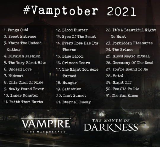
Vamptober Day 1: Fangs Out!

1 HR 20 MIN
I am really happy with this piece for a multitude of reasons. The composition is well balanced, drawing your eyes down center to the text, then up to the pearly whites. The hands are so simple, I just went to town with the digital dry ink brush. The nails are so shiny, I love them. There’s this sense of someone else controlling and going to grab them--thats not the smiler’s claws.
I am critical about my shading in some places- namely the tongue. I think it looks phallic. I should have erased it and drawn the other fang. Also, the vein work is a bit too controlled for my liking. I should have taken more time to vary the widths of the veins- so it looks more like the effects of diablerie than cracked porcelain.
Vamptober Day 2: Sweet Embrace
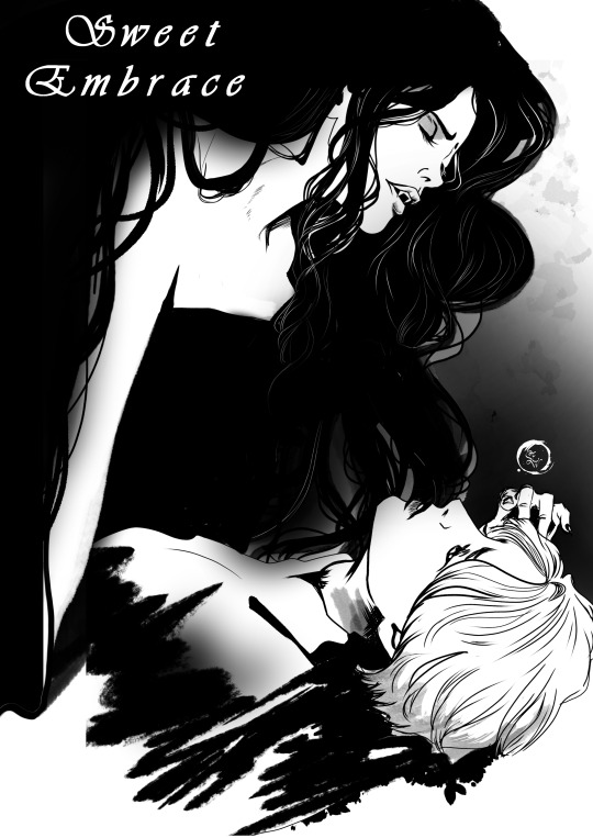
1 HR 10 MIN
To quote a successful local manga artist I met in a comic shop, “Just vibe. Just draw the fun vibes. If you aren’t having fun, what is even the point?” So I did just that.
I definitely was inspired by some of those romance mangas I was eyeing on the shelves of that comic shop. I am really happy with her hair, it looks like it curls so effortlessly. Additionally, it look like it has weight. Hair is heavy. How her hair drapes over her shoulder or across her face feels very accurate. I like how I used the dry ink brush to end the piece, hiding the shadows of their shirt with a “hey this is the end of the drawing.” My favorite quick detail is her hand, gently playing with their hair. I think I could have made it a little bigger, but It was enlightening that I just drew it- and didnt spend 15 minutes looking for a reference or oddly angling my own hand to see how it would look.
I think I needed to be a bit more careful with my layers. The grey from her clip layer is showing between curls, blocking the textured background. That is a small enough fix I should have taken the couple minutes to do it.
Vamptober Day 3: Where The Undead Gather
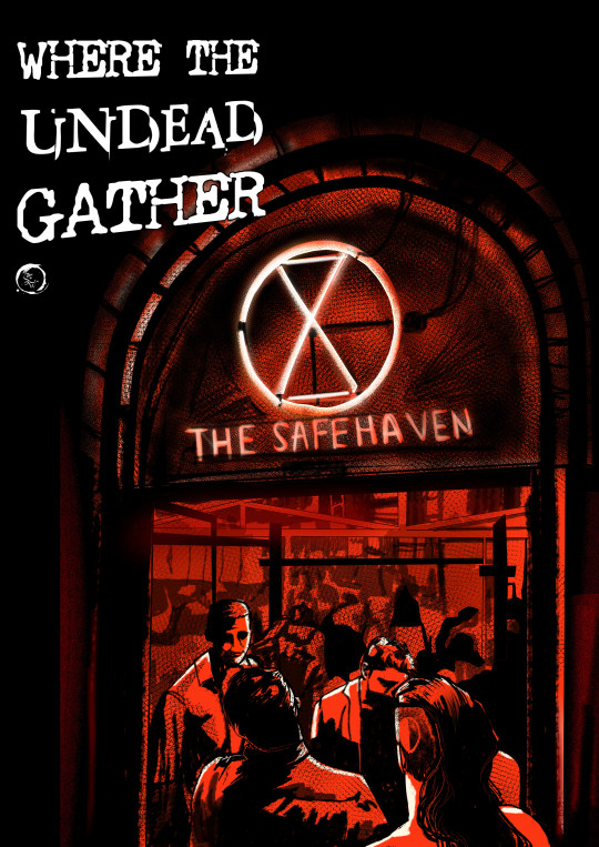
1 HR 45 MIN
THINBLOOD SAFEHOUSE THINBLOOD SAFEHOUSE THINBLOOD SAFEHOUSE!
Most of you know I’ve been tossing this idea around- perhaps in my vampire posts or on my rp blog as Hazel. But actually visualizing it has proven quite a challenge. Last year I wasn’t even up to the task- I couldn’t capture it the way I wanted to and ended up posting Hazel’s jacket instead.
But this... this feels right. Its cramped. It’s absolutely drenched in saturated red light, hiding any stains and drips. Bright red, like a fucking target. Hiding plain sight has so many advantages... but once you are spotted its game over.
I really feel like I managed to get loose as you look into the background. It feels like the right level of lack of detail. I am very proud of the neon light up top, its the alchemical symbol for thinbloods. The text is also very good, it has the right textures for the atmosphere I’ve created. The side shave with the mark is subtle enough that it is noticed after your eye has glanced around the entire piece. I think there is only one note I’d give myself. I which I had done the bricks a little better. With the neon light illuminating the arch so vibrantly, I should have spent a little more time highlighting textures and perspective.
Vamptober Day 4: Elysium Fashion
2 HOURS
Ever just know you have a masterpiece concept and you know exactly how you want to do it? Thats how I felt about this piece. When I read through the prompts, I considered doing some haute couture fashion... and then it hit me. That line my storyteller used on me to understand the nature of Elysium. Its a place to see and be seen... its a chance to make a statement. And a thinblood walking in with the mark they branded her with on full display- as they commanded her. How dare she walk without shame. How dare she not lower herself to us. CHEFS KISS
My only note for myself is that I need to be careful with compositions. I borrowed a lot of elements from a full page piece from a Catwoman comic for this. And although I have made it my own and am not aiming to monetize this piece, there is a part of me that knows to be cautious with what I claim is mine. I am capable of replicating work without tracing, yet I look at this and see that the lines are still too similar. I do believe that if I let myself continue working on this overnight (I stopped at like 1 am oops) that this would be less of an issue- as I would have continued to add details and textures to my background characters.
Vamptober Day 5: The Very First Bite
1 HR 9 MIN
I streamed this drawing with a friend and it was wonderfully fun. I am really happy with the sense of motion from the ink in the background with the splashes of blood drops. I think I did a good job with the proportions and subtle highlights on black ink. The soft eraser on a separate layer is a godsend.
The parts I am critical about are in two places. The head of the vampire feels a bit too big. Namely the side shave. I think if I had worked the airbrush there and shortened how far the shave goes, the head wouldn’t feel as cartooned and a bit more proportioned. The other spot is where the victim’s hand is going. I definitely knew this when i was drawing- but I couldn’t find a way to properly incorporate it. I commend myself to making my shading consistent to hide this- but i really wish I could’ve gotten that part to feel less “wait...where’d her hand go?”
Vamptober Day 6: Undead Love
1 HR 3 MINUTES
HAZEL AND LISA MY BELOVEDS
I based this piece off of what I drew in 2019 from my first ever chronicle. One of the most striking scenes I have ever played with Hazel was with her girlfriend, Lisa. That night Lisa agreed to drink some of Hazel’s vitae for her to tell her...everything. There’s poison under the layers of comfort.

When I had first drawn this piece, I noticed a lot of odd proportions. Hazel’s head was oddly shaped, Lisa’s arms were weirdly long for her body shape. In this piece, I have mostly remedied those errors. However, there is something about the piece having these sketchy mistakes left in that feels right. Theres a softness to the original sketch that I managed to keep with the updated version- although it feels different. The original definitely looks like they are cuddling after having sex- not just had the most intense discussion about continuing their relationship despite all the trouble they know is going to head their way. Not that they didn’t have sex after this discussion but details. I think I managed to retain their relaxed expressions, though I wish I could have incorporated a bit more detail about the influence of the blood into the piece.
Vamptober Day 7: The Hideout

1 HR 45 MIN
For some reason, I wanted to paint this. I started messing around with the water color brushes and before I knew it, there was color on the page. I think i did a good job capturing the atmosphere of this moment. My friend commented, [paraphrasing here] “Its exactly what I like about VTM, its a layer over our world. It doesn’t take much to peel back the layer and see the story within it.” The last thing you see is the person calling at the bottom right- and you don’t know if thats good or bad for the person watching the sky. I let my viewer form their own story of what is happening here.
I think I had a hard time with the lighting. I spent a lot of time trying to figure out how intense of a yellow-green i needed to place on objects and scenery. Ultimately, I returned to the just vibe rules.
Week 1 Reflection:
So that’s 7 pieces. WOO! I did it! While bumping myself up to a full time position AND writing a comic. AND doing commissions. And am somewhat being social...
There’s a part of me that is like when do I mess up and fall behind?
And I’m wrestling on why that feels like such a failure to me. I’ve put so much on my plate, it would not be surprising to fall behind. And is it so bad? Its okay, life is like that. Things come up. I am still trying to wrestle my own brain on I don’t have to do it all. I think giving myself that time limit has extremely helped. if I didn’t have that self discipline, I definitely could have spent hours and hours on each piece and felt overwhelmed. I think being extremely strict with myself about my vitamin and food intake as we head into seasonal depression time is helping. I am very good at hiding the big Sad tm with tons and tons of tasks. The sad can’t get me if I’m constantly busy. I am hoping that as I continue, I will be more at peace with this, and feel less anxious about this inevitable fuck up. Because....what if I manage to pull it off? I know I can. I know I can.
Completely switching gears here and back to technical shit, I notice how much I am utilizing the Dry Ink Brush, the Rough water color brush, and my Tapered Ink Liner. Nothing wrong with finding what works, I am just surprised that this is becoming my go-to tool set after a year of swearing by the “For Effect” Line (it just autocorrects curves). I am noticing how I like to frame things with a lot of rough brush strokes. Some are images I find on open source sites like pixabay, some are my own creations I’ve saved to a personal library of stock images. Right now, I feel as if I am at a crossroads of style. There’s a part that likes the rigid structure, and a part that is absolutely vibing with being lose and unstructured. I can’t wait to see what else I create and how my digital style evolves.
Thank you for reading and supporting through this entire thing! Now here comes the shameless self promotion. If you like my work and want to support me- I have a Ko-Fi! No pressure to donate though! Supporting me can be reblogging my art, sharing it with your friends, or leaving outrageous comments in the tags. I read every single one and cherish it! Thank you all!
Lets have a Fangtastic Week 2 to Vamptober!
#vamptober#vamptober 2021#stephanie's sketchbook#my art#reflection#long post#inktober#okay to reblog#ko-fi link
26 notes
·
View notes
Note
Hey! I'm the one who asked the poorly worded art process question. I'm here to give it another try by being more specific. The problem is . . . that's hard. Because that was about a specific as I can get, since I kind of want to know everything about how your art works.
Big things, like how you come up with ideas, or how you design characters. But small things, too, like what tools you use for drawing, how you balance between traditional and digital art, and how you decide what color to use for your unique and beautiful line art.
I want to be more specific so you can answer, but the question in my head is too vague and broad for me to be specific about it. So . . . here are some subquestions of my question, I guess! Maybe that helps?
Sorry this is so weird, and thank you, your art is amazing
first of all, thank you so much <3
and yes, this is far more answerable! i hope i can satiate some of your hunger for insight without writing a whole book.
HOW DO I COME UP WITH IDEAS?
this is obviously going to be very different for everyone. i very rarely have to dig for ideas or sit down and brainstorm, unless of course i am trying to achieve something very specific, like fulfill art contest criteria or working on a commission. my brain is very visually wired, so a lot of my ideas literally just pop up in my head (i know of several artists with aphantasia - some people don't have any visuals in their head at all and I HAVE NO IDEA WHAT THAT'S LIKE AND I AM IN AWE OF THESE ARTISTS), sometimes i see a character or character design and im like HNNNG i need to draw them, or i just... have a concept i really want to Exist and i'm going to figure out how.
my biggest problem is that often, when i get an idea i want to DRAW IT, NOW NOW NOWNOWNOW, and that's just Not Feasible. sometimes because i'm Literally In Bed, sometimes because i have too many things i need to do or draw first... but i need to clear up space in my head, because my Urge To Draw will be like, beeping and whirring until i satisfy it... so i write it down on my TO DRAW-list! it's a real list that exists on my phone and i have to use it frequently. if i keep scrolling down i start finding weird notes that i have NO idea are supposed to mean anymore, but that's fine. i can't satisfy every Art Urge. sometimes i need to let them pass.

HOW DO I DESIGN CHARACTERS?
this one might vary a bit, but it can often be boiled down to "i sketch around until i figure something that Works." many of my characters, especially my older characters, became characters by accident when i kept drawing them over and over and i was like Ah I Like Drawing You... You Exist Now. that's how sparrow spellcaster happened, at the very least. this could happen because i had school and i would focus in school by doodling/sketching while listening to class. since i no longer go to school, pretty much all of my new characters are far more intentional. Timian and Vinta specifically exist as a result of a "favourite character fusion" challenge, and a lot of iphimery characters started with a Purpose rather than just harnessing the vibe of something i drew multiple times without thinking.
it helps to write down elements or tropes i want to include, like "sturdy-looking" or "VILLAIN OF EVIL SCARY MAGICS but it's a little girl and the dark magic is bright lightning and not shadows" or something. it can vary from a tiny visual detail to their role in the story. whatever i want to Achieve. my Intent. because my brain works so visually, i just really need to sketch somethign repeatedly until i nail it and can be like Yes That's It.
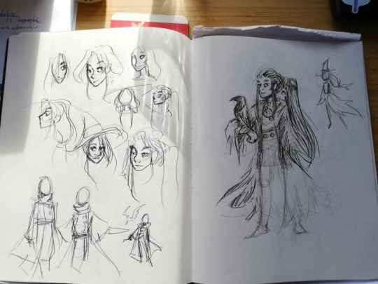
sketchbooks look a little messy but that’s what they’re for.
WHAT TOOLS DO I USE
for digital art, i’m currently using an ipad pro and procreate. i use a lot of the brushes that came installed, like Mercury is my primary lineart brush, and Moorilla is my primary sketching brush, but i also buy a lot of custom brushes on the hunt for More Delicious Textures (DAUB has a lot of good ones, especially if you want some that imitate traditional art). i have also used Huion and XP-pen tablets and generally recommend them, as well as clip studio paint as an art program (i love it very much and if it wasn’t subscription-based on ipad i would still be using it).
for traditional art, mostly just whatever sketchbook i have + my trusty mechanical pencil. i mean i have two: one with softer lead (it comes out darker) and 0,7 mm thickness, and one that’s 0,5 and harder lead for more light sketching, or if i’m going to line it with ink.
i also have a trusty pentel brush pen that i love DEARLY and feel bad for not having used in a while for reasons i will get to.
when i work on calendar pieces traditionally, i like to draw lines with ink - i use a dip pen with exchangeable nibs - and then color with watercolors. i have several sets because they’re all slightly different and i want the Range.
i sometimes travel with a little sketchbook in my bag and an assortment of pens, so that i can sketch Anytime, Anywhere. i think doodling with a pen can be very useful because you gotta become comfortable with the mistakes and imperfections and keep going anyway. if i doodle at work that’s the tools i have - regular ball pens and a bunch of paper lying around.
HOW DO I BALANCE BETWEEN DIGITAL AND TRADITIONAL ART?
currently, i... don’t, really. it was easier when i had school, and i would just doodle freely and then maybe use some of my sketches as thumbnails or concept ideas. it’s harder now that i need to intentionally sit down with my sketchbook, and tbh... the ipad works very well for sketching. it’s so CONVENIENT and i have WORK all the time and my time to create art has become much more limited than it was. i miss going to my weirdo art high school where we would try out a whole bunch of different tools and methods. sure, yes, i had to paint with Acrylics My Beloathed, but getting to play around in different mediums is VERY valuable.
i genuinely want to be able to make more time and space for non-digital art again, but i just don’t have the ability to right now. it’s also different now that i’ve moved away from my parent’s place - i used to have an enormous desk and my mother has a large collection of art tools and there was a lot more storage space for whatever i created. digital art is very convenient and very accessible. ah well!
HOW DO I DECIDE ON THE COLOR FOR MY LINEART?
i usually line in black or a very dark color, and when i’m done coloring + shading i might play around with the colors and see what works. if you lock the layer you can just throw all the spaghetti at the wall you want. i decide on whatever fits the piece. i tend to be pretty fast and loose about it too, sometimes you can probably spot parts of my lineart that have slightly mismatchy color, but it’s like... done is better than perfect! i don’t have the energy to overlook every single pixel of my piece or else i would drive myself utterly mad.
HOPE THIS ANSWERS ANYTHING AT ALL!! THANKS FOR ASKING!!!
#art advice#(tag for archival purposes not to imply my methods are gospel)#everyone has their own ways!!!
40 notes
·
View notes
Text
THE FORTY-FIVE: ST. VINCENT
Sleazy, gritty, grimy – these are the words used to describe the latest iteration of St. Vincent, Annie Clark’s alter ego. As she teases the release of her upcoming new album, ‘Daddy’s Home’, Eve Barlow finds out who’s wearing the trousers now.
Photos: Zackery Michael
Yellow may be the colour of gold, the hue of a perfect blonde or the shade of the sun, but when it’s too garish, yellow denotes the stain of sickness and the luridness of sleaze. On ‘Pay Your Way In Pain’ – the first single from St. Vincent’s forthcoming sixth album ‘Daddy’s Home’ – Annie Clark basks in the palette of cheap 1970s yellows; a dirty, salacious yellow that even the most prudish of individuals find difficult to avert their gaze from. It’s a yellow that recalls the smell of cigarettes on fingers, the tape across tomorrow’s crime scene or the dull ache of bad penetration.
The video for the single, which dropped last Thursday, features Clark in a blonde wig and suit, channeling a John Cassavetes anti-heroine (think Gena Rowlands in Gloria) and ‘Fame’-era Bowie. She twists in front of too-bright disco lights. She roughs up her voice. She sings about the price we pay for searching for acceptance while being outcast from society. “So I went to the park just to watch the little children/ The mothers saw my heels and they said I wasn’t welcome,” she coos, and you immediately recognise the scene of a free woman threatening the post-nuclear families aspiring to innocence. Clark is here to pervert them.
She laughs. “That’s how I feel!” From her studio in Los Angeles, she begins quoting lyrics from Jimi Hendrix’s ‘Red House’. “It’s a blues song for 2021.” LA is a city Clark reluctantly only half calls home, and one that is opposed to her vastly preferred New York. “I don’t feel any romantic attachment to Los Angeles,” she says of the place she coined the song ‘Los Ageless’ about on 2017’s ‘Masseduction’ (“The Los Ageless hang out by the bar/ Burn the pages of unwritten memoirs”).“The best that could be said of LA is, ‘Yeah it’s nice.’ And it is! LA is easy and pleasant. But if you were a person the last thing you’d want someone to say about you is: ‘She’s nice!’”
On ‘Daddy’s Home’, Clark writes about a past derelict New York; a place Los Angeles would suffocate in. “The idea of New York, the art that came out of it, and my living there,” she says. “I’ve not given up my card. I don’t feel in any way ready to renounce my New York citizenship. I bought an apartment so I didn’t have to.” Her down-and-out New York is one a true masochist would love, and it’s sleazy in excess. Sleaze is usually the thing men flaunt at a woman’s expense. In 2021, the proverbial Daddy in the title is Clark. But there’s also a literal Daddy. He came home in the winter of 2019.
On the title track, Clark sings about “inmate 502”: her father. He was sentenced to 12 years in prison for his involvement in a $43m stock fraud scheme. He went away in May 2010. Clark reacted by writing her third breakthrough album ‘Strange Mercy’ in 2011; inspired not just by her father’s imprisonment but the effects it had on her life.“I mean it was rough stuff,” she says. “It was a fuck show. Absolutely terrible. Gut-wrenching. Like so many times in life, music saved me from all kinds of personal peril. I was angry. I was devastated. There’s a sort of dullness to incarceration where you don’t have any control. It’s like a thud at the basement of your being. So I wrote all about it,” she says.
Back then, she was aloof about meaning. In an interview we did that year, she called from a hotel rooftop in Phoenix and was fried from analytical questions. She excused her lack of desire to talk about ‘Strange Mercy’ as a means of protecting fans who could interpret it at will. Really she was protecting an audience closer to home. It’s clear now that the title track is about her father’s imprisonment (“Our father in exile/ For God only knows how many years”). Clark’s parents divorced when she was a child, and they have eight children in their mixed family, some of whom were very young when ‘Strange Mercy’ came out. She explains this discretion now as her method of sheltering them.
“I am protective of my family,” she says. “It didn’t feel safe to me. I disliked the fact that it was taken as malicious obfuscations. No.” Clark wanted to deal with the family drama in art but not in press. She managed to remain tight-lipped until she became the subject of a different intrusion. As St. Vincent’s star continued to rocket, Clark found herself in a relationship with British model Cara Delevingne from 2014 to 2016, and attracted celebrity tabloid attention. Details of her family’s past were exposed. The Daily Mail came knocking on her sister’s door in Texas, where Clark is from.
“Luckily I’m super tight with my family and the Daily Mail didn’t find anybody who was gonna sell me out,” she says. “They were looking for it. Clark girls are a fucking impenetrable force. We will cut a bitch.”
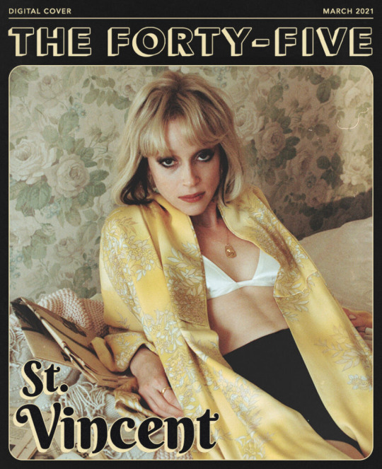
Four years later, Clark gets to own the narrative herself in the medium that’s most apt: music. “The story has evolved. I’ve evolved. People have grown up. I would rather be the one to tell my story,” she says, ruminating on the misfortune that this was robbed from her: a story that writes itself. “My father’s release from prison is a great starting point, right?” Between tours and whenever she could manage, Clark would go and visit him in prison and would be signing autographs in the visitation room for the inmates, who all followed her success with every album release, press clipping and late night TV spot. She joked to her sisters that she’d become the belle of the ball there. “I don’t have to make that up,” she says.
There’s an ease to Clark’s interview manner that hasn’t existed before. She seems ready not just to discuss her father’s story, but to own certain elements of herself. “Hell where can you run when the outlaw’s inside you,” she sings on the title track, alluding to her common traits with her father. “I’ve always had a relationship with my dad and a good one. We’re very similar,” she says. “The movies we like, the books, he liked fashion. He’s really funny, he’s a good time.” Her father’s release gave Clark and her brothers and sisters permission to joke. “The title, ‘Daddy’s Home’ makes me laugh. It sounds fucking pervy as hell. But it’s about a real father ten years later. I’m Daddy now!”
The question of who’s fathering who is a serious one, but it’s also not serious. Clark wears the idea of Daddy as a costume. She likes to play. She joins today’s Zoom in a pair of sunglasses wider than her face and a silk scarf framing her head. The sunglasses come off, and the scarf is a tool for distraction. She ties it above her forehead, attempts a neckerchief, eventually tosses it aside. Clark can only be earnest for so long before she seeks some mischief. She doesn’t like to stay in reality for extensive periods. “I like to create a world and then I get to live in it and be somebody new every two or three years,” she says. “Who wants to be themselves all the time?”
‘Daddy’s Home‘ began in New York at Electric Lady studios before COVID hit and was finished in her studio in LA. She worked on it with “my friend Jack” [Jack Antonoff, producer for Lana Del Rey, Lorde, Taylor Swift]. Antonoff and Clark worked on ‘Masseduction’ and found a winning formula, pushing Clark’s guitar-orientated electronic universe to its poppiest maximum, without compromising her idiosyncrasies. “We’re simpatico. He’s a dream,” she says. “He played the hell outta instruments on this record. He’s crushing it on drums, crushing it on Wurlitzer.” The pair let loose. They began with ‘The Holiday Party’, one of the warmest tracks Clark’s ever written. It’s as inviting as a winter fireplace, stoked by soulful horns, acoustic guitar and backing singers. “Every time they sang something I’d say, ‘Yeah but can you do it sleazier? Make your voice sound like you’ve been up for three days.” Clark speaks of an unspoken understanding with Antonoff as regards the vibe: “Familiar sounds. The opposite of my hands coming out of the speaker to choke you till you like it. This is not submission. Just inviting. I can tell a story in a different way.”
The entire record is familiar, giving the listener the satisfaction that they’ve heard the songs before but can’t quite place them. It’s a satisfying accompaniment to a pandemic that encouraged nostalgic listening. Clark was nostalgic too. She reverted to records she enjoyed with her father: Stevie Wonder’s catalogue from the 1970s (‘Songs In The Key Of Life’, ‘Innervisions’, ‘Talking Book’) and Steely Dan. “Not to be the dude at the record store but it’s specifically post-flower child idealism of the ’60s,” she explains. “It’s when it flipped into nihilism, which I much prefer. Pre disco, pre punk. That music is in me in a deep way. It’s in my ears.”
On ‘The Melting Of The Sun’ she has a delicious time creating a psychedelic Pink Floyd odyssey while exploring the path tread by her heroes Marilyn Monroe, Joni Mitchell, Joan Didion and Nina Simone. It’s a series of beautiful vignettes of brilliant women who were met with a hostile environment. Clark considers what they did to overcome that. “I’m thanking all these women for making it easier for me to do it. I hope I didn’t totally let them down.” Clark is often the only woman sharing a stage with rock luminaries such as Dave Grohl, Damon Albarn and David Byrne, and has appeared to have shattered a male-centric glass ceiling. She’s unsure she’s doing enough to redress the imbalance. “There are little things I can do and control,” she says of hiring women on her team. “God! Now I feel like I should do more. What should I do? It’s a big question. You know what I have seen a lot more from when I started to now? Girls playing guitar.”
If one woman reinvented the guitar in the past decade, it’s Clark. Behind her is a rack of them. The pandemic has taken her out of the wild in which she’s accustomed to tantalising audiences at night with her displays of riffing and heel-balancing. Instead, she’s chained to her desk. Her obsession with heels in the lyrics of ‘Daddy’s Home’ she reckons may be a reflection of her nights performing ‘Masseduction’ in thigh highs. “I made sure that nothing I wore was comfortable,” she recalls. “Everything was about stricture and structure and latex. I had to train all the time to make sure I could handle it.” Is she taking the heels off when live shows return? “Absofuckinglutely not.”

Clark is interested in the new generation. She’s recently tweeted about Arlo Parks and has become a big fan of Russian singer-songwriter Kate NV. “I’m obsessed with Russia,” she says. In a recent LA Times profile, she professed to a pandemic intellectual fixation on Stalin. “Yeah! I mean right now my computer is propped up on stuff. You are sitting on The Gulag Archipelago, The Best Short Stories Of Dostoyevsky andThe Plays Of Chekhov. I’m kinda in it.” The pop world interests Clark, too. She was credited with a co-write on Swift’s 2019 album ‘Lover’. At last year’s Grammys she performed a duet with Dua Lipa. It was one of the queerest performances the Grammys has ever aired. Clark interrupts.
“What about it seemed queer?!”
You know… The lip bite, for one!
“Wait. Did she bite her lip?”
No, you bit your lip.
“I did?!”
Everyone was talking about it. Come on, Annie.
“Serious? I…”
You both waltzed around each other with matching hairdos, making eyes…
“I have no memory of it.”
Frustrating as it may be in a world of too much information, Clark’s lack of willingness to overanalyse every creative decision she makes or participates in is something to treasure. “I want to be a writer who can write great songs,” she says. “I’m so glad I can play guitar and fuck around in the studio to my heart’s desire but it’s about what you can say. What’s a great song? What lyric is gonna rip your guts open. Just make great shit! That’s where I was with this record. That’s all I wanna do with my life.”
More than a decade into St. Vincent, Clark doesn’t reflect. She looks strictly forward. “I’m like a horse with blinders,” she says. She did make an exception to take stock lately when the phone rang. “I saw a +44 and that gets me excited,” she says. “Who could this be?” Well, who was it? “Paul McCartney,” she says, in disbelief. “Anything I’ve done, any mistake I’ve made, somehow it’s forgiven, assuaged. I did something right in my life if a fucking Beatle called me.”
Now there’s a get out of jail free card if ever she needed one.
Daddy’s Home by St. Vincent is out May 14, 2021.
#‘I HAVE NO MEMORY OF IT’#LOOOOOL#WHY ARE U LIKE THIS#st vincent#full of shit#annie clark#Annie Clark on beds#yellow is the color for dull ache of bad penetration?
68 notes
·
View notes
Note
hi !! i love how u draw bgs SO much its so pretty n pleasing to the eyes i literally cant look away !!! its like watching a sunset/rise w/ur friends n the fireflies r surrounding u n ur all in a peaceful silence n smiling, u know,, ! got inspired by u to try n draw bgs now lol, so i would appreciate any advice from u ! :D (no pressure tho ofc) thnks ! :]
Hello!!! Wahghh this means a lot to me, you don’t even kno. Makes me feel fuzzy and happy inside ;o;
I remember I first got into painting bgs when I was in a big art block, but I was also nervous to make the plunge myself!! I painted bgs pre 2020 but usually they were like a placeholder/afterthought bc of this fdggbfhdnjf LOL; but I was really inspired by twitter artists like Diesel2b and koichame (and many others) who put so much care into their compositions, and I wanted to start doing that too!
Hmm! For starters, I guess it would be good to start with something you would like to focus on, what types of bg you would enjoy drawing + a goal of where you want to take your paintings! (Not necessarily art style per se, but a direction to head in)
‘I want my art to be delicate like a flower (so cheesy)
Soft pastel colors but also vibrant in spots’
A quote I wrote in my planner in February LOL. If you look at my older works, I guess the vibrancy was there, but at the same time it was dull. I didn’t understand how colors worked without the help of premade swatches and such, altho I wanted to know badly, so I made this my goal!
This direction could be as specific as mine, but it could also be broad, like "I'd like my paintings to be realistic" or "I wanna learn how to paint mountains, trees and foliage" etc etc.
With this goal in mind, I started to take screenshots of different zones from Genshin Impact, and used those for reference in my bgs. Pretty much anything that caught my eye; a nice sunset, the view of Celestia from the pillar in Dragonspine, the patterns on The Golden House, etc etc.
Around the same time, I bought a brush pack called the Sumi brush pack by TheOneWithBear https://graphixly.com/products/theonewithbear-sumi-brush-pack-for-clip-studio-paint
And altho I definitely am not using them as intended since they were created for ink styled drawings lol, I found I had a lot of fun playing around with them in my bgs!
I said this in an earlier ask, but honestly embrace inconsistency + try new things in each of your paintings! If we stick to one way of doing a certain thing all the time, our brain will get good at doing that one thing, but I think our growth slows if we get too much in our comfort zone. Style will come naturally! It’s hard to force. So go with the flow, and you will surprise yourself!
After a while of using references, I started to veer away from that and was able to make my own compositions, and am having a lot more fun with colors now too!
Even if the outcome for some of your paintings are bad as you’re starting out, don’t beat yourself up about it. I have a zillion unfinished wips myself; I spent 2 months trying to draw a Kokomi piece I was proud of bc I couldn’t get her likeness right. Of the 6-7 sketches I made, I was only happy with 2!
(tldr:
1. Come up with a goal/direction to take your art in
2. Do self-study/life study! Usually drawing/painting things from real life helps us get a grasp of how stuff works, so its easier to paint. I also like to do studies from Genshin Impact for fun too tho.
3. Embrace inconsistency! Your style will come naturally. Don’t be disheartened if some compositions don’t work out!)
I hope my rambles will help in one way or another. I'm not a spectacular teacher, because even I still have much to learn, but these are some things I wish I heard when I was starting out! ^^
#asks#you got this!#painting bgs is a lot of fun once you get the hang of it ^^ so I'm rooting for you!
9 notes
·
View notes