#its not entirely how i explained it either like
Note
THIS NERDY PERVS TAKEN OVER MY MIND AUGHHHHH
otaku Gojo gives off the vibe he would steal bunnies panties buy buy new ones so she’d never notice (she does)
Oh yeah he most def would nonny!
You'd be so suspicious of the "laundry service" at the Gojo residence because your returned "washed" panties were clearly brand new every time. I mean you weren't about to complain when its brand new Gucci on your coochie so you initially shrug it off as Gojo family being so fuckin rich they never wore the same underwear twice.
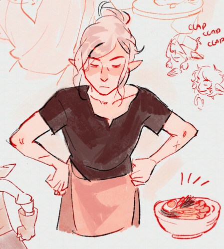
That is until one day after awaken from a nap (that was very much earned from Gojo rearranging your guts midmorning) you are lookin for him around his mansion. You enter into his hentai figure museum rooms thinking he's there (6/10 times he is). Yet, he isn't this time though. However, when turning to leave you accidentally trip over a plushie on the floor before catching yourself on a shelf for stability. Shifting the objects accidentally on the shelf you yelp as your gravity shifts. Not realizing you triggered a switch (it was a figure of you in cosplay that gojo had custom made) and the wall case swings inward to reveal what gojo would dub "the panty palace."
Framed and mounted were dozens of your panties all over the wall. Each frame contained a panty in addition to a photo of you either in them or in the clothes you wore over them. The plaques next to them explained the date as well as the memory. Memories like: the red lace thong you wore for your first xmas; the granny panties from the first time you let him hit it on your period; the sky blue see through g string you wore on your first date and black cheeky boy shorts from you wore the first time you got the flu and he nursed you back to health.
However, the biggest display of them all was the hot pink thong you wore the first time you had sex.
It was on a pedestal in a glass case in the center of the room, custom lights illuminated the material that was displayed on a makeshift mannequin--one of the custom onaholes you let him make from your pussy (that you IMMEDIATELY regretted letting him do at this point).
There had to be over 30 pairs of the walls and an extra 20 in air sealed bags labeled " fap material for travel :P ".
You didn't know whether to be incredibly touched or incredibly disgusted. It was truly puzzlingly how he managed to always bring out two intense emotions at complete opposite ends of the spectrum.
But you knew you'd give him shit for it either way.
"SATORU GOJOOOOOOOOOO!!!!!!"
is the cry that can be heard throughout the entire mansion which of course sends your otaku boyfriend running to your side.
"COMING MY ECCHI ANGEL!!!"
#otaku!gojo#ೃ༝💌⁀➷ 𝓀𝒾𝓏𝓏𝒶𝓉мαιℓ#ೃ💌⁀➷𝓀𝒾𝓏𝓏𝒶𝓉αησηѕ#y'all gotta leave me alone fhkdsfhadsk this is BRAIN ROT#LMFAOOODJOSIDASD#HOW AM I GONNA FINISH PLUG!CHOSO THINKING ABOUT THIS KDJSKDLJFHALSKDFJHAS#tysm anon for the brain food lol
30 notes
·
View notes
Text
weirdest au ive been spinning around in my brain to try and work out out the bits that dont make sense is my age/roleswap one i think
#leo composes#this one is.i dont know how to describe it#take the canon age order and flip it#basic era third yrs r now first yrs and vice versa#some other wonky shit happens too but yeah#in this the eccentrics are . i think i said koga mika shinobu sora andddddd . i was undecided on the wataru equivalent#tomoya could be interesting. actually#a lot changes in this au which is why im still spinning it around#the idea of shinobu and mika as eccentrics is so interesting ot me#its not entirely how i explained it either like#mika is technically aged up so he'd be a 2nd yr in the war#nazuna and shu would be first yrs#i like the mental image of nazuna as the single junior getting spoiled by the other three#pathetic wet cat first yr chiaki vs. tired ass midori as his senpai#this one's very conceptual still#id ratherfinish bad timeline au before doing this one but ohh if it isnt compelling sometimes
1 note
·
View note
Text
awesome long post about sonic and shadow you love finished by mentioning untagged sonadow in the last sentence to piss you off
#CAN YOU PLEASE TAG YOUR SHIPS#some people dont want to see the offhand mention of it either#like my entire dash is FULL of filtered posts right now and then i see the ONE post that isn't flagged#and its about sonic and shadow wow yay i can finally read something about them#and its of course just untagged shit#like idk how to explain this to the shippers but seeing everything there interpreted as ship makes me just not want them around each other#at all in the show because i know how tiring being on the internet will be afterwards#AND IM TRYING TO AVOID THAT BY FILTERING POSTS#but i keep getting untagged sonadow on my dash
20 notes
·
View notes
Text
Margaret of Anjou’s visit to Coventry [in 1456], which was part of her dower and that of her son, Edward of Lancaster, was much more elaborate. It essentially reasserted Lancastrian power. The presence of Henry and the infant Edward was recognised in the pageantry. The ceremonial route between the Bablake gate and the commercial centre was short, skirting the area controlled by the cathedral priory, but it made up for its brevity with no fewer than fourteen pageants. Since Coventry had an established cycle of mystery plays, there were presumably enough local resources and experience to mount an impressive display; but one John Wetherby was summoned from Leicester to compose verses and stage the scenes. As at Margaret’s coronation the iconography was elaborate, though it built upon earlier developments.
Starting at Bablake gate, next to the Trinity Guild church of St. Michael, Bablake, the party was welcomed with a Tree of Jesse, set up on the gate itself, with the prophets Isaiah and Jeremiah explaining the symbolism. Outside St. Michael’s church the party was greeted by Edward the Confessor and St. John the Evangelist; and proceeding to Smithford Street, they found on the conduit the four Cardinal Virtues—Righteousness (Justice?), Prudence, Temperance, and Fortitude. In Cross Cheaping wine flowed freely, as in London, and angels stood on the cross, censing Margaret as she passed. Beyond the cross was pitched a series of pageants, each displaying one of the Nine Worthies, who offered to serve Margaret. Finally, the queen was shown a pageant of her patron saint, Margaret, slaying the dragon [which 'turned out to be strictly an intercessor on the queen's behalf', as Helen Maurer points out].
The meanings here are complex and have been variously interpreted. An initial reading of the programme found a message of messianic kingship: the Jesse tree equating royal genealogy with that of Christ had been used at the welcome for Henry VI on his return from Paris in 1432. A more recent, feminist view is that the symbolism is essentially Marian, and to be associated with Margaret both as queen and mother of the heir rather than Henry himself. The theme is shared sovereignty, with Margaret equal to her husband and son. Ideal kingship was symbolised by the presence of Edward the Confessor, but Margaret was the person to whom the speeches were specifically addressed and she, not Henry, was seen as the saviour of the house of Lancaster. This reading tips the balance too far the other way: the tableau of Edward the Confessor and St. John was a direct reference to the legend of the Ring and the Pilgrim, one of Henry III’s favourite stories, which was illustrated in Westminster Abbey, several of his houses, and in manuscript. It symbolised royal largesse, and its message at Coventry would certainly have encompassed the reigning king. Again, the presence of allegorical figures, first used for Henry, seems to acknowledge his presence. Yet, while the message of the Coventry pageants was directed at contemporary events it emphasised Margaret’s motherhood and duties as queen; and it was expressed as a traditional spiritual journey from the Old Testament, via the incarnation represented by the cross, to the final triumph over evil, with the help of the Virgin, allegory, and the Worthies. The only true thematic innovation was the commentary by the prophets.
[...] The messages of the pageants firmly reminded the royal women of their place as mothers and mediators, honoured but subordinate. Yet, if passive, these young women were not without significance. It is clear from the pageantry of 1392 and 1426 in London and 1456 in Coventry that when a crisis needed to be resolved, the queen (or regent’s wife) was accorded extra recognition. Her duty as mediator—or the good aspect of a misdirected man—suddenly became more than a pious wish. At Coventry, Margaret of Anjou was even presented as the rock upon which the monarchy rested. [However,] a crisis had to be sensed in order to provoke such emphasis [...]."
-Nicola Coldstream, "Roles of Women in Late Medieval Civic Pageantry," "Reassessing the Roles of Women as 'Makers' of Medieval Art and Culture"
#historicwomendaily#margaret of anjou#my post#henry vi#yeah I don't necessarily agree with Laynesmith's interpretation (that it was essentially Marian with an emphasis on shared sovereignty)#which she herself says is 'admittedly very speculative'#as this book points out that interpretation tips the balance too far on the other side and has a somewhat selective reading#It's also important to remember that this interpretation was not really reflected across wider Lancastrian propaganda at the time#which isn't really talked about - let alone emphasized - as much by historians but remained focused on the King#For example: look at the pro-Lancastrian poem 'The Ship of State' which hails Henry VI as a 'noble shyp made of good tree'#and emphasizes how he was widely supported and defended by many great Lancastrian lords and the crown prince#but not Margaret who was entirely absent#also look at the book 'Knyghthode and Bataile' (presented to Henry) and Fortescue's various pro-Lancastrian texts in the 1460s#even the recording of that Yorkist trial which was iirc reported in the 1459 attainder#all of these were entirely conventional and highlighted the presence and importance of the King. Margaret was not emphasized.#so either the Lancastrians were impossibly inconsistent about what message they actually wanted to convey about the role of their own queen#or the Coventry pageants were not actually meant to emphasize Margaret in the lieu of Laynesmith's interpretation#and would not have been viewed in such a manner by contemporaries#I think we should also keep in mind that we don't really know what Henry VI's condition was like at the time of MoA's entry to Coventry#we know he had been injured in St. Albans and had only just recovered from his second illness#this is especially important to consider since we know he had also arrived at Coventry before Margaret but much more discreetly#and was not welcomed by any pageants that we know of. This is VERY unusual and can be best explained if we consider the fact that he#may have simply not been in the right state (be it physical or state of mind) for it at the time#in which case the pageants for Margaret should be viewed as more of a improvisation/cover-up/temporary measure to bolster prestige#or Henry may have deliberately taken a more discreet role to emphasize the position of his heir - especially important after the long wait#imo I think Kipling's interpretation (ie: that they addressed Margaret but really referenced the prince & heir) makes a lot more sense:#'Coventry [...] regarded Margaret's entry as a kind of triumph-by-proxy: the Queen entered the city but Coventry received its Prince'#though I think he tends to view Margaret as more of a cipher (and has a very questionable view of Henry VI) which I also don't agree with.#The pageants very much DID focus on and reference her but they most prominently emphasized her 'motherhood and duties as queen'#ie: I think Kipling and Laynesmith tip too far on opposite sides and I think this interpretation takes the most realistic middle ground
11 notes
·
View notes
Note
how do you get your colors to look so nice and your lineart so red and vibrant? i love it
omg anon thank you!! 😭 im going 2 be honest I am Not Great with color theory... but i like having my sketch pages look cohesive to me...
BUCKLE UP this is going to need a readmore bc i like talking.
I always sketch in neon colors it's a habit i picked up from an old teacher but I'll think of a color usually on a whim and draw with that. and then if i want to draw something else ill pick another color that i think goes well with the page. usually most of my color schemes r analogous (colors right next to each other on the wheel)

yanked this from recent dunmesh post; i kept most of my colors within the pink/red/orange range.
i wouldn't recommend doing everything in monochrome or analogous palettes though because it's sort of a guilty crutch of mine XD.
sometimes when im coloring ill change the layer mode of the sketch. color burn gets you either very very bright or very very deep colors depending on the color of the flats underneath. multiply and linear burn do the same thing but they're a lot tamer and generally always return darker colors. im sure there's some technical bits behind this though. ill either color my lineart afterward to compliment the color of the flats, leave it as is, or mess with layer modes if i feel like it. my favorite trick is color burn + linear burn + some combination of two lineart layers and just fiddling until i get a nice burn effect.
mithrun was done with crimson red on color burn.
coloring... like 999% of this is relative color which is like. kind of the idea that colors look different when placed next to each other. if you eyeball it a bit it's pretty noticeable.

what i used to do a bit ago was i would fill in the area i wanted to color with one big mask of color, make a new layer that has a clipping mask down to the flat layer of color, and then draw my actual flat colors. the color of the mask helped me pick my flat colors bc if I picked a color i think stood out too much next to the mask i could kind of just adjust it until it looked a little more cohesive.

old ish drawing next 2 a canon reference. i ignore local color a lot...mea culpa....but my overall color palette here was a light pink, so the shirt here is actually a desaturated pink? or violet i believe. if you shift sort of that purple color far enough into the gray area of your color wheel it can take on a blueish or even greenish hue. it being next to a lot of warm pinks/fuschias helps.
a neat thing that kind of helps is that if you desaturate or saturate certain colors they can kind of take on a certain hue? not sure if this makes sense. sort of how orange here turns tealish blue the grayer it gets. so if im drawing something that's predominantly orange and i have a blue color i can just take an orange color and desaturate it until i get a color that sort of looks like blue. and that way it kind of looks more harmonious? at least to me XD
shading. i don't apply serious lighting to a lot of my drawings, but a helpful bit is that the shadows tend to be the opposite of whatever color the lighting is? i try to think first about the "mood" or the main color i want to go for in the drawing and then i pick a shadow color opposite of that. so for here, i wanted the lighting to be a coolish magenta so the shadows r lime green. if there's anything off i fiddle around until i get something i like. the shadows on the skin here were too green initially so i shifted them a little more orange.
there's a "band" of color going on between the transition of the shadows to the light. generally this could be for a lot of reasons and i tend to use it differently (core shadow? overexposure? etc etc). but this is a color post so ill try not to go too off track.
but generally digital doesn't "mix" colors the same way traditional colors do if you use RGB (cmyk is a bit better with this but is kind of a pain to get used to), so to make blending a little less muddy, i sometimes add an intermediate color to smooth things out a little. for example, mixing digitally blue n yellow tends to get you gray, but generally, blue + yellow makes green, so if im making a blue->yellow transition ill slap some green color in the middle so it flows a little better.
I do a lot more cel shading nowadays. if you've been on here for a while earlier this year i have another style of coloring but it's not really accurate to how shadows really work so i wouldn't recommend looking at it. it's mostly to add zest and texture to the underlying flat colors.
coloring your lineart does a TON to helping your colors look vibrant, though its like the garnish on a dish to me (same with shadows). i think it's good to try and play with your flat colors and try to make sure those look in order first before adding flourishes. usually ill leave it a dark, saturated color that again matches my overall palette but sometimes i go in and color them by alpha locking my lineart layer and picking a color that matches the flat colors underneath? not sure how to explain it properly.

i used a darkish purple for shuro's ponytail to match the dull red of the flat colors (more relative color! trying to simulate a black/brown while keeping the pink palette there) but a lighter crimson for laios's blond. the light was this super intense like blush pink so i thought it might be cool to add this neon salmon red in the areas of that light to really give off that vibe of a very bright intense rim light.
sometimes you could also tweak with gradient maps or color balance, which adjusts hue based on how light or dark a color is. these r fun to mess with as a final touch but i need to watch using them because they can become crutches real fast XD but those are also just tools to help you. in the end just developing a good sense of how color works and how you want to use it is the best place to start.
LONGASS ramble but yeah. tldr just kind of train ur eye for color and look at what you like best. which is unhelpful and a little sucky but it really is just observation and practice and maybe some personal zest.
happy drawing!
#SORRY THIS IS THE SIZE OF CANADA I YAP A LOT#i like being thorough when explaining myself a lot XD but i think the easiest way to get good with this is just repeat practice n observing#and figuring out how stuff behaves in certain situations and what you like to do and blahblahblah#if you have artists u like that do this well looking at how they use color might be cool#...i feel this entire post is just putting my entire thought process on blast LOLLL.#“eyeball it out” -> study some actual fundamental stuff and or intake new info or art -> apply it back to just eyeballing it out#i dont think i have a natural sense for some basics#but i dont think im naturally one of those people who grind out studies all the time and breakdowns either#i guess i just kind of like knowing the mechanations behind why to do a certain thing or how stuff works and then figuring out#how that translates into what i know nerd emoji#james gurney has a good book on color and light#if you like reading. but its very informative!#quirinahscreams#ask#anon#this is mostly just me talking about how i draw i dont think this is meant to be educational or informative XD um
12 notes
·
View notes
Text
It feels so Weird after both the Kazui guilty shrine Incident And the Amane Momose Voting...just generally that Mikoto's voting has been pretty stable. It's just been hovering at various levels of 70 and I haven't seen many long posts about if you should vote him one way or another...its strangely peaceful honestly.
#I vote him inno and its so weird to just casually cast my vote and not feel like the entire state of the prison is on the line#like either verdict feels kinda...alright...#not really alright alright but not as tense basically?#I dunno how to explain it
14 notes
·
View notes
Text
(person whos exhausted and thought of chloe a second too long) u know how im 70% sure chloe has an area convo where akira says something nice and chloe goes "is this what its like to have a big sibling?!?!", i need rustica to date someone n chloe to go "is this what its like to have (loving) parents?!?!?"
#stardust speaking !#DO U SEE THE COMEEEDDYYYYYYYYY#im not gonna word it better. imagine the superior wording in ur minds#also since figaros june bride has that...' oh id like to have that role one day. 'do u think ure good enough for my rutile?!' like that'#training ep. can i have that for chloe. for rustica. since theres alrdy that entire summer event where chloes so concerned rusticas#getting scammed#AUGHHHH 1.5 MY FAV MOMENT FOREVER WITH CHLOE N RUSTICA......PARENT CHILD DUO OF ALL TIME#im not normal when i think about oz n arthur for long either#mhyk said heres a billion family relations and i was the target audience#i think mitile should accidentally call figaro or leno dad one day and Die on the spot#at the same time i do think a lot of my views r on them r more complicated than 'haha parent child'#its just that rustica n chloe especially......since rustica took care of chloe since chloe was like 13??#n they get along so well that im always kinda. yeah those 2 r family in the very sense of the word#its why im so annoying with them in my own modern aus cuz rustica raising chloe....T_T#I JUST like them a lot#massages temple mhyk and the older wizards raising/looking after the younger kids oh i have a headache#(neros care for heath n shino n riquet comes to mind always)#oh im so tired id like to write all of them so i couls properly explain how i feel about all of their relations#cuz i just cant in posts like this#oz is not a parent but. also. ALSO. u get me dont u
14 notes
·
View notes
Text
are we really back to "oh you support (blank)? name ten people who (do/are) that right now or else youre lying for allyship points and everything you have to say should be disregarded". i thought we left that back in like. 2012 misogynist nerdbro culture
#i have seen it on two entirely separate topics lately and its like. hello?????#'if you cant name 10 trans authors off the top of your head you shouldnt be talking about trans issues full stop.#i dont think thats an unreasonable expectation for anyone wanting to engage in rational discourse' how about we all go outside#because like yeah i couldnt name you too many trans authors but given my transgenderismness i think i do in#fact still deserve a seat at the table. and i dont think there should be a prerequisite academic education level to be allowed to talk.#'but you could find them for free-' yes‚ you can‚ but people should still be allowed to a) choose what they read based#off of what interests them and not mildly-to-extremely dense nonfiction writing and still Talk About Their Own Lives And Have#Opinions#shockingly not reading a lot of one specific type of author doesnt prevent a person from having reasonable and valuable opinions#if youre not capable of parsing someones argument because theyre not well-read enough then that just imo means you dont actually understand#the things youve read to be able to give them a synopsis#this isnt school. we're not being graded. there is no required reading and you are perfectly capable of giving people an#explanation on your stances if theyre unfamiliar with them#i had a b) but i dont remember what it was‚ i think it probably was part of what i covered there that i thought was a separate thought#but yeah just like. idk you can just say 'hey i would really recommend reading xyz but to summarize‚ (thing that disproves them)'#it is not . difficult to either Explain yourself or‚ if that is not possible‚ Not be condescending to the person youre not willing to teach#for not knowing#ill stop there bc ive already done that ramble before but. yes#origibberish#edit: ok upon reread i got turned around and switched from addressing the less educated one conveying their arguments#to the more well read one#bc that was the b is i was gonna talk about both#yall get what i mean though just like. split it in half and flip it turnways
4 notes
·
View notes
Text
people keep making me think I'm smart and it's fucking with my fundamental understanding that I am simply a Person and I know what I know which is equal to what everyone else knows even when those people specialize in different knowledge than me. Like I had this general trust and respect that everyone knows something I don't and didn't consider that I, in turn, also know things that they do not 🤨 crazy how that works
#also im just really scared of giving unsolicited advice/knowledge because many people have gotten mad at me about it before#i would get called a know it all and a killjoy and all this stuff just because i wanted to say something#i think i have a small mansplaining problem... i just really love to state things on#mm stating facts my favorite#ok but there is a subtle difference between mansplaining and autistic explaining (and right now im doing both 🥲)#lmao im sorry guys i am trying my best not to be dismissive or disruptive or interrupt anyone#i genuinely just like talking about things i know about#and if you bring one of those things up and youre wrong about something i will either correct you#or say nothing for the entire rest of the day. because im thinking about how i didnt tell you#just thinking about the 'they dont know...' meme but its just 'they dont know how serotonin actually works' or something#i can show self restraint but with emphasis on the show. it will show#im sorry i really dont know if theres anything i can do about that#i love to explain. maybe i could be a teacher or something someday
23 notes
·
View notes
Text
god. i watched one ep of helluva boss and i wanna post my thoughts here.
i fucking hated it, man. i unironically find it cringe i really dont wanna be that guy thats like, "ITS CRINGE!!!" but the humor just doesnt click with me (i dont even know if its supposed to be funny).
and the thing about this show that irks me is that the show is Very Adult but it looks to be its targetted for edgy teens. which makes me kinda uncomfortable...?? i honestly dont know how this show is so fuckin popular, man. at least from what i can tell from the first ep, it just made me die inside from how... Overly Edgy and Corny it was.
#its not even that is 'offensive' that makes me uncomfortable#like im sure they want it to be offensive. which is yeah. whatever.#if you like this show im sorry. im sure it gets better ??? maybe#but it just doesnt click with me. i just find it to be Annoying#im not sure how to explain it other than like. cringe teenagers saying shit like 'UWU MY CUTE GENOCIDER'#(ive seen someone like that before online. lmao)#like i GENUINELY cant see anyone past the age of 15 or 16 liking this.#it feels so geared towards teens but at the same time the content is NOT for kids#and it makes me kinda fucking uncomfortable.#also the fact that this show is just floating around on youtube where random ass kids can come across it#doesnt... sit right with me????#i dont wanna sound like a Prude or anything. with the 'THINK OF THE CHILDREN!!' mindset#but i dont think this show is meant to be on youtube. it should be on netflix or some other streaming platform. imo.#anyways . i dont wanna dunk on people and take the moral high ground#by pretending im better than someone if they like the show#i like cringe things too#its just these factors abt it that makes me Uncomfortable as hell#im sure i cant judge the entire show based on one ep but from that one ep i saw i just didnt like it#for the record i didnt care for the other show either. whatsit#the hotel one.#i feel like these shows could be better if they were executed in less of an. 'immature' ??? way#bc the humor does feel immature. Edgy Teen immature.#idk theres smth about it that annoys me and its the way an edgy teen annoys me by hyping themself up or smth#theyre not bad or anything theyre just Annoying. yknow? cause theyre like overly dramatic and shit. and they think people will give a shit#about their edginess. when in actuality most adults think theyre just being annoying#IM SOUNDING SO MEAN TO THOSE KIDS RN#IM SO SORRY IF UR AN EDGY TEEN BUT LIKE. I GENUINELY DONT CARE THAT U FUCKING DONT CARE FOR GORE OR WHATEVER#OOO you want a cookie for that????? you want a cookie for looking at gore websites???? ok. whatever.#skypeaks
5 notes
·
View notes
Text
ok might start exiting that phase of Me severly doubting and gaslighting myself on being possibly autismal because yea when i go research mode it all adds up but even when im assessing myself carefully on DSMV criteria it gets to a point where it's like ash ...... please stop playing dumb this is rlly serious
#its like. all of the criteria. all of it. To a very confident degree#i fit it so perfectly#and sometimes im like OK BUT its normal (gaslighting myself) to have abnormal interests at times (gaslighting myelf😁)#and to just have it be your whole identity (gaslighting yourself! age 9 all you could think about was little big planet 24/7 with#no exaggeration whatsoever it impaired your school life and temporarily your relationship with your brother:) youd throw intense meltdowns#when mom and dad said go to bed after playing all day:) you refused to get up and pee when you really had to!#age 13 you would rewatch my little pony equestria girls every single day after coming back from school. age 14 you became a knowledge bank#for every single youtuber/micro influencer on instagram who you admired and spent intense amount of study and focus trying to copy to a tea#in order to mask. age 16 and you oftentimes explain your extensive knowledge to haircare as you yoursef probably able to deal with a wide#variety of hair textures and porosities and types because you spent an entire year learning about nothing else but haircair#and stayed up till 6am every night doing so. unable to stop.#age 18-19 you became so fixated on tarot the passage of time didnt exist. you almot forgot to eat for an entire 10 hours when you got your#first deck. if you were to pick up a deck at that time you wouldnt be able to stop yourself. age 20 your fixation on makeup is so strong#youve probably spent a total of 4k on makeup in the past year. you couldnt stop infodumping on both haircare for HOURS and on makeup#it is the only thing you want to talk about)#but no. its normal that EVERY SINGLE interest ive had ive had it to an abnormal extent#and its not just that. its the fact that i also have Other criteria.#my friend robin could hypothetically have interests to a weirder extent than me#but she doesnt struggle with friendships and conversations. it causes me severe distress with the way how i cant manage either#and its obvious on here too#the echolalia i have. the movements. the COUNTLESS fixations ive had since i was little (rubbing my mouth and humming whenever i heard#something uncomfortable so the vibrations would calm me down. always hating motorbikes. hating the sound of plates. bright lights.)#my teacher reporting i had poor motor skills but my parents going like chile anyways#and the way how ive always been embarrased throwing quote on quote tantrums at an age i wasnt supposed to anymore#which were basically meltdowns lol like its not nomal to feel like a danger to yourself when you're angry and want to punch mirrors when#ur makeup routine isnt going to plan#theres more but yewh hehshdhfjfj#just. i keep telling myself ok but Ash anyone can have this....YEAH BUT BITCH UR TICKING ALL THE BOXES!#also i made mistakes on saying fixation instead of stims and also listing my sensory issues#im just venting and 👍👍👍 yeah
10 notes
·
View notes
Text
actually im kind of thinking abt how all the main players in the AU are probably way more mentally Not Great than it may appear at first
#like Alex is constantly worrying she isn't doing enough for her family and pushes herself way too hard physically and mentally bc of it#no one expects it out of her but she kind of just got herself into that mindset and ends up hurting herself by pushing too hard usually#(Rana is working with her to help break the habit)#Herobrine lived in caves for like 7 (I think. im too lazy to go check the rough timeline rn) years straight#like i already dont have to explain why thats bad on its own but hyperfixating on a dead civilization that long#to the point where you almost entirely forgot your first language is Worse.#he's had so many spider bites and eaten parts of spiders that he's literally just immune to the venom now#Rana you'd think would be better off since she's like the traditional happy cheery character but I guess that's also why she's Not#being happy is a choice to her. she's lived through some of the worst shit but she keeps persisting because the world needs more love in it#she's going to be happy out of spite despite all the odds and she wants to give that to others as much as she can#this girl walks in and out of the Nether every other month for potion ingredients like how 'okay' can she actually be really#Steve is probably like the most normal by comparison#but im not really sure how sane you can realistically qualify yourself to be when you've previously done DIY top surgery with a sword#that was not a fun day for neither Steve nor (pre transition) Rana but it worked! please dont do that again#no one else do it either neither of them would recommend it#he's not traumatized from that or anything but ill be damned if the gender dysphoria didnt win that day#but at the same time so did he. via the use of like 20 healing potions#thanks Rana#minecraft au mastertag
3 notes
·
View notes
Text
People are perfectly fine to condemn genocide until they realize actually fighting it means sacrificing your own comfort then it becomes "actually 15,000 dead and 2 million displaced isn't that big of a number"
All this is doing is taking away from the main issue which is Palestinians dying and being driven from their land not "well this war monger is louder about his support for genocide than this war monger who hides his support genocide behind closed doors"
While you twiddle your thumbs and get mad at us for being furious and demand consequences for our leaders for supporting this, more people are dying. And yeah I care about that more and more
#im disappointed i was ever part of that fandom#watching people go from either saying nothing about palestine or liking/reblogging my posts about it to wait wait wait now youre being too#much you need to tone it down actually its not that bad its gonna get worse can you please be nicer to the rich white man who is killing#people he seems nicer than the other rich white man killing people and you know it would be worse for palestine if—#how do i explain that you are the entire reason it is already as bad as it is#because you just want to turn a blind eye to bidens crimes#it sucks cause i know exactly who sent those anons in my inbox and im so disappointed
3 notes
·
View notes
Text
I feel like growing up with parents that are rabid conspiracy theorists about anything and everything affects you like. way way way deeper than most people do (or maybe want to?) acknowledge. and I just wish it was talked about more honestly
#misc.txt#ventish#(<-not too bad just tagging for blocking purposes)#like. this is embarassing to say but my parents were and still are severely anti vax. so at some point I need to go get#proper rounds of vaccines#bc obv I was not fucking allowed to#preferrably uh. fucking soon if I can work out how to do it without them knowing#(and if I can't I guess. I'll have to figure out some health insurance stuff bc I could literally be in danger if they did know.)#(which is a whole can of worms on its own.)#and EVEN THOUGH I fully 100% know that everything they fed me was bullshit#I still have so much deep fear around it bc it was drilled into my head so fucking hard growing up#x will kill you. y will make you sick. z will probably damn you to hell forever but maybe not who knows better to be scared and 'safe.' etc#and it's so hard to even explain it to ppl because they go 'oh so you still believe that stuff' and no!! no I do not!!#Ive just been trained since birth to be afraid of anything n everything!! I've been fed lies for my entire life!! thats hard to shake off!!#I WANT to do good things for myself but my stomach drops on instinct just thinking about it#and I am so so so tired of having to be brave about things I never should have had to be brave about. that's all ig. I'm tired.#like either ppl think you have also inherited their insanity OR they just look at it like 'oh haha funny quirky kooky'#no it's kind of torn my psyche to shreds in ways I'm still uncovering. but w/e go ahead and laugh <3
2 notes
·
View notes
Note
OKAY BUT NOOOOOOO that's exactly why I could never stream and I'm so irrationally afraid of actors/voice actors stumbling across my art of their characters too 😭😭😭I agonize over the content of like every idea for a drawing I have because Hiroyuki Sakamoto follows me too... sorry sirs the old man yuri was a momentary lapse in judgment... won't happen again...
REALEST SHIT IMAGINABLE LIKE ACTUALLY
#snap chats#im never forgetting the time someone tagged these voice actors in art i did of their charas and i wanted to delete the post immediately#i dont think they ever saw it- or if they did they didnt like the post but either way im 90% sure i deleted it right afterwards#ive always sworn the day an actor or VA acknowledges me in any capacity i'll delete my entire internet presence#1.) thats a testament to how unlikely i find the possibility to be but also 2.) I Mean It When I Say I'll Die If It Ever Happens#BUT LIKE NO LISTEN AT LEAST THE ART YOU'VE DONE IS LIKE. LIKE YOU CAN SHOW THAT TO ANYONE YK. from what IVE seen#gorgeous stuff. im trying to explain but like i hope you know what i mean..#cause with the stuff /i/ usually draw its like... Oh You're Ill You're Sick like yeah youre right and im waiting for the day i get caught#and then i will go to prison for my crimes never to be seen again. But Until Then.#its like tax evasion. do it until youre caught ☠️
2 notes
·
View notes
Text
omg also im soo mad i e been listening to rhis worldbuilding podcast at work and it was giving me lots of ideas but i had to turn it off bc i took like..an hour on a room bc i was so focused on jt and my beautiful world.. and i forgot all the ideas i had 😭😭 all i can remember is my fairy thing and that isnt even a from today thoufht
#bc bssicallyyy the way magic works is every living thing produces Some magic. like its legit produced by an organ in all lviing things. and#how Much you produce is like. it can be influenced by a lot of factors genetics etc but everybody produces some. so thats all well and good#and the fairies technically dont produce lke. more magic rhan humans yk. kts actually Very similar levels BUT bc theyre so small that amt#of magic is proportionally a LOT. thats why fairies glow is bc they have so much magic (magic glows and in humans who#have a lot of magic they also tend to glow around their chest :] omg and alsooo some of the ways magic can be channeled is likee. through#your hands or your voice theres rly so many basically. and its very versatile but its likee#so im stoll working on the rules for it but basically the idea of it is like. it can be used as a form of energy and also as temporary#form of matter if that makes sense ?? idk how to explain kt)#But anyways so the fairies theg r soo little but have sooo much magic proportionally. so fhey can '#fly' with it (not rly flying rly its more like making little platforms to walk on in the air... this parts jnspired by kekkaishi cant even#lie to you i thjnk its awesome when they do that.) so ya#and technically a human could do the sane thing but the platform would be bigger and bearing more weight so it wouldnt rly be as like.#practical.. bc 1 human sized platform would be like..1000 fairy skzed platforms LOL. yk. but yeah so yeah#n then on occasion fairies are born with very low amts of magic (this happens with all creatures everybody Has magic but some ppl have so#little that rhey cant do much with jt) n these 'fairies' +#(theyre usually called something else but they r fairies. ive been calling them borrowers in my head but thats copyrighted skull) usually#cant live in fairy cities bc. well. fairy cities r very oriented around being able.to use magic to navigate them. so in antiquity the#borrower fairies would form sort of like. Underlayer cities where youd have the main fairy city up in the trees and then on the ground#would be the borrower city. but that started getting dangerous especially when tthe bigger ppl started expanding their territories and#stuff. so borrower fairies ended up forming Way more secretive communities either underground or like. oftentimes there will be entire#borrower communities in a house yk. and u see where my jnspo is comjng from yes i love the borrowers yes i watched arrietty a few weeks ago#but yeah :] the borrowers are wayyy more secretive bc they cant defend themselves against the big folk the way the magical fairies can yk.#so fairies are Known (though not often encountered bc of how defensive they are of their cities)#to humans but borrowers are WAYYY less frequently seen bc they go out.of their way not to.#theres ALSO. so. as mentioned magic is produced by an organ. normally if anything happens to that organ youre like. dead. yk. you cant rly#live without it. However fairies have figured out a way to majorly decrease your magic levels while keepjng you alive#like 50 percent kf the tjme it works the rest they just die. its a surgicql procedure basically and its Intensely guarded#as in 1-2 ppl know how to do it at any given time and if anybody else fjnds out theyre killed immediately. the only ppl who know it Exists#r like. theee highest ranking fairies in existence. its used as a punishment for the most 'heinous' crimes. aka the ones the fairy monarch#dislikes the most -_-. its not a Technical exile but like. yes it is..yk. since as i said you rly cant navigate a fairy city if you dont.
1 note
·
View note
Last Seen Blogs