#mainly because i cant think of a good composition
Text

im not gonna finish this
#ultrakill#gabv1el#mainly because i cant think of a good composition#anyways fear and delight is the most gabv1el song fucking ever im not even joking#its insane#shoutout if you can figure out anything going on here
206 notes
·
View notes
Note
My hand never seems to actually translate the ideas that are spinning up in my brain. how do you get it all out? any advice? just draw more? do i need to use more references? your art is just so beatiful you are one of my top inspos.
ah first of all thank you very much! i'm honored! 😳
(long post incoming lol)
to answer the question though, i don't think i sufficiently translate what's in my mind and i frequently let myself down! but it's important not to let that Stop you. i think overall it's sort of multifaceted and different for everyone--theres no single answer i can give you that will guaranteed work for you--but for me personally i think it mainly comes down to Derangement, DISCRETION!!, Discipline, & Diet
before i say anything more though it's important also to remember that making visual art (in our case drawings/comics) is training like 2 or 3 separate skills (depending on how you divide them). the HAND represents your current drawing ability & technique; what your drawing hand is physically able to produce when you set pen to paper. the BRAIN is the creative engine that cooks up your ideas and thinks of ways to assemble them. and the EYE represents your ability to recognize what art looks like and how it "should" look. when your brain is thinking of ideas and your hand can't capture them, that is not because you're "bad" at it: it means your eye skill is currently outpacing your hand skill. your ability to discern art, to see things like proportions and anatomy and composition and whatever else is going on, is currently stronger than your ability to draw them yourself. this is not a flaw. this is not a flaw. this is not a flaw!!!! but it does mean your hands' ability to capture what your brain has imagined will let your eyes down until your hands catch up. once they do--by studying, practicing your technique, using references, and gaining confidence--your eye skill will then begin to outpace it again. this cycle, the dance between the two skills, is why you might sometimes feel yourself suddenly "getting good" at art, then just as suddenly plateauing or "getting worse"; you are training different parts of what makes art happen. there is nothing wrong with this. you are improving even when it doesnt feel like it--even when it feels like THE LITERAL OPPOSITE is happening. because you're improving different skills!
(and of course as your eye skill develops you will look back at previous stages of development and go "HOW COULD I NOT SEE HOW BAD THIS LOOKS!"--and yeah. that's the thing; you probably, rather literally, couldn't see it! you only think it looks bad now because you've improved your "eye" skill. you should try to be proud of that feeling, even though it also likely sucks and is embarrassing to you at the same time. there's posts, even recent ones, that i go "i cant believe i thought that looked OK enough to post PUBLICLY" and it is embarrassing for me! but all it means is that i'm better at what i do now...so it doesn't get me down too badly. you gotta shrug that stuff off.)
with that out of the way, my four evil councilmen are as follows:
DERANGEMENT: find something you are not normal about. this can be anything (whether it's a topic that interests you, The Character, a medium, a damn color palette...anything!), as long as it captures your mind and motivates you to create. your brain should be spinning up ideas like crazy and your only choice is to draw them. because once you have Derangement the only thing that feels worse than Making Something Subpar is sitting around Not Making Anything At All. you should be interested in what you draw. you should ideally love it, even if you don't love your own art yet. once you know what motivates you, let that simmer until you have no choice but to draw even if you're scared it'll turn out bad. and hey--there will probably (unless you become some kind of Art God) always be parts you think should've turned out better in some way, however:
DISCRETION!!: realistically nobody NEEDS to know what parts of a piece you're unhappy with. it's valuable to have friends/art partners/mentors/whatever that you can comfortably check in with and go "i dont like [part], what do you think" and get feedback, but that's for YOU. for the audience at large, maybe people will notice, maybe they won't, but as an artist you are constantly growing and you will very likely be constantly looking back at past pieces (even just days or hours old sometimes) and going "what the hell was i thinking? how did i not see [error/s], or why didn't i go for [different idea/finish/color palette/etc]?". getting hung up on this will probably either light a fire under you or demotivate you completely depending on your particular brain soup. for me it can go either way depending on where i'm at in my current hand/eye development phase. but i try not to fixate on it. it's enough to observe it and take notes for next time. every drawing is part of your growth and you have to make wonky art in order to occasionally make something that satisfies your eyes. in the meantime, don't beat yourself up or put yourself down. you are gaining experience and technical know-how, and spotting things you'd like to work on for next time; especially if you're sharing this work and other people are telling you they like what you made, there's no need to undercut this by dwelling on the rough parts so much that you can't enjoy it. the important thing is that you made it.
DISCIPLINE: you made it, it's done, now make something new. do it again from the top! you're right: Drawing A Lot is absolutely the key to Drawing Better. it is also usually an evil curse that reveals How Bad You Drew 3 Months Ago. but you have no choice, if you want to hone your skills and improve the Brain Image -> Art Image translation. you have to do it even when it sucks. do it bored, do it scared, but you have to do it or you'll never get anywhere. when improving yourself, you have to draw a lot to see change, and this is the part that sucks, right? feeling like you're not really getting anywhere or like you'll never capture what's in your mind. you can do studies where you collect references and focus in on ironing out something that's bothering you (such as, like, specific objects, perspectives, clothing details, anatomy pieces, light and shadow, etc etc); this can help crack the malaise for sure... learning how to use references is good, as well as whatever tools are available to you (in your medium/software). How To Do This is sort of a different post, but it does help (and sometimes annoyingly so; there's been rare but very annoying moments in my career where i will be simply looking at a picture and idly make an observation that cracks a style/anatomy problem i've had for Years and im always like COME ON!!! hahaha--but yes looking at references and studying them "like an artist" definitely helps, even when it's not as miraculous as that). overall work smarter and nail down the stuff you're unsure about, then incorporate what you've learned into your art style until it looks a way you like. you will likely have to just grind it out sometimes, and often this grind will not feel particularly fun. but you can Dog Medication Salami Pocket yourself into it if you're drawing something you're sufficiently Deranged about. <- this is what diesel is always doing with those women (LOL)
also, Output. you do have to Be Making Stuff in order to finish stuff. for example for comic projects like adastra or failteacher au, if i can draw ~1 page a day, the update will be complete in no time. but i have to draw that 1 page every day to make it happen, even if i feel off or lack confidence about what i'm making. of course i'm not saying you shouldn't take breaks; you NEED to take breaks, set your goals to your own level, and listen to yourself (and don't get some kind of wrist problem like me please). but the point im trying to make is that if you can make yourself sit down and do it even though you're scared it'll turn out bad, (or, hell, even if this part of your project is Simply Boring), then you can do it anytime. this is important too. but you will probably still sometimes feel stuck if you try to work and grind all the time.
DIET: regularly, but especially when you're stuck in a rut, step away from your craft and enrich your diet. you have to play just as much as you have to work. for example, i am always ALWAYS reading comics. at any given time i probably have 1-4 (sometimes more) tabs open of different comics i am simultaneously reading!!!! i read webcomics, webtoons, manga, DC--any demographic or genre, i take random recs from people and just go read them. whatever medium you're in, you have to take in what other people are doing with it, you have to let them teach and inspire you. you have to branch out and look at genres and styles you usually don't. unwind and look at comics, at illustrations, at design, at animation, at video games. enjoy them as an audience, but look at them like an artist too. when you like something, pause and examine (as both an artist and audience) why you like it. (vice versa: if you don't like something, you can try to figure out why that is!) let other people's ideas and habits flow over you. you have to relax and enrich your mind, to refresh your creativity and motivation. this is crucial. when you come back, you'll feel refreshed and ready to go, and your big brain cauldron of tools + ideas + techniques will be all shiny and bubbling. it's just as important to experience art as it is to make it. i really can't stress that enough!!!!
i talk about comics specifically here because right now obviously i am making a lot of comics (adastra, failteachers). i often feel like i get stuck in boring page layouts and can't think of how to panel something. and honestly sometimes a basic layout that just Gets Through The Scene is simply sufficient (after all, not everything has to be a Groundbreaking New Masterpiece; we would all get fatigued by that!)--or otherwise a "boring layout" is just what i have to put down in order to put down anything at all. but in both cases, reading comics and taking in what people are doing with their layouts makes me feel refreshed and i can return to my own work all rested and bright-eyed. everything we read and watch and take in is added to our "mental library" for the brain to reference when it's time to create something. it is just as enriching and important to experience someone else's art and perspective, and to enjoy a diverse range of impressions. you are always learning and observing, so try to pay attention--it's feeding your brain... :j
(and now, hopefully, your enriched Diet has added fertilizer for your Derangement, and the entire council can take their turn again from the top of the order. HDFHBJFS)
hmm...
well, overall, like i said at the top, there's no One Solution or really Single Piece Of Advice i can offer you. but i hope maybe you got something out of it anyway. everyone's a bit different and everyone's ideal workflow and journey is different too. but don't give up, keep at it, and...GOOD LUCK!!! 🫡🫡🫡
& always remember: in the end, making something YOU like, that looks good to YOU and fulfills YOUR goals, is more important than making something "perfect" (if such a thing even exists). as long as YOU'RE enjoying making your art (yes, even when making the art is hell and sucks!), that's all that matters. 🤝
37 notes
·
View notes
Text
art tipz:
sketch in a different color than you do lineart in and also make sure you use either a brush that is a low opacity or turn the opacity down on the layer so you dont accidentally draw the lineart on the sketch layer (i do pink, red, or blue for my sketch color and i always initially do lineart in black).
make sure your sketch is the same brush size or smaller than your lineart because it will be harder to line precisely if youre tracing over the sketch. this might be way you always think your sketch looks better than your lineart: thick sketches, or sketches where you go over the same line multiple times or chicken scratch will look better to you because its more ambiguous.
people are correct when they say that tracing is Morally Neutral but make sure youre A. using either your own photos or photos that are free to use (you can use unsplash to find reference photos or there is a function on google to filter by usage rights). photography is an art form too and you shouldnt just trace over photographs you dont have permission to use especially if youre tracing the composition and B. make sure the traced bit matches with the rest of your art style and stylization or else its gonna be super obvious that you traced it. also while tracing isnt a mortal sin you should draw from reference too it makes it way easier to draw from memory if you cant find or take a photo to trace.
if youre stuck on a piece download a new brush.
if you primarily draw digitally pick up a pencil. if you primarily draw traditionally try digitizing a piece you already made in photopea (or draw digitally if you have a tablet).
flip your canvas
flip your canvas
flip your canvas (ive seen some people complain about this advice because "if whoever looks at my art flips it in an editing program thats THEIR problem!!!" when thats not why people ask you to flip your canvas. they ask you to flip your canvas so YOU can see the mistakes easier. a lot of people tend to draw their characters at a lean/warp depending on if theyre right or left handed or what pose the character is in, and flipping the canvas helps you see this. the audience, however, has fresh eyes, and will likely be able to see the lean WITHOUT editing the photo. i personally see leans and unevenness all the time in other peoples art (not judging, i think its Fine and im not gonna complain about it, the pieces usually look good anyways, but you dont need to be a nitpick to notice this. also if you come back to your own piece later you might be able to see it). also if you draw traditionally look at it in a mirror or take a photo of it with your front camera)
the top jaw is connected to the head. the lower jaw is the one that moves. the NOSE and LIPS can move around because theyre flexible, but the teeth and the stop will not move unless the entire head moves.
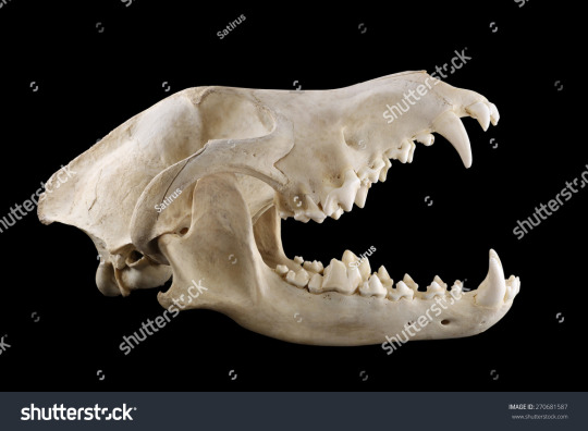
notice how even though the mouth is open, the entire skull is moved along with the upper jaw. the lower jaw is the only part capable of moving independently from the rest of the skull
this is mainly an issue in furry art where people will break their characters skulls in order to open the mouth: only the squishy part of the nose and lips will flex
EXAMPLE OF THIS:
the soft part of his NOSE can be pushed up, but the rest of his face cannot be bent that way.
the front and back legs of most 4 legged animals (not all) bend differently from each other. example:
use a reference 4 more information... the internet is such a beautiful place
even if you are drawing just a bust of halfbody shot of a character. if you are drawing them With another character in in an environment MAKE A SIMPLE SKETCH OF THE ENTIRE BODY AND *THEN* CROP IT TO YOUR DESIRED SIZE. please learn from me i never do this and i always mess up the heights or proportions...
perhaps this advice is specific to me and nobody else but stop trying to "learn color theory" none of the tutorials work. color theory is learned by violently throwing yourself at it over and over and over and over and over again until you make something that works. you just Get It or you Dont Get It UNTIL you Get It and ive never met someone able to teach it properly in a way that allows you to apply it to your own art (especially digital art). just keep trying ur not doing something wrong just look at pieces you like and try to emulate how they use colors by eyeballing it. you will pick it up eventually. also try not using pure black or white unless you REALLY know what youre doing bc it usually is kind of distracting.
if ur trying to make a clear pose squint your eyes at it, if you can still see whats going on its probably fine. or just color the entire thing the lineart color to see the silhouette. or start sketching in blocked out silhouettes instead.
you can do whatever you want forever
0 notes
Text
whenever i draw fanarts, the biggest satisfaction to me is when i was able to draw...an idea that is unique to the source material, something that i cant just simply recycle to ocs or any other fandoms, and especially, something fans of the source material can appreciate the most... its also something i knew i cant achieve with ocs. because at least with fanarts, at least someone get the context behind the art. i couldnt care less if im not drawing for a bigger or more popular fandom if i was able to share my love for something like this to the same people who love the source material as much as i do...
im fully aware that my artstyle is not the most desirable. or the most social media-favored. or just anything thats worth being stared at anything for more than 5 minutes, haha. thats why i rarely post my doodles or rarely draw headshots because...i often find to look the most boring... but thats also why i really. tried really hard to get rid of my shortcomings by focusing more on the composition and "story" side of it over anything else. i tried. again. really hard to put my style in the backburner so the flaws of my unappealing style wont overshadow the "story" i wanted to tell in my art....
but yknow i just...feel like lately its all pointless hahaa...
so just when my mimi fanarts gets the most attention solely because it has mimi on it and not because of the art that i drew...im starting to ask...whats the point anymore if i even spend any extra time beyond just drawing the character. i might as well just draw the most soulless headshot or even stickman of the character and i'd guarantee it'll still get as much attention only because of the subject i drew. and the last important thing being...my art.... and this isnt just limited to one character or fandom, haha. every time any more replies to any of my art starts focusing on the subject over anything i put in the art, i knew that i failed to deliver the "story" i wanted to tell. at that point its starting to feel like...my art is nothing more than an accessory to a conversation starter. haha. i get it. my art isnt all that appealing. and my composition is still extremely amateur. but i guess no matter how much love and soul i tried to put in my art, it still doesnt matter if the subject is not creating any interesting conversation...
and its lately more and more apparent when i start to draw more oc artworks and obviously? theres less things to talk about now since theres 0 prior attachments existing with my ocs! :')
you could say that its mainly because im drawing for a small fandom. you could say its because i drew for a fandom where 90% of its contents is untranslated. but i just cant help but think...its simply because im still not good enough.....
i cant translate. im not fluent in any languages that isnt my mother tongue. im not the most talkative and hardly ever fit in any friend group. and every skills i have any inch of knowledge of is barely useful to anyone. and i know that i’ll never be remembered for anything. so i just....in the end, when i love something, the last i could do to say that "i love it" is to tell them with my art, despite its shortcomings and imperfections... but i guess thats...still not enough... to prove even that... :')
so just. haha. idk. even right now i kinda...lost all my motivation to draw. every single time i tried to i started to ask "is this even worth it?" and wonder if i shouldnt finish the art and put the bare minimum on it now, even if its gonna be the most soulless thing i've drawn. ultimately, a part of me just felt like i shouldve changed my priorities and focus starting this year. haha.
(and i'll just be real. if someones gonna say "draw for yourself!!! not for others!!!!" i would...rather not just post them at all to solve that. period. saves MUCH more of my time and anxiety if i just stopped posting them!!! :'))
i just. really dont know anymore...
#tbd ///#please dont reply if you have nothing important to say. thanks.#i just needed this off my chest bc i really...cant draw anything rn...#ultimately if you start mass liking my art after reading this please dont. im not intending on guilt tripping anyone here :')#and i dont intend on vaguing anyone. any names or fandoms here are just examples for emphasis. thanks.#also cool i typed this on impulse and on a stress week so if you see me regretting this post later 👍 gj
0 notes
Note
Im glad you asked, cause i’ve been dying to talk about it for a hot minute! Srsly lyrics are sooo important to me when it comes to music. Starting of: all wonder girls members are great lyricists. Even if they dont put out music!! I just know their poetry would bring me to tears. But honestly sunmi, yeeun & yubin snapped on the reboot album & didnt stop since. I love how they feel comfortable to actually write about their issues (yubin leaving jyp, sunmi’s mental health, yeeun’s problem w her dad) & not just sugarcoat everything. They just tell it like it izz ok? Another one goes to LE. She wrote all of exid discography. This woman will not stop until the whole world knows about her hatred towards men, i just have to respect her for that. Interestingly she also makes damn good sexy times music. Now to f(x)’s luna. Everybody should listen & read the entire free somebody album. Then they would understand. So ahead of her time, its a pity. Another great addition: heize. Everytime i listen to her lyrics is like im going thru a breakup. 10/10. And last but not least, the OG songwriter idol, miryo. From what i know she has the most writing credits among all female idols (LE is catching up tho!!) and thats got to mean sth.
i actually ult miryo!! she works primarily as a lyricist at mystic story now (is that common knowledge? i don't think she's credited half the time 😭) as her day job though ofc she still does her youtuber gamer streams and soundcloud raps. i forgot to mention how much i enjoy yeeuns unbridled and raw emotion she puts in her lyrics mainly because her music isnt my style but that doesn't mean her lyrics arent great. ofc sunmi i already mentioned how much i love, her double (and sometimes triple, quadruple) meanings in her songs and the extended metaphors and how her lyrics link to the composition cant be described as anything but genius. (thinking of heroine/gashina/noir/lalalay) of course i mentioned her weaknesses are when she goes for commercial viability instead of emotional expression, which is why i don't care much for pporappipam or you can't sit with us (tail doesnt have mindblowing lyrics but theyre perfectly fine, and the actual song production is good enough to carry it lol). ofc i listen to EXIDs title tracks but i really haven't tried any of their bsides! i didn't even know LE wrote for them! ill look into her credits when i find the time. also from what i heard, i enjoyed heize and i know she works with monotree so that immediately means shes good hehe... i was curious, are there any non-idol lyricists you like too?
5 notes
·
View notes
Note
ok i'm back with another LIP-related Transformers question. In the event that there are LIPs on Cybertron, what kind of structures do you think they'll form?
also, tangential but related, how do you see the weathering of LIPs on a Cybertron with radically different weathering ...i cant remember the word but the things that make it do that. Like, iirc there's no water on cybertron, so water-based weathering Just Wouldn't Happen, etc. How do you think that would change the way it looked?
also djfhlg sorry for presenting this like a high school essay question but genuinely i am SO curious and i love hearing about LIPs
[rubs dirty fly hands together]
In the event that there are LIPs on Cybertron, what kind of structures do you think they'll form?
There are a lot of options! :D
Dikes & sills - magma gets into cracks within the crust and solidifies into a sheet-like layer. If the magma follows the plane of existing strata, squeezing between layers, it forms a sill. If the magma cuts across layers, it forms a dike/dyke (US vs Brit spelling strikes again). Often you'll find lots of them associated with a single magmatic event - that's called a dyke swarm or a sill complex.
Lopoliths and laccoliths - like sills, but bulgy.
Batholiths - intrusive masses of igneous rock larger than 100 square km in area. Sometimes they're much bigger.
Cybertron's planetary interior, per Aligned, has a lot of hollow structures that go very deep. I think these are a natural conduit for rising magma to get to the surface. Depending on magmatic composition you might end up with an interesting thing where the tunnels are flooded but the surrounding metallic crust doesn't melt, so you end up with a magmatic cast of the tunnel network.
On the surface, if you have nice liquid magma, more mafic in composition, you'd get the layered flows that build up thick plateaus and weather into stepped terraces. Columnar jointing is a distinct possibility. If your magma is more viscous, you might get lava domes. If you have large-volume explosive eruptions, chances are you'll get tephras from ashfall and ignimbrite sheets from pyroclastic density currents.
how do you see the weathering of LIPs on a Cybertron with radically different weathering ...i cant remember the word but the things that make it do that. Like, iirc there's no water on cybertron, so water-based weathering Just Wouldn't Happen, etc. How do you think that would change the way it looked?
Water is the major driver of erosion on earth, so if you take that out of the equation, you immediately slow things down a lot. Water causes both physical and chemical weathering - for example, feldspars break down to clay. Snow and ice break rocks and grind them down to flour. Liquid water is also good at transporting and sorting eroded material. If Cybertron has no water, it probably has very little in the way of sandstones and mudstones.
(I tend to go with Cybertron having some water in my headcanons, but not nearly as much as earth. Mainly because I fuckin love dramatic erosional landscapes lmao.)
Aeolian (wind) erosion does account for some weathering, it's just not as good at it. Heating and cooling cycles can cause fracturing in rocks, as can simply unburying them - if a rock is formed under certain pressure conditions and then the pressure gets way lower, it's probably going to expand a little. That can cause interestingly geometric jointing. :D Gravity itself also imposes a limit - create a slope too steep for the ground to hold itself together and some of it is just gonna collapse.
In general, all of this is going to be as true for any igneous provinces as anything else on Cybertron. If there's oxygen, there'll be oxidation eventually. At some point I'll look up my silicate weathering notes and think about how Cybertron's shitty pseudotectonics fucks that up lol.
9 notes
·
View notes
Text
high stakes 0.1
bodyguard!tom holland x reader
Your small black heels clicked against the wooden pleated floor, echoing in the empty, white hallways, pictures of you and the family spread across the wall every so often, in between pieces of expensive art pieces and photography canvases. The white dress you were wearing blended in with the white, light hallway, your skin shining and glowing against the composition, complimenting your bright eyes and hair. The familiar dark red oak door came into your view as you huffed, tucking in your hair away from your face, the faint beating of your heart skipping every so often you had no reason to be nervous, but the sudden urgent texts and calls from your father had always worried you, especially with the fact that his security had almost tripled since the last time you visited.
Three light knocks landed on the door, your palms slightly clammy and shaking as the reached for the handle, twisting gently, emphasising the faint squeak it gave off, and the moaning of the great oak double doors. The first thing you noticed was your father, dark suit, dark facial features and his slumped body language, his age and tiredness practically flooding the room's atmosphere, and you almost cried at the sight of him. The second thing you noticed, was the man in front of you, how hadn't turned toward you, so all you could see was his dark brown curls, his tall stature and position in the office chair, if you hadn't known any better, you would assume your father was in a meeting but you had been cleared to come inside.
“Hi Daddy,” You said, walking around the large dark desk, leaning down to place a gentle kiss on your fathers cheek, rubbing your thumb against his skin gentle whilst giving him a loving smile as he looked up at you, and all you saw was a broken puppy, lost and tired, which broke your heart.
“Hello sweet pea, please sit down,” You father replied, motioning to the second office chair placed next to the stranger. Now you had a good look at him, and it took your breath away, his dark eyes where solely focuses on you, building your nerves as they looked you up and down. You walked over, sitting down next to him, trying not to keep close o the intoxicating smell that leaked off the man's body.
“What's going on dad?” You asked, you fingers fidgeting as you bounced your foot up and down, tapping against the floor rhythmically.
“Sweet pea, this is Tom, your new appointed bodyguard,” Your father said, nearly choking on his words as he watched your face fall, confusion, shock and little anger fell over you as you stayed speechless.
“Since I have merged with another business we had to make a lot of changes, I have received multiple threats, which doesn't bother me, but now they are using you as a target as well, so I need to keep you safe,” You dad started, and every so often, your eyes would travel form your father to the man next to you, who had been looking at you since you sat down, making you feel slightly nauseous. "So, Tom will be staying with you until we can eliminate the threat,"
You sat for a while, both your father and Tom looking at you, waiting for your reaction as you stayed motionless. You blinked multiple times over, trying to calm your swirling mind, making you dizzy, shaking your head slightly as you looked at your father.
"He's staying with me?" Dad, have you really thought this through? It cant be that serious, I can look after myself," You said, turning sour as you hear Tom scoff beside you, causing you to look him up and down with a dirty look on your face; you must admit, he was beyond attractive, but a bodyguard. Really?
"Yes, until I can be sure you are safe on your own, you need to be nice to Tom, and do anything and everything he tells you too, I'm sorry sweet pea," You father said, and your bitterness built up; you didnt want a stranger living with you, just when you had gotten to the routine of being by yourself, walking around in basically nothing whilst eating a shit ton of pot noodle, now you had to wear clothes and cook meals for you both.
"Don't even fucking bother," You sighed, standing up and leaving. You flooded with guilt as you remembered your fathers face, but you stood your ground, walking down the same hallways and making your way back to your car, saying hello to the familiar security and maids that roamed through.
Before you could even pull open the car door, it slammed shut in front of you, Toms body coming into view before you as you rolled your eyes to the heavens.
"Seriously? I can't even drive?" You scoffed, shoving the car keys harshly into his chest as you rounded the car and made your way to the passenger's seat.
"Why are you so against this?" Tom said, staring the car and pulling ou the gravel driveway.
"Normally the security doesn't talk to the client, just saying," You remarked, thinking about all the films and book you had studied, where the security guards took place in the background, but then in your previous experiences, you were always close and friendly with the staff your father hired.
"What about Princess Diaries? Don't they fall in love" Tom said, laughing to himself as you ignored him. You were surprised, he didnt seems like the kind of guy that would watch cheesy chick flics, but here you were. The short car journey was filled with silence, it was uncomfortable, biting away at your skin as you watched the familiar scenery pass you by. You had always stayed close to your father, mainly because of his guilt-tripping about abandoning him, but this way the only way you could be your own person and grow up, which your father also resented.
a mix of anger and anxiety coursed through your veins as you got out of the parked car and into your house, disregarding any emotional or physical response Tom had to your brisk actions. It was unnecessary for him to be here, to live here, you had always received a threat and you didnt understand why this was any different. But you sighed again at the recurring image of your ill father.
Once you opened the door, you threw the keys into the bowl beside the entrance, the jingle and crashing making you wince at the scurring silence. You could feel Toms presence behind you, hear his breath in and heavily breath outwards again, and you could hear your heartbeat racing faster than electric; you knew that no matter how hard you could try you wouldn't be able to ignore him, or his insanely good looks.
You gave him a brief tour of the apartment; showing him the kitchen and bar, the living room and how to work the controls of the room and of course his bedroom and en-suite, and you wished he would settle in and keep to himself for the most part; but you knew it was wishful thinking.
“Wheres your room then, sweetheart?” He said, his gorgeous frame leaning against the door frame, arms folded and a sly smirk on his face, looking you up and down as you rolled your eyes. You wanted to bite back and tell him to shove it, but you decided it wasn't fair; this was his job after all, and it was only to protect you.
“Down the hall the left, and don't you dare even think about coming in uninvited or without knocking or ill have you fired before you can even blink,” you said, a flirtatious hint somehow ending up in your meant to be threatening sentence, you huffed again and left, feeling his deep brown eyes stare at you as you walk away, locking yourself in your bedroom and falling dramatically on the soft, white silk sheets.
It felt odd to you, having someone in the house that you can't really treat as a welcomed guest, but not a staff member either; Tom was now a permanent residence in your home, and that would take some getting used too; you now had to be careful around your own home, not wear, do, say anything to risque or harsh, not sing in the shower to your hearts content, go to the toilet with the door open, lay in your underwear on the balcony recliner, all the small things you now couldn't do with Toms company. You decided that this may be a good thing though; there was no doubt in your mind that Tom was attractive, unbearably so, but this meant that you had no control of your action, you will either act like a nervous prick who can't stand up for herself or become a mean, walls up, closed off person with anger issues; really there was no telling what could happen.
But for now, you grabbed your favourite book and changed into your pyjama shorts and a crop top, even though it was around 3pm, and sat on the balcony recliner, to induld]ge oni some much-needed vitamin d.
Tom found it amusing, the way your eyebrows and nose would furrow and scrunch up to read the words on the cream white page, and how he could tell how interesting the book was by the way your facial expressions contorted with each paragraph or so.
He found himself watching you intently, his eyes being drawn to you and your figure; he was stunned that he was going to get paid this huge sum of money every month to look after some rich mans daughter; although he felt guilty that he couldn't stop thinking about how much he wanted to fuck her senseless ever since he saw her.
---
#tom holland#tony stark#tom holland imagine#tom holland one shot#tom holland smut#tom holland fluff#peter parker#peter parker smut#peter parker imagine#peter parker fluff#harrison osterfield#bodyguard!AU#bodyguard!tom#marvel#marvel imagine#marvel fanfiction#marvel one shots#MCU
405 notes
·
View notes
Text
rent sound and light tphcm COMPANY BLUE GLOBAL
I see your lips shifting, but all I listen to is Blah, blah, blah, blah, blah. I do know its not what you would like to hear, but fairly only, When you are a speaker, author, specialist or other “expert” I see getting interviewed with the news media, your expertise just isnt quite fascinating. https://www.empowher.com/users/grounddigger5 is usually a dime-a-dozen and yours is not any distinctive.
So in this age of round-the-clock, on-demand, blue tooth, on line, substantial def., Wi-Fi, via satellite, information junky, at your fingertips planet of knowledge, what separates those messages that crack in the litter along with the overwhelming majority of experience that goes un-tapped? The solution is very simple: Its the delivery!
Details, sent by industry experts in a straightforward manner, is simply too normally reminiscent of a classroom lecture Uninteresting! Even so that same content, provide with enthusiasm, function, urgency, spirit and conviction can shift men and women to motion and go you to definitely the best of your information medias first phone checklist.
The information saved with your brain is simply the entry payment. Your credentials to provide that articles is just the prerequisite. But your Campaign is what definitely will make you interesting. Your passion for your information is exactly what can make you plausible and its timely connection to some latest or own problem is what can make it applicable.
Watch any national early morning clearly show, or cable information speak show and Take note who has the lions share of digicam time. In television news, the one particular who most deftly steers the conversation, wins. But all much too frequently, gurus who are invited to sit on the television set to touch upon a story of nationwide interest, simply reply the thoughts posed to them and provide educated Investigation. They are graciously thanked for his or her time, but hardly ever questioned again. Why? Mainly because most media prospects can be a examination in disguise. And many authorities unknowingly are unsuccessful the check.
But Believe for your second regarding the specialists which have been showcased time and time again within the nationwide news some even currently being rewarded with their own clearly show. What is the typical denominator? Higher than all else, it is that they are fiercely opinionated. thuê âm thanh ánh sáng tphcm tochucsukienhcm know what they would like to say and arent worried to mention it. Im not suggesting that you have to become a jerk to become newsworthy, only that you've to possess the conviction that personifies a real believed chief.
Fantastic radio communicate demonstrate hosts, by way of example, dont convey up a subject and request for the opinions. As a substitute they tell you what they Believe and invite you to concur or disagree. Who among the us is encouraged to abide by, or be moved to action by a credible, nonetheless uncomplicated, or dry expert presenting his or her abilities with a story of countrywide or market-specific fascination?
To develop âm thanh ánh sáng ngoài trời , to appeal to consumers or consumer, to encourage Other people to rent you or get your books or products and solutions, to engender loyalty and inspire genuine modify, you have to shift over and above the realm of basically being intelligent and excellent at That which you do. It's essential to really inspire.
And whilst we're all designed up of precisely the same composite elements, we are all wired somewhat in another way. Becoming overly expressive and providing content on the edge of your respective seat is usually difficult for a few, nonetheless it have to be finished. In dealing with the information media, we have been participating in of their sandbox and we must Engage in by their guidelines, or we wont be requested to Perform all over again.

For any type of superior-profile sustainability, youve obtained to provide what tv journalists phone Excellent Tv set. New, revolutionary, or provocative methods to very long-standing troubles could be superior Tv set. Either wholesome exchanges or outright conflict amid company can each be excellent Television set. Very good Television suggests nothing at all more than currently being intriguing and never blending in. Sadly, experts are typically so immersed in their content that they feel it really is the data that is interesting. In fact, it is the enthusiasm that provides about Very good Television set.
The greatest misperception in working with the push is definitely the Wrong notion that when a reporter asks a matter, its as they want to know The solution. Unless its some type of news investigation, the objective of their inquiries is usually, simply just to provide you with a start pad to your ideas, your enter and point of view. Im not suggesting that you just dont response the issue, just use The solution given that the springboard to your crusade.
Most reporters dont know the subject just about together with the guest and you'll simply transfer earlier the usually irrelevant, or less significant issue by just employing transitional phrases such as: Whilst I surely concur, its also crucial to bear in mind…, That may be accurate, but The problem that basically worries me is…, When that concern is generating headlines, we cant ignore that…, people in some cases are unsuccessful to acknowledge that…, I come across it fascinating that… Then say Everything you arrived there to state, and get it done with passion whatever the inquiries requested. Even with regular wisdom, the reporter or interviewer might be incredibly appreciative within your media savvy.
As most on-air interviews final not more than ninety seconds, I suggested my clientele to be crystal obvious within their mind what they would like to say, what they've to mention, exactly what is critical for them to impart for their audience for them to achieve success within their enterprise. Then they need to produce a solemn pledge to themselves (also to me) that they will not get away from that chair right until they say it!
Its the quid pro quo of dealing with the press: We aid them refill their newspapers and newscasts with information, As well as in return, we receive a platform to relay our Suggestions. Use it. Dont squander it. Dont be uninteresting. Be opinionated. Be passionate, related, provocative, believable, timely, distinctive, memorable and news-deserving.
This short article is more than just my belief and my experience it really is my crusade. If I'd begun this informative article with an easy admonition to generally be far more animated inside your interviews, do you think youd however be looking through? Or would you may have turned the site way back? Remember, there are many millions of Television set distant controls and web site-turning fingers available. Dont be unexciting and theyll very likely keep on with you, flip to you and ideally come back to you personally.
0 notes
Photo


For the first poster i think it captures what the movie is about perfectly, in the glasses you can see it some sort of event like a concert because there’s one main person standing in front of a crowd. You’re instantly drawn to the eyes, you read the title and then try to make out what’s behind in it, the contrast of the warm colour of the overall poster and the cold purple in the sunglasses works well together.
The next poster I thought the layout design worked well, the white background compliments the pink and the background working into the title is different but it looks good. The idea of the two images is great because you get to see who the main characters are and the direct eye contact shows that the movie must be about her but the two men who are looking away makes you wonder if they don’t know about each other.
I was drawn to this poster because of the side profile at the front of the image and in the shallow depth of field you can make out a girl and from the title you can imagine the movie is about the girl and not the woman standing closest to us. The shallow depth of field is something I wouldn’t normally think about to put in a movie poster but this time it works and makes me think that it could work with the right background. The composition of the poster allows you to see enough of the background to get the idea of the movie but yet it’s not leaving too much empty space.
The heathers poster is quite simple and is straight to the point of a young couple in school, the lighting in this is bright and leaves no shadows, the black of the clothing and background is dark enough to let the actors stand out in the poster. The overall poster is effective because it leads you to believe that it’s a high school movie about a happy couple but the poster mainly involving the colour black and a hit of blue could be foreshadowing sadness and danger. This is something I would looking into for my poster, to involve some sort of foreshadowing in the colour scheme.
Once again the final poster is simple but the main focus is on the actor and how he’s posed but also the small detail in the title of the padlock on the two OO’s. This small detail links to the background of the high fence and portraying perhaps the actor is locked up somewhere he can’t escape. All the small details adding up is different to other posters where sometimes they add extravagant backgrounds and effects so with one look you get the idea of the movie whereas with this you have to look at it a little longer to understand what the poster is about.
I’ve picked pink flamingo because i like the aspect of having a drag queen as a main character and there’s a lot of options you can do style wise and story wise. This poster has a vintage film feel to it but yet it looks like a parody of a western cowboy film so its very comical.
The reason I've picked little red riding hood is because of the background, it’s not too dark where you cant make out what it is but the lighting still creates this spooky eerie background.
for my final image i am thinking of doing little red riding hood but the model being a drag queen to add comedy to the dark scene.
1 note
·
View note
Text
Heterotopia
Heterotopia is a idea that is explained by philosopher Michel Foucault which describes certain Institutional, cultural and digressive spaces that are different somehow usually, disturbing, distorted intense, contradictory of transforming. Heterotopias are worlds that are within worlds which mirrors and also unsettles or distorts what is outside. Examples of heterotopia would be: graveyard, prisons, brothels, ships, bars, garden of antiquity, and many more, these examples are provided by Foucault.
Etymology
Heretrotopia follows the arrangement created by the concept of utopia and dystopia. The prefix part of the word Hetero- comes from Ancient Greek, (it means “different, other, another”) its is also fused with Greek morpheme τόπος (This means “place”) together they become “other place”. A utopia is a society or community that is imagined, it is the ideal place with high value or almost perfected qualities for the society. The opposite of this would be dystopia, this is a society or community that is low value or unsettling, dystopia translates to “bad place”. to put things simple a utopia is a place where everything is good; Dystopia is a place where everything is bad; Heterotopia is where things are different.
Foucault’s six principles
Become accepted in all cultures but in diverse forms (mostly as sites of ‘crisis’ or later ‘deviation’)
Mutate and have particular actions at other points in history
Juxtapose in one space many incompatible spatial elements
encapsulate spatio-temporal discontinuities or intensities
presuppose an ambivalent system of opening and closing, enter and exit, distance and penetration
Have a particular action in relation to different spaces as, for example illusion or compensation
Examples
1: Swimming Pool
-Feels like you are in another world but yet surrounded by the normal world.
-When under the water everything looks and feels different and also looks distorted
-Time feels slower especially when under the water as everything moves slower.

2: Disney Land
-Mirrors a world within a world, once your in it you the fact that the normal world exists is gone, this is because Disney land is design so that you cant see the outside world.
-Forget about time, you enjoy yourself so much in this new world that time flies by and you don’t realise what is happening outside.
-Has the potential of producing a world as itself.
3: Space Station
-Mirrors a world within a world (The space station is sort of looking down on the earth/world giving the effect of life being beyond just earth in another place.)
-lose sense of time (it also looks as if time isn’t moving as gravity is different and the normal world is far far away.)
-Distorted feeling (it would be difficult to understand sense of direction in a place like this.)

Heterotopia artist research
1: Beksinski


Beksinski was born in 1929 and passed away in the year 2005. He was a great polish artist as you can tell from some of his work shown above. He mainly used techniques such as photography, sculpting and painting, he specialised in dystopian surrealism. Beksinski did his drawings and paintings in a way he called ‘Baroque’ or ‘Gothic’ manner. His creations were created mostly in 2 sections. The first section would usually consider to have expressionistic colour with a very powerful style of utopian realism also surreal architecture, just like a doomsday setting.
2. Vincent J. Stoker


Vincent J. Stoker is a French photographer Heterotopia: the end of history is one of his series. He has a interesting style of art in his photographs, the setting in his images are usually shot in an abandon place like building with symmetry, this creates a very pleasing image to look at. His images give off the feel of heterotopia as the abandon places have turned into another world to what they used to be, looking at it you can sort of picture what the building used to look like which reflects the use of heterotopia.
3.Michael Sweerts
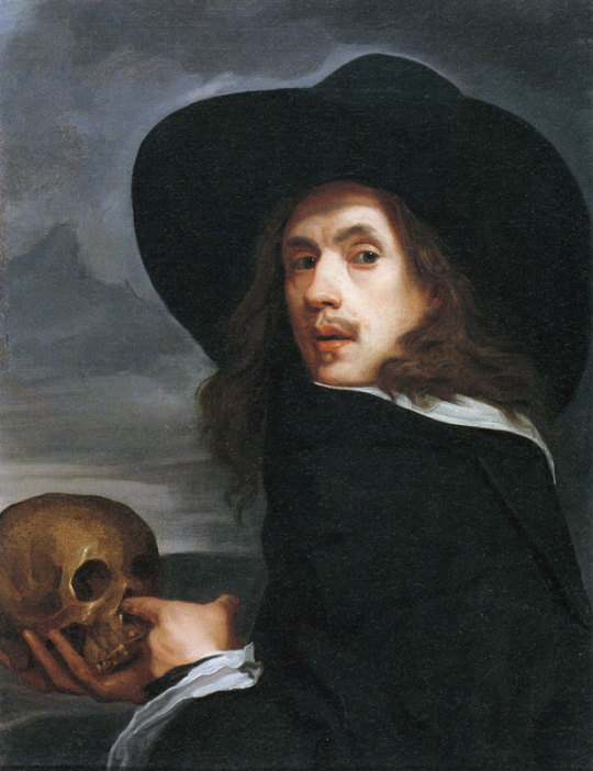

Michael Sweerts was born 1618 - 1664, he was a flemish painter/printmaker of the baroque style. he is most known for his figurative and genre portraits, paintings and tronies (tronies is common in dutch golden age in painting that shows overemphasised face expressions usually relating to a common type, or category of types). Michael Sweerts followed a peripatetic life, he worked in many places such as Persia, Rome, Amsterdam, Brussels and India.
He has learned a lot of his techniques from travelling to different places, for example when spending time in Rome he became connected to the dutch and Flemish painters of low-life scenes commonly known as the Bamboccianti.
Project Model Development
First we had three main ideas we wanted to build, we narrowed it down to a single idea by debating with our group which idea was most interesting and best shows Heterotopia. Me and my group settled on the idea of modelling a space station. We took many different things into account before making our decision, such as how we will create the space station? what materials do we have to work with? how is this a Heterotopia? is it possible? and so on.
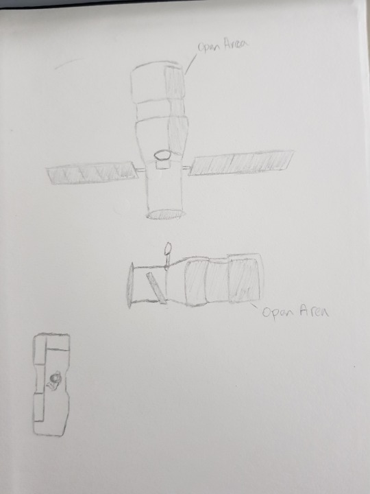
After settled on an idea we started to research space stations to see what they looked like on the outside as well as inside. With and idea of how they looked we began to sketch more ideas on how it would look and also work.

We all then look at each others sketch idea and then decided on which best fits what we were looking for, once the vision was there we started getting the process of developing the model, which first need measurement and a scale. Once finding the dimensions that would work well with our vision, we started to sketch out a few more idea such as the details of the space station and thought about how we can use the materials necessary to make our model as good as possible.

Here we have measured and drawn onto the cardboard (which will be used for our model) the back wall window part of our design, this section of the model will be connected to all of the rest so it is a crucial piece. after using this as a guide it was easier to find the correct size for the other pieces.
All of the piece for our models are now cut out and correctly measured, it was just a matter of sticking it all together. First we tried using a glue stick, it work but it didn't have the stability we were looking for so we found a glue gun instead which made things a whole lot easier and strengthened the model. Stick the models together was a bit of a fiddle but helping each other, one holding the pieces one using the glue gun also saved time and made it easier to a line the parts correctly.
Here are some of the smaller details that we have drawn out onto cardboard, theses will be stuck onto the sides of the model, they will be used as the wires and little other pieces that are seen on the outside of a real space station. This will give the model a more realistic feel instead of just having plain sides with no definition.

Here we have the final model, overall the model looks great and turned out just as we wanted, we also added a spaceman character to peak the potential of the model, There we also other ideas that were took into account but however we thought the best decision would be to leave them out. The only con of our design would be a bit of glue is visible on the model, and it would look better with colour.

Other ideas we had:
Stand: We thought about adding a stand to the model, however we though the model would look better without a stand and there would be more and better types of images without one, below you can see the types of images we were able to achieve without the stand that would be possible with the stand.
Background: A space background was another thing we consider but it was shortly decided against it after little development. We thought the background would properly get in the way and it would also require the stand.

Here are some of the images we took during the photo-shooting of our model. I think they all look really cool, we had a bit of trouble sorting the camera, but once the setting were correct and to our liking we were able to create some really nice images. We used dark and lighting to make the environment give a space feel to it. We were able to get a lot of cool and different angles as well, we decided to use different colour lights (colours: blue and pink) to give an even more spacey feel. Other techniques such as composition were also used to enhance the look of the pictures, my opinion of the project would be it was really fun and we were all able to create something we were happy with. If i could do it again i would added more detail and colour.
Through the process of making this we all took turns doing different activities to contribute to the model, we all research and used references to do our own sketch ideas and discussed them to further improve our project design, we all took part in cutting out the pieces and building the model in some way, i found trying to stick the smaller pieces together a challenge however others in the group were able to do this a lot easier, which made it better for them to focus on doing things they were best at in a result of saving time.


Treatment and Research
Mood board

0 notes
Text
Why do People Write ?
Many people are wondering why people write, every person has different reasons of writing. On my perspective, writing is a way of expressing a one’s thoughts, opinions and Observations. There are different Reasons why people write. For some they use it as a platform to develop their abilities on writing and along the way they become good writers and develop a Career on writing and eventually publish their own book. For some people it is their Hobby and it helps them express mental state or they have Stories to tell or mainly because it makes them happy. Someone asked me, Why do people write? Bakit nga ba ? Writing is one way of expressing thoughts and Ideas and you can showcase your knowledge, feelings and Understanding on the topic. In writing it can express Pain, Joy, excitement, humor and the emotion of the writer.
On the Other Hand, I started this Blog because i want to Express my Feelings and hanash towards a Certain topics and give motivation to other people around me or simply just writing Because i don’t have anything to do. Madami din feels this sem and a lot of things to write and talk about. This platform is giving me the freedom to state the things I want to tell without anyone telling me their opinions, most of the time opinions are the factors that are preventing you from doing what you want to do, I met different persons recently and they have different personalities, having them in your life, you will recognize their uniqueness and similarities in terms of behavior and personality. In writing it also gives people the opportunity to express themselves regardless of whatever they are writing. It can be a sense of personal expression. People mainly Write because writing serves to provoke change.
As a Student, Writing can expand and enhance imagination, thoughts and elaborate your observation towards the ambiances and the people around you. When it comes to writing essays for school most of the students are having a hard time doing it, simply because some students lack of ideas due to stressful school works or doesn’t have enough mindset or maybe because they are not interested with the topic. A writer who is not interested with his topic cant compose a worthy Composition because he is not focused on what he is doing, there are various concepts that are blocked due to dispassionate topic or simply because he doesn’t have any idea about a certain topics.
On my perspective, Writing is my way of expressing my thoughts and feelings. On my previous blog-post, I talked about one of the things that I faced recently and how I’m dealing with it and how I think I’ll overcome the situation. For me experience is one of the factors to consider when it comes to writing because by experience you will learn tons of things, it will also help overcome your fears. I personally, I don’t like speaking in front of a lot people. Growing-up, I’m the type of person who doesn’t join games on birthday parties, I don’t talk to someone when they didn’t approach me because I’m too shy interacting with people. Up to this day, I still have that persona but once I get comfortable with people they will know the real me, how my personality goes, my likes and Dislikes, things I can and I can’t do and so on. On this approach I can express all the things I want to tell and No one recognize who I was.
1 note
·
View note
Text
ok, so it's RvB rec day!!!!! This is my first rec day since I had no idea that it existed before so hopefully I do this right!
Fics:
All of Riathedreamer’s fics!
Ria is seriously my favorive fic author of all time. She mainly writes Grimmons and all of her fics are amazingly in character and are completely plausable in canon. I couldnt choose a favorite fic because they are all good. She is also the queen of Grimmons angst tho so beware while reading her fics becuase there is A LOT of grimmons whump and angst. Aome of her fics WILL make you cry... a lot. Anyway, Ria is amazing and super nice and she also has a tumblr you you can find her here @riathedreamer. I really cant explain ecnough how good Ria is. Just go. Check out her stuff. Shes amazing.
Incremental Annihillation by Septdeneuf
This fic, like most of the others on this list, is pretty angsty and filled with Grimmons. This fic is an AU where the purge was successfully activated but was stopped before everyone was killed. The victims of the Purge end up being resurected, but at a price! I dont want to spoil it too much though so Im just going to say that if you like angst and charcters making difficult situations this is the fic for you! There is on NSFW chapter but if you dont like smut (like me) you can easily skip it. The fic updates every sunday and I believe that it is almost completed!
All of Yin’s fics
Man all of Yin’s fics are amazing. My current favorites are Pillow Talk which is a series of Grimmons one-shots , both fuffy and angsty, Specials which is a superhero au, and Above Ground which is my absolute favorite fic of theirs. Above groud is a sci-fi? AU where the planet is separated by those who are privileged enough to live above ground, and the underground Slums where the lower classes are forced to live. This fic mostly follows Grif, who live in the slums, and Simmons, who lives aabove ground and their intereactions as the tensions between the Slums and Above Ground rise. This fic has themes of genocide, class differences, etc. and if you dont really like Grimmons, just about every other character in RvB makes an appearance and ships like Tucknington are definitely focused on as well. This fic is super long though (about 477,000 words) so it is a commitment, but a very rewarding one if you chose to read it!!
Why Do You Try So Hard? by Lieutenant_Kader
This fic is a Grimmons fic (surprise surprise) that follows Grif, Simmons, and a little bit of Tucker through basic training through Blood Gulch. This fic really goes into Grif’s experience on the doomed colony and shows what he went through the days following the massacre. In is an angsty fic and is written as if it is a collection of memories opposed to a sequential story. It really is one of the best doomed colony fics at the moment so if you are interested in that part of Grif’s history you should totally check it out!
Green is Definitely a Shade of Red by Prim_the_Amazing
thi fic is the only really silly one on the list. It is also the only one that is not about Grif and/or Simmons. This fic is a super cute fic about Locus essentially being adopted by Red Team against his will. It is super adorable and it really makes me want Locus to come back soon. Also, this fic 100% includes Donut painting Locus’s nails a sparkly green color too, so that might convince you to give this fic a try. you can also find @primtheamazing on tumblr as well.
Art:
@mercuryblacksleg Miles is amazing. His Red Team art absolutely makes my heart melt, especially his sarge. I die everytime I see his team bonding art. Some of my favorites have to be:
Red Team Dragons: this is just so cute! I actually teared up the first time i saw it because of how tiny and adorable the Sarge dragon is and the little blep!!!! THE BLEP! Its just so freaking cute...
Egg Timer Caboose: man this one is also adorable. Caboose is so precious and I absolutely love the background!!!! Everything about this pic is adorable!
Game Night!: Listen, I love bonding moments between Red and Blue Team. This piece is just so happy. I love the idea that red and blue team occasionally get together to have some fun (annoy each other)
@captainkonot Im sure everyone and their mother has seen their art but I just love it so freaking much. Their style really remings me of classic strip comics and they have such great compositions. Also theirs Grimmons stuff is adorable. Here are some of my favorites:
Lil’ Grimmons family and BIG Tucker family: Ok, so this piece is just so cute. I cant even explain how adorable it is.Happy families just make my heart melt so this pic has just turned me into a puddle.
Grimmons Frustrations: Man, I died laughing the first time i saw this because its so true lmao. Also Simmon’s little “you cant catch me gay thoughts” absolutely murdered me.
Other:
Contact Piano Sheet Music by Ariel’s_Lament
This is a lovely arrangement of Trocadero’s Contact for any of you pianists out there (or people who just like to learn how to play songs)! You do need to make an account to download any sheetmusic from this site, but it’s free and really easy!
Ok, so I think I'm gonna stop there. I have so much more that I want to include but this has gotten WAY too long. There are so many wonderful fanworks in this fandom and I'm just so amazed by how welcoming and lovely everyone has been!!!! I love you all!
35 notes
·
View notes
Text
What Is your Specialism?
The specialisms that I am passionate about and enjoy doing are graphic and a little bit of illustration. I am not very good at drawing or digital art but it is something that I enjoy doing and I feel like I have never really given digital illustration a proper go so I would like to try and learn more about digital art and illustration. Within graphic design I really enjoy and mainly make things like posters and cover art for things as branding and advertising is definitely a route I would like to go down with graphic design.
Are there common materials and techniques involved in the practice of specialisms?
With graphic design lots of work is usually made digitally with digital software such as Photoshop or illustrator. Graphic designers might also use more traditional methods like sketching and experimenting with colors and materials to influence there work. Techniques used within graphic design are things like color, gradients and composition. With illustration both digital and traditional methods are heavily used because illustrators could be using a variety of pens and pencils onto different papers or textures but then lots of it is all done digitally with drawing software and tools like digital drawing pads.
How long has this specialism been practiced ?
Graphic design has been around for ages some say it started in the 15th century and this is because graphic design is not all digital but modern design really started around the 1919 with things like the Bauhaus school creating posters and typography work. For illustration people have been drawing forever which you can see with cave paintings, there is also lots of different types of illustration such as scientific and fine art but digital illustration started around 1985 with artist like Andy Warhol using the Commodore Amiga and software called Pro paint making imagery with pixels. There are lots of influential illustrators like David Hockney and Butcher Billy but one of my favorite illustrators that I follow is a smaller artist called lumps who is a illustrator from Cardiff and creates work that’s unusual, grotesque and wacky.

Lumps always enjoyed drawing and started by doing it on the side for fun whilst he was at university but he gained client work and became a full time illustrator. His preferred techniques are drawing with pens like fine liners and markers onto paper but he also does digital illustration with a iPad and adobe draw. He usualy goes to instergram and other social media platfroms for inspiration but he says he is influced by artist Alex Gamsu Jenkins and Pollynor
Pollynor
Alex Gamsu
Lumps makes his money by doing freelance client work and using Instagram to sell prints of his work and promote his website. I really like his artwork and am drawn to how dark but funny his peaces and characters.
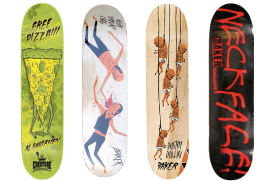
Neck Face
Neck Face is a anonymous graffiti artist and illustrator and is know for his more dark and grungy work which is also commonly comedic. He was born in California in 1984 where his work is featured on the streets but also in art galleries around the world, his first gallery show was when he was 18-years-old and was sponsored by Rich Jacobs and held at New Image Art gallery in West Hollywood, California. His drawing style is said to be rough and scratchy with bloody violent themes attached to his work. His first skateboard design was for krooked skateboards creating a pro model for skater Mark Gonzales. Neck face uses lots of mediums from marker pens spray paints and pencils but sharp metal masks, felt installations, and sculptures have been featured in his work.

Christoph Niemann
Christoph is an illustrator, graphic designer and author of several books but out of these things he is mainly known for his illustrations. He was born in 1970 in Waiblingen in west Germany. He studied in Germany and developed his art but his career really took off when he moved to New York in america in 1997 and worked on and created many covers for the popular magazines and news papers such as the new Yorker, Atlantic monthly and the new York times. His work follows lots of different styles as he uses lots of things to create his work from pencils to paints and painting with coffee.

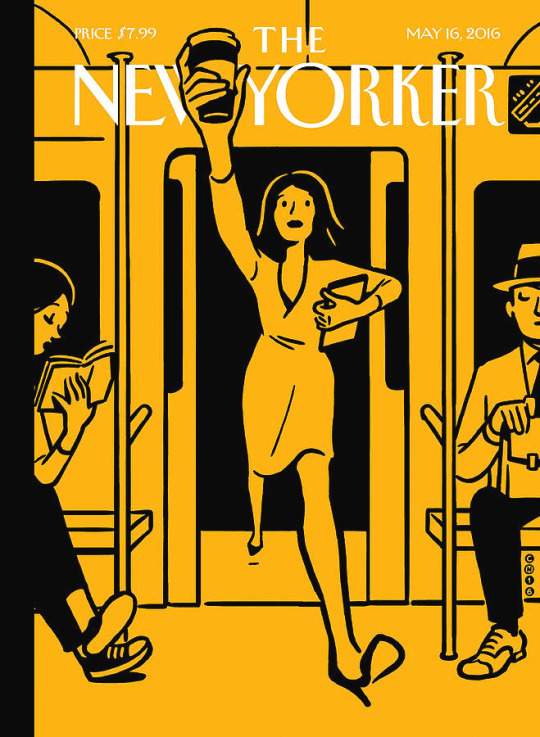
I do really like his illustrations and I think the reason why there so good is because of how creative and abstract some of the ideas are. He does things to help his imagination go wild and to help him create interesting ideas, for example he has multiple sketchbooks with one shape on the front and then he will fill the hole sketchbook with drawings incorporating the shape. One of the things he does to help his work be as creative as possible is that he says when things are going well you should always pick another direction allowing him to really experiment and create complex ideas.
The reason I am looking into this illustrator is because I watched a Netflix documentary and I really like the way he works.
His design process.
He usually does all his work in his office as he says he cant do it anywhere els and he will work from nine in the morning to six at night. He has everything he needs with him before he starts working allowing him to just start and create something. the thing that I like about his approach is that he doesn’t plan or wait for inspiration to hit him he will just start drawing and let the ideas come to him, he says “you haft to trust that crazy things happen”. He dose not like to put words or titles to his work as he feels that the illustration should explain itself and represent the contents its associated with. When he works to deadlines he dose not allow himself to experiment to much and he will just jump right in by putting pen to paper. He says that its not about waiting around for hours waiting for inspiration to arrive its about turning up and starting because once you start creating something creations and ideas take place and this is something that I really like the idea of and would like to try in my work.
After looking into artists and how they work within there specialisms I started creating ideas using idea generation techniques.
I set my self the task of coming up with 5 ideas and then I would narrow that idea down to one that would be ready to pitch or be approved to go forward with.
The main thing I did to come up with ideas was just let things and ideas come to my head randomly much like Christoph Niemann would, but the one thing I need to keep in mind is that with this project I want to step out of my comfort zone and try something new or tackle a project using new techniques or styles that I haven't used before.
I mainly used mind maps to help me build ideas.
The first mind map was titled buildings and this is because I really like modernist architecture and would like to learn more about perspective and making illustrations look more 3d and less flat.

This mind map is me thinking about the things I could lean and try like isometric architecture or designing floor plans but I also had the idea to create a set of building designs with a variety of buildings that shows different wealth levels so you could have run down houses for poor people and then some designs for middle class people and then luxury and billionaires.

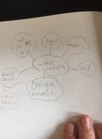
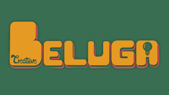
Beluga creative is a creative agencies that is being made so I thought I could make different advertisements such as social media ads and banners. Its my brothers company and he is a cinematographer and there is a model maker/animator and another artist involved, I already created the logo but more collateral would be helpful to help launch the project so that Is something I could do.
The next idea was logo design just because I have only really created a very small amount of logos and haven't really tried using different styles like negative space or custom hand drawn typography, also I really struggle to make simple design look good and a lot of logo design is very minimal so making some sort of logofolio I might get better at minimalism and logo design. Also there is a very high demand for logos to be made for short freelance project and If I get good at logo design I might be able to get some small logo design jobs.
Another idea that I explored was creating a clothing brand as it is something I have always wanted to do and I enjoy street ware but I feel like lots of it is to simplistic and lots of it looks the same so I would like to create a brand and garment using my designs. With this project I could explore lots of new things such as making a brand identity, putting graphics onto clothing and possibly doing some model making.
The next thing I thought about was tattoos because I am currently very interested in tattooing and all the styles so I thought I could look into different tattoo styles like traditional, realism and new school and try and design tattoos and could experiment with drawing or painting on people or projecting something onto someone and then inking over it.
one of the ways I came up with these ideas is a technique called crazy eights and the concept is to come up with 8 ideas in 8 minutes forcing yourself to think quickly and come up with ideas off the top of your head.
The eight ideas I came up with were, logo design, character design, food branding, illustrations of dogs and there experiences on walks, animate a staring contest that goes on for hours, coffe shop interior art, animated drawings, a leader board of animals that mark there territory the most and which areas they own.
After doing all this idea generation I came up with five ideas:
1 - set of buildings showing different levels of wealth.
2 - looking into tattoo styles and creating tattoo designs.
3 - create a clothing brand and garment design.
4 - create advertising and collateral for beluga creative.
5 - design logos working on things like minimalism and create a logo folio.
From these five ideas the two that I liked most are the building designs and clothing brand. The next thing I did was create mood boards for each one looking at others peoples work to see which topic inspires me most.
I have decided that the idea that I am going to go with is the idea of creating a verity of buildings that people might live in at different levels of wealth. I am picking this because I really like modernist architecture and like the idea of creating buildings but one of the main reasons I picked this is because of all the different techniques I can use to create the buildings for example I really struggle with perspective drawing and 3d drawing as I cant wrap my head round it so I would like to possible try and make some flat designs not look as flat. There is also software where I could create 3d models of buildings and I would also like to bring things back to basics and learn more about simple geometry and form as that is a big park of modernist architecture, i’m still not sure if I want to do my final piece in illustrator or Photoshop or something else but hopefully after this project I will have learnt more about drawing and will try some new things out.

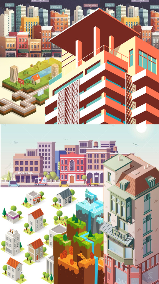
I went onto Behance to look at other artists work of buildings and here is was I found.
Oumomo - https://www.behance.net/gallery/24416351/building-illustration-and-motion-practice
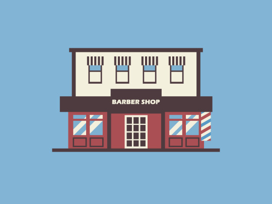
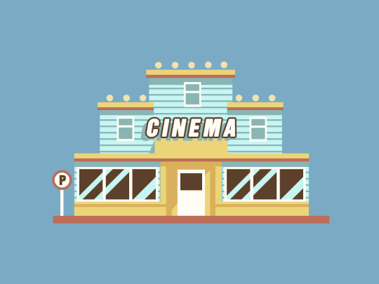
This work is by a designer called oumomo who is based in china, I really like the work in this project because I looks great but also shows very simplistic techniques using simple geometric shapes to construct the buildings. I really like the soft color pallet used and my personal favorite building is the barber shop as I think it has a really cool old possibly western feel to it and I think oumomo work is impressive because of nice his buildings look just by using a few shapes like squares and rectangles.
Anna Kajda - https://www.behance.net/gallery/16479195/3d-city

Anna Kajda is a 3d artist and illustrator from Germany. I looked at a project where she has created a 3d city and I really like how it looks. All the models have a very toy like feel and I think the people look a little like the old playmobeal toys. I really like all the shops and how fun the hole city looks with the vibrant colors and large shop signs like the large envelope on the top of the post office.
Rafael Varona - https://www.behance.net/gallery/16854501/Self-Promotional-Work?tracking_source=search%257Cbuildings&fbclid=IwAR1Xs9NIVsmgAbFcWK-o3YKaycbAHsgRQ79MZVqe9QI1jlNjtlirgwxB7wo


Rafael Varona is a illustrator and animater based in Berlin and Amsterdam. I really like this project because I think all the buildings and illustrations come together really well as one big scene, you can see in the buildings that they use simple geometric shapes but the main thing that I like about this project is a really like the pastel color pallet with the pink and blues but also the noisy dotted texture which makes the illustrations have a bit more depth with mild gradients.
lots of buildings today use simple geometric shapes and this comes from art movements such as the influentially art school the Bauhaus who helped pioneer modernist architecture. I have previously done a project on modernist architecture looking at movements such as the Bauhaus and Russian constructavism where I created museum in some game design software.
What is modernist architecture?
modernist architecture came around when the technology in material advanced for construction so more industrial materials came back and were used in sleek simplistic building designs. Materials That were heavily used were glass, steal and concrete. The main concept is that form should follow function and minimalism was modernism. The general building design within modernist architecture uses strong geometric shapes like squares and ovals and commonly use lots of glass like large windows and balconies, There general look of a building can look sleak and simplistic as large elements of structures are made of rectangles and squares. This style of architecture came around in the first half of the 20th century and is now heavily used for large buildings for banks and office buildings.
What are the key design elements of modernist architecture that will help you design your Museum.
If you look at buildings around places in London like kings cross or Liverpool street were there is lots of banks you can see theirs lots of examples of modernist architecture. The use of glass is heavily used as buildings have large windows either in separate squares but you also see very big large strips of glass that are windows which can wrap around buildings. Concrete is heavily used in buildings within this style and you will sometimes see large concrete rectangles layered on top of each other for floors or levels to a house. Its also about whats inside the building in terms of decoration, now this is going a little more into interior design but modern interior design follows the same principles and uses large amounts of geometry and minimal color pallet in furniture and wall paintings.
Modernist architecture mood board.
The Bauhaus.
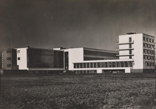
The Bauhaus was founded in 1919 in the city of Weimar by German architect Walter Gropius. It was around this time when the first world war ended so the economy was being rebuilt. Technology is always on the rise but it was around this time that large factories were built and were appearing making the process to build things quicker as large factories would now start mass producing things. The Bauhaus was created because the creators though art and design was fading away and one of the reasons was because of all this industry mass producing things making things less personal and more generic and they wanted to step away from this and merge lots of different elements of design together to bring back more freedom within the art world and less mass produced items making more personal pieces of art.
Design theories.
the Bauhaus’s main deign theory was that form follows function. The school educated there student on basic design and focused on composition and color theory to help the students follow this design theory making sure that a design also relates to how something works.
Production.
One of the reasons the Bauhaus was such a influential school was because they taught so many different things and tried to merge as much as possible together. Students of the Bauhaus were creating all sorts of art pieces from large installations made out of metal and clay or posters and advertisements using more traditional techniques like paint and different types of papers and fabrics to create textures. Because computers were not around everything was mainly hands on.
use of science and new technologies.
When the Bauhaus opened in 1919 art technology was very basic and most techniques and procedures were very traditional so like a said in terms of materials a lot of it was collage work/Photo montage pieces which were created by using fine blades and scalpels, papers and inks. Lots more technologies were being improved on like bottle making and Pyrex and clothing technology was advancing like the use of zippers on clothing items so there was lots of metal work, glass work and fabric being used to create.
Influence:
Photography
Graphic Design
Product Design
Architectural
Fine art
ceramics
metal work
interior design
fashion
sculpting
Function:
The Bauhaus wanted to open up a variety of subjects and different mediums to students and this is why they didn’t keep everything on one subject they gave students the opportunity to dabble in a variety of subjects and materials which is why it was so revolutionary with large amounts of work being produced that would change and inspire the design industry. The Bauhaus is well know for teaching with the concept of form over function meaning that what every look and design something is it should relate back to the form or function of the object or building. Looks are important but if one is not put with the other you could have bad design that is why you need to think how a look or design will affect the purpose of an item like a kettle for example.
Design Characteristics.
If you look at the Bauhaus and how it influenced architecture, art and design you can see recurring themes and styles. You can see a heavy use of geometry in furniture, buildings and art. composition and layout was heavily thought about as students made collages and posters. If you look at buildings that were possibly inspired by the movement you could possibly see sharp edges and geometric shapes like rectangles and oval elements within the construction and a large amount of glass from big windows and lots of smaller rectangular ones.
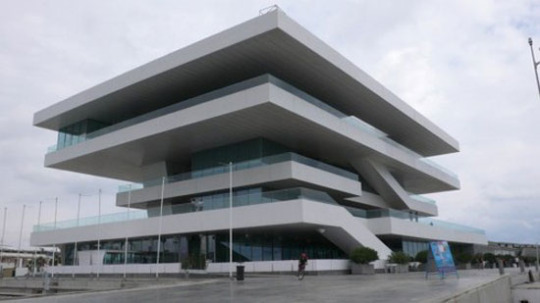
I went ahead and tried to do some perspecive drawing and just tried to work with simple geometric shapes.
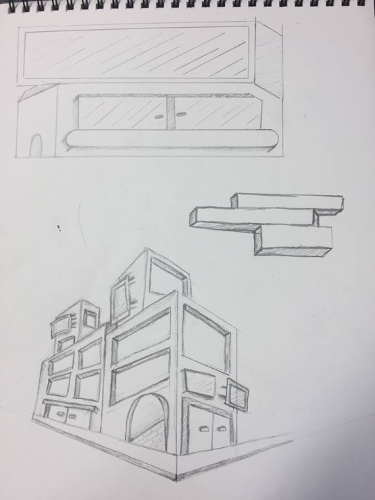
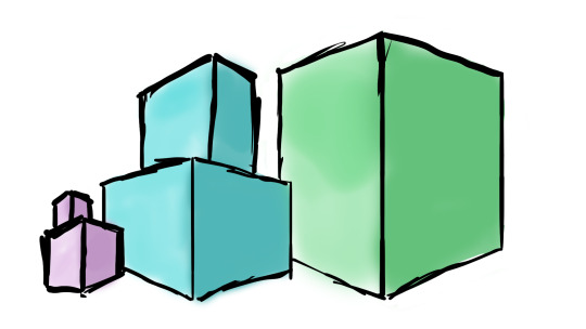
I found it really hard to get my head around how to make thin look more 3d and drawing things at different angles. I think I will really strugle to make my perspective drawings look good so I don’t think perspective drawing is for me so instead I will try working with a more 2d flat design but also try and make it look a little more 3D.
I started trying to work out how I want to make my building designs and what software I wanted to use so I thought the best way would be to test them.
The first specialism that I wanted to try and use for this project was illustration so I went into Photoshop and gave my self the challenge of drawing both a old run down abandoned house and a more wealthy modern looking house. I tried to go into this like the artist Christoph Niemann and he says that you should just start and let the ideas come to you, so I went into these drawings doing no sketches or tests I just started drawing and sure enough ideas came to me of things like where to place windows and the shapes I wanted to involve in the buildings designs. Here are my illustrations.
I really like the illustrations but I think the abandoned house looks better than the modern house, It might be cause I did it in a more rough scratchy style which makes it look like theirs more detail.
I am now going to try and create a building in illustrator and then compare the two specialisms to see which one I want to use.
Digital Drawing VS Vector Art.
I think both specialisms can come out with different looks but I think with digital drawing its easier to make things look a certain style and I feel like a lot of the time vector work in illustrator can often look very similar and just like one style bu with drawing you I think its possibly easier to create if you have the drawing skills. With vector work you can get exact shapes and make everything extremely precise with aligning things and tools but if your drawing it might be harder to get things lined up perfectly or create perfect curves and shapes. But I personally find it harder to get started when working with illustrator and it takes my longer to work out the sizes of shapes and color but this is possibly because its so easy to change the size of things and manipulate the vectors so I spend to long doing that but with digital drawing I tend to work quicker and spend less time manipulating things and just start sketching and drawing. I have only started digital drawing and am enjoying it but with my skill set of digital drawing and vector work my vectors can look very clean and professional whilst my drawings are rough and have a more scratchy look to them but I enjoy both but for this project I want to keep things looking clean and sleek so I think I might stick to illustrator rather than hand drawing in Photoshop.
I like the 2d vector art i have created and then I tried to used shadows gradients and opacity variants to try and bring some depth to the building and make it look a little more 3d. Because I wanted to experiment further into 3d I learnt some new things in illustrator about mapping pre made vector graphics to the perspective grid. I tried to place my flat house design on two sides of the grid to see what it looked like and here it is.
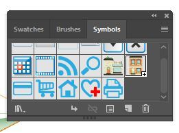
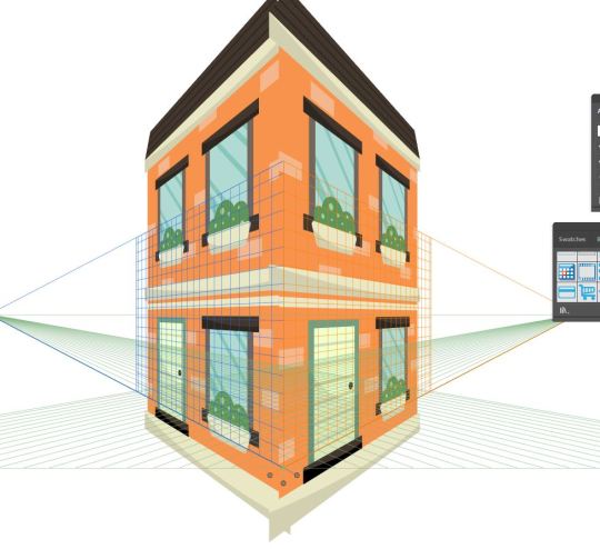
I did this by opening up my symbols panel and draged the building design into it turning it into a symbol, I then took the perspective selection tool and draged the new house symbol onto the grid and illustrator mapped it on.
I think this does show perspective and you can tell its a house but I think I would really struggle to use this technique and make it look clean and not tacky so I am most likely going to use a more common graphic design 2d style for my buildings and then use thought out shadows to give them more depth.
Before I 100% decide to make my buildings as flat vectors in illustrator I want to try and create some isometric buildings to see how difficult it is and if I like it.
I have created some isometric artwork before using the extrude and bevel options within illustrator to make 2d shapes 3d.
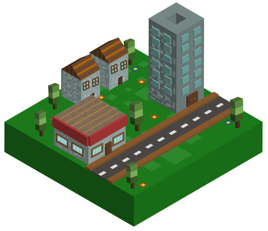
But I want to try a different way and make my own isometric grid using equilateral triangles and then I will used the pen tool to create shapes that will make a building.
I made the grid by taking the line tool and making a large row of long lines, I then grouped the lines and duplicated them and rotated the duplication 60 degrees with the rotation tool. I then duplicated that and reflected it creating my isometric grid. I then used the pen tool and tried to use perspective to build some sort of simple isometric building.
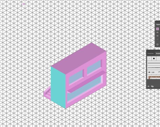
Here is the small building I made.

I found it really tricky to make my isometric design look good and I really struggled to get my head around trying to make things look more 3d, I am glad I tried it but it took a look of time to create something that dose not look that profession so I don’t think isometric design is for me.
I am starting the building designs now I know what specialist techniques I am going to use. I also want to try and choose color pallets for the buildings and I could possibly make 2 buildings for each custom color pallet I make. I will be making the color pallets using a custom pallet site on google.
Now that I have started designing I thought it might look nice to put the buildings on a circular backdrop making them almost look like icons.
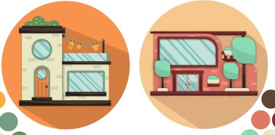
but this became a slight problem as the original idea was to create buildings at different price point so I wanted to create some large houses but when I took a large house and put it into the circular border it wouldn't look good next to the other buildings and there was too much space left in the circle.
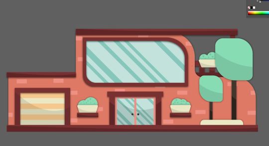
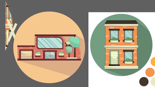
so to fix this I will keep all the houses smaller so they fit in the circle which you can see here as I made the bigger house smaller.
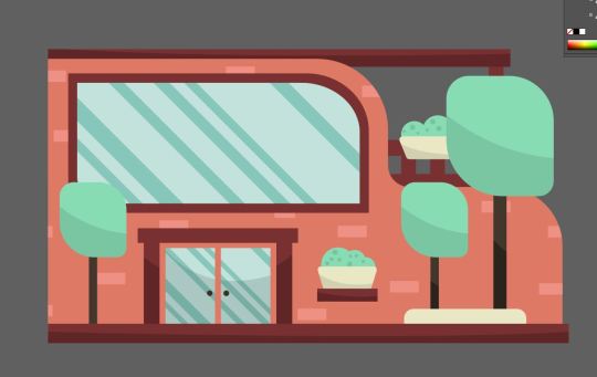
Because of this I am going to try and use techniques used in modernist architecture like large windows and more common geometric forms related to luxury housing so you can distinguish a house being more expensive not by the size but by how it looks.
for example here the houses are similar sizes but hopefully the house on the right looks more expensive than the one on the left.

I also intend on putting the houses in a layout of price order making it more obvious which are the more expensive and less expensive houses.
I Was told that the Icon look that I was creating was a little dated by the way the buildings have this big dark shadow coming off it so I came up with another border which was by making the circle smaller so the building is overlapping out of it and then the circle consists of two colors for each half to the circle.

I also created roofs for two of my buildings but I got rid of them because it made the buildings with roofs not fit with the others when you look at perspective.


Now that I have made a couple buildings trying to make them look at different price points I need to think about how I am going to present them, I could make one large poster or present them on a road in price order. I could make an advertisement selling the houses or an info graphic piece.
I made a quick poster showcasing one of the buildings to help me work out how I want to present my designs.
Here is the poster I made in a vintage style.

I wanted to put some text on the poster so I thought I would try and do some custom typography, I have created type before bey drawing it on paper, scanning it in and turning it into a vector but I wondered if I would be able to use a wacom pen and tablet and just draw the word so I gave it a try in Photoshop.
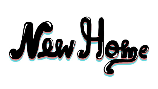
It dose not look terrible but it looks very rough and not like a clean vector. I tried adding it to the poster but I think It didn't work and made it look bad.
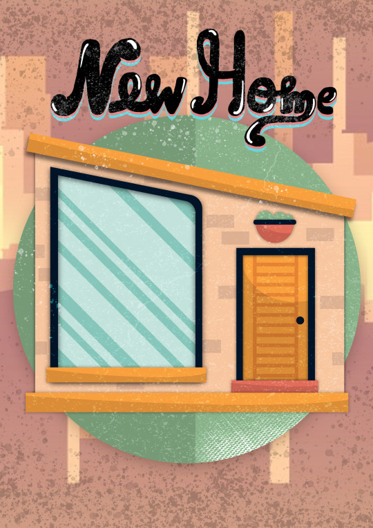
After making this poster I do like the idea of creating some sort of set of vintage posters advertising a house for sale and I could possibly use unrealistic prices like 50 pence for a home. I could also split the houses into 3 or 4 categories variation in price so I could create 4 backgrounds for the houses to go on.
I could also just have a few posters for my buildings and then a generic info graphic piece displaying all the houses and prices.
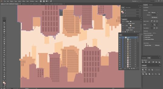
I really like the idea of having a new York looking skyline as a background so I made this simple skyline by using a minimal color pallet and mainly rectangles and squares to create a geometric clean new York looking skyline.
In the quick poster design I did I used the brush tool to paint on some textures that made it look a little dirty and aged, I also used to images which made it look aged and I like the vintage retro look it had at the end so this is an angle that I might want to take with my work, so I am going to look at some a vintage house advertisements as this is a road I might go down. So essentially the final piece could be an advertisement that an estate agent might put on show showing the variety of houses I have created at different price points.
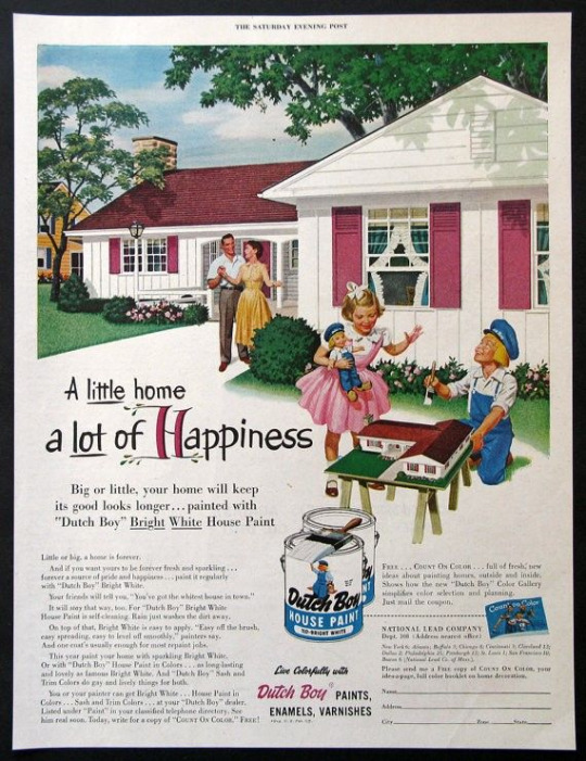

I worked in illustrator to create all the buildings taking influence from modernist architecture and buildings. I created lots of custom color pallets and used less high saturated colors because I think pastel colors are a little easier on the eyes but also when it comes to print if i was using high contrast web colors when you print it, it will look less contrasted or faded. The lighter less saturated colors also work well with the vintage style I am trying to portray.
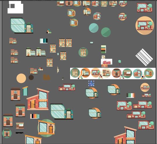
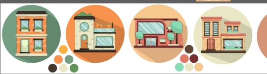
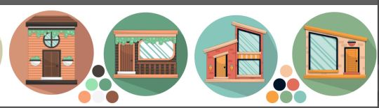
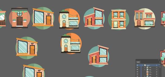
I also created lots of designs for the houses experimenting with form and thinking about how I would portray modernism in my work. I also looked at the designs both with shadows and as flat vectors.
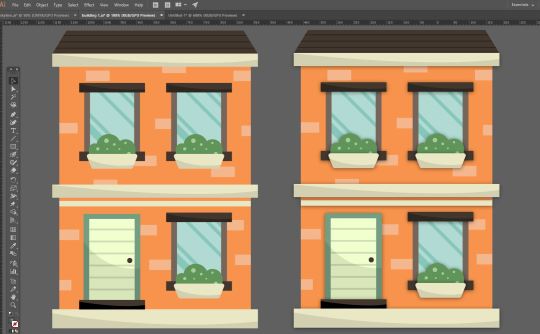
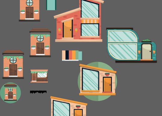
Whilst I was creating my buildings I was constantly getting inspiration form google and looking and different buildings and focusing on different elements of the buildings like looking at the angles of the roofs, different windows and doors, wood paneling and concrete highlighting parts of a building and other things like balconies and plants.

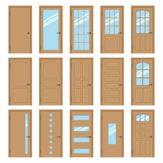
Because I was exploring modernist architecture I wanted to create some more complex shapes in illustrator whilst keeping it looking geometric. If you look at expensive buildings some have less square like shapes and sometimes involve more curves and rounded edges.
I learnt a new thing in illustrator which allowed me to round the edges of corners separately by simply double clicking the small section of a shape which you would drag to round a shape and this let me create more complex shapes for the buildings that were meant to look more expensive.
I then placed the buildings on the background and put them in different sizes and they look like floating bubbles.
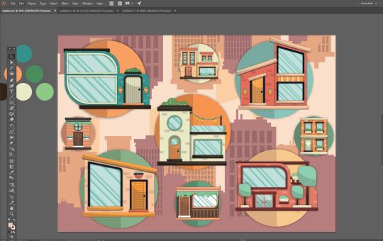
one thing that I want to do is add the prices and because I am going to add some vintage textures to the design and I have a new York style skyline background I thought I could add unrealistic pricing and make the buildings 50 cent or 25 cent like you would see in old ice cream advertisements.

But I will still represent the value of the cheap and more expensive houses by making the cheaper ones 15 or 20 cent and then the expensive house 99 cent for example.

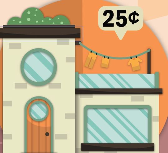
It was suggested to me that my work looked possibly too staged and that I should try and experiment and make buildings overlap and come of the page, but my problem with this is that I think when its coming off the page it looks it doesn't look right and because this is going to displayed for the end of year show I want to display my graphics and not make them look cut up also people might think the printer as messed up or I have done a dodgy crop, basically I am not a huge fan of this idea and will go on with my other layout displaying my work.
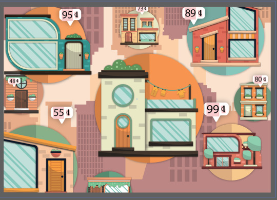
Now that I have the design work in illustrator finished I went into Photoshop so finish by drawing some custom textures using dots and scatter brushes and then changing the blending modes and opacity so it works as a texture and dose not change the colors or vibrancy of the image.
Here is my final piece.
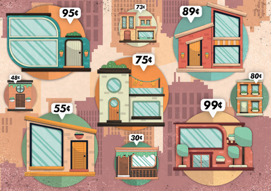
Here it is on Behance.
https://www.behance.net/gallery/81269061/Buildings-Project
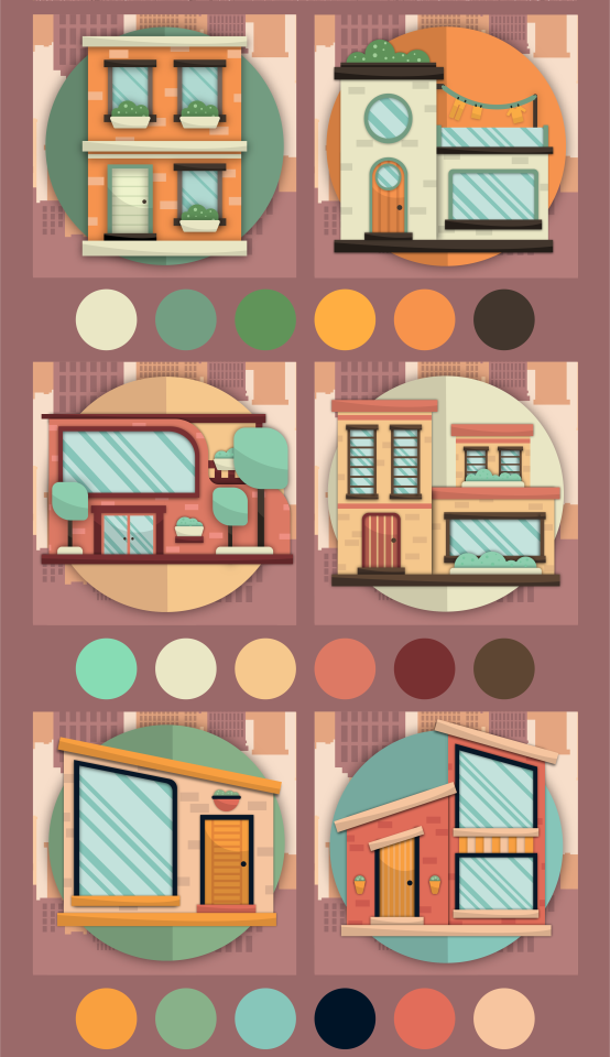
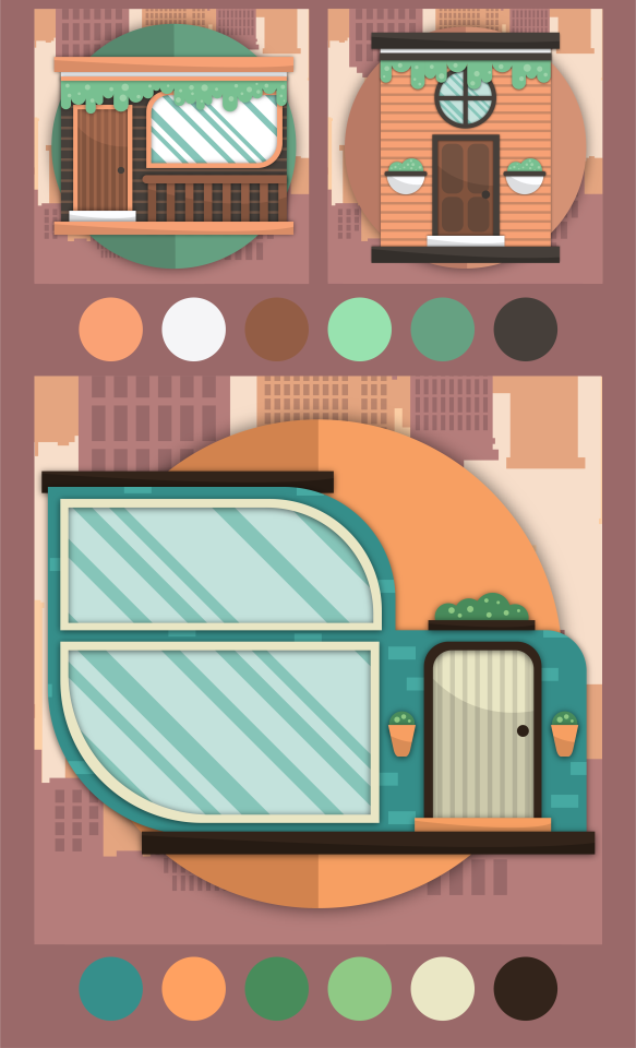
Evaluation:
Whats the final idea,
The final idea was to create an advertisement advertising a variety of buildings at different price points in a retro/vintage style. The buildings should express value by its architecture and size and the prices of the buildings will be inaccurate and will be done in cent to represent old american vintage advertisements for things like ice cream and candy.
How did you arrive at these Ideas.
To arrive at my final idea I looked into lots of specialisms and focused on elements of graphic design I enjoy. I tried lots of things out and after lots of mind mapping and idea generation like creating ideas in short amounts of time forcing myself to come up with quick good and bad ideas on different topics that I want to explore in graphic design as well as bouncing off words and looking into artists and getting inspiration.
what specific approaches did you practice?
I this project I wanted to try lots of different things until I truly knew how I wanted to create my final piece, I practiced digital drawing and vector illustration as well as trying to learn more about perspective drawing grids, and isometric artwork. But the finalized approach would be that I use adobe illustrator to create vector illustrations and would try and use simple geometric form and modernist architecture to influence my building designs as well as using gradients and shadows to try and give my flat 2d designs more depth instead of heavily relying on perspective.
What issues did I encounter?
When I was experimenting with perspective I tried to put a flat building design on the perspective grid so I could make sides and It didn't work, I was also struggling to curve edges and create complex shapes in illustrator.
How did you over come these issues?
I turned my building into a symbol and then made sure it didn't have any affects on it so it when locked onto the grid and I also learnt that I could click on section of a shape like a rectangle and curve individual corners instead of curving the whole shape, and with this simple new technique I was able to create more complex shapes with curves rectangles and ovals.
what have you learnt during this project?
I used the perspective grid in illustrator for the first time and learnt how to map pre made graphics onto it. I also learnt how to set up an isometric grid and create isometric vector art in illustrator. After doing research into modernist architecture and just looking at buildings I learnt lots about the different forms and shapes used to create windows and doors.
What do you like
I really like some of the buildings that I created especially once I designed for the higher price point as I enjoyed coming up with concepts for houses and designing them. I am also a fan of all the custom color pallets a created and then used for the buildings thinking about which colors would work well for the windows plants and other elements of the buildings. I also really like the simple new York city style skyline I created for my background as I basically used just squares and rectangles and I nice color pallet to create the skyline and I think it looks nice and works as a background complementing the building designs on top of it.
What do you not like.
Personally its a bit confusing what the final piece is or what its purpose is for and I think I could of fixed this by possibly creating a logo for an estate agents or created some custom text that said something like houses for sale. The price tags do make it understandable that its an advertisement for houses for sale but I think I could of possible communicated that better within my design. Also I am not a massive fan of all the buildings for example there are one or two that I just don’t think look as good as the other ones and I could of kept them out of the final piece and I have learnt you don’t have to use everything you create. Lastly the composition could be improved on as it looks possibly a little crammed.

0 notes
Text
Brayden Schrader
Documentary and Photography
David B
Feb 7 2019
Activism
Photography is a never ending subject and will continue to change everyday. There are so many different types of ways to photograph something and how to do it. One big subject of photography is Documentary. I like in the beginning of the book how it states that basically every photography is documentary, because it's kinda true. No matter what the photograph is its documenting something. Whether it's a piece of candy or homeless people, it's still evidence in front of the camera that you captured. This entire subject is hard to process, because where do you draw the line? What really is classified as documentary?
The book talks about documentary being a journey, and I fully agree with that. I think in order to fully say you're doing something for documentary you have to have spent a good amount of time studying that subject, and only focusing on that. You can't just photograph the mountains once and call it quits and say boom I did a documentary on the mountains. You've gotta revisit those mountains time after time to see the change and to show how that place has evolved or changed. To me, the best galleries of documentary are the ones who spent months and months even years at the location, shooting everything they could.
I think one of the biggest problems today about how documentary has changed is simply photoshop and image manipulation. People thrive to get that best image, and best composition, and are willing to do anything they can to get in the spotlight. Because of this people will tend to move things around in the frame or delete something in the frame to make it that much more appealing to the eye. Us photographers understand that little things can distract the eye or engage the eye even more to the photo, and that's why I think it's so hard to do Documentary photography. Whatever your eye sees, needs to be the picture. You cant remove something or alter how it looks, because that's not documentary anymore.
Still to this day I believe war photography is hands down the best documentary to me. It doesn't matter how many times somebody shows me a war photograph, I'm instantly appealed to it. I think im very intrigued by it mainly because I've never seen anything like this before. The photographs shows nothing but the truth of what happened. It shows the thousands of people who gave their life for this country, and how this country was built and formed. People forgot very quickly about our past and what has happened to get where we are today. The war photographs will forever be around to show the world and show the brutal honesty of what happened. There is no sugar coating anything or something fake. What you see…. Is what happened…


0 notes
Text
Caitlin’s Three Things List
Okay, so moments (probably hours by the time I finish this) ago I wrote a goals list that I think is good for self-evaluation. (Keyword: This is what I think. results may vary depending on what you’re looking for.)
I’m going to hop to it and answer some of these that I laid out in hopes of having a better idea of what I want to accomplish.
The Three Things Lists!
1) Three things that went well this year.
* Audience growth
So once upon a time, I grew a pretty decent following due to creating an Inktober Prompt list. My expectations: Maybe two of my friends would do this, maybe. And then one stranger that has followed me for a while. (There are a few followers I recognize their username because if I post something they always like it and for some reason that keeps me going.)
But because of this prompt, I was exposed to MANY new creators and illustrators that I now enjoy chatting with and following! Instagram had the biggest maintained growth. I’m excited to create for an audience that actually expects me to create and not just for friends who see my things “whenever they aren’t busy”. (Not to bash them or anything, just there are a lot where unless I tell them, they don’t see the posts I make.)
Another surge of growth in my audience was due to tabling at conventions this year. I was terrified to show my work let alone attempt to sell it to someone. Tabling at cons not only boosted my confidence but also quieted one of my ever going demons. “YoU sUcK aT dRaWiNg CaItLiN.” “How do you have a degree? oh right, you just barely passed.” I can’t say this is the case, there is an audience that genuinely enjoys my scribbles. So I am forever thankful to Atlanta Comic Con for giving me that chance. It honestly opened a few doors for me.
**Process
I’ve gotten more comfortable with showing my process. It can be messy, crisp, and illogical. But turns out the people who enjoy my content enjoy my scrambled thoughts. It’s something about not being alone in this sort of sense that calms the nerves.
So I can say with chest poked out that sharing process has gotten MUCH better. I can thank a self-help book I bought this year that was a FANTASTIC BUY. Austin Kleon has [two] (currently? If he has more then I’m buying it like people buy a name brand.) books that helped me see that it is GREAT to share not only the process but advice. “Show Your Work” is the book I’m talking about for now. Great tips, the outline is on the back of the book. So if you’re like me, I need to clearly see what I might be getting into, you might have a ball.
And finally, (not calling myself out on this but other) If you’re going to respond to people when they ask you “how do you___?” do not answer “Google it”. That is the rudest thing I’ve seen some of even my FAVORITE illustrators do; that response can burn in hell. PERIODT. (my one typo allowed.)
*** Art Style Exploration
For those who think college will help you establish an art style that you’ll enjoy or help nourish the one you currently have.... Let me save you over 80K.... No, the fuck it won’t.
That was the biggest thought I had going into art school. If anything, it confused me more and utterly destroyed what little confidence I had in my drawing style. After graduating, I had a huge swing from how I used to draw to how my art currently looks. I stopped trying to please the one professor who stood between me and my degree and started drawing to please my tastes. And guess what? That did something. And that something WORKED. I love what I draw now; I see why I chose this as my career path. I’m genuinely happy with how my pieces turn out versus in college just wanting to turn the damn thing in and hoping it isn’t an F.
2) Three things you could have handled better.
* The loss of a good paying client.
Now hear me out when I say this: A good paying client DOES NOT EQUAL a good client. Say that three times and then exhale.
Back earlier this year, I had the opportunity to work with a writer who gave me hell and back. And even that is an understatement. I dealt with her because in school you were taught “if they pay on time, finish the work and get the exposure.”
I’m here to tell you my lesson learned: A good paying client DOES NOT EQUAL good exposure, good pay, a good client.
I was doing the work of three for the price of one and a half. (And was always told I charged too much.) She tried abusing this power with friends of mine, with other illustrators. When things turned out bad, she tried saying it was my fault. She read my contract and then tried telling me I changed the wording, I purposely did this thing, another thing was my fault. I could go on with this story.
The part that I wish I handled better?
How I treated myself afterward. I’m so used to people telling me, “Cait, this is what you do wrong. This is how you fix it.” that I don’t consider my own feelings, and when I bring my feelings into the scenario they no longer matter. Because they tell me they don’t matter. In this case, I wish I had treated me better, because my feelings, my mental health, DOES matter.
**My Patience Getting Into Conventions.
Pretty self-explanatory. I got into one, finished one, and wanted to do eight more in a week. But this sort of thing just takes time and I need to accept that.
***My losses
I had to listen to a Little Mix song to actually learn this one. The context of the song is nowhere near the topic at hand. But a verse from Power feat Stomzy really packs a punch after this year:
“ You look him in the eye and say, "I know I'm not a guy
But see there's power in my losses and there's power in my wins" “
I had to look one of my demons in the face, and state something similar. My loses mean I’m trying. My loses piling shows I’m not willing to give up easily, and that is something that took a while to be content with.
3) Three things artistically you want to improve on.
*Composition
It’s not awful, but it can be better.
**Color
I told this BOLDLY if I might add while critiquing someone else’s portfolio; “Your color palette is boring. All your [things] look as if they are from the same universe, during the same time of day, with the same kind of mood. After three photos it’s bland, boring, and understood you have a preference.”
Can you say damn Cait? The statement was, in fact, true, but I certainly could not talk. My color palette is mainly bright, pop, and happy. In order to tell a story, I KNOW it is best told with color. And I failed myself this year. But I sure won’t next year.
***My Damn Tag
Okay, alright. Why is it well-established artists have their tag figured out? Even some who’s art style is so recognizable (I’m looking HEAVILY at you Gabriel Piccolo.) we know it’s theirs, seem to have a tag that suits them and works for them. But more importantly, they put it in A VERY DECENT SPOT. SOMEONE SHARE THIS SCIENCE WITH ME? CAUSE APPARENTLY I DON’T GET IT.
4) Three things you want to focus on trying.
*More backgrounds.
As much as it pains me, I need to improve on backgrounds and perspective. When I do make backgrounds, I’m told I make great pieces. That I should look into becoming a background artist. And don’t get me wrong, I like them. But I don’t like them.
I feel as though I need to improve in that region so that way I don’t feel as though it’s a weakness of mine. My backgrounds are nice, but they aren’t nice to my standards.
**More designs
I love character designs, but let’s be real. If you were to scroll down my site or my Instagram page, or even this Tumblr archive, could you tell?
I draw characters a lot sure, but none are designs. No process, no sheets, no turnarounds, none of that. So that’s a huge goal of mine for 2019.
***Scheduling posting
At one point I was pretty good at this. Live stream in Instagram and Twitter, cool. Videos on Facebook, Twitter, and Instagram. Cool. Everywhere gets a photo, everywhere gets a silly one-liner. Yay. I’m not leaving anything out.
Well by the end of this year that totally crumbled.
SO I want to try getting better at that thing there. Because having attempted this at the end of the year was cool, but it still wasn’t enough apparently.
5) Three positive things to tell yourself.
* You are an inspiration. That’s all you wanted to be in life, you did it. I’m proud of you.
**You didn’t kill yourself like you tried to; you opened up about it for once and used that pint up anger creatively. That is very hard to do, trust. I’m proud of you.
***You moved on, matured, and let it go. Even when the goddess inside you told you these peasants didn’t deserve your light, your friendship, your greatness. I’m proud of you.
I’m just proud of me for not snapping when I had every right to; not everything deserves a reaction.
6) Three negative things you want to leave for 2018.
*Comparisons
Oh boy. I am extremely guilty for this: I’ll compare myself to a well-known illustrator my age. I’ll compare myself to friends who are in the field having a blast and getting work; I’ll compare myself to friends who aren’t in the field and they struggle at getting work. I’ll compare myself to the kid I graduated high school with who is traveling the world, is able to eat, come home to his dog and relax because he doesn’t have tuition to pay. I’ll compare myself to these goddamn baby boomers who keep repeating “We didn’t have it hard, you’re just being stupid. Millennials aka our children deserve to starve. We’ll just put our faith in our grandchildren because screw the kids we raised and refuse to pay accordingly. $7 an hour worked in my day, they need to make it work now.” I’ll compare myself to fake people I created in my head and purposely made scenarios and wonder why I’m not like them, said creations I made because I was pretty low for ten minutes...
I just compare myself too much. To any damn body. It’s draining, obnoxious and most of all pointless. My new motto for next year is: “Unless it is helping you grow yourself, your brand, your spirituality, don’t do it.”
I’m not comparing my chapter two to someone’s chapter thirty-five. I’m not even comparing my chapter two to someone else’s chapter two. I need to stop doing that PERIOD! My journey is different, unique, and worth seeing through.
**Listening to negative others.
A couple of years ago, I lost a close friend around the time my aunt passed away. During this time I was hypersensitive to any and everything done or said; I also kept many walls up to hide my mourning. He caught the crossfire of all of that. I kept secrets from him I was too prideful of admitting and lashed out because of the emotional turmoil I kept suppressed. While in the midst of packing his things and leaving my life, he mentioned that I was a failure because I was unemployed and artistically speaking I hadn’t accomplished anything; that I would remain that way because that’s just the person I deserved to be. Now mind you, I graduated college that year; he was a flunk out. I changed my art style dramatically compared to when I started school to pass; he thought just posting crappy pictures of lukewarm sketches were equivalent. I started attempting trends and all he could do was copy. Don’t get me wrong, this isn’t to bash my old friend. If he were to come back into my life and move on like nothing had happened I’d do the same. (With some limitations.)
It’s just while typing out this scenario, of our four-year friendship I can’t think of one nice thing/compliment/gesture he has said to me. That’s my problem.
I can be praised, admired, and look highly upon for years straight. But my problem is I let others negative thinking and comments marinate with me for a long while. Too long of a while.
Another example is my mother’s friend. (My mom has many friends that do this shit, but this one stung more.)
This friend always roots for me; treats me like a person, and encourages my artistic journey. I consider her family before my actual relatives.
We went over for some barbeque the family was having and I was ready. Black Hallmark Cookouts, laughing, good food, good music, shit talking others teams. She asked me a harmless question of when was I going to quit my day job. Seemed like nothing at first, until the added gest of what she continued with. “All I’m saying is you can’t do [your day job] forever. That will get old. If the art thing doesn’t work out next year what’s plan b?”
I’m not a calm person (usually). Normal Caitlin would have cursed her out and mentioned how just because she chose a job to settle and be miserable at for most of her life doesn’t mean I have to follow suit. But again, of all the nice encouraging things she has done, said, and showed, for a while, I couldn’t think of it.
So I pray I let go of this nasty behavior in 2018; it’s going to be hard but it is dire.
***Saying I’m Not Enough
Alright, now put the combination of the two above in a bowl and what do you get? A Caitlin who struggles in interviews and applying for jobs because I let comparisons and negative comments rule my thoughts. This stopped me from applying to jobs I would have been perfect for; internships that could have helped me; posting art online.
We (including me) have to stop thinking that in order to be an illustrator means we have to pass a certain threshold of struggle, success, and a huge number of followers. That isn’t the job description. NO JOB DESCRIPTION has ”must have at least 10K followers on Instagram or Twitter.” nOnE.
So we (including me) need to stop treating ourselves this way. Period.
7) Three things you’re looking forward to in 2019.
*Going to move conventions.
**Adding pieces to my portfolio to try again at job hunting.
***Becoming content with the fact that my current situation isn’t my permanent situation. Unless I laze around and make it so.
Alright, so this was basically me calling myself out on my noise. Lashing out my demons and putting it in writing what I want to accomplish. I hope this inspires you to write yours, even if you keep it private. I hope it guides you and maintains your vision.
I’ll see you in 2019
A new wave
Caitlin xx
0 notes
Text
Conventions:
In this blog i am going to cover conventions and different types of conventions in and around photography. In my photography lesson with John, we covered conventions of a mugshot, conventions of a wedding shoot and the OJ Simpson trial.
A convention is a belief that is common in society of how a certain thing should be. For example, a convention of school would be that you start around 9am and finish at 3pm with only a lunch break. Conventions are mostly made to maintain order within society.
Mugshots:
1.) What conventions does your mugshot follow?
My mugshot:

As you can see, this photograph is very high contrast and is black and white. I did this using Photoshop and this is some of many conventions of a mugshot. This is a convention because when mugshots first came around in police stations etc, colour photography didn't exist. In addition, when colour photography came around, it was too expensive to produce. Another convention is the fact that i have used flash. The flash that i had used created a shadow behind the model and this is a convention because when a mugshot is taken, you need the shadow as part of the subject’s identity. Furthermore, the composition that I have chosen to use is another convention because it is very much filling the frame. Also, i have a side profile of the subject which is a common thing in mugshots. IF i were to do this task again, i would include a front facing picture also to make it more realistic and put them side by side. In addition, i would also include an ID board and a height chart to add to the authenticity of the mugshot as a whole.
2.) How did you know about these conventions?
Mainly i knew about these conventions because of media outlets such as news papers or TV shows/music videos. For example, in the Oli Murs music video, Dance with me tonight, he gets arrested and has his mugshot taken. The pictures then come out the printer. Furthermore, you see them in the news paper when a celebrity or a high profile criminal is arrested. I knew mostly what they were and how to do them because i just payed attention really.
3.) How does following these conventions make the viewer *feel* about the subject?
Well.. say a high profile criminal was having his/her mugshot taken. It would end up in the news paper. Coincidentally, a lot of people would see this and probably gain a lot more information about why they are a high profile criminal. They would already be intimidated by this. Also, the fact that the mugshot would mostly be black and white would add to the intimidation because a black and white filter and high contrast always makes a person look more intimidating. Furthermore, news papers predominantly use a front facing mugshot rather than the side facing one. This would add to the intimidation because the criminal is essentially staring right into the camera.
On the other hand, because the criminal looks so dangerous the viewer may feel relieved that they’re in prison or glad that they are off the streets as well as intimidated by the person.
Weddings:
4.) What's wrong with each photo?
5.) How does it change the meaning of the photograph? What unwanted meanings do we now have?
. Photo 1.)

In my opinion, this photograph is very generic for a wedding shoot and lacks originality. This is because it is the typical couple holding each other with leaving space background. Also, to improve this photograph I would definitely increase the depth of field so that you can focus on the newly married couple more. I just feel that the white stature takes away the focus of the viewer a little. This type of photograph doesn't necessarily change the meaning but upon seeing this, I would think that the photographer lacks originality as much as the couple. If this were my wedding photograph i wouldn't be impressed as it doesn't portray the couple right. Surely they could all be more creative?
Photo 2.)

In my opinion. Location for a wedding photograph is everything. Although there is a nice clear sky, this rubbish dump is quite literally a rubbish background for a wedding photograph. Location is everything because without the right one the photograph as a whole doesn't look right. The only good thing about this photograph is the fact that you can see the couple better because they are closer to the foreground of the photograph. This affects the meaning of the photograph because it no longer looks like a wedding photograph, i would say it looks like more of a comedy photograph. This is because it is taken in a rubbish dump site. Furthermore, if this were real, i would think that the couple have no sense of pride in their special day and that the photographer just wants to get paid rather than do a really good job.
Photo 3.)

Clearly, another thing that you need to consider when photographing a wedding is your distance from the subject. In this photograph you cant even see most of the couple as they are being covered by a post in the middle of the shopping centre. Furthermore, the location isn’t great in this photograph either. The impression that i get from this photograph is that the photographer is unskilled. This is because the composition looks off as well as the fact that you can even see what the subject is supposed to be properly.Furthermore, If these were my wedding photos, i would look quite cheap or unconventional because the background isn't nice. It’s a shopping centre.
6.) What does these examples teach us about the importance of conventions?
All these examples have taught me that the photograph won’t look right/will give off a bad impression if you don’t get the basic foundations of location, distance from subject etc. Furthermore, it teaches me that without even noticing, you just expect the conventions to be there.
0 notes
Last Seen Blogs

mojtabaheidarpanah
Mojtaba Heidarpanah

iunity-blog
Sin título

jcigas
Lex

glitchsthetic
tv shows

vingadosetevezes-blog-blog
Ambrosia;