#neutral color palette scheme
Photo

Orange County Enclosed
Inspiration for a mid-sized eclectic formal and enclosed carpeted and multicolored floor living room remodel with beige walls, a standard fireplace and a tile fireplace
#neutral color palette scheme#transitional living room#beige sofa#travertine coffee table#coffee table top decor#granite fireplace mantel
0 notes
Text

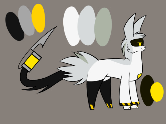
Tender Sugar - Alias Conrad Coldwood
★ #826662 ★ #BDAFA0 ★ #FCF8E1 ★ #523538 ★ #1C0E0F ★
#color palette#cecilpal#not requested#song palette#game palette#alias conrad coldwood#off (game)#color: white#color: brown#color: black#scheme: gradient#scheme: monochrome#scheme: desaturated#scheme: neutral#5 colors
4 notes
·
View notes
Text
Exploring Inspiring Color Palettes For Home Design
Exploring Inspiring Color Palettes For Home Design - #homeimprovementreferral #ColorScheme, #HomeSpace, #InteriorDesign - https://www.homeimprovementreferral.com/exploring-inspiring-color-palettes-for-home-design-2024-04/
#color#Color Consistency#color palettes#color scheme#Color Temperature#Neutral Colors#Solid Colors#Warm Colors
0 notes
Text
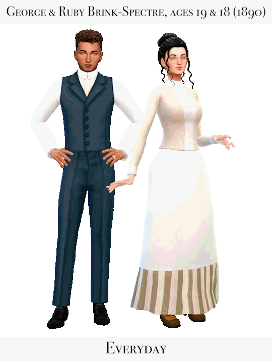

George and Ruby's outfits going into the 1890s represent the odd dichotomy of their new lives. On one hand, they live a relatively "simple" life on Ruby's father's farm, and are compelled to dress practically, in simple, sturdy clothes, in order to support a lifestyle of hard labor. On the other hand, they have Moses's consistent financial support - less so cash, more often in the form of lavish gifts, especially of expensive clothing. They often have multiple outfits for the same occasion, one more expensive, and one more practical.
George in particular has taken to Moses's habit of giving gifts. George finds the promise of wealth infinitely appealing, and although he hasn't yet obtained said wealth, Moses's expensive presents often make him feel as if he has. Because of this influence from his father-in-law, George's outfits have also trended more towards Moses's all-black color scheme, becoming darker in color and adding in more blues and jewel tones, to replace George's teenage greens and yellows. He dresses in Moses's gift-clothing whenever possible, only returning to more practical garments while working on the farm.
Ruby, on the other hand, seems discomforted by the expensive clothes her father throws at her. Her hunger for independence and identity tends to push her away from making use of his gifts, no matter how lovely. She does dress up when he asks her to, or when the situation arises, but otherwise Ruby favors sturdy, comfortable, practical clothing. Some of her outfits do retain her teenage greens and yellows, especially those given to her by Moses, but the majority of her clothes are in a soft, neutral color palette, made up of mostly creams and browns. Still, Ruby does have a taste for drama, and what she lacks in fashionable clothing, she makes up for in her variable, expressive hats, often covered in flowers or feathers.
Links below the cut
George
Genetics: Skinblend / Eye shape / Blush / Hair / Beard (High School Years)
Everyday: Outfit / Shoes / Ring (Basegame)
On The Farm: Outfit
Going Out: Jacket / Pants / Hat / Gloves (Get to Work)
Wedding: Outfit / Hat / Gloves (Get to Work)
Formal: Top / Pants / Hat
Underthings: Pants
Sleep: Union Suit (TSR warning)
Morning: Robe / Slippers (Basegame)
Hot Weather 1: Outfit / Hat
Hot Weather 2: Outfit / Hat
Cold Weather 1: Outfit / Scarf / Hat
Cold Weather 2: Outfit / Scarf / Hat (Basegame)
Ruby
Genetics: Skinblend / Eye shape / Structure (retired) / Nose Details / Eyebags / Updo / Blush (High School Years)
Everyday: Glasses (TSR warning) / Top / Skirt / Apron Acc / Ring / Shoes (Post deleted)
On The Farm: Hat / Top / Skirt & Apron Acc
Going Out: Hat / Outfit (1880s set) / Jacket / Gloves (Get to Work)
Wedding: Dress (Anachronistic) / Necklace / Veil / Earrings / Gloves
Formal: Dress / Earrings (Growing Together) / Gloves / Flowers
Underthings: Corset / Combinations / Socks (Dream Home Decorator) / Hair
Sleep: Nightgown / Braids
Morning: Robe / Slippers (Basegame)
Hot Weather 1: Dress / Hat
Hot Weather 2: Outfit (The Schoolmistress) / Hat
Cold Weather 1: Top / Skirt / Scarf / Hat (Eco Lifestyle) / Gloves (Horse Ranch)
Cold Weather 2: Outfit / Scarf / Hat
Playing with SeveralPerson’s Ultimate Decades Challenge Rules
Started: 1800
Current year: 1890
Family tree
Spreadsheet
CC Finds
#remind me not to give my sims so many outfits next time around#it literally took like two hours#to find all those links#(the real lesson is that i should organize my cc better)#but that's against my nature#ts4 ultimate decades challenge#ts4 decades challenge#sims 4 ultimate decades challenge#sims 4 decades challenge#decades challenge#ultimate decades challenge#spectre legacy#spectre family#npcs#spectre lookbooks#npc lookbooks#lookbooks#ruby spectre#george brink#ruby spectre lookbooks#george brink lookbooks#ts4 historical#sims 4 historical#1890s#1890s lookbook#esoteric sims
160 notes
·
View notes
Note
how do you go about picking colours for your drawings? do you use any blending layers or do you just rawdog it?? the colours in your art are always so lovely and i was wondering how you do it, since i always struggle with achieving the colour palettes i want without using 1 million billion blending layers
somewhat longer answer below, tldr make it pink
color picking is hard to advise on because it's up to individual taste. ive been coloring for a long time and i also started out coloring on lots of individual layers. with any aspect of art it helps to find artists whose color schemes inspire you, maybe study them / eyedrop them to learn, i used to do that (and ofc i'm still inspired by other artists!)
but as for technique i personally just get sloppy with it. and limitations can be freeing -- these days i color on one layer (lit. every picture, cuz procreate limits how many layers i can make and i fit as much as possible into one canvas)
like here's an older canvas of rocko fanart. i love simple toony characters, esp colorful ones, because they're a fun excuse to play around with colors.

lately with pnf i'm getting even messier and smushing everything together, sometimes i steal one drawing's colors and use it as the base for another drawing


now i have a very messy/sketchy style, my art isn't clean/professional, im just trying to make art as easy and fun as it can be! so over the years that makes colorpicking intuitive - i like picking a lot of neutral tones and contrasting them, like if i'm drawing orange and i want a blue/green i'll instead pick a desaturated orange and see how that looks, and leave all my random picks on the canvas for future inspo.
background -> fill in main shapes with colors that seem fun -> color over those with more specific picks


then i put it in photoshop and autotone/autocontrast my way to success
62 notes
·
View notes
Text
hufflepuff fashion
part 2 of what i think each hogwarts house's style would be like! you can find part 1, ravenclaw, here.
layering
hufflepuffs just feel like such comfy people to me. comfortable to talk to, warm and inviting personalities, so they need just as many layers of warmth in their fashion. they like to mix different textures and fabrics for optimal comfort and warmth. think knit cardigans, wool sweater, tweed jackets, and corduroy pants. as far as the color palette, i feel like they're very warm autumnal people, earth tones, and, of course, yellow/gold.
hair
to me, hufflepuffs would definitely be the most savvy house when it came to their hair. not just having really nice hair in general, they literally all do it's crazy, but the hairstyles and accessories of it all...beads, clips, rings, braids, bows, headbands, head wraps, all of it. it's so cute watching them share different charms and ribbons to match with each other. the other houses are always stopping by the hufflepuff common room asking if they can do their hair in intricate braids or curl it for them because they just do it best!
colorful academia

if any of the houses love color, it's hufflepuffs. they're similar to their ravenclaw friends in the sense that they love the eclectic look, but hufflepuffs always prioritize a color scheme for their looks. even if some hufflepuffs are more neutral in their palettes, they still love going for the academia look to keep it simple, classic, and chic. colorful leggings, plaid skirts, statement jackets, patterned scarves, and tall boots are just a few of their closet staples.
victorian-inspired
i don't know about you guys, but to me, hufflepuffs feel like very classy people to me. they enjoy the more traditional, contemporary parts of life and that includes fashion. they would love the modern victorian-inspired style of academia fashion that's been getting more popular, with things like lace, peter pan collars, baby doll dresses, ankle-length skirts, and vests. this is about the only time you'll see them in black & white!
ravenclaw | masterlist
#harry potter#harry potter fandom#harry potter x reader#golden trio#harry potter au#harry potter fluff#harry potter moodboard#harry potter aesthetic#hp fluff#hp#hp fandom#hogwarts#hogwarts aesthetic#hogwarts houses#hufflepuff#huffleclaw#hufflepride#gryffindor#gryffinpuff#slytherin#slytherpuff#slytherclaw#ravenclaw aesthetic#ravenclaw#hufflepuff aesthetic#hufflepuff moodboard#mine#dark academia#light academia#hogwarts legacy
117 notes
·
View notes
Text
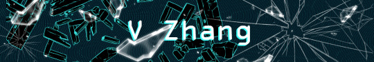
Victoria/Victor Zhang (she/her or he/him | 31) often seems cold and serious, wielding their glare like a weapon. But you know there must be more hidden under the surface.
Victoria keeps her straight black hair in a neat, short pixie cut. Usually gelled back without a strand out of place.
Victor prefers to wear his straight black hair long, held in a tidy ponytail. You'd wager it hit around his waist, if he ever wore it down.
They have honey brown eyes, pale skin, and cheekbones that could cut glass. V stands at a respectable 5'8" with an elegant build. They don't have any visible scars but they do have a small beauty mark just to the left and below their bottom lip.
V is practically always seen wearing formal business attire. A suit, perfectly polished loafers, with a tie neatly in place. Pinstripes. They tend to stick to a monochrome color scheme with the occasional navy blue.
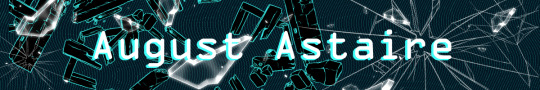
August Astaire (he/him | 27) is an interesting man, always wearing a dagger sharp grin you can't tell is real or fake.
His dark brown wavy hair falls messily down to his shoulders in a way that should look terrible but (unfortunately) doesn't. Complimented by his fair skin and pale green eyes.
August is on the taller side (5'11"), with a slender but muscular build. He has numerous scars, the most notable of which runs up from his jaw onto his right cheek. He also has a couple of tattoos, including a full sleeve on his left arm made up of thorny red roses and black butterflies.
August is most well known for his signature red coat he wears nearly year round. Yes, even in the summer. Beyond that, he is often seen wearing plunging v necks, tight pants, and boots. His entire wardrobe seems to be nothing but black and red with not a single other color in sight.

Amara Ingram (she/her | 25) carries herself with a sunny, carefree disposition. But don't underestimate her, appearances can be deceiving after all.
Her shoulder length black hair falls in tight curls that halo her head, her warm brown eyes shine with an unexpected cunning, all complimented by her dark brown skin.
Amara stand proudly at 5'5" with a fairly average build (not extremely slim nor very muscular). She has a handful of scars on her hands, arms, and legs from a few small engineering accidents. (Nothing to see here! I swear!)
She prefers comfortable, practical clothes above all else. Loose fit jeans, chunky sweaters, sneakers and sandals all rank among her favorites. She leans towards a more neutral color palette with some small pops of bright color here and there as accents.
#redo; rewind if#character intro#august astaire#amara ingram#v zhang#interactive fiction#if game#will add link to this from the intro post shortly!#feel free to ask for more details if there's anything specific you'd like to know
58 notes
·
View notes
Text
⏰ Its Time To Level Up Your Wardrobe: Everything You Need to Slay This Fall / Winter ! 💋

Hello Besties and Future Besties of B.F.S,
Tis’ the season to dress to impress! As the holidays approach, it's time to embrace vibrant colors, luxurious fabrics, and fashionable accessories that capture the festive and wintry spirit. From cozy gatherings to glamorous parties, each occasion calls for a unique outfit that showcases your personal style. Whether you opt for a classic little black dress, a chic tailored suit, or a playful holiday sweater, remember to accessorize with flair. Statement jewelry, elegant shoes, and a stylish clutch can elevate any look, making you shine at every event. Embrace the season's trends, mix and match textures, and don’t be afraid to step outside your comfort zone.
This is where your BFF (us, duh!) comes in to make sure you have the best fashion looks while you create unforgettable memories!
👩🏿🎨 Let's start with the color schemes:

As the seasons change, it's the perfect time to refresh your wardrobe with inspiring color schemes that capture the essence of fall and winter. Think warm earth tones, rich jewel hues, and cozy neutrals that not only evoke the beauty of nature during these months but also create stylish, layered looks. Use the color palettes above as a guide to mix and match pieces, from chunky knits to tailored coats, ensuring your outfits are not only chic but also reflective of the season's spirit!
It’s a Cheetah-licious Fall 🐆

Animal prints (done the right way) can add flair and dimension to your looks! This season we want you ladies to experiment with cheetah/leopard prints! Whether it's a boot, jacket or scarf, we encourage you to mix and match these bold patterns with your existing wardrobe. Pair a cheetah print scarf with a solid-colored top for a chic look, or wear leopard print boots with a denim skirt for an edgy vibe. Don't be afraid to layer different prints together; just keep the colors complementary for a stylish effect (see season color schemes above) . Accessories are key, so consider adding a statement bag or bold jewelry to complete your outfit. Embrace your wild side and have fun with these trendy prints!
😻 Fur Trimmed Galore:

Last season, we discussed the importance of elevating your jacket selections (see post here) we mentioned how fur was giving ✨Rich Aunty💰✨ just like the Sherling jacket was highly recommended last season. We urge you to look into ANY clothing item with a fur trimming to elevate your look.
👛 Meet Tweed, Plaid’s Rich Bougie Sister:

As the crisp air of fall and winter settles in, tweed clothing emerges as the quintessential choice for those seeking both warmth and sophistication. This elevated plaid fabric, with its rich textures and intricate patterns, effortlessly elevates any ensemble, making it a staple for the season. Tweed’s timeless elegance not only provides comfort against the chill but also adds a touch of refinement to your wardrobe, whether you’re dressing for a cozy gathering or a formal event. Embrace the allure of tweed this season and step out in style, showcasing a look that is both classic and contemporary.
👢Soft Girl Suede:

This winter, let’s embrace the cozy charm of the "soft girl suede" look – it’s the perfect blend of comfort and style that will make you feel effortlessly chic! Imagine stepping out in those stunning suede high boots paired with an oversized shirt and a flirty skirt, topped off with some chic gloves to keep you warm. Suede not only looks fabulous, but it also adds a luxurious touch to any outfit, making it a must-have for the season. So let’s elevate our wardrobe and wrap ourselves in the soft, dreamy textures of suede – trust me, you won’t want to miss out on this trend!
🥋 The Power of a Belt:

A little beltology is needed this season. Point number one: do not underestimate the power of adding a belt to your look. Whether it’s a simple leather belt to add on to your trousers or a glamorous statement belt to put over your blazers or dresses, please get your belt game up! If you can splurge on a designer belt this season. This will add a little extra touch to your outfits! Accessories are a must so have fun and don’t overthink it 😉
🪢 Dare to Mix and Match Fabrics?

As we embrace the cozy charm of fall and winter, let’s elevate our layering game by mixing fabrics for a stylish twist! Imagine the warmth of a chunky knit sweater paired with the sleek elegance of a silk blouse, or the rugged appeal of a denim jacket layered over a soft cashmere turtleneck. Mixing textures not only adds depth and interest to our outfits but also allows us to play with colors and patterns in exciting new ways. This season, let's break free from the ordinary and create unique looks that reflect our individual styles. So, gather your favorite pieces, experiment with combinations, and watch how effortlessly chic our ensembles become—because layering isn’t just about warmth; it’s about making a statement!
👔 Layering with Corsets:

As the chill sets in and our wardrobes start to cozy up, it’s the perfect time to add a little flair to those capsule favorites! 🤎 This fall and winter, let’s take our style game to the next level by layering corsets over our beloved staples like a crisp white button-up, a chic long-sleeve dress, or even that classic blazer jacket!
Imagine the magic: a structured corset adds a touch of sophistication and a hint of edge, transforming your everyday looks into stunning outfits that turn heads! 🤩 Whether you’re heading to brunch, a night out, or just want to feel fabulous while running errands, this layering trick is a must-try!
🎨Colorful Monochromatics:

As we embrace the cozy vibes of fall and winter, why not add a splash of fun to our wardrobes? This season, let’s say goodbye to the dull and hello to colorful monochromatic looks that are not only stunning but super easy to pull off!
Imagine stepping out in a chic matching set or coordinating pieces that make you feel like a fashionista without the fuss. ✨ The best part? You can choose one or two pops of color from the fabulous color schemes above and effortlessly build outfits that turn heads! 💥
Whether you’re vibing with warm earth tones or cool hues, monochromatic looks can totally work with our core colors too! So, let’s mix and match, layer it up, and have fun with our outfits this season.
✨✨✨✨✨✨✨✨✨
Connect With Us 🫶🏽🫶🏾🫶🏿
📸 Follow us on Instagram !
💬Join our ‘Ladies Room’ Group-chat on Discord !
📲 Follow our Facebook page !
#fall lookbook#winter lookbook#fall looks#winter looks#black women in femininity#black women in luxury#feminine energy#black luxury#classy black women#black women makeup#femininity#luxury fashion#fashion#elevatedessentials#outfit inspo#soft black women#black femininity#soft girl era#feminine black women#leveling up#level up
13 notes
·
View notes
Text
Just wanted to mention this because I’m finally getting to revise this scene within the second part and I’m excited to talk about it! When the MC gets to Aurelian, and the dorm you’ll be staying in, you’ll be able to choose your rooms design. (Since Aurelian Academy is enchanted, the magic will happily oblige.)
And, yes, each one will potentially offer unique reactions from the various characters.
You’ll be able to choose from these:
Cozy: A crackling hearth sends off a gentle glow throughout the room, something that only exemplifies the dark color palettes strewn throughout: showcased in the deep engravings within the wooden walls, in the plush rug stretched in front of a couch within the small sitting area situated in the corner of the room. It’s a place that radiates warmth, safety, and a general feeling of home.
Elegant: Tastefully chosen decor— from the leather sectional to the hand-engraved bookshel, and even the beautifully crafted stained glass window— complements the overall feel of the room, as well as the beautifully handcrafted crystal chandelier that offers the central lighting. It’s a place that radiates power, wealth, and, above all, comfort.
Gothic: Straight out of the classic vampire guidebook— the room is splashed with black, blood red, with the barest hints of dark gray. Various alcoves are dotted throughout, filled with various oddities, and stone gargoyles stand as sentries within the topmost ones. Dragon clawed scones offering the main lighting for the room. It’s a place that’d make Count Dracula proud.
Minimalist: Less is more, right? Well that saying is personified within this room! Clean lines, sparse furniture, only the necessities, along with a neutral color palette. This place radiates a certain light and airiness that can rarely be found anywhere else!
Normal: The typical Aurelian Dorm experience! Why customize it when you have everything you already need? A simple bay window, along with a sturdy elevated bed, with a desk situated underneath, are the main focal points of the room. Added on, you’ll find a few bookcases, a small couch, and a rather nice rug. It’s a room that’s so good you don’t need to even think about changing it!
Nature: Why go outside when you can simply stay in your room? The bed is seemingly carved at the base of a grand tree itself, along with a small meadow being created to simulate the main sitting area— with bits of bioluminescent bark, mushrooms, and fireflies (not real), being the main lighting of the room. It’s a place that any nature lover will love to spend their downtime in!
Colorful: Why have one simple color scheme when you can have them all? The rainbow has made its home within your room, and you wouldn’t have it any other way! A slew of different colors are dotted throughout— from the tie dye bedspread to the multicolored flames that dance within the hearth— to give you whatever you may need! This is a place that’ll never have you seeing in black and white!
73 notes
·
View notes
Text
HEEHEHEHHEEHH
NOW THAT I CAN FINALLY DRAW THESE CHARACTERS I WILL BE UNSTOPPABLE
I’ve a laundry list of ideas
And from this point forward
YOU WILL ALL BE UNDER SIEGE >:D
Also I took a bit of inspo from @nat0041 w/ the way I drew the DDs’ tails
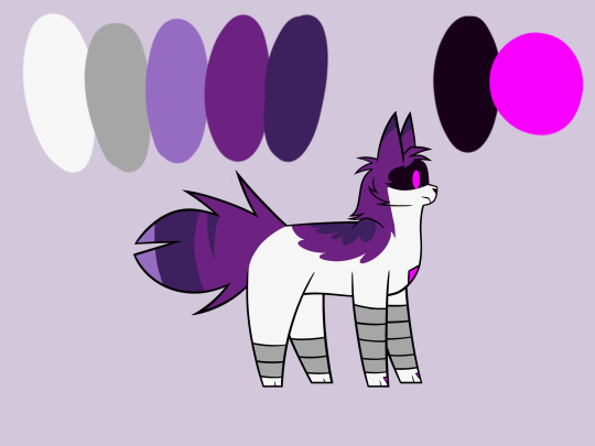
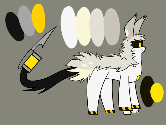
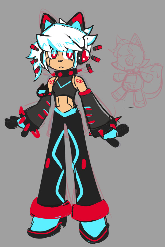
[Image ID: A series of five drawings, each depicting a catified design of a character from Murder Drones. In order from left to right, the characters are: Uzi, N, V, J and Doll.
Uzi and Doll have grey segments on their legs, while N, V and J have stripes of a caution-tape pattern at the bottoms of their legs.
Uzi’s tail is short and bushy. A tuft of fur sticks out over her face, and her ears are short and triangular. She has a mostly white color scheme, with striped purple areas. Her eyes are a purplish-pink; and she wears a neutral expression.
N, V and J are all tall, with long, chisel-shaped ears. From each of their short tails emerge a long, black tail ending in a syringe-like stinger. Their eyes, as well as the contents of the stingers, are yellow. Each of their color schemes is mostly white with areas of gray.
N has a yellow-ish shade of grey, along with pale yellow spots, and dorsal fur along his neck and back. He wears a neutral smile, and his ear tips are split into tufts.
V’s grey is more cool-toned, with much neater fur. She wears a tired expression, with a frown and partially lidded eyes.
J has a reddish shade of grey, with longer, more wavy fur. Her ears are tipped with two tufts each. She wears an annoyed expression, with a frown and angry eyes.
Doll’s tail is short and boxy. The fur on her head is very straight and neat. Her ears are long, with rounded tips. She has a mostly white color scheme, with dark purple areas and lighter, red-violet markings on her tail and upper back. Her eyes are orange, and she wears a tired expression. To the right is a copy of her head, the eye covered with a scarlet button.
Each drawing contains a sample palette of the colors used in the design. End ID]
#I left out the dds’ headband things cause I could not FOR TGE LIFE OF ME figure out where to put them hhhhh#maybe I’ll draw something for that later#murder drones#murder drones uzi#uzi doorman#murder drones n#serial designation n#murder drones v#serial designation v#murder drones j#serial designation j#murder drones doll#md doll#catified
42 notes
·
View notes
Note
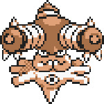
Have you done the Tyrogue line yet? (Hitmonlee, Hitmonchan, Hitmontop, Tyrogue)
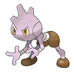
Tyrogue is interesting because it's the only case of two unrelated Pokemon being connected into a single line via pre-evo after their original release. I think this was a good change—there was nothing wrong with Hitmonlee and Hitmonchan being separate, but there is a really cool concept with Tyrogue evolving into either a kickboxer or a boxer-boxer depending on how it trains.
The design itself is good. I always enjoy designs that are humanoid without being too human-like, and Tyrogue strikes a good balance between the two extremes. I like the purple-ish pink body in contrast with the dark brown areas—it's definitely the best palette out of the line—and the expression and pose/animations give it a lot of personality.
My only issue with it is that it does feel a lot more like a pre-evo to Hitmonchan than to Hitmonlee. I can see some elements of Hitmonlee—the brown "pants" and "shoes", the bandage-like markings, the circles on the cheeks that arguably are where the arms go, the hands—but the eyes, head spines, and separate head instantly invokes Hitmonchan. Not entirely sure how you'd fix that though, and it's not a big deal by any means.
Tyrogue also had a beta in the form of this guy, known as "Gong". It maybe looks a bit more like Hitmonlee than the final version does, but it also feels less like either and is a bit more generic in terms of body shape. Final design's definitely the better one.
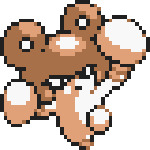
Hitmonlee is a really cool design, being what I can best describe as a drumstick with extendable legs. Very monster-y, and the stretchy legs are fun and convey the typing well.
Visually, the simple color scheme works well, and the black eyes pop nicely without bringing extra color into the design. The arms also have a good deal of anatomy to them despite the weird body shape.
My only nitpick is that weird yellow circle on the feet feels like an afterthought. Oddly, some of the early sprites suggest that used be a dewclaw, but now it's just this out of place element that probably could've been dropped.
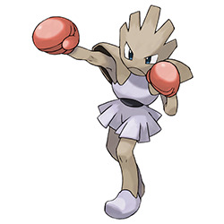
Hitmonchan has a completely different vibe to it and is more humanoid in design, but it still works well to convey its concept. The head spikes mimic the shape of the "skirt", and the shoulder pads have this plated look to them, a design element that you rarely see after Gen 1.
My only nitpick with it is that the purple areas of the body are way too low-contrast and don't really add anything. Pumping up the saturation might've helped, but it also could've stood to be a different color—maybe a light tan, to go with Hitmonlee's palette. Other than that, it's solid.
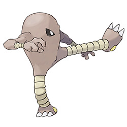
Hitmontop has always been kind of a strange addition to the line. For example, Tyrogue is neutral, HItmonlee is kicking, Hitmonchan is punching, and Hitmontap... is the Brazillian martial art of capoeira. It works well enough, but it is oddly specific all things considered.
It's also weird because it has little in common with its other evos. It has Himonlee's claws and bandages, and Hitmonchan's head spikes, but it also has completely different eyes than either of them and a bright blue palette that comes out of nowhere. It doesn't look completely out of place or anything, but I do also feel like it could've been its own thing entirely with few tweaks.
Visually, the top idea is fun and the design gets it across well with the head spike and eyes and mouth that can be read regardless of direction. However, I'm not a big fan of the overly round body or the weird V cut in the blue, and the tail's always felt a bit out of place to me.
Of course, the reason it might feel slightly out of place is because it was originally... well, whatever the hell this thing is. Seriously, this has got to be one of the most out-there beta designs, and I'm telling you, there are a lot of out-there beta designs.
There are some elements to this design that I do wish had been kept. For example, the three legs form a perfect radius regardless of position, and I feel like they work better than the tail due to how rigid they are in structure. They also look a bit more like Hitmonlee's legs, so that's a neat touch.
I also really like how the face works. Hitmontop is a creature that's upside-down, but this thing has two completely different faces, one upright and one upside-down depending on which way its facing. That is VERY cool, and feels like a fun play on the concept.
However, it's undeniable that this thing is utterly bizarre, with its complete lack of a mouth, single eye when upright, and three legs. It honestly feels more like a UB than any kind of regular Pokemon. I do like elements of it more than the final, but as a whole, Hitmontop was probably the better choice and the more "Pokemon-esq" option.

Anyway, as a whole, this is a solid line with some fun abstract monster designs and clear themes. Personally I think Hitmonlee's the strongest while Hitmontop's the weakest, but all of them have their own charm.
66 notes
·
View notes
Note
hey -had a weird question. so, i get that there’s nation colours that are heavily incorporated into the fashion of diff cultures -but are there universal colours within the atla universe? if you see a character wearing all black, grey, etc. would that be canon-compliant or would it look out of place?
-also, your account is fucking insane, i use this as a source for writing and from a world building perspective, you going into every detail and dissecting it has me frothing at the mouth. i could scroll through your account for hours.
Thank you! The best compliment is when people fall down the ATLAculture rabbit hole. -^_^-
Regarding canon-compliant colors, ATLA actually doesn't stick as closely to its color-coding as people tend to assume. Check out my "People of..." series for an overview of the general look of each nation's population:
The Cultures of Avatar: The Last Airbender on Tumblr - #people of...
In general, I think dressing your characters in non-standard colors signals to the audience that they live more on the fringes of society. Kyoshi Islanders wear blue because they're isolated from the rest of the EK, the pirates wear all colors because they probably purchase (or steal) their clothing from ports all over the world, Jet's group probably scavenges for their clothing, Aunt Wu's village is a borderline cult, and June is a bounty hunter.
I think neutral colors like white, black, greys, and browns work well in any nation, especially if you're willing to give your character trim or other details in the color of that nation. In the case of the Earth Kingdom and Fire Nation, I think you could dress your character in any color, since both nations are relatively rich in resources.
However, if you do plan on dressing your EK or FN character in an unconventional color palette, you should go with a de-saturated color scheme. For example, you'll notice that members of Jet's group wear blue, but it's very dingy and grey-tinted blues. When the color is too bright and saturated, you tend to assume they're representing a specific nation. When the color palette is more faded and "realistic", your brain just assumes they're wearing what's available to them, rather than making a statement.
81 notes
·
View notes
Text
Neutral Colors In Interior Design
Neutral Colors In Interior Design - #homeimprovementreferral #InteriorDesign, #PopularPosts - https://www.homeimprovementreferral.com/neutral-colors-in-interior-design-2023-08/
0 notes
Text


Developing S0-R0 (Sketches)
I just feel like drawing Kun3h0-likes lately, so I decided to work more on developing a "rival" character for her. Right now, I'm whittling away at this design that I'm calling "S0-R0" for the time being.
The 2 pics are the latest drawings, then I have the progress of getting to that point in chronological order. You can see the very first "rival" sketch in the last Misc doodle dump.
When I first went into this project, I didn't have any strong direction for where I wanted the character to go. Since Kun3h0 isn't fully developed as a character either, it was kinda hard to think of a foil to basically nothing. However, I did know that I at least wanted the rival's theme to be "stars" to contrast Kun3h0's hearts. So whatever I did was gonna drift towards sharpness.
The first chronological sketch is almost a straight inverse of Kun3h0's design in terms of palette. I wanted the silhouette of their arms and legs to be roughly similar so that it's more clear that they're supposed to be connected and not (just) that I have a limited amount of body-plans that I default to. I do like the black/green color scheme, but they've got a real "XBox" and "Monster Energy" vibe to them.
The outfit itself was heavily based on these clothes, just to give me a little direction, but the current design really drifted away from this.
(I added spinning bulborb just so the clothes wouldn't stretch out the post too much)
I also borrowed an old idea from my "Digital Idol Kayane" design, where she had some of her elements floating around. I figured since Kun3h0's ears/antenna just kinda "float" that I could apply the same logic to the whiskers. That detail would persist through most iterations of the design, but I eventually dropped them.
But, I was still pretty unhappy with that design, so I made another sketch and started working around it. The first iteration was mostly a palette swap to get away from Monster Energy, so I went with cyan since it's a kinda futuristic color that I thought would go great with the black base. Eventually it evolved into the second iteration where I went back to giving them the pants of the very first rival sketch and working from there. I'm not quite sure where the idea for the spikes came from. I think I just wanted to add some more "sharpness" to really work in the star motif, but then that kinda became the "main" motif beyond the stars.
I thought the black/cyan/red color scheme was really cool, but it kinda works against my established symbology where stars are yellow and moons are blue. In the event that I design a moon-motif character in the GAB universe, it would be odd for them to now not be able to use blue because the star-motif character got to it first. So, I did another palette swap, this time exchanging cyan for yellow and gold.
While I was working on that, I also got the idea to design their mascot to help with the design process. Since Kun3h0 was originally based on GAB, I thought that it might help me come up with ideas to solidify the mascot design first and that would help me design the rival proper. So, I made this little fox fella and have been designing S0-R0 around them since. I made several other palettes for the mascot, but in the end I went with my first design.

Finally, I took another stab at the outfit and landed on this minidress and made the collar comically large. I really liked the idea of this slim body being covered in large, overbearing spikes. I also took out more of the red accenting since I wanted to limit their palette as much as Kun3h0's, which is a neutral + 2 shades of the same color + a pop of one other color for small details.
It's not perfect yet, but I do like this direction. I went with this for some rough characterization: While GAB sought out someone with a strong heart to help them, FOX (name not final) sought someone with physical strength. Unlike Kun3h0 who is more emotional than a robot ought to be, S0-R0 tries to complete tasks as efficiently as possible, which leads to them using physical force to address most of their problems. They're not evil per se, they just don't consider the greater ramifications of their actions if they still ultimately complete their original task.
I haven't drawn it yet, but I think their weapon would be a morning star/flail.
15 notes
·
View notes
Text
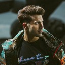
alright so i know i already made that post detailing foreshadowing with larrys design. but i would also like to have a new post going more into character design of him just because i find myself obsessed once more
so to start, larry is designed to be clearly reminiscent of a businessman/salaryman/etc. obviously this choice is to go with the normal type theming for his gym, because whats more normal than a plain old office worker? in addition, working for the league seems to be fairly normal, given the abundance of suited npcs scattered around paldea. his eyes have lines under it, and combined with his general personality, serve to portray him as somewhat tired despite his dedication
however, he has a few details that play into his actual elite four status. first and foremost is the cloudy tie. its blue with white clouds, resembling the sky. hes got a string of buttons on his cuff that seem to be similar to a feather, and two triangle details in his lapels that give them a vague wing appearance. additionally, the flyaway hairs on his head, along with the black bit that wont quite stay flat, help to make it feel like hes standing in wind with the air blowing his hair about. these flyaways also seem to resemble grey hairs, as if larry started going grey due to the fact that hes always working so much
for his color scheme, hes overwhelmingly using black in both his clothes and his actual hair/eye color. black is the ‘typical’ color one might think of for a suit, even if it is not the only color they can be. dark hair and eyes are also extremely common traits with people, falling on more prominent genes compared to something like light eyes or hair. it fits well with the everyman concept, making him blend in more as just some worker. black is a color of formality, yet also mystery and power, which fit well with the suit and the fact hes a member of the elite four. grey fits with his dress shirt and the flyaway hairs on his head. its far more minor in use, and seems to be a bit blue. greys a neutral color that can seem dull, slotting in once again with that ‘boring guy’ vibe. though because of the blue tinge, it helps keep his over all palette more cool and match better with the sky blue tie. blue can be seen as a more calm and collected color, and personality wise larry is definitely one of the less energetic characters in the game
for shape language, larry seems to be built with a focus on squares. squares are a dependable shape, but can come off rigid and boring depending on their use. they have a sense of stability and strength, yet also clumsiness because they can seem a bit unnatural at times. larry as a character seems to be reliable for his job in a more roundabout sense; hes dedicated to it, but hes not known as the best worker, according to his pregym encounter description. hes the normal gym leader, so using a shape that can be ‘boring’ works well. in addition, larry also seems to stumble over when he throws his pokeballs, before jumping back into a more rigid standing position. there is the use of a few triangles in the design too, which are used with his hair especially. triangles can be used to suggest movement, which with how the hair is shaped, checks out. the lapels and collar of his shirt serve to frame his tie, and the smaller darker triangles further serve to point it out. theres a bit of circles used to help soften his design, although not many. hes rigid with his schedule, but not entirely inflexible

now for a more fun analysis of the design, i feel like some aspects can relate to his pokemon, either in a more obvious or more abstract way.
first up is his hair. larrys bottom flyaway strands seem to be similarly shaped to braviarys lowest head feathers, while the top feel more flowy like altarias. the sides of his hair give me the impression of the sides of tropiuss head in terms of placement, but the general concept of hair in front of more hair is reminiscent of braviarys feather crown in front of the plumage. staraptor is the only pokemon to have a feather hang downward in the middle of the head, matching the lower middle strand of grey hair.
now to the suit. his tie with clouds easily connects to altaria, who has a cloud for wings. however i believe this can be further stretched to komalas rounded tufts of fur, given their color and shape. flamigo and komalas nose/beak could be behind the rounded shape of the suits buttons. the triangular bits on staraptors tail feathers could be referenced in the lapels on the suit. oricorios head feathers are set in threes and rounded, just like the feather detail on the suit sleeves. dudunsparce has a general rectangular theming to it, which fits well with the rectangular pockets adorning the suit.
in fact, dudunsparce also has rectangular eyes, which fits with larrys quite well. komala has thick eyebrows, and while not exactly in the same shape as larrys, id say they seem to be about the same thickness for the widest section
the shoes are probably more of a stretch, but the very top rounded bit reminds me of the front toes on tropius
color scheme wise, the blue grey of komala seems awfully close to the blue grey used in larrys hair and shirt. the blue of the tie also seems to match up more with the altaria. but that would be going strictly off of concept art, as his in game model renders these shades far differently
its actually kind of insane just how much you can pull from a character who seems incredibly simple on the surface design wise. some of these points are likely to be stretching it just a bit, but im definitely sure that this man was designed with a lot of intent and purpose given his role in the game and how hes shown off
#pokemon#pkmn#gym leader larry#elite 4 larry#larry pokemon#pokemon larry#elite four larry#pokemon scarlet and violet#scarlet violet spoilers#pkmn scarlet and violet#sv#scarvi#scarvio#scvi#scarlet and violet spoilers#scarlet and violet#pkmn sv#pkmn scvi#pkmn scarvio#pkmn scarvi#pokemon sv#pokemon scarvi#pokemon scvi#pokemon scarvio#sv spoilers#scarvi spoilers#scarvio spoilers#scvi spoilers
177 notes
·
View notes
Text
I think smth interesting is that unlike ... a lot of media. . . (aight theres a lot of media that does this too don't come at me) the character designs in dunmeshi don't lock in into a definitive color scheme. Like, color association is still there like you will see the palette of maybe a combo of blue, red, yellow, green, and think Marcille, but like Marcille's main color isn't blue. Or something. Like Falin's main color isn't exactly purple. Namari isn't quite red even though she's got that vibrant kind of chrome-y red of her hair.
Like, Ryoko Kui doesn't stick a character with an obvious color. Most of them wear neutrals and they do have a pop of color but I can't exactly say I associate Chilchuck with green unless theres brown in there too. Laios wears a lot of Red in like extra media and I agree that Red is his color but Izutsumi also wears red like look at that !!! Kabru's eyes are super blue and that's probably his most noticeable color trait when you look at his entire palette of brown and grays but again I wouldn't say his color is *blue*
Like does this make sense? It probably doesn't. I just think its neat that even though you can definitely associate a color with a character it's not as obvious as like. Just looking at their hair color and going oh yeah this ones pink. Or something. Anyway now that I think about it this isn't a problem for media or anything like color coding is great I love it and I genuinely don't know what I'm saying. Time for. a nap. Time to conk out.
#sash talks#dunmeshi#dark blue / navy does look good on Kabru though I'll give him that.#anyway they (lab.ru) escaped the black and white doomed yaoi colorscheme guys we should be proud#they got hit with red and blue instead but like thats fun . love red and blue. even though they're not quite . red and blue. but. like. Okay#okay srsly what was the point im trying to make ? Idk anymore. lets all have a party
8 notes
·
View notes
Last Seen Blogs

captainsublimesoulstudentst-blog
Sublime Soul

tauzgamer1100-blog
Tauz Gamer
varundvnsworld
Varun Dhawan
eorzeas-okayest-paladin
Eorzea's Okayest Paladin

justino-finch-fletchley-blog
Harry Potter