#no need to do anything in return
Text
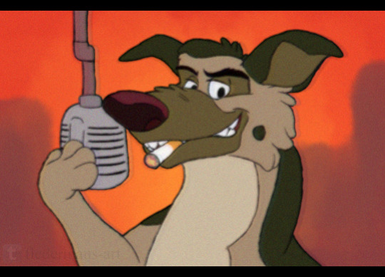
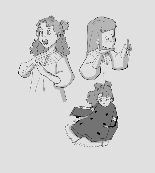
A gift for @bluestar-of-thunderclan!
[MY WEBSITE] | [BLOG LIST]

#this is the best i can do lmao#no need to do anything in return#gift art#all dogs go to heaven#charlie barkin#charlie b barkin#vhs style#fanart
14 notes
·
View notes
Text
This definitely won't happen but it would be so fucking funny if they arrive at the planet Thrawn and Ezra were stranded on and it turns out that these two are best friends now and Thrawn is completely on Ezra's side. Morgan Elsbeth pleads for Thrawn to return and reignite the Empire and he's just like "those bitches? Fuck em. Ezzie and I started a band, we play Jizz music on Wednesdays. Here's my wallet pictures of us hanging out."
#Thrawn becomes the autistic older brother Ezra always needed and Ezra is the pet Loth cat Thrawn never wanted but loves anyway#Ahsoka#ahsoka series#ahsoka spoilers#Thrawn#ezra bridger#mitth'raw'nuruodo#ahsoka show#ahsoka show spoilers#Ahsoka Tano#ahsoka series spoilers#What will most likely happen is that they'll arrive to find Thrawn and Ezra were completely separated upon arrival#Possibly Ezra is on a completely different planet entirely#And it'll be an extra side quest to continue looking for Ezra#Thrawn will be the same old crusty musty dusty blue boy who hates everyone and is too smart for anything#<- I only called him crusty musty dusty because my phone's predicted text insisted those words belonged together and I'm crying#I do like him. He just smells#I'm interested to see how they handle his return however#We know the Empire never gets reformed until another 20 or so years from the time of the show under the name The First Order#So idk we'll see#This episode was so great
742 notes
·
View notes
Text
the appeal for nine and rose for me, is that nine gets to reconnect with the wonders of the universe by seeing it through this young woman's eyes and rose gets to have a fantasy of being taken out of everyday life and see the wonders of the universe, as a simple fairytale/(re)introduction to the world for the audience
the appeal for ten and rose for me, is that they double-down on this premise because it's inevitably going to end and is constantly ticking down to that end throughout this story, and the only way for them to move through life now is to pretend that nothing ever ends which makes them increasingly detached from reality, and is in and of itself a tragedy
the appeal for ten and martha for me, is that ten is spiralling and martha is a doctor to her core, and both of them want to fix everything for everyone else except themselves and so they're mirrors of a similar self-destructive sacrificial drive that makes them orient around each other in an unhealthy coping-mechanism kind of way that martha eventually has to detach herself from, even though there were the wonders...
the appeal for ten and donna for me, is that donna is actually very level-headed, and in many ways very capable, even though she doesn't believe in herself she can make decisions that are healthier than either rose or martha could, and the doctor initially through wanting her to believe in herself forces themself outside of their bubble of despair, which somewhat breaks the cycle of the previous companions (although, not properly until a very long time later)
#rose and the doctor do not work for me if they're not a tragedy -- if the ending isn't fated and they're not running from it#and martha and the doctor... well i need some fucking closure on that one BUT i do like this story a whole lot#i think it is delicious#doctor who#dw#i do think technically martha's story with ten / fourteen / this era is over in a way that is different to donna returning for the specials#but i think if anything could explore her well it's fifteen-era (and hey maybe within that there's an allusion to her seeing donna again#and fourteen by extension)#(but the point is martha and fifteen in my head)#rose tyler#martha jones#donna noble#the doctor#the ninth doctor#the tenth doctor#the fourteenth doctor#doctor who meta
343 notes
·
View notes
Note
That is all thank you
ANSWERED: Art credit for da first Ren meme goes to @meo-eiru!!
BUT HELPPPPP THESE ARE SO FUNNY JDSGJH T_T The Moth meme + Uno meme had me CACKLING lmaoooooooo
#This has been happening a lot recently (and is by no means directed to OP) but!! Just a reminder to credit artists if you use their art!!#And it's always better to ask for permission beforehand; some artists don't like havin their art shared / reposted / reuploaded / etc.#They put in effort to create content for you to consume; so it's only fair to give them da proper credit and exposure in return!!#''Credits to the original creator'' and ''I found the image on google / pinterest / etc.'' isn't a good enough excuse >.<#If you can't find the creator; don't share it. And at the very least try to reverse image search to locate the source#But!!!! With all that being said:#Everyone is welcome to use the official 14DWY sprites/game assets without asking for my permission or giving credit!#I personally think it's ok because game assets can be found /within/ the game itself; it's not like folks have to go on a search hunt--#--to find a specific artist. They can find the art/asset within the game without having to do the extra steps.#If that makes any sense??#Like the 14DWY style is fairly recognisable if you're familiar with the game; folks don't need to reverse image search for anything.#Anyways I'm done ranting in da tags#I might make this an actual post in the future because; again; this has been happening a lot recently in the 14dwy tag/my askbox#and all these talented artists don't deserve this ;n;#Plus it shouldn't be my job to be the one giving credit..... T_T /lh /nm#OKOK I'm done for realsies now#Thank you OP for making these memes!! And sorry for ranting on what's supposed to be a lighthearted post dghjdgjhsg ^^;#💜 — 14dwy memes.#💌 — answered.#💖 — 14 days with queue.
198 notes
·
View notes
Text
i really do think the desire to paint ten as unambiguously The Worst™️ when it comes to his relationship with martha is out of this desire to uncomplicate their relationship. to decouple them as friends and people who profoundly impacted each other’s lives. it’s just an easier narrative to swallow: that ten was Awful to her and then martha kicked him to the curb when she realized she was too good for him. easier, maybe, then dealing with the troubles of unrequited affection don’t have to be anyone’s fault, or that ten shut martha out in a lot of ways but let her in in others that he wouldn’t let any other companion near, or that they were still friends, they still wanted to see each other and be around each other, even though it was messy and sometimes hurt. you know?
#sometimes the doctor is shitty. this is not news we know this. this is part of the package. its what makes their relationships with their#companions so interesting so important.#like. how do i put this. i see posts sometimes about how ten was ‘leading martha on’ implying that he was taking advantage of her feelings#to keep her around. and. okay. so. putting aside how that’s a weird thing to say about anyone period.#its also just. from my viewing experience. not true?#the doctor is just sort of Like That. he’s too intense he’s too quick to grasp for emotional intimacy he’s too messy.#but he’s not leading her on. he really is just Like That.#like i feel by getting caught up in the fact that martha is hurt by being compared to rose and is hurt by the fact that the doctor can’t or#won’t return her feelings. and like. yeah. of course that hurts.#but in being caught up in that. i think what im saying is that it feels like people sometimes forget that he’s. not required to do that.#like just because she has feelings for him doesn’t mean he needs to get over himself and return them or else he’s using her. that’s. that’s#not how relationships work. people can have romantic feelings and still be friends and not have anything come of it and that’s not a#terrible outcome. thats just how friendships are sometimes.#thats the core of it to me. they’re friends. the way people post about ten & martha sometimes i wonder if everyone’s forgotten that they#are friends. that they last parted as friends. that martha doesn’t hate him or secretely resent him for how he treated her.#like. she’s got complicated feelings about the whole thing. but they didn’t stop being friends.#i tell you what: if the doctor was in trouble and called for help. you could be damn certain that martha jones would be one of the first#people to answer. that’s what i know.#doctor who#the doctor#tenth doctor#martha jones
116 notes
·
View notes
Text
i actually cannot overstate the fundamental damage that n52 did to tim by giving him to lobdell--completely erasing his post-crisis self--tim drake wasn't even his real name, removing his presence at the circus, making it so he chose not to be robin out of respect for jason and thus removing his personal investment in batman & robin, making him a asshole "genius" who figured out who batman was & then blackmailed him about it, removing from his base characteristics his traits of being a robin who managed and promoted team-ups and brought so many characters into the batfold & working together to instead make him a solitary outsider in the family like jason--has done to tim that we're *still* trying to fix *to this day*. like the fact that nu52 and what it did to tim started just as comics and comic panels were starting to become more widespread on the internet bascially warped an entire new set of fans' perceptions on who tim is a character that has proliferated to this day by retroactively imposing n52 traits onto post-crisis tim--it's exactly how and why tim as a lonely, friendless fan of jason came to be. a lot of the fanon-y tim traits that we still see today came to be because tim headcanons that were imposing n52 tim traits onto post-crisis tim were gaining popularity and have embedded themselves so much into fandom's understanding of tim that it leaked into canon itself. like. i do think that tim is being treated well by dc now. but i also do think re-orienting him back around his 90s characteristics is much needed for him as a character because of exactly how much damage was done to him & his fundamental characteristics that he's *still* being rehabbed from, even years and a reboot later.
#this is why i don't have it in me to entirely hate zdarsky--because while it does stem from nostalgia#it's also trying to bring tim back fully to the basics of his character#which is *sorely needed*#like i may not personally love putting others down bc i do think zdarsky could bring him back to basics without that#but the fact is. like rebirth was a start for returning tim but we're still fixing the damage lobdell did to him#now i don't think that tim is particularly oppressed or anything like that. but his character was so utterly destroyed.#we do need to reorient him to his base traits#and we're still working on that just bc of how extensive the damage was
85 notes
·
View notes
Text
NOT
#munch sketches#wasnt it called my sketches. i dont remember. i dont care#not#my ocs#etc#ive had a really bad week. i dont usually have bad weeks. i dont think abt the past. i just move on#but it was a bad week. i was forced to sleep all day wed bc i was so sick and cramped that i couldnt do anything#this week was supposed to be a week off but then i was forced to go do volunteering for a school event for days and it rained all week#and i bought a new printer that im going to return tomorrow bc it sucks as expected. epson ecotank 2400 dont buy it. its not good quality-#wise. i keep pushing off my “day off” days further and further. i was supposed-#to take a day off for the weekend but that didnt happen. my next day off may be friday hopefully#it doesnt help that i dont like having unproductive days. but i really badly need one to bum around and relax soon or i might bite someone
102 notes
·
View notes
Text

smth smth about 'the thing that the character did that you thought was rly rly funny in the moment is actually linked to a terrible trauma that lies within said character.' or wahtever.
#jrwi show#jrwi fanart#jrwi riptide#gillion tidestrider#made this within a short span of wahtever bc i gotta go up to the mountains for my stupid gay job tonight n im trying#nnot to frrRREAAAK THE FUCK OUUTTTTTTi dont wanna work but. get that bread we fuckin shall i guess#ONWARDS TO THE FISH TORMENT!! sometimes flowers feel pain when you trim them before their blossoming. atleast i imagine so#i used to draw gillion with loooong hair tied into a big ol braid. and then it was confirmed that he had short hair when he was little.#AT FIRST I WAS SAD. but then i realized the duality of. when they were little. gill had short hair. edyn had long hair.#AND NOW THEYRE OLDER. and gillion has long hair. and edyn has short hair#both mirroring eachother. looking up to eachother. subconsciously or not. they most certainly care. and most certainly miss eachother.#GILLION ALWAYS LOVED HOW LONG HAIR LOOKs. atleast i imagine so. he hasnt cut it since he left the undersea. sure he wanted to go back home#but even at the very start. he knew he was free in some way now. free to grow out his hair. an adventure would await him before he returns.#he knew it would be a while. so he cant let this go. he cant let this sought-after hair-length get cut away from him again#not yet. not yet. i like to think he loved music too. I SAW SOMETHING INTERESTING A BIT AGO#i see alot of ppl commenting on my baby gill comics like;'i wouldFIGHT this teacher i wanna KILL EM i want them DESTROYED#all very good and nice sentiments! i LOVE the energy here! and it would be nice. to have that catharsis#but the story of young tidestrider is not a story of catharsis. it is a story of agony and being so so small and so special and also so dum#and sucking so bad. and just being a kid and doing the things that a little kid does and so many tired tired people reacting badly to it#youre supposed to be the hero that will save us. our world hangs in the balance and you are the one who tips the scales.#YOU are supposed to SAVE US!! you NEED to SAVE US! CAN YOU PLEASE STOP SQUIRMING IN YOUR STUPID CHAIR!!#you'd think that young tidestrider ought to prevail. and be tucked someplace all safe and sound.#elders gone missing and rotting in a jail. their cultists nowhere around. but theres no happy endings. not here not now.#this tale is all sorrows n woes. you may dream that justice n peace win the day. but thats not how this story goes#BIG ideas for this lil baby gillion series. if anything i make ever gets disproven im killing myself in a well as to poison a water supply
82 notes
·
View notes
Photo
wizard of the sky (again!!!!)
#pokemon#swsh#champion leon#reworked the sky wizard design because I wanted to proper it up. and it turned into an entirely different design#but! I prefer this one! there's thought put into this one!#can't fault the other one it was made during a 2hr break or something#also. how come I've put out there a buncha see-thru áo tấc and nhật bình and have yet to see anything return. why is no one making these#do I have to make these myself. I would! one of these days! thats a threat!#I need to eat chips n lay down now but I had fun doing this one :]#I will draw wizard leons for as long as I still have ideas of what kinda wizard to turn him into. there are like three in queue rn#its so dang fun doing these wah!!!#have a good night lads!! use hook to bring opponent into close quarter
846 notes
·
View notes
Text

#witch hat atelier#witch hat fanart#witch hat agott#tetia#qifrey#richeh#my art#digital art#clip studio paint#only a few books in but if anything happens to them I don't know what I'd do#artists need to read this series it cured my art block#I might post them more later might return to the bog#we'll see what happens ig#also my computer crashed like three times making these#probably not normal :/
244 notes
·
View notes
Text
I sorta need help again and this time I don't know if I'll be able to offer anything in return.
My phone bill was due a few days ago but I just had to make an almost $400 car payment so I only have $6 to my name right now. I should have more money yes. But it's been tough at this new amazon I work at. The building is a complete disaster. It's not safe to operate ops/pits because the building doesn't follow proper safety precautions.
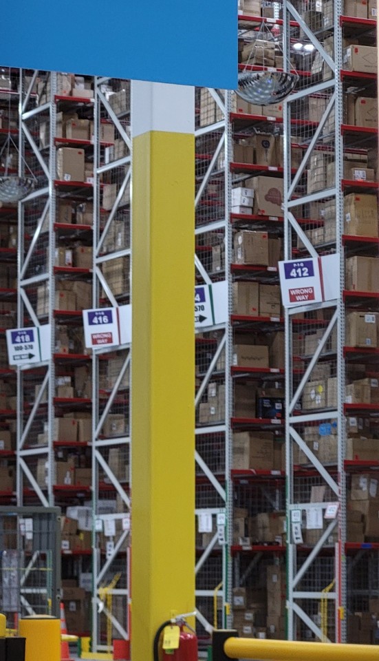
These boxes aren't supposed to be sticking out with nothing to keep them in the bins. Some of them are very heavy and could fall and hurt someone.
And unfortunately for me, since this is a crosstrained site they told me that I cannot come to work if I don't operate those because saying "I don't want to, it's unsafe" is not a "good enough of an excuse and I need accommodations" only after that to be told "usually when people use safety as a reason to get accommodations they get denied"
So with all that batshittery I've either been taking vto and not going to work at all or going but only staying for a few hours and then dipping out. I applied for a transfer to another facility but I'm still waiting for it to be approved. So until then I feel kinda screwed.

My account was just suspended today. If anyone is willing and able to help me I would appreciate it immensely.
My PayPal is [email protected]
My venmo is @ onyxtruth
#help me out#help#please and thank you#im so sorry i wont have anything to give in return#I'm still kinda depressed and it's been really hard to draw consistently#the only thing I've been able to work on is my ask blog#i have so much more i need to do but it's almost impossible right now
110 notes
·
View notes
Text
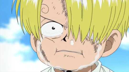
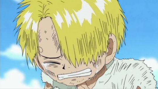
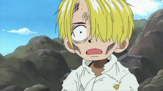
sometimes I forget how painful sanjis initial backstory is.. a kid so young experiencing starvation. carrying so much physical and mental effects from it. not to mention the isolation and loneliness he experienced as he sat alone watching the shore everyday. and the whole thing with zeff...
anyway I made myself sad so I saved a bunch of young baratie sanjis to cheer myself up
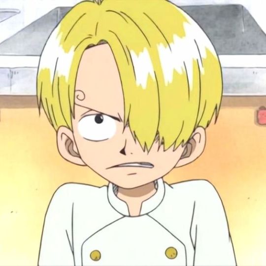
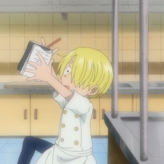
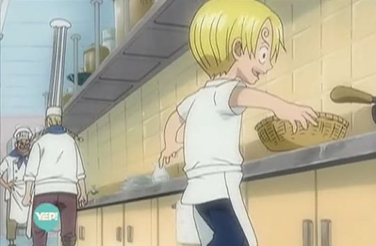
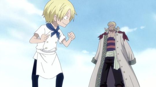
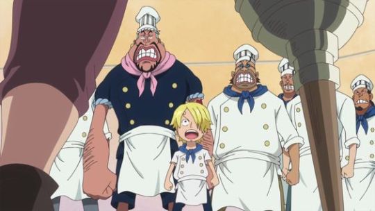
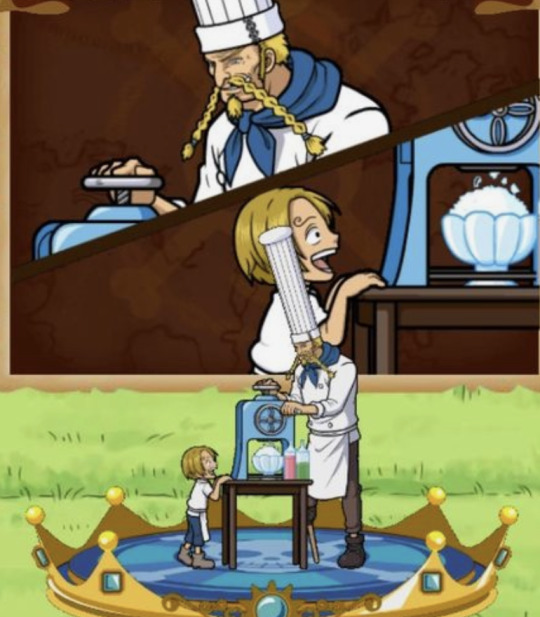

after everything he went through he found zeff- someone who gave him encouragement in his craft he had never experienced before and someone who proudly called sanji his son
#sanji and zeff mean sooooo much to me#zeff doesnt seem like the kind of person who ever desired kids#in fact I feel like he didnt want a kid at all#but then he met sanji and he saw and innocent child who shared his dreams and he knew he was going to look after him#he teaches him how to cook#he teaches him morals#he makes sure sanji is always FED#sanji didnt go looking for a mentor#or for a father#he was ready to face the world alone at the age of 8 and never questioned anything else#bc what could 'the failure' ever do but be tolerated??#but then zeff sacrifices everything for him#and even more#zeff lives for him#they create a home together; a restaurant in the sea#zeff became everything sanji needed and even though sanji felt he owed zeff so much..zeff never expected anything in return#because that is his SON and he LOVES HIM#my sanji and zeff ramblings#of all the many found family parent-child relationship theirs really hits me#zeff was a pirate until he saw a child in need ; a child he saw himself in; and then he STEPPED UP.#I gotta stop rn or ill never shut up#red leg zeff#black leg sanji#baratie#I could ramble about bellemere and nami and nojiko too#they remind me of the dynamic of zeff and sanji tbh#met in a storm and prioritizing the kids#refusing to show anything but pride for being parents of these kids
76 notes
·
View notes
Note
if you drew sora in his original kingdom hearts 1 outfit i would be so pleased to draw you something from any fandom in return
i haven’t drawn this guy in so long….

#sora kingdom hearts#asks#art tag#no need to do anything in return I had a lot of fun with this :> thank u for the rq!
30 notes
·
View notes
Text
what if i put my life in your hands?
what if i took your life in mine?
#okay look there's a reason i've been obsessed with this scene for 21 slutty slutty years#imagine for a second you're yue#your master—whom you loved more than your own existence—decided his work was finished and didn't need you anymore#and he pushed you into the dark where you slept for centuries until a little girl woke you up by sheer dumb luck#you now are trapped in this horrible new era where everything is too loud and too fast and too bright#you're also trapped in a body that isn't yours jockeying for room with a completely separate soul that you don't know or particularly like#and you're draining your meager stores of magic to the dregs in order to keep the two of you alive#under the surface of tsukishiro yukito you're drowning—and the both of you are fading away entirely#and then this boy#pulls you to the surface of yourself#and says with his whole heart 'i won't let you disappear'#he smiles at you and teases you and then pours his not inconsiderable power into you#and you take and you take and you take and he never says stop#he never says only a little but no more#he holds you close and lets you sup on the very marrow of his magic until there's nothing left and he's simply an ordinary human#and for the first time in centuries—perhaps ever—you feel full#when you finally step away and ease his unconscious body onto the bed as gently as you can manage#you murmur that you ought to thank him#but it's such an inadequate way to convey your gratitude#how do you give thanks for what you've made him lose?#you put your life in his hands and he cradled it as if it were precious... and then he gave you his own in return#in the world before this one you would have been as good as wed#you thumb the swell of his cheek and allow yourself one last look at your would-be husband#and then turn around to face the threat behind the door#as it creaks open to reveal a little body wracked with sobs you think you would face anything that would dare come for him or his sister#not because it is your duty as the guardian of the cards#but because you love them#touya/yue#ccs#yue
36 notes
·
View notes
Text
Teruko and Yosano should've faced off. I think Yosano should've been posed that question that Atsushi was; that reveal of the "future war" - Teruko went along with Fukuchi out of a mix of indebtedness and being at a loss for what to do. War is all she's known; of course she doesn't know. But Yosano has been to the depths of despair and come back out of it again. She might've faltered at this horrific reminder of her trauma, but when it comes down to it, she saves the lives before her. She fought for a way back to light and life. I just think there could've been a really interesting conflict there. And it would've made Teruko's role much more tragic if she wanted desperately for there to be a third option but just didn't have enough time to sit with it and process what that third option might be before Fyodor made it all go to hell.
Also a fight between them would've been interesting, because Teruko is much physically stronger than Yosano, but Yosano can heal from any physical injury inflicted. However, since we now know Teruko can alter mental age, she could inflict psychological wounds by de-aging her, which would've been a good callback to the horrors of war in her backstory, and also been a nice bit of foreshadowing for Teruko actually being a child.
Teruko eventually allowing Yosano to leave out that door after seeing her resolve would've been a deeply bittersweet and powerful moment, I think, especially in hindsight after her backstory reveal.
#look i love atsushi's response in that scene - it's a wonderful bit of character development for him to choose to walk out that door#i wrote a meta about it even#but it didn't go anywhere. and with teruko being present and having such an impact at the climax of the arc#her tragedy would've hit harder if she'd had literally any moment of relation with a member of the main cast.#also atsushi didn't even really do anything with the info. it was literally just to tell the audience that there was more to the story#his conflict really should've focused solely around sskk's previous failure and akutagawa's sacrifice#and meursault arc should not have been so prevalent. sorry.#either that or they should've kept dazai and fyodor contained and had sigma nikolai and chuuya be the main actors. but whatever#the arc should've been more focused on fukuzawa ranpo yosano fukuchi teruko and tachihara#from the start.#see i actually think the twists are fun and good but man i do wish we actually had the time to sit on them.#the emotional core is there it's just... buried under shock value plot twists. doa arc is a tragedy. let us sit with the tragedy.#fukuchi is a tragic figure by which i don't mean he makes me sad but like. a classical tragic figure. he was doomed from the moment#he went to war.#his desperation to avert another caused him to go hurtling down the path of no return. to hurt his friend ironically because he had#unshakeable faith in him#fukuzawa and fukuchi are the emotional core#the themes are war and desperation.#those only became fully evident at the very end. there was some great set up then the middle became a bit. muddled? to me?#i just think we needed to have picked a few focal characters and stuck with them. imo.#eh ignore me i'm not even really complaining i'm just thinking#bsd#storyrambles
27 notes
·
View notes
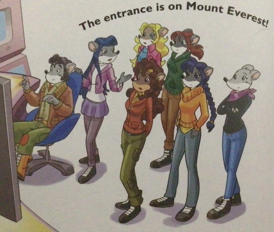
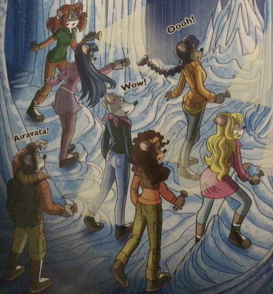
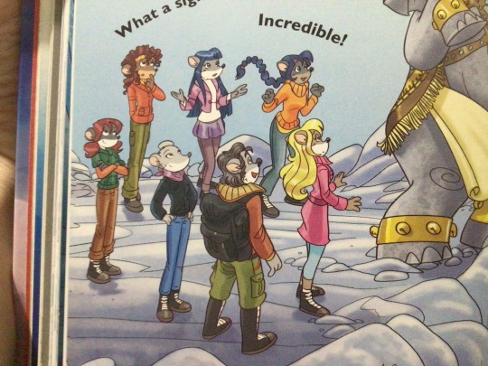
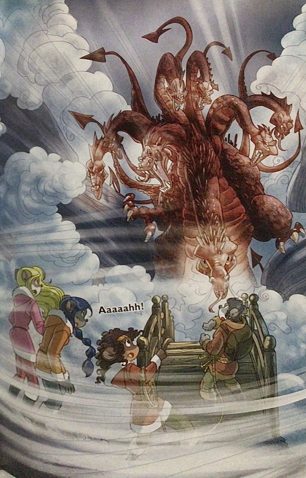
Note
The art style of Cloud Castle is absolute ass bro why are their eyes so big
Idk man it just looks.... off
I wish they brought back the og art style like Blue Scarab Hunt because that was gorgeous
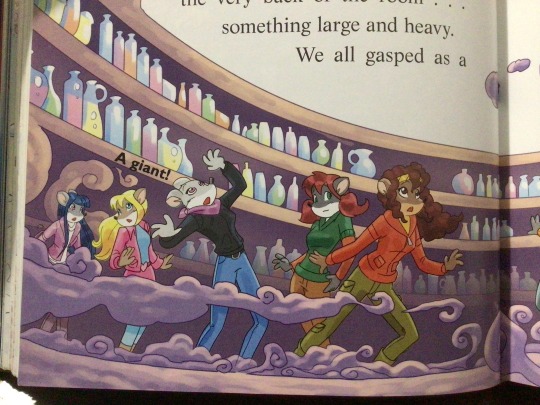
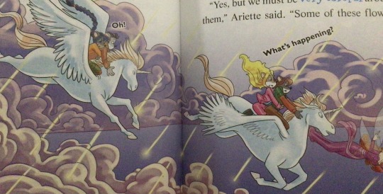
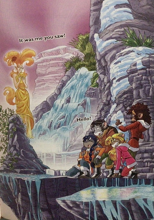
Well if you’re referring to the book's artstyle as a whole, then calm down buddy the illustrations as a whole are pretty good all things considered (believe me some of the illustrations in the later books are waaaaayyyyy iffier)
But if you are referring to Danilo Barozzi’s illustrations in the book then uhhhhh… yeah I don’t blame you, I didn’t like the big anime irises either, she didn’t cook with this one,,,
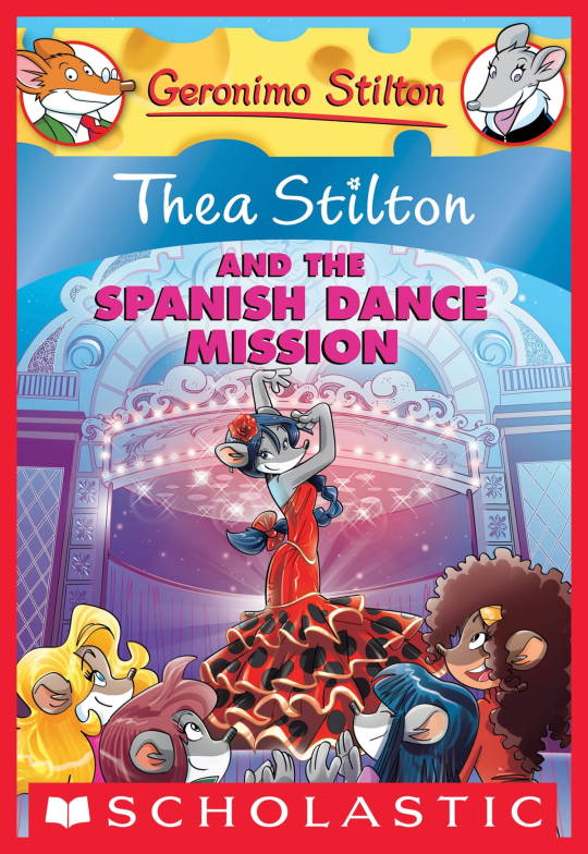
The interesting thing is Barozzi also did pieces for Secret of the Snow and those looked fine (she did well enough that I have to squint to determine which ones were done by her). My guess is either she did a lot of the illustrations for the latter half of SotS and we just got used to it, or it’s because the artstyle of special editions 2 and 3 were more… experimental? Books 4 onwards developed a very specific… look for the artstyle that adhered very closely to the main book illustrations of Spanish Dance Mission onwards, thus the illustrators had to follow suit, resulting in whatever looks off to look especially off.
(Even with this set of pictures, I’m only about 70% sure these are Barozzi’s because of how alike yet different the styles are from each other in the book. The first one could be Barozzi’s, but it could also be Giuseppe Facciotto’s, since he also did illustrations for SotS and his stylization means he sometimes puts the eyes really close to each other in a way that’s weird but still makes sense somehow.)
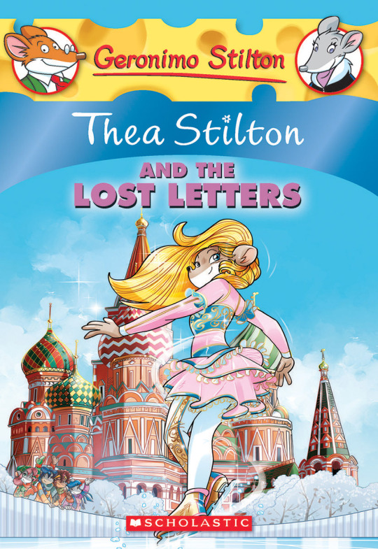
On the contrary, books 2 and 3 (and I would probably even include book 1 there) had a more experimental look to the illustrations, which seems to be based more on (and this is just a theory of mine) Giuseppe Facciotto’s iconic work for the covers of Mouseford Academy books 2-12, 14, 15 and 17 in the English books (he did waaayyy more covers for the Italian Mouseford books— he was basically the cover guy for the Mouseford books for a WHILE) as well as the books from Spanish Dance Mission to Lost Letters. If you’re wondering why those covers go as hard as they do, then now you know why.
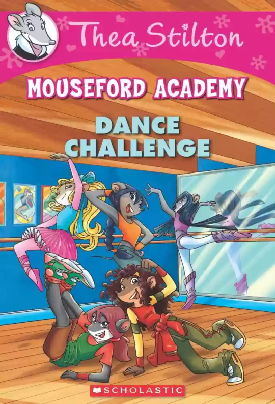
(These aren’t all of Facciotto’s works for the covers we know in English but you can see that he popped off <3)
But yeah as you can see with special editions 2 and 3, the art direction seems to be heavily inspired by Facciotto’s artstyle.
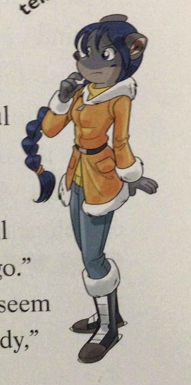
However, when Barbara Pellizzari’s works became the aesthetic poster child of the books’ brand, that was reflected in the illustrations and how their aesthetic changed, as seen in the main books and how they look currently, special editions 4-9, and the Treasure Seekers trilogy.
This new profile thing of the girls? This was done by Pellizzari (coloring was done by Flavio Ferron), and thus it became the main reference for how the girls look in the book’s illustrations.
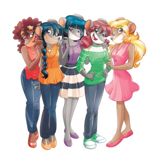
And it’s not just in the general direction to the artists for how to draw the Thea Sisters, but also in the direction given to the colorists. Alessandro Muscillo was the colorist for the special edition books since book 1 and the Treasure Seekers trilogy, and you can see that the direction for the style varied through books 1-3, like maybe direction was experimenting with the mood the illustrations were to convey, beginning with the cartoony and bright colors of book 1, easing into the more grounded and layered palettes of books 2 and 3
Then book 4 was when they transitioned to using digital art /j
I jest, but seriously book 4 was the debut of the coloring style we end up keeping for the rest of the special editions and for all of Treasure Seekers, which is very… bright :D
(I would show more picture examples but I manually took pictures of my physical copies for the Cloud Castle and SotS illustrations and gwuh I’m too lazy to grab my entire collection just to take pictures,,)
Bright as in like… the colors are very defined and saturated. I dunno how to describe it, but when you see it, you get what I mean. It’s very bright and pretty and colorful and it stands out. There are still variations that happen on occasion (Star Fairies in particular uses a good dose of airbrush for the lighting and shadow effects, and Crystal Fairies looks like someone had a bit of fun using sparkle brushes), but other than that, it’s very bright. I don’t hate it, but I do acknowledge that yeah, if I was introduced to the series when it had fully transitioned to the new style, I never would’ve gotten into the series in the first place, because the older books had something that didn’t make it feel specifically catered to girls. The colors were bright, but not too bright. Colorful, but unified. They weren’t that complicated, and they didn’t have to be because the colorists (plural, there were at least 3 per book once upon a time) were popping the hell off with the colors they were given. But y’know, the newer books’ consistent style did give me a good spot to practice drawing mouse furries so I’m not complaining too much about the newer style, haha.
(Tiny baby E’s (it’s literally from 2020 what’re you on about mate) her first mouse Violet drawing using Barbara Pellizzari’s artstyle in Treasure Seekers 1 as an anatomy guide!!)
With that said tho, yeah I miss the old books -m- dunno if it’d fit the aesthetic of the special editions but m a n we could’ve had it and it probably would’ve looked cool
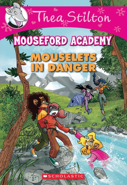
Also the illustrations go way harder in the older books, like Prince's Emerald? I've talked about Prince's Emerald and how it goes hard before, and I still stand by it and say that it does in fact still go hard
Maybe it won't fit the uh splash of color they gave the hardcovers, but imagine they grabbed Giulia Basile's coloring work for the graphic novels and used that as sort've a basis for the coloring style of the hardcovers. Not exactly the same-- would probably still add a touch of whimsical watercolor and/or paint to the very cel-shaded style, but we could've had something pretty dope -m-
Anyway that's my ramble simultaneously defending the hardcovers' artstyle and reminiscing on what could've been haha
#geronimo stilton#thea stilton#thea sisters#questions with e#rambles#the style of the older books is gorgeous but the main thing I'm wondering is can it pull off fantastical whimsy#that's the main thing i dunno if it can do (i would love to be proven wrong tho)#the style is so grounded that i'm wondering if it can pull off what the hardcovers needed it to do#which is convey the otherworldly fantastical thrill of exploring the fantasy worlds (which uh the newer books were able to do but#my main gripe is that fantasy and reality are near indistinguishable in vibes coloring-wise#sure there are sparkles and stuff is more saturated but the girls' dorm in book 4 still has the same-ish feel of the land of clouds#i dunno what it is. the bright colors just feel mundane somehow and don't take a shift when returning to reality)#looked at my books again and i think it might be the fact that the later books have no grounding color?#compare book 3 to book 5 and you'll see it the most distinctly methinks#the newer coloring style doesn't have a color that grounds the illustrations' palettes and thus everything's always bright 100% of the time#the girls' colors are always at their most saturated#like they're always under broad daylight in terms of lighting#it's not eyebleeding or anything but they don't look affected by the lighting in the setting they're currently in#and the result is it looks.... meh?#we get so used to the bright colors that they end up looking meh somehow#i'm not an art expert by any means this is just my observations as someone with a little too much brainrot
35 notes
·
View notes
Last Seen Blogs
svetabil
Sveta Bilyalova

quebecsouverain
Un nouveau pays?

advanturers-blog
Advanturers

tkbhsr
Tanpa judul

mugiwarcs
Rough Sex