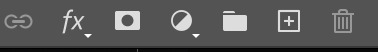
#photoshop menu bar tutorial
Explore tagged Tumblr posts
Visit Tumblr Blog
Explore Tumblr blogs with no restrictions, modern design and the best experience.
Last Seen Tumblr Blogs


Fun Fact
In February 2021, Tumblr had 518.6 million blog accounts.
Text

Create Your Own Main Menu for The Sims 4 - Tutorial
Hey folks!
This tutorial will walk you through creating your own main menu override for The Sims 4 based on my custom repository.
_________
What is required:
JPEXS Free Flash Decompiler
Sims 4 Studio
Raster graphics editor (e.g. Photoshop, Gimp, Photopea)
Your Own Main Menu repository
_________
Step 1: Download and unzip the Your Own Main Menu repository
It's available on my Patreon page for free.
_________
Step 2: Prepare your custom images
There are two images that you need to customize:
SimMattically_YourOwnMainMenu_MainBG.pngThis is the main background image, where you want to put the desired graphic.Size: 1440px x 1200px
SimMattically_YourOwnMainMenu_BarBG.pngThis is the second background for the navigation bar on the right.Size: 480px x 1200px
Prepare your own images based on these templates. Do not change the size of the images.
Tips: If you're using a more complex background, such as a screenshot from your game, I recommend blurring the Bar_BG with a Gaussian Blur (~60px). Additionally, I suggest adding a white overlay with ~50% opacity and a 5-pixel wide white bar on the left edge with ~10% opacity. This helps improve the readability of the navigation bar buttons and adds an extra layer of detail to your menu design.

The repository also contains the optional file "SimMattically_RefreshedMainMenu_ScenarioButton.package" from my other mod, which replaces the Scenario button icon with a semi-transparent white version. It's up to you whether you want to use it.
_________
Step 3: Import the images to the .GFX file
Firstly, open JPEXS Free Flash Decompiler and then open my SimMattically_YourOwnMainMenu_Template.gfx with it.


Select "No to all" when prompted.

On the left, choose "images" and scroll to the bottom where you will see the images you just edited in their original form. Right-click on each and select "Replace." Select the custom images you prepared in step 2.


Save the file.
_________
Step 4: Import the .GFX file into the .package file.
Open Sims 4 Studio, then click on "My Projects" and open SimMattically_YourOwnMainMenu.package. Select "Scale Form GFX" (the one with the "gameentrylauncher" description) and click on "Import." Select the modified .GFX file and import it. On Windows OS, you need to switch from .binary to all file types to see the file.


Save the .package file via File -> Save As... Give it a custom name and place it in The Sims 4/Mods folder.
That's it! Enjoy!
_________
IMPORTANT INFORMATION/TERMS OF USE:
Main menu overrides can become outdated with some game updates, causing them to break the game. You will have to remake your custom main menu with a new, updated template in this case. Always make sure you are using the latest available template and that it's not outdated.
Since these mods can break the game, I do not advise sharing your custom main menus with other players. You are free to do so, but be aware that since you're relying on this repository to create your own version, you most likely won't be able to update the mod and resolve issues for other players on your own, so you take responsibility for breaking their game.
If you decide to share your version with other players, please credit my repository and link to my Patreon post.
Do not put your custom main menu based on this repository behind any paywall or early access. I made this repository and tutorial free for everyone, so keep it fair.
I do not take responsibility for people misusing this repository or breaking your game with incorrectly modified files. I do not provide support for custom main menu overrides created by other creators using this repository.
_________
#sims#thesims#thesims4#sims4#sims 4 mods#sims 4 custom content#simblr#s4cc#ts4#main menu override#sims tutorial
316 notes
·
View notes
Text
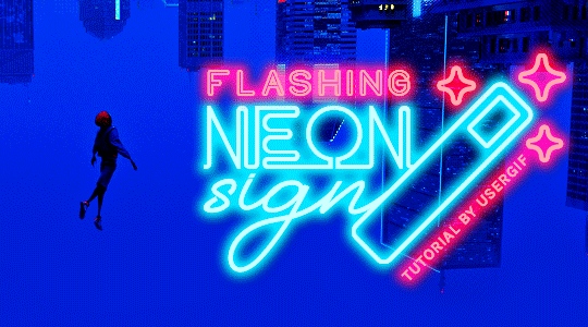
HOW TO: Make Animated Neon Text
Hi! No one asked for this tutorial, but this is one of my favorite typography effects as of late — so I thought I'd share how I do it. You can see this effect in the first gif of this *NSYNC Celebrity set and the last gif of this Anthony Bridgerton set. Disclaimer: This tutorial assumes you have a basic understanding of gif-making in Photoshop. It's also exclusively in Timeline and uses keyframes for the fading effect seen on the blue text.

PHASE 1: PREP YOUR BASE GIF
1.1 – Choose a dark scene. This effect looks best contrasted against a dark background. You can definitely do it with a bright background, but just like a neon sign irl, you only turn it on in the dark/at night — so keep that in mind!
1.2 – Determine the length of your clip. Depending on how much you want your text to flash or fade in, you'll want to make sure you have a scene long enough to also allow the text not to flash — reducing the strain it takes to actually read the text. For reference, my gif is 48 frames.
1.3 – Crop, color, etc. as you would. New to gif-making? Check out my basic tutorial here!
PHASE 2: FORMAT YOUR TEXT
Before we animate anything, get your text and any vectors laid out and formatted exactly as you want them!
2.1 – Finding neon sign fonts. It's easy as going to dafont.com and typing "neon" into the search bar!
2.2 – Fonts I used. Neon Glow by weknow | Neon by Fenotype | Neon Bines by Eknoji Studio
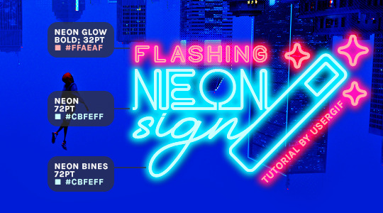
And to not leave my fellow font hoarders hanging, the font for "tutorial by usergif" is Karla (it's a Google font) 🥰
2.3 – Group your text layers. (Conditional) If you plan on having multiple text layers like I did and you want them to appear connected (like how the last letters of "NEON" and "sign" intersect with the wand icon), I suggest putting the layers into groups according to color (the shortcut to group layers is Command+G). If you don't group your text and just apply the outer glow settings to each individual layer, you'll end up with something like this:
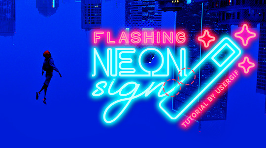
—where you can see the glow overlap with the line, instead of the smooth connection you see in my final example gif. I'm using 2 colors for my text, so I made a group for red and a group for blue.
2.4 – Apply Outer Glow. Right-click your text layer (or your group if you have several layers) and select "Blending Options" to open the Layer Style menu. Check "Outer Glow" and feel free to play around with the settings until you like the way your text looks!
Your outer glow color should be darker and more vibrant than the color of the text itself. The text should be within the same color family but much brighter and, sometimes, almost white (see Step 2.2 again for my text colors).
Here are the settings for the Red Glow (the glow color is #FF3966) and Blue Glow (#00F0FF):
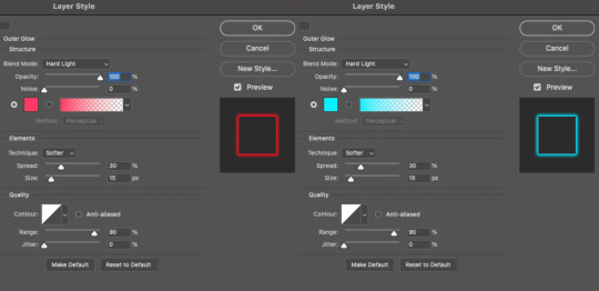
These aren't always my exact settings but they're pretty close to my standard. I always set the blend mode to Hard Light and usually have the opacity at 100%.
For every gif I use this effect on, I like to play around with Spread and Size. Spread will make the glow look denser and "expand the boundaries" (source: Adobe) and Size will diffuse the glow and blow it out so it covers a larger area (Adobe says it "Specifies the radius and size of blur").
2.5 – Duplicate your text layer/groups and remove glow. We're only going to be animating the glow on our text, and since doing this affects its opacity/visibility, we want to preserve the base text by creating a duplicate.
I just hit the Command+J shortcut to duplicate my groups and delete the Outer Glow effects, making sure that the "No Glow" version is above the "Glow" version:
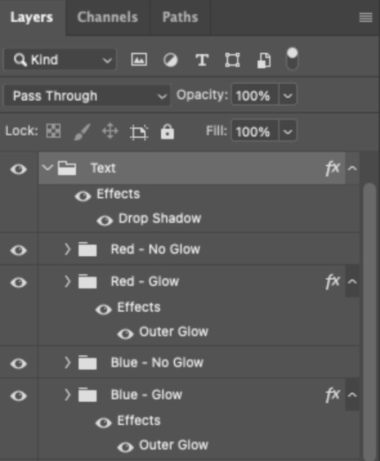
I also put all these groups into one group called "Text" for organization and so I could apply a drop shadow to all the elements for better visibility.
PHASE 3: CREATE THE FLASHING EFFECT
This is for the effect you see on the RED text in my gif!
3.1 – The 0.03-Second Rule If you've read any of my animation tutorials before, you're probably already familiar with this rule. In my experience (and for reasons I can't explain), Video Timeline pauses every 0.03 seconds (try clicking the forward button a few times, you'll probably find a "duplicate" or paused frame). So, keep all your layers a duration of 0.03-second increments (e.g. 0.06 or 0.09 seconds can also work) and align them on the Timeline at 0.03-second intervals. If you don't follow this rule, you'll get duplicate frames when you export, resulting in a choppy final gif.
3.2 – Trim and arrange your text layers. Only on the layers/groups WITH the Outer Glow effect, trim them into several segments of varying lengths where the glow will be "on" (visible) and leaving spaces where the glow should be "off."
Typically, I'll have a mixture of 0.06 and 0.03-second text. That's when the glow will be visible. Between each "flash" of visibility, I've got a 0.03-second blank space, baby *pen clicks* and I'll write your name:
The layers shown above are arranged with a few flashes and two long segments of no flashing. This is the order and duration of each segment shown above (purple = visible segments):
0.06 blank, 0.06 visible, 0.03 blank, 0.03 visible, 0.03 blank, 0.03 visible, 0.03 blank, 0.24 visible (the long bit where "FLASHING" doesn't flash at all), 0.03 blank, 0.03 visible, 0.03 blank, 0.12 visible
(I only did this for the text that says "FLASHING" to give it a glitching effect. The other red text keeps the glow visible starting at the first long segment.)
PHASE 4: CREATE THE FADE-IN EFFECT
This is for the effect you see on the BLUE text in my gif!
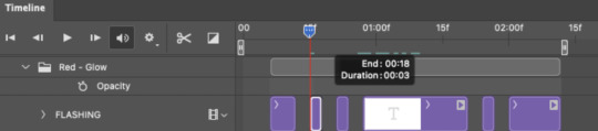
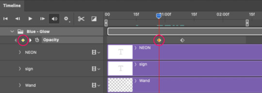
4.1 – Animate using the Opacity Keyframe. Again, we're only touching the layers/groups WITH the glow effect. If you only have one layer of text, you'll find the Opacity Keyframe by clicking the film reel icon:
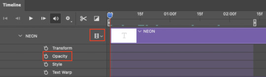
If you're working with groups like me, you'll find it in the Timeline panel under the group when it's expanded:
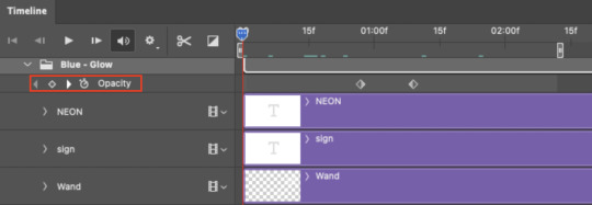
As you can see, I already added my keyframes (lil diamond babies). And luckily, it's super easy to do!
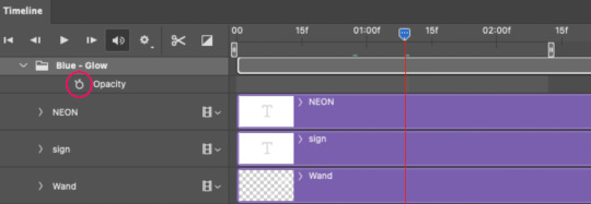
4.2 – Add the ending Keyframe first. We're starting at the end because our layers/groups are already at 100% opacity. Drag the playhead (the blue arrow attached to the red vertical line) to a spot where you want the glow to be 100% opaque — this is where the glow will be fully "on" or visible. [Again, follow the 0.03-Second Rule. You will get duplicate frames regardless when using keyframes (this will be explained in the note in Phase 5), but abiding to the rule will mitigate the amount of dupes you get.]
Then, click the clock icon by "Opacity" to place a keyframe:
4.3 – Add the starting Keyframe. Go backward from the ending Keyframe you just placed (I went back 0.12 seconds — but you can play around with the duration of the fade, just keep it a multiple of 0.03):
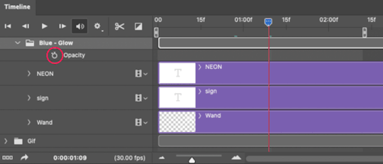
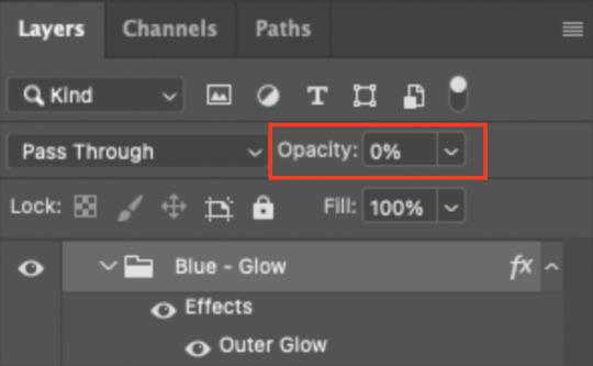
And drop another keyframe, this time by clicking the diamond icon by "Opacity":
4.4 – Reduce the opacity on the starting Keyframe. Keeping that keyframe you just placed selected, go to the layers panel and reduce your layer's/group's opacity to 0%:
Now, this Outer Glow will slowly fade from 0% to 100% opacity.
And just for a visual aid, here's where my fade-in keyframes are in relation to my flashing segments:
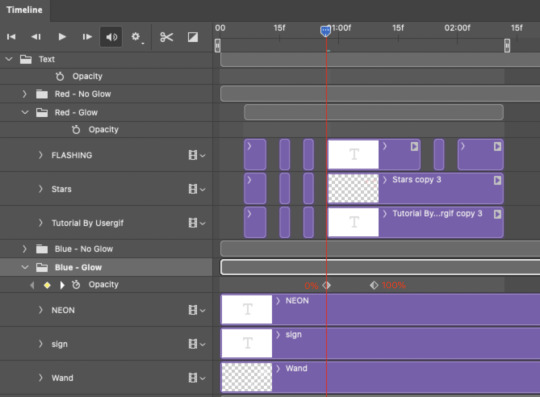
To refresh your mind, the 0% Opacity Keyframe starts when "FLASHING" is visible for 0.24 seconds (the first long segment of visibility).
With these keyframes, you'll get a smooth fade-in à la ✨light switch with a dimmer✨
PHASE 5: EXPORT
Yay, we're finished! Convert from Timeline back to Frames and export your gif!
NOTE: If you only did the flashing effect and followed my 0.03-Second Rule, you shouldn't have any duplicate gifs. BUT if you included the fade-in effect using keyframes, you WILL have duplicate frames. 'Tis the nature of keyframes. 🤷♀️ I had 4 extra frames where the fade-in starts, which I deleted. So, as always, I recommend checking your frames when you convert from Video Timeline back to Frame Animation — and manually delete any duplicate frames.
Sorry this tutorial is so long 🙈 I over-explain so you're not just mechanically copying steps, but understanding the WHY behind each step! Thanks for bearing with me
If you have specific questions about this tutorial, feel free to send a message to usergif and I'll try my best to help! :)
More USERGIF tutorials • More resources by Nik • USERGIF Resource Directory
#typography#gif tutorial#completeresources#usershreyu#useryoshi#userelio#userzaynab#userives#usertreena#usercim#userrobin#userkosmos#usersalty#userhella#alielook#uservalentina#uservivaldi#*usergif#*tutorial#by nik#flashing gif
834 notes
·
View notes
Text
Moffy's Photoshop Tutorial #1: Importing Gifs/Videos + Intro to the Animation Panel
(This tutorial assumes you know general PS things such as layers and blend modes -- but if you have questions, don't be afraid to ask)
---Importing Files---
Okay, so you want to make gifs/animations in photoshop!
First you need to know how to import your files. If you're just working with image files and then exporting as gif, you can start as normal and when ready to animate you can click window > timeline
If you want to import a gif, it's the same as any other image file.
Right Click > Open With > Photoshop (Or just choose File > Open in PS itself, and then click on the file)
(Note! If you don't see PS as an option, you may have to click "chose a default program" and then it will give a menu of programs and you can choose Photoshop from there)
If you want to import a video, from inside Photoshop click
File > Import > Video Frames to Layers
When you do this, you will be greeted with a new window

This is where you choose the section of the video to gif. Be warned, longer videos will be harder to "crop" because this window is quite small and the bar to trim your video is insufficient for longer media. If you can, use small clips that are ten minutes or less.
(Most common video files are able to be opened in PS)
Photoshop has a limit on how many frames it can import at a time, and I have found that limit is 500. At least, with my computer. (who wants to work with this many anyway??) PS may also tell you that it will take time to open the file, so be patient if you have an older computer
I also HEAVILY suggest clicking "limit to every two frames", sometimes I would go as far as every three or four frames, but this may make your final product choppy. Tumblr's size limit for gifs is a lot better than it used to be (10mb) so normally, stick to every two frames for a decent final file size. The longer the selection, the bigger the gif.
You can select whether to import into a timeline or frame animation, for beginners I always suggest frame timeline. This panel is a lot easier to learn and more forgiving. However, if you are experienced in video editing, you may prefer the video timeline.
After imported, you can change the size! 540px is the width of tumblr posts! Height usually isn't an issue for me
---The Animation Panel(s)---
Frame Timeline:

This timeline is beginner friendly, you can work very precisely, very easily. The only downside is that you need to make some edits frame by frame
At the bottom of the frame thumbnail is your delay. I recommend always using 0.08 -- this seems to be the right speed for animation and movie gifs
Make sure "Forever" is selected, of the animation will only play the selected amount of times. (meaning the gif plays once or twice then stops. This is often used in memes though, if you ever wondered)
Use the trash can to delete one frame at a time or select multiple and delete. You can move frames around in this panel, add frames or tweens. (the icons are: add tween, add frame, delete)
The four lines to the right can be used for other options such as changing to a video timeline or reversing the frames. Play around with these! (you can also switch between timelines by clicking the bottom left icon)
Things to know: ALWAYS, ALWAYS, have the first frame selected when making your layer edits IF you want the edit to effect all frames (Such as changing blend modes) Failure to do this means you have to change the blend mode for EVERY frame. and this can take forever.
Certain things will always effect every layer, such as transforming an object. Other will effect the selected frame only, like opacity! So be mindful!
Video Timeline:

This is a timeline I recommend to skilled users, so I won't go too deeply into it (the truth is I rarely use it, so I don't know all the ins and outs)
It works like a video editing software, so if you've used anything similar this will be easy for you.
Layers work just like the layers panel, You can also precisely set the crop of the animation/gif with the blue arrow.
Folders are super useful for this timeline btw!
---EXPORTING---
To export the gift, you need to click ctrl + shift + alt + s at the same time. Just more work than ctrl + s
then you will be greeted with this window, save for web

Here you can experiment with color range, gif modes, and dither. (that's what makes gifs look grainy) I normally use Selective and Diffusion. With dither set as high as possible. (the higher it is, the smoother color gradients looks) I don't have a good way to describing the different modes, so experiment and see what looks best to you!
Need a small gif size? Lower dither, but only a little at a time or the quality will go way down. You can also choose to use less colors. Less colors is great for cel shaded animation, but you'll want the most colors possible for anything realistic.
Click save and your gif is ready to uploaded!
34 notes
·
View notes
Text
How to position facial features for the Our Life sprites
Idk how many people need this tutorial (especially since I kinda sat on it for like a month...whoops) but I noticed people were starting to make more sprite edits and videos using the in-game sprites and I thought having this tutorial might help for those of you who don't know exactly how to place the expression layers for the sprite.
Part 1: What am I talking about?
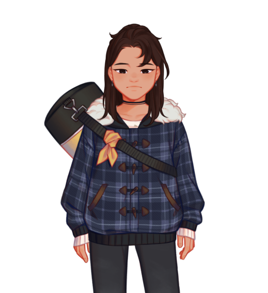
Ok so some of you may be reading the post title and thinking "what the hell does that mean?". For those who are unaware, if you decompile OL1 and OL2, you can find the sprites used for the characters in the game. These files are generally in character folders that contain all the bits for each sprite as well as several versions of the sprite itself in different outfits. All these base sprites files look a little like this
You may have noticed the glaringly obvious detail that Qiu here is missing most of their face. That's because there are several seperate images used for their eyebrows, eyes and mouth. The reason they're all seperated like this is to give more creative freedom over expressions than what would be allowed if there were just already a set number of sprites with set expressions
However, if you want to make a spite edit video, that means you have to piece all the expression layers over the sprite and, since the expression layers don't have the same canvas size as the sprite, you have to actually place them on the face yourself. This can lead to stuff like this.
If you're looking at this and thinking it doesn't look quite right, you're correct. This is the issue you're noticing
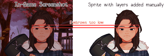
This is generally what happens when you try placing expression layers by eye, you end up sort of assuming you've got the right spot when you're actually slightly wrong. And this is gif just shows the facial features in the wrong spot vertically
So, I've explained the problem, now how do you fix it? It's simple actually.
Part 2: The actual tutorial part
What you'll need:
The sprites and expression layers you need (this tutorial assumes you already have the game decompiled. If you don't and have no idea how to do so, here's a tutorial for just that)
An editing software that has a tranform tool such as Photopea, Photoshop, GIMP, etc.
Step 1: Open up the sprite you want to use in your image editing software of choice and import in all the expression layers you want to use
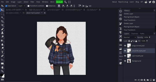
Step 2: Open up the transform tool on your editing software. Where this is may vary, on Photopea and Photoshop you can open up either through the shortcut alt+control+t or clicking on edit in the top bar and selecting Free Transform from the menu. If you don't know where the transform tool is in your software, I'd suggest looking it up

(A showcase of where the tranform tool is in Photopea and Photoshop)

(What the transform box should look like
Step 2.5 (This might be photopea specific, idk if other software does this): If your transformation tool box looks like this, cancel out of the tool (using the little x button on the top bar) and then open the transformation tool back up again. Make sure you're not selecting multiple layers and also make sure you didn't open the tool with the transformation controls tick box from the top bar. If none of that works, just delete the layer and grab it from your folder again and try again
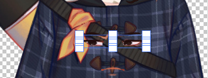
Step 3: With the transform tool still open on your desired layer, move the layer so that it snaps against the corner of your canvas. Your image editing software should automatically have layer snapping enabled but, if not, I suggest looking up how to turn it on. If it doesn't have this, the best suggestion I have would just be to make sure the corner of the transform tool's box and the corner of the canvas allign. Zoom in if need be. You then repeat this process for the other expression layers (and any other layers that aren't automatically allighned like the blush layers or the tear layers)
(Notice the red lines that show up when it snaps against the corner)
Step 4: Export your sprite file because that's it, you did it! Now you have a sprite with the layers placed in the right spots! Isn't that great!
...(maybe I should've chosed a happier expression for this...)
Anyways, I hope this helps!
63 notes
·
View notes
Note
this is going to sound like a dumb question, but hi! i happened to stumble over your coloring tutorial from back in february, and i was wondering how did you managed the linear transition to show the difference between the of scene and the one you edited. thank you so much for your time.
✨ gif transitions using clipping masks and keyframes ✨

hi!! it’s not a dumb question at all, thank you for asking! I think this is the gif you mean, from my gif colouring tutorial. to do the transition I used clipping masks and keyframes - full explanation beneath the cut!
(I apologise in advance if any of this is confusing - to be honest I worked this out by just fucking around and guessing on photoshop, so it took me a little while to reverse-engineer my steps to work out what I did lol - but I hope it makes sense!)
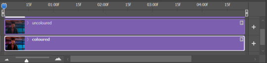
so the first step is to make your gifs. you need two - one coloured and one uncoloured, saved separately. make sure that they are both the exact same number of frames, and that they're both running at the same frame-rate.
load both gifs into photoshop and put them in timeline mode. then copy the uncoloured gif and paste it onto the same timeline as your coloured gif, with the uncoloured gif on top. like this:
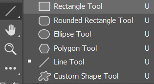
next, add a layer that is just a white rectangle of the same size and shape as your gif. my rectangle tool is hidden in a secret pop up menu attached to my line tool, for some reason:
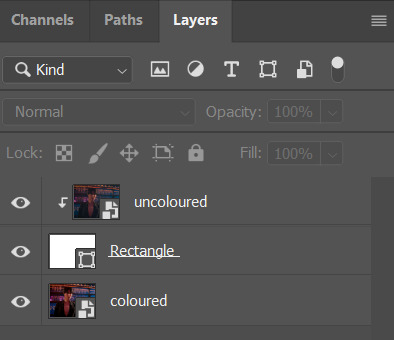
put this rectangle layer between the coloured and uncoloured gif layers, and then clip the uncoloured gif layer to this rectangle by right-clicking on the uncoloured gif in the layers panel and selecting 'create clipping mask'. this will automatically clip the gif to the rectangle layer beneath it.
now your layers panel should look like this:
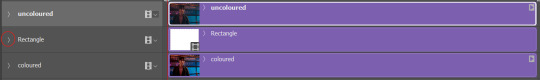
at this point I personally hide the visibility of my uncoloured gif layer, just to make it easier to see what I'm doing. like this:

which should mean your gif just looks like a white rectangle. this seems wrong but it's not!!
and now we need to fuck around with keyframes. basically what we're doing is telling the rectangle to move out of the way while the gif is running.
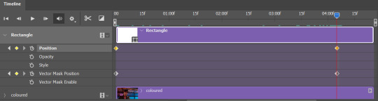
to start using keyframes, click the little arrow on the left hand side of your rectangle layer in the timeline panel -
which should bring up this drop-down menu.

now, with the red timeline bar set to the very beginning of the gif, click on the little stopwatch button next to 'Position' and also 'Vector mask position'. it should put some little diamonds on the timeline, like this:

next, take your white rectangle layer and move it just off the right edge of the gif canvas, like this:
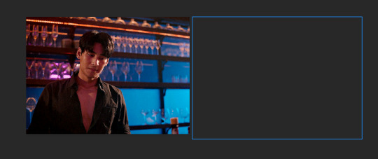
(you can't see it because it's not in the canvas, but photoshop still knows it's there!)
then move your timeline bar to about 4/5 of the way through your gif, and click on the stopwatch icons next to 'position' and 'vector mask position' again. like this:
now, if you slide your timeline bar back and forward between those two points you marked, you should see the white box moving across the gif - from its first position covering the gif, to its second position just off the canvas.
now you can make your uncoloured gif visible again - and it should look like a transition between an uncoloured and a coloured gif when you move the timeline bar around.
save as normal!!
you might want to mess around a bit with where you put those second keyframe markers depending on how long you want the completed coloured gif visible before the gif replays - just play with it and see what works for you.
sometimes I find using keyframes makes the frame-rate a bit weird when you save the gif - if that happens just save as usual and open the saved gif to fix the frame-rate afterwards.
I hope this was helpful!! lmk if you have any more questions :D
#sorry this took a couple of days to respond! hope it's still helpful 🫶#gif tutorial#darcey.gif#darcey.txt#ask#gif making#tutorial#photoshop tutorial#gif resources#photoshop resources#userdramas
37 notes
·
View notes
Note
hello! im a newby gimaker and i want to follow your tutorial on sharpening but i dont know how you got to the photoshop page you started from where it looks like a video timeline. can you tell me how you got there? <3
Hey!!
Welcome to the wonderful world of gifmaking <3 yes i can lead you through to that point. I have a mac so this might look different for you, but all the steps stay the same - I just shifted from windows to mac so i know this xD
I'm going to show you how to do this on this gif:
I prefer to use screenshots for my gifs (I also don't know how else to make them), so I use Mplayer for that. I used to use MPV player but that stopped working with my new computer system.
First, you want to make sure that you're using a high-quality file. If 1080p is available to you, use 1080p at the very least. This will make sure your gifs are crisp and sharp.
Open your file with Mplayer. Then find the bit that you want to gif. I sometimes search forward by frame by using the ">" key. Once you're at the start point of your desired gif, pause the video. Then, Cmd/Ctrl + Shift + S to start screenshotting. The video will start to play slowly as the screenshots are captured. (They go to the desktop automatically but you can change that in interface settings).
The rest of the tutorial is under a cut:
Once you get your screenshots, you're going to go Photoshop. File > Scripts > Load Files Into Stack.

You're going to get a dialogue box. Click Browse and load the screenshots that you want. This is what that looks like when you finish:
Next, you're going to crop your gif, using the crop tool. You can press C on your keyboard for this or use the tool with this icon in the sidebar.

For this, I'm using an aspect ratio of 540 x 400:

Click that checkmark to crop. Once you do, we're going to resize the image. Use the Cmd/Ctrl + I function to bring up this box. For tumblr gifs, you want to change the width. The height doesn't really matter but if the width doesn't match up, Tumblr is going to fix it for you and it'll look funky. Per row:
1 gif , we use 540px
2 gifs, 268px each
3 gifs, 177, 178, 177 px
We're just doing one, so I'm using 540px.

Now, you want to make sure you can add the timeline. In the top bar, go to Window > Timeline
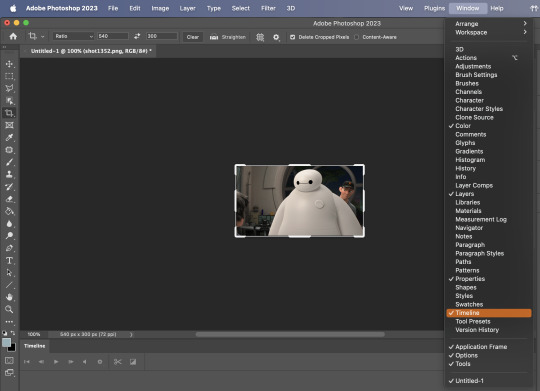
This will bring up the timeline.

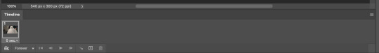
From there, click "Create Frame Animation" (you might have to press the arrow in the timeline bar first.)
It's going to look like this:
We're going to use those three lines in the corner of the picture above. The first option we'll select is "Make Frames From Layers"
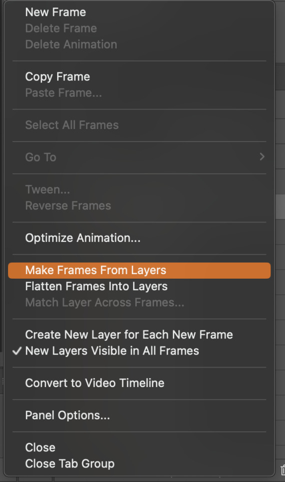
That looks like this:
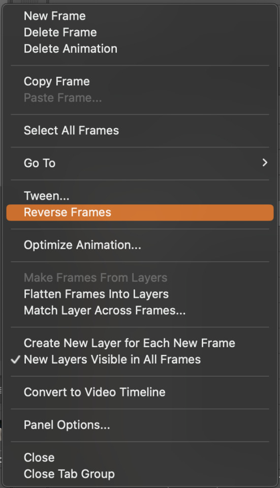
Now, when these load in, you may notice that they're all in reverse. To make them go back in order, we're going to go back to that menu and click "Reverse Frames."
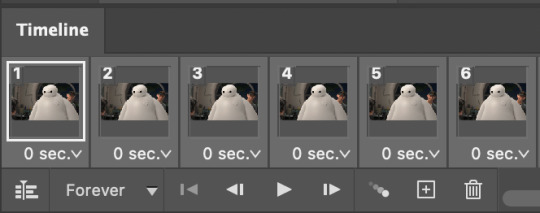
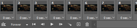
Then, in that same menu, click "Select all Frames." We're going to change the animation speed. You want to make sure you have the first frame selected. We're going to click the arrow next to the "0 sec"
When you click that, it will give you a menu. Click, "other..." You should get a dialogue box that says "Set Frame Delay", just like the one below.
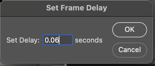
You want to use anywhere between 0.05-0.1 seconds. I find that anymore more is just too slow, so I prefer 0.06. This is fully changeable at the end of my sharpening tutorial, and you can use what you want, but that's what I prefer.
When you do that, it'll change the frame speed of all the gifs.
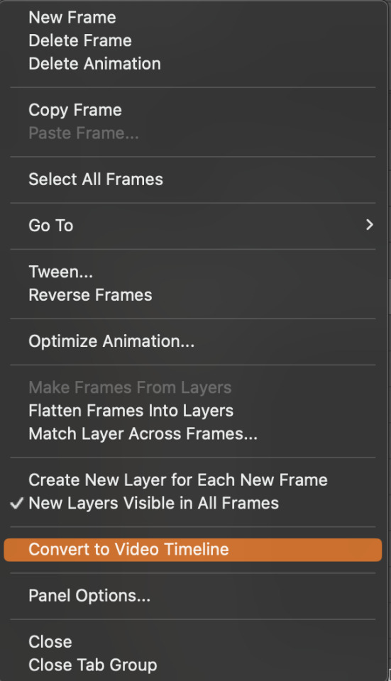
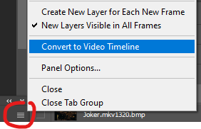
Now, go back into that little menu, and click, "Convert to Video Timeline."
This is what it'll look like:

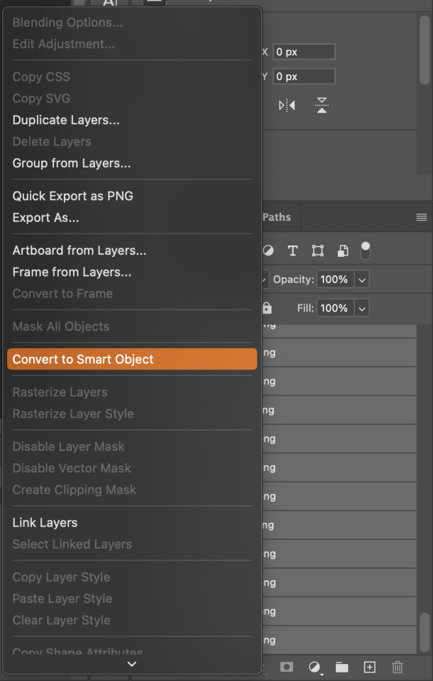
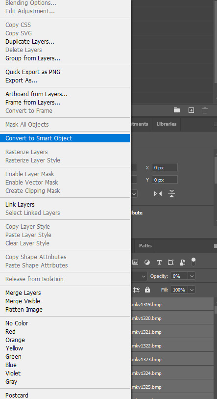
Now we're going to select all the layers in the right-hand pane. Once we do that, right-click and select, "Convert to Smart Object."
And you're there! Now you can use the sharpening tutorial to your liking.
Pro tip: Make an action with all these steps so you don't have to do them by hand with every single gif you make.
Hope this helps and it wasn't super long winded. Let me know if you have any questions <3 Happy giffing!
#zee answers#zee's tutorials#sharpening#gif creation#tutorials#gif tutorial#photoshop tutorial#resources#ps help#dailyresources#userphotoshop#completeresources
46 notes
·
View notes
Note
Hi! Happy 4k celebration 🥰 Can you share how you make your gifs or make a gif tutorial?
hi !! tysm <3 i'm more than happy to give you a little tutorial on how i make my gifs ! of course, my process is not the same to other gifmakers and may not always work for everyone but i hope it helps !
for this tutorial, i'm using the most recent edition of photoshop (2023) on my mac. full explanation under the cut.
full disclaimer: most of what i've learnt about photoshop and the giffing process is through pure trial and error. this won't work for everyone and others may think it's a little weird, but this is just how i make my gifs !!
1.find your scenes.
finding your scenes is sometimes very time consuming but you want to get it right the first time !! for this tutorial, i'm using a music video in mp4 format.
2. loading your scenes.
to load your scenes, you want to go: 'file' > 'import' > 'video frames to layers'. i know that this step varies on the user because some people like to go to timeline first, but i'd advise starting in frames first !
after that, a screen like i've depicted below will pop up. i've also annotated everything for you as well.
so, select your desired range, press 'ok' and then it will all load into ps !
3. setting up your gif.
i'm grouping this all into one step, but it's broken down into a few things.
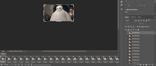
the first part of this is: cropping. the recommended dimensions i follow are on this guideline here, but for the sake of this tutorial i'm just going to crop my gif 540x540 (as a w x h setting). the crop tool is on the left hand tool bar.
now, my gif looks like this. from here, i'm going to click on the timeline (the space along the bottom that has every frame). from there, click on the three lines to get this menu (i've circled where to go + what you'll click):

from there, go 'select all frames' and then click on any of the frames NUMBERS (where it says 0.04 with an arrow besides it, or whatever yours says) then change the frame rate. with most youtube videos i will use 0.08 as my desired frame rate, but when i'm gifing a show or something, it loads in as 0.02, so i change it to 0.05. 0.05-6 on any normal screen cap should be fine, but obviously you can change it depending on if it looks right or not.
from there, you've basically done the first half of the basics. now, you'll want to click on this button:
and now you'll be taken to the video timeline ! from here, select command + option + a (this is for mac, i think it would be control if you're on another device) then, right click on your layers and go 'convert to smart object'.
from here, i'll sharpen my gif before i colour. for this step i have two alternative sharpening settings first one by anyataylorjoy (rb to download !) and the other by maygrant (please ask !). the first one is tuser maygrant's and the second one is tuser anyataylorjoy's. i typically use morgan's for all my basic gifs but anyataylorjoy's for creative sets. every user has a different preference but just find what's good for you !

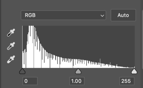
4. colouring your gif.
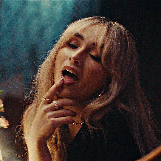
definitely the most tedious, this can be a little bit of a hassle depending on the scene. if the colouring isn't riddled with heavy yellows or cyans, colouring is usually a breeze but if it is, it can be hard.
CURVES
the circle with the arrow dropdown and that's half grey-white is the circle you want to click on to find curves. it'll open a menu and curves will be at the top.
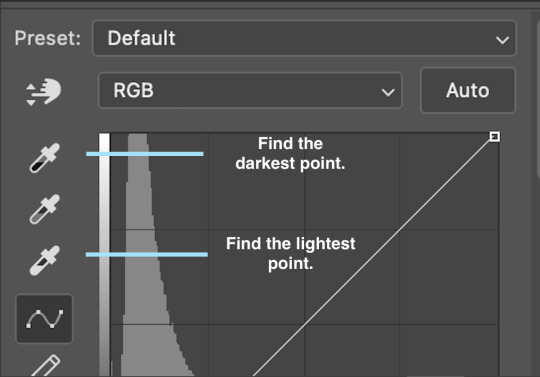
you'll see a little menu like above appear. now, select the dropper i've indicated as being the "light point" and then, using the zoom tool, we're going to zoom in and find the brightest point on the gif. this is typically where the light source is.
in this section here, i can see a couple of bright points. using the dropper, i'll click on the closest to white (note: i find that white rarely changes the colouring of the gif, so if there's like, a really really light yellow, for example, click on that) and then i'll do a similar process with the "dark point" dropper, finding the darkest spot, which is usually in shadows or in the corners. unlike with the light dropper, you want the closest to black, whether that's a dark dark brown or dark dark blue.
now, we can see how the colouring has changed:

optional: you can change the white line on the curves menu, which can make it lighter, or darker in different points of the gif.
LEVELS
levels is an optional step, but i recommend it on very light gifs, or if you want to add a little more depth. probably don't do it on an already very dark gif.
the levels menu looks like this:
the far left slider adds shadows and the far right slider makes it lighter. on this particular gif, i only need a little bit of depth to her face and i only need to contrast that a little bit. by just dragging the slider a little bit:
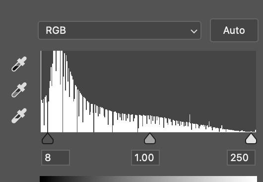
this is the result:
with levels, it can very quickly alter skin tone/make your gif look bad !! with levels, i don't think you need to go above 1-12 in adding depth.
OPTIONAL: BRIGHTNESS/CONTRAST
brightness/contrast is optional !! only add it if it's necessary :)
COLOUR BALANCE
a colour balance layer is great for fixing the tones for the gif !!
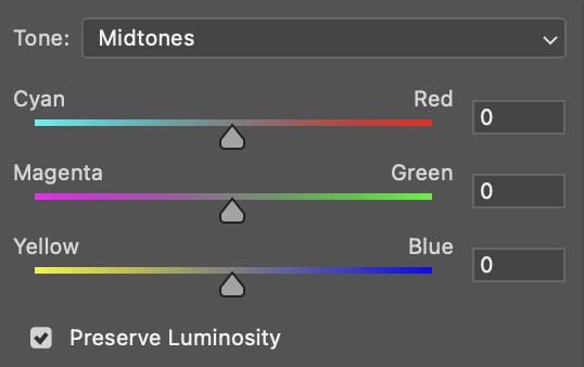
this one's pretty self explanatory. if you want it to be more yellow, slide it towards yellow. if you want it to be more red, slide it more towards red, etc etc. i've attached some gifs showing how i change tone:
but just play with it until it looks right. be very careful with skin tone !! colour balance can very easily whitewash/colour wash and that is not something encouraged, in the slightest.
SELECTIVE COLOUR
a selective colour layer is basically a "final touch" to colouring. where colour balance just kind of does an overall change of the gif, selective colour allows you to alter your specific tones, ie. reds, magentas, blues, etc. for me, i'll do the bulk of getting my desired colouring with colour balance, but if it overcorrects reds, for example, i'll add some cyan to red tones in selective colour, to diffuse that.
currently, in my gif, it's very red/yellow heavy. to balance that out, i want to add cyans. so, on the drop down list of the selective colour menu, i'll select 'red' and then i'll ADD cyans (so move the slider to the right, not the left to decrease) and then repeat that on other tones that i want to correct, with different colours.
with each of the sliders, just add or decrease how much of that colour is in that tone. once again, be mindful of skin tone and whether it is appropriate or not.
with selective colour, if there are any standout colours (eg. in my gif, there's a big patch of cyan) that don't interrupt their face (eg. reds and yellows are always in faces) and change the way the subjects look, you can change those colours to make it more vibrant. so, in this gif, i'll enhance the cyans and blues and magentas to make the colours pop more.
5. saving your gif
once your happy with the colouring of your gif and done what you need to do with it, save it as a smart object with all your colouring layers, then go to 'file' > 'export' > 'save for web (legacy)...' . play back your gif, and it should be all good !! congrats on making your gifs !
i've included a playback of each layer, which is staggered to show each layer come into effect.
in order: nothing -> curves -> levels-> brightness/contrast -> colour balance -> selective colour.
hope this helped !!
#*tutorial#gif tutorial#ps help#ps tutorial#userriel#userautie#userraffa#usernorah#userrsun#usercats#thingschanged#**l.myeditss
130 notes
·
View notes
Text

Updated Gif Making Tutorial!
What you will need: Google Chrome. Quicktime Player. Photoshop.
TLDR version
Turn off graphic acceleration in Chrome and relaunch.
Use Quicktime Player to record the screen.
Trim the recording and upload it to Photoshop.
Turn the layer into a Smart Object. Resize Image to 540 width. Apply Smart Sharpen Filter.
Add adjustment layers as needed to correct color. Suggested Adjustment layers: Exposure, Brightness/Contrast, and Color Balance.
Save for Web (Legacy) set to Gif 256 colors Loop Forever. Must be under 10M for Tumblr.
So I have changed my process and I figured I should document it for whenever I inevitably forget how to do it. This is definitely for more intense gifmaking so if you are just wanting to do something less intensive, you can still do step one of this tutorial but then use something like GIPHY Capture to record the gifs. You can do basic gif captures and add text with it but you won't be able to get the same quality without doing a little editing. Most of my older stuff was done with Giphy Capture and some of those gifs I would use this tutorial to edit. Even then, they weren't the quality I wanted so now I use this process.
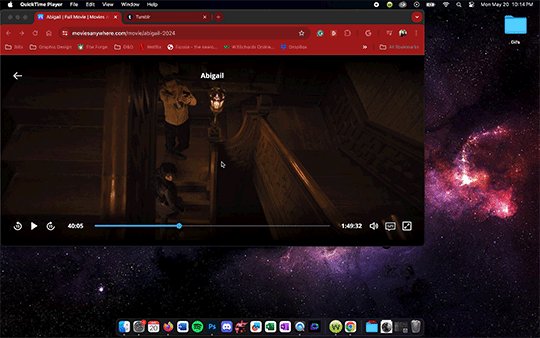
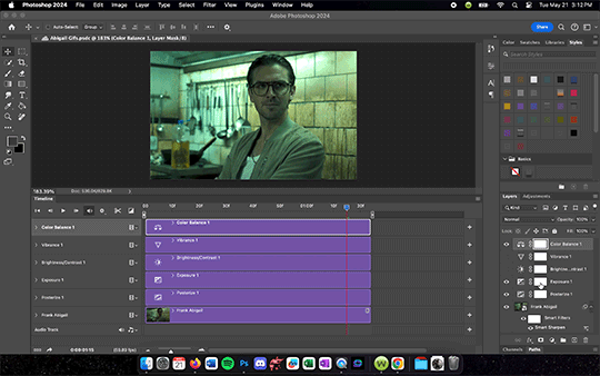
Anyone who is just starting out doing this, super important first step - you need chrome. It sucks but you need it to do the screen recording later on. Once you have chrome downloaded, go to the three dots in the top right hand corner >Settings> System>make sure that the Use graphic acceleration when possible is NOT CHECKED. You will see in the first gif mine was already turned off (greyed out with toggle to the left side). When you initially turn it off then it should give you an option to relaunch (note that because mine was already off I did not need to relaunch).
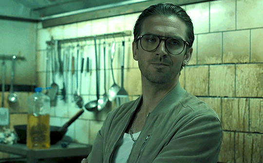
Now for the screen recording. First go to whatever streaming site you have the media you want to gif on it. For this tutorial I used Abigal that I streamed through Movies Anywhere. You should be able to screen record from pretty much any site but be aware of the quality. VUDU/Fandago at Home will only let you stream in SD on Chrome so that is why I use Movies Anywhere. I then use Quicktime Player to record. I keep it on my dock so I just go down to it and tap it to open a menu at the top of my screen. On that menu, go to File>New Screen Recording and a menu will pop up on the screen with options of what to record. Use the Record Selected Portion then adjust the size to match the size of the video. Once you hit record you can play the media and then it will record until you hit the little stop button on the top right of your menu bar.
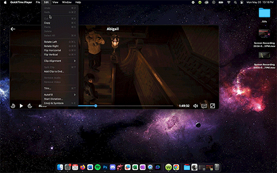
Once the recording is done, you can trim it and save it. I HIGHLY recommending trimming down the screen recording before moving the file into Photoshop. Otherwise it will be such a pain when it comes time to edit. Also, your screen recording original will still be saved usually on your desktop if you want to trim down multiple parts of the video into different gifs.
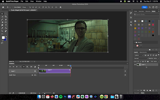
Next, you drag the trimmed file into Photoshop and turn it into a Smart Object by right clicking the layer and selecting Convert to Smart Object. This will allow you to add filters which you will want to do if nothing else but to sharpen the layer. Then you should resize the image to an appropriate gif size (I use 540 x 335ish for my gifs because I find it just looks nice but you can mess around to find what dimensions work best for you).
After you resize your image, go ahead and go to Filter > Sharpen > Smart Sharpen and set the amount to 500%, radius .3, reduce noise to 10%, and Remove to Gaussian Blur. Hit OK and then you should notice your gif looks clearer. After that, you are free to play with the Timeline to adjust timing (you may have to double click the Smart Object layer to change the trim of the layer but once you have adjusted it just exit out of that project and it will automatically save the trim to the original PS document you are working in), add shapes/text, add adjustment layers, etc. I would recommend an added Exposure, Brightness/Contrast, and Color Balancing layer then play with those settings until the color looks right. Be sure to save the file once you get the coloring down so you can just drag and drop other screen recordings into the PS document and it will copy those settings to it. Just remember to do the Smart Object and Sharpen Filter on every new screen recording layer you drop in.
Once you are ready to save, go up to File>Export>Save for Web (Legacy). It may take Photoshop a moment to load this menu. There will be a circle of loading white dots you will just have to wait out. Once the menu does load, select Gif from the menu just under Preset. Make sure the colors are set to 256 to get the best quality gif. Also check in the bottom left hand corner under GIF that the size is under 10M or tumblr will hate it. You may have to adjust the length of you gif if it is over that size. Also, select Forever under looping options and that the dimensions are reasonable. Tumblr hates anything bigger than 540 wide which is why that is my standard width. Once your settings are right, hit Save and then now you are ready to upload to Tumblr!
#Gif tutorial#Gif making#I am still learning so this process will get refined the more I practice#Now back to giffing Abigail#Reference#I should also note I DID NOT do any sharpening or adjustments to the tutorial gifs#I was just trying to get this tutorial out fast
14 notes
·
View notes
Note
Would you mind teaching me how to create gifs? ♥️ Like what program do you use, how to adjust their sharpness or things like that because your gifts are both beautiful and high-quality! I am still an amateur when it comes to editing. 😭
Hellloooo, sweet anon! Of course I can give a mini tutorial on that for you! :3 PHEW, honestly I haven't made GIFs in a fucking hot minute (since early May!). I put that on the back burner to focus on crunching away that writer's block. 🥲🙄 BUT... Making GIFs is like second nature to me because I've been at it for 2 years now, so allow me to tell you all I know! ❤️
I use Adobe Photoshop 2023! My GIFs are started, edited, cooked and finished all up in there. I know there's plenty of cheaper/free alternatives, but I've literally only ever used Photoshop so I have zero experience with those alternatives. 🥲
Remember, a huge part of how smooth and high quality your GIFs are gonna be is 95% where your GIF source is coming from. Stay away from 720p quality files! You want your GIF screencaps to be pulled from the most HD, crisp source material. At least 1080p unless you absolutely can't get your hands on anything else.
Once you pop open Photoshop, you want to follow...
Click "File"
Click "Scripts"
Click "Load files into stack..."
Now select all of your GIF screencaps. I would recommend a maximum of 85 screencaps otherwise your GIF will be longer/beefier and Tumblr for some reason hates GIFs over 10mb.
Wait for it to load! If your computer is older/slower, this might be a pain in the ass and will be 2x a pain in the ass if you have a high screencap amount.
CROPPING YOUR GIF: Select W x H x Resolution on the top bar.

It's honestly best to crop out as close to the edges as possible for the sharpest gifs. A general rule of thumb I like to follow for cropping/GIF sizing is:
One gif: 540 px x 400 px.
2 gifs side by side: 268 px each.
3 gifs side by side: 177 px, 178 px, 177 px.
Hit enter twice to crop!
Once your GIF screencaps are loaded in, click on "Create Video Timeline" on the "Timeline" option. If you can’t see the Timeline > Window > Timeline.
Click on the stack of 3 small lines on the far right of your Timeline and click "Convert to Video Timeline".
8. Click on those 3 lines again and click on "Make Frames From Layers".
9. Click on those 3 lines again and click "Select All Frames".
10. Click on the 3 lines again and click "Reverse Frames" otherwise your GIF will play backwards!!
11. Then you'll notice all your frames like this showing 0 seconds.
Now you get to decide how fast or slow you want your GIF to play, but we're not using whole numbers like 1 2 3 4. Those will make your GIFS incredibly choppy and slow. Instead, we use numbers like 0.01. I would recommend sticking to 0.05 or 0.06. The higher the number, the slower it is. 0.06 feels just right to me, but 0.05 is more like watching the clip live from the movie. I also use 0.07 and 0.08 when I try to GIF a screencap that's very short so unfortunately you have to slow it down otherwise your GIF zoom replays and if you're making a GIF set it'll look horrible next to the other ones going at normal speed LMAO. 0.08 is a good, sensual slow motion type of GIF. Definitely play around with the speeds until you feel comfortable with how your GIF plays out. Not all GIFs are made with equal speed!
For my example, I'm choosing 0.06.
12. Next, go to the far right where your screencaps are all layered and select every single one of them from top to bottom. Then, right click on any random layer until this menu pops up. Click "Convert to Smart Object".
13. On your Timeline, you'll get your smushed chunky little GIF looking like this.
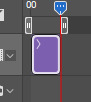
Now with my extensive experience in navigating Tumblr's hellish rules for GIF size and keeping my GIFS clean, smooth and not too long or not too short, I can easily eyeball this every time but I can see why a beginner with Photoshop GIFs might struggle. You see how big that purple block, AKA your GIF, is? It basically needs to be half of that. The bigger that block, the longer/beefier the GIF.
Slowly drag your mouse over that purple block from start to finish to watch your GIF essentially manually play out in front of you. Then you can decide what parts to trim out using the scissors option.

You can then click anywhere on the Timeline to unselect those now 2 chunks of purple. Then you can select just the one piece you want to delete and either hit the backspace key on your keyboard (Like I do) or right click it and click delete.
14. Next, make sure you drag that little blue arrow thing that lets you comb through the GIF all the way back to the beginning. We're going to edit the actual GIF now and we want to edit the whole thing from start to finish, not have effects randomly playing right before the GIF ends or in the middle of it.

15. Time to sharpen up that GIF as the first part of our editing and make it pretty!!

Click on lower left convert button to Convert from Frame Animation to Video Timeline.
Select > All Layers.
CTRL + click on any Layer > Select Convert to Smart Object.
16. Filter > Sharpen > Smart Sharpen.
A little menu will pop up and you can select/input these defaults I use for my crispy GIFs:
Preset: CUSTOM.
Amount: 500%.
Radius: 0.4 PX.
Remove: GAUSSIAN BLUR.
Once more...
Filter > Sharpen > Smart Sharpen again only this time for the second Smart Sharpening, make the attributes:
Amount: 10%.
Radius: 10 PX.
17. Colouring the GIFs!
If you don’t have Adjustments tab > Window > Adjustments.
Adjustments > Exposure.
Another little menu will pop up, and you can use my defaults:
Preset: CUSTOM.
Exposure: 0.99
Offset: 0.0000
Gamma Correction: 1.00
Adjustments > Brightness/Contrast.
Brightness: *anything you want* Drag your mouse around to play with how you want this to look, there are no set numbers however you might want to note down the amount of brightness you put or took away if you want all of your GIFs to match this one!
Contrast: *anything you want*
18. Colouring GIFs when skintones or scenes are too orange/red:
Adjustments > Selective Color.
Colors: REDS.
Cyan: +6.
Magenta, Yellow, Black: 0.
The reds result in the orange color to begin with, but remember each color has its own counterpart. To decrease red tones, increase the cyans!
Example: Making a blue dress more vibrantly blue à Adjustments > Selective Color.
19. Adding text.
Remember, text layers should be on top of the rest of your layers, even if you have several pieces of text on the GIF. It doesn't matter in which order you stack text layers on top, they just have to be up there.

Click Text Tool on the lefthand bar and then click wherever you want to add the text.
To change text settings on a panel > Window > Character.
18-20 pt font is suitable for 540 px gifs! It's to use Calibri font in italics for text talking or Myriad Pro. Those are GIF text classics.
Right click on Text Layer > Blending Options > Stroke > + Stroke.
Size: 1 px.
Position: OUTSIDE.
Blend Mode: NORMAL.
Then hit OK.
Right click on Text Layer > Blending Options > Drop Shadow > Drop Shadow +.
Once again, right click on Text Layer > Blending Options > Stroke > + Stroke.
Blend Mode: NORMAL.
Angle: 30 > Use Global Light.
Distance: 1 px.
Spread: 17%.
Size: 3 px.
Noise: 0.
Layer Knocks Out Drop Shadow > OK.
To center and move the text, just press Y on your keyboard to use the move tool.
20. Finishing up the GIF!
File > Export > Save for Web (Legacy). Check bottom left corner of save screen for GIF size.
Do not go over 10MB EXACTLY! Otherwise Tumblr won't let you post it. You'll have to go back and shorten your GIF as a result, even if that means just splitting the clip off at the very end or very beginning.
Happy GIF making!! :3 ❤️❤️❤️
8 notes
·
View notes
Note
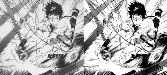
Hi, i have a question, how did you make the animation in Photoshop? It's awesome how you made animation, I want to try my hand at animation now too 😎👍
(sorry for my bad English, it's not my first language 😅)
I'm not good at explaining, I'll try to show how I do it a little bit, but if you really want to learn, I advise you to look it up on Youtube, as that is how I learned. I'll put my quick explanation under the cut to not make the post too long.
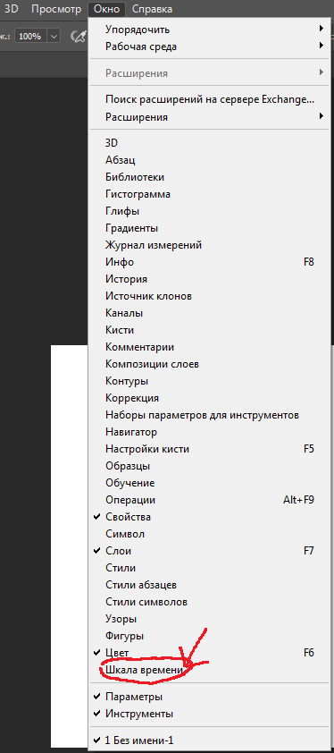
First, in Photoshop, go to the line at the top of the screen and press "Windows", at the bottom there should be a button saying "Time Scale" or something like that. I don't remember what these are called in english, as my Photoshop is in russian. Then, a block of grey will appear at the bottom, and you should click the long button in the middle of it, it should say "Create time scale for video" or something similar.
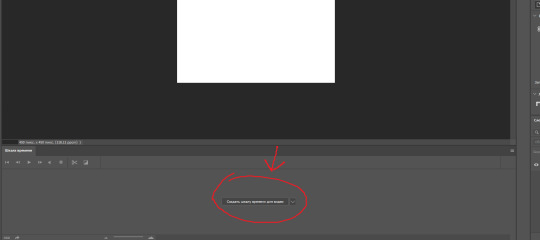
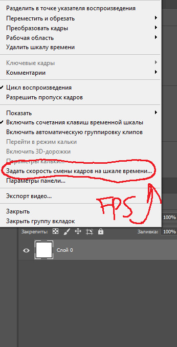
See the three small lines in the top right corner of the video bar? Click it and set your FPS - Frames Per Second. If you decide to change your FPS after making video layers it gets a bit complicated, I keep forgetting how to do it myself, but I think I saw a Youtube tutorial for it too.
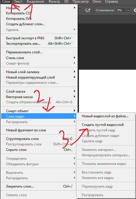
Now that the FPS is set, go back to the bar at the top, go to "Layers", then to "Video layers" and to "Create empty video layer". That's the layer you can animate on, it has frames. You can also use regular layers, to make backgrounds, or still frames.
There are a lot more things I didn't talk about, but mainly the "Onion Skin" that you can turn on or off in the little three-line menu where the FPS is, and being able to move from frame to frame with the arrow keys on your keyboard. To play the video, just press the triangle left and up to the block with blue and purple layers. Saving is harder, I only know how to save gifs, but you can save your project as a regular PSD file while you figure out other formats, it saves all the layers.

This is not really a tutorial, again, there are better explanations on Youtube, I just didn't want to answer this ask with "Look it up yourself". Overall, Photoshop is really not a good program for animating, but I have nothing better, so it works.
7 notes
·
View notes
Text
Tutorial: editing manga raws
Disclaimer: This is a tutorial for beginners with no experience using Photoshop for editing manga raws. It is not comprehensive, nor does it detail the only reliable method for achieving a good result. This is just a walkthrough of the method I find to have the best ratio of effort to result quality, according to my own tastes.
Open the file in Photoshop: If you do not own PS, see notes at the end of this post.
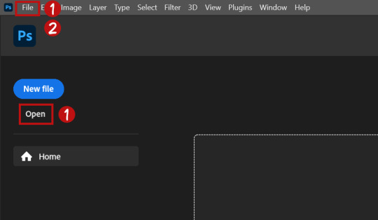
Click "open" on the PS startup menu or under "File" on the top bar of the window.
Click "File" on the top bar of the window, click "Save As" and save in your desired location as a Photoshop Document (.psd).
Regularly save the file with File > Save or with the shortcut CTRL+S/CMD+S while editing so you don't lose your work.
Change image mode: If your file name has "(Index)" after it, you will need to change the image mode to edit it properly.
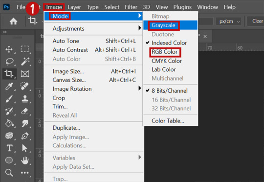
Click "Image" on the top bar, then "Mode". Select "Grayscale" if you are working in B/W, or "RGB" if you plan on working with color. You can change this later, although it can sometimes affect your image in unexpected ways.
Crop (optional): You may want to crop your file down to what you want your final edit to include. You can also do this later if you prefer.
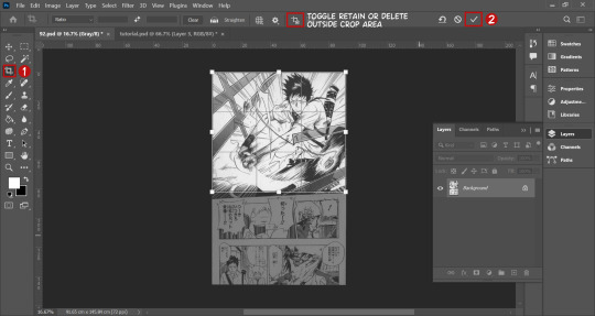
Click the crop icon on the left toolbar and click and drag over the area you want to work with. You can adjust by hovering over the edges of the selection and dragging when the arrows appear. You can rotate the crop by doing this at the corners as well.
Click the check mark on the options bar to confirm.
Be aware of the icon on the options bar which, when selected, permanently deletes the pixels outside of your crop. It is best not to have it on so you can adjust the crop later, but if your computer struggles with running PS, it may be worth using.
Surface blur (optional): Surface blur helps limit the amount of manual cleaning you will have to do by evening out some of the texture of the paper fiber you can see in raw manga.

(Extra optional) resize the image to 2X its current size. Go to "Image" on the top bar, then click "Image Size". Change the width or height to 2X the original value, making sure the "constrain aspect ratio" icon is checked. Hit OK.
Go to "Filter" on the top bar, then "Blur", then "Surface Blur".
Adjust the values on the box that comes up to balance between limiting the amount of texture in flat black and white area with not blurring details together. It will not be the same for every image, but will likely be similar. You can check and uncheck the preview button to compare your adjustment to the original. Hit OK when done.
If you resized the image, repeat the process, this time returning it to its original size.
Leveling

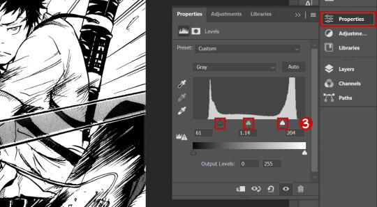
Click the "Layers" panel button on the right of the screen to open it.
On the bottom of the layers panel, click the button that looks like a half-white, half-black circle. Under that menu, click "Levels".
The levels adjustment panel should open, and you should see something that looks like a graph. As you drag the right and left slider on the graph inward, you will notice the blacks and whites getting more intense, respectively. Adjust these too your taste, but be aware that dragging them too far towards the middle can mess with gradation and midtones if they are present. You can adjust the middle slider as well. Play around until you get a look you like.
Sharpening (optional): Sharpening increases the definition of the edges of an image. I personally don't do this a lot of the time because I'm not crazy about the look, but it is a common step for many people, so it is worth knowing about since you may prefer the sharpened look.
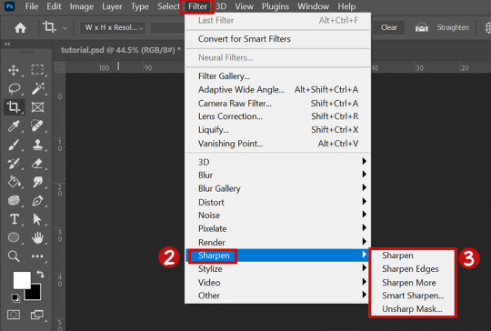
Go back to the "Layers" panel. Make sure the layer that has the image on it is selected.
Go to "Filter" on the top bar, then "Sharpen".
There are a variety of sharpening options underneath sharpen. Try them and see what appeals to you. You can use all of these on one image, and apply them multiple times. If you sharpen too much, just use the CTRL+z/CMD+z shortcut to undo your previous actions.
Spot cleaning: If there's still some visible "dirt" on the image, I quickly clean it up with the brush tool.

On the bottom of the layer panel, click the "+" icon to create a new layer. Make sure you have it selected.
Click the brush tool in the left tool panel.
Size of the brush can be adjusted on the options panel, and the color can be adjusted on the side toolbar.
Just click over spots with a black/white brush to cover them up. You can use the eraser tool in the left panel, or CTRL+z/CMD+z, if you mess up. The eraser won't effect the image itself because your touch-ups are on a separate layer.
Export: When you're all done with a basic manga edit, you can either keep editing if you want to do something more elaborate (not covered in this tutorial) or export your file to a type you can upload on the web.

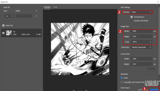
Click "File" on the top bar of the window, then "Export", then "Export As".
You have the option to change the final file type in this window. I recommend a PNG for high quality or a JPG if you want to limit file size. You can also change the size of the exported image here; it is up to you and your needs if you do this.
Click the blue export button and choose where you want to export the final edit.
Additional Notes: Software
Photoshop: I recommend Photoshop for editing, and it is what this tutorial is based around. However, I don't recommend paying for it. Here is how you can get if for free.
(Highly recommended) Enable your VPN if you have one.
Go here.
Type "photoshop" into the search bar on the top right of the screen, and look for the result with the highest "S" value (green text).
Click on the magnet icon next to the file size to torrent the file.
If you don't know how to torrent, here is an external tutorial.
Install the program according to the instructions in the information file and you will be set.
Photopea:
If you aren't comfortable downloading pirated files onto your computer, Photopea has a lot of the same functionality as Photoshop, but in-browser.
I'm not sure how it handles large files, but in terms of functionality it should be able to do anything you would need for edits.
Additional Notes: Space
Raws can take up a lot of space, because ideally they are both large and lossless (meaning they don't lose quality as the files are uploaded, downloaded, etc). Additionally, having few GBs free on your computer can hinder Photoshop's performance when editing said raws. If you don't have a lot of computer space, these are my recommendations:
The cheapest solution is knowing what you want to edit and what volume it is in, so you can download only what you need. This may not work for all raws, because they might all be grouped together in one massive upload, but mine are posted by volume.
The best solution is to buy an external hard drive. I would not encourage you to get one just for this, but this is a useful tool for anyone. Besides helping you free up a ton of storage space, it blows your piracy game wide open, and you can save a crazy amount of your favorite media in a place no one can take it from you. They are not super cheap, but they are well worth the price if you use them. Be sure to get the most out of it. I have this one and it works great.
You can also make use of cloud storage, though I don't really recommend it.
28 notes
·
View notes
Text
CROPPING TUTORIAL FOR PHOTOSHOP
Below is an easy guide to cropping your pictures on photoshop!
On the left side of your photoshop there will be a tool bar. That's where you will find your crop tool. It's the 5th icon down.

When this tool is selected an outlined box will appear around your photo you wish to crop. This is normal!
Above the photo should be another tool bar that extends the width of your photoshop. This is where you will put your dimensions you wish to crop your photo to.

On the left side of the tool bar you will see the following. I've chose to crop my photos 170x220 cause that what I personally think looks best on roleplayer.me! If you select the first box, a drop down menu will appear and you can save your crop settings so you don't have to constantly re-enter them. *It's important to include the px in your crop settings for it to crop correctly*
Lastly, when you're ready to crop, adjust the crop box however you want on your picture and double click on it to crop! Alternatively, you can also click the check mark that's on the right side of your top tool bar where the crop settings are.

Congratulations! You've successfully cropped a picture!
15 notes
·
View notes
Note
hello chrissie! I hope you're having a good day!
do you have any tips on gifmaking for someone who wants to start?
Hi Nonnie, thank you so much for your ask, I hope you're having a good day, too 🥰
Tbh, I always feel like I am not really qualified to answer these questions, because – unlike me – most of the wonderful gif makers on this site use photoshop and if you have access to that software, I would always recommend using it because it’s easier, faster, the outcome is so much better and the opportunities it offers are endless. (There are a lot of beginner tutorials on this site if you search for gif + tutorial in the search bar 😊)
However 😉 If you don’t have access to photoshop or your cpu can’t handle it or you are simply overwhelmed by the vastness of the program, you can always try GIMP 😊 It’s opensource, you can download it legally for free and it runs on all platforms. The main drawback is that it doesn’t have the timeline feature, which means that you have to edit every single layer separately. (The program literally wasn’t designed to create gifs, it’s just that a few clever people found a way to work around that 😆)
I would recommend starting with this tutorial here. It explains how to create a gif in GIMP in general, how to create screencaps, how to import them, how to resize, how to crop and how to export your gif.
As for the really fun part (editing your gif), I think for a beginner it would be easiest to concentrate on three basic steps: brightening up the gif, adjusting the colours, and sharpening the gif. You’ll find all the editing tools that you need for that under “Colours/Colors” in the menu bar.
The brightening/contrast tool of GIMP can give weird results, so it’s usually easier to use the exposure tool, but that’s just my personal opinion.
As for playing around with the colours, the tools that you would want to look into first are “curves”, “levels” and “components -> channel mixer”. The channel mixer isn’t nearly as good as the one in photoshop, of course, but it makes me so giddy that GIMP finally has a proper one implemented 🙃
Also, if you’re just starting out, I would always recommend working with the largest quality source material that you can find (at least 1080p). I spent most of last year giffing really low quality vids because I’ve never been able to resist a cute Oscar moment, but if you’re just learning how to gif, the quality issue might become really frustrating, especially in the beginning.
And of course, the most important part: Allow yourself to have fun playing around and trying new things 🥰 Every new gif poses a new challenge, so don’t be discouraged if a certain editing step doesn’t result in the outcome you’d expected, you’ll soon get the hang of it 💜
I hope this was at least a little helpful 🥰
1 note
·
View note
Note
Hey elz! Would you consider doing a tutorial of how you did the frame thing in this post: /post/724195624728379392/and-it-felt-so-nice-so-peaceful-and? It looks so cool!
hi anon! thank you for reaching out. i really appreciate it & you made my day! 💚 ily!!! for length reasons, you'll find the tutorial under the cut!
Resources used:
Photoshop
Vintage flowers pngs -> you can either google vintage/watercolor flower png or here are some DeviantArt packages [x] [x] [x]
Font: Avenir
Workflow
After you have made your gif as you would normally do, it's time for the frame.
First: place the flower
Once you got your flower pngs it's time to place them on your gif. Go on File > Place Embedded... and select the file. This is what will happen.

Now, click on that little tick (✓) on the top right corner, so that your image is actually placed.
Press the shortcut CTRL+T (on Mac: Command+T) to open the transform options - basically it is the same as the photo above. I tend to do it this way, because if I don't like the adjustments, I click on the ⊘ button. If you did that when you placed the image, it would delete the image.
So now, move the image, resize it using the handles on its corners while pressing shift on your keyboard to maintain the proportions.
Once you get a result that satisfies you, click on this button (highlighted in purple)

Now you can wrap the png, and make it "fuller", more natural looking, moving the intersection points of the grid that will pop up

When you're done, confirm.
Now that you placed your png, you can manipulate the colors. Click on the png layer and press CTRL+U (Command+U) and in this case you would adjust the Reds and Yellows.

And you're done!!!!
Second: the border
To make the border use the Rectangle Tool (shortcut: U). On the menu bar on top, set the fill as transparent and the stroke as white

Then drag your mouse and create the rectangle

Then of course, adjust it if needed - by clicking on the rectangle layer, the properties panel will open (if not, go on Window and check Properties).
Now duplicate the layer (CTRL/CMD+J) and make the original rectangle invisible by clicking on the eye next to it.
Right click on the copy and rasterize the layer -> this rasterized layer will be the one you'll work on (you keep the original one as a safe harbor in case you don't like the changes made on the copy).

Now, with the copy selected, pick the Eraser tool (E), reduce the opacity of the layer and zoom in, and erase the parts of the rectangle that goes over the flower. When you're done, set the opacity back to 100%.

Third: add the text
And that is literally it! Super simple and quick to make, and of course you can add as many pngs as you want to create somewhat of a bouquet. The real game changer is the Wrap thing you do to make it more natural, like a real bouquet!!!!
I hope this was helpful and if you have some further questions please please reach out! Love u!!!
E.
#ask#elz:explains#ps tutorials#literally the simplest manip i know - learned it many years ago and it's never old fashioned! it's from the troye sivan flower phase here#on tumblr dot com#*resources
2 notes
·
View notes
Note
How did you do the Maiddy icon?
Here's a mini tutorial:
1- Open Photopea (or Photoshop, I imagine you can do the same there.) Upload your image there. I have two layers, one for the PNG and one for the black background, but you can do this with any sort of image.

2- Select your image and go to Filters on the top bar, then click on FIlter Gallery. Choose Bass Relief and adjust the settings to your liking.

Bass Relief utilizes the colors you have selected btw. I'm using black and white because for that icon I applied the colors separately, but if you like the effect on its own you can change your palette and it will use those colors for the effect like this:

4- In a new layer, color each of the characters with the color you want each of them to have.

5- Go to the blend modes menu (the one over our layers that usually says normal) and set the layer to color.

6- Adjust to your satisfaction! I didn't end up liking the direction of the light with the colors, so I went back to the original image and applied the filter again (for these reasons, I would always keep the original image in a duplicate layer, in case you don't like your initial result) with these settings:

Then, I duplicated the layer and set the top one to Overlay for a more obvious effect. I added a dramatic gradient and set it to Multiply because I like dramatic lighting.

And there! Icon for you.

This one isn't my favorite ever, but if you experiment you'll probably get some cool ones.
-Mod Golden.
1 note
·
View note
Text
Getting Started with PhotoShop way later than you should have, but we're here.
It's 2025. We're on the verge of collapse in many industries across America, but one booming industry is digital art. From memes to album covers to harshly over-editing your photos to make an unreal perfect version of yourself, it's all possible and fabulous.
This post will be your guide to beginning in Photoshop, even though, like me, you shoulda BEEN used it, chile.

STARTING NOW!
We'll go over how to begin creating projects on the Adobe Photoshop app by learning to create a thumbnail video for a YouTube video. Once you pay for the app (or use your grandma's email for a free trial for the 500th time) you can start the app, which opens up to our Home Screen.
The Home Screen offers multiple ways to get started on the left side of the screen. You can click on the "Ps" logo on the top left to open Photoshop workspace where you can start working. Otherwise, there are options for opening projects you've been working on as well as ones shared with you and even projects you deleted due to shame and embarrassment. The Home option serves information about new features and offers ways to get started with images that are local to your device (whatever you have on your computer or phone GRAMPS). The Learn option will give you tutorials on how to get started for my visual learner girlies.
Click on New File to start a new document, once on the creation screen you'll see that you have a myriad of options for what you can do. You'll see templates and different types of files you can start making as well as the size and resolution of your project.
We're gonna do this together, bestie! Click on Film & Video in the options for templates and click "Create". Once open, you're going to drop an image by clicking and dragging the photo you'd like to do and placing it on the blank screen. Once you drop your image in, you'll see bars on the image with squares at the end and if you reposition the squares you'll be able to resize and stretch your image. Once you have stretched the image to cover and empty canvas space, click on the check mark in the options bar to drop that there photo. Once you drop that photo in, we'll add another layer to the layer panel by clicking the box with the + inside it. Adding this new layer is like adding a clear sheet of paper on top of what's already on the campus.
On our second layer you can use the rectangular selection tool and select different blocks on top of your loaded image to fill with color in the options menu to the right. Once you've added the colors, you can set auto-blend layer options to have the rectangles you've color filled can fill the colors on the image in layer 1.
This is your first step in creating an image.
2 notes
·
View notes