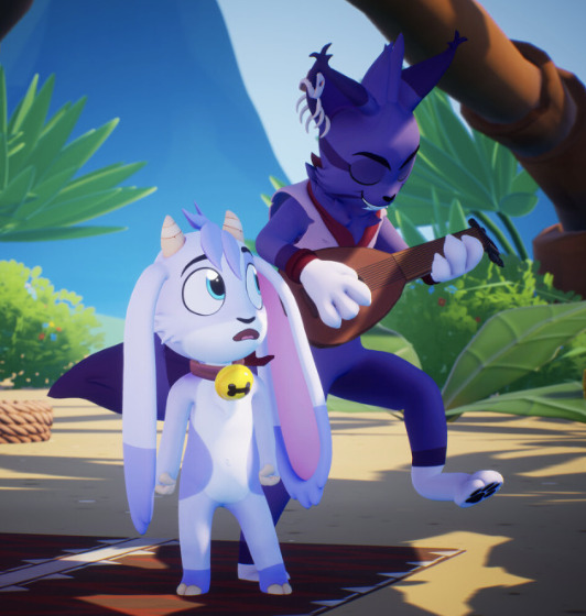
#phtotoshop
Text

— I'll keep you safe.
#bucky barnes#wanda maximoff#winterwitch#manip#marvel#phtotoshop#two posts as an apology for not posting for days lol
11 notes
·
View notes
Photo
47 notes
·
View notes
Note
i really liked your grunge brush pack for krita!!! are you going to be working with it again??
Not anytime soon I think. The constraints of its limited brush settings are hard to work with. I've run into the same wall with Photoshop.
It was my goal to have most brush sets available for other programs, but it's not possible.
For example: I've been trying to tweak the dagger brushes for Phtotoshop, but without certain settings it's just not nearly as good. It works, but it doesn't perform as intended. 🥲
14 notes
·
View notes
Text
Evaluation
In this project I have taken my work in slightly different directions depending on which artists and topics I have been researching and looking into each week.
Initially I looked Into Sherlock Holmes and the victorian era, especially around London. I figured out that i especially liked how the characters of Conan Doyles stories were drawn in the Disney film "The Great Mouse Detective"
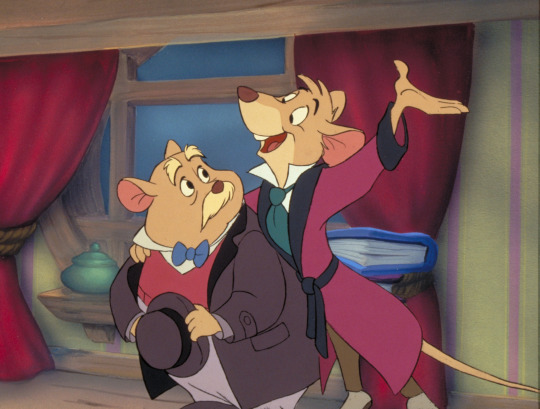
I have always enjoyed drawing animal characters, as they are easy to design distinctively, so I decided to for this project.
With the knowledge that we would be designing a cult and a sacred object I took inspiration from one of my own interests, 1930s animation. In the great depression era cartoon "Bimbo's Initiation" comical looking cult leaders are seen.

As these cartoons are rather macabre and gothic looking i thought it would fit with the grittiness of the victorian tone. Especially the backgrounds. (notice the broken windows and knocked over trash can, indication of the great depression) The hard times these cartoons were made in affected their visual design, just like how dark and gloomy victorian illustrations were.

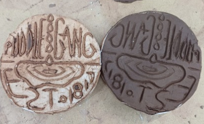
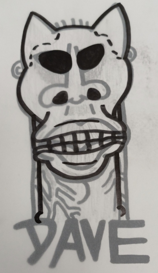
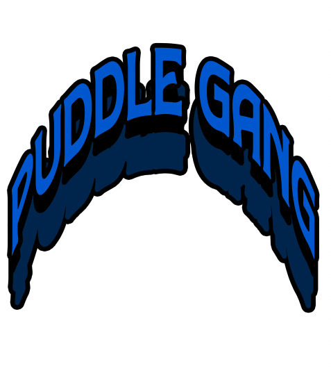
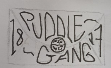
I decided To make a rough design for my cult leader, with somewhat comical robes. as well as design my logo.
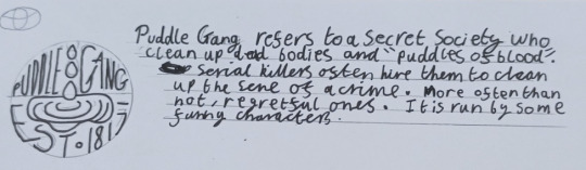
The name of puddle gang was a completely off the spot thing, however I thought this could mean a puddle of blood. The name is inconspicuous enough to fly under someones radar as anything suspicious.
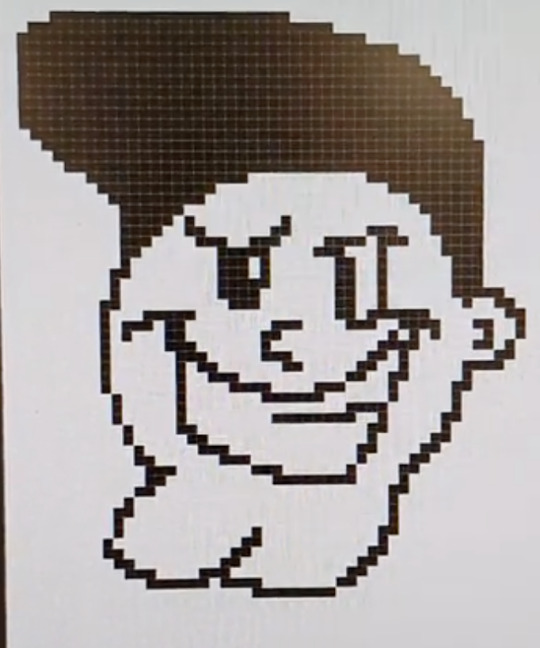
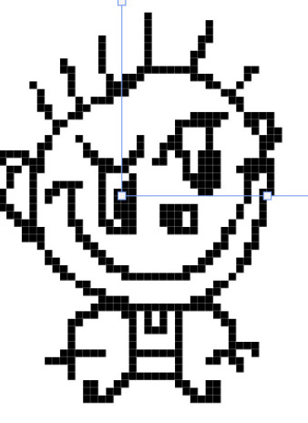
At this point in the project we were looking into pixel art and experimenting with how that would look. It was then that I Designed my detective on the spot. Somewhat taking inspiration from Paul Robertson by using black continuous outlines.

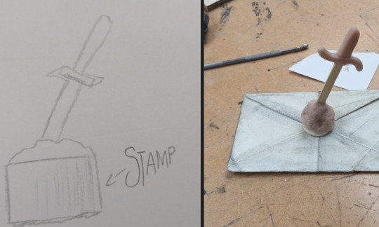
Then in the same week as my pixel art experiments we moved onto practical sculpting. first using clay and plaster to create a large logo and then moving down a scale to using super sculpy and resin to cast a wax seal.

This wax seal would be used to seal any letters my cult sent out to its members. I have always been fascinated by wax seals, so i wanted to make this as good as i could. Here is a fairly nice initial mockup.

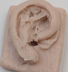
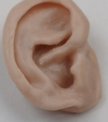
I also played around with some basic anatomy by using tracing paper to create a skull from an already designed creature and by sculpting an ear, a very complicated shape which i am very happy i replicated as well as i did.
At this time i also toyed with some basic pixel art animation and reseached the voxel art style. looking at paul robertsons amazing composition and the voxels 3d nature made me realsie i would like to add depth to my work when i can. Even if i am not the best at pixel art.
I was able to do just that when i had a rather frustrating session with the program magicavoxel. while i can see the potential it has i found the controls unweildy.

adding depth became less frustrating when i added it to text using phtotoshop. this i had fun with.
I then designed my trading card, improving on an earlier design which is quite ugly. this is on paper and is just a rough sketch, however i liked it so much i vitualy traced over it.


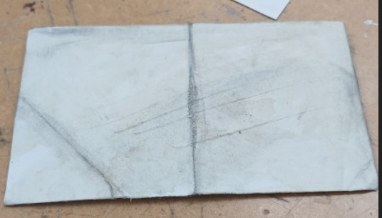
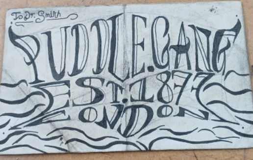
The next week I was able to complete my letter. i used coffee grounds and graphite to make my letter look aged which was a new process for me. when i was little i used teabags ro stain my own little treasure maps of our garden.
I then was able to sculpt on top of the resin seal i had made. making a blade from thin wood and combing that with sculpy to make a hilt and a mound for the balde to stick out from.
the next day we went to the EGX gaming convention in london whcih was good fun, however the most relevent thing to my work was seeing all the indipendeent creators set up shop and gain an audience in person. it was quite inspiring and gave me a little insight into the creative industry.
Overall I am very happy with the outcomes of this project and I think I have given clearly explained how my project developed in this evaluation. I think to improve this project I really could show a more detailed record of my progression with more pictures of my semi complete work. I also think I could plan a bit better. I think the most fun I had was sculpting for the first time, it was really enjoyable.
2 notes
·
View notes
Photo
Trying a different artstyle.
3 notes
·
View notes
Photo
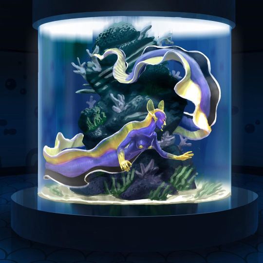
MerMay day 3! Ribbon eel mermaid! Got a bit invested haha. One again I struggled with the process! Gotta clean up my technique, anyways Gotta work on my finals! Hope y’all have a good Monday! . . . . #mermay #mermay2020 #mermayday3 #digitalart #digitalillustration #digitalpainting #digitalartist #art #mermaid #ribboneel #eel #phtotoshop #aquarium #artistsoninstagram (at Virginia Commonwealth University) https://www.instagram.com/p/B_yFFfAD_ES/?igshid=18ukc9dfhjxp8
#mermay#mermay2020#mermayday3#digitalart#digitalillustration#digitalpainting#digitalartist#art#mermaid#ribboneel#eel#phtotoshop#aquarium#artistsoninstagram
5 notes
·
View notes
Photo
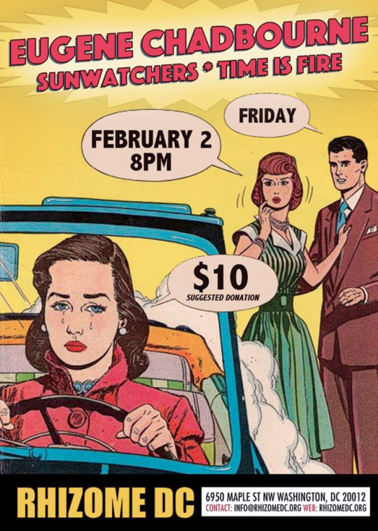
Today in Bopst Design: 2018
#Bopst#Chris Bopst#Design#Graphic Design#Phtotoshop#Eugene Chadbourne#Time is Fire#Sunwatchers#Rhizome#RhizomeDC#Washington DC#2018#Vintage#Comic#Vintage Comic
1 note
·
View note
Photo
[Emergency Commission are open] / [Ko-Fi]
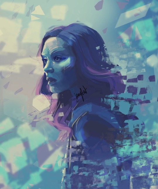
Gamora
ref photo by : Chuck Zlotnick
#Gamora#avengers infinity war#guardians of the galaxy#GOTG#digital art#digital painting#Phtotoshop#marvel#MCU#marvel cinematic universe#Jemyart
166 notes
·
View notes
Link
2 notes
·
View notes
Photo
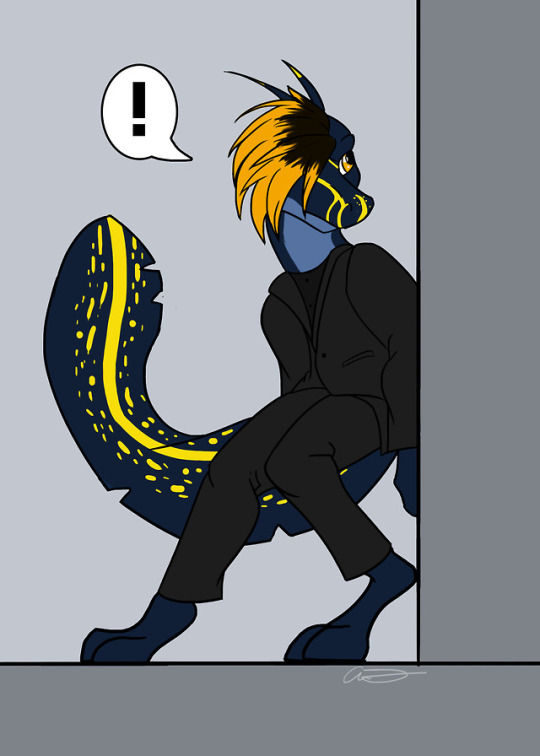
First image was for a friend of mine who commissioned me. His character sneaking around a hall way.
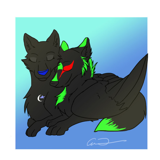
Second one with the two wolves are mine and a friend’s character. He has been feeling a little down as of late and thought his will cheer him up
4 notes
·
View notes
Photo
1 note
·
View note
Photo
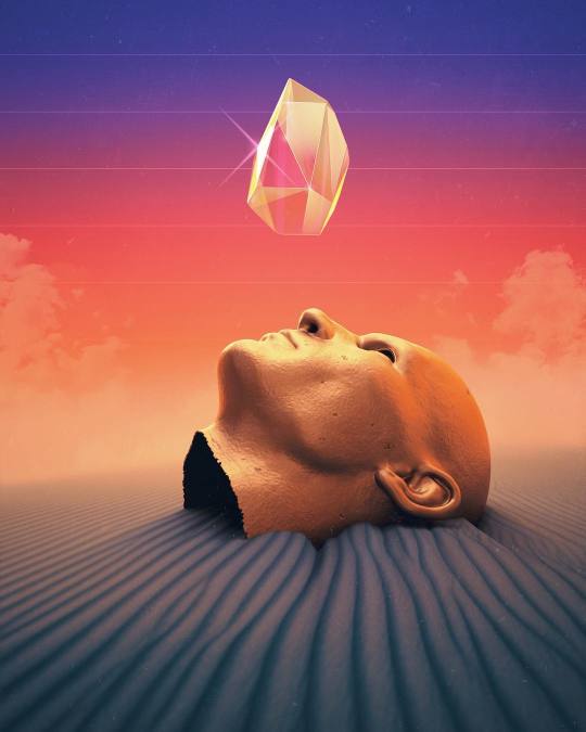
‘Numb.’ by Jorge Luis Miraldo (IG: @shorsh)
#sci-fi#concept art#surrealist art#phtotoshop#geode#desert#graphic design#render#3d artwork#whitemeatfestival
0 notes
Photo

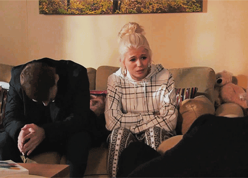
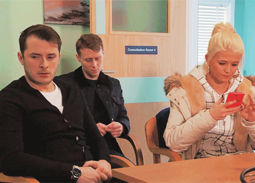
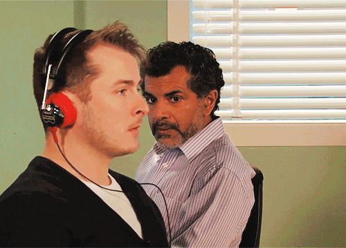

Ballum in Every Episode - [93/?] - 25th Feb 2020
#ballum#ben mitchell#callum highway#eastenders#ben x callum#Ballum in Every Episode#BIEE#25th Feb 2020#the last scene <3#gif#phtotoshop#ben and callum
45 notes
·
View notes
Text
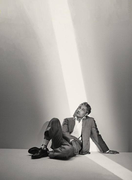
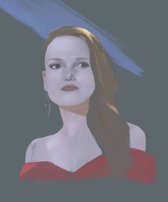
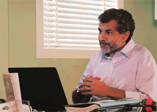
Taika Waititi by Jessica Chou for WIRED
#Taika Waititi#ofmd#thor love and thunder#did I spend 2 hours removing the text in a free online phtotoshop ripoff? Yes
19 notes
·
View notes
Photo
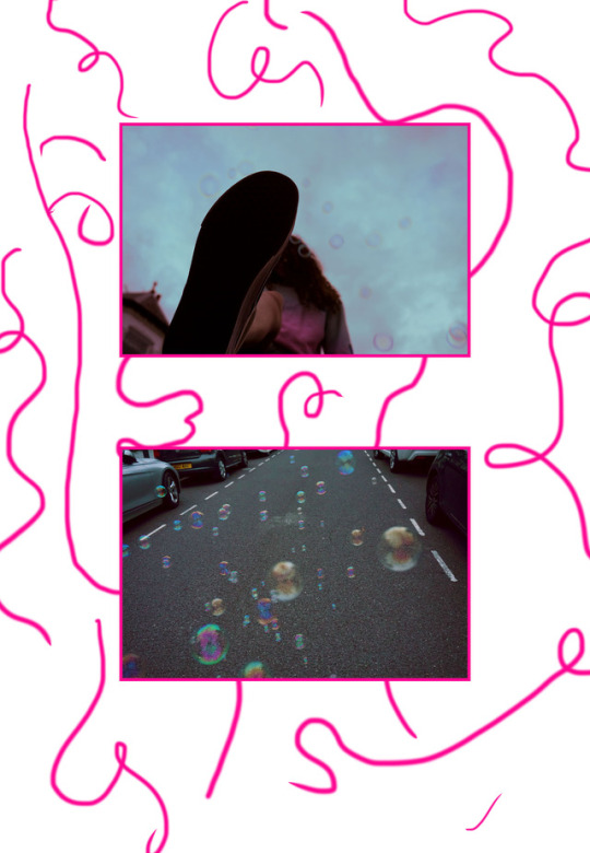
Not my best work, but I try, we all try
#ciaraism#art#work#freelance#student#graphic design#design#illustation#pink#bubbles#perspective#phtotoshop#photography#illustrators on tumblr#instagram#street#vans off the wall#vans girl#doodle#magazine#idea#portfolio
3 notes
·
View notes
Last Seen Blogs

legiaoto360
Oto360
halawany
Be strong for you

baguiosojuprincess
Soju-soaked Scribblings

sodas-cafe
• Soda’s Cafe •

affordabledentalclinics
Dentist in Greely, CO