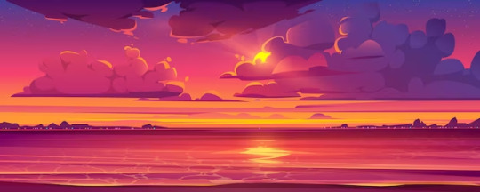
#pre artstyle change is better
Text
Shikama reminds me sm of that one audio like "He can be beautiful. Because he's a fallen angel, and he used to be God's favourite" because that's so right he IS beautiful
#☆ — riri says.#pre artstyle change is better#non binary Shikama was just better than masc Shikama#shikama#shikama doji#owari no seraph#ons#sote
7 notes
·
View notes
Text


GUYS I LIED I FOUND AN EVEN OLDER NOTEBOOK WITH OLDER ART 👹👹
#old OLD notebook dump#my artstyle aint even change since these drawings i just got better anatomy#and less same face syndrome i hope#there was a big jump in artstyle in 2022-23 tho. this notebook was from year of 23#no one needs to know abt my pre 2022 art 😇#that was before the stuarts too#william iii#charles ii of england#WHERE IS WILLIAMS NOSE 😭
7 notes
·
View notes
Text


he is the only thing inthe world. that matters
#skye's ramblings#hes got some of the best smiles in the series <3#pre timeskip don is skrunkly incarnate i feel like he has one of the most noticeable differences despite not actually. changing much#like some of the other kids get hairstyle changes don gets an artstyle change. his power#no i cant pick which design i like better theyre both perfect. this is true#ive been gone all day and im going to be gone almost if not the entire day tomorrow due to traveling so take these dons as my parting gift#you look at him and think of me. ok you dont have to think about me but you have to look at him and think abt him. for me <3#i know im gonna be. i may have to spend hours in the flying anxiety tube (aired plane) but at least i have my. my anime boys <3
24 notes
·
View notes
Text
January and February dump
This is my most recent work of Lloyd, and my most recent work in general. I made this in the computer room at school with a painful high-sensitive mouse. We have these special course thing in our junior high, so every tuesday after class, I get to be in the computer room. For six hours... (My course is Visual Graphics Design. I'm kinda regretting it now since I've been thinking of becoming an architect... I can't change my course now since it's too late. Which is stupid.)
I'll try to draw more there! I really like drawing with a mouse cause I like the challenge. And since I'm not accustomed to a high-sensitive mouse, it'll be a bigger challenge for me!

I made these two in traditional then polished them digitally since I straight up just used a pen. I rarely use a pencil nowadays so I can learn to fix mistakes without erasing it. Usually it ends up looking like chicken scratch but I'm getting better.
My Harumi one is so bad lol.. When I was making it, my classmates around me were messing around and moving the chairs in the process, making me have to draw strokes with shaky lines. It's not that noticeable though since I made the lines thicker.


I was planning to make something for Rebooted's anniversary but I got busy... (And lazy) The PIXAL one was inspired by an animatic I saw.
If you compare the previous Arin portrait, yes, they don't look the same. I'm trying to find a look for Arin, as I do with every character, that I'll be satisfied with.
By the way, I'm kind of basing Arin's hair with my classmate's hair. Which is funny because my other classmates compared this artwork to my classmate, who looked nothing like Arin but have similar hair, commenting they're the same. (I'm not mad because I actually find this a bit humorous)


I was trying to make an animatic and this was going to be the sketch. But then again, I got busy and lazy. (Mostly lazy)
I accidentally changed their facial features a bit by accident on the second page because I forgot to reference the first page. It was tiring flipping pages every 5 seconds, ok! Also, I drew it after 2 days when I drew the first page, and I didn't have a design I liked for them yet. (...I just noticed Jay has different eye colors in both pages...)
I think I'm sticking to these looks for Lloyd. I'll try to make it accurate to this. (I think I did great with the first image of this post. Though, I made him too round for my liking.)
Discard the growing beard post redesign Lloyd has. That beard thing was supposed to be where his chin was until I realized it was too small. And it's still too small.
Child Lloyd is so cute! The eyeshadow wasn't intentional at first, but then it got me thinking, what if Lloyd had an emo phase? And now emo child Lloyd is my headcanon.
Pre redesign Lloyd kind of reminds me of TommyInnit, and I find it quite funny. Maybe it's the facial gesture, I know a lot of TommyInnit fanarts with that silly face.
For Dragons Rising Lloyd however, I want him to have long hair with his post redesign face. I'll try to make full body designs of the 4 Lloyds.
You guys probably don't care, and this is the first time you've seen me because I don't have an exact artstyle and I dont post as much, but I'm going to put descriptions now since this blog is going to be a silly little art dump! And blog posts are supposed to be descriptive. Which I should've done in the beginning and explained my works..
Anyhow
If you liked my art, thank you!
If you saw me before and told me I did well, thank you and I'm sorry!! I know my previous posts have gotten comments and I'm sorry I didn't respond.. I'm not trying to be ungrateful, I just don't know how to express my appreciation for your positive feedback! Or just reply in general... I get nervous even when I'm wearing my mask..
Please don't hate me, I'm just really anxious to show my work to people I don't know to the point where I might think people disliked my artwork when it's the opposite..
(I'll probably copy paste this in future posts now lol. But I AM thankful that some of you guys think my works are great!)
#everytime i draw idk#traditional art#digital art#2024#2024 art#ninjago#ninjago dragons rising#ninjago lloyd#ninjago lloyd garmadon#lloyd garmadon#ninjago harumi#ninjago arin#ninjago pixal#pixal borg#ninjago zane#ninjago zane julien#zane julien#ninjago jay#ninjago jay walker#jay walker#ninjago cole#tag
57 notes
·
View notes
Text
Picrew Masterpost
So uh... I use picrew a lot. Like, a lot a lot. Because of this I have a lot of funky picrews in my catalog, some are really popular some less so - figured I'd make a master list with as many as I physically can. I'll try to list pros and cons* for each picrew - unfortunately, due to the image limit I can't include examples**
*pros and cons are my personal opinion, I am not trying to insult any picrew on this list nor am I saying my opinion is the be-all or end-all. I will not be commenting negatively on any art styles in my con list, I will simply focus on what it does well and what I think could be better
**If you have a maker you think should be added send me an ask with the link and lmk it's for this post
For the sake of actually browsing this post, we're gonna have sections. Under these sections will be all the picrews relating to it. The sections, in the order listed, are:
Modern - has a majority modern clothing options
Fantasy - has a majority fantasy clothing options
Historic - clothing options or artstyle reflect a specific time period
Full Body - shows knees up of the characters or more
Group - more than one character in the image
Animals - any non-humanoid
Misc - makers that don't include a character or that work better for icons than character design
I will also put emojis next to picrews that include certain things, 🧕 for picrews with hijabs, 🌈 that include LGBT backgrounds or pins, 🎉for picrews with vitiligo, ♿ for disability options (wheelchairs, feeding tubes, etc) and ✨ for my personal favourite picrews. If there's another thing you want me to mark for let me know.

makowka character maker II🧕🌈🎉
Pros: Great for avatars, multiple body shapes, diverse hair, lots of skin tones, hijabi options, pleasing art style, wrinkles!
Cons: only plain colour backgrounds and pride flags, clothes all feel very samey, would like to see more vitiligo placement options, hates don't fit properly half the time, beards can look a bit flat
PotatoLord’s Persona Creator🧕🌈🎉♿
Pros: Very nicely stylized, lots of nose options, visually pleasing, hijabi options, lots of facial hair options, wheelchair options, wings
Cons: only preset hair is available meaning you can't mix and match, not a ton of clothing options, vitiligo options look a bit flat
Ultimate friend's face maker ✨🌈🎉
Pros: So many vitiligo options, scar variety, three face detail slots, options to mix and match hair or have pre-selected, cool glasses, background variety
Cons: not a ton of noses, only preselected hair has dye options, only one hat option, only one prescription glasses
뒤를 보는 픽크루
Pros: Dynamic posing, hat variety, beautiful backgrounds
Cons: Lack of skin options, lack of noses, overall lack of variety
Nuggts character maker! ✨🧕🎉
Pros: Lots of skin tones, expressive eyes, stylized, hijabi options, funky hats, eyebrow options
Cons: Vitligo looks painted on, eyes are all black, can only select from pre-chosen hair options, lack of clothing variety
KZ's dolls🧕
Pros: Skin tone variety, funky eyebrows, nose variety, makeup, caters to more alt/punk/goth styles, hijabi options, clothing variety
Cons: Hair isn't very customizable, would like to see more layering options given the style it seems to pander to
rawravera's icon maker🧕🌈🎉♿
Pros: Skin tone variety, customizable eyes, customizable hair, beautiful backgrounds
Cons: Lack of facial hair options
piney's icon maker! 🌈♿
Pros: Face shape variety, skin tone variety, hearing aids, nose shape variety, heterochromia, facial hair variety
Cons: Body options only change neck size, not a lot of clothing colour variety
vonnegratci Honolulu maker
Pros: Skin tone variety, tattoos, clothing variety, aesthetic af backgrounds
Cons: Lack of hair texture variety, lack of glasses variety
Black Centered Picrew✨🧕🎉♿
Pros: Skin tone variety, ear variety, heterochromia, freckle variety, vitiligo variety, scar variety, lots of hair variety, hair jewelry, facial hair variety, hat variety, Hijabi options
Cons: Clothes feel very samey, only one background option
ElenaA's Little Guy Maker✨🧕🌈🎉♿
Pros: Decent skin variety, multiple sets of eyes, horn variety, hair texture variety, lots of earring options, kippah, many many hats, many holdable items, pets, weapons, super customizable background
Cons: Lacking colour options across the board
mimzies picrew #2✨🌈🎉♿
Pros: Decent skin variety, can choose how the face is shaded, braces, feeding tube, self harm scars, split dye hair,
Cons: No eyebrow variety, only one curly hair bangs option,
キラキラ鱈メーカー3
Pros: Heterochromia, cool hair options, hair accessories, pets
Cons: Only one skin tone, only straight hair, lack of clothing variety
Character maker✨🧕🌈🎉
Pros: Skin tone variety, multi-eye options, heterochromia, eye shine variety, split dye hair, hair variety, mushroom hat :)
Cons: Would love to see more mouth variety, would love some more afro hair, I would commit crimes for more clothing options and variety
skyeslovenotes🧕🌈🎉
Pros: Skin tone variety, face shape options, hair texture variety, clothing layering,
Cons: There's a bit around the fact that stays white regardless of skin tone, can't change blush colour so some blushes only work for certain skins without looking odd, lack of eye shape variety,
ElenaA's Windswept Oc Maker✨🧕🌈🎉
Pros: Dynamic posing, lots of skin tones, the green skin actually looks nice, eyes are very customizable, nose variety, Hijabi options, hair variety, facial hair looks good, rings, background variety, base is androgynous so you can actually make masculine men, there is a very fat toad you can hold
Cons: Only 2 vitiligo placements, compared to the rest of the picrew facial hair lacks variety
Dragon Age Elf/Human maker
Pros: Skin tone variety, cool face paint, hair is quite customizable,
Cons: The outlines stay the same regardless of skin tone so on darker tones the nose outline is lighter then the skin, can't layer clothes, would like to see more elf ear options since it's an elf maker
Tiefling Maker✨
Pros: Skin tone variety, green skin tone looks nice, a lot of variety overall in body shapes, hair, clothing, etc, customizable nose,
Cons: Only one eyebrow shape
[BAYDEWS' avatar maker!!] V2🧕🌈🎉
Pros: Skin tone variety, nose variety, heterochromia, androgynous enough to make masc characters, hair texture variety
Cons: Only one facial hair option, would love to see more clothing options
Fantasy OC Creator ✨🎉
Pros: Skin tone variety, ear variety, nose variety, ok hair texture variety, beard variety, clothing style variety, nice wing selection
Cons: Some of the wing colours do not match, the left monster hand skin tones do not match the other skin tones

Nothing here yet! There are some I have in mind, just need to find them - will be added eventually :)

TOON ME! ⟪ A ⟫ ⟪ B ⟫ ✨🧕🎉♿
Pros: Two body shapes that can use all the same items, expressive eyes, options for heterochromia, tattoos, lots of prosthetic options, so many hair options, variety of clothing, lots of hair accessories, beautiful backgrounds
Cons: Would like to see more facial vitiligo, the hats don't fit on top of the hair half the time, would like some necklace and bracelet options independent from one another, glasses are a bit bulky
Magicdoll*Maker
Pros: Eyeshine variety, great hair options, detailed dresses and skirts, shoe variety, unique concept
Cons: lack of skin options, lack of mouth options
Nyx character creator✨🌈
Pros: Lots of ear options, all eye shapes have a lashless option, 5 clothes layers, the animal ears on this maker are to die for
Cons: Not as many skin options as other makers, can't change scar colours so they're hard to see on some skin tones
criador de drips insanos ✨
Pros: Skin tone variety, cute af clothes,
Cons: Only preset hairs available, not a ton of clothing or colour variety
Baby Carrot outfit maker🧕🌈🎉
Pros: Skin tone variety, two body shapes, top surgery scars, stretch marks, everything available for the thin body is also available for the larger body, lots of clothes layers, clothing variety,
Cons: Only one vitiligo placement, wish there was more facial hair, the bags do not fit the larger body type, only one glasses option
Alli’s OC Creator!🧕🎉
Pros: Skin tone variety, heterochromia, hair variety, clothing layers, style variety, many many shoes
Cons: Would love to see more accessories like bracelets
Something about them 🧕🎉
Pros: Skin tone variety, lots of animal features, decent hair texture variety, heterochromia
Cons: Lack of clothing options/variety, would love if the animal ears and tails were separate pieces
Cryptid Spotters
Pros: variety of hair textures, skin colour choices are decent, hairs have fun colours, lots of noses
Cons: Wish there was more hair, wish there were more body types

なさや式CPメーカー
Pros: Nice variety of outfit styles, versatile, heterochromia
Cons: Lack of skin tones, no hair texture variety, lack of choice
보슬비가 내려요
Pros: Good hair options, very cute, unique concept, phrog
Cons: Lack of skin ton variety, lack of hair texture variety, can't change clothes
元気ゴリゴリ🦍
Pros: Characters are very androdynous, heterochromia, pupil variety, decent clothing options, animal ears,
Cons: Lack of skin tone variety, lack of hair texture variety,

ラットメーカー | Rat maker!
Pros: rats, markings variety, tail decorations, expressive
Cons: lack of colour variety, only two shirts
My Froggie✨🌈
Pros: Frogs, four frogs to choose from, froggie hats, froggie weapons
Cons: None :)

ロリータがつくれるやつ
Pros: lots of skirt options, lots of accents and accessories
Cons: Lack of colour variety, colours come across washed out
Wervty's Obscured Icon Maker✨🧕🌈🎉
Pros: Great for icons, fun artstyle, eye shape variety, eyebrows look fantastic, nose variety, the variety of things you can cover the face with is amazing and they all look good, facial hair looks good, Hijabi option
Cons: Not great for character making, not a ton of facial hair variety
Heart Hold Character🧕
Pros: Cute concept, skin tone variety, expressive, hijabi options, hair variety
Cons: only two eye options
grumbot maker
Pros: Grumbot, variety of screen options, lots of mustaches, mumbo and grian
Cons: None :)
ぽやぽやばぶちゃんメーカー
Pros: Heterochromia, decent hair colour variety, cute clothes,
Cons: Zero skin tone variety, only straight hair available, not a lot of clothing colour variety,
◆ PROFILE MAKER ◆🧕🌈♿
Pros: An insane amount of skin tones, different undertones for all skin tones, hair texture variety, facial hair variety, wrinkles, hearing aids,
Cons: Would love more hair options, shirt variety is lacking
48 notes
·
View notes
Text
It's Ouroboros time!!! Yet again my artstyle has shifted and honestly just expected that- I don't care much for trying for consistency anymore.
Anyways, this time I present concepts for all the younger members of the smp (or at least the early smp)
--
Thatcher (Tommy) - Skywing/Hivewing - I've shown Thatcher off before but he appears again, everyone's favorite bright and annoying when you first meet him guy. Nothing has really changed with his design or my plans for him.
Bee? (Tubbo) - Sandwing - I am not set at all on his color palette I'm gonna be honest, so if anyone has ideas for a more 'CTubbo' palette please give it to me. As for other facts I plan to probably give his design some sort of striping to match up with my idea of potentially naming him Bee, as well as making sure his design keeps it's similarities to my plans for Schlatt in this au since I am going the route of them being family. This design test is also pre-smp so no scars just yet.
Verglas? (Ranboo) - Icewing/Hivewing - Now I know that everyone who dragons CRanboo makes him an ice-night but not me!! Hivewing blood supplies both a black other half, the ability of green or red accents AND better fits their lanky body type compared to the bulk of icewings and nightwings. Oh and it also supplies a secret third thing :)
Purpled - Silkwing/Hivewing - Purpled's name isn't changing, but anyways everyone's favorite angsty teen is a Silk-Hive who never went through any metamorphosis, he lacks wings entirely and possesses an extra set of arms, giving him a more 'alien' vibe. He can produce silk though, and his UFO in this case is more like a single dragon hive structure that took several months to build considering he is just one young dragon. He lacks venom but still has stinger like extensions on his claws and tail tip that can be used as natural blades, also he's gonna have some fun background lore that I'm not gonna get into just yet.

#wings of fire#wof art#wof au#wof crossover#wings of fire art#wings of fire au#wings of fire icewing#wings of fire hivewing#wings of fire sandwing#wings of fire hybrid#dsmp#dream smp#dsmp au#alternate universe#crossover#dsmp characters#ctommy#ctubbo#cranboo#cpurpled#crypts art#art from the crypt#art#ouroboros au
55 notes
·
View notes
Text
Tower of God Season 2 (New Trailer with OP Theme) Thoughts
Hello everyone! I haven't done a pre-written post in a while (Did I ever?), so let me yap about the new Tower of God trailer! I wanna tell you guys my honest thoughts and initial reaction to certain scenes.

I waited so long for them to show literally anything else other than the same 12(?) scenes and even a sneak peak to the OP theme performed by NiziU. FINALLY!
I will be yapping a lot so SPOILER ALERT FOR ANIME ONLIES
(Also if you guys like posts like this from me, I'll try my best to do this more often as opposed to pre-written reviews!)

Ok so first off I want to say, I was overwhelmed with emotions. I read this arc back in 2016...to see it finally animated, man. Not to mention, it has been like 4 YEARS since season 1. Time flies and a lot happened in my life in between that. I remember how I felt when the OP of the first season played and it hit me that the very first WEBTOON I have ever read, finally got an anime adaptation, which was something that felt impossible back then.

I AM HOPING THIS SCENE WITH ANDROSSI MEANS THAT THE NEW STUDIO WILL FOLLOW THE WEBTOON PROPERLY. Don't get me wrong, besides its flaws, I did love Season 1. However, I was upset with the needless changes they made and important scenes they removed. So I hope the new studio follows the webtoon. They should definitely re-establish how much Bam meant to Androssi.

Seeing Khun in season 2 artstyle is nice. Regarding the artstyle, this may sound weird but I liked season 1's a bit more. Season 1's artsyle felt more "unique" along with its vibrant colours. But, I'll admit, season 2's artsyle is definately more suitable for the long-run when considering how serious the story gets later down the road.

Okay, I'll admit. This scene felt a bit...stiff?? But that's not a big deal.

I CAN'T WAIT TO SEE THEM AND THEIR FRIENDSHIP GROW ALL OVER AGAIN AAAAAAAAAAAAAAAAH.

AND THE OP THEME FINALLY PLAYS!
Now here's the thing. I listened to a few songs by NiziU and I won't lie, as nice as the songs were, I was unsure whether they fit the Tower of God tone. But I kept an open mind as I knew nothing about STRAY KIDS back in season 1 and now I listen to TOP and SLUMP so often and associate it with Tower of God due to the lyrics.
As for the sneak peak of RISE UP by NiziU, I like the song. I'm not obsessed over it, maybe I need more of it to form a solid opinion. However, I think it's fine overall! (Hopefully the song isn't wasted in the OP by the use of black screens and credits lol)

I LOVE THIS SHOT SO MUCH. THE DETAIL ON THE SHINSU IS SO GOOD. The lighting as well!

I like how they drew Viole's eyes here. He looks tired which honestly fits well given what he faced during his time with FUG. I don't remember if he looked like that in the WEBTOON whenever his eyes were shown but if it's an anime-original detail, I love it!
(I hope we see his bright eyes during the scene with Wagnan and Viole on the rooftop! Can't wait to see that animated!)

OH I CANNOT WAIT TO SEE THIS FIGHT ANIMATED OMGGGG

Okay, this shot was kinda cool sorry guys I just wanted to say that.

AAAAND THATS ABOUT IT.
First of all, WAY BETTER TRAILER THAN WHATEVER THEY WERE SHOWING US BEFORE!
Second, I feel a little more confident about season 2 now. It's alright. I feel like nowadays everyone expects MAPPA or UFOTABLE quality for every anime but this is fine. While I'll miss the season 1 artsyle that I grew to love, I look forward to see what the new studio has to offer.
ALSO KEVIN PENKIN RETURNING LETS GOOOOOO

I want to end things off by saying that when I first read this arc. I ADORED TEAM SWEET AND SOUR. I believe it was because they reminded me of Quinx Squad from Tokyo Ghoul :re...
I just love this team's dynamic and how well they play off eachother. It felt more like a found family. I understand people liked season 1's cast more but I have always been more partial to this team <3
I look forward to seeing them again in the anime cause I miss their early days so much. NOTHING BAD HAPPENS TO ANY OF THEM OKAY? HELL TRAIN ISN'T REAL </3
(SIU please bring back the active members please I beg of you. SHOW ME THEIR SEASON 3 LOOKS)


#my thoughts#tog#tower of god#webtoon#anime#25th bam#jue viole grace#team sweet & sour#omniscient reader's viewpoint#ja wangnan#tower of god season 2#tog season 2#tog spoilers#tower of god spoilers
14 notes
·
View notes
Text
I have shown how my art looked in 2019 in comparisson to now.
BUT.
I'd like to say that my artstyle changed so much between 2019 and like 2021. And it's rather different to how i draw now. So i wanna show that too. Because honestly. I feel like 2019 and 2024 me aren't that far apart in anime inspired style. While 2021 and 2024 me has... interesting differences.
Here lemme show.. and yes it's Yosuke again ...listen he's the only character i have drawn frequently and long enough to do this with...:
(feel free to ignore the comments 17 yo me made. Or don't bc i still find them funny )


It's like it was anime that inspired me most (2019), then it became semi-realism and cartoony (2020-2022) and then we're here where it's cartoony, and anime esque style.(2023-2024).
And to be fair they're both in different mediums (ink and pencil), so my 2024 one is a bit stale.. considering i did it on the fly w no pre-planning... if i had done it w pencil it would have been less stale i think..
ALSO, i'm not saying one is better than the other. But i find it hilarious to se my style change and then come back and then change and then blah blah blah. So wanted to show my silly sketches.
(ACTUALLY, one thing that hasn't changed since 2021 is his nose shape, IT'S THE ONLY THING THAT STAYED!)
8 notes
·
View notes
Text

ALRIGHT, WHO LIKES TO GO DOWN THE RABBIT HOLE FOR THIS ONE?
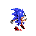
So here's the deal, these sprites are not pre-rendered, which... looking closer at them, makes a whole lot of sense

But guess who also isn't a pre-render, yeah it's this fella right here from Sonic 3!
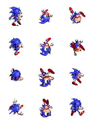
And I do mean it, with some minor pose changes (fixing some misc. weirdness but also adding it's own), everything checks out.
But you wanna know why I even know all of this? Why it's even something I noticed right away?

Cause I was commissioned to do a rotation animation for Khalifax10 not too long ago, which is the end of a wonderfully long chain of sprite edits
Sonic 2 -> Sonic 3 -> Sonic Mania -> Sonic CN -> Shadow CN -> Khalifax10's OC
...the Tail is completely custom tho, screw the baby stationary tail from the originals
Now this isn't the end of the story, cause I was asked about the Advance sprites right after and lo and behold!

They too got a hold of the homework and changed it enough so the teacher couldn't tell! (the advance spritesheet on TSR doesn't center the sprites, sorry for the wobble x.x)
They're more based off of the Sonic 2 iteration rather than Sonic 3's which is a good call since the Mohawk-like spines are easier to read and translate better into the more stylised Advance artstyle.
Most changes seem to be at the end and start of the animation, mainly because it wasn't smooth at all in Sonic 2 and that transition happens more often in the spring animation while Sonic 2's was designed mostly for the corkscrew.
Curiously, the peak frame is missing, though looking at more Sonic Advance footage reveals they didn't need it as that's when it transitions back to the advance walking style.
Arms are kept more "static" during the rotation to make them less of a mess when animated.
Moral of the story: It's ok to reuse assets, make sure to polish them first.
#sonic the hedgehog#sonic 2#sonic 3#sonic & Knuckles#sonic advance#art#pixelart#pixel art#commission art#THESE ARE NOT PRE-RENDERS
137 notes
·
View notes
Text
Trigun manga
I thought the Vash ass was a one time thing but Nightow gives us an ass shot panel like 3 times every chapter.
As someone who entered the franchise through Stampede it's interesting to see what Stampede changed (I mean besides the obvious timeline stuff). Like Stampede left out Vash getting a vent cover dropped on him while using a urinal and that whole subplot. It really is a rewrite, reminds me of the Evangelion movie series in that way, a reinterpretation of the major concepts of the series.
Vash's Stampede design better matches my sense of aesthetics. I never liked the BDSM leather harnesses and straps aesthetic but I gotta give it up for manga Vash's design, it is the most iconic and unique Vash design, it really stands out. 10,000 leather straps with a sleeveless leather harness with cutouts isn't my thing (seriously what the hell are you wearing Vash!) but it is definitly a Thing. Gotta recognize Nightow's dedication to giving Vash long shapely legs.
In stampede the Plants look like bulbs with roots or when unfurled Avatar alien plant people, in the manga there resemble living cells with amalgamated human faces and wing things and are feathery when unfurled. Trimax has stronger angel/demon imagery while Stampede sets up a stronger dichotomy between terraforming vs. Plant technology as the future of humanity. Manga plants are also giant in comparison
Milly is peak character concept. Bigg woman with a giant gun who loves her family, I'd go cafe with her and eat cake.
Oh hey Gunsmoke has pigeons.
Vash Legato telepathy?
I was wondering just how delusional vashwood shippers were. I mean shippers WILL see something when there's nothing this always happens. Wolfwood and Vash have no chemistry in Stampede season 1. Manga tho? Vash is instantly smitten when Wolfwood 3 way splits his last 3 coins with some street kids. And then they start flirting immediatly, yeah this is what chemistry looks like, "Your smile itself is a compliment", "a smile suits your face" damn.
Interesting interesting, in the manga its Vash's fleshy right arm that merges with the gun, in Stampede it's his mechanical left arm that merges with the gun. Although given Stampede is pre-July the right arm could also still happen.
I can see why people like the manga. I can also see how Stampede is playing a longer game planning farther ahead and has a more constructed narrative. The manga was always in jeopardy of being cancelled and then it was and you can see Nightow writing like every few chapters would be the last. Stampede has the advantage of knowing everything and being able to reconstruct the series while having the whole picture. I do like Meryl and Milly in the manga better than Stampede's Meryl and Roberto, but I like Stampede's Vash better than the manga's, he's cuter. In terms of story and format I like both, the more meandering episodic and the more straightforward story.
Maximum! So Knives blew Vash's angel gun again and now there's a hole on the moon and that dyed half of Vash's hair black… somehow
I rather how with the artstyle you can't tell if the black is because his hair color changed or if its dramatic shading. I do think Stampede made the right call with the July incident leading to Vash's Eriks phase and 2 year gap instead of having another moon hole incident. The original 3 volume manga almost feels like a gaiden.
Wait wait. 2 year timeskip as Eriks and then we jump another 11 years!! Year 113 Meryl is 23, moon blast was on year 100. No way Meryl was 10 and a senpai insurance agent. Huh?? Between year 100 and year 113 2 years passed. Is this a translation error??
I need to go rewatch Stampede, Vash was able to keep far less secrets like Meryl and Wolfwood found out about him being a plant much earlier
10 notes
·
View notes
Note
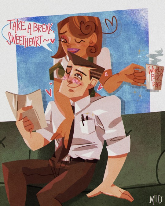
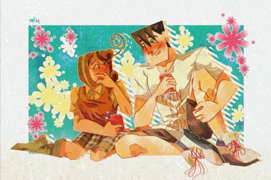
Hi! I really love your art, especially the piece you did of Marc Spector and the one of Javier Peña—the textures and the colours and just the whole feel of your pieces is phenomenal. I was wondering if you would mind sharing what sorts of brushes and canvas textures you use? I’m learning digital art right now so I’m always super fascinated by what other artists use.
Hello Anon, thank you for liking these ⭐️
I’ll try to make this understandable and clear to some extent !
I draw on my IPad but you can really get stuff done with a regular drawing tablet (that’s how most people start and it’s a great tool for beginners )
I use procreate which isn’t a free app but it’s really worth every penny. Also it’s not a subscription and just a one time payment (I paid about 16 euros but the might change depending on your country)
If you are using a drawing tablet I really don’t know what program is the best because it’s been a while and it will depend on your budget and computer. However I do recommend that you use chonky brushes. The point is to mimic brush strokes to some extent and play with these.
For procreate :
Free brushes ! : The app comes with a bunch of great brushes. A favorite is definitely Nikko Rull. It is chonky and has strong edges that you can make harsher or softer with pen pressure. Over all all the brushes under the paint and textures group are fun to play with. Try to play with shapes. Erase with other brushes to get them to look like splashes or brush strokes. Be messy
Brush Packs ! : These one aren’t free but they’re great and they’re the ones I use. I mainly use two packs from MaxPacks . For lineart and sketches I use the Gouache Pack although I believe you don’t necessarily need it for the artstyle you’re trying to achieve., it is still a great pack to go and try brushes if you want a gouache like style. The Watercolor Pack is GREAT. It provides really useful brushes to achieve unique textures and blending styles. Also not a necessity but it’s really unmatched. The paper/canvas texture I usually use for my drawings comes from this pack. (The brush is the MaxU Paper Hot Press). They will also give you a pre made canvas with a cold press and hot press style, use what fits your taste better.
If you do not want to buy brush packs (or can’t), you can also look for paper textures for procreate and you should be able to find some for free. You can layer the texture as the top layer and use it as a filter (usually it’s the multiply filter but I believe other filters could also be applied). If you’re editing savvy you could also just take a good quality picture of textured paper and use it as a base.
My overall advice is to : Play with brushes, make them random, erase, bring texture and body to the drawing. I’m still learning but the clue is to experiment ✨
I recommend you to look for gouache paintings as they are often really textured and make great inspiration :) . Some favorite artists of mine right now are Dean Cornwell, Ludek Marold and J.C. Leyendecker
I also recommend you check awesome artists like : Foxystaches @dracarysgang
⭐️
4 notes
·
View notes
Note
oh i'm curious about the ones with insect species and overall mods that make the game prettier (textures, more furniture, etc)

If you want pre-made insect people with their own stuff and lore there are the Apini (bee people) and Motz (moth people). Apini use the Humanoid Alien Races mod, but the Motz require the Biotech expansion.
The fairies I made were made with parts from Alpha Genes, Outland Genetics, and Big and Small genetics.
Or if you're just looking for actual bugs, Alpha Animals and Biomes! Caverns have a lot of cool ones.
I typically use Outland Terrain for the ground, water, and stone textures, though Clean Textures is also a popular one. Or if you want something closer to the vanilla feel there's "Better Ground Textures?"
To make the game overall look cleaner/less blurry there are mods like Graphics Settings+, Vanilla Textures Expanded, High Quality Textures, Vanilla Hair Retextured, Vanilla Beards Retextured, Retextured Apparel, Vanilla Pawns Retextured, Oracle+ Erin's HD Tattoos... And to get a better look at things I highly recommend Camera+ to zoom in way further. Also a lot of mods also have retextures if you look them up, so if you don't like a mod's artstyle there's probably a retexture for it.
And if you'd like your pawns to have more life and personality there is the [NL] Facial Animation Mod. It has a sort of anime style, but if you'd like to keep a somewhat more vanilla feel there's also the Vanilla Textures Expanded - [NL] Facial Animation mod. If you have Biotech I would also recommend using the Facial Animations Xenotype Compatibility patch.
For furniture mods, there are things like Gloomy Furniture, Erin's Cottage Collection, basically anything in the Vanilla Expanded Furniture and Factions collections, Fishing Decorative, Gothicstyle Vampire Furniture, ATH's Style Draconic and ATH's Style Gothic and Bloody Gothic, Gerrymon's Nautian Style.
And since I tend to turn my game into a medieval fantasy you will often see the lovely stuff from either Outland Furniture or more often Medieval Overhaul (there's a lot of overlap between and their styles are similar), though do note the latter is a well and true overhaul of things and will change some of the games mechanics and stuff. There is a "toggles" patch you can get that lets you restore some vanilla mechanics though.
My modsets tend to get up to and over 300 mods, so uh. Yeah. Also highly recommend looking into Rimpy as a mod load order manager, it saves a lot of time and hassle.
Honestly, my bf may be right in that I may enjoy modding the game more than playing it lol so if you or anyone ever has a type of game in mind they want to do and need mods, hit me up I would honestly probably enjoy helping someone made their own modpack.
1 note
·
View note
Text
Final Update (Capstone) 11/28/2022
Time flew by, huh? Let's end it on a good note. The actual final update will be a video format, so for now, let's chat.
There were plenty of hiccups in the last few weeks as a result of bugs and revisiting the finished demos to try and tweak them to run better. It even resulted in me not having the time to finish the third, but that is more than ok. I only intended to finish one and did two that still capture my original vision.
To student devs reading this because Sharla said so? Start NOW, do not wait! Do not think you have all the time in the world, start sketching, planning, pre production NOW. I planned my capstone almost a whole semester in advance and I still ran out of time. Not because of deadlines, but because of life happening, this is your senior year, your last project, work on it the moment you get out of your first class of this capstone semester. Especially if you're making a game.
Scale back. You have time after you get your diploma to make a fully fleshed out game of your dreams, prototype small and get something out there, work on your coding, artstyle, and more. And if you must, there is no shame in using assets from the Unity Store, just be aware of proper credits. Choose your engine and learn its language, update as you go, keep the scale small.
You can change your topic, but keep your eye on the calendar. You don't want to wait for week 10 and still be floundering to begin.
If you are a junior, look into internships with game companies now, some big ones have graduate jobs and internships open. For fellow seniors, you're a little late, but Indie Companies are always looking, join twitter, artstation and even reddit and find them there. I found my company and its been a great experience, especially when you're first starting out and need the work experience. There is no game job opportunities in Hawaii unless you make a business yourself, which is a feat in itself.
Market and promote yourself as many times as you can, this is how you build an audience.
In the end I finished two demos and a third that I won't be posting on itch as I feel like it isn't my best work. Its finished and it works, but would I be proud putting it out there? No. I still plan on making my game to its fullest, and updating my instagram about it too, for now, I did too demos with zero prior experience and a third that i can take and polish until I'm happy with it.
Good luck Senior, this is where it ends for me, this is where it starts for you.
0 notes
Text
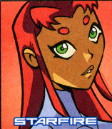
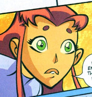
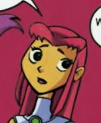
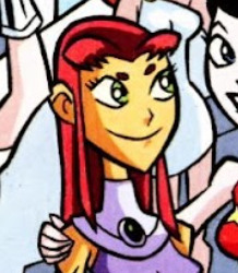
im basing this on my completely fallible memory so ive surely got the more finer details wrong but i do think that im correct abt the overall idea, that despite the drastic visual changes of tt2003 starfire compared to her OG ntt designs, i think they still managed to maintain most of the core components of her original personality, mainly her deep love for others, her very passionate way of expressing this love, and of course, being the Token Foreigner.
they definitely played the Foreigner (Alien) trope up to 11, to a degree that many tt2003 critics find very annoying, which like, fair. its very zany and comical (love of mustard comes to mind), meanwhile theyve toned down her fiery/passionate personality by a bit, which led to some people saying that tt2003 has completely flanderized her. and while on a surface level it may seem true, i dont think it is entirely. tt2003 is an adaptation of her character after all, so yes they played up the foreigner aspect and toned down her more assertive traits, but i do think that theyve managed to have her still be essentially the same character at heart.
but in spite of all this, tt2003 still does deserve shit for starting the (still ongoing) trend of whitewashing starfire, or more specifically, making her racially ambigious. bc in tt2003 she does have that one(1) episode where shes actually experiencing racism so she is still very much a Girl of Disenfranchised Racial Identity, just not specifically black coded anymore. though more recent comics have gone way too crazy with this and sometimes she just looks like a tanned white girl which is like... 🤮
so much to say about starfire. like although it couldve been done without the whitewashing, i do think that her design is great for the show*, just like how donna troy's design was adapted, starfire's design is still very much inspired by her ntt design but was adapted just enough to be more age-appropriate, clean and impactful, and more readable as an animated character, but the fact that it continues to inspire how she looks in non-animated properties is like.... eh? stop that. but tbh from what ive heard at least, it doesnt seem like starfire has gotten any good writing after tt2003, so its sadly not super suprising that theyve gotten too lazy to give her a better design either (her injustice 2 design is the best recent one i can think of)
*although i like her design i can recognize that theyve essentially made her into a 'Generic' Anime Girl, which while very cute! it does take away quite an amount of charm that her original design had. (her beautiful voluminous hair was very reflective of her character). and whether whitewashing was the intention or not, the simplification of her character design (most glaringly, making her hair thin and straight) was most likely done in order to make her easier to animate, bc as pretty as she look with voluminous big hair even in tt2003's artstyle, it wouldve not hv been practical to animate for 5 whole seasons.
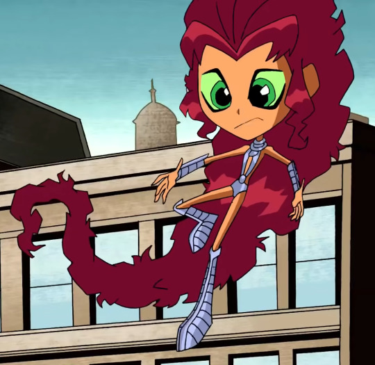
tho making her more practical to animate doesnt entirely justify the other design choices done to her character (alien eyebrows, thin nose, no lips**) and theres definitely ways they couldve still have starfire to be practical to animate while not entirely converting her into a Racially Ambiguous Anime Girl (which im currently making an edit of, and will post later :3c)
**also interestingly, while the show does have starfire be an anime girl in all her anime girl glory (aka no lip, though sometimes she'll get a small bottom lip if the shot calls for it), in the comics she does tend to have a lip
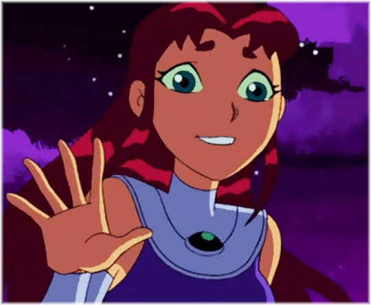
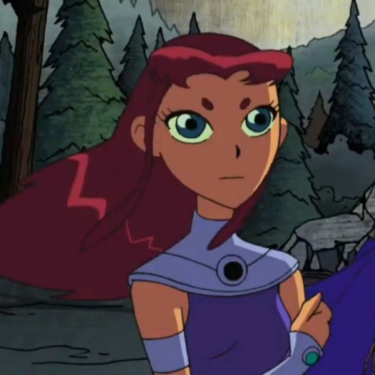
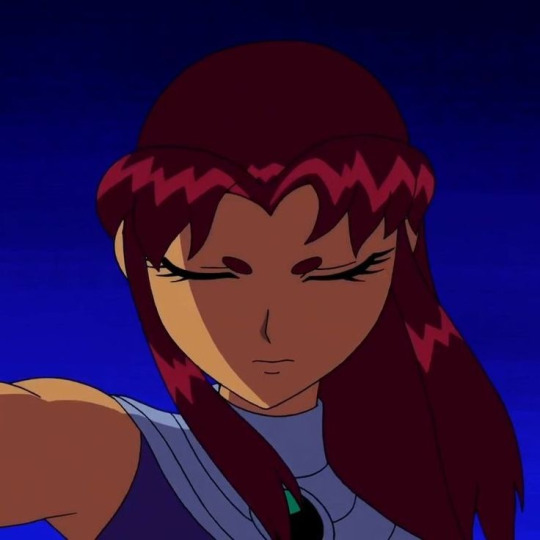
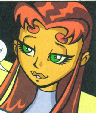
...sometimes. todd nauck is the main artist for the comics (these 3 starfire lips pics are by nauck) and starfire always has a lip when drawn by him (except pre-issue #7, when hes still getting used to tt2003's artstyle), but guest artists are plentiful and when its up to them, its a "sometimes they do, sometimes they don't" deal on whether or not starfire still gets her lip or not. though it tends to often fall on the 'no lip' side.
credited pencillers from left to right, top to bottom:
yes lips: mike norton, issue #17; sean galloway, issue #22
no lips: alexander serra, issue #52; ethen beavers, issue #54
#my meta#kinda.... whatever idc#also ive only just noticed that nauck tends to make her eyebrows stylistically bigger wow tq for ur service
0 notes
Text


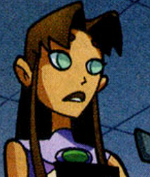
I can't sleep because i am lowkey nervous about tomorrow but also I just want to show yall basically my art progress (in terms of rendering) in the spam of 1 year contracting Utonium brainrot hhhh it's so surreal to see how different both of them looked like ahaha
(for guide, first pic to last, 1st week july 2021>3rd week july 2021>21st Nov 2021>9th Apr 2022)
Also witness me talking about each journey of my progress undercut lol
I cAN TOTALLY EXPLAIN THE FIRST 2 PICS. The first one is exactly from a year ago when my brainrot just started and I was like "well fuck I guess I have a new f/o now". If you ever see or feel familiar about the first art even though you prooooobably never see it,
its because it was an original picture for this redraw a few months AFTER that pic
Also if you notice, the art style for that one is totally different from others and shhh the reason it was like that is because initially I want to draw them in my actual artstyle around that time and I dont want it to follow the same artstyle like in the show. My friend said Utonium kinda reminds them of that guy from clo.udy wi th a ch.ance of meatb.alls and im like "oH SHITTT". There's more drawings of Utonium pre-brainrot era with this kind of artstyle in my folder but I don't think the world is ready for that yet lol
Anyway as I progresses to the 2nd pic, I changed my mind and was like "wait I actually WANT them to look like they're in PPG and not my own artstyle" so I slowly draw both of them to look more like the ppg style if you understand what I mean??? Althoughhhh in the 2nd pic I still want him to look a bit like my own style with my own touch and despite how much I don't like the reboot, I actually like his gray hair on his sideburns??? So if yall remember that phase and followed me from way way in the early days of this blog, I used to draw Utonium with those streaks before I gradually stopped doing that because of.... actually idk why I stopped??? I should totally add the grays back because I love it actually lol but anywayyyyyy the 2nd pic was also around july too me think? So there's probably like a few weeks gap between the actual totally real not clickbait picture of Chloe and Utonium 'together'.
That was how my render looked like for a few months until november (the 3rd pic).
So in the 3rd pic, I discovered this very magical spectacular magnificent function on CSP called t E xt U r e and holy fuck, let me tell you, I feel like I am a changed person. I was never the cringe person with mediocre render like I was, this legit marked a cultural shift in me, I just feel like I've been blessed by god himself. I spammed the fUCK OUTTA THOSE TEXTURES like it was MY BUSINESS. i pAID CSP FOR FULL PRICE I HAVE EVERY RIGHT TO USE IT TO ITS FULL CAPABILITIES AND SQUEEZE IT OUT OF ALL IT'S WORTH. Although I must say, my render time after that significantly increases. By standard I used to render around 3 hours? Now this bitch took 6 fuckin hours to completely. It wasn't a daijobu era ngl 😔😔😔
And holy fuck do I have a fuckin field day with it. You think I was a changed man back then? I have ascended, I am now r e b o r n. My friends feared my, my peers stared at me, my teachers are baffled by the amount of brainrot I drew at that time. How am I real?
I rendered like that for around 4 months until I discovered something even more cooler:
B L E N D I N G M O D E
Okay jk but hhh anyway for my current render; it's kinda more like an accidental discovery? I wanted to look for ways to cut render time because it was really tiring for me to render with a fuckton of texture layers and I also wanted to emulate my fav artist's render style soooo bad (it was luoman if anyone asked) and I kinda figured out how they did it? I mean they still do it better but like I was really inspired to be like them and lemme tell you, I cried for 3 days 3 nights unpaid vacation time when I figured it out. I wasn't kidding when I say I feel like I am a new person. I am quite pessimistic tbh, I'm insecure about my art but like this is the first time in like 3 years ever I feel like I did a major progress and I feel really good.
Why did I made this post? I actually dont feel good about myself, maybe because I am nervous about my test tomorrow and I just need a quick mood boost from myself. I don't believe I did any progress. But now, after typing all of my thoughts at 3 am, after I just put art phases of my braunrot together, kinda believe I actually did progress and I am proud of myself ;w;
#i didnt do any spell check because its 3 fuckin am#so im going to correct that the next day lol#but also i feel better after writing all of those haha#maybe sometimes I just need to sit down and not make myself feel bad for a second#and acknowledge my own achievement ;w;#asuka speaks#selfshipping community#selfship#selfshipping#selfship art#oc x canon#self insert#self insert oc#ppg professor#professor utonium#asukart
48 notes
·
View notes
Note
Hi. Off topic, but: someone on twitter said Mihoyo hates women, comparing Ganyu's trailer and Xiao's. That Xiao's trailer was "badass" and most they talked about Ganyu in her trailer was about her sleep habit. Ganyu is half adeptus while Xiao is an adeptus, kinda like a mythical powerful creature in Genshin's world, so she should be depicted as such too (powerful), but apparently since "Mihoyo hates women" they didn't show her badass side, and not only that, they couldn't give her a meaningful, deep trailer.
I couldn't stop thinking about Honkai, and that I think her statement isn't true. Right, Genshin is not Honkai. But if Mihoyo hates women, it'd be shown in all their games, wouldn't it?
In my opinion, there's a certain amount of fan service, something that I dislike in both games, and there's things they could do better when representing women, but still, to say that they hate women? Because a character trait is emphasized, does not mean that it is the only trait of the character...
Her tweet has more than 1,5K of likes. So many people agree with that?
I feel out of place, "defending" Mihoyo, a company that creates wonderful games, but at the end of the day it is still a company that wants your money...
So, in general: I think criticism is valid and it's good so Mihoyo can become a better company, I just don't agree with her opinion and wanted to see other point of view, when comparing Mihoyo's other games.
In your opinion, when having Honkai girls in your mind, is it true that Mihoyo hates women?
Firstly I’d like to say this.
Rather than be the Purity Police expecting perfection and constantly being disappointed or infuriated, I can recognize that something has plenty of flaws, but still has other merits and enjoy it. You can think parts of something are bad but still enjoy the whole.
To actually get started.
It’s hard to say anything about mihoyo as a whole because there are many teams at the company. The Honkai team, GGZ team, Genshin team, AI research group, that first-person shooter in development, their otome game, and other projects I’m sure I don’t know about.
I can only give my opinion based on my experience with Honkai Impact because I only played a few hours of GGZ and Genshin and just didn’t like the gameplay.
As for my take on that Genshin statement of hating women. I think it’s only a problem if it’s consistently happening to every female character. If they only advertised men as badass and then women on other traits that would probably be showing some favoritism for their male characters, or sexism rather if they showed the women as incapable of the same things as the men. There’s nothing wrong with advertising a character on their different traits I don’t think. You can’t advertise every character as being the most badass, that’d get boring.
But I don’t think I know enough about what happens in the Genshin community or Genshin itself to comment on what happens over there.
But I do know a lot about Honkai Impact and the Honkai community here, I’ve lurked on Reddit, seen plenty of youtube, and spent one terrifying moment on Amino.
So at the beginning (of Honkai), there was a lot of bad fanservice-y stuff that I really didn’t like, we could go on but I’ll just show you these pre-release Mei designs.

In-game on the left, pre-release on the right.

In short, it wasn’t good. But they changed them so I can commend them for that, but these images are representative of some of the stuff that was in the game earlier. I am split on how if you touched the characters in inappropriate places on the bridge they’d kill you and log you out of the game. It is funny but probably not something that should’ve existed in the first place.
So there were definitely some bad approaches they took to the characters, but over time this started to change and I’m not sure what happened. I’m guessing that they really came to love and respect their characters as people rather than caricatures they could sell?
Don’t get me wrong, they are still trying to sell you something but it seems like ever since Honkai Impact began they’ve done so much better over time portraying women in their media as characters and selling the story they are part and the people they are of rather than selling you on fanservice of their boobs or other such silliness.
Sure outfits may be revealing still but they make sense and are overall super cool. They make the characters look amazing/powerful/beautiful without shoving them out of character or reducing them to sex objects. For example, the Herrscher of Thunder battlesuit is revealing, no arguing that, but it makes her look so powerful and awesome.
There are still bad ones, they aren’t perfect and their target demographic is people who are really into anime so sometimes nonsense sells. Looking at you, HoT outfits and Succubus outfits.
Even a character like Himeko or Rita isn’t out of character when she has mostly revealing outfits because it can come down to whether she is being sexy vs being made a sexual object. And sometimes they do cross that blurry line into “haha anime titties pls buy”.
The comics are a great example of their improvement, the first volume has a ridiculous amount of inappropriate angles with panty-shots and and idiot focus on boobs. You look at recent manga, esp after they switched the artstyle/artists there is none of that.
This wasn’t asked about but I’d like to discuss it too, the wlw representation in Honkai Impact is fantastic even working in the restraints of CN gov’t censorship. I don’t care if they meant for it to be or if they’re just trying to get my money, these characters feeling like people in love, for better and for worse, in healthy and unhealthy relationships. These aren’t stories about lesbians coming out or how hard it can be to be queer. These women are just in love and they explore the dynamics of that love just as they would for any straight characters. But my girlfriend wrote a much better post about this subject so I’ll link that if you want to read more.
I’m not sure if I worded this exactly how I wanted to but
I can’t speak for Genshin Impact but really believe the Honkai team at mihoyo at least loves and respects the women they write in their stories.
63 notes
·
View notes
Last Seen Blogs

rksinteriors
Untitled

midanddown
Untitled

gabrielfduran
Divinity In Us

accountt1234reblog-blog
/r/accountt1234 reblog

cleanlegs
Clean Legs