#pstutorials
Explore tagged Tumblr posts
Visit Tumblr Blog
Explore Tumblr blogs with no restrictions, modern design and the best experience.
Last Seen Tumblr Blogs


Fun Fact
Tumblr Inc. is using 66 technologies for its website.
Text


4k Eye Textures Practice - dreamstate - 2024
(+ .psd/textures)
It's been awhile since I made a game texture but I got inspired while scrolling XIVarchive.
I am releasing my files for this as a resource/asset, (download is at the bottom. t.o.u is in the download folder for modders) you can use this as a base for your own textures and change out the iris. The images you see above are all my original work and assets (minus the red iris and pupil which uses brushes from Obsidian Dawn for many of the layers).
The .psd's come in 3 separate files. The first is the Iris file, since it has so many layers and they can't be baked down easily, it's easier to export from here and into the main file. The gloss texture + catch-lights in the bottom row are in a separate file as well, these combined with everything else was causing insane lag. You can edit and export the texture in this file should you wish too, it has already been imported as a flat image into the main file. The last is the main file which has everything set up for you to import your iris and export as whatever you like, catch-light+sclera layers are also still separated in this file for convenience.
These are sized 4096x4096. Everything was made using Adobe Photoshop 2018.
CREDITS
Used for painting most of the Iris. If you use the iris for anything you must buy a license or give credit to Obsidian Dawn for her brushes in your description.
Used for a few GMs. I use these quite a bit in general, they're great for shadows/highlights. The base iris texture in row 2 uses one of these for example.
More GMs, I used one of these in the finished texture file as an overlay. These and the GM's above are the two sets of GM's I use most, both packs are extremely versatile.
DOWNLOAD LINK - dreamstate eye texture 1
#photoshop#psd#dds#assets#psassets#assets by others#textures#moddingtutorial#pstutorial#eye texture#eye mods
2 notes
·
View notes
Note
Hi, hope you don't mind me asking, I was wondering how you got the emojis in your "the untamed character as tumblr bots" gifset?
Hi! no problem, I used the pre-installed EmojiOne font in PS.
All you have to do is click on the text tool and then use the glyph option to select whichever emoji you want by double clicking it.

2 notes
·
View notes
Video
youtube
🖌️ Restore old memories! Learn Image Restoration & Black and White to Color in Photoshop! 🎨✨
📺 Watch now: https://youtu.be/zPYpK_QMSS8 🔥 Master Photoshop tricks step by step! #PhotoshopTutorial #ImageRestoration #BlackAndWhiteToColor #PSTutorial #GraphicDesign
0 notes
Text
bringing back old editing styles: picspams (no textures needed!)
hi everyone!
so i previously posted this picspam tutorial which was more ~texture~ heavy but if you’re looking to make a picspam that really just focuses on the colors and is simple, then keep reading! :)
example:
first screencap tutorial: changing the screencap to a color you want that is different from the original lighting
step 1: put a base coloring on your screencap
in this case i added a brightness layer and also a photo filter layer set to the cooling filter so that the screencap has no yellow lighting and more cool lighting

step 2: color the background in using the brush tool
in this case i also changed the color of her eyes) + set it to soft light (you can adjust opacity as needed but i usually leave it at 100%)

step 3: add another layer and use the brush tool to make a light leak + set it to screen
the brush layer should look like this, you can save this if you want and change the hue to whatever color you need!!

the results should look like this:

step 4: adjust the layer with brightness, vibrance, etc to your liking
pro-tip: use gradient map and have it be black to the color of your choice. so for me, i made it black to purple + set it to screen and adjusted the opacity

final product:
now this looks different from the picspam above bc i forgot to save my psd (stupid of me, i know lol) but i hope this helped! also i use topaz labs for sharpening and that's it!

alright next..coloring a picspam that already has the color you want!
step 1: add a base coloring + selective color
add your basics like brightness, vibrance, curves etc. AND selective coloring! for the selective coloring, increase the yellows to +100 and for this, i increased the cyan of the reds but you should just play around with the selective coloring to your liking

step 2: add brush layers
using the bush tool, i used light orange and dark burgundy and set the light orange one to soft light, and the dark one to screen


final product:
just add some more contrast or vibrance if needed and you’re done :D
overall, i recommend using the brush tool and setting it to soft light + screen along with using selective color to make the colors really pop out!
hope this helps and as always, my ask box is open to all and any questions <3
best,
~farah
#picspam tutorial#tutorials*#allresources#hisources#emeraldsources#photoshop tutorial#pstutorial#yeahps
187 notes
·
View notes
Note
Your gifset with the boarders and circles is gorgeous 😍 Can you do a tutorial on it?
thank you! and of course, i’ll explain how you get this gif under the cut. this is probably gonna be very picture heavy because that’s how i learn things and i think it just helps to see each step.

so once you choose your gif(s), place them on the same canvas [540x575] and situate them where you want them.

then, create a layer mask on the top gif and use the soft brush tool to blend the two gifs together. it should look something like this.

this is when i would color the gifs personally (though this “layer” of gifs is going to be covered with a gradient map, i think it’s beneficial to color now so you know what you’re working with, rather than having to change the gradient later.)
create a gradient map adjustment layer. change the color to whatever you want it to be, in this case, i chose one of the preset ones (purple 06). change the blending style to color.

and personally, i want to change the purple a little, make it a little warmer. so i create a selective color adjustment layer and mess with the magentas. now it should look something like this.

looking good, right? well, i want to make more changes because i think it looks too bright/white. i want this to be a good background, so i want it to be more dark and solid. so, above the coloring but below the gradient map, i create a solid layer of black and change the blending mode to soft light.

okay! onto the middle gif. i use the ellipse tool and create a 200x200 circle and use the alignment tools to make sure it’s in the middle of the canvas. next, i copy the circle layer, putting it underneath the first circle, and use the transformation tool to make it bigger. it happens to be 213.5x213.5 now, but it’s just personal taste for how big of a gap you want. change the properties so that it has a stroke of 4px and no fill. and then change the stroke option to be the dotted line instead of solid and mess with the gaps until it lines up the way you want it to. mine is set to be 5.59.
next, i add a drop shadow to that dotted stroke circle. these are my settings for them.

now that we set that up, copy that layer (not the original circle), and use the transformation tool again to make it bigger. mine is 238.7x238.7, and i changed the stroke to now be 5px. this messes with the dots, but all you do is mess around with the gap number again. now, it’s set to 5.57.
the way i decide how big the gap should be is by seeing when the next dot begins and doing the one before that. by using the arrow keys to go down by decimal points, you can see the exact shift in the circles. so for example, for the first one, having the gap set to 5.58, you can see the top dot start to deform. that’s the next dot coming out behind it. you want it to look like it’s perfectly spaced, so you set the gap to 5.59.
now, you can add the gif you want in the middle to the canvas. i just copied the same coloring i used before and added any adjustments i needed to make sure the gif looked good and then shift-clicked all those (the colorings and gif) and converted them to a smart object. then it’s just right clicking the gif layer and making it into a clipping mask so that it “fits” into the middle circle.

before i move on, i realized that i wanted the background to be darker again, so i create another layer after the gradient map but before the circles where i create a vignette like effect of just using the soft round brush on the corners, and setting the blending style to soft light at 50% opacity.

rectangle time! first, i always create a rectangle that’s the same size as the canvas and set it in the middle and then transform it to be smaller so that the proportions are always the same. this one happens to be 472.69x503.33. you get weird numbers most of the time since you’re just eyeballing where you want it to be. similar to the other dot strokes, set the size to 5px and then mess with the gap sizing until you’re happy with it. mine comes out to 3.15.
add a gradient overlay style to this one. again, i chose a preset gradient (purple 12) and set the opacity of the gradient to 85%.

for the other layer, copy that last layer and clear the layer styles. this should set it back to just before the gradient color. place the layer underneath the colored rectangle layer and change the fill to 0%. it’ll look like it’s not there, but it’ll be back, don’t worry.
add a stroke to this layer, set to 1px and 100% opacity. and now you should have the outline of the dots! i moved the layer using the arrow keys 1 to the left and 1 up to give it the offset look.

time for the text. choose whatever text you want, this is really all up to you! i have cherry and kisses for my top font and big noodle titling for the bottom font.
for the top layer, i wanted some color so i duplicated the layer (moving it underneath the original layer) and added a gradient overlay and drop shadow. then i shifted it over a few spots again to have it be visible.
for the bottom layer, i just added a drop shadow.

now, i just create a layer mask on the dotted rectangle layers and use the hard round brush to “erase” the dots that are behind the text on both layers.

and that’s it! if you have any questions, whether i missed something or something doesn’t make sense, just shoot me an ask/dm :)
happy giffing!
#tutorial#photoshop tutorial#gif tutorial#pstutorial#yeahps#completeresources#allresources#dailyresources#quirkyresources#hisources#uservalentina#tuserdi#userrobin#ref#ask#anonymous#star talks
111 notes
·
View notes
Text

HEADER TORN PAPER — TUTORIAL
desde a minha primeira header assim, venho recebendo pedidos para fazer um tutorial ensinando como fazer pois esse dia chegou! preparei o tutorial com muito carinho e espero que ajude vocês, caso tenham dúvidas é só me mandar mensagem <3
primeiro de tudo, você deve escolher a foto que deseja pra sua header e abrir um novo arquivo (ctrl+n) com o tamanho 1000x500.

feito isso, você posiciona a foto que escolheu, no meu caso eu escolhi uma obra de claude monet e apliquei o psd peek a boo da peach coloring junto do future friends da soleiledits e ficou assim:

pra adicionar a textura de torn paper existem dois modos, eu vou ensinar com a ferramenta de pincel. pra isso você precisa ter brushs com ponta torn paper (aqui você encontra uma pack com eles) e cria uma nova camada. com a camada que você criou selecionada você carimba a parte de baixo da sua header deixando ela assim:

primeira parte completa, é só salvar em png e se você quiser pode usar assim mesmo. no meu caso, eu quis que ficassem caindo uns brilhinhos. nessa pack você consegue baixar as overlays de gifs que eu usei, eu usei a 028. você precisa abrir a linha do tempo. em janela > linha do tempo

depois disso, você abre a overlay que você deseja e posiciona em cima da sua header pronta. assim:

vai ficar preto mas nessa configuração você consegue arrumar isso, escolhendo divisão:

pronto, desse jeito o que ficará visível no seu gif será apenas as bolinhas. você também precisa ficar atente nessa configuração da linha do tempo com as camadas, se não, o tempo do gif ficará errado então tenha os dois do mesmo tamanho assim:

feito isso, você salva o seu gif mas não como salvaria um arquivo normal. você precisa salvar para web para que ele possa se movimentar, alt+shift+ctrl+s

vai abrir essa tela quando o gif carregar e são com essas configurações que eu salvo.

E PRONTO!! depois de salvar, o seu gif fica assim e você pode usar ele como sua header no seu perfil do tumblr <3333 espero que tenham entendido, qualquer dúvida é só me falar que eu prometo tentar ajudar!

#tutorial#resources#pstutorial#tutorial torn paper#psresources#tutorials#photoshop resources#photoshop tutorial#ps tutorial#ps tutorials
117 notes
·
View notes
Text
Tutorial 2
This one’s for Anon, who wanted to know how to make edits like this one and this one.
First of all, I’d suggest to check out the first tutorial which explains how to get the size of the screencap you want to work with and the width you should use to create your set.
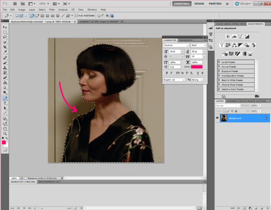
Once you’ve picked the screencap or picture, you’re gonna open it and select the Pen Tool. I suggest you zoom in a little to get a clear view of the outline of the person or object you want to cut out. Always try to pick a screencap in which the object has, if possible, clearly visible edges/contour so that it’s easier to cut. Once you click on the Pen Tool, you’re gonna start clicking the outline of the object. I suggest not to leave a lot of space in between the “dots” so that the cropping is smoother. Whenever you reach an area that has curves, you can click and drag the selection so that the line from one dot to the other has the curve you want:
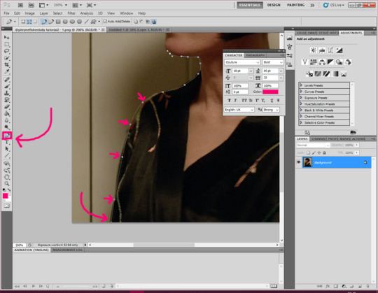
After you finish the outline you want, the last dot will have to be places on the first do you made. that is, the selection will have to come “full circle” so that it’s “closed”. You’ll get a line contouring the object. After that, you will right click inside the object and click “make selection”:
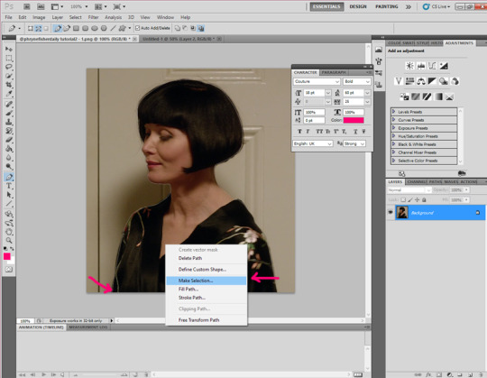
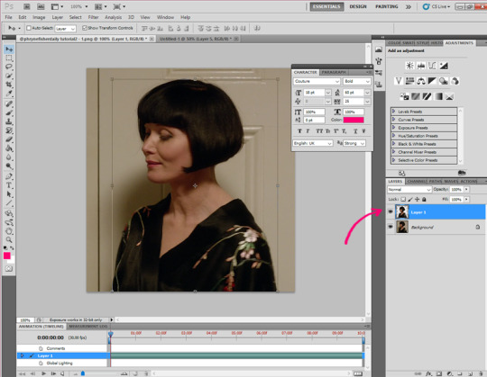
Once the object’s been selected you’ll click on “edit - Copy” and then “Edit - Paste” to get your cut out. You can see the object as a new layer in the layer panel on the right:
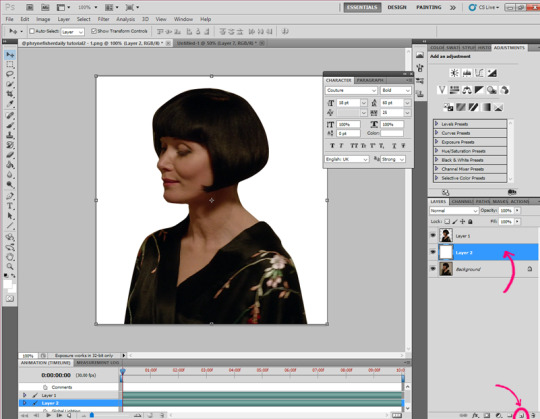
Now you can click on “new Layer” (bottom right) and paint it the colour you want. In this case i painted it white so that you can clearly see the cutout. i sugest you pick a colour that combines with the image you cropped (this part, of course depends on you and what you want to make):
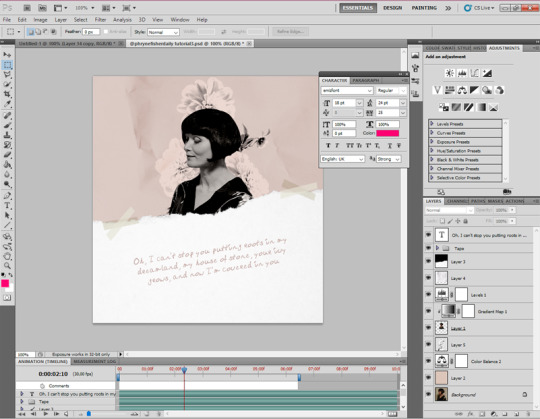
Now comes the fun part. Unleash your creativity! change all the settings you want, add more layers, textures, colour gradients, add texts, play with the fonts, etc. In this case I changed the size of the object (you can do so by selecting the “Move Tool” which is the first icon on the left bar, and drag on of the corners towards the centre of the object while pressing shift so that you keep the original proportions of the object), sharpened it (Filter - Smart Sharpen), added some paper textures, changed the colours a bit and added some text. To get a better sense of what to do and which effects to use, here you can download the psd of this edit (and the ones from the previous tutorial!). The result was this:
Don’t worry if it takes you a long time, that’s the thing! You have to try each setting for yourself and discover rather intuitively what works for you and what doesn’t. Be patient with yourself and trust your choices ♥
You can leave the edit just like that and click on “File - Save as...” and save it as a .png. However, if you want to add some motion effects, you can look for “gif overlays” on google and pick the one you like most. In this case I used this one:
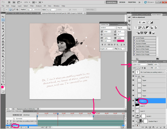
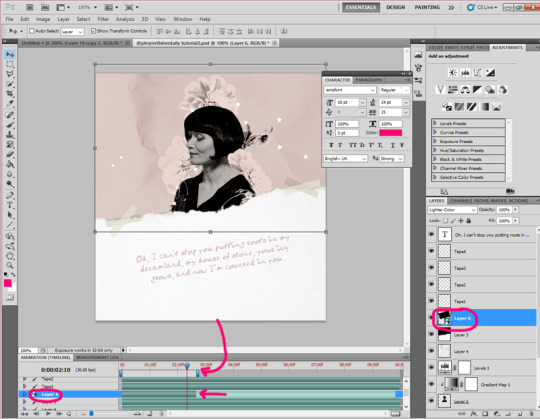
You’re gonna open the gif on photoshop and select all the layers on the right and all the layers from the bottom panel as well. Once you have, you’re gonna click on “Convert to frame animation” (near the bottom right). After that, you’ll click on “Filter - Convert to Smart Files”:
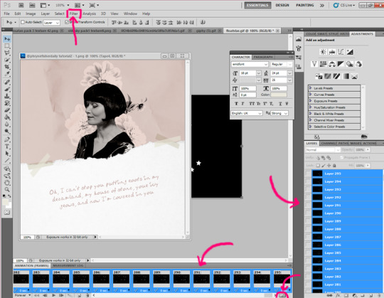
Now you’re ready to drag the gif layer to the edit. Usually, you have to set the layer on “Lighter Colour” so that the white parts of the gif are visible. On the animation panel at the bottom, you’ll see green horizontal bars that indicate the length of the layers on the file, in this case, this gif (layer 6) is long so I reduced the duration of the gif by dragging the small blue bar which sets the seconds it lasts:
Always bear in mind that, if the gif is shorter, you’ll have to drag the blue bar so that it covers the length of the gif. Otherwise, the overlay gif will “dissappear” during the animation because the file lasts longer than the gif layer. Here’s an example of a shorter gif layer and how to set the duration bar:
Finally, to save it as a gif, click “File - Save for Web & Devices...” and check that the settings are like the ones in this picture (especially the looping option so that the gif “never stops”):
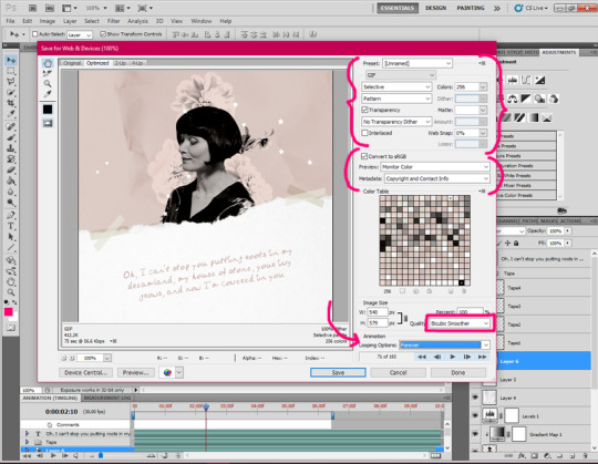
Click “Save” and there you have it!! ♥♥ Hope I’ve been clear enough and that you find this tutorial helpful! Sorry if my language is technically incorrect or if I’ve made any mistakes :) There are probably easier ways lol, but this is the one I use.
14 notes
·
View notes
Note
hey I was wondering how do you make the solid color backgrounds in gifs like in this post of yours? /post/175078168046/the-100-season-five-episode-seven-acceptable I always want to do it but don't know how. I know it's a lot to go through and answer/give a tutorial on it but it'd be sooo helpful!!!
hello! no problem at all i’ll try and walk you through it! this is my first ever tutorial so i’m gonna try my best and i hope it will help! (i hope this is helpful!!)
you will need basic knowledge of how to make gifs, other wise it’s quite simple!
[original gifset]
1. Open up the footage you want to use. I’d highly recommend to use footage with little movement and with a solid colour around the person, something like this.

2. Crop it to your liking, i use the dimensions 268x170 and i cropped the gif like this to get the solid colour in focus;

3. Add the psd or the colouring of your choice, i simply put one of my psds (with heavier levels to keep the black) over it so it looks like this (the right part of the frame is transparent for now);

4. Now add a new layer (the highlighter button)

5. Now go to brushes and i have these settings

6. Now simply I just brush over the new layer where I want the solid colour (which in this case is black) so it covers all frames equally, something like this;

7. And then you just save the gif! Here’s the difference;


And the final result


11 notes
·
View notes
Text
Look at this... 👀
Look at this... 👀 https://pin.it/3QKLD0C
3 notes
·
View notes
Photo

Yo guys. My first tutorial is on youtube, check it out! Link is in my instagram bio :) Follow me for more! #insta #tutorial #photoshop #pstutorials #adobe #idstudio #ids #dilans #rose #poster #posterdesign #clean #grunge #simple #white #minimal
#grunge#idstudio#simple#clean#photoshop#dilans#rose#pstutorials#adobe#minimal#posterdesign#ids#poster#insta#white#tutorial
0 notes
Text
Has any poster ever made you feel hungry? This one definitely will. 🍔 Want to know how we created this poster with an utterly satisfying juicy burger? Follow the link and watch the full timelapse video to find out!👇

____
If you want us to create more tutorials and videos of Yellow Images products in action - just contact us and share your feedback.
#poster #posterdesign #images360 #burgerdesign #fooddesign #vectorgraphic #branding #brandinginspiration #brandingidentity #brandesigner #branding #mockup #packaging #packagingdesign #payoutdesign #yellowimages #visualidentity #corporateidentity #graphicdesign #graphicdesigner #visualdesign #objectmockup #graphicasset #tutorial #designtutorial #pstutorial #postertutorial
0 notes
Note
Can you please make a gif sharpening tutorial? Or link us to a sharpening tutorial ? *hopeful face*
Hello! sure thing!
okay before importing almost all of my gifs in photoshop, I run the clips through vapoursynth first (you can find that here). I'm going to divide this tutorial into two parts; one with vps and one without vps


SHARPENING WITH VPS:
you can find the vps process here. the settings for mine are
Denoise > KLMN > 1.5 - 2.0
Finesharp > 1.5- 2.5
some ccs like to only sharpen on vps which is fine but I like to sharpen them a bit on ps too.
So after importing your clip in PS convert the layers into smart object. (select all > filter > convert to smart filters)
Apply the smart sharpen filter (filter > sharpen > smart sharpen)

my settings are:
amount: 100
radius: 0.3
no gaussian blur cause denoise pretty much does that job
And that's it for this one!
SHARPENING WITHOUT VPS:
You're going to import your clip the same as you always do and convert the layers into smart object just like above (select all > filter > convert to smart filter)
Apply smart sharpen to the layer (filter > sharpen > smart sharpen)
my settings are:
amount: 500
radius: 0.5
reduce noise: 75-100
gaussian blur: 0.3

Now duplicate this layer and change the opacity of the layer on top to your liking.
And that’s it! hope that made sense, but if anything’s not clear feel free to ask!
#sorry I'm almost a week late I barely got any time to open ps this week#sharpening tutorial#gif tutorial#completeresources#allresources#photoshop tutorial#pstutorial*#ccnet
118 notes
·
View notes
Text


MUST READ: This is actually 3 tutorials all sharing the same general concept. So this will be quite long hehe. These are textured gifs btw, do please overlook me calling them effect background gifs.
It is very important that you have the 'Convert to Timeline' button. I know that Full version CS5 all extended CS version users have this, but no idea what other program has it as well. If you have no idea what that button is it's explained in my Gif Sharpening tutorial.
If you have questions just send them to my askbox :)
Tutorial 1~

This tutorial is really simple so worry not.
Effect background used: [x]
Step 1: Edit your gif and picture. Remember the gif background needs to be entirely black for the smoke (or whatever) to show through.

*Your image does not need to be gray scaled like mine.
Step 2: Select all of your animation frames and click Convert to Timeline. Now click all of the visible animation layers and go to Filter > Convert to Smart Filter.

Step 3: Click and drag your gif to your image and place it on top on the image (and the adjustment layers if you have any of those on top too)

You should now see parts of your image now covered by the gif or entirely.
Step 4: In the left hand corner in the drop down box that says Normal, click that and find Screen. Click that and your gif should screen through your image erasing the black while everything else appears over the image.


And TA-DA! The final project.
Tutorial 2~

This is gif on gif action and should not be hard at all. After you have both of your gifs prepared it should take less than 5 minutes to finish the rest. This is very similar (if not the same thing) as the smoke tutorial.
Effect background used: [x]
Step 1: Prepare/Edit both of your gifs til they are to your liking.

You do not at all need to worry about if both gifs are the same number of frames. You'll be able to mess with that after you have them both combined.
Step 2: Convert both to timeline and then select your animation layers before going to Filter > Convert for Smart Filters (on both).
Step 3: Click and Drag your background gif to the ...other gif. Make sure the background gif is on top.

Play around with it til it covers either the entire gif or just certain parts.
Step 4: Go to the drop down box that says Normal and find Screen. The black should erase now leaving everything else to show through.

and TA-DA!
Tutorial 3~

Out of the three this is probably my favorite :) This definitely has more detail to each step but it depends on how you play with it. This tutorial here explains how to basically do the same thing, but to a different background.
Effect background used: [x]
Step 1: Prepare/Edit your gif and image. To save time for your gif, after you're your done editing it, click Convert to Timeline and then go to Filter > Convert for Smart Filters.

If you are using this particular background, playing around with the brightness could make it look nicer. If you do it, make sure it's just the gif and not the image.
Step 2: Click and drag your image to your gif and place it on top of the layer.

Make sure your gif is mostly covered by the gif.
Step 3: Go to the drop down box that says Normal and look for Lighten.

Your image should now screen through all parts that were black. Play around with your image to fit around your gif to show certain parts of the image.

And TA-DA!
13 notes
·
View notes
Text
PS :: Color Range
O Color Range é uma ferramente pouco conhecida que permite o isolamento de cor, com ela você pode transformar cores em outras sem afetar o restante da foto. Ela é fantástica e a achei por acaso, espero que o tutorial seja útil.

Unfe3ling Tutorials & Desenvolvimentos. Se for útil dê like e credite, jamais copie.
•• Foto Original usada no exemplo - Abra a imagem que queres modificar alguma cor;
•• Print 1 - Vá em Select >> Color Range.
•• Print 2 - Após abrir a janelinha do Color Range você vai selecionar a opção Sampled Colors e logo em seguida Localized Color Clusters. Feito isso deixe o Fuzziness em 110. Agora clique no primeiro conta gotas.
•• Print 3 - Com o conta gotas selecionado você vai clicar na cor que você vai querer selecionar (lembrando: não feche a janela do Color Range). Após isso, você irá selecionar o segundo conta gotas (o que tem o símbolo de adição) e irá clicar nas partes que você quer selecionar mais ainda não estão brancas no exemplo da janelinha. Caso você tenha selecionado uma parte que não queria é só selecionar o terceiro conta gotas (com o símbolo de subtração) e clicar na parte que você tinha selecionado. Quando selecionar todas as partes desejadas clique me ok.
Toda vez que você clicar em uma cor, todas as outras partes da imagem que tenham essa cor também será selecionada.
As partes brancas que ficam na prévia da janela (do Color Range) são as partes que serão selecionada.
Pronto, seleção realizada. Agora você poderá usar dos recursos da aba Images e personalizar as partes selecionada. Caso queira mudar as cores, você poderá ir em Image >> Adjustments >> Color Selective (ou em Hue/Saturation) e deixar como quiser. Você pode também deixar a seleção preto e branca, com mais brilho, em destaque e etc.
•• Print 4 - Quando finalizar clique na ferramenta da corda vá na foto e com o botão direito clique em Deselect.
Veja um dos meus resultados aqui.
7 notes
·
View notes
Note
from where do you download your videos?
http://convertfiles.com/
and these are my settings
1 note
·
View note
Video
What's going on guys, today I want to present you completely new graphic design channel on youtube. If you want to master compositions, color combinations or learn how to use graphic design software you are on the right place. Follow me now to get notified when I upload a video, share this video with your friends and make sure to follow me on social media. Thank you for watching, see you soon. #design #channel #new #tutorials #video #graphicdesign #youtube #composition #colortheory #photoshop #software #pstutorials #dilans #idstudio
#composition#channel#photoshop#youtube#design#video#colortheory#pstutorials#dilans#tutorials#new#graphicdesign#idstudio#software
0 notes