#questions / tutorials。
Explore tagged Tumblr posts
Visit Tumblr Blog
Explore Tumblr blogs with no restrictions, modern design and the best experience.
Last Seen Tumblr Blogs


Fun Fact
Tumblr was acquired by Yahoo for $1.1B in 2013.
Text
♡ JUBILEE | pacific northwest based pixel artist
♡ WAYS TO SUPPORT MY ART
↳ wallpapers ↳ prints & merch ↳ cross stitch patterns ↳ deskmats & tapestries ↳ sticker by number kits ↳ continue to like & reblog my art
♡ MY PIXEL ART TUTORIALS
↳ simple landscapes (old) ↳ city tutorial (old) ↳ water reflection (old) ↳ clouds tutorial ↳ how i use values ↳ color process ↳ BONUS: bluesky 101
♡ OTHER PLACES TO FIND ME
↳ bluesky ↳ kofi ↳ discord server ↳ instagram | facebook | twitter | no longer active
♡ FREQUENTLY ASKED QUESTIONS
WHAT PROGRAM DO YOU USE? ↳ photoshop (i do NOT recommend it) WHAT PROGRAMS DO YOU RECOMMEND? ↳ pixquare (you can get 30% off with code 8PXL), aseprite, graphicsgale, even krita! HOW DID I LEARN PIXEL ART? ↳ trial and error basically. I started by just trying to create, and once I hit roadblocks I would google tutorials, or find similar artwork to what I'm trying to achieve. i started heavily doing monochromatic work then eventually working into more complex pieces! GOOD RESOURCES ON LEARNING PIXEL ART? ↳ lospec is a great learning resource. has tutorials, color palettes, and a large community. there's also lots of great tutorials on youtube, like adamcyounis. there's also saint11's great tutorials.
#FAQ is under the cut!#i'll add more questions if you wanna send one youre curious about#thought id make a pinned post........ finally#pixel art#artists on tumblr#artist on tumblr#art tutorial#art tutorials
1K notes
·
View notes
Note
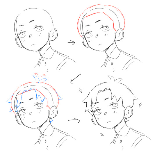
If you don't mind my asking, how do you go about drawing fat? :3
JUST THE EXCUSE I WAS LOOKING FOR
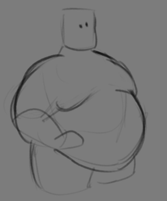
So, for me personally, a lot of the time when I draw fat characters, I'm not looking to specifically capture the specifics of fat as much as the feel of fat. Bulkier, rounder shapes in the right places that has a feeling of weight to em! A lot of that is intuition and simplification at this point, but it all works on the same frame as just any ol' person. Like take this-

For example. This is the basis for any body shape, not just the more average one that it may imply. Sure- it can be that average body shape:
But also a fat one too!

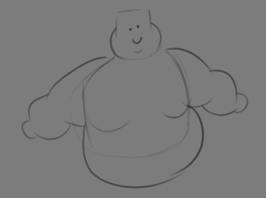
And a big part of that is knowing where fat usually tends to bunch up on the body, so lets take a look piece by piece! (Please keep in mind this is very simplified, and not completely precise in some parts)
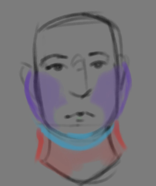

THE FACE: Cheeks (in purple) and especially the chin (in light blue) are the places where a lot of the fat is gonna wanna gather and round out on your face! Additionally, theres a small pocket of fat beneath the cranium on the backside of your head. It's small, but it is there. I believe fat can build up elsewhere like the bridge of your nose and forehead, but generally speaking, you're gonna have a whole lot more buildup in other places first.
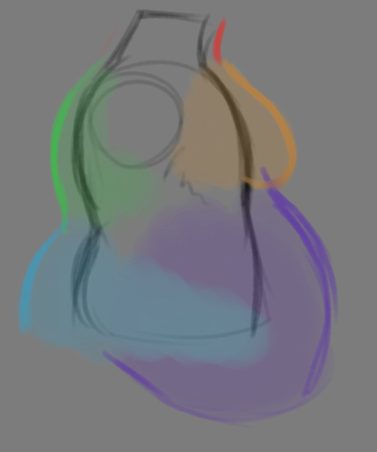
THE TORSO: A lot of the fat built up on the torso is gonna be sent to your tummy. More cushioning for vital organs, mostly out of the way, it just makes sense. Additionally, the lower backs fat builds up and joins with a patch of fat on your sides that forms what is typically referred to as the love handles to make that double belly look. Along with this, the immediate next target for the torso is the breasts, followed by the upper back!
THE ARMS: For this limb, a VERY notable amount of the fat present builds up on the tricep and bicep areas, lessening once you get towards the flexor and extensor areas. You can almost think of the arm as a sort of triangular shape, wide side starting from the shoulder and tapering towards the hand, which itself mostly builds up fat around the back of the hand and the fingers. The shoulders themselves don't build up too much fat unless you got a lot
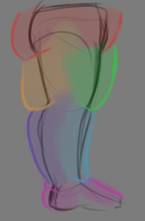
THE LEGS: And finally, you can think of the legs having pretty similar curves to what you're probably already used to thinking. The front of the thighs getting a big buildup, along with the back of the calves, the other parts being flatter in turn. As far as the feet go- similarly to the hands, the top of the feet, along with the heels get most of the buildup, as fat on your soles would impede mobility. The glute, hip and crotch area will also especially build up fat, lending to the same triangular shape that you can see in the arm!
A big thing to note with fat is that it tends to taper off towards joints. Your knees, elbows, shoulders, hips, and all the other places are gonna have significantly less fat so that you remain mobile and flexible, as that's important!
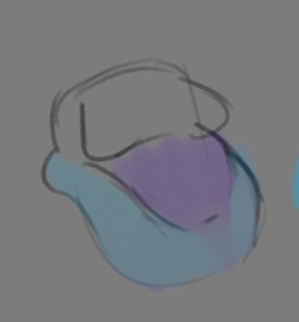
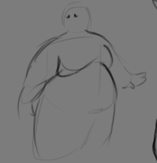
Now that we have an idea of where fat builds up on the body, you might have something that looks kinda like this
Which yes, does demonstrate a solid understanding of the places fat builds up, lacks the weight you're probably trying to convey, which brings us to out next point! Fat is well... heavy! Gravity is what gives fat much of it's shape, especially as you tread towards larger and larger bodies.
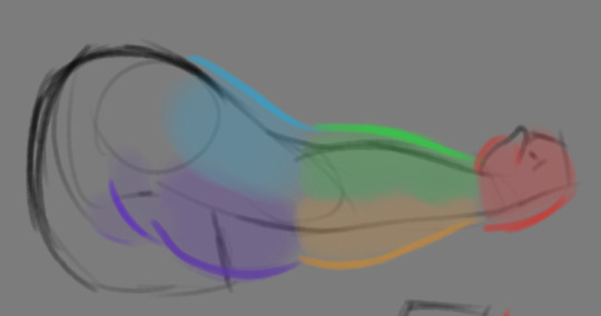
This is demonstrated really well on the arms especially-


Those big ol' bits of fat'll really start to sag when left hanging, and they will squish like hell if they run into something. I like to think of these bits of fat as big ol' ovals that squash and stretch depending on if there's an obstacle in their way or not


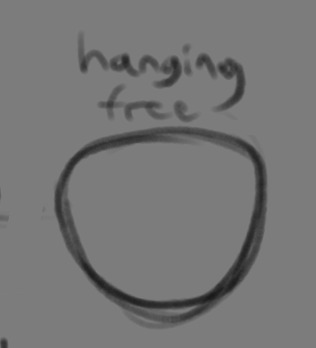
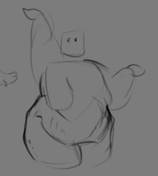
These are the important shapes to remember when it comes to the weightiness of fat! If you take all of this into mind, you should be getting something a lot closer to that shape you've been after!

Oh, and always remember that fat bodies come in all variety of shapes and sizes! Play around with a whole lot, and seek out all the resources you can! it'll really lend to your knowledge when it comes to this kinda stuff!
And as I always recommend when it comes to learning art- look at what your favorite artists do with fat bodies. See what you really like about the fat bodies they draw and try to replicate it in your own work, I promise you it's one of the most helpful things ever.
This is like the most basic of basics when it comes to drawing fat bodies though. If there's any additional thing about fat bodies, or maybe you want clarification on something, don't be afraid to ask! If there's enough to cover, I'll make an addition to this post!
#hat answers#my art#design talk#tutorials#yeah im unfortunately pretty tired so this gets a liiiitle rambly at the end but i think this covers like the basic basics#i hope this was helpful at all#and again dont be afraid to ask questions and stuff#if theres enough traction/questions on this i will most definitely try to clear up as much as i can in an addition to the post#whoops this took a bit!
3K notes
·
View notes
Text
how to grub your karkat
or you can use this for any other plush or if you wanna make a whole new plush entirely or whatever

disclaimer im not a professional in any sense of the word and theres anything technical im doing wrong or you think you can do it better by all means dont hold back
Things you’ll need
sewing machine unless youre really dedicated but doing it by hand is gonna be an agonizing feat i promise. I just used a straight stitch for everything
Fabrics: for the main body i suggest a minky or something soft, for the inner lining something in the same color as the main body and ideally with some stretch, and anything black for the legs. Less than a yard of each will do
if youre using minky or anything furry get a lint roller. Trust me
stuffing, i used polyfil
threads that match your fabrics
good fabric scissors
sewing needle for hand sewing/fixes
karkat plush (optional)

Heres the pattern i came up with! They are numbered for your convenience and pieces with the same numbers are going to be part of the same row of segments. cut everything out on the black lines (Make sure when you’re printing to fit the image to the page size.) on the left we have the belly pieces, the right is the main body, and we have the foot in between
Im using a relatively thin minky fabric, im sure you can use whatever but something with some fluffiness kinda helps to mask any imperfections in the sewing. When drawing out your patterns keep in mind what direction your fibers settle in and try to keep it consistent
On the wrong side of the fabric measure out at least a half inch seam allowance around each piece of the pattern, i used a centimeter and that worked but had me sweatin a bit.

For the main body pieces fold your fabric in half before you cut so you can have 2 of each segment that are mirrored to each other, i also extended all of the #1 pieces an additional centimeter/half inch at the top so we can fold them over at the very end. I highly suggest numbering the insides of all the cut pieces, especially in a way where you will remember what direction they are each meant to sit

After you’ve numbered all your pieces, set them aside and start making your feet!
Each of the 6 legs is made of two pieces, but i because i only had a swatch of the black minky i made up for the rest with some random black scrap fabric from an old project. Try to keep your fabric consistent if you can lol
I didnt give these pieces any more seam allowance on the fabric but i recommend adding a centimeter or half inch to the base of it to extend the length and have some more wiggle room

like so
Instead of cutting out 12 individual pieces and struggling to stitch them all together i started with 6, then pinning each piece real tight with the right/furry side down onto my secondary fabric, and slowly stitching around the shape real close to the edges- DO NOT CLOSE THE FLAT SIDE as we are going to stuff the feet through here

Now cut the shape out of the fabric and repeat till you have 6 feet

Now flip those bad boys inside out, stuff up, and if you wanna you can match them to their best pairs

now grab a pair of feeties and your #1 pieces and line them up, in this picture my belly #1 piece is shorter bc i forgot to add the extra centimeter and i recut that once i realized. Line those sides up with the right/furry parts touching and with the feet in between, flip it around to make sure everything's sitting the way you want it

Note. i didnt realize until later but i sewed my feet in upside down. save yourself the time it takes to fix it and dont make the same mistake
Straight stitch these layers together and repeat with the next two segments our good friends #2 & #3

Repeat this for the #2 and #3 sections but NOT THE #4, that part doesnt need feet! just line those edges up right/furry sides together and sew


the secret to the squish of the suit is making this inner lining from another fabric and stuffing it! I used what i had leftover from a stretchy red fabric for a kanaya skirt. For this we need to make a new pattern for each section, making sure it follows the curve of the round edge but the piece itself is shorter, almost like youre removing the seam allowance you added. Mine is a centimeter shorter on the top and on the bottom and reaches to the middle

Make one of these for each numbered segment,you only need to make half the pattern and you can fold your fabric in half on a crease and you end up with one symmetrical piece (bars)

Now you need to pin these pieces right on top of the wrong side of your numbered furry sections and line up the straight edges like so (disclaimer for LOTS OF SCARY NEEDLES !!)

Admittedly i didnt estimate how long these pieces needed to be very accurately and overshot it a bit, if you start pinning it from the middle and continue outwards on either side thatll ensure its not too lose and you can cut off any excess after
The only exception is piece #1, if you recall we gave this #1 section extra seam allowance. This is so we can sew down that excess at the neck later and hide any of the inside that might show once its all put together. Do not connect the top edge to the inner lining! Since i added an extra centimeter earlier im gonna leave that hanging and pin + sew down the inner lining a centimeter lower than the top edge. LEAVE THE CURVED EDGES OPEN! DONT SEW THEM TOGETHER! those stay open to stuff

Straight stitch the lined up edges together

Now you have all these skinned pieces of little freak and we need to connect all these segments together making sure to sew UNDER the existing stitches so we dont see those on the outside when its all put together


Inside looks like a bit of a mess but thats fine bc its not the part that matters
Now stuff it! you might need a stick or pencil or something long and thin to get stuffing into the middle bits

Now thats its stuffed you can finally close those curved edges. Try not to sew over a thick mound of stuffing, push it in a little further to give yourself some space and you can fluff it back out after everythings closed. I cut off that excess lining fabric after sewing

Ough… they filleted my boy…
Finally, match up all the edges and lines and HAND SEW them right sides together. You will destroy your machine trying to work around that stuffing i promise. You also have an excuse to get up from your work desk and sew on a couch or smth. I used a standard backstitch for a tight finish and again, make sure you sew under any existing stitches so they arent visible on the outside!

Speaking of the outside, once you stitch everything together you can very gently flip this sucker inside out

This is @hatamonu’s cat Cocaina, aka Coco. Her perfectly square figure made it into my grub files somehow so shes essential to the tutorial

Check the fit and all thats left to do is roughly baste stitch down that excess neck fabric onto the stuffed lining and youre set! I gave the thread slight tugs as i went to tighten the opening a bit put dont tighten it too much

tadaaaaa

It fits pretty snug but starts to slip a bit with motion. Heres a bounce test

If you do shake your baby make sure to safety pin the plush to the suit so he doesnt prematurely shed his exosekeleton
Now spread that baby fever and show your baby to the world


pics from the ALA 2025 homestuck meetup and supplied by para.dox.cos
Tysm for coming along this ride with me especially if you followed the prototype journey on twitter, much thanks to my more sewing savvy friend for the solution to my grub dilemma and for helping me design and build my dolorosa cosplay <3 much love and hopefully many more homestuck cosplays and meetups to come in the future!
#homestuck#homestuck cosplay#karkat plush#karkat#karkat vantas#cosplay#tutorial#homestuck grub plush#plush pattern#long post#ALA 2025#anime los angeles#dolorosa#the dolorosa#apologies if this is hard to follow or utterly incomprehensible please note i am making shit up as i go and results may vary#feel free to ask any clarifying questions and ill do my best to answer#no i will not be selling these#technically i have more minky left than i know what to do with but the cost would have to justify the pain in the ass it all was to complet#and i dont think anyone will pay that price#send me suggestions of red characters to make plushes out of
424 notes
·
View notes
Note
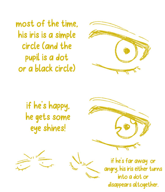
hii i hope this is ok to ask but i love how fucking HUGE you make curly look, do you have any advice on how to draw muscular frames? :o
thankies!! i love drawing him Robust-Looking <3
as far as advice goes, when it comes to anatomy i always recommend the channel proko on youtube, they have all kinds of videos about how to draw anatomy with each area of the body broken down. basically, if you're trying for anatomical accuracy with muscles and stuff, their vids are a great way to grasp how muscles work!
as far as general shapes and vibes though, i have a couple quick tips of my own <3
the biggest part, if you can imagine, is proportions. typically tutorials will tell you the average shoulder width for a person is about 2-3 heads wide, so if you're making someone Bigger and Beefier, you'll wanna go past that a bit. (and making a character's head smaller is gonna make their body look bigger by comparison, so if you wanna go crazy, shrank that thang)
For example, Daisuke (who i draw as lean, but still with some muscle, especially in his arms) is 4 heads wide at his shoulders, while beefcake curly over here is 5 (sometimes more depending on the drawing lol). something as simple as broadening the shoulders already gives a character a beefier-looking silhouette.

[ID: Simple rough sketches of Daisuke and Curly from Mouthwashing with colored circles showing how many heads wide their shoulder width is. Daisuke is four, Curly is five. end ID]
~~~~
"but what if i don't know how to draw the muscles and am not going for realism/don't feel confident enough in that yet? how do i give a muscular vibe without as much detail?" FEAR NOT it's super easy. here we use the power of SHAPES!!
i draw jimmy and curly with the same "skeleton" or base frame, so i think they're a good example of this next bit. despite having the same bones, i broaden the fleshy parts on curly's limbs (focusing on his shoulders cuz he has big ass shoulders) and keep his upper arms wide before tapering down into his hands (muscles tend to be largest at the base of the limb and get smaller up to the hands/feet but there's plenty of design exceptions). i carry that shape language down into his legs (which i emphasize with his fitted calf-height boots). meanwhile jimmy stays fairly squared, especially when fully clothed

[ID: Simple sketches of Jimmy and Curly from Mouthwashing with notes describing their shapes. Jimmy has a rectangle over his body and is noted as being "relatively rectangular" and the shapes of his limbs are mostly straight. Curly has a trapezoid over his body and has a "top heavy shape" with limb shapes that taper down and in. end ID]
~~~~
and honestly, a good hack to make a character read as more muscular or robust is to give them a buddy that contrasts that. once again, jimmy will assist.
even in a simple drawing like this, giving jimmy the opposite tapering to his limbs just emphasizes curly's hugelargeness by comparison. it also shows that you don't need a lot of detail or realism to convey Beefiness

[ID: Another, more simplified doodle of Jimmy and Curly, pointing out that Jim's limbs taper outwards while Curly's taper in. end ID]
~~~~
another final quick tip i have is: the neck makes a difference!
people with more muscle tend to have thicker necks (it's because of the muscles there, if you can believe it) and it's kinda become one of my fav bits of drawing curly lol. idk why <3 necks fun to draw <3 for him, i draw his neck starting at the very edges of his face and widening out at the bottom to match the shape of his head and to flow a bit more into his trap muscles, but you could go Even Further Beyond if you so Choose. i've found this is a surprisingly good way to convey Beefy Person Beefy even if you don't have as much anatomical knowledge.

[ID: Four bust sketches of Daisuke and Curly comparing their necks. The first two show them both facing forwards. Daisuke's neck is slimmer and straight, while Curly's neck meets the edges of his jaw and has a wider base with higher trap muscles. The second two shows them in profile, with the back of Daisuke's cranium sticking out past his neck, while Curly's is even with his neck, showing how thick is is from the side. end ID]
~~~~
in review we got:
widen shoulders relative to the head to convey a Broad silhouette
taper limbs inwards from base to extremities to emphasize the shape/size of the muscles
give em a less muscular buddy for contrast
thick necks help a lot in conveying a muscular build
and of course, i know i only used men in these examples, but these tips will work just fine regardless of a character's gender. please draw more beefy women ily <3
i hope this made sense and helps you and whoever else might see this uwu
if anyone has any questions about it i will. Try. to answer them. making these posts is oddly difficult lol
#fg's art#mouthwashing#just gonna use the one tag since this mostly has nothing to do with them lol#art tips with major#art tutorial#fg's answers#asks#cursing#WOW AN ART ADVICE QUESTION I ACTUALLY ANSWERED WITH A TUTORIAL. AMAZING. I THOUGHT IT COULDN'T BE DONE AKSDJHAKDJH#the part of me that loves helping people and teaching people art stuff#vs the part of me that finds it SO DIFFICULT TO GATHER MY THOUGHTS INTO A POST#it's hard <3 but we work <3
192 notes
·
View notes
Text
tutorial — changing the background color in a gif
sofia & remy asked for this tutorial so here it is :)
note: i pay for photoshop and currently own the most recently released version of april 2025 - some things might be different if you're working on earlier versions of photoshop
i've made several gifsets (x, x, x, x) where i've isolated the gif subject so i can change the background into a bright, colorful background or into b&w backgrounds - in this tutorial i'll explain how i do that :)
in this tutorial we'll be going from this:
to this:

putting the tutorial under a read more!
step 1 — open your gif
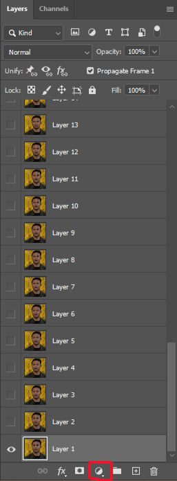
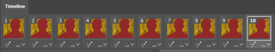
i usually tend to make my gif beforehand, fully colored and sharpened and everything else, and save it before reopening it (as a gif) in photoshop cause i find it's the easiest way!
you'll have to work in frames mode when isolating the background color (because as said, you'll have to do this frame by frame) and it's important to always have the same frame and layer selected, otherwise you might run into some issues

for the purpose of this tutorial my premade gif (eddie<333) has not been colored, only sharpened
step 2 — selecting your subject
next up we're going to select our subject by going to the select category up top and clicking subject

↓ you'll now have a marching ants line around your subject ↓

sometimes photoshop will be silly and select either too much or too little, and you'll have to manually make sure (for every frame) that your subject is correctly selected - but i'll get back to that later!
step 3 — adding a solid color (/gradient color) layer mask
once you have your subject selected the way you want it, we're going to add a solid color (or gradient color) layer mask by clicking this half filled circle icon in your layers tab - from here on out you can choose whether you want to add a solid color or gradient (for this tutorial - we'll go with a solid color)


photoshop will ask you to pick a color (or gradient) so just go ahead and pick whatever color you wish to make your background! the lighter your color the brighter your background, and the darker your color the duller your background (for b&w backgrounds you can use black or white, it makes no difference) - once you're happy with your color, just press ok :)
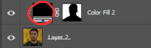
step 4 — create a clipping mask
this might seem like nothing, but is actually an important step in the process! you want to make sure that the color fill layer you just created is clipped to the corresponding frame like so:


you can do this by pressing cmd/ctrl + alt + g or clicking right on your color fill layer and selecting create clipping mask

by clipping your color fill layer to the corresponding gif layer, you avoid this happening:
the color fill layer for the last gif layer has been applied on all gif layers before that, which will make it so that your subject will move in and out of the colored background and makes your gif look silly ↓

obviously this is what we want to avoid so clipping your color fill layer to your gif layer is an essential step!
step 5 — invert the layer mask of your color fill layer
next up we're going to select the layer mask and invert it by pressing cmmd/ctrl + i


this way we go from this

to this

step 6 — changing the blend mode of your color fill layer
the final step (!) is changing the blend mode of your color fill layer - i tend to just use the blend mode color on most of these as this mode tends to give the brightest results but you can definitely mess around and see what you prefer :)

(for this set i actually put the blend mode to soft light to create a duller background, for a gradient background just follow the exact same process but in step 3 choose gradient instead of solid color)
and you're done! now you only have to repeat this process for every. single. gif. frame. :)
and that's all there is to it really, so happy creating <3 see more tips/comments below and if you have questions, my askbox is always open!
tips / comments
1.- record this entire process into an action (tutorial on how to create actions) – this way you'll only have to select the correct frame/layer combo before pressing play and letting photoshop do the work for you! i made two general actions;
bw with subject select: use this action when photoshop can select your subject without issues!
bw without subject select: use this action when you need to manually edit the selection of your subject! (see 2.-)
feel free to download and use these actions! they will turn your background b&w - you can change the background color by clicking this square;
sofia @sadgayeddie made an action to select next frame + layer so you don't have to move your cursor around as often and graciously allowed me to share it <3 you can find it here
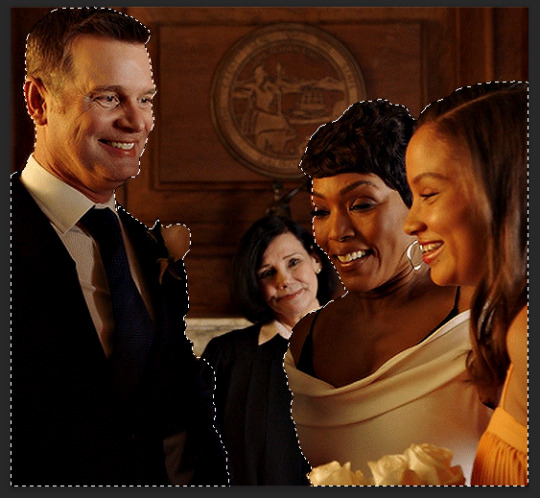
2.- (circling back to step 2) make sure photoshop correctly selects your subject – when using the select subject feature, photoshop may fuck up the selection of your subject, as such ↓

i don't want the lady in the background included in my subject - you'll have to use the quick selection tool to manually unselect whatever you don't want in your subject and/or manually select what you do want in your subject
from personal experience i know photoshop tends to fuck up with;
hair (especially when it moves around a lot)
blurry subject (eg eddie dancing in 8x06
one or more colors in your subject being too close to the background color(s) (such as bobby's suit in this example)
hands (the smaller the hands, the more photoshop makes a mess)
this is what the subject looks like without the lady in the back selected:
it's a bit more work if you have to edit the subject selection for every frame (and you might make small mistakes), but it's worth it! we want the gif looking like this in the end (sneak peek for my bobby set!!)

#resources#tutorial#itsphotoshop#usergif#i say tutorial but it's just me rambling sjkfhskdf#i hope this makes at least a little sense :') otherwise i'm always ready to answer questions!
228 notes
·
View notes
Text
ENA TREND IS REALL FOR SUNNY!! >0< 💥💥/pos
Anyway please enjoy my ENA Oswald/Mickey trend animation?? Yeah something along those lines haha! (ENA Oswald/Mickey (my vers) inspired by @rockhousejai of her ENA Mickey/Oswald version , she drew them so beautifully and definitely should check out (along with her art too :DD) teehee :3)
#my art#mickey mouse#oswald the lucky rabbit#epic Mickey#epic Mickey 2#epic mickey rebrushed#ena dream bbq#ENA#ena oc trend#(?) yeah I’ll tag it why not#holy moly how did I do this?? even with a tutorial I used..#usually I quit at the beginning but hm. I didn’t :0#eh I’m not gonna question it lol#anyway ima go disappear now bye bye-#thank you again jai for letting me have permission to get inspo on your design again!! deeply appreciated it :>>#the lip syncing isn’t the greatest but it’s a good enough for me
146 notes
·
View notes
Text
i remade my old talon tutorial with a few extra tips! these are just things i have learned from references, other artists and experimenting myself, so i hope they can be helpful for you!
#art tutorial#i guess#art#dragons#idkkkkk what to tag#anyways :3#you can use both this and my old tut to compliment each other idk#some talons came out a bit wonky looking but thats what i get for drawing on the ipad#if you have any questions or want me to do another tutorial on something else dont be scared to ask!#tutorial
2K notes
·
View notes
Text


boykingscourt can GIF???
#and no before you say it kaz did NOT help me every step of the way I only asked them like three questions#I am not tech savvy and wanted to feel accomplished and try it on my own (following a tutorial)#(but thank you kaz <3)#and yeah this scene has been done a million times but whatever ain't a crime#sam winchester#supernatural#spn#spn 1x01#spnedit#boykingsgifs#<- working tag
129 notes
·
View notes
Note
Damian hair tutorial when 😪? Love your art btw!!
OK SO embarrassingly enough, i have drawn him so much that it just comes to me instinctively now. so i had to break his hair down for the first time since may 2022 and i think this would help??
at its most basic, his hair is just a big ole circle with a hairline so if you put those two down, the rest should come fairly easily! and ofc a lot of referencing always helps
i use PureRef for referencing and have a page for him if anyone wants it JSDFLSDKL
also you didn't ask but i might as well, so here's a small breakdown of his eyes, too!

i hope this helps in any way!! :D
891 notes
·
View notes
Text
Okay finally
Small lighting tutorial (very long post, lots of images)

First of all I work on PS but if you have basic knowledge of your program of choice this will be easy to follow.
Second I use a different layer for everything. So assume that each screenshot is a new layer.
Third I've seen people not knowing how to choose colors for light and shadow and for me it comes out naturally so I don't put that much thought in it, but picking the neighboring color in the color wheel never fails, so lets say you use a red for the lighting, then pick either orange or pink for the shadow. The shadow should be fairly desaturated. However if the lighting is the desaturated you can go wild with the shadow saturation. But this is subjective and it's very dependent on your goals and art style.
Okay let's start:
Line art
Base color
Now for the shadow layer. The layer blending mode is in hard light mode

I use the quick selection tool on the previous base color layer, and in the new shadow layer with the hard light mode set I fill the selection with the paint bucket tool.
The lighting layer is on the linear dodge (add) mode.

I use the lasso tool to select the lighting parts, then I fill it with paint bucket tool.
Then once I have everything, I use the quick selection tool on this lighting layer, and in a new layer also on linear dodge mode I use a radial gradient, drag it from the direction of the light source, you have to try it out on it's own but it usual takes me a couple of tries to get the desired intensity.
Also tbh you can just leave it like that no gradient, if pure cel shading is your goal.
I add all the extra shadows, this layer is also on hard light mode, I use the lasso tool and a normal round soft brush.

This next part is something that I sometimes do and sometimes it's not necessary, in this case since the light source is moonlight the light on the clothes should bounce off on the face so I do an extra gradient. (or just do this if you want to make it lighter lmao)
With the quick selection tool, I select either the base color or the shadow layer, and in a new layer with the linear dodge mode, I use a gradient, it has to be either a fairly dark color or a very soft gradient.

And lastly in a new layer, with linear dodge mode I use a soft edge brush on top of the lighting areas, to give it that glow.
Sometimes, like in this case, I have to use some color balance adjustments, more contrast or brightness.
And that's it. Good luck and hope this helped you, if you have any questions my inbox is open 😊
#tutorial#my christmas present to all of you 😘#actually this is a present for myself because when the inevitable question about lighting comes up I can just point to this
803 notes
·
View notes
Note
hello and happy new year! ceci, do you happen to have or could you please make a tutorial on creating teeth if it's not a big hassle? i wanted to make a very particulat teeth shape for my sim, but apparently i do something wrong because the result morphs the whole face in a weird way
gurl the "happy new year" is beating my ass rn, not this exposing the state of my inbox...... 😭😭😭
but ok more seriously, I'll get on with the tutorial 😳
Step 1
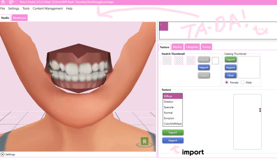
first, we're going to use s4studio to create our package. we're going to clone the EA teeth to use as our base.

open s4studio and select "create 3D mesh" under "CAS"
click the blue "CAS" button
Step 2

select "Face" from the Part Type dropdown menu. this will make only the teeth files show up.
we're interested in both "yuTeeth" and "yuTeeth_Snaggle", but select yuTeeth first! (you can hover over each picture to see the names too)
click next, and save your package file as whatever you want.
Step 3

zoom in close to the model with mouse wheel until you can see the teeth, to make sure everything is correct, then go to the "meshes" tab on the right side
export your mesh and save it where you can find it.
note: if you've never used s4s or blender before, make sure your blender location is set up correctly in the s4s settings. otherwise, the sims4studio tools won't show up in blender & we won't be able to edit our cut numbers later.
Step 4
now that we have our mesh, we need to edit it in blender. I'm currently using version 4.2. the controls are different in different versions, so feel free to ask me about it if you're using another version and something isn't working right.

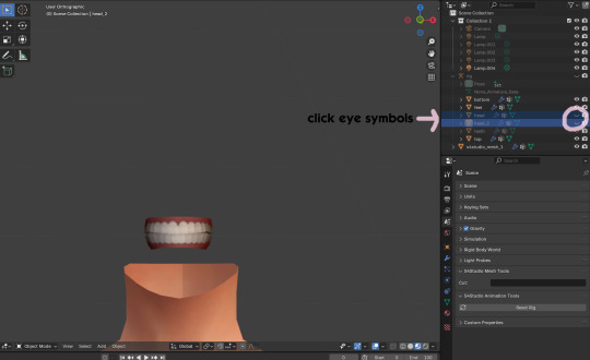
open your mesh in blender. press the N key to get rid of the side panel and Numpad 5 to make the view better/less disorienting. you can zoom in and out with the mouse wheel, and move around by holding the mouse wheel and moving the mouse.
look to the right panel where "rig" is listed. click the arrow to expand the list so you can see all parts of the rig.
click the eye symbols next to "head" and "head_2" to make them invisible so you can easily see the teeth!
Step 5
there are many ways of editing teeth, of course, but what i'm going to show you is basically how to frankenmesh them. this is a good way of creating subtle variety in MM style, without it being overly difficult! we're going to combine the regular and snaggle teeth as an example.
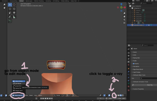
go from object mode to edit mode by clicking the menu at the bottom and selecting "edit mode"
afterwards, click the symbol on the bottom right to toggle "x-ray" so you can see all your vertices when editing.
Step 6

left click in the gray space to deselect all. there will be no orange left anywhere on the mesh.
then, hover over the top teeth and press the "L" key over a vertice (the small black dots) to start selecting the top half only. you should only have to select a couple vertices until everything on the top half is highlighted orange. you can change your view by holding down the mouse wheel and moving the mouse.
Step 7

now, press "X" key to bring up the delete menu.
click "vertices" to delete the parts of the mesh we've highlighted. only the bottom half of the teeth will be left behind. if there's any floating parts left over, highlight those with L and delete them the same way.
Now, repeat Steps 1-3 with "yuTeeth_Snaggle". when you have that mesh exported and saved where you can find it, continue to the next step.
Step 8

go back into object mode. you must be in object mode to append meshes.
go to file -> append to bring up another window

double click your snaggle mesh you just exported
double click "object"
double click "s4studio_mesh_1"
click "append" (if the window didn't close already) and the snaggle mesh will be added to your current mesh!
Step 9
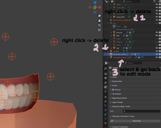
you will see several new mesh parts in the list on the right. right click over "bone_bone_shape.001" and click delete to remove it, since it's just a duplicate.
do the same thing with "rig.001" to delete it as well
select the mesh part you just appended- which is "s4studio_mesh_1.001" to select it and go back to object mode (you can also rename it now by double clicking it if you want)
Step 10

repeat what we did in Steps 6-7 to remove the bottom teeth of the snaggle mesh. you may need to be more careful since these teeth are less straight & overlap more. take your time, and if you make a mistake, you can press CTRL+ Z to undo. you can also click the eye icon next to our first mesh part to hide it so you can see better.
when you're done deleting, unhide the first mesh part to see how it looks together. you now have the top teeth from yuTeethSnaggle and the bottom teeth from yuTeeth on the same mesh! you can mix and match many teeth parts this way.

I decided to rename my mesh parts to top & bottom to keep them organized. you can click the eye symbols to hide either one and see how each part looks. when you're ready, select the top teeth mesh part and return to edit mode.
Step 11
some of EA's meshes have very few polys, so they can be hard to edit, especially if you want to move individual teeth. but, teeth are so small that they don't need/shouldn't have too high of a poly count. having every single tooth be super detailed is overkill, so it's a good idea to only increase polys in the specific areas you want to edit. for this example, i'm going to mainly focus on the front teeth.

select the front teeth by right clicking + dragging over the area you want to select, and it will highlight orange.
go to "edge -> subdivide" to increase the polys in the selected area only, which will give you more to work with. DO NOT SUBDIVIDE TOO MUCH! once should be plenty for this.
Step 12
now for the fun part- actually editing the teeth to be unique! you don't have to do this if you only want to mix & match EA parts, but it's neat to toy around with, even if you just do tiny edits. there's a variety of ways to do this, and I like to do a mixture, but for this example I'm going to use proportional editing.
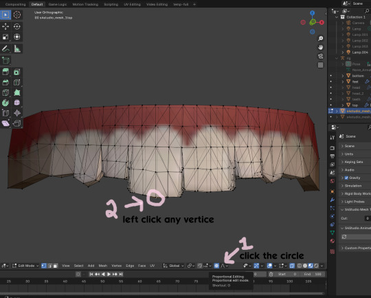
click the circle button to turn on proportional editing
left click any vertice you'd like to edit
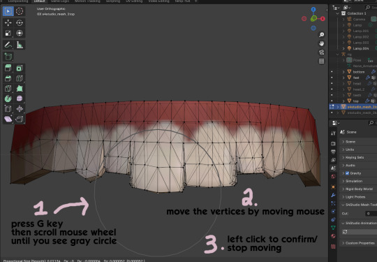
press the G key (move tool) and scroll the mouse wheel forward until the gray circle appears on your screen. this circle represents the influence of editing- the bigger the circle, the wider range of vertices will be moved around that point. the smaller the circle, the smaller/more detailed the change.
move the vertices around by moving your mouse. you'll see right away how it moves. play around with it by using a combination of scrolling the wheel back and forth and moving the mouse.
left click to confirm/stop moving the vertices. you can undo using CTRL + Z if you need to. keep repeating this step by selecting vertices, pressing G, and moving them around how you want. you can also use proportional editing with the S key (scale tool) to make areas bigger or smaller. in blender 4.2, you can also click the tools on the top left side of the window if you want to mostly use your mouse, but I usually use the keyboard.
when you're done editing your mesh and you're ready to test it out, save your file before moving to the next step. keep a copy to the side so you have something to come back to later if you want to change anything!
Step 13
now we're going to prepare our mesh to be game-ready. some of the most important aspects of that is ensuring a) the mesh part is correctly named and b) the "cut" number is correct. if these things are off, the game won't know how to read it, and we'll get odd bugs like missing heads or our mesh just not showing up at all. we currently have two mesh parts and teeth only need one, so we'll fix that first.
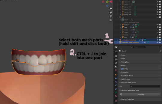
first, go to object mode and select both mesh parts by holding shift and clicking each one.
press CTRL + J to join them together into one part.
Step 14
another thing we need to do is remove doubles so our mesh doesn't look weird or have any odd shadows in-game. in blender 4, it's "merge by distance", but in earlier versions it's just "remove doubles". you should do this when you're done editing, because it'll be difficult to edit after this step. I always do it after I merge all my mesh parts & am about to import for testing. I also double check the cut numbers after this to be sure they're right.
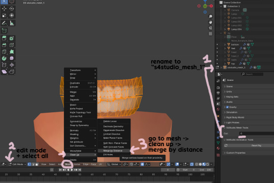
rename your combined mesh part to "s4studio_mesh_1" and ensure the cut number is 0.
go to edit mode and select all by pressing the A key
go to mesh -> clean up -> merge by distance
unhide the "head" and "head_2" parts of the rig you hid in Step 4
save your mesh as a new file name so you don't overwrite your working mesh, in case you want to go back and change something
Step 15
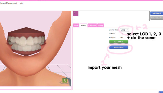
go back into your package in s4studio and import your new mesh
if you like how it looks & are done editing, select LODs 1, 2, and 3 in the dropdown menu and import your mesh there too. these are normally different meshes, but since EA based teeth are so insanely low poly, there isn't much point making individual LODs for them. but it's not that difficult to make them if you want to- if anyone wants a quick tutorial for that, let me know!
Step 16
you can stop here if you want- the teeth will take on the texture of your defaults if you used the yuTeeth package as a base. however, since we've used the Snaggle teeth on top, I think an adjusted texture might look better. I always use the textures by @ice-creamforbreakfast for my teeth, so head over there and grab their defaults if you haven't already! then grab the "uneven teeth" package file and open it in s4s.
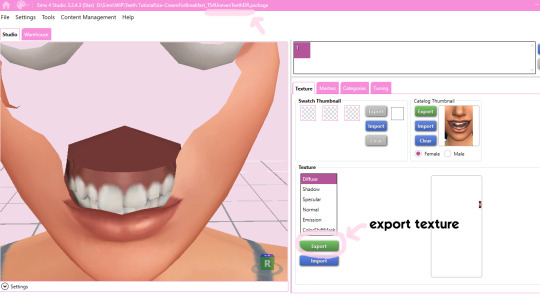
export the texture from the uneven teeth package file as dds
go back to your package file and import it! (and don't forget to credit ice-cream if you post your teeth publicly ;3)
Step 17
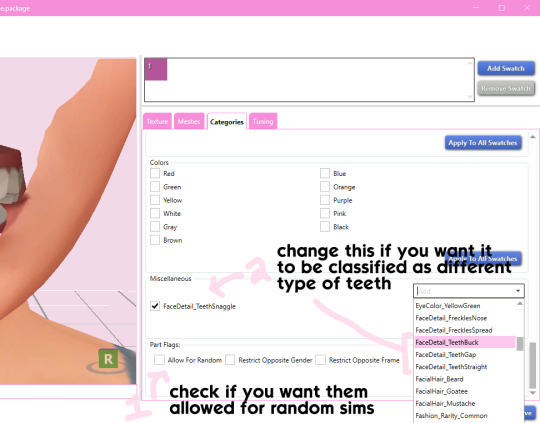
lastly, go to categories tab and scroll to the bottom. if you want your teeth to be enabled for random sims, check the box
if you want the teeth to be considered a certain type (like buck teeth), change the miscellaneous to that type. if it doesn't matter or you're not sure, just keep it as TeethStraight.
Finally, save your package and you're done! :)
#asks#adelarsims#ceci speaks#tutorial#reference#phewph!#long post#i don't think i missed anything#let me know of any questions!
66 notes
·
View notes
Note
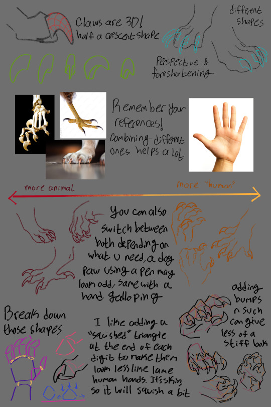
I absolutely love how you draw paw hands. They're so perfectly shaped. Could you do a tutorial or just share some tips on how you draw them?
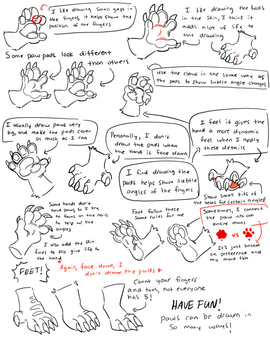
Thank you so much! I’ve actually made a tutorial before, I went ahead and just attached the old file here rather than searching through my old posts lol. My style has developed a bit since I made this, but the same rules still apply to how I draw them! (Sorry this tutorial is rather sloppy tho and sorry my handwriting is bad, you’d think as an artist it would be better but you’d be wrong lol)
#thank you for the question!#I get so flattered when people like my paws#art#doodle#drawing#furry#furryart#fursona#digital art#furry fandom#furry art#furry anthro#tutorial
367 notes
·
View notes
Note
Hey I was wondering if you would do a post about how you make your feralnette au? I really like how you color it and was curious about your process.
Yes this is absolutely for plagiarism purposes /j
(I want to incorporate something similar on a smaller scale within my artwork, I don’t plan on posting anything but I can run the art past you if your worried about me actually stealing your style)
sure! as a note I'm not a pro or anything, this is just how I render my comic for ease of access
as a general note I draw everything in black and white first

I use a LOT of texture heavy brushes for effects, and specifically because I render with gradient maps a lot. people ask me why I do AU's in different styles - usually anything outside of feralnette is done in color - but that's because the rendering process is different.
for instance in the dad villain au, I do basic linework and chunky colors. if I was to do Feralnette in the same style, the gradient maps wouldn't nearly have the same effect, as you can see up there ^
when a gradient map is applied I can fiddle with the color values to set a Tone for the update I'm going for, while also making it really pretty, bc textures can really bloom the subtle colors in a gradient map. I get a lot from the CSP page itself, but I also MAKE a lot too. this specific map I made by color picking off of a neuron map from a brain scan I thought was pretty~
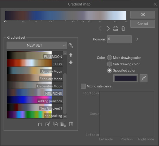
I don't do the feralnette AU in full color because generally, anything IN full color will have significance - either to show that a scene is important character development,
is a flash back,

or to put emphasis on something supernatural happening.
with Feralnette, when something is colored purposefully, its to emphasize it, whether that be to highlight character moments, or to stress that something eldritched and unnatural could be occurring, as its colors that do not exist in the pre-existing gradient map. Color out of space, yknow?
((SOMETIMES I put gradient maps on my colored chunky stuff, but once again, for the purpose of creating a tonal shift, like when papa Tom shows up in the dad villain AU!))
anyway I hope that helped!
#replies#tutorial#sort of#im answering a lot of questions bc im bedridden w/ ms rona herself#my kitty retail sis caught it too (she's a champ so she's beating it like a fuckin pro)) and nudibranch sister remains unscathed!!!!!#we stay winning even if im dying!!
809 notes
·
View notes
Note
haii i usually use ibis paint to edit and if its not too much trouble i was wondering if you had any tips or like a tutorial on how to make better psds on photopea??(/nf) i tried playing around with the adjustment layers for a bit but it didn’t really turn out the way i wanted it to… 💔 thank you for your time and sorry this was so long 😭
PSD coloring tutorial / Recommendations by a self-taught loser
hello! i don't really know how to make a tutorial on PSDs, but i do have a few recommendations!
a useful setting would be Selective Color ( i apologize if the name is wrong, i have my photopea in spanish and have to translate everything myself 😓😓)

for example, the PSDs i used here barely have any layers, but i used a ton of selective color layers!
basically, from my own experience, i'll say Selective color is to make a specific color kinda .....pop (?. idk how to explain it.
moving on, i also recommend threshold! idk how to explain this one, so i'll just leave an example!
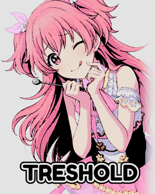
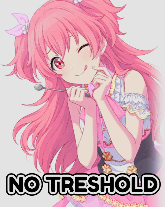
I exagerated it a little to show the effect properly lol, you can adjust it to as little or as much as you want! just remember to set the layer to multiply! (or any blending mode that works for you! many of them work, i just use multiply for... no reason at all actually)
next up, we have Replace Color!
it literally just... replaces colors. most people use it on black! just add the effect, set the color to the one you wish to replace, and start playing with the settings!
-- also, note that when using it on black, you have to turn up the luminosity for it to work!
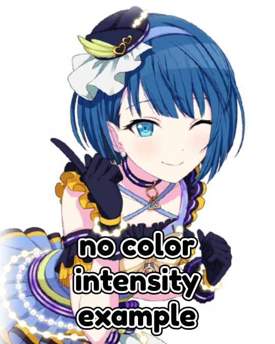
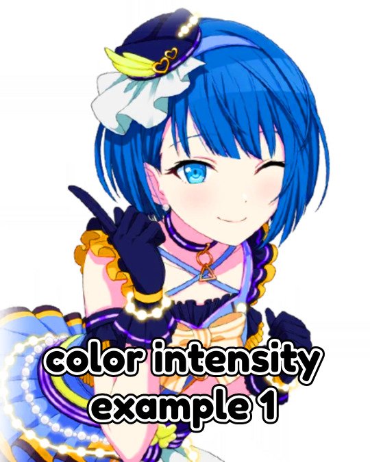
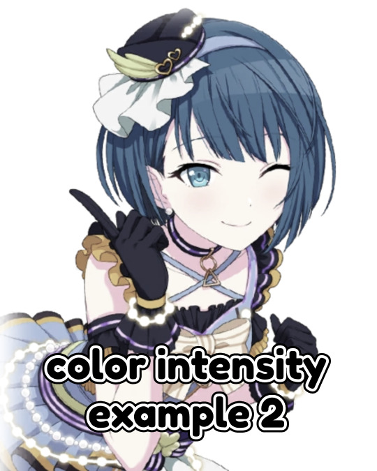
last but not least, Color Intensity!
its just... color intensity. but yeah! its pretty useful! i'll leave 2 examples here.
If anyone has any other tips, feel free to reblog! i kind of learned everything by myself, so im not the best, sorry.
i'll confess i haven't seen it myself, but @/canarysage has a psd tutorial here! so... just saying, you should check that out!
(user canarysage feel free to throw tomatoes at me and boo me off the stage (in other words, feel free to send an ask to be removed!))
...and if i left something out, let me know!
#questions / tutorials。#rentry help#rentry tutorial#photopea tutorial#photopea help#psd help#psd tutorial#rentry#psd#rentry graphics#rentry dividers#carrd material#photopea psd tutorial#coloring help#psd coloring help#photopea coloring tutorial#coloring tutorial#coloring psd
273 notes
·
View notes
Text
Hi everyone!! A super quick tutorial I drew up of face proportions/anatomy of a portrait🥰💓 I teach art/drawing classes like 10 hours a week & these are some helpful tips that really helped me elevate my art! I did it traditionally though bc pencil is my first true love sorry it’s not as clean as digital art jajajajajajaja
( sorry for the English, I teach this in Spanish & idk how to express half of these thoughts in English to be honest😂😂😂)
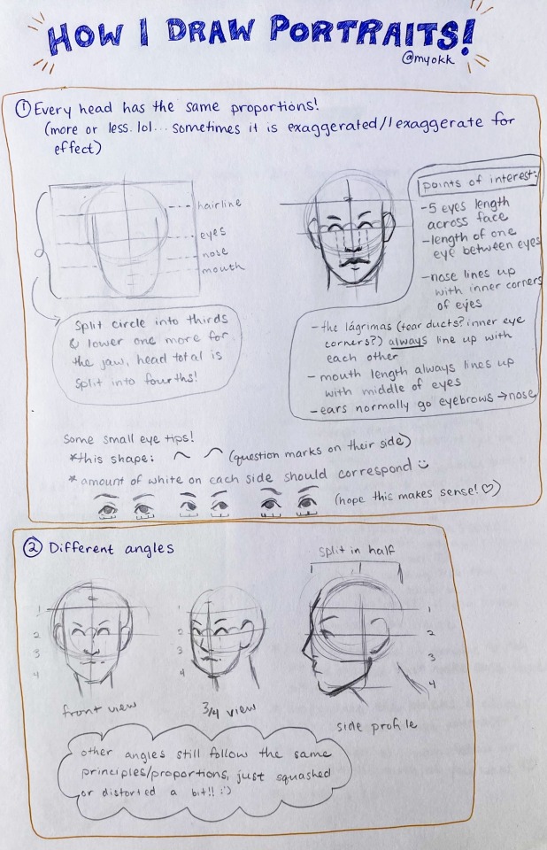
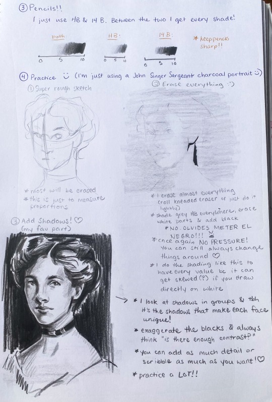
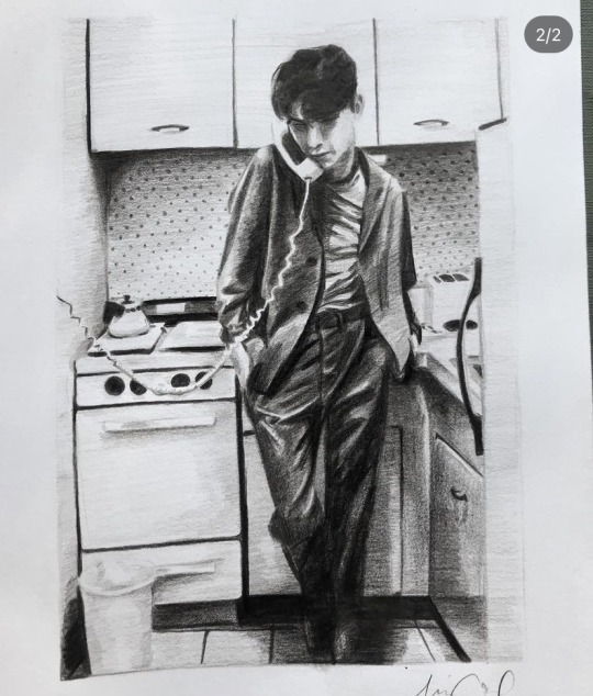
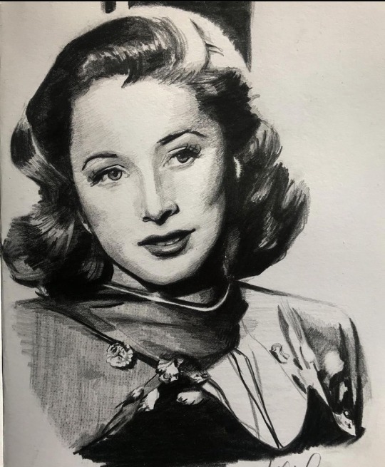
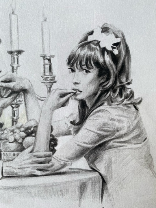
Some examples of portraits I drew using this technique🥰💓

#art#art tutorial#art reference#art resources#tutorial#my art#hope this helps 😙😙#and if you have any questions or it’s unclear let me know😅🙏#anatomy
300 notes
·
View notes
Note
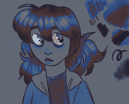
How do you get that grainy texture on your art? It’s very nice!
thank you!! i love art that's soft and fuzzy...
i generally do it a handful of different ways, but i tend to bounce between a color noise filter layer in soft light mode, between 30% and 50% opacity,

... or i use something from my wide array of paper textures, and usually set the layer to overlay and play with opacity till i'm happy with it

......oooorr i do a combination of the two! which i did in the final version of this piece, which i Also added a gradient map to to make the colors a lil more ✨Dramatic✨
here's where i got (most of) my paper textures and here's a rainbow color noise texture (that i don't personally use but looks rlly similar!)
#i actually use a color noise filter from a VHS auto action set i used to use on my VHS icons. if yall remember those#my art#ask#tutorial#i guess??#idunno#if you have more questions feel free to dm me! i love clip and i love to teach ppl abt all its cool features#dinosaur#since i prolly wont seperate post my landscape study tht i threw a spinosaurus on
110 notes
·
View notes