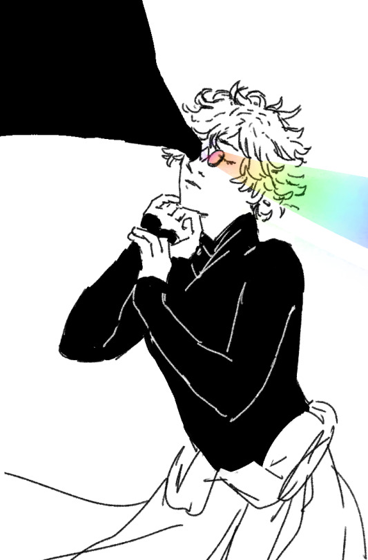
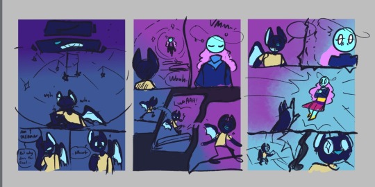
#second one was one of my first drawings in csp
Text
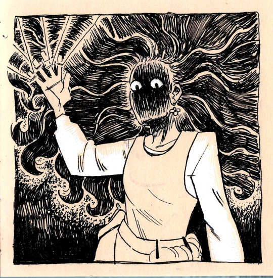
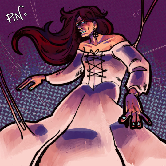
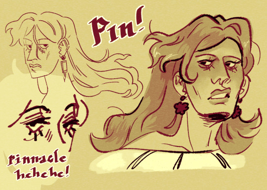
when im bored i like to draw my magus oc
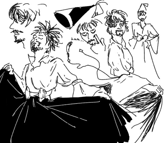
#gayepo#gayepo oc#illustration#digital art#traditional art#sketchbook#artists on tumblr#everyone say hi pin#first one is from a couple months ago in my sketchbook#its like 5 in by 5 in brush pen + white gel pen#second one was one of my first drawings in csp#third is pre and post carpal tunnel drawings (drew the tiny pin and sent it to ari being like my hand hurts so bad)#then the one on the right i drew today after getting my screen drawing tablet set up properly so now i can draw more w my arm#we have a little fun where we can#anyways go read gather ye power its so cool
35 notes
·
View notes
Note
(Anonymous because i tend to be Shy af when it comes to making asks like this XD)
First things first, your artwork Always takes away my breath and legit You're one of my inspirations to keep drawing and improving Myself as seeing your art always brings a smile to my face and def makes me want to practice digital arts
Secondlly, if its ok to ask. What are program do you use? I am always curious into what other programs artist as the curious cat that I can be. Personally I use Clip Art Studio and i've love it so far (Still learning how to fully use it tho lol) Sorry if it came out as a weird question or you have answered it before
-Phantom
Thank you for the kind words ♥ Knowing that my work helps motivate you to create in any small way makes me very happy.
Not a weird question at all. I use Paint Tool Sai. I've been trying to make the transition to Clip Studio for a little while now but I'm an old dog. Learning new tricks seems less and less appealing these days.

#I admire you pushing yourself to learn CSP#Trashtalk#Anonymous#the last time I switched drawing programs was when I migrated from MS Paint to Sai. . . which was when I was twelve or so#clearly I'm a creature of habit#I thought I would have to learn Photoshop when I entered the industry. Everyone said I would.#but then I got my first studio job and lo and behold - no one cared. As long as I could save my work in PSDs no one gave a hoot how I drew#I worked alongside someone I'd admired for years and was stunned to find that he too hates Photoshop and uses Sketchbook instead.#It was extremely reassuring to hear this person (who I sat at the feet of ) say that he thought Photoshop was garbage.#If it isn't clear yet I'm a Photoshop hater first and a human second.
32 notes
·
View notes
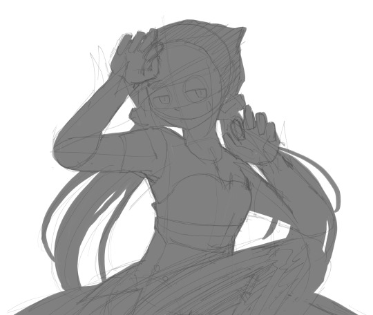
Photo

first scribbles to warm back up with them
#witch hat tag#orufrey#i'm back! i'm frustrated with my skill level so i have to do my best from now on. i intended to do studies and stuff on paper while gone#but i ended up just. not drawing at all for a month. which i think was good for me tbh but... well anyway. i'm drawing takarazuka too!#my heart is still with reiko and everybody... i wanted to keep seeing outen no mon...#and i want to draw some stuff from ffx kabuki! and i have a HUGE backlog of orufrey ideas. i just...well anyway. all i can do is keep going.#the second one is literally the first thing i doodled after opening csp. blowing dust off my tablet..#I CANT JUST DO BLACK AND WHITE !!! THE NEXT TIME I DRAW COLOUR CAN SOMEONE CLAP
68 notes
·
View notes
Text

Timelapse of my last queued post! aka of the funny chill big brother dragon dude who is totally neat af to me
took me 3 hours just to draw this one piece ;;; no wonder i feel like i don't have enough time to draw on the weekdays bc i really dont
regardless!!! while i struggled with this piece i do like how it turned out!! would've liked to try drawing a more full-body version but alas i couldn't quite manage that OTL. some day ill manage to accomplish it!! just not yet!!!
#TME art#Daniel Dystria#hey wanna see how bad at anatomy i am just watch the first few seconds LOL#CSP head models are a godsend for me ngl#i rely heavily on them to draw faces which is probs a bad thing for art growth but i just draw art as a hobby so im okay with that~#i just wanna draw pretty pictures of my own characters and the ones i hyperfixate on good enough to suit my picky tastes and im good~
2 notes
·
View notes
Text
Sleep walk BTS post!
will go in depth with my process and put better quality drawings in here!
Before any of this i was listening to several fiddauthor/ford playlists to hear a song that really got my brain moving. Funny enough i didn't get Sleep walk from one of the 100+ song playlists i was listening to, it was in my oc playlist (thats a mad scientist who would've thought). Originally i wanted to make a fiddauthor animatic (who knows maybe i will), but THIS SONG just caught my brain in a way i couldn't refuse.
So i technically started working on it the late night of September 27, exactly a week ago! which yes yes i hear you all in unison go "WHAT???" to that, and all I have to say to that is.... I have untreated adhd and lots of caffeine in my system! (honestly felt like ford sometimes while workin on that animatic)


Started it off with some notes, then thumbnails. I had my tbob AND J3 open next to me stood up with clips for reference (prob looked a little insane looking back but its fine)
now for the rough animatic! i did this in Adobe animate 2022 (i'll get back to that later)
the only thing that really got changed was i wanted to add the diner scene from j3. i realize now that it messed up the timeline i was going for with the animatic but i like to think things are out of order because of the state ford is in, things start to merge together.
After i sat with this rough animatic for a bit, i wasn't sure if i was going to make it in Adobe animate (what i usually do) or make it all in Clip Studio Paint. I wanted this animatic to be way more visually interesting then i usually do, so CSP it is. But! i only have CSP Pro, so i had to draw and export every single new frame from this animatic.

it was a little tedious at first (again never done an animatic like this before) but i got used to it! I edited it all together in CapCut and thats really it!
The missing J3 pages from TBOB spoke to me in a way that im not fully comfortable talking about to my followers. I put a lot of myself in this animatic then i'd want to realize, it's very important to me. The night when i uploaded it i was literally shaking with anxiety (and caffeine-) but the overwhelming support for it is really amazing, thank you so much! if you have any more questions please ask away i love talking about the art process.
Below im going to talk about the code and put HD backgrounds!
thank you for dyemro on here for cracking the code first! now i can talk about my insane little thought process about it
So i never planned to add a code until halfway through with the animatic. i was watching ThatGFFan videos and him talking about gravity falls codes got my brain cooking. i wanted something sweet and simple (i realize with dyemro's post it wasn't as simple as i thought, give me some slack it's my first time). like what you should with making codes you start at the end. And i wanted something that was a nice send off for drawing ford be fucking miserable for 1 minute and 30 seconds.

so i got this. (honestly every time i look at this drawing after finishing the animatic it makes me real emotional)
There are 4 codes in this whole animatic 0:02, 0:15, 0:30, and 0:58


wanted the first one to be REAL noticeable so people can stop and be like "wait... theres stuff in here". people usually think to use the bill symbols, but no! from the description theres a little hint to use the Author symbols

doing that code it leads to:
imgu
r.com
/a/uZa
iVfu
(and if you know that double line a under a letter means capitalization + im a dumb dumb that used a code image that didn't have a Z so thats just a normal Z)
it makes a LINK! > imgur.com/a/uZaiVfu <
now enough of that boring stuff, heres some HD screenshots and backgrounds of my fav parts


286 notes
·
View notes
Text
OK PEOPLE LETS DO THIS ONE LAST TIME
---------------
HELLO!
my name is sir fluff, also goes by just fluff
i am a adult
i am korean, yes english ain't my first language, no i don't care for typos
i go by any pronouns, place your bets and headcanons, perecive me however you want. just don't go "ermm actually, sir fluff is [your headcanon] 🤓"
-------------
i talk about my ocs (mostly anthro characters) and make storys with them a lot on tumblr
i also make art....sometimes
you may find me on other places such as
main youtube for animations and videos
second channel for streams and funnys
pateron for exclusive pay-to-view content
instagram for art and pet pics
twitter for also art but more active artwise
toyhouse to store ocs
and perhaps even on these places i sometimes visits
tiktok
blueskies
---------------
most frequently asked questions and answers are
what apps/programs do you use to draw?
- i use medibang paint and flipaclip on mobile, and CSP EX on ipad!
can we ship our ocs with yours?
as long as
- my oc in question don't have a official ship going on.
- its not anything wierd
- you lable it as a "AU" or a "fan ship"
sure go ahead!
can we ship your ocs together?
- same as ☝️! go ahead!
can we make ocs in your universe?
- sure! just mention "sir fluff universe" or something like that and you'd be set!
although im not sure if the exact fluffverse character is possible cause not everything about my univserse is written in text.
can we draw fanart?
- of corse!!!!!! 💖
do you have a webcomic/series?
- nope! i just have storys in my head that i draw and make short animations about sometimes.
do you plan to have a webcomic/series?
- i wish 😭 however it takes a LOT of time and costs a LOT of money to do so, so for now im only working on my wee arts and animations
do you have merch?
- not ATM! however i plan to open a merch store soon so theres that!!
are your commissions/customs opened?
- right now for tue public, nope!
if they do open in public, it'll probably be announced on twitter or toyhouse
more TBA if needed!
ty for coming to my ted talk
473 notes
·
View notes
Note
I love Golden Shrike! I've had my own comic idea for about a decade now, but I'm wondering, for you, how long did it take you to be confident enough with your art to start your comics? had you attempted panels and backgrounds earlier and didn't put them out because you weren't happy with them yet? I'm almost done with my characters and writing but I'm worried I'm not good enough to actually start doing panels
(these are just my views and experiences! there's as many approaches as there's artists)
I was BAD when I started comics, but then I again I was a kid who didn't care if my bunny-cat-digimon comics weren't good enough, it was just fun to do. Which is what it should still be, fun and a fulfillment to you. I think the happiest an artisit can be is when they can draw like they have no audience.
My comics stopped in my teenhood when I actually wanted to make something good. I made so much groundwork but VERY rarely got to the actual page production because I thought everything should be perfect, but we all know there's no such thing. When I noticed all my attempts were doomed, I stopped making them for like ten years until I was zapped with Fuck It We Ball-mentality. And it's the best thing that has happened to me. Childhood whimsy. Make your own toys.
Did I make test pages for Golden Shrike before starting production? Well, the first page of the comic is a test page. And the second page. And the whole first chapter. I just never stopped. Not smart but it's what works for me. Starting these 'test pages' has kickstarted two bigger comics for me, Golden Shrike and Jet and Harley.
Sure I made couple of style tests for GS even though I had a clear visual vision from the start, but Jet and Harley I just started to draw without any real practice pieces, just based on couple of CSP brushes I wanted to use. This isn't very smart as you'll likely find out later that MAN, this style takes too much effort, but if you're unlike me and don't care so much for consistency, you can always simplify it on the fly. And even I've had to change it: I stopped shading after chapter 5, briefly used 3D assets in upcoming pages, now I'm gonna shrink the font a little. They're teeny tiny things for readers, but huge for me.
There's many comic authors who like to plan every little detail before getting to work, but it doesn't work for me so I can't say much about it. I have a skeleton to follow, but I fully flesh out each chapter one by one when I reach them with pages, because I like to revisit my old visions with fresh brains. When you actually get to work, you might realize some scenes aren't needed, or they'd be better changed. Don't be scared to crack some ribs off your story skeleton. Being too loyal to your old vision can often hinder you.
Starting production is the biggest monster in comic making, but after the first step you'll mow over it leaving it in your dust and create a baby you can be so proud of. I wish you, and everyone else on the cusp of their projects GOOD LUCK, HAVE FUN, LOVE YOUR WORK.
219 notes
·
View notes
Text
Okay, second drawing time! A reminder - I was working on a birthday project with my friends! We made a Strahd-themed calendar for our friend, and I drew three illustrations for it! And now it's time for June!

And there he is, in all of his fiery glory. The previous drawing had a calmer vibe to it, and I wanted this one to be more chaotic. Honestly, considering how hot it is at the moment, I wish this illustration was for July instead... And this time I actually have a speedpaint!
TW: Flashing Lights!
I worked on this illustration the same way as with the first one - I drew the lineart traditionally, imported into CSP, used binarization, and set the layer on multiply. This one needed a lot less cleaning in terms of line art because I liked how textured the lines looked, especially on the frame of the broken mirror. But once again, I hated how the face came out during the lineart stage, so I spent a whole day fixing it 😭 I kinda wanted to add more to this drawing, like some silhouettes in the shadows and the fire behind him, but sometimes less is more, and I just didn't have enough time :,,,) Either way, I'm definitely satisfied with the final work. It almost looks like a comic book cover!
#dnd#dungeons and dragons#curse of strahd#cos#strahd von zarovich#dnd strahd#digital art#my art#vampire art
94 notes
·
View notes
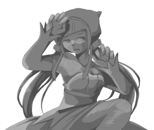
Note
hi! not exactly a request but i do wanna ask, whats your process when you're rendering more paint like art? (if that makes sense, English isnt my first language so apologies hdskhsjdbd) i really love how you use the colors and im curious how you do it :0
i’ve been meaning to answer this one for a while so here’s how i painted miku in today’s post (put under the read more because yeah prepare for a long post
i’d also like to preface this by saying that i never follow a set way of doing things, so in terms of what my personal process is like, these are only broad strokes of what i do! sometimes i’ll combine or skip parts entirely, depending on how i feel. also, this is not a tutorial, just how i do things, so please don’t treat it like one :’D this will read like the ‘how to draw an owl’ picture if you do
first, like every artist, i sketch. more specifically, i’m getting an idea of what i want to paint later on. this could be how a scene is set up or in this case, how a character is posed. here i’m not concerned about details or getting everything perfectly, i’m only planning how the thing will be composed. maybe a lot of canvas size changing, or adjusting what miku’s doing (note how busted miku’s right hand looks from all the transforming!) however, i still have to be concerned with how clear the sketch will be to future me, because the sketch won’t be any good if i can’t read what miku’s doing

after that, i lay down a flat gray under the sketch, mainly focusing on giving miku a clear silhouette. this is also a good time to make adjustments to the composition on the fly if i suddenly feel like something can be improved upon, like shortening miku’s left arm from the sketch!
after painting a flat silhouette, i start shading in grayscale, focusing only on lighting. i usually do it in two passes, one for the lightest and darkest tones i’ll use (not black and white) and then a second for midtones to blend them better with the base gray but i forgot to screenshot the result of the first pass 🗿 nevertheless, here is where i can start adding some amount of details. i’m not including any extra accessories yet, just focusing on the base design of the outfit and the character herself (for anyone wanting to draw characters from That Gacha Game, this is how i personally make the process more bearable for myself.) i still use the dark gray to separate where certain details (like the facial features and fingers) begin and end, mainly to make colouring more bearable later.
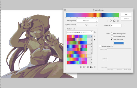
now here’s where i get the Good Colours. it’s a cheat lol. i put a gradient map layer over the grayscale painting so that there’s a little bit of color to start. some gradient maps can be applied as is, some need the layer settings adjusted to make it look good. this one, for example, is a (free) gradient map set from the csp assets store that needs you to set the layer opacity to 20% and to set the blending mode to color to achieve this result. in general, i tend to pick which gradient map i want to use based on vibes, or basically whether i want the work to be warmer or cooler, colour-wise. but this does do quite a bit of lifting for the colors in my stuff.
and then, finally, i add the colours. i add flat base colours in an overlay layer. at this stage, i’ve made the character silhouette clear enough that i don’t need to refer to the sketch anymore for what miku looks like. also, the gradient map layer does its magic by making the shading a bit more vibrant than it would’ve been without it. after that i paint over with a new layer to add details like the lace.
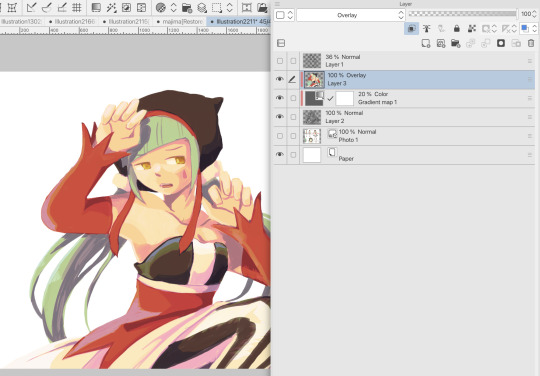
and then i put some extra shading on top. basically this is where the ‘better lighting’ happens. again, this isn’t a tutorial, so i’m not here to say what each part of the lighting is, but i’ve labeled which layers do which job. in other works where the lighting within a scene is more defined (from a window, from a small crack in the walls, etc) the glow dodge layer may be more opaque and sharper, but since this isn’t a work with that, the lighting was applied using an airbrush. the linear burn layer is also there to make the whole thing darker so the glow dodge doesn’t end up oversaturating miku. i also usually match the lights to the vibe i want, and use a complementary color for the shadows. so here you can see i have warm colors on the glow dodge layer, but light purple on both the linear burn and multiply layer.
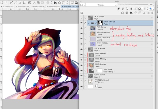
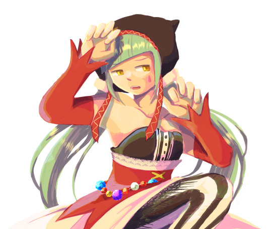
and that’s it for the character—here’s a gif showing how each layer adds to miku! (sorry it’s so toasty)

as for the background, depending on the complexity, it may go through a similar process, or if i can settle with flat image backgrounds, i just go for that. it’s ok to use external image materials. i didn’t have a background in mind for this miku in specific, so i got some default csp materials and threw together something
and that’s about a rough overview of what my process for more finished works looks like! again, art is a fluid process so i never specifically stick to certain steps all the time, and you shouldn’t either. i can probably answer why i’d pick this colour over another in one particular work, but it’s something that kinda has to be learned on a grander scale. i think everyone can already feel what colors work with what atmosphere or what setting, even if they can’t immediately explain why. colors and composition do take some level of experimentation to find what works best!
127 notes
·
View notes
Text
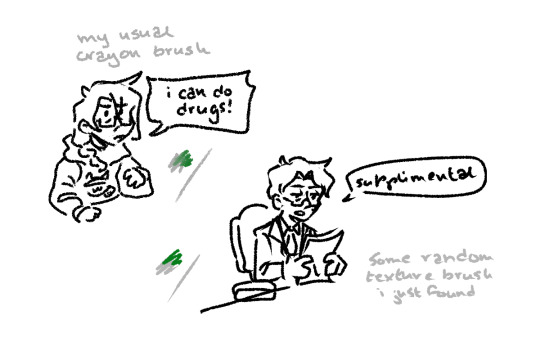
Testing out a pen I discovered on clip studio paint that looked similar to one I normally use by doodling Jonathan sims.
FUN FACT!
Csp changed up my usual crayon brush recently and now it's completely different to what it once was!! So now I have to find a NEW brush to do all my sketches, linart, and coloring in! And no I can't use this doppelganger brush bc it has a taper that I dont like and also doesn't have color jitter like my old brush did. I AM DEINITELY NOT SUPER MAD ABOUT THIS AT ALL NO! I AM DEFINITELT NOT MAD THAT IM BEING FORCED TO CHANGE MY STYLE OVER THIS!!! THIS DEFINITELY DIDNT RUIN MY MOTIVATION TO DRAW!!! (/s)
------
[ID: Two doodles of Jonathan Sims from the Magnus Archives. The first doodle on the left is of him with long braided hair and wearing a cat hoodie. Annoyed, he says "I can do drugs!" A light colored note above it reads "my usual crayon brush".
The second doodle is of a slightly younger Jon with shorter hair looking at some papers, saying "supplimental." The note under this one reads "some random texture brush I just found."
/End ID]
#but seriously this made me so pieved#sorry for the vent#carry on#my thoughts#my doodles#tma#the magnus archives#jonathan sims#my art#ramadan drawings
84 notes
·
View notes
Note
Nudges you
Hi I love your work your colours are so. Colourful. It makes my brain tickle in a good way
Okay onto questions!!!!
one: where the hell did you get the references slash ability to draw iron man mech suits. like. if you just doodled that in a meeting??? what????? you didn’t have a reference???????
second question: what brushes do you use?
third question: how you anatomy (good grammar yes)
ok thank you goodbye have a. Lovely day
lkdfghlkdjfhlgkj hey THANK YOU YOU'RE VERY SWEET i did look at him to see what he looked like first, but mark 1's all rectangles and messy bits he's very nice to draw!!! i highly recommend it. clunky little guy
all other iron man suits i learned to draw by simply drawing iron man 1000 times. i learned to draw in general by drawing iron man i love him very much :) but looking up pictures of hot toys figures/those cool model kits of the suits is super helpful for refs! nice clear shots and fun poses.
secret: my art is very easy. here are all of the base colours i use

taken from an old timey comics colouring guide palette thing because i love old timey comics and i hate colouring <3 for skin tones/shading i'm usually adding overlays and fiddling with the colour wheel though
for that iron man, i used the "real g-pen" brush that comes with clip studio paint; for most of my other art i use this little dude that i made!
I colour with the default "milli pen" brush that also comes with CSP, and then the speckle shading stuff is with. the tone scraping thing in the airbrush tool that also comes with CSP......tone scraper my beloved how would i get through the day without it......
anatomy is really hard and i am constantly fighting for my life, glad it's looking successful i will tell you when i figure it out lkdfjhgkj i try to do studies breaking bodies down into shapes but gosh people are just shaped so weird. iron man suits are easier. let's just draw iron man suits
have a lovely day!! 💛❤️
#i use like 3 tools i am very tired i make things easy for myself :)#how did i draw him: gazed at him lovingly while my boss was talking until he was scanned into my mind & then drew him :)
24 notes
·
View notes
Text
Food fantasy diversity issue
Gotta put the word. I'm mad.
Food fantasy isn't the worst game about diversity and skin color... I know but.
It isn't the game with the best rep AT ALL.
You know, I love this game, I love the lore. But this doesn't mean I should be boot licking everything. I have the right to criticize and ask for improvement.
Let's start with the first issue. Skin color. The game of course has more east Asian and European food so it's natural that white skinned characters are the majority. However I noticed that more than half the design of the supposedly more tan or melanined characters are pale or ashey asf. I swear I know they are darker than the white white, but damn I'm as tan as them but I'm actually not tan and I'm white skinned. Artists, please stop being scared to color your character's skin with actual COLOR. Also almost all of them are white haired for some reason. I won't lie about the design some white haired were peak ( Ganache, Reuben, Tomahawk) but a lot of them only have white hair to make their skin appear darker. Also btw the excuse "yeah but you know that not all people of this country are dark skinned" is invalid. Ganache and Reuben are respectively French and United-Statizen. Both these countries are mainly white. So heh.
Ganache and Reuben


Second issue, the orientalism. When I see the dark skinned characters and especially the Middle East food souls, they are often portrayed wearing revealing clothes. If you do some research, it's very weird with their culture. "Yeah but the white characters also wear revealing clothes" Que Neni. If you compare the ratio, obviously dark skinned or just the tan ones are a lot more "fetishized". Always revealing their belly and for what ? Nothing because their outfits are based on fantasm and stereotyped views (belly dancer) about what the middle east looks like not the real traditional clothes which is a shame for a game about food diversity. Food eaten in Muslim countries for Ramadan wearing these ....
Knafeh and Shawarma the worst of them all


And third issue. A lot of them just don't have ethnic physical features. I can understand that this clashes with the artist's art style but I swear it's not that difficult to draw curly and kinky hair. You know it's not that hard to download brush on CSP. Brushes that help you to draw afro hair style.
This food IS FROM ZAMBIA but man looks like a Middle East/American native. Not African from Zambia.

And this is the end of my rant.
"the game company is Asian that's why they don't add a lot of diversity." First research, second, Dislyte, Pokemon both are Asian companies with rad black and poc design. Excuse refused. Don't try to justify culture erasure even if it's not done with a malicious intent. ( And Hoyoverse is NOT a role model. Being better than hoyo at skin diversity isn't a feat. It's the bare minimum)
And yes maybe I'm just a hater "You should just go play another game if you are just gonna hate", man. The bar is so low that I can't even wish for improvement for a game that was my first Gacha Game and a part of my teenage years ?? If you thought like everything I wrote between the quotation marks, I urge you to broaden your horizon and learn about these often misrepresented cultures.
Bye
22 notes
·
View notes
Note
Let me preface this: I'm an architecture major
I used to be a big LO fan but obviously fell out of love of it like a lot of us did, and I know LO uses SketchUp for backgrounds. That is not an issue I have with the comic or any comic, I want artists to have an easier time in any way they can. I was always under the impression Rachel imported the models into Photoshop and drew over them like you can see in the early episodes with the sketchy lines. Well, school just started recently for me and I now have access to SketchUp for my coursework, and I made a few discoveries:
1. Photoshop cannot read SketchUp files, and while you can import them into Clip Studio through some configuring, they can be finicky and will lose parts in the importing process, so they are best used into the original SketchUp program to export as PNGs.
2. Many of the models Rachel uses are incredibly easy to find, especially if you put "modern", "luxury", or "classy" before the main part of the search. Many of the houses and rooms for example are first page results.
3. The biggest discovery: You know how we all assumed Rachel was hand-drawing all the lines over the SketchUp models and how she gave up the longer LO went on? Well, it's actually worse. It turns out SketchUp has a thing called "Styles" in it, which means you can mess with the lines and look of the model, such as making it look more like a blueprint or playing with the colors. Well, they have a lot of styles on SketchUp known as "sketchy lines", which are the exact ones Rachel used early in the comic to fit with her style, and it takes a literal click of a button to do. All she would do is pose the model, click the sketchy line style, and export the PNG. That's it.
So, yeah, Rachel is so checked out of the comic that she can't even bother to click a single button to make the models fit into the comic's style anymore. Use that information however you like.
Ouhhh sorry OP, I'm about to like, undo all the work you just put into that ask. We've already known about the 3D background problem for a long while now.
First off, it's more likely LO doesn't use SketchUp but actually Acon3D, which is a website that offers 3D models both for free and at cost, which are actually compatible with software like Clip Studio. As soon as you open it up you'll likely see a lot of very familiar backgrounds that are often used in romances, isekais, and period pieces. It's literally the go-to spot for Webtoon Originals creators. Like, to the point that I wouldn't be surprised if Naver was partnered with them because of how many of their creators use it.
Second, there's plenty of up-to-date evidence to support the fact that Rachel doesn't exclusively stick to one software, sometimes she's drawing in Photoshop, sometimes she's drawing in Clip Studio Paint, sometimes she's drawing in Procreate. She's undoubtedly using Clip Studio for her paneling, speech bubbles, and backgrounds, as there are built in tools to utilize and convert 3D materials into lineart, among other features that are recognizable as coming from CSP because they're not available in PS or Procreate.
Third, yes, she just uses filters to turn her backgrounds into lineart, this has been apparent since S1. The only backgrounds she's ever 'hand drawn' were the ones involving lots of nature and even those are mostly just Photoshop brushes stamped on.
Like I realize I'm probably bursting your bubble here and I apologize for that lmao but these buildings were never hand-drawn, this is not new information ( ̄﹏ ̄;) I appreciate you mentioning your own experiences with it as you're learning it though, I find once you start to learn the process yourself you really start to notice what others are doing. Even I've gone through that over the past couple years as I started to use 3D models and more advanced tools specifically for drawing webtoons.
I will mention btw, there's nothing wrong with using 3D models for your character drawing and backgrounds. The only time it tends to get frustrating is when you're reading a comic that isn't making any attempts to blend the background in with the art style.
Like, The Kiss Bet probably uses 3D models to help with perspective and laying out scenes quickly without second-guessing, but you can tell they still hand-draw over the models because they look natural and like they belong to the comic's stylization. The characters don't look out of place sitting in a living room and the living room doesn't look distracting.
But then you get stuff like Lore Olympus, Let's Play, and Midnight Poppy Land, and it becomes a bit more obvious they're not giving a shit about backgrounds lmao


I get it, WT's deadlines are cutthroat as fuck, but if it's getting to the point that you have an entire team behind you and you're literally just copy pasting video game models from Phantom Hourglass, then it's probably time to re-focus your priorities a bit. There are comics with as few as 1-2 assistants (and even in some cases no assistants at all!!) pulling off backgrounds better than this, even when they're taking shortcuts.
(Nevermore and City of Blank)
But a lot of that does come down to how WT manages its expectations as well as support for their creators. The deadlines and requirements WT puts their creators under are insane and awful in the long-term, and they're not acting with the amount of professionalism they ought to be for a platform that's trying to breakout as a major publisher here in the West. I feel like it comes down to WT loosening the choke chain around their creators, but also creating a standardized level of quality to ensure it's not suffering for the sake of quantity. The traditional literature industry has real editors and stages of quality control for a reason, whereas WT is more interested in just throwing as many series at the wall and dumping all their stock into the ones that stick.
#lore olympus critical#lo critical#webtoons critical#antiloreolympus#anti lore olympus#ama#ask me anything#anon ama#anon ask me anything
87 notes
·
View notes
Text
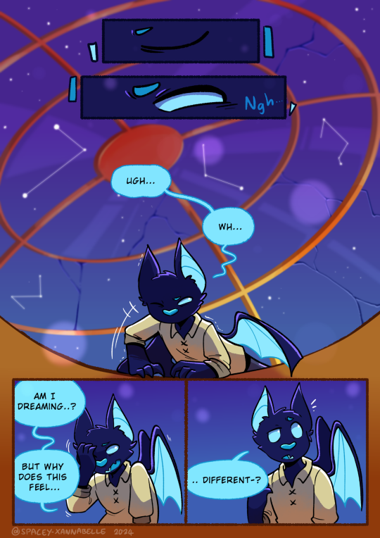
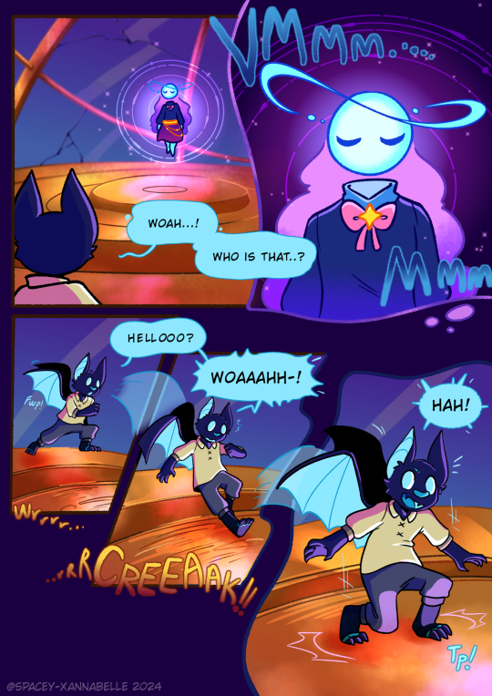
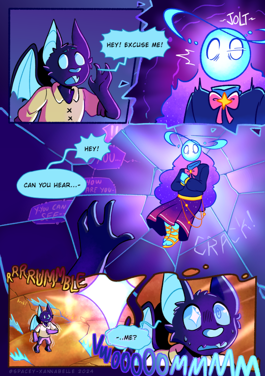
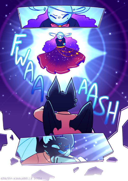
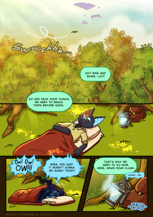
Fateful Encounter...
Last month, at around April 10th, I decided to revisit an old project I started months prior which was to polish up a test sketch of a comic page about Lucy encountering Lumi in the dreamspace. And after slowly making progress on this, I'm finally finished with this!
I'm gonna leave some artist notes under the read more, but overall I'm super proud of how this turned out!! This is pretty much my first serious attempt at making comics in general so this has been a very interesting learning experience!
Artist notes:
So this is what the original sketch for this whole thing was. It was just me scribbling out a scene I had in my head for Startrails that I wanted to put on paper:
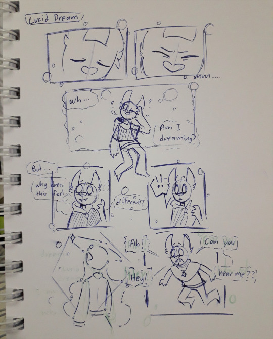
This I'd say was made around 2020-2021 ish. At the time, I didn't really do much with it. Until several months ago, I thought of trying to redraw this page and expand upon it.
But my first attempt at doing this didn't quite lead anywhere. I barely got through the thumbnailing process and just gave up bc I lost motivation (and life/work stuff was Happening so yea I had to put this aside as I figured stuff out). Here's the first draft of the thumbnails:
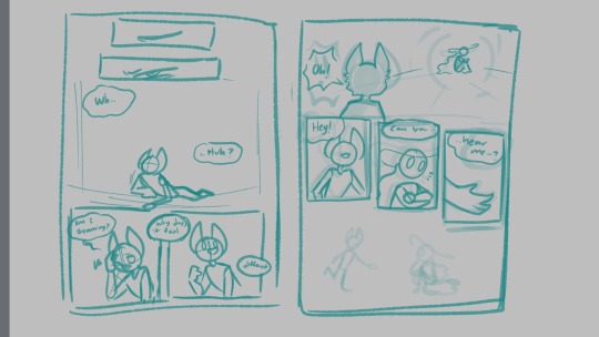
It was just two pages at the time and was pretty simple. I left this project sitting in my files for a while until I one day just, started binging videos from Thestarfishface on YouTube, primarily her webcomic guide videos. And I decided I'd give this project another go.
It was here where I began making a second draft of the thumbnails and this was what I had to work with:
I wanted to experiment with the panels and get funky with the compositions this time around. The 2 page draft expanded to a 3 page thing. But I thought it would've been better if I added one more page at the end with Lucy waking up as a conclusion to wrap this whole thing together.
And in the middle of working on page 3, my friend had suggested to do a an impact frame page, which I hadn't considered during the thumbnailing, so 4 pages became 5. And this was the result!
I posted the pages as I finished them onto my deviantart so that's where a lot of my thoughts were journaled as I went along dfjsdh.
To summarize my ramblings there, this project was a very fun (and a bit frustrating) learning experience! I'm hoping to keep practicing and improving my workflow, and hopefully one day make Startrails a full fledged webcomic :')
Additional ramblings:
The structure that Lucy finds Lumi in is inspired by an orrery.
For page 5, I initially didn't plan for much dialogue but as I drew it, it felt just a liiiitle bit empty, so I kinda just threw in some dialogue for Mira. But bc I was already in the inking process (and I just wanted to have this project completed), I didn't redo the page to even include Mira in it. So Mira's just out of frame sdfjskdh. If I had more time and energy to keep this up, I'd have made a revision of the page so I could include her.
This experience has taught me that I could seriously work on my rendering process a bit more, and that my layer management is just atrocious sdkfjksdfh
This has also taught me that while Medibang has the tools needed for me to draw these pages just fine, it also lacks some stuff that I personally need if I were to do a longer project like this. So I'll be experimenting with CSP next!
The dialogue throughout this whole thing wasn't all that planned out- I really just stuck close to what the initial doodle had which probably wasn't the best idea bc I just have like, 2 pages of Lucy's awkward sounding dialogue aaaa. I might do something a bit more dialogue heavy to help improve this skill next time.
Anyway, thank you for reading through my 1 am ramblings on this little project of mine shdkjhks
#artists on tumblr#Art#Digital art#comic art#original characters#OC lobby#OC art#Xan draws#Lucy#Lumi#Mira#Kinda dfjfkh#Startrails
17 notes
·
View notes
Note
hi!! Your art is incredible and awesome... not sure how to say it otherwise but it's super tasty looking lol 🫶
I was wondering if you have ever posted what brushes do you use ? I am always on the lookout for nice brushes! Also if you've got any tips for inking, I'd appreciate it enormously. No worries if not! 💕
hi, thanks so much!
i mostly just use whatever defaults came with clip studio paint. for inking, my go-to is the the default marker pen brush (under the marker tab in pens), but sometimes i'll swap to the calligraphy one (should be in the pen tab), or this brush but with the pen pressure turned off. just depends on how i'm feeling about whatever i'm inking. when i want to add some texturing when toning, i use stuff like the spray or diagonal line brushes (again, should be included in CSP), i just make an eraser version of them so i can also use them on layer masks.
as for inking tips ... i don't have any hard and fast "always do x for y" advice but i rambled a little about how i approach it.
this first point is actually pretty straightforward, it's just to look at inking techniques by artists you like, think about what makes them work so well in their context, and try them out for yourself. this isn't about plagiarizing art styles but more about understanding how other artists choose to stylize certain things in their work, and seeing what works and what doesn't for you personally. sometimes it's through looking at other people's stylizations that you get a better understanding of how you want to approach translating this actual 3d object (people, clothes, background details, whatever) into your own art as well. as you try out various techniques, maybe you find that some of them work well with your own style, and some of them don't and you stop incorporating those. it's all a constant work in progress. over time you can adjust how you use them in a way that fits your own drawing methods and workflows and they just start to come more naturally to you. of course, they may and should change a lot along the way because now it's something that's part of your own style. work on developing a good eye for these things and be thoughtful about what you want to convey and how.
just as an example, daiya no ace by terajima yuji definitely has to be up there for me in terms of influences, the way he approached body lines and clothing folds as a way to convey movement and posing made a lightbulb turn on in my head back when i was still reading it.

not a comprehensive list, but other manga i just like looking at off the top of my head - rookies (morita masanori), anything by yamashita tomoko but i really recommend the night beyond the tricornered window for something that's easily accessible, anything by asada nemui (please check for content warnings for their works first though!), all-rounder meguru (endo hiroki), urasawa naoki's works, dungeon meshi (kui ryoko), witch hat atelier (shirahama kamome), yotsuba&! (azuma kiyohiko), a bride's story (mori kaoru), i recollect love (moegi yukue), the later works of tojitsuki hajime (unfortunately a lot of is now out of print and not accessible online but i managed to get all their books bc their commitment to crosshatching shaved heads each time impressed me so much LMAOSJDsd) etc, etc.
this second thing is much vaguer and harder to quantify but ... honestly just draw a lot and see what feels good to your hand. inking and art styles in general are fluid things. so much of what inking comes down to, to me, is just drawing the lines that in a way that feels good to me. that only really comes from doing it a lot (not saying i'm a hardcore artist or anything lol just that i've been drawing on and off for a while now) and, well, getting a sense of what you like doing. sometimes you might look at a detail you finished that looks really good but feels like a happy accident, and it kinda is, but it's also just as much of the things you've internalized over time. combining the first point (developing your eye and a sense of thoughtfulness about inking) and the second (getting experience through developing your muscle memory) is basically it.
idk if any of this made sense lol but hope some of it helps!!!!!
31 notes
·
View notes
Text
Eggtober 14th 2023
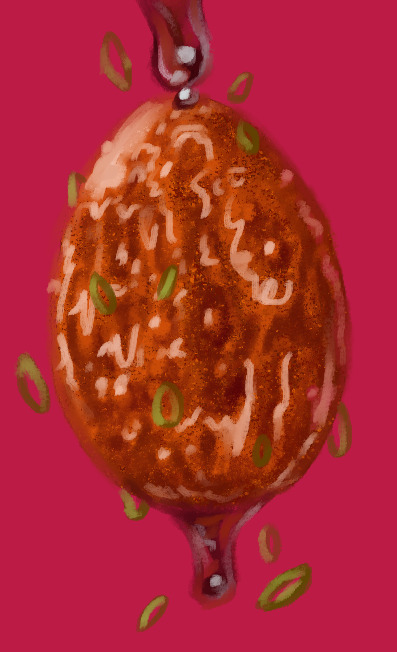
"Sticky": Tiger Skin Egg with Sauce.
(Clip Studio Paint, Gouache Brush, Gouache Blender, Airbrush tool. 10 colors, 45 minutes.)
Cripes, I almost forgot to post this one. Been a busy bee the last few days.
The first time I made this dish it was all going perfectly until it came time to caramelize the sauce. It goes from runny and thin to thick in what feels like 30 minutes and then from thick to CHARRED AND AWFUL in 0.5 seconds. I'm not a stranger to syrups and sugary sauces! Maybe it's the soy sauce that's dangerous because the color can't indicate early signs of caramelization that I can see? But I make brown sugar glazes for fruit all the time. And my standard stir fry sauce has soy, brown sugar, and gochujang in it, which are all dark, and I've never burnt those things.
Anyway, first time I made these was a disaster. The eggs were overcooked because the sauce took too long to thicken and then I burnt it so it tasted terribly perfumey.
But I remade the sauce by itself much more carefully later and it really is tasty! I just had an awful first attempt.
Speaking of which, I need to do a proper study of craggly, crackly fried things. I can get away with a lot here because the rendering is a bit stylized and it's a shiny sauced egg, but trying to replicate that almost-breaded looking fried exterior from my reference was hard. I think we've established I'm fairly effective at drawing smooth things with all my shiny eggies of late but I need to learn how to draw coarser, rougher textures. Maybe more pencil tool next time.
Anyway, here's the speedpaint and the shoutouts.
@lady-quen, Another gravity defying eggy for you to draw your precious brebbugs on. Take your time of course. The breadbugs need time to eat all the eggs they stole already!
Thanks as always to @quezify for all the inspiring fried eggy art.
Despite the unfamiliar textures being a challenge, it was fun. And of course I got to make it deliciously shiny. The speedpaint makes it all look so competent and deliberate and my ass is sitting here like "Past me has the competence of a god, or at least seems like it, but I know that bitch personally and I know for a fact there was internal screaming for part of it. "It's bumpy in the reference! There's texture there! But how do I do that? AUGH!" And then it turned out fine anyway, despite faffing around. Gotta get better at trusting my process and actually treating these as LEARNING experiences like last year. Self mantra of "It doesn't need to be perfect. It needs to be an egg. If it's hard, that mean's you're learning." Actively squash that little voice in my brain that doubts. Making art is about the making. The art is just a coincidence. It can be a product later if I decide so, but that's not the objective. The objective is to turn 1s and 0s and funny little lights on a funny little screen into things that look like eggs and manifest something that didn't exist anywhere before except my brain. No doubts, no stress. Only eggy. Plus at the end I can stare at past me making egg very fast like magic. I do like that part. Bless CSP for having a native timelapse capture feature. I just get to click a button and share with you all my magical process.
41 notes
·
View notes
Last Seen Blogs

albumdinle-blog1
www.AlbümDinle.com

chloesbimboplace2
Dumb Blonde Bimbo

raynewritesbutnotverywell
Rayne writes
i-have-the-best-url
Fairy Batman >>>

rayslay90
Untitled