#so i can make my own logo and cards and stuff
Text
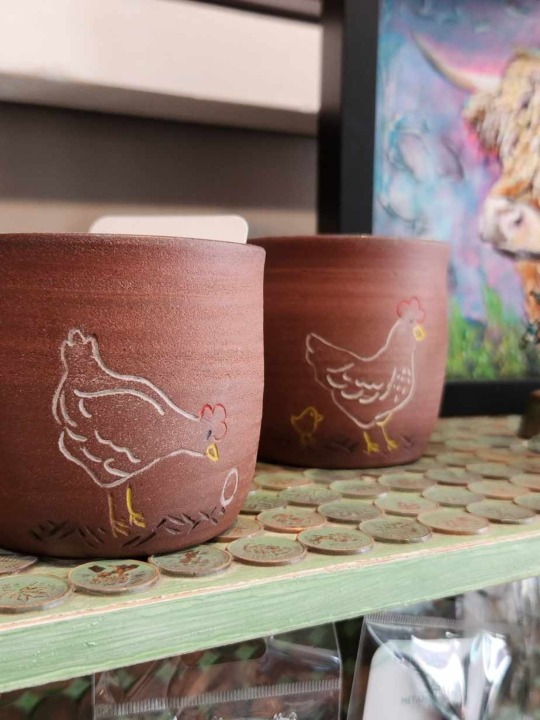
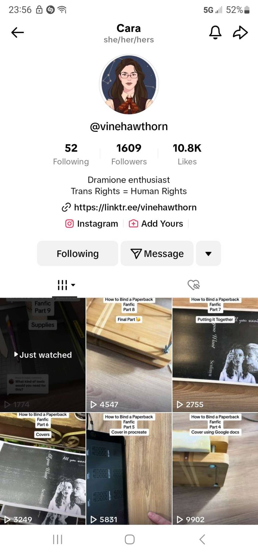
These are some of my mugs that I'm currently selling at a local coffee shop. Some of the first mugs were rough cuz it had been two years since i sat at a wheel, but after 5ish months they improved alot. I don't usually post my pottery on here but i decided it couldn't hurt.
#monka mumbles#monka makes art#pottery#coffee mugs#mugs#pottery mugs#ceramics#clay#clay art#artists on tumblr#frog house ceramics#i started my business in april as soon as classes ended#so I'm still learning alot#im working out of my dads garage which is great except that there isnt alot of space and there isnt enough power for a kiln#so i go to my local guild#im gonna do my first christmas craft show this November so im excited#at least takeing art in college gave me the chance to learn graphic design#so i can make my own logo and cards and stuff#but i still got classes this fall#then im free#well sort of...I'm chooseing to pursue pottery as a career instead of completeing my art degree...at least for now#I'll finish it when im older. do it part time and get that good feeling of completeing something
14 notes
·
View notes
Text
THE BATTLE JACKET MASTERPOST
FINALLY PUNKS IT'S HERE
a battle jacket (also called battle vest, cut-off, punk jacket, patch jacket, and probably other stuff) is a jacket (duh) usually made from denim or leather with DIY additions of patches, studs, flags, painted panels, chains, and other bonuses, used to signify subculture. Punk, metal, and biker scenes all use patch jackets, but I'll only go into specifics about how they're used in the punk scene. Metalheads, I think, almost solely personalise with music/band shit. Bikers use them to signifying which club you're riding with. Punks started using them in the 70s and they've remained a staple of the subculture's style since. They're good for signalling your politics, bands you like, and other information you might want to get across. They also look cool.
HOW TO START
If you're here I assume you wanna learn how to make your own so I'll cut the history lesson short and get on to the practicals.
1: first you're going to want to get a plain jacket, probably denim or leather, but you could get a canvas jacket if you're nervous and new to the scene because it's way easier to stitch canvas, so you could experiment with that as you're building confidence. The jacket should be at least a bit oversized because with all the stitching and painting or whatever you'll be doing, you could run into fit issues with a very form fitting jacket. also, this jacket might frequently be worn over other jackets or layers so that will help with that too
2: start making choices. namely whether you want to keep the sleeves. obviously you can remove or reattatch the sleeves later but I think making that big mod first is a good starting point to help you feel like it's a work in progress. so if you're going to chop the sleeves I say do it now
3: brainstorm. I know, I know, coming up with your own ideas is hard, but this is your own totally literally unique piece, so think about what sorta look you want
4: you don't have to brainstorm alone though. search tumblr or pinterest for punk jackets, punk patches, punk clothes ect for inspiration. you might get a good idea for an individual patch, or for a broader layout
PATCHES
1: the big deal. this is what will make your jacket into a battle jacket. there are some unofficial rules/sayings in the scene about what sort of patches you should put on your jacket. some people get dickish sometimes about if you put a non-punk band on your jacket? however i think that is bollocks and you should do whatever you want forever. one saying i do personally mostly stick to is "politics up front, bands on the back" with the idea you stick your politics on your front so you can see the punches coming
2: where do you get the patches? you make them yourself. You can buy ofc but don't get shit off amazon or shein or whatever the fuck. If your fav band or small artist is selling patches go for it though. You will have the most choice if you make your own patches. Do you have scrap fabric (maybe the sleeves of the jacket, which is where i got a lot of my patch material)? Do you have paint and paintbrush? good. you can make a patch
3: how do you do that? well depends on whether you stencil or freehand. stencil means you cut out an outline, of say a band logo, out of card, and use that as a stencil. freehand means you paint whatever tf you like
4: paint?? yes paint. messy as you like. start maybe with simple slogans or symbols often found in the punk scene like "ACAB" or "eat the rich". maybe an anarchy symbol. i also like to paint a layer of mod podge over my designs to waterproof them.
5: great, you've got a patch, what are you going to do with it? sew it onto the jacket. unless ofc you bought an iron-on in step 2, in which case iron that shit on and be careful punks. most likely though, you're sewing it on. a lot of punks use tooth floss to sew on because its cheaper, easier to find, readily waxed and waterproof, and does a better job sewing shit down onto heavy duty material like leather or denim. I use a combined running stitch and whip stitch personally
STUDS n SPIKES
1: all those punks you've seen have metal sticking out their jacket eh? yeah, theres a whole lot of options here. spikes of many different sizes and shapes, which within that can be stitch on, screwback, or have fold down prongs on the back of them
2: where do you put them? probably the front or top of the jacket. you can put them on the back but that might be uncomfortable, or rip up someone's upholstery
3: where do you get them? you can still DIY these by cutting up a metal drinks can [whole other post] but BE CAREFUL. i suggest checking out the internet for these, same buying rules as patches though. no shein. no amazon.
OTHER SHIT??
1: go wild
2: other common additions would be chains, lighter caps, badges, and can tabs
HAVE FUN PLS ASK ME QUESTIONS AND SHARE IF YOU START A BATTLE JACKET
938 notes
·
View notes
Text
ViDoc... 2!
A lot of cool stuff shown, my favourite being the strike, but first I want to mention this:
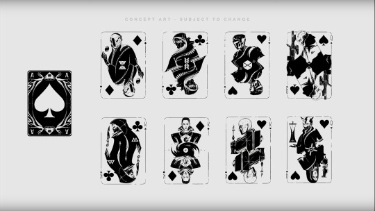
They said that when looking at Ace of Spades they realised they have the potential to make the rest of the deck of cards so this is why TFS weapons look like this and have character portraits; they're a deck! And specifically, these characters were chosen because of their ties to Cayde's story.
Obviously we have the generic Warlock, Hunter and Titan to symbolise the Guardians, but then there's others. Ikora and Zavala are obvious. Bottom left is most likely Shiro-4; hooded Exo with Hunter knives, I'm not sure who else it would be. The hood first made me think Elsie, but the Hunter knives don't make sense then.
Bottom right? That's Maya Sundaresh! Both as human and as Lakshmi-2, as we've learned from Veil Logs. It helpfully also has the Ishtar Collective logo. For those that don't know, Cayde worked as her guard, as an Exo, while she was still with Ishtar on Venus so that's why she's connected to him.
And top right? We have the "neoteric kiyot" cloak with the symbol of the Six Coyotes. Six Coyotes Exo member with ties to Cayde? That's Micah-10. Micah-10 category 10000 event.
Also for those that don't know, back in Beyond Light we got a really neat story about Micah-10 as a child in the lore book Your Friend, Micah Abram and some associated lore pieces that confirm Micah-10 is this kid. In one of the entries from the lore book, Micah is exploring Europa and accidentally alerts two Exos who then end up panicking, trying to shoot the intruder and then catching the kid. Then on one of the raid armour pieces, we have Cayde's flashback to this event from his POV, showing us that he was one of the Exos (as Cayde-1 then). He tried to shoot Micah, not realising it's a kid, then later grabbed them and held them up; the implication here that this is almost certainly the source of his mismatched memories that made him think he had a son. Him holding Micah is what eventually progressed in him simply remembering holding a child and constructing a story to go with it.
Micah-10 is an incredibly interesting character in general, as she is the closest thing we have to someone fulfilling the prerequisites for a speaker; even as a child, she was having strange prophetic dreams where something was speaking to her (most likely the Traveler) and showing her as an Exo. As a Guardian, she has the unique quality of being followed by Ghosts and has the title of "den mother of Ghosts."
She was also illustrated for the Volume VI grimoire collection, the one about Ghosts! Her Ghost Stories lore book is featured there accompanied by an illustration which shows her with a sniper, which the weapon with her image in TFS seems to be:
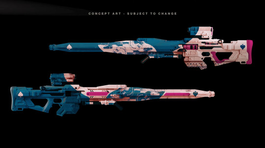
And yeah the sniper appears to have trans colours which I can't see as anything other than deliberate because Micah-10 is canonically trans! (Link to my post about it with links to a few more posts about it)
Incredibly exciting to see her featured on one of the TFS weapons, especially after she was featured in the grimoire and also in the TFS CE, in the autograph book where she left her own message, and so did the Ghosts that follow her. It's also interesting to tie her to TFS when we're going into the Traveler, given her unique relationship to the Traveler that she's harboured since she was a child. Can she become more than just a lore character now? Please?
Destiny fandom when a minor lore-only character gets one new mention be like: time to write an essay.
#destiny 2#destiny 2 spoilers#the final shape#the final shape spoilers#micah-10#long post#me looking at this card and thinking then suddenly the lightbulb turned on and like. oh my god that's micah#please please please micah as a full character in the game#or at least more lore about her
201 notes
·
View notes
Text
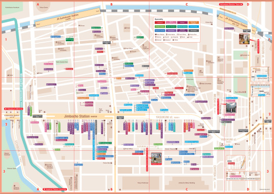
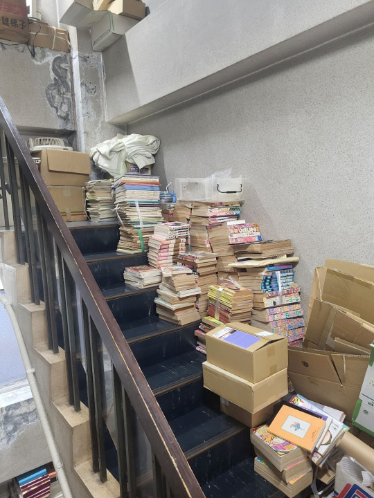
Another big stop in Tokyo for me was Jimbocho Book Town! It is a neighborhood of, depending on who you ask, up to 400 generally-secondhand bookstores flanked by some of the major universities in Tokyo. The local government even prints out maps of the stores to help people find them all:
Which, you will note, is not 400 stores, because the process of becoming an "official" Jimbocho Town Bookstore is an intensely political operation run by local stakeholders with tons of fights over what should qualify and what rights that entails - never change humanity!
"Book Towns" used to actually be quite a common thing, and they peaked during the literary boom of the late 19th century. Figuring out "what books existed" was a hard task, and to do serious research you needed to own the books (you weren't making photocopies), so concentrating specialty bookstores in one area made sense to allow someone to go to one place and ask around to find what they need and discover what exists. It was academia's version of Comiket! Modern digital information & distribution networks slowly killed or at least reduced these districts in places like Paris or London, but Jimbocho is one of the few that still survives.
Why it has is multi-causal for sure - half of this story is that Tokyo is YIMBY paradise and has constantly built new buildings to meet demand so rents have been kept down, allowing low-margin, individually-owned operations to continue where they have struggled in places like the US. These stores don't make much money but they don't have to. But as important is that Japan has a very strong 'book collector' culture, it's the original baseball cards for a lot of people. The "organic" demand for a 1960's shoujo magazine or porcelainware picture book is low, but hobbyists building collections is a whole new source of interest. Book-as-art-collection powered Jimbocho through until the 21st century, where - again like Comiket - the 'spectacle' could give it a lift and allow the area to become a tourist attraction and a mecca for the ~cozy book hoarder aesthetic~ to take over. Now it can exist on its vibes, which go so far as to be government-recognized: In 2001 the "scent wafting from the pages of the secondhand bookstore" was added to Japan's Ministry of Environment's List of 100 Fragrance Landscapes.
Of course this transition has changed what it sells; when it first began in the Meiji area, Jimbocho served the growing universities flanking it, and was a hotpot of academic (and political-polemic) texts. Those stores still exist, but as universities built libraries and then digital collections, the hobby world has taken over. Which comes back to me, baby! If you want Old Anime Books Jimbocho is one of the best places to go - the list of "subculture" stores is expansive.
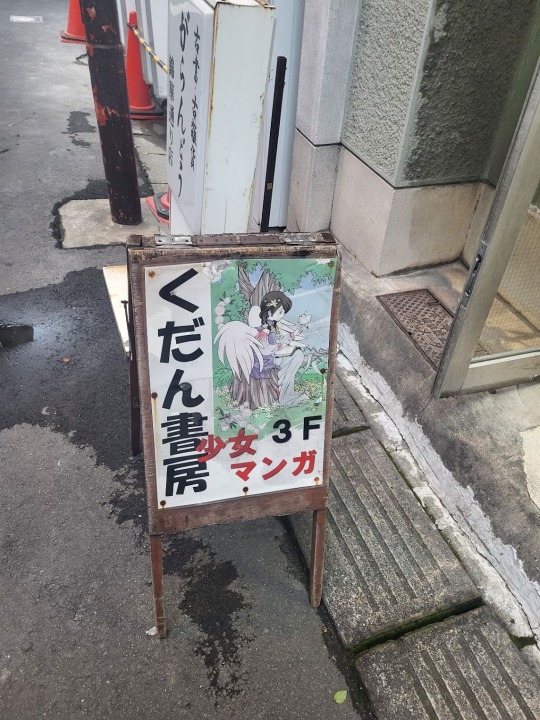
I'll highlight two here: the first store I went to was Kudan Shobo, a 3rd floor walk-up specializing in shoujo manga. And my guys, the ~vibes~ of this store. It has this little sign outside pointing you up the stairs with the cutest book angel logo:
And the stairs:
Real flex of Japan's low crime status btw. Inside is jam-packed shelves and the owner just sitting there eating dinner, so I didn't take any photos inside, but not only did it have a great collection of fully-complete shoujo magazines going back to the 1970's, it had a ton of "meta" books on shoujo & anime, even a doujinshi collection focusing on 'commentary on the otaku scene' style publications. Every Jimbocho store just has their own unique collection, and you can only discover it by visiting. I picked up two books here (will showcase some of the buys in another post).
The other great ~subculture~ store I went to was Yumeno Shoten - and this is the store I would recommend to any otaku visiting, it was a much broader collection while still having a ton of niche stuff. The vibes continued to be immaculate of course:
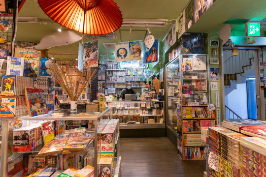
And they covered every category you could imagine - Newtype-style news magazine, anime cels, artbooks, off-beat serial manga magazines, 1st edition prints, just everything. They had promotional posters from Mushi Pro-era productions like Cleopatra, nothing was out of reach. I got a ton of books here - it was one of the first stores I visited on my second day in Jimobocho, which made me *heavily* weighed down for the subsequent explorations, a rookie mistake for sure. There are adorable book-themed hotels and hostels in Jimbocho, and I absolutely could see a trip where you just shop here for a week and stay nearby so you can drop off your haul as you go.
We went to other great stores - I was on the lookout for some 90's era photography stuff, particularly by youth punk photographer Hiromix (#FLCL database), and I got very close at fashion/photography store Komiyama Shoten but never quite got what I was looking for. Shinsendo Shoten is a bookstore devoted entirely to the "railway and industrial history of Japan" and an extensive map collection, it was my kind of fetish art. My partner @darktypedreams found two old copies of the fashion magazine Gothic & Lolita Bible, uh, somewhere, we checked like five places and I don't remember which finally had it! And we also visited Aratama Shoten, a store collecting vintage pornography with a gigantic section on old BDSM works that was very much up her alley. It had the porn price premium so we didn't buy anything, but it was delightful to look through works on bondage and non-con from as far back as the 1960's, where honestly the line between "this is just for the fetish" and "this is authentic gender politics" was...sometimes very blurry. No photos of this one for very obvious reasons.
Jimbocho absolutely earned its rep, its an extremely stellar example of how history, culture, and uh land use policy can build something in one place that seems impossible in another operating under a different set of those forces. Definitely one of the highlights of the trip.
290 notes
·
View notes
Text
it's where I belong
Summary: Rancher Boy!Javier Peña’s queer awakening
Tags: bisexual Javier Peña (although his identity is not explicitly stated); the bartender ships it; javier peña x OMC
Words: 1,937
Note: Title (and general inspo for this installment) is taken from the song Pink Pony Club by Chappell Roan. You don't have to read the rest of Rancher Boys for this to make sense, but you should bc it's great 😌 Happy pride :)
Masterlist

Once, Javier Peña walked into a bar in June.
It wasn’t that kind of bar. Or at least, he hadn’t thought it was. But looking around, he noticed a lot of people who seemed…sparkly, somehow. And affectionate. And there, on the back wall by the pool tables, hung a large, rainbow-striped flag, fluttering over the bricks.
“Can I get you anything?” A bartender appeared in his line of sight.
Javier tore his gaze from the flag.
“Whiskey, on the rocks.”
The bartender adjusted her cutoff flannel while the card machine booted up. It was tied beneath her chest, and the edges of a tattoo snaked along her ribs, the finer details blending into skin darker than Javi’s.
As Javi took out his card, he started, “Is this a…a bar for…”
Lord only knew what he thought he was trying to say. Thankfully, the bartender took pity on him. “A gay bar?”
“…Yeah.”
“Not explicitly. ‘We’re friendly to all’,” the woman quoted pointedly. She pushed a coaster toward him with that very declaration stamped beneath a depiction of a familiar sign. Friendly’s, read the green neon loops- the same as the ones above the door he’d entered through.
Ah.
“We just like to make sure everyone knows.” Her head tilted. “Is that a problem?”
“No,” Javier said.
After a beat, the bartender relaxed. “There’s not usually this much rainbow stuff in here. But we always go big for pride month.”
“Pride month?” Belatedly, Javi recalled the rainbow logos and merchandise that he’d noticed appearing over the past few days. Because it was…June? “Oh.”
The bartender had stepped back to dry some clean glasses. Now she smiled slightly, turning to face him. “You new in town?”
From a booth near the pool table, several voices rose in chorus with a soulful pop song playing from the speakers. Five sets of masculine shoulders swayed; they exhibited not a shred of self-consciousness. The bartender sent them a fond look.
“Temporarily. I’m here for a few weeks on business, with my pa.” Javi sipped his whiskey, the burn a warm, familiar comfort.
“Workin’ hard, then,” she deadpanned.
Before Javier could reply, her face softened, all her attention diverted to a second woman that had appeared beside him, leaning over the bar. Her black sequined top let out a spill of cleavage that Javi quickly averted his gaze from.
“Hola, mi amor,” the second woman cooed.
“Hola, nena.” The bartender set down her work and met the woman over the bar top with a lingering kiss.
“Puedo tomar una bebida? Tengo mucho sed,” the woman purred. Can I have a drink? I’m so thirsty. But it wasn’t any of the bottles behind the bar that claimed her attention. Her eyes danced up and down the bartender’s body, gleaming.
She angled Javi a sharp, appraising glance. Javi met her gaze, then deliberately looked away, sipping his drink. Satisfied, she sat back on her stool.
The bartender, after extracting another kiss from the woman, brought her a glass of something clear and full of ice, and Javier listened to them talk. About their days, about their friend’s new cat, about what to have for dinner tomorrow. They sounded like every other couple Javier had ever known. They could have been Steve and Connie, if Steve and Connie knew anyone who would adopt a hairless cat or complained about gringos clogging up their favorite taco place.
Two of the men in the booth embraced when the song they’d been singing ended. One of their friends threw a fry at them, dramatically lamenting his own singlehood. Javi looked down and swirled the ice cube remaining in his glass, feeling simultaneously alone and strangely reluctant to leave.
The bartender reappeared in front of him. “Another whiskey?”
Clearing his throat, Javier straightened. “No, I shouldn’t. Thank you.” He made to stand and don his sunglasses
“Come back anytime. A lot of nice people come in this time of year.”
Javi gave a nod to her and then to her partner. The woman smiled in return, and Javier left the rainbow flags rippling behind him.
—
Twice, Javier Peña walked into a bar in June.
It wasn’t that kind of bar, but you wouldn’t know it looking around. The place was full of bubbly, happy people of every appearance on the gender spectrum, and some off the spectrum besides. Rainbow was too limited of a word to describe the variety of colors on flags.
All the same, it felt…relaxed. Homey. Pool balls cracked from a trio of tables. Too-big groups squashed into booths, giggling over knocked elbows and pressed-together thighs. Dancing broke out sporadically, the odd couple swaying alone or groups unable to resist the combination of the music playing and the contents of their glasses.
“Oye, whiskey boy!” The bartender Javi had met before popped up behind the counter in front of him. “Nice to see you again. The same on the rocks?”
Tonight she could have been mistaken for a college bartender, in a t-shirt snipped and tied to within an inch of its life. Glitter streaked her long black braids. Javier couldn’t help but wonder if her more feminine partner had had a hand in either statement. Tonight the bartender’s eyes were wide and bright, as if absorbing the energy in the bar and reflecting it back.
“Just a beer, thanks.”
Javi found a stool near the end of the bar, bottle in hand. He didn’t really have a plan of any kind. He could, technically, take someone back to his hotel room, but he didn’t relish the thought of his [pops] potentially seeing them leave tomorrow morning. He wasn’t in the market to make friends. His usual play was to nurse a few drinks while people-watching alone, but somehow that felt…wrong, here.
Or maybe it was Javier who was wrong. This place sure felt like a gay bar tonight, and he didn’t really have a place in one of those. Everyone else seemed to have friends and lovers and grins on their faces. What was he doing here, besides bringing the mood down with his brooding?
“You’re looking at that bottle like it’s about to break your heart.”
Javier looked up (and up, and up) at a man with desert-blond hair sticking out from under a Texas A&M ballcap. He was good-looking, Javi supposed, and dressed pretty normally if you didn’t count the sinfully tight fit of his shirt. He might have been one of few people in the bar besides Javi himself who didn’t have rhinestones somewhere on their person. Fine lines were just visible at the corners of his eyes, so it might have been his rangy build- or maybe the openness of his smile- that made him look young.
All of Javi's dependable wittiness seemed to have fled. His mouth quirked by muscle memory. “Nah, beer’s about the only thing that hasn’t broken my heart,” Javi tried.
The younger man laughed. “Can I get you another one, then?”
And so Javi allowed himself to be drawn into conversation with the man. Jason, his name was. The bartender gave him a friendly nod as she deposited their drinks- he must have been a regular here. It was nice, talking to someone- about himself, about Jason, about nothing at all. This kind of…companionship, however brief it would end up being, was something Javier hadn’t realized he’d been missing.
He relaxed into it. Into the comfortable, friendly atmosphere of the bar. Javi wasn’t blind. He saw the admiration in the younger (for he was indeed slightly younger) man’s eyes, heard the comments that tiptoed just this side of flirtatious. He didn’t discourage it. Why would he? It felt like it’d been a damn long time since Javier had been so enjoyed.
And he found himself enjoying Jason in return. There was a warmth, an awareness prickling in Javi’s chest that he recognized. It spread the longer they sat and talked, sparked in his fingers, the ends of his hair. It felt like…something loosening in him. Some knot unraveling that he hadn’t ever acknowledged was there.
As the night wound down, though- as their knees bumped and their laughter came warmer- Javier felt the knot drawing tighter again. He came to a decision. Quickly, gruffly, he confessed: he’d never done this before. He hadn’t set out find someone like this, didn’t want Jason to feel used- but Javi did want him. Had he mentioned that part?
As Javi half-stood from his stool, breathing hard, mouth dry, Jason’s look of surprise melted into something else. He placed his hand on Javi’s knee. Jason’s warm smile set fire to Javier, and the knot in his chest turned to ash and flaked away.
—
There was more than one knot to his fears, Javier would discover. There was a whole web, intricately tangled and connected to subjects he would have never imagined. Some of the knots he picked at thoroughly, taking the time to smooth every kink (ahem) in their connecting cords. Some, he would realize, during the course of his research, were actually stupid, and these he excised without a second thought. Others, he wasn’t sure he’d ever be able to undo completely.
But that was for future-Javi to worry about. Present-Javi was tangled in much more pleasant things, like bedsheets and Jason’s unexpectedly strong arms. They spent many long, long nights together over the next few weeks. A few mornings, too, making Chucho raise his eyebrows upon seeing his son dash back through the hotel to shower, shirt buttoned askew and sweat still gleaming on his neck.
It was a dizzying fling. But Jason was a good teacher, and Javi had never been one to shy from a challenge. By the end he’d have Jason flush-faced and gasping, making jokes like “my best student” and “Remind me to bring you a gold star next time”.
Javi didn’t remind him, of course, and Jason didn’t bring any gold stars.
He brought something else.
“I got you a present,” he said, and Javi did a double take.
“What?”
“I mean, it’s just a little thing, they sell them everywhere during pride month, and I just thought…” Jason shrugged, fidgeting bashfully, and held out his hand.
In it sat a small pin in the shape of a waving flag. Its rainbow stripes were unmistakable. Javi stared at it, his throat constricting. Slowly, he took it from Jason’s palm, the metal cool against his fingertips.
“You got me a pride pin.”
“You don’t have to wear it, or put it anywhere visible, obviously. I just thought…to remember me by. To remember yourself by.” Jason looked up from under his lashes then. Whatever else Javier took from their time together, Jason wanted him to remember the significant conversations they’d had.
Emotion swelled unexpectedly in Javier’s chest. He reached out, wrapped his fingers in Jason’s hair, and tugged him closer. Jason accepted his kiss with a sigh of pleasure, and they spent the next several minutes memorizing each other’s taste, the feel of their bodies pressed together, warm and firm.
Finally they parted, lips swollen, breath mingling. “Thank you,” Javier said, voice rough. “I’ll remember.”
He didn’t wear the pin. But he put it in his pocket, and it gave him a little jolt every time the edges poked him.
–
Their paths didn't cross again. But Javi takes the rainbow pin with him everywhere he travels, and on a ranch in Tennessee, he takes it out and studies it. He thinks of a man, and a woman, and another flag striped in red, blue, and black.
Thanks for reading :) ♥️♥️
Dividers by strangergraphics
#javier peña fic#narcos fic#javier peña x omc#javier peña fanfiction#pedro pascal characters#pride fic
67 notes
·
View notes
Text
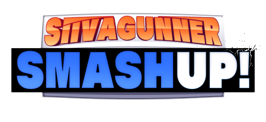
SiIvaGunner SmashUp! Behind the scenes and post-mortem
Hello folks and welcome to my new Tumblr blog. I don't know how much I'm going to actually use this thing in the future but I figure if I need it, it's here. As you can probably tell by the title, today's subject will be none other than my most recent "work", the SiIvaGunner SmashUp!
youtube
The idea of a SiIvaGunner take on the concept of "Royal Rumble but full of stupid contestants" was in my head for a while, but the motivation to do it wasn't in place until I found Dead Meat's Horror Royal Rumble in August or September of 2023. The Jerma Rumbles and Vinewrestle were definitely also influences on the idea, but the Horror Royal Rumble was the impetus, and played a part in influencing some creative choices featured in the SmashUp (more on that later).
youtube
After running the idea by the team and the rest of backroom, I picked up WWE 2K23 (which fortuitously was on sale that weekend) and got to work. Going in, I had next to no idea of the ins and outs of pro wrestling, which meant that I had to do a lot of research into things like the wrestlers themselves, moves, terminology, different match types, general historical stuff, how shows are actually presented, etc. This put me in a very, very deep rabbit hole which I have still not crawled out of. I even went to two house shows!
Making the wrestlers was the first step and by far took the longest amount of time out of anything, since this was the first show of its kind on the channel and required the creation of 34 unique wrestlers. Some of them were easier than others (lookin' at you AMUNO), but others such as Ninomae Ina'nis took days to complete due to the amount of detail they required. This also isn't including wrestlers who were made that got cut; some of these exclusions include Bottom G, who was left out because Andrew Tate sucks, Elly from Touhou Project, who was replaced by Sumireko, and Wood Man, who was left out for lore reasons and replaced with 8-Bit Beast in a somewhat 11th hour decision. Maybe next year?
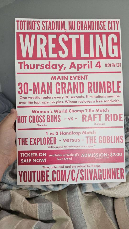
The decision to make Hot Cross Buns and Raft Ride into women also spawned from this period. Hot Cross Buns was made first and was originally meant to show up in the Grand Rumble, but after some time I ended up deciding to move her to her own match, which became a Women's World Champion match because lol. I had to use mods to make the men and women able to fight each other, so theoretically Raft Ride could have been a man, but women are awesome.
Being an egotistical maniac, I also included some references to things I'd worked on in the past. Totino's Stadium, the arena where the match takes place, was first mentioned in the FUMO JAM ad from the DJ Professor K Day stream, and Nu Grandiose City is the city where Woodyana is from in Woodyana Stones: Raider Made of Lost Bark. Also I guess this is why Elvira was included? LOL. Fun fact: The footage of "Totino's Stadium" is actually of Gazprom Arena in Russia.
Since I was involved with the channel's MAGFest panel in 2024, I was able to announce the show months in advance, although I'm not sure how many people actually paid attention at the time. Getting a logo ready between finishing CCC and MAG was a bit tight, but thankfully it was able to be done on time, and on top of that I was able to make the big card poster thing on my own. I actually designed it to be printed, and I proposed making it a sold item, although that idea was rejected. I also came up with the date during this period, choosing the day right before the WWE Hall of Fame show, and while things got a bit close to the wire, it was luckily able to make the date and time without a hitch in the end.
After all the wrestlers were made, it was time to record and edit. I was a bit worried about my laptop overheating while doing so, but I was able to get good quality 60 FPS 1080p footage recorded without any hitches other than some human error on my end. While the controversial ending of the Grand Rumble wasn't what I had in mind, I ended up leaving it as-is for time reasons and also because it felt like a funny troll ending. Which it was! Editing was not quite as smooth since I had to go through all the footage and edit it together into a cohesive product. WWE games don't allow you to cut to entrances during a Royal Rumble, which meant that I had to record and edit those in myself. The method I ended up using resembled the one from the Dead Meat rumble mentioned earlier with cuts to the audience as the buzzer rings, although I'd like to believe I did a better job than they did with their 2024 entrances where they awkwardly cut around shots of the ring. This is also where the fun facts come from, as they are actually covering up the nameplates that show up as an alternative to cutting to the entrances.
After editing was done I got some other team members to do commentary. Thankfully I was able to get someone with wrestling knowledge, which definitely added a dimension of realism and legitimacy to the project. I don't know if I can say who the announcers are because of leaks, but if you haven't figured it out, Randall Shields is a Smash Bros. reference. Also it was the first contribution to SiIvaGunner that had "Randall" made in about half a decade. What a return!
The premiere of the project was electric. Seeing over 1.3K people tune in and get hype over something I made was incredible and made my week, if not month. I did feel a little bad about the reaction when Dream came in (💀), but other than that it was awesome. And don't worry, he won't return.
In the end, I had a lot of fun with the project and it was awesome seeing everything pay off. I want to thank everyone who helped, including the artists who designed the logos and the people who did commentary. It couldn't have come together without help and assistance from everyone, and I hope that this becomes the first in a series of similar videos.
40 notes
·
View notes
Note
do you have any tips on where and/or how to make blinkies? i want to learn how to make them but don't know how. have a good day btw :3
hiiii i will do my best to give tips!! o7
first of all if you want to get a feel for blinkie making without diving in directly i recommend using a site like blinkies.cafe which lets you just add text to premade blinkie templates! i think it's a good way to get an eye for the blinkies "aesthetic" especially regarding the actual blinking part, the borders, all of that. and ofc the size (which for the record is traditionally 150x20px!)
if you want to actually get into Real Custom-Made Blinkies, studying ones you like up close is a great idea because it'll help you see what works and what doesn't. obviously everyone will have different design sensibilities, but that's why it's always good to take inspiration from things that you personally like!
here are things that i like, as an example:
dotted/dashed borders that blink between two colors
shadows
outlines
pixel art
keep in mind that blinking can be upsetting to the eyes for some people! i always try to not overdo it, but at the same time, they are blinkies, so it seems kind of like a waste when they don't blink at all...
traditionally, blinkies include two things: a picture, and text. they don't always! sometimes there's only a picture, and sometimes there's only text. for example, this blinkie i made of lysandre only has his card art and little hearts. this is once again going to depend on your preferences. but for the sake of explaining, let's say you want one or two simple pictures, and some text.
i find pokémon to be a pretty easy thing to make blinkies for, because you have a large panel of pixel art to choose from! for example, i made this blinkie for my blog using one of the mini scyther sprites. a lot of them are animated, too, which is fun. i can't really advise you on what program to use for animated stuff because i use really old ones LMAO but i've always had a good time using ezgif! you can just feed it your frames and use the website to put them together into an animation.
the text imo is the trickiest part. the blinkies you find on blinkies.cafe use pixelated fonts, but i've had a really hard time using them outside of that context. it's hard to get them to look good imo, especially at the small scale that blinkies end up at... so what i've been doing is making my own little pixel art alphabet. it's very fun for me and i don't think it's as difficult as it sounds, so i definitely recommend it because it gives you a lot more flexibility imo. i handdrew the text for all of my PSS blinkies, as well as the aforementioned scyther one, and this trans rights one. i actually have the trans rights and PSS alphabets completed and saved in a file for later use in case i need them, lmao:

you can see what the process is like: i make a rectangle, draw one letter, and then copy the rectangle to draw the other ones at the same size and in the same style. it's very, um, vibe-based, i guess? you just have to figure out what looks good for your Vision. but i find it super fun... so it's easy for me to do, i guess...
if you want to see the scyther blinkies text closer up, here it is at 500% size:

uncapitalized letters are more difficult than capitalized letters imo, but i think i did an ok job! maybe i'll make a full alphabet for that one too at some point, lmao. for the "tumblr" text i just copied the style of the logo (hopefully that comes through...)
i'm not sure what else to say, so feel free to ask more specific questions if you'd like! i think a lot of the other stuff is more general art/graphics advice, like color theory and the likes, which i'm not sure is worth going over LOL. but as a parting note, i'd definitely suggest not going overboard on the color palette. blinkies are pretty small at their default size, and too many colors will make them really hard to look at, let alone understand. in general, keep in mind the final size when working on something like blinkies, and make sure to zoom out periodically to double check you've got something readable!
and don't forget to have fun 👍👍👍
#la réponse d#in the process of looking thru my blinkies files for this post i realized i had apparently started working on villain team blinkies so uhhh#maybe i'll get back to that LMAO#blinkies
14 notes
·
View notes
Note
Hey there, Support for this Chronivac thingy? I have no idea what this is but my flatmate keeps talking about it on the phone with his bandmates , saying weird stuff like needing a new drummer and using it on me or smth? Him and I don't get along? Ive had to work hard doing medicine and he just rode on this music scolarship and gets to laze around and hook up and be a buff menace with his friends (lucky bastards).....They're this mean punk metal thingy and i can barely stand them being so loud and stuff practicing after the gym, whatever they're planning can't be good. Looking it up only led me here.....Any advice?
I am unsure now… There is a Chronivac account with a transformation going on…. Licensee is you. And the licence is also paid for with your credit card. It all looks fine to me…
During the lunch break in the canteen of the university hospital you catch yourself drumming with the cutlery on the edge of the table. Must be some song by your flatmates' band. Cool beat. Gets into your blood. And it's catchy… You don't usually listen to music while you study, but you search YouTube for videos of the band. Yeah, you're jealous. It just looks like a lot of fun. More fun than you're having in the library. And more fun than you'll have in the lectures. Fuck, maybe you should just skip pathology class today. And meet up with your flatmate and his band at the outdoor gym on the sports campus.
Shit, the band members are all well trained. Not a gram of fat on their wiry, muscular bodies. And they're all having fun. Of course they have a boombox with them on which they play their own songs. You have to admit, a great motivation for training. You haven't worked out like this in a long time. And yet you feel fitter than ever after the training. Fuck, you really neglected your body, that felt really good!
Normally you would go home now, tidy up, study a bit. But the boys have a gig at a big club. Wouldn't you like to come along? You feel a bit uncomfortable. The guys are all wearing leather jeans and black tank tops with band logos on them. Apart from your sports shorts, you only have the white jeans and the white polo shirt from the hospital. You are also sweaty from training. You shouldn't worry. Everyone at the concert is sweaty. And when it really gets going, you'll be partying bare-chested like everyone else there anyway. Okay, it's one night. Tomorrow, Friday, there's not much going on at the university anyway. And you're only young once. So let's get into the hustle and bustle.
You party wildly and exuberantly with your friends. Where your tank top has gone, the devil knows. All this time it was still tucked into your leopard print jeans. But at some point during the pogo you lost it. You pull your wallet with the heavy chain out of your trousers and get beer for the boys with the last of your money. You have already drunk a few today. You've had just as many as a beer shower. Your hair is soaking wet from beer and sweat. But the evening is amazing! The main act of the evening is announced to the cheers of the masses. Your buddies push their way towards the stage. You ask where they want to go, they pull you along. As if in a trance, you let yourself be wired up. And then you take your beloved sticks and set the beat for the highlight of the evening.
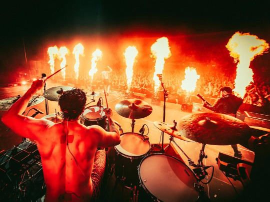
The tour starts next week. If it goes badly, you have to make up a semester. If it goes well, the university will never see you again!
64 notes
·
View notes
Note
There are just some customers you never forget.
I will never forget the guy who said my 'attitude was disgusting and that I should be ashamed of myself' cause I said I couldn't sell him the paper cake box since it had the logo of the company on it (such a stupid policy).
I will never forget the woman who gave me a business card for some sort of makeup technician(?). The reason she did this is because I have HORRIBLE acne. I'm not exaggerating, red irritated bumpy dry+oily skin, blemishes all over my forehead, cheeks, chin and jawbone, sometimes I get cysts along my jawbone or near my nose. I get flare-ups when my period is approaching. It didn't help that the hair net I had to wear would reveal all that. Because you know makeup will totally solve the problem. It might hide the redness but all the bumps, scars and cysts? How is makeup going to hide that?
I will never forget the other woman who said I should blend spinach in a drink to help my acne. She said it helped her so much with all 'this', motioning to her stomach area, and said it would help me too. Maybe she meant ovaries since hormones can also cause acne but idk. She was kinda vague about it and I didn't want to talk about it. Seemed like it was a personal struggle to her.
I will never forget the mid-age Spanish dude who said I should get the large aloe leaf I didn't know the store sold in the produce section and rub that on my face which will help with my acne. He came back a couple days later, another aloe leaf in his cart and asked if I tried his method. No fuck off I don't have a sunburn my skin is irritated with all the hormones, genetics and probably all the stress I get from customers like you. Even if it helped with the redness, it won't help with literally all the other problems.
I will also never forget the guy who said I need to eat more carrots to help with my acne.
Also the woman who gave me an attitude cause she wanted to buy a cake topper, but she wanted it for free cause it comes free with a cake. She was not buying a cake. I told her how much it cost and she started giving me 'tude saying that's a new policy she's never had to pay before blah blah blah. Ma'am. I've never seen your face here before and I've been working here for a year. Buy the 8$ topper or not I do not care. I do not get commins for this.
ALSO this one woman who made zero attempt to communicate with me. She only spoke Spanish and my white pale-ass self does NOT. I could say very very basic things regarding orders but anythin other then what's on the form (not in Spanish, only English) I don't know how to say. There was no one else in the department with me who spoke Spanish and they guy who I usually call to translate was not at work at that time. I could ask what flavour, what day do you want the cake for, basic stuff. This woman did not want a basic cake. She wanted a fondant cake with a popular luxury fashion brand on it. I know this because she pulled out her phone showing me the cake. The part that makes me mad is that I pull out my phone to use Boogle translate so I can tell her, 'no, we can't do this, fondant cakes needs two weeks in advance and we can't do logos'. She wanted a two tier fondant cake for the next day. She was not getting it, not using her own phone for translation, I'm clearly struggling over here tryin to pronounce everythin tryin to not sound like a gringo, typing in my phone responses and she's not budging. She eventually throws her hands up and leaves clearly frustrated. I tried to help lady🤷 She wasted so much of my time too.
66 notes
·
View notes
Text
took a bit but that one post that i said "ten notes and i share my funy godgame cards" got the required notes. ideally i'd be reblogging said post and adding this under it but the boopometer is doing strange things to my dashboard right now.
To preserve everyone's dashboards because cards is big: READMORE! This dish contains a lot of spicy rambles of autistic machismo!
To get it all out of the way: none of these cards will enter the steam workshop. They're just funny cards for get togethers with the pals.
you will also find that i am super inconsistent with wordings and also forget important clarifications. but! that just makes the cards more fun. or less fun. it depends on how often the readers of the cards bicker, which in my case is never often. (i've only played with 2 friends thus far, but I have faith even still.)
i also cannot explain the mechanics of godgame. because.... there's a lot of mechanics. ...I mean, I can, but it's a lot of effort, especially when I don't physically have the board in front of me.
anyways here's our first card... one of my lobcorp OCs in fact!
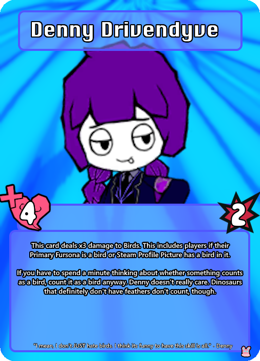
Denny.... she's one of the originals. She's not as funky as everyone else so she doesnt see much sun nowadays but! I can count on her to be easy to make a card for at least. As the blurb says, she's not ALL hating birds. She, like, has a boyfriend. It's just very funny to play it up for the bit. (She also is easy to rile up.)
Side Note Number One... I have formats and shit. However I dont know and dont want to learn how to work photoshop. so it's all a bunch of pngs that i layer on top of one another individually rather than some sort of photoshop type thing.

this is about what it looks like. dont worry about what "overlay jewel office" means. i am not at liberty to explain jewel office because i didnt create it; i just invent the cards...
OK, card number 2!

sootpy. i drew Soot (another lobcorp OC) as peepy once. i was looking in my doodles folder for an image of another guy ive got in here and i found him. I fudged this card up in about 10 seconds not counting time spend actually putting the card together.
Actual Soot might function entirely differently from sootpy. i dont think the peanut part is capable of functioning.
Okie, next caaaaard...!

Memory Maggot! memory maggot's from my original universe type thing i call elsewhere; hence the unique background. It's a champion card, but since i'm biased and like making card backgrounds, cards from elsewhere get their own backgrounds.
originally this card had different (albeit not by much) art, but then I made my silly memory maggot pixel art and liked it better. memory maggot's a lot more than just memories, but i thought that idea for a card would be funny. and speaking of elsewhere champions...
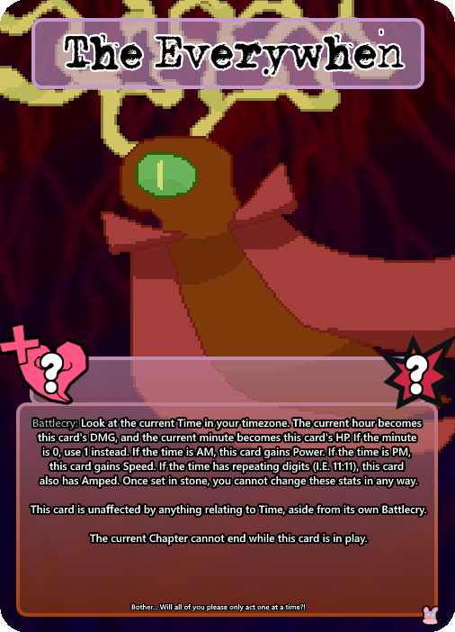
this is the Everywhen. he also lives in elsewhere. i designed him, but at the same time i don't hold full custody over him so to speak. he's goofy levels of busted, yes, but I think Champions are allowed to be just a little bit like that. For fun.
I don't only make cards of my own OCs, though!
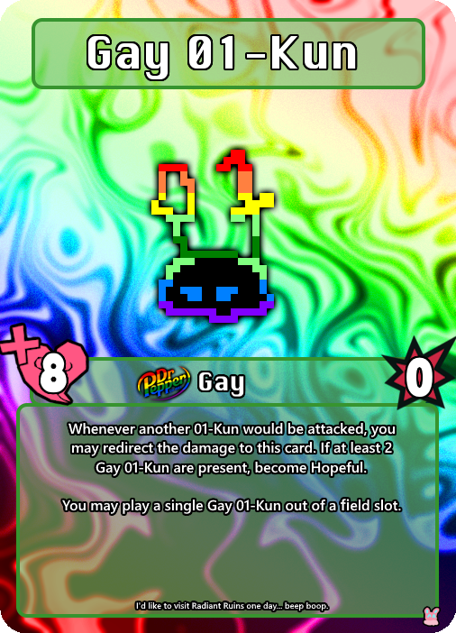
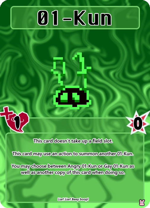

Example: these are the 01-kun, they're from yume 2kki. They don't actually have any of these abilities ingame, but I think I'm allowed to fudge things up a little bit when it comes to these sorts of things. Plus... it makes for a funny archetype.
Yes. The status icon for gay is dr pepper gay icon. I made that myself, actually. In the past I made a whole bunch of just. Dr pepper pride logos for some reason when I made drinking the stuff by the gallon my whole personality... I still have them, and I figured "why let them go to waste?"
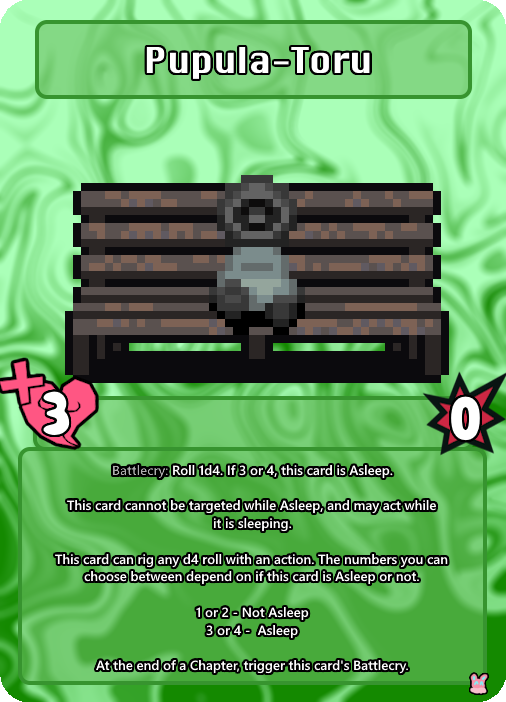
This is Pupula-toru, also from Yume 2kki. This one actually has some basis in how the little guy appears ingame. Even if it is a little complicated for a basic card...
See, in yume 2kki, there's this thing called Variable 44. One of the easiest ways to check the status of this variable is to visit Pupula-Toru, as they're not too far in the dreamworlds. They'll be in one of 4 different poses depending on the variable, and two of them are asleep. Variable 44 is what changes other different forms of per-dream RNG, so knowing it is pretty useful for looking for certain things. Therefore, checking on Pupula-toru has a slight rng-manipulation association in my head, hence how it works.
...Well, errors are popping up when I try to post more images, so now I think I'll just make a reblog chain, or more posts and I'll add them to this one later. There's way more cards I wanna show off..........
#all the stuff in the chain will ALSO be readmore'd if i go that route.#so now its time... for Kira's God Game Moments.
5 notes
·
View notes
Text
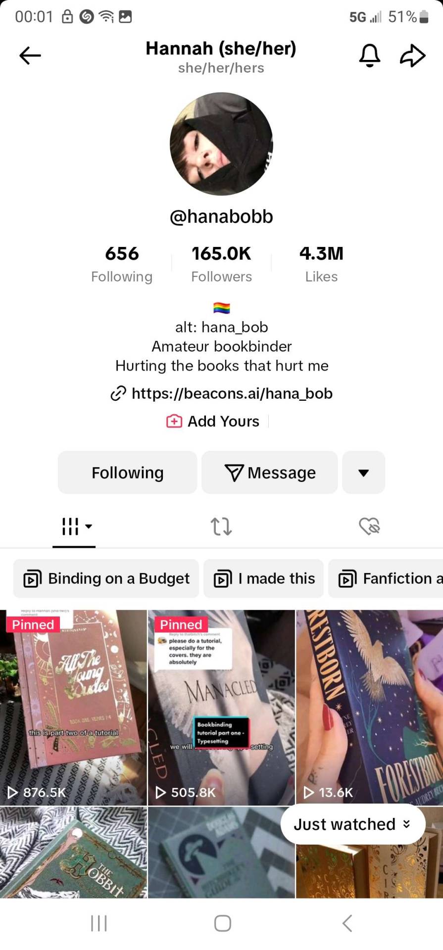
Bookbinding for Beginners by a Beginner Part 2
Am back there were some things that I missed stating in my last post. And starting up where I mean to continue. I may add things as I go, fair warning, but there is a lot to cover and sometimes I walk away and go "Welp.... forgot that thing". But for the sake of things not being overwhelming I tried to get the most "Up front" stuff done and out of the way in part one.
And I would like to take this time to say: Take it slow, pace yourself. There is no race. And the learning curve is steep in areas. You have to be ok with making mistakes because it WILL happen. Accept that you've made a mistake but don't get upset with lost time or materials. Make a note of what happened and have a journal on hand if you'd like to see how far you've come and the "OK so.... that didn't work. Don't do that again." At the end of the day we're here to line our shelves with lovely wonderful stories and have the pride of "I did this ain't that cool?"
There are a few optional things you might want to consider.
A paper guillotine this is to make the pages of your bind more tidy, but there is nothing wrong with a deckled edge.
example of deckled edges. It's just a fancy way of saying 'uneven'. There are ways to trim your project with a crafting knife / box cutter and a ruler but my experiments have yielded not so great results. Likely, it's due to several factors: One I don't know my own strength half the time, Two "light but firm pressure" means exactly "Well which is it cause for me those are two different things". Three See one. So deckled edges it is. But if you splurge on a paper guillotine, I salute you. You can also take it slower with a more traditional paper cutter but I recommend measuring twice before committing to a tape marker of where to line your pages up. It is up to you.
Optional but fun: Scrap book paper for decorative end pages. It's fun hunting around a craft store and finding what suits the vibe of the fic you're binding. My only note is aim for something that's not too stiff aim for something fairly easily folded and thin. Card stock like paper won't lay nicely in your book.
End bands these will go on the edge of the spine of your fic but over top of the mull (What is mull? That's coming up)
Mull which is essentially stiff cheese cloth this will add extra structure to your bind
Another option is a Subscription to Canva I only say this because you can sign up for free, but some of the options are locked behind a pay wall. It's fun to play with but the Pro version of Canva also lets you resize your canvas and do custom sizes. I have also done my binders logo in Canva (I actually have two as variants). I also use it to make decorative cover pages.
For your viewing pleasure this is what I came up with. Fun fact about me, I'm a thalassophile (I love the sea and everything about it) since I was consciously aware of the sea. The primary reason WHY I got into book binding is because I am going to be eventually moving onto and living and working off of a boat.

Lucky Seas Bookbinding one and two. Depending on what I feel like using.
Cricut all cricut accessories- there is a mini cricut if you want to dip your toe in. IF you go this route you'll need "HTV" or "Heat Transfer Vinyl"
You can also build your covers in canva and get as cost saving options
Printable sticker paper. OR Heat transfer paper
But this is stuff for covers. I'll get into what you need for covering the chipboard in a minute and give you a "Recipe" for book cloth (Cause I ain't got time nor the funds for some of the book cloth that is out there) but if you want to splurge for your project by all means look and see what is out there. But make note of this- you can just cover your book case in paper and just use sticker paper. I will recommend getting some sort of transparent contact paper to protect your cover (I will go through all of this in future just make a mental note of this)
Now for I promised:
I will be using Celestial Navigation as my example fic of how to down load a fic.

You're going to go to AO3 and go alllll the way over to "Download" and hit "HTML" you can either have it pop open right away or you can go to your downloads and open it up along with your word processor of choice.
You're going to hit Control A (PC) or Command A (Mac), Control/Command C, and then go to your word processor and hit Control/Command V. And listen to the take off noise your computer brand of choice inevitably wants to do while the fic makes it's way from the HTML over to the word processor.
What this all did was copy EVERYTHING and plop EVERYTHING (Save for comments) onto your document. Feel free to save what you have this far and pat yourself on the back you're about to start type facing.
I'm a minimalist in my designs but I have expanded a touch in terms of what I'm doing just to know and experiment for what works for me and what doesn't.
I will reiterate that I will be using Microsoft Word but I'm sure there's away to do this on other processors I just don't know how to do the other one's. I know Mac has something called "Pages". I never worked with it. I will try to add as many visuals as possible but some of my instructions will be "Go to this tab, click X Y and Z to make a thing happen".
Just know that this is what works for me and this is how I've managed to bumble through thus far. This is hardly perfect and I'm still very much experimenting with EVERYTHING. IF you find a better simpler way of doing things- by all means do so.
There's even a way to set up a template when you fire up Word but I've yet to figure it out.
But for now the fun begins- there is some tedium with this but it's best done with music or something on in the background that you can easily listen too but not watch.
First and foremost what you need to do is make the formatting into "Booklet" How to get there is:
Next up hit command A again. Yes... trust me. There might be a lot of this going on for a little bit while you fiddle and fart your way into a typeset you like.
Indent first line and line spacing is found here: Home Tab, Paragraph section hit the arrow pointing down towards the document- next to that is Line and Breaks- hit that if widow and orphan control is clicked unclick it what that does is allows paragraphs to be broken up and will flow into the next page.

Widow/Orphan control example:
Font: For me personally I do Garamond at 11 or 12 depending on my mood. I just like how it looks but find a font type that pleases your eye.
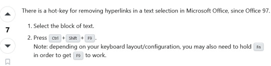
To get rid of hyperlinks:
Line spacing I set mine to 1.5 lines for easier reading. You can keep it to 1 or bump it up to two but the more space between lines means the larger the text block (AKA the book itself) will be.
Now I go back and highlight all of the fic information, and go to the popup menu after highlighting and take the line spacing down to 1 and remove the indents.
I also like to go to the headings section and get rid of the indents one by one on the chapter headings and then center them in the page. Go in front of the Chapter title EX "Chapter 1" and hit backspace until the indent is gone Highlight, there should be a pop up that allows you to change formatting, font and where the indent is.
This is all in the Layout Tab of Word:
Margins- I keep my margins at 1" all directions just because of how it looks on the page but you can have that as narrow as you please.
Next Page- separating the document to make type facing easier. What this does is make the document have "Chapters" within the document. Do this between Chapter one and the first few pages- the opening blank pages, title page ECT.
Double click on the header and footer on the document itself and click "link to previous"
What this does is make sure headers and footers (page numbers and the like) do NOT go up to the "Section" above the area you're working.
Word of note- I like having Chapters start at the beginning of a fresh page so I will go to the beginning of the Chapter Title "Chapter One" and hit "Next Section" and it will jump automatically to a new page.
You might also want to open up the navigation panel so you can hit the headings tab (I have mine set with Navigation Panel already open I don't recall how to get there, play around BUT the Navigation Panel will look akin to this on the Left Hand side of the document:
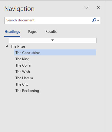
I downloaded "The Prize" to continue the examples as best I can sometimes it's hard to screen grab what I need on an already done document.
You can also add section breaks but leave it linked to previous to continue page number flow.
So you know selecting "Different odd and even pages" means that if you set a fun or different font for the page numbers you will have to go to ex page 2 and unlink the section from the previous.
Do this for headers as well. But that this does is give you the option to put the author's name and fic title alternating on odd and even pages:
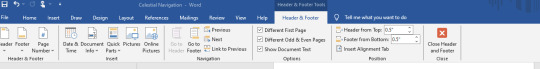
Headers and footers:
With headers and footers section still highlighted hit "Page Number" "Format Page Numbers" Hit "Start at" and hit "One" for the section with the main text body.
This... I will admit took some fiddling for me to figure out. There were some frustrated noises and some choice words at times. But if you hit Layout, Next Page it should prevent you some heart ache instead of just constantly hitting the Enter Key and hoping for the best.
Different Odd and Even Pages what this means and how it works:
In my experience you will have to go to the first 1-3 pages to unlink everything from the Previous Section so it doesn't show up on the beginning pages of the document- but if you like the look of it, more power too you. It's your fic. It's going to be on your shelf at the end of the day. Follow your joy. I'm just letting you know what I do.
You will also have to unlink to previous section with the footers as well, and if you choose a different font and you want the numbers to match through the whole text you will have to input that. Hit the "Pages" Navigation and use that to scroll through things quickly so you can check your work and see if you're happy.
I'm kinda a fan of leaving the headers with the author's name and fic title alternating on pages OFF but I have experimented with it a little bit just to know what it looks like and what it does.
But here is an example of alternating Headers for Sabrecmc's "The Prize" (It was on my To Bind List and since Sabrecmc has given their blessing I'm hoping they don't mind me going "Alright people need visuals.... and this is what I'm working on."
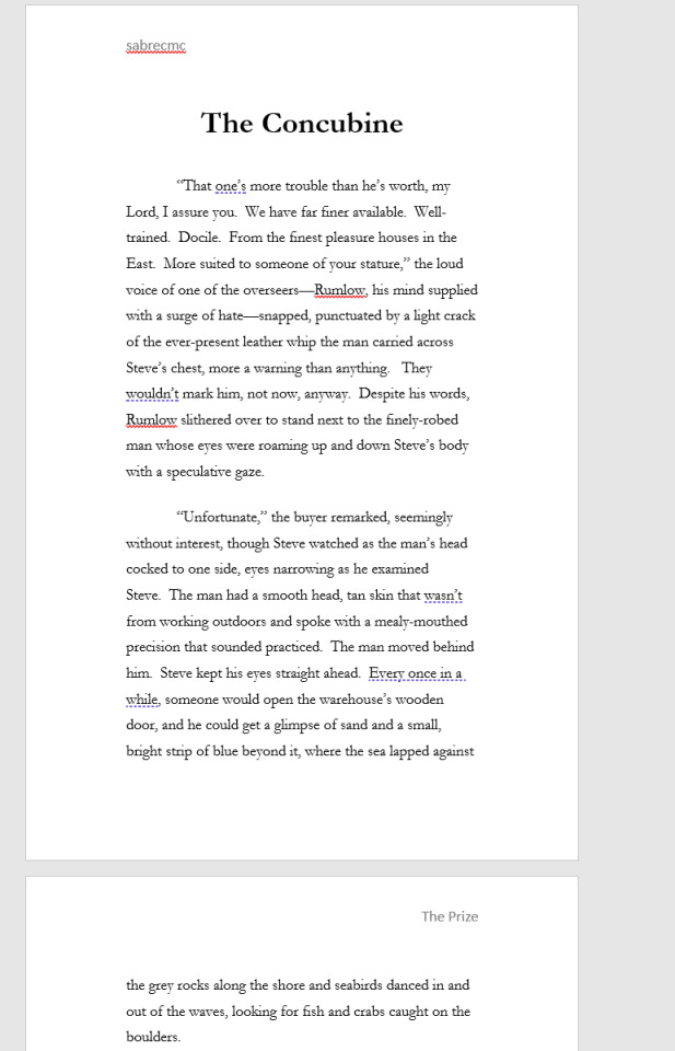
To get the header from the left to the right side- hit tab and type what you please you can also highlight and set colour and font type. This is just Garamond for now for ease of example and reading for now.
Choices choices choices.
Some fic binders like to keep everything including author's comments at the beginning and ends of fics. Personally, I remove them just to keep the flow of everything. You can have a section at the back of the fic if you'd like with all of the comments but that is entirely up to your own personal preference. This is the fic for your shelf make it in a way that makes you happy.
Now all the way at the top of the fic I want you to insert 6 blank pages. But keep in mind this is front and back of pages in a book. Two blank pages on the document equals one page. Some binders go more than that depending on what all they like to do. You'll figure out what you like and what works for your project. Think Bob Ross- Happy little trees and do what you want.
But for me in the document: Pages 1 and 2 are blank as a sort of buffer page, 3 is the title page with the fic name and author and likely some simple design, 4 is all of the fic information- I keep the pairing, chapters, any additional or important tags or warnings, rating and a QR code to link back to the original fic. Page 5 is either left blank but I have added images as something fun for the hell of it that fits the fic, page 6 is my logo. In earlier experiments I played with where my logo goes this works for me I think but it may change in the future. IF you want to have a table of contents by all means add some pages to do so. I don't find it necessary so I don't do it.
To insert an image- for QR codes or title pages:
QR codes can also be just dragged and dropped I've been lazy and dragged and dropped and resized them from there.
I also put a disclaimer in red font: "This is for personal use only and is not intended to be sold! Retail value is estimated 25$" That is to cover the cost of the materials you have used or made in the process of your book that way if your fic somehow ends up in a donation bin it can't be sold for very much.
This is what the info section of a completed fic looks like for me:

To insert an image:
Insert Tab (Next to Home Tab) , Picture- next to the "Table" section, hit the drop down menu and hit "Upload from this device" and select where you have saved the QR Code to, desktop downloads what have you.
It should appear on your document and you can resize it as you please, if you click on the image there should be a pop up with a grey looking rainbow with lines- that's important for QR codes I have it "in line with text"
for fun headers "Have image behind text"
This is.... getting LONG as hell... so I'm going to stop here. But this should give you a jumping off point to start with your fan binding. Play around! Have fun.
Last few Tips:
Home Tab- in the paragraph section- if you need to know what the nitty gritty of what's going on in the document is- hit the backwards looking "P" with the line that's the sign for "Enter" on your keyboard. So you can see what that looks like I don't use it cause it clutters everything for my eyes, but it won't show on the final product. You can turn that on and off at your leisure
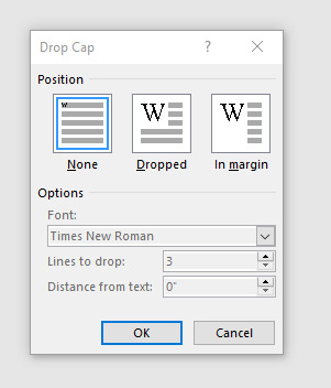
Insert Section: Scroll along the top until you see "Word art" one more over "Drop Cap", That's how you can get fancy letters at the beginning of the chapter. Sometimes you DO need to add some spaces between the Letter you're Drop capping and the rest BUT what that window looks like is this When you hit "Drop Cap Options" you can set whatever font you please for however many lines I typically do 3 but the more lines you drop the larger the letter. Tinker with it have fun.
There will likely be more type facing goodies next post... but after I get done type facing I'll get into getting the document ready for printing, how to print and what to do with that shopping list I gave you in that previous post.
REFERENCES, LINKS AND HELPFUL PEOPLE!
Some links for your consideration you will need this for future reference so book mark these:
French Link Stitch
Perfect bound books (AKA Paper backs)
Fun Fonts to spice up the document body itself, you can also import them into Canva.
Da font
1001 Free Fonts
Another resource to keep in mind for ink is this site here if you have cartridge printers see if you can't get a refillable set for your printer so you don't have to sell your arms, your legs, your first born and your house to keep printing your fic projects.
These two tiktokers right here explained everything the best, they are worth checking out even if you don't have Tik Tok. They've been going at this longer than me and don't go "OH SHIT I FORGOT A THING" constantly.
EDIT ONE!
This is the punch cradle I have it makes it easy for french links for me
HoneyMinCo Sea Lemon
14 notes
·
View notes
Note
Hey Sophie, I'm going to be in Melbourne soon! Do you have any tips for what to do, see, or eat?
Hey! Ah! How exciting! Melbourne's a really fun city to visit, and I feel really does have something for everyone.
Hmmm, tip wise, I think I'd say:
grab a Myki card for public transport. You can buy these at any news agent, train station or petrol station. Melbourne has a free inner-city tramzone, which is great for getting around the CBD, but you should also take advantage of Melbourne's incredibly good train network which'll open up the broader city to you. A Myki card works on all forms of public transport - buses, trams (for trams outside of the free tram zone) and trains - so they're pretty straight forward.
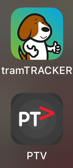
On that note, the PTV app is pretty useless for public transport (you're better off using Google maps tbh), but it does let you top up your Myki instantly via your phone, which makes it useful. The TramTracker app is very good for trams though, especially because you can type in the number of the tram you're on and know exactly which stops you're heading towards. The logos look like this: (trust the doggo)
Don't drive in the city - it's a layer of hell.
Have a little bit of cash on you. Most places take cards or smart watches, but you'll need gold coins for certain things too, particularly accessing certain gardens or markets.
Pack for all weather. Melbourne's known for having four seasons in a day, and having lived here for almost five years now, it's not an exaggeration. Layering is your friend, and always have an umbrella!
Hook turns are a real thing here, and whether you're driving or just crossing the road, they're worth being aware of.
Places to visit
Melbourne's famous for its street art, and while you can just wander around and observe yourself, doing a tour is particularly fun (and makes sure you see the best stuff!)
Australian Centre for the Moving Image (ACMI) is one of my favourite places to show out-of-towners (although that's probably partly just because it's me, haha). It's a museum of film, tv and games, and explores the moving image as both a form of commercial entertainment and as a form of art. Their cinema is often playing really interesting films too.
National Gallery Victoria is always worth checking out.
Chapel Street is known for it's little galleries, restaurants and indie shops, and makes for a fun day out.
Queen Vic Market and South Melbourne Market are both iconic and for good reason. They've been operational since the mid-1800s, and you can often feel that when you're in them. They can get packed though, so just a heads up.
I love love love heritage buildings and exploring history through place, so will always recommend checking out the National Trust's historic sites in Melbourne. Rippon Lea Estate is a personal fave and only about 20 minutes out of the CBD on the train. They shot parts of Miss Fisher there, and even if you don't get to tour the house (although I recommend you do!) even just exploring the gardens are beautiful.
Abbotsford Convent & Collingwood Children's Farm are right next door to each other and a pretty amazing day out.
If you fancy seeing a movie, my all time fave cinemas are The Classic and The Lido, which are owned by the same family. Either spot is worth checking out.
If you're looking to see a show or performance, you can look for the big ones at any of the big theatres, but for smaller, exciting indie stuff, I'd check out the programs at Malthouse, La Mama, Art House, Meat Market, and Footscray Community Arts Centre,
What to eat
Wellllll, this ultimately depends on your budget, haha, since Melbourne restaurants can run the gamut. Some of my favourite restaurants that are a bit more on the expensive side but great for a special occasion:
Maha's probably my favourite restaurant in Melbourne? It's modern Middle Eastern cuisine and their seafood in particular is divine. It's a set menu, and like I said, a little exy, haha.
Mabu Mabu is modern Australian First Nations (Torres Strait Islander) cuisine and is very good! They sell some of their own sauces too, and I highly recommend snagging their pineapple hot sauce! It's also very easy to get to, as it's located in Fed Square right next to the Koori Heritage Trust which often has Indigenous exhibitions on (and a great gift store if you're looking for anything to take home)
Chin Chin's - delicious South East Asian fusion cuisine. Again, a little exy.
Transformer - incredible vegetarian restaurant. They do both ala carte and a fixed menu. Highly recommend their fixed menu! They're also very good with dietary requirements, particularly if you're gluten free or if you have annoying allergies for a vegetarian restaurant like me, haha (tomato and eggplant).
Cheaper eats that are also delicious:
A little out in the South Side 'burbs, but Saigon Mamma is my favourite Vietnamese restaurant in Melbourne.
Rice Paper Scissors is good too, as is Chocolate Buddha, Green Man's Arms, and oh! Studley Park Boathouse is a fave. It's beautiful location-wise with pretty standard (but good) pub eats, and they've got a lot of water birds you can feed and boats you can hire pretty cheap ($30 for a kayak, $40 for a row boat) to row along the Yarra River. It's also really close to the Convent + Children's Farm if you fancy making a day of it.
If you're willing to travel a little further out of inner Melbourne, I'd also suggest:
Healesville Sanctuary - the bird show is i n c r e d i b l e. I took my nephews last year and the older one still talks about it, haha.
Mornington Penninsula Hot Springs - Mornington Penninsula is a great day trip from Melbourne. It's only just over an hour drive, and it's pretty stunning. Full of wineries and beachy walks. The hot springs are so relaxing though, and really centring if you need it.
Mount Macedon - home of the Hanging Rock of Picnic at Hanging Rock fame! Plus it's just a beautiful area.
Cranborne Gardens - the Royal Botanical Gardens in the city are beautiful too, but I'm particularly partial to these ones.
Hope this gets you started, and just let me know if you have any other questions!
#i'm not sure if you're visiting from interstate or overseas but i think my tips would mostly be the same#oh! a random fun fact to observe if you're coming from interstate#i went to a history of colonial architecture talk a while ago#and they talked a bit about how brisbane sydney and melbourne were built from different materials#brisbane wood sydney sandstone and melbourne bluestone#which is a really fun thing to keep an eye out for#because the bluestone are the oldest buildings in the city#if you've got kids in your travelling party i have some different recs too haha#another fun fact: the classic cinema is the first place in melbourne i sort of laid claim to when i moved here#it made melbourne feel like home#i love it a lot#welcome to my ama
4 notes
·
View notes
Text


Ignore the garbage BG, opened the rest of Dinosaw good friends blind boxes wave 1.
Each sealed set contained one of each pony, including the "glittery" Izzy variant. The distribution order for my box was as follows:
Back row, left to right: Variant Izzy, Hitch, Sunny
Front row, Left to right: Pipp, Izzy, Zipp
Rarity is listed as a flat 1/6 for all of them, appropriately.

They all have "bio cards", the other side includes a render of them. Izzy bg is Bridlewood, Pipp and Zipp have unique Zephyr Heights bgs, Sunny and Hitch share the same Maretime Bay bg.

Bio side includes the CN Names, and a lot of information i don't know about yet...! New renders on that side, along with their marks, and Sparky is included on Hitch's.
Dinosaw's logo is on the bio side, Hasbro's license, logo, all rights reserved, and the english name is on the other side. It's made of simple card stock, my Izzy variant's was bent but there is no difference between regular Izzy and the sparkly variant's cards. They're about an inch wide, maybe an inch and a half long. very tiny! I'll scan them some time i guess
There are two tail molds in this line. One "styled" for Izzy, and one regular tail used for the other dolls. Each doll has a unique hair sculpt, and both pegasi have unique wing molds. Seems every head is the same, with a different face print and hair sculpt. All the hair is made with a plastic that has fine glitter in it, so it shimmers in person. It may be harder to see in photos. Sunny's mane rainbow is metallic paint, she has a blue, yellow and orange stripe. The rare Izzy has translucent clear plastic for hair, and larger glitter pieces in it.
It may be difficult to see in person and photos, but sunny and hitch are infact different colors. Hitch is more yellow. The eyebrows are all the same print shape, pipp does have both eyebrows printed. Pipp's headband is painted in metallic gold, both Izzys have their printed on bracelets! (Both of these details are missing on the Hasbro toys.)


The marks are all somewhat simplified and share some simple colors, like yellow, blue or white.
Zipp's mane has one metallic blue stripe, the same blue as Sunny's mane. The same Blue is used to paint Zipp's wings. Zipp's tail is unpainted. Pipp's wings are simply airbrushed with a metallic pink, closer to her body color, mine did not get sprayed fully on one wing (which is okay :) ) Both versions of izzy have her horn painted in the same blue.
Every pony has a unique plastic color. On their bellies, they have copyrights. Copyright 2024 Hasbro, and Copyright Dinosaw. Made in China. All in English. Their hooves have heart holes to presumably hold items, maybe from Hasbro's line or their own? Or maybe they're a carry over from the mold casting.

made some edits but final section (aside from the eye stuff in a repost) i think(?) articulation!
Leg swivels up and down, 4 points. Head ball joint, head can look down and up slightly. Hair may get in the way. tail on a swivel. Wings on ball joints.
total 6 point articulation, two more to make 8 points on a pony with wings.
No different than hasbro's 3 inch, in fact arguably better head wise. some may feel a little looser, again, like hasbro's.
1 note
·
View note
Text
DND POG
some props ive made for a friends dnd campaign i am very hype ab, im very proud of how they came out :>

OK SO FIRST WE GOT A SPELL BOOK-

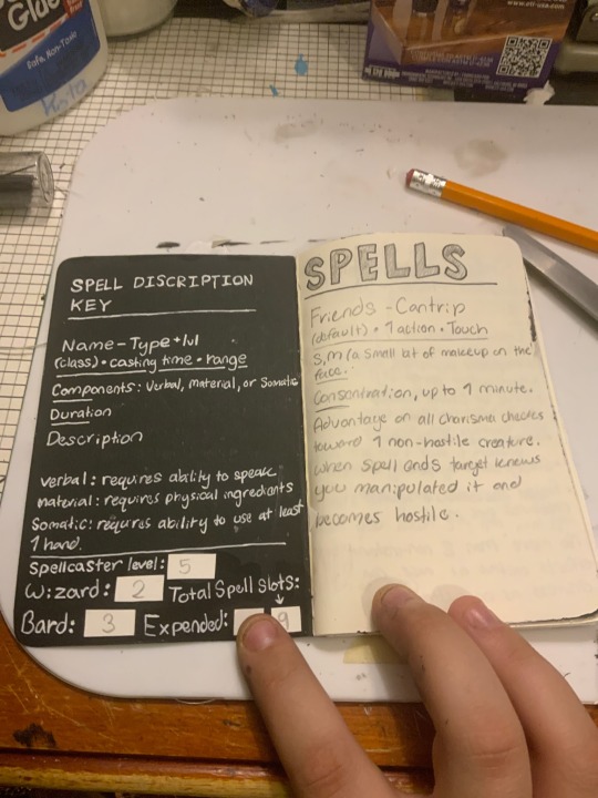
My charachter's name is Maxwelle Harbinger- and the little sun/eye logo is his family crest :>. I had a very hard time in my last campaign remembering what my spells do- so i went and wrote the description + every other bit of info for every spell I have. It took a very long time to write, but im glad i did it bc its in terms i actually understand now lol
NEXT IS A LETTER/ HIT LIST


So like- Maxwelle is a bounty hunter, right? well He recived a letter from a very powerfull official called Lady Michelle Cronk to kill her son and their party. (Maxwelle end up joining the party instead bc hes like: yo this bitch is crazy). Anyway yuh- the wax seal's design is a monogram I designed for Michelle Cronk inspired by the British Royal Families cypher.
this is what it was sposed to look like, but when i was making the seal i forgot to flip it, so it came out backwards lol
I also wrote the letter itself with a fancy dip pen :>
NEXT WE GOT FAKE-ASS BUSINESS CARDS

Bc Maxwelle is like- a paid assassin, my DM gave me a list of ppl and organizations he would likely know or be connected to as a part of the criminal underwolrd. Two of which are companies, Armstrong and Sons and Cellbase are a famously aggressive repo group, and an illegal science organization that creates monsters to be released into the world- respectively.
The others are members of the Silver Corps, a criminal organization dealing in all manner of illegal trade. illicit substances, murder, debt reclaims, turf wars, you name it. These members are "Cladmasters" the highest possible rank in the organization, all head of unique criminal departments within the Silver Corps.
AND LASTLY- I MADE A DICE ARENA

Made of paper bc I dont have anything else atm ;>> planning on making it sturdier with cardboard bc i already ripped it tryna get it outa my bag lol.
Anyway- yuh Im supper excited to do this new campaign. :> I should start posting my dnd stuff more often, not to mention drawing stuff for them. Fun thing, all my dnd characters in their own lil universes are part of the same multiverse, so I'm hoping I can write a comic for them at some point. But thats kinda far off bc I've got plans for other things I gotta do, lol.
I'll post my charachter's reference sheet here when its done, i think you guys will like him ;]
9 notes
·
View notes
Note
3, 4, 12? <3
This is or the Smosh Ask thing I guess :D
Thank you ♡ :D
3. What's your favorite channel between main/pit/games?
Surprisingly enough, this is a very hard question. My heart lies with the main channel, but we get to know the people better on the other channels (especially Pit), which is tremendously important to me when watching Youtube. Even the really old content on Pit when it was still IanH was at times more dear to me than main. But now Main has all the stuff that makes me become really annoying once a week so idk. I'd love to have this be a tie between Pit and Main 😭 If I have to decide then probably Pit, but only with the thought in mind that several shows will go to that channel in the future. I just really only can love Youtube content if I get to know the creators a lil bit better.
4. Who is your favorite castmember?
Ian. Apart from Ian? Anthony. Apart from Ian & Anthony? Uh. Courtney. But Amanda, Angela and Chanse are climbing the ladder fast y'all . I love them all though T_T. And I miss Jacky sooo much T_T
12. Do you own any Smosh merch?
Yeah! I can't put photographs of my own stuff rn but I have:
- Smosh socks (found no pics of them online lol but they have little Smosh logos on em)
- The black Shut Up! tshirt
- The Potato tshirt for members
- the 100Mil Tomahawk tshirt
- and I ordered the Food Battle 2023 trading card pack a few days ago (and also the Food Battle 2023 Edition MFC Coffee XD)
I've had a bit of My Favorite Coffee before, idk if that counts as merch. I don't remember anything else tbh.


(The second the Let's Do This "Overthink Everything" stuff comes back I will buy it, though, I want it so bad ;_;)
Thank youuu! ♡
[Smosh Ask Game]
5 notes
·
View notes
Note
hi i just wanted to ask if you could go more in depth about your creative process? how much work goes into lykaia and making content for other things like your logo etc. im making sims content too and i want to improve on it and make my stuff more original. so people know its me when i post. and i also wanted to say i saw you say before about not stepping on other creators toes and as a small creator i really appreciate that because i feel like a lot of people don’t make space for other people. sometimes everything feels like a competition in the sims community and that’s why other creators don’t like to give credit to people they actually get influenced by because they don’t want their numbers to grow only they own. And most time i don’t even want to post because of that
Hmmm. I’ll talk about my creative process for sure. I like talking about my creative process lol. It’s gonna be long tho so.. you asked for it.
Background: Lykaia at its core is just a cinematic version of my gameplay save. I had a story in my head while I played their household, but it was never fully planned out. The first season of Lykaia was just me practicing with storytelling and machinima making. I didn’t really have any direction. I just made things up as I went. Lou’s friends never existed in my gameplay save. I just made them for the machinima. A lot of it was just finding my footing as I went. What the story has become now, I never planned. It sorta just happened. As it is now, Lykaia’s a fully planned out series with a brittle back bone lol. It’s a whole lot of making something out of nothing.
Planning the Series & Making It: So, I have a full outline for the season. Where I want to go and how that can be developed on further. From that, I plan out the episodes. Right now I have a week where I film and a week off from filming. On my off week, I write the script. Scene by scene. I storyboard it to visualize how I want each scene to look. Once the script is done after a draft or two, then I start setting for filming. I get everyone dressed, moved into the households, and get the sets built. On the week I film, I just go in and film. I try to go in order of scenes but sometimes I jump around. Especially if I’m excited to film a scene. I do about two scenes a day. They take about an hour or so to film each. (I’ve got a full time job, a fur baby to care for, my family, and my social life so my time to work on it is limited. I try to budget it wisely.) Then I usually edit while I’m in bed or cooking. I edit on my phone so I’m not carrying around my pc lol. Editing takes the longest and it’s the most tedious part. I go in and add in the into, outro, title card, then I add in the scenes and the breaks. If I have to overlay something then I do that before audio. And the. I color grade each scene individually. Last thing to do is audio. I hate audio. I break it up scene by scene and mix some of the music myself depending on the episode. Once I do a quick check, the episode is done and ready to export. Sometimes I pick the title beforehand, but I usually don’t come up with a name until after the full episode is done.
The Brand: Ophernelia and Kiricheu are a brand. (Ophernelia being like the parent company in a sense) Especially Ophernelia since I have a Patreon for it. I run Ophernelia as a sole proprietor, so branding is important for me. Anything I have my hand in, I take seriously. (“It’s just sims content” Sure. For now at least. Doesn’t mean ima take it any less seriously lol) Especially since I’ve curated an audience and one that pays. Idc if it’s $2. It’s money spent, so I want my audience to get quality content. Branding’s been tough because I’m super indecisive lol. I like to change things up constantly but when it comes to like a company type of thing, you shouldn’t really do that. Which is why I hate changing mine. Especially once I find something that works. It makes me feel like I’m failing my audience by not being consistent. As of now though, I love my branding. I feel like it reflects my content style really well. It took a few tries to make. I looked through old art I’ve done and tried to combine it with my current style. Somehow I came up with how it looks currently. I think it’s pretty, I wanna stick with it. It took a while to get here, but 8 months later, here we are. I’ve been trying to rely a little less on external programs (like canva) and more on me actually making my stuff myself. So I hopped into procreate and got to work lol.
Ultimately, I just make stuff I like and sometimes I like to share it with other people. And when I do share it, I try to do it to the best of my ability and while trying to be mindful of others. It’s hard and idk if I do it well but I’m trying! The process of getting there is almost always enjoyable. Almost lol.
4 notes
·
View notes
Last Seen Blogs

tooprincessunknown
My superb blog 6506

thedarkestmile
My Beautiful Dark Twisted Fantasy

christenahhhh
Dead💀

nilab
nilablr.

nilladoodle
nilla mini goldendoodle