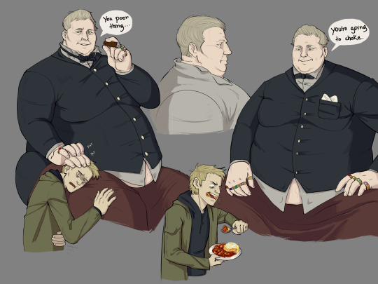
#someone draws a character as fat.
Text
i'm about to make the lamest post possible: i rlly don't like comments like "feed that boy" or whatever other references to food when someone draws a character as fat. are you not capable of looking at a fat person without immediately connecting them to food.
i never, ever see comments about people's eating or food when thin characters are drawn unless that character is extremely thin, and even then it's usually with sympathy. i don't know man - i can't tell if y'all are fetishists or just fucked in how you think about fat people, and i'm really not sure which is worse.
#tal.png#some people are just fat. you know that right. you know that some people will always be chubby to fat no matter what they eat.#you know that fat people are sexy without going man i wanna give him more cheeseburgers right. right? haha. right???#i'm fat + n have ED stuff and i recognise it's my issue to work on but i flinch whenever i see someone immediately bring up food when#someone draws a character as fat.
155 notes
·
View notes
Note
I'm so in love with everything about your art!! I wanted to ask something about your MLP human designs in particular. all of them have really lovely and interesting face shapes/details. even though all the pony designs have the same head molds (save for eye shape), all the unique characteristics you gave them just... look RIGHT. is there a particular method or design principle you used? thanks for your time!! I can't wait to see more of your work!
It's all about shape language and how they inform a person's read on the character.

I talked about this before, but each of the Main 6 were paired together so I could design them in contrast with each other. For RD, I wanted her short hair to have a wind-swept look, as if she's constantly running. So bare forehead and hair spiking out at the bottom. She contains lots and lots of sharp lines and shapes to give her the look of a speeding arrow.
Felice, on the other hand, droops down a lot to reflect her solemn, shy disposition. I didn't want her hair to be perfectly straight though, as that'd suggest she spends a lot of time fretting over it and isn't outdoorsy, so I made it a bit of a tangled mess too.
In short, RD's features are sharp and point upwards, Felice's features are round and droop downwards. (Think Joshua tree vs. weeping willow.)

For these two, I specifically wanted to include non-Western facial features, as I found I haven't really included them in my character designs up until now.
Pinkie's bold and loud, so I gave her bold eyes, bold eyebrows, a bold nose, etc. I worked on Thea's nose for quite a bit and ended up abstracting the shape a bit to look more cartoony, borrowing from Pixar's Soul's character design notes. In cases like these, I recommend finding ways to simplify features and break them down into easily-recognizable shapes and forms (Cartoon Saloon are masters at this). The less visual noise, the easier their expressions are to read! And it's generally more fun to draw.
In short, diversify, exaggerate, and simplify. Figure out what works for you and get a little wacky with it. Character design is all about finding a balance between maintaining your voice and vision and creating something unique and lively.
#ask me#anon#long post#i would recommend studying character design sheets too#my personal favorites are by cartoon saloon/ami thompson/anything from disney and pixar#you can learn a lot about how to draw specific eye shapes and facial structures and hair styles#and how all these features squash and stretch for different emotions#ask yourself: do you know how to draw someone with a very high cheekbone? how about someone with a lot of cheek/neck fat?#then ask yourself how these differences in features reflect on the character#facial structures especially are something i see a lot of beginner artists struggle with
537 notes
·
View notes
Text
woe, the duke be upon ye
#this was so fun to draw#but again. my eyes hurt from staring at the puter too much lol#i think that i didnt make him THAT fat u kno#he is fatter i think :/ but hey. it was a fun#i think more ppl should draw him. mostly ppl that only know how to draw stick thin characters :T#idk. im just saying .-.#the duke#re8#resident evil village#the duke re8#fanart#fat character#fat male#fat art#this wasnt one of my old wips lol i made it on a whim because i really wanted to draw someone fat :u
98 notes
·
View notes
Text
if there's one [1] thing i will be forever grateful for in the internet era it's the vast variety and availability of pose / anatomy references supplied by photographers and models
i can go online and find PERFECT references for how fat folds crease the skin or how muscles wrap around the body and as someone who habitually draws most of his OCs ~modestly lean~ and wants to hone his skill in other body types, it is literally a godsend to have those refs so readily available
seriously, thank you all models and photographers for providing me the resources i need to expand my art skills i owe u my life
#drawing other body types is important to me#not just for my own Art Skill but for my audience and clients too#i've seen many a post in my many years on the internet of people saddened for not seeing themselves or their OCs represented in artists wor#esp when it comes to fat characters when it comes to body types#and i can imagine it's Super hard when you wanna comm someone but you're worried they'll slim down your OC#and regardless of whether the artist does it intentionally or not - it still sucks!!#i have a couple OCs - one fat and one meant to be kinda strong-bulky and i wanna use them more for example art#i also wanna play more with different skintones and hairstyles so i think i may make some human OCs to work on those with#ppl have called my art godly / called me an art god and while i'm iffy on being called some kind of god in any sense [despite the username]#i can only ever hope to live up to that praise by having my audience feel properly represented when i draw something that relates to them#obligatory mention that the username is solely bc of an OC of mine who i love dearly
181 notes
·
View notes
Text

anne maria! 💎💅
in my own headcanons, she’s def plus sized!
we need more fat total drama girls tbh
#total drama#total drama island#total drama revenge of the island#tdri#tdroti#total drama fanart#td anne maria#anne maria#total drama Anne maria#art#my art#artists on tumblr#fanart#procreate#artwork#drawing#cartoon#cartoons#digital art#redesign#headcanon#headcanons#drew this because someone drew gwen slightly chubby a few months ago and they got so much hate for it#i wanna show ppl being fat isn’t bad and i can redraw td characters as fat if i want to
55 notes
·
View notes
Text
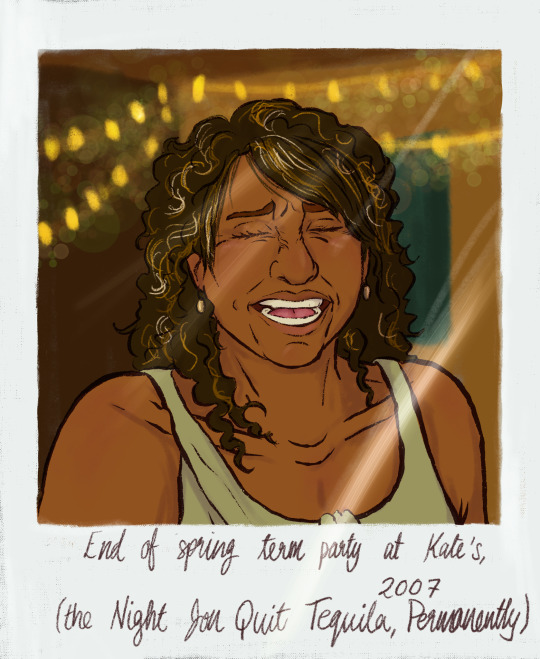

[ID: Two digital drawings of Georgie from TMA, made to look like polaroids. She has medium brown skin, dark curly hair, and brown eyes. In the first picture, she is younger and thinner, and her hair is long, with artificial highlights. Her eyebrows are pencilled in conspicuously and she wears a light green sleeveless top. The front section of her hair is straightened where it falls over her face. She is laughing, and writing at the bottom of the polaroid says “End of spring term party at Kate’s, 2007 (the Night Jon Quit Tequila, Permanently)”. In the second picture, Georgie is older, her hair greying and cut in a short mullet. She wears a bleach-stained shirt and purple ghost earrings. She has one eye closed in an exaggerated expression of amused incredulity, and the caption, presumably written by Melanie, reads “Asked G if she would still love me if I was a worm… :(“. End ID.]
i just. have. Some thoughts. about georgie and what recovery, such as it is, would look like on her. also i love her.
#tma#the magnus archives#georgie barker#described#my#saint draws#eye contact#someone was pretty fuckin rude to me the other day re drawing characters fat and to that i have to say fuck u fat ppl rule lmao <3#also. wow posting like twice in two days but im kinda takin advantage of i have to go back to school soon#and much as i would love to have been writing. i simply havent had the brain
205 notes
·
View notes
Text
its 2024 stop drawing willow park thin or skinny already
SHE IS A CANONICALLY FAT CHARACTER
FAT. CHUBBY. PLUS SIZED.
and we LOVE HER THAT. WAY.
#willow park#toh#the worst part ? most of the artists that do that are like#PROFESSIONAL artists ya know ? if it was someone who's still learning i can let it slide but#its CLEARLY people who KNOWS how to draw pretty well and just refuse to draw fat people#hm#and the excuses are the worst part#“she works out she exercises she looks thinner as the seasons go by specially the finale”#the day yall find out that people that exercise and are healthy can ALSO BE FAT your minds will blow up#and just compare willow to other characters and TRY AGAIN to say she is thin when she's CLEARLY NOT skinnier than the others#yall just hate fat people and characters. yall have all the characters in the world to identify with. let us have this one thing#and specially for girls. its rare when we get a fat girl character that is actually awesome and isnt the joke just for being fat
12 notes
·
View notes
Text
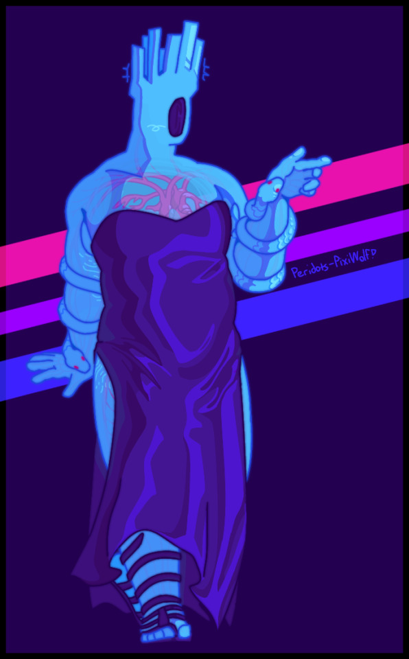
[Start ID. A digital drawing of Minos Prime from Ultrakill, who's wearing a strapless slit dress and sandals of the same deep purple. He faces towards and slightly to the right of the camera, his head is tilted further right. With one hand he gestures in a vague pointing motion, his arm folded and held close to his body. There is nothing in the background, but bracing himself on one arm, Minos is implied to be leaning against something about the height of a countertop. The background is a blank purplish black, save for three diagonal stripes in the colors of the bisexual flag. End ID]
Shading study that quite literally came to me in a dream two weeks ago, after this post apparently beamed itself into my mind
(also a few edits below the cut! they're very slight but whatever :])
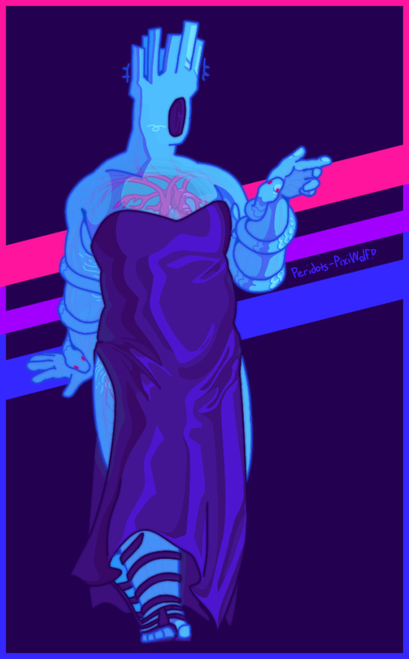

[Start ID. Three different versions of the previous drawing. The first changes the tone of the lighting from blue to pink, and similarly the shading from pink to blue. The second replaces the faint black border with pink, purple and blue, syncing with the stripes in the background. The third combines both these changes. End ID]
#the tags got NERFED so let's try this again.#peridots-art#minos prime ultrakill#ultrakill#ask to tag#organs#...? gore maybe? for the whole ''transparent chest/visible cardiovascular system'' thing. not very detailed/realistic though so#i don't think this has all of the same charm as i usually find in my posts. but i tried my best to make it work so i don't think it matters#also ''not too happy with how this turned out'' is something i've seen tacked onto posts worthy of being preserved in museums#i heard someone say his snakes should be ball pythons. i'm not autistic about snakes so i decided to listen to the masters#i still have seven levels to p-rank before i can meet this guy!! halfway there (lust/greed and 1-3 remaining) i've only had my own copy#of ultrakill for a week and i already have 33 hours in. anyway he's grown on me i think. absolute bi king and only monarch i respect <3#i think it's interesting how i now define my queerness by being gray-ace and trans when i first only identified with bisexual. it's still#an important part of me even if sometimes i forget. sorry that sounds completely unrelated but it's related to my feelings on this piece#anyway (i wonder how many ''anyway''s i've slapped on so far) i also find it interesting how often people draw him with this body type.#i think it's cool there's variety in how people draw the uk characters. it just kinda feels right here? i know i unfortunately don't draw#fat characters often at all (partially due to being a primarily fandom blog who likes to stick to canon designs. i wouldn't say i have#trouble with drawing a realistic amount of fat even on rather thin people though lol) but i try! also genuinely unsure what counts as like.#fat vs chubby? or whatever? i don't know exactly how the terminology works and a fair amount of minos' bulk is muscle anyway but. yeah 👍#men are pretty in dresses my final message. goodbye
196 notes
·
View notes
Text
because i've seen that there are some dp artists that struggle with how to draw fat ppl i'm now going to share some sources that i have found that i think could help other ppl out
#1 tutorial
#2 tutorial
#3 tutorial
#4 tutorial
#5 tutorial
a link to how you can access morpho: anatomy for artists (fat and skin folds) for free
lastly this website is also another great reference source but you will have to request permission by the ppl in charge of it in order to gain access first as it's protected
this should be a good starting point and i encourage y'all continue to seek out other sources where you can👍
#basically i made this in response to seeing ppl talk abt how ppl not knowing how to draw the fat characters in the show aka val and jack#while i do get we all gotta start someone and by no means am i myself an expert on how to draw fat ppl#but love of god ppl pls use resources if you don't know how#like the point is you can learn and practice you just need to actually do it and seek it out is all thank you#anyways hope this helps#if anyone has anymore tutorials similar to the ones i listed feel free to add#danny phantom#robi rambles
18 notes
·
View notes
Text
me watching some folks draw Split skinny as shit (she is canonically fat)
#SOMEONE IN THE AXOLOTL SUN SERVER DREW HER. SO FUCKING SKINNY SHE LOOKED FRAIL#she was almost unrecognizable#LEARN HOW TO. DRAW FAT PEOPLE FOR THE LOVE OF GOD!!!#LEARN BODY TYPES!! SHE IS NOT THIN!!!!!#makes me. so mad when i see a canon fat character turned skinny by fanartists.....#miles posts#miles rambles#regretevator#regretevator split
27 notes
·
View notes
Text
the idea of fantasy characters having abs is so wild to me, there's literally no reason for it other than aesthetics, because really anyone who would be muscled wouldn't be in the way we know of, especially when it comes to things being that defined
#im very biased im very anti abs and only into fat characters#sorry if they have muscles there's fat over that in my brain#also wizards being shredded is either lame or funny no in between#gale bg3 would NOT be in the funny category he needs to be fat. no abs for that wizard#anyways someone should draw a astarion with fat on him i'd be on my knees over it#this post isn't about bg but it's just what i got on my brain
66 notes
·
View notes
Note
I know it’s not a question but i can’t help but appreciate the fact that you draw adult Steven as a chubby guy! We big boys need some positive representation in here. Also, i’ve been following you for almost a year now!
Btw sorry for my English lol.
Hi! It's very pleasing to know you've been around for as long! 😁😁😁 I absolutely appreciate the appreciation! And no worries, your English is super fine! 😁
(Relatable actually. I am also apologizing in advance if I can't exactly have my point clearly across because I'm not well at English myself! lmao)
It took me quite some time to learn how to draw chubby characters but it's so satisfying to have eventually. ( *`u*) (I mean, there's still so much to learn, but still.)
Having a chubby main protagonist is so wonderful to have. And a good kid at that. (Ngl I'm attracted to kindness. haha So of course it's very important to me that he's fat AND kind.)
Also design-wise, I personally think it fits his character so well. Soft and huggable, shaped like a friend. Thick arms to hug people with snuggly. Body wide like a shield. etc. ¯\_(ツ)_/¯
And I just really like to capture these elements when I draw him as an adult. Also that it's just fun to draw.
Simply personal thoughts about it, nothing against any other ways he's being portrayed by others of course.
#And it's not even because English isn't my first language. Just generally bad at language. RIP#I had this conversation with someone once where they headcanon he'd get lower back pains if he slim down because of how his gem will#poke or stab his spine#I really like that he's chubby/fat just because. and that he's happy and confident about it#but him being fat not entire by choice is an interesting angle to look at.#I mean obviously he's naturally chubby because of DNA too but you get when I mean. or I hope you do. ;u;#Yo I had a theory.... or at least a headcanon about how his gem is arranged inside his body and how it's practically designed so it can be#passed down eventually without killing him. But I never get to a cohesive written explanation about it so I kept procrastinating.#I like to think the Pink Diamond gem will become like an heirloom. But I digress.#Steven Quartz Universe#Connie Maheswaran#I guess implied connverse#connverse#TFW growing up in media where 'look at us we're different but we are all friends!' And the differences were just personalities and status i#society but the body shapes are practically the same. 😆#They were the same shape because the merch used the same mold. ^^; But I think that contributed to messing up my perception.#Like. The level of unawareness I had in drawing fat characters is crazy back then.#when I thought I drew a chubby character but the reality was that she was still slim! I still have her saved in my Deviant Art account#Nobody would've known because she's my OC.#If I were to argue with that past me that she's not chubby. Past me would be extremely confused because she is totally convinced that she#drew a chubby character. Mind you I was above 18 then too.#I had another OC I wanted to be really chunky but I was so bad at it that I found an excuse why she's so slim so I can avoid drawing chunky#I did eventually made her chunky but I almost never posted any of my OCs lol. She also have a black and pink theme. 🤔#Same with skin color but it happened in my own Sona. I have a tan skin tone and I thought I gave my Sona the same skin...but like... Bruh.#I'm even looking at it now. That is kinda pale. RIP#It still baffles me how different I've been seeing thing in the past. Eugh I'm digressing again. :/#sc answers#ask#luisnavarro04#meme
90 notes
·
View notes
Text
im gonna have to be so strong during artfight this year i fear
#for various reasons but mostly cause ppl cant draw fat characters#or poc actually#every time someone whitewash one of my characters an angel dies#like please please please etc#the color palettes are Not there for aesthetic reasons<3#anyway im also gonna have to b strong cause i love my ocs sm rn and#ehm yeah .. explosions of love#like wdym ppl will draw them several times ?? i will die /pos#whatevs
8 notes
·
View notes
Text
there is one thing that bothers me a little bit on here, and that's the definition of "chubby" that's applied to some of my designs.
i'm kind of known for putting weight on my characters, and that's good, that's what i wanted! people have weight to them, they have fat and muscle and organs, and i want that to be felt when i draw, it's important to me.
however.
some of the characters i draw will be skinny little things, or have a lot of muscle, and people will interpret that as fat or chubby. i do draw fat/chubby characters, but some people will apply that to any character i draw, and it feels like some of ya'll have lost the plot of what fat characters actually look like.
#like. listen.#im not mad but it does worry me when you guys apply the word Fat to any character w any kind of body mass#i draw donatello fat but#someone called my juno fat and im looking at him and im like. how. i made him dorito waisted
14 notes
·
View notes
Text
I see a lot of art tutorial posts saying how to draw black people or fat people (just some examples I see most often, I’m sure this applies to other things) and a lot of them say “if you don’t draw x people well you’re a bad artist” and many people comment that on art posts where someone doesn’t draw a character’s body type (or other physical trait) accurately because apparently they didn’t even try to represent their body accurately.
Personally, I think it’s a bad message to tell people they’re a bad artist for not drawing certain traits accurately. While it may help some people, for many it’ll just discourage them from drawing as they feel like their art is bad.
Many people genuinely are trying their best at drawing certain body types or physical features, but since they’re still practicing it’s not going to look perfect. And that’s okay! Let people know how to improve, but don’t tell them they’re bad at art. People aren’t going to improve if they’re told their art is bad, it’ll just discourage them.
Insulting someone for drawing a character “too skinny” even if they clearly made an effort to draw their body as well as they could will just make them feel bad. Why not encourage them for trying to draw the character’s body accurately, and tell them how to improve on it? Provide reference images for certain physical traits and say how they could be applied to their style. Don’t insult them. Especially since many artists who struggle drawing certain traits are younger or beginners.
I’m not the best at drawing fat bodies or black features, but I am trying to improve on it. I have many sketchbook pages where I practice drawing different parts of the body. There’s always room to improve! But telling someone they’re bad at art doesn’t help. You can teach people how to improve without insulting their art.
So many tutorials have helpful information yet they can be quite rude towards people who don’t draw things accurately. People are more likely to listen to advice if you’re encouraging, not if you’re insulting.
(Note: I’m not black so I didn’t make any remarks about drawing black and other POC features accurately as I didn’t want to say anything incorrect. If you are black I’d appreciate your input! I’m just speaking from my perspective about drawing fat people, I’d appreciate perspectives of other people who are commonly drawn incorrectly!)
#This is something that’s bothered me for a LONG time but I didn’t know how to put it into words#I’ve been planning out this post for months#I try my best to draw certain physical features and I’m sure many others do#being told they’re “fatphobic” for not drawing a character “fat enough” is really cruel when it’s clear that they at least made an attempt#to draw them accurately#yes there are some people who intentionally draw characters thinner due to fat phobia#but many people are trying their best!#Or sometimes they draw the character’s body accurately but it gets covered up by their clothes#that happened to me when making fan art of Catty Noir#Downvotes and hate comments DO NOT help someone improve!#constructive criticism does!
2 notes
·
View notes
Text
My hot take is that if you don't know how to draw fat people and aren't going to try you should not accept commissions of fat characters
#this is NOT in response to anything in particular btw#its just something i think about#when i was younger and ummm stupid i commissioned a few artists to draw my ocs and they just.... made the fat character skinny#bc they only knew how to draw skinny people#these days i dont commission ppl unless i know for a fact they have the ability to depict my characters accurately#but honestly i think it's fucked up to accept someones money when u know full well you arent going to do a good job#i think thats disrespectful as hell#and if it seems embarrassing to turn down a commission bc the character youre being asked to draw is fat#maybe thats a sign that as a working artist you should learn how to draw fat people.#😐
14 notes
·
View notes
Last Seen Blogs

myguyblues
Blue

jbones69
enjoy the finer things.
vormkgfnnd
无标题
larissafleming
larissa fleming

freepict
Free License Images