#squarepantz
Text
previous urls you may know me from: isolectric, squarepantz, spongedyke
15 notes
·
View notes
Note
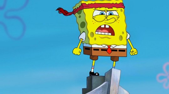
um..............meow?
He’s waiting…
24 notes
·
View notes
Note
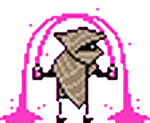
either high fashion for tommy coollatta or anxiety for dr coomer you can choose:]
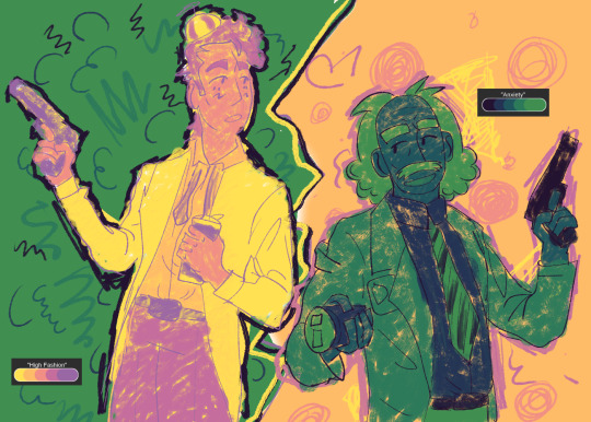
i couldnt decide so i ended up doing both, i hope you dont mind
they r friends :]
64 notes
·
View notes
Text
Kai parker/ chris wood × spongebob
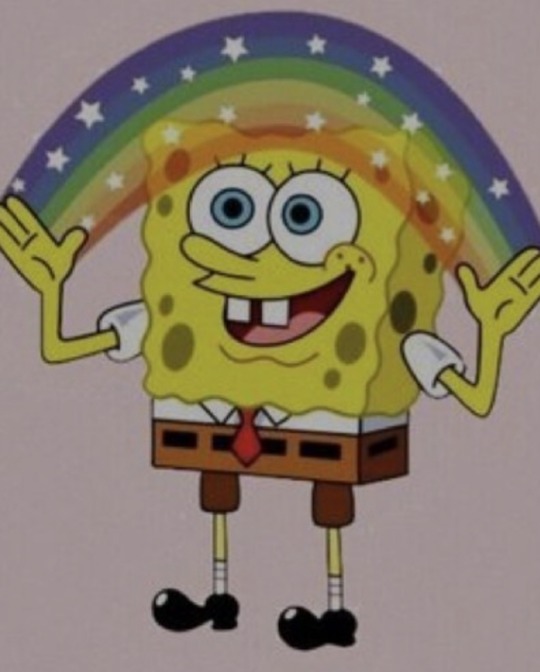
✋🌈🤚
#spongebob#squarepantz#kai parker#malachai parker#chris wood#the vampire diaries#the originals#the legacies#rainbow#christopher wood#season 6#gemini coven#witches#supergirl cast#mon el#nina dobrev#ian somerhalder#paul wesley#kat graham#candice king#caroline forbes#bonnie bennett#damon salvatore#stefan salvatore#elena gilbert#my posts
41 notes
·
View notes
Note
what are your opinions on the different artstyles throughout the seasons?
I'll go through each season!
Season 1 is my favorite in everything. There's no competition. I really adore his design. Tbh his character design changes a bit every episode in this season and I'm not going to go through which storyboard artist's style was in which episode. That's a hassle. But I like the pilot. It looks like Hillenburg's concept art. Looks very gummy and squishy. I like how odd his style looks. But I also like the more consistent style we see in Reef Blower, Valentine's Day, Hooks. It has a thick outline.
There's another style from season 1 where the outline is very thin. You can generally tell because his eyelashes are drawn very thin. I've seen in some episodes like FUN and ScaredyPants. It's a weird look that I kinda like. Though his toothgap is so wide that it looks like he's missing a tooth.
Season 2 - his design is more angular. The transition from traditional to digital shows. They don't have to constantly redraw each frame. Which allows for a more homogeneous design. I miss how each frame looked different but that's okay. His style is very sharp and square. Similar to the end of season 1. But a lot more stiff. He's more narrow around his waist so he isn't actually Squarepants. More like upside down trapazoidpants. Also idk if this is about early digital animation but Spongebob looks very gray throughout the season. Still I'd rate this my second favorite style because it has the best parts from his season 1 design.
Season 3 - hes more square here. A lot more yellow. Season 3 has the best colors. Hands down. He's even more square and sharp. Surprisingly his expression doesn't change much. Mostly because of Hillenburg wanting spongebob to always be drawn on model. But the charm of his design is how off model he looks and how every frame looked so unique noooo. Jokes aside, I know this design is what most classics fans consider the best design. It's paired with his personality in this season which was more of a young adult with occasional childish tendencies. He seems the most mature in this season. Seasons 1 and 2 is a lot more kid-ish in a way. Idk why this brings up a random thought of seasons 1-2 SB are how kids think they are vs 10-12 is how adults view kids. I'm getting off topic. This design leads to what we get in season 4.
1st Movie - very square. Pretty much doesn't have that narrowness towards the bottom like seasons 2/3 has. Now he's not trapazoidpants but actually Squarepants. I've noticed some of Hillenburg's sketches of spongebob post the movie era look pretty much like the movie. That off model, really square shaped look.
Season 4/5 - this style actually reminds me of the modern style. Very square and spunky. Only difference is he occasionally has black brows. I like it a lot actually. Look at this boi!! He's adorable!! One of the better styles. I'd rank it high up there.
Season 6 - slight transitional style. Between seasons 4/5 and 7/8. I don't have a particular opinion on it tbh. I guess I don't like what would later become his design for 7/8
Season 7/8/9a - ehhh don't really like it. I have a personal bias tho. I didn't like much of these seasons when I was a kid and I think that childhood bias is clouding my view. But anyways I'm gonna talk about why I don't like it. He's so stiff in these seasons. I feel like his expression doesn't change much. His nose is drawn wider, I don't like that chubby cheeks look he does.
This one. His arms are drawn so high up. He's very rectangular. His eyes are smaller. I feel so nitpicky but he looks so dead. I feel like my love for the later seasons is kinda reactionary towards these seasons since they feel so opposite to me. So extreme blankness shifts over to extreme expressiveness.
Season 9a actually gets better but it still has remnants of this design.
2nd movie - follows the style of season 9a which was already starting to transition styles to the one we have in the modern era but I will make a pass because this is my comfort movie. Sponge out of water my beloved.
Season 10/11/12 - love it. Adore it. One of my favorite styles. He's so spunky and definitely a lot more angular. A lot of people complain about the expressiveness. I'm not really talking about it here but uhh I do like it. With digital animation, its a lot rarer to have unique frames. Everything is so on model. It's a bit boring. I understand the expressiveness can be too much for some people but it does remind me of what I found charming about the first season. No frame looks exactly the same. It's so stretchy. It only doesn't have that unique gummy squishy look, reminiscent of Hillenburg's art style in his concept art but none the less I like it. Also something worth mentioning. Sponge looks more shorter throughout the seasons. He's not really drawn shorter but him being more rectangular throughout the previous era and here he's slowly getting more and more square.
I really like this picture. I love his expression so much??
3rd movie - I heard that storyboard artists from the 1st season worked on this movie. Tbh it shows because a lot of frames looks like those photoshopped CGI version of Sponge's season 1 look. This movie was stunning visually. I like the style a lot. We can see parts of his older design like the narrower nose, more narrow towards the bottom.
Can't comment on season 13 because it just started, wait for that lateeer
#I should mention kamp koral but i dont feel like writing it#Talking about main series spongebob#The rest is for another day#Squarepantz#Hope ya enjoy!#spongebob#spongebob squarepants#sb#spongebon squarepants#the spongebob connoisseur#spongebob meme#Ask
46 notes
·
View notes
Note
🏳️

WAHOO!!!!! No color meanings aside from yellow for spoingbubble <3
#THOSE COLORS R LIKE. WHEN I THINK OF U I IMMEDIATELY THINK OF THOSE COLORS#asks#squarepantz#tw eyestrain
11 notes
·
View notes
Note
🏳️
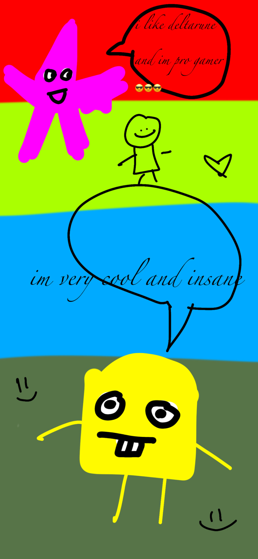
my sister said that bright red and lime green represent insanity so i chose that, i did blue because i think you like lancer, and i did sage green bc its my fav color and ur a cool mutual😎😎 also i think that your very good at gaming, so i added gamer patrick💗💗 and i added a littol dude in the middle bc why not!!!!!
#cw eyestrain#eyestrain#btw i dont mean insane in a derogatory way#asks#ask game#squarepantz#friend tag!
9 notes
·
View notes
Note
yelloo pink
Hiii omg hi ^v^ pink & red &yellow & white
#ask response#spongedyke#squarepantz#<-i think the last time u sent me an ask that was yr url so tagging as that for . continuity or smthing
2 notes
·
View notes
Note
Oh my god waywaad vagabobo pfp ⚫_⚫
vagablorbo from my webcomic
2 notes
·
View notes
Note
🍓 hi 😎
ISOOOOOOO HII
REALLY COOL ART AND AMAZING TASTE IN AESTHETICS!!!!!
2 notes
·
View notes
Note
💌
spongebob, deltarune, dandelions, drawing on your hand, childlore
mutuals send me a 💌 and i'll tell you what i associate you with
2 notes
·
View notes
Text
8 notes
·
View notes
Note
“Swag”? Isn’t that just something that TUMBLR USER MNTDEW invented?
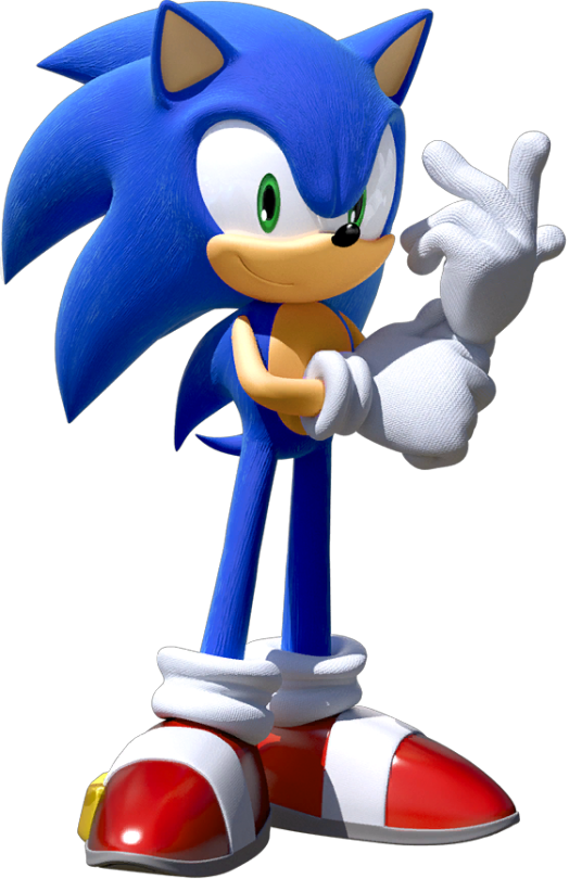
Read this in sonic voice bc of the image and REALNESS I did invent it thank you for noticing 😏
17 notes
·
View notes
Note
HI jade havent talked to you in a while 😁👍 how you doing
I'm doing great :)
Thanks for asking
2 notes
·
View notes
Note
I forgot if it was you but if it was do you remember that gif editing website you sent a while back it was fun :]
YEAH https://aidn.jp/ygif/ right ? love it sm
2 notes
·
View notes
Note
WAIT CHARLIE SINCE I HAVE UR DISCORD WE COULD WATCH NEWSIES SOMEDAY if u want :3
HOLY FUCKIFN SHIT YORUE RIGHT. ISO YOUR MIND
#dont let me turn on my mic though or ill be doing happy vocal stims AND quoting just about every line AND infodumping about tiny details.#BUT YES THAT WOULD BE LOVELY WE SHOULD TOTALLY DO THAT SOMETIME :D#asks#squarepantz
7 notes
·
View notes
Last Seen Blogs

baureihe185
Baureihe 185
fizzygreenlimeade
Twinkle Twinkle

kaeostudios
Kaeo Studios
cyclediscovery-blog
cyclediscovery
