#the cinematography!!!!!!!!!!!!!
Text
comics as an art form make me insane. they’re so difficult to do well. there’s so many different ways to make sequential art work and most of them are deeply unintuitive. onomatopoeia that feels completely ridiculous to put down often reads seamlessly. panels on a page become a fractally nested image composition challenge that’s only possible to lose because if you do a good job no one will notice. you have to direct the readers’ eyes on a specific path across the page but also account for the fact that they won’t follow it. comic time isn’t linear. if the order of events isn’t crystal clear the story becomes incomprehensible. sometimes you need to do this on purpose. all this for a medium almost universally considered less effective than animation and less respectable than plain text. even its own name doesn’t take it seriously
#don’t mind me just chewing on drywall#some of the absolute best comics don’t look remotely impressive until you try to make one yourself#and some absolutely beautiful panel layouts and art combine to make a stunning visual that barely manages to get any meaning across#you have to emulate cinematography by cultural necessity at this point#but if you lean too hard in that direction your comics just become Worse Movies#there’s barely any standard practices for anything because people are just barely starting to look at comics seriously#mumbling
29K notes
·
View notes
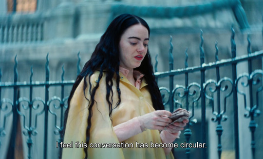
Text
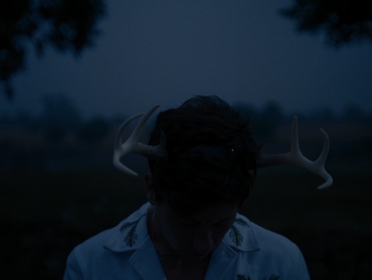


Saltburn (2023) dir. Emerald Fennell
#saltburn#emerald fennell#barry keoghan#jacob elordi#alison oliver#archie madekwe#ewan mitchell#rosamund pike#carey mulligan#richard e. grant#film screencaps#film stills#films#screencaps#cinematography
13K notes
·
View notes
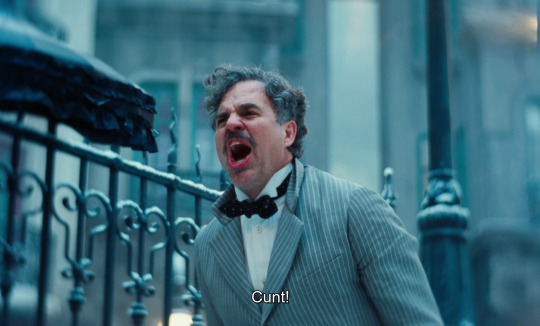
Text

#girlblogger#girlblogging#girl blogger#vintage moodboard#lana del rey#vintage aesthetic#vintage#cinematography#maladaptive daydreaming#girlblog#just girly things#dollette#coquette aesthetic#female hysteria#gaslight gatekeep girlboss#coquette dollete#coquette girl#coquette#doelette#dollcore#manic pixie dream girl#this is what makes us girls#lana del rey aka lizzy grant#lana del ray aesthetic#lana del ray aka lizzy grant#female manipulator#female rage#divine feminine#femcel#girly stuff
7K notes
·
View notes
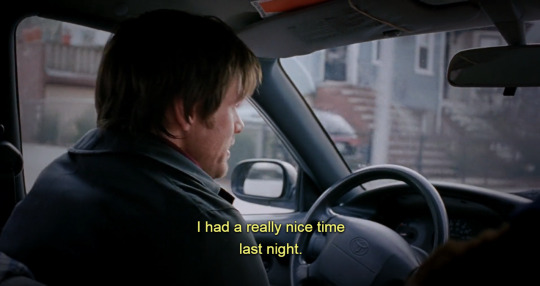
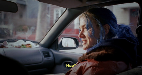
Text
I love how TLOU HBO uses colors…
Before Sarah dies the colors are a lot warmer, a lot “kinder”, almost


But when she dies, and it transitions to present day, the colors get colder. More stark.


But Ellie’s colors are warm
And you see that contrast…

…then you see their color schemes come together

#PaigeGoneAnalysis#the last of us#tlou#the last of us hbo#tlou hbo#joel miller#ellie williams#joel tlou#ellie tlou#joel and ellie#ellie and joel#the last of us analysis#tlou analysis#tv shows#tv show#cinema#tv#television#cinematography
4K notes
·
View notes
Text
Poor Things (2023)
dir. Yorgos Lanthimos
#poor things#emma stone#mark ruffalo#willem dafoe#film#stills#film stills#caps#screencaps#screenshots#filmmaking#filmedit#cinema#dailyworldcinema#cinemaspam#cinephile#cinematography#bella baxter#2023#duncan wedderburn#godwin baxter
5K notes
·
View notes
Photo
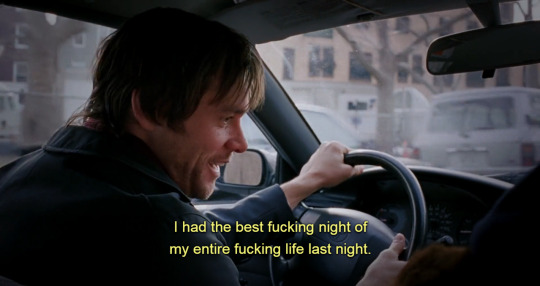

Eternal Sunshine of the Spotless Mind (2004)
#eternal sunshine of the spotless mind#jim carrey#kate winslet#movie#movies#film#movie quote#movie quotes#movie scene#movie scenes#movie line#cinematography#vintage#retro#quote#quotes#sayings#love quotes#life quotes
5K notes
·
View notes
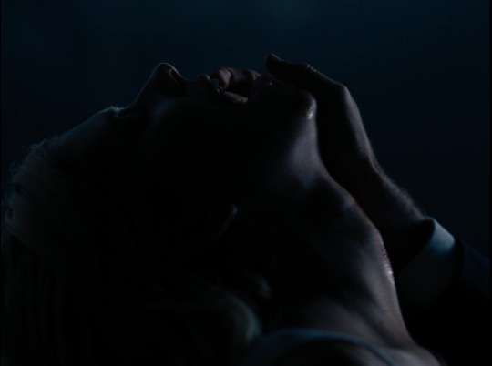
Text

Eyes Wide Shut (1999) dir. Stanley Kubrick
5K notes
·
View notes
Text


realized that both the beginning and the end of the happy paris stage of Loumand's relationship has this same contrasting orange to blue/green color scheme. and like. the visual metaphor of Armand literally leaving his cold, lifeless world behind him and choosing the bright, golden warmth of life with Louis instead of killing him like he was supposed to in that tunnel. but as soon as he chooses the coven over Louis, he separates from the warmth like oil in water that was never supposed to be there. and now he's back out in the cold. I'm normal about this, btw.
#armand's look in the restaurant scene is going to haunt me foreverrrr too#he just found out louis genuinely does care for him and even started to move on but the play is literally already written and rehearsed#anyways...I love cinematography#yellowjackets does a lot with orange vs blue too it's become a favorite coloring trope of mine#it's visually more fun than just light vs dark and works well for horror too#iwtv#iwtv parallels#iwtv season 2#iwtv spoilers#interview with the vampire#armand#louis de pointe du lac#loumand#iwtv meta#.txt
3K notes
·
View notes
Text
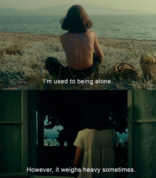
One Sings, the Other doesn't (1977)
#cinephile#cinematography#cinema#movie quotes#movie stills#movies#movie art#movie aesthetic#film and television#film art#film aesthetic#film and tv#film analysis#films#asthetic#sadcore#aesthetics#movie scenes#film stills
2K notes
·
View notes
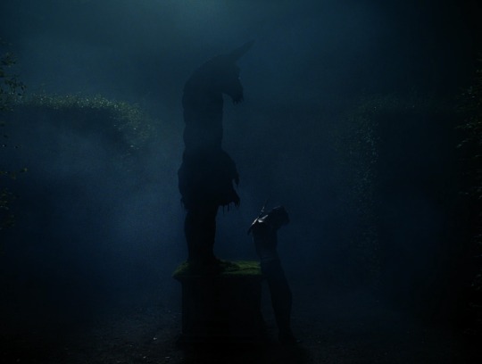
Text

The Adventures of Baron Munchausen (1988)
11K notes
·
View notes
Text


The Devils (1971) by Ken Russell
2K notes
·
View notes
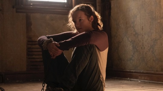
Text
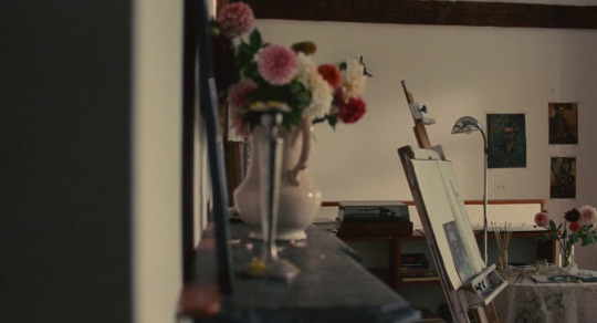
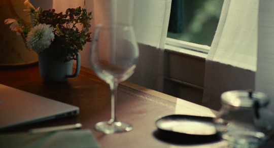

Past Lives (2023)
Dir. Celine Song
Language: Korean, English
#past lives#2023#english#korean#celine song#greta lee#teo yoo#john magaro#korean cinema#female directors#movie screenshots#movie screencaps#film screencaps#cinema#film screenshots#cinematography: shabier kirchner
8K notes
·
View notes
Text

Taylor Russell photographed by Luca Guadagnino, 2022 🦴
#bones and all#blue velvet#films#cinema#movies#luca guadagnino#david lynch#taylor russell#aesthetic#film#cinematography
11K notes
·
View notes
Text

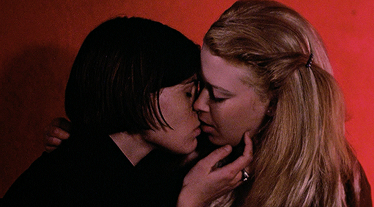
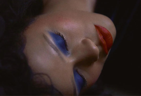
BUT I'M A CHEERLEADER (1999) dir. Jamie Babbit
#but i'm a cheerleader#natasha lyonne#clea duvall#cinematography#letterboxd#cinephile#cinema classics#90s movies#aesthetic#vintage#photography#lesbian#lesbian pride#classic movies#filme
4K notes
·
View notes
Text


I Saw The TV Glow (2024) | dir. Jane Schoenbrun
#i saw the tv glow#jane schoenbrun#justice smith#brigette lundy paine#films#movies#cinematography#screencaps
2K notes
·
View notes
Text
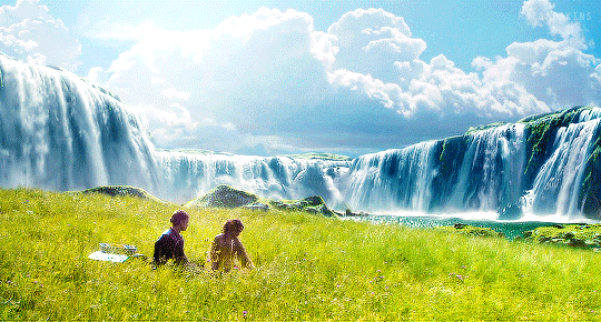


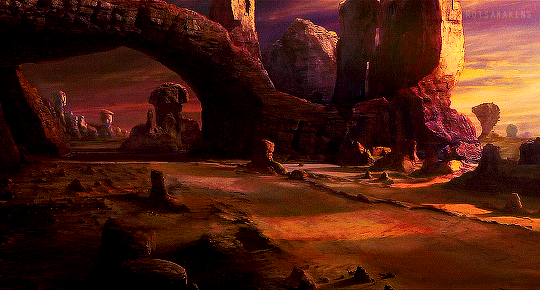
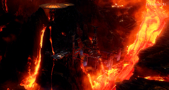
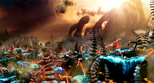
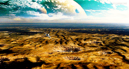
STAR WARS PREQUELS + SCENERY
Cinematography by David Tattersall
@pscentral event 27: scenery
#swedit#starwarsedit#star wars#prequelsedit#prequel trilogy#userlumi#starwarsblr#*mine#*2024#*gifs#[cinematography]#pscentral events#I was originally gonna do pt filming locations but the photos and the shots wouldn't line up rip#these movies are soooo pretty#1k
2K notes
·
View notes
Last Seen Blogs

robertkday
Robert K. Day

smritimandhanaclub
Smriti Mandhana

comtechno2603
Computronics Techno

saintz
Saintz

role-of-a-lifetime
Stay With Me