#the extra sketches are usually added to the manga
Text

love this update’s extra sketch, the vibe is chef kiss
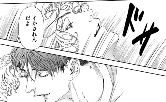
#the extra sketches are usually added to the manga#as in between chapters you know what i mean#i wonder if this one would be too#it looks more like a front page tho volume or title page chapter#although the chapter was not about him#anyway#mokumoku ren artbook when?#hikaru ga shinda natsu#the summer hikaru died#hgsn official art
26 notes
·
View notes
Text
Thoughts on Episode 120 (S6 E7)
Protective professors, growling giants, and Miss Midnight. Let’s talk about it
Spoilers for the episode. No manga spoilers but like, if you know you know
This episode was SO GOOD holy crap. They even put the scenes of the families going about daily life! I’m so happy!
Makes me wonder what happened in the writing room lol. “Yeah so everything we cut last season ended up being important so we’re just gonna not do that ever again”
Actually a lot of this episode was like… scarily manga accurate. There were so many scenes where I could tell the exact panel it was adapting because it was THAT similar. It’s not necessarily bad when an episode doesn’t do this, I just thought it was neat. And idk why but I noticed it with this episode specifically
However, I did not need to see buff Gran Torino. That is something I could have lived without
The entire fight with Shigaraki was chilling. “Little brother” BROOOOO
“Let’s do this rationally” BAKUGOOOO
Ugh everything was so good
I think the way they adapted Aizawa thinking of his students was done well. I know the manga has him shouting with all their pictures in the background, but when you switch mediums sometimes visual tricks like that don’t work anymore. This was a clever interpretation
“The worst thing would be losing Mr Aizawa!” HELL YES! In this house we love and respect Mr Aizawa!
They! Added! The! Dadpress! Scene! My life is complete. My skin is clear. My crops are thriving.
(For anime onlies who didn’t know, that scene was a messy sketch included as a volume extra. Horikoshi wanted to put it in the series proper but ran out of space)
Dabi floating away when Gigantomachia grabbed Compress is the funniest thing I’ve seen all day. I love it so much
That said, I did always think Dabi was running to Skeptic rather than casually sauntering around, but that’s how the anime usually characterizes him lol (see episode 2 of season 6). Still a good interpretation of the scene, I’m just glad they included it at all
Also… Dabi… do you maybe want to rephrase what the FUCK you said? Like manga readers know what’s going on (and a translator is technically the one who picked the words) but still… there’s gotta be a better way to phrase that lmao
Also also I like the implication that after Skeptic’s office melted into nothing, he just crouched on the ground and kept working. Big mood
Wow Geten and Re-Destro are so cool! Sure is a shame half their characterization got axed last season (I’m sorry, I’m still salty about it)
Midnight pretty, brain go burr
Lol remember when that Midnight scene was in the trailer and even MHA haters were simping for her? Good times
Speaking of Midnight, I was hoping we would actually see her fight. In the manga it all happens off screen, so I thought maybe they’d add it in. It’s possible we’ll see it in the future, I guess, but it would have been kind of nice to see even a little now
It hurt seeing her all beat up though :(
Overall? Really solid episode. 10/10. I wasn’t expecting this episode to be anything particularly special but it was such a pleasant surprise! I loved it!
8 notes
·
View notes
Text
welcome! this is a blog where i'll post things relating to my aus as well as take writing (and sometimes art) requests. below cut are some guidelines and links to certain tags.
What can I request from you?
You can request both art (Examples in art tag.) and fanfics (Examples in fanfic tag)
For those requests I'm fine with near anything being asked of me, including nsfw. If something comes up that I will not create for, like proship content, I will say so when it arises. Fanfiction will usually be created faster than art pieces, which often may be sketches, so keep that in mind when requesting.
Examples of requests: "Can I see Nyota Riddle Rosehearts?" "I would like a fanfic about Trey x Cater in cookie run au" "Can I have Mary from IDV x Fem Reader?"
What fandoms do you create for?
Fandoms I do are Twisted Wonderland (I will default to the game canon, but I will do novel and manga canons if asked), Identity V (Including specific essences), Obey Me (Especially Nightbringer), Project Sekai, Vocaloid, and Cookie Run (Ovenbreak and Kingdom)
More fandoms may be added later but this is all for now.
I want to know more about certain aus you have.
I love talking about aus so if you have a question about one or even would like to just talk about it send an ask! Certain times I may answer an ask by having a character from the au respond.
If you'd like character interaction specifically you'll need to request it like, "Emma (ivory raven tower) what do you think of Crowley?" which will get you an answer directly from the character you asked for, much like a character askblog.
You can also request fanfics/fanart involving the aus if you'd like to see certain things in specific.
The general au tag is here
The Current Aus I have are:
Ivory Raven College
Overblot Identity
Prototype Wonderland
Tweels of Evil
Extra Links:
Mod Introduction
AO3
Tag for unthemed posts
Tag For Masterlists
#idv#identity v#obey me nightbringer#obey me#twst#cookie run#project sekai#vocaloid#twisted wonderland#saintess speaks#pinned post
2 notes
·
View notes
Text
10 Dance Vol. 6 Special Edition overview
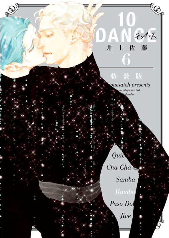
Volume 6 of the 10 Dance manga was released in Japan on March 18th, 2021. As with volumes 4 and 5, there are both regular and special editions available. In this post, I will provide an overview of the release, including observations on changes that were made to the chapters compared to how they were printed in the magazine, plus summaries and select scans of content from the special edition booklet.
It is often the case that when chapters come out in the manga magazines, they aren't always fully polished, and since I became highly familiar with this run of chapters from the summaries I made, several things immediately jumped out at me as I went through the book. First of all, though chapter 29 was split into two parts and released in subsequent months in the magazine, these two halves were combined into one chapter, with no indication they had ever been separate. I assume that they were always intended to be one chapter, but since the full chapter was not completed before the deadline (and it was a month when 10 Dance was being given the cover image, so not possible to delay its release), it was simply split over two months instead.
For visual changes, the most common alteration was scenes that originally had little or no screentone having it added in:
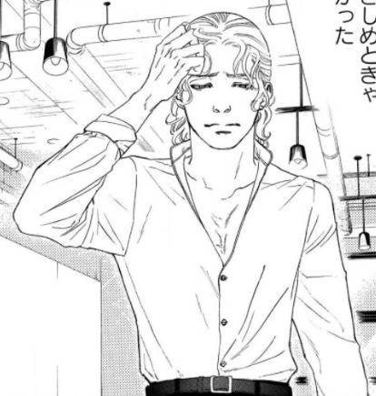

There were also some instances of either slight panel redraws, or complete replacements with new panels. None of these were from particularly important scenes, so it could just be Inouesatoh or someone on her team didn't like the look of the original panels and wanted to change them. The following example has a bit of both, with Suzuki in the upper left corner being replaced, and his eyes being redrawn in the lower panel:
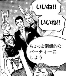
Personally, the most amusing addition I noticed was when Max was thinking about throwing a party. Originally, we didn't see what he was envisioning, but in the volume, an addition has been made in the background: the New Year's piece Inouesatoh drew with sexy men dressed as cows, except now they're bunnies!

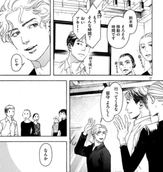
As for dialogue, it appeared to be almost the same in both versions throughout. Some minor exceptions include a spot I found where the dialogue was put in a different order, swapping Sugiki’s lines between this panel and his first line on the following page (in addition to another altered panel example):

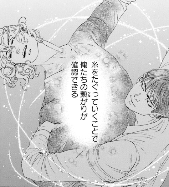
As well as in this shot of Suzuki describing how they tug at the thread that connects them through their dance. Whereas before it put the word “dance” next to the part about tugging on the thread to specify what was meant by that, it was deleted in the volume. And while it was originally described as “affirming that we’re connected”, this was also tweaked a bit to be, “affirming our connection”.

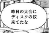
There were a couple instances of character names being different from when they appeared earlier in the story. In this volume, two characters who were last mentioned back in volume 2 (Lucas Calvo, one of the champions at the table in Blackpool, and Deeks, who Ernie said hated Sugiki because he "stole" his girlfriend), either from typos or intentional changes, weren't the same as before. Lucas' last name was written with a 'g' sound (ガルボ) instead of a 'c' (カルボ), and this change carried over to the volume. On the other hand, Deeks' (ディクス) name got transposed as Disc (ディスク) in the magazine, but was fixed in the volume.

There was a typo that unfortunately made it through to the volume (but could perhaps be fixed in future printings). In chapter 34, when Norman is testing Suzuki's skills, he flashes back to Sugiki taking the national title from him several years earlier. The text in this scene, written in English, incorrectly states that Suzuki won the championship, rather than Sugiki.

The volume also includes the usual additions that are not present in the magazine, such as the under the cover flap comic, and Inouesatoh’s notes about each chapter.
The cover flap comic (which looks very much like a sketch, compared to previous ones that have had more complete art), features the Shinyas during a practice session earlier on in the series in December, where Suzuki complains that Sugiki’s Latin just isn’t sexy. Sugiki suggests that he can practice being sexy by wiggling his butt around to write a message in the air. Suzuki worries that if he starts writing out “love” or something, he’ll have to run away and escape. Sugiki gets started, and Suzuki calls out each letter that he can make out from his elegant butt bouncing. After figuring out he’s written “M-E-R-R-Y”, Suzuki guesses that he’s writing “Merry Christmas”. Sugiki gets mad that he said it aloud before he finished writing his message, and says he’s going to leave. Suzuki says, “Wait, I love you,” as narrative text says that this somehow turned into a love story in one panel.
And here are some tidbits I found interesting/amusing from the chapter notes:
She thinks readers who are fans of pecs will like Saichi.
She’s not sure if readers will love Max or hate him, but she personally likes him (sorry Sensei, I kinda hate him lol)
As of chapter 32, a portion of the art is now done digitally.
The epic “last dance” scene from 33 was something that she had planned since the beginning of the series, and it ended up being 8 times the cost for a typical chapter.
Special edition booklet:
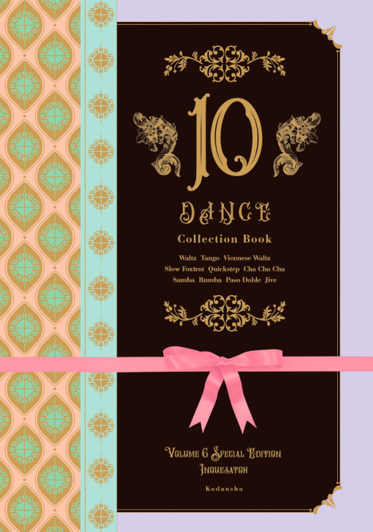
The special edition comes with a 48 page hardcover booklet that includes a variety of different extras, divided into 8 sections called “heats”.
Heat 1 is a newly drawn, 12 page parody manga. Back in September 2020, Inouesatoh put out a request on Twitter for fans to send in their suggestions for an erotic side story. Putting the characters in a high school setting was the most requested scenario, so she chose this idea as the basis for the story. The title is “And All That Jazz” (the premise makes this somewhat confusing to summarize, so keep in mind that I’ll mostly be describing their actions based on the soul rather than the body, but will use quotation marks if it’s about other characters and who they think they’re addressing. It’ll all make sense, I promise...I think :P)
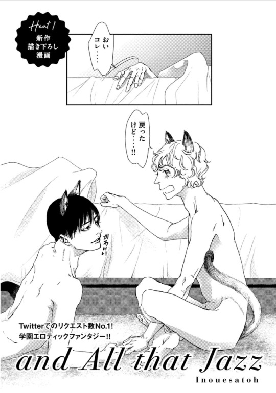
(The title page actually depicts the ending of the story, so I’ll come back to it later). It starts with Suzuki narrating his introduction, saying that he’s a transfer student to the Standard Academy. He really doesn’t get along with a guy named Sugiki, but for some reason, the two have now switched bodies with each other. Sugiki opens his shirt and inspects his new physique in front of other students, as Suzuki yells out asking what the hell he’s doing to his body. They look at themselves wearing each other’s expressions, Sugiki seeming surprised his mouth can gape open like that, and Suzuki wondering what happened to his body’s facial expression muscles. The bell rings and Sugiki heads off to class, as Suzuki is baffled that he can act so calm about this.

Sugiki perfectly reads a passage aloud in English class, something everyone (including the teacher, who looks like Norman) find unusual coming from “Suzuki”, as they wonder where his usual hearts are. Suzuki makes the decision to enjoy living as Sugiki for a bit, and is shown getting flirty with several girls. He notes that the more serious personality in his regular body is also strangely popular, though with a very different crowd.
A student named Alberko (Alberto in a girl’s uniform) shows up and says that “Sugiki” was supposed to have lunch with her(?) today. Suzuki says that he thought Alberko was going out with Dorou (a masculine alteration to Dolores’ name). Ernie and Suzuki watch as his harem falls apart with Alberko running amok. Ernie comments that both “Sugiki” and that transfer student have been acting weird all week, and he asks if something happened. Suzuki internally reflects back to one week earlier, when he was relaxing in bed in the infirmary. Sugiki comes in and accuses him of skipping class, and Suzuki tells him to mind his own business. He thought this would turn into one of their usual fights, but he can’t believe that actually happened instead...

After school, Sugiki asks Suzuki if they can go home together today. As they’re walking, Suzuki asks if Sugiki realizes what it was that made them switch places, and Sugiki says he does. Suzuki says that in that case, they know how they need to fix it, and they should go over to his house. Sugiki asks for clarification of whose house exactly he means by that.
As they start to get undressed, Suzuki says that he always thought his mom and sisters were annoying, but after a week apart he really misses them. Sugiki promises that he’ll make sure he can see them soon. Suzuki claims that he’ll be the one making Sugiki come, and Sugiki asks how he can talk like that when he was the one who looked like he was about to cry when Sugiki first touched him in the infirmary.
Sugiki peeks into Suzuki’s pants and wonders if he won’t get hard unless he touches him. Suzuki thinks it’d be weirder if he could get hard while looking at his own face, and wonders if Sugiki has AI in his crotch or something (Sugiki contends that it’s not his body). They fool around with each other until they finish, and Suzuki wonders why they didn’t change back yet. Sugiki suggests that maybe it needs to be just like the last time to count as a complete set, when they went at it until they fell off the bed, so both agree that they need to go for one more round. This then ties back to the title page, where they’ve finally managed to get back into their old bodies, but have now sprouted cat ears and tails.
Heat 2 of the booklet is 8 pages long, and contains short comics and illustrations that were not previously included in the volume releases. The comics include “How to 10 Dance”, a one-page comic with the Shinyas demonstrating the tango. Their privates end up touching, and Sugiki seems highly amused, gleefully asking Suzuki how it feels. Suzuki says that he was the one who got all bent out of shape over that back in volume 1, and tells him to lay off the sadist mode since they’re not dancing Latin right now. The second comic is “2nd Step”, and shows a glimpse of how the Shinyas were with each other after Suzuki gave the go-ahead for kissing. In fact, Sugiki ends up kissing him so much that Suzuki’s lips get sore and swollen. Sugiki then tries to kiss his neck as an alternative, but Suzuki’s not having it. The third comic depicts Suzuki’s first time in a public bath, where he realizes that Japanese people aren’t fully shaved everywhere like he is. Some of the old guys talk to him and slap their balls with their towels, and Suzuki, seeming a bit confused, gives his own balls a slap, too. After the comics are a selection of illustrations that were never used in the volumes, including this one from a Real 10 Dance event in 2018:

Heat 3 is 18 pages, and contains a variety of colored versions of both chapter covers and scenes from the manga, a couple of which I’ll share below:

Heat 4 includes 3 pages of insight from the professional dancers who consult for the manga, in which they explain the moves shown in specific panels.
Heat 5 is a single page look at Inouesatoh’s work space.
Heat 6 is 3 pages worth of advertisements that have been used to promote the series, including things like ads that were posted in subway stations:

Heat 7 is a single page look at the storyboard for chapter 1 of the manga.
Heat 8 is a single page showing the covers for foreign editions of the manga (Taiwanese, Korean, North American, and French).
Finally, there’s one last page with a thank you message from Inouesatoh, including an absolutely precious illustration of the Shinyas in happier times.
And that’s that! This really is an incredible release, and I’d definitely recommend picking up the special edition if you can. CD Japan offers direct international shipping, and I’ve also seen that Kinokuniya lists it as “available to order” currently (though they don’t appear to have stock on hand, so might take longer).
33 notes
·
View notes
Text
My Review of Arte
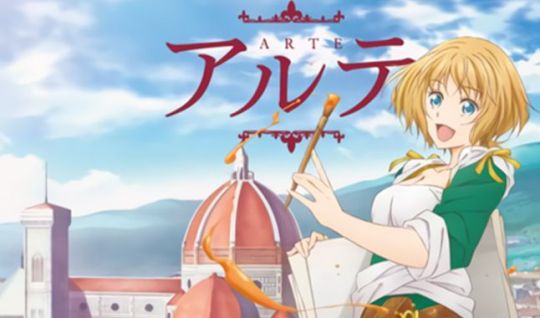
How did I get into this anime? Well, I had a few slots open for the spring 2020 anime season! Let’s read what this anime is about.
A girl during the Renaissance era in Florence, Italy wants to be an artist…
*ADDS THIS IMMEDIATELY*
I really don’t want to be disappointed with this. I have a horrible habit of adding animes where the main concept has to do with the art world. And have it go wrong when the anime is too boring or not enough love is given to it. But maybe this will go well! The manga is already getting high marks and praise. And for being a history piece, it got picked up rather quickly from a big anime licensor in the west.
Arte comes from a noble family and her family has plans for their daughter. It’s just that Arte is heavily into…well…art. They’re fine as long as it’s only a hobby, but it’s getting a little out of hand for Arte’s mother. Arte wants to become an artist! BIG problem! This is Italy during the Renaissance era. No women artists! But Arte persisted by asking all around to become an apprentice.

The only man to even give her a chance was an artist named Leo. After testing her endurance, he allows her to become his apprentice. Arte’s life is officially changing as she throws away her nobility to draw and paint.
BETWEEN THE SUB AND THE DUB: FUNimation grabbed this anime. Surprisingly, they didn’t give Arte a simildub. Quite possibly because this was one of those newer animes that arrived during the COVID-19 nightmare! Or they didn’t want to fuck with Italian accents this time around! The sub had a nice mixture of veteran and newer seiyuus. Color me surprised when I heard Rie Tanaka’s voice again near the end of the series. Here’s what you might recognize these folks from.
*Arte is played by Mikako Komatsu (known for Mairin on Pokemon XY, Seishirou on Nisekoi, Susamaru on Demon Slayer, Wy on Hetalia, Eternal Feather on Soul Eater NOT, and Tori on YGO Zexal)
*Leo is played by Katsuyuki Konishi (known for Kamina on Gurren Lagann, America on Hetalia, Tsumugu on Kill la Kill, Laxus on Fairy Tail, Tanaka on Durarara, Fuegoleon on Black Clover, and Arima on Tokyo Ghoul)
FAVORITE CHARACTER: Arte! This girl wants to pursue a career in the arts and will do whatever it takes to do so. She defies her mother’s wishes, cuts her long hair, almost cuts off her breasts, did all the impossibly difficult tasks other apprentices could never do, and so much more. You have to admire this crazy, little lady.

SHIPPING: In episode 3, Arte started feeling that light and fuzzy feeling many of us feel when we “fall” for someone. And she started to feel funny whenever she was around Leo. This would be fine and dandy except for a few issues. For one thing, Leo is her boss and she’s his apprentice. Best to keep things professional! Secondly, during this period in time, Veronica does have a point. It’s best that if you want to achieve in your craft in a man’s world, it’s best to stow the romance bags to the side. After that bag of reality was dropped on Arte, she mostly focused on her art work and no romance was ever brought up again.
Although, I do have an inkling about Yuri having the hots for Arte! But I know my girl Arte here don’t have time for this boy’s bullshit!
LEO AND ANGELO: No, this isn’t a shipping debate. Actually, there are fans of the show speculating if these two characters are in fact the famous artists Leonardo da Vinci and Michelangelo. Come on now, this story is absolute fiction with a few true details here and there. Yes, we still don’t know the full name to Leo to prove that he could be the fictionalized version of the real-life artist and the anime never once put up an advisory at the beginning of every episode saying that any character that’s similar to real-life people is purely coincidental. But it’s possible that these two could very well be those very artists. Both da Vinci and Michelangelo were living Florence around the same time. I’ll chalk this up to you history buffs and conspiracy theorists out there. I choose to believe the creator of Arte just used the names of these artists and that’s that!
ENDING: During the 7th episode, Arte is given an opportunity to go to Venice to become a tutor for a handsome man’s niece and to paint a portrait of his sister-in-law. At the time, Venice was seen as a staple in the art world (despite Florence’s rich history that we know today) and this would be a perfect time for Arte to spread her wings. I mean, she won’t be an apprentice under Leo forever, right?! Yeah, Leo’s words to Arte before she left for Venice played around her head a lot during her stay in Venice. Saying that it’s okay if she chooses to stay there longer than six months or even stay permanently!
During this time, Arte was able to find ground with this difficult child (Catalina) that she must tutor as these two do share something in common. Both girls have a certain passion that they want to hone as their own, but can’t due to family forbiding it, status in the world, and even gender. Arte did so much to get where she is now including disobeying her mother by leaving home and try in a profession that’s mainly for men. Arte was unable to do much with her relationship with her family (especially after her father’s death), but she was able to help Catalina and her mother with theirs and even hope for a future where Catalina can see a boy she likes again.
As we near the end of this series, we find Arte still wondering about her future. She’s still seen as the rarity as being a woman of nobility entering the art world when that profession is usually done by people seen as lower than nobles and majorily male. Plus, what Leo said before setting for Venice keeps replaying in Arte’s mind. It’s true that this time Arte has spent in Venice with Sofia and Catalina was life-changing. And Yuri ended up asking Arte to stay with the family permanently. Meanwhile, Leo is noticing that maybe, just maybe, he’s missing Arte. That or he’s annoyed by all the people in Arte’s circle bugging him.
In the finale, Arte has reached a conclusion on where she’s going to go after finishing up Sofia’s portrait. She got some decent advice from one of the apprentices she met in Venice. That Arte should use her nobility and gender to her advantage in a male dominated profession. Okay, he didn’t exactly say that, but you get what I mean. There’s a certain softness to Arte’s work that’s not seen with many male artists. She should continue doing what she loves despite what others may say or think.
So in case you’re wondering, she turned down Yuri’s proposal of staying with Sofia and Catalina full-time. She’s going to head back to Florence and continue as Leo’s apprentice. Yeah, Catalina is pretty upset by Arte leaving after spending over six months with them. But they promised to keep in touch with letters. Upon Arte’s return to Florence, she learns about Leo doing a special mural for the Easter holiday. But Leo got ill and has been bed-ridden for days.

Arte steps in and takes over the mural so that it could be completed in time for Easter. With a little help from her friends like Darcia, Angelo, and Veronica, she was able to complete it. And just in time for Leo to emerge to give his critique on Arte’s work. As usual, he told her on what she should have done, but acknowledges that she has definitely grown as an artist during her time in Venice and is happy to see her again. Surprisingly, that wasn’t the only shocking moment of the finale.
Arte’s mother was there for the unveiling of the mural and actually praises her daughter. I guess she’s come a long way from the first episode where she burned all of Arte’s drawings. So yeah, girls can be more than just bargaining tools for marriage or becoming nuns. So Arte’s going to continue working under Leo and we end there.

I can already tell you that many people were not digging this anime, but I liked it. But again, painting is my thing. And being a female, I’m drawn to stories of girls trying to overcome prejudice just because of their gender. Even when studying art in school, most pieces that were covered in the curriculum were majority (if not, all) male. Well, unless I took a class with a supremely feminist teacher, we would not learn anything about female painters. And if we did, it would just be for like one day or one week out of the semester before we get to the well-known names like Van Gough, Pollock, and Monet.
By the looks of it, Arte doesn’t look like it’ll get any kind of continuation. I know that the manga is still in publication and maybe if that ends we might get something extra. But I wouldn’t hold my breath on that one. Even FUNimation didn’t bother giving this an English dub. Then again, this aired during the height of the COVID pandemic (in Japan) In fact; it was one of the very few animes in the spring season that never took a week off due to COVID. I would like to see what happens to Arte in the future. Like if she ends up with her own workshop or if she takes over Leo’s place when he retires. It’s fun to think of what happens and I might just one day pick up the manga to see if any of that actually happens. Due to my particular love of painting, I’m going to recommend this series regardless. And while you’re at it, check out some other series like Honey and Clover or Hidamari Sketch.
If you would like to watch this anime, FUNimation and Hulu have all 12 episodes available for streaming.
1 note
·
View note
Text
March 28th-April 3rd, 2020 Creator Babble Archive
The archive for the Creator Babble chat that occurred from March 28th, 2020 to April 3rd, 2020. The chat focused on the following question:
How many hours do you work on your comic per week, and how do you manager to balance that with other responsibilities?
Holmeaa - working on WAYFINDERS
heheh So we are.. cheating a bit Both me and my coworker are unemployed, and is working on hour comic, like was it a full time job. It is our passion project, and dream that we can work and live of makeing comics. In Denmark you can apply for grants from the government, but you need to have releashed a book before that is possible. We are useing the comic, to show potentional clients in the future what we can do. For now we are working on it from 09:00-17:00 ish (with a long lunch break) while applying for other kinds of grants, and also does all the things we are supposed to to get our unemplyment money, and searching for jobs, and freelance gigs, gathering the courage to start our own small company (not right now though) and yeaah time will tell
carcarchu
@Holmeaa - working on WAYFINDERS that doesn't sound like cheating to me? more like using the tools at your disposal to turn your passion into a viable career
Holmeaa - working on WAYFINDERS
hehe it feels a little like cheating! there are some debates about if it is okay or not, but we think that strengthening our skills is a good use of our time
eli [a winged tale]
Haha also not cheating! It’s great you’re using the time to chase the dream I’m curious what’s your breakdown for those time working on the comic? As for me, usually 1-2 hours a day with a bit more on the weekend if time permits. These days with the quarantine it’s about 2-3 h a day
DanitheCarutor
Since I'm unemployed until who knows when I've been working on my comic between 40-50 hours a week about 6 to 7 days a week... most weeks. Some days, like update day or chore day, I hardly work on the comic or don't work on it at all. Admittedly I'm not the best at balancing drawing with other responsibilities, sometimes I get so into it that I forget about daily house chores, other weeks I do the opposite and only do house chores which makes me totally behind of comic stuff. I can't seem to find a good middle ground, it always turns into completely focusing on one or the other.
eli [a winged tale]
Yeah when I get in the zone, time flies and life gets put to the wayside
shadowhood (SunnyxRain)
So I have no school or work, so the webcomic has become almost a fulltime project for me
I average about 10 hours per day working on it, not counting on chores and exercise
Another thing I worry about is the possibility of carpal tunnel syndrome, which is why I've been relentless with exercise, too
I guess it's just a combination of relentless reminders and also sheer willpower that gets me to do other responsibilities haha
@eli [a winged tale] also I know that feeling
Joichi [Hybrid Dolls]
So since my school had to cancel, I have to be more responsible for my online course. Sometimes I give myself 2 days off each week to work more into my upcoming webcomic but I have to switch my mind for school work, online classes. Also extra time for food. I need to get back into exercise or I feel exhausted more easily. I keep a wall schedule so that I make it a routine to write what I'll do every 3 or 5 days, to keep my active brain reminded(edited)
LadyLazuli (Phantomarine)
I spent the majority of last year (fun)employed (partially by choice, partially not! my previous job let me go rather unceremoniously... and I needed a hiatus anyway... so it worked out) so I poured a lot more hours into that chapter of Phantomarine than I usually did. I worked on it almost every day - at least for a couple of hours, but sometimes up to a full eight-hour day. That number has dipped tremendously since I’ve gone back to work, but I’m spreading the same amount of time out in a broader way. I’m trying to get a good buffer during my hiatus, so I can work and draw in a healthy balance. I don’t have crazy overtime at my current job like I did at my last one, so that’s already a comfort. I’m confident I’ll be able to hit a good stride once the comic returns in June (edited)
eli [a winged tale]
Can’t wait Lady!!
Feather J. Fern
Two part time jobs, and school killed my comic, but I been working on getting one panel done a day, which is around 30minutes to an hour if possible.
eli [a winged tale]
My routine used to be rendering on the commute but now just once in am and once pm until this limbo time is clarified
That’s awesome Feather! It’s so rewarding when everything comes together after putting effort everyday
Feather J. Fern
Once school is done in two more weeks I will be more free to do things so I hope to get maybe two panels done in a day XD
Online school, stupid quarantine
Tuyetnhi (Only In Your Dreams!)
Due to the pandemic im mostly off school and my part time job so i spend like 4-5 hours on my comic per day. Still would like try to get a page done per day but lmao digital painting is slowwww
eli [a winged tale]
What’s everyone’s tips for breaks/stretches/balance? I feel like I certainly need to revisit these to avoid burnout and continue feeling motivated!
Feather J. Fern
Actually there was a cool manga artist who's tip was literally he only worked working hours. His mornings are free and since manga was his job, he worked form 12-6, giving him 2 hours to do other work he needs to get done, and takes morning walks and stuff.
Another person I know had "No working weekends" as a thing becuase they are a freelancer.
I personally have try to make sure I ahve a routine, and actually, stretch before drawing.
Streetch before, during a break, and then after, to keep that body nice and warmed up
keii’ii (Heart of Keol)
Health-wise there's this hing for your : every 20 minutes, look at something 20 feet away for 20 seconds. I'm not good at following this, but when I do it, it helps a lot.
Cronaj (Whispers of the Past)
Despite the current pandemic, my work-life hasn't changed much (unless you count stress getting in the way). I am currently "unemployed," but I do consider comicking my full-time job. I am also not very good at balancing work and life. Something's always gotta give. Last year, I worked at a job that basically ruined my ability to work on my comic. I worked 30-40 hours typically, ruined my sleep schedule, took work home sometimes, and was constantly exhausted. This is what resulted in my year and a half long hiatus, and it's what drove me to work like hell on my comic when I quit. Now (when I'm in the groove and not suffering from art block), I typically spend 60-70 hours on my comic and get 2-3 pages done: - 30 hours sketching (I know, ridiculous) - 5 hours filling in base colors - 20-25 hours painting - 5 hours adding text, speech bubbles, sfx, and finishing touches - 1-2 hours formatting for Webtoon I also spend some time throughout the week typing up the script, doing concept art for things coming in the future of the comic, and preparing for conventions, but I can't tell you exactly how much time.
eli [a winged tale]
Thanks for the breakdown! I’m always keen to learn from everyone and seeing how the workflow is like for different people
shadowhood (SunnyxRain)
oh don't forget to do wrist stretches!
eli [a winged tale]
Ahh formatting time is always so tedious for me!
Yes wrist exercises! Any recommendations?
shadowhood (SunnyxRain)
hmmm well the easiest one is literally just shaking it out
like every hour
and I also like to hold my arm out parallel, point my fingers up and using my other hand to pull the fingers back so i'm stretching the wrist
then I point the fingers down and pull on the fingers until my wrist is stretching
eli [a winged tale]
Awesome. Will be adopting those!
Eightfish (Puppeteer)
I'm pretty fast. 2-6 hours per page, depending on how detailed it is. Average of 3-4. I could probably do 2 pages/ week easily enough, but don't want to do more than that. I'm the kind of person who always needs to be doing a million different things. I need to leave time for my other hobbies and my paintings and my academics and extracurriculars. Otherwise I'd get burnt out doing one thing only
Holmeaa - working on WAYFINDERS
@eli [a winged tale] So since it is both me and @Q (Wayfinders: Off Course) working, we start with working on a rough each, our goal is one step (so rough, ink, color) for two pages pr day, pr person. So in a weak the goal is four finished pages a week, and then we upload 3 pages per week. So it is divided that in the morning we start at 09:00 in the morning, maybe checking mail, being practical or whatever. Then we work until 12:00 were we eat lunch, go for a long nice walk and then we go back to work between 13:00 and 14:00 ish and then work until 17:00 when we begin to prepare dinner. Then of course breaks inbetween
Q (Wayfinders: Off Course)
It’s pretty wild to be able to dedicate your entire day to comics like that
shadowhood (SunnyxRain)
damn you all work fast
do you guys have any tips on how to work on a webcomic faster?
Cronaj (Whispers of the Past)
Lol, I wish!
Still looking for those magical secrets
Eightfish (Puppeteer)
@shadowhood (SunnyxRain) You know the 80-20 rule? You can get 80% of the result with 20% of the effort? My comic is very messy if you zoom in. I don't spend time making sure the linework or the coloring is perfectly clean. Also, I'm pretty fast at drawing figures. I used to practice figure drawing a lot by rushing to draw strangers irl before they moved, or by drawing a bunch of fast figures from the free figure drawing model websites online. I've also taken a figure drawing course (didn't even have to pay because it was part of my university! Even if you don't have that option you can probably find free life drawing sessions on Meetup or similar!) which really helped me streamline my process for drawing people
shadowhood (SunnyxRain)
Oh I see! Yes, I used to take life drawing classes too! And your response makes me feel a lot better
I tend to be a bit messy with inking, and since i'm a perfectionist a lot of my time is wasted on editing/clean up
Eightfish (Puppeteer)
I've seen cronaj draw, and while I think the results look excellent, I think her method is a kind of inefficient. She draws like a printer, nearly finishing one detailed body part before moving on the the next. I think maybe if she drew in a more classical way, going from a gesture drawing to progressively more detailed, it might help her be faster and her poses more cohesive and dynamic. Maybe working on 1 or 5 min figures would help? Practicing things like this?
eli [a winged tale]
Yeah I try to do figure practices for efficiency
shadowhood (SunnyxRain)
I heard that there are some online life drawing vids you can follow too
but what are your experiences with online life drawing vids versus the real thing
like is there a real difference?
Eightfish (Puppeteer)
found some of my old 1 minutes
To me there's not too much difference
I've heard some people say that life drawing is either way easier or way harder though. Because of your depth perception when looking at a real person
But the bruises on my legs can attest to my horrid depth perception haha. That might be why I don't notice a difference
Actually those previous sketches might be 30 seconds? I don't remember
I would recommend you try both but right now we pretty much only have the online option haha
eli [a winged tale]
Yeah I’ve done both and I think irl creates complexity with depth and the interactions with others etc is helpful but online is my go to for flexibility
I think having a process streamlined will make things more efficient. The downside is that it might feel tedious and I do switch it up from time to time for variety
Eightfish (Puppeteer)
Might feel uncomfortable but that's how you know you're improving
keii’ii (Heart of Keol)
There is a TON of difference for me. I HAVE to look at a physical model in front of me.
Eightfish (Puppeteer)
Can't get better if you always do the same things
keii’ii (Heart of Keol)
This is what my brain does.
Eightfish (Puppeteer)
I wonder- could drawing yourself in a mirror be a decent substitute?
If youre lucky you might also be able to ask an SO or roommate to model for you. Should probably pay them back by cooking for them or something though
keii’ii (Heart of Keol)
Brain: sees a real model in front of me Brain: translates 3D to 2D, result: drawing Brain: sees a photo/video of a model Brain: SHIT. That's supposed to be 3D, isn't it? Brain: Translates 2D to 3D (basically re-constructing it in my head, or attempting to re-construct) so that it can translate it back to 2D Brain: BSOD
There's some online resources out there that have "3D" photos... you know, two near-identical images side by side, so if you look at it cross-eyed, it becomes 3D?
But I can't do those because I get a headache X'D
Eightfish (Puppeteer)
Just thinking about drawing from that makes me dizzy
eli [a winged tale]
Oh interesting!
Yeah maybe looking out the window to draw people would be the way to go...
Eightfish (Puppeteer)
But maybe figure drawing in VR exists?
eli [a winged tale]
Balcony figure drawings
Eightfish (Puppeteer)
I live on the top floor so those are going to be some very small figures
eli [a winged tale]
For ants
keii’ii (Heart of Keol)
Once this coronavirus thing is over, there's lots of ways you can do gesture drawings from just random people -- bus stops, cafes, museums (I have not done this, but people who have done this report this is really good because others assume you're drawing the artworks. XD)
Eightfish (Puppeteer)
I've done this a lot
Sometimes I've even shown people drawing of themselves if they've turned out particularly nice
They've always taken it well
shadowhood (SunnyxRain)
I like drawing my professors because they use hand gestures a lot when they talk
keii’ii (Heart of Keol)
Airport was REALLY good for finding people stuck in one pose indefinitely
shadowhood (SunnyxRain)
they alwayas laugh when I show them
eli [a winged tale]
Shadow omg I do that too
Draws classmates
shadowhood (SunnyxRain)
yeah the only issue i have with drawing classmates
is that they're always doing the "i'm using my phone" pose
keii’ii (Heart of Keol)
Become the master of drawing people on their phones
Eightfish (Puppeteer)
Maybe try drawing children on the playground?
This works better if you're a woman
shadowhood (SunnyxRain)
oh thank jesus
I also like going to the zoo or the museum
or the aquarium if i'm feeling adventurous
Eightfish (Puppeteer)
I am a University student so I also have some pretty interestng drawings of people asleep in weird poses
keii’ii (Heart of Keol)
I really need to start going to weekly figure drawing sessions once this is over (there's one here... 20 min drive... 8AM Saturdays )
shadowhood (SunnyxRain)
ditto or just go to the park and draw
and @Eightfish (Puppeteer) I've had some.....weird poses from all my profs
one guy was incredibly hard to draw; he was VERY enthusiastic about showing us knife skills
keii’ii (Heart of Keol)
The parks here are too spacious, to a degree where it's weird to get close enough to people
Eightfish (Puppeteer)
Bring binoculars
shadowhood (SunnyxRain)
Don't worry ma'am I'm an artist
nothing sketchy
Eightfish (Puppeteer)
(except my sketch)
shadowhood (SunnyxRain)
A+ pun right there
another place to go for figure drawing
theaters
like.....opera/plays
I once tried drawing the men dancing in the Newsies musical
Eightfish (Puppeteer)
Tried that once, but it took me out of the performance
shadowhood (SunnyxRain)
same i was dazzled by dancing men
aaaaand then i abandoned sketching at all when they started throwing newspaper strips into the audience
Eightfish (Puppeteer)
But they were giving you free paper!
shadowhood (SunnyxRain)
THEY WERE
i'll take what i can get
Cronaj (Whispers of the Past)
@Eightfish (Puppeteer) While I agree that my method of drawing is "inefficient," I do not draw like a printer. There are videos of people drawing like a printer and it's not what I'm doing. I have done gesture drawing before, but it always looked incredibly abstract, and not quite like people, which is fine, but not what I'm going for. I treat gesture drawing like a warm-up exercise. It doesn't really do anything for my end result, but gets my drawing muscles stretched out.(edited)
eli [a winged tale]
Gesture drawings are definitely a good warmup!
Eightfish (Puppeteer)
Perhaps it was an inappropriate analogy. What works for me I guess wouldn't work for everyone. I was trying to offer advice because whenever you talk about how much time you spend on art and you work life balance it's commendable but also dismaying. I hope you find something that works for you in the future
sssfrs (JOE IS DEAD)
Oh god.. I sometimes work 6 hours a day. I guess thats like 30 hours a week? Crazy to think about, it's like a full job
Oooh you guys are sharing figure drawings... I swant to show some of mine
Behold
sssfrs (JOE IS DEAD)
My figure drawing usually breaks down into like, medical anatomy study. I feel like I understand body shapes better by including the muscles & bones
carcarchu
ABS the most important figure study
Deo101 [Millennium]
ah figure drawing? I love figure drawing ^^
I do like a lot but this kinda thing is most of it
anyways as for the question at hand, I do a lot of different things for my comics weekly. My millennium pages take me 2-6 hours i would say, but I also have patreon things I need to do so I'd say i spend 10-15 hours on it a week. for my other comic, I spend about 6 hours an update, and it updates every other week. but honestly, all of my free time goes to assorted comics. If i'm not working on school work or chatting with people, I'm working on things for patreon, potential merch, or other comics I want to start sometime.
sssfrs (JOE IS DEAD)
Oooh nice poses!!’
Deo101 [Millennium]
thanks!! I have a ton of gesture/figure drawings but these ones are my most recent that I have saved to my computer i think
10 minutes im pretty sure. very good for speeding up
sssfrs (JOE IS DEAD)
Those look really nice, good values
Deo101 [Millennium]
thanks ^^ I really hate working in charcoal honestly, it kinda always winds up hurting my body somehow, but its very quick sooooooo
kayotics
My answer for the prompt question has changed a lot since I started quarantine lmao... I used to do about 10 hours of work throughout the week on my comic page (usually after work, I have an office job) but ironically it’s gotten harder while I work from home. I’ve been struggling to find time since I don’t have a separation between work and home now, and putting the boundaries up of “I’m not always available” to coworkers is difficult.
Also on figure studies: they’re a great way to practice speed. I use the concepts of figure drawings all the time.
RebelVampire
@kayotics As someone who always works from home doing remote contract work, I have to say I think this is something a lot of people underestimate about work at home life. In that it's sometimes really difficult to establish boundaries with ppl and make them understand you aren't always available and also aren't gonna work billions of hours of overtime. So I'm sorry to hear that's affecting your comic work.
Shadowmark Productions
I work anywhere from 6-8 hours a day on comic stuff. That’s an average though. Sometimes I slack and need to pull all nighters to make up for it. Yes, I am terrible at time management. They say entrepreneurs are the only people willing to work 80 hours a week for themselves so they do not have to work 40 hours a week for someone else. I guess webcomic creators are the only people willing to work 80+ hours a week so that they can... go to work for someone else afterwards
AntiBunny
4 days of procrastinating, 1 of procrastinating and hating myself, and 2 of actual comic drawing seems to make up my weekly comic making schedule. :p
sssfrs (JOE IS DEAD)
I can only imagine how stressed I would be if I forced myself to update weekly
Cap’n Lee (Flowerlark Studios)
This is a hard question to answer because it varies a lot depending on my energy levels. Ideally I’d spend several hours a day on comics, but realistically I draw as much as possible when I have the energy (5+ hours a day for as many days in a row as I can handle it) and then go weeks or months too tired to do comics. On average, barring any long periods of exhaustion or other interruptions from RL, I spend about 20+ hours a week making pages for my comics.
sagaholmgaard
I prefer to work on my comic for about an hour ever morning and maybe 2-3 hours in the evening, that's the ideal routine for me. Right now I sadly have a lot of schoolwork to do (writing my thesis) so i might get less than 30 minutes in the morning and then feel rlly tired in the evening so I dont get as much time then either. but oh well!
I can still work for 4-5 hours on the weekends so I manage ^^(edited)
chalcara [Nyx+Nyssa]
The whole stay-indoors order's currently completely wrecked my pattern, but before that I did between 3-4 hours a day.
Shadowmark Productions
Can’t imagine the stress of a daily or even weekly posting schedule. Hats off.
#ctparchive#comics#webcomics#indie comics#comic chat#comic discussion#creator babble#creator interview#comic creator interview#comic tea party#ctp
1 note
·
View note
Note
For the ask things: 1, 2, 16, 19, 27... And 31: When(like a specific date or year)and how did you get into Jojo?
♥
1. Do you prefer traditional drawing, or digital?
you can see the answer to this one here c:
2. How long have you been drawing?
My whole life. First it was Disney that inspired me, then Dragon Ball Z kept the passion alive through primary school, and then it went on from there.
16. Do you draw more today than you did in the past, or do you draw less?
I draw a whole lot less today than I used to. Work makes me draw more than I would otherwise, which is kinda sad for me tbh.. TuT
19. What is the most difficult thing for you to draw?
Cityscapes probably. Interior backgrounds are in there too I think.
27. For digital artists: how many layers does a typical piece require?
With paintings usually very few because I tend to work in just one layer and when I add a new one to do stuff I’m not entirely sure of I usually just merge it with the other layer when I’m satisfied with how things are going… There might be a couple more added for extra effects, as needed.Drawings with linework and flat colours or cell shading usually will have more… Sketch layer, lines layer, base colour layer, which I usually brake down into more layers for different parts of the drawing, shadow layer, light layer, and one or two more if I wanna add any filters or noise or somethin.For work stuff right now, one of the pages I finished colouring the other day has about 100 layers.
31. Ask me Anything: When(like a specific date or year)and how did you get into Jojo?
I’m not a veteran Jojo fan like many of you; I’d heard of it for a while before but only got into it in late 2015. How I got into it… long story short, I’d heard a lot about it from the video game streamer Vargskelethor aka Joel [from Vinesauce], but seeing a picture of DIU Josuke for the first time was what made me start watching the anime and read the manga from the start because I REALLY wanted to know what he was all about.
9 notes
·
View notes
Text
Jorge Torres Analysis
Jorge Torres, also known as Limbo Mask, is a graphic designer from Tijuana, Mexico. I really enjoy the likes of his art for the cartoon characters and all the different colours and shades.

I like this image and all the different things that are going on in this image. I like the contrast between the sketches and the solid colour shapes. I like all the different doodles in this image and how the doodles actually interact with the image. I like all the different Asian like text around this image, It adds effect to the anime theme this image has. I like how the two original images are fashion based and make this image more fashion influenced like a fashion editorial of such. I like all the different pastel colours used, the pastels add to the anime theme going on in this image and makes the image pop and stand out, using all these different tones scattered around makes this image eye-catching. All over this image has a cutesy theme to it mixed with some more sophisticated images, being a huge contrast with the cutesy images, with the black and white image of the woman with a spiderweb doodled on her neck, I like all the added shapes, it adds more detail and how Jorge was able to add all the detail without the image looking too busy, however his work is more busy than Sacha’s work. I like how he has added the hand image holding a tin type thing, It adds to the anime main theme going on in this image, alongside that, I like how he has coloured in the dress in the image behind the main image, having a image other than the main image fitting more with the juxtaposed theme adds the the theme and makes it work more.

I like how simplistic this image is compared to his other work, The heart in place where her head would be, It adds effect to this image with the extra decoration and adds to the aesthetic of this image. I like how the diamond pattern in the back of the main image matches with the heart and all the pink tones in this image, it conceals the theme of love or valentines. I like how he has kept/brightened the colours to add to the theme of love/valentines, It also makes the image stand out more. I like the soft cutesy clothes in this image to pull everything together and add to the theme of love. I like how he has cut off the woman’s head with the selection/cut tool and the move tool, stretching the neck a little to give the illusion of a balloon along with two other balloons, adding a white circle on her neck where her head was, covering up where he cut the image and help to make the image look more 3D. I like the tones of the two other balloons, making the image pop more. I like the added detail to the balloons, making the image more detailed and less plain. The added yellow starts around the balloons add to the effect of the balloons as if one of them popped or is ready to pop. I like this added detail because of how well stars match with balloons.

This image is more similar to most of his work, feels like a darker theme with added cartoon characters is his trademark. I like the glitch effect throughout this whole image and how it adds to the dark theme of this image. I especially like the glitch effect on the anime character involved in this image, It really adds effect to this glitch dark digital effect. I like the added doodles on the two original images, making the more elegant images more darker, fitting in better with the dark cyber glitch theme throughout this image. I like how this one is more simplistic from his other work including anime cartoons, The more simplistic yet effective cartoons are usually the ones that catch my eye more. i like the added detail with the glitch coloured rectangles to add detail to this image, making it feel less empty alongside with the squares behind the right hand side image, this may be a drop shadow or a square made with the shape tool. I like how he has added the globe symbol, adding to the digital theme, making the digital theme more obvious with the idea that where all connected online. I like the added heart symbol, it matches with the dark elegance aspect from this image, I also like how he has added what looks to be Japanese text to add to the anime theme/anime character and how he has kept/used the tones from the anime character throughout the whole image.

This image really stood out to me because of the more pop-art theme to it with all the different toned down pop-art like shapes. I like the added scene from a manga book, bringing two types of cartoons together, the theme of pop-art with the mango theme. I like how Jorge had the image black and white while colouring parts of it to make it more colourful and less plain, helping the image to stand out more, with the coloured skirt, hair and eyes. I get the them of pop-art because of how bright he has coloured the woman in and the contrast between the real life imagery mixed with the bright colours overlaid on the imagery. I like the added symbols like thew heart symbol, marking out where her heart is, adding extra detail with out making it too busy. The yellow boom visual effect on the woman’s shoulder adds to the pop-art/mange effect as this visual effect is popularly used in both cartoon illustration. I like how he has coloured in the extra space by the imagery in with blue to add extra detail, making the image stand out more. The use of primary colours help make this image more eye-catching with all the different shapes decorating this image making it less plain and empty. The added text matches with the manga cartoon involved and populate the anime/manga theme. I like the added grid and brown square, adding detail, making the image more detailed and eye-catching.

This image is a lot to look at with all the different bright and bold coloured shapes. This image is definably different from a lot of collages out there. The detailed mange cartoon cut outs are juxtaposed with the simple coloured shapes and symbols really make this image a lot to look at. Focusing more on the shapes, I have noticed that he likes to overlay his shapes, the shapes overlay with the detailed mange/anime cartoon illustration, really makes this image a lot to look at. I like how he has coloured in the black and white image, making this image more vintage looking, especially with the style the woman is wearing and the hairstyle. I like the contrast between the bright colours and the vampire effect he has put on this image, I like how he has used the same colours and tones throughout the whole image and how this image matches well together. This image is more busy and has a lot too look at, however, all the different details makes it too much to look at and too busy, I defiantly prefer some of his other work compared to this specific image.
0 notes
Photo
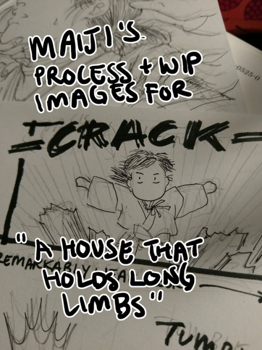
Process and wip images for A House That Holds Long Limbs (Part 4)
Previous process and wip documentation: Part 1 / Part 2 / Part 3
Read the pages for part 4 here (full complete version will be linked from YYH North Bound master post)
This is a rare glimpse into how I tackle action scenes!! It’s rare because I rarely do it. Action is honestly one of the hardest things for me to draw, and as I’m sure I’ve said here many times before, I have the utmost respect for shounen manga artists whose works are steeped in them. It’s a really impressive skill to be able to do it well - to create a cinematic, dynamic sense of motion that doesn’t dissolve into visual confusion and incomprehensibleness.
This was as interesting for me to document my thought process as it hopefully is for you to read and discover what the heck was going on in my head (a big honking mess, that’s what). There was much screaming and crying while working on this hahaha.
Aside from Hokushin’s beautiful face (lmao), Part 4 is packed with things I don’t usually draw. Specifically: action, things taking place in the dark, and corpses. For things taking place in the dark, I heavily referenced the dark room rounds from the tournament for Genkai’s successor in volume 4, because it involves action and Togashi used practically zero screentones in it and I didn’t want to either. For the dead rokurokubi, I looked up photos of skulls and drew on my memory of various horror comics I’ve read, like Kurosagi Corpse Delivery Service. (At one point I also googled photos of rotting skulls, but TBH I didn’t really want to spend a lot of time looking at detailed photographic references of corpse and decomposing bodies for obvious reasons, especially as I usually work on these comics late at night before I go to bed. The last thing I need is for images to get stuck in my brain when I’m sleeping.)
The rest of this post focuses mainly on action and redrawing things.
Script
The original script for this section actually ran a little further in the story than what’s shown here, but in order to convey the sequence effectively, I ended up stretching a number of key moments out and have booted the later ones to be completed for Part 5.
Thumbnails
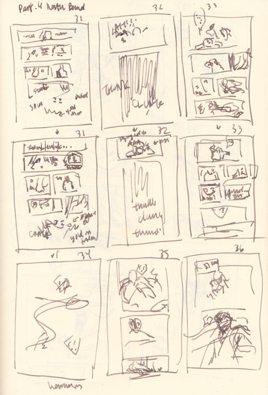
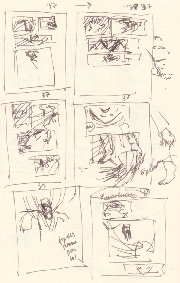
In the thumbnails above, you’ll notice quite a few are redraws of the same page as I struggle - pages 31-33 repeat immediately in the rows after, page 37 was attempted three times, etc.
Page count growth
A script of 8 pages turned into 10 pages at the thumbnail stage, and then ultimately netted out at 12 pages in the final version that was posted. As you can see, effective action sequences generally take me more pages than I think they will. With an exception (documented below).
Thumbnailing/storyboarding things out should theoretically minimize the page count creep! But because I tend to treat my thumbnails as such a loose stage (to avoid later disappointment when I can’t recreate it as nicely in the final page), I rush through them. Unfortunately, action sequences require me to think a lot more carefully through the scene as a director - staging the shot and the experience of the motion and coordinating people’s limbs and all the items in the scene more carefully and whatnot than, say, just a couple of heads talking. So inevitably, when I rush to get ahead to the finished pages, that’s when I realize it doesn’t flow as well as I was imagining (or not really imagining it).
As a result, the actual “live” pages turn into constant mental checks and runthroughs of the panels, realizing it’s not flowing as well as I’d like, and restarting. By restarting I mean mentally reenvisioning the sequence, sometimes quickly doodling alternate thumbnails (I didn’t bother in this case, so I have no alternate examples from after I started redrawing), and erasing and redrawing and adding pages. I guess I could probably avoid this if I just stop and put more time into thinking through the thumbnails… but it seems like I end up revising no matter what. So, constant juggling forever.
The evolution of the key action sequence
In my head, the main sequence was:
Hokushin lands.
He gets up and feels something in the dark.
He discovers the rokurokubi corpse.
He turns around to discover a swarm of hands in the dark!
Ahhh hands!! Ahhhh!!
Then he gets sealed and stringed up. End action sequence, back to people standing - or hanging out, I guess - and talking.
I roughed out my panels and pencils for all the pages following my thumbnails instead of doing one page at a time, because I’m impatient and also tend to think of all the pages as a wholistic narrative and then drilling down to the details on each page (big to small perspective).
As I went back over each page and detailing the base pencil art more, I began noticing more issues with the flow of the action and the pagination. Things started really shifting and changing at point 4. Here’s essentially how my thinking played out as I drew:
He turns around to discover a swarm of hands in the dark! - WAIT he just sees the corpse and then turns around? I should have him sense something is behind him first to get you more into his head and experience. OK, insert another panel of him sensing and whatever. THEN he can turn around. This is also good because I can erase the panel where he’s turning around and give the first panel a bit more room so I can draw more of his body in the first one and make his startled falling back motion a bit clearer.
HANDS!! AHHH HANDS!! - Wait, I have hands coming from BEHIND him and don’t effectively show that before they just appear to grab his hair. Which I suppose they do, but when I review panel flow it seems jarring, like a poorly directed cut and something was missing. Let’s try adding some hands behind him in the panel where he looks shocked. Never mind, this looks dumb and he looks dumb and basically seems even more like an afterthought. Ooh, better idea: let’s have him dodge the first wave of hands. That’ll be kinda cool and more interesting. And then he can land and be like OH SHIT MORE HANDS FROM EVERY DIRECTION
Ahhh hands!! Ahhhh!! - Hmm, maybe I should add a page here to better capture his dodge sequence. So the panels will be hands, dodge, and then the next page is he lands, then he realizes there are more hands behind him. How crouched down should he be? I guess in the later pages I basically drew him in a practically fully upright position… eh.. Working this out...
*starts drawing extra page* … Mmm, thinking about this again, no. It stretches things out too much. Now it feels like he lands, the new page adds an extra pause that could be interpreted unconsciously as he thinks he’s ok, then he gets attacked by hands from behind. But that’s ridiculous because he’s a rokurokubi, he KNOWS the hands can come back around or whatever, and he’s a good and cautious fighter, the extra pause doesn’t seem to fit. Thinking this through, basically I need it to feel faster - he lands (typed “he hands” there first time around haha), and he doesn’t have a chance to react again before it turns out hands are coming from all directions. So, I’ll keep it to the one original page and draw the reaction to the sound of the hands coming from everywhere. Done. (one of the few instances where I reduce page count in an action sequence)
Oh yeah, I forgot about his arms and legs getting sealed. Er, add another page. OK done.
For comparison, below are photos of the pencils for pages 35 and 36 before the above process:
... and after:

Redraws
I generally try to avoid redrawing an entire image/page from scratch if I don’t have to. Even if I don’t like the overall drawing, I’m still terrified of effing up the parts that turned out OK the first time around. However, sometimes you gotta know when to cut your losses and start anew and save yourself time and grief (I’m definitely still learning how to know lol). I do have a few strategies to ease my mind - I often take photos of something before I proceed to the next step or change direction (which is where many of these wip photos come from). This helps calm me down because at least now I have a reference for what it was before I took the leap of faith to move forward. Another option is to just leave it and draw on a completely new blank page.
Page 37, where Hokushin is getting his head pulled back by the hands, was an incredibly rare instance of the pencils for a page turning out almost exactly how I wanted on the first try, so I was loathe to redraw or adjust it. This means I basically forced myself to shuffle things before and after to accommodate not having to change it.
On the flipside, page 40, where the shot backs away so you can see Hokushin tied up with the hands, is one I full-on redrew from scratch. I was having a hard time with his pose and how all the hands were wrapped around him and how everything was actually working. I wasn’t happy with the drawing the first time around, but inked it anyways to see if I would like it better the next morning (sometimes this works, to wait and look at it with a distanced frame of mind). Spoiler, I didn’t lol. However, the process of inking the entire thing helped me better hone in on what parts I liked and didn’t like, so when I sketched it out again I was better able to adjust.
This photo shows the original (with the words REDRAW :/ at the bottom), a sketch I did trying to figure out his posture and where all the hands were/how the wrapping actually worked, and then the pencils of the redraw.

Final miscellaneous things
The end page of Part 4 is once again a last minute addition that resulted because I was facing a blank page (again!) after adding the page where Hokushin gets his arms and legs sealed. I changed the spoken line multiple times. First it was a line that’s been pushed to the upcoming part 5, then it was the “You certainly found my “treasure room” quickly” (that’s on the previous page). In the end, I just wrote a completely new line for it. It seemed to work better with the panel and closing off this part at a good point.
Last but not least, I somehow broke my pen inking this part lmao. Fortunately it’s a Muji pen so I only broke the tip off the cartridge somehow, probably in my intense scribbling/shading at some point. It’s not super clear in the photo but if you look closely at the point you’ll see this thin line coming out of the tip of the pen - it was this metal filament that basically scratched the paper without any ink coming out. I had to make an emergency run to two Mujis, neither of which had the black refills, so I ended up just buying two pens with similar thicknesses. Worst case scenario, I would have just inked with my blue cartridge, since the scanning would turn everything black and white anyways... the original pages would have just looked weird.

Phew! Hopefully it worked out and isn’t a totally incoherent mess!
#yu yu hakusho#comics#fanart#hokushin#wip#process#drawings#yyh north bound#art by maiji/mary huang#action sequences#redrawing#art supplies
5 notes
·
View notes
Text
So I started to freak out again, and in an attempt to distract myself, i've been cleaning, repacking, and reorganaizing. Tonight's turn is on my purse and a little backpack i use that has more room. I carry a lot of stuff since usually when I go out, it's for the whole day. Plus I love using this backpack, and while I love my purse, it's just too small now. i carry art supplues, extra things mom and other folks need, and more just to be safe. not enough to look like im overpacked, but enough to feel safe. Plus I need a lot in my daily life, and its good to have it all on hand
plus for the long days out, i need something to put the tablet and clip board in, along with my two pencil bags, wallet, earbuds, notebook, etc etc. thank god the clipboard can have some of these things in it. this has also been my chance to clean up what i carry and condense some of it (i've still got keycards from two years ago wtf). I want as much order as i can get in my life now, starting with my purse. hell, my jump drive for art has three of art programs i use on it, jut so that way i can run them off of things i need too. you never know when youll need sai, manga studio, or photoshop.
when i do the next drive with mom, to hopefully the place we're living at, i can just grab my bag at the rest stops for meals a lot more easily than the first time. or if we suddeenly have to leave, i need my partial go bag ready. im too scared not to have preperations ready to go at a moments notice, i mean hell, everything in the room can be packed up in less than an hour if need be, and im making sure it stays that way.
i've got one jump drive for art stuff, the other for all of my music, and maybe ill find one of my missing ones for my writing stuff, since each is so massic on its own. i've also got one thats missing atm for school stuff, and another blank one for emergencies. i used to have more, since gramps would get a shit ton of them for free and give me the ones i liked, all with very little space, but they've been damaged or stolen orz.
i'd love to condese everything as i go, and i've got plans to do so, a bit expensive and once we're stable ill hopefully be able to pull them off, but plans that will have me leaving behind some things and will hopefully be the more green option. it just also requires myself to be weaned off of notebooks and traditional sketching on the go once I get my plan A for this.
and as an added note, if i talk to you, please dont bring this post up since its just late night/early morning ramble i needed to calm my ass down.
3 notes
·
View notes
Text

An interview with the character designer for IBO, Chiba Michinori, from March 2016 issue of Animage (characters are designed by him and Itou Yuu who did rough sketches)
ITOU YUU'S SKETCHES ARE DRAWINGS OF AN OLD SCHOOL MANGAKA
--The story is approaching its climax, so allow us to ask how do you like it so far?
Chiba: When I watch the finished video I find quite entertaining. To be honest with you, I hardly read the scenario in advance. Due to that, I can enjoy as a viewer how the characters turn out or be sad about the death of a character that I went through pains creating (*chuckle*) This time Itou Yuu-san's original sketches were really good, so I simply continued the work he started by adjusting them to be suitable for drawing in an anime. Itou-san created the rough sketches of many minor characters as well. Though I created some, too, like random extras in the city or when director Nagai requested something specific.
--How do you feel about peculiarities and appeal of Itou-san's drawings?
Chiba: To me personally, they're filled with appealing fierceness. Nowadays, many mangakas are adopting the anime style, don't you think? Because they are people who grew up watching anime or playing anime-influenced games, and now they draw their own manga. But Itou-san's drawings aren't from that category, the feel about them is that of the orthodox school of manga drawing, and I think it's great. They let you feel the fun of converting a mangaka's peculiar flavor into anime, and I enjoy it quite a lot.
--What do you pay special attention to when adapting Itou-dan's drawings into anime designs?
Chiba: Well, take hair, for example, a mangaka would usually draw a lot of lines and strands, but it's a difficult task to make it all move for the modern anime, so the lines have to be adjusted without the overall impression changing. You have to always think about the ease of drawing for the animated footage.
--I have a feeling the characters have extremely peculiar hair style or eyes though.
Chiba: Itou-san's designs had those recognizable peculiarities that make the characters who they are at the rough draft stage already, and even if those particular details are to move on footage, they shouldn't be too much of a problem to animate.
--Could you please tell us in detail how you designed the characters for the anime?
Chiba: For starters we'd had several discussions on Mikazuki and Orga's character designs, and I had a bit of trouble figuring out what it should be. With Mikazuki, I have a habit to emphasize his eyes or draw him tight faced, so at the beginning he looked like he glared more. But after the director had said it wasn't what was needed, I redid the design to be what it is now, with the character striking you as flat. He has a lot inside but just doesn't show it on his face often. Anime these days tends to give characters a lot of facial expressions, but Mikazuki hardly has any amusing ones to speak of.
--Surprisingly, there is a lot of uniqueness about body types and clothed silhouettes in the show.
Chiba: That's where Itou-san's sketches really shine. For example, Orga, Akihiro and Shino are all big, but Itou-san gave me his instructions on which direction their body types were supposed to lean as early as the rough draft stage, so I incorporated that into the designs. For Mikazuki, too, I knew from itou-san's sketch that his limbs are rather big compared to his body size. Itou-san points out in writing at the rough draft stage what to be careful about in a picture.
--Then, what about Orga's design?
Chiba: I had a lot of trouble with him, too. According to Itou-san's commentary to the sketches, Orga's eyes were supposed to be pretty, but mouth - not so much (*chuckle*) That's why his mouth is always slightly downturned and never cleancut, but that's what makes Orga Orga. Anime tends to iron things out and draw everything pretty, but little details like that that move away from the standard is why Itou-san's characters are so entertaining. Orga is not just cool, you can also feel a prankster air about him, I think. Also, Orga's forelock is peculiar, too. It bends at a sharp angle that almost makes it a weapon (*chuckle*) Draw this, and everyone will know it's Orga, it's a good and easy to see mark, in my opinion.
--Orga tends to make faces where he closes his right eye, obscured by that bang, quite often.
Chiba: That was something that was in Itou-san's sketches, too, and that's where the director picked it up, I suppose. For the first episode we had the director's instructions that Orga was to do that. I'm really glad that when Itou-san creates his characters, he gives such a deep thought to what kind of life they've come to live. Nothing less from a person creating a tale.
NUDITY IS TEKKADAN'S UNIFORM?!
--Tell us about the female characters like Kudelia and Atra.
Chiba: With Kudelia... you can't cut corners when drawing her, so it's quite a pain (*wry chuckle*) As per the director's words, this show's characters in most part are rough and mud-smelling. He said he didn't care about good looks, so I thought I'd have an easy time, but Kudelia must be drawn beautiful and Atra cute. Kudelia has somewhat old-fashioned features, and that Araki-production feel is what I was being mindful about when drawing her (*chuckle*)
--Atra, on the other hand, seems to have a more modern feel to her.
Chiba: For Atra, with her hair style like a small animal's ears and her baggy clothes, Itou-san's rough sketch notes had "weaselly" in her descrption, so I just went with that (*chuckle*) Also, at first, the premise was that it's cold on Mars, so Atra's clothes are remnants of that. In the end though, that premise went away somewhere.
--The characters fought the battle on Mars half-naked, didn't they.
Chiba: That, too, wasn't there from the start. We had a talk about if we should have the characters wear something while in the cockpit, but then it would be annoying to dress and undress them every time for sortieing and it might end up half-cocked, so after a lot of consideration, we just decided that the trouble wasn't worth it (*chuckle*) There are few anime works that depict muscle these days, so maybe it's a pain to draw them. But it's not like our demands are that detailed in that area, we just leave it to the animators to decide how ripped a person of a specific build should be. Good if it's your forte, but those who draw may choose.
--I feel the fact that Mikazuki and the rest fight half-naked expresses their roughness.
Chiba: Well, they're not on par with Apache Baseball Team (from anime "Apache Yakyuugun"), but they, too, have that air about them that nudity is their uniform (*chuckle*) Although we avoid showing them being uncool or smelly, they're not your typical glittery modern anime characters either. And I like it better that way. Everyone mostly has their hair short, and it's been a while since I've worked with that kind of characters, it's nice for a change. Although I have to say that every anime where characters fight with their hair all silky and smooth must be assessed on a case-by-case basis, so it's not all bad either. With this show, the vein I work in is quite different, so I have a lot of fun.
--The show does have a chubby character like Biscuit, I suppose (*chuckle*)
Chiba: Oh yes, Biscuit. Nice to have him (*chuckle*) The Yellow Ranger from good ol' super sentai is a necessary character, after all. I think Tekkadan's appeal lies in them having all kinds of characters.
--Are the Tekkadan members based on Itou-san's original designs, too?
Chiba: Yes, they are. Out of the main members, the only ones I created are Dante and Chad. I only knew Chad's name was supposed to be Chad, and that was my only clue when I created him with a chad's image in mid (*chuckle*) With Dante, too, I didn't really know anything about him at the design stage, and I only learned that he specializes in electronic warfare after watching a few episodes (*chuckle*)
--Tell us about Gjallarhorn's McGillis and Gaelio.
Chiba: Those two, too, are mostly designed in accordance with Itou-san's rough sketches. Only, with McGillis, his good physique with wide thick chest reminding an inverted triange was per the director's instructions. And Gaelio was to have your usual smart feel about him, so it's possible to tell them apart. McGillis' habit of fiddling with his forelock is something that the director added to the storyboard of episode 1.
--They're the characters that catch the eye with their gorgeousness, very different from Tekkadan's mud-cacked feel.
Chiba: True. When McGillis and Gaelio's characters got colored, someone mentioned that now they started to feel like legit Sunrise anime characters (*chuckle*) Well, a marked contrast is not a bad thing. The show has a lot of characters, and each of them stands on their own like they’re supposed to. I think that variety is what makes it so fun.
CHARACTER DESIGN IS SOMETHING TO EXPAND ON AND ADD TO
--How deep are you involved in the original animation directing?
Chiba: A little, since there's still some work left on the setting and the director requests me to watch certain scenes of certain episodes from time to time. For you to understand, for example, episode 11 where Almiria has made her first appearance. I'm often requested to watch the scenes where characters debut. The scene where Naze was shown on the monitor screen went through my check, too. Well, when it's something that can be fixed just by the animation direction, I pass it quick, since what I'm watching is that a character gets the right feel about them. Come to think of it, there was this old man, Orcus, he was a character I created, but it surprised me when his scenes ended up in my workload. Well, I touched them up anyway, thinking all that while that he's not even an important character to spend so much time on (*chuckle*)
--You're also involved with drawing characters for the openings and endings, aren't you?
Chiba: Yes, I am. Although I make minimal corrections for them since a lot of skillful staff are involved with creating the OPs and EDs. I'm the type to prefer not to touch others' drawings when they're up to par, you see (*chuckle*) I want to give a chance to the good stuff. It goes without saying that it doesn't apply to something that's conspicuous in a bad way, but to me it's all good as long as a character stays themselves within the work. Like with Itou-san's original sketches (*wry smile*), character design is just the minimal tentative draft. It's something you're encouraged to expand on and add to for the actual animation, is what my position is.
43 notes
·
View notes
Text
Dissecting the Art of SING “YESTERDAY” FOR ME Part One
SING “YESTERDAY” FOR ME, the anime adaption from Doga Kobo of Toume Kei's manga of the same name, tells the story of four young adults right outside of Tokyo trying to find their purpose in life. Through their personal struggles, they try to better themselves, but more importantly, the people around them in their time of personal uncertainty.
One of the highlights of the show is its attention to detail, capturing the feeling of a Japanese suburb with the concrete and developing landscape of 2001 Japan. Crunchyroll was offered the opportunity to publish a translated version of a two-part interview series featured on the SING “YESTERDAY” FOR ME website to highlight how the team brought that world to screen.
Part one of the original Japanese interview with Usami Tetsuya and Fujii Yuta can be found here. The translated text follows.
One of the essential parts of the anime SING “YESTERDAY” FOR ME is the background art. The ones in charge of the background art are the art director Usami Tetsuya-san and Fujii Yuta-san, who’s in charge of the art design. Both are from STUDIO EASTER and we asked them a few questions looking back on the production of the series.
01: Please tell us about your jobs
Usami Tetsuya (left) and Fujii Yuta (right)
Fujii: My jobs are art design, 3D modeling, and 3D layout. Being in charge of the art design means that I’m in charge of all the designs for things other than props ... For example, the rooms, the outside of buildings, what the town looks like, etc.
Once the script is done, I will do art design so that the director can do the storyboards. They’ll tell me what kind of scene they want to do and what they need and then I’d create that for them. The director actually did the initial design of the town, and then with the photos I receive, I put all that together and add details to go along with the script and the scenes.
Usami: As the art director, once the storyboards and the art design are done, I would work on bringing the director’s requests together like what colors they want to use or where they want the light coming from in certain scenes. I believe it’s the art director’s job to create the “atmosphere.” I add color to the world that art design created and then think like, “Older looking wood would look better here.” It’s up to me to decide what the atmosphere of the room, the city, and basically everything is going to look like, and it’s up to the art design to work on all the details up to that point.
Fujii: My world is black and white. The art director’s world is filled with color.
The kotatsu in Rikuo’s room.
02: What did you concentrate on when recreating what Tokyo looked like 20 years ago?
Fujii: The story takes place in 2001 and around the Setagaya Line. The director loves the original story and definitely wanted to make sure we made it obvious that the story took place along the Setagaya Line. (From Episode 2, the story takes place from 2002 and on.)
At first, the director was having a hard time putting everything together, so we went to find locations together and would interview people who actually frequented through those locations. That helped him figure out how he wanted the animation to look to express the world of the original story along with some trial and error. Watching him work all of that out still comes to mind. He also talked about how he wanted the TVs, traffic lights, and LEDs all to look older like they did back then.
Usami: Yeah, or like erasing “taspo” [Note: a smart card used for buying cigarettes in Japan introduced in 2008] from the cigarette vending machines. And he wanted the cigarette packs to look more like they did back then. It may not be that far back, but it was actually very hard finding references for all of this.
I was reading this series as a student, and simply as a fan, I totally understood why the director wanted things to look this way. We mostly work with cells, but I did create a 3D model for an old school game. (lol)
Fujii: I heard we were doing cel animation so it definitely wasn’t that detailed. (lol)
Usami: I thought, “Man, this series really likes to concentrate on the little details.” (lol) Is it okay for a TV series to worry this much about minor details?
Fujii: It really does almost feel like we’re making a movie. (lol)
Director Fujiwara looking for a reference for the photography studio that Rikuo works at.
The director was also seen talking to the studio staff so he could figure out how the studio would look different in the anime.
The design for the analog TV in Shinako’s condo.
03: The town that exists between reality and realistic graphics
Fujii: The director had decided the initial layout of the town, so he’d give me some stairs and ask me to just create a certain part of the stairs, or like for the outside of a building, he’d give me a photo of a building and ask me to expand certain parts of it. I created everything under his direction. I had the director do the initial design of how he wanted the inside of the room to look and then I would fine-tune it, trying to make sure everything was within the limits of reality.
The original sketch and 3D model of Rikuo’s room.
Fujii: You can do some pretty extreme things in anime if you really wanted to, but I didn’t want that to happen, so while keeping the director’s vision, I did my best to make sure all the art design and 3D models all looked realistic still. Because all the characters live near each other, we do reuse the 3D model of the town. Depending on what the characters do in their daily life, we add and subtract things from the scene and adjust as needed. For example, with the convenience store, I was asked to create a back entrance because they wanted to do some scenes there. I then show them an example of what it’d look like and go from there.
04: The art of SING “YESTERDAY” FOR ME that balances reality and the story
Usami: At first, I was asked to keep things as realistic as possible, as if we were looking at photographs. But if we went too far, we’d lose the hand-drawn feel of SING “YESTERDAY” FOR ME, which was a problem that we discussed. So how do we balance the two?
So the more realistic we make it look, the more the hand-drawn feel seems to stand out in a way that we don’t want it to. So I’d look at the director’s storyboards and think, “I should add a bit more of the brush here,” or “If I mess with this anymore, it won’t look as realistic.” While I kept asking myself those things, I’d add a few extra touches and take some away. I basically kept trying to find a happy medium.
First, I thought about what kind of “brush” I would use. I wasn’t sure if I should use a brush that would make things look a bit more hand-drawn or more like watercolor. In the end, I wanted things to look like they were done in pencil.
When I tried that and we agreed that it looked pretty good, so we went with that. My biggest reference was Toume Kei-sensei’s artbooks. The director was really attached to the flashback scenes, so we went heavier with the hand-drawn feel there.
Usami: With more recent series, they try to lay on more realistic textures to make everything look more realistic, but we decided not to use as many textures this time, and I was asked to make everything look more hand-drawn. If we just use wooden textures, you can make trees look like trees, but we decided to use brushes instead. Or like using textures for the tatami mats would look too detailed, so we used brushes. There were a lot of times where I blurred some of the details in this series.
In this day in age, efficiency is top priority in this industry, so I wondered if my job would be okay at times... (lol) A lot of our staff were first-timers when it came to hand-drawn animation, so they said that this series was harder to work on and different. (lol)
What’s difficult is when you try to add some finishing touches to something, you can’t let it look “dirty.” A lot of the staff grew up in the digital age so there are a lot of them who have never done any paintings, so there were some who couldn’t tell the difference between touching up and something just looking dirty. But through trial and error, all of them made SING “YESTERDAY” FOR ME the best it could be. Normal series would usually only have 4 to 5 people to do all the art department stuff, but this time, we had 15. So basically 2 to 3 times more than usual (lol).
I think the whole company worked very hard on this project.
The scene from episode 1 with Rikuo and Haru talking at the park.
If you look closely, you can see that some hand-drawn nuance has been added to the ground and stairs.
Next time, we ask them how they used art to craft this multi-character story!
Kyle Cardine is an Editor at Crunchyroll. You can find his Twitter here!
0 notes
Text
Draw a bad-ass geisha
In this geisha illustration I wanted to capture a grungy, dark, urban vibe, laced with elegant traditional Japanese elements. The idea that kept coming up again and again was to make her ‘bad-ass’. That’s the core essence of Geiko – she’s a geisha turned self-serving samurai, a vigilante within a dangerous cyberpunk universe. I got the idea from a competition to design a geisha or samurai character.
Here, I’ll explain how I developed this Geiko illustration, and my whole thought process and approach to the design. You’ll pick up tips on how to push your ideas forward and craft the final details. I want to leave you with concepts and methods you can adapt and use in your own work. So let’s start with the most crucial bit…
How to draw and paint – 100 pro tips and tutorials
1. Visualise the big idea
Geiko is a young geisha doll, driven by anger and revenge, roaming the streets as she takes down all the bad men that hurt people like her (Click the icon in the top-right of the image to enlarge the picture)
The very first step is deciding the look and feel of the character and capturing it all with a rough sketch. The most important thing is knowing exactly how you want your audience to feel about your character, because this will drive your whole thought process from start to finish. My core idea was to design Geiko so that people’s gut reaction to seeing her is: “That’s bad-ass!”
2. Generate thumbnails
Develop initial rough ideas that fit in with the big idea (Click the icon in the top-right of the image to enlarge the picture)
With that clear goal in mind, I jump into SketchBook Pro and use the Triangle brush to sketch my ideas out, exploring and pushing them further while staying true to the original Geiko essence. I keep it loose and gestural at this point, making notes on the ideas that I’d like to take forward. Throughout this process I keep asking myself, “Is she bad-ass enough?”
3. Finalise the idea
Play with your favourite ideas to try out variations (Click the icon in the top-right of the image to enlarge the picture)
This is where I take all my favourite ideas that came out of the thumbnail process and explore how they can better capture Geiko’s essence. I duplicate my favourite thumbnail several times and try out those ideas, mixing more Japanese cultural elements back in with an urban cyberpunk twist. Don’t add too many details just yet. All you want to do here is finalise your big idea.
4. Polish and craft the design
Refine the final character more (Click the icon in the top-right of the image to enlarge the picture)
Everything from this point on is just polishing up. You’ll still be making some design choices, but the core essence shouldn’t change. I usually start with the face, because it’s the most important part of any character. If I get it right, the rest falls into place. There are no secrets here. I sketch with the Triangle brush and Eraser, pressing S to quickly flip between the two brushes.
5. Refine the clothing
Use references to draw realistic clothes (Click the icon in the top-right of the image to enlarge the picture)
The next major element to get right is her kimono. I start by grabbing some references. (But remember: references are just guides, so don’t feel bound by them.) Then I create a new layer and make a rough sketch, focusing on the design and flow of the wrinkles. For the final look, I use the Eraser to follow my initial line work on the black kimono and create the white-on-black effect.
6. Accessories and props
You can build the character’s personality through accessories (Click the icon in the top-right of the image to enlarge the picture)
Using references, I work on the swords on her back, making a quick sketch in red to explore the function of the strap, while also playing with the idea of adding kunai knives. I also try to add clues about her personality, like a Totoro charm at the end of one of her swords. It’s subtle, but it helps make the character seem more well-rounded.
7. Bring in detail on her boots
White highlights create the impression of glossy leather-like fabric (Click the icon in the top-right of the image to enlarge the picture)
Next I start cleaning up Geiko’s boots. In a similar way to how I did the clothing, I use the Eraser to create the line work, which is consistent with the style of the image. Her footwear is inspired by a mixture of high-heeled boots with a sporty twist and Japanese ninja sandals. I want to create a glossy type of material for her legs, so I add white highlights to achieve that look.
8. Create the mechanical gauntlet
Tweaking details like this can bring them to life (Click the icon in the top-right of the image to enlarge the picture)
I want to keep the essence of my sketch, so I use the base silhouette of the gauntlet and start cleaning it up, erasing panel lines in, and drawing exposed wires to make it feel more customised instead of being built in a factory. I flick back and forth with the S key throughout, drawing lines in and erasing where necessary. I realise that the silhouetted gauntlet is blending in too much with her kimono, so I opt for a lighter version that helps to create a better read.
9. Stop… it’s paintover time!
A quick paintover puts the character in context (Click the icon in the top-right of the image to enlarge the picture)
Now that I’m almost done with the design, I take a step back and look for any bits I can push further. A quick paintover enables me to explore how I can exaggerate Geiko’s bad-assery. I add a more well-rounded toolset of weapons including samurai gun-swords and a traditional Japanese umbrella. Then I push the storytelling with dripping blood and bullet holes, along with a smoke trail that adds movement, mystery and depth.
10. Detail Geiko’s primary weapon
Build up details that add to the character’s story (Click the icon in the top-right of the image to enlarge the picture)
From the loose sketch done in the paintover stage, I begin to finalise the main sword design. I don’t want her weapon to be elegant or well-crafted, but to feel more imposing and threatening, so I choose to go with an exaggerated butcher’s knife. I use the Ruler and Lazy Mouse features in SketchBook Pro to create the long, sweeping arcs in the blade, ensuring the line work feels rough and grungy.
11. Add the finishing touches
Even discreet Japanese writing needs to be accurate (Click the icon in the top-right of the image to enlarge the picture)
Before finishing up the design, I take the time to polish it up. I decide to add more details to her mask and sword, tweak the design of her cross-body strap and give her some branding and tattoos, making sure I use the correct Japanese phrases. Details like these count. I also include a shadow pass to add more depth, as well as the juxtaposition of her red demon eyes and rosy red cheeks.
12. Establish the background
The story becomes more believable with a background for your character (Click the icon in the top-right of the image to enlarge the picture)
With the character done, I jump into Photoshop to create the background and atmosphere to round off the piece. I imagine Geiko in a back alley, fresh from a fight. So I add a floor and wall pattern, making these more sci-fi and grungy looking to enhance the cyberpunk feel. I add a quick gradient to them, which helps pop the character from the background and add more depth to the image.
13. Build background details
Custom brushes and textures push the realism (Click the icon in the top-right of the image to enlarge the picture)
I now add extra details and textures to the environment. Bullet holes, dust particles and dripping blood help tell more of Geiko’s story and push the final illustration. I use masks to blend some of the line work out, and use texture on the background and character with custom brushes to help it appear less digital.
14. Bring in action cues to push the mood
Use quick movements to draw puffs of smoke (Click the icon in the top-right of the image to enlarge the picture)
For even more depth and mood, I add action cues like smoke at Geiko’s feet. I use the Lasso tool to create the shape of the smoke, taking into account the wind direction that may tilt it slightly. I do this quickly to capture the motion, instead of lingering on it too long and making it too refined. Once I fill in my selection, to make it appear more like smoke I reduce the Opacity and use a mask to blend out specific parts even more, letting the background elements pop through.
15. Add a brand to your work
Identify your work as yours (Click the icon in the top-right of the image to enlarge the picture)
Branding, like your logo or signature and website URL, helps make your illustration yours wherever it ends up. People will always know whom to credit and future clients can contact you easily. Don’t forget to give it a title, too. It’ll help finish it off and make the piece feel more considered and complete.
This article originally appeared in ImagineFX issue 149. Buy it here!
Related articles:
How to create a comic page
How to draw manga
Draw a figure in under five minutes
This post comes from the RSS feed of CreativeBlog, you can find more here!
The post Draw a bad-ass geisha appeared first on Brenda Gilliam.
from Brenda Gilliam http://brendagilliam.com/draw-a-bad-ass-geisha/
0 notes
Last Seen Blogs

kinironome
star in the sky

pikablu410
pikablu

free-presets
Free Presets

annawife-blog
Untitled

limoservice-blog1
Limo