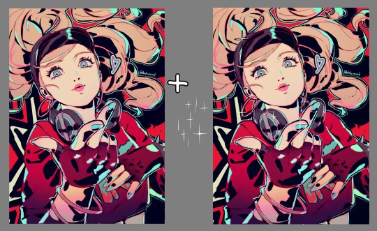
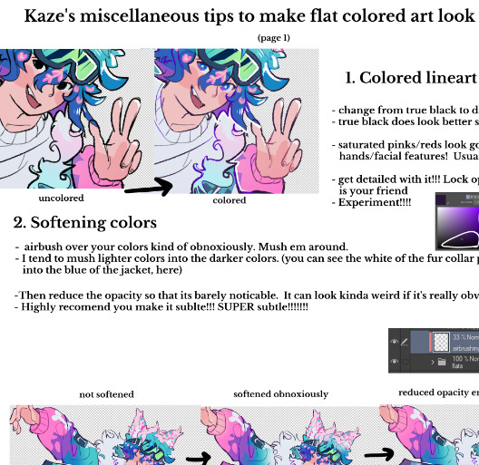
#the lineart and rendering goes HARD
Explore tagged Tumblr posts
Visit Tumblr Blog
Explore Tumblr blogs with no restrictions, modern design and the best experience.
Last Seen Tumblr Blogs


Fun Fact
Kazakhstan’s Minister of Communications and Informatics has blocked the Tumblr site because it contained 60 sites of terrorism, extremism, and pornography in 2015.
Note
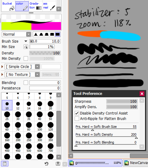
hi!! do you have any advice on how to finish projects faster? or at least more efficiently? i take a few days to finish a piece (1 or 2 days at minimum) and i want to learn how to refine my process
that can depend a lot on what kind of look you’re trying to achieve, and what exactly is slowing you down!
things you can do if you take too long doing lineart:
Practice sketching in pen & marker! Do exercises that train your hand to be more efficient. If you can draw the same thing with 5 lines that previously took you 20, you’ll cut down on time.
Try a different brush! Maybe the one you’re using is too soft, and you have to keep going back over the lines to make them dark enough. There might be another brush that gets the same result with less effort.
Zoom out! On paper, a drawing that’s 2 inches tall will take wayyyy less time than a drawing that’s as big as your torso. When you zoom in, you’re essentially making the whole drawing bigger. When I draw, I like to be able to see the whole pose. If you’re worried about it not being perfectly clean, I promise you, no one is paying that close attention.
Skip the lineart entirely! Odds are, your sketches might already be pretty clean. If it takes you 20 minutes to do a sketch and 2 hours to do the lineart, but the lines look almost the same, then why bother doing the lineart?
similar advice for coloring/rendering!
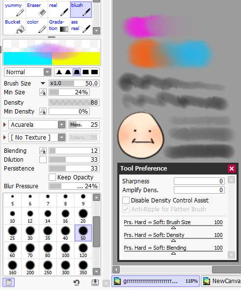
Maybe it’s your art software! I can color 10x faster in CSP than anything else, because CSP makes it really easy to color in flats.
Limit how many types of brushes you use. There ARE certain effects (like convincing digital watercolor) that really do need 5-10 different brushes to get the look Just Right, but going through your tool menus to swap brushes will add time. When I render (which is rare, honestly) I stick to one, maybe two painterly brushes.
other general advice:
Don’t be so hard on yourself! Honestly, 1-2 days is still objectively pretty fast!
If you’re a perfectionist who will arbitrarily spend too much time fiddling and fiddling until it’s justttttt right, try setting timers! Give yourself a predetermined amount of time for the lineart, for the coloring, for the rendering, etc and MOVE ON once that timer goes off. Not everything you do has to be your magnum opus.
Use keyboard shortcuts!!!!!!!! I don’t like using screen tablets, especially if I can’t use shortcuts. If you have a tablet with programmable buttons or some kind of remote, that can work too. I see people use bluetooth xbox controllers sometimes, which is a good option if you already have that. Personally, I use so many shortcuts that there are never enough buttons to program, so I just stick with a keyboard.
JUST KEEP AT IT! The more you draw, the faster you get. I avoided doing paneled comics for nearly 10 years cause they took so much effort, and would only do comics where each panel was its own layer/image. After enough time doing that, I eventually got good enough at everything else to do with comics that the paneling aspect wasn’t that difficult anymore.
294 notes
·
View notes
Note
Your art is jaw-droppingly stunning. Can I ask, how do you render things so beautifully? Can you give any tips? Especially with colored lineart.
Aww thank you so much, that's so sweet of you to say. <:3
I don't think I can give much advice on rendering; I've always been highly dependent on line-art to portray form and any attempt at lighting more complex than "shade with one layer of a desaturated color on multiply" frightens me.
BUT I can share what I do with line coloring!

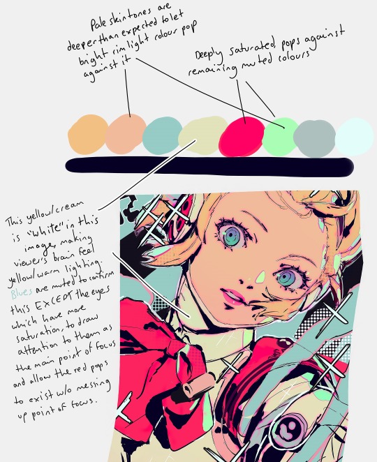
This is a drawing I've done both with and without the coloring on the lines, to show the difference it makes.
In general, the color of the lines is just a darker shade of the color surrounding it. The more defined I want a feature, the darker the hue.
The interior lines, everything that goes on inside the outermost line-art, is where I put most of my attention. I separate the lines into tiers of importance and color accordingly, with the most important things getting darker (and often thicker) line-art.

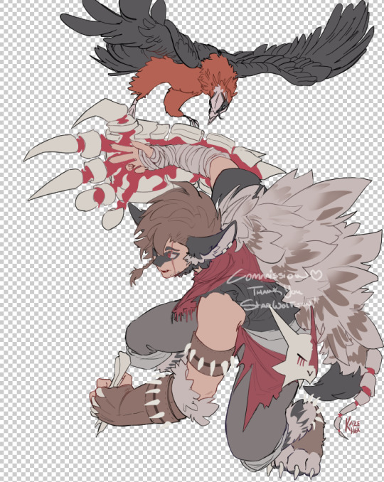
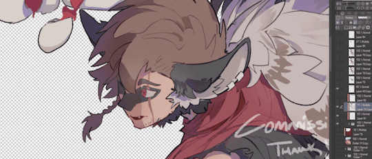
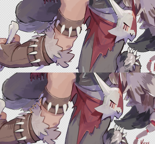
Here's a cropped image of Ambroys holding a very expensive future murder weapon to try and show what I mean. The big circles are the base color of his dumb face and ludicrous glove, and the smaller circles are the color of the line-art for each of his features.
The hierarchy tends to go like this:
Important Features: eyes, mouths, hands, forearms, anything that I want to be emphasized or needs to be very clear, etc. gets dark line-art. This separates these features from the rest of the image and makes them pop.
Secondary Forms: joints, noses, the edge of bangs over the face, the lines between fingers, big wrinkles on evil old bastards, cravats etc. get medium line-art. These forms are meant to be distinct from what surrounds them (fingers shouldn't look melted together, the hair is not part of the forehead) but giving them dark line-art would draw attention from the important parts (for example, Ambroys' punchable grin), so they get slightly darker line-art to make the forms clear but not distracting.
Fiddly Little Details: fabric folds, flesh creases, strands of hair, seams in clothing, etc. These add texture, but I don't want them to be making everything look like a mess of scribbles. So these have light line-art, relative to the base color, to allow them to blend more than the important features.
Sometimes I'll make the line color more saturated or a slightly different hue (cooler or warmer), but it depends on the image and how much skill I randomly roll in color usage that day. It just looks more interesting than just going over the lines with a low-opacity brush of the base color.
When it comes to the exterior lines, I have two approaches. If I want a form to be bolder or stand out I tend to leave the outside lines around the form black or a very dark color. If I want something to look softer or blend into the surrounding image, or want the form to appear to glow, I color the outside lines closer to what colors surround the form or a brighter, paler color.

For example, all the characters here have nearly black exterior line-art. The background objects all have pale line-art, so they don't overwhelm the characters. Even objects in the mid-ground have slightly lighter line-art than the figures so that the eye is (hopefully) drawn to the characters instead of my labored attempt at drawing a cash register.

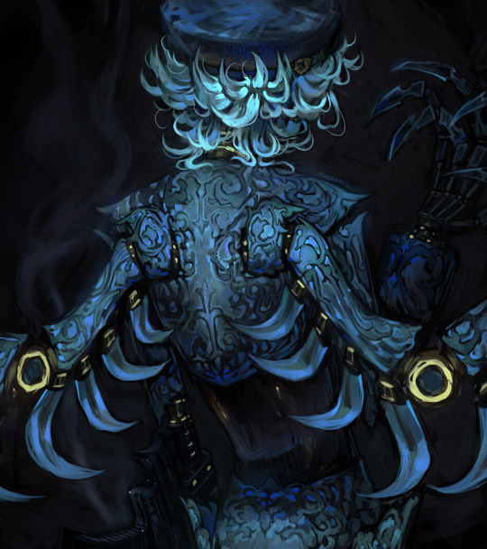
Or here, the parts of Ambroys that are en flambé have orange-red exterior line-art, while everything else has dark exterior line-art.
Like most things with my art, it's not hard to do, it just takes a long time. :P
And of course, this isn't the "right" way to color line-art! My art style is pretty cartoony, heavy on line-art and low on shading and very focused on silly characters making silly faces. A softer, more realistic, more rendered style, or one that is more graphic and focuses more on silhouette, would likely require a different approach. But regardless, I hope this ramble is helpful!
#asks#i never feel quite qualified to give art advice... but this is less advice and more just my personal approach#it could use tweaking and refining i'm sure!#but anyway super flattered by this ask thank you anon!#chocodile did the heavy lift with the lineart color on that ambroys on fire pic but i liked that pic better than others i had with glow#thanks chocodile for being better at color than me!
136 notes
·
View notes
Note
Hello :D
I have been following you for the last year or so (a few days after I got my Tumblr lmao) and I absolutely love your art!
I have been wanting to study your art style for a while but don't really know where to start,,,
Could you please show me a small portion of your art process, if it isn't too much trouble of course. Thank you and have a nice day!
hello. oh my god. this took forever to find.
im sorry it took 2 WHOLE FUCKING MONTHS for me to respond to this but i wanted to put it off until i felt happy with my art process again, so here it is
my fall 2024 rendering tutorial!
(this will be very very long)

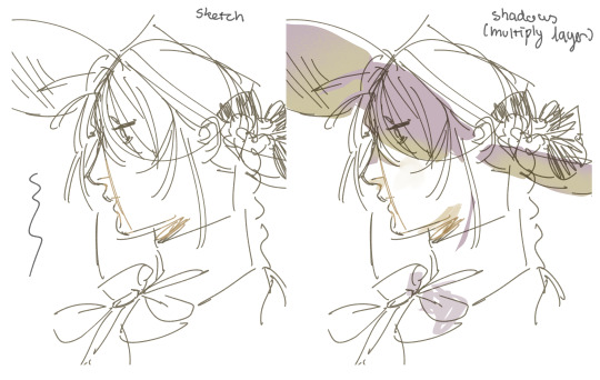
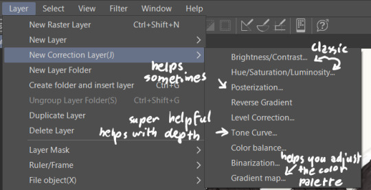
FLATS AND WHATEVER YOU WANNA DO WITH LINES GIRL. then make sure to recolor the lineart to better match your base. trust me it helps, bold dark lines are Not your best friend when rendering. wait for that post-rendering
i start off with a doodle or a sketch, and then filling it in with flats and other details such as blush

FIGURE OUT YOUR LIGHT SOURCE. FIGURE IT OUT GIRL YOU CAN DO IT you can make it as simple as possible, make it as big as possible, dont even THINK about the details.........just make it really fucking big so you at least know where the shadows and the light goes THEN add smaller shading details LISTEN TO ME. LISTEN TO ME OKAY!!!!!!!!
my key point with this is for you to learn lighting fundamentals.
it's SOOO ANNOYING but alas......they are all correct. it helps a lot.
one thing i also really want to point out is that i like creating a big shadow shape first before fixing up the little details (such as folds and whatever) because it helps me focus on the way the lighting actually works instead of tunnel vision-ing into making the shading make sense on the clothing.

contact shadows (i dont remember if thats what theyre called okay) theyre fucking ugly because im not actually thinking sorry 💔
okay so basically:
contact shadows (if that's what they're called) are the spots in shading and lighting where light will NEVER hit.
shadows are still influenced by the colors and lights around it (it's why a blue shadow and a yellow shadow feel completely different, despite both being shadows) so it's not always COMPLETELY dark.
BUT! there are small points in shadows where light never hits, and they're almost always super dark or pitch black.
it's hard to explain shadow and light so briefly for a tutorial, but you'll notice it when watching fundamental studies and when trying it out for yourself


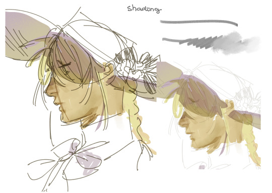
YES i unclipped the multiply layer YES its ugly and terrifying but it makes coloring the multiply layer easier okay the colors merged w multiply so now it looks cool and has depth overlaying colors that actually make sense
so basically what i did was color the multiply layer that i used to shade the overall drawing
adding a band of red/orange/yellow around where the light hits, and blue where the shadows get big and wide, gives it a fake ambient occlusion effect in the way that a person would get if they stood under the sun with a clear blue sky
the colors don't have to make sense, especially because i never draw backgrounds, but coloring the shadows really help it give a sense of depth and extra subtle detail and effect that just helps make the painting look nicer
around the end, i also put in colors (in an overlay layer with a low opacity brush) that actually make sense in context of the drawing, which is the lit cigarette and the yellow eyelights
mostly because none of the colors were making sense and i needed to actually make use of the lighting that DOES exist in the drawing lol

adding a muddy golden yellow pin light layer (opacity turned down to like 40-50%) to make the light colors less ugly lol
i SWEAR by the fucking pin light layer style. it's so useful and so so underrated.
i used an almost brown-ish gold color on stop of all the layers, and with the pin light layer, it helped make the bright (almost blue-ish) white colors more warm and more yellow. it just helps make things more warm (something i prefer)
i could probably show what it looks like without adjusting the layer opacity to truly show off what i mean (like in the coming section) but i sadly forgot to do that lol


make a layer on top of your drawing with this color in these ranges YES the drawing is fully merged NO don't be afraid, the base was fucking ugly anyway 💔 make this layer into an exclude/exclusion layer style TRUST turn down your exclusion layer opacity from a range of 10% to 40% literally until you're happy with the contrast and the way the color over the drawing. use your eyeballs. i know you can do it im so proud of you
this is pretty self-explanatory instruction-wise, so i'll go into why i do this instead
i really like art that seems like it has low contrast, with almost mid-gray shading and lines. i don't personally use dark and bold lines and shading, unless i find it necessary for the tone of the piece, so using this method helps lower the contrast of the art and make it look "pleasantly muddy" in the way that it's easier and softer on the eyes.
the inverted blue color also helps makes things warmer!
the exclusion layer style is still a bit of a mystery to me but i really like the effect it gives, even if i don't completely get how it works lol
if you want an alternative method to this, and if you have access to it (because i primarily use sai and sai only),
i absolutely encourage you to play around and experiment with gradient maps.
there are so many out there you can make yourself or even get from others that just give the painting an extra amount of depth and color variation. they're SO fun.
personally, if sai2 gets a gradient map update, it's over for y'all it will literally be so over no one will be able to stop me


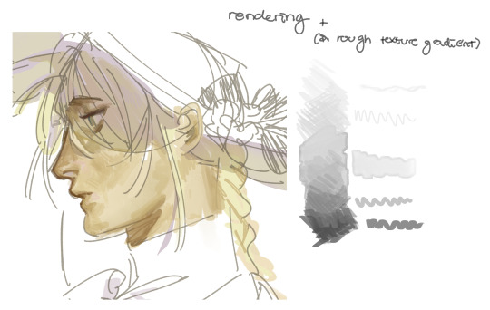
then i merged everything and actually adjusted the contrast back up because it was looking too muddy for me 💔 but the color adjustments are still there so all hope is not lost here's a comparison of the adjusted contrast in black and white (adjusted on the left) (newly merged layer without adjusting the contrast on the right)
as you can see, i actually turned the contrast back up (despite talking all about how i liked things with less contrast lol)
i wanted to demonstrate that doing adjustments should be done in moderation, and is why i adjust layer opacity often when making color effects
you are free to play around with colors to help your style, but don't lose your initial idea and colors along the way.
you still need to trust your own colors and intuition!
along with that, i just want to say that it's completely okay to change your mind mid-painting, and it's okay to make somewhat drastic changes.
don't be afraid to change things you don't like or change your mind about certain aspects way later on
that's basically the whole thing of this!!! don't be scared!!!

now im gonna hold your hand when i say this..........but you need to learn how to render by yourself. it seems like i can teach you but i literally can't, because rendering is different on every piece and depending on how clean your base is. i have to render A LOT because of how fucking ugly my sketches are LMAO to simplify it, think of it as obsessively cleaning up every detail you can see, but with a color picker and a clean, hard edged brush. if you have shit lineart, you don't have to redraw it cleanly over and over, just paint over it. that's basically what rendering is
THIS especially is where you need to be brave and stop being scared.
like i said, i can't teach you how to render, and it's something you have to discover yourself because rendering is something that will always be personal to every single piece you make. the way you render on every piece is different.
on one piece, you will barely need to render, and on another, rendering is more than half of your ENTIRE process.
don't be afraid to paint over your old art.
rendering is a process that's both very perfectionist yet also very careless.
find your balance and just go for it.

and then that's it……..u did it………..now yuo know how to paint and render. it's literally just layering shading and lighting knowledge until you think it makes sense and looks okay lol additional note: since i render in only one layer (you don't HAVE to do this, but it'll be harder for you���), i also made slight adjustments with the transform (and liquify, if you have it) tool to make things more proportionate. (i drew the head too big lol)

if you compare the finished piece to the final unrendered base, you can see that a LOT changed, including a bit of subtle proportion adjustment.
particularly, the sleeves changed A LOT (because i really didn't like them)
but it's also over all cleaner and more coherent, instead of having haphazard colors and shading just thrown about.
rendering is when you finally use all 100% of your brain to finalize and figure out where the shading should go, where to clean up your lines, where to ERASE or ADD BACK in lines, and make sure all your colors look coherent.
it's not as intimidating as it seems, i only use a hard edged brush with a little bit of color mixing and my color picker.
it's like dragging and dropping colors to cover up mistakes, it's really quite fun when you get used to it
i wish i could explain it clearer but it's hard to describe without visuals!
i hope this helped, and i hope all my yapping isn't annoying (art as a special interest beloved)
have fun studying and trying to render in my art style!
#long post#art tutorial#rendering tutorial#art help#art tips#tutorial#kia doodles shit#artxstic-scr1bbles#tutoriel
200 notes
·
View notes
Note
HI HELLO I love your art So much,,, do you have any tutorials on how you render your stuff? For example, the colors you use & how you pick them, how you get that pink tone around the Lineart (I think) (it's just rly cool). I would love to see stuff like that, cuz your art is Such visual candy (◍•ᴗ•◍)
Hey! Thank you so much, I'm glad you like my art, I worked hard to make it what it is!! Means a lot you appreciate it!!!!!!
I've had no professional art training, I seriously don't know what I'm doing and struggle making tutorials. But will try here!!
For me the colour work is really situational on the drawing! I find myself experimentally attempting to weaponize colour theory and there's a lot of instinct involved that I can't figure out how to verbalise yet. Here's an example of some thought process I have:
My main advice is to play with sliders a lot and really experiment (that's what I do for every drawing)!
To get the pink glow around your lineart, copy your lineart layer, fill the copy in with a pink of your choice (sometimes I do a gradient), blur the layer (experiment with how much blur you'd like), put it directly below the lineart layer, and set the layer to multiply (or any mode you think looks pretty)!
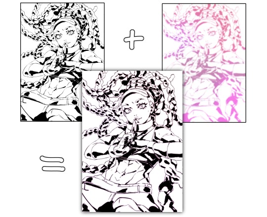
You may want to adjust your piece's brightness/colours after applying it and sharpen the image after exporting.
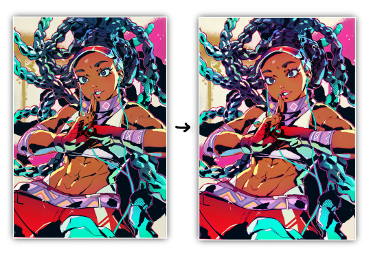
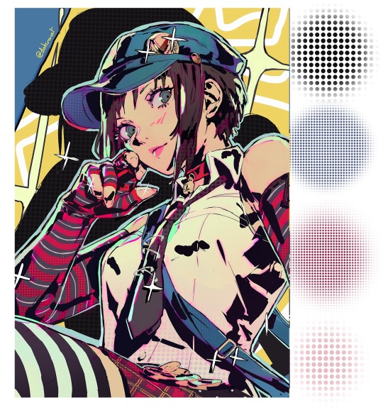
A lot of colour gradients are involved and on their own they can eventually compromise the gritty/punchy style, especially the ones that are between extreme and subtle. A good way to combat this is with screentones/haftones!! You can use them to diversify colours and imply shading/texture.
I recommend going nuts and having a lot of fun with it to find what works for you!
I often add a lot of small lens flares as they satisfyingly cut through the piece, imply flash photography (which goes well with the strong black shading), add visual noise to areas you don't want to be your main point of focus, are a great way to show speculars, and idk man sparkles are just pretty haha.
Go nuts with them and have fun!! When you get them to look good, think to yourself why that is.
I made a tutorial ~1 year ago on how I shade with black. This simple trick will really help it look good, 3D and rendered - it just requires a lot of knowledge about shadows to start with. I have a lot of experience rendering "normally" which helped me learn how to use black in an experimental way.
Minor correction that the shadows labelled "ambient occlusion" in the tutorial are actually just normal shadows, ambient occlusion is total lack of light.
I hope this is useful to you!! You have a knack for art, your work is very inspired. Please keep drawing!! I am still learning too, let's keep going baby.
-Cravat x
479 notes
·
View notes
Text
FAQ & Important Info
About me:
bday: march 30th
lgbt?: im bi
What can we call you?
Seraphont is fine, its supposed to be a play on of Seraph and Serif Font, you can call me Seraph!
What pronouns do you use?
I'd prefer They/Them, but you can use She/Her.
Whats your Main blog?
not posting it publically for now.
Dying and Getting Over It (DaGOI au) Related:
Where can I read DaGOI?
It will be uploaded to my Ao3. its currently being written, so there is no link to the fic yet.
When will you post the fic?
short answer: I'm not sure, Im busy w life, comics will b made in the meantime. its my first time writing a fic, so I ask you to be patient with me! the outline is written and being tweaked, and its going through adjustments now that MD ep 8 is out. Im also moving across the world, so I'm a tad bit busy rn.
Will you include MD ep8 into the canon of your fic?
at first I was on the fence, but its grown on me, its being integrated now.
Will you be drawing all of DaGOI in comic form?
if I was a stronger man I would. I'll mostly be drawing key story moments. making comics is an aid to helping me write. so I'll be making a lot, but I may not be posting them until the chapters start coming out (trying not to spoil everything). to give you an idea, as of writing this, I have 6 comics on the backburner lol.
Art Related:
What art program(s) do you use?
Procreate -Brushes: Shiyoon Kims Wet Brush pack (X) (everything you see on this blog is made with this brushpack) and several Max Packs (X) for procreate
How long have you been drawing?
I've always drawn, but I started getting really serious at 14, around the same time I first made my main blog. I was self taught up until I got into animation school.
What do you do as a career?
I'm currently doing Freelance work for publishers and individuals. I was previously an animator, I'm making the move to storyboarding
Do you take requests/commissions?
I do have commissions open. only lineart, and flat colours are available. if you want a rendered piece: slots are closed, but you can dm me for interest.
Asks and Messaging:
Rules for asks/tagging?
Anyone can send me an Ask, Mutuals, Anons or not!
Dont send discourse or anything explicitly NSFW. you'll be blocked lol. I'd prefer if you didnt send suggestive. if you send me triggering content I’ll mind blast you into dust. (block).
Do not send and DNI's?
Transphobia, Homophobia, Acephobia. All the obvious bigot contenders.
SA, pdfilia and incest are absolute no goes.
are you okay with me direct messaging you?
only if we have spoken before/ you're giving me a headsup about something/ I've prompted you to send me one.
***minors: please refrain from dming me to chit chat, im not down to.***
Why don’t you answer my asks/dms?
my main has 1000+ asks and my other side blog is pushing 250+, sometimes the ask's get lost in the sauce. that being said, some ask's go unaswered because: 1. it might spoil too much if I were to answer. 2. I simply have to think hard to reply. 3. its super nice and im hoarding it all for myself.
Misc
Can you reblog my donation posts?
no. too many scams.
110 notes
·
View notes
Note
hi hi I really love your work ajskejke
im curious about how you paint cause it looks so fucking cool and I love the lil textures and patterns (/nf to answer ofc)
hi!! im VERY bad at explaining so hopefully this helps ??? also id love to use older art as an example but theyre stuck on my old laptop that crashes if i look at it too hard
sketch/lineart + multiply layer note; i actually think sketches n lineart tend to be more fast and loose than final renders so i get rlly fussy over preserving the sketch in the final.
shading layer
note: im p sure this counts as ambient occlusion? i dont have much to say, its just basic shading, sometimes i use the airbrush** for clothing
rendering !
note: the color layer has its opacity turned down to 70% for clarity purposes, the chart isnt rlly representative of how rendering normally goes im unfortunately NOT that put together. lol
this is all over the place im really sorry dude
#art tutorial#?? i guess??#art#illustration#artists on tumblr#(i rlly only use that tag when idk what else to add lol#)#asks#anon#some corrections since i was half asleep when i posted this crying emoji
67 notes
·
View notes
Text
adamantines guide to commission pricing: stop paying yourself under 5 bucks an hour edition
im not an artist but i did do a personal finance course in high school where we learned about the living wage. here are some rules:
PLEASE DO NOT GO ONTO LIKE, R/FURRYCATWALK OR SOMETHING AND ASK HOW MUCH PEOPLE WOULD PAY. the amount that people would pay is highly dependent on their personal financial situation. also many people just truly do not understand what an actual fair price looks like because we are all underpaid and money is kind of hard to work with.
search "[country] living wage". if youre in the states you can use this calculator by the massachussets institute of technology. it's current as of feb 2024 (which is very recent, financially speaking) and it goes into SIGNIFICANT detail.
(sidenote: if youre in the uk, make sure youre looking at the living wage foundation. the government changed the official name of the minimum wage to "national living wage" to throw people off, but it's not the real living wage.)
time yourself making your artwork. let's say it takes you 5 hours. let's also say youre a single adult with no dependents living in bradley county of arkansas, for a random example.
THE CALCULATION: [living wage per hour] * [hours worked]
this calculation is the ONLY way to guarantee that youre actually getting paid a living wage. in our example it comes out to $92.70
you are probably thinking "woah that's way too high!" and i really want to get it into your head that if you get paid even a cent less than that you are not making enough money to live. and that's the wage for someone working 40 hours a week, living in bradley county of arkansas, which is probably not how much you will spend on commissions per week and also probably not where you live. it may be higher (or lower) depending on your location.
more stuff under the cut about stuff like backgrounds and material costs and stuff, but that calculation up there is the absolute minimum you should be getting paid.
THE RULE OF FIVES
decimals, and non-round numbers, are a kind of ugly thing to put on a commission sheet, so we want to decimate the decimals. there are two rules:
always round up
rounding to multiples of five makes your numbers look good
in our example case, the nearest multiple of five that we can round up to is $95. so this is how we will price it.
PERCENTAGES ARE REALLY COOL
generally when we talk about commissions on this site, we mean specifically digital art commissions. in that case, theres a lot to consider: extra characters, very detailed designs, backgrounds, extra features like .. idfk glowy anime effects or a semi-detailed border around the image with like vines and deer and skulls and shit. cool as hell.
it's kind of hard to put a flat rate on these things! flat rates are nice because they let us work out how many hours we worked, and how much we should get paid in proportion. but maybe an extra character doesn't actually add that much to the amount of work you do, or some borders are very complex but some aren't, so you can't really put a single round price on it.
that's why we love percentages! percentages increase the price in proportion to the cost of the original commission. let's say our $95 commission is a piece of fully rendered digital artwork, and that we also offer lineart. the lineart takes us, say, 2 hours, so 18.54 * 2 = 37.08, rounded to the nearest multiple of 5 is $40.
if we were to make the complex background price $30, that's only about 1/3 increase on the full render. but it's almost 1/2 on the lineart. this is another good rule: most people find it easy to figure out halves, so you don't want to work with them. (this is because you'll have people be like "the complex background is like 1/2 the commission price?!")
instead, we'll use a percentage of 20%. to calculate a percentage, divide the percentage by 100 (so in our case, 20% becomes 0.20), add 1 (so we have 1.20), and then multiply by the original commission price. we use 1.20 because multiplying by 0.20 would give us only 20%, whereas 1.20 gives us 20% added to the original price.
40 * 1.20 = 48. very nice, only $8. (you could increase that, tbh.)
95 * 1.20 = 114, which we'll round up to 115, making the background cost $20. which is completely fair!
MATERIALS COST MONEY TOO
in terms of digital artwork there's not really many materials to get money back on. but if you're making something physical - a painting, or you're knitting, or making music - you'll need to purchase materials.
the material cost is: (how much you paid for the materials) + (how much you paid to get them to you - this would include things like shipping if you bought them online, or perhaps just a flat amount in terms of gas or public transport costs) * 1.25 or 1.5.
so, if our commissions were physical painting, let's say we needed to stock up on 3 paints, costing us $100. one of those paints was purchased online and the shipping cost $11, and two of those paints were purchased in person. you should price gas costs based on your local gas prices, but let's just say that $5 is reasonable. so, the material cost is $116 * 1.25, bringing us up to $145 for materials.
"wait, but that means a fully rendered, complex background, plus materials, would cost $260!"
well yeah. art is severely undervalued and materials can cost a lot. i'm probably lowballing material costs for things like knitted or crocheted works. if you don't multiply the material cost by something (in the example used its 25%) you're going to be potentially losing money on materials.
GET PAID UPFRONT
i don't have more to say on this. for larger commissions, or for things that naturally take a while like knitting or crochet, you definitely want to get paid upfront. if you have a material cost you should use that as your upfront cost because once the materials are purchased it can be very hard to get refunds, so even if your person needs to back out for completely legit reasons, you're not losing money on a lost commission and potentially buying material you would never use for a personal project.
in terms of art without material costs (especially digital art) you should use an upfront cost because there are a significant amount of scammers. don't move forward with the commission until you have the upfront cost. hound them for it. make it clear that without the upfront cost they would be effectively stealing from you.
MISC
let's go back to our figure from earlier, $92.70. i said that that was the lowest our example person could price their commissions in order to get paid a living wage. you should also include material prices in that figure. but what that means is that, theoretically, you can cut off any of these prices. you can choose not to multiply the material cost, you can lower the percentage values on additional features. if you get faster at your work you might be able to lower your commission prices. as long as it doesn't go below that figure that we calculated at the start, you're still getting paid a living wage.
a lot of pricing is based on vibes. these rules are what i consider to be a fair way to price your work. it prices it in a way that takes into account the money you lose, and also gives you a little extra money because we live in a capitalist hellscape where more money means more living. you can choose not to price your stuff this way. i just really, really don't want to see more of my mutuals-in-law on my dash asking if their $14 full render complex background commissions are too cheap.
#uh. what tags can i use.#commissions#commission sheet#commission info#oh seeing that 'cheap commissions' exists as a tag breaks my heart. please please don't pay yourself less than the minimum wage. please
28 notes
·
View notes
Text
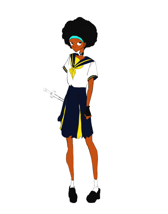
[ID. A simple drawing of Espa wearing a bright yellow and marine blue sailor school uniform. There is a small, uncolored sword on her waist. End ID.]
Testing those new brushes
Ok, so the one I picked for lineart is indeed very awesome and I'm pretty happy with it. It's the sort of brush that's hard, and when you lessen pressure it doesn't judt get thinner but lowers opacity as well. Ive wanted one like this for ages!
The first one I tried to use to sketch was more of a pain. It's good for doodles I'm but it's...pretty awkward to use. Not sure why I even picked it for it lmao, it's one of those more crispy and texturized hard brushes. So I started this second drawing. For the sketch I got a soft and low opacity one that looks like a thick pencil and it was delightful 10/10 sketch brush 👍 experience aquired
NOW onto coloring. I miss my old brush here XD all the ones i have now are either low opacity with low pressure (which makes me have to press hard to get any color out of them, but then the brush size also goes up and i need to keep adjusting the size to get to smaller areas) or sorta soft like cps's standard g-pen, and lemme tell you, I Did Not Like Coloring With Them. I ended up using the sketch brush and some rectangular rendering brushes and managed to do my thing so it moreso works, but I want to find something else. A hard retagular brush like my old one ;) hard brushes are easier to color because with them i can apply the bucket tool and it makes my job soo much easier. Speaking of which i might have to configurate it again coz my bucket tool is being a hassle lmao
art taglist || @inhurtandincomfort @seastarblue @for-the-love-of-angst
11 notes
·
View notes
Note
Hello!!! I love your art so much, especially the way you render!! Do you have any tips, tutorials, etc on rendering?? Be as detailed or curt as you like, I'm just hoping to improve my skills -- and I hope to see more art from you, in any form!!! You're a fantastic artist !!!! Have a good day :)
Sorry for the delay in answering this, I wanted to answer it well!!!
Here's my typical 5-step process:
flats
he has been flatted. You'll notice I also colored the lineart at this stage as well! Also, I do work with the background at the same time, but I have hidden it here for simplicity.
2. Cell shade shadows

I used to skip cell shading and just ball with my rendering, but I have found starting out like this is much faster!!
3. Airbrush shadows and colors
I did two things here, one is just a touch of airbrushing the colors into eachother, to help make everything more harmonious. The other is to airbrush colors onto my shadows! I set that layer to multiply, and mess around until something looks a little like I want.

4. Painting

This is the time sink - there's no getting around it, it just takes forever!! It's a lot about making the dark areas darker, and artifically injecting some color diversity - I like to diversify shades, and just slap on slight hue shifts as i go, and if it sucks I just paint over it some more. I draw different colors into eachother (look at the black shirt above, see how i bring in the tan and whites into the grey?) and add detail and texture. It's a little hard to explain beyond that, hmm... Do let me know if you have specific questions about it!
5. bedazzle and effects
I add extra highlights to the highlights, maybe a sparkle or two on a hard edge, hash lines for texture, and occasionally I also do screentones in shadows. Also, importantly, i blur things that shgould be out of focus! See on the arms and legs here - the bottom image has them blurred more intensely the further they are from the focal point. It's a small thing, but this effect goes a long way!
Annd done!

It's the little things that make a rendered piece sing! A balance between detailing and speed is a tricky one to figure out - I'm still working on that myself!
Also, there's two different ways I render at the moment, one is the quick-messy for sketches, which is what I've done for most of my fanart lately, but I assumed that you were asking about my full process so I went into detail on that. Tho if you're curious about my sketch rendering, anyone is welcome to ask me about that as well!
(there is little method to this madness though, haha)
Omg wait I had forgotten, a few months ago i was making a mini art guide about some tips and tricks
I lost motivation but if anyone is actually interested do let me know and maybe i'll finish it hjsdhjfghjs
Anyway, thank you so much anon!!!!! wah!!!!!!! Your kind words mean the world to me ;w; They fill me with strength and joy1!!!!!! thank you so much!!!!!!!!
54 notes
·
View notes
Text
my art process goes a little bit like this
sketching: wow holy shit drawing is so fucking hard this took a million years but i think it finally looks good i have a good feeling for this one
lineart: uuuuh. looks kinda weird but surely itll be fine right
flat colors: what the fuck. this looks like garbage what is fucking happening. holy shit ok trust in the process its fine its fine its fine
shading and rendering: YES. YES. YES. YES. YES. I AM GOD
39 notes
·
View notes
Note
oh my god I just recently stumbled across your art but I have to say it is my dream art style frfr 😭😭
any tips on how you render?
I personally use procreate and I’ve tried doing an art study on your art, but it’s kind of hard since I have to eyeball everything. I noticed you use thicker lines on the outside and thinner, more “unstable” lines on the inside sometimes. It makes a very pretty aesthetic.
Hi! I'm really flattered by your words honestly youre so nice 😭💗
As it comes to my rendered art pieces, I tend to mimic the traditional ways of painting, it really helps and it gives you more room for expression. One thing that I wish i did when i was younger was painting on one layer and not following the scheme sketch->lineart->coloring->shading so strictly. It was very limiting, yet i wasnt able to notice it for some reason 😭

here's how i painted before the realization vs after
also, use these
i use clip studio paint, but im certain procreate has those options, they're really helpful when you think your artwork goes bland
also remember about the rule -> things that are further have lesser contrast and aren't that much in the focus in contrary to the things on the foreground. This effect can be achieved by making things you dont want to be in the foreground more closely colored to the background color, but also you can render it less and sometimes leave it somewhat in a sketchy unfinished form - its the method that I use and also a lot of other artist from different eras.
It's hard to pin point the exact things i could help you with, but I told some things that I'd consider useful. also here's a speedpaint I did recently, maybe it will help ^^
I'm always open for questions etc so if you have any dont be afraid to ask!
9 notes
·
View notes
Note
Have u ever posted your comic or animation workflow anywhere? Im super curious on how you tackle the process, especially not using a drawing tablet. I know you have a very simple (and adorable) style so that probably helps in terms of workflow -- Im just curious about the steps you take.
Thank you! With both comics and animation my key thing is to not spend too much time on any particular thing, just draw loose and fast. Honestly the only downside to drawing with a mouse is that I can tell my arm has extremely specific muscle memory regarding it- if my mouse breaks and I get a new one I have to spend a good month or so just letting my hand get used to it again lol. Same with if my setup gets readjusted too much- right now my setup is my mouse on one of those padded mousepads, on top of 2 books, with my elbow resting on my 3DS case (I'll get an actual pillow or something for it eventually lol). But luckily thanks to this I suffer very minimal wrist pain 👍
(...Okay I started to go really in depth in my process here, so sorry if this is way more than what you were asking. Putting it under a readmore just to save space lol)
With MFM in particular, I start by writing out the entire script for the next story arc, which really is just all of the dialogue and vague notes about any important actions. Then I do the paneling with very loose stick-figure like sketches of where the characters are and what they're doing. I prefer having very little planning when it comes to character poses and panel shapes, coming up with those on the fly makes things much more exciting and faster to make. But it's the opposite with dialogue... it needs to be 100% FINAL before I draw a single line lol.


That's part of my script for my most recent chapter, as well as what my extremely loose goofy thumbnail sketching is like. I write the script as one big thing and don't separate it into pages until I actually start drawing- then I go and color change it just to keep track of what dialogue goes on each page
After that, I go back and do the ACTUAL sketch, as well as the lettering (I don't believe this is how it's done professionally. I used to do lettering as the very last step in the process... but then found it hard to cram speech bubbles in the right places lmao.) After that is lineart, coloring, background flat colors, then shading/rendering for all of it. I do each step in batches, as in I sketch out ALL pages of a chapter before moving to lineart, I line ALL pages before starting coloring, etc. I find it way easier to be productive when it's broken up like that, though when I first started the comic I used to draw each page to completion before starting the next (but also, the comic's style was DRASTICALLY simpler back then haha)
(Unfortunately I merged some of the shading to the background flat colors so it's not entirely accurate... oops) FireAlpaca has a sand texture feature that I only found out about last year- adding that to the backgrounds makes them look 10x better with WAY less effort.
With animation, it depends on the project. For simple 5-10 second animation I make for fun, there's very little planning lol. I skip some steps in the process- I'll sketch out the keyframes (and maybe any difficult inbetweens if necessary), line those, then go straight into making linework inbetweens. I'm not a cleanup artist and have no experience in that, so I always find trying to line my rough animation makes everything jittery and wobbly. If I do it with a clean line from the start then I can avoid that and save a lot of time 👍
For my bigger projects (such as the Parvey cartoon and the MFM Kickstarter trailer), I do the whole animatic with final audio first and foremost, with the animatic being almost like the keyframes. I split them up into individual shots, .mp4 files anywhere between 1-30 seconds usually, and animate those one at a time. I'm a huge fan of free to use programs and try to use them as much as I possibly can, here's a list of the ones I use:
FireAlpaca- for the actual drawing part itself (storyboarding/animating/etc). FireAlpaca has a feature that lets you export every frame as it's own drawing, as well as an onion skin mode
Windows Movie Maker- for compiling all of those frames into video format, creating individual shots. If you upload all of your frames and set them to around 0.08 seconds, it equals about 12fps (I usually animate at 0.10 seconds/10fps, its a bit slower but looks nice)
Onlinesequencer.net- for making music. It's the place I've made all of my songs on, like the timeloop song, hyperworkaholic, and the background music for the MFM Kickstarter trailer.
Audacity- for editing audio/music. Also great for recording things directly from your desktop
DaVinci Resolve- for editing and putting together all of the shots into one big video. Can get kind of intensive on the computer during rendering, so watch out.
YouCut (app)- also for editing and compiling shots, I used this one a lot a couple years back but I'm not sure how well it holds up. Doesn't need much phone storage to download but needs a lot to render videos.
MS Paint (yes really)- for typing up text. FireAlpaca has a text option but I don't like it as much as Paint's.
...The only thing I genuinely can't do alone is voice acting. Luckily there's a big voice acting community on Twitter and they're all amazing to work with!
This got... way more in depth than I planned for it to be, so sorry if this is way more than what you were asking lol. But that's my general process when it comes to my art 👍
32 notes
·
View notes
Text

Since I forgot to share this like a moron, I’ll recap my contributions. I worked on the Rowdy Runway: A TWEWY Fashion Zine as the artist who not only did the cover art (seen above) but also I did three different artworks.

The first artwork I did was for my hubby Higashizawa, repping the now defunct Sheep Heavenly (replaced with Top’ o Topo in NEO for garishly cute and saturated clothing). Each item worn by Higgy here is a piece of Sheep Heavenly clothing interpreted by me staring way too hard at the pixel clothing sprites. This one was so fun to color and I get to draw muscular men in bright cute colors??? Like hell yes!
(Also yes I had to make that Sheep Heavenly logo myself)


The second artwork I made for the zine is one of Susukichi rocking the monocrow drip! This piece was a traditional art piece I colored digitally to fit the zine. I’ve included the lineart version so you can see how much pain and suffering I mean detail I put into this one. I went with MonoCrow as a way to push myself out of my comfort zone and focus less on rendering and shading, using simple cel shading and heavy shadows to make Susy K look cool~! In the end this one turned out to be my favorite traditional art pieces.
This last one was a collab between me and a writer friend who goes by Stinkfly03 on twitter/X. They made a fic about Beat truely seeing himself as more then a Neku copycat and he cuts his hair to match his younger self. I went fully into my comfort zone with this one by relying on rendering and lighting. In this story, Beat’s physical appearance is thinner and a lot more Neku like which (I hope) I conveyed well. The fic is called “Reflecting Neku” by PetildaFan on A03 (Archive of Our Own)! Pls go check it out. It’s a super interesting character introspection on Beat that is worth the read!
Interested in the art I do? You can check out my other works or support me by checking out my linktree.
#anixdraws#fanart#rowdy runway#twewy#twewy fanart#neo: the world ends with you#the world ends with you#ntwewy#ntwewy fanart#a twewy fashion zine#Yodai Higashizawa#susukichi#Susy K#daisukenojo bito#twewy zine#AnixDraws Contributions#I finally posted this#I’m so sorry I forgot to share this#I completely forgot
122 notes
·
View notes
Note
Hey! I love your art so much and was wondering what brushes and/or art programs you use, I'm an artist myself and am just genuinely curious. Sorry if this is a strange ask or anything... I don't use or get on Tumblr too often. Thanks for reading this ask and have a good day/night. (This is my first ask to anyone I think)
hey!!! i use Paint Tool SAI 2!
as of the moment (which means i constantly change it) here is my main doodling/sketching/lineart brush:
my coloring brush: any hard edged basic brush will do, you can also use the bucket tool or the lasso tool, it's simply for coloring
my blushing brush: i blend this brush out by switching to transparency (making it an eraser) and lightly tapping the outside of the paint! (sai users, do this by pressing C on your keyboard. lifesaver been using this shortcut for years) it's versatile, i love using it for gradients
marker brush (usually for ecto): i use this brush only when i want to paint ecto (which i don't do often) but you can use this for other purposes too! it's not my favorite, not even good enough for ecto imo, because my sai 1 version is much better i blend things out the EXACT SAME WAY as the blush brush so please keep that in mind!

a basic brush im testing out for shading purposes: it has a little bit of texture and is made for baaasically cel shading but slightly softer and has the tiniest bit of color mixing

blending brush i barely use and don't actually really like that much: i'm still testing out blending brushes that i like because i can't find one that i like that isn't just blurring colors together or making them muddy when mixed together. if anybody has suggestions, PLEASE let me know! anything like a procreate or csp blending brush that can be recreated would be great
and finally, my rendering brush: it's basically a basic hard edged brush that can pick up the smallest bit of color i use it to clean up and add final touches by using the drop picker often and over the entire artwork

ofc, change anything to your preferences. that's how it goes these are just the settings that work for me :) this also goes for the program LOL i know sai is not for everyone (but it's my baby my bestie my 5ever so like this is about ME)
i have an in-depth post about my CSP brushes and how i work with them (and i don't really ever use csp unless it's a big piece so it's not changing anytime soon) if that's what you have or prefer
my #ref tag is also a treasure trove of my old settings over the years if you'd like to see those too
83 notes
·
View notes
Note
your one of my favorite artists and i wanted to know if you have any tips for anyone who wants to makes drawings with colors like yours. the backgrounds are beautiful and i wish i could play with colors like that
AAAA Thank you so much Ruby 😭🫶🏻 it really means a lot.
Lots of typing below so I'll add a keep reading tab!
I did go in depth in a previous ask, where I also linked back to yet ANOTHER ask, lol. I definitely encourage you to give them a read if you'd like! :)
But of course I can definitely add some more tidbits!
Besides playing around with clip studio's built in features (tone curve, approximate color, gradient map, etc.) Taking inspiration from real life is one of my favorite things to do. ^^
In fact it's possibly one of the best places you can get color reference from, because how you interpret it is entirely up to you!
For example with the celestial crystalfly piece, I saw these flowers near a supermarket, and a really lovely color scheme near the end of a sunset. (Besides the fact that I was daydreaming about painting Lumine if she collected all of the elements FHAHDGSHA) I didn't actually color drop for this piece, because I wanted to treat it like a study, and I was painting the flowers from memory because I didn't have a picture of it them the time. I stylized it in the end but was very pleased w the result. ^^
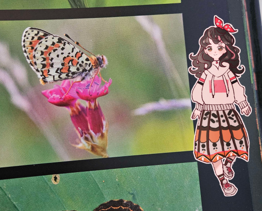
And with this character design, I got color inspiration from a butterfly in a photography book that was on sale in Indigo.
So generally my colors don't always come from nowhere!
Besides that for all pieces, I personally also like to plan colors during the sketch phase!
If you're like me and you used to follow the traditional sketch > lineart > color workflow, but once you got to the coloring part you'd get stuck, try it! Once you have a pose and character in mind, add some lighter base colors. As you work on rendering the piece, build up your base colors with darker colors (or lighter colors for things like accents and highlights)
It's probably more suited to painterly styles, but I think you could definitely find a way to make it work if you prefer clean lineart.
I hope this helps give you some jumping off points to think about!
Color is a bit of a hard area to give concrete guidance on because it almost goes hand in hand with style. You get more comfortable with it and find what works the more you practice.
And that's coming from someone who used to color/draw like this 8 years ago,,,,,
so trust me. 😭
#asks#Actually I feel like I should compile all these tumblr asks into one at some point for people to refer back to#so I might do that when I'm free.#or maybe record one of those speedpaint videos where you explain as you go 🤔
20 notes
·
View notes
Note
Hiya, if you don't mind, how do you make or is the process on making Disco Elysium portraits?
Ofc!
Usually I'll work from very blotchy colors first, basically letting the shape of the Default Procreate Nikko rull brush do all of the work. Generally I sit for a good hour or so just working with palettes and values and making the general blockouts feel like they belong. After which I'll start refining with both Nikko rull and the dry brush, both utilized at very high pressure, to avoid lower opacity and smaller sizes, and to really allow the brushstrokes to be seen in the piece itself. I feel it tends to make faces look like they've been "painted on" with as few brushstrokes as possible, which is usually the best approach in emulating that oily, impressionist look that Tamsalu usually goes for.
A general piece of advice I have if you're trying to emulate the style is that over-rendering almost always ends up being a bad idea. If you feel like you're making your brush too small in a place, turn it around and paint over it with bigger brush-strokes until it feels like you've captured the surface perfectly in one or two hard, heavy strokes.
Generally, I avoid using lineart, and instead emulate thicker line-weight by adding heavy and very geometrical shading on areas such as the nose or underneath the jaw, usually just colorpicking from the darkest hue i might have picked for the skin. Usually, bounce light in a thin line can really make darker areas pop, if I feel like an area is a little too hard to read shape-wise.
Hope this helps!
#txt#sorry if this is super long lol i just rly like interpreting styles and talking ab impressionism
58 notes
·
View notes