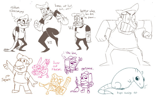
#this was the first illustration i made in my new art style :>
Text

Do you like moths? I love moths, especially luna moths which this design was based on. It's one of my favorite character designs I've ever done.
#character design#original character#illustration#illustrationartists#artists on tumblr#krita artists#luna moth#moth art#cottagecore#fantasy#fantasy art#elf#fairy art#fairy#I really struggled when I was coloring the staff haha#but the gradients turned out perfect#this was the first artwork I made in my new coloring style which is much more simplistic then what I used to do
41 notes
·
View notes
Text
Olympics AU Info dump!
First, I am blown away by how much love the series is getting, thank you all so much! I do really enjoy all the comments and reactions in the tags. Know that they all delight me and the only reason I don’t reply to everything is because there are so many! But I read them all 💕
General questions:
Can you draw the designs or concepts? Write fanfic in this AU?
Yes of course! I’d love for you to tag me if you post them so I can see
Do they all know each other?
At first, I would say no- with the exception of Nico and Will (they’re developing a whole backstory in my head that I cannot and will not stop.). But they all meet in the Olympic Village after the opening ceremonies and quickly become friends. They all try their best to attend each other’s events. (Someone please tell me how Percabeth becomes a thing. Please. 🙏 )
Why didn’t Percy win gold?
Percy was an Olympic medalist in swimming before moving to diving. After competing in several swimming events and feeling like they were all just small variations of the same thing, he wanted more of a challenge. He chose diving to stay rooted in to the water, but to add a new dimension to his bodily awareness and control.
What’s Annabeth and Luke’s rivalry?
They most definitely trained together, and it was Luke’s skill that motivated Annabeth to aim for the Olympics. But, she wanted to compete for her home country, Greece, which Luke thought was just a shortcut since there was a clearer path to an Olympic team in a smaller country. Annabeth is constantly trying to prove to him that she would have made it to the top of the sport either way.
Also, apologies to the IRL fencers out there for the inconsistency. I know fencing is a gendered sport, and Annabeth’s gear/style are inconsistent, please forgive the oversight ☺️🫶
Volleyball?
The whole Hunters of Artemis are a volleyball team (that apparently has no country 😅). Thalia ends up the captain. When Reyna moves on from tennis they welcome her with open arms.
Rejected sports
Will as a runner. Canonically, he’s super fast, but just having him as a sprinter didn’t fit with his personality.
Will as a pole vaulter. Specifically the guy that lost because he was ‘blessed a little too much’ and knocked down the bar. I will not explain further.
Will as a gymnast. He was this || close to being a gymnast essentially modeled after Steven Nedoroscik, I had the sketch and everything. (I shared it here!) But when an anyonomous ask clued me into the sick medical team uniforms it all fell into place from there. (Thank you no-longer-anon @helyeahmangocheese !)
Percy in anything equestrian related. I see him not having the patience for all the formality of it all, but he definitely crashes Hazel’s shows and chats up all the competition (the horses.)
Annabeth on a sailing team. Also, related to that, Reyna on a sailing team. It was a fun idea, especially for Reyna and her history with pirates but ultimately it was really hard to capture in a few illustrations.
Nico in several winter sports. For consistency mostly. He could fit for a lot of winter sports - ice skating and snowboarding are my personal favorites.
Leo as a shooter. He would most definitely build his own gear and make tweaks to his weapon. Which would get him immediately disqualified.
Jason in discus. Jason as a basketball player. Golf is just… fitting. 😂
Other Characters I’ve been thinking about
(that may have art in the works… and may not actually be athletes!)
Clarisse
Meg
Grover
Rachel
Lester / Apollo
Mr. D
Chiron
#olympics au#pjo#pjo hoo toa#percy jackson#rrverse#annabeth chase#jason grace#nico di angelo#will solace#reyna avila ramirez arellano#hazel lavesque#trials of apollo
245 notes
·
View notes
Text
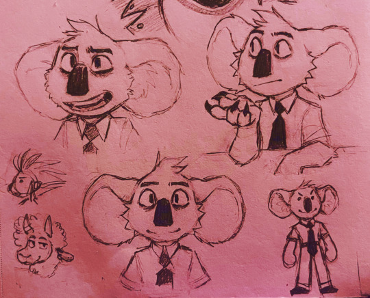
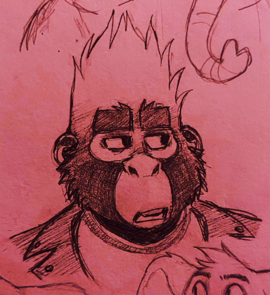
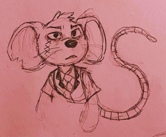
Some sketches because it's been months since I drew these idiots oops☝️🥰

HI THERE. It's been a minute, sorry about that lol. I took a tiny out-of-nowhere and sorta involuntary break from the fandom because I lost interest for a second, but I'm slowlyyyy making my way back. With art, and some news about Tone Deaf for the people who are still wondering about that.
Also I see there's some asks in my box, I'll get to that eventually, I see you ;-; dw
--------------------
As stated, I momentarily lost a bit of interest with this movie- partially because I've recently been ensnared in a new fixation that will not be named right now, but yeah. I'm digging my heels in rn, because the last thing I wanna do is abandon this project. But, also, I've clearly bitten off more than I can chew with this being a comic lmao. In over my head and going through all 5 stages of grief and currently on acceptance.
The story got bigger. Like, a LOT bigger. Too big to capture every thought in a drawing and panel it and put it out as a perfectly polished comic without seriously burning myself out. It really doesn't help that my art style evolves by the second too apparently, so I've reached a middle-ground:
Tone Deaf is going to be a fic with some comic-like segments in it. An illustrated fanfic bc I still love showing and not telling a little too much.
This'll help me not only get stuff out faster, but also to help me fill in the gaps I didn't know how to draw with just text. So I can focus on just drawing the juicy shit. This also means it'll all be collected over on Ao3 in a neat little package, and I honestly prefer that over having a bunch of posts of pages that might be hard to find. So yeah, that's the plan.
Another bonus is that the frames can now be a lot more polished and nice looking [in glorious color] rather than hastily mashed together due to my bad habit of going overboard on singular frames without realizing it.
--------------------
Tldr; Tone Deaf is technically still gonna be a comic, it's just now gonna be supplemented with word-based fic mixed in because I made the project way too fucking big [the first Act has like 20 chapters I'm going to literally die]. Also it's gonna be on Ao3 and I'll probably be posting all the art here alongside any updates I make so huzzah! Help me :>
#UPDATE POST#Sing: Tone Deaf#sing movie#sing 2016#sing 2021#Buster Moon#Meena sing#Johnny sing#Mike the Mouse#tiny little pictures of Ash and Eddie too heehee#furry art#fanart#anthro#traditional art#sketches#it's been 5 months since I last posted#never let me do that again#also my art style's changed an itty bitty bit#just a little#finally updated how I draw Buster's ears and have an actual method for drawing Johnny >:] still unsure on Meena and Mike#I think this is the final plan for TD#gonna try posting more trust me#uwu#I always come back
281 notes
·
View notes
Text
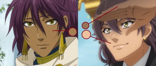
For the yet-to-be-informed, let me preach to you the gospel of Das gayszlen

What is Das Gayszlen?
Das gayszlen, generally translated as the "whip" is a technique in historical longsword fighting from 15th century German tradition. The basic mechanics of the gayszlen are as such: a single handed strike with the nondominant or lower hand, where the sword is released from a traditional grip to allow the blade to sweep towards the leg of your opponent. Some also define other one handed strikes, slices, or thrusts as a gayszlen, but (in my experience) the more common interpretation is the narrower definition I provided. There is some difficulty however in knowing definitively how it was used historically, beyond the general difficulty in knowing anything for certain in HEMA that comes with the territory of reviving a dead art. Much proverbial ink has been spilled online about how, when, and if it is appropriate to use, and many consider it to be a cheap trick, not to be used in serious competition or incorporated into a revival of historical fencing systems. I have Thoughts™ about it and my new URL change inspired me to detail those thoughts, continued below.
Where does it come from?
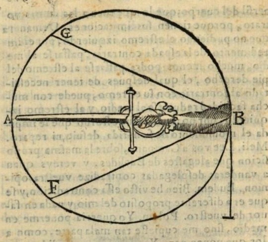
Ok. so. maybe "15th century german tradition" is a bit generous. There is a grand total of ONE source for the gayszlen, which is in a fechtbuch (fencing book) by fencing master and author Hans Talhoffer, one of the most influential and prolific of his time. His numerous manuals cover a wide range of weapons and techniques including grappling, dagger, polearms, mounted and armoured combat, as well as some more silly things like duelling/long shields and "man vs woman" duels (last two pictured below).
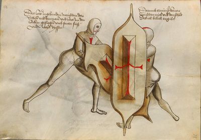
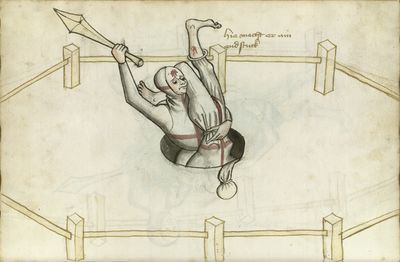
Despite all that and multiple depictions of many of the techniques for these silly "niche" styles of combat (at least in the context of modern HEMA practice, they likely were somewhat prevalent at the time and used to resolve legal disputes) there is only one illustration of the gayszlen, in one of Talhoffer's books. It depicts an exchange between a fencer in a "free point" (afaik the only time that term is used as well, though it is a position that is quite common in german longsword fencing, being a sort of hanging guard or the midpoint of a strike like a zwerchhau) and another performing the gayszlen against the aforementioned fencer, shown below (figure on the right is performing the gayszlen).
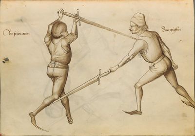
You may notice the text on the image, next to each figure! These say Ain fryes ortt and Das gayszlen, again translated as "a free point" and "the gayszlen". You may ask "but what does the actual caption or description say about it?!" I'm so sorry to disappoint you, and I share in your misery: this is all there is. Truly sad, I know. This lack of source material is (in my opinion) why there is so much difficulty defining it and so much debate over its historical usage and value in modern use.
So how do people interpret it?
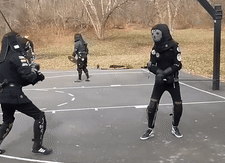
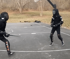
As stated earlier, the (general) consensus is that it is a one handed strike (a hit, hew, or cut, as opposed to a thrust or draw/push slice) made with the offhand to the lower half of the opponent's body. One of the main disagreements on how to interpret this is whether the sword is "whipping" or cutting to the left from the right, or from the right to the left. Based on the foot position, it might look like the fencer performing the gayszlen (hereafter referred to as G) is bringing the sword from their left side to swing into the opponent's (hereafter referred to as F) left calf. However, this hand position and movement of the sword leaves G entirely open to attack anywhere on their torso or the right side of their body generally. An example of me (right) executing this interpretation is below: you can see that I do actually get the hit, but my opponent nearly hits me with the first strike to the right side of my head, where I am most vulnerable, and follows it up with another strike to my head. If this scenario played out with sharp swords and no protective gear I would lose this fight.
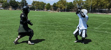
Another interpretation of the gayszlen is this: G holds the sword in any guard on the right side of their body (higher guards may be better for generating more force or deciding to do literally anything other than the gayszlen) and releases the sword from their right hand, holding the pommel in the left and sweeping the sword towards F's right calf. in the picture we have, it may be that the "free point" is meant to be a response to the gayszlen, and therefore F is retracting their foot to avoid the gayszlen, while striking G to their unprotected body. An example of me (left) attempting to execute this interpretation is below: even though my opponent fails to parry or suppress my attack, it wasn't necessary. I didn't have the reach to hit her leg, though her dodge may have saved her even if I had been a bit closer to begin or had extended farther.
Something that I believe supports this second interpretation is the general attitude of historical German longsword manuals to favor attacks and guards from above, to high openings, or generally closer to the upper half of the body than lower attacks and guards. A reason for this is detailed in many European sword systems, namely the destreza rapier tradition, thibault by extension, and meyer.
https://www.youtube.com/shorts/tPHbG28niyc
The above image and video are pretty simple explanations, the core idea being that a sword and arm extended at the height of the shoulder (or nearer the shoulder) will have more forward reach than a sword and arm extended higher or lower than the shoulder. Because of this, F theoretically has somewhat of a reach advantage over G, as their sword and arm are closer to their shoulder. though the utility (as I'll talk about more later) of the gayszlen is that it is done in a grip that extends G's reach beyond a normal grip like F has.
There are also interpretations that point to it being a thrust (like I attempt below) which is supported by similar techniques showing up in other European sword systems, which I could spend a whole equally long post talking about, but this is plenty long as is, maybe a topic for another time. The two lame reasons I have for not liking this interpretation is that a thrust doesn't seem very "whiplike", and also a thrust to the legs with one hand is harder to pull off than a cut to the legs or a one handed thrust to the torso.
How can I incorporate the gayszlen into my modern HEMA practice?
To preface this, throughout all of this I'm mixing terms and concepts from Fiore and Liectenauer and Talhoffer and Meyer and probably some other stuff. I primarily study and practice Liechtenauer blossfechten via Ringeck, Danzig, and Lew, as well as most of Fiore's system. This is just my opinion on what purpose the gayszlen can serve in the frog DNA filled world of HEMA longsword, this is not pure to any martial art system, just an application for the sport.
That being said: I believe the gayszlen's place in modern longsword fencing is similar to that of guards like the boar's tooth, long tail, or the key, all of which can use distance deceptively. they place the sword further back than it would be in an iron gate or a plow (guards which are somewhat close to those I mentioned) and allow the fencer using them to seem less threatening than they would with more aggressive guards. Likewise, I often find myself throwing gayszlens from positions where I'm somewhat retracted or seemingly out of distance, or preparing for an attack to another opening. This can often allow an attack at an unexpected timing or from an unexpected angle. I find it works well when your opponent is static in a guard and you to a distance juuust outside of where you could hit them with a normal grip, and the switch to a one handed pommel grip gives you the couple inches you need to get the hit, and hopefully enough speed to avoid getting beaten away by their sword. One of the big dangers with the gayszlen is the opportunity it presents for getting hit. When you employ this technique, you give up basically all protection your sword has to offer, you can't block any incoming attacks, and you don't have a good enough grip to bat your opponent's sword out of the way. This means that if you don't plan well, you leave yourself totally open to a double or a hit to you if they avoid your gayszlen. See below! The fencer attempting the gayszlen (right) goes in with his head down and totally unprotected, allowing the opposing fencer to get a really beautiful hit to his head as she dodges his gayszlen. This is what you should do if you encounter someone who is eager to use the gayszlen and you wish to discourage them.

A safer position (both to avoid getting hit and to avoid injury, as I'll mention in the next section) is a more upright stance and a deep lunge, though keeping your shoulder up, as I mentioned earlier, reduces your range to that lower point.
Why don't some people allow it in tournaments?
Many tournaments, in my area and others, don't allow gayszlens. some ways this manifests are bans on all one-handed cuts, all one handed strikes altogether, including thrusts, hits to the leg below the knee, etc. Some people just don't like the gayszlen, think it's too hard to judge, think it doesn't have enough historical basis, or think it is dangerous to the person doing it or the person having it done to them. A lot of those reasons are laid out in this article, which, while I disagree with most of the points, makes those points pretty well. It's also the first result when you search on google for gayszlen, which makes me sad :( Another argument regarding the safety that isn't mentioned in that article is that to get additional reach and evade strikes from above, some people get really low when executing a gayszlen, even exposing the back of their head or body, which can lead to some really nasty hits to the back of your head or your spine, which are vulnerable areas even when wearing gear, are are often the parts of the body that have the least protective gear. In my opinion, any ruling that is intended to ban gayszlens that we've seen is too broad. banning one-handed cuts (or strikes altogether) means that whole sections of manuscripts or traditions (such as fiore's uno mano plays) can't be performed, banning cuts to the legs or parts of the legs can give an advantage to taller fencers, discarding them automatically because they're too difficult to judge the quality of can punish those who have worked to perfect them safely, etc. At the end of the day it doesn't really make a huge difference one way or the other, and every tournament organizer is biased in the way they make their ruleset one way or the other, but I think the gayszlen is unfairly maligned. In my opinion, with proper attention to levels of force, protective equipment, and judging, the gayszlen deserves a place in modern HEMA tournaments.
ALSO IT HAS GAY IN IT TEEEHEE!!
some people pronounce it "guy-slen" and I usually say "gay-slen" and I don't speak modern or medieval german so idk how it should be pronounced but I like saying gay :) because homosexuality get it???? I
I've made the gayszlen a bit of a meme in my local scene by shouting "GAYSZLEN" whenever I do it, like an anime character. This is typically regarded with friendly annoyance, and it makes hitting this silly ass technique SO much more satisfying and makes whiffing it a lot less embarrassing :)
anyways thanks for reading my long ass post ily <3 if anyone has additional thoughts, please leave them in the comments! I'd rather not debate anything, but I'd be happy to discuss intricacies of the gayszlen's use and interpretation if you're nice about it!
105 notes
·
View notes
Text

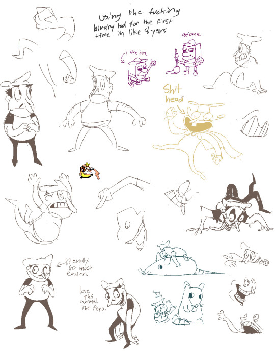
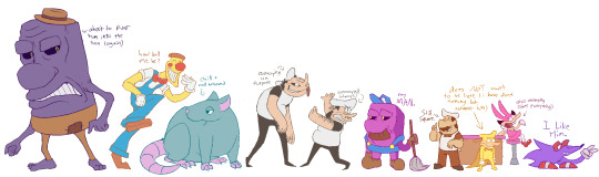
a year!!! as of today i have now been drawing these funny little pizza freaks, to the exclusion of almost everything else, for!!! an entire year!!! i wanted to do a nice group shot/lineup of everybody to compare to when i first started trying to draw them because oh boy were they bad. i never even posted most of them anywhere because they were so bad. but im posting them here, now, to see how everything's changed/evolved.
this is probably the hardest time i've ever had trying to figure out how to work with a style, but we got there eventually; i'm pretty happy with the handle i've got on everybody now...dont let ur memes be dreams. lots of unimportant journaling and idle thoughts abt it below.
older pics
the first one is the VERY first time i drew them, before i thought i was going to actually have any interest in drawing them [lmao]; it was just the one isolated image, for my friendserver, to illustrate the funney message, so there was no attempt to make it Good or actually understand anything going on w/ the designs or style.
second is the original run of practices sketches to start trying to figure them out for real; done after i started having ideas for the comics and such and realized oh god maybe i am actually gonna draw fanart for this. [again, lol, and lmao.]
third one is the first pt art thing i posted on here. there were a couple weeks of sprite studies between this one and the previous image. the one on the top right wasn't part of that post i just threw it on as space filler; i'd intended to shift to doing Sprite Redraws But Stylized to explore tings more, but that was the only one i did. ¯\_(ツ)_/¯
individual characters
peppino: by far the hardest dear god. bro what ARE your shapes how DOES your face work. jesus christ. everything i have trouble with this style for, peppino has it in excess. i draw in polygons! i need consistency! and that is the last thing this kind of style is concerned with. they are made of squarshy clay and i do not understand how to mold them. i was really hoping trying to learn this game's style would GIVE me that kind of flexibility for fun exaggerated facial expression but i don't think much came of it in the end 😔. anyway on the bright side all this means once i got peppino figured out a little bit everybody else clicked way easier.
fake peppino: honestly i never did anything with him on purpose except for how his eyes work + the perma-smile thing. i figured ok hes supposed to look weird and off model so whatever happens with him happens. and it did. and it kept happening. it is still, in fact, happening.
noise/ette: somehow, for every bit that peppino was the least natural thing i've ever tried, these two worked pretty much right off the bat. i still don't understand it, seeing as pretty much all the things at play for peppino are also at work for them. i think the new sketches are actually a little worse than older ones but not enough that i care.
gustavo: really funny bc i drew him on model twice and just went 'okay, cool nice, easy, um. he doesn't have any fucking legs?' fortunately he was the only one i had a strong idea for how to stylize him [square] and it worked exactly as i was hoping so wahoo.
brick: is an animal and therefore 5000x easier and more natural for me to draw/stylize than anything else in the cast. that is Just a rat bro. i can draw a rat.
gerome: i think the funniest one here. the most drastic and least necessary change imo. i was gonna have him be really small at first, like smaller than the noises, but then i just... didn't. he's just peppino-sized now. also i gave him like. actual human facial structure, which is funny bc in most cases i'd do anything to avoid, but it works well for his being A Rock to give him some angles and definition like that+ to differentiate his vibe from the rest of the cast who are all very squishy. also since he is essentially Just A Head it's good to emphasize that too ig.
john: i only drew john a couple times but he gets to be here because i like him. and because most of the stuff i applied to gerome was readily applicable to john, though i did try to keep him a little more uncanny because he is a Huge And Lanky Freak. i hate that he is barefoot btw but idk how to make his color balance look right with shoes.
pizzahead: i did not want to put him on here honestly but i Have drawn him a handful of times and more importantly i didn't know what i was gonna do with john's pose if i didn't have him there to be glared at. the only thing that's different with him is giving him wider-bottomed pants, which i got from when i tried to draw these guys in clone high style [i never posted that one either][i will eventually]
snick: he gets to be here because 1. he's like 6 lines 2. i like him and 3. ive scribbled him a few times offhand and it went pretty well
misc
there are some guys missing because those are guys i didn't draw enough [or at all] to have gotten comfortable with them. sorry
i would have Liked to shade these but for the time being i have accepted that my grasp of light/shadow has decayed to the point im not going to be happy with anything i try there, so For Now i am working on my presentation with flats i guess. gerome has a shadow only because he's shaded like that ingame and looks naked without it
anyway if you are still reading [hi?] i get to shamelessly plug now. i'm over the hill of my pizza run now, and while i still have plenty of things i want to make here, most of the bigger more in-depth ones have passed. pizza tower was the first thing in THREE YEARS to get me out of my oc groove to doing fanart, and once i am done with my ideas here i will be going right back to it. if you like my art or how i write characters/interactions you should check out my oc/webcomic blog @jamverse . i can't promise people who like pizza stuff will be terribly into my designs, but i can guarantee i treat my guys with the exact same sort of tone i handle the pt guys with. and hell, i've mentioned it a few times before, but like 70% of my characterization for fake pep is just copied off one of my characters, so if u are going to miss him... he will still be there in spirit >;p
and if you dont care about any of that and are still reading thank you anyway. actually making these comics + seeing how shockingly well-received they've been has done a lot for my confidence, and for seeing that my kind of stuff IS something people enjoy :')
#pizza tower#peppino spaghetti#fake peppino#gustavo and brick#the noise#noisette#pizzahead#arting#pizzaposting
183 notes
·
View notes
Text

my new pixie hollow oc, her name is Astoria and she's a scribe talent. (she was made to basically be another mouthpiece for me to infodump about disney fairy facts and stuff, if you got looking in my past art/videos i think i posted Livra my first oc and basically sona for the same purpose)
i want to try opening up specific commissions so i can draw more of these lil fairies in the style of the books illustrations, like this one.
250 notes
·
View notes
Text


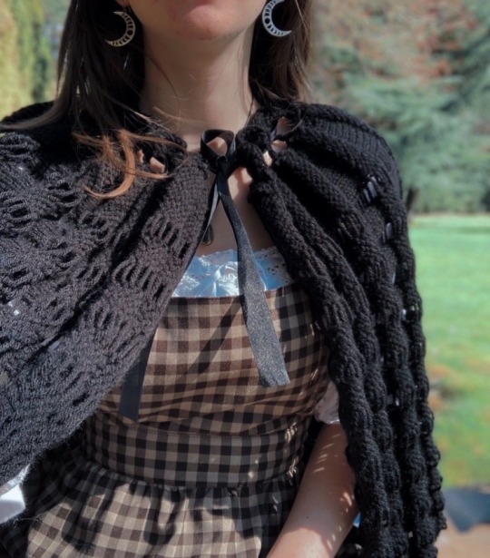
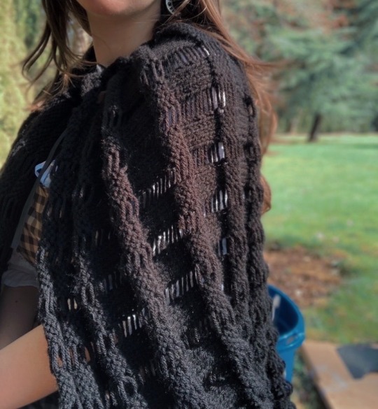
Knitting in Victorian England
I wrote this for a class on Victorian Literature because my professor let me research knittinf and make a cape instead of writing a literary analysis paper. The cape that is discussed from The Art of Knitting is what I created for this project, with the illustration from the book on the top right and the cape I knit on the left. The book is from 1892 and is free on Internet Archive, and Engineering Knits on YouTube made a wonderful video about it. (More photos of the cape at the end!)
Knitting experienced a surge of popularity in Victorian England, and was even a topic of discussion in Charlotte Bronte’s Jane Eyre. After gaining popularity due to industrialization, knitting became a common pastime for women. Knitting was important because it existed as a way for Victorian women of all classes to be seen as virtuous and gave them the look of domesticity, while additionally functioning as a means of income for working-class women by either knitting or writing about knitting.
Industrialization shifted the view of knitting from economic necessity to a fashionable pastime for gentry women. In 1589 the first mechanical knitting machine was invented in Nottingham, which industrialized the knitting industry (“The History of Hand-Knitting"). Dyed wool trade with Germany and the subsequent booming industry of knitting pattern books turned knitting into something more accessible and artistic than solely practical (Rutt 112). Knitting became popular and fashionable for gentry women around 1835 (Rutt 111). Women of all classes have knitted long before the Victorian period, but the industrial changes shifted knitting to a popular and fashionable pastime for gentry women, in addition to the economic necessity for working-class women.
Knitting served as a way to keep women wholesomely busy. In The Art of Knitting, a quote from the beginning by Richter reads “A letter or a book distracts a woman more than four pair of stockings knit by herself” (qtd in The Art of Knitting 2). Knitting kept women busy without opening them up to new ideas that came from letters and books. Furthermore, a writer in The Magazine of Domestic Economy writes how useless the items (upper-class) women made were, but praises knitting in its effort “to rid of those hours which, but for their aid, might not be so innocently disposed of” (qtd in Rutt 112). Concentrating on knitting produces something at the end of the hours of challenging work but does not expose women to any material that the Victorians would deem dangerous or immoral. Thus, even when women made something useless, they were keeping themselves busy in a virtuous way.
Knitting also gave women the feminine and domestic look that was expected of them in the Victorian era. This can be seen in Jane Eyre with Jane’s description of Mrs. Fairfax upon their meeting. Jane thinks, “[Mrs. Fairfax] was occupied in knitting; a large cat sat demurely at her feet; nothing in short was wanting to complete the beau-ideal of domestic comfort” (Bronte 145). This is the first time the reader sees Mrs. Fairfax, surrounded by a warm fire, a cat and engaged in a feminine pastime. She is the image of domesticity. Jane admires Mrs. Fairfax, in part, for the comfort her nature, including knitting, brings. Mrs. Fairfax shows the role knitting plays into the idea of women as domestic creatures.
Certain forms of knitting made women appear elegant. Frances Lambert, author of 1842 manual The Handbook of Needlework, advises women to knit using the common Dutch knitting method, in which the yarn is held over the fingers of the left hand and the needles pointed upwards, because it was seen as a more elegant style of knitting (Rutt 113). While Rutt notes that this method was a faster way of knitting, Lambert does not comment on this, but instead focuses on its aesthetic qualities. This style of knitting was popular because it allowed for the look of style that was mandatory in women’s lives.
While gentry women were often restricted to making less practical knit items, some knitting authors disparaged this for frivolity and immorality. Working-class women did not have this criticism as the things they made were out of practicality and meant for regular use. In picking yarn color and material, Mlle Riego de la Branchardiere, author of Ladies Handbook of Knitting, Netting and Crochet writes “...and let her be careful to make all she does a sacrifice acceptable to her God” (qtd in Rutt 116). Rutt asserts that although Victorian knitting is seen as producing useless knits, some authors disparaged this (117). They instead encouraged women to focus on what they saw as the spiritual aspects rather than on aesthetics, as everything women did, including knitting, should enhance their virtue.
While knitting was popular as a pastime, it was still used out of economic need and served as a way for working-class women to earn money. Knitting was taught in orphanages and poor houses, with the first knitting school opened in Lincoln, Leicester, and York in the late 1500s. One school in Yorkshire was established for boys and girls who were “not in affluence” (“The History of Hand-Knitting"). The first knitting book, titled The National Society's Instructions on Needlework and Knitting, published in 1838, was an instructional manual for teachers to teach poor students the art of knitting and needlework. Knitting was used as a personal hobby, but also as a way for working-class people to support themselves.
The importance of knitting to working-class women can be seen in Jane Eyre. St John tells Jane, “It is a village school: your scholars will be only poor girls—cottagers’ children—at the best, farmers’ daughters. Knitting, sewing, reading, writing, ciphering, will be all you will have to teach” (Bronte 541). Knitting will be a way for these young girls to get jobs and to be able to make clothes for themselves and their families. In this way, knitting was more than a fashionable and artistic hobby, but a necessity for many working-class women.
In addition to manufacturing knitwear, women were able to make substantial livings writing about knitting. There was a boom in knitting and needlework publications during the 19th century (“The History of Hand-Knitting"). Some, such as The Art of Knitting, were published directly by publishers with no one associated author. Others were authored by women and were immensely successful. Cornelia Mee, who published shorter pamphlet-type knitting books, sold over 300,000 copies during their run in print (Rutt 115). Francis Lambert, author of two editions of My Knitting Book, sold a combined 65,000 copies and was translated into several languages across Europe (Rutt 113). Knitting gave working-class women opportunities to earn money, whether it was making knitwear or writing about knitting.
Knitting manuals contained various topics, such as some focusing on the religious and virtuous aspects of knitting as discussed previously, but most, if not all, had patterns in them. Under the chapter “Hoods, Capes, Shawls, Jackets, Fascinators, Petticoats, Leggings, Slippers, etc., etc.” in The Art of Knitting there is a pattern to knit a cape. Victorian knitting patterns tended to be broad and vague. Today's patterns are quite concerned with needle size and gauge, unlike many Victorian patterns. For instance, the cape pattern instructs the reader to “use quite coarse needles and work rather loosely,” (60).
Knitting was an important skill for women in the Victorian era, and they knit for a multitude of reasons. Knitting gave women the look of virtue, elegance, and domesticity. Working-class women used their knitting skills to support themselves and their families through making knitwear or writing about knitting.
Sources:
The Art of Knitting. The Butterick Publishing Co. 1892. https://archive.org/details/artofknitting00butt/page/60/mode/2up?ref=ol&vi ew=theater
Bronte, Charlotte. Jane Eyre. Planet eBooks. 1847.
“The History of Hand-Knitting" Victoria and Albert Museum.
Rutt, Richard. A History of Hand Knitting. Interweave Press. 1987. https://archive.org/details/historyofhandkni0000rutt/page/n7/mode/2up?vie w=theater
#knitting#historical knitting#history bounding#Victorian knitting#knitting history#cottagecore#victorian#knit cape#gothic#slow fashion#handmade#my knits
286 notes
·
View notes
Text
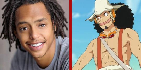
Whitewashing in Anime - Soma ft. Usopp
Avoiding "Brown"
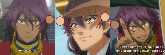
Here is an image of Soma comparing his skin tone from the first season of Black Butler and the current season airing now. As you can see, Soma's skin is noticeably lighter than it was in the past. I considered the lighting and took shade from his hand that looks relatively mid tone. However, that's not really a fair excuse if the anime continues to lighten Soma's face this way.
I also compared his skintone from the Book of Circus season which is relatively more recent, and chose images where he's clearly in good lighting. Soma is still noticeably lighter this time around.
Whitewashing is an incredibly common phenomenon that been happening a lot lately in anime, especially with reboots. A great example I can think of off the top of my head is One Piece where they lightened nearly everyone's skin color in the anime, despite some of the cast being characters of color?

(^^^this character is canonly black according to Oda, the mangaka.)
"Oh but Oda gives Usopp pale skin in all his color illustrations"
One, he should know better. Two, if Oda said Usopp would be African in real life, and chose a brown, Jamaican-american actor to play him, then yes, they have been ridiculously disrespectful in how they've been portraying the character's racial features so far.
In that sense, it's actually relief that anime studios in the past weren't afraid of giving their characters darker skin unlike mangakas who were terrified of even the lighest shade of brown.
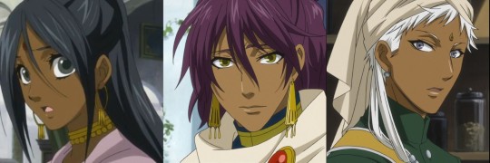
For instance, I am happy that A-1 studios made Soma, Agni, and Mina, who are all the same race, slightly differ in skin tone. Mina's skin is cooler toned compared to Soma and Agni's warmer hues.
HOWEVER, and other fans pointed this out, Soma and Agni's skin leaned so far from being golden brown to straight yellow in many scenes, that they were walking around like they have jaundice which is so... Of course A-1 studios found some way to mess it up ¯\_(ツ)_/¯
Another thing, do you guys honestly think being accurate to Yana's art style is always the best thing to do in adaptions? Angela Blanc, the secret villain in the anime original first season, pretends to be an abused maid and gets whipped in her very first scene. And according to Yana's concept sketches, she was originally brown. I'm actually glad the anime whitewashed her in that instance.
I'd like to point out, Sebastian's skin tone has also changed in the new season, and he's noticeably tanner than his previous anime appearances and yana's illustrations. So why is this okay for the anime to make creative changes for sebastian's skin tone, but have to stay accurate for Soma? (whose dark skin been established in anime viewers' eyes for decades now).
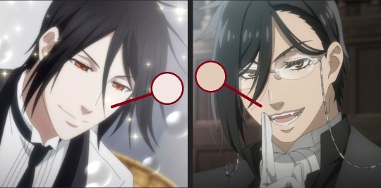
To be fair, I did a comparison of the anime grayscaled and Soma in the manga during the Weston arc. I checked the values and while I will say that his skin is relatively in the same as the manga, only few degrees lighter, whitewashing isn't only about skintone.
Colourism in Features
We could argue whether its just different anime styles or the way Yana draws noses, but its not a great look for Soma's nose to be made noticeably sharper compared to his flatter/rounder nose in the manga/earlier seasons of the anime.
Talking about the Mandela effect and cognitive dissonance as well... there's also something about how manga readers seen Soma with brown skin and pure black hair years in the manga, only for the anime to lighten those features.
It doesn't help that Soma canonly has purple hair and yellow eyes (if anything, I do appreciate the more natural tones they gave Soma this season. No more highly saturated purple hair and yellow eyes!)
Yes, Kuroshitsuji is a fantasy story, and YES artists of color like to play with fantasy features with characters, me included! But my point is that black/brown representation in media is so little already, especially when character artists are also averse to drawing any defining racial features.
Yana has designed brown-skinned characters in the anime with straight white hair and light-colored eyes about three times now (ie. Agni, Angela, and Hannah). The only Indians with dark skin and hair are a bunch of homeless thugs that Soma and Agni stop from mugging Ciel, proving they're "one of the good ones", and Mina whose treatment in the manga/anime is abysmal.
Discussing Racism in Fandom
Alright, so over the past few days, I've seen some fans disappointed with Soma's skin tone change and I hope my post illustrates why they would be. But I've also seen some angry and frustrated reactions to those fans! And I want to ask, why?
Why is fans bringing up racism in anime considered "discourse" but reacting harshly towards those fans is not?
Why would fans expressing disappointment about whitewashing gets you more angry than the whitewashing itself?
Why is being disappointed that an anime lightened a character's skin tone, a character who both anime-only watchers and manga readers alike saw as dark-skinned, "stupid" to you?
How come the fandom gets a good laugh out of the usage of "fag" potentially canceling the anime, but talking about race is a "risk" to getting a new season?
And if you disagree with my points and believe the anime is only being accurate to Yana's work, why not just say "Soma's skintone is more accurate to Yana's color illustrations, but I understand the disappointment and shock," without being condescending towards us for being concerned in the first place?
I'd be pretty happy if the anime was just using intense lighting and that Soma is darker than he appears (in fact, if that happens I'll reblog the good news to this post!) Because this post isn't "discourse" to me, I'm discussing race regarding one of my favorite characters in the fandom. Discussions like these don't ruin the fandom, but actually help it become a more welcoming place for fans of color.
Whitewashing in Anime - Agni ft. Cithis
#breaking out the caps for this#i really do feel spoiled by manga edits of soma#that give him dark brown skin i imagine him having#only to return to yana's art of him like oh... :')#some of yana illustrations of soma is just inconsistent anyway so im used to it#like he'll go from midtone to white... eh#also one piece fans you have my condolences#this recent season hoo boy#anyway im not even 'that' bothered by the change - its so typical at this point#but i just dont want anger towards fans of color to take root in this fandom#just because they want to discuss race#kuro#kuroshitsuji#soma asman kadar#weston arc#public school arc#b.txt#racism#whitewashing#usopp#one piece#fandom racism
63 notes
·
View notes
Text
Houseki no Kuni Chapter 107 Thoughts: Goodnight, Sweet Phos...
Hello everyone! Sorry for the delay with this post. I originally intended to finish it and post it on Wednesday, but you know.... life happened.
Another month has gone by and now we're on our second to last chapter for Houseki no Kuni. That's right; it's been confirmed that the next chapter will be the last chapter. Can you believe it? If you've seen my previous posts, I'm sure you have an idea of how I feel about this news.
But that'll be for the end of this post. For now, let's talk about this chapter! I don't know how long this one will be, but I'll still warn you that it might be longer than intended, which is the norm for me. This post is a bit too messy for my liking so I might end up making some edits to it later. For now, I just want to have it posted.
As always, please feel free to share your own thoughts in this post! Here we go!
Visual Storytelling Through Change in Style
The first thing I want to talk about is the visuals for this chapter. It greatly contrast with the visual style of the previous couple of chapters. In those chapters, the art was loud, intense, and chaotic, and yet mesmerizing and immersive. The heavy use of black, sharp lines and patterns emphasizes on the harshness of the changing environment. And in many of those page, Phos looks so small, as they are literally being consumed by their surroundings. Even though there were many panels where Phos, Eyeball, or the pebbles are the focus, the background is still very overwhelming in comparison.
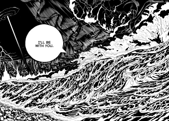
Now contrast that with most of the visuals in this chapter. Most, if not all, of the intense visual motifs from the previous chapters are gone; no sharp patterns, black is subdued significantly, and the background isn't overpowering the characters.
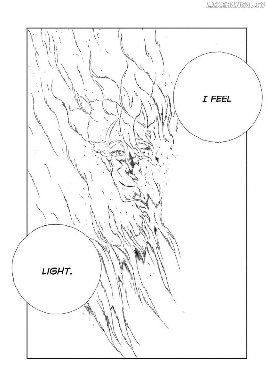
The intensity of the visuals were cut back significantly and were traded in for simplified line art, heavy use of the white negative space, and soft hues that make everything airy and dream-like. This is especially true during Phos's sequence. I like how there are very few thick continuous lines in the artwork. These illustrations are mostly made up of light, loose broken up short lines that create abstract structures. And I like that as the regression continued, Phos's design simplified to the point that they were just a small abstract face.
This art style literally and metaphorically showed us the deconstruction of Phos. It's so simple, and yet so impactful.
This is also the case for the last two pages.
The change in visual tone does a nice job emphasizing the literal and figuratively change in scenery. To be more specific, the drastic art style changes can symbolize the final metamorphosis of the remaining characters and the story itself. With Eyeball and the pebbles, the style emphasizes how they've transitioned to a whole new place in a literal and allegorical sense. And with Phos, they're style does the same by emphasizing on the deconstruction of their being during their final moments.
I apologize if what I said was confusing (I also got myself confused for a moment haha) But I'll just end this section with this: I liked the art in this chapter.
Now then, we should jump into the meat of this chapter....
Phos's final curtain call.
Phos Can Finally Rest...
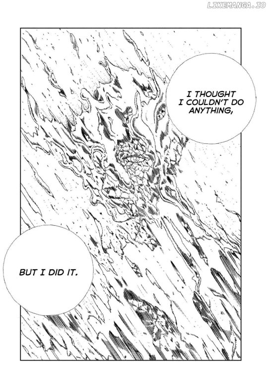
Like I stated before, I found Phos's pages really beautiful for different reasons. In terms of visuals, it's nice seeing some softer imagery after having nothing but sharp, chaotic ones. And story wise, it's nice to see Phos finally letting go and feeling fulfilled.

They are finally free, for real this time. Free from heartache, pain, existing. Phos is no longer held back by the sorrow they had been carrying, and they are free of regret.
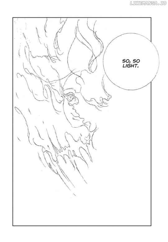
They are finally at peace.
And would you look at that? We got to see Pho's original face one last time. And they were happy.
Good for them.
Before going to the next section, I want to quickly talk about this page:
When I first looked through the spoiler tag for the previous couple of chapters, I remember seeing some posts from people who seemed unsatisfied with how the story progressed. From what I understand, many of them didn't like that Phos decided to forgive the remnants of humanity. With this latest chapter, I'm sure there are fans who were also not happy that during Phos's final moments that they are thinking about wanting to see their old families again. I can understand the sentiment, though I'm not surprised with this development.
Despite everything that had led the story to this point, Phos did not hate their old families. Yes, they harbored malice towards them during different points of the story, and it would have been justifiable for Phos to punish them along with the other remnants of humanity came to them to pray. But instead, Phos chose to forgive and free them.
I originally saw Phos's actions as their way of finally cutting ties with their families and relieving themselves of the emotional baggage that they burdened them with. But it's been hinted for a while that despite everything, Phos still loved their families. And the fact that Phos wishes they could see them again solidifies this fact.
Though I can't say if I like this revelation or not, I still find it interesting. But again, I can understand if some readers disagree with Ichikawa's writing decisions. If you have your own thoughts about Phos's final moments, please feel free to share them!
But regardless of everything, I still think this was a wonderfully fitting send off for Phos.
But I'm not done talking about Phos just yet.
And Start Anew...
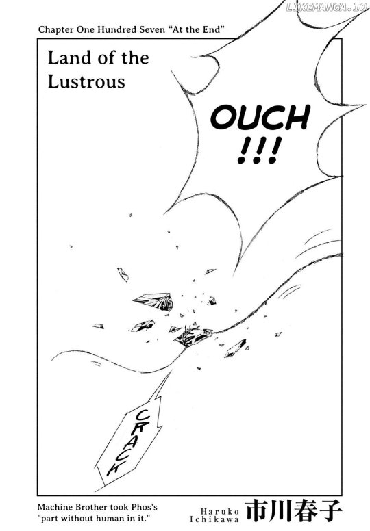
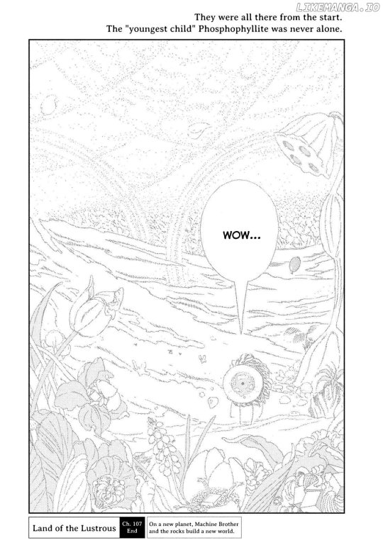
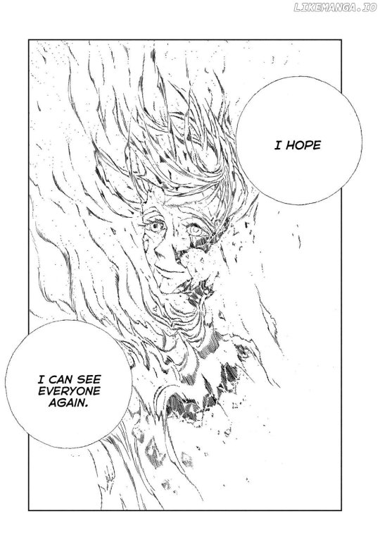
I'll admit that having the first image I see be Phos's last gem piece shatter was not the welcoming image I wanted to see. For a moment, I thought my hope that there was a chance the small piece of Phos would grow sentience and live a new life was shattered (haha.)
But hooray, for that theory became a reality! Despite Phos's last piece breaking up again, a small bit remained and is evidently showing signs of life. It was wonderful how the pebbles immediately recognized that small piece as their brother, showing once again how open and welcoming their are. Small Phos is so lucky.
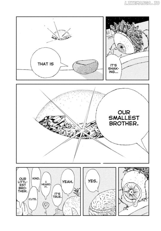
And how ironic is it that this Small Phos is considered the smallest, (in some ways) youngest, and most fragile new member of this new family... much like how Phos was with the gems at the beginning of this whole story. (I know that Phos was the same height as the other gems, but because of their makeup and position within their society, Phos can be considered less significant or "smaller" than everyone else)
Hm. With that thought in the air... I hope the parallels end there and this doesn't mean that this small and untainted piece of Phos won't be subjected to a similar treatment of their predecessor, right?
...right??
Nah, it should be fine....Unless Aechmea somehow comes back-
Created Their New Path: Final Act of Defiance?
The second to last thing I'd like to talk about is this page because it had me thinking about few things.
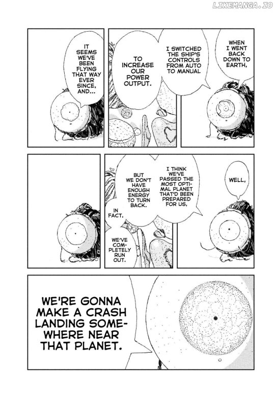
It made me think back to the previous chapters, namely the crazy, nearly perfect plans perpetuated by Aechmea and the Lunarians. It's been emphasized many times how calculated Aechmea's plans were, especially when it came to Phos. He nearly predicted every action Phos would make and kept planning and manipulating accordingly until things go the way he wants. And in the previous chapter, it was also heavily implied that he and the other remnants of humanity counted on Phos, Eyeball, and whatever new organisms they came across, to get onto the Dues Ex Machina ship. In some way, they predicted correctly.
But now I must ask these questions:
Did they also count on the possibility of Phos not entering the ship?
Did they also count on Eyeball switching off the ship's autopilot, manually controlling it, and subsequently crash landing it on a planet that more than likely wasn't the original destination?
For these questions, I want to say no.
It's interesting how even though at this point in the story, both Eyeball and Phos seemed resigned to the fact all of their actions were a result of them being manipulated, even after the perpetrators were long gone. But funny enough, I think that their very last actions were entirely their choice. For Phos, staying on the planet and ceasing to exist was entirely their choice. And for Eyeball, choosing to meddle with the ships settings to grab Phos's last gem piece and boost the ships' output. I don't think Aechmea counted on Eyeball doing that. If Eyeball is correct and they did pass the planet that Aechmea had possibly prepared for them, then this means that Eyeball had in many ways changed the trajectory of his and the pebble's lives, albeit unintentional. This could all mean that are all finally free from Aechmea and his long-game, 4D chess plans.
Phos and Eyeball have finally and truly defied Aechmea and humanity.
...BUT THEN AGAIN.. there's always that dumb chance that this was ALSO somehow part of Aechmea's plan. I highly doubt it, because that would be very ridiculously convoluted, even for this story. But then again, you never know with this author.
But for the sake of this post, I want to believe Phos and Eyeball came out on top in the end by intentionally and unintentionally forging paths that wasn't previously made for them. Even though Phos's final choice was somewhat influenced by the professor, it still felt like it was truly their decision.
I hope this doesn't unravel somehow with the final chapter.
Speaking of which-
The Final Stretch...
I can't believe it. This story is about to end. We'll finally almost done and what a journey it has been. I can't believe I started getting into this series almost over 6 years ago. Many things have happened since then, and during this time, this story had sent me on such an emotional rollercoaster. Though there are many things within the story that I wish was different or handled better, I still think this was a very wonderful and thought provoking story.
Now Ms. Ichikawa has to stick the landing. This could make or break this series.
After everything you put us readers through, I hope the true finale will be worth it.
#houseki no kuni#land of the lustrous#hnk#hnk spoilers#hnk phos#hnk spoiler#lotl#hnk meta#lotl spoilers#hnk analysis#hnk chapter 107#hnk phosphophyllite#hnk manga#hnk thoughts#story analysis
62 notes
·
View notes
Text
Der Student von Prag (The Student of Prague)
Dir. Henrik Galeen
1926
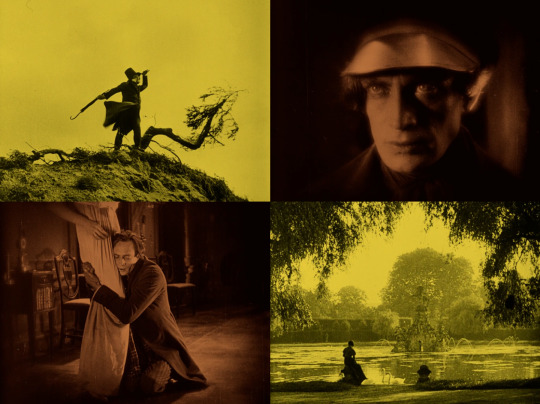
So I'm going back and rewatching a handful of the titles from the initial 50+ film journey into Conrad Veidt's filmography. Some I'm revisiting because they made such an indelible impression on me the first time, others because I want to give them a second chance. The Student of Prague was among the first films on what wound up being a year-long deep dive into Connie's work and history. I loved it then, but even more so now.
I want to live inside this movie. Galeen and his crew made a hell of a picture, made all the more special by Conrad Veidt doing the literal most.
There is a bewitching quality to The Student of Prague, from Conrad Veidt's dual performances as both Balduin and his Double to the atmospheric cinematography and special effects. It's a dreamy film that really sets itself apart as a dark and lovely supernatural period piece.
Despite some very minor issues, over all it's genuinely pretty perfect. It's one of those films that, even with its faults, sweeps me effortlessly into the gothically Romantic world of the story.
Maybe the film could have benefited from tighter editing, cutting some of the longer sequences and unnecessary shots. But an argument could also be made that these longer scenes aid the spell the film is casting over its audience, the way Sciapinelli weaves his spell on the hilltop to draw Balduin and Margrit together.
The cinematography by Günther Krampf and Erich Nitzschmann is really something special. Shadow was a big motif and standard tool filmmakers used back then, especially those working in the Expressionist style, but for 'Student, maybe because of the early 19th century setting and the proximity of the natural world (both real and fabricated), the use of shadow here makes the film feel more like a fairy tale illustrated by Arthur Rackham than the Uncanny Art Deco of classic German Expressionism. The digital restoration really highlights how successfully they worked with value and contrast to create such a visually rich film.
And it fucken WIMDY. The use of wind throughout the film is really effective -- Sciapinelli's coat billowing out behind him on the hilltop, the rustling foliage behind Balduin after the duel, dead leaves blown into the Countess's bedroom, and the gales that follow Balduin through the city in the film's final act. Whether used on a studio set or in location shots, wind here feels not only atmospheric but also supernatural; it's Sciapinelli's invisible presence when he's not even in the shot.
Even the relatively minimalist score works. It's mostly piano supplemented occasionally by one or two other instruments, a flute or an accordion, and there are only a handful of repeated themes. Apparently the music that's in the most recent restoration was composed only a few years ago by Stephen Horne, so it's really anyone's guess what the original soundtrack by Willy Schmidt-Gentner was like. Regardless, the new music definitely feels appropriate not only to the period the film was made but also the overall Vibes.
On my first watch about a year ago, I was struck by the special effects used in this film. For the time it was made, the effects had to be incredibly impressive. The transitions where the Double appears and disappears in a ghostly fashion are fun, but there's an especially cool shot where he appears to walk through an iron gate, and a really great close up dolly shot towards the end of the film where the Double appears to float toward the back of the room. And I don't know if this was something they touched up in post-production or if the lighting on set was chef's kiss perfect, but Connie's eyes literally glow. There are shots where his eyes, especially as the Double, are like two beacons set in the shadows.
The other performances… they're fine. I mean, everyone who wasn't playing Balduin has to have known it wasn't their movie. Except for Werner Krauss as Sciapinelli who looks like if Alfred Molina was sent back to the 1920s and did as much cocaine as he could find. He's so creature coded that I genuinely don't know what to make of his performance. Everyone else, including Connie, is kind of doing a riff on realism to varying degrees of exaggeration but still relatively tame for the era (compare the acting in 'Student to The Hands of Orlac just two years earlier). But I guess Werner Krauss didn't get the memo, or because Sciapinelli is a supernatural character it's ok for him to be a little out there. He does some really delightfully creepy and borderline upsetting stuff especially in the scene when he makes the deal with Balduin. It's all very weirdly sexual and I hate it. Otherwise, there's unfortunately very little of note in the other performances. Elizza La Porta as the flower girl does the pathetic-cute thing well, but Agnes Esterhazy's Margrit is sadly pretty forgettable.
But the Balduin of it all. This is truly a groundbreaking role for Conrad Veidt at this time in his career. I feel like this film alone slingshot him into his meatier and more interesting roles in the late 1920s. Sure, Connie was doing some interesting and versatile stuff around this time (Ingmarsarvet and Carlos & Elisabeth come to mind), but this just hits different. Everything kind of lines up perfectly for him as this character, and the story is that unique Poe-inspired blend of the uncanny and capital R Romance that really suits him. Because of the nature of the story itself, Connie's free to play big when it works for the character, but also works in these incredibly vulnerable and subtle moments as well. I don't know if this is thanks to the director being hands-on with Connie or just letting him do his thing. Whatever the case, it works.
It's maybe worth mentioning Connie was 33 when they shot this. I don’t know how old Balduin's supposed to be, but he's probably at least ten years younger than Connie was at the time. And I buy it, I buy that Balduin is a young man, foolish and naïve in the way only someone that young could be. His youthfulness isn't just suggested in the character's decisions but also in his physicality. When we first meet Balduin, Connie's doing this sulky, pouty, petulant thing that I love for him. In the first act, he's clearly beloved by his fellow-students and by the flower girl, and he easily slips out of his misery about his money problems into a more lighthearted mood. He's moody one moment and playful the next, joining in a low-stakes fencing match for fun when just moments before he was brooding alone full Morrissey style in the garden. This initial lightness about the character sets him up for his eventual inevitable hard fall into shame and helplessness.
I'm afraid to admit it took me a whole 24 hours after watching this a second time to realize that Balduin is kind of a dick. But Connie's performance is so good and so empathetic that I didn't notice right away. He himself is stunningly, Byronically beautiful in this film. He's like a painting of a tragic, Romantic hero come to life, I can’t even handle it. And, my god, the yearning! It's palpable. In the wrong hands, I would probably hate this character. I haven't seen Wegener's or Walbrook's versions, but I can't imagine they're as charismatic as Connie is in the role.
But what I love even more than Connie as Balduin is him as the Double. I am FASCINATED by this performance and this character. I have SO MANY QUESTIONS. The way he consolidates his movements so that he practically glides through the frame, the way he keeps this performance distinct by slowing everything down and keeping a lot of the Double's anguish internal… it's so good.
I think we only see the Double four times before the last act of the film: first when he steps out of the mirror; much later outside the Countess's party; in the graveyard; and after he kills the Baron in the woods. Initially, when the reflection steps out of the mirror after Balduin signs Sciapinelli's contract, the Double seems pretty soulless. His dead-eyed, mask-like expression as he stalks out of the room makes it seem like he's just going to be a mindless puppet Sciapinelli can use to torment Balduin. And certainly in their first two encounters, Balduin's mirror image slinks out of the shadows as a reminder of his Faustian bargain but also as something of a stand in for his conscience. The first two times we see the Double out in the world are when Balduin is at his happiest, in his most romantic moments with Margrit, who is not only completely out of Balduin's league but also promised to someone else (even if that some one else is her cousin...). Nothing about the Double's presence in these scenes suggests that he's anything more than a phantom, a specter to haunt the protagonist from a distance.
But then, something changes. The Double isn't just a ghost that only Balduin can see; he's just as real as his counterpart, and his actions have consequences. Balduin promises Margrit's father, the Count, to spare her cousin-fiancée in a duel the Baron knows he cannot win -- Balduin is, after all, the best swordsman in Prague. They even say the fight is supposed to be with heavy sabers, which sound like they could really mess you up. But when dueling day arrives, Balduin is delayed by the wheels inexplicably coming off his carriage. He races through the countryside on foot in order to make his appointment, but it's too late. He stops dead in his tracks, frozen in fear, as the Double appears, approaching him slowly from the tree line. When the Double reaches him, Balduin sees the bloody sword and immediately recoils, fearing the worst. But what's most interesting about this scene is that, when the Double finally looks up, his expression is not that of a mindless zombie. When he looks up, the Double looks horrified. Realization slowly rises in his face, and he turns to Balduin with this look of abject horror and helplessness while Balduin cowers in fright. And as the Double turns to walk out of the clearing, he hangs is head in pained resignation and I AM OBSESSED. There are no intertitles in this sequence, but the anguished look he gives Balduin says, "Do you see now? This, and worse than this, is going to keep happening." Connie's performance in this scene suggests the Double may not be able to control his actions but he certainly has feelings about them. So does this mean the Double is in fact Balduin's soul? His goodness? His innocence? I NEED TO KNOW MORE.
The Double is also consistently dressed in the student costume Balduin wears at the beginning of the film. After Sciapinelli gives Balduin the money, Balduin buys a whole new wardrobe (honestly, who wouldn't?). But the mirror version of Balduin doesn't change to reflect Balduin as he is in the present; the Double wears the clothes of a student -- the cap, the velveteen jacket -- because he represents who Balduin was. He's the boy, the youth uncorrupted by excessive wealth and privilege, now made to do horrible things because Balduin so easily handed him over to Sciapinelli when they made their deal. UGH.
The final time Balduin sees his Double, his mirror self hounds him with measured steps, pushing him away from the fragile security of wealth and opulence back to his abandoned student flat. And the expression on the Double's face now is grimly accusatory, it's deeply solemn disappointment, it's a final judgment before an inevitable end. There's sorrow and resentment in the Double's eyes, but kept restrained and subtle, gradually building in wordless intensity until Balduin must finally face himself, literally, in order to end his torment, finding a pistol and shooting his mirror image and therefore killing himself.
Maybe a lot of the descriptors I use for Connie are hyperbole, but his work in this film is remarkable. Anyone interested in getting to know him as an actor, hell, anyone interested in film history period, absolutely should watch The Student of Prague at least once.
Final thoughts: For real, though, it would suck to not have a reflection. I recently had a whole conversation with my (straight, cis male) family members about this; not a one of them owns or even sees the need for a full length mirror. And maybe the big mirror in Balduin's student room came with the place when he moved in, but you get used to having something like that. I know it would drive me crazy not being able to check my whole outfit to make sure I don't look like a doofus before leaving the house.
#my writing#conrad veidt#the student of prague#tl;dr i have a lot of feelings about this movie and need to yell about it online#remember when i used to make and post art here lol#now it's almost exclusively a conrad veidt appreciation blog and i am so so sorry
27 notes
·
View notes
Text

...So I was noodling around with the above image as preliminary work for a piece of Middle Kingdoms concept art that's going to illustrate a chapter-heading rubric from The Door Into Sunset. And while working on it, I belatedly realized that to correctly set up that scene, I was first going to have to tear up the entire left-hand side of the image (and the space beyond it), because the new covered fish market I had in mind wasn't going to fit in the space.
So I rolled my eyes at myself (I should have seen this coming...), got busy tearing it up, and then built the fish market. It's very loosely based, as I think I mentioned somewhere here earlier, on the famous Vismarkt, the covered fishmarket in the center of Brugge in Belgium (a.k.a. Bruges). (Image via Carto.net.)
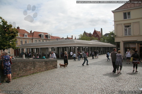
Back in medieval times, right through to the Renaissance and beyond, fish was originally sold in Bruges in the open, from wooden pallets. But other stallholders in the main market complained about the smell, and the fish-sellers themselves weren't happy with the venue: selling such perishable goods out in the broad (and often hot) daylight was suboptimal. A permanent, covered place for the fishmongers' stalls makes more sense. Yet at the same time, you want decent light on what you're selling or buying... just not direct sun.
Choosing the architecture for a market like this in Darthis city was also going to be an issue. The Vismarkt was installed in a new dedicated market square in 1821, with the architect opting for a Victorian-cum-Classical look: not something that would make sense in this alternate Earth—if I was seriously considering a straightforward copy, which I wasn't. However, the Darthene architectural aesthetic does contain both building styles very like our Romanesque style, and elements similarly reminiscent of Gothic. (Though in the Middle Kingdoms the AU-Romanesque wasn't abandoned when the kinda-Gothic came in, but coexists with it).
After I'd given the situation some thought, I found myself wanting something that drew on those two traditions... or would maybe kind of split the difference between them: a building open on all sides that would be relatively light and airy, recalling a tent or canopy. This kind of design's unquestionably made a lot easier in that universe by the availability of magic-workers able to pull stone out of the ground without excavation, and also able to fashion it into the desired shapes without the use of physical tools. So finally I settled on a broad, vaguely Gothic-styled cross or groined vault as the preferred shape for the roofs: then rummaged around to see what I could find in the local toolkit that would enable me to build it.
Semi-plan view:
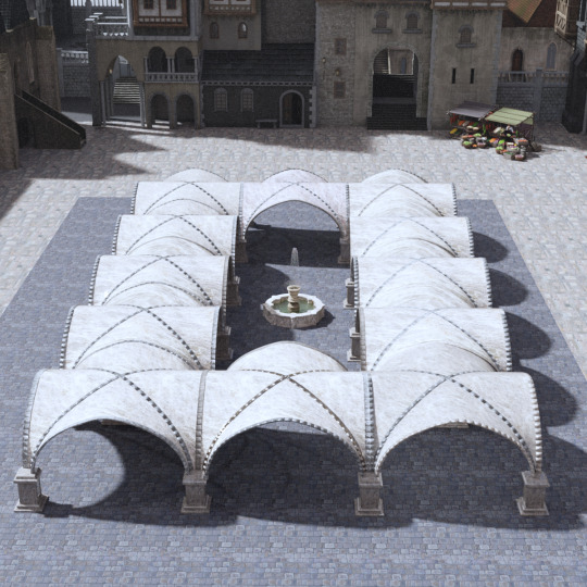
Diagonal side view:

(Please note that all of these images are the result of the digital version of kitbashing, as I don’t currently have anything like the skills to create shapes like these in Blender.)
Better lighting in this case is fortunately a materials-technology issue, long since solved on our own Earth. The stone of the roof segments is what architects now would refer to as an "alabastrite marble", about an inch thick—light enough to need relatively little in the way of external supports, and thin enough to transmit light readily. This marble's name comes (probably obviously enough) from alabaster, which has been used on and off in European church windows since medieval times as an affordable alternative to glass, in times and places where that’s been expensive.
This approach has had occasional revivals in modern our-Earth architecture. However, since alabaster is only useful in relatively small pieces, and is vulnerable to heat and moisture, it's often replaced by thin-cut marble set in metal frameworks. One good example of this would be the Beinecke Rare Book and Manuscript Library at Yale. (image via Amusing Planet)
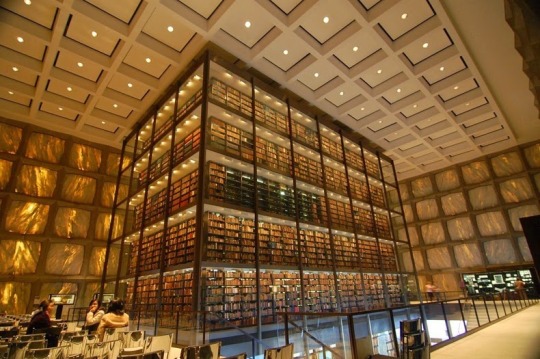
The thin-cut Vermont marble transmits light safely without endangering the documents. But sometimes genuine alabaster has been used, too: the Cathedral of Our Lady of the Angels in Los Angeles features tens of thousands of panes of it. (image via Expedia)

The equivalent use of marble in the royal Arlene library rr'Virendir, in Prydon city—replacing much ancient glass destroyed during the earthquakes accompanying the last battle of the Great War—is probably where the Darthene authorities got the idea for this implementation. And since the marble used in this construction would almost certainly have come from Arlen, light-colored marble being the country’s “vernacular" stone due to it being quarried all over the place there, it makes perfect sense for this marble to have been a gift of the Arlene Throne to the city of Darthis. And would also account for the presence of his grace the King over there by the market stall up against the wall, pretending to check out the produce while he also checks out the nearly-finished construction (and, idly, two of his spouses).

The Queen is after all very picky about making sure her contractors are getting things right. Yes, she jokes a lot about having lots of room in the dungeons if things go wrong... but sometimes, if you don't know her, it's hard to be sure she's joking.
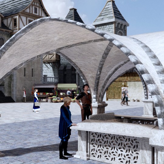
Meanwhile, so far, it doesn't look too bad.
Things learned over the past couple of weeks, in between also doing other work:
Translucence is a bitch to master in Daz Studio
Certain aspects of Blender are conspiring with one another to make me scream
My rendering computer is displaying a tendency toward quirkiness in the memory department that would register as nearly endearing if I could figure out what was causing it
...But at least now that the set I need is pretty much done (except for some minor tightening, straightening, and tweaking of materials and color temperatures), I can turn my attention to the question of how to produce the rather specialized VFX required for the two shot I'm setting up. ...Yeah, all this work has been for a two shot. But that shot needs people in the background, and the right street furniture. And nature abhors an undressed set. ...See also: "the backs of the melons."
Next challenge: track down a source for heaps of digitized prawns. :)
#Middle Kingdoms#Darthis#fishmarket#Middle Kingdoms meta#Freelorn#Herewiss#Eftgan#and a cast of tens#also#Blender#argh
142 notes
·
View notes
Note
OK so I'm feeling some guilt I started to draw cartoony like you but I get frustrated because it does bot look perfect like yours it's mostly small stuff like colors and clothes I love making cartoony body's sometimes clothing but I have color picking because I'm still new to art that has colors is my feelings normal or is it wrong of me? And how do I pick colors because it frustrated me to no end and made me stop drawing for months anyway in short summary how do I color the right way like I guess I know skin tones but anything else goes wrong and the other summary is how do you draw clothing because I can't for the life of me get clothing right
don't worry - it's normal to get frustrated when drawing. i know i've literally quit and deleted entire illustrations in the past because i didn't like how the colors came out, and i can spend whole hours just choosing base colors TwT i think the important part about learning art is not to rush. i'm seriously flattered you see me as inspiration, but what worked best for me back when i heavily referenced other artists was "mixing" styles together to create a "new" one - so i'd recommend studying and copying multiple artists you like and trying to blend their styles into one if that makes sense! ^^
hating color picking is completely normal when you're first starting out, and even late into art like i said before - i've been making original digital art on ibispaint for about 5 years now, and it's still difficult. but it's easy to make it fun, and the best way to do that imo is to experiment! i'd recommend studying color theory on a larger scale, and understanding how certain colors might look completely different based on where you put them. or maybe make an illustration and color it in a bunch of alternative ways! also, having "bad" or "awful" color skills starting out is OK - i still think my colors suck sometimes even now lol.
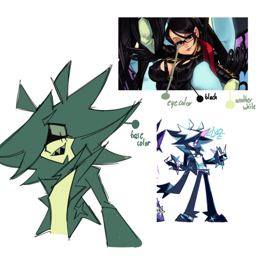
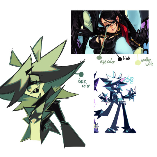
anyway, the best way for me to color pick is to just use that color for whatever the OG artist used for their art. let's use alex ahad as an example because i find his art and color use super interesting -
i don't usually color pick, but when i do, i typically start with picking the eye color. then, based off of the eye color, i chose a base color based on the character's color pallete (easier of the eye color is already close to the main color of the character, which for clyde is turquoise).
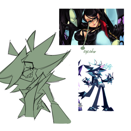
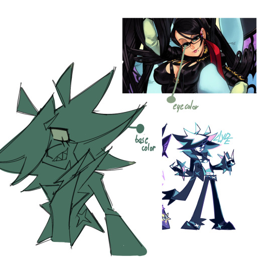
then, i pick more colors directly from the reference, for stuff like skin. at this point i have a good idea of the colors i want to use and stop color picking from the ref, but there's no shame if you still feel you need to.
after that, based on the colors i picked, i'll color in the rest of the piece. i usually end up changing the colors that i did take from the reference due to experimenting - for me, i just use color picking as a sort of stepping stone for when i'm not sure how to color a piece the exact way i want.
eventually, you can learn to color pick by eye rather than with the picking tool in your art program, tho that takes a lot of knowledge on color theory.
really there is no "right" way to color, especially for skin imo - don't limit yourself to just peach, tan and brown. clyde's skin is bright white, but i still used a yellowy color here because it was relative to the other colors in the piece. i've also used "alien" tones for human-toned characters in the past before!
and about clothing folds - i can make a full post on that if anybody else is interested OuO
47 notes
·
View notes
Text
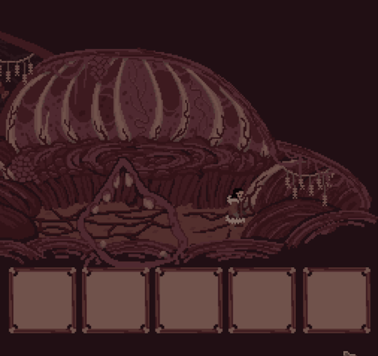
Ignota's Top Surgery Fund Commissions!

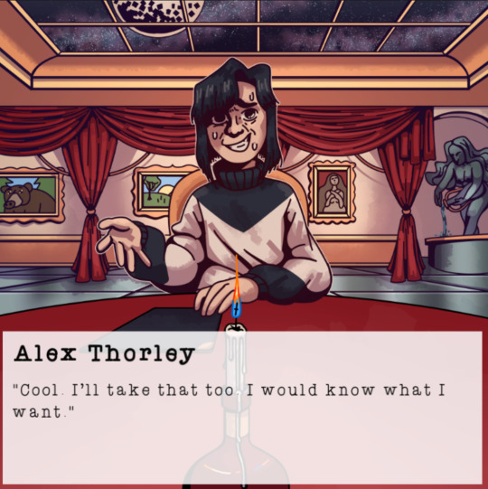


Hello! I am Ignota. I am a 25-year-old non-binary artist, known mostly for my pixel animations, my comics, the Godot games/interactives I've made/am making for the SCP Wiki, and TikTok videos. I recently FINALLY got my insurance to cover top surgery(I live in California, but my insurance is out of Florida)
I just found out my insurance kinda lied about my doctor being in-network.
My insurance agreed to cover the top surgery itself but does not cover the surgical center I need to get it done at. I've been quoted at $2140, not including additional medical workup, prescriptions, travel, and temporary living expenses.

I am trying to reach out to my insurance to see if it'll be covered, but I am about to age out of my current insurance and I am not in a position to afford new insurance.
There is still a chance I can convince my insurance to cover it, but this is time-sensitive and I want to have the ABILITY to do it regardless. So, I am doing commissions now.
PRICING


Pixel animation $50-$400
$50(Art similar to the first image): Maximum of 12 frames. One character. Very limited movement. Canvas size under 135x135
$80(Art similar to the second image) Maximum of 24 frames at any framerate(Typically 4fps for 6 seconds or 8fps for 3 seconds), Simple Movement, 1-2 characters, maximum canvas size of 135x135. Price can be adjusted to accommodate more detail
$200(Art similar to the third image) a couple characters, a detailed environment, and a moving scene. Maximum canvas of 256x240. The scene can be converted to a simple one-room HTML5 format that can play in-browser.
$400+(Art similar to the fourth Image) A complex environment, multiple characters/moving parts, and the ability for a scrolling background.

Illustrations $50-$250
$50(Art similar to the first image): A simple close-up shot in any style.
$100(Art similar to the second image) A simple scene or full body with no background.
$250+(Art similar to the third and fourth images) A complex environment. Alternatively, a detailed comic page.
All features are negotiable and individual requests might change the price. If there's something from one tier you want but don't want all the other stuff, chances I may be able to work something out that will fit your needs. These descriptions are suggestions to make it a little easier, not solid outlines of what they need to look like. Feel free to bring other ideas to the table. I have worked on background illustrations and pixel animations for indie devs making games, Dungeons and Dragons character sheets, individual character pieces, and many other things in the past.
Contact me through my Email([email protected]) or my Discord(ironshears)! Alternatively, I do have a Ko-Fi if you want to support my art.
Alex Thorley's Blind Date(The Dating Sim) by me under CC-BY-SA
Kuobach's Eyes(Orange Comic) by me under CC-BY-SA
Nacre Series by me under CC-BY-SA
The other pixel game in question is tentatively titled Brand New Colors and has not been completed yet, but you can find more of it on my blog. It will also be under CC-BY-SA
124 notes
·
View notes
Text
*Sighs*...Okay, yeah, Wish really IS bad
And I didn't want to go in thinking that. I went in with the most optimistic view possible. Because with EVERYONE treating this movie as the worst thing possible, a POX upon the house of mouse itself, I went in thinking that there's no WAY it's THAT bad. So when I finally watched, I decided...I was right. It's NOT that bad. But...Well...Let's get into it.
This is the part where I'd say "Positives First," to show off what worked before picking apart what didn't. Except that, aside from a few little moments and easter eggs that made me go, "Aw, that's cute," I'm coming up EMPTY. Every single thing--And I do mean EVERY SINGLE THING in this movie, from the animation, songs, characters, story, themes, ideas, and even EXECUTIONS...is ALMOST good. Every single aspect of this film ALMOST worked. The pieces are there and I can see just how this film could have been the masterpiece that was a CENTURY in the making. The problem is that there's ONE THING holding it back: Not enough time. And I don't just mean that the movie should have been longer. No, I mean that this movie needed another YEAR of production to tighten up EVERYTHING. Why's that? Well, let's go in order of the things I mentioned.
The animation is clearly trying to go for this mixed-medium style that movies like Puss in Boots: The Last Wish or Spider-Verse popularized. Those movies mixed hand-drawn animation with 3D models, making storybook illustrations or comic book art feel ALIVE. That's sort of Wish is going for. I hear people say that Disney's 100 year celebration should have been completely hand drawn to call back to their early years, but I tend to disagree. I think Disney making a movie that's mixed-medium is a better way to honor its one hundred years, taking the animation that made Disney huge and mixing it with modern CGI as a way to make it feel like a celebration of the old AND new. EXCEPT that it doesn't really look good, aside from certain screenshots. There are SOME still images where if you paused the movie at the right time you can get something that looks like a 2D image with CG touch-ups. For the rest of the movie, it looks like a modern CGI Disney film with a storybook filter slapped on it. It doesn't look TOO BAD when your eyes get used to it, but it doesn't stop the movie from feeling like it ALMOST hit the right mark. The only times it REALLY works is with Star.

Wha--No. No, not that one. That's the wrong Disney character named Star.

There he is. There's my little guy.
But look at him. He's a 3D character with hand-drawn touch-ups that really makes him feel like a 2D character brought to life. If the whole movie looked like HIM, then it would have been a revolutionary achievement for Disney. But it doesn't. Instead, it feels like a missed opportunity that would have worked better if they had more time to animate this film instead of leaving their animators scattered to the winds to make half-assed sequels or forcing out one to two projects every year.
There should have also been more attention given to the songs because...Oh my gosh, they're bad. They SOUND nice, I love the instrumentals and the POWER these people put into the vocals. "This Wish" and its reprise successfully gives me chills through how well they're sang and how epic the instruments make them. But the LYRICS...are messy. When you sit down and actually LISTEN to what's sung, it all just...BLEH. That's the best way I can describe it, I'm sorry! It's BLEH!
Why would a king in a fairytale kingdom in the distant past sing, "You're sure you're not the prob?"
"Throwing caution into every warning sign" doesn't come across as a person freeing herself from her insane king's vague warnings but ADHERING to them.
The way that Asha and King Magnifico sing about protecting wishes makes it sound like they're singing to EACH OTHER.
And "You're A Star." OH BOY! The song that's meant to explain how these animals can magically talk is just filled with allegories and allusions that think they explain EVERYTHING only to explain NOTHING. It's just vague nonsense that, again, SOUNDS nice, but offers no real substance. On its own, I guess I can get into it, but to tell a story, it falls apart. Because that's the difference when it comes to writing a regular song and writing a musical: You're not just making a good song, you're telling a story through MUSIC. Wish's soundtrack is one that's filled with catchy songs, but not ones that properly move the story forward. Not to mention how they're so jarringly out of character in cases like "This is the Thanks I Get." When Disney released the soundtrack, that was my favorite song because I felt like it perfectly fit this smug, egotistical prick who thought he was the best person alive. Turns out that's not what Wish was going for...Not entirely.
Magnifico feels like he's meant to be a mix between Gaston and Maleficent. A character that has a huge ego and loves himself more than anything, but has an incredible amount of power to make himself a threat. If done right, a villain like that could stand up to be with some of Disney's best. And, yeah, like everything else in this movie, he ALMOST works. When he's finally a villain, he's campy and over the top, making him entertaining...But notice how I said "When he's finally a villain." That's because Magnifico doesn't really become what he's meant to be until halfway through the movie. He starts off as a King with good intentions but paranoid ideals that doesn't make him evil, it makes him feel like a guy who needed evidence to prove that other magic isn't a threat. By the time he finally acts more like a Disney villain, it was such a jarring left turn that his sudden switch-up made me feel like it was somehow a nightmare sequence from Asha. He's NOTHING like the guy he starts out as, and it's not a natural change that flows well throughout the film. That's mainly because the story has a pacing problem worse than any movie I've seen. If King Magnifico's path to the dark side was slow and gradual, showing signs of his worst qualities first and make them more apparent as the film goes on, he would have worked INCREDIBLY. Instead, it comes across as his villainy was activated like someone flipped a switch in his brain that says, "Be evil now." It's the absolute REVERSE of a bad redemption story, mixed with a lazy explanation that it was dark magic that made him more corrupt when he should have been evil since minute one. And you want to know the worst part? He's probably the best character in this.
Asha...isn't bad. She's your standard quirky nice girl protagonist that Disney just LOVES to use, especially lately. It's just that Asha doesn't have that "Gets stuff done" attitude like Moana or Mulan, nor does she have the infectious charm like Maribel or Anna. Asha, instead, is a lot like her breakout song: Nice and enjoyably, but doesn't stand out from the biggest hits. As for her animal sidekick Valentino...He's not annoying, but he's not funny either. Honestly, his comedy peaked when it was revealed that this cute baby goat sounded like Clayface from that Harley Quinn cartoon. A joke, by the way, that got spoiled by the trailers, so it's not really AS funny in the movie. Honestly, Asha's SEVEN FRIENDS are funnier at times. Speaking of, those characters are very clearly meant to be the Seven Dwarfs. And it is VERY distracting because not only does it feel like only two or three of them are necessary to the plot, but they're the ONLY major reference that the movie shines a light on when it comes to Disney's history.
Would I have wanted this entire movie to be nothing but references of past Disney movies? Of course not. That's not how movies work. But Wish seems to have this problem where it doesn't really COMMIT to honoring Disney's legacy. The most it does is give the Seven Dwarfs human OCs, make them supporting characters, and throws in tiny little easter eggs here and there. Again, some of them are cute, but it's not enough. The same goes for when Wish tries to honor some of the tropes and cliches that Disney popularized. It's an animated musical with talking animals, a campy villain, an objectively pretty protagonist, and goofy sidekicks. But it takes more than ADDING that stuff to your movie in order to honor them. You need to look at what made those tropes and cliches work in the first place and make something that calls back to those classic films while still having something new to say. And Wish almost--ALMOST--has something new to say.
With everything surrounding King Magnifico and how he got more power with people's wishes, I almost thought Wish was going to be a film that called out modern Disney. At least, modern CORPORATE Disney, a company that takes ideas and thoughts created by dozens of talented people, twists them into something unrecognizable, and refuses to give those ideas back when choosing to do NOTHING with this great idea leaves them free of competition. And to stop something evil like that, you must make something of your own and work hard to make your idea yours instead of letting someone more powerful take it from you. I thought that would have been a GREAT message...But of course DISNEY wouldn't want a movie calling them OUT for their one hundred year victory lap. So, instead, we have a message that tries to get the same idea across, but in a simplified way where the wishes are taken LITERALLY and that the only way to get what you want is to wish hard enough for it. That is...NOT the message I want kids to learn from this as it often leads to bad expectations. If this movie tried an ironically anti-Disney message in ANY OTHER year, it would have a better chance of getting away with it. But for a hundred year celebration, there was no chance in hell.
Wish is NOT Disney's worst movie, but it's nowhere near the best. I love SO MANY of the ideas and what it TRIES to do, but there's a difference between good ideas and good executions. It was ALMOST good, but Wish was not the movie anybody was really wishing for...
39 notes
·
View notes
Note
Question for ya (if you happen to know) - so Cere gave Cal her lightsaber hilt in jfo and he used it to make a split saber but in Jedi survivor she suddenly has one again when fighting Darth Vader. Where'd she get it from? Was it Cordova's? And if not when did she get a new lightsaber?


Good question - we don't actually know. Sometime between the two games Cere built/found a new lightsaber, but (as far as I'm aware) none of the databank entries or side conversations explain its origin.
But this question made me curious about Cere and Cordova's lightsabers, so here's a longer answer with my own ideas:


[Dark Temple Series: cover art by Marco Checchetto, Paolo Villanelli, and Will Sliney]
In the cover art for the miniseries Dark Temple, Cere uses her original saber with its green kyber, but Cordova's saber design doesn't match what we see in Fallen Order. So at some point after these comics, Cordova creates/updates his saber and engraves the Zeffo iconography on its switch.


[Eno Cordova's Fallen Order lightsaber: design by Amy Fry]
This design can be seen briefly in Survivor when you find the saber in Wayfarer's Tomb. And while we don't see it during the game's final cutscene, Cal possibly buries the saber with Cordova after the pyre. But the balance between game mechanics (new customization options from a chest!) and narrative details (didn't Cal already find Cordova's saber in FO?) makes a "canon" answer more challenging.

Cere's first lightsaber had specific design requirements because of its story purpose. Jordan Lamarre-Wan explains the hilt is proportionally shorter so it fits the broken section of Jaro Tapal's staff after Cal combines them. We also know the kyber is gone - Cere sold it to pay off Greez' gambling debts and continue their mission.
Cal might've returned the hilt to Cere after fully restoring his master's saber, or maybe pieces of Cere's saber are still inside. Maybe Cere chose not to use it again or simply wanted Cal to keep it.
In her concept art for Survivor, Theo Stylianides does show Cere holding this first saber and its green kyber, but these illustrations were likely made before the sequel's saber designs were finalized.
(Do I wish she had a green saber in Survivor though? Yeah, I do. Is it possible she was given blue for the aesthetic of blue vs red while fighting Vader? Maybe.)

[Cere's second saber: model by Aaron Fowler]
Cere's new saber, according to Aaron Fowler, is heavily inspired by the "Boone Kestis" concept created by Gus Mendonca in the early development of Fallen Order. The rugged, more utilitarian style matches well with her new role among the Anchorites. Survivor doesn't tell us where the lightsaber came from, but on a planet like Jedha, it's possible she found it or was gifted it while helping create the Archive.
I also think, practically, Cere's first saber would have been difficult to adapt to the new customization options in Survivor. Its small hilt and proportions would've required more alterations to fit the expanded saber components at the workbench. I miss the marble-like textures and woven grip, but I'm glad Cere was allowed to grow and change between games, and her new lightsaber reflects her new identity as both a Jedi and a protector of knowledge.

#thanks for the ask!#help i have feelings about lightsaber symbolism again#jedi survivor#jedi survivor spoilers#cere junda#eno cordova#asks
28 notes
·
View notes
Text

🍑 art
[x] hualian by @mmagurro
[x] mo xuanyu by @kkarmin
[x] nightless city by @ann-mauriii
[x] betrayed...? by @bxbxbx0
[x] it hurts by @juicedpeachy
[x] xianle trio in battle wip by @mooncakebun
[x] hua cheng new sketching style. by @mooncakebun
[x] jjk 251 panel by @innaillus
[x] jjk season 2 by @sonialiao
[x] shi wudu by @mariauri
[x] wangji-xiong. wangji. lan wangji. lan zhan! by @apothecaresa
[x] to die for you in battle is my greatest honour by @roremy
[x] one of my favourite panels from another angle by @obliviani
[x] hua cheng by @kuropii6
[x] when our eyes meet by @kuropii6
[x] a commissioned illustration for "no water is enough" by boomchick by @auchrauch
[x] start and end of a blue spring by @xo-romiiarts
[x] oh, starboy by @mochipong
[x] hualian by @ghironda7
[x] the boy who swallowed a star by @tamberella
[x] "... and broken dreams" by @blackwhitefeatherart
[x] shuangxuan by @cruelnemothesis
🍑 edits
[x] a tribute to mork methas pankhamdee, the last spark of hope in a world gone dark by @morkofday
[x] pov: you just asked your friend who's still on tumblr about... the untamed by @itstrikesback
[x] jabami yumeko by @izuku
🍑 gifsets
[x] the days are coming that she'll never forget by @buzzcutseascn
[x] nam seonho + first light by hozier by @pondsphuwin
[x] game of thrones characters as taylor swift songs by @reputayswift
[x] percy jackson by @jakeyp
[x] seasons by @jakeyp
[x] good omens by @maines
[x] regina george by @gloriapritchetts
[x] in turning divine we tangle endlessly like lovers entwined by @tommykinrd
[x] itadori yuuji by @cal-kestis
[x] this is jujutsu kaisen by @cal-kestis
[x] jujutsu kaisen by @queenrojpag
[x] the han joo won 'seasons 계절' collection: out now! by @khaotunqs
[x] i ought to stick to another man, a man that surely deserves me…but i think you do by @khaotunqs
[x] "run boy run! this world is not made for you." by @black-dread
[x] omg it's blorbo bleebus by @chinzhilla
[x] an eight word story by @eddiediaaz
[x] I owe her a love worth sixty thousand years by @baifengxis
[x] lilacs by the sea by @kimtaegis
[x] you wanna know how I know your daddy, don't you? by @speakviolence
#*shoutouts#creator shoutout#yknow all my shoutout gifs this year might just be scenes from the spirealm
37 notes
·
View notes
Last Seen Blogs

princesskairi
don't ever forget

topazolite
Neo!!1!

solkana
-._.-

hanfmann1555
Ihr seid alle meine Fans

the-great-lord-calicorn
Bow, Bitches